Newburyport Blue HC-155
Benjamin MooreBenjamin Moore Newburyport Blue (HC-155) is a sophisticated, dark denim blue with deep slate-gray undertones and a subtle hint of green. With an LRV of 10.31, it offers a moody, historic depth without turning completely black in shadowed spaces.
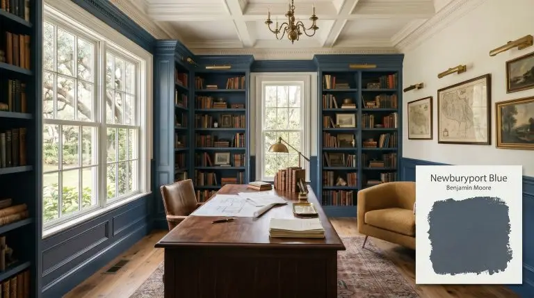
Benjamin Moore Newburyport Blue: The Ultimate Guide to a Historic, Grounded Navy
Many homeowners chase the dream of a sophisticated, quiet sanctuary, only to end up with walls that look like a child’s primary-colored playroom. Benjamin Moore Newburyport Blue (HC-155) is the absolute antidote to that design disaster.
This shade from the Historic Color collection is currently dominating the interior design world because it offers a moody atmosphere while retaining its distinct maritime soul. It delivers a coveted heritage aesthetic without turning your walls into a gloomy, unreadable cave.
The Color DNA of Newburyport Blue: Undertones & LRV
Before you commit a single brushstroke, you must understand the core pigment makeup driving this paint’s behavior.
At an LRV 10.31, this cool-toned navy sits precisely on the razor’s edge between a versatile mid-tone and a true dark. It absorbs nearly 90% of the light that hits it, demanding thoughtful placement in your home. Because it reflects just enough illumination to keep the blue legible, it avoids the dreaded black-hole effect.
You can apply wallpapers, paints, etc. on walls and see how they look in various interiors.

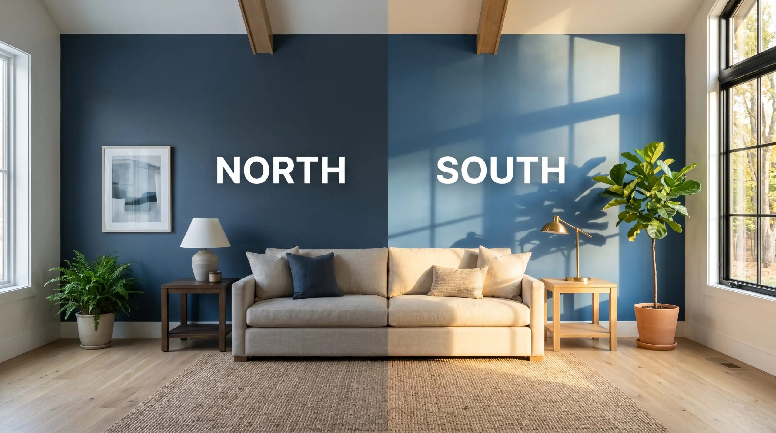
Lighting Effects & The Chameleon Factor
The single biggest fear designers hear about dark blues is that they will either collapse into a flat, lifeless black at night or turn into an overwhelming “smurf” blue in direct sun. The slate undertones in this specific paint act as a brilliant buffer against both of these extremes, but the hue will still shift dramatically depending on your light source.
Benjamin Moore Newburyport Blue in the Wild: Popular Room Applications
Let’s be fiercely honest about this paint’s versatility. It requires spaces with either abundant natural daylight or highly intentional, layered artificial lighting to survive. If you apply this to a narrow, poorly lit hallway or a basement with low ceilings, its heavy light absorption will aggressively shrink the architecture and feel incredibly oppressive.
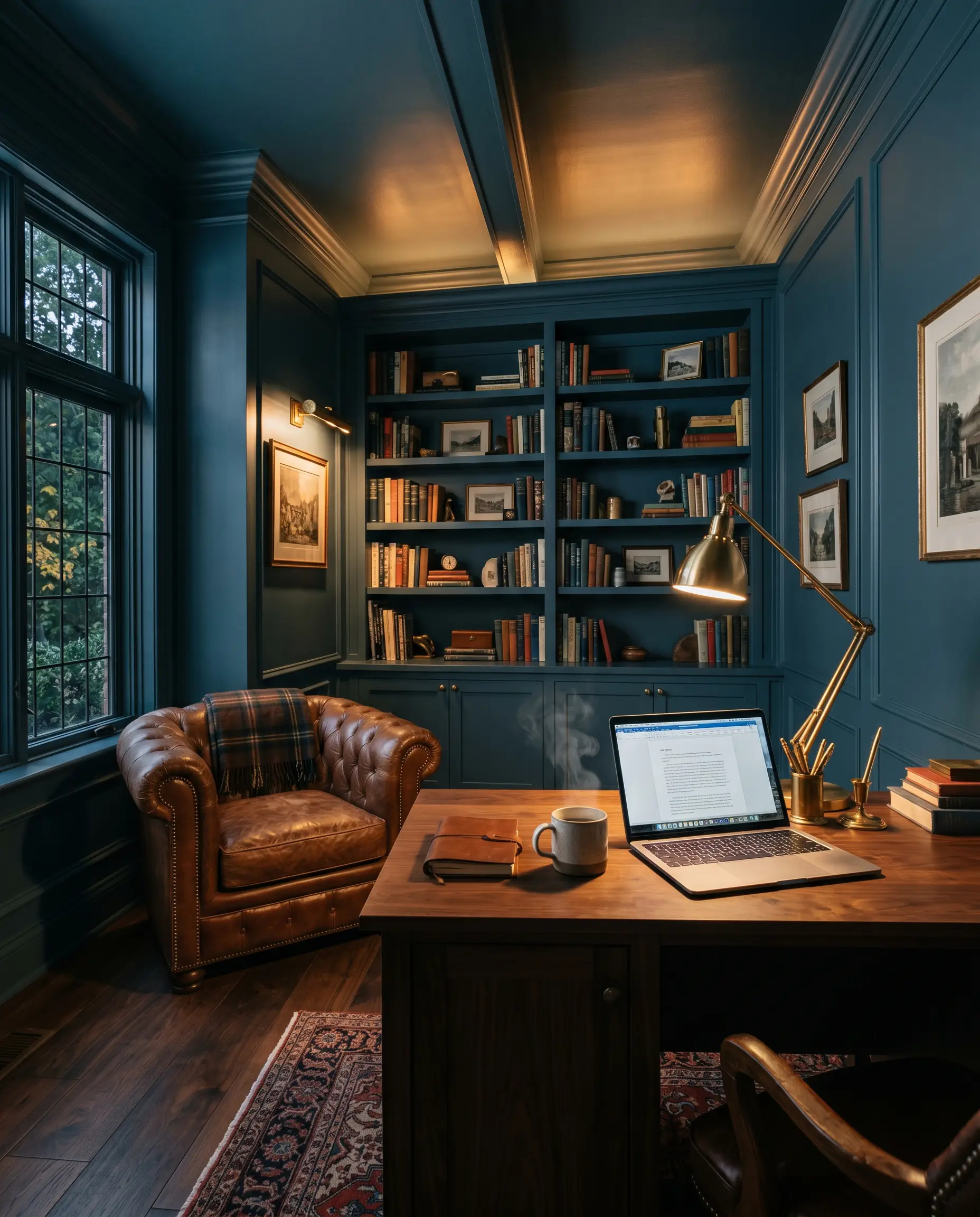
Home Offices
This shade thrives in a workspace because it inherently fosters a focused, enveloping atmosphere. You can wrap the entire room in this denim blue to create a deeply intellectual, cocoon-like environment. However, you must strictly control your bulb temperatures.
If you are navigating low-CRI lighting in home offices, be prepared for the walls to lean heavily into their green-slate alter ego. Pair it with rich leather seating and brass desk lamps to bounce warmth around the room.
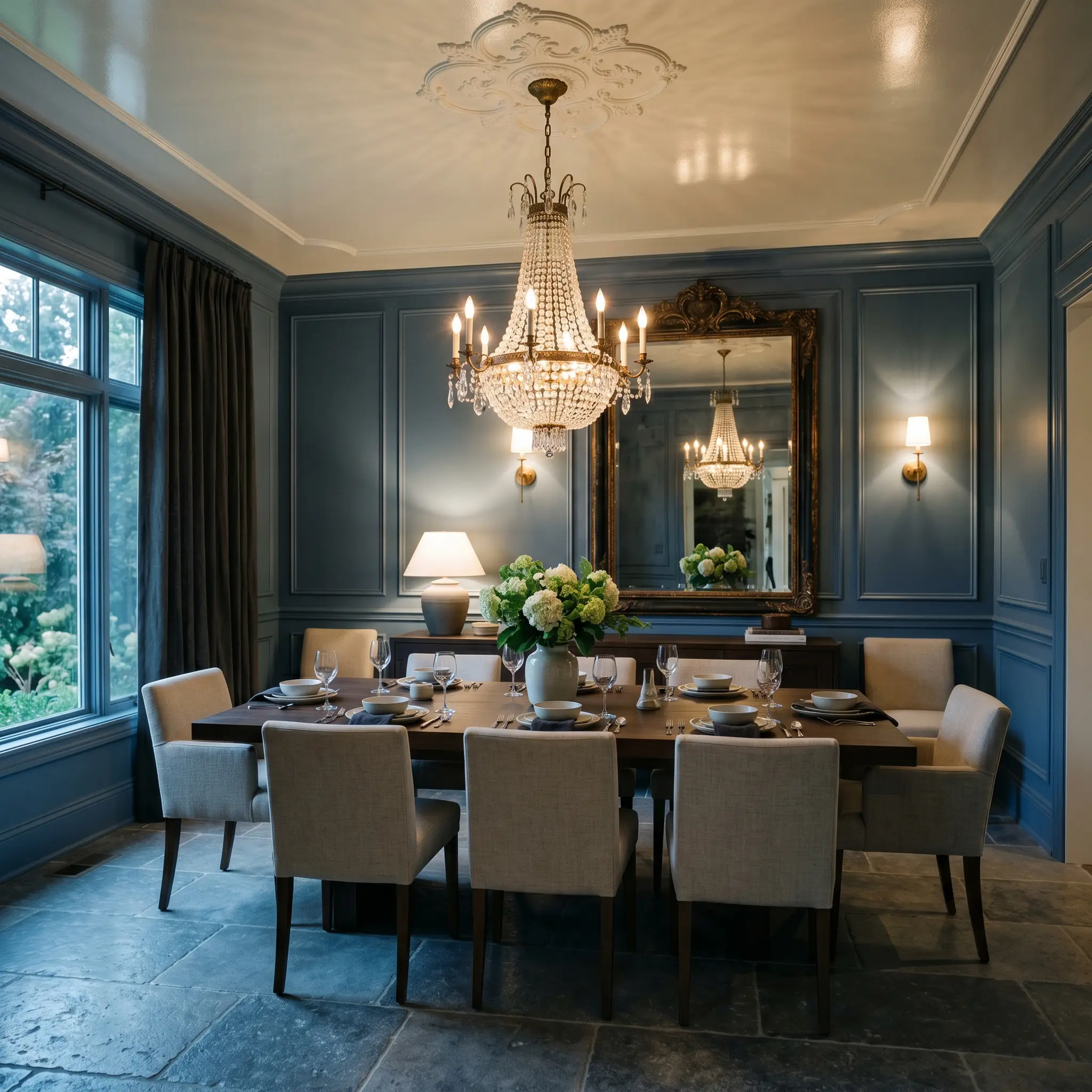
Dining Rooms
A formal dining space is the perfect canvas for dramatic, moody tension. The heavy pigment grounds the room, making evening dinner parties feel intimate and expensive. Consider balancing the visual weight of the walls with a lighter, reflective ceiling or an oversized vintage mirror to keep the space from feeling too enclosed. The key is to introduce high-contrast reflective surfaces that catch the ambient light.
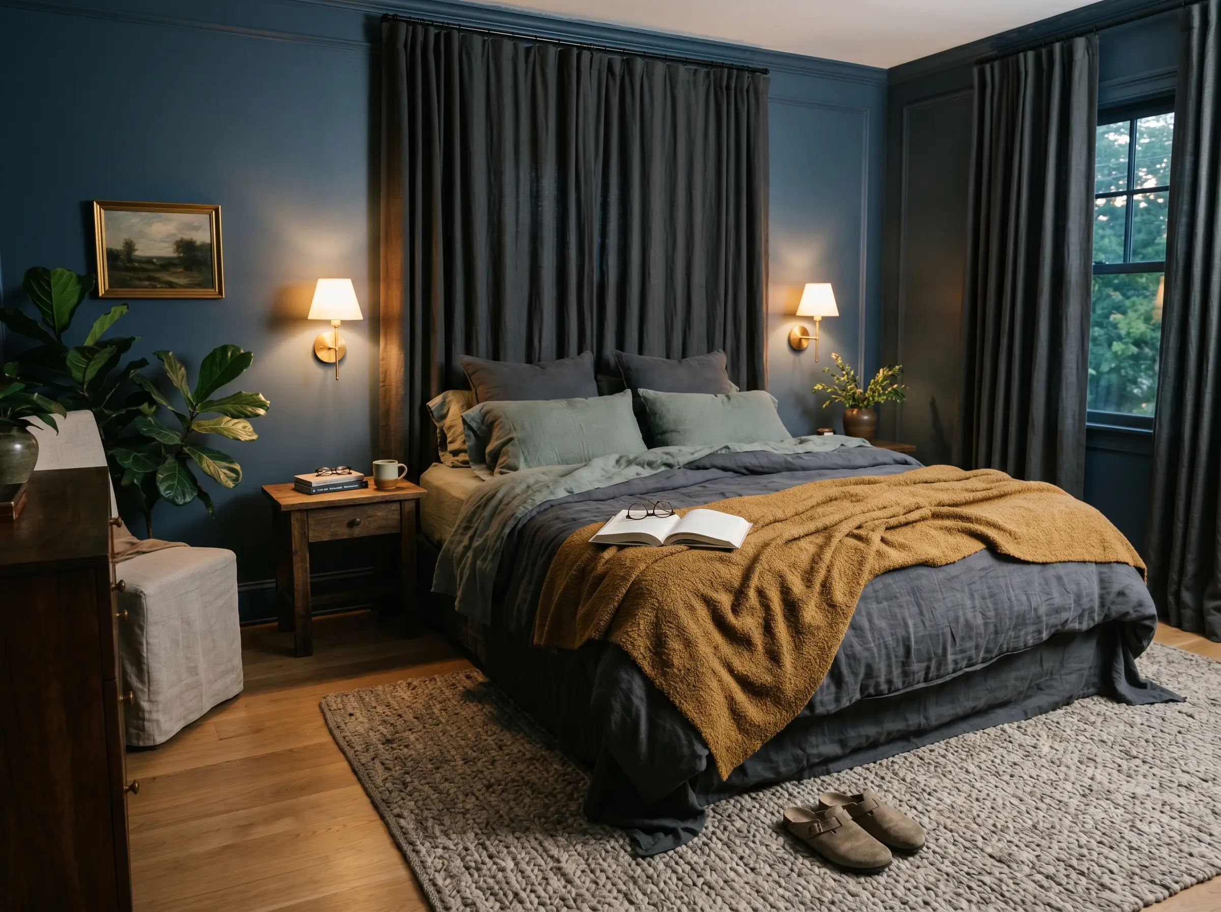
Bedrooms
When used in a sleeping space, this historic color acts as a visual sedative. It creates a deeply relaxing retreat that begs for layered, textural bedding. To prevent the room from feeling stark, you must introduce warmth through tactile elements. Think heavy linen curtains, woven wool rugs, and warm ambient sconces to soften the architectural edges.
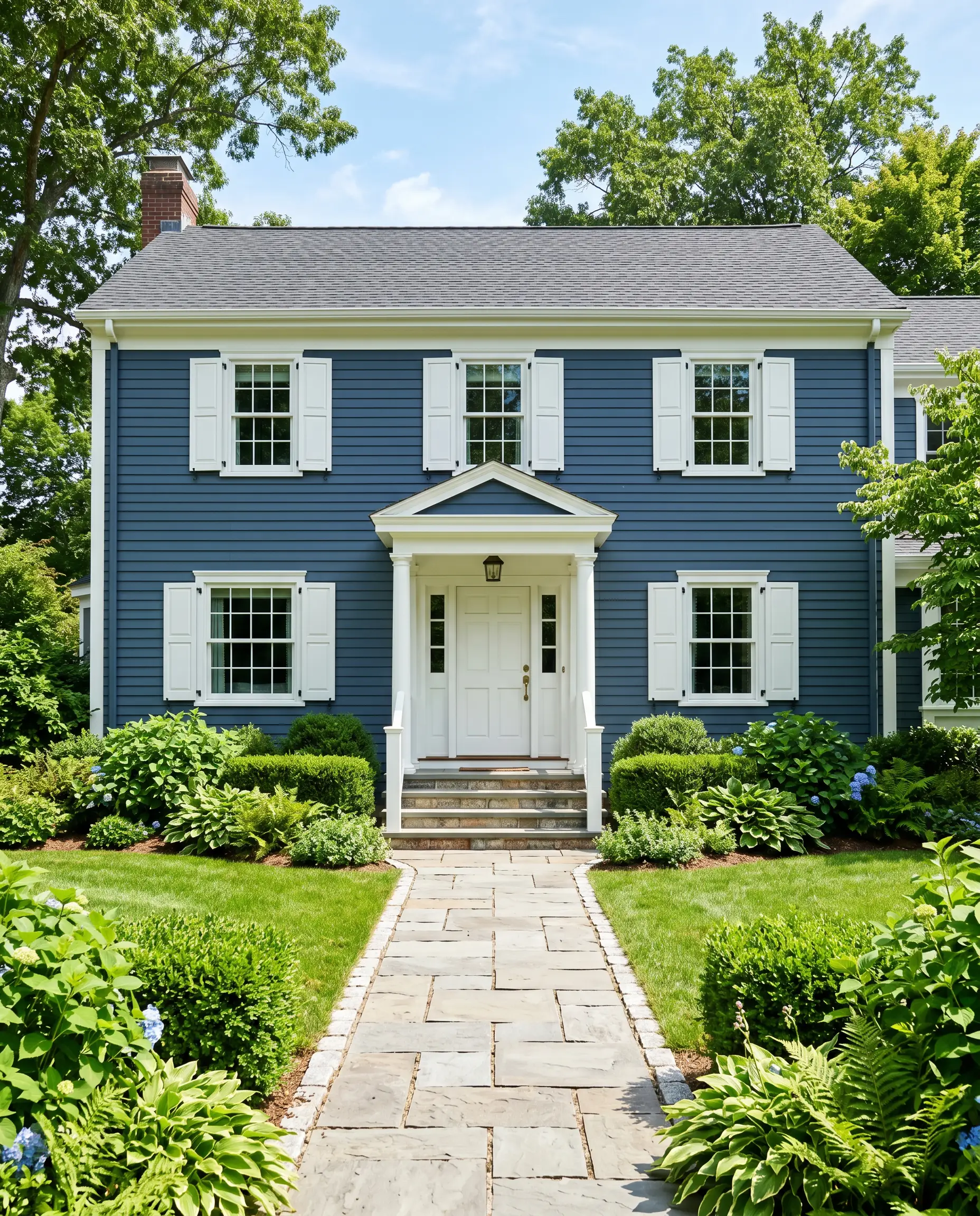
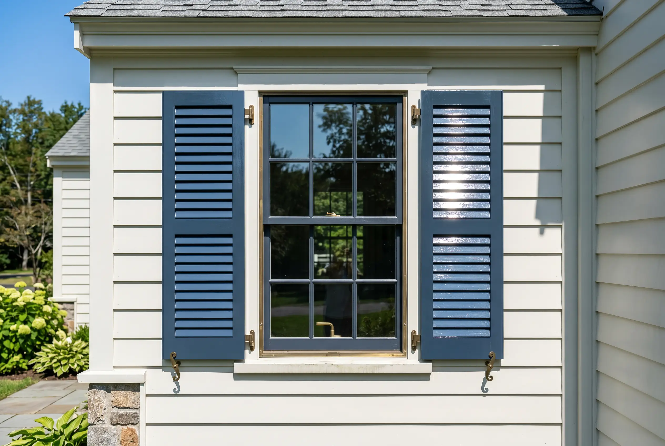
Home Exteriors
On an exterior facade, natural sunlight washes out the darkness, revealing a stunning, crisp maritime blue. It works beautifully on classic architectural styles, offering a grounded alternative to stark black or predictable gray. You must pair it with crisp white trim to frame the house properly and prevent the siding from looking muddy on overcast days.
Signature Architectural Ideas & Inspiration
Moving beyond four standard walls, this specific tonal profile shines brightest when applied to structural focal points. Here is where the historic DNA of the paint truly transforms a space.
Classic Millwork & Paneling
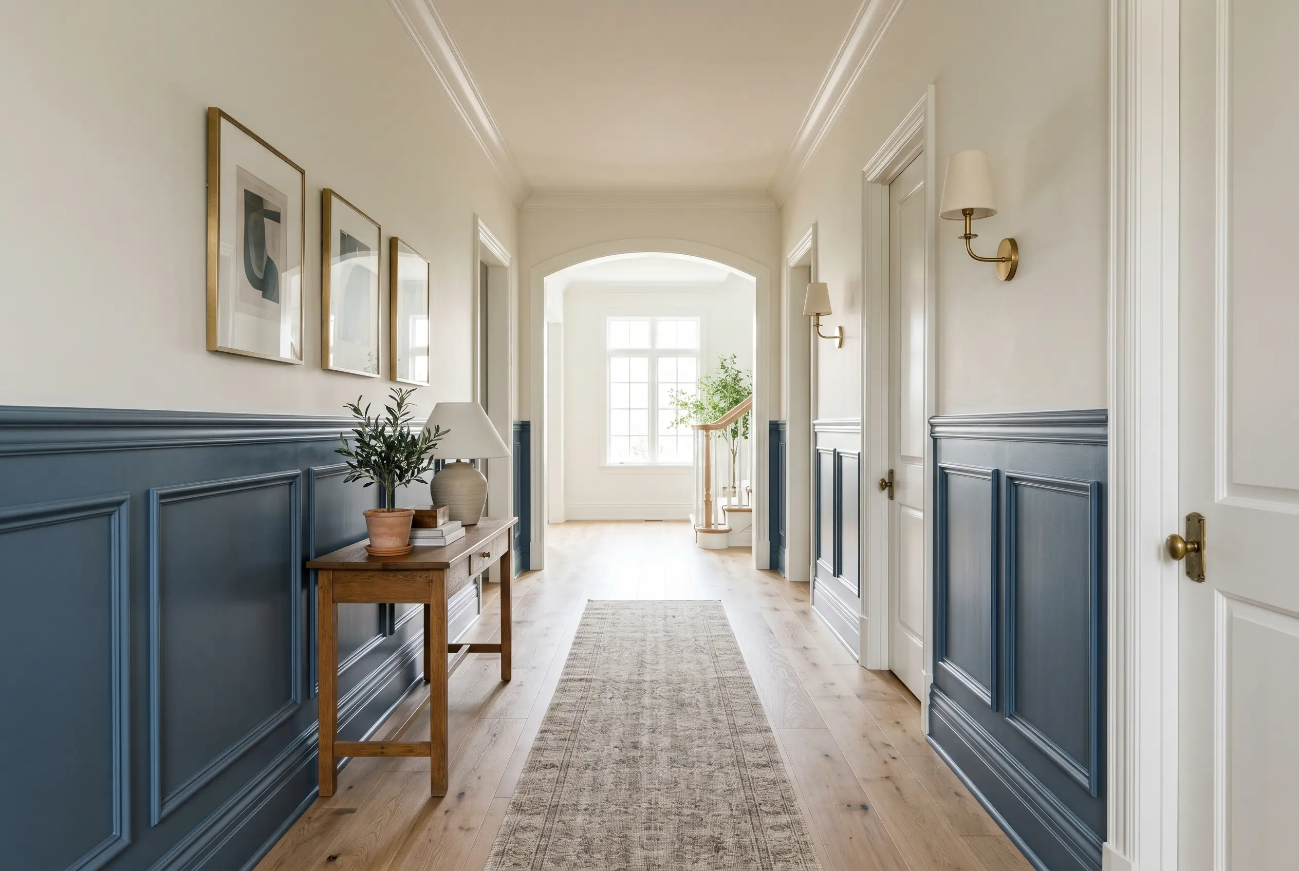
Applying this shade to lower-third architectural features is a masterstroke in grounding a room. The deep pigment anchors the space, while the crisp upper walls provide essential breathing room. If you are exploring moody millwork and wainscoting applications, this color highlights intricate trim details beautifully through subtle shadow play.
Never use a dead-flat finish on detailed paneling with this dark of a color. You must use a satin or semi-gloss sheen so the raised edges catch the light and emphasize the carpentry.
Hackrea Pro-Tip
Floor-to-Ceiling Built-Ins
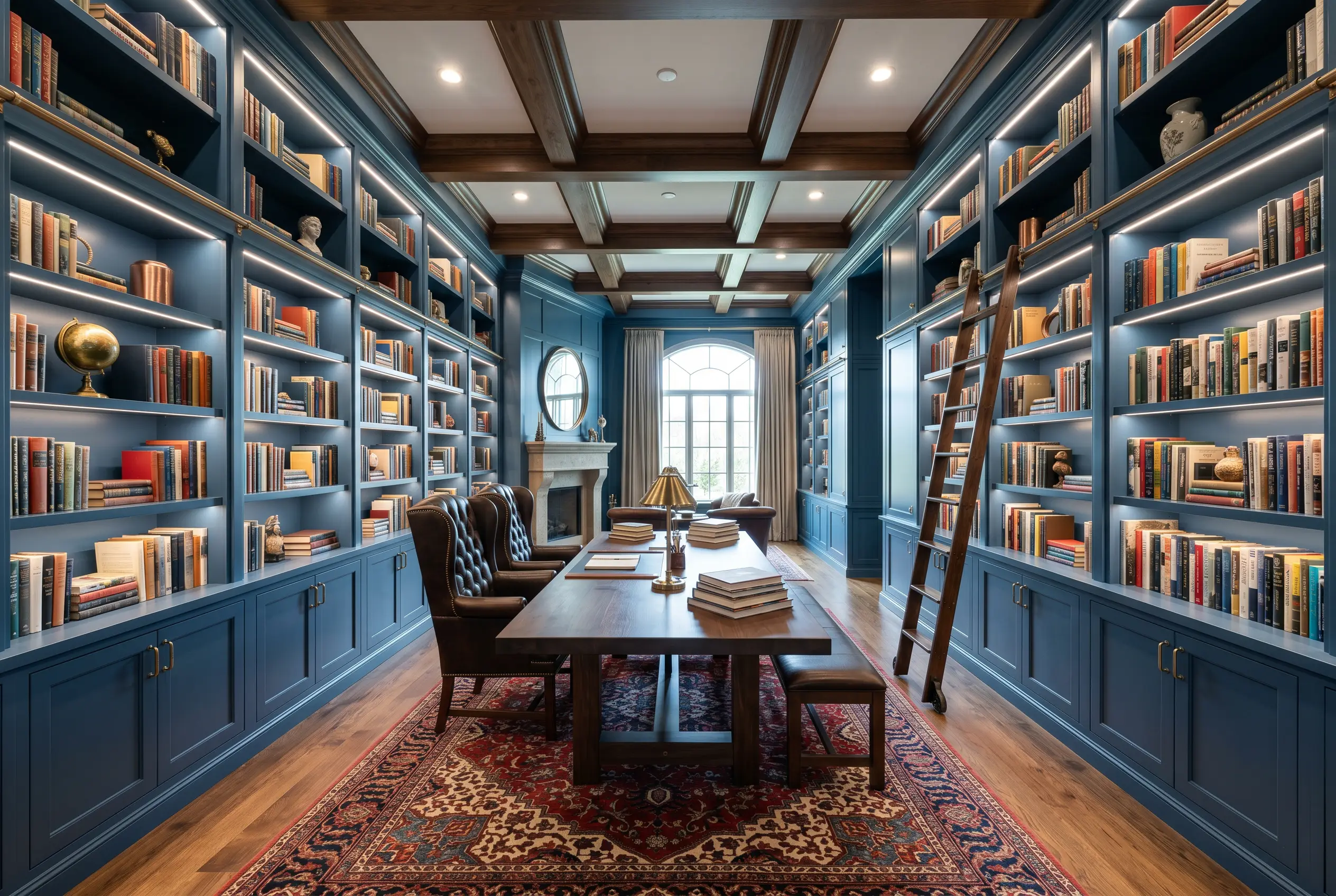
Color-drenching an entire wall of cabinetry manipulates the perceived depth of the room. By painting the shelves, the backing, and the crown molding in the same dark shade, the structural boundaries of the woodwork seem to recede. This spatial illusion makes the built-ins look massive and imposing. If you leave the backing white, you instantly break the illusion and create a cluttered, choppy visual.
High-Gloss Exterior Shutters
Using a high-gloss finish on exterior shutters completely alters the color’s behavior. The glossy sheen acts like a mirror, bouncing sunlight and preventing the dark pigment from looking flat against the siding. This technique frames windows with a sharp, tailored contrast. If you use a flat finish outdoors, the shutters will absorb dirt and quickly look like faded black voids.
The Pairings & Accents Guide for This Denim Blue
A paint color is only as successful as the materials placed next to it. To unlock the full potential of this historic shade, you must curate its surrounding ecosystem with absolute precision.
Trim & Baseboards
Hardware & Metal Pairings
You must rely on warm, reflective metals to cut through the heavy light absorption of the walls. Unlacquered brass is phenomenal here; its living patina brings a raw, organic warmth that grounds the blue. Polished copper is another brilliant choice, offering a fiery contrast that makes the cool slate undertones recede.
Avoid brushed nickel at all costs. The flat, cool gray of the nickel blends far too closely with the paint’s slate undertones, resulting in a cheap, washed-out aesthetic.
Clash Warning
Tactile Finishes & Textiles
The raw materials you choose will dictate the entire mood of the space.
Strongly avoid pairing this shade with red or orange-heavy brick fireplaces. The complementary color interaction will cause the blue to look jarringly bright and “sports team” blue, completely destroying its historic elegance. You must also avoid yellow-toned travertine and red-leaning woods like cherry or mahogany, which instantly create an unwanted, dated 1990s Americana theme.
Clash Warning
Coordinating Colors
Curated Mood Boards
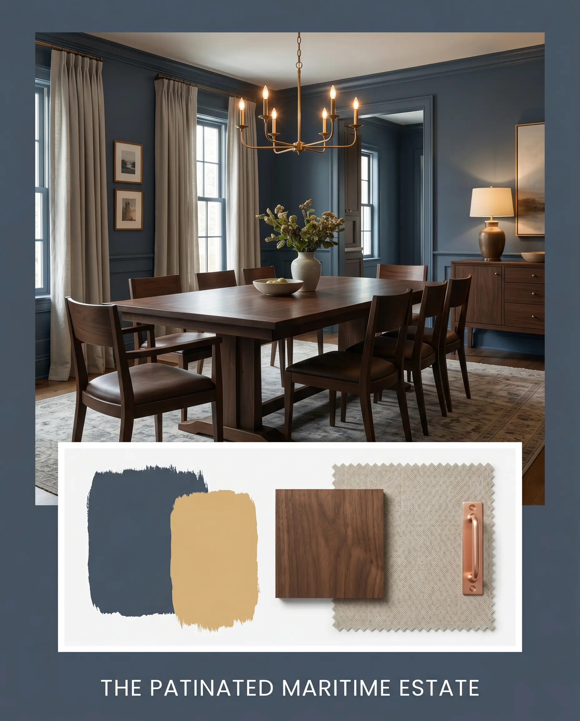
The Patinated Maritime Estate: This palette thrives on the tension between cold, deep waters and fiery, aged metals. By pairing the grounded navy with the brassy heat of Sherwin-Williams Tarnished Trumpet and raw, polished copper accents, the atmosphere feels both historically rich and intensely dramatic. Heavyweight linen and deep matte walnut anchor the aesthetic, creating a vibe that is unequivocally expensive and deeply layered.
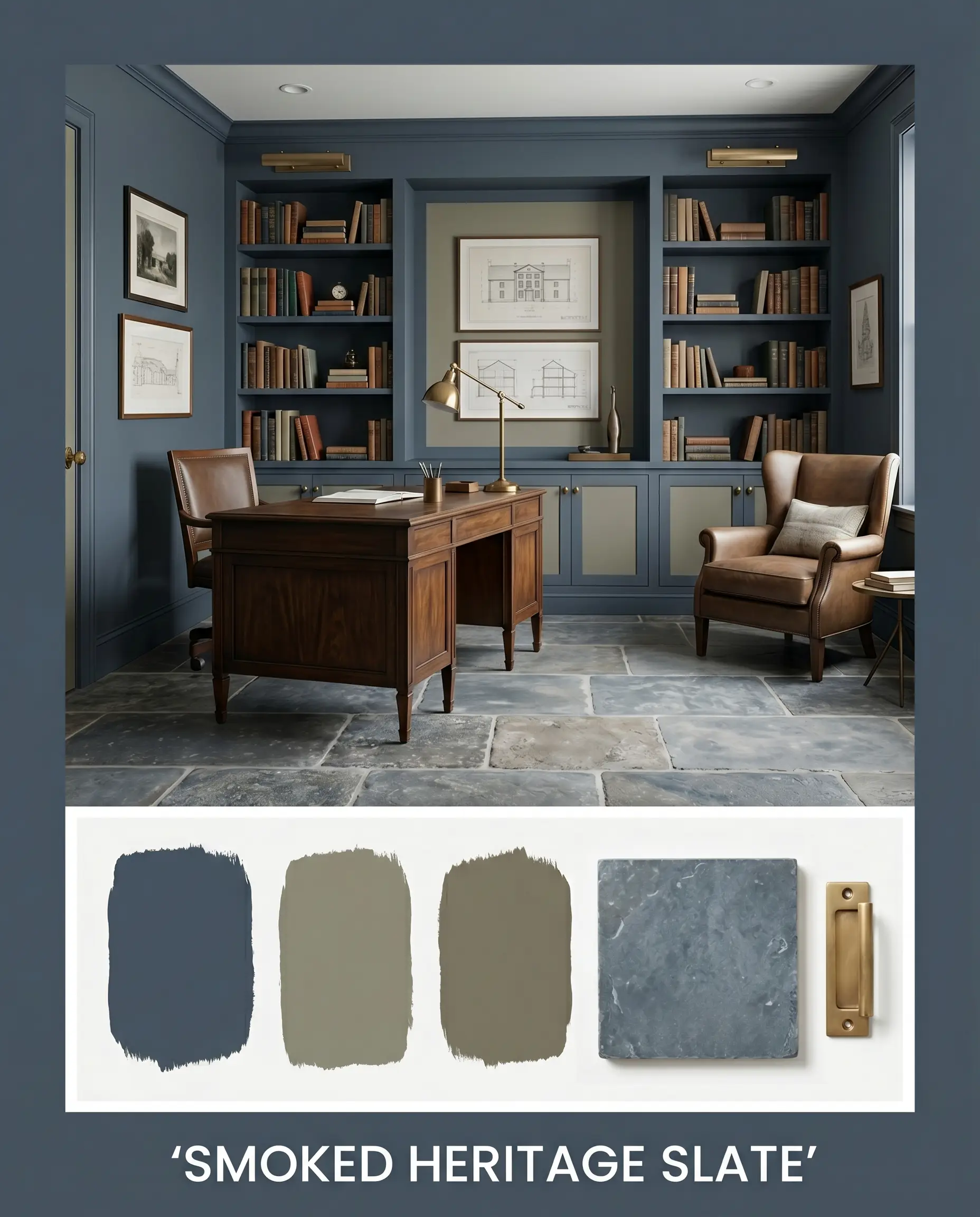
Smoked Heritage Slate: Leaning entirely into the paint’s stealthy green-slate micro-nuance, this aesthetic uses Farrow & Ball Treron and Benjamin Moore Gloucester Sage to build a moody, monochromatic-adjacent ecosystem. Tumbled Belgian bluestone and unlacquered brass hardware provide necessary tactile friction. The resulting mood is quiet, intellectual, and completely enveloping, perfect for those who crave a dark, sophisticated sanctuary.
Head-to-Head Comparisons
Choosing the right dark blue often comes down to microscopic differences in pigment. Here is how our featured shade stacks up against its fiercest direct rivals.
Benjamin Moore Newburyport Blue vs. Benjamin Moore Hale Navy
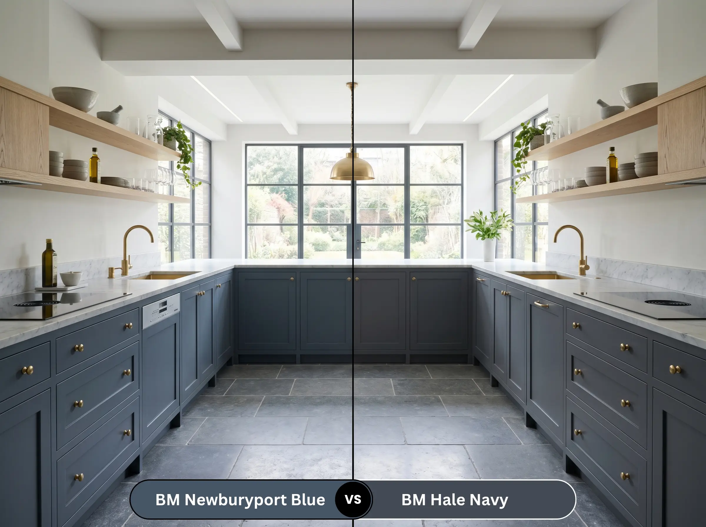
Many designers lazily classify HC-155 as merely a “lighter version” of Hale Navy. This is factually incorrect. While Hale Navy is darker and leans heavily into charcoal, Newburyport Blue is actually noticeably greener and warmer. In lower lighting, HC-155 will lean toward a dark teal-slate, whereas Hale Navy remains a strict, cold charcoal-navy.
Benjamin Moore Newburyport Blue vs. Benjamin Moore Van Deusen Blue
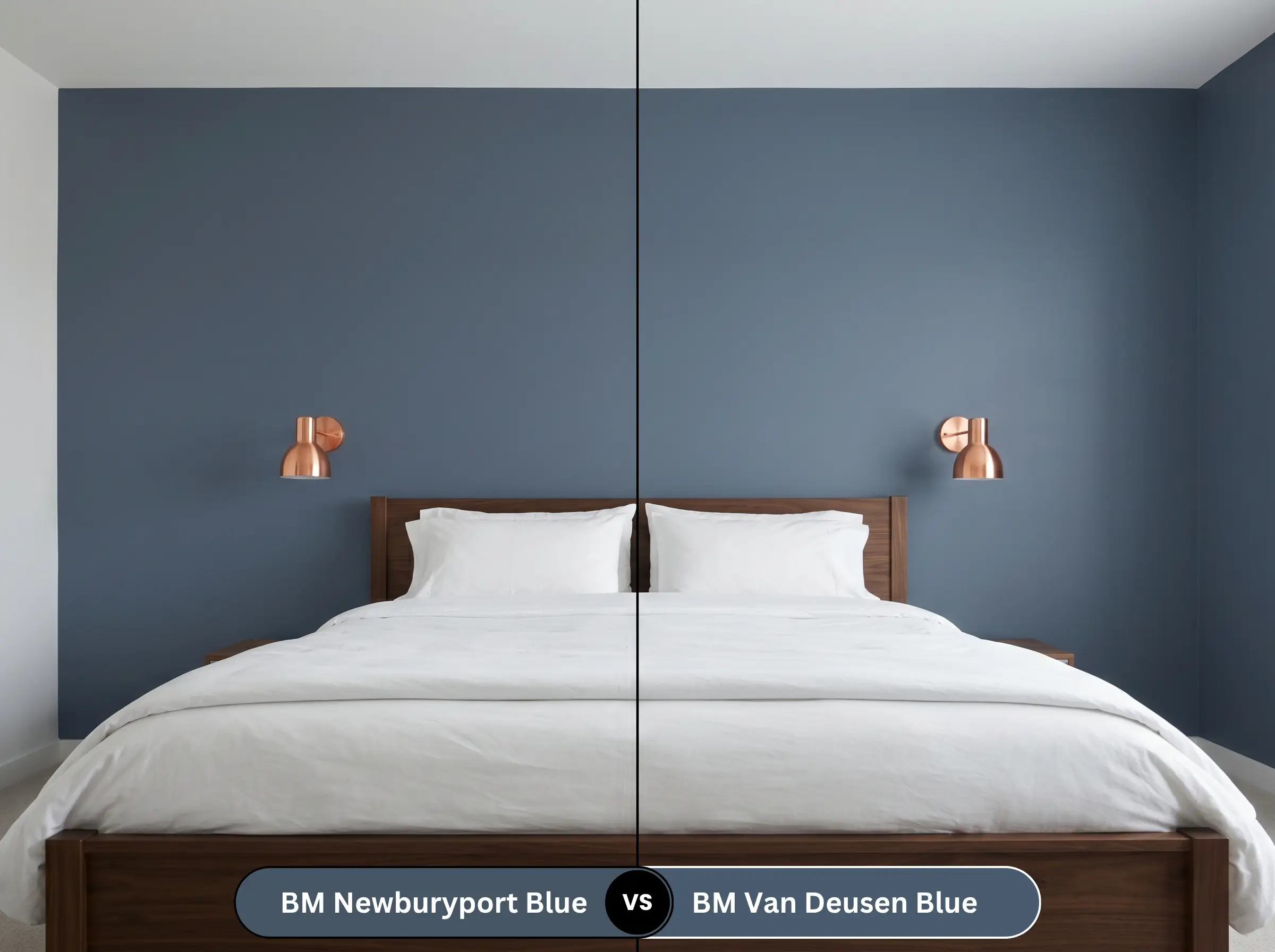
Van Deusen Blue is the brighter, more traditional sibling in the Historic Color collection. It has a higher light reflectance and significantly less gray in its base. If you want a true, classic blue that pops immediately, choose Van Deusen; if you need a stormy, muted color that feels aged and subtle, stick with HC-155.
Benjamin Moore Newburyport Blue vs. Sherwin-Williams Naval
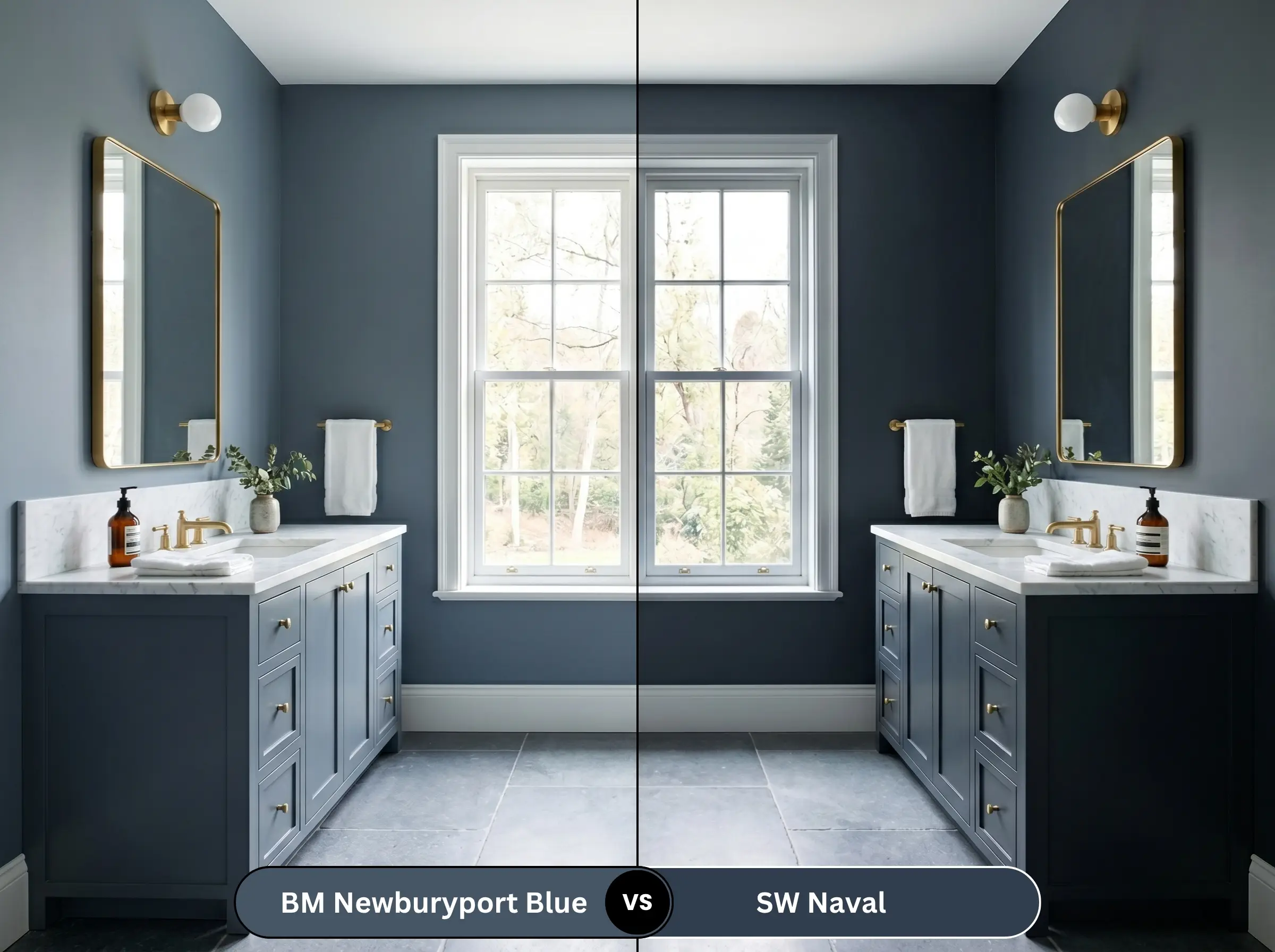
Sherwin-Williams Naval is an iconic, deeply saturated navy with very little gray or green interference. It is much darker and reads as a purer, more regal blue. HC-155, by contrast, is far dustier and more muted. Naval commands attention, while the Benjamin Moore option recedes quietly into the background.
Similar Colors & Brand Equivalents
If the exact tonal profile isn’t quite right for your lighting, these alternatives offer slight variations in depth and temperature.
Same-Brand Alternatives
Cross-Brand Matches
Practical Application & DIY Advice for Newburyport Blue
Transitioning from design theory to the tangible reality of a roller brush requires a strict game plan. Dark pigments demand flawless execution.
The Dynamic Sheen Guide
Primer Strategy
You cannot simply roll this over a builder-grade white wall and expect perfection. A high-quality, tinted gray primer is absolutely required. The gray base prevents the underlying light colors from bleeding through, ensuring the final coats achieve their true, historic depth without looking streaky.
Coverage & Touch-Ups
Expect to apply a minimum of two generous coats, though three may be necessary in rooms with heavy natural light. Contractor-level warning: Dark paints with matte or eggshell finishes are notoriously prone to “flashing” (visible roller marks). You must maintain a wet edge while painting, and touch-ups later on will likely require repainting the entire wall corner-to-corner to blend seamlessly.
Frequently Asked Questions
Yes, like all dark, heavily pigmented paints, it is susceptible to UV degradation over time. Direct, relentless sun exposure will eventually cause the slate undertones to look slightly chalky. You must use a premium exterior paint line formulated specifically for UV resistance to delay this process.
In a windowless space, the heavy pigment removes the visual boundaries of the walls, creating an infinite, jewel-box effect. Understanding the psychology of dark colors in small spaces reveals that instead of feeling claustrophobic, the room actually feels grander and intimately dramatic.
No, they actually create a brilliant synergy. The stealthy green drop in the paint speaks directly to the surrounding foliage, grounding the house in its environment. It prevents the exterior siding from looking too cold or clinical against the organic landscape.
If you use standard 3000K or warmer under-cabinet strips, the yellow light will hit the dark blue and pull the muddy, teal-slate alter ego forward. To keep the cabinets looking crisp and distinctly maritime, you must install 4000K neutral white LED strips.
Final Verdict & Expert Warnings
Benjamin Moore Newburyport Blue (HC-155) is an absolute triumph for those seeking a heritage-rich, grounded aesthetic. It delivers the moody sophistication of a dark room while retaining enough light reflection to keep its maritime soul alive. Its absolute best application is color-drenching a home office or framing classic wainscoting, where its depth can truly anchor the architecture.
However, this is not a universally forgiving shade. You must avoid this paint entirely if your home features heavy red brick, yellow travertine, or cherry wood floors. In those environments, the historic elegance collapses into a jarring, dated clash. If you have the right lighting and the right tactile pairings, this denim blue is a flawless, high-end choice.