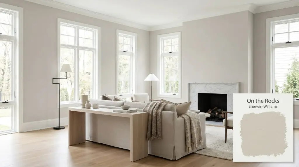
On the Rocks SW 7671
Sherwin-WilliamsSherwin-Williams On the Rocks (SW 7671) is a highly versatile, light gray paint color with an LRV of 62. While it appears as a classic neutral gray, it possesses subtle warm taupe and faint violet undertones that prevent it from feeling stark or icy.
Paint Technical Profile
| Color ID / SKU | SW 7671 |
| HEX Code | #D0CEC8 |
| Light Reflectance (LRV) | 62 |
| Use | Interior, Exterior |
| Best Exposures | South-Facing, East-Facing, West-Facing |
| Best For | Living Rooms, Kitchens, Open Concept Spaces, Bedrooms |
Sherwin-Williams On the Rocks: The Tactile Greige That Redefines Neutral Walls
Some paint colors demand all the attention in a room, while others quietly elevate everything placed in front of them. Sherwin-Williams On the Rocks falls firmly into the latter category, acting as a highly sophisticated backdrop that shifts beautifully throughout the day. It is the kind of color that makes a simple white oak console look instantly more expensive and gives honed Carrara marble a softer, more inviting context.
When you are tired of stark whites but not quite ready to commit to a moody, saturated hue, this specific shade offers a brilliant middle ground. It provides just enough pigment to contrast cleanly against crisp white trim, yet it remains airy enough to keep a room feeling expansive.
By understanding its underlying color structure, you can manipulate this adaptable neutral to fit entirely different aesthetics. Whether you are layering it with nubby wool textiles in a cozy suburban living room or pairing it with blackened steel hardware in an urban loft, SW 7671 molds to your design intentions.
Sherwin-Williams On the Rocks: Undertones & LRV
If you are currently holding a swatch and wondering, “Is this paint warm or cool?” the answer leans softly toward warm, though it plays a very clever balancing act. Sherwin-Williams On the Rocks is a highly nuanced greige that behaves like a true chameleon on your walls. Its ability to feel cozy without turning muddy comes entirely from its underlying pigment profile.
To truly understand how this color will look in your home, we have to look at its foundational makeup:
With a light reflectance value (LRV) of 62, this shade sits comfortably in the sweet spot for interior walls. It absorbs enough light to retain its distinct greige identity without washing out into a generic off-white. At the same time, it reflects a generous amount of illumination, ensuring your spaces remain breathable and visually open.
Lighting Effects & The Chameleon Factor
Because of that delicate violet micro-nuance and taupe base, this paint is highly reactive to the light moving through your windows. Its chromatic profile shifts dramatically depending on the time of day and the direction your room faces.
Here is exactly how you can expect the color to behave:

If you paint your room and find the walls looking slightly too purple in the evening, check your lamps. Swapping cool LED bulbs for warmer 2700K options will instantly pull those taupe undertones back to the surface, stabilizing the color.
Hackrea Pro-Tip (The Bulb Swap Strategy)
Architectural Applications for This Adapting Greige
The true value of a well-formulated neutral is that it does not dictate your furniture choices; rather, it supports them. Because this specific color balances warm and cool notes so effectively, it serves as an incredibly flexible foundation for a variety of home updates.
Below, we explore how to maximize the impact of this shade across different environments, from cozy private retreats to expansive exterior facades.
Open-Concept Living & Dining Areas
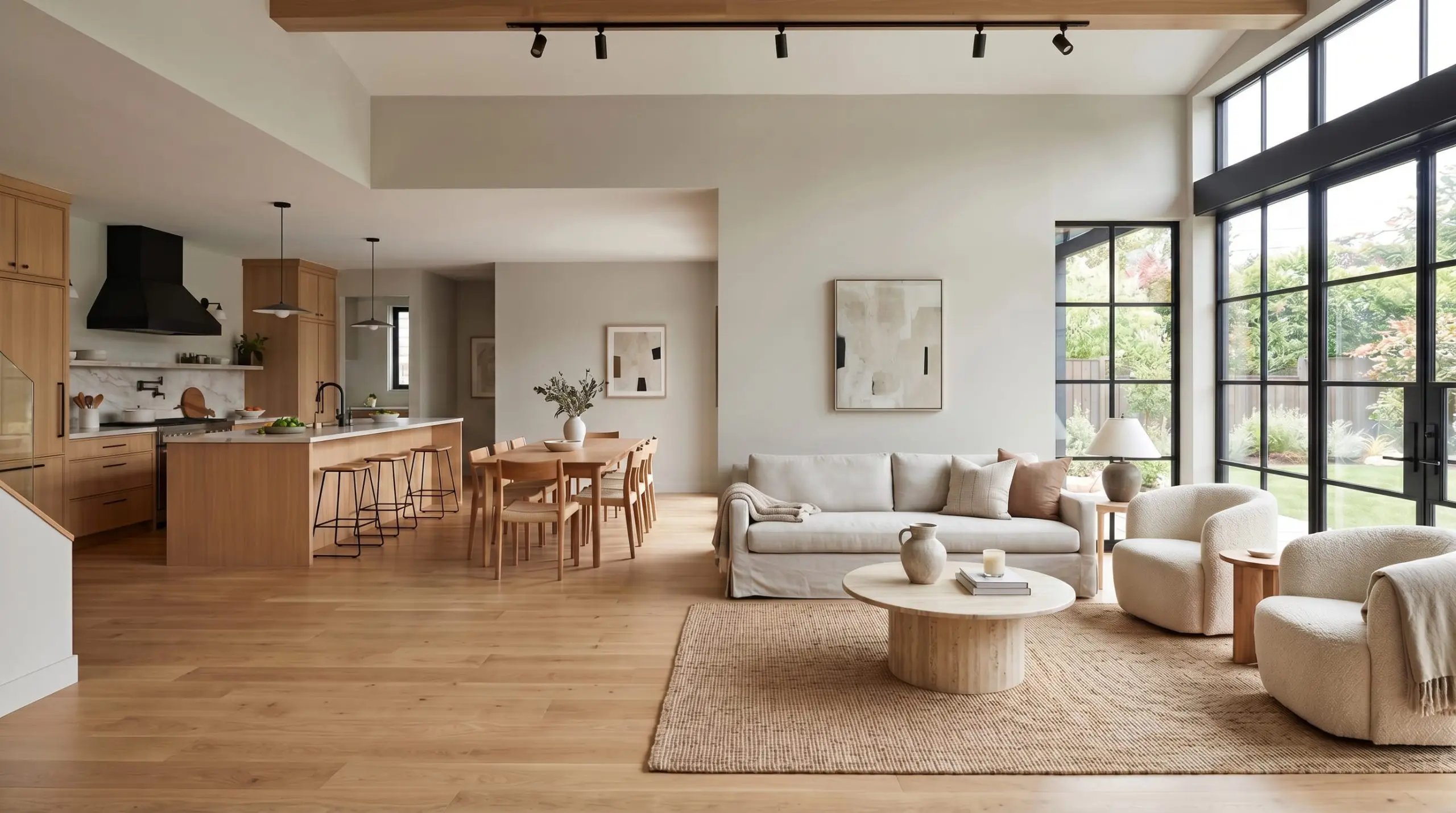
In sprawling, multi-use spaces, you need a color that can unify different functional zones without feeling overwhelmingly uniform. This soft greige excels here, providing a continuous visual thread that links a bustling kitchen to a relaxed seating area. To prevent the expansive walls from feeling flat, introduce highly textured materials like travertine coffee tables or nubby boucle accent chairs.
Instead of defaulting to the expected farmhouse styling, try pushing the color into a soft industrial aesthetic. Pair the walls with blackened steel window frames, warm white oak flooring, and a streamlined, slipcovered sofa. The subtle warmth in the paint will beautifully offset the harder metallic edges, creating a space that feels curated and intentional.
If your open-concept area receives a mix of north and south-facing light throughout the day, embrace the shift. You will notice the dining area might read as a crisp gray during breakfast, while the living zone warms up into a cozy taupe by late afternoon.
Transitional Hallways & Entryways
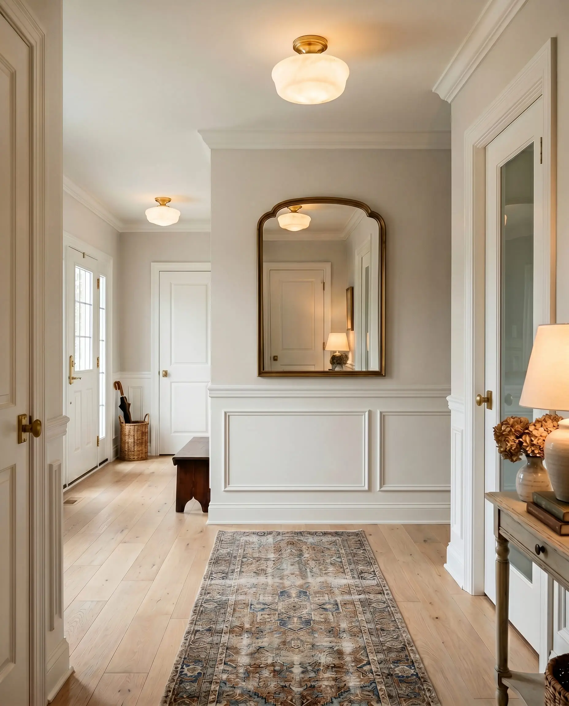
Hallways are often starved for natural ambient lighting, making them tricky spaces to paint. Thanks to its mid-range LRV, this shade provides enough brightness to keep narrow corridors from feeling closed in, while still offering enough pigment to contrast nicely against white doors and trim.
Elevate a basic entryway by pairing the paint with classic architectural features like crisp white wainscoting or picture molding. Painting the upper half of the wall in this soft neutral while keeping the lower millwork bright white establishes a beautiful, traditional elegance.
To finish the space, lean into warm, reflective accents. An oversized brass mirror, an alabaster flush-mount light fixture, and a vintage runner rug will instantly make a standard suburban hallway feel like the entrance to a boutique hotel.
Primary Bedrooms
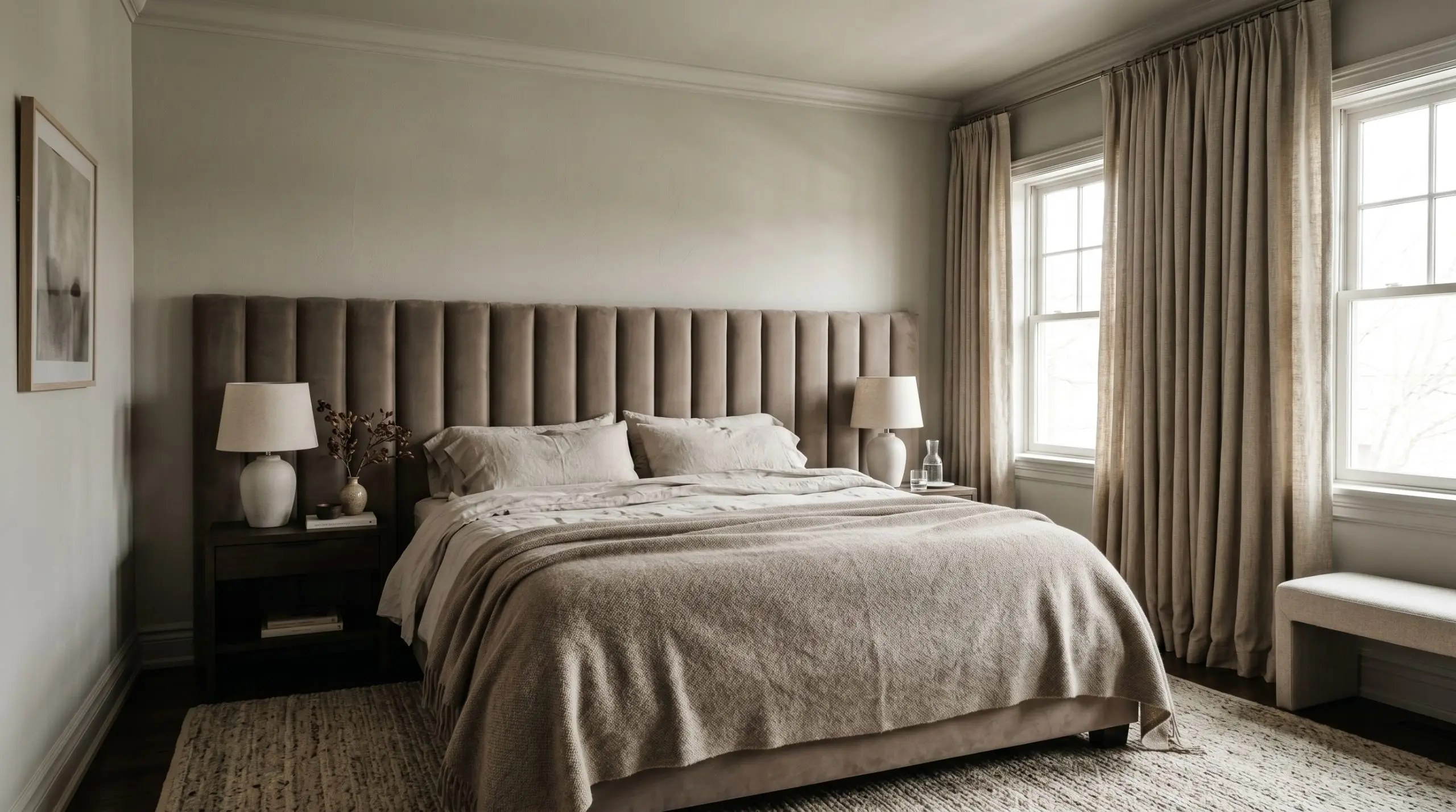
For a primary bedroom, the goal is often to create a serene, restorative atmosphere that feels entirely separate from the rest of the house. This paint establishes a deeply calming foundation that pairs beautifully with rich, tactile fabrics.
Consider color-drenching the room—painting the walls, trim, and even the ceiling in the exact same finish. This technique erases harsh visual boundaries, wrapping the room in a continuous, soft taupe blanket that feels incredibly luxurious.
Layer the space with contrasting textures to bring the design to life. Think channel-tufted velvet headboards, washed linen sheets, and heavy woven drapery. The subtle violet micro-nuance in the paint will occasionally catch the morning light, adding a layer of quiet romance to the room.
Kitchen Cabinetry
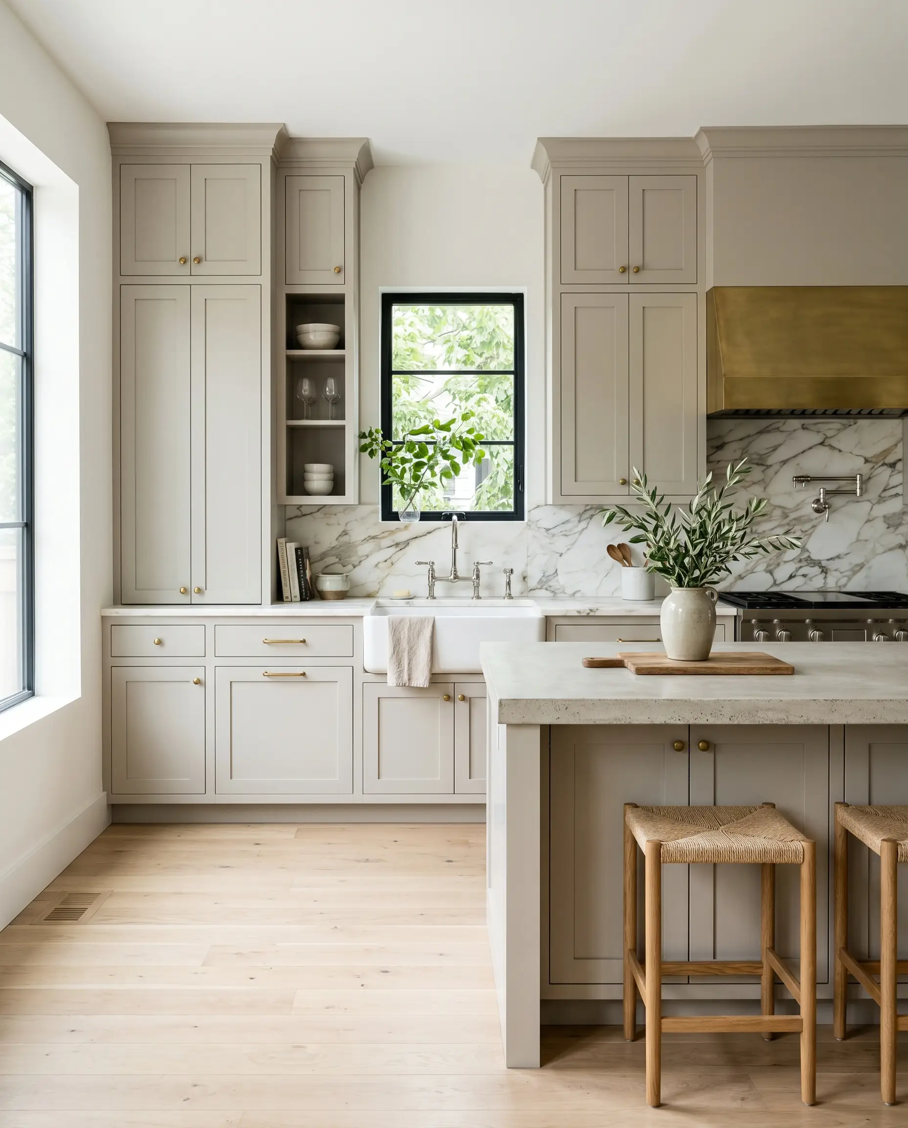
If you are updating a kitchen and want to move away from stark white cabinets without committing to a dark, heavy hue, this is a brilliant alternative. It provides a soft, sophisticated color saturation that feels timeless and incredibly custom.
This shade looks exceptionally premium on classic inset cabinetry, especially when paired with unlacquered brass hardware that will patina over time. To keep the kitchen feeling bright and modern, pair the painted cabinets with a heavily veined marble backsplash and polished nickel plumbing fixtures.
For a more contemporary approach, apply this color to flat-panel, slab doors. When combined with reeded glass upper cabinets and concrete countertops, the paint leans into its crisp, architectural qualities, perfectly suiting a modern urban renovation.
Exterior Siding in Sun-Drenched Climates
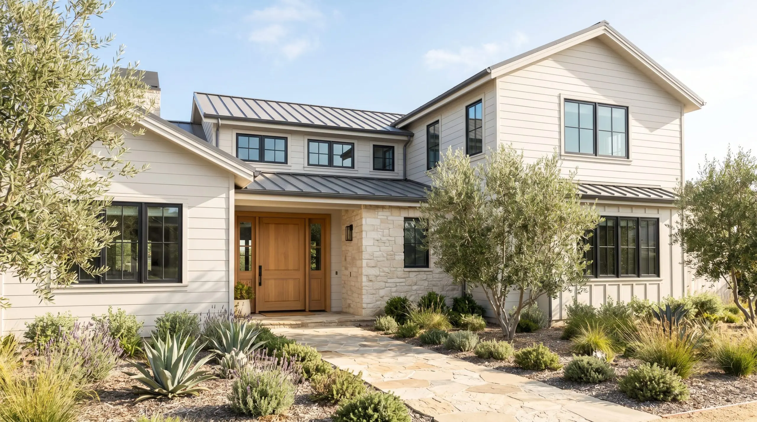
Taking an interior neutral outside requires a solid understanding of how direct sunlight strips away color saturation. In full, blazing sun, an LRV of 62 will wash out significantly, often appearing much lighter and slightly cooler than it does on a swatch indoors.
If you live in a highly sun-drenched climate, be prepared for this greige to read almost like an off-white during peak afternoon hours. Always test a large swatch on both the shaded and sunny sides of your home before committing to a full exterior paint job.
Clash Warning (The Siding Washout)
To secure the design, pair the siding with high-contrast exterior elements. Charcoal black window trim, a warm wood-stained front door, and natural stone pathways will help define the soft gray siding. The resulting facade will feel effortlessly coastal and highly refined, perfectly suited for a neighborhood of updated mid-century or contemporary homes.
Styling Sherwin-Williams On the Rocks with Complementary Finishes
Unlike highly saturated colors that dictate the mood of a room, this muted greige requires intentional tactile pairings to establish its final identity. It thrives when placed next to contrasting textures that either draw out its inherent warmth or sharpen its cooler, architectural edges.
Framing the Walls with Crisp Millwork
When dealing with a mid-tone neutral, the trim color acts as a crucial visual boundary. Without a sharp, clean border, a soft greige can occasionally blur into the ceiling or flooring, losing its tailored appeal. To force the wall color to hold its shape, frame the room with ultra-crisp, un-tinted whites.
Benjamin Moore Chantilly Lace OC-65 is a brilliant pairing because it lacks any distinct yellow or blue undertones. This pure white provides a stark, luminous contrast that makes the taupe base of the walls feel richer and more intentional.
Similarly, Sherwin-Williams High Reflective White SW 7757 offers a brilliant, clean edge. By pairing SW 7671 with these highly reflective trims, you create a sophisticated, tailored envelope that elevates standard baseboards and crown molding.
Tactile Elements that Elevate the Hue
The materials you introduce into the room will directly manipulate how the eye perceives this paint. Because the color sits right on the fence between warm and cool, you can use hardware and textiles to push it in either direction.
Expanding the Palette
When building a whole-home color scheme, you need secondary colors that interact constructively with your primary neutral.
Curated Design Aesthetics
To truly understand the versatility of this paint, you have to see how it shifts its personality when combined with specific styling elements. By changing the surrounding textures and accent colors, you can completely redefine the atmosphere.
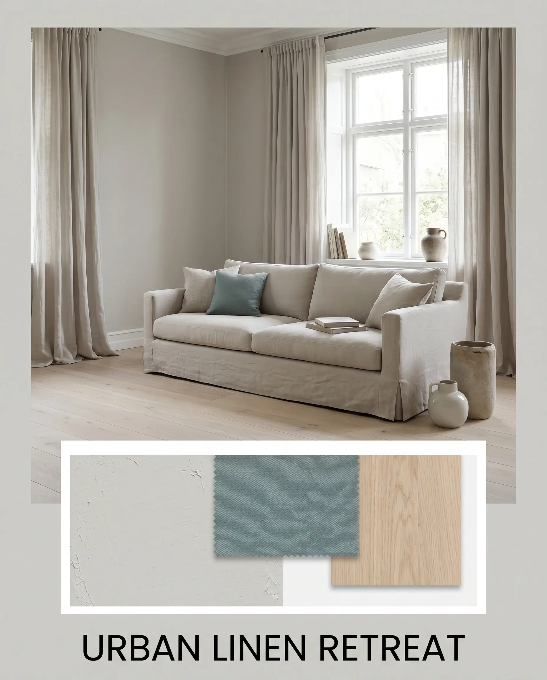
Urban Linen Retreat This aesthetic leans into the softer, more relaxed side of the greige base. Picture the walls paired with washed linen drapery, a slipcovered sofa, and pale white oak flooring. The introduction of Benjamin Moore Aegean Teal on a piece of accent furniture or a vintage rug adds just enough color saturation to keep the space from feeling flat. By keeping the textiles matte and the woods light, the paint feels airy, breathable, and effortlessly calm.
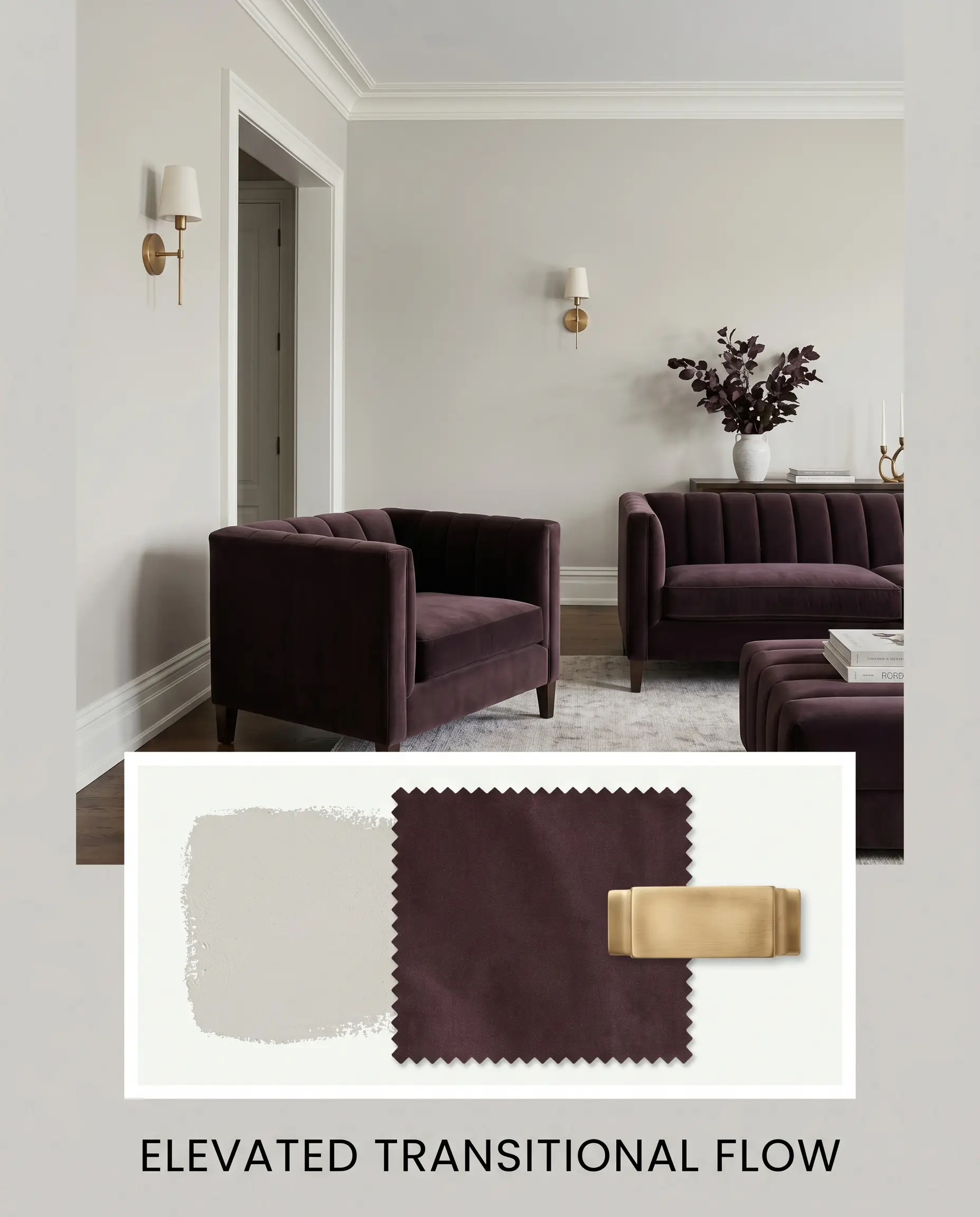
Elevated Transitional Flow For a more structured, traditional approach, this palette utilizes crisp contrasts and premium finishes. The walls are framed perfectly by Chantilly Lace trim, while unlacquered brass wall sconces add a warm, reflective glow. Layer in dark, channel-tufted velvet textiles and perhaps a deep accent wall in Farrow & Ball Brinjal. The resulting vibe is tailored, highly intentional, and deeply sophisticated, proving this neutral can handle formal styling beautifully.
Sherwin-Williams On the Rocks vs. Industry Rivals
Choosing the right neutral often comes down to comparing highly similar shades under your specific lighting conditions. While SW 7671 is incredibly adaptable, certain architectural exposures might cause its subtle undertones to misbehave. If you find the color leaning too cool in a north-facing room, or if you simply want a different light reflectance value, testing it against its closest competitors is the best way to secure your design.
Sherwin-Williams On the Rocks vs. Sherwin-Williams Agreeable Gray SW 7029
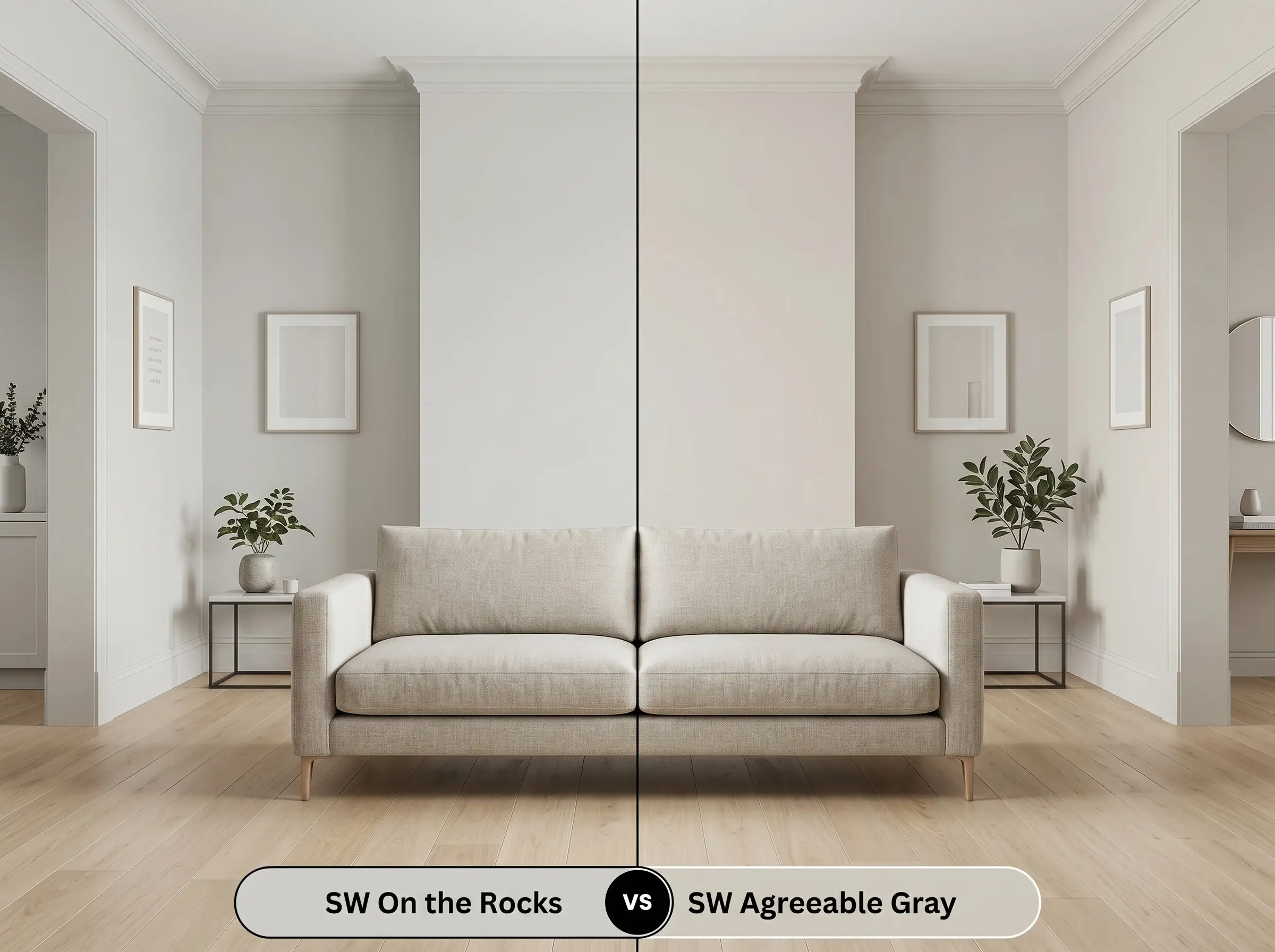
Agreeable Gray is a cornerstone of the neutral paint world, but it behaves quite differently on the wall. While On the Rocks leans toward a crisp gray with a touch of violet, Agreeable Gray is noticeably warmer, driven by a stronger beige foundation. If your room receives cool, north-facing light that makes SW 7671 look a bit too purple, switching to Agreeable Gray will inject the necessary warmth to stabilize the space.
Sherwin-Williams On the Rocks vs. Benjamin Moore Classic Gray OC-23
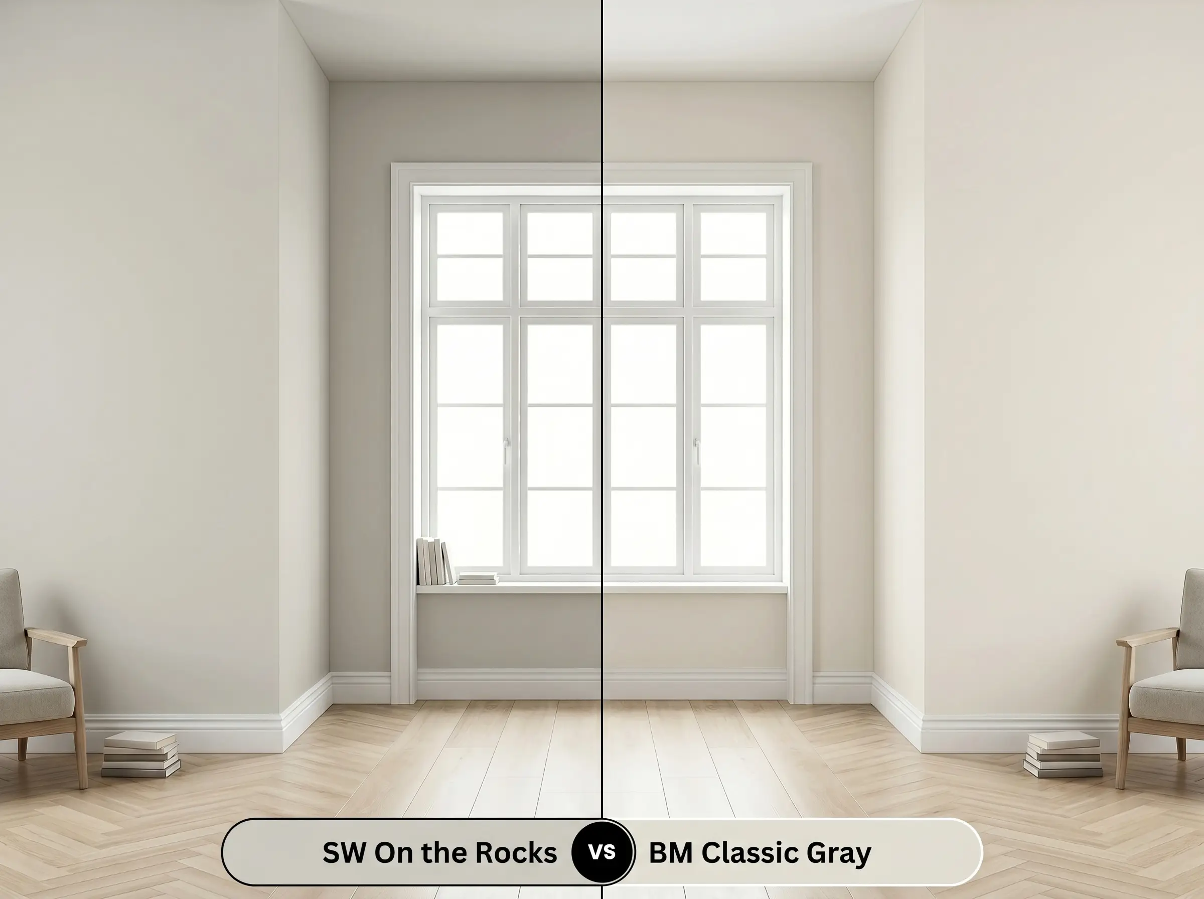
This comparison is an exercise in depth and presence. Classic Gray boasts a significantly higher LRV, pushing it firmly into the off-white category rather than a true mid-tone neutral. If you are looking for a highly saturated color that will contrast sharply against white trim, stick with the Sherwin-Williams option. However, if you want a whisper-quiet, barely-there whisper of warmth that keeps the room feeling expansive, Classic Gray is the superior choice.
Sherwin-Williams On the Rocks vs. Sherwin-Williams Repose Gray SW 7015
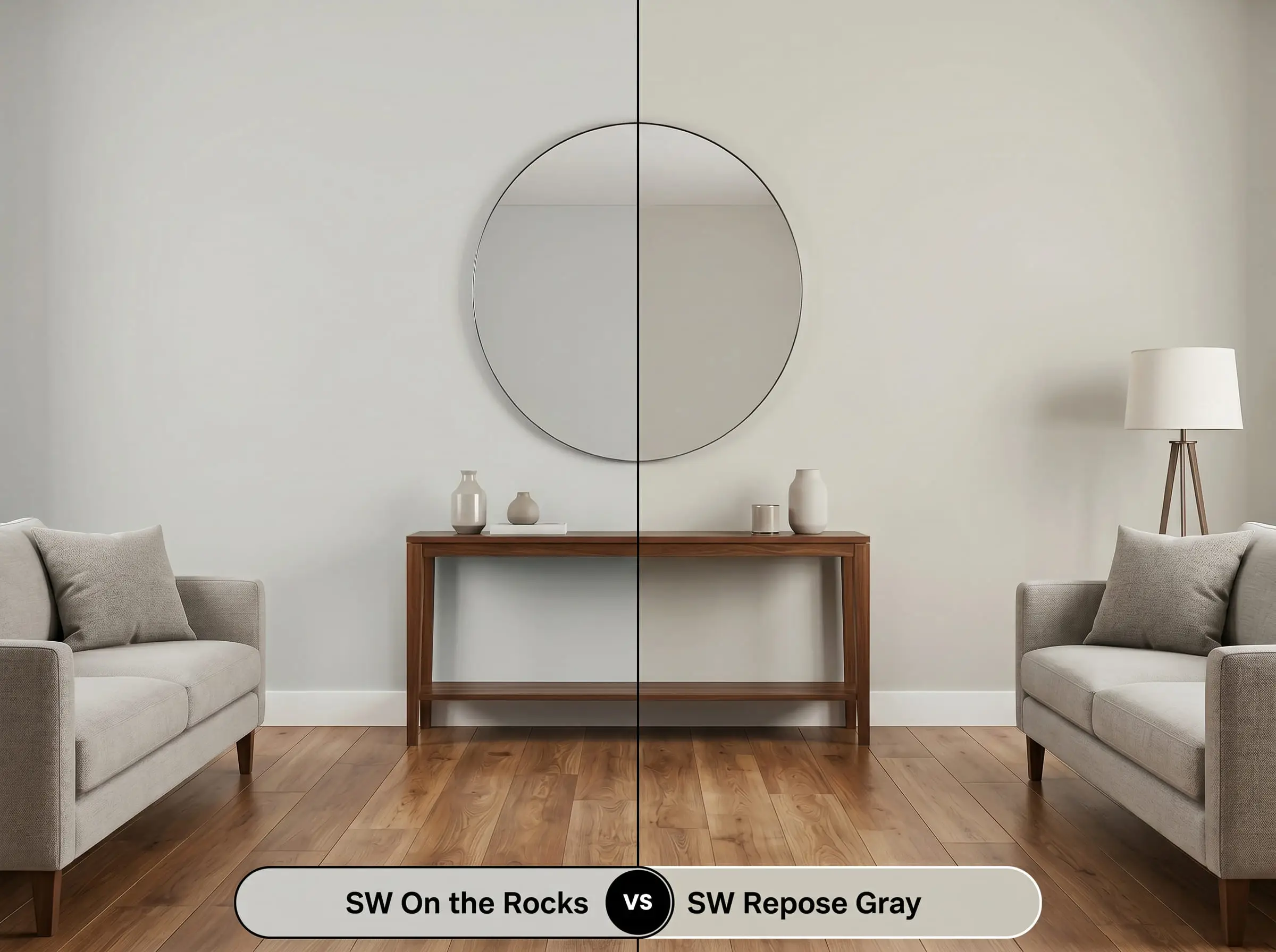
These two shades are often debated by homeowners seeking the perfect gray, but their foundational color structures are distinct. Repose Gray is slightly darker and features a subtle green-blue undertone, making it feel cooler and more traditional. If you are pairing your walls with warm wood tones and want to avoid any green clashing, the taupe base of On the Rocks is much easier to manage.
Finding the Perfect Greige Match
Sometimes a color is almost perfect, but it needs a slight tweak in brightness or a minor shift in undertone to work with your existing flooring or furniture. Whether you are looking for a subtle variation within the same manufacturer or need to cross-match with a different brand due to availability, these alternatives provide excellent starting points.
Closest Alternatives Within the Same Brand
Color Matching Across Rival Brands
Painting with On the Rocks
Transitioning from color theory to the physical reality of painting requires a strategic approach to finishes and preparation. The sheen you choose will fundamentally alter how the light interacts with the pigment, changing the final perceived color.
Selecting the Right Sheen
Primer and Coverage Strategy
Because this shade has a comfortable mid-range LRV, it generally offers excellent coverage over standard, light-colored walls. However, if you are painting over a dark or highly saturated hue, a high-quality, white stain-blocking primer is non-negotiable. Skipping the primer over a dark wall will alter the final cure, allowing the old color to muddy the delicate taupe base.
Plan for two full coats applied with a high-quality, 3/8-inch nap roller to achieve a professional, opaque finish. When rolling, maintain a wet edge and avoid over-working the paint as it begins to tack up. Touching up half-dry spots will lead to “flashing”—visible, shiny roller marks that disrupt the smooth, cohesive look of your freshly painted room.
Common Questions About SW 7671
Because shaded exteriors lack direct, warm sunlight, the cooler ambient light will pull the subtle violet and gray notes forward. The paint will lose some of its cozy taupe warmth, reading as a much crisper, traditional cool gray against the textured stucco.
It generally coordinates quite well. The taupe foundation in the paint relates to the warmth in the wood, creating a cohesive look. However, if your room faces north, the paint may flash its violet micro-nuance, which can occasionally emphasize the orange tones in the oak.
Yes, it acts as a brilliant counterweight. The slightly cool, violet-leaning gray base actively fights the green-yellow tint often cast by energy-efficient windows, helping the room feel balanced and naturally lit.
The taupe undertone harmonizes beautifully with muted, earthy bricks. The subtle warmth in the paint bridges the gap between the neutral walls and the rich red masonry, creating a seamless, organic transition rather than a stark, jarring contrast.
Is Sherwin-Williams On the Rocks Right for You?
Sherwin-Williams On the Rocks is an incredibly sophisticated, highly adaptable neutral that bridges the gap between warm beige and stark gray. It is the perfect choice for homeowners who want a clean, tailored backdrop that still feels inviting and soft. This paint excels in open-concept spaces, serene bedrooms, and on kitchen cabinetry, actively shifting its mood to complement your chosen textiles and lighting.
While this paint is highly versatile, it strongly rejects overly yellow or orange-heavy fixed elements. If you have outdated Tuscan-style travertine tile, heavily lacquered cherry cabinets, or bossy yellow-beige countertops, the violet micro-nuance in this greige will aggressively clash. The cool undertone will make those yellow surfaces look incredibly dated, while the walls will suddenly appear unpleasantly purple. Always ensure your hard finishes lean neutral, crisp white, or genuinely earthy before committing to this shade.
Hackrea Design Secret (The Red Undertone Clash)
Closest Cross-Brand Equivalents
The absolute closest scientific color matches for On the Rocks across top paint brands.