Morning Dew OC-140
Benjamin MooreBenjamin Moore Morning Dew (OC-140) is a soothing, light chromatic gray with prominent green undertones. With an LRV of 69.33, it acts as a versatile off-white that gracefully shifts between a soft, earthy sage and a cool, misty gray depending entirely on your room's natural lighting.
Paint Technical Profile
| Color ID / SKU | OC-140 |
| HEX Code | #DDDCCD |
| Light Reflectance (LRV) | 69.33 |
| Use | Interior, Exterior |
| Best Exposures | South-facing or North-facing |
| Best For | Bathrooms, primary bedrooms, kitchen cabinets, sunrooms |
Crafting a Spa-Like Retreat with Benjamin Moore Morning Dew
Finding a paint color that feels organically connected to nature without devolving into a juvenile pastel is one of the hardest balancing acts in interior design. You want a sophisticated, atmospheric backdrop, not a nursery wall.
Benjamin Moore Morning Dew OC-140 is the architectural solution to this exact problem.
This highly specific shade bridges the gap between a crisp neutral and a botanical hue. It delivers a deeply calming, spa-like environment that relies on mathematical restraint rather than sheer pigment.
We rigorously test colors against light, texture, and architectural constraints to separate the versatile staples from the situational nightmares. Morning Dew requires a strategic approach to lighting and material pairings to truly perform.
Here is exactly how to manipulate this nuanced shade to achieve high-end, organic sophistication in your home.
The Color DNA: Undertones & Light Reflectance
To understand how this shade behaves on a wall, we have to strip away the marketing terminology and look at the raw color math. If you are exploring the best green-gray paint colors, understanding the underlying pigment structure is non-negotiable.
Despite Benjamin Moore categorizing it within their off-white collection, it is absolutely not a true white.
Sitting at an LRV 69.33, this shade falls squarely into the “light” category. It reflects enough light to keep a room feeling expansive and breathable. However, it retains a distinct depth that provides a sharp, tailored contrast when placed directly against a pure, un-tinted white trim.
Morning Dew’s Chameleon Factor & Lighting Shifts
The greatest fear most homeowners have with this specific green-gray neutral is that it will look overly minty, skew yellow, or wash out into a dingy, lifeless shadow in a dark room.
Because of its delicate balance of gray and green, it is highly reactive to its environment. If you want to master how lighting affects paint undertones, you must control the bulb temperature and respect the room’s exposure.
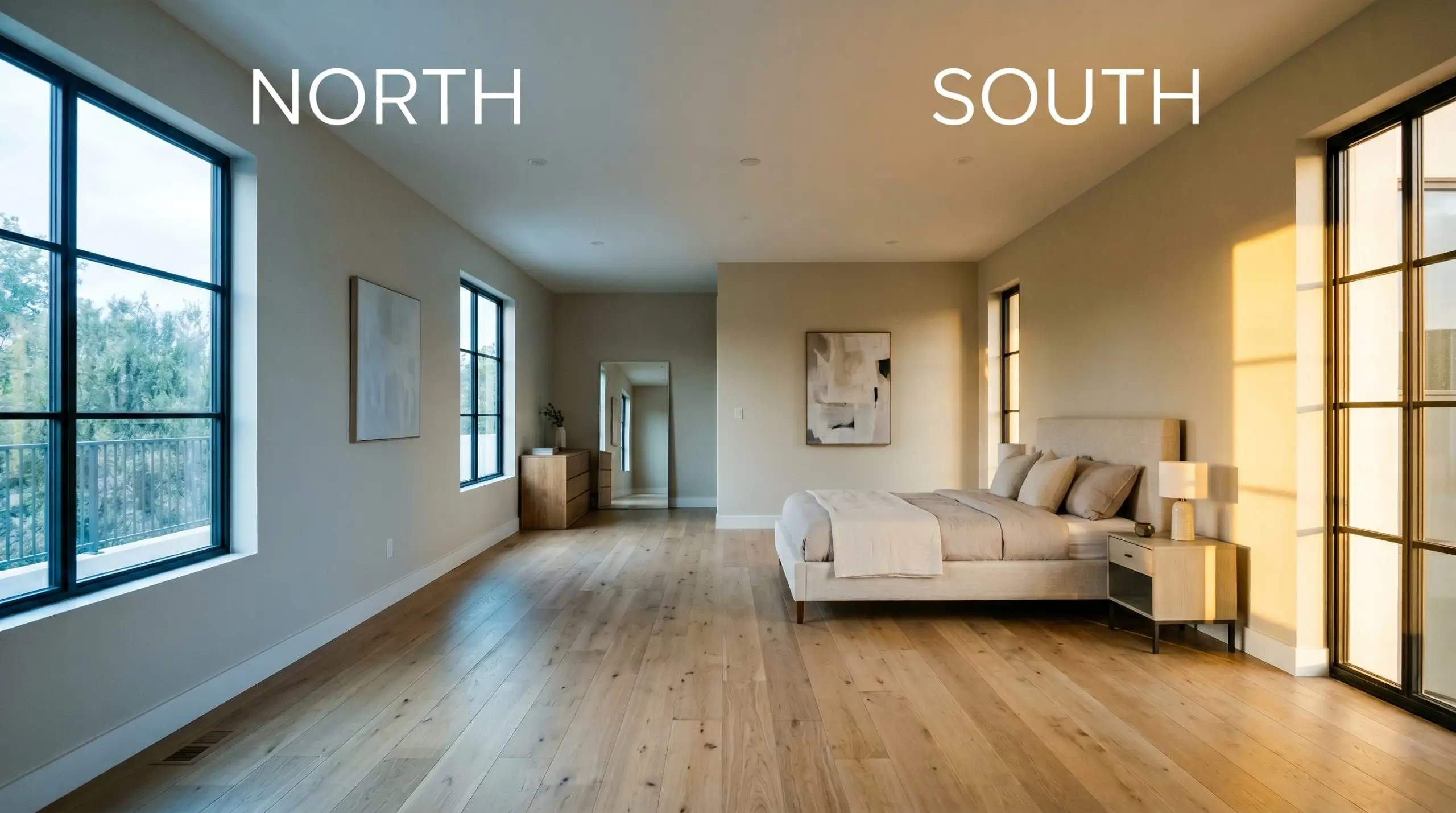
Beware of environmental reflection. If your room features large windows facing a lush lawn or dense forest canopy, the green light bouncing off the exterior foliage will “overclock” this paint’s undertones. The reflected exterior light will strip away the gray, turning your sophisticated neutral into a glaring, minty green.
Hackrea Pro-Tip
Broad Room Applications for this Green-Gray Neutral
Not every color belongs in every room. While this shade is highly adaptable, it requires specific conditions to thrive and can look profoundly out of place if forced into the wrong architectural context.
Here is our fiercely honest assessment of where it works and where it struggles.
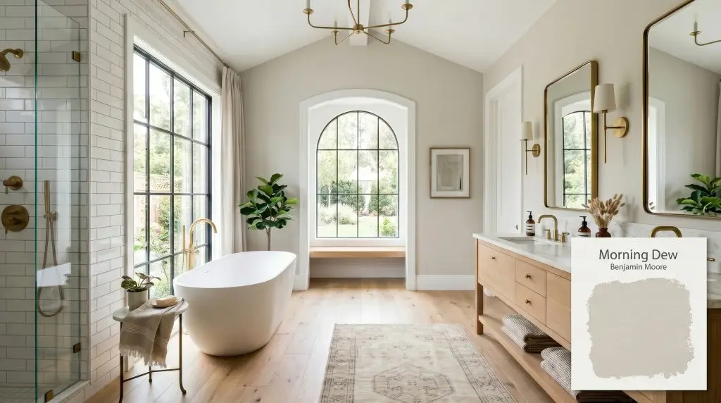
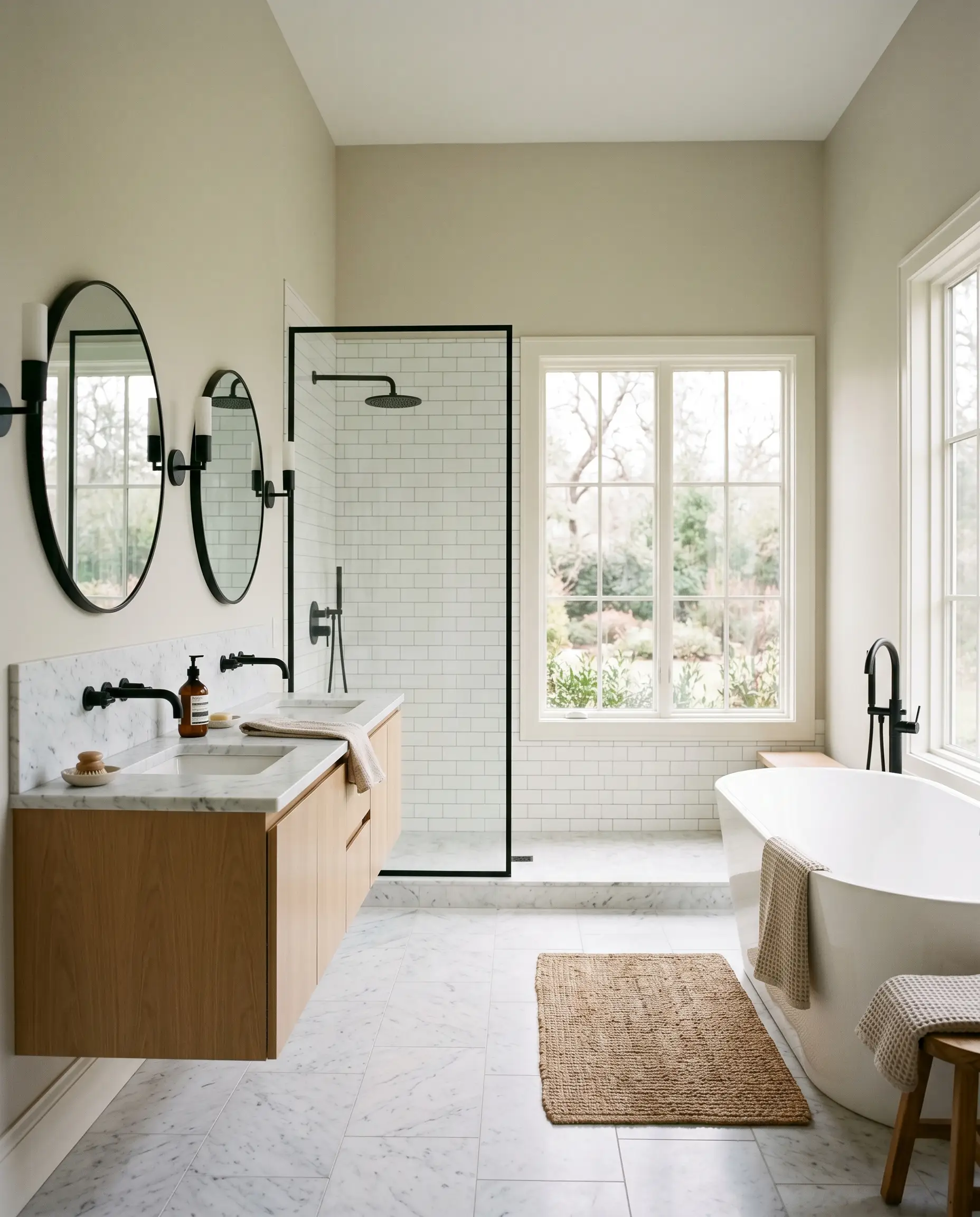
Primary Bathrooms
This is arguably the most powerful application for this specific shade. It instantly establishes a tranquil, restorative atmosphere.
To maximize the spa-like quality, you must flood the space with natural light. If your bathroom lacks windows, the color will lean heavily on your vanity lighting. Always avoid warm-toned amber glass fixtures here, as they will muddy the green and make the room feel dated. Pair it with crisp white subway tiles and honed stone to keep the visual temperature balanced.
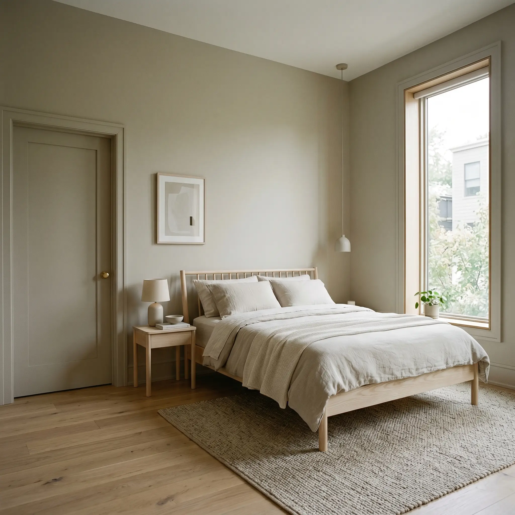
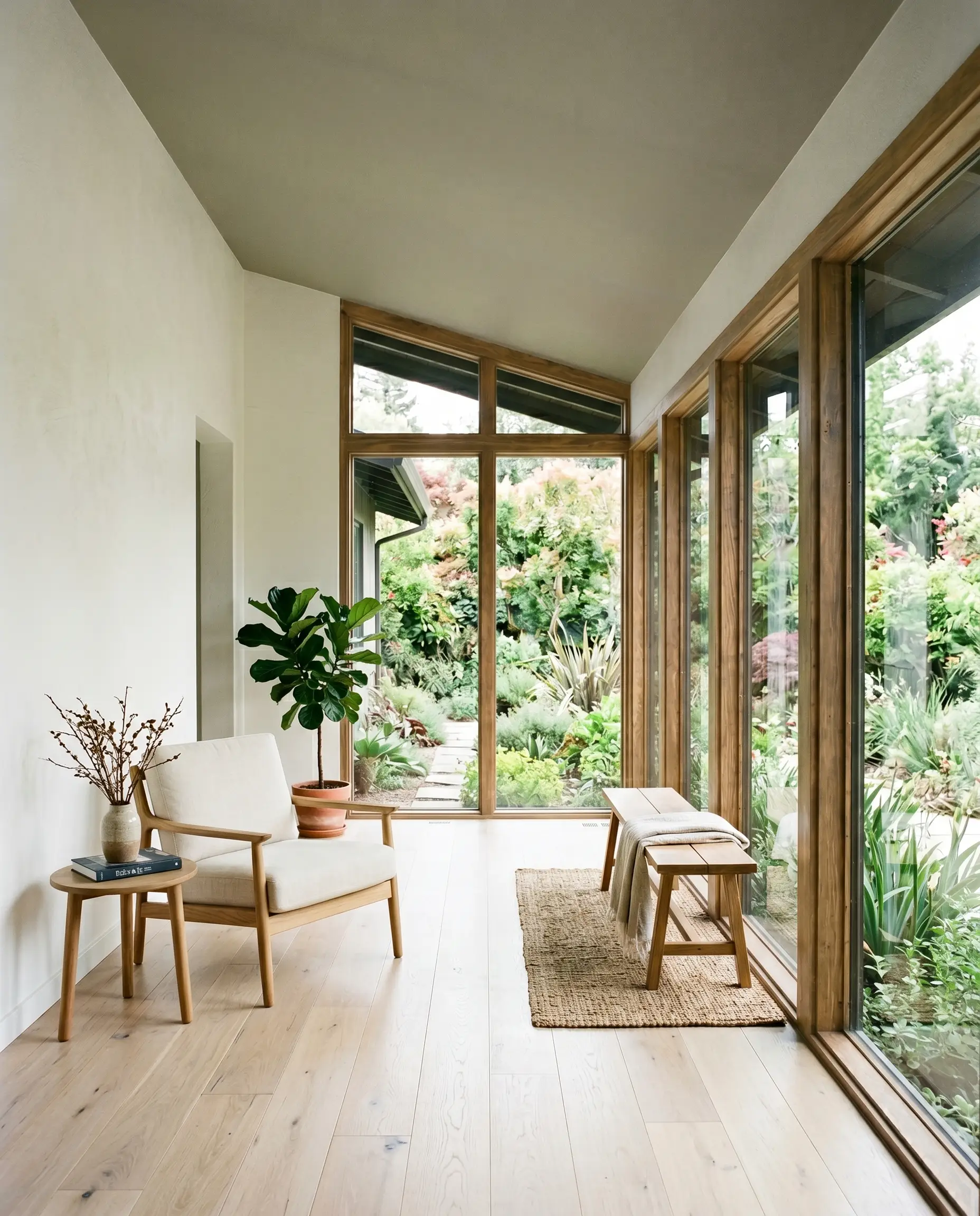
Bedrooms
In a sleeping space, this color acts as a visual palette cleanser. It lowers the visual heart rate of the room.
For the best results, consider color-drenching the space by painting the walls, trim, and doors in the exact same color, varying only the sheen. This erases harsh architectural lines and creates a seamless, enveloping cocoon. If your bedroom receives heavy afternoon sun, expect the walls to radiate a warm, herbal glow just before sunset.
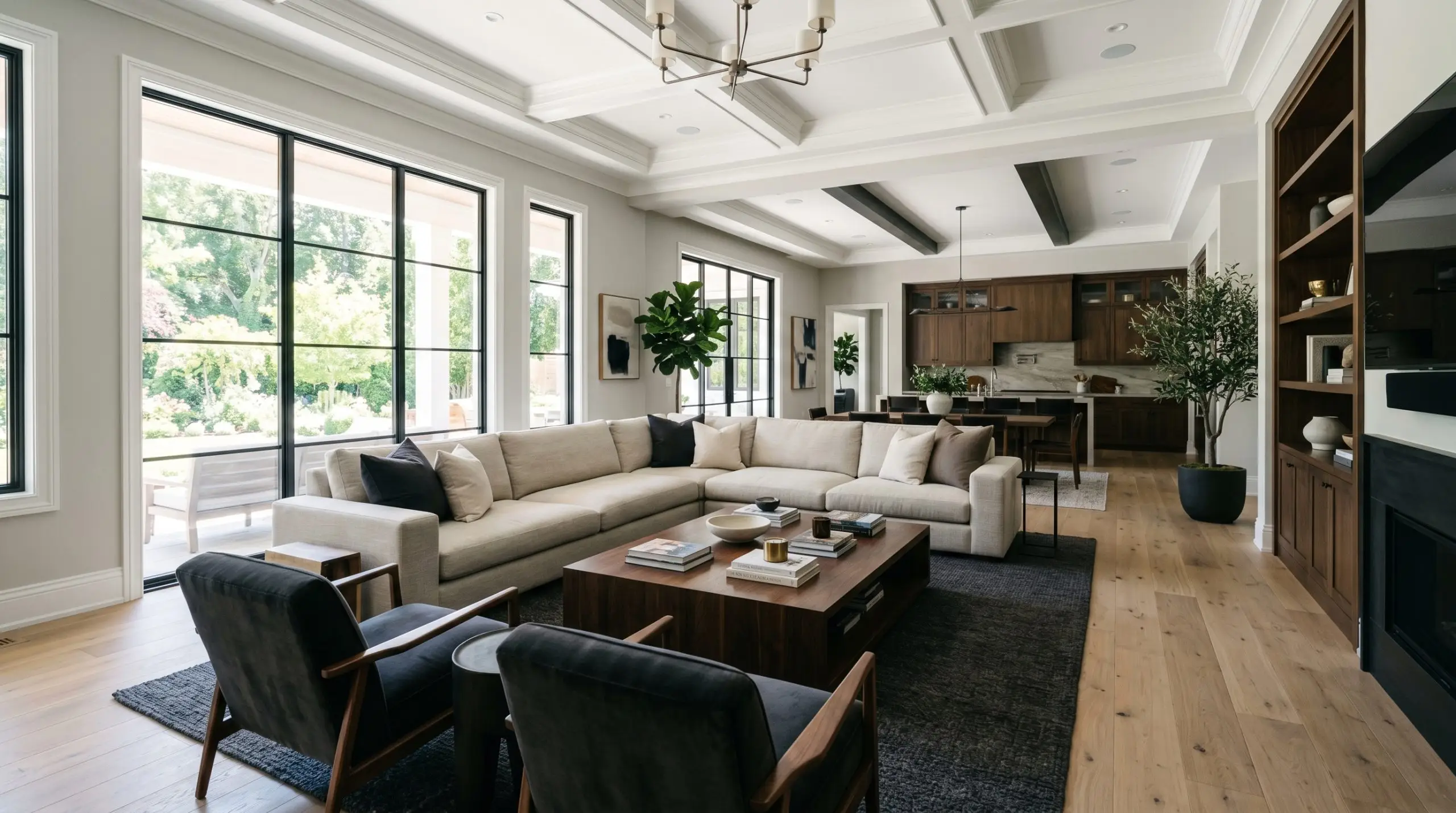
Living Rooms
Using a botanical gray in a large, open-concept living space requires structural discipline. It works beautifully, but it demands high-contrast anchoring.
If you paint expansive living room walls with this shade, you must ground the room with heavier, darker furniture or deep-toned area rugs. Without dark visual anchors, a large room painted in this light LRV can feel unmoored and floaty.
Signature Architectural Uses for OC-140
Beyond standard drywall, a paint’s true pedigree is revealed when it interacts with distinct architectural features and physical textures.
When applied to specific structural elements, this shade transforms from a basic wall color into a curated design statement.
Mudroom Beadboard & Wainscoting
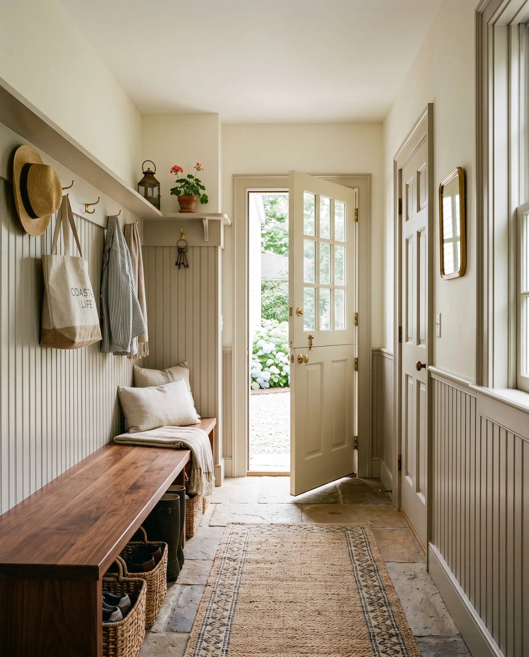
This application is a masterstroke in biophilic design. By applying this earthy gray-green to beadboard or lower wall paneling in a transition space, you create a literal and psychological bridge between the outdoors and the interior.
The vertical grooves of the beadboard manipulate the light, creating tiny, sharp shadows that emphasize the color’s muddy gray base. If you use a flat finish here, you will ruin the effect. You must use a satin or semi-gloss to allow the ridges of the wood to catch the light and highlight the botanical undertones.
Two-Tone Kitchen Cabinetry
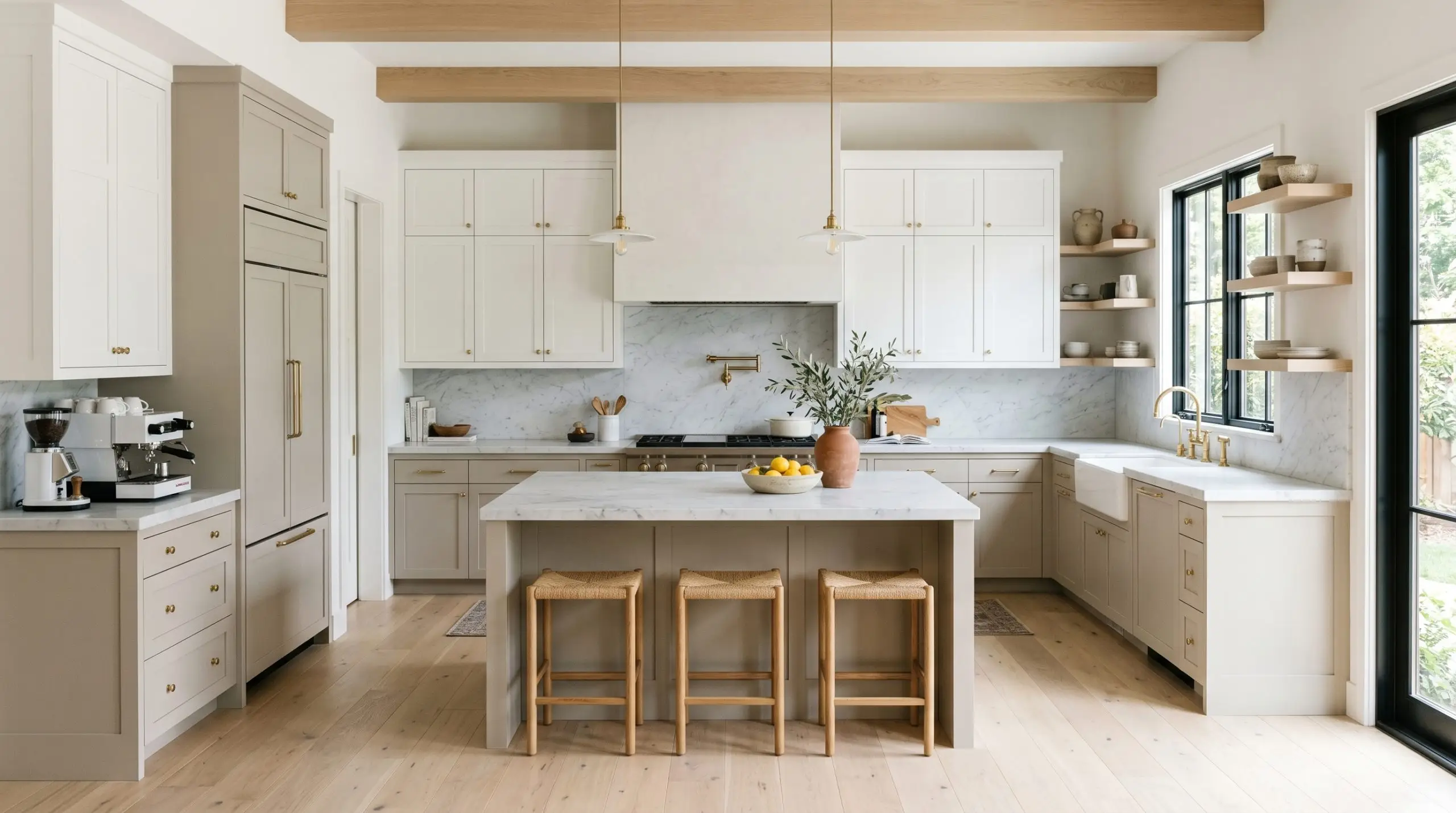
Using this muted sage on lower kitchen cabinets grounds the room with an organic, bespoke weight.
When paired with stark white upper cabinets, the contrast pulls the eye downward, making the ceiling feel taller. However, the physical hardware you choose will make or break this application. If you pair this cabinet color with sterile, polished chrome, the kitchen will feel cold and clinical. You must introduce living finishes, like unlacquered brass, to provide the necessary visual warmth.
Sunroom Ceilings
Painting the ceiling of an enclosed porch or sunroom is a classic architectural trick that manipulates the perceived temperature of the space.
By applying this shade overhead, you mimic the natural canopy of trees or a misty morning sky. This draws the eye upward and visually dissolves the barrier between the roofline and the outdoors. The ambient light bouncing off the floor will illuminate the ceiling, keeping the green-gray feeling airy rather than oppressive.
The Pairings & Accents Guide
A paint color is only as successful as the materials and hues placed directly next to it.
You must ruthlessly avoid pink-toned beige tiles (like travertine) and reddish brick fireplaces. Because red and green are complementary, the pink/red undertones in the stone will inadvertently amplify the greenness of the paint. The result? Your expensive stone will look dirty, and the paint will look sickly.
Clash Warning
Trim & Baseboards
Because this shade is relatively light, your trim white must be stark and highly reflective to prevent the walls from looking washed out.
We strongly advise choosing the right trim white that lacks heavy cream undertones. Benjamin Moore Chantilly Lace is the ultimate pairing, offering a razor-sharp, clean border that forces the green-gray to step forward. Sherwin-Williams High Reflective White performs equally well, providing the necessary stark contrast.
Architectural Materials
The fixed materials in your space dictate the final mood.
Coordinating Colors
To build a cohesive palette, you need colors that respect the mathematical weight of the primary shade.
Curated Mood Boards
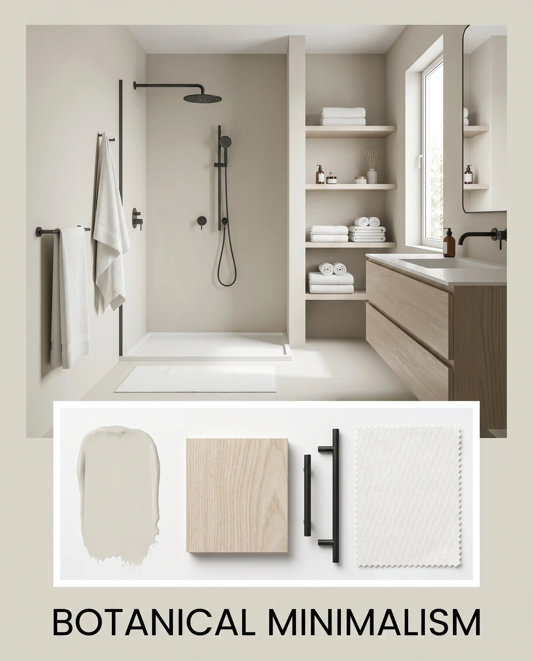
Botanical Minimalism: This palette strips away excess, relying on raw texture and razor-sharp contrast. The soft, misty green-gray walls are violently interrupted by matte black steel fixtures and stark, un-tinted white canvas textiles. Bleached ash wood provides a pale, grounding texture that allows the subtle sage notes to act as the sole source of organic warmth in an otherwise highly disciplined, austere environment.
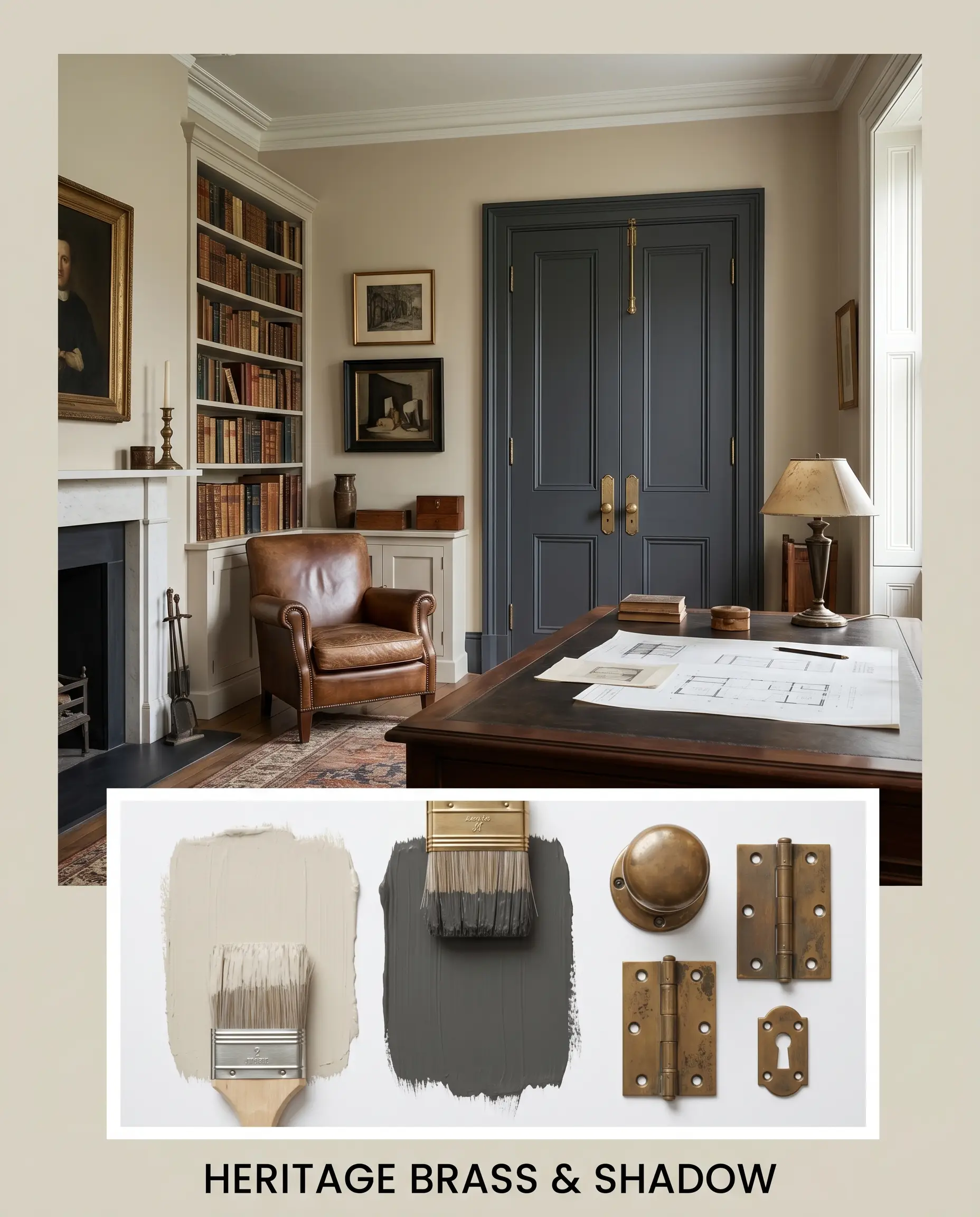
Heritage Brass & Shadow: Deeply rooted in historic, tactile design, this aesthetic uses heavy visual weight to anchor the airy walls. Deep charcoal accents absorb light, creating moody, shadowed corners. Unlacquered brass hardware introduces a living, evolving metallic warmth that directly contrasts the cool gray base of the paint. It feels grounded, permanent, and rich with patina.
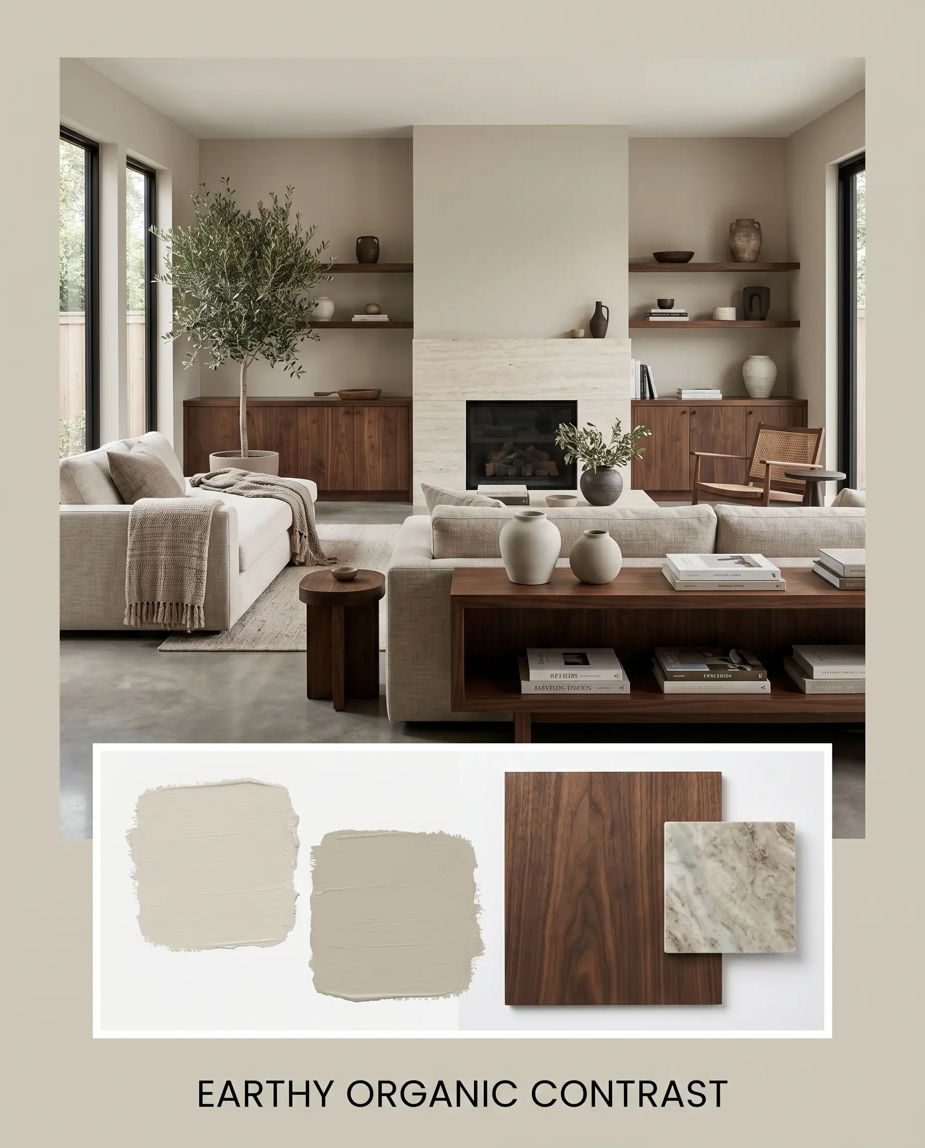
Earthy Organic Contrast: This vibe leans heavily into the raw materials of the natural world. Deep, chocolate-toned walnut wood introduces a heavy, grounding base that prevents the light walls from floating away. Honed, matte stone surfaces absorb light rather than reflecting it, pulling the muddy, earthy qualities of the paint forward. It is a highly tactile, layered aesthetic that feels inherently restorative.
Head-to-Head Paint Comparisons
When narrowing down your final selection, you must compare your top choice against its direct mathematical rivals.
Benjamin Moore Morning Dew vs. Benjamin Moore Gray Owl
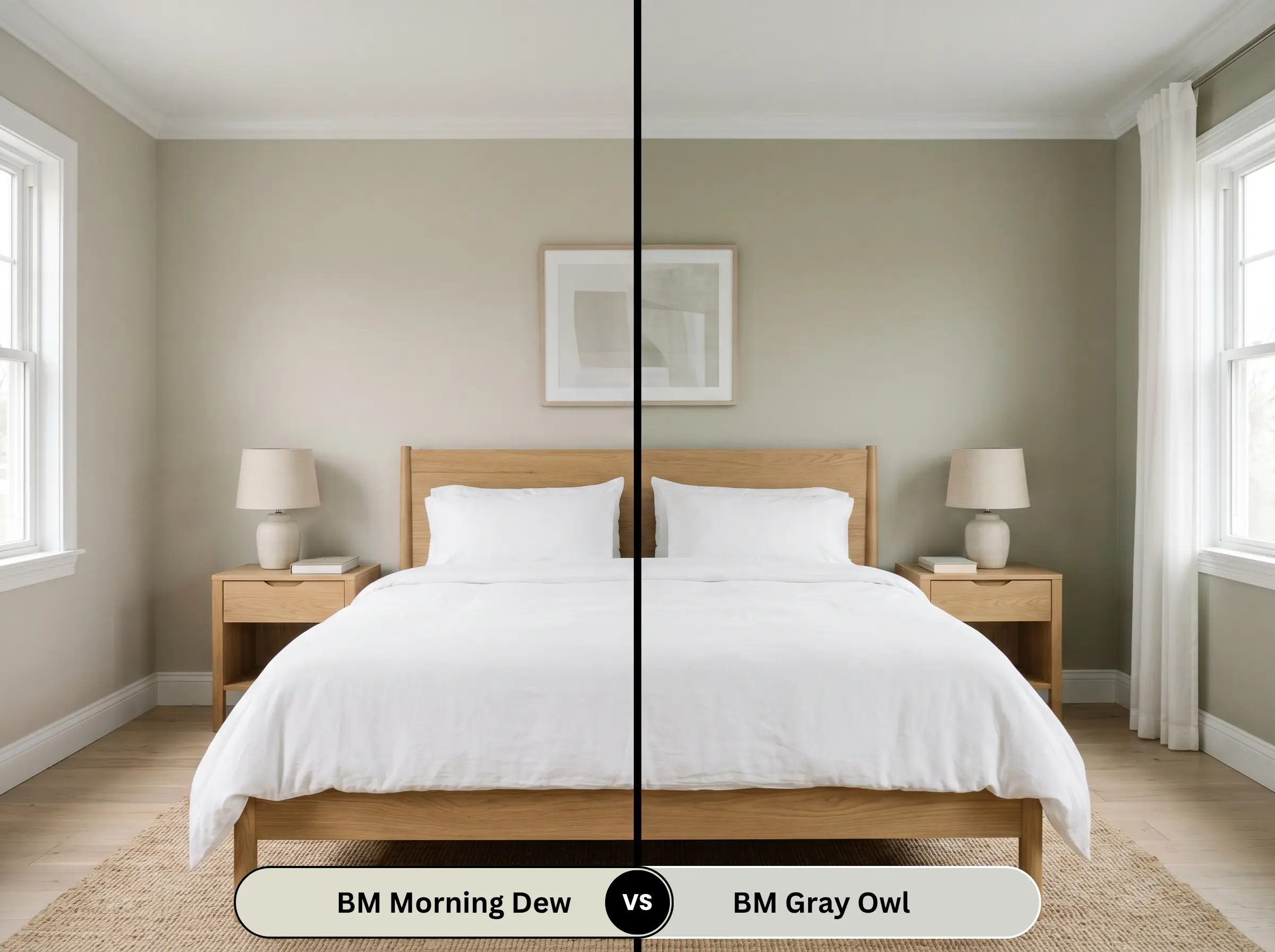
Gray Owl is a notoriously popular cool gray, but it lacks the distinct botanical commitment of its rival. While Gray Owl can flash green in certain lighting, its base is significantly more blue-gray. If you want a true connection to nature, Gray Owl will leave you cold; if you want a safer, more traditional neutral, Gray Owl is the better choice.
Benjamin Moore Morning Dew vs. Benjamin Moore Healing Aloe
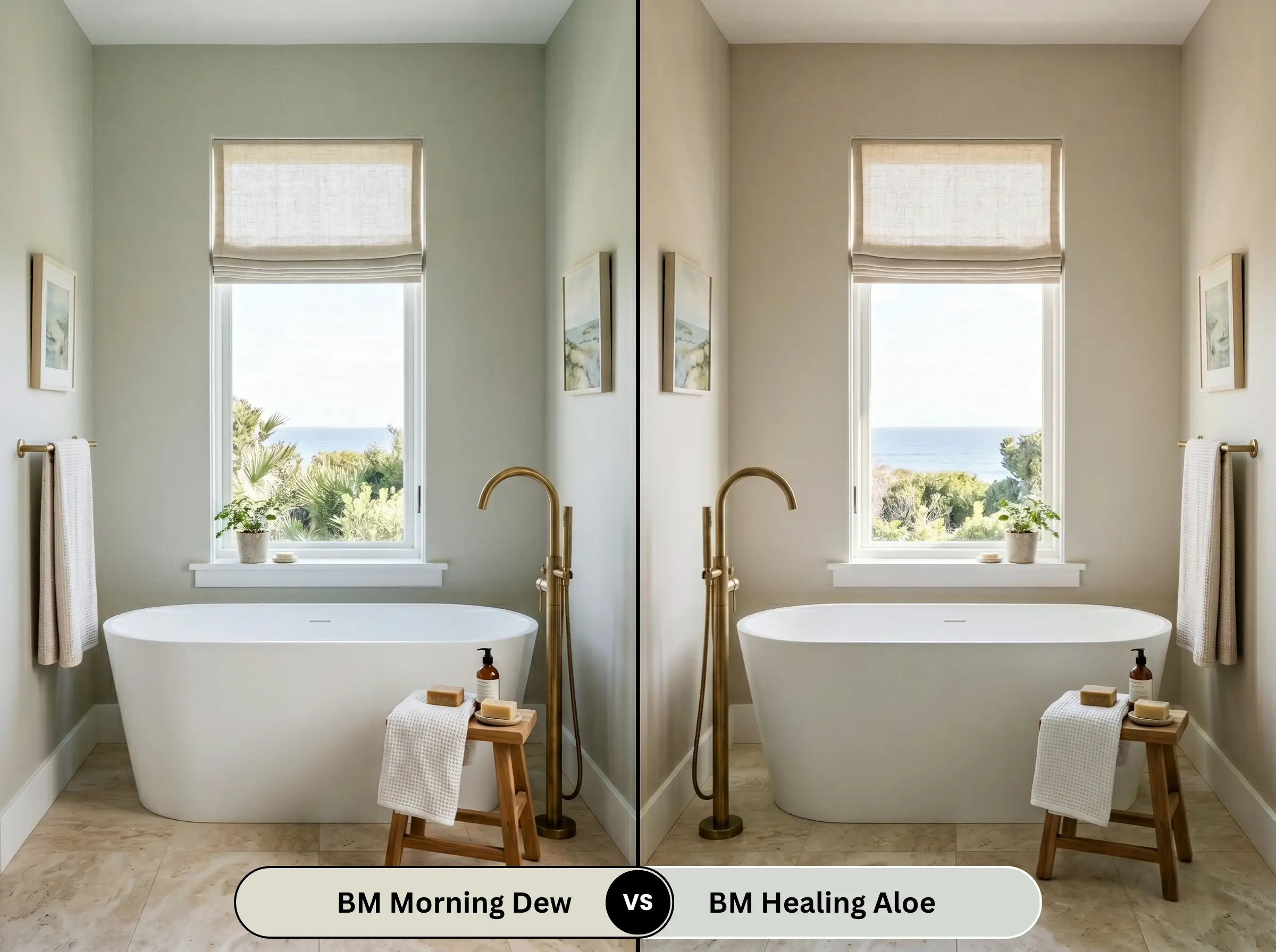
Healing Aloe shares a very similar LRV but leans much harder into the blue-green spectrum. Healing Aloe feels distinctly coastal and aquatic, whereas its rival feels grounded, earthy, and terrestrial. If you are styling a beach-inspired space, choose Healing Aloe. If you want a woodland or botanical feel, stick with the sage undertones.
Benjamin Moore Morning Dew vs. Sherwin-Williams Sea Salt
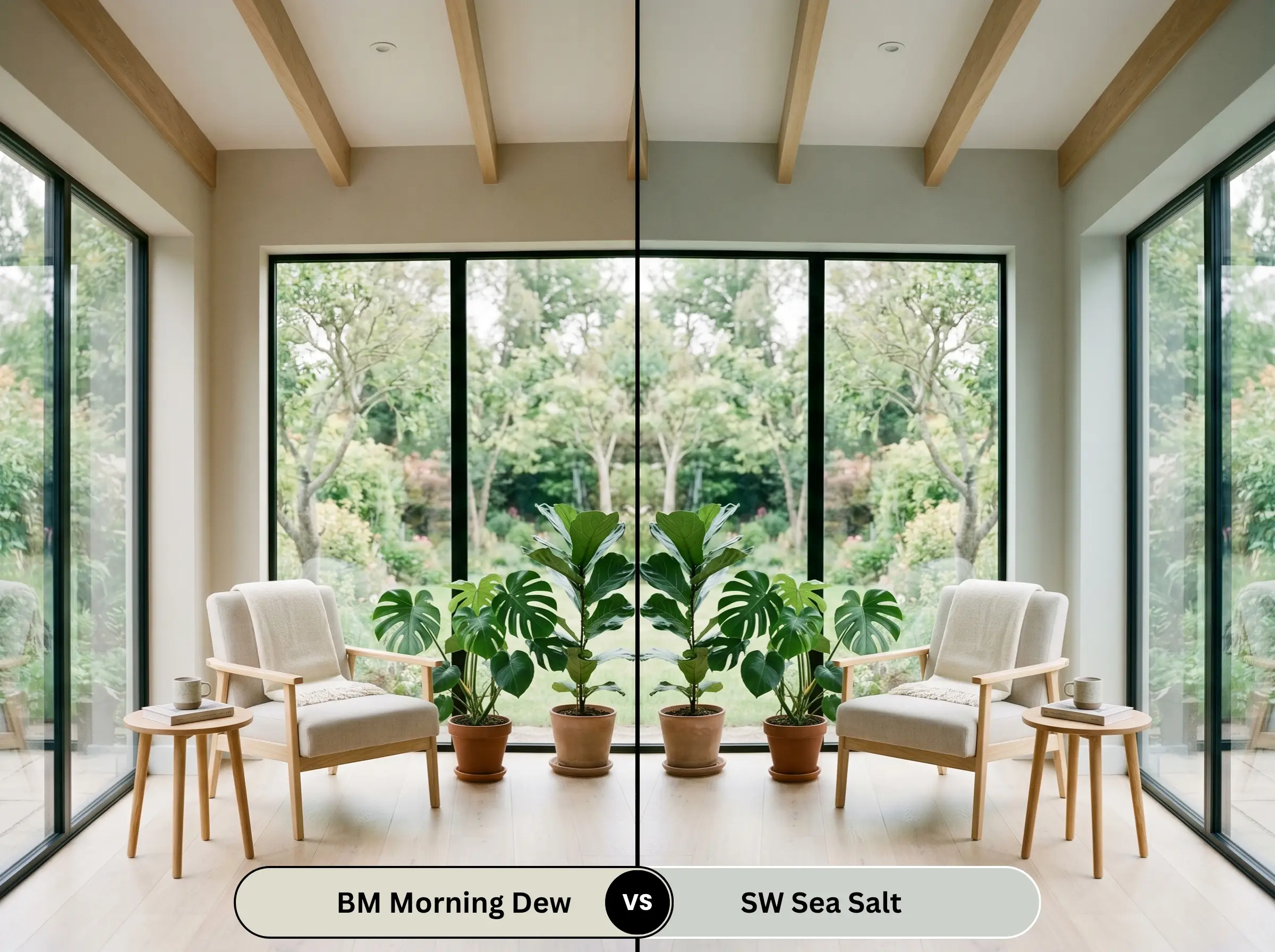
Sea Salt is significantly more saturated and possesses a much stronger blue-green undertone. Sea Salt commands attention and acts as a definitive color in the room. In contrast, the Benjamin Moore option is heavily muted by its gray base, allowing it to recede into the background and act as a true neutral rather than a focal point.
Similar Colors & Brand Equivalents
If you are locked into a specific brand or need a microscopic shift in depth, these are your mathematically proven alternatives.
Same-Brand Alternatives
Cross-Brand Matches
Practical Application & DIY Advice
Executing a high-end finish requires more than just picking the right color. The physical application dictates the final result.
The Dynamic Sheen Matrix
Primer Strategy
Because this is a light color (LRV 69.33), it does not require a deep-tinted gray primer.
However, if you are painting over a dark, saturated wall, you must use two coats of high-quality white primer. If you skip this step, the old color will bleed through and permanently alter the delicate green-gray undertones. When painting raw wood cabinets or beadboard, a stain-blocking primer is mandatory to prevent wood tannins from seeping through and yellowing the finish.
Coverage & Touch-Ups
This shade typically achieves full opacity in two standard coats over a primed surface.
Because of its light-reflecting nature, touch-ups are generally forgiving in a flat or matte finish. However, if you apply this in an eggshell finish in a room with heavy directional sunlight (like a hallway with a window at the end), you must maintain a wet edge while rolling. If you let the paint dry mid-wall, you will experience “flashing”—highly visible, shiny roller marks that ruin the professional aesthetic.
Frequently Asked Questions
In spaces devoid of natural light, the cool gray base dominates. Without sunlight to activate the botanical warmth, it can look slightly flat or shadowy. You must rely entirely on 3000K to 4000K LED lighting to keep the color crisp and intentional.
Yes. Terracotta is inherently orange/red, which sits opposite green on the color wheel. Placing this green-gray next to terracotta will violently amplify the green undertones, making the paint look minty and the floor look overwhelmingly orange. Avoid this pairing.
Absolutely. The natural sunlight will wash out about 30% of the color’s depth, making it read as a stunning, sophisticated off-white with a hint of earthy green. The charcoal roof provides the necessary high-contrast anchor to keep the exterior looking sharp.
Traditional sage greens are heavily pigmented and act as definitive accent colors. This shade, conversely, is a chromatic gray first and a green second. It provides the psychological benefits of biophilic design without dominating the visual space, making it far more versatile for whole-home palettes.
Final Verdict & Expert Warnings
Benjamin Moore Morning Dew is a masterclass in restraint. It is not for the homeowner who wants a loud, vibrant splash of color.
This paint is exclusively for those who want a deeply sophisticated, atmospheric backdrop that shifts beautifully throughout the day. Its absolute best application is in a sun-drenched primary bathroom or used as a bespoke accent on mudroom beadboard.
Who should avoid it? If your home features red brick fireplaces, pink-beige travertine floors, or heavy cherry wood cabinetry, you must walk away. The complementary color clash will ruin your space. But if you have white oak floors, crisp white trim, and a love for organic minimalism, this is the exact shade you have been searching for.
Closest Cross-Brand Equivalents
The absolute closest scientific color matches for Morning Dew across top paint brands.