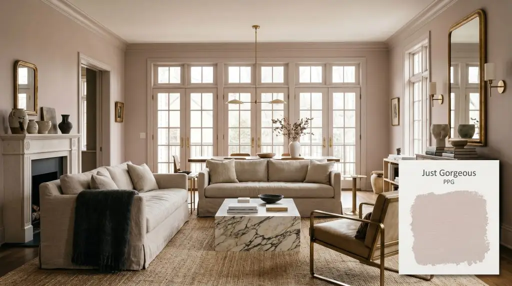
Just Gorgeous PPG1047-3
PPGPPG Just Gorgeous (PPG1047-3) is a warm, soft dusty mauve paint color with distinct rosy and subtle violet undertones. With an LRV of 58, it acts as a mid-tone neutral that brings delicate warmth to bedrooms and powder rooms without feeling overly vibrant.
Paint Technical Profile
| Color ID / SKU | PPG1047-3 |
| HEX Code | #d6c4c1 |
| Light Reflectance (LRV) | 58 |
| Use | Interior |
| Best Exposures | South, West |
| Best For | Bedrooms, Powder Rooms, Accent Ceilings |
PPG Just Gorgeous: The Grown-Up Dusty Mauve Redefining Modern Neutrals
For years, homeowners have treated blush tones with a cautious skepticism, banishing them to nurseries or kitschy vintage bathrooms. PPG Just Gorgeous shatters that hesitation entirely. This is not a sweet, sugary pastel, but rather a sophisticated dusty mauve that acts as a highly structural mid-tone neutral.
Its beauty lies in its remarkable restraint. When applied across expansive walls, this warm blush creates an atmosphere of quiet, tactile luxury that feels incredibly intentional. It wraps a room in a soft, inviting energy without ever overwhelming the senses or demanding constant attention.
Because of its complex chromatic profile, it serves as a phenomenal backdrop for a wide variety of textures. It pairs just as effortlessly with an accessible slipcovered linen sofa as it does with an investment piece of heavily veined, honed marble. This shade proves that you do not need stark whites or predictable grays to establish a serene, elevated home.
PPG Just Gorgeous: Undertones & LRV
If you are trying to determine its temperature, PPG Just Gorgeous is undeniably warm. Instead of relying on stark, primary reds, this hue is built on a soft rose foundation that feels organically derived from nature. To truly understand how this architectural finish will behave on your walls, you have to look at the subtle layers beneath its surface.
With a Light Reflectance Value of 58, this color sits comfortably right in the middle of the mid-tone range. It absorbs enough light to maintain its distinct color structure, ensuring the walls never look washed out or flimsy. At the same time, it reflects just enough illumination to keep moderately lit spaces from feeling enclosed or visually weighted.
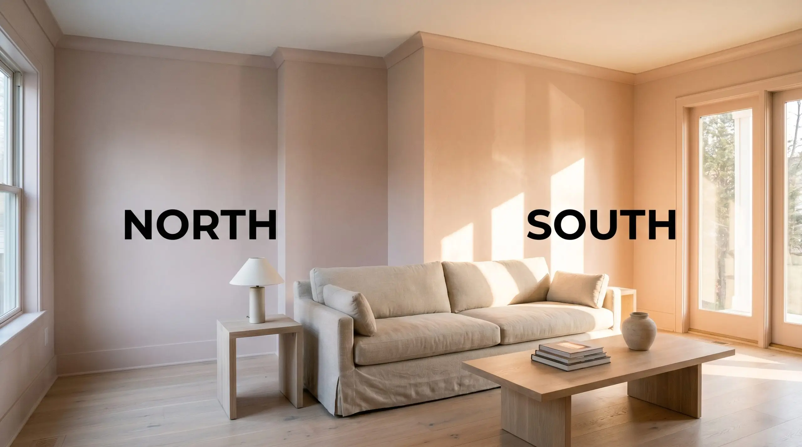
Lighting Effects & The Chameleon Factor
Because of its nuanced gray base and subtle violet notes, this dusty mauve is highly responsive to the shifting temperature of the sun. You must anticipate how your room’s natural and artificial light will manipulate the final aesthetic.
Where to Apply This Dusty Mauve
While it is tempting to restrict a rosy cast to highly specific, traditional zones, this shade thrives when treated as a versatile architectural finish. By pairing it with the right materials and lighting, you can easily pull this color into the main living areas of your home. Here is how to maximize its potential across various spaces.
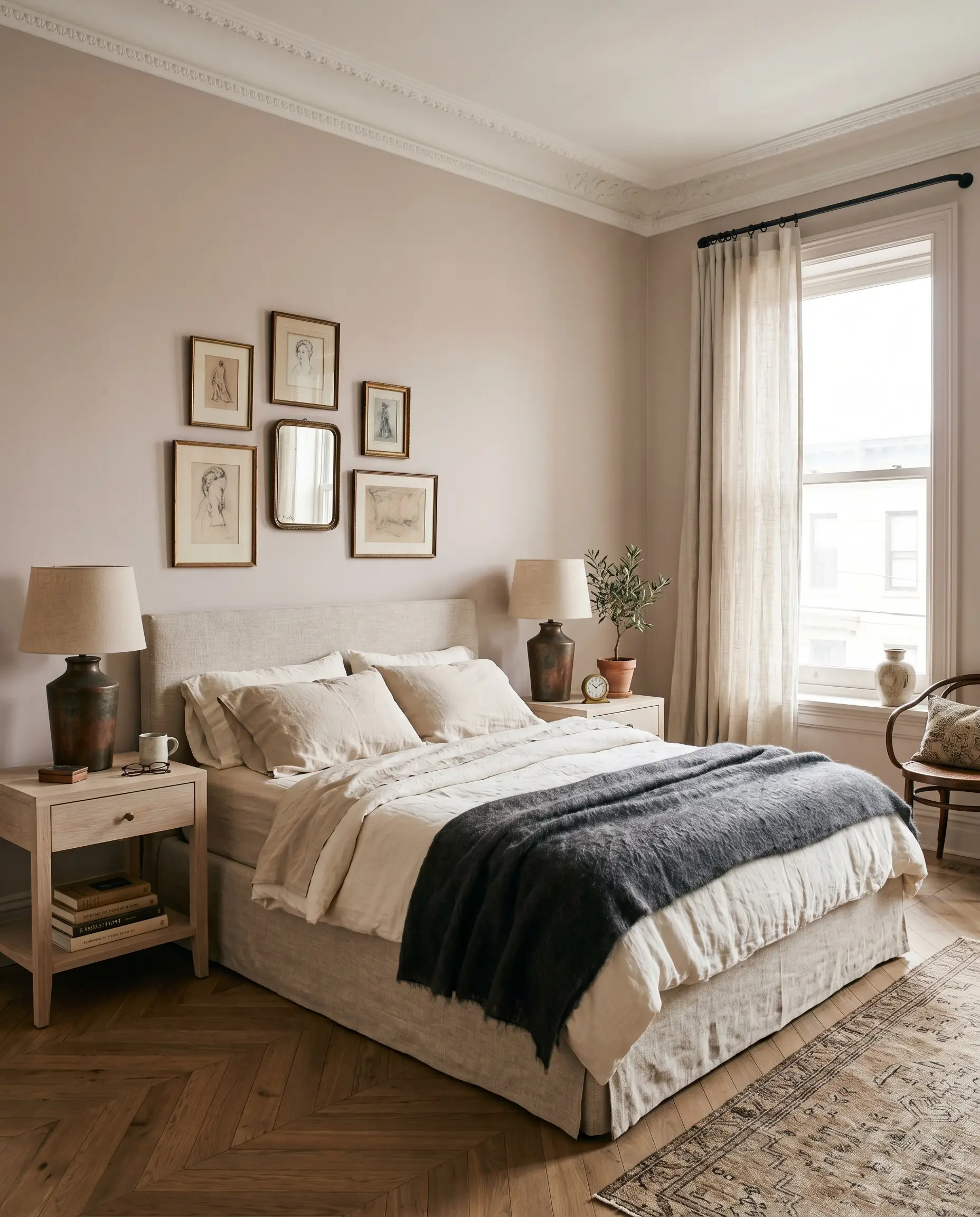
Serene Primary Retreats
For tired professionals looking to create a true sanctuary, this shade establishes a restful atmosphere without resorting to predictable grays. The warm blush wraps the bedroom in a cozy, tactile energy that feels instantly relaxing at the end of a long day. It works beautifully as a full-room application, especially when paired with a slipcovered linen bed frame and bleached oak nightstands.
To avoid a saccharine vibe, introduce contrasting textures and slightly more masculine elements into the styling. A charcoal mohair throw, an oxidized copper table lamp, or matte black steel curtain hardware will instantly modernize the space. This creates a balanced, Parisian Eclectic aesthetic that feels curated and deeply personal.
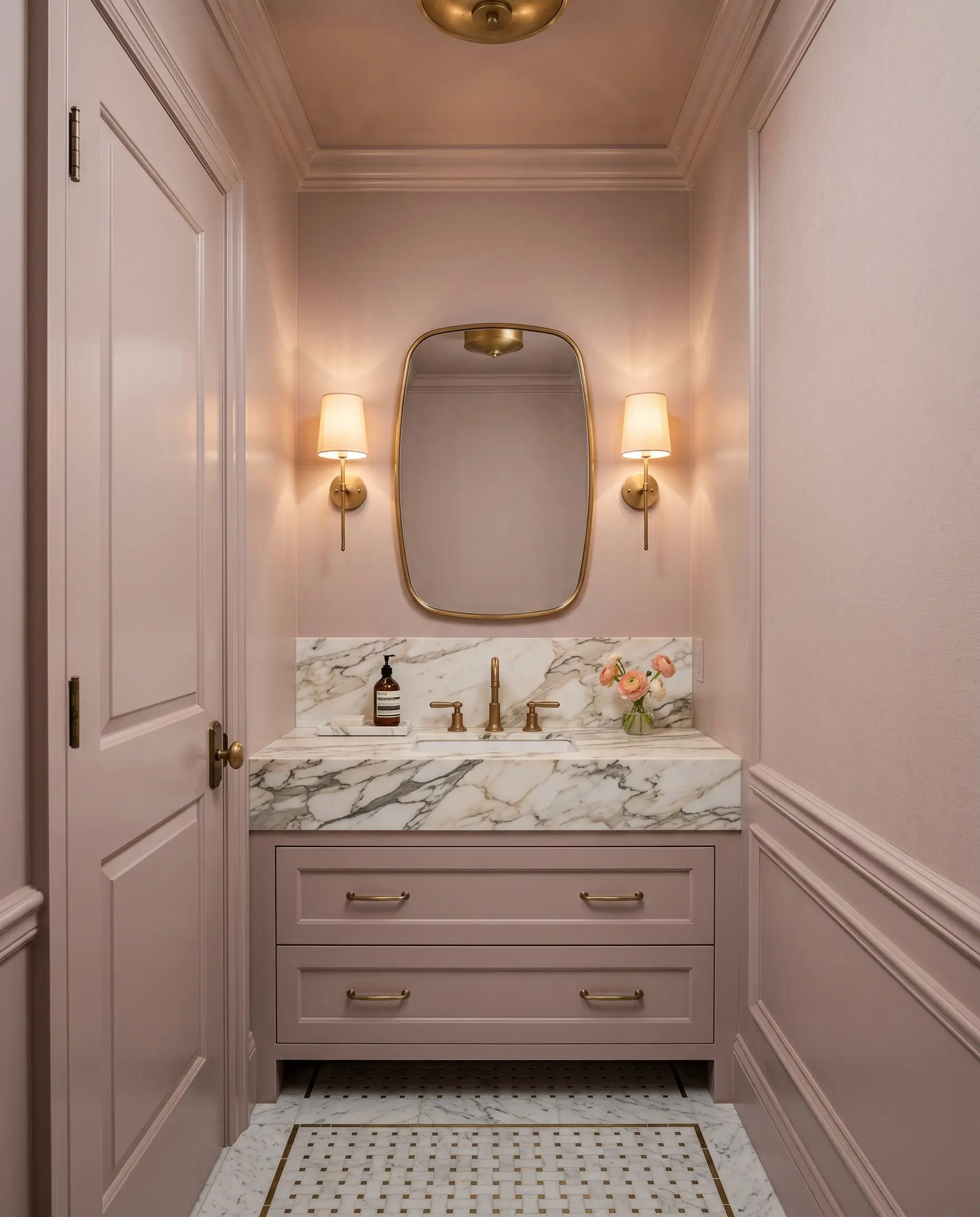
Jewel-Box Powder Baths
Small, windowless spaces are the perfect canvas for leaning into the paint’s richer violet undertones. Consider color-drenching the entire powder room—painting the walls, trim, and the back of the door—to create an immersive, continuous wrap of color. This technique blurs the room’s hard edges, making a tight footprint feel surprisingly expansive and incredibly chic.
Elevate the standard fixtures by installing a single statement piece that contrasts beautifully with the fleshy tone. A heavily veined marble vanity top or an unlacquered brass faucet will naturally patina over time, adding a layer of organic luxury.
When using warm mid-tones in a small bathroom, flank the vanity mirror with shaded sconces rather than relying on harsh overhead lighting. This prevents the gray base from casting unflattering shadows on the face, ensuring the warm blush reflects a healthy, radiant glow.
Hackrea Pro-Tip (The Mirror Strategy)
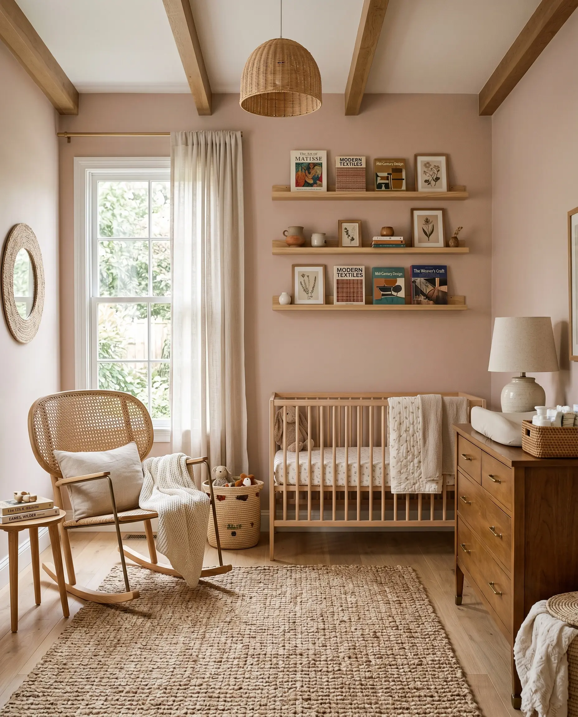
Sophisticated Nurseries & Playrooms
Forget the overly sweet, pastel stereotypes of the past. This shade provides a calming, earthy foundation that a child can easily grow into over the years. By treating the walls as a mature neutral, you allow the room’s decor to dictate the age-appropriateness of the space.
Root the room with natural, highly textured materials like a cane-backed rocking chair, a chunky jute rug, and floating shelves styled with vintage art books. As the child ages, the color seamlessly transitions from a gentle baby’s room to a chic, boho-inspired preteen space simply by swapping out the textiles.
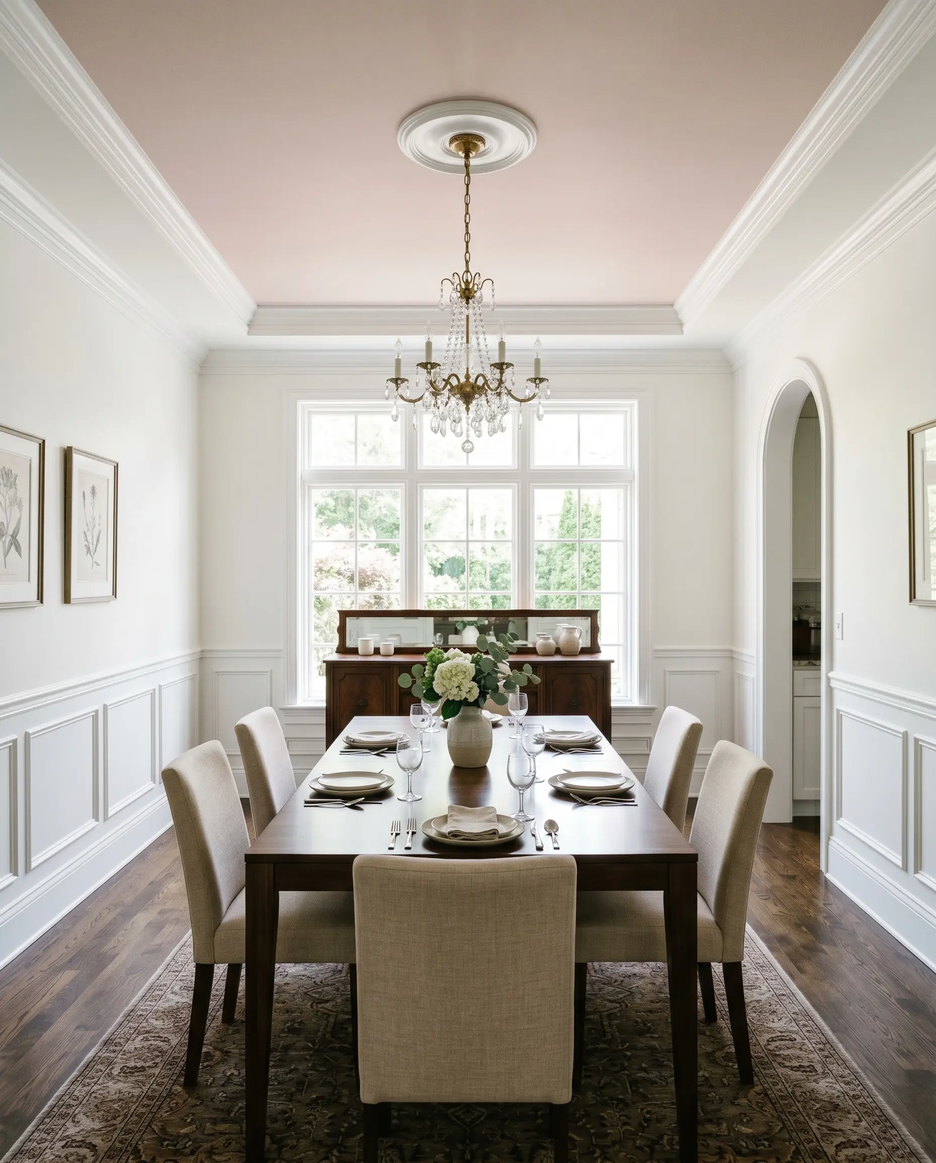
Unexpected Ceiling Treatments
Applying this color to the fifth wall completely redefines the visual boundaries of a room. In a dining space or home office with crisp white walls, a dusty mauve ceiling draws the eye upward and casts a phenomenally flattering, warm glow over the entire space. It is a brilliant way to inject personality into a room without committing to painting all four walls.
This application works exceptionally well within rooms featuring traditional architectural details. Crisp white crown molding or a stark picture rail will beautifully frame the ceiling color, creating a sharp, intentional contrast.
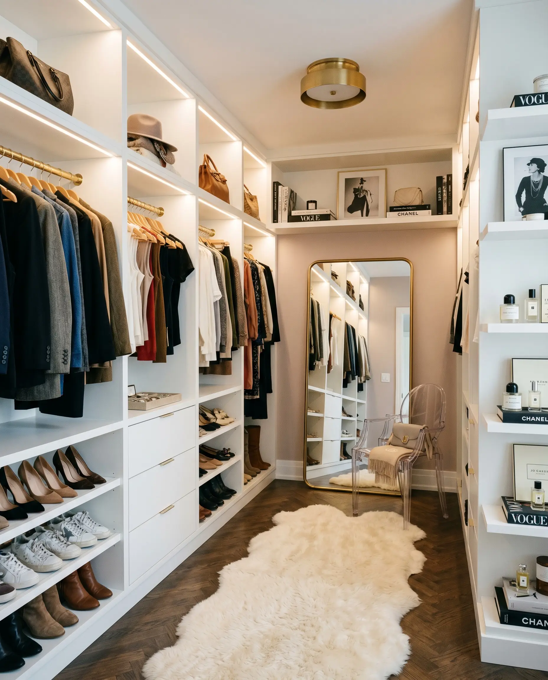
Boutique-Style Dressing Rooms
You can easily transform a standard storage area or walk-in closet into a highly personalized, high-end dressing room. The paint’s excellent light absorption properties help standard white MDF shelving look custom and intentional against the warm backdrop. It adds an immediate layer of glamour to your daily routine.
Style the space with an acrylic ghost chair, a textured sheepskin runner, and an oversized leaning mirror to bounce the available light around the room.
Clash Warning (The Lighting Trap): Be incredibly mindful of your closet lighting. If you install stark 4000K LED strips to see your clothes better, you will unintentionally flatten the paint’s rosy cast, making the walls look like a dull, lifeless gray. Stick to a crisp but balanced 3000K bulb to keep the color true while maintaining functional visibility.
Building a Palette Around PPG Just Gorgeous
Because of its highly nuanced gray base, this muted mauve requires intentional, crisp boundaries to hold its structural shape. If you surround it with too many tonal pastels, the color loses its sophisticated edge and bleeds into a washed-out, undefined aesthetic. To make this fleshy tone feel truly premium, you must pair it with high-contrast materials and deeply saturated accent colors that force the hue to stand at attention.
Curating the Perfect Trim
When selecting a trim color, you want to avoid creamy, yellow-leaning whites that will drag the room’s energy down and make the walls look muddy. Instead, you need a highly reflective, stark white to create a tailored, architectural frame around the dusty mauve.
Hardware, Wood & Tactile Pairings
To truly elevate this mid-tone neutral, you must introduce tactile materials that introduce visual friction. The goal is to balance the softness of the walls with materials that feel rooted, historical, or intentionally raw.
Never feel locked into a single hardware finish. If you use unlacquered brass for your primary lighting fixtures, ground the room by using matte black steel for your door hinges and curtain rods. This high/low metallic mix keeps the dusty mauve feeling incredibly modern and layered.
Hackrea Design Secret (The Metal Mix)
Harmonizing Paint Colors
When building a cohesive home palette, you want secondary colors that either deeply ground the walls or pull out their underlying warmth.
Designer Mood Boards
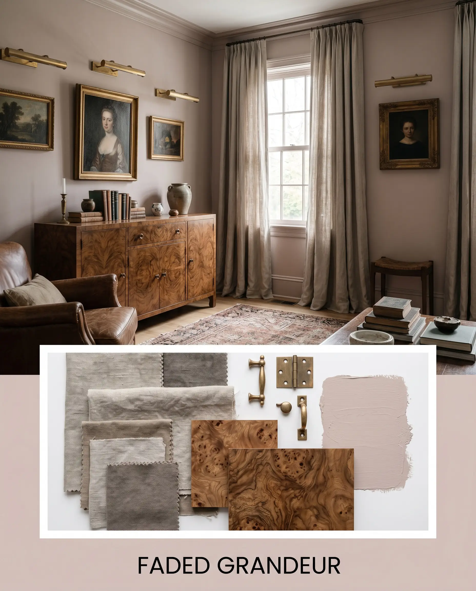
To help you visualize how this color structure comes to life, we have curated three distinct aesthetic directions. Each palette proves how a simple shift in styling and textiles can completely transform the energy of the paint.
Faded Grandeur This aesthetic leans heavily into a relaxed, historical elegance that feels effortlessly collected over decades. The dusty walls are paired with heavy, washed linen drapery and an intricate burl wood credenza to create a sense of faded, tactile luxury. Unlacquered brass picture lights and layered, distressed vintage rugs add a quiet, soulful warmth that makes the entire space feel like an intimate retreat.
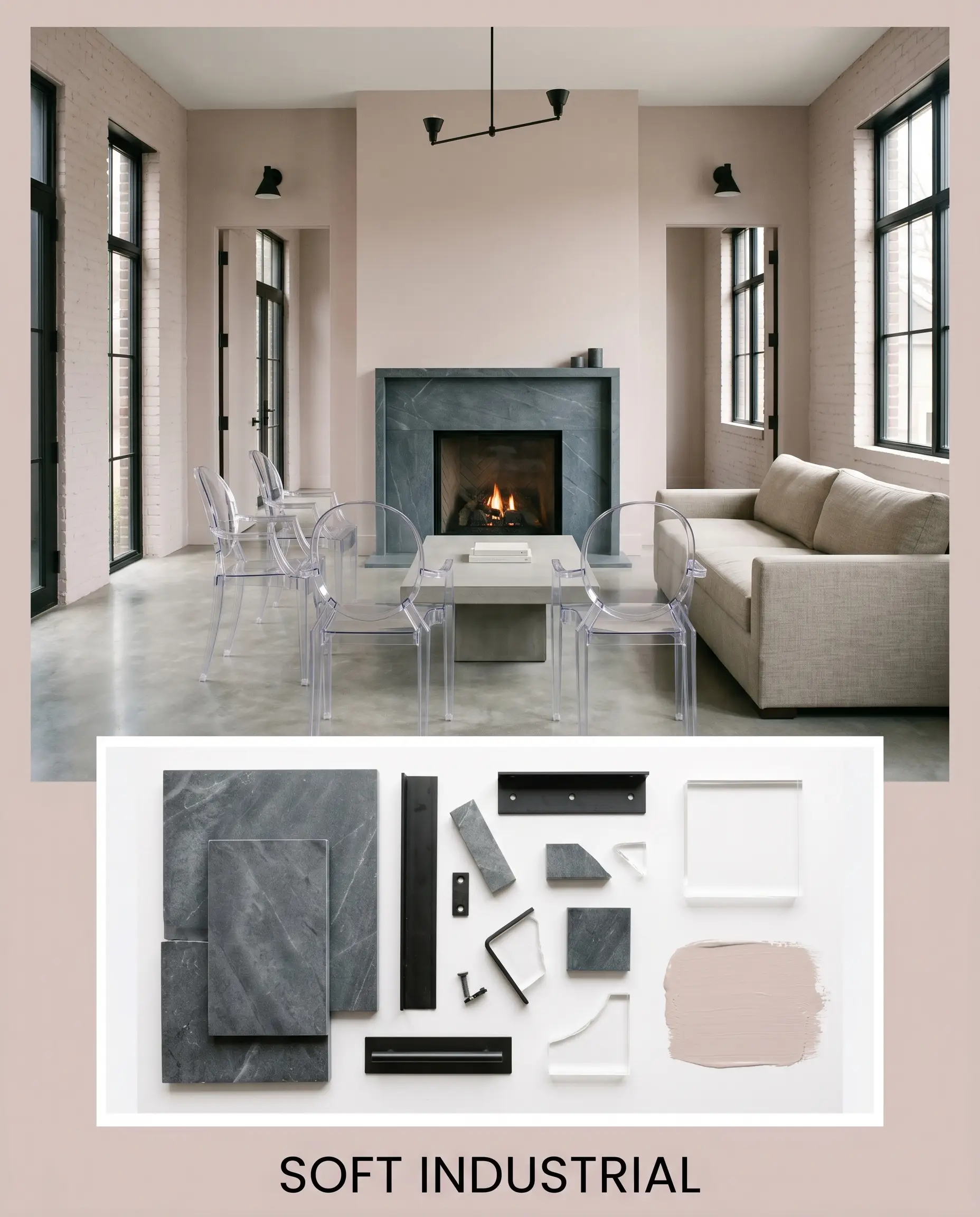
Soft Industrial Here, we strip away the traditional romance of a rosy cast by introducing raw, utilitarian textures. The walls are grounded by matte black steel hardware and a striking, honed soapstone focal point that adds immediate visual weight. Sleek acrylic ghost chairs and minimalist line art keep the energy sharp, proving this fleshy tone can feel incredibly edgy and modern.
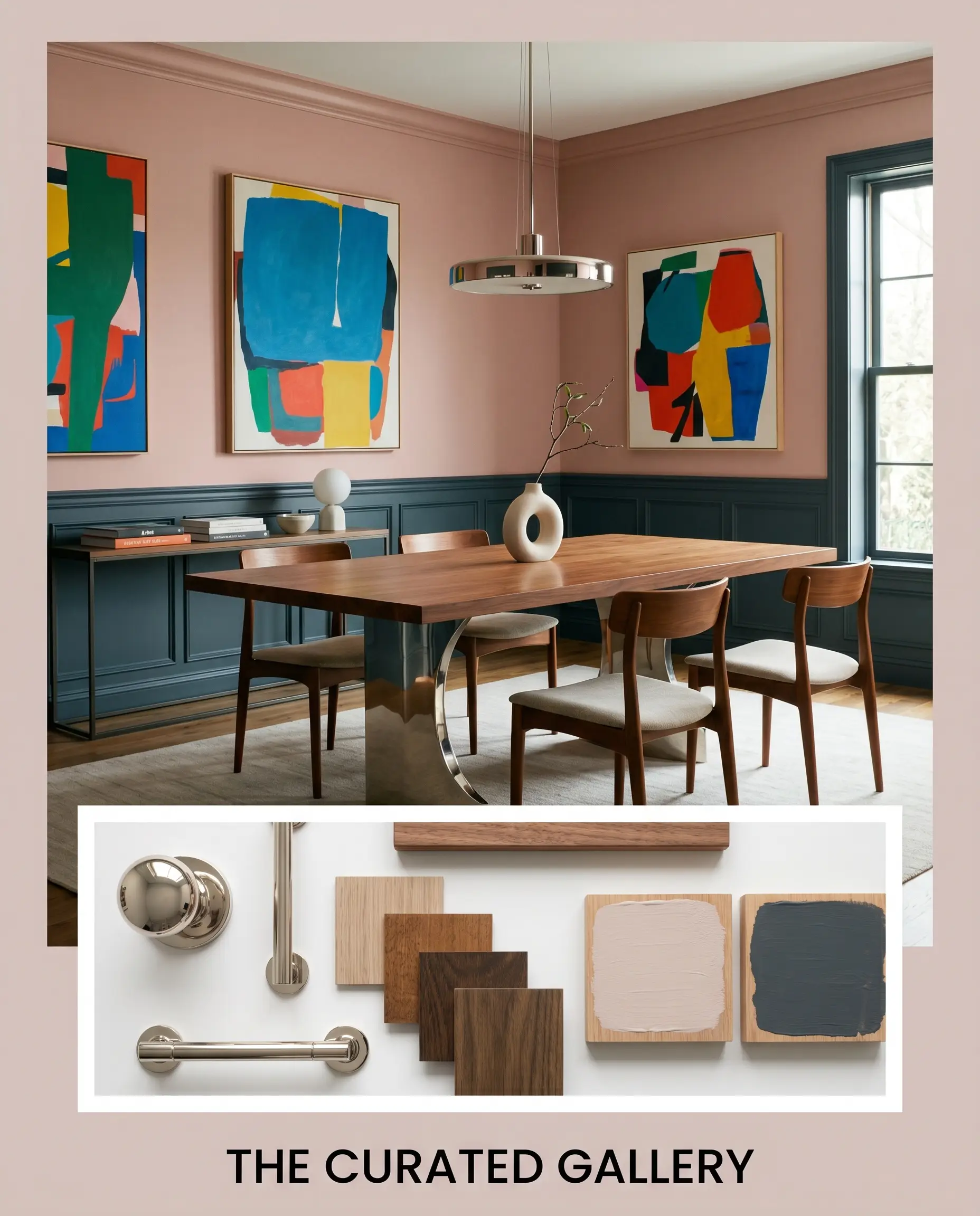
The Curated Gallery Designed for the avid collector, this palette uses the paint as a sophisticated backdrop for dramatic, high-contrast moments. Deep accents of Farrow & Ball Hague Blue on the millwork anchor the room, while asymmetrical gallery walls showcase vibrant, abstract canvases. The addition of a sleek, cantilevered dining table and subtle touches of polished nickel give the space a highly tailored, museum-like quality.
Comparing PPG Just Gorgeous to Industry Rivals
Even when you fall in love with a color’s chromatic profile, it is crucial to test it against its closest competitors. Depending on your home’s natural light exposure or the specific tone of your existing flooring, a rival shade might actually be the smarter choice. If your room receives heavy, cool northern light, you may find that you need a paint with a slightly higher LRV or a warmer base to prevent the walls from looking chilly.
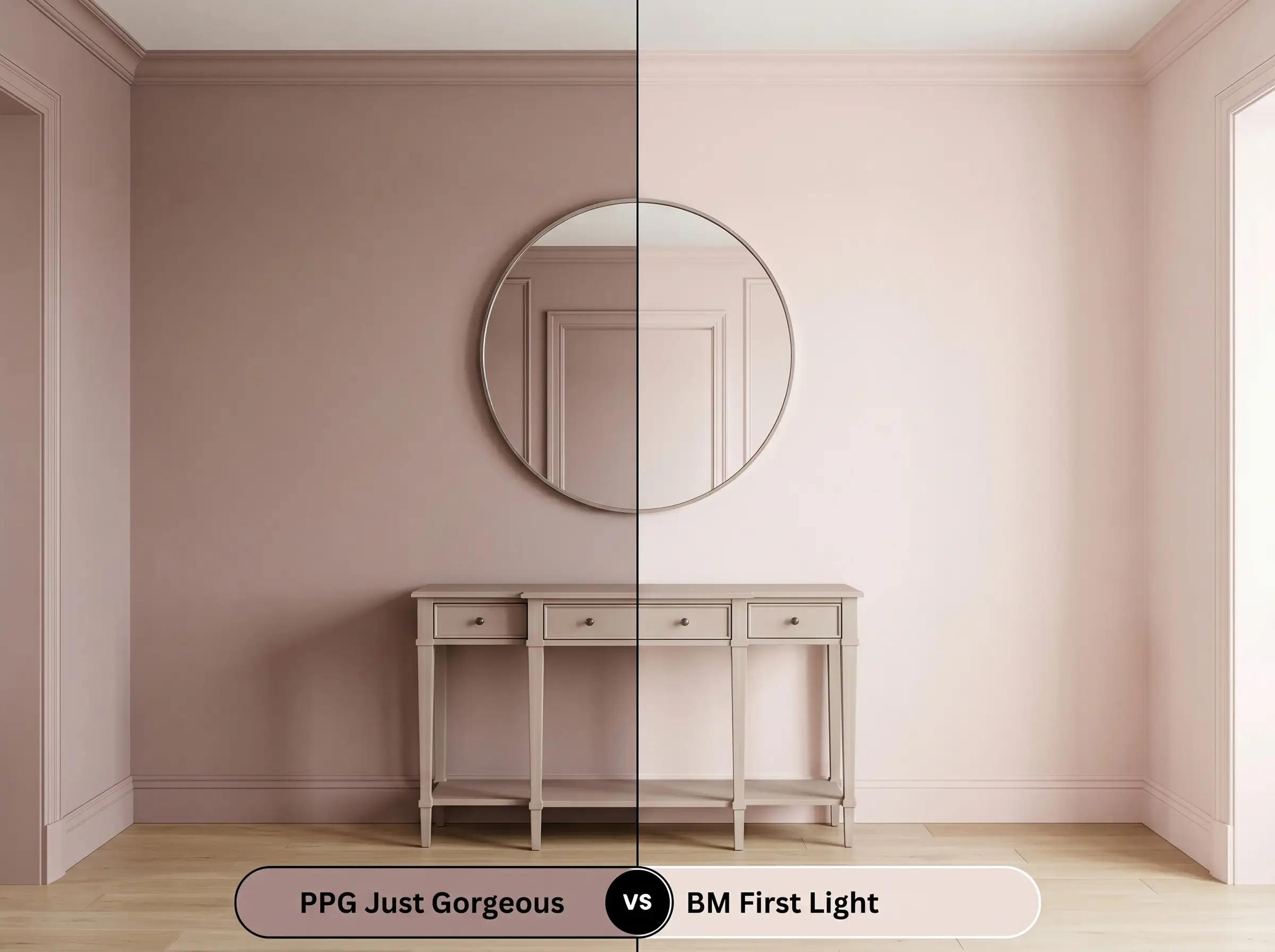
PPG Just Gorgeous vs. Sherwin-Williams Malted Milk
Sherwin-Williams Malted Milk offers a noticeably warmer, slightly more peach-leaning approach to the blush category. While the PPG option relies on a cool violet undertone to maintain its dusty appearance, Malted Milk pushes further into a true, warm beige.
If your room features a lot of cool, gray-toned natural light, Malted Milk will often perform better by injecting much-needed warmth into the space. However, if you are looking for that sophisticated, slightly moody Parisian plaster look, the gray base in Just Gorgeous provides a far more elegant, structured finish.
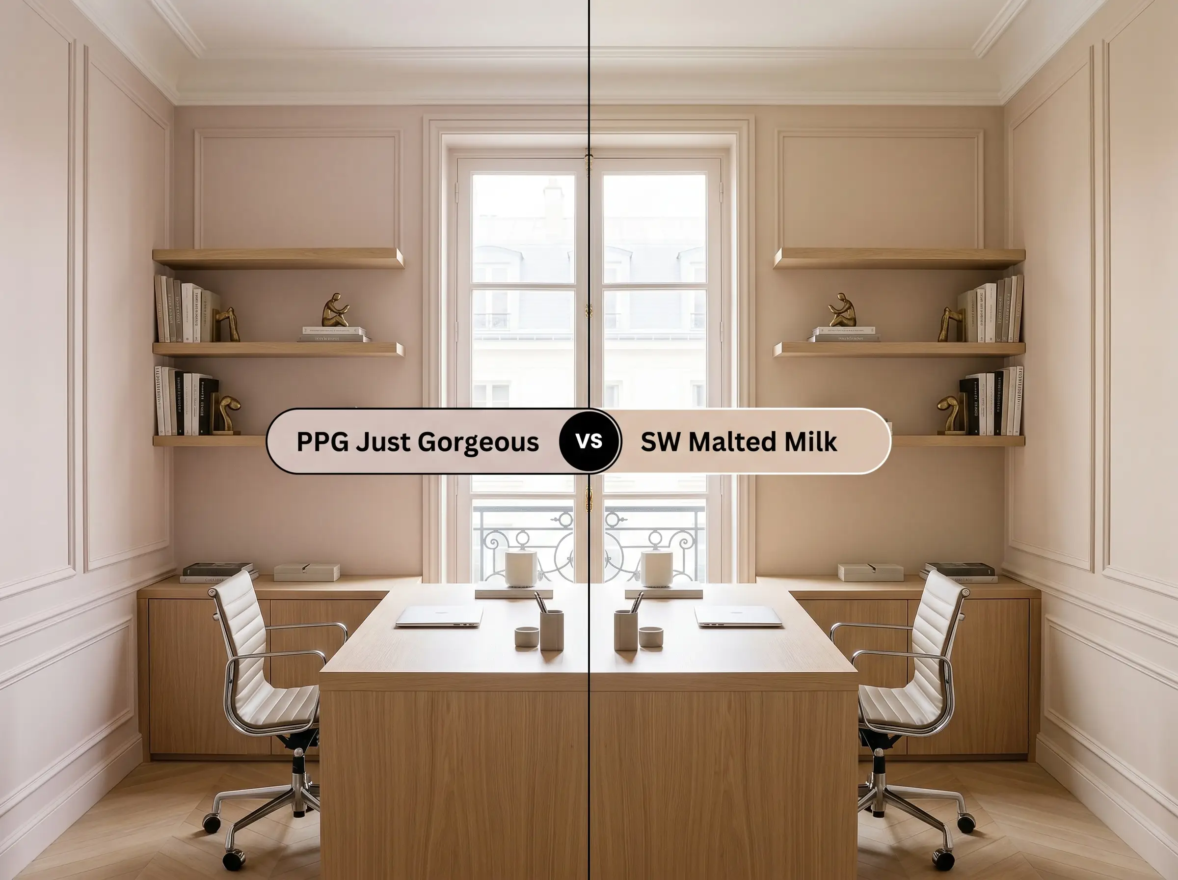
PPG Just Gorgeous vs. Benjamin Moore First Light
Benjamin Moore First Light is a significantly cleaner, more luminous color that lacks the heavy gray muting found in the PPG hue. First Light reads as a much more traditional, optimistic soft pink, making it feel lighter and more airy on the wall.
If you are painting a small, dimly lit space and want to maximize brightness, the higher light reflection of First Light is the clear winner. But if you want a mature, architectural finish that feels like a fleshy neutral rather than a pastel, the PPG shade offers much more depth and character.
Exploring Alternative Fleshy Tones
Sometimes, a paint is incredibly close to your vision, but you realize you need just a fraction more depth or a slightly different undertone to perfectly match your home’s hard finishes. Whether you are dealing with stubborn artificial lighting or simply need to match a brand carried by your local hardware store, having a backup plan is essential. Here are the closest alternatives to guide your final selection.
Similar Colors Within the PPG Voice of Color
Cross-Brand Matches
Getting PPG Just Gorgeous on the Wall
Transitioning from curating your mood boards to actually rolling the paint onto your drywall requires a shift in strategy. The way this specific mid-tone absorbs light means your choice of finish and preparation will heavily dictate the final luxury of the room.
The Dynamic Sheen Guide
Primer Strategy & Coverage
Because this shade sits firmly in the mid-tone range with a complex gray base, a standard white primer is usually sufficient. However, if you are painting over a dark, saturated color like navy or forest green, you must use a high-quality, high-hiding white primer first. Skipping this step will allow the old, dark color to pull the delicate violet undertones out of balance, making the new paint look bruised or muddy.
For a truly professional, architectural finish, plan for two full, generous coats of paint. Be highly mindful of your roller technique to avoid flashing. Because the color has a decent amount of depth, inconsistent roller pressure or stretching the paint too thin will result in visible, uneven streaks once it dries.
Frequently Asked Questions
Because it lacks natural sunlight to balance it, the color will rely entirely on your lightbulbs. If you use warm 2700K bulbs, it will enhance the rosy cast and look quite warm, but its gray base prevents it from ever looking like a juvenile, bubblegum pink.
Textured surfaces naturally create tiny micro-shadows that trap light and darken the paint. On a textured ceiling, this hue will look slightly deeper, moodier, and more muted than it will on perfectly smooth, flat drywall.
This is a challenging pairing. The cool violet notes in the paint can sometimes clash with the strong yellow-orange tones of honey oak, making the wood look overly brassy and the paint look slightly bruised.
Heavy, yellow-toned artificial lighting (like older incandescent bulbs) can actually flatten the gray base and aggressively pull out the red tones. To keep the color balanced and true to its dusty nature, upgrade to crisp 3000K LED bulbs.
The Final Verdict on This Dusty Mauve
PPG Just Gorgeous is a masterful lesson in color restraint, proving that you do not need to rely on stark whites to create a calm, elevated home. Its absolute best application is in spaces where you want to foster a sense of quiet, tactile luxury—whether that is a serene primary retreat wrapped in washed linen or a highly curated, art-filled living space. This shade is perfect for the design enthusiast who wants to experiment with warm, fleshy tones but demands the structural sophistication of a true architectural neutral.
However, this nuanced hue does require a thoughtful approach to its surrounding materials. If your home features a heavy amount of yellow-toned, rustic woods or large expanses of earthy, orange terracotta tile, the cool violet undertones within this paint will actively fight against those warm surfaces. That specific combination often results in a visual tension where the wood looks overly brassy and the paint loses its clean, dusty elegance. Keep your hard finishes crisp, your metals intentional, and this remarkable color will reward you with a beautifully atmospheric home.