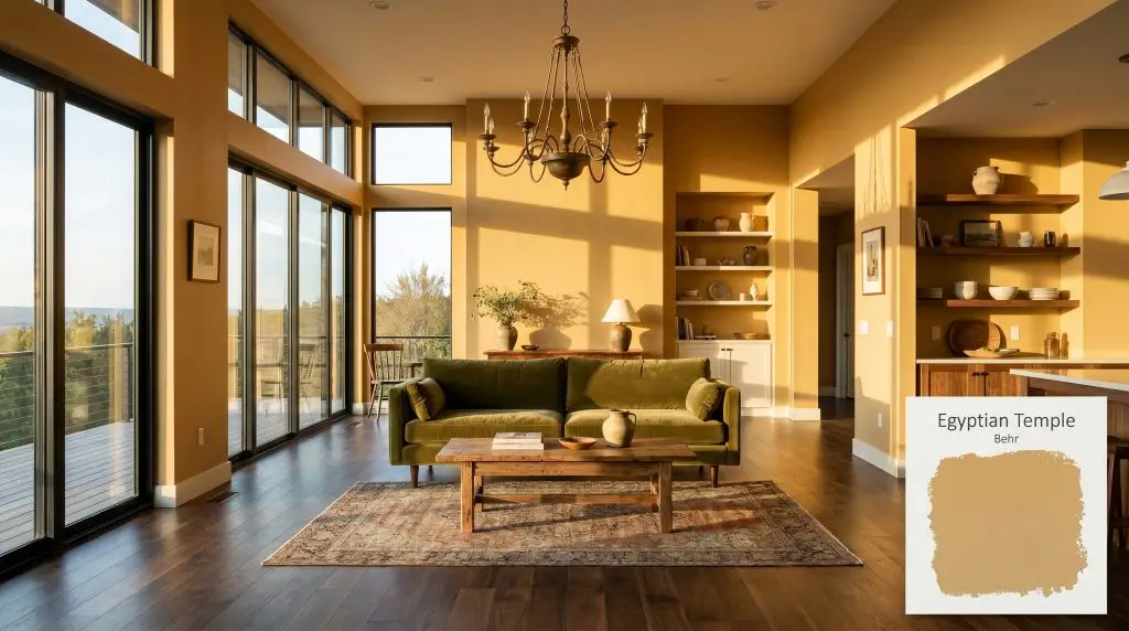
Egyptian Temple UL180-22
BehrBehr Egyptian Temple (UL180-22) is a warm, medium-toned earthy gold paint color with subtle brown and ochre undertones. With an LRV of 48, it provides a grounded, timeless elegance that perfectly balances cozy warmth with sophisticated depth in both interior and exterior spaces.
Paint Technical Profile
| Color ID / SKU | UL180-22 |
| HEX Code | #d6b378 |
| Light Reflectance (LRV) | 48 |
| Use | Interior, Exterior |
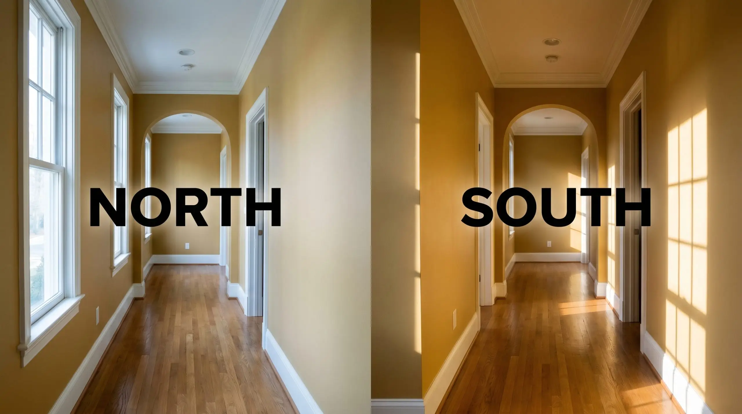
| Best Exposures | North-Facing, East-Facing |
| Best For | Living Rooms, Entryways, Dining Rooms, Exteriors |
Behr Egyptian Temple: A Sun-Baked Anchor for Grounded Interiors
There is a distinct difference between a flat yellow wall and a color that actually radiates architectural warmth. When you are trying to inject life into a standard, builder-grade living room without making it feel like a novelty space, you need a shade with serious depth.
Behr Egyptian Temple (UL180-22) steps in as a masterful solution to this everyday design challenge. By carrying a mid-tone weight, this earthy neutral wraps a room in a rich, sun-baked radiance that feels both intentional and incredibly grounding.
Whether you are updating a suburban entryway or planning an exterior refresh, this golden beige proves that you don’t need a massive structural renovation to completely shift the atmosphere of your home.
Undertones & LRV of Behr Egyptian Temple
When evaluating whether this paint leans warm or cool, the answer is definitively warm. Behr Egyptian Temple is a deeply saturated color, and understanding its hidden structure is the key to making it work seamlessly on your walls.
With a light reflectance value of 48, this shade sits squarely in the middle of the spectrum. It absorbs just enough light to establish a substantial presence, ensuring standard-sized rooms feel wrapped in warmth rather than overwhelmed by brightness.
Lighting Effects & The Chameleon Factor
Because of its heavy ochre base, putting this color in a dim, windowless room with the wrong bulbs can turn the beautiful gold into a heavy, muddy mustard. Every paint shifts as the sun moves across the sky, but golden hues are especially reactive to their environment. If you place this medium-toned brown-yellow in a poorly lit corridor without testing it first, those rich undertones can quickly flatten.
Popular Room Applications
This shade demands an environment where its inherent warmth can act as a foundational layer. It thrives when used to create a sense of enclosure and welcome, turning vast or sterile areas into highly curated, inviting retreats.
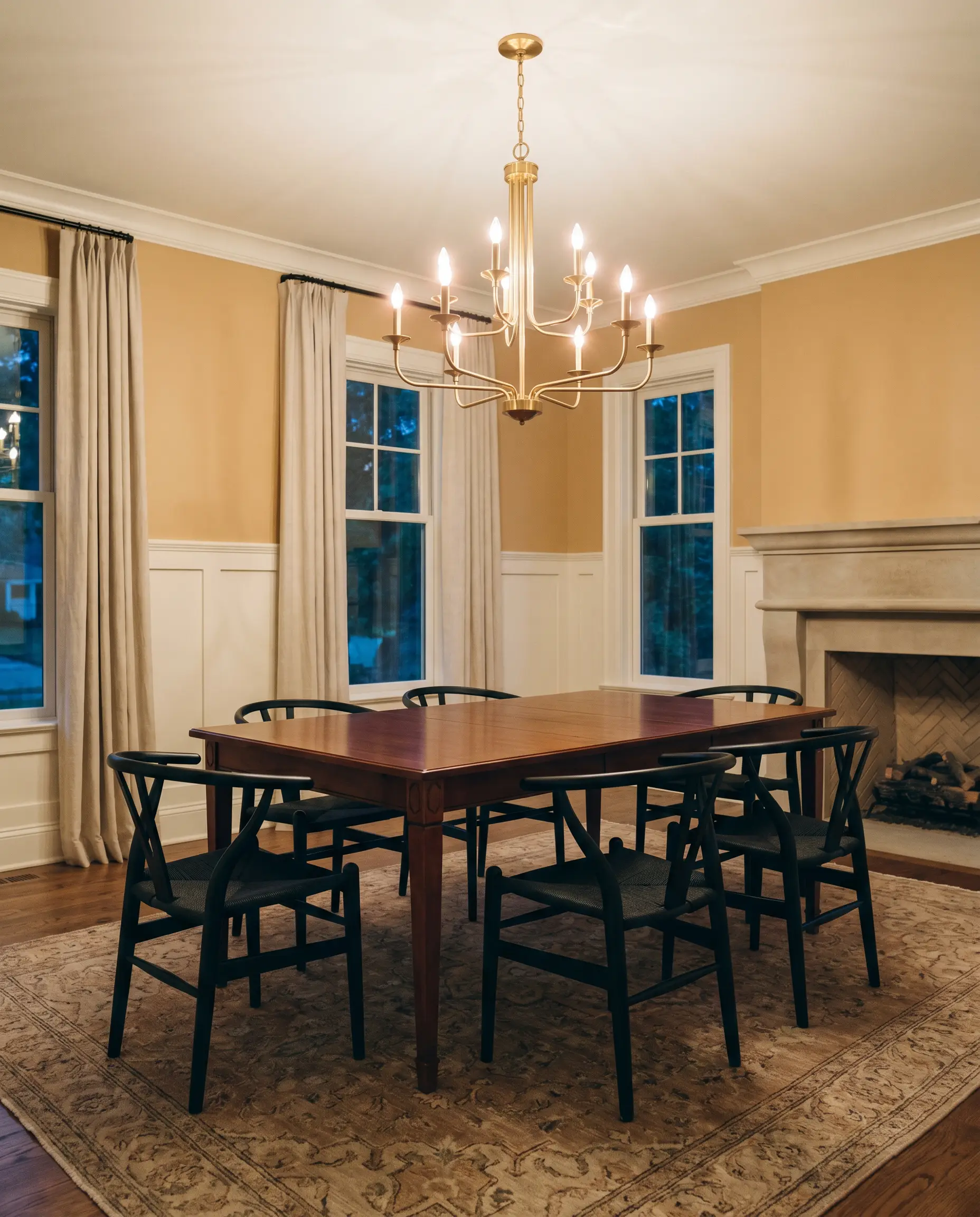
Formal Dining Rooms
This golden hue is brilliant for spaces meant for evening gatherings. It grounds standard dining furniture beautifully, allowing a classic mahogany table or a set of modern matte black wishbone chairs to pop against the walls. By using it above a classic white wainscoting, you instantly elevate the room’s architectural profile.
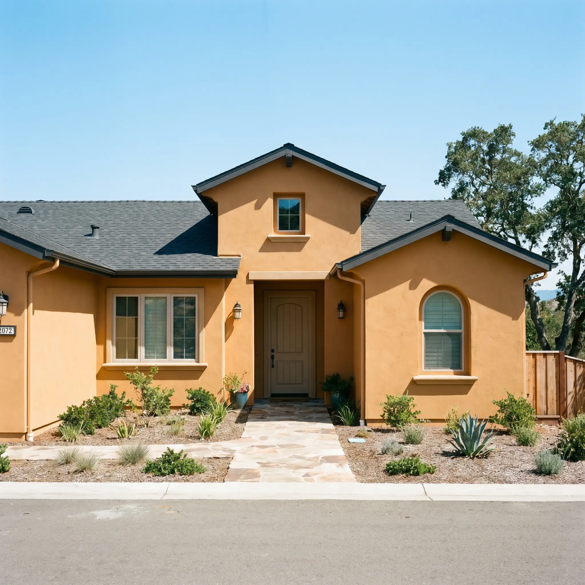
Exteriors
On a facade, natural sunlight washes out a significant amount of a paint’s depth. Using UL180-22 on siding or stucco delivers a gorgeous, Mediterranean-inspired warmth that holds its own against intense daylight. It pairs effortlessly with natural materials like stone pathways and deep charcoal roof shingles, making it a staple among Behr exterior color palettes.
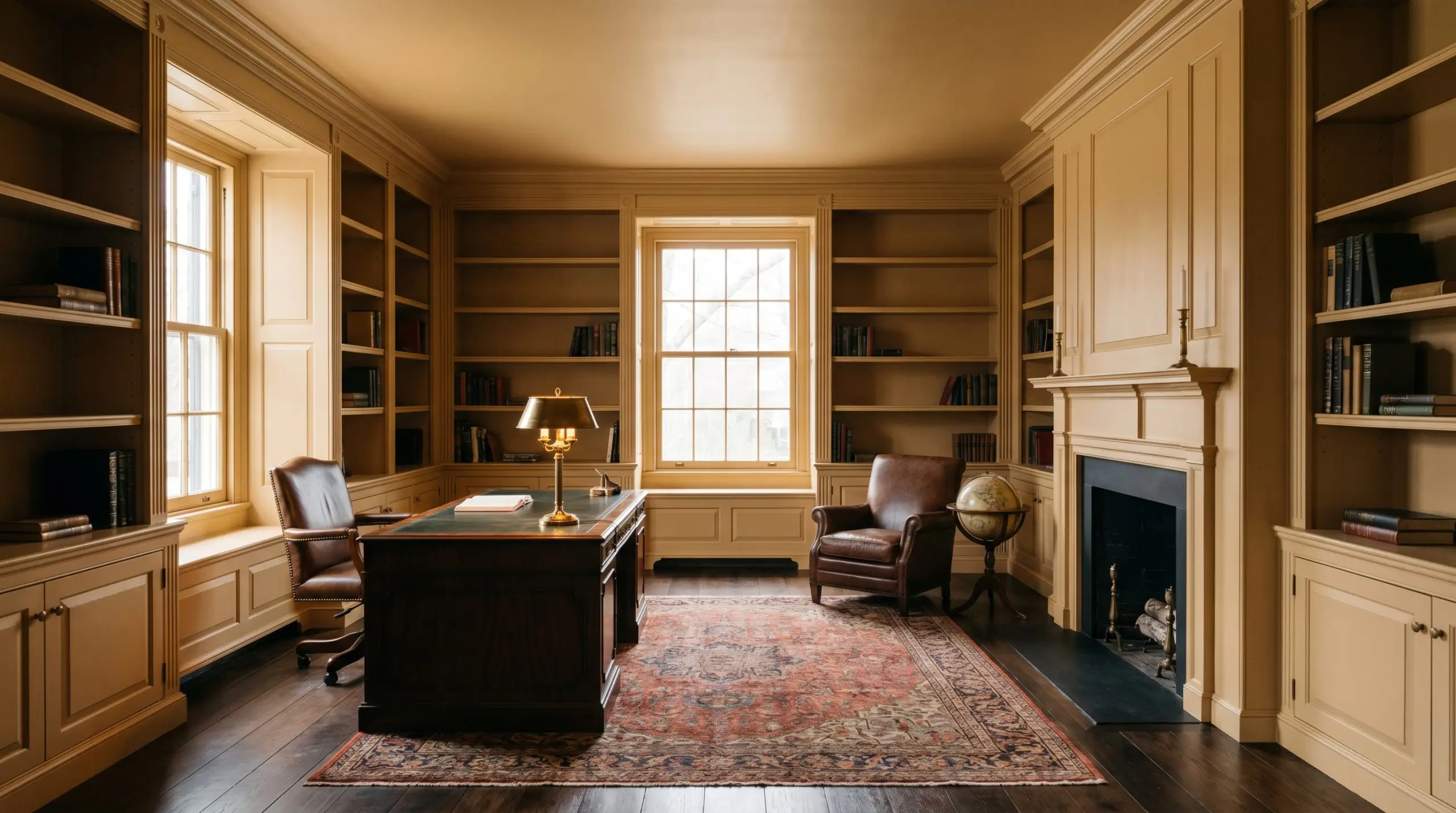
Libraries & Studies
If you want to create a space that feels instantly collected and historic, wrapping an entire study in this earthy neutral is highly effective. The deep ochre base provides a stunning backdrop for built-in bookcases, effortlessly highlighting the textures of vintage rugs and brass reading lamps.
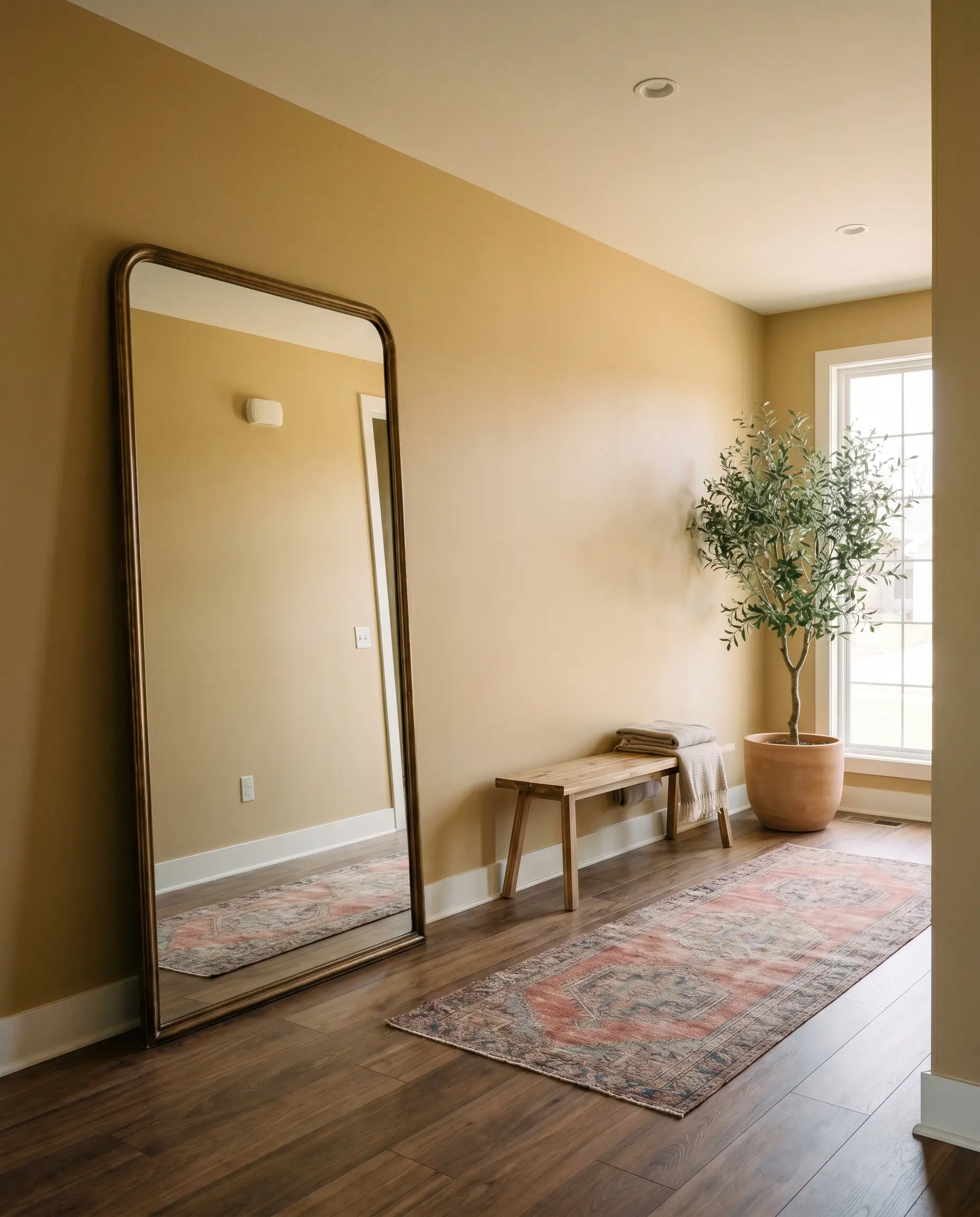
Entryways
Hallways and foyers often lack architectural interest, relying entirely on color to make an impression. This shade acts as a warm embrace the moment you walk through the door. It pairs wonderfully with a simple vintage runner and an oversized mirror to bounce ambient light around the space.
Creative Ways to Use Egyptian Temple
Beyond standard wall applications, this rich ochre hue is an incredible tool for clever, high-impact transformations. When you treat paint as a tactile material, you can make standard spaces feel incredibly intentional and custom-built.
The Color-Drenched Mudroom
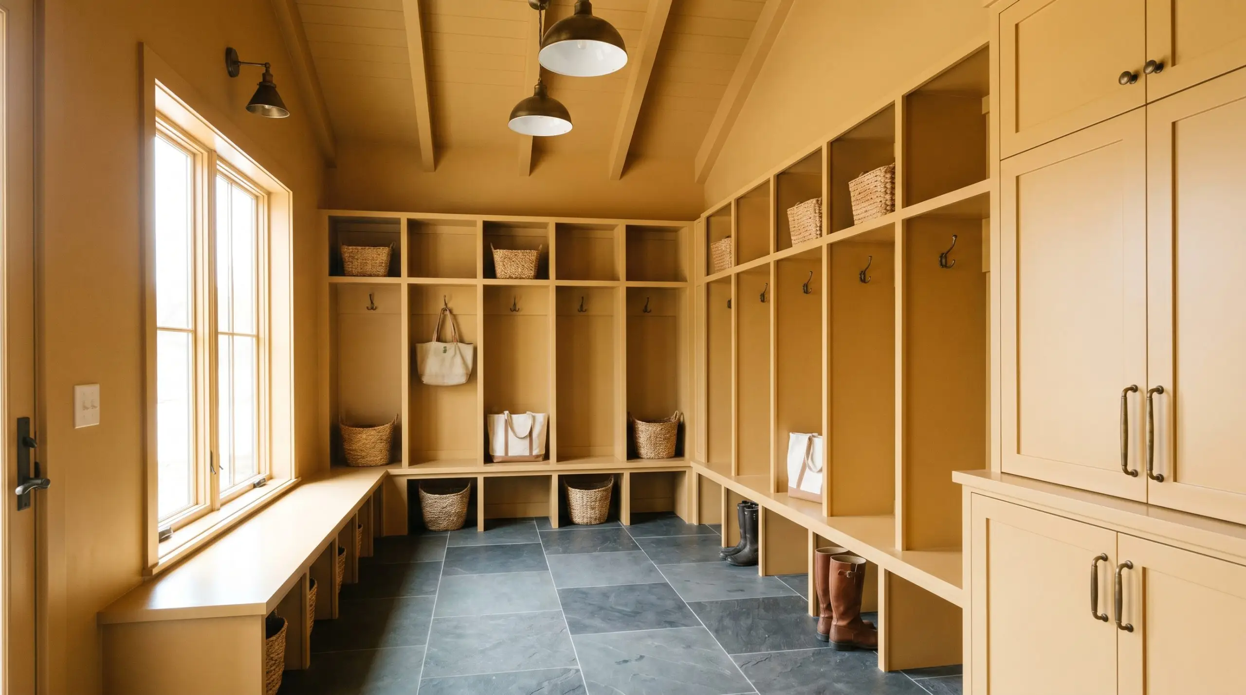
Mudrooms are often treated as afterthoughts, but applying this warm glow across the walls, ceiling, and built-in cubbies creates a striking, jewel-box effect. The deep yellow-brown hides everyday scuffs beautifully while providing a highly curated backdrop for woven storage baskets and slate floor tiles.
The Two-Tone Kitchen Island
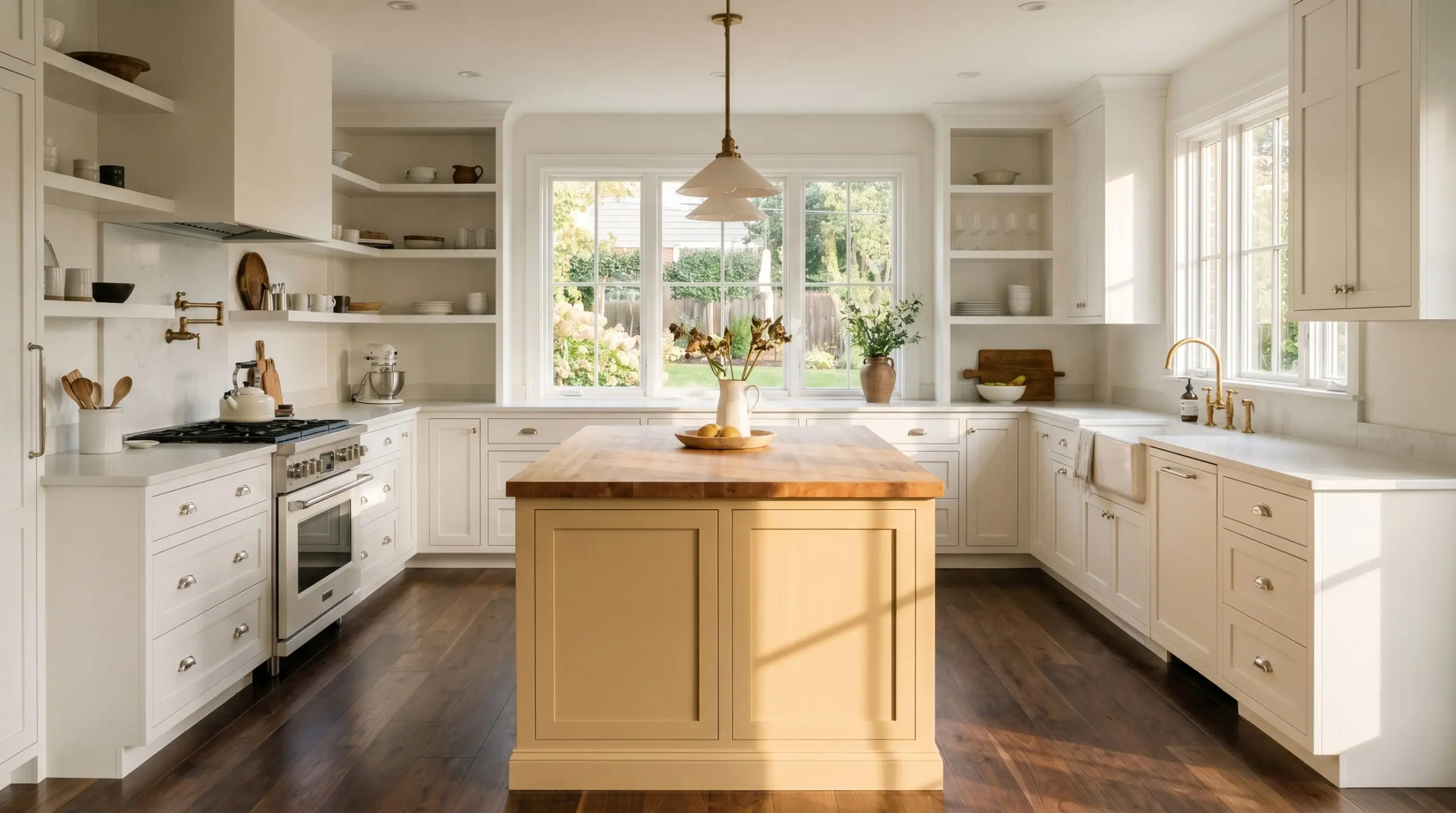
If you are working with standard white shaker cabinets, painting just the central island in this earthy gold completely shifts the kitchen’s energy. It grounds the room with a touch of English Country charm, especially when paired with polished nickel cup pulls and a simple butcher block counter.
A Faux-Headboard Arch
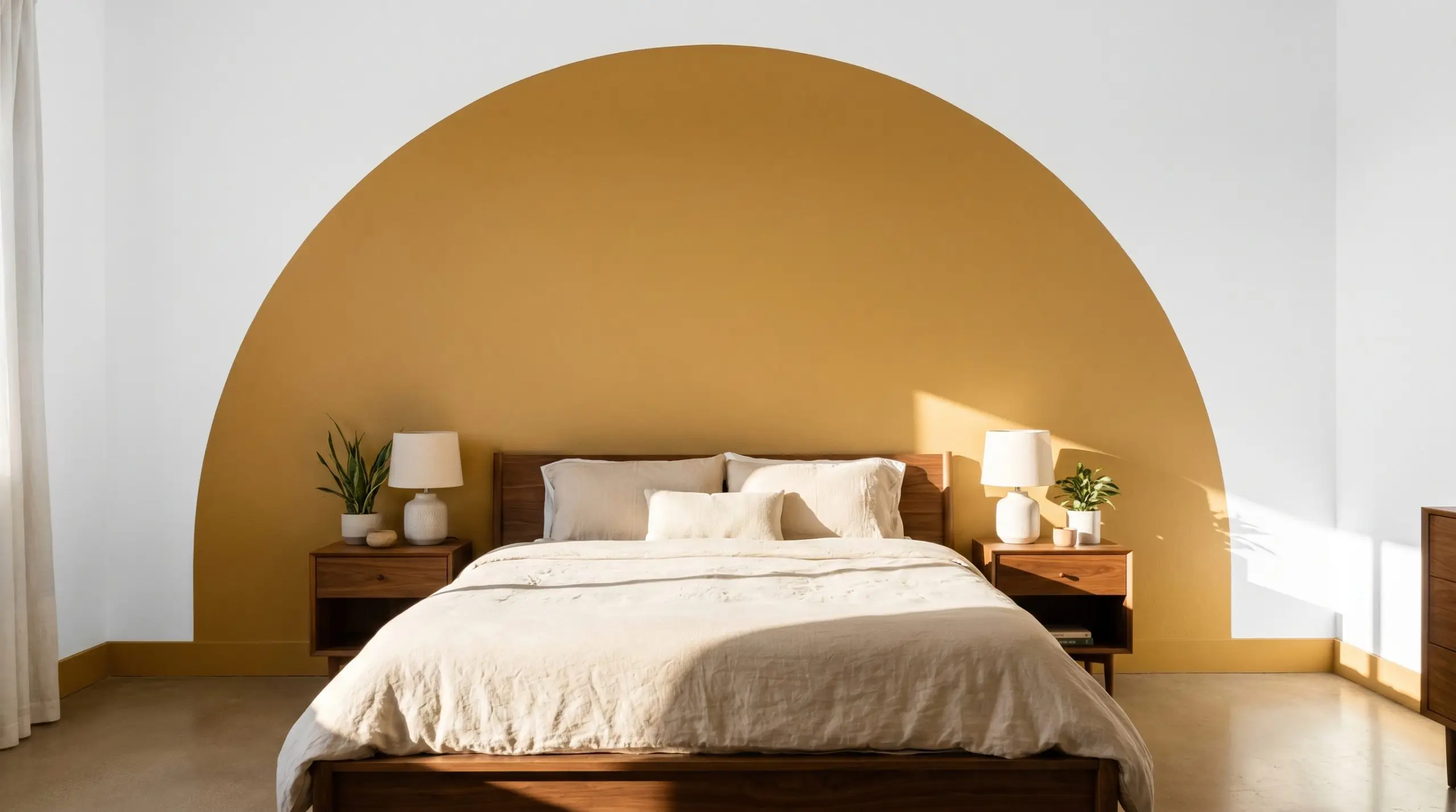
In a basic guest bedroom lacking architectural features, painting a solid, sweeping arch directly behind the bed frame anchors the room. The rich depth of the color mimics the visual weight of a physical headboard, bringing a touch of Desert Modernism to the space without requiring a massive furniture investment.
When painting a geometric feature like an arch, always carry the color all the way down to the baseboards. Leaving a gap breaks the visual tension and ruins the custom-built illusion.
Hackrea Design Secret (The Visual Anchor)
Coordinating Colors & Best Pairings
To make this sun-baked shade feel premium, you must surround it with elements that respect its heavy, earthy base. It requires intentional boundaries and thoughtful material contrasts to truly shine.
Trim & Baseboards
A crisp, tailored boundary is essential to keep the deep yellow from feeling overwhelming.
Hardware, Wood & Material Pairings
Aged Bronze Hardware: The dark, mottled finish of aged bronze absorbs light, grounding the vibrant walls and adding a layer of historic charm.
Coordinating Colors
Designer Mood Boards
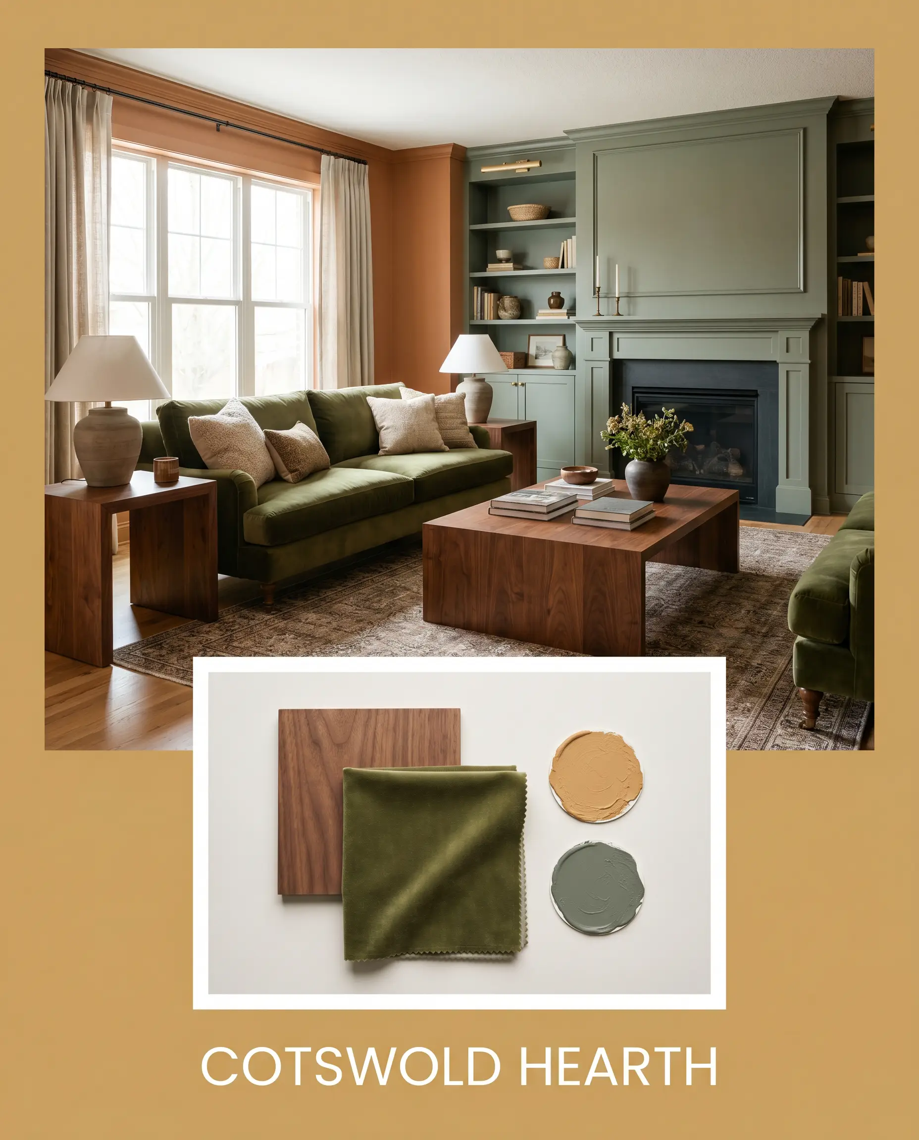
Cotswold Hearth This palette leans heavily into traditional warmth and historic charm. By pairing the golden walls with rich walnut side tables, Farrow & Ball Green Smoke on the surrounding millwork, and a plush, deep olive velvet sofa, the room feels instantly collected. The deep tones work together to create an undeniably cozy, grounded retreat.
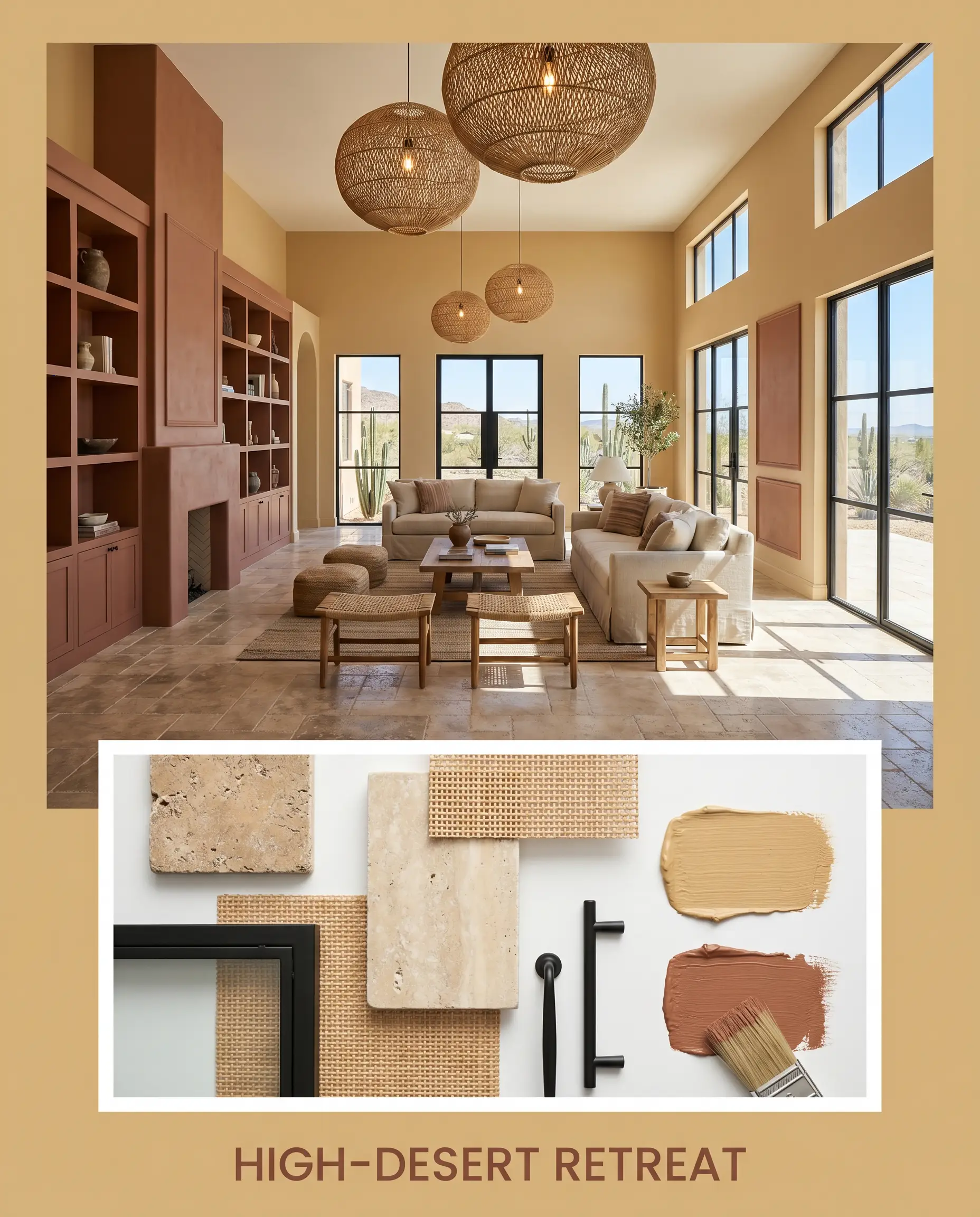
High-Desert Retreat Channeling the warmth of desert sands, this combination utilizes tumbled travertine flooring and painted accents of Sherwin-Williams Cavern Clay. Woven rattan light fixtures and matte black window frames provide the necessary visual tension to keep the space feeling sharp and modern. It is an airy, arid aesthetic that feels incredibly intentional.
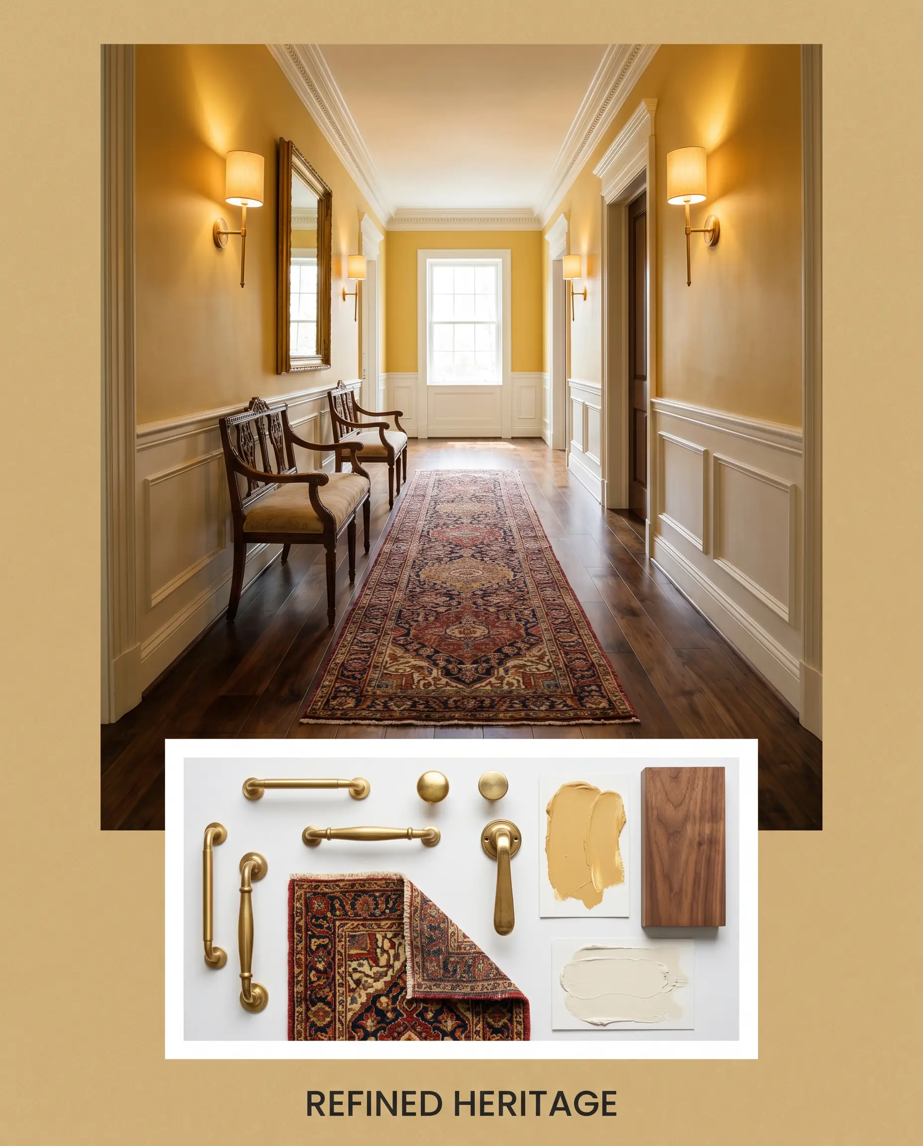
Refined Heritage Focused on classic elegance, this setup features Behr Swiss Coffee on the trim to soften the room’s edges and let the golden beige truly glow. The addition of polished unlacquered brass wall sconces and a vintage Persian-style runner introduces a high-end, curated sparkle. This mix of accessible warmth and premium styling elevates the entire layout.
Head-to-Head Comparisons
Sometimes a room’s specific lighting or architectural style demands a slight pivot in your color strategy. If your space lacks the natural light to support a mid-tone, these direct comparisons will help you finalize your choice.
Behr Egyptian Temple UL180-22 vs. Benjamin Moore Chestertown Buff HC-9
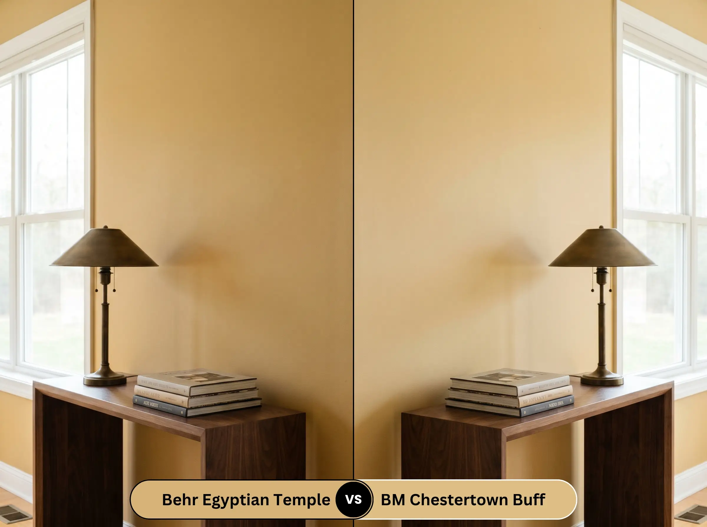
Chestertown Buff carries a slightly more refined, historic yellow base with less heavy brown in its DNA. If you are working in a dimly lit, North-facing room where the Behr option might turn muddy, the Benjamin Moore alternative retains its crispness much better. However, for sheer earthy impact in a sunlit room, UL180-22 provides a much richer, grounded presence.
Behr Egyptian Temple UL180-22 vs. Sherwin-Williams Hubbard Squash SW 0044
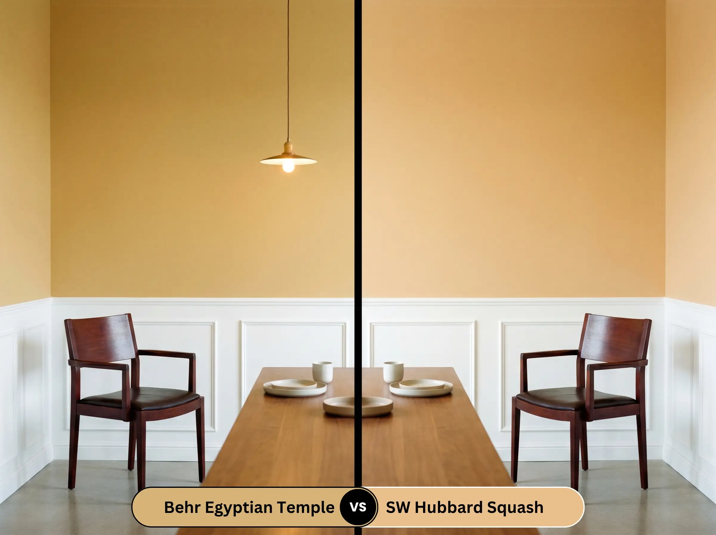
Hubbard Squash is noticeably lighter and leans further into a traditional, buttery yellow rather than a deep ochre. If you are painting a large, open-concept space and fear a dark color might visually shrink the room, the Sherwin-Williams shade is the safer bet. Conversely, if you want a dramatic, moody dining space, the Behr paint is the clear winner.
Similar Colors & Brand Equivalents
Whether you need a subtle shift in depth to accommodate your home’s unique lighting, or you simply prefer working with a different manufacturer, these alternatives offer excellent pathways to a similar aesthetic.
Similar Colors
Cross-Brand Matches
Practical Application & DIY Advice
Moving from the design phase to the actual execution requires a solid understanding of how this specific pigment behaves on a roller. Properly prepping the surface and choosing the right finish ensures the color reaches its full potential.
The Dynamic Sheen Guide
Primer Strategy
Because of the heavy brown and yellow pigments, applying this over a stark white wall without a primer will result in a streaky, glowing finish. You must use a high-quality primer tinted to a warm gray to ensure the deep ochre builds to its true, intended depth.
Coverage & Success Tips
Expect to apply at least two generous coats to achieve full opacity. When rolling mid-tone yellows, “flashing”—where overlapping roller marks dry unevenly and catch the light—is a common frustration.
To avoid flashing with this saturated hue, you must maintain a wet edge while rolling. Never stop halfway across a wall, and avoid the temptation to go back and touch up semi-dry spots.
Hackrea Pro-Tip (Application)
Frequently Asked Questions About Egyptian Temple
Because direct, intense sunlight naturally washes out a paint’s intensity, this mid-tone actually performs brilliantly outdoors. The heavy brown base prevents the stucco from looking like a blinding, neon yellow, settling instead into a beautiful, baked-clay warmth.
The strong yellow-orange base of this paint can aggressively compete with the red hues found in cherry wood, making both surfaces feel overly heated and chaotic. It is much more successful when paired with neutral or dark brown woods that allow the wall color to be the sole source of warmth.
Cool, high-Kelvin lighting acts like a visual bleach on warm pigments. In a windowless space with 4000K bulbs, the beautiful golden glow will be stripped away, leaving the walls looking like a flat, institutional tan.
Not at all, provided the room receives ample natural light. Taking this warm shade up onto a vaulted ceiling visually lowers the height just enough to make a massive, echoing room feel intimate and grounded.
Final Verdict on Behr Egyptian Temple
Behr Egyptian Temple is an incredibly effective tool for homeowners looking to inject instant architectural warmth into their spaces. It is the perfect choice for those who want to move away from sterile whites and embrace a rich, historic atmosphere in dining rooms, studies, or on exterior facades. When used as a foundational layer among warm earthy gold paint colors, it completely transforms standard rooms into highly curated, inviting retreats.
However, this golden beige is absolutely not for homes dominated by cool gray flooring, icy blue textiles, or stark, modern red-toned woods. Pairing this heavy ochre with cool-toned, ashy luxury vinyl plank flooring or blue-gray countertops will force a harsh visual battle, making the paint look dirty and the floors look artificially blue. If your home’s fixed elements lean heavily cool, you must look for a much more neutral, less saturated alternative to maintain a cohesive flow.
Closest Cross-Brand Equivalents
The absolute closest scientific color matches for Egyptian Temple across top paint brands.