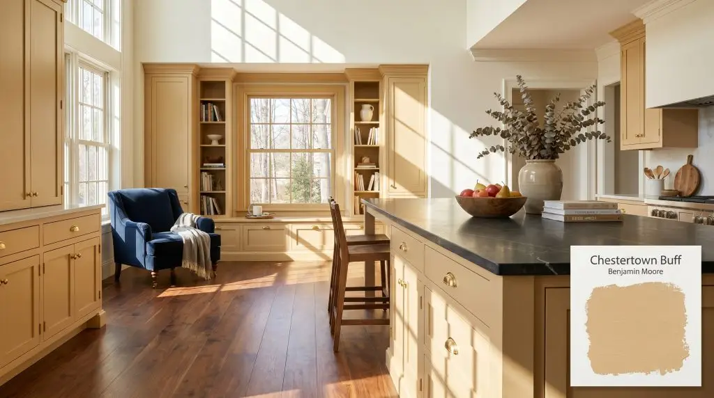
Benjamin Moore Chestertown Buff HC-9 is a warm, earthy golden-yellow paint color with subtle tan and brown undertones. With an LRV of 52.98, it acts as a muted, sophisticated mustard that brightens spaces without looking overly neon or acidic.
Will Chestertown Buff clash with your room?
Paint Technical Profile
| Color ID / SKU | HC-9 |
| HEX Code | #DDBF86 |
| Light Reflectance (LRV) | 52.98 |
| Temperature | Warm |
| Primary Undertone | Yellow |
| Hidden Undertones | Earthy Tan, Beige, Brown |
| Use | Interior, Exterior |
| Best Exposures | North-facing, East-facing |
| Best For | Kitchen Walls, Traditional Dining Rooms, Cozy Living Areas, North-Facing Bedrooms, Exterior Siding |
Chestertown Buff Digital Design Concept Boards
Kitchen Walls and Cabinetry
Will Chestertown Buff work with your specific lighting, floor, or furniture?
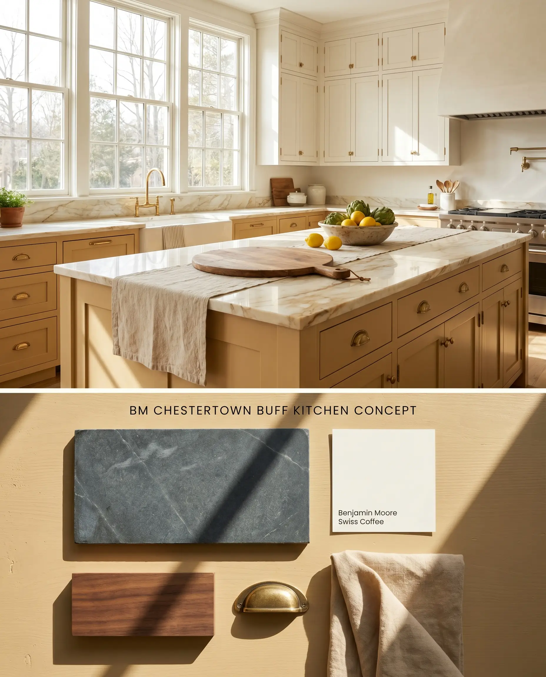
Using Chestertown Buff on lower cabinetry grounds the kitchen with an earthy honey hue, especially when balanced against creamy white uppers. Because yellow intensifies across broad surfaces, restricting this high color chroma to the millwork prevents the bounce effect from overwhelming the space. The golden-apricot nuances bridge the gap between rich walnut islands and unlacquered brass hardware, provided you strictly avoid cool gray slate flooring.
Traditional Dining Rooms
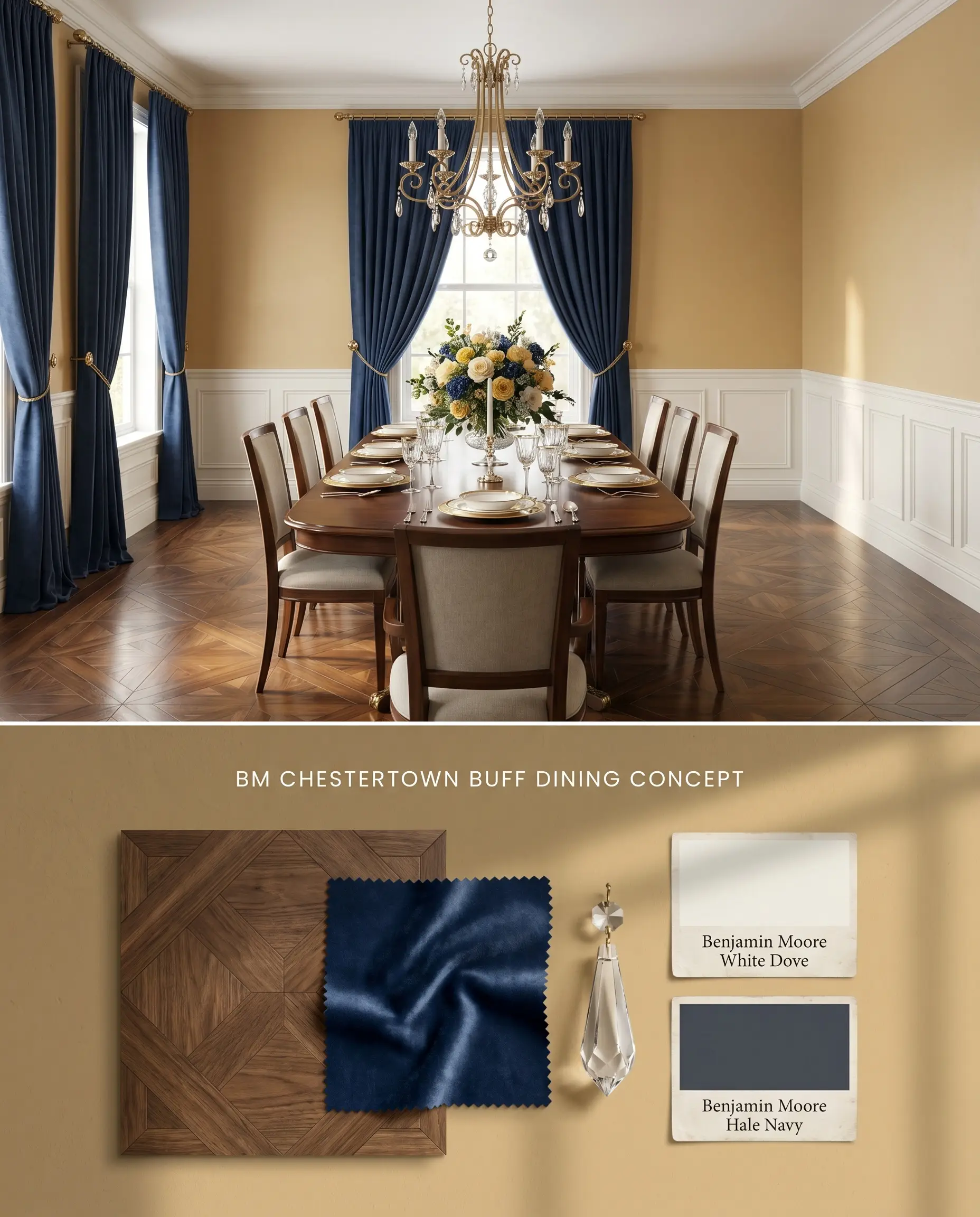
In formal dining spaces, applying this color above classic wainscoting mitigates the intense reflection while wrapping the upper walls in a warm neutral glow. The historical collection pedigree shines here, offering a baked terracotta-tan depth that interacts beautifully with the flickering warmth of a central chandelier. Surrounding the room with rich navy blue drapery actively cools the perimeter, forcing the golden-beige undertone to take center stage.
Cozy Living Areas
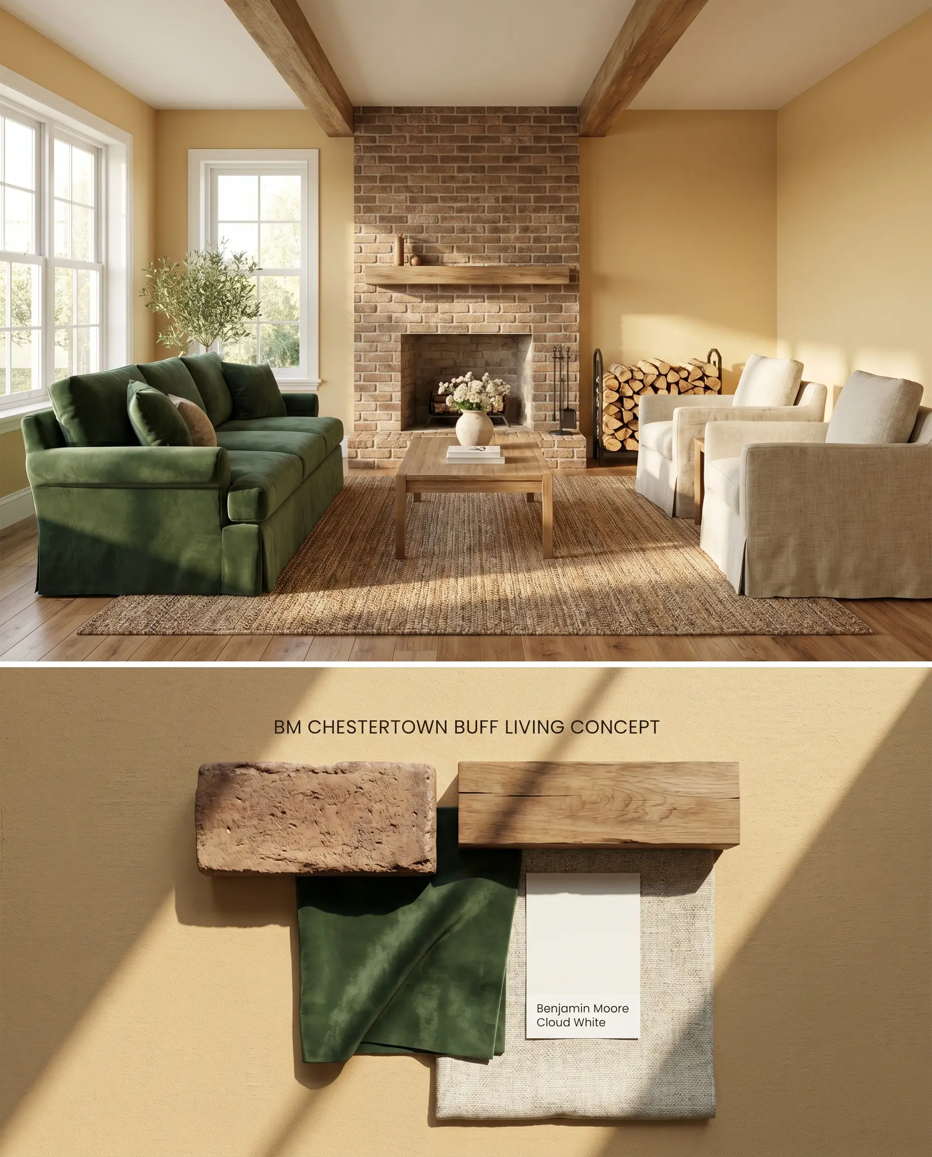
Chestertown Buff transforms expansive living rooms by absorbing harsh glare and radiating a grounded, cottagecore aesthetic. Because the color relies on a brown base, it anchors large upholstered pieces and warm wood architectural beams without floating away like a pastel. Pairing this with a warm brick fireplace surround instead of cool-toned gray stonework ensures the undertones remain harmonized.
North-Facing Bedrooms
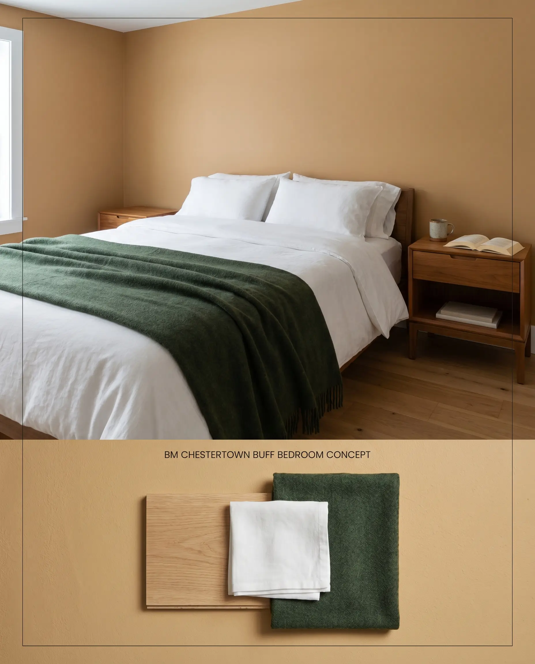
The cool, indirect light of a northern exposure strips away the vibrant yellow, pulling the brown undertones forward to create a denser, baked terracotta-tan. This physical lighting shift turns a potentially overly-bright mustard yellow into a subdued, restful backdrop suitable for sleeping quarters. Layering rich greens and warm wood tones against the walls compensates for the lack of direct sunlight.
Exterior Siding and Accents
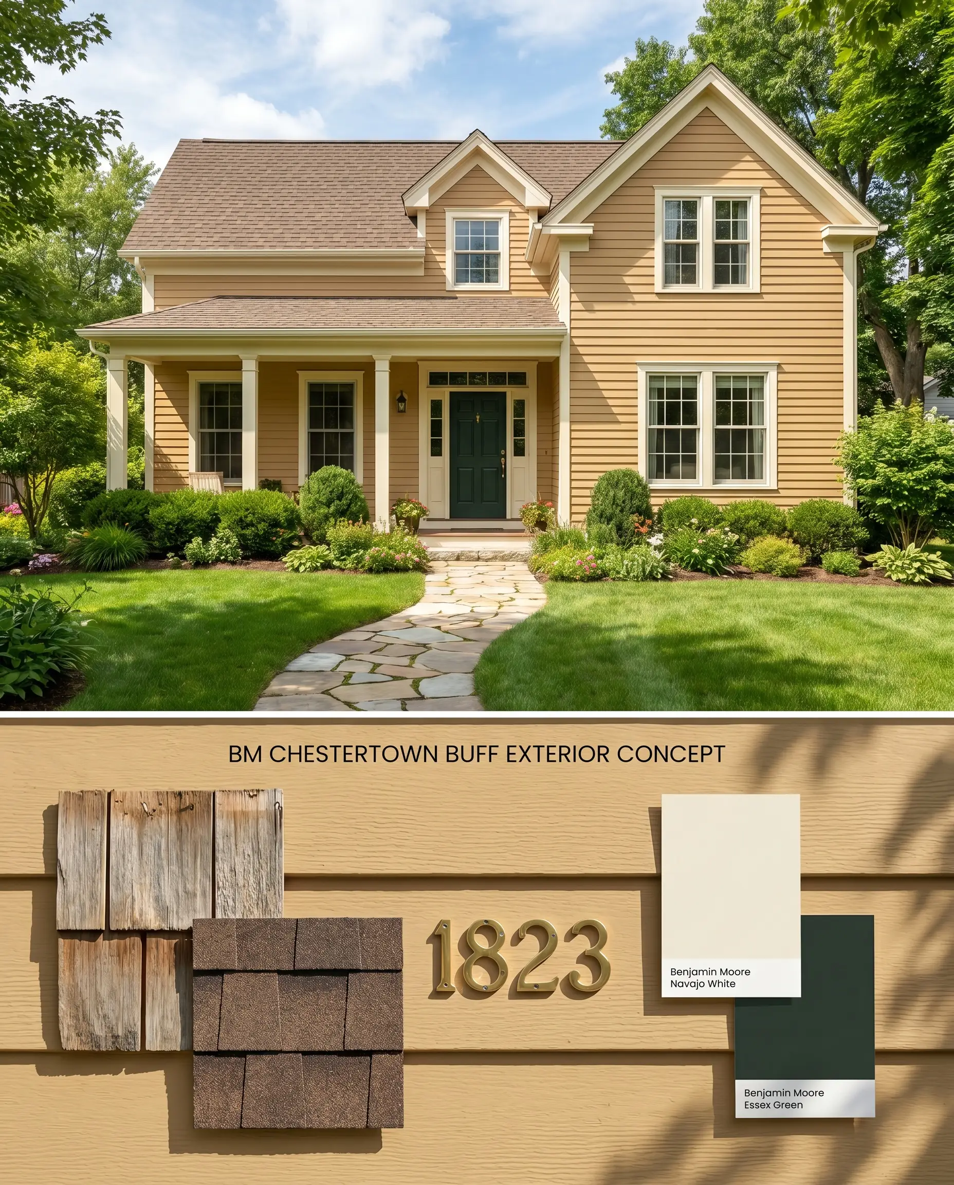
Under direct, unshielded daylight, the light reflectance value (52.98) prevents the facade from appearing stark, while the earthy honey hue stands up to the visual weight of surrounding foliage. Using this on traditional clapboard siding provides a historically accurate warmth that bridges the gap between dark roofing materials and crisp exterior trim.
Benjamin Moore Chestertown Buff vs. Concord Ivory HC-12
Will Chestertown Buff work with your specific lighting, floor, or furniture?
Benjamin Moore Concord Ivory HC-12 sits slightly higher on the LRV scale and features a more pronounced apricot-yellow base, making it noticeably brighter on the wall. Chestertown Buff relies entirely on its brown undertones to ground the color, pushing it closer to a baked terracotta-tan in dim lighting. Specify Concord Ivory HC-12 when you need to inject light into a space with dense tree canopy outside the windows, but rely on Chestertown Buff when balancing dark, substantial millwork that requires a sturdier, earthier neutral.
Chestertown Buff vs. Benjamin Moore Powell Buff HC-35
Benjamin Moore Powell Buff HC-35 functions as a true warm neutral tan, stripping away the distinct mustard yellow chroma found in Chestertown Buff. Because Powell Buff HC-35 has a higher light reflectance value and a muted khaki base, it behaves predictably across lighting conditions without the aggressive bounce effect. Choose Powell Buff HC-35 for open-concept floor plans where color consistency is critical, and reserve Chestertown Buff for enclosed, south-facing rooms where you want a deliberate, saturated golden-beige undertone.
Benjamin Moore Chestertown Buff vs. Sherwin-Williams White Raisin SW 7685
Will Chestertown Buff work with your specific lighting, floor, or furniture?
Sherwin-Williams White Raisin SW 7685 is a clearer, more luminous golden hue that lacks the dense, muddying brown base of its Benjamin Moore counterpart. In north-facing rooms, White Raisin SW 7685 maintains its sunny disposition, whereas Chestertown Buff physically shifts into a muted terracotta. Deploy White Raisin SW 7685 when you want a vibrant, cottagecore aesthetic that stays persistently yellow, but switch to Chestertown Buff if you need the color to harmonize with rich, dark antique furniture.
Technical Specifications & Application FAQs
The color features a high color chroma that will intensify and bounce across four walls, making it look significantly brighter than a small paper swatch. However, its dense brown base prevents it from reading as neon, keeping it firmly in the earthy honey or mustard category.
Yes, the strong golden-apricot nuances in this paint will aggressively clash with cool-toned gray stonework and slate. You must pair this color with warm elements like wide-plank oak, unlacquered brass, or red brick to maintain architectural harmony.
In bright, south-facing rooms, the direct sunlight amplifies the yellow, creating a vibrant, earthy honey hue. In north-facing rooms, the cool, indirect light suppresses the yellow and pulls the brown base forward, shifting the color into a denser, baked terracotta-tan.
No, you should strictly avoid applying this color in windowless rooms or hallways with poor artificial lighting. Without adequate light to activate the golden glow, the earthy brown base takes over, causing the walls to appear flat and muddy.
Room Compatibility & Clashes Diagnoses
Hackrea's reports evaluating the compatibility of Chestertown Buff in real rooms.No compatibility tests for Chestertown Buff yet.
Be the first to see how this color reacts to your space. Run a free architectural diagnostic now.
Paint Aesthetic & Practical Analysis
| Profile | Analysis | |
|---|---|---|
| Aesthetic | Chestertown Buff is a designer favorite for a reason. It masterfully balances the cheerful energy of yellow with the grounding stability of a tan neutral. It’s a fantastic choice for those who want a welcoming, sun-baked warmth without the glaring intensity of a primary yellow. | |
| The Coverage Catch | Because it is a medium-light color with noticeable chroma, coverage is usually manageable. However, darker or uneven substrates can still show through and may require a tinted primer or a third coat for a flawless finish. | |
| The Lighting Shift | In bright, south-facing rooms, it reads as a vibrant, earthy honey. In north-facing or low-light spaces, the brown undertones become more prominent, making the color look slightly heavier or more like a baked terracotta-tan. | |
| The Clash Warning | Avoid pairing it with cool-toned gray stonework, slate, or pink-beiges (like Shaker Beige), as the golden-apricot nuances will clash. It pairs beautifully with warm woods, unlacquered brass, navy blues, and rich greens. | |
| The Bounce Effect | Yellows intensify on the walls. Chestertown Buff will look significantly brighter and more saturated when painted across a whole room compared to the small paper swatch. | |
| The Low Light Trap | In windowless rooms or hallways with poor artificial lighting, the earthy brown base can cause the color to lose its golden glow and appear somewhat muddy. | |
| The Touch Up | Generally stable, but sheen matters. Matte surfaces read softer, while smooth gloss finishes look cleaner. Touch-ups on higher sheen finishes may flash if not blended carefully. |