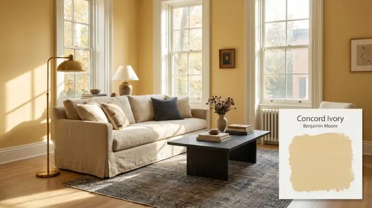
Concord Ivory HC-12
Benjamin MooreBenjamin Moore Concord Ivory (HC-12) is a sophisticated, saturated yellow-gold paint color with subtle apricot undertones. Boasting an LRV of 60.04, it provides a warm, earthy glow that bridges the gap between a traditional mustard and a soft, inviting ochre.
Benjamin Moore Concord Ivory: Mastering the Sun-Drenched Historical Ochre
A truly saturated gold doesn’t just sit passively on a wall; it actively warms the architecture around it. When you are looking to establish a foundation of rich, glowing color without crossing into sharp neon territory, you need a pigment with an incredibly disciplined structure.
Benjamin Moore Concord Ivory HC-12 provides exactly that level of curatorial restraint. Part of the brand’s Historical Collection, this shade is a masterclass in nuanced pigmentation, offering the vibrant energy of a yellow with the grounded, earthy cast of a centuries-old estate.
It is a color that demands intentional styling, shifting beautifully from classic heritage spaces to highly textured, modern eclectic homes. By understanding how its hidden undertones react to your specific lighting and materials, you can harness this ochre to completely redefine the temperature of your home.
Benjamin Moore Concord Ivory: Temperature, Undertones & LRV
Benjamin Moore’s Concord Ivory is an undeniably warm, golden-yellow hue. It completely avoids the icy, acidic sharpness of a true lemon, relying instead on a complex internal color structure to generate its welcoming, sun-baked temperature.
With an LRV (Light Reflectance Value) of 60.04, this shade sits comfortably in the mid-light range. It possesses a luminous reflectance that keeps interior spaces feeling buoyant and open, while retaining enough pigment density to hold its character on brightly lit exterior facades.
You can apply wallpapers, paints, etc. on walls and see how they look in various interiors.

Lighting Effects & The Chameleon Factor
The way Concord Ivory HC-12 physically renders in your home is entirely dictated by the directional lighting it receives. Because of its apricot and beige undertones, this color is highly reactive to the shifting temperature of the sun.
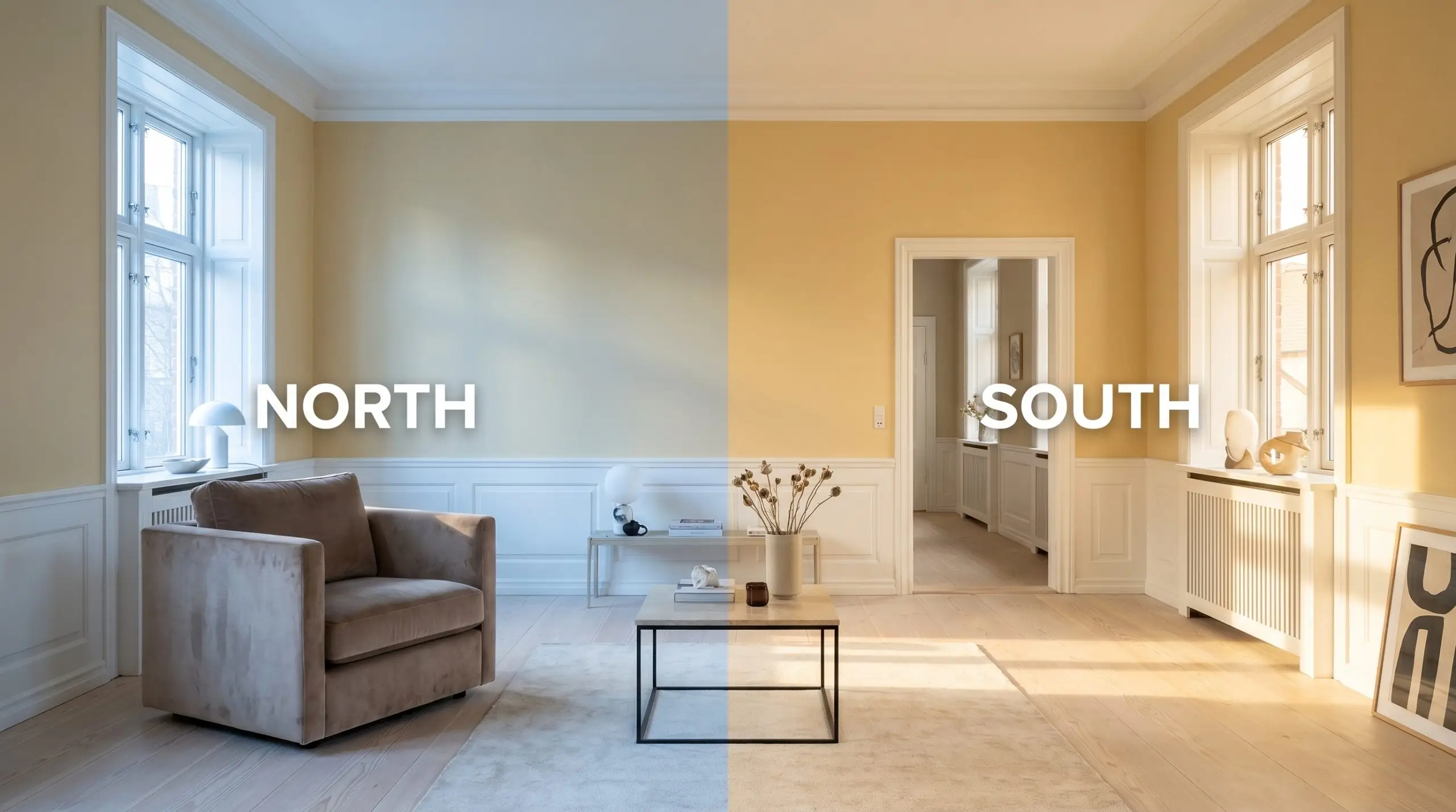
If you want to maintain the sophisticated, muted ochre read of this paint in the evening, stick to LED bulbs in the 3000K range. Going too warm (2700K) will push the color aggressively toward orange, while going too cool (4000K+) will make it feel stark and synthetic.
Hackrea Pro-Tip (The Bulb Strategy)
Popular Room Applications for This Golden Ochre
Because Concord Ivory possesses a highly adaptable LRV, it functions beautifully across a wide variety of architectural placements. The secret to styling this color is treating it as a foundational layer, allowing your hard materials and textiles to push the room’s final aesthetic toward either classic heritage or modern organic.
Luminous Dining Spaces
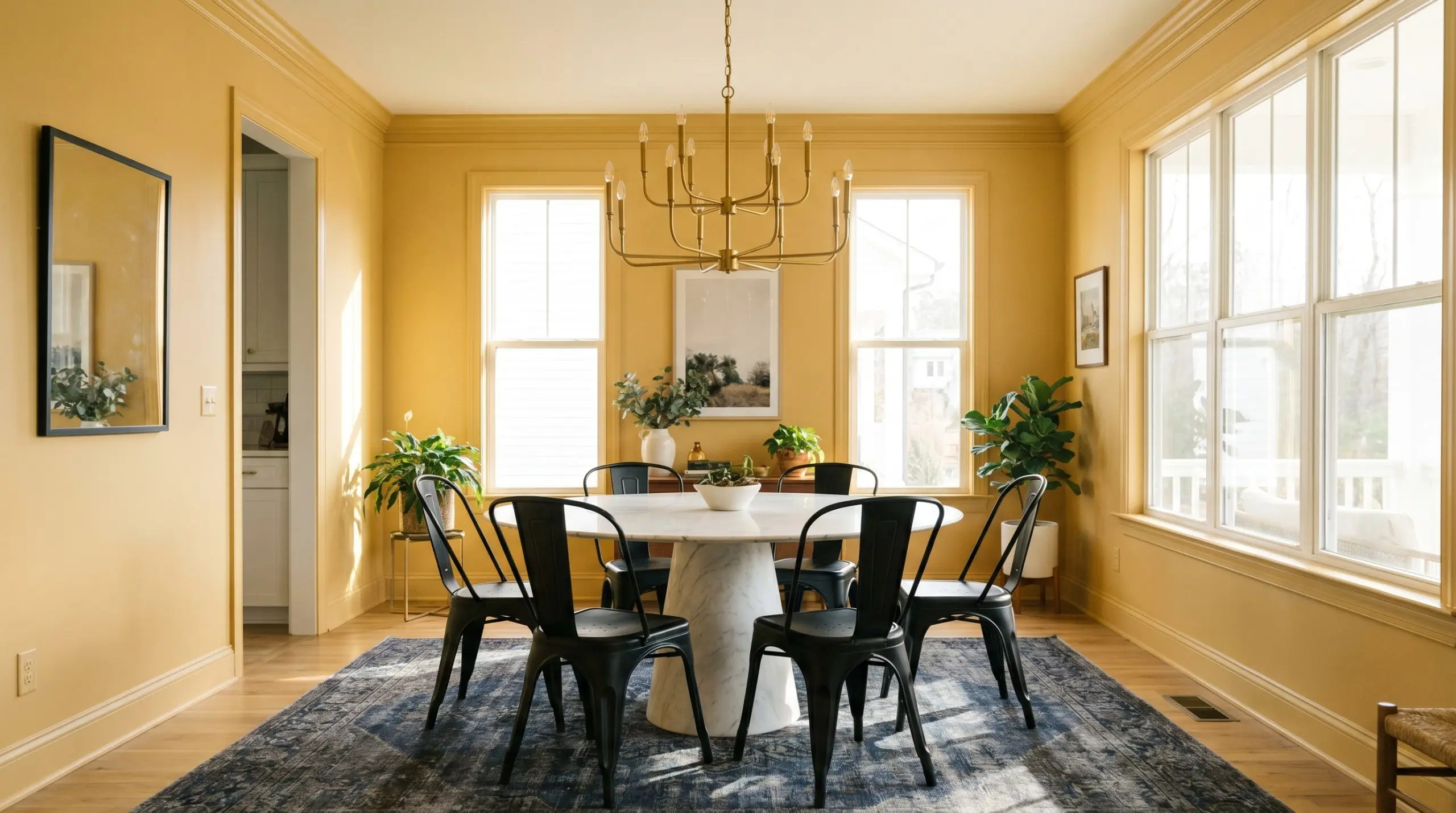
While historically popular in formal dining rooms, this golden hue thrives when pulled into a more transitional, eclectic design scheme. Color drenching—painting the walls, baseboards, and crown molding in the same finish—modernizes the ochre, making the room feel like a seamless, glowing jewel box for evening dinner parties.
To balance the intensely warm walls, introduce cool, tactile materials like a honed marble pedestal table or matte black steel dining chairs. Ground the space with a vintage, faded vintage rug featuring subtle navy blue and charcoal accents, which provides a striking, sophisticated contrast to the golden-yellow base.
Kitchen Cabinetry & Millwork
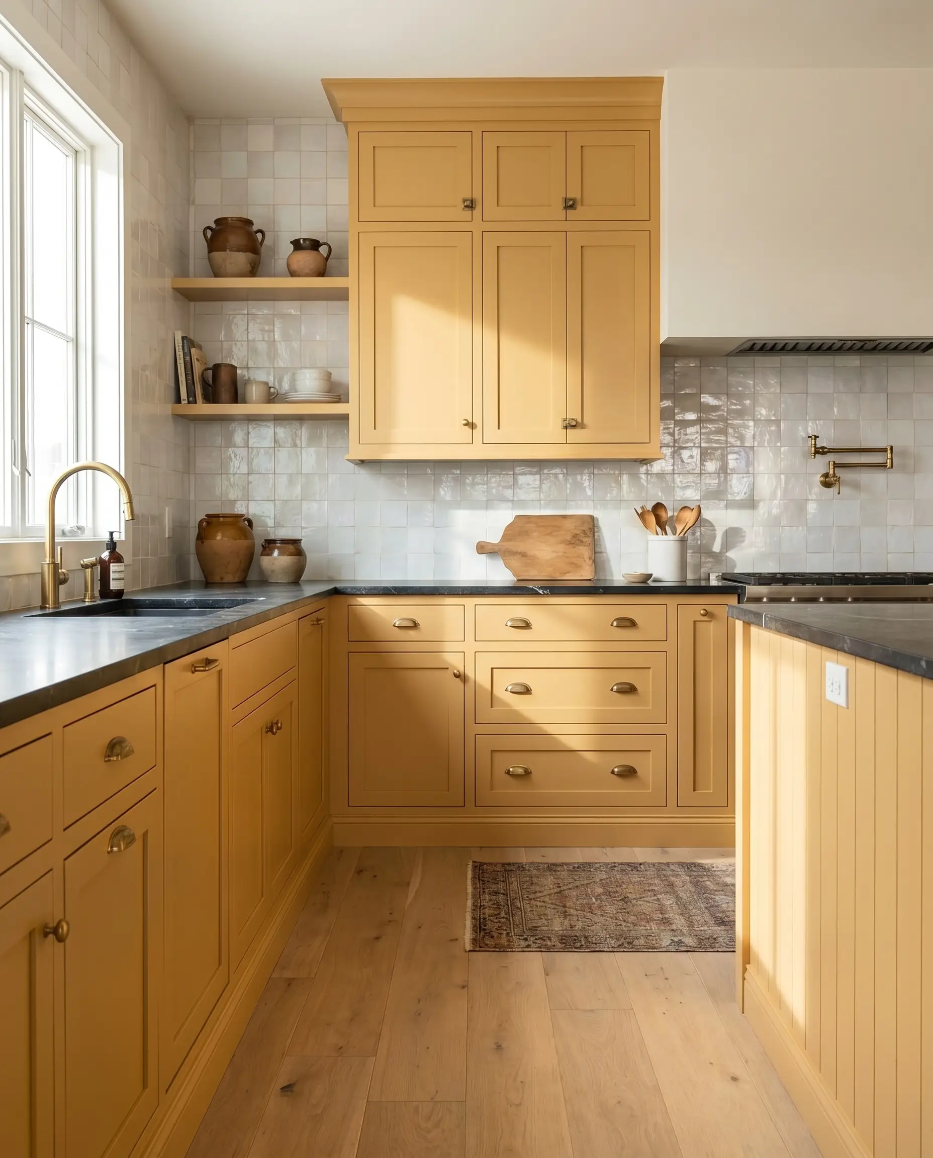
Using this rich ochre on kitchen cabinetry instantly establishes a space that feels custom, layered, and deeply welcoming for a busy family. Instead of defaulting to predictable traditional styling, pair the painted millwork with raw, organic materials to create a “Modern Heritage” aesthetic.
Complement the apricot micro-nuance with warm, unlacquered brass hardware, but introduce a sleek, dark soapstone countertop to stabilize the visual weight of the room. A backsplash of pearlescent white zellige tile will bounce light around the space, beautifully highlighting the luminous reflectance of the painted cabinets.
When using a strong yellow-gold on cabinetry, your hardware choice dictates the era of the room. Polished nickel pushes the design toward classic, early-20th-century traditional, while flat black or aged bronze instantly grounds the space in a more contemporary, rustic-modern aesthetic.
Hackrea Design Secret (The Hardware Contrast)
Entryways and Architectural Transitions
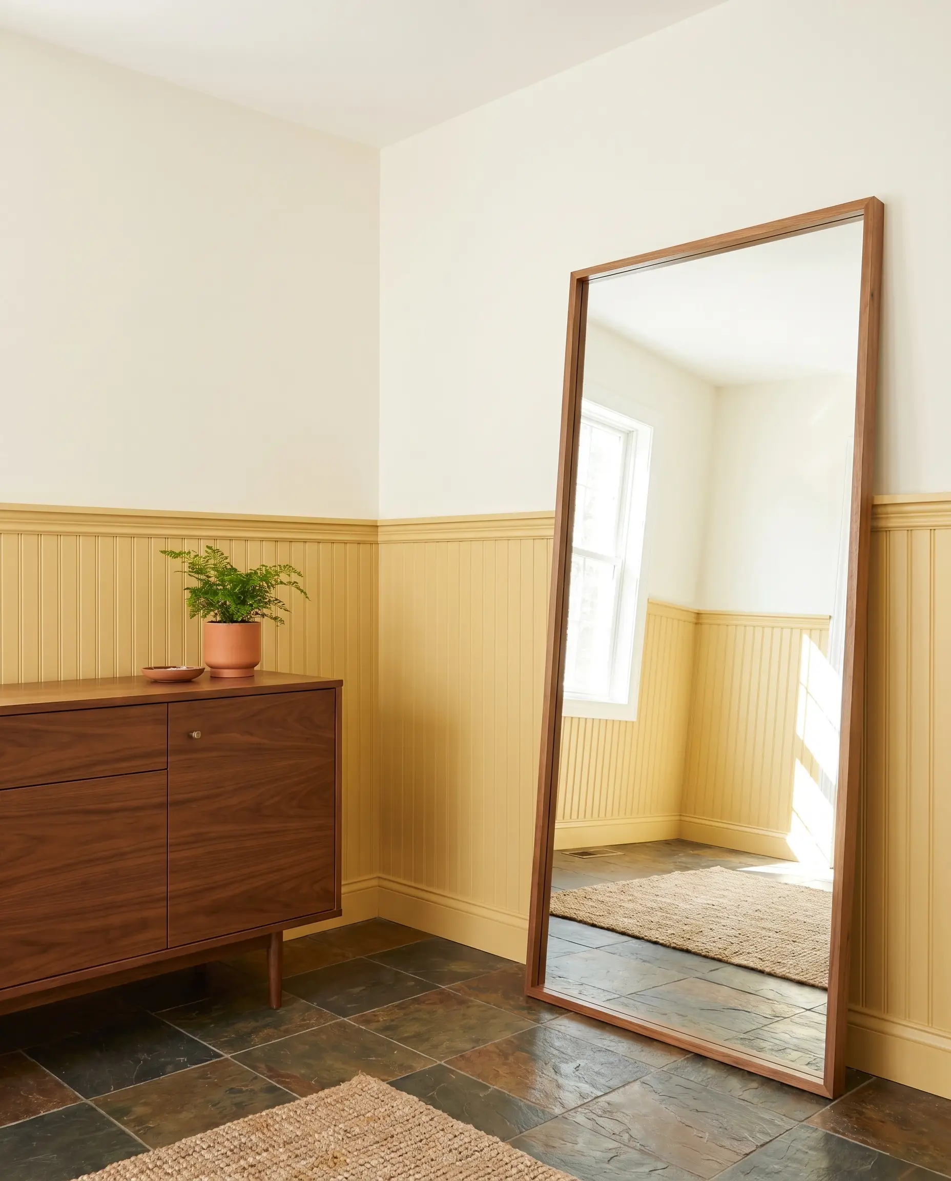
Foyers and hallways lack natural architectural focal points, making them the perfect canvas for a highly saturated, welcoming color. Installing beadboard or v-groove paneling on the lower half of the wall and painting it this earthy cast provides immediate texture and durability for high-traffic areas.
Pair the golden wainscoting with an earthy travertine or slate floor to emphasize the color’s organic roots. To keep the entryway feeling curated rather than overly rustic, incorporate a sleek mid-century credenza and an oversized, leaning floor mirror to reflect light back into the space.
Creative Workspaces and Studies
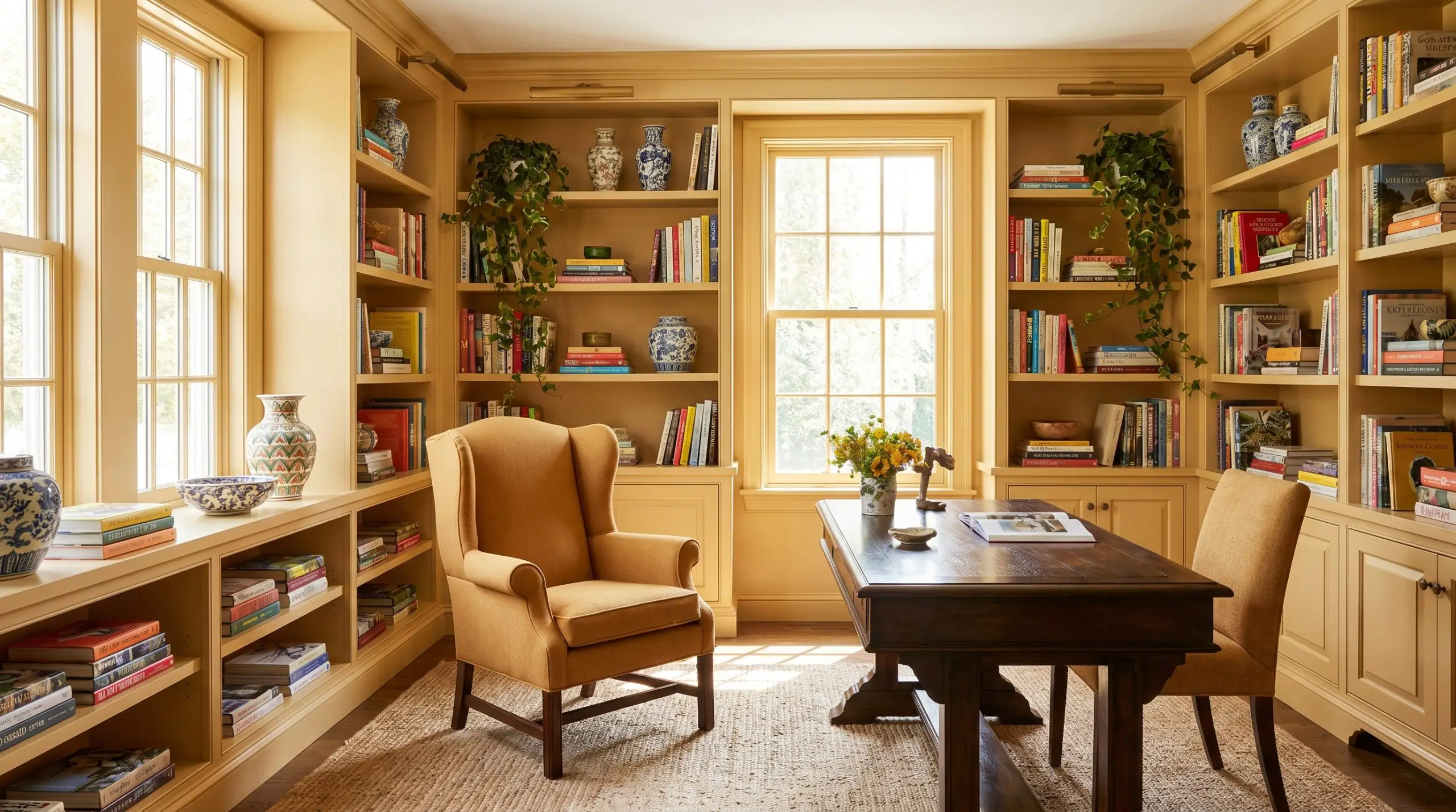
This hue completely subverts the expectation that a home library or study must be painted in a dark, moody color. In a room flooded with natural light, this paint creates a vibrant, sunlit environment perfect for a creative professional’s home office.
Paint the built-in bookcases to match the walls, allowing your colorful coffee table books, ceramic vases, and trailing ivy to pop against the ochre background. Introduce tactile softness with a slipcovered linen sofa or a worsted wool wingback chair, ensuring the room remains comfortable and inviting for long hours of focused work.
Exterior Facades and Entry Doors
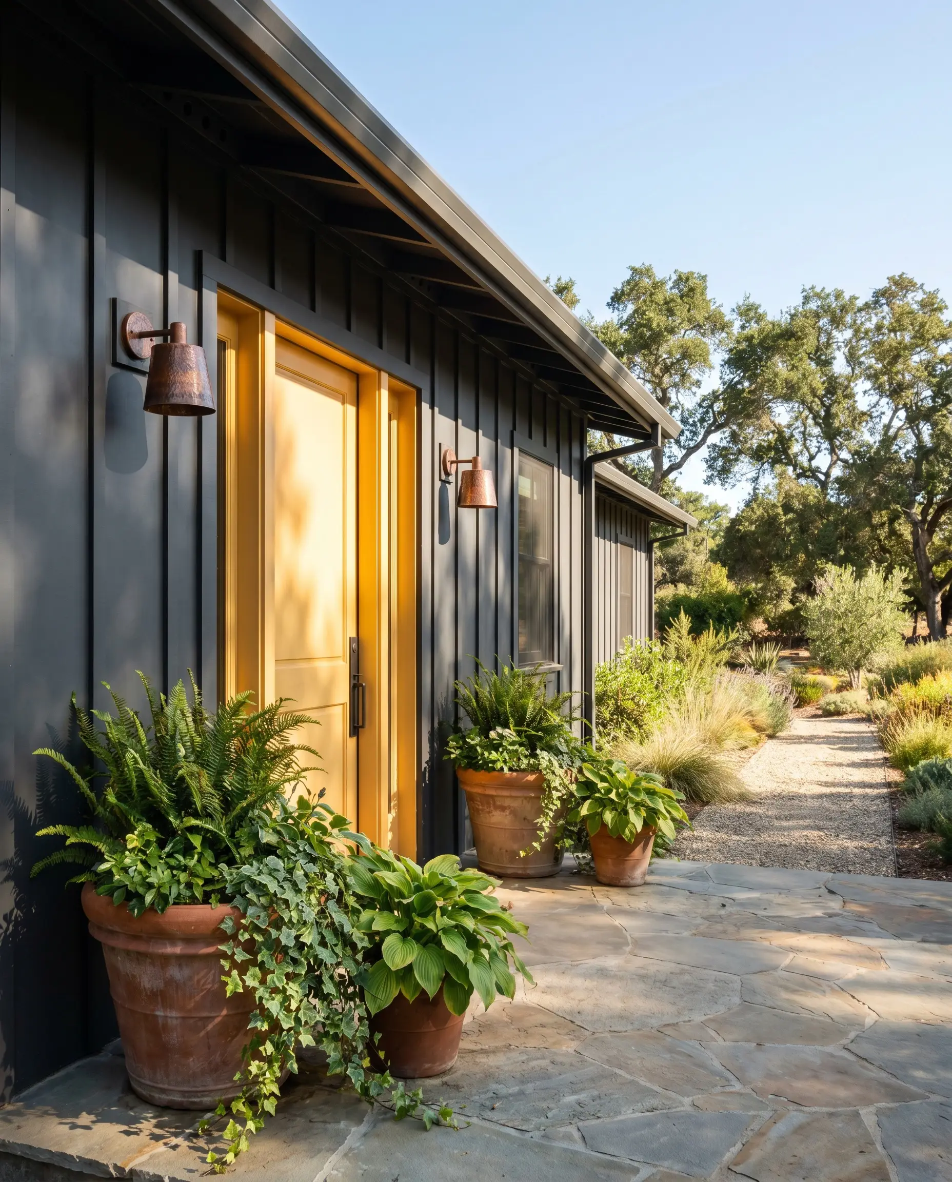
When applied to an exterior surface, the intense natural sunlight will inevitably wash out a portion of the color’s depth. Because of its solid LRV and dense pigment, this shade successfully absorbs that bright light without losing its rich, golden identity.
As a front door color, it acts as a brilliant, welcoming focal point against neutral siding like charcoal, sage green, or soft white. Pair the painted door with hammered copper exterior sconces and large terracotta planters to seamlessly connect the home’s architecture to the surrounding natural landscape.
Pairing Benjamin Moore Concord Ivory: Trims, Metals, and Accents
Instead of relying on stark, minimalist contrasts, Concord Ivory HC-12 demands materials that either gently cool its inherent warmth or ground its radiant energy with dense, earthy textures. Its golden-yellow base requires highly intentional boundaries and curated companion tones to prevent the hue from bleeding into adjacent spaces and overwhelming the eye.
Defining Architectural Trim
Tactile Hardware and Organic Materials
Deeply Saturated Coordinating Tones
Curated Designer Mood Boards
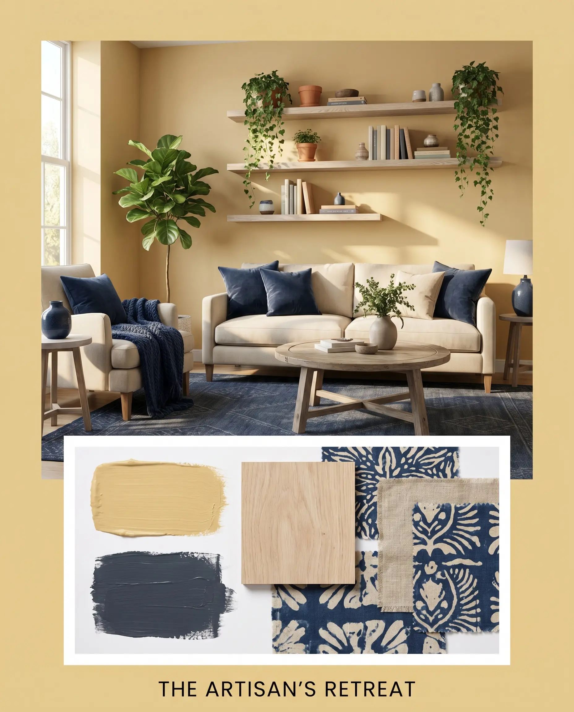
The Artisan’s Retreat
This palette radiates a grounded, creative energy by balancing intense chromatic warmth with deeply saturated, cooling contrasts. The golden walls act as a vibrant canvas, allowing the profound depth of Hale Navy accents to establish a striking, sophisticated boundary. Tactile elements like bleached oak floating shelves and block-print pillows introduce an organic, collected feel to the space. By incorporating abstract art and trailing ivy, the room pulses with a lively, sun-drenched atmosphere that feels both highly curated and effortlessly relaxed.
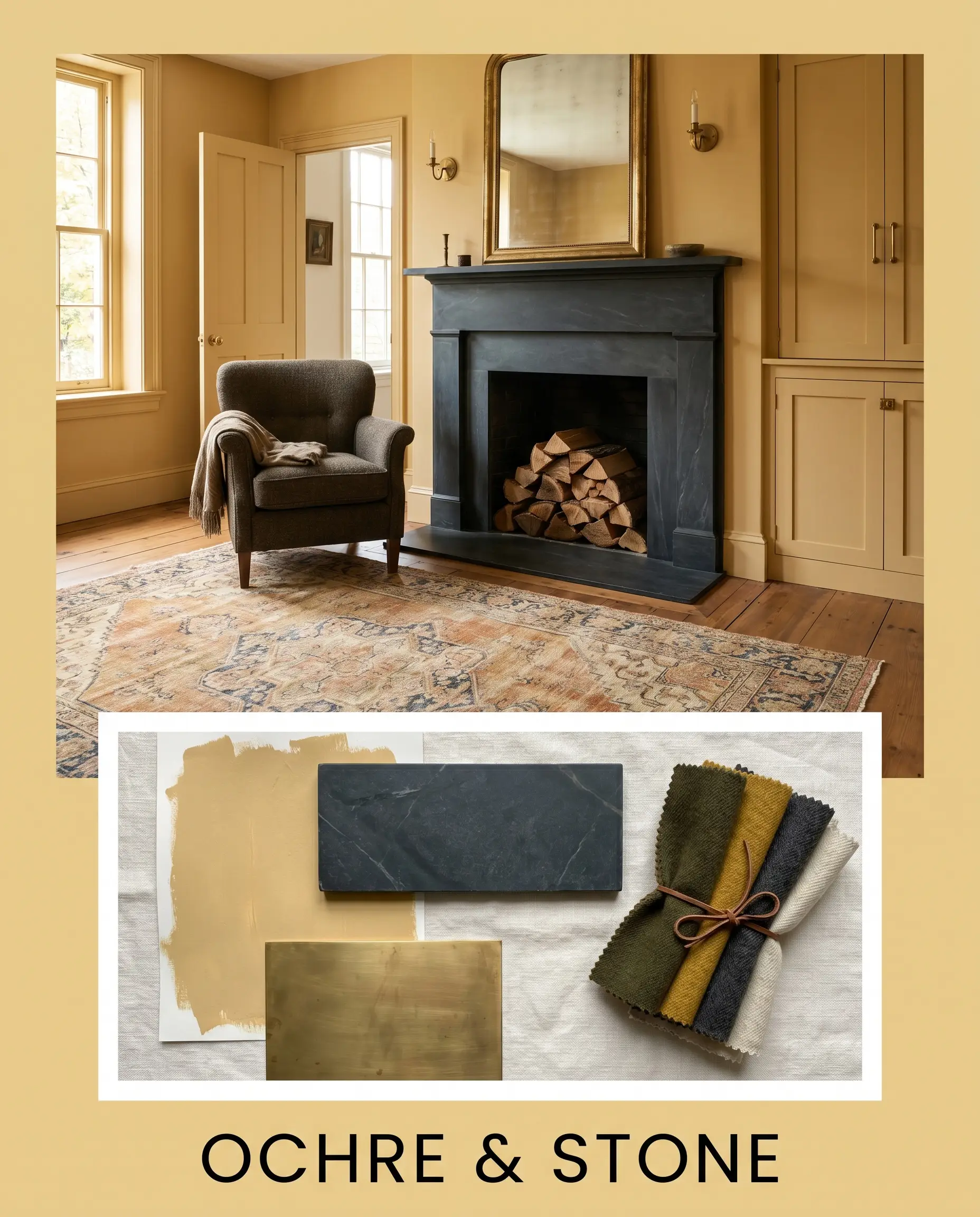
Ochre & Stone
Focusing on the historical gravity of the paint, this aesthetic uses dense, matte textures to stabilize the luminous reflectance of the yellow. The introduction of honed soapstone surfaces immediately absorbs excess light, giving the room a quiet, enduring permanence. Unlacquered brass minimal hardware adds a subtle, premium gleam that perfectly speaks to the paint’s hidden apricot micro-nuance. Styled with faded vintage rugs, stacked firewood, and worsted wool textiles, the resulting environment is enveloping, deeply comforting, and undeniably timeless.
Evaluating Rival Ochres and Golden Hues
Lighting conditions or exterior exposures often dictate whether a true gold thrives or fails, forcing a pivot to a slightly different undertone profile. If your space is flooded with intense, direct southern light, a highly saturated ochre might amplify into an unmanageable orange, requiring a more muted or brown-leaning alternative to maintain elegance.
Benjamin Moore Concord Ivory vs. Benjamin Moore Chestertown Buff HC-9
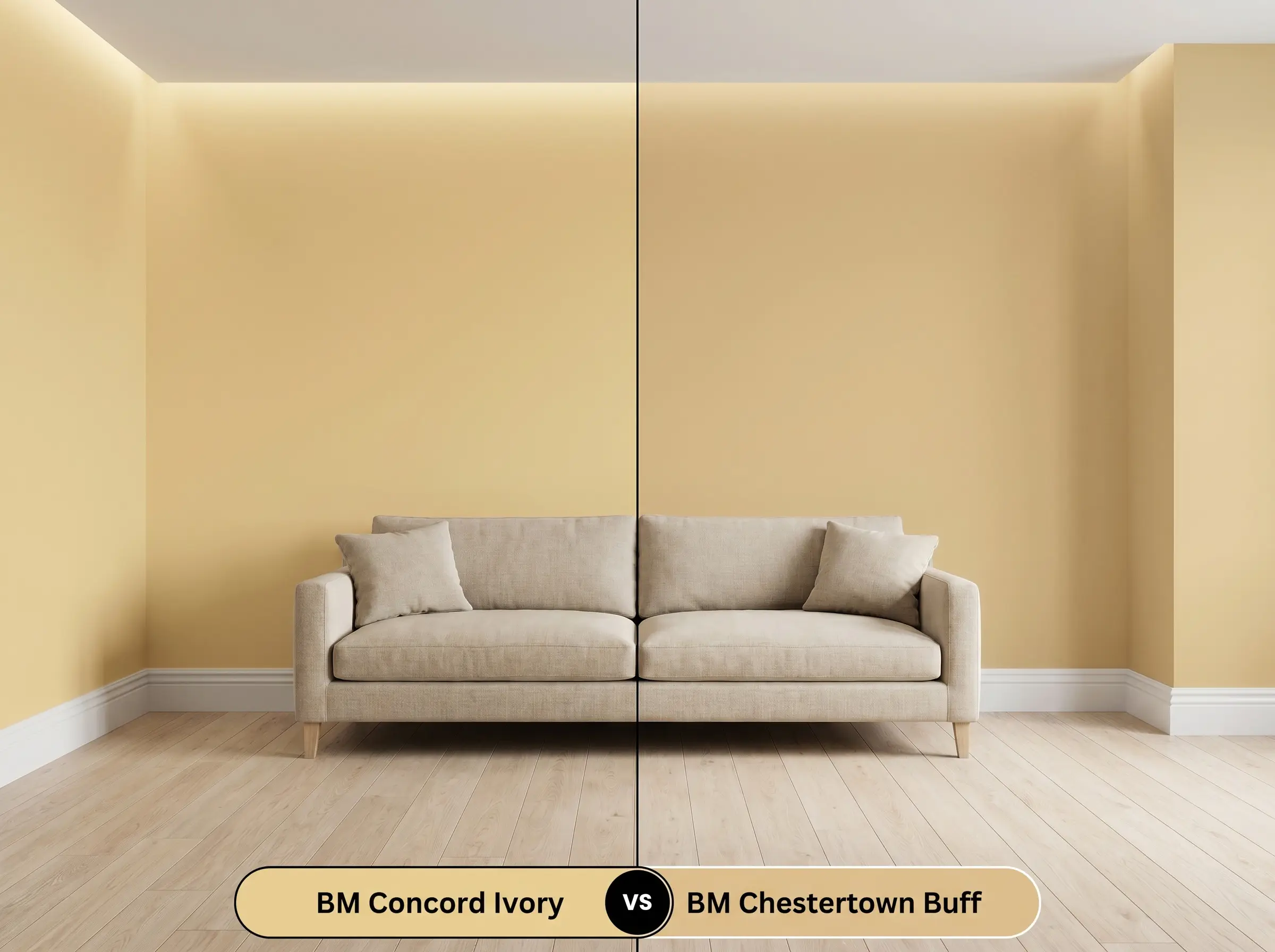
If you are designing a space with overwhelming afternoon sun, Chestertown Buff offers a much lower light reflectance and a stronger brown undertone. While Concord Ivory HC-12 radiates a clear, vibrant yellow-gold, Chestertown Buff acts more like a baked terracotta-tan. Choose Chestertown Buff if you need to suppress the yellow energy, but stick to Concord Ivory when you specifically want to brighten a shaded, north-facing corner.
Benjamin Moore Concord Ivory vs. Sherwin-Williams Bosc Pear SW 6390
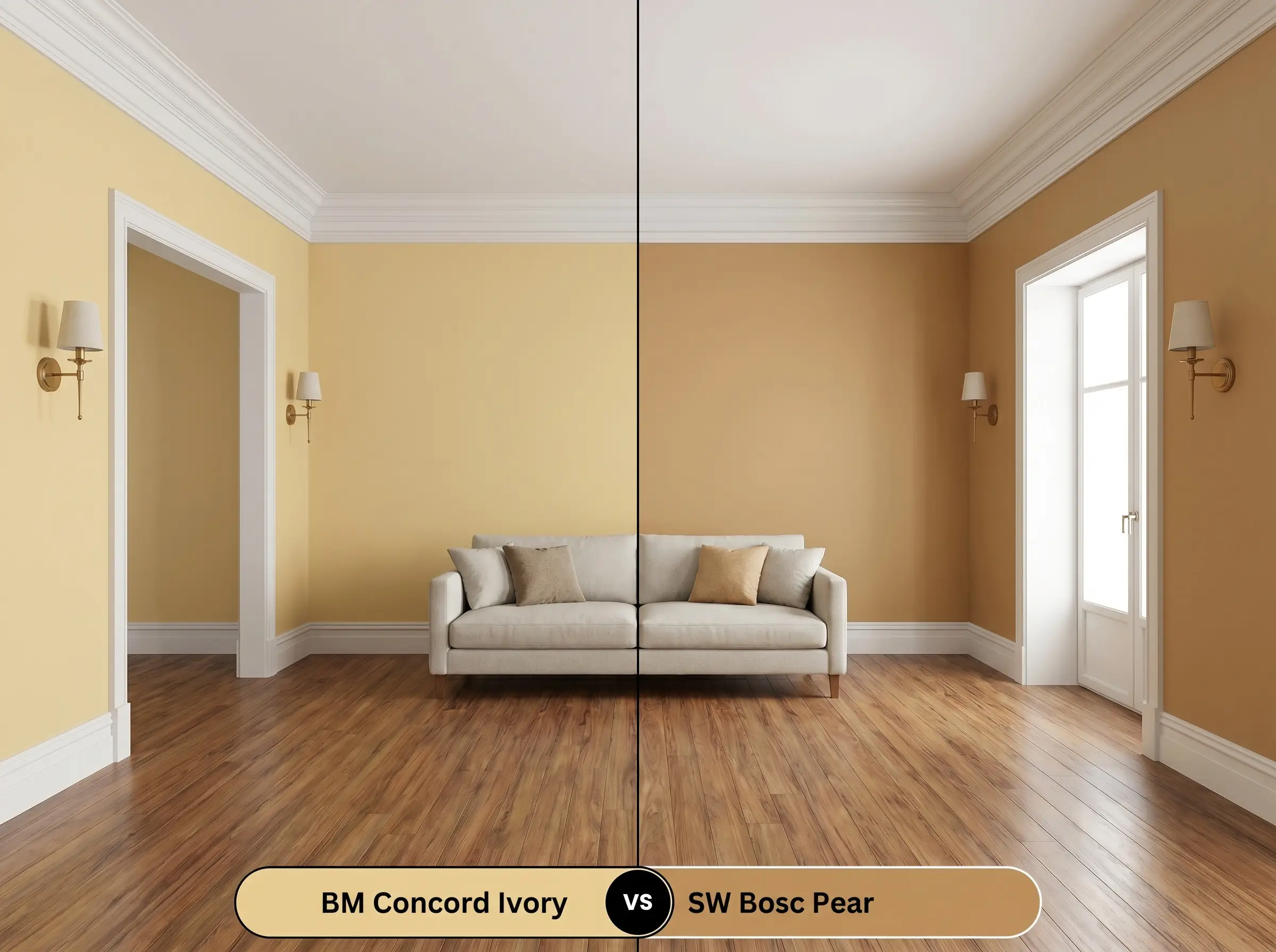
Bosc Pear introduces a distinct green undertone that fundamentally alters its relational behavior compared to the apricot-leaning BM Concord Ivory. If your home features cool-toned gray stonework or slate, the green in Bosc Pear will harmonize beautifully, whereas the apricot nuance in the Benjamin Moore option might quietly clash. However, if you are pairing the paint with warm woods or unlacquered brass, Concord Ivory provides a much cleaner, more complementary glow.
Alternative Color Matches and Equivalents
Sometimes a foundational color is conceptually perfect, but the literal execution requires a minor adjustment in light absorption or pigment density to suit your specific square footage.
Same-Brand Paint Alternatives
Cross-Brand Manufacturer Matches
Applying Concord Ivory: Sheens, Primers, and Coverage
Moving from curated mood boards to the physical reality of rolling pigment onto drywall requires an entirely different set of technical considerations.
A high-quality, warm-gray tinted primer is absolutely mandatory to establish a neutral base layer for this specific pigment. Applying this intensely pigmented gold over a stark white, untinted primer will require excessive coats and often results in a streaky, uneven finish.
Expect to apply a minimum of two generous coats to achieve the true, saturated depth of this ochre. Because mid-tone yellows are notoriously difficult to touch up without visible flashing, you must maintain a wet edge during application and avoid spot-treating dried sections.
Frequently Asked Questions
Because red oak inherently pulls warm, it will aggressively amplify the apricot micro-nuance in this paint. To prevent the room from feeling overly orange, you must introduce cool-toned textiles or a deeply saturated contrast color like navy blue to absorb that excess heat.
Thanks to its solid LRV of 60.04, this color actually performs beautifully in spaces lacking natural light by mimicking the warmth of the sun. However, you must use high-quality LED lighting in the 3000K range to keep the golden-yellow base looking crisp rather than muddy.
Absolutely, provided you decouple it from traditional, ornate styling. By pairing the painted millwork with sleek, modern materials like matte black hardware, honed soapstone, and pearlescent zellige tile, you instantly shift the aesthetic from dated heritage to modern organic.
This is a highly challenging pairing because the cool, gray-blue veining in Carrara sharply fights against the earthy cast of the ochre. If you want a stone with elegant veining, a warmer option like Calacatta Gold or heavily veined soapstone provides a much more harmonious dialogue.
Final Verdict & Expert Warnings
Benjamin Moore Concord Ivory is a masterfully balanced historical ochre perfect for homeowners who want to inject profound, sun-drenched warmth into their spaces without resorting to aggressive primary colors. Its brilliant combination of a golden-yellow base and a grounding earthy cast makes it an exceptional choice for color-drenched dining rooms, welcoming entryways, and striking exterior accents. It thrives in homes that embrace the High/Low mix, effortlessly bridging the gap between classic heritage architecture and highly textured, modern organic styling. When supported by rich woods, dense stones, and saturated contrasting tones, this paint creates an environment that feels both relentlessly cheerful and deeply curated.
While this golden ochre is remarkably versatile, it fundamentally rejects any pairing with icy, blue-toned grays or stark, clinical whites. If you attempt to force this radiant, earthy cast alongside cool Carrara marble, blue-gray luxury vinyl plank flooring, or frosted glass fixtures, the resulting visual friction will make the paint look sour and muddy. The apricot micro-nuance requires complementary warmth or profoundly deep, saturated contrasts to thrive. Placing it next to sterile, cool-toned finishes completely neutralizes its historical charm, leaving the space feeling disjointed and poorly planned.
Clash Warning (The Cool Gray Conflict)