Clove SW 9605
Sherwin-WilliamsSherwin-Williams Clove (SW 9605) is a deeply grounded, nearly-black warm brown. With an LRV of 5.05, it absorbs significant light, creating a moody, restorative atmosphere. Its subtle red and gray undertones keep it earthy and sophisticated rather than stark or cold.
Sherwin-Williams Clove: A Grounding Anchor for High-Contrast Interiors
| Best Exposures | South, West, or well-lit North |
|---|---|
| Best For | Cabinetry, Accent Walls, Moody Bedrooms, Libraries, Exterior Accents |
There is a distinct moment in modern design where a room stops feeling like a collection of furniture and starts feeling like a curated retreat. This transformation almost always begins with a deeply saturated, low-chroma brown that completely alters the boundaries of the space. Sherwin-Williams Clove (SW 9605) delivers exactly that kind of enveloping, moody interior design experience.
By absorbing light rather than reflecting it, this rich shade acts as the ultimate warm black alternative. It provides an incredibly sophisticated backdrop that makes everyday linen sofas look expensive and vintage brass accents absolutely sing. Let’s explore how this earthy neutral can fundamentally shift the atmosphere of your home.
Sherwin-Williams Clove: Undertones & LRV
When evaluating this shade for your home, the first question is always whether it leans warm or cool. SW 9605 is definitively warm, but it carries a highly sophisticated desaturated quality that prevents it from feeling heavy or dated. This balance is what makes it such a versatile tool for architectural definition.
At an LRV 5.05, this shade absorbs a staggering 95% of the light that hits it. This immense light absorption means the color will visually pull walls inward, creating a deeply intimate and cocooning atmosphere. It requires intentional lighting strategies to prevent it from feeling like a void in naturally dark spaces.
You can apply wallpapers, paints, etc. on walls and see how they look in various interiors.

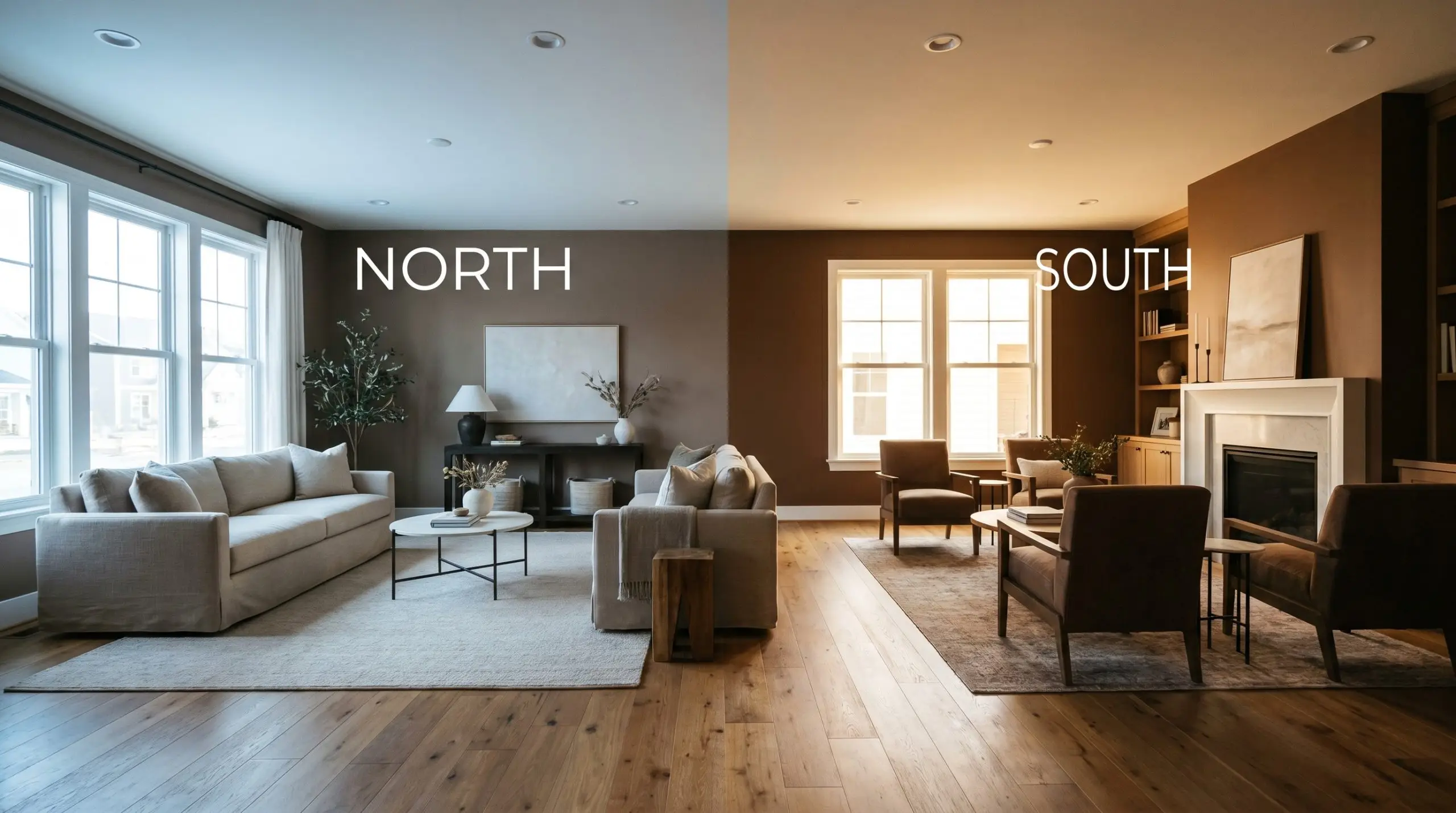
Lighting Shifts & Environmental Behavior
Relying on my own color analysis, the biggest risk with SW 9605 is placing it in a heavily shaded, north-facing room with minimal artificial illumination. Without enough light to activate its hidden warmth, it will flatten into a murky, uninviting shadow. Because of its incredibly low light reflectance, this shade is highly reactive to the temperature of the light around it.
Grounding Everyday Spaces
This shade demands to be used with intention, acting as a rich anchor that dictates the energy of the entire home. It excels at creating intimate boundaries and highlighting the textures placed against it.
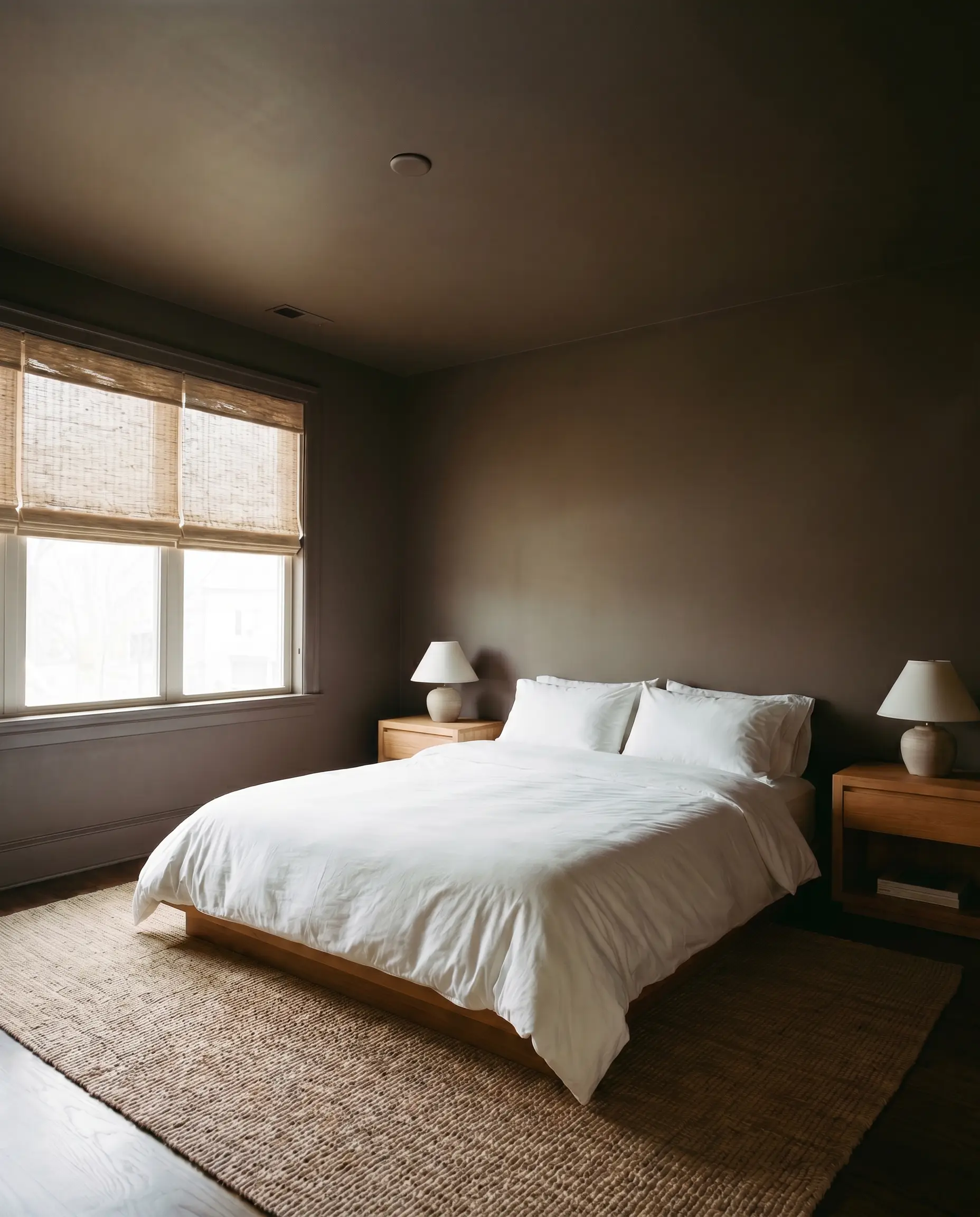
Primary Bedrooms
Embracing color drenching with dark neutrals completely transforms a standard bedroom into a sensory retreat. By wrapping the walls, baseboards, and even the ceiling in this rich tone, you eliminate harsh visual boundaries and create a seamless, cocooning effect. It provides an incredible backdrop for crisp white percale bedding, natural woven window shades, and a mix of warm wood nightstands.
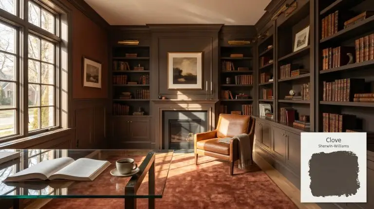
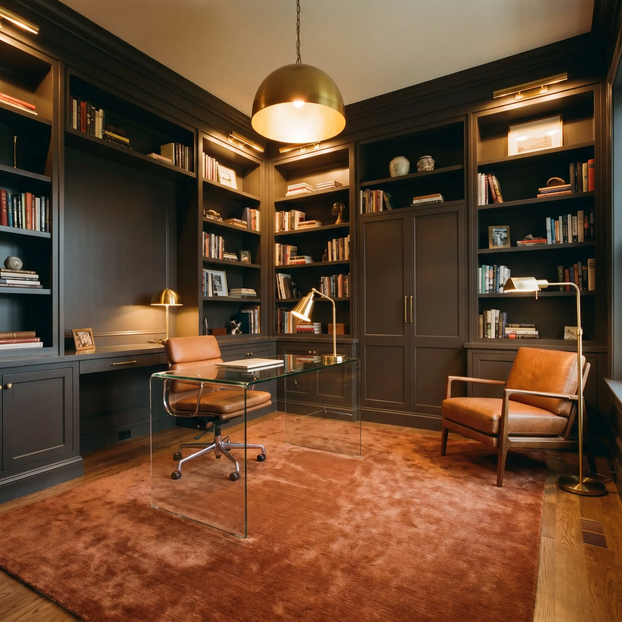
Home Libraries & Studies
This deep tone brings an immediate sense of heritage and focus to a home workspace or reading room. It pairs beautifully with classic architectural details like wainscoting or built-in bookshelves, lending them a handsome, tailored presence. Style the room with a plush rust-toned rug, a sleek glass desk, and a cognac leather reading chair to bridge classic warmth with modern lines.
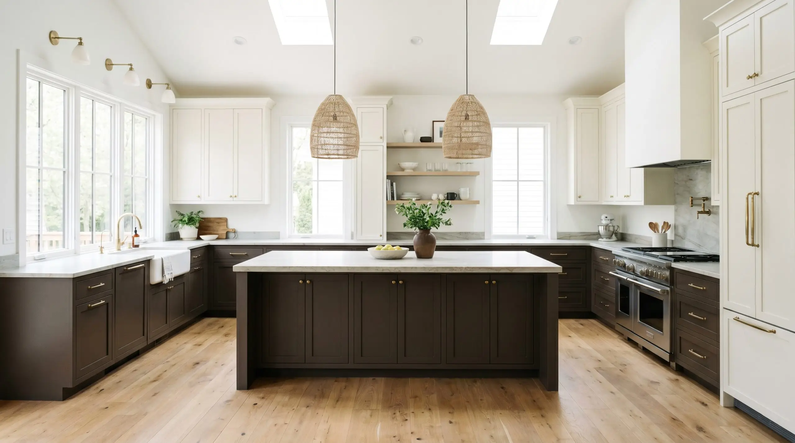
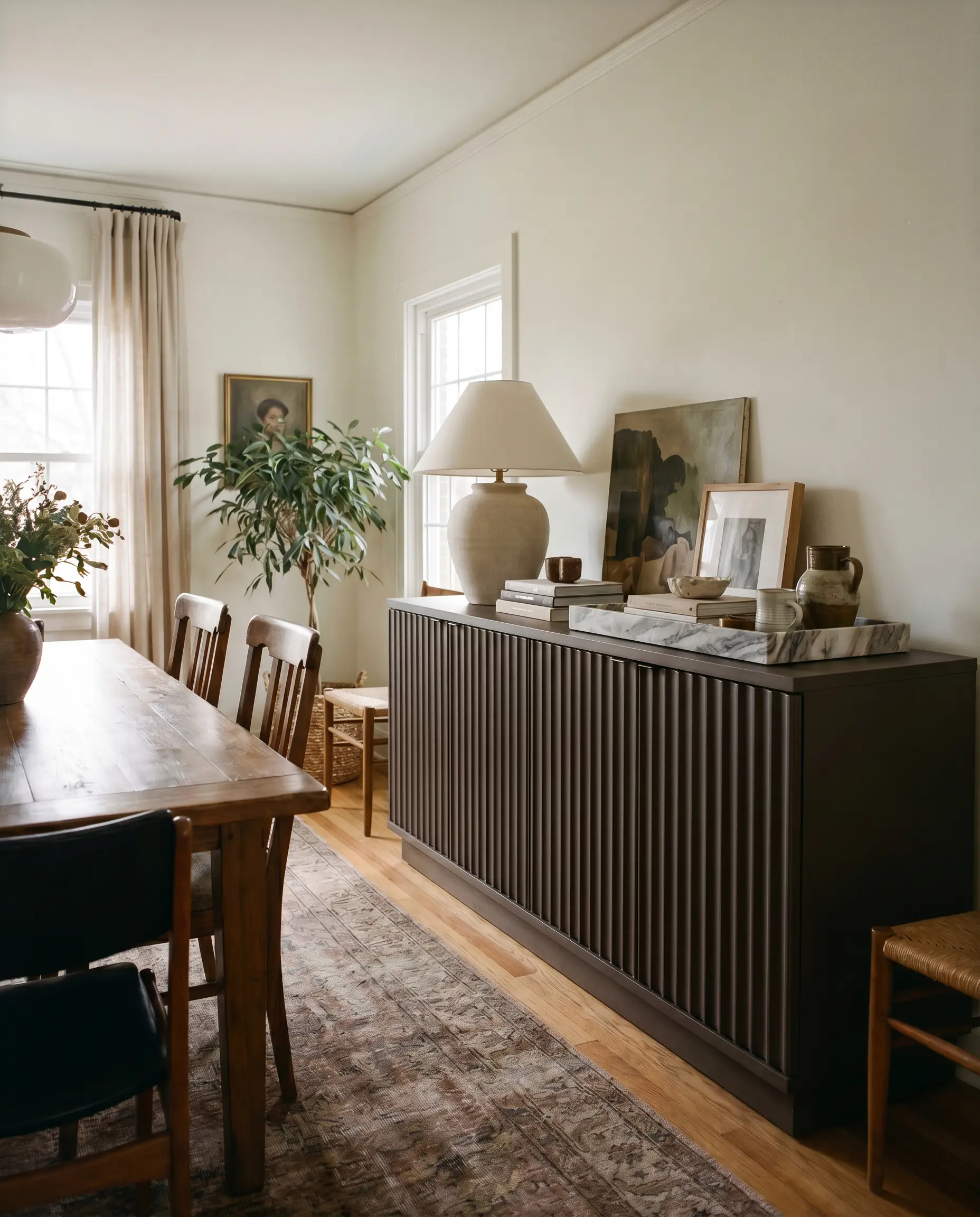
Kitchen Islands and Lower Cabinetry
If you want to ground a bright, airy kitchen without resorting to stark black, this is an exceptional choice for lower cabinets or a central island. The subtle warmth of the paint connects beautifully with natural stone countertops and wide-plank oak flooring. It allows upper cabinets painted in a soft, creamy white to feel airy and lifted while hiding everyday scuffs on the lower half of the room.
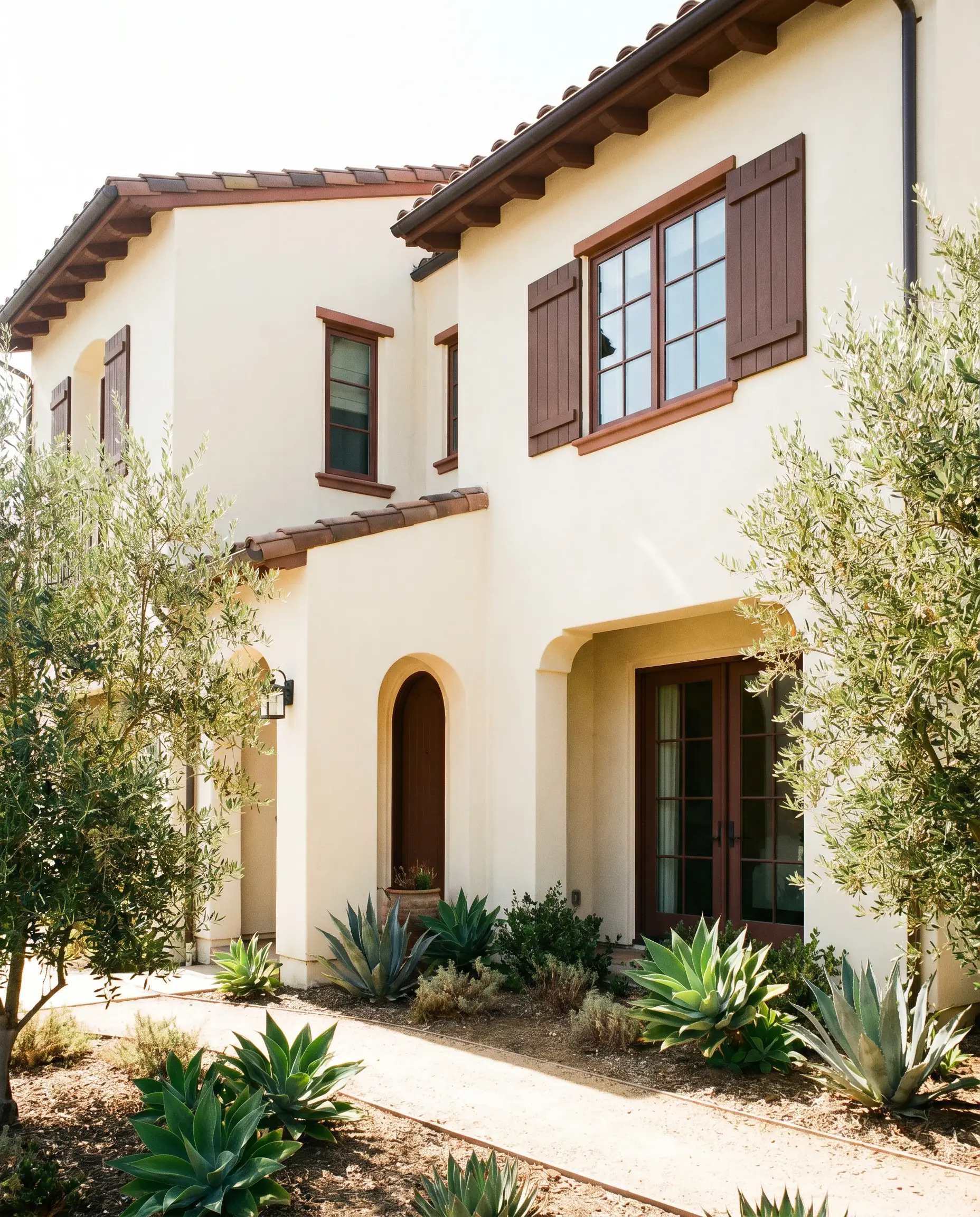
Exterior Trim, Shutters, and Fascia
On an exterior facade, this shade provides stunning definition against lighter body colors like creamy stucco or warm greige siding. Direct sunlight will wash out some of the paint’s depth, bringing those hidden baked-earth nuances to the forefront. It is a brilliant choice for outlining structural features, offering a softer, more organic contrast than a harsh jet black.
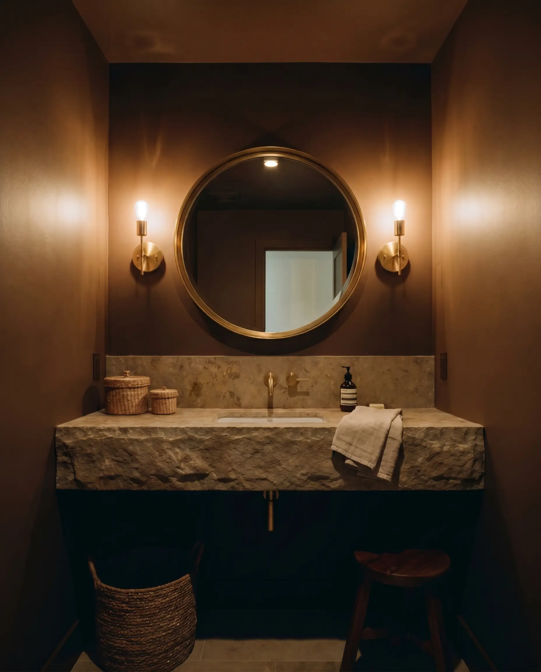
High-Contrast Powder Rooms
Windowless powder rooms are the perfect canvas for embracing dramatic, light-swallowing colors. Instead of fighting the lack of natural light, lean into it by painting the entire room this enveloping shade. Add an oversized, brass-framed mirror and elegant wall sconces to bounce focused light, creating a jewel-box atmosphere that feels highly curated.
Creative Ways to Use Sherwin-Williams Clove
Beyond standard wall applications, this deeply saturated tone is a brilliant tool for highly specific, curated design moments. Let’s explore a few inventive ways to harness its impressive weight.
The Color-Blocked Hallway Arch
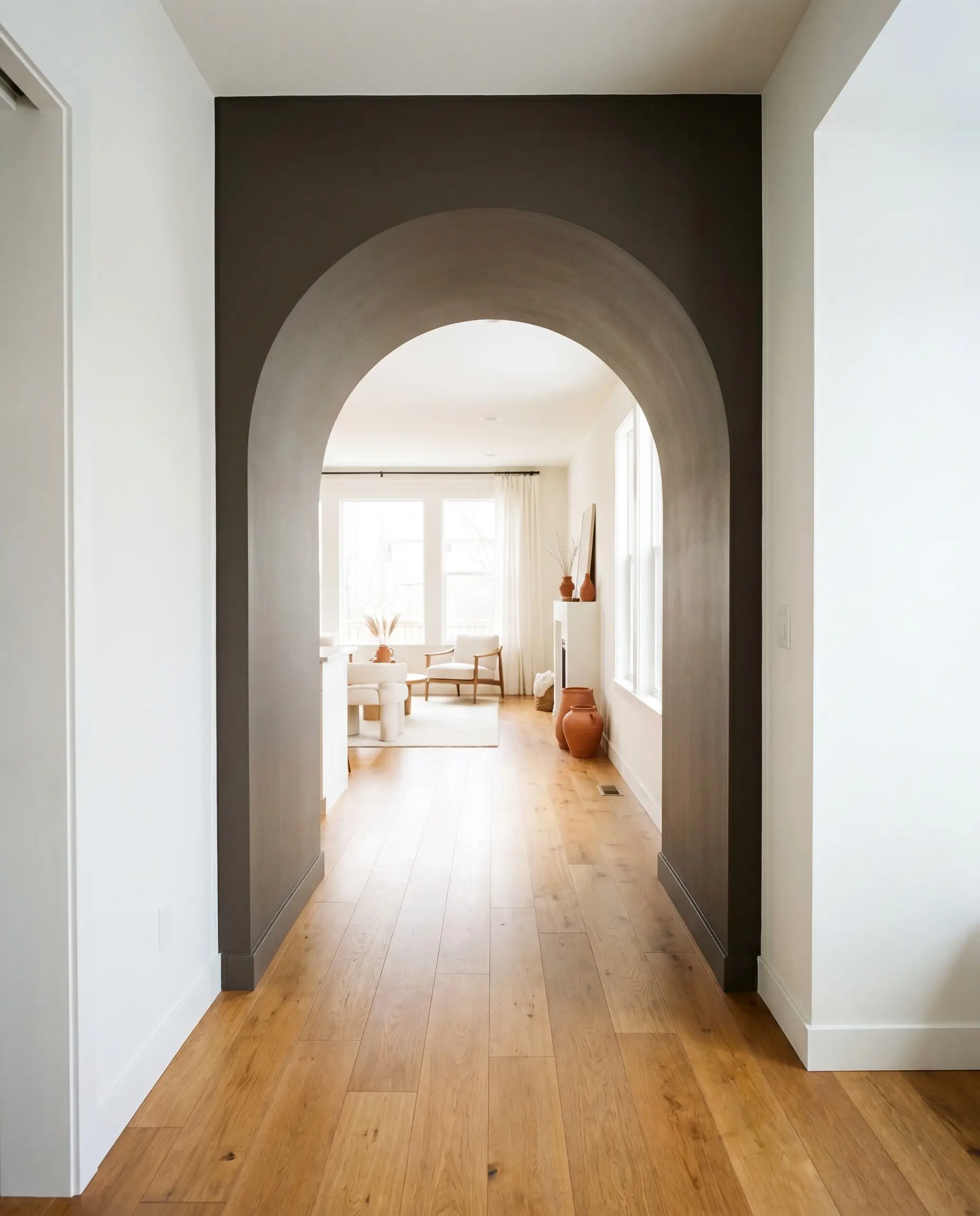
Transition spaces often lack interest, making them prime real estate for a bold, painted intervention. Painting the interior casing of a hallway archway in this deep tone creates a striking, structural threshold between two lighter rooms. This technique frames the view into the next space like a photograph, adding instant custom character to a standard builder-grade layout.
The Upcycled Fluted Sideboard
Transforming a thrifted, flat-front dresser by adding half-round dowels and coating it in this rich finish creates a bespoke, high-end focal point for a dining room. The deep, matte nature of the paint emphasizes the rhythmic shadows of the fluted wood texture. Pair the finished piece with a heavily veined marble tray and an oversized ceramic table lamp for a stunning high/low mix.
The Boutique Hotel Guest Room
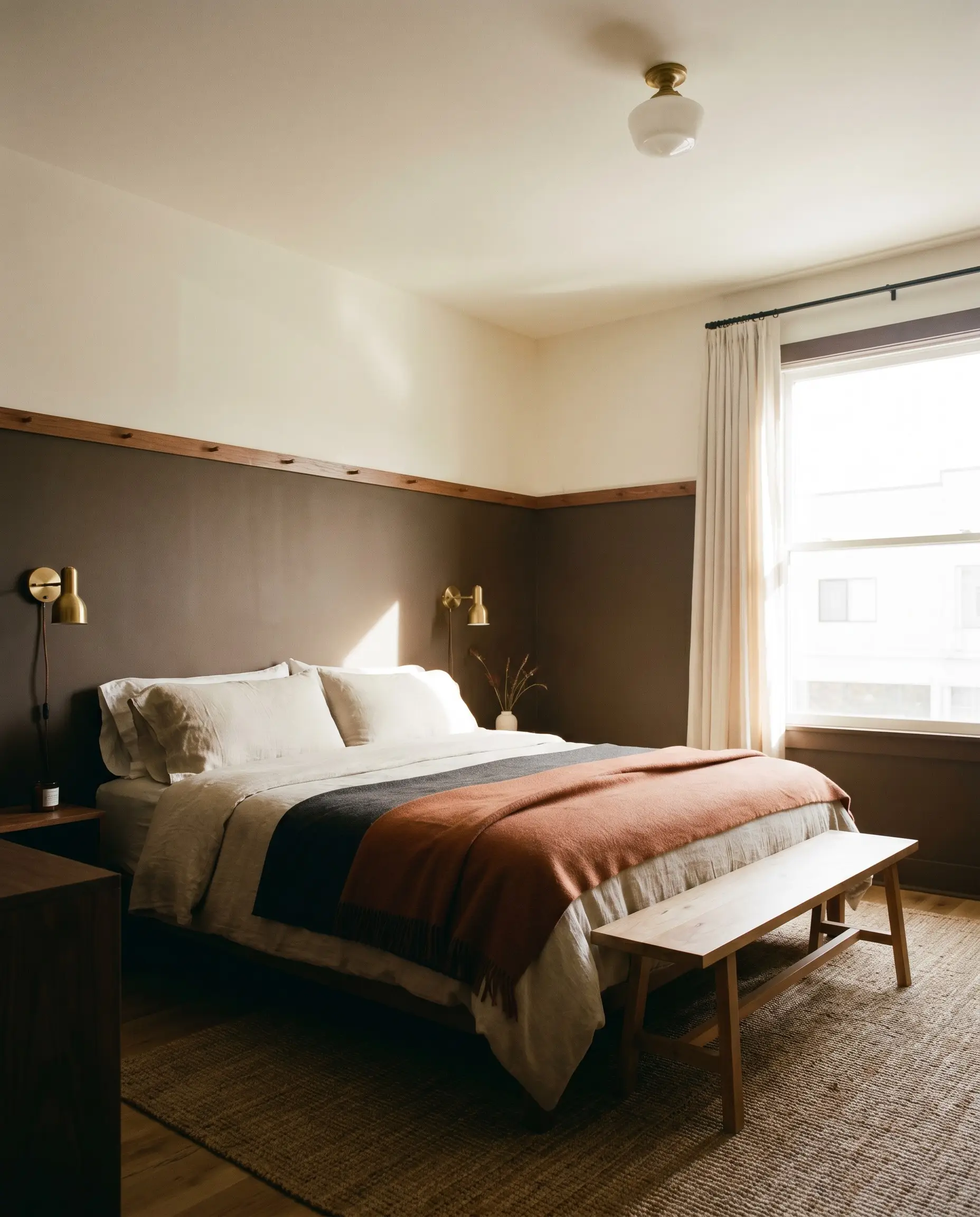
To give a standard guest room the stylized feel of a luxury getaway, apply this shade to the lower two-thirds of the wall, capping it with a simple picture rail. Leave the upper third and the ceiling a soft, warm white to maintain visual height. This grounding technique wraps the bed in cozy warmth while allowing artwork and plug-in brass sconces to pop beautifully against the dark horizon line.
When painting a piece of furniture in a tone this dark, always opt for a satin or semi-gloss finish. The slight sheen will catch ambient room light, highlighting the edges and preventing the piece from looking like a flat, heavy silhouette against your walls.
Hackrea Design Secret (The Light Bounce Rule)
Curating the Warm + Welcoming Palette
To make this shade feel intentional, you must surround it with elements that either match its earthy warmth or provide a crisp, illuminating contrast.
Trim & Baseboard Boundaries
Because of its heavy depth, this color requires trim that offers a clean, decisive break without feeling icy. Sherwin-Williams White Snow SW 9541 provides a brilliant, crisp border that enhances the modern edge of the dark walls. For a slightly softer transition, Benjamin Moore Chantilly Lace OC-65 offers a clean, bright contrast that still retains just enough warmth to harmonize perfectly.
Hardware, Wood & Material Pairings
The tactile materials you place against this color will dictate the final aesthetic of the room.
The Core Coordinating Palette
Building a cohesive home means threading complementary tones throughout your adjoining spaces.
Designer Mood Boards
Let’s visualize how these individual ingredients come together to create distinct, atmospheric environments.
Modern Heritage: This palette leans heavily into classic warmth with a tailored edge. The deep, grounding walls are brightened by the creamy illumination of Behr Blank Canvas on the ceiling. Warm honey oak flooring provides an approachable foundation, while aged unlacquered brass picture lights and a vintage Persian runner add layers of curated, historical charm.

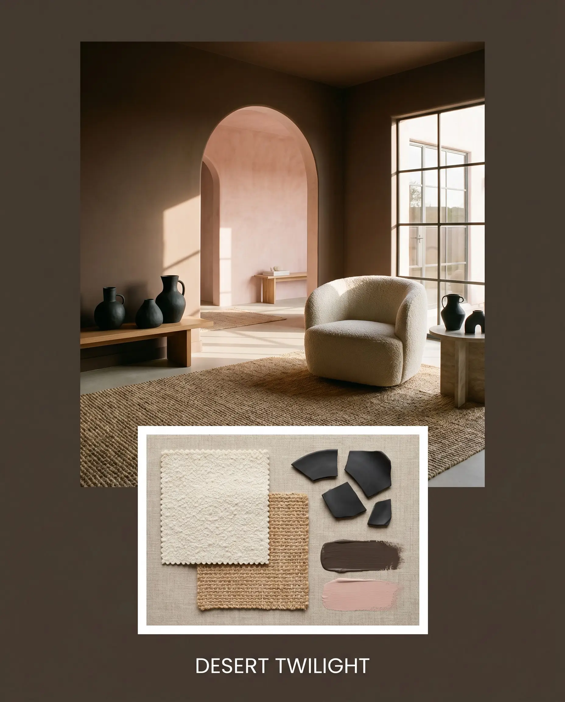
Desert Twilight: A deeply organic and serene combination that embraces the paint’s hidden warmth. Adjoining spaces painted in Farrow & Ball Setting Plaster create a soft, dusty glow that transitions beautifully into the darker main room. A nubby bouclé accent chair, matte black ceramic vases, and natural jute textures complete this relaxed, earthy narrative.
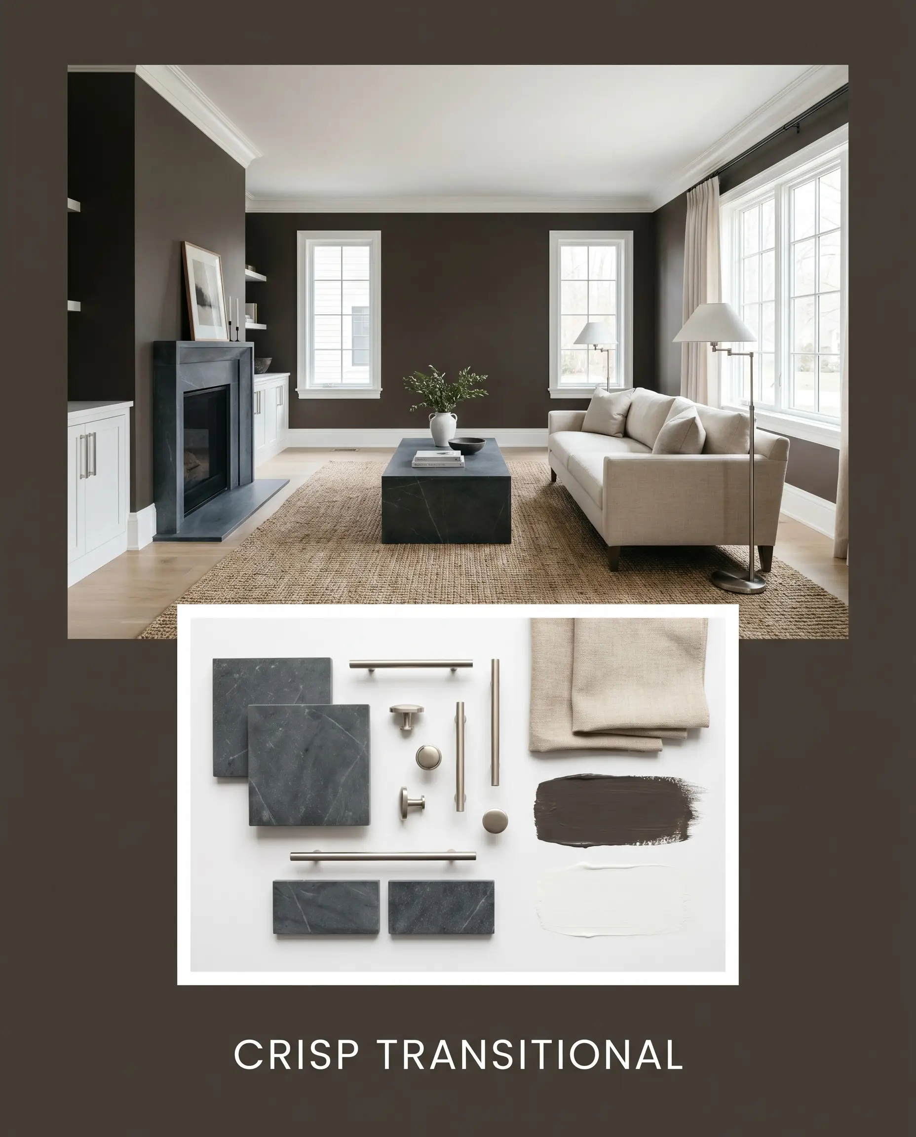
Crisp Transitional: This approach uses high contrast to create a sharp, sophisticated aesthetic. The walls are framed by the brilliant, clean borders of Benjamin Moore Chantilly Lace trim. Honed soapstone surfaces and sleek brushed nickel hardware cool down the palette, while a tailored linen sofa keeps the space feeling highly livable and fresh.
Comparing Sherwin-Williams Clove to the Alternatives
Sometimes a specific room’s lighting or your existing fixed finishes demand a slight pivot. Here is how our featured shade stacks up against its closest rivals to help you make an informed choice.
Sherwin-Williams Clove vs. Sherwin-Williams Urbane Bronze SW 7048
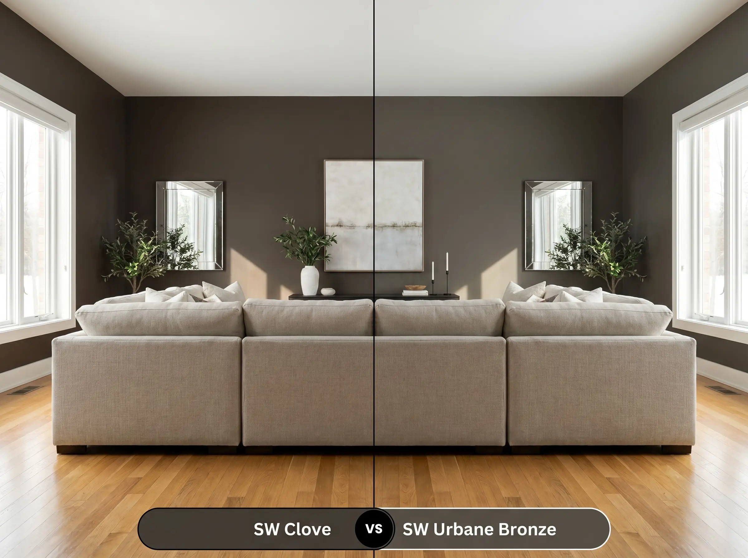
If your room has strong southern light that pulls too much red out of the walls, Urbane Bronze is the superior choice. Urbane Bronze leans significantly heavier into its green-gray undertones, making it read cooler and more muted. Choose Clove when you want a rich, chocolate-infused warmth, and Urbane Bronze when you need a stony, grounded neutral.
Sherwin-Williams Clove vs. Sherwin-Williams Sealskin SW 7675
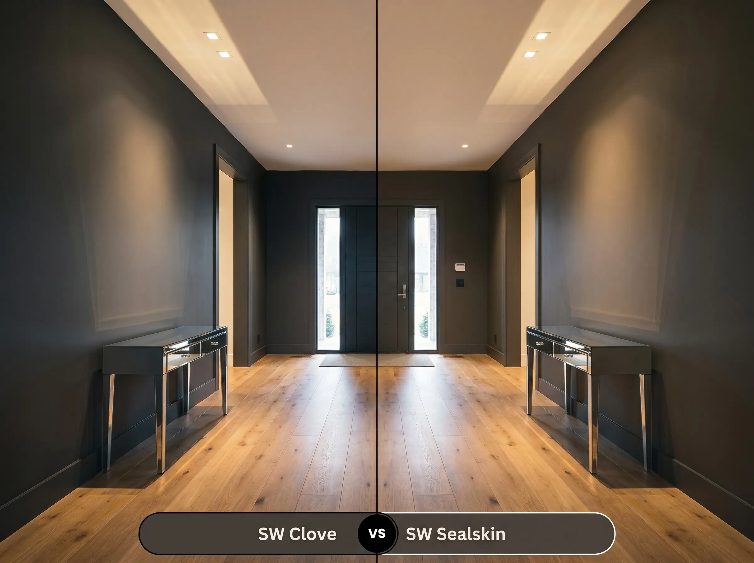
Sealskin is an incredibly close relative but operates with a slightly different temperature profile. While both are deeply saturated, Sealskin has a stronger black-brown presence with less of that subtle, glowing warmth. If you are worried about the paint looking too warm next to cool-toned floors, Sealskin provides a safer, more neutral shadow.
Sherwin-Williams Clove vs. Benjamin Moore Black Bean Soup 2130-10
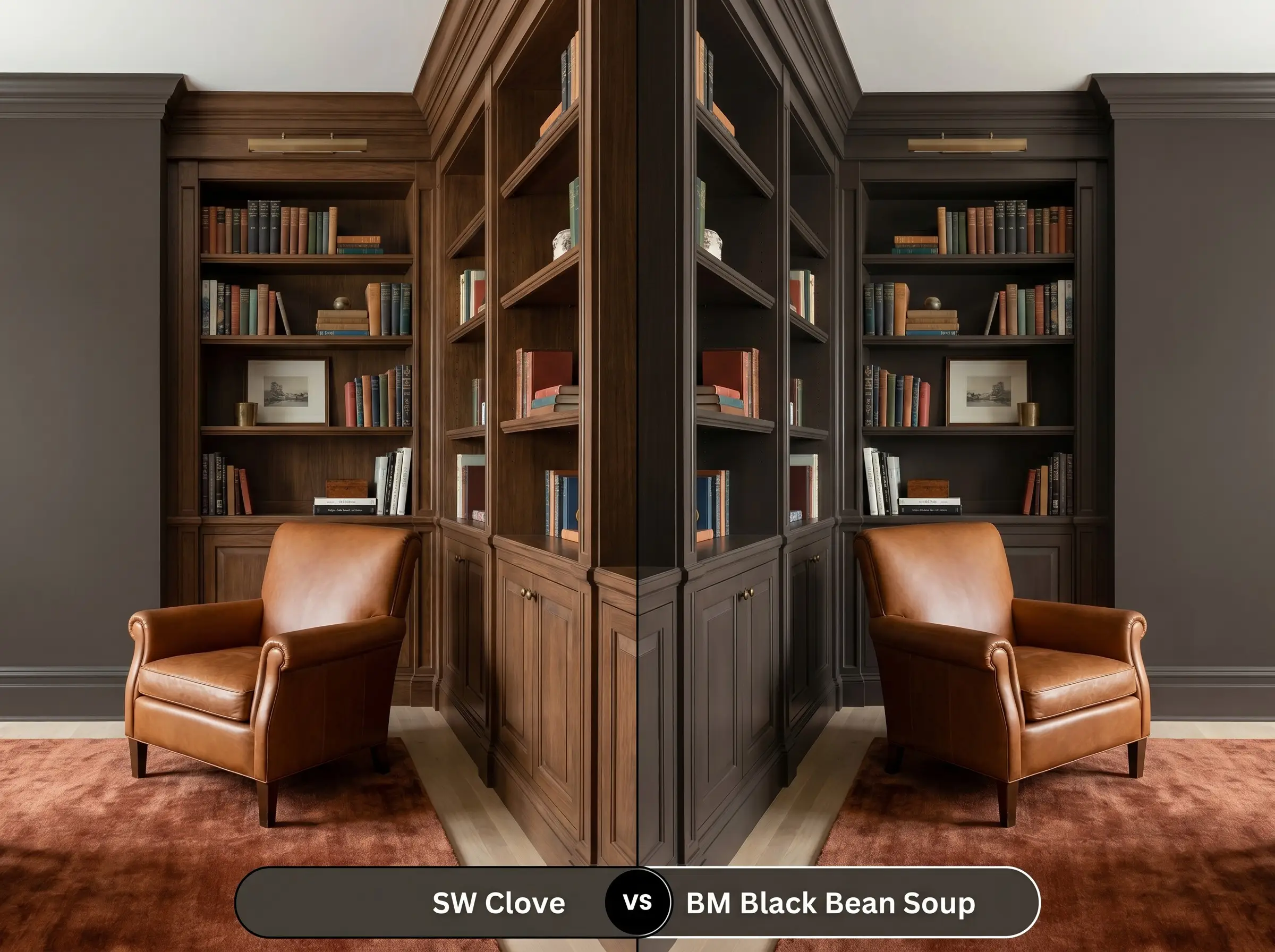
Black Bean Soup offers a much more pronounced, almost purple-red undertone compared to the balanced gray cast of our featured color. If you are designing a highly traditional library and want a color that feels distinctly like aged mahogany, the Benjamin Moore option excels. However, for a more versatile, modern aesthetic, the Sherwin-Williams shade remains much easier to style.
Finding the Perfect Match
Whether you need a subtle shift in depth or are restricted to a different manufacturer, these deep brown paint alternatives offer excellent flexibility.
Same-Brand Alternatives
Cross-Brand Matches
Executing the Perfect Finish
Achieving a flawless, high-end look with a color this dark requires strict attention to your materials and technique. Let’s break down the practical steps for a successful application.
The Dynamic Sheen Guide
Primer Strategy
You cannot skip the priming phase when working with a tone this saturated. You must use a high-quality primer tinted to a deep gray. A standard white primer will force you to apply three or four coats of the dark paint to achieve true opacity and prevent a streaky, uneven finish.
Coverage & Success Tips
Even with a tinted primer, expect to apply at least two generous coats to reach the true, rich depth of this shade. Be incredibly mindful of “flashing,” which occurs when you touch up a dry wall and the new paint dries with a slightly different sheen, leaving a visible mark. To avoid this, always maintain a wet edge while rolling and avoid going back over semi-dry areas until the entire wall is ready for a second coat.
Frequently Asked Questions
Because of its hidden red-orange nuances, it can occasionally pull a faint plum tone in very specific, cool northern lighting. However, the strong gray cast usually keeps it grounded as a rich brown, though you should always test a large swatch outside to see how your local sun exposure affects it.
It performs beautifully by creating a highly intentional, jewel-box atmosphere. The warm 3000K bulbs will enhance the paint’s cozy, ember-like undertones, making the small space feel intimate and luxurious rather than cramped.
While the high contrast can be striking, you must be careful. The heavy warmth of the paint can sometimes make the delicate gray veining in Carrara marble look slightly washed out or icy, so bridging the two with warm brass hardware is essential for a cohesive look.
Due to its incredibly low light reflectance, it will absolutely pull the walls inward and make a low ceiling feel closer. If you want a cozy, cinematic lounge vibe, this is perfect; if you are trying to make the basement feel expansive and airy, this color will work against you.
Final Verdict & Expert Warnings
Sherwin-Williams Clove belongs in the Designer Color Collection for a reason; it is a masterful, grounding anchor that instantly elevates the architectural weight of a home. It is absolutely perfect for the design enthusiast who wants to create a deeply atmospheric, sensory retreat, whether through a color-drenched bedroom or a striking kitchen island.
However, you must be highly strategic about your existing fixed finishes before committing to this shade. If your home features prominent cherry wood floors, heavily red-toned brick fireplaces, or dominant terracotta tiles, the subtle red-orange nuances in the paint will actively compete with those elements, creating a muddy, visually overwhelming environment. It also struggles against stark, cool-toned gray luxury vinyl plank flooring, which can make the rich brown walls look inexplicably dirty by comparison. Always pair this beautiful color with crisp whites, warm oaks, or natural stones to let its true sophistication shine.