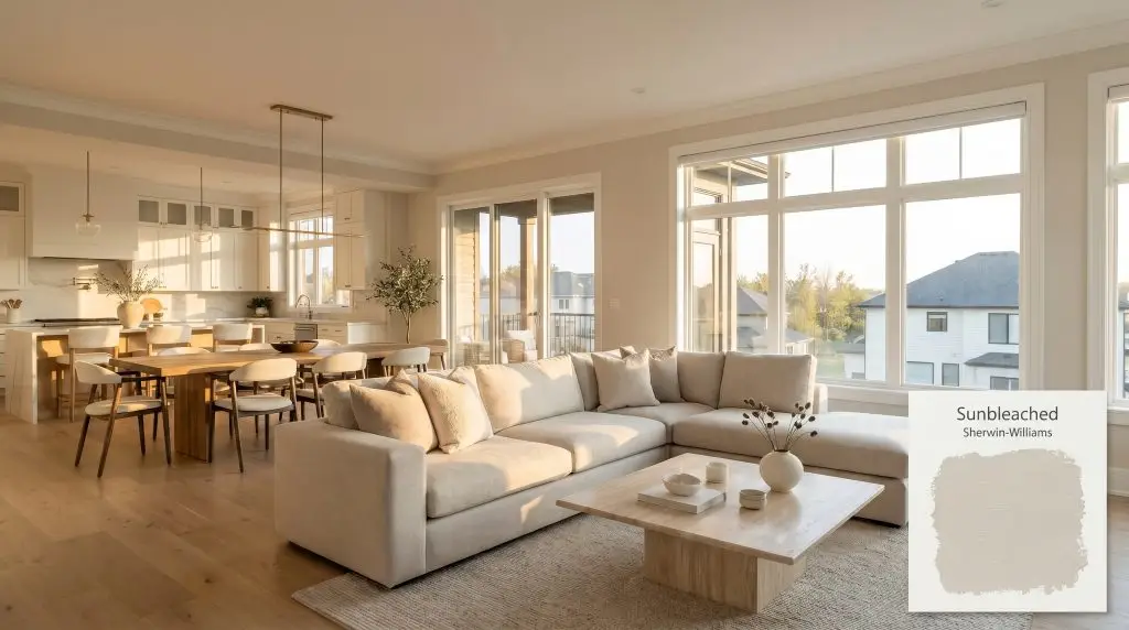
Sherwin-Williams Sunbleached (SW 9585) is a soft, sun-warmed neutral greige with an LRV of 74.75. Striking a perfect balance between warm beige and airy off-white, it features subtle yellow-orange and green undertones that adapt beautifully to varying light conditions, making it an incredibly versatile foundation color.
Will Sunbleached clash with your room?
Paint Technical Profile
| Color ID / SKU | SW 9585 |
| HEX Code | #E5E0D7 |
| Light Reflectance (LRV) | 74.75 |
| Use | Interior, Exterior |
| Best Exposures | North, South, East, West |
| Best For | Open floor plans, living rooms, bedrooms, transitional spaces, cabinetry |
Sherwin-Williams Sunbleached: Anchoring Expansive Architecture with Luminous Warmth
Earning its celebrated spot in the 2025 Color Trends and Capsule Reviews, Sherwin-Williams Sunbleached (SW 9585) completely redefines how we approach vast, undefined residential footprints. When faced with sprawling layouts that lack architectural intimacy, selecting the right foundation is a critical design decision. This nuanced pigment wraps stark drywall in a gentle, atmospheric glow, effortlessly grounding the room without shrinking its perceived boundaries.
It serves as an incredibly versatile open floor plan color, offering a sophisticated alternative to the sterile whites of the past decade. By shifting its visual weight depending on the time of day, this dynamic hue acts as an anchor for both modern and heritage aesthetics alike.
Undertones & LRV of Sherwin-Williams Sunbleached
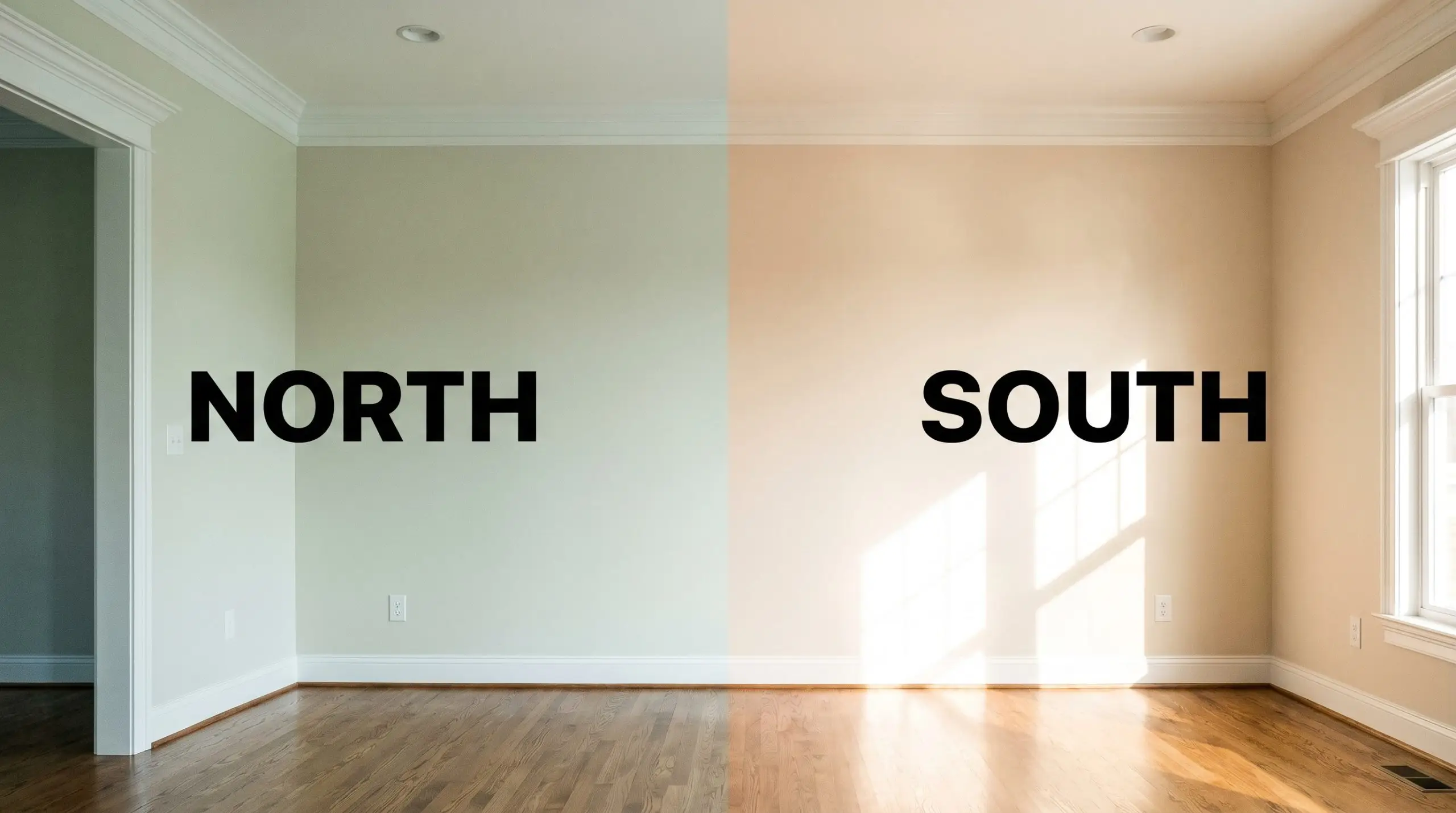
If you are trying to determine its core temperature, rest assured that Sunbleached is a definitively warm neutral. It operates as a brilliant greige chameleon, shifting its personality to accommodate the lighting and materials surrounding it.
Registering a light reflectance value of 74.75, this shade possesses immense illuminating power. It bounces natural sunlight deep into shadowed corridors while holding onto enough pigment to contrast beautifully against crisp white trim.
Lighting Manipulations & The Chameleon Factor
Because this shade is so highly responsive to its environment, its greatest strength can also become a vulnerability. In light-starved rooms, the cooler shadows can abruptly pull that hidden green forward, occasionally leaving the walls feeling a bit murky if not properly balanced with warm ambient lighting. Always test large swatches on multiple walls to track these daily shifts.
Paint large swatch boards rather than directly on the wall, and move them from corner to corner throughout the day. You must watch how the shadows interact with the green nuance before committing to your final purchase.
Hackrea Pro-Tip (Undertone Tracking)
Popular Room Applications
This dynamic pigment demands to be used in spaces that crave a soft, cohesive energy. It effortlessly sets a restorative tone, acting as a gentle backdrop that allows your curated furnishings to take center stage.
Open Layouts
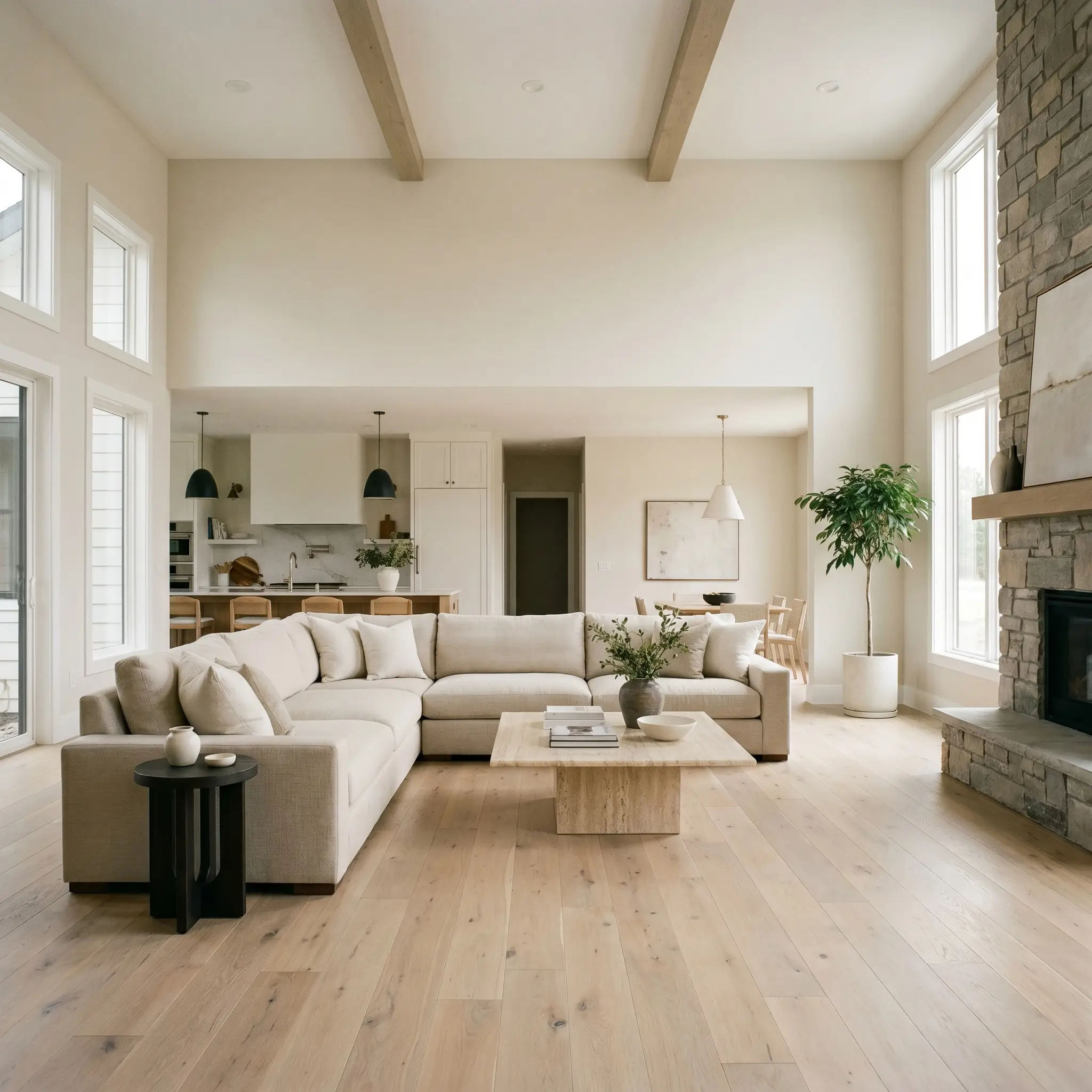
In vast, multi-use living spaces, SW 9585 excels at uniting different zones without overwhelming the eye. It provides a stunning backdrop for everyday linen sectionals, while simultaneously elevating premium accents like a honed travertine coffee table. This adaptability makes it a flawless choice for transitional design schemes that blend contemporary lines with classic comfort.
Will Sunbleached work with your specific lighting, floor, or furniture?
Sleep Sanctuaries
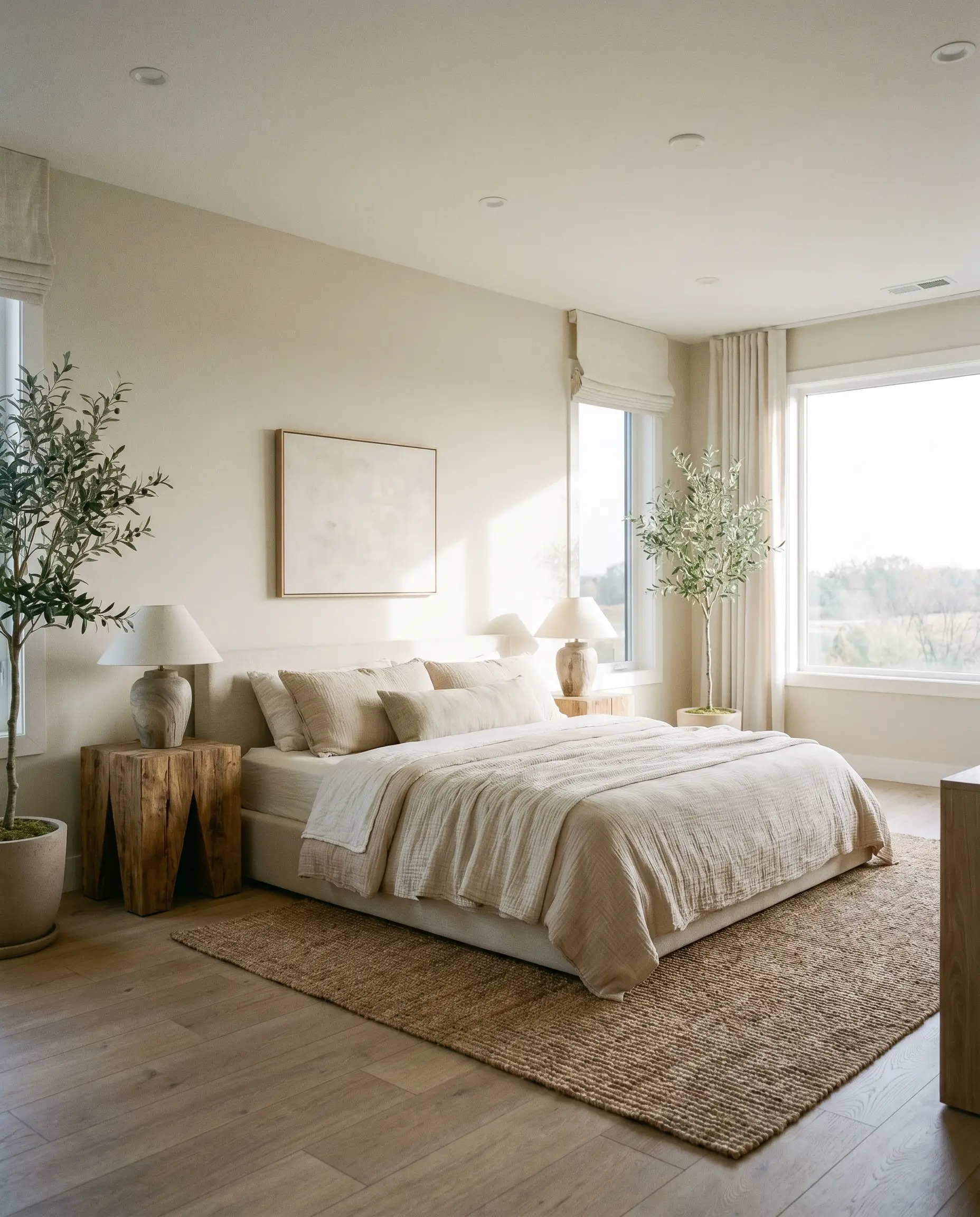
When applied to primary bedrooms, this shade fosters an immediate sense of calm and retreat. It pairs beautifully with the textured, layered approach of nature-inspired interiors, harmonizing with rough-hewn woods and relaxed muslin bedding. The warmth of the paint physically softens the room, preparing the mind for rest.
Cabinetry & Millwork
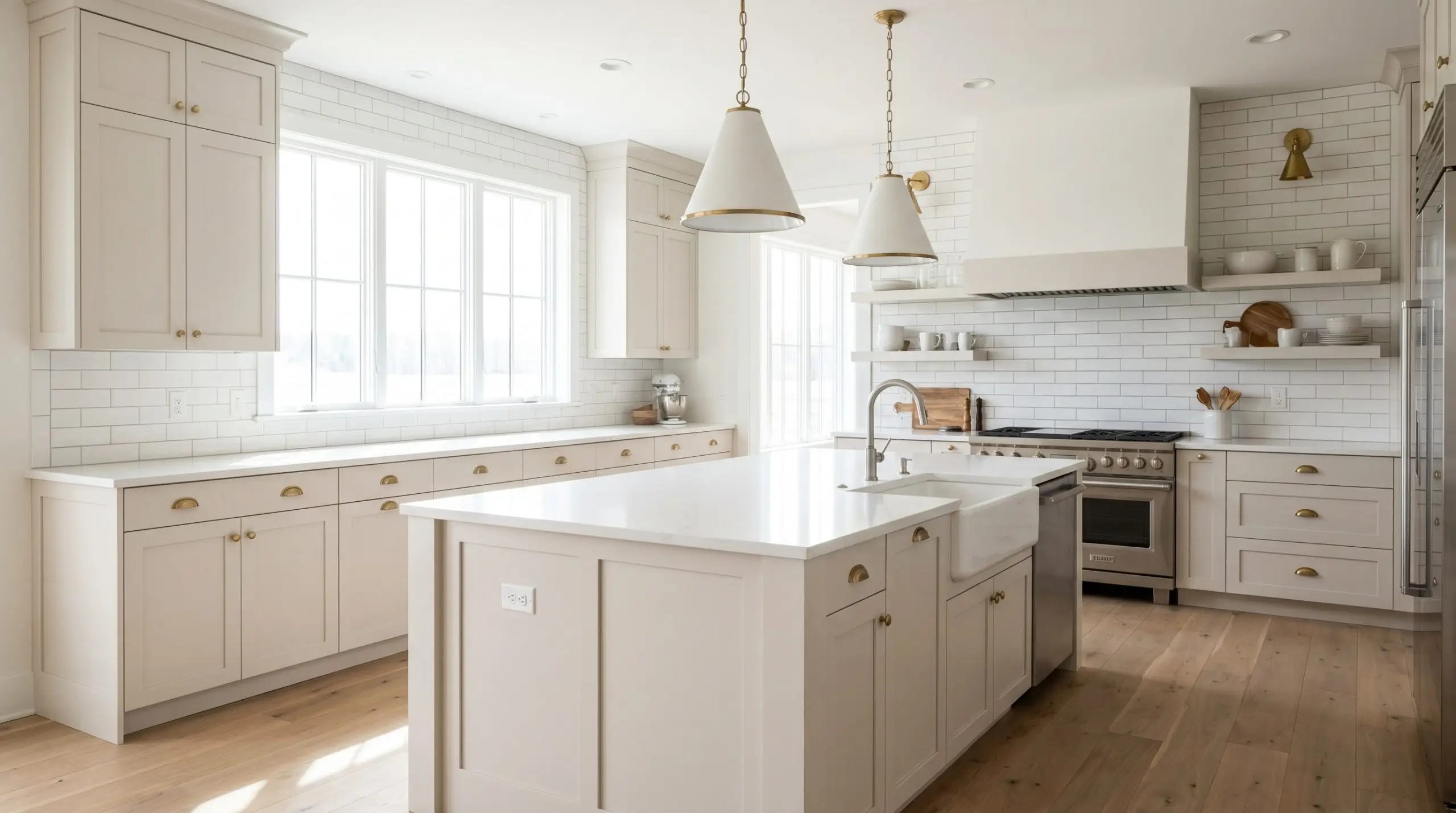
Painting kitchen cabinetry in this nuanced hue offers a refined departure from standard builder-grade white. It looks incredibly intentional when paired with everyday white subway tile and premium unlacquered brass hardware. The resulting aesthetic feels both timeless and fresh, effortlessly supporting modern farmhouse or sleek contemporary styling.
Glazed Additions
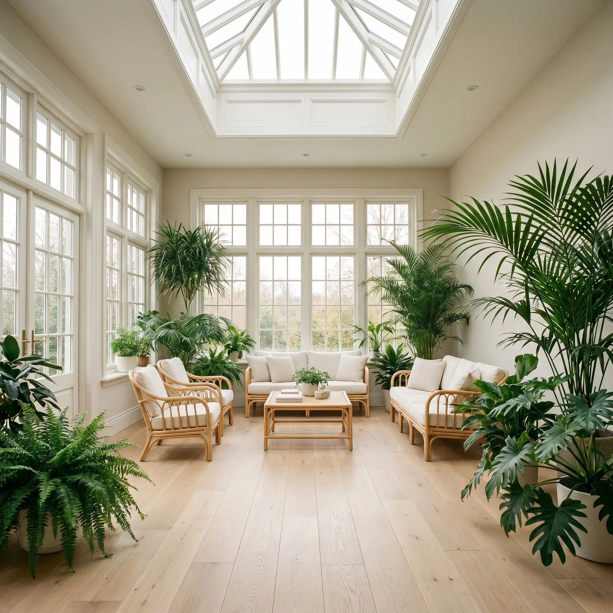
Sunrooms and conservatories benefit massively from this color’s high light reflectance. As the abundant natural light hits the walls, the paint glows, blurring the line between the indoor living space and the outdoor environment.
Will Sunbleached work with your specific lighting, floor, or furniture?
Creative Ways to Use Sunbleached SW 9585
Moving beyond standard four-wall applications, this nuanced shade shines when applied to highly intentional, curated projects.
The Color-Drenched Mudroom
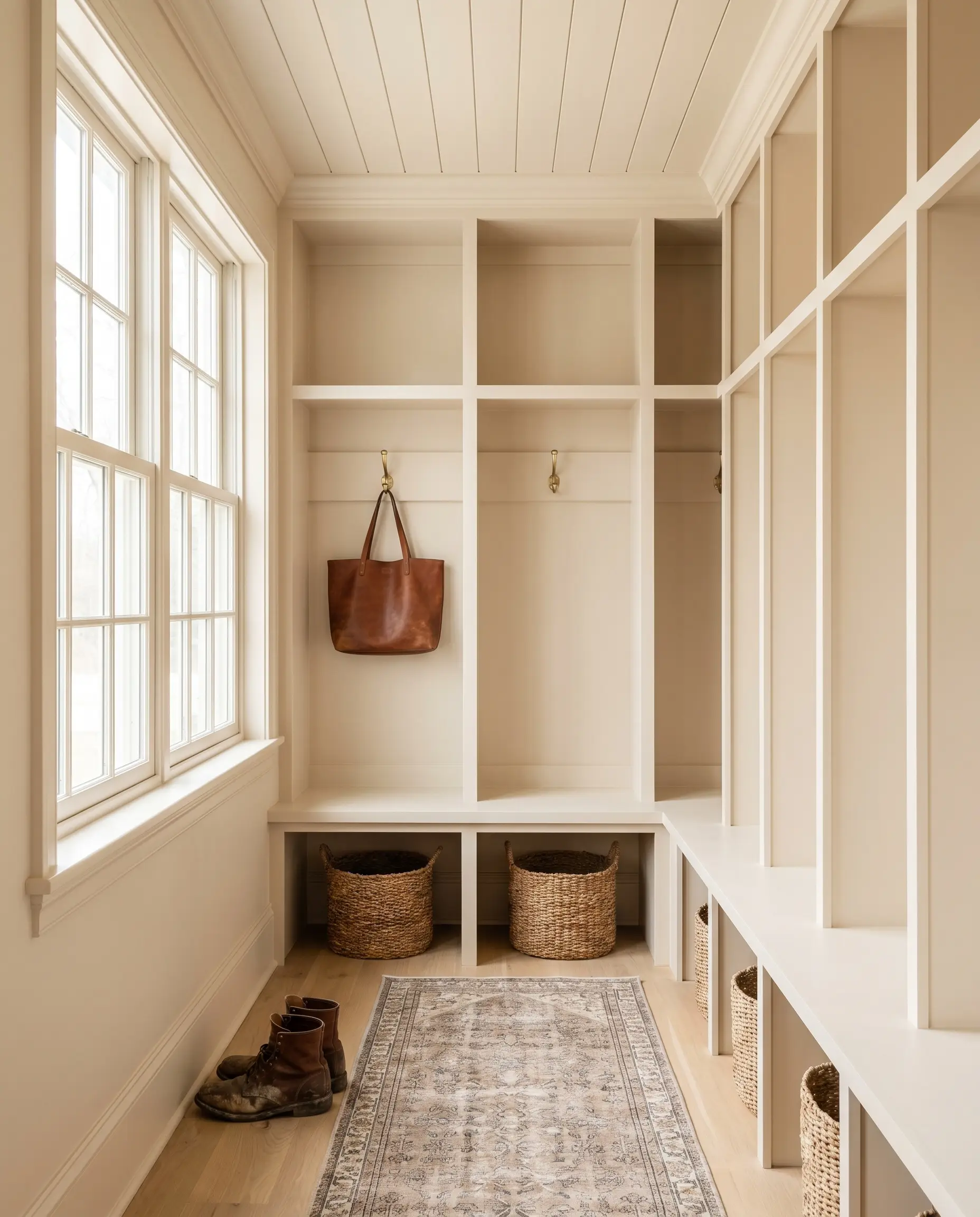
Transform a utilitarian entryway by painting the walls, trim, and ceiling entirely in Sherwin-Williams Sunbleached. This seamless application eliminates visual clutter, turning a typically chaotic drop-zone into a sophisticated, tailored transition space. The enveloping warmth immediately welcomes guests while hiding minor scuffs better than a stark white.
Reviving Vintage Casegoods
Will Sunbleached work with your specific lighting, floor, or furniture?
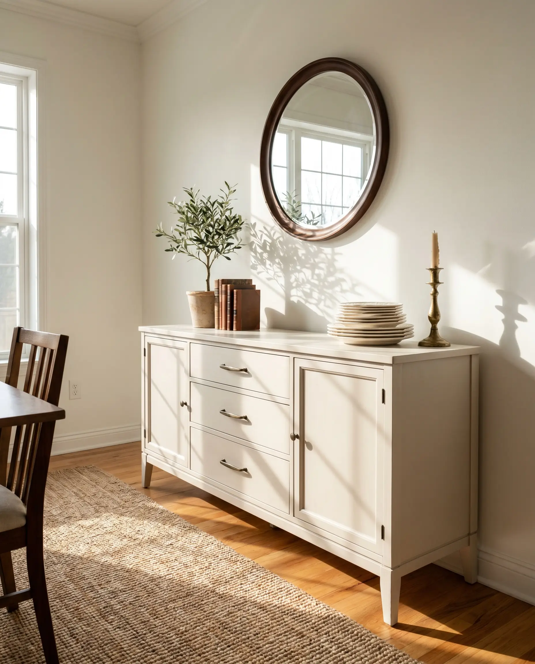
Update a thrifted wooden armoire or a heavy mid-century sideboard by coating it in a durable satin finish of this greige. The fresh, sandy tone completely modernizes the heavy silhouette while respecting its vintage charm. Pair the newly painted piece with aged bronze hardware to complete the high-end transformation.
A Serene Wellness Studio
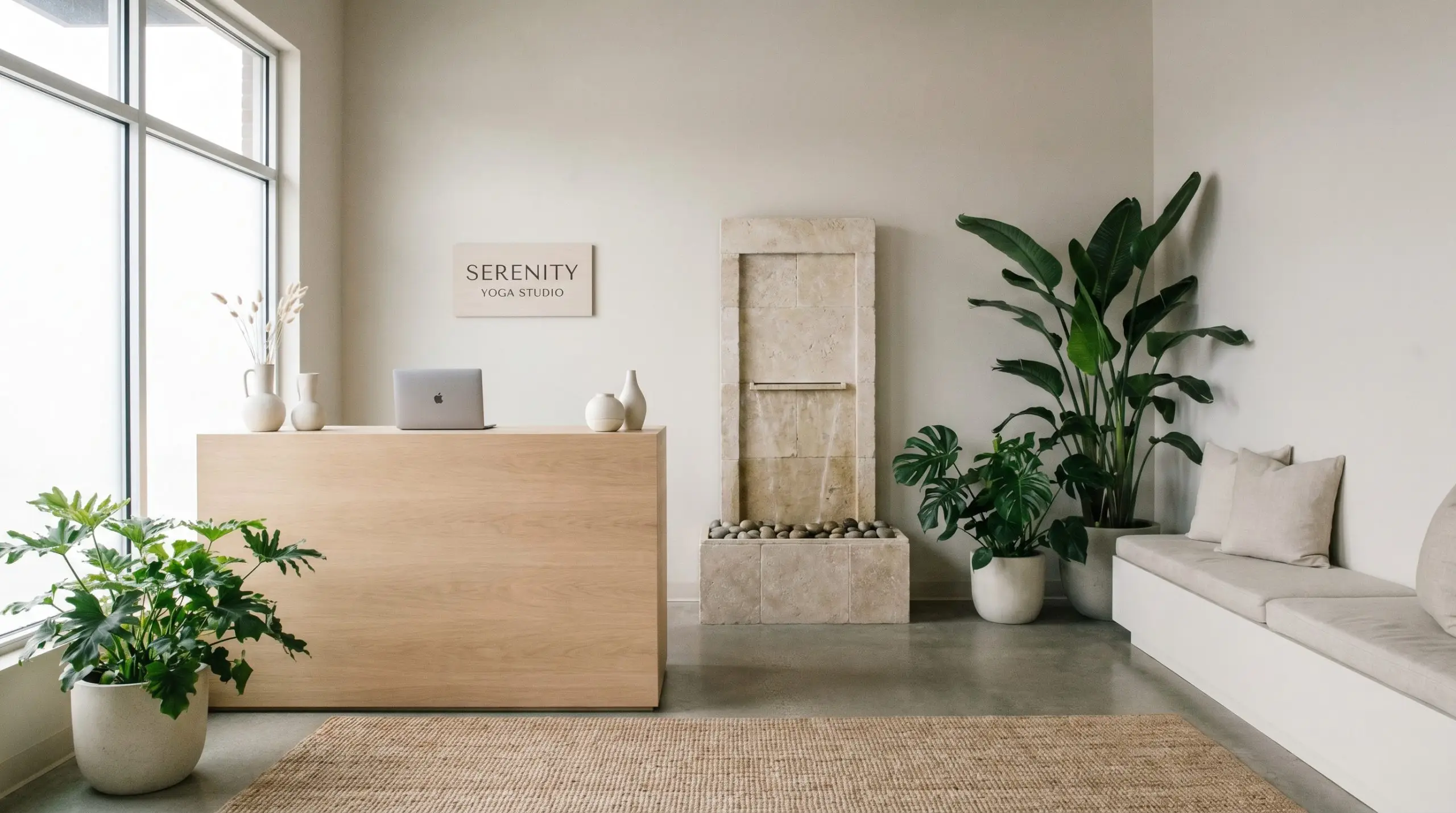
For a commercial or hospitality environment, apply this shade to the reception area of a boutique yoga or pilates studio. The earthy, grounding energy of the paint instantly lowers the heart rate of clients walking through the door. It creates a pristine, restorative atmosphere that feels far more inviting than a clinical white lobby.
Coordinating Colors & Best Pairings
To truly elevate this warm neutral, you must surround it with elements that respect its subtle complexities. It thrives on soft, tonal transitions rather than jarring, high-contrast borders. If you are transitioning from gray to greige, focusing on these specific material and color pairings is essential.
Tailored Trim & Baseboards
When selecting trim, Benjamin Moore Chantilly Lace OC-65 provides a crisp, highly tailored boundary that makes the main wall color pop. For a slightly softer, premium glow that avoids harshness, Farrow & Ball All White No. 2005 is an exquisite choice. If you prefer a modern, sharp architectural line, Sherwin-Williams High Reflective White SW 7757 delivers a brilliant contrast.
Hardware, Wood & Material Pairings
The Secondary Palette
Designer Mood Boards
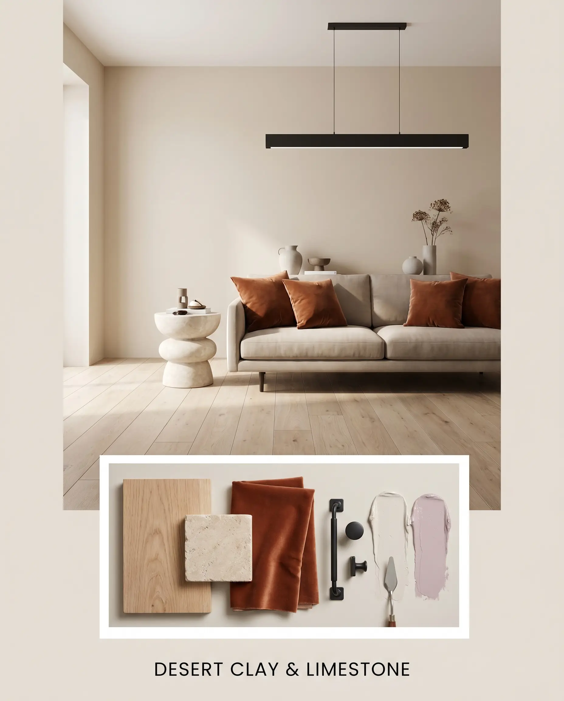
Desert Clay & Limestone This palette leans heavily into the paint’s earthy warmth, pairing the main walls with accents of Mauve Finery SW 6282. Ground the space with everyday white oak floors and elevate it with a premium tumbled limestone side table. Finish the styling with rust-toned velvet pillows and matte black linear lighting for a grounded, sun-baked energy.
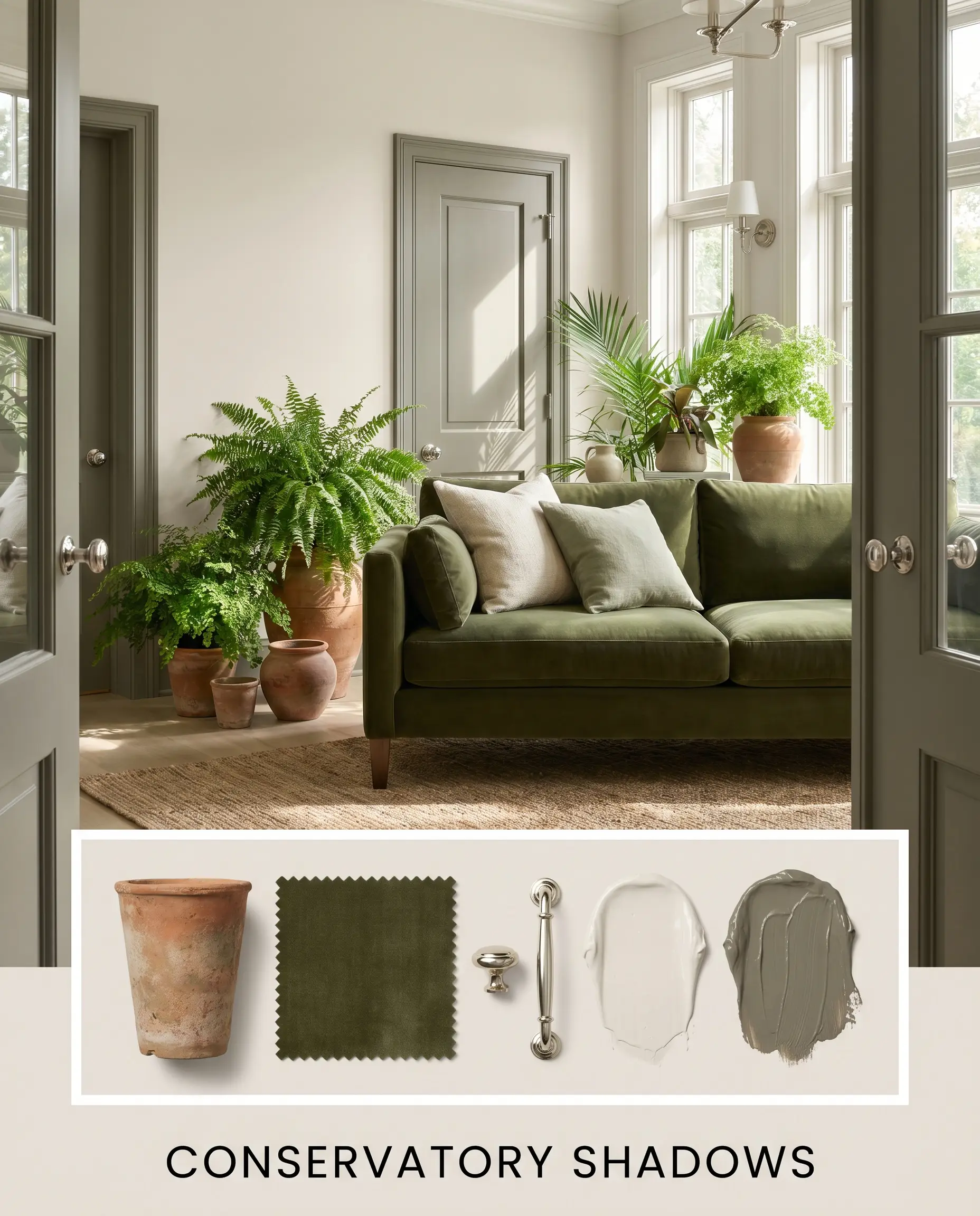
Conservatory Shadows Focusing on the hidden green nuance, this concept utilizes Gloucester Sage HC-100 on interior doors or built-ins. Introduce polished nickel hardware to bounce light against the deeper tones, and anchor the room with a deep olive velvet sofa. Trailing indoor ferns and aged terracotta pots complete this lush, restorative vibe.
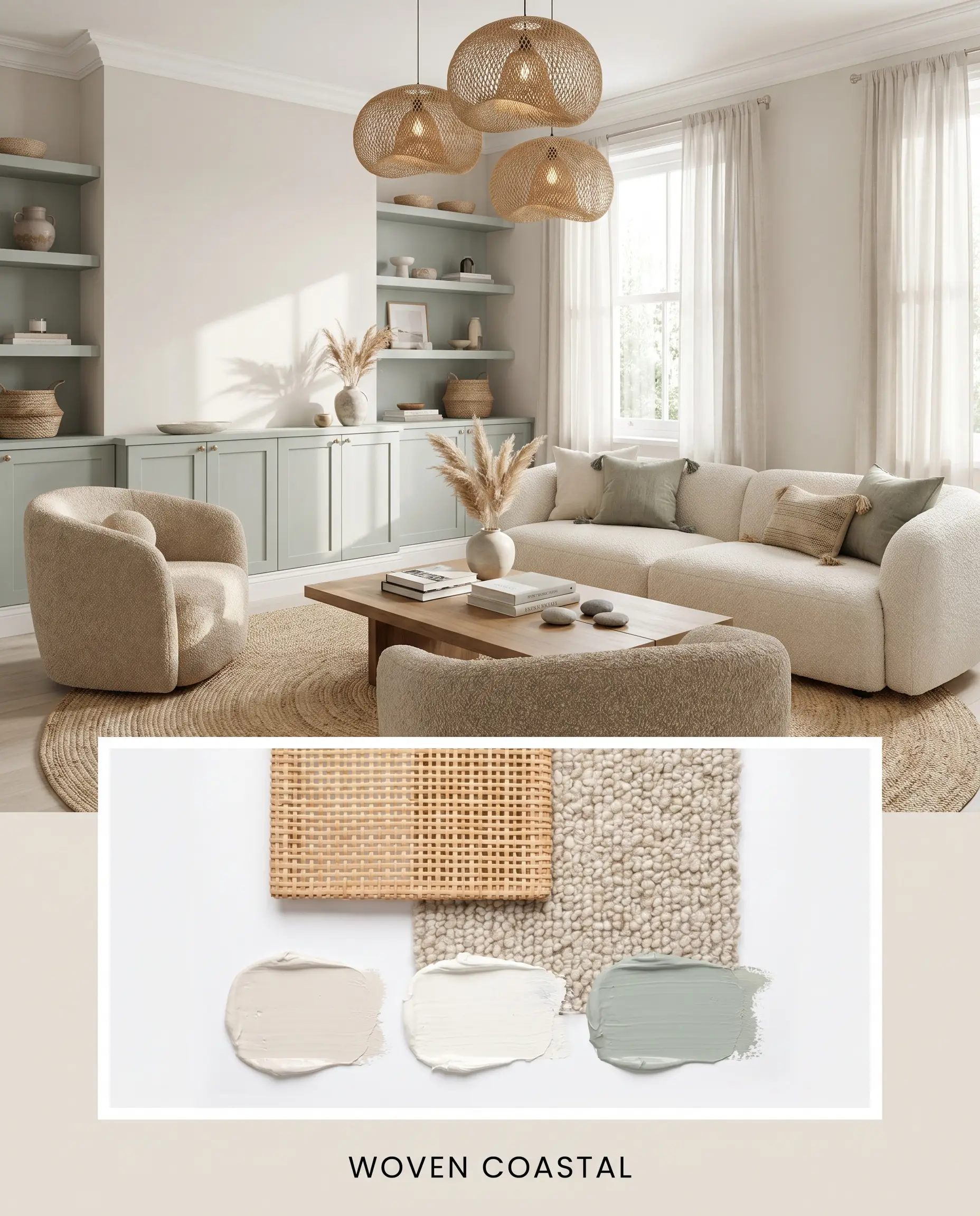
Woven Coastal This breezy, relaxed approach pairs the main wall color with soft accents of Quietude SW 6212 and crisp All White No. 2005 trim. Layer in highly textured boucle fabrics and natural woven rattan pendants to create a tactile, inviting environment. The resulting mood is effortlessly serene, capturing the essence of a sophisticated seaside retreat.
Will Sunbleached work with your specific lighting, floor, or furniture?
Head-to-Head Comparisons
Sometimes, the specific architectural exposure of your home demands a slight pivot. If your lighting conditions threaten to wash out or muddy our featured shade, exploring these direct competitors will ensure a flawless finish.
Sherwin-Williams Sunbleached SW 9585 vs. Sherwin-Williams Creamy SW 7012
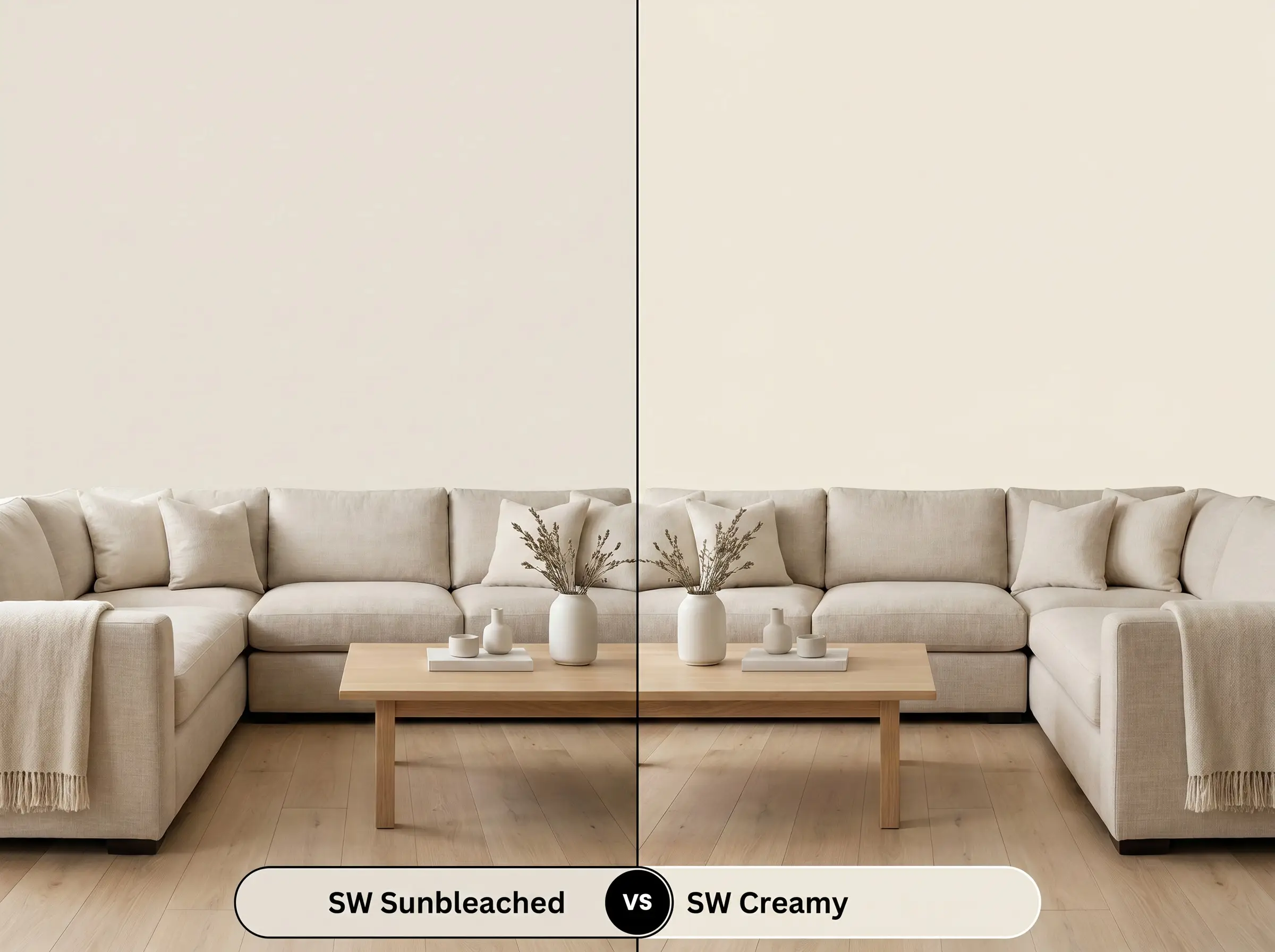
If your room lacks natural light and feels overly chilly, Creamy SW 7012 might be the better option. Creamy carries a much more pronounced yellow base, offering traditional warmth without the green nuance. However, if you want a modernized, earthy feel, Sunbleached remains the superior choice.
Sherwin-Williams Sunbleached SW 9585 vs. Benjamin Moore Pale Oak OC-20
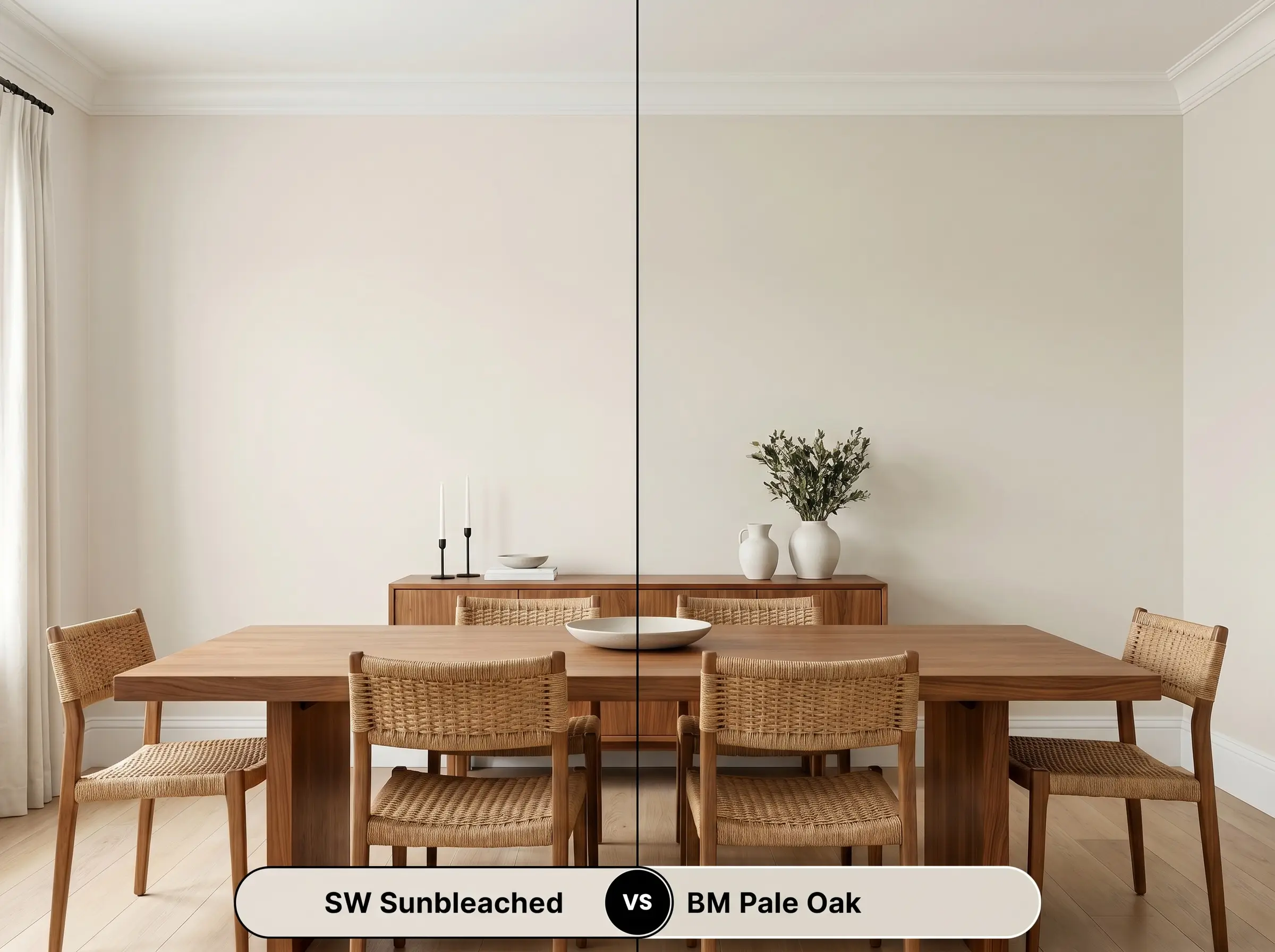
Pale Oak OC-20 is a true, classic greige that leans slightly more toward gray and taupe. If your existing furniture features cooler tones, Pale Oak will bridge that gap smoothly. Sunbleached, by contrast, is distinctly sandier and warmer, making it better suited for rooms with rich, warm woods.
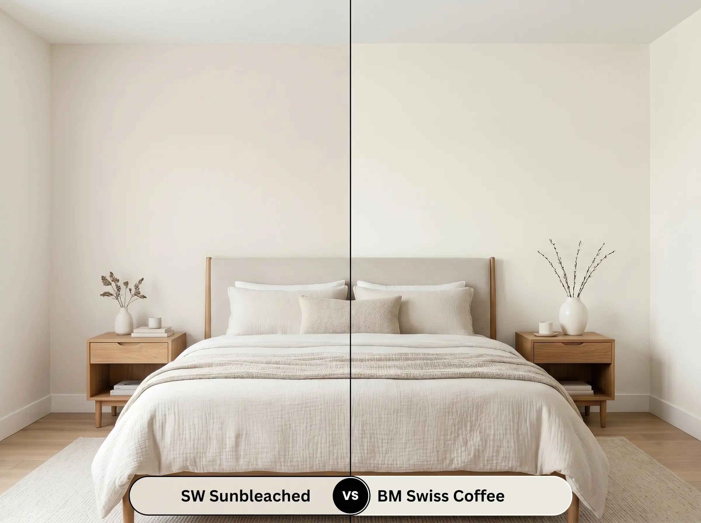
Sherwin-Williams Sunbleached SW 9585 vs. Benjamin Moore Swiss Coffee OC-45
Will Sunbleached work with your specific lighting, floor, or furniture?
Swiss Coffee OC-45 functions much more like a traditional off-white, offering a cleaner, lighter presence on the wall. If you want the walls to recede entirely, Swiss Coffee is highly effective. Sunbleached carries significantly more depth and pigment, allowing it to act as a definitive color rather than just a bright backdrop.
Sherwin-Williams Sunbleached SW 9585 vs. Sherwin-Williams Agreeable Gray SW 7029
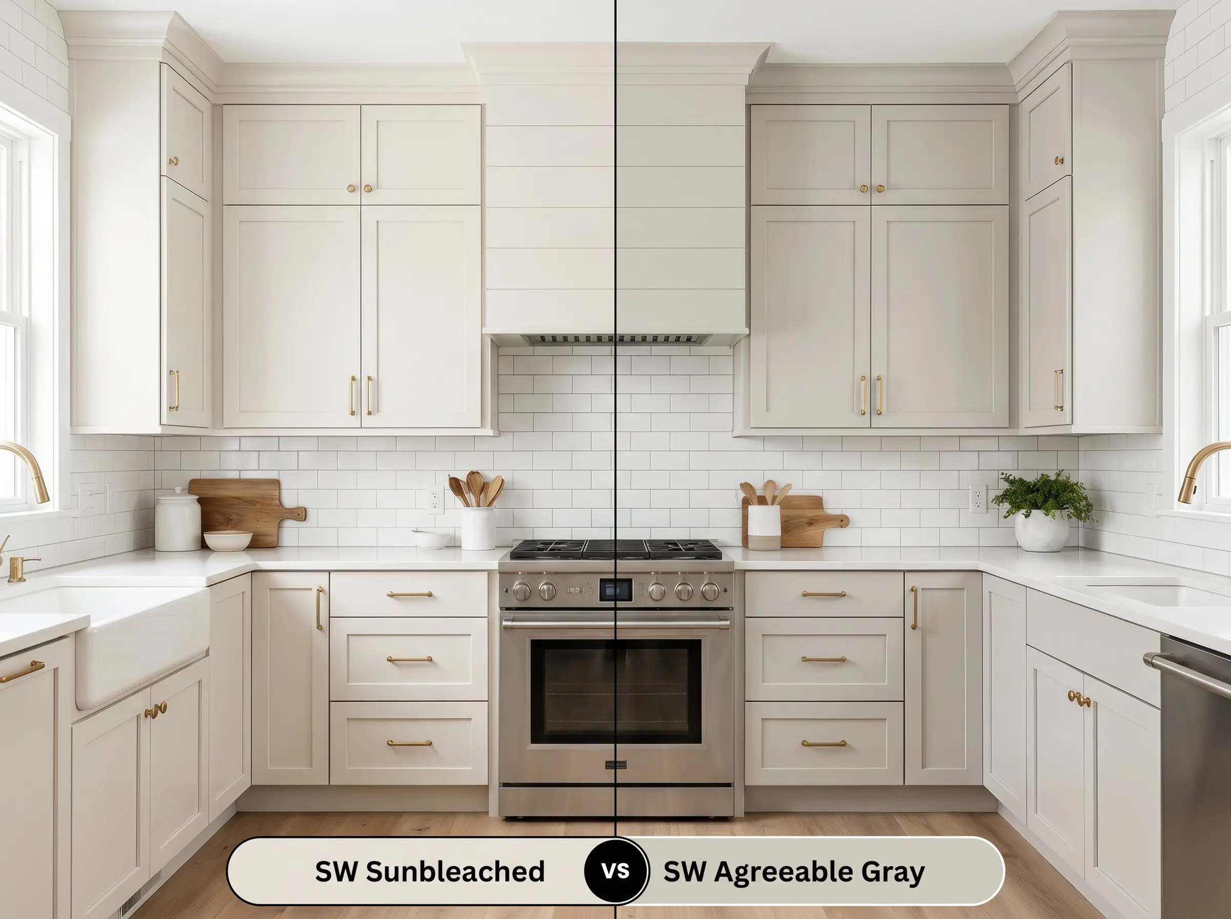
Agreeable Gray SW 7029 is noticeably darker and leans into a more traditional, historic gray profile. If you are trying to update a space to feel fresh and luminous, Agreeable Gray can sometimes feel a bit heavy. Sunbleached lifts the energy of the room, providing a much airier, transitional aesthetic.
Similar Colors & Brand Equivalents
Whether you need a subtle shift in depth for a shadowed hallway or require a match from a different manufacturer, these alternatives provide excellent pathways.
Same-Brand Alternatives
Cross-Brand Matches
Practical Application & DIY Advice
Transitioning this beautiful pigment from the swatch to your actual walls requires strategic planning. The finish you choose and the preparation you do will dictate the final aesthetic.
The Dynamic Sheen Guide
Primer Strategy
To ensure the subtle green nuance isn’t corrupted by underlying pigments, always use a high-quality, pure white primer over new drywall or dark existing colors. Skipping this step can cause the sandy beige to pull unexpectedly muddy.
When rolling this color down a long, light-filled hallway, be highly mindful of your roller pressure. Pushing too hard to stretch the paint can cause visible flashing—uneven streaks that become glaringly obvious when natural light hits the wall at an angle.
Hackrea Design Secret (Application)
Coverage & Success Tips
This specific depth of color typically requires two full, even coats to achieve true professional opacity. Take your time maintaining a wet edge while rolling, as touch-ups on light-reflecting greiges can sometimes dry with a slightly different sheen if not blended perfectly.
Frequently Asked Questions
Because 3000K bulbs cast a notably warm glow, they will absolutely amplify the sandy beige base of this paint. However, the hidden green nuance typically prevents it from crossing into a harsh, outdated yellow, keeping it feeling cozy and enveloping instead.
On heavy stucco, the deep shadows created by the texture will pull the color slightly darker and emphasize its earthy greige qualities. On smooth HardiePlank, the high light reflectance allows it to read much brighter and cleaner, almost like a warm off-white in direct sun.
Yes, it performs beautifully on the ceiling in these environments. The warm, sandy undertones help counteract the chilly, blue-leaning shadows typical of northern or artificial lighting, bringing a gentle, flattering warmth to the space.
While the green nuance is subtle, it actually works to balance and cool down the intense warmth of red oak floors. Rather than clashing, the combination creates a highly grounded, natural aesthetic that feels intentional and harmonious.
Final Verdict & Expert Warnings
Ultimately, Sherwin-Williams Sunbleached is a brilliant choice for homeowners looking to inject a sophisticated, airy warmth into their spaces without resorting to outdated, heavy beiges. It excels in large, open layouts and nature-inspired interiors, acting as a luminous anchor that shifts beautifully throughout the day. Its high light reflectance brings life to shadowed corners, while its complex undertones provide enough architectural interest to stand on their own.
However, you must be highly strategic with your surrounding hard finishes to protect the integrity of the color. Because of its subtle green micro-nuance and sandy base, this shade actively fights against heavily red-toned woods like traditional cherry or unrefined mahogany, which can make the paint look slightly sickly and discordant. Additionally, avoid pairing it with icy, blue-leaning gray tiles or cool-toned marble countertops. That stark temperature difference will strip away the paint’s gentle warmth, leaving the entire room feeling disjointed and visually confused.
Room Compatibility & Clashes Diagnoses
Hackrea's reports evaluating the compatibility of Sunbleached in real rooms.South-Facing Two-Story Living Room
"The paint's airy warmth complements the natural limestone fireplace and southern daylight, though its high reflectance sharply contrasts against the dark wood furniture."
Closest Cross-Brand Equivalents
The absolute closest scientific color matches for Sunbleached across top paint brands.