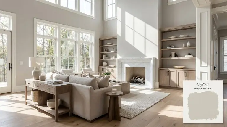
Big Chill SW 7648
Sherwin-WilliamsSherwin-Williams Big Chill (SW 7648) is a light, cool-toned gray with subtle blue undertones. With an LRV of 62, it provides a crisp, airy feel that avoids looking overly icy, making it a versatile neutral for modern and transitional spaces.
| Temperature | Cool |
|---|---|
| Primary Undertone | Blue |
| Hidden Undertones | Subtle blue-green and passive stormy gray |
| Best Exposures | South, East, West |
| Best For | Living rooms, bedrooms, bathrooms, kitchen cabinets, open-concept spaces, exteriors |
Hackrea Review
Big Chill is the ultimate 'cool but not freezing' gray. It brings a sophisticated, stormy calmness to a room without feeling like a sterile office. It is highly reliable, but you must respect its chromatic profile—pair it with crisp whites, not creamy yellows.Architectural Applications for Sherwin-Williams Big Chill
Living Rooms
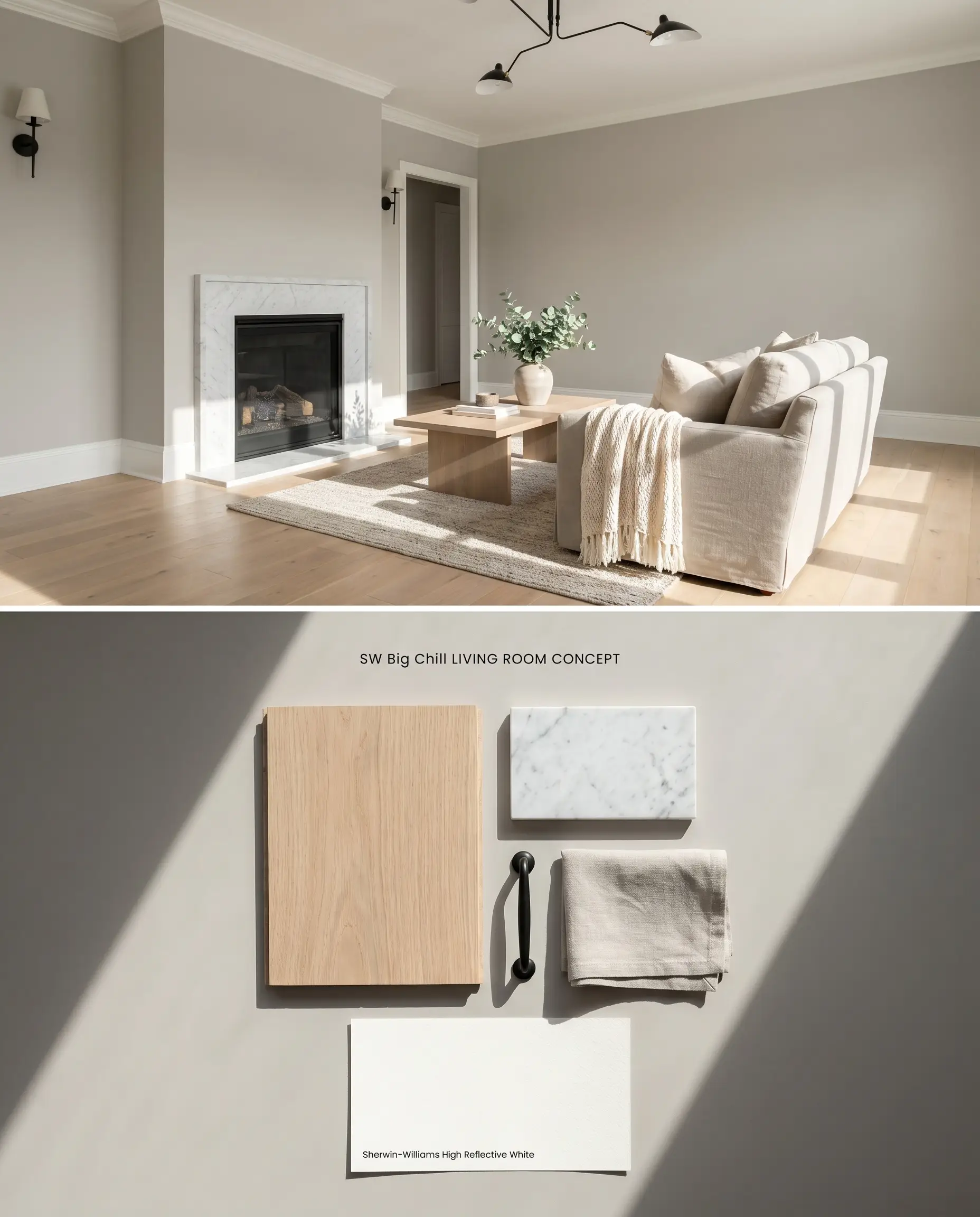
Sherwin-Williams Big Chill SW 7648 acts as a structural cool gray when paired with wide-plank white oak and honed marble fireplace surrounds, absorbing the ambient light to neutralize the room’s chromatic profile. The paint’s blue undertones actively repel the visual heat of south-facing sunlight, preventing the walls from turning muddy mid-afternoon. By grounding the space with a crisp white trim, the gray maintains its sharp edges against soft linen upholstery and matte architectural features.
Bedrooms
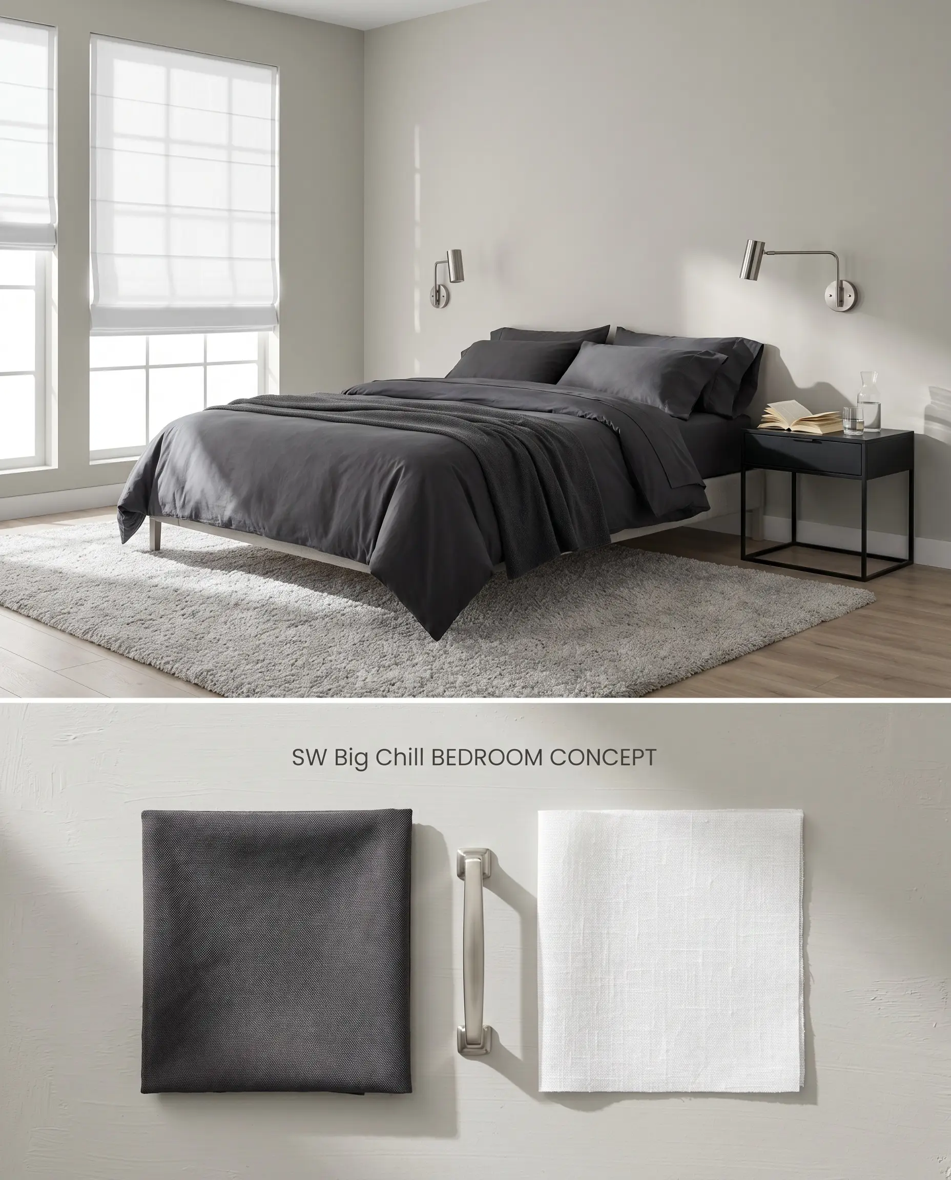
In sleeping quarters, this stormy gray leverages its LRV 62 to reflect just enough morning light to feel expansive without becoming glaring. The color structure of Big Chill SW 7648 relies on its cool base, which pairs seamlessly with layered percale bedding and brushed nickel sconces to create a crisp, tailored retreat. When applied over builder-grade flat white, it requires a minimum of two coats to establish its true depth and prevent the primer from washing out the pigment.
Bathrooms
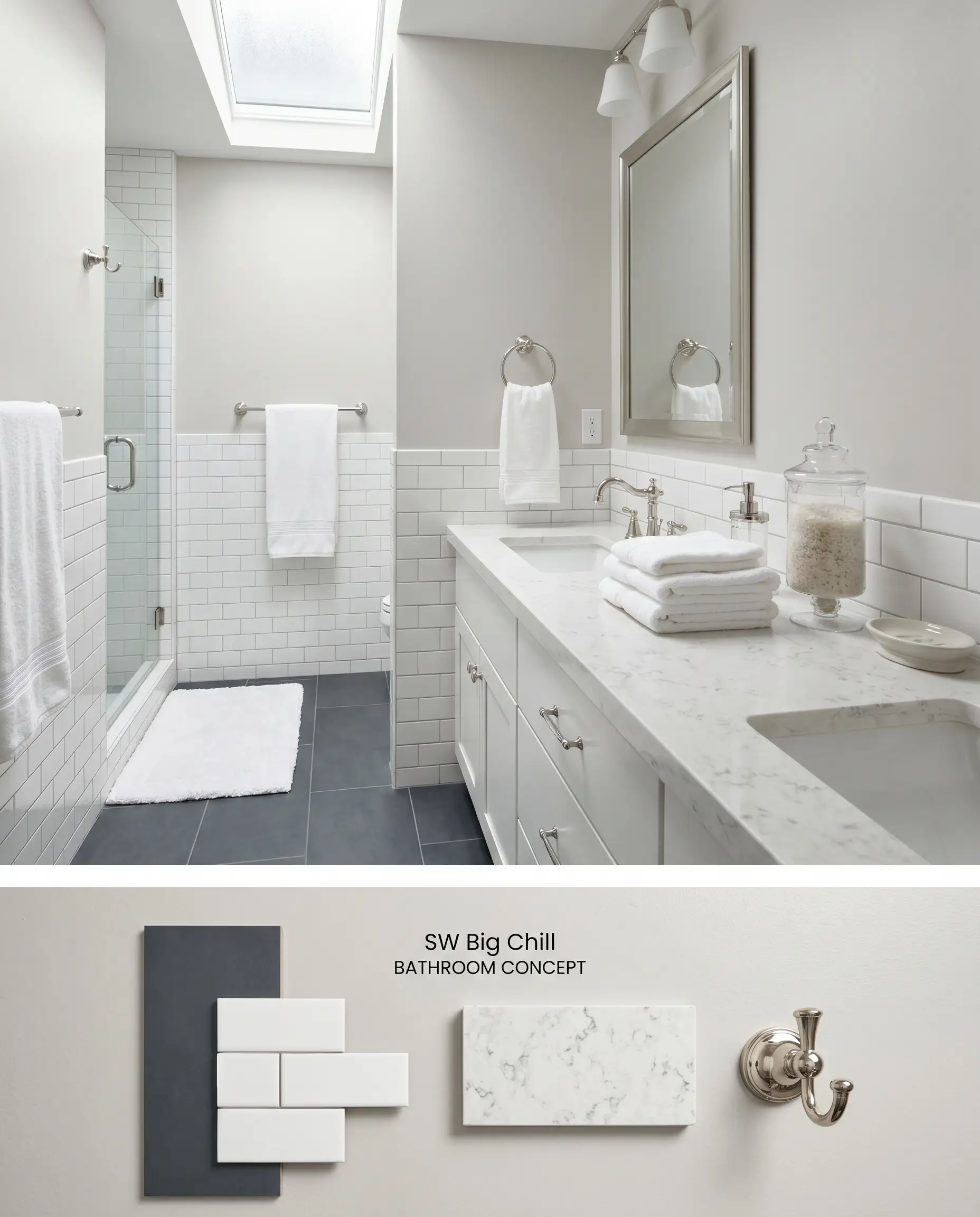
Big Chill SW 7648 requires significant natural light to thrive in a bathroom setting, as windowless spaces will trap the color and cause it to read flat and lifeless. When illuminated by a frosted skylight or large privacy window, the paint offsets the rigid, glossy surfaces of glazed subway tile and polished quartz vanity tops. The cool gray provides a subtle visual relief from highly reflective hard finishes while maintaining a sanitary, crisp aesthetic.
Kitchen Cabinets
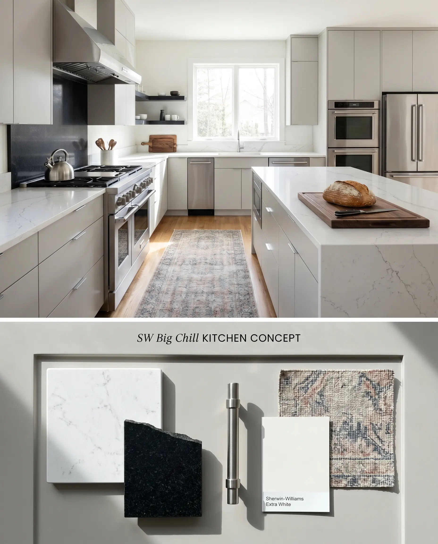
Utilizing Sherwin-Williams Big Chill SW 7648 on cabinetry requires strict isolation from warm, earthy tones like terra cotta backsplashes or creamy yellow walls. The paint transforms into a sleek architectural finish when anchored by crisp white quartz countertops and stainless steel professional appliances. The cool blue-gray base visually recedes, making tight galley kitchens feel wider while offering more grounding weight than a standard white cabinet.
Open-Concept Spaces
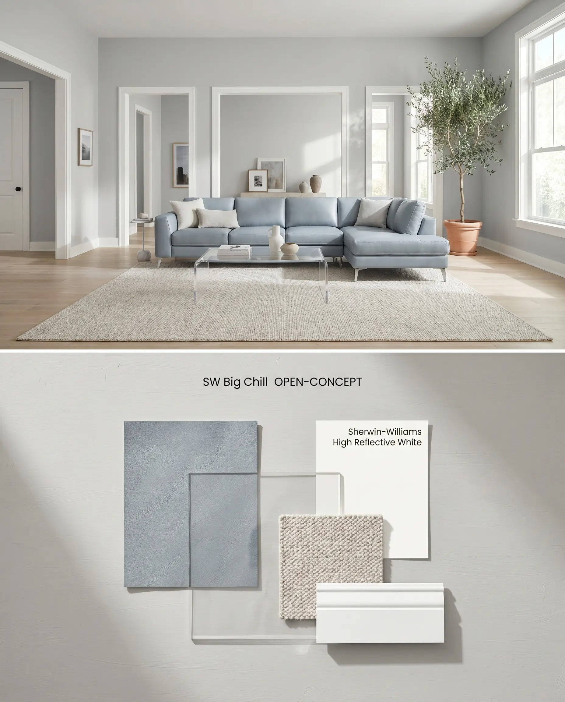
Spanning large, multi-use areas, this LRV 62 gray acts as a cohesive neutral bridge, provided the flooring remains neutral or cool-toned to prevent clashing. The color shift across different times of day is predictable, moving from a sharp, cool gray in the morning to a slightly warmer, yet still crisp, neutral by late afternoon. Applying it across expansive drywall requires a matte finish to absorb glare from large window banks while allowing the subtle undertones to read evenly, and this flat profile ensures seamless touch-ups in high-traffic zones.
Exteriors
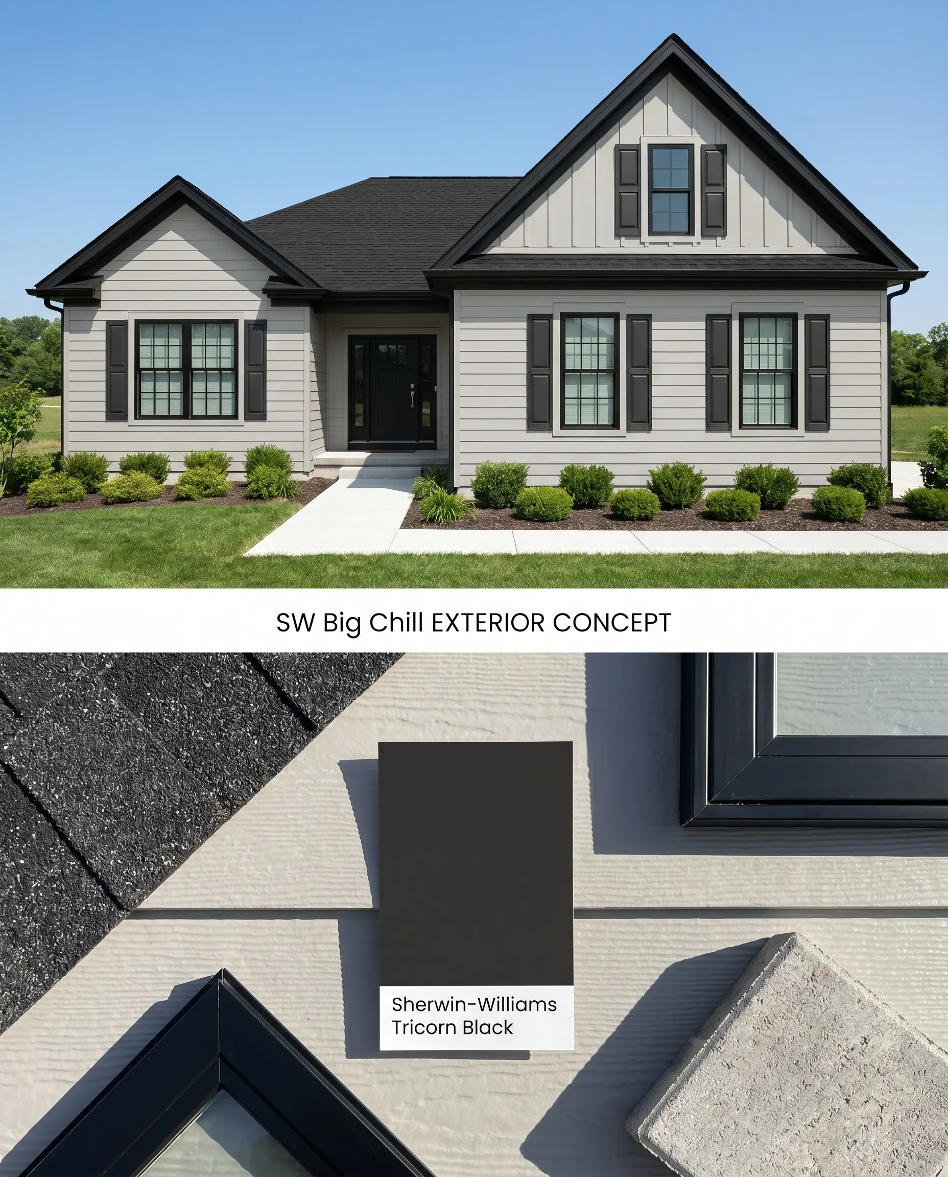
On exterior siding, Sherwin-Williams Big Chill SW 7648 reads significantly lighter due to the washing effect of direct sunlight, often appearing as an off-white with a distinct blue-gray cast. The paint is highly susceptible to environmental reflections, meaning heavy exterior foliage will bounce green light onto the facade, shifting its stormy gray appearance. Pairing it with a stark black roof and matching black window sashes grounds the lightness and prevents the home from looking washed out.
You can apply wallpapers, paints, etc. on walls and see how they look in various interiors.

Evaluating the Chromatic Profile: Direct Color Comparisons
Sherwin-Williams Big Chill SW 7648 vs. Sherwin-Williams Repose Gray SW 7015
Sherwin-Williams Repose Gray SW 7015 operates with a warmer, greige base that contains subtle brown and taupe undertones, contrasting sharply with the distinct blue-gray foundation of Big Chill SW 7648. In north-facing rooms, Repose Gray SW 7015 holds its neutral warmth, whereas Big Chill’s blue undertones become highly pronounced, leaning into a true cool blue-gray. Specify Big Chill SW 7648 for spaces with south-facing light where its cool base neutralizes the sun’s yellow cast, and reserve Repose Gray SW 7015 for low-light or north-facing rooms that require injected warmth.
Sherwin-Williams Big Chill SW 7648 vs. Sherwin-Williams On the Rocks SW 7671
Both paints share an identical LRV of 62, meaning they reflect the exact same volume of light, but their color structure differs entirely. Sherwin-Williams On the Rocks SW 7671 relies on a more neutral, slightly taupe-leaning base that makes it more forgiving against warm woods, while Big Chill SW 7648 maintains a strict, icy blue undertone. Deploy Big Chill SW 7648 when pairing with stark white marble and cool metals, but pivot to On the Rocks SW 7671 if the space features existing honey oak cabinetry that would clash with a blue-based gray.
Sherwin-Williams Big Chill SW 7648 vs. Benjamin Moore Stonington Gray HC-170
Benjamin Moore Stonington Gray HC-170 is a classic stormy gray with a slightly lower LRV of 59, absorbing more light and reading marginally deeper on the wall than Big Chill SW 7648. Stonington Gray HC-170 carries a subtle green-blue undertone that can flash green in certain afternoon light, whereas Big Chill SW 7648 remains firmly anchored in its blue-gray identity without the green shift. Choose Big Chill SW 7648 for a crisper, slightly brighter architectural finish in well-lit living spaces, and opt for Stonington Gray HC-170 in larger rooms where a slightly deeper, more traditional gray provides necessary visual weight.
Technical Color Shift and Application FAQs
Yes, the indirect, cool light of a north-facing room amplifies its blue base, causing it to read as a true cool blue-gray rather than a neutral gray.
Yes, the icy blue undertones of Big Chill SW 7648 will actively clash with honey oak and warm woods, making the paint look unintentionally baby blue while making the wood appear overly orange.
In windowless rooms or low-light hallways, Big Chill can fall flat and look like a stormy gray, lacking the inherent warmth that greiges use to artificially brighten dimly lit areas.
Pair it with a stark, highly reflective white like Sherwin-Williams High Reflective White SW 7757 or Extra White SW 7006 to maintain a crisp boundary and prevent the gray from making creamy trims look dirty.