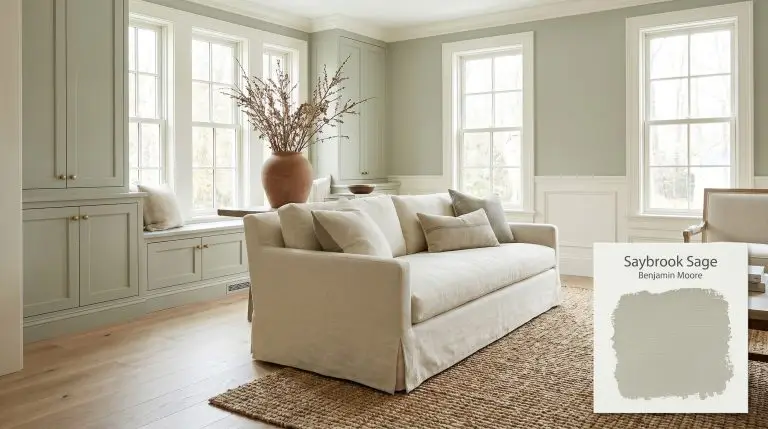
Saybrook Sage HC-114
Benjamin MooreBenjamin Moore Saybrook Sage (HC-114) is a muted, herbaceous sage green with a prominent gray cast. With an LRV of 44.91, it acts as a mid-tone architectural finish that bridges the gap between earthy warmth and cool, silvery sophistication.
Benjamin Moore Saybrook Sage: The Silver-Tinged Green That Reshapes a Room
A truly transformative green paint does not just splash color onto drywall; it acts as a structural baseline for the entire room. Benjamin Moore Saybrook Sage HC-114 is exactly that kind of foundational shade.
Part of the brand’s esteemed historical color collection, this mid-tone sage bypasses predictable woodland greens in favor of something far more curated. It carries a quiet, silvery sophistication that instantly makes standard millwork and everyday furnishings feel highly intentional.
Whether you are updating a suburban kitchen or wrapping a primary suite in a soft, organic hue, this color provides a stunning architectural finish. Let’s look at the underlying pigment data to understand exactly why this muted green works so beautifully.
Benjamin Moore Saybrook Sage: Temperature, Undertones & LRV
Homeowners constantly ask if this specific herbaceous green reads warm or cool once it actually hits the wall. The answer is a beautifully balanced neutral-cool.
At 44.91, its light reflectance value places it directly in the mid-tone category. It absorbs enough light to establish a substantial, stabilizing presence without turning your space into a shadowed cave.
You can apply wallpapers, paints, etc. on walls and see how they look in various interiors.

Lighting Effects & The Chameleon Factor
Because of that prominent slate-gray cast, HC-114 shifts dramatically depending on the sun’s angle and your chosen light bulbs.
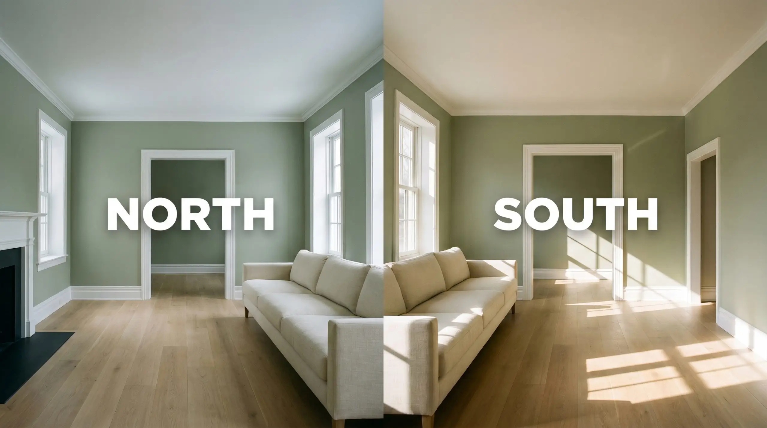
Full, direct midday sun on a facade will aggressively wash out the nuance of this green. It will appear significantly lighter and more gray on exterior siding than it looks on a small indoor swatch.
Hackrea Pro-Tip (The Exterior Wash-Out Rule)
Popular Room Applications for Saybrook Sage
This muted pigment manipulates the visual weight of a room, allowing it to transition seamlessly across completely different architectural styles and daily routines.
Kitchen Cabinetry
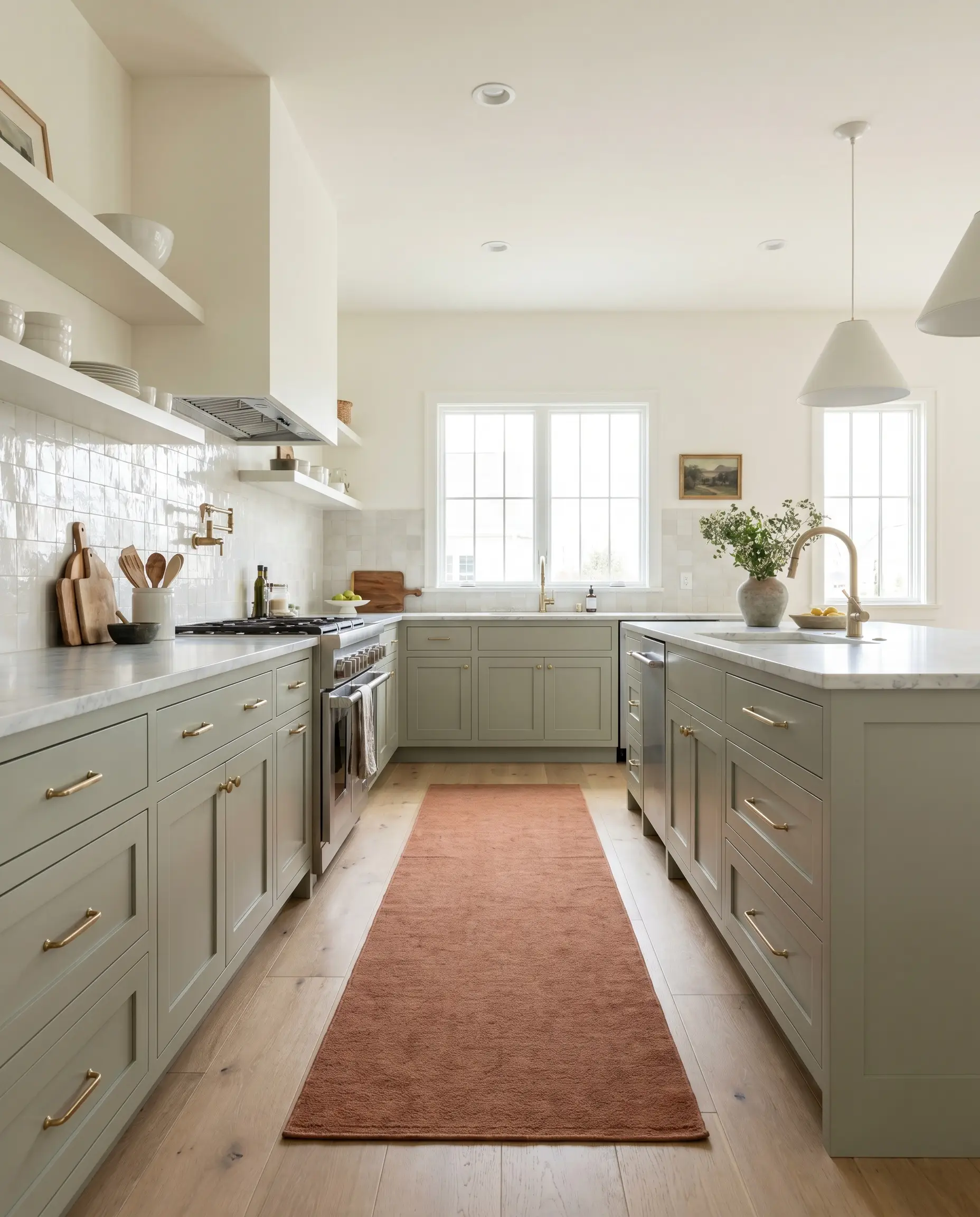
A cabinetry application of this silver-tinged green instantly updates a hardworking family kitchen without relying on stark whites or trendy blacks. To avoid the predictable farmhouse aesthetic, push the design into a tailored transitional space. Pair the painted lower cabinets with honed Carrara marble countertops and a backsplash of glossy, handmade zellige tile to bounce light around the room.
Anchor the island with unlacquered brass hardware that will patina over time, bringing a raw, living finish to the cool gray undertones. If you want a slightly more industrial edge, swap the brass for blackened steel pulls and install fluted glass upper cabinets.
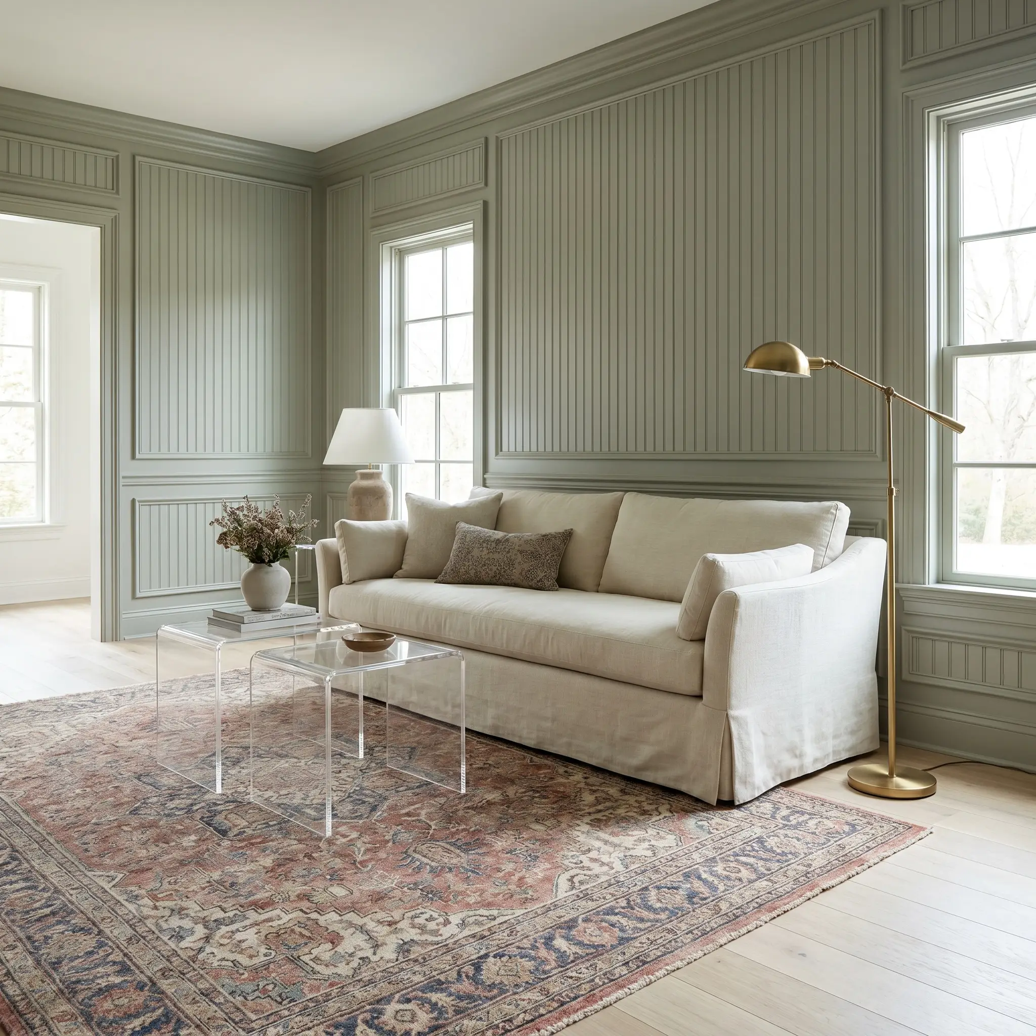
Primary Bedrooms
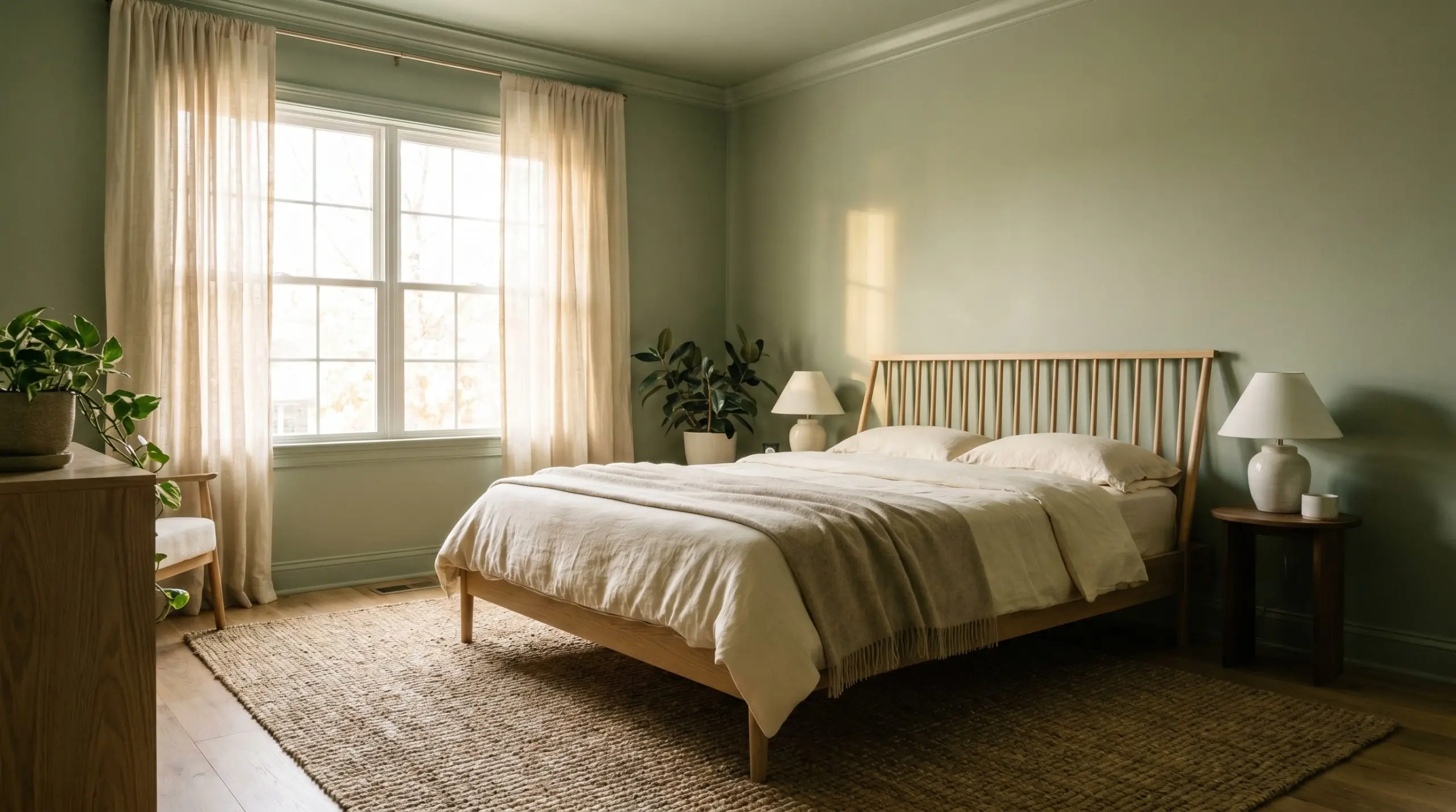
Instead of defaulting to a traditional cottage look, use this mid-tone sage to build a deeply calming, Organic Modern retreat. Color-drench the entire space—painting the walls, baseboards, and crown molding in the exact same sheen—to blur the boundaries of the room and create a seamless, stabilizing wrap.
Introduce tactile contrast through your textiles and flooring. Layer a chunky jute rug under a white oak spindle bed, and frame the windows with sheer, raw silk drapery that filters the morning light.
Avoid pairing this specific green with stark, blue-toned white bedding. The cool undertones will clash awkwardly; instead, opt for creamy, warm linen sheets to soften the slate-gray cast.
Clash Warning (The Bedding Trap)
Exterior Siding & Trim
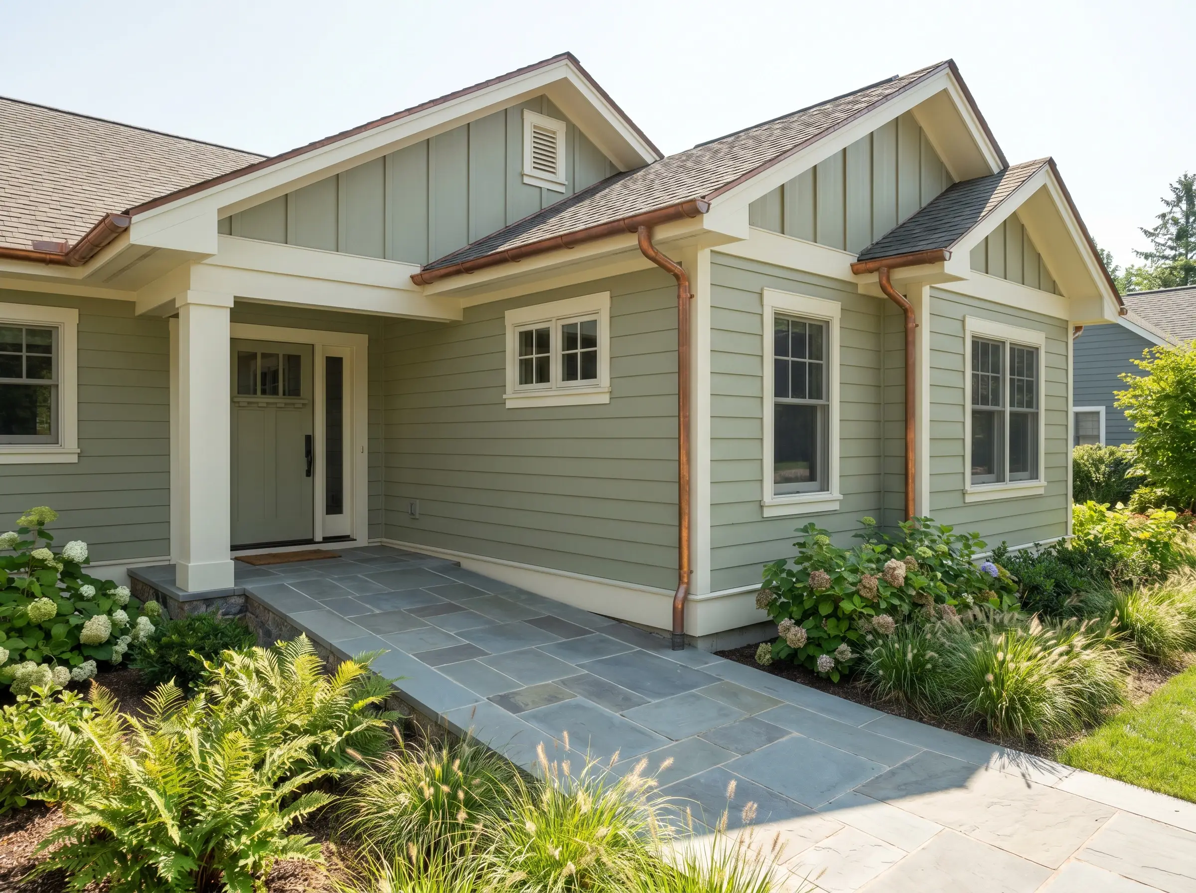
While it has roots in historical collections, this shade is brilliant for updating a mid-century ranch or a modern suburban cottage. The earthy aloe base connects beautifully with surrounding landscaping, while the gray undertone keeps the facade looking crisp and intentional.
Pair the green siding with creamy white trim (like Benjamin Moore Swiss Coffee) for a soft, accessible contrast. To elevate the entire exterior profile, introduce natural copper gutters or slate stone walkways, which pull out the subtle warmth hidden in the paint’s DNA.
Traditional Living Rooms
You can honor the classic nature of a traditional living room while keeping the aesthetic fresh and highly relevant. Apply the green to classic picture molding or floor-to-ceiling beadboard to establish a rich architectural foundation.
Break up the heritage feel by mixing eras within your furniture plan. Flank a classic, skirted slipcovered sofa with modern acrylic nesting tables and sculptural brass floor lamps.
Home Libraries & Studies
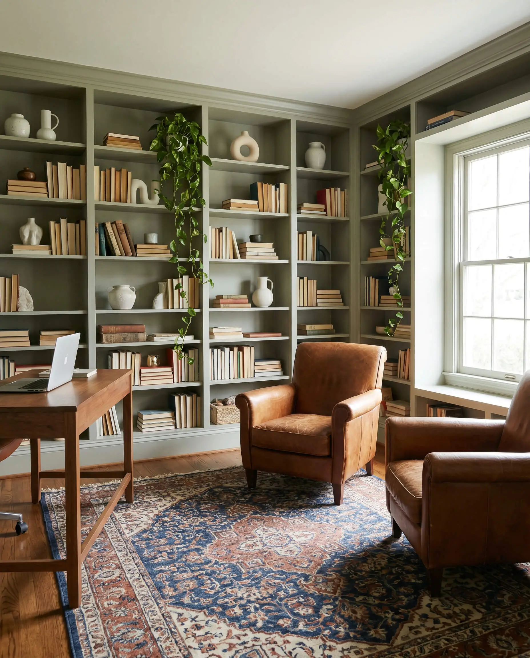
You do not have to rely on cavernous, dark jewel tones to create a sophisticated study. Using this muted green on wall-to-wall built-in bookcases establishes a tailored, sunlit reading room that feels incredibly inviting for daily remote work.
Style the open shelving with stacked vintage books, minimalist ceramic clusters, and trailing pothos to bring life to the cool silver undertones. Ground the center of the room with a vintage, block-print cotton rug and a pair of worn saddle leather chairs.
Coordinating Palettes & Material Interplay
Saybrook Sage requires intentional contrasting textures to keep its muted profile from flattening out a room. Its slate-gray cast thrives when pressed against crisp, luminous boundaries or rich, warming tones that force its green base to the surface.
Tailored Trim & Baseboard Pairings
Selecting the right framing color completely dictates how this green reads in your home. The goal is to manipulate the paint’s color structure by providing a border that either sharpens its edge or softens its presence.
Hardware, Wood & Tactile Finishes
Secondary Coordinating Colors
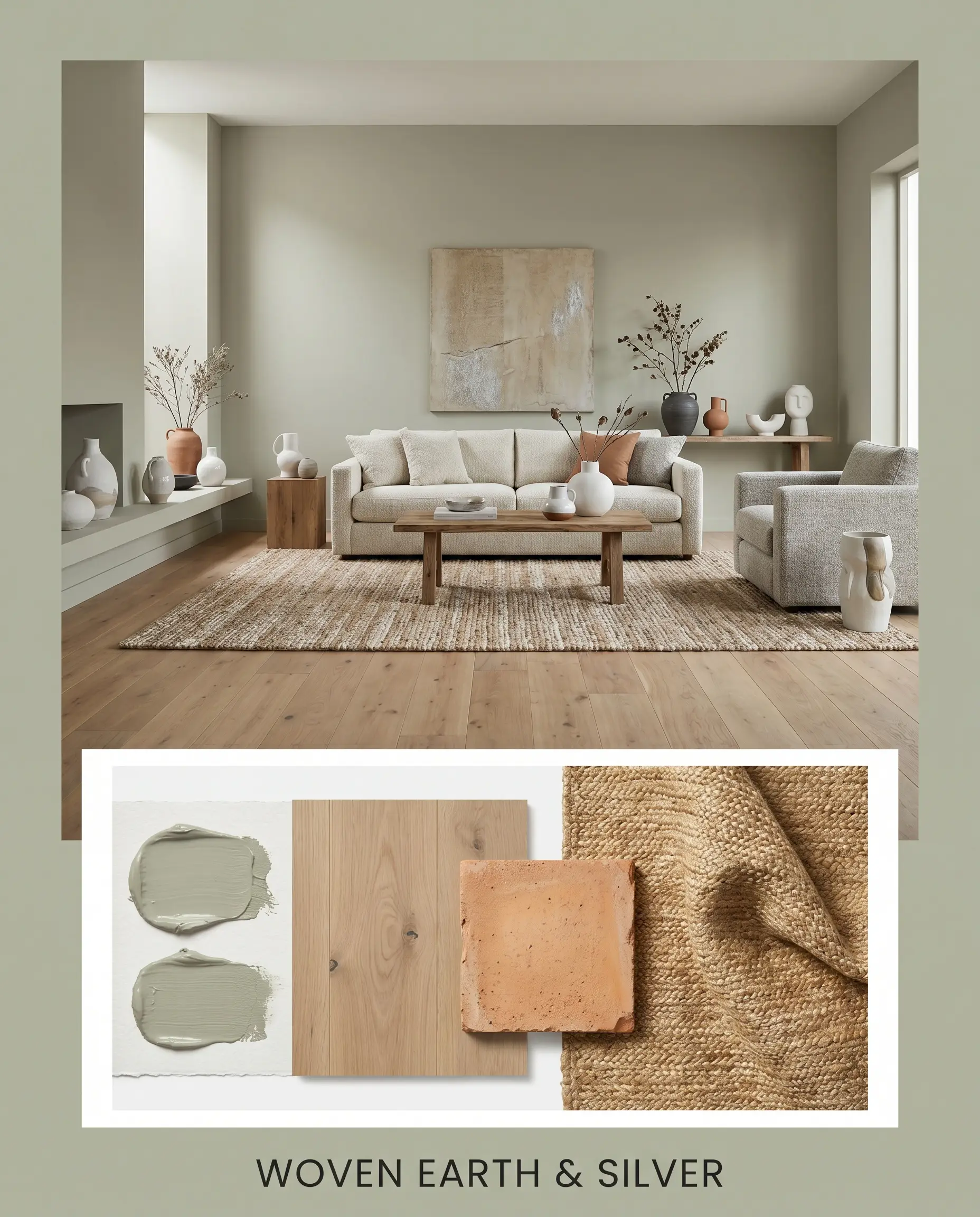
Curated Aesthetic Mood Boards
Woven Earth & Silver This palette leans heavily into an Organic Modern energy, stripping away traditional pretenses to focus entirely on raw texture and natural light. The silvery undertone of the paint is warmed up by expansive stretches of matte white oak and the grounding presence of terracotta tile accents. To build a deeply calming, tactile environment, layer a chunky jute rug under furniture upholstered in worsted wool, and finish the styling with minimalist ceramic clusters and dramatic floor plants.
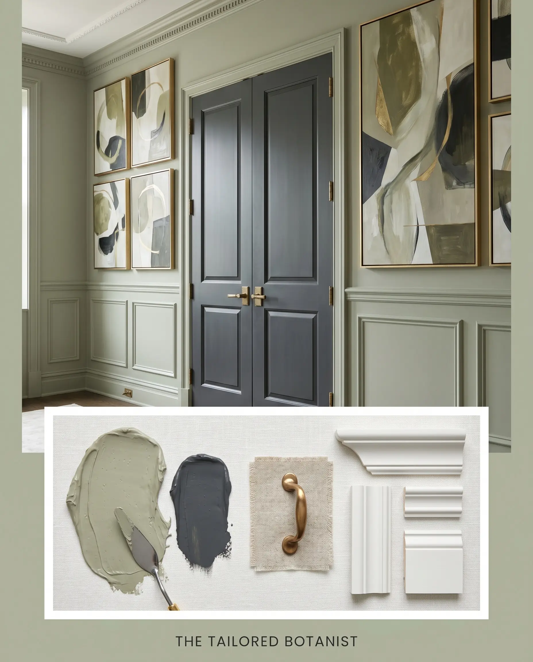
The Tailored Botanist For a more structured, transitional mood, this combination uses sharp contrasts to elevate the paint’s historical roots into a modern context. The mid-tone sage is framed by crisp, clean millwork, while unlacquered brass hardware acts as the jewelry of the space, throwing warm light against the cool walls. Introduce deep accents of Hale Navy, style the surfaces with stacked vintage books, and hang oversized abstract canvases to create a room that feels both highly collected and effortlessly sharp.
Head-to-Head Comparisons
When evaluating a foundational green, the final decision often comes down to the specific lighting exposure of your home and the surrounding hard finishes. If your room lacks natural light or your existing floors pull heavily warm, a competing shade might offer the exact structural shift you need.
Benjamin Moore Saybrook Sage HC-114 vs. Sherwin-Williams Clary Sage SW 6178
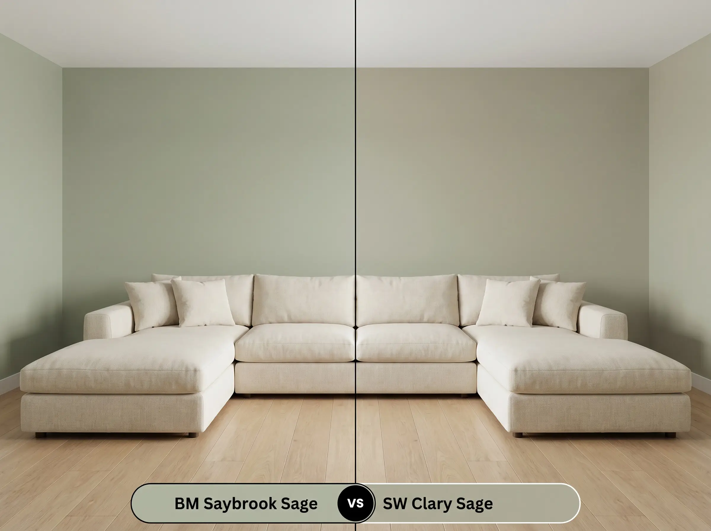
If you are designing a north-facing room that receives chilly, indirect sunlight, Saybrook Sage might lean too far into its gray-silver profile. Clary Sage offers a slightly warmer, more yellow-based alternative that fights off the shadows. Choose Clary Sage if you need a cozier, more traditional green, but stick with the Benjamin Moore option if you prefer a crisper, tailored aesthetic.
Benjamin Moore Saybrook Sage HC-114 vs. Sherwin-Williams Evergreen Fog SW 9130
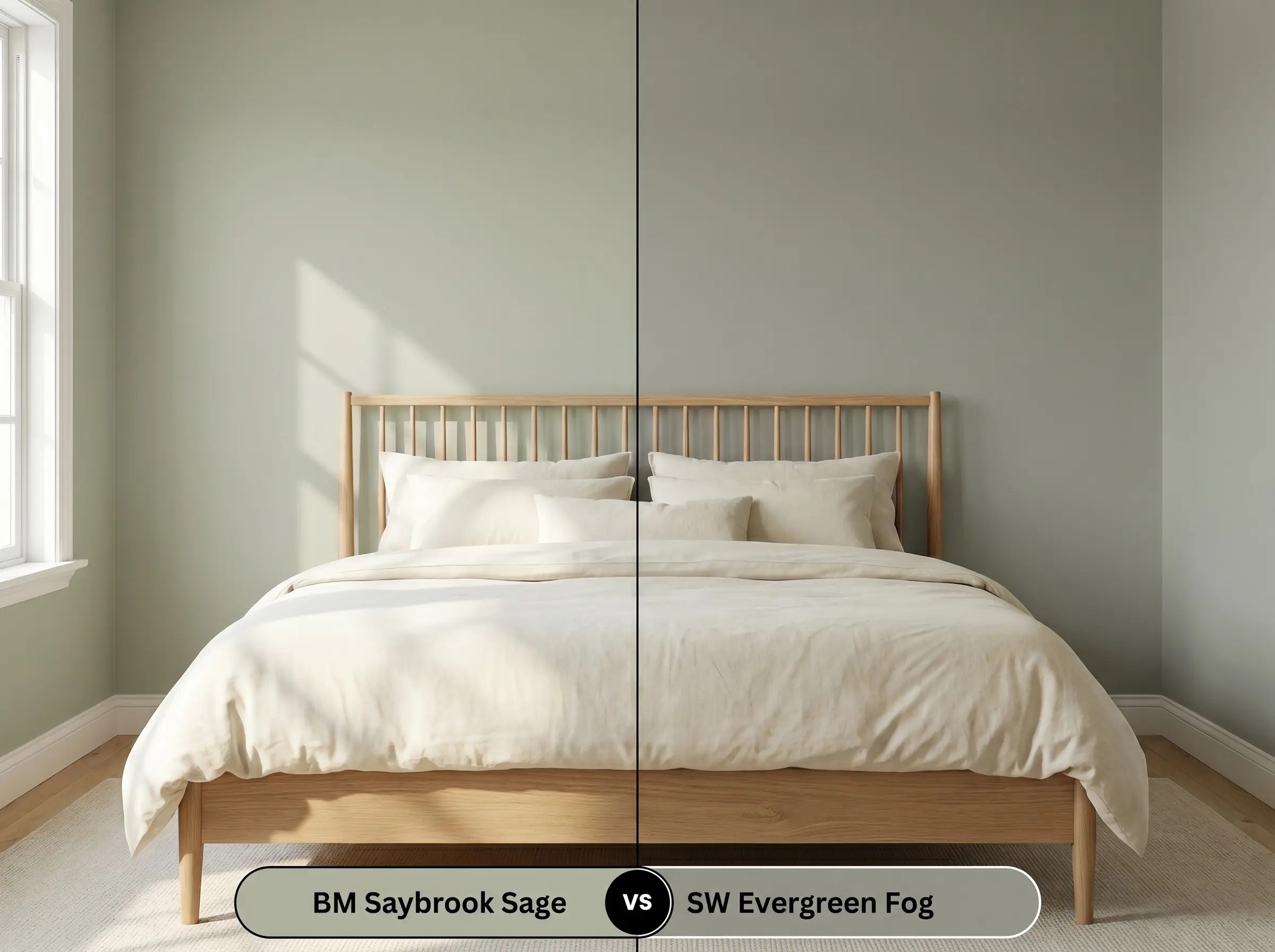
Evergreen Fog carries significantly more visual weight and leans heavily into a moody, brown-gray undertone, dropping down to an LRV of 30. If you are trying to create a deeply saturated, enveloping atmosphere, Evergreen Fog provides that dramatic anchor. Opt for Saybrook Sage if you want the room to remain airy and reflective, as its higher LRV bounces much more light around the space.
Benjamin Moore Saybrook Sage HC-114 vs. Benjamin Moore October Mist 1495
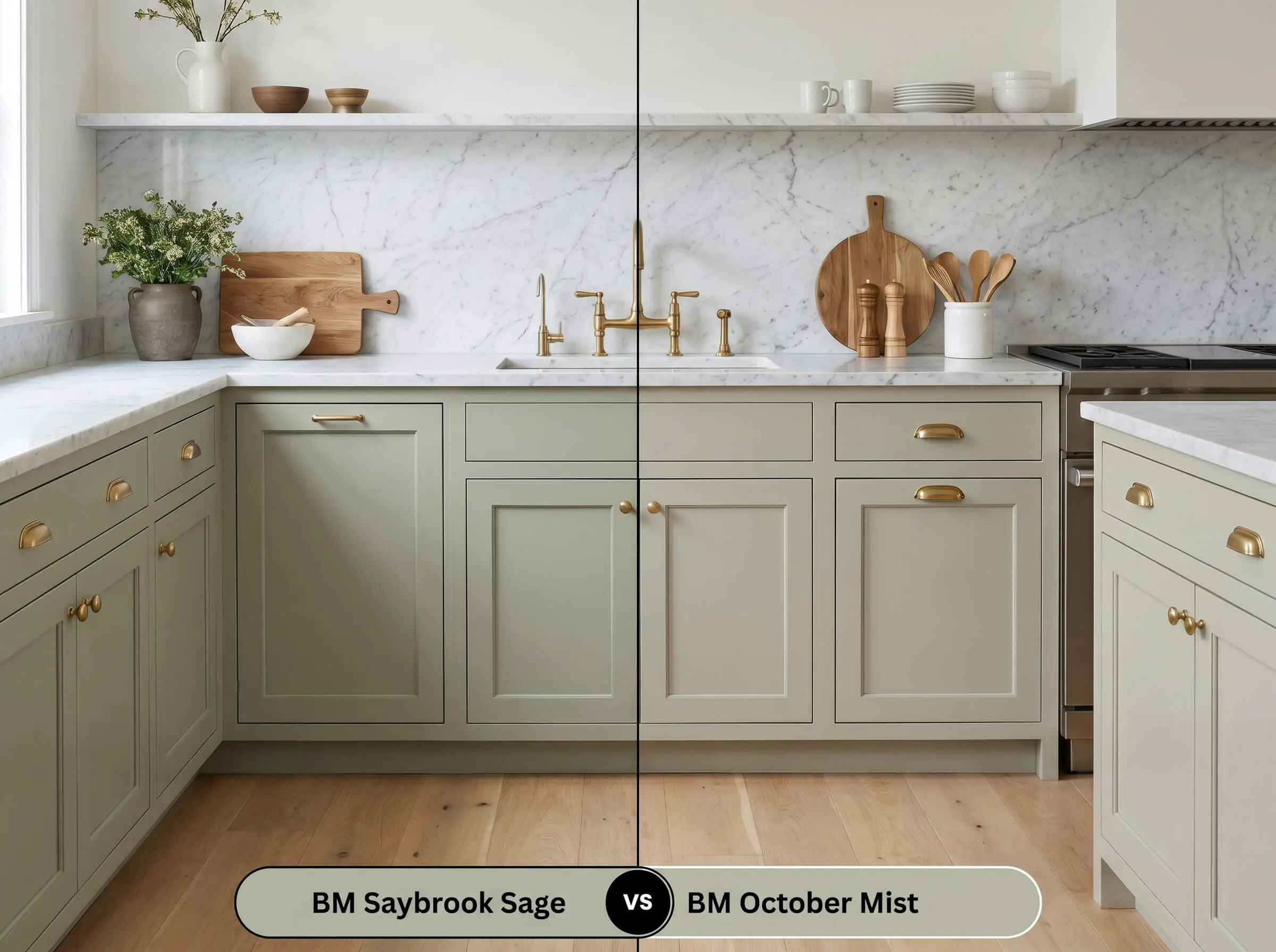
October Mist is noticeably lighter and carries a softer, more floral silver undertone, making it feel slightly more delicate on the wall. If you are color-drenching a small, windowless space, October Mist will prevent the walls from closing in. However, if you are painting exterior siding or lower cabinetry, Saybrook Sage has the necessary depth to hold its own against bright sunlight and heavy architectural elements.
Similar Colors & Brand Equivalents
Sometimes a paint is incredibly close to your vision, but you need a minor adjustment in depth or you are restricted to a specific brand’s formulation.
Same-Brand Alternatives
Cross-Brand Matches
Practical Application & DIY Advice
Transitioning this beautiful pigment from a tiny paper swatch to a massive wall requires an understanding of how sheens and primers manipulate light.
Because this color relies on a complex mix of green and slate, applying it directly over a stark white wall can cause the first coat to look chalky. Ask your paint counter to tint a high-quality acrylic primer with a touch of light gray to give the sage a proper, stabilizing base.
Hackrea Design Secret (The Primer Strategy)
For a truly professional, opaque finish, this specific mid-tone depth requires two full coats, regardless of the brand’s “one-coat coverage” claims. You must maintain a wet edge while rolling. If you allow sections of the wall to dry before overlapping your roller, this specific gray-green is highly susceptible to “flashing,” leaving you with visible, uneven streaks that ruin the tailored aesthetic.
Frequently Asked Questions
Because it relies on natural light to activate its herbaceous green base, this pigment will lean heavily into its slate-gray undertones in a windowless space. To prevent the room from feeling chilly, offset the wall color with warm brass sconces and a glowing, warm-kelvin lightbulb.
This mid-tone sage performs beautifully on textured surfaces like stucco or wood, where the natural shadows enhance its depth. On flat, glossy vinyl siding, the sun will bounce off the sheen and wash out the complex silvery undertone, making it appear much lighter and flatter.
The prominent cool-gray cast in this paint actually provides a stunning, balancing contrast to the fiery orange and red tones found in traditional oak flooring. The green neutralizes the aggressive warmth of the wood, making the entire room feel more tailored and intentional.
Absolutely, provided you style the surrounding elements with a modern lens. By pairing the painted cabinetry with sleek blackened steel hardware, honed marble, and clean-lined transitional fixtures, you immediately strip away any predictable rustic stereotypes.
Final Verdict & Expert Warnings
Benjamin Moore Saybrook Sage HC-114 is the ultimate architectural chameleon for homeowners who want to introduce color without sacrificing sophistication. Its brilliant balance of herbaceous green and stabilizing slate-gray makes it perfect for grounding transitional kitchens, elevating exterior facades, or wrapping a primary bedroom in a deeply calming energy. It thrives in homes that utilize a mix of eras, bridging the gap between historical millwork and sleek, modern furnishings with effortless grace.
However, you must respect the silver undertone hidden within this paint’s DNA. Pairing this specific green with stark, blue-toned grays or icy, cool-toned carpets will immediately pull the life out of the pigment, leaving the walls looking murky and flat. Furthermore, if your home features heavy, red-leaning cherry wood cabinetry or deeply orange stained trim, the cool slate notes in the sage will violently fight the warm wood, creating a disjointed, vibrating clash. To succeed with this color, you must surround it with neutral-warm woods, creamy whites, and rich, tactile metals that allow its elegant green base to truly shine.