What color is Marmelo? Farrow & Ball's Marmelo (No. 316) is a warm, earthy burnt orange inspired by the marmelo quince. With an LRV of 20.75, it acts as a deeply comforting, mid-tone terracotta that brings toasty warmth and intimate depth to any space.
Farrow & Ball Marmelo: How to Design with This Rich, Sun-Baked Quince
Stepping into a room painted in Farrow & Ball Marmelo feels like being enveloped in the lingering warmth of a late-summer afternoon.
This rich marmelo quince isn’t just a wall color; it is a structural element that completely shifts the emotional temperature of your home. By leaning into a sophisticated terracotta base, this earthy burnt orange bypasses the glaring intensity of primary shades, offering a nuanced, lived-in radiance.
It is a masterclass in atmospheric design, instantly turning flat, uninspired walls into highly tactile surfaces. Whether you are enveloping a dining space or saturating bespoke millwork, this pigment demands to be paired with equally substantive materials to reach its full potential.
Temperature, Undertones & LRV of Farrow & Ball Marmelo
Homeowners constantly ask if this shade reads as a true, blazing orange or a muted brown, and the answer lies entirely in its exceptionally warm, earthy foundation. F&B Marmelo relies on a complex chromatic profile to maintain its sophisticated, curated edge.
With a light reflectance value of 20.75, this shade absorbs a significant amount of natural light. Rather than pushing walls outward, it acts as a cocooning architectural finish that draws the room inward to create a highly intimate, protective atmosphere.
You can apply wallpapers, paints, etc. on walls and see how they look in various interiors.

Manipulating the Light: How the Color Shifts
Because of its rich terracotta base and low light reflectance value, this color reacts dramatically to the shifting angle of the sun.
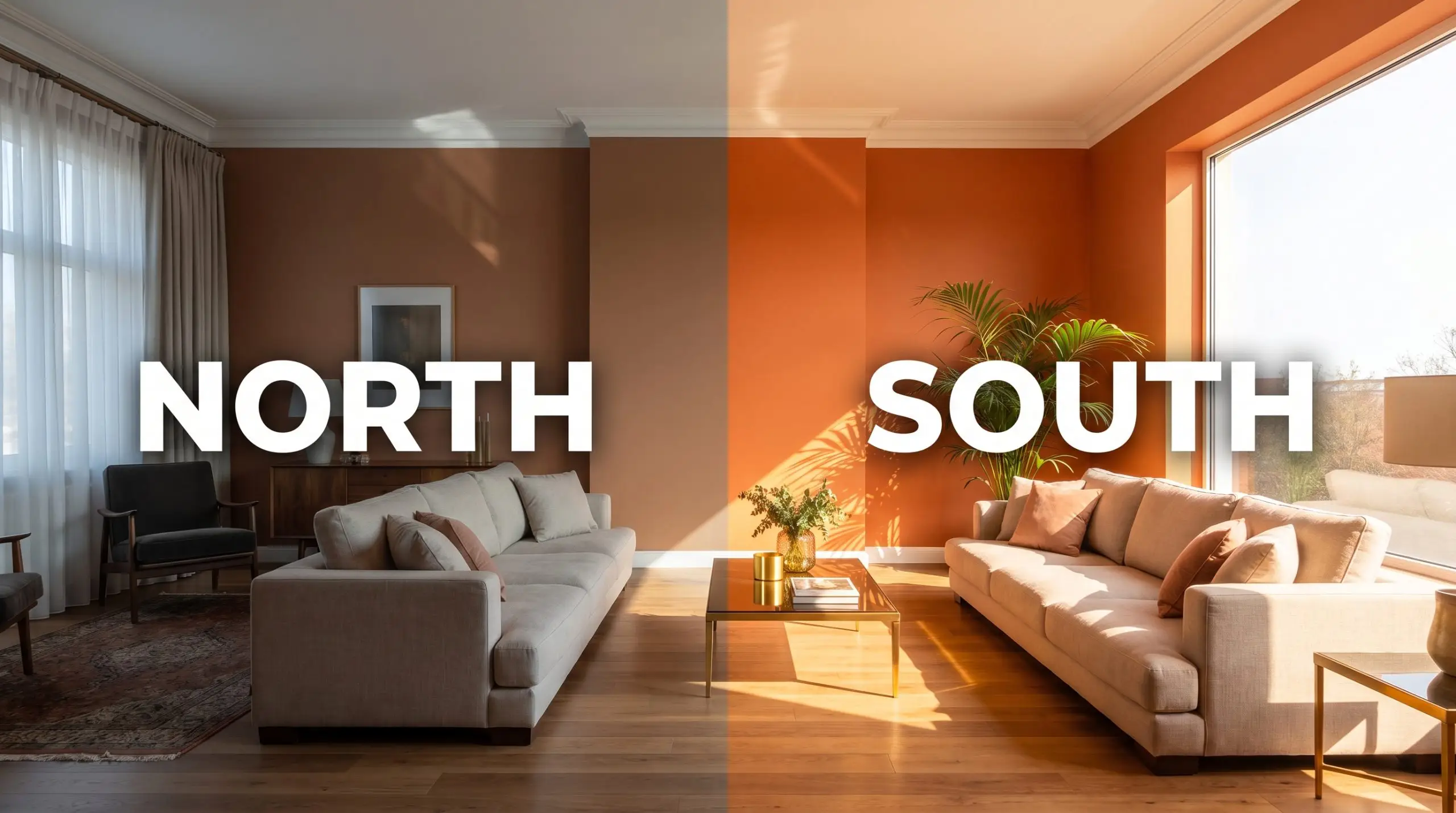
If you apply this burnt orange to an exterior facade, expect the direct overhead sunlight to significantly wash out the nuances of the apricot cast, leaving behind a much lighter, chalky terracotta.
Hackrea Pro-Tip (Exterior Sun Washing)
Popular Room Applications for This Earthy Burnt Orange
Applying this robust pigment requires a strategic approach to surrounding materials, lighting fixtures, and architectural details.
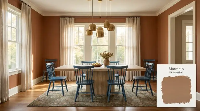
Intimate Dining Spaces
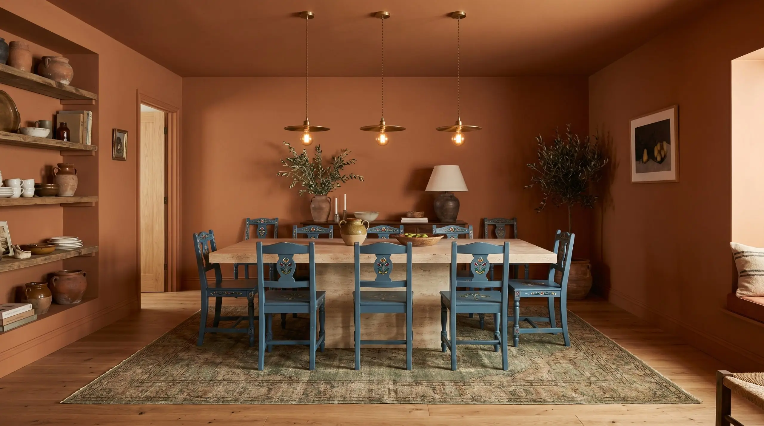
A dining room wrapped in this color instantly feels like an upscale, low-lit Mediterranean bistro. Pair the walls with a warm off-white trim to crisp up the edges, or fully commit to a color drenching technique across the baseboards and ceiling for a seamless, immersive environment. Introduce unlacquered brass pendants and a honed travertine dining table to play up the organic warmth of the pigment.
To balance the rich terracotta base, layer in folkloric Swedish blue dining chairs or a vintage rug featuring muted greens. This creates a sophisticated, high-contrast palette that feels intentionally curated for hosting long, intimate dinners.
Restorative, Tactile Bedrooms
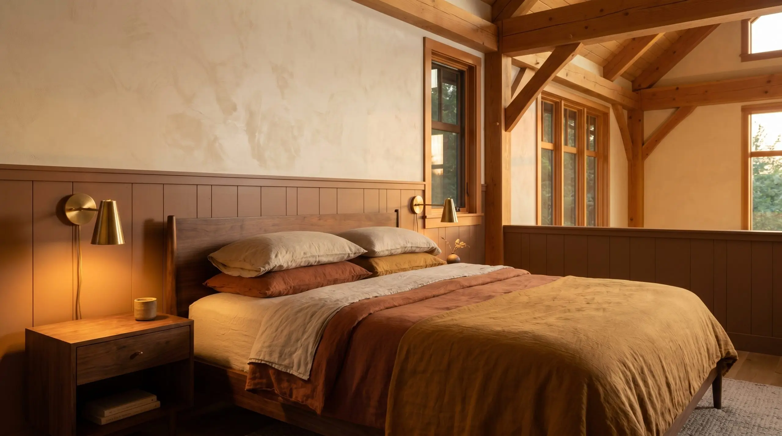
In a bedroom, this dusty quince provides a highly restorative, protective energy perfect for winding down at the end of the day. Offset the visual weight of the walls with low-profile mid-century walnut furniture and layers of raw, washed linen bedding.
If the room features wainscoting or a picture rail, apply the paint to the lower half and a soft, creamy lime plaster above to maintain a sense of vertical height.
Avoid pairing this sun-baked shade with stark, cool-toned gray bedding or carpeting. The blue undertones in the gray will fight the earthy warmth of the walls, leaving the room feeling disjointed and muddy.
Clash Warning (Cool Grays)
Bespoke Kitchen Cabinetry
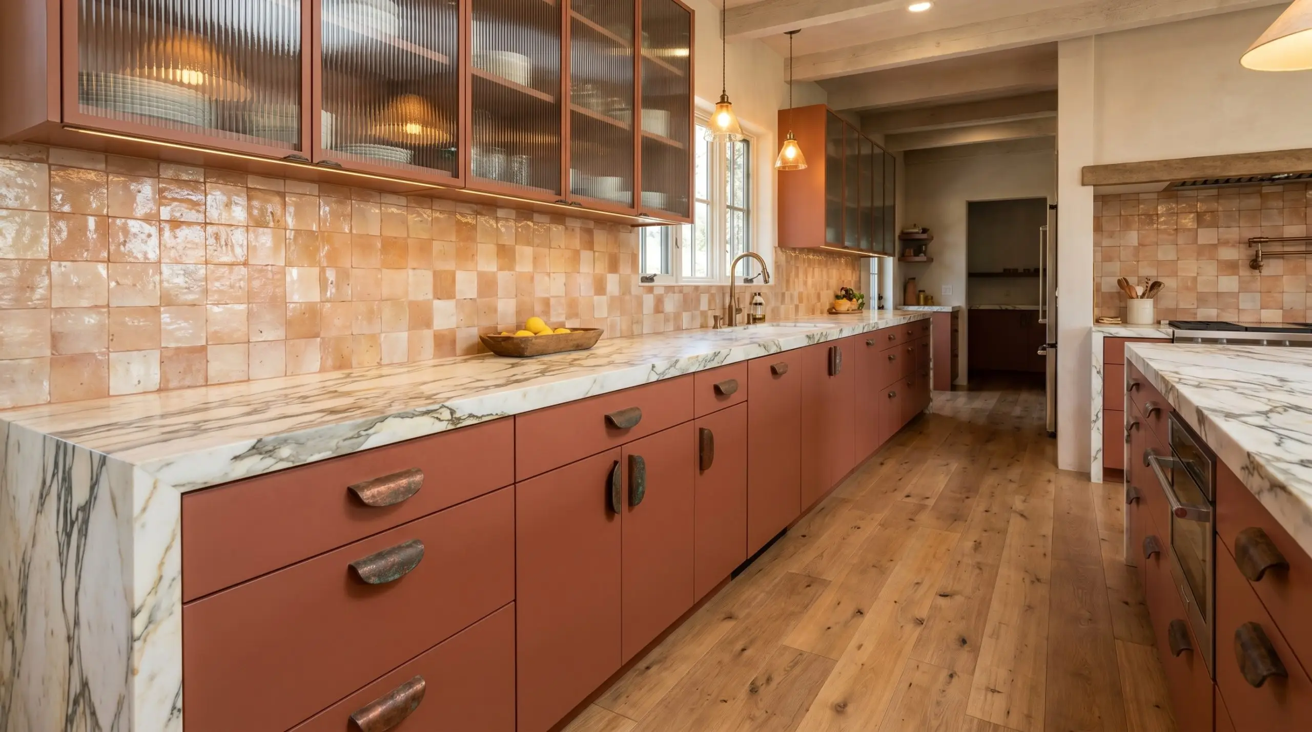
Moving away from standard neutrals, applying this hue to kitchen cabinetry introduces a highly custom, artisanal layer to the home. It pairs beautifully with heavily veined Calacatta marble countertops and handmade zellige tile backsplashes that beautifully reflect the ambient light.
For a more contemporary execution, use flat-panel doors painted in this shade, accented by oversized, oxidized copper hardware and fluted glass upper cabinets.
Windowless Nooks and Transition Zones
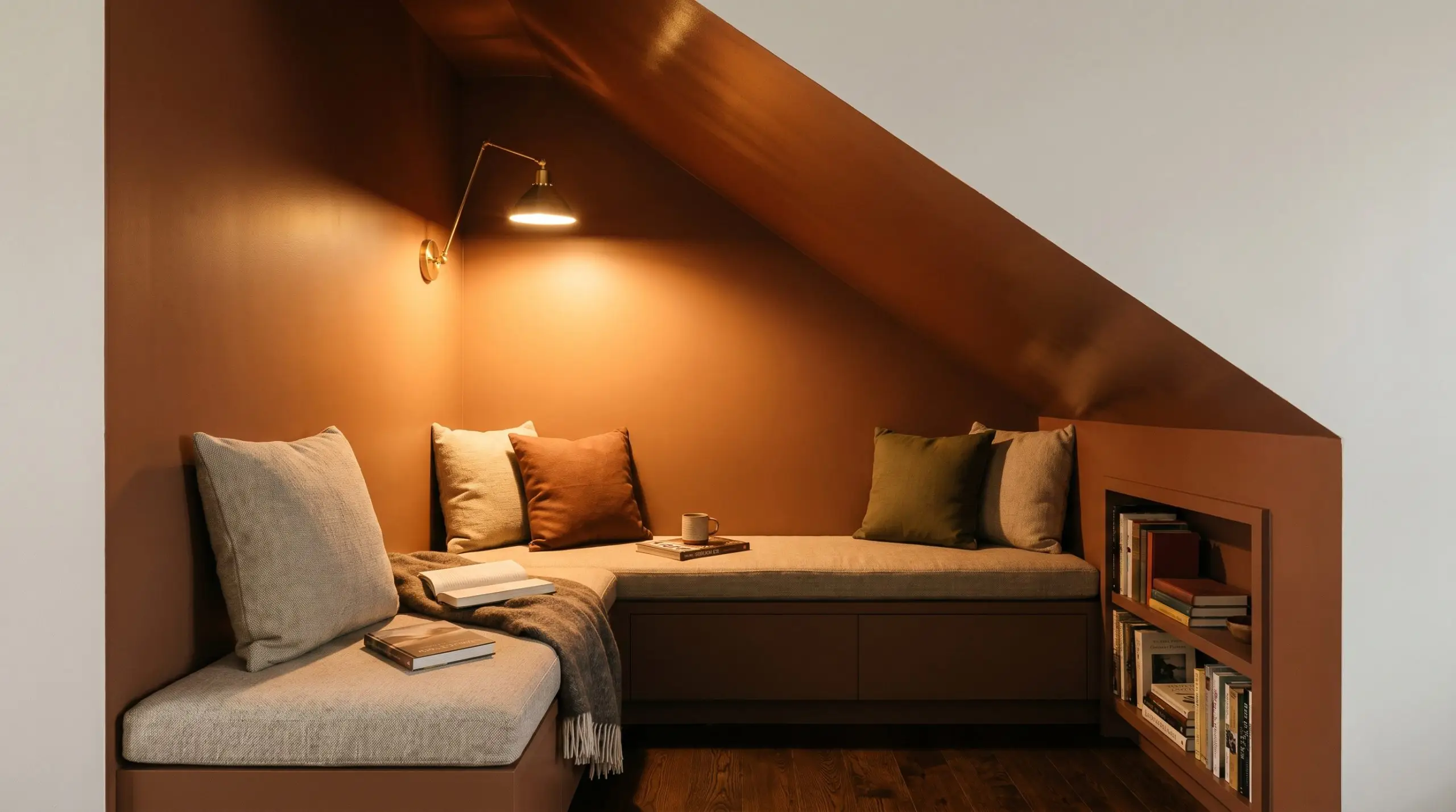
Windowless corridors, under-stair reading nooks, or hidden wet bars are prime real estate for this light-absorbing color. Because there is no natural sunlight to dictate the undertone, you have total control over the mood via your artificial lighting plan.
Consider using a high-gloss finish on the ceiling of a dark nook to bounce the glow from a warm 2700K sconce, amplifying the autumnal terracotta shade. Pair this glossy application with matte walls to create subtle, textural tension within the small footprint.
Coordinating Colors & Best Pairings for Farrow & Ball Marmelo
This toasted pigment demands neighboring elements that can either absorb its radiant energy or offer a crisp, cooling contrast. It thrives when pushed against highly tactile, organic surfaces, requiring thoughtful material pairings to dictate whether the room feels like a historic study or a sunlit Mediterranean villa.
Tailored Trim & Baseboard Combinations
Hardware, Wood & Material Pairings
Harmonizing Secondary Palettes
Designer Mood Boards
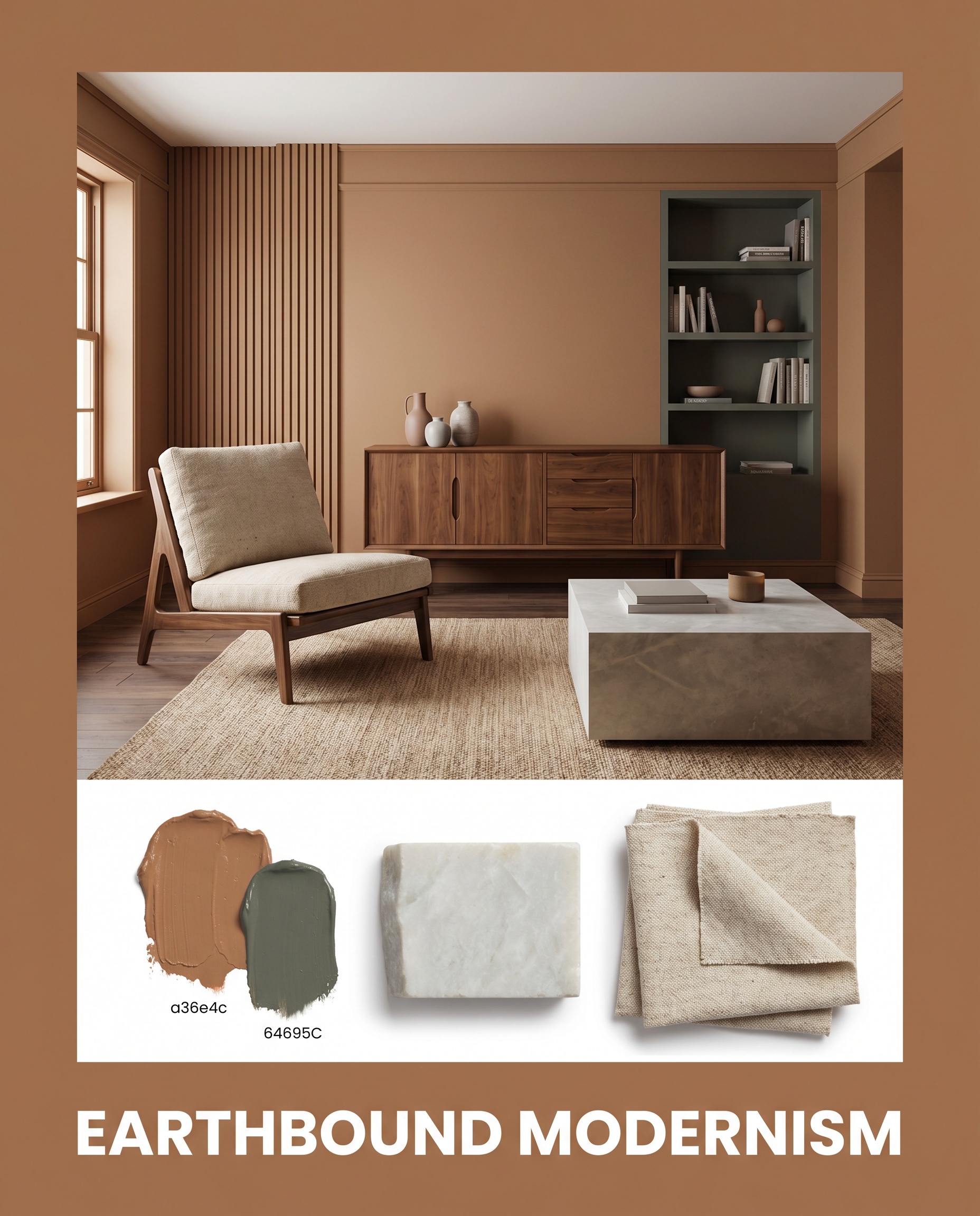
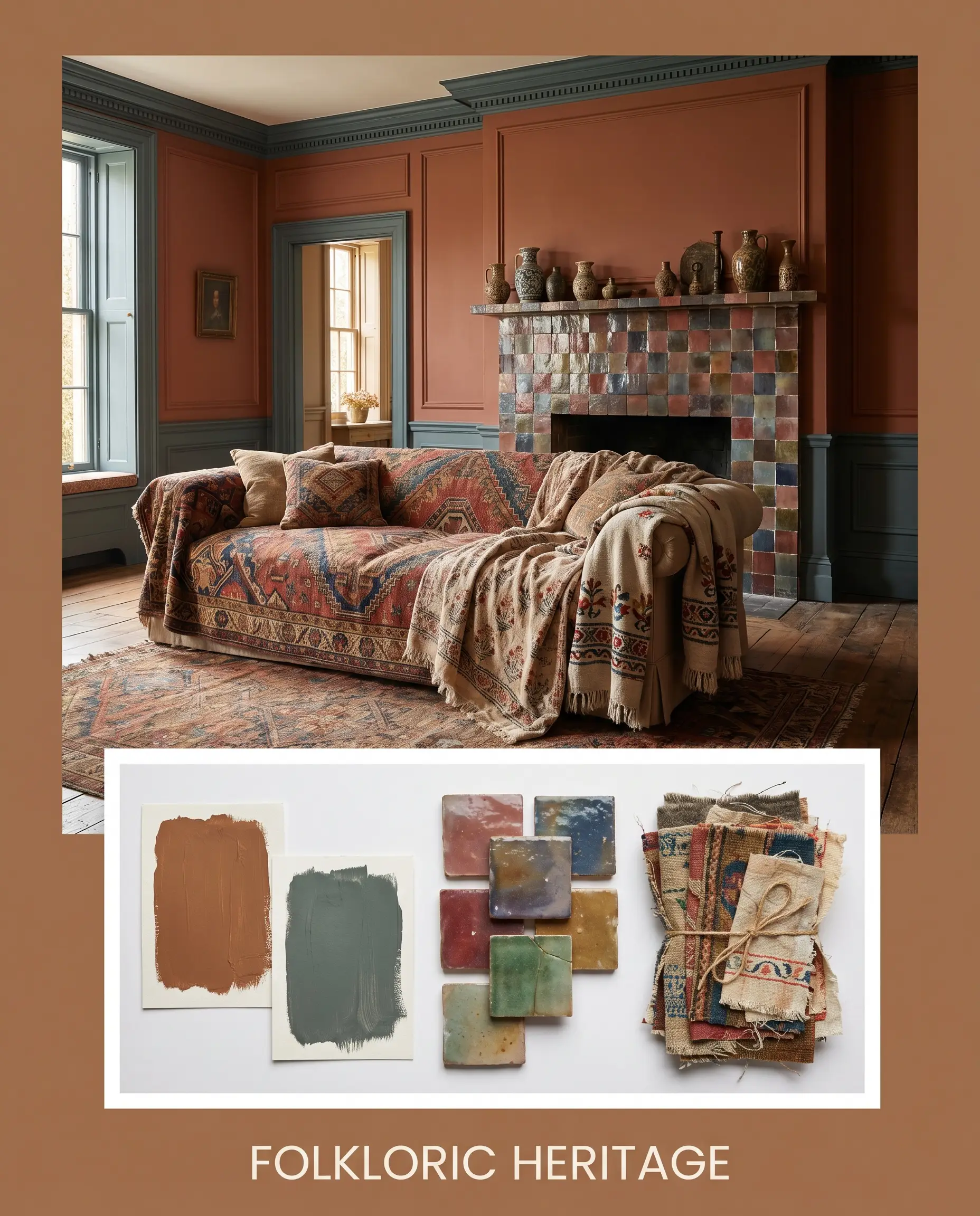
Earthbound Modernism Combine mid-century walnut silhouettes with honed soapstone surfaces to ground the vibrant walls and establish a calm, structured aesthetic. Layer in raw canvas textiles and a few intentional accents painted in SW Rosemary to create an organic, highly tactile environment. The tension between the rigid modern furniture and the warm, dusty apricot walls generates a deeply inviting, lived-in energy.
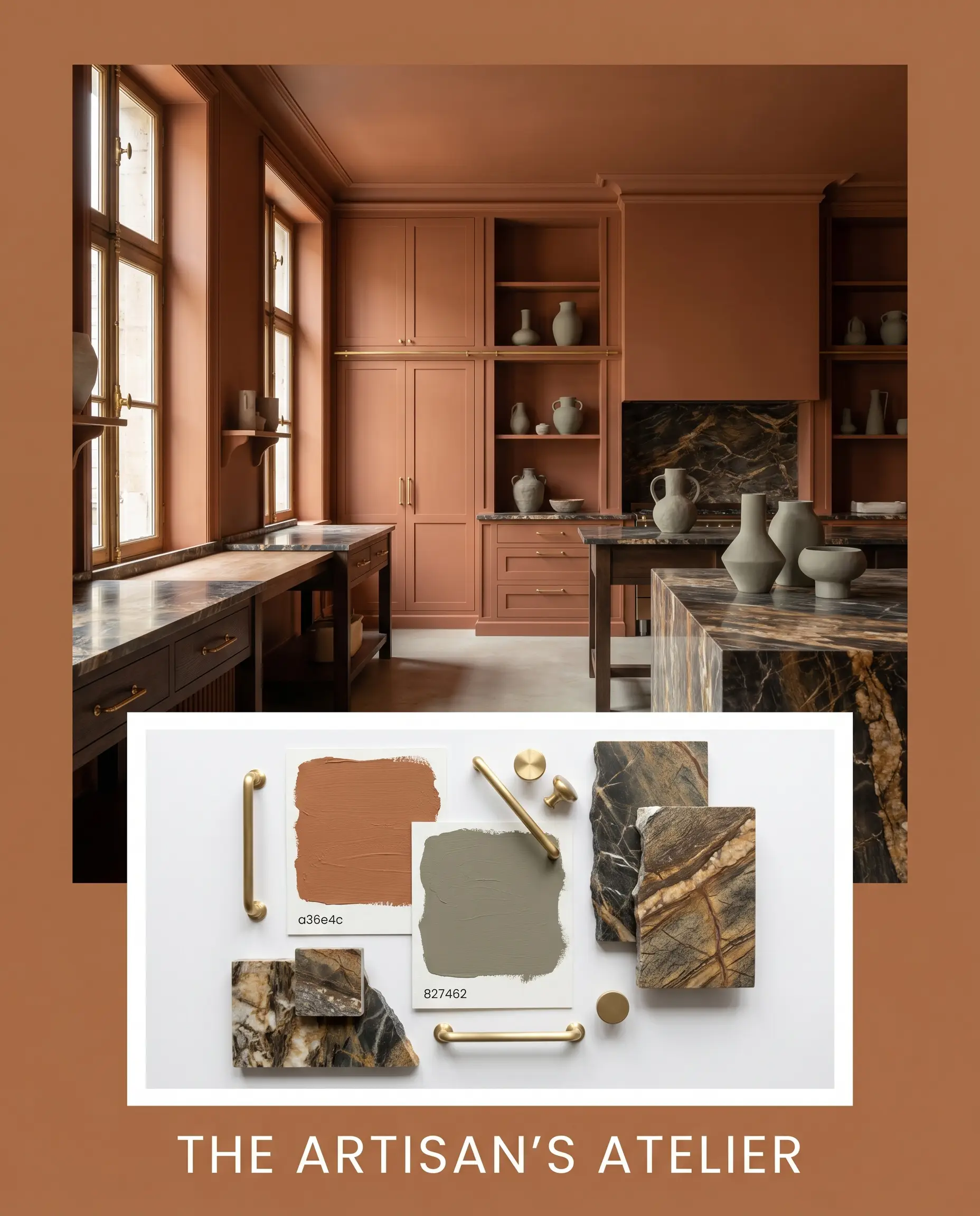
The Artisan’s Atelier Wrap the walls and ceiling entirely in this Farrow & Ball pigment, offsetting the intense color-drenching with gleaming unlacquered brass hardware and heavily veined marble. Introduce subtle notes of F&B Broccoli Brown through sculptural ceramics or woven jute rugs to root the energetic palette. This combination feels incredibly bespoke and curatorial, evoking the warmth of a historic European workshop.
Folkloric Heritage Pair the baked terracotta base with accents of BM Knoxville Gray to spark a vibrant dialogue between warm, sunlit tones and moody, cool shadows. Finish the look with glazed zellige tiles and vintage patterned textiles to maximize the tactile charm. The resulting atmosphere is richly layered and slightly bohemian, perfect for a home that celebrates global design influences.
Head-to-Head Comparisons: Marmelo vs. Industry Rivals
When natural light is severely lacking, or if your home’s fixed finishes lean heavily toward cool stones, this specific hue might pull slightly muddy. In these architectural scenarios, pivoting to a crisper or darker alternative ensures your walls retain their intentional design without fighting the environment.
Farrow & Ball Marmelo vs. Farrow & Ball India Yellow 66
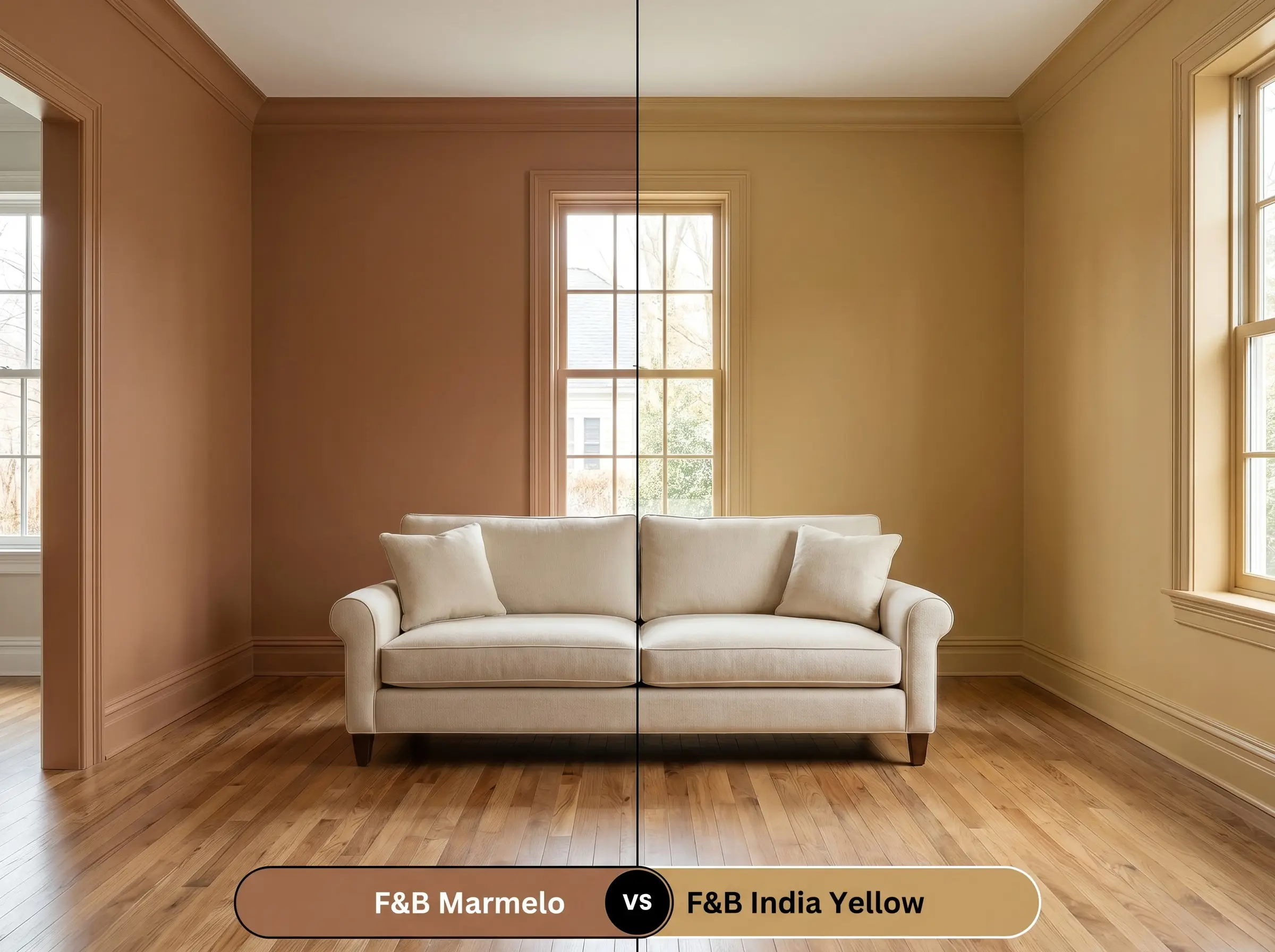
If your space faces north and the terracotta base feels too heavy in the shadows, then India Yellow 66 offers a sharper, mustard-toned alternative. India Yellow bounces slightly more light and cuts through gloomy corners, whereas the quince hue absorbs light to create a deeply cocooning intimacy.
Farrow & Ball Marmelo vs. Benjamin Moore Audubon Russet HC-51
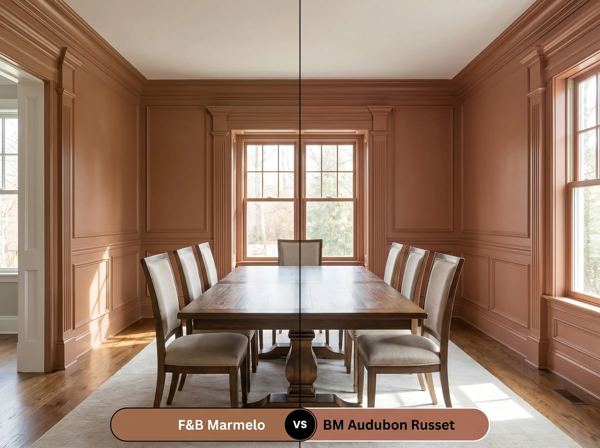
If you need a more historic, red-leaning brick tone, then Audubon Russet HC-51 provides a deeper, more saturated presence on the wall. Audubon Russet sacrifices the playful apricot notes in favor of a serious, oxidized red cast, making it better suited for traditional heritage properties with heavy millwork.
Farrow & Ball Marmelo vs. Sherwin Williams Cavern Clay SW 7701
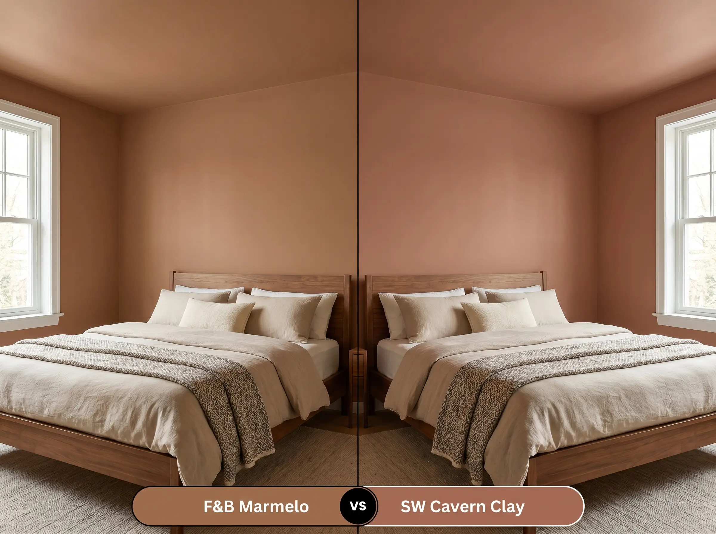
If you want a true, unmistakable desert rust, then Cavern Clay SW 7701 strips away the subtle brown undertones found in the F&B option. Cavern Clay reads significantly more orange on the wall, perfect for vibrant bohemian styling, while the Farrow & Ball shade remains a muted, dusty brown-orange.
Similar Colors & Brand Equivalents
Sometimes a project demands just a fraction more red, or you may need to color-match across different manufacturing lines for logistical reasons.
Same-Brand Alternatives for a Subtle Shift
Cross-Brand Matches & Accessible Equivalents
Practical Application & DIY Advice for Marmelo
Transitioning this rich pigment from a digital swatch to a flawless physical wall requires strict attention to surface preparation and sheen selection.
The Dynamic Sheen Guide
Primer Strategy
This specific depth of color absolutely requires Farrow & Ball’s Red & Warm Tones Primer & Undercoat to establish a rich, opaque foundation. Attempting to roll this over a standard white primer will result in a streaky, translucent finish that completely lacks the intended warmth.
Coverage & Success Tips
Achieving the true, cocooning atmosphere of this shade demands two generous, meticulously rolled topcoats over the tinted primer.
Because of the heavy red and brown colorants, this paint dries exceptionally fast and is prone to “flashing” (visible lap marks). Always keep a wet edge while rolling and never press hard on a half-dry section to stretch the paint.
Hackrea Pro-Tip (Preventing Roller Flashing)
Frequently Asked Questions
Because of its intense earthy undertones, this color looks stunning on exteriors but will visually wash out under direct overhead sunlight. It will shift from a deep burnt orange into a much lighter, chalky terracotta, so always test a large swatch on the south-facing side of your home before committing.
Without natural daylight to lift the apricot notes, the heavy brown base will dominate in a dark room. To prevent it from looking like muddy rust, you must rely on warm artificial lighting (around 2700K) to artificially pull the vibrant quince tones back to the surface.
Color-drenching actually works beautifully with this shade because erasing the high-contrast white trim lines blurs the physical boundaries of the room. Wrapping the ceiling in this warm hue will create a cozy, tent-like atmosphere rather than making the space feel visually crushed.
Applying a high-gloss lacquer intensifies the pigment, making the burnt orange appear significantly darker and more vibrant than it does in a matte finish. The glossy sheen bounces ambient light, highlighting the rich apricot notes and adding a highly tailored, custom layer to the woodwork.
Final Verdict & Expert Warnings
Farrow & Ball Marmelo is the ultimate architectural tool for homeowners who want to inject unapologetic, sun-baked warmth into their spaces without resorting to aggressive primary colors. It excels in intimate dining rooms, restorative bedrooms, and bespoke cabinetry applications where its nuanced, dusty apricot notes can truly shine. When paired with highly tactile materials like unlacquered brass and honed soapstone, it transforms everyday walls into sophisticated, curated surfaces that feel incredibly intentional.
The Hackrea Design Warning: You must be incredibly careful when introducing stark, cool-toned grays or crisp blue-white artificial lighting into a room painted this color. The icy undertones in cool gray flooring or stark white LED bulbs will aggressively fight the warm terracotta base, stripping away its radiant charm and leaving the walls looking like a flat, muddy brown. If your home features predominantly cool-toned fixed finishes that you cannot change, this sun-baked quince will feel entirely out of place, and you should pivot toward a cooler, more adaptable neutral.