Etruscan Red 56
Farrow & BallFarrow & Ball's Etruscan Red (No. 56) is a deep, brown-based earthy red inspired by ancient civilizations. With an LRV of 11, it provides a rich, grounding presence that feels sophisticated without being overwhelming, making it an exceptional choice for dining rooms and intimate spaces.
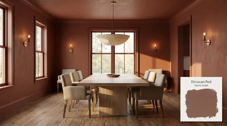
Farrow & Ball Etruscan Red: Crafting Architectural Warmth with a Brown-Based Clay
Red paint is notoriously difficult to get right, often leaning too fiery or too synthetic for sophisticated interiors. Farrow & Ball Etruscan Red completely bypasses this risk by relying on a highly stabilizing brown base. This earthy red feels less like a traditional pigment and more like a tactile architectural finish.
It evokes the sun-baked permanence of a Pompeii excavation without feeling trapped in the past. When applied to modern walls, its rich intensity creates an immediate sense of intimacy and permanence.
While it easily supports neoclassical decoration, this shade is incredibly versatile. You can pair it with sleek, heavily veined marble just as effortlessly as you would with reclaimed oak or antique brass.
Farrow & Ball Etruscan Red: Temperature, Undertones & LRV
Etruscan Red is a definitively warm color, radiating a baked heat that instantly softens rigid architectural lines.
To understand exactly how this brown-based red will behave in your home, we have to look at its structural DNA:
At an LRV of 11, this color structure absorbs 89% of the light that hits it.
This means the paint is distinctly dark and moody. It requires either abundant natural illumination to reveal its vibrant warmth or intentional, layered shadow to lean into its enveloping nature.
You can apply wallpapers, paints, etc. on walls and see how they look in various interiors.

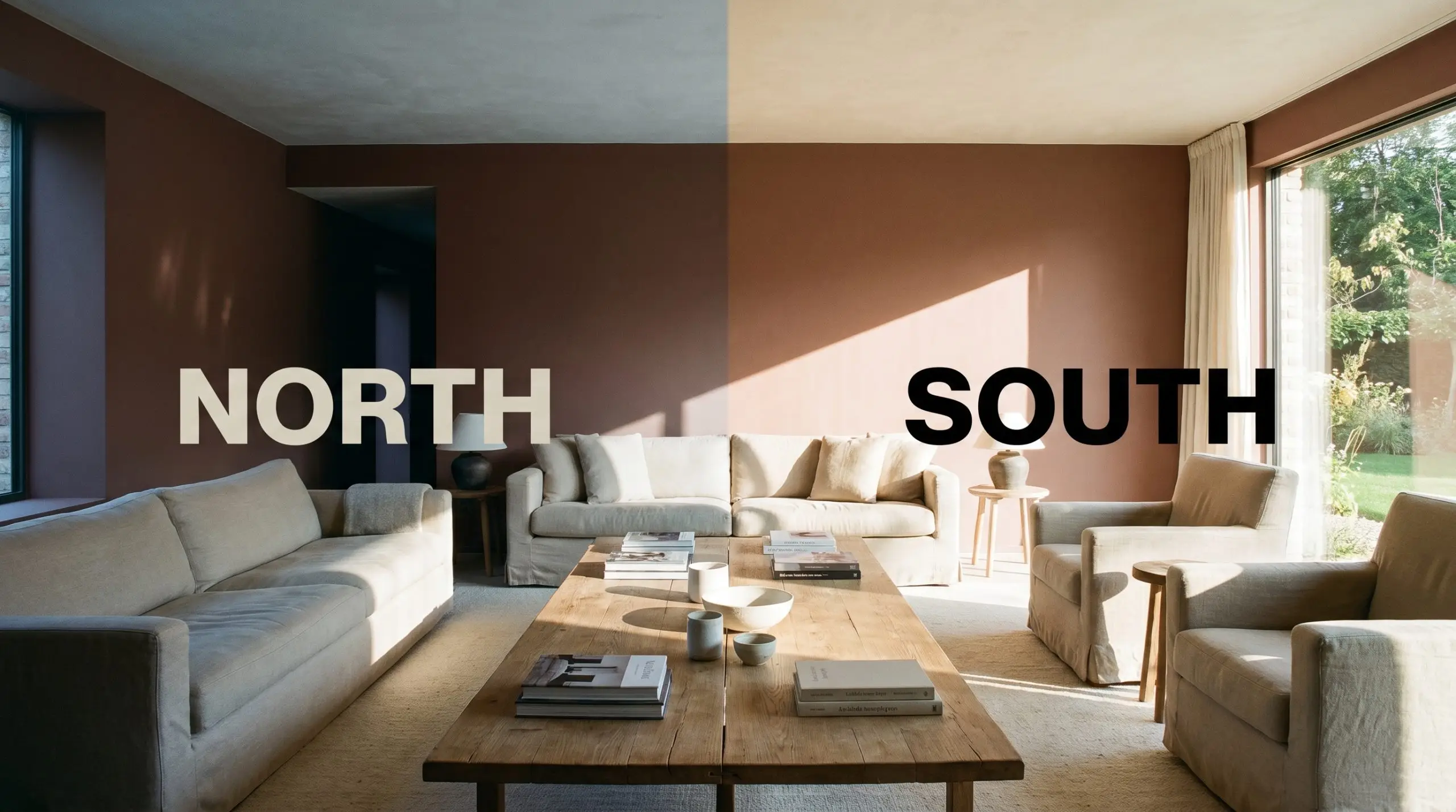
The Chameleon Factor: How Light Alters This Chromatic Profile
Sunlight dictates exactly how this pigment behaves on your walls.
Depending on the direction of your windows, you will experience drastically different versions of Etruscan Red throughout the day:
Architectural Placements for This Grounding Shade
Understanding a paint’s DNA is only the first step; the true design work happens when you apply that chromatic profile to actual architecture.
Enveloping Dining Spaces
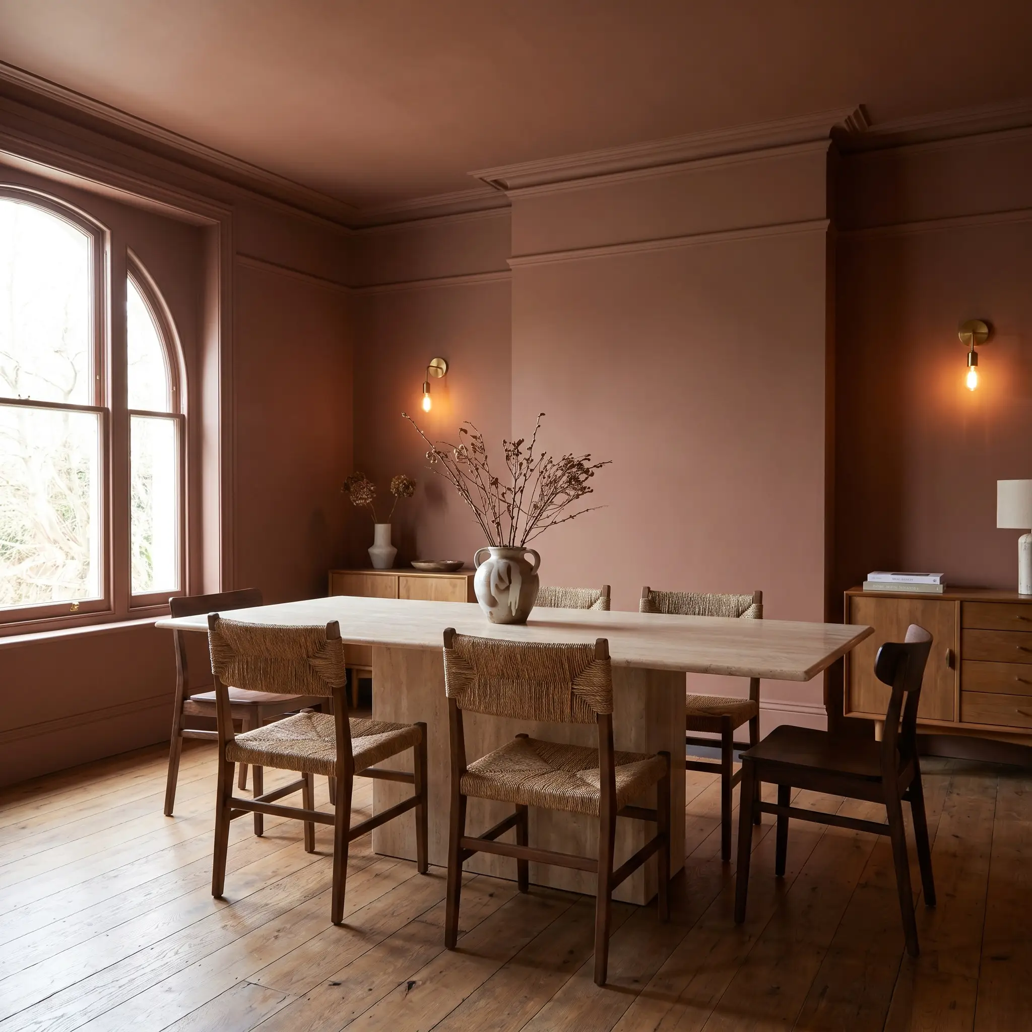
Instead of defaulting to traditional wainscoting, try color-drenching the entire dining room—walls, ceiling, and trim—to create a seamless, uninterrupted experience.
Pair this saturated wall treatment with a honed travertine dining table and unlacquered brass sconces. The metallic accents will catch the ambient light, breaking up the dark walls with intentional, high-end contrast.
For the frequent entertainer, this approach turns a standard evening meal into a highly curated, atmospheric event.
Cabinetry & Hidden Pantries
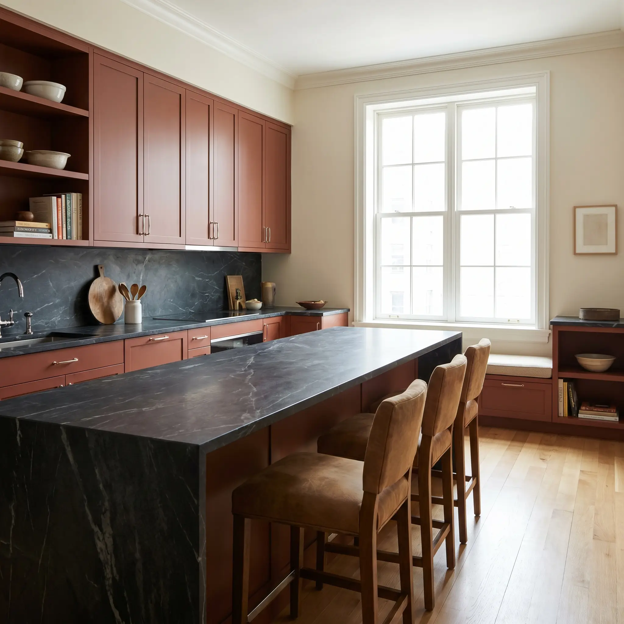
Flat-panel cabinetry coated in this shade instantly warms up a stark kitchen without reverting to predictable farmhouse tropes.
Contrast the earthy red doors against heavily veined soapstone countertops and polished nickel hardware for a sharp, tailored aesthetic. This combination feels incredibly custom and works beautifully for an urban chef who wants a kitchen that feels like a furnished living space.
When applying dark reds to high-traffic cabinetry, opt for a durable, lower-sheen finish like an eggshell or satin to hide fingerprints while maintaining the color’s inherent softness.
Hackrea Pro-Tip (The Finish Selection)
Compact Washrooms
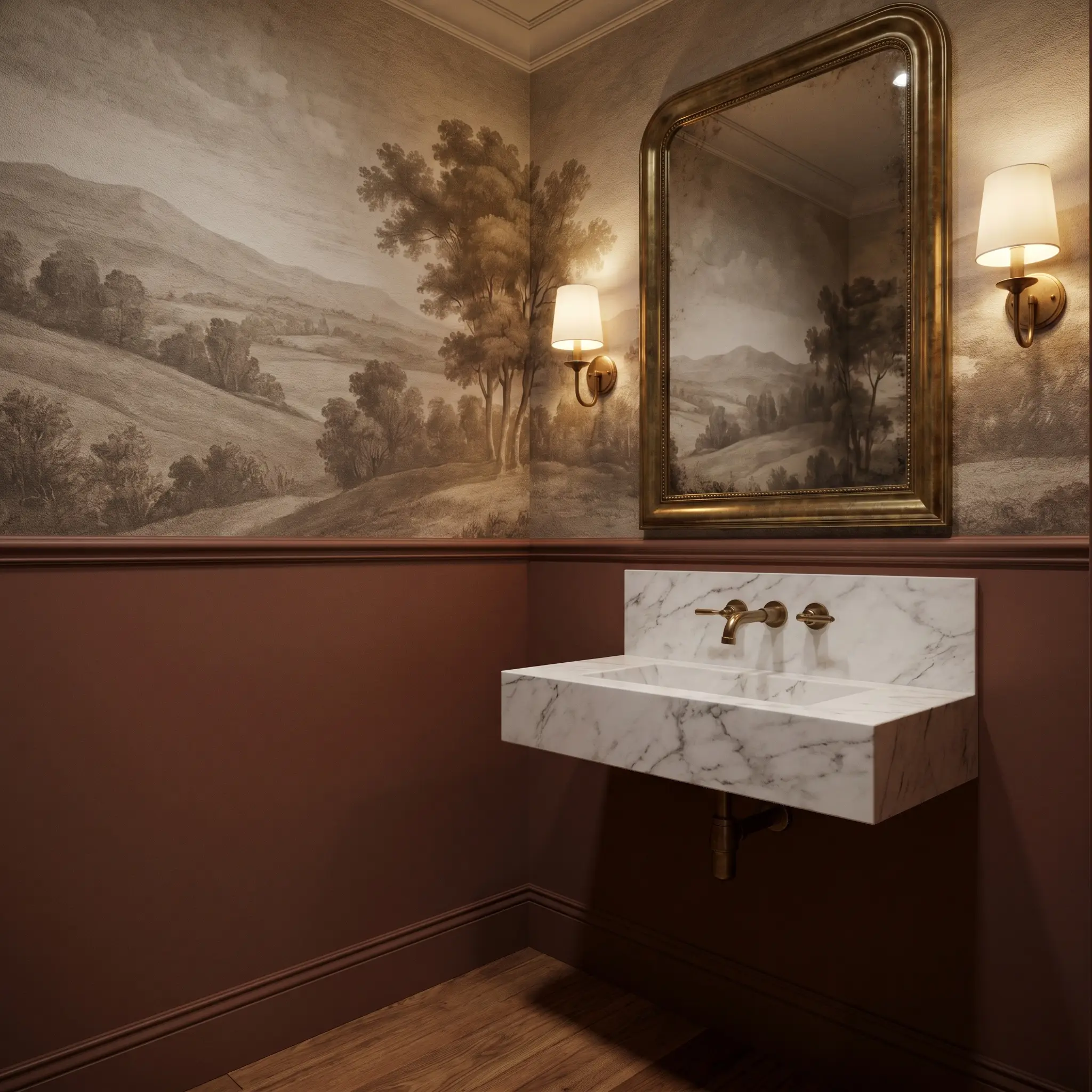
Small, windowless washrooms are the perfect canvas to exploit this paint’s low light reflectance.
Pair the dark walls with a floating marble basin and an oversized, antiqued mirror to bounce the available light around the room. You can elevate the space further by installing a textured mural wallpaper above a half-wall painted in this exact terracotta hue.
Intimate Retreats & Reading Rooms
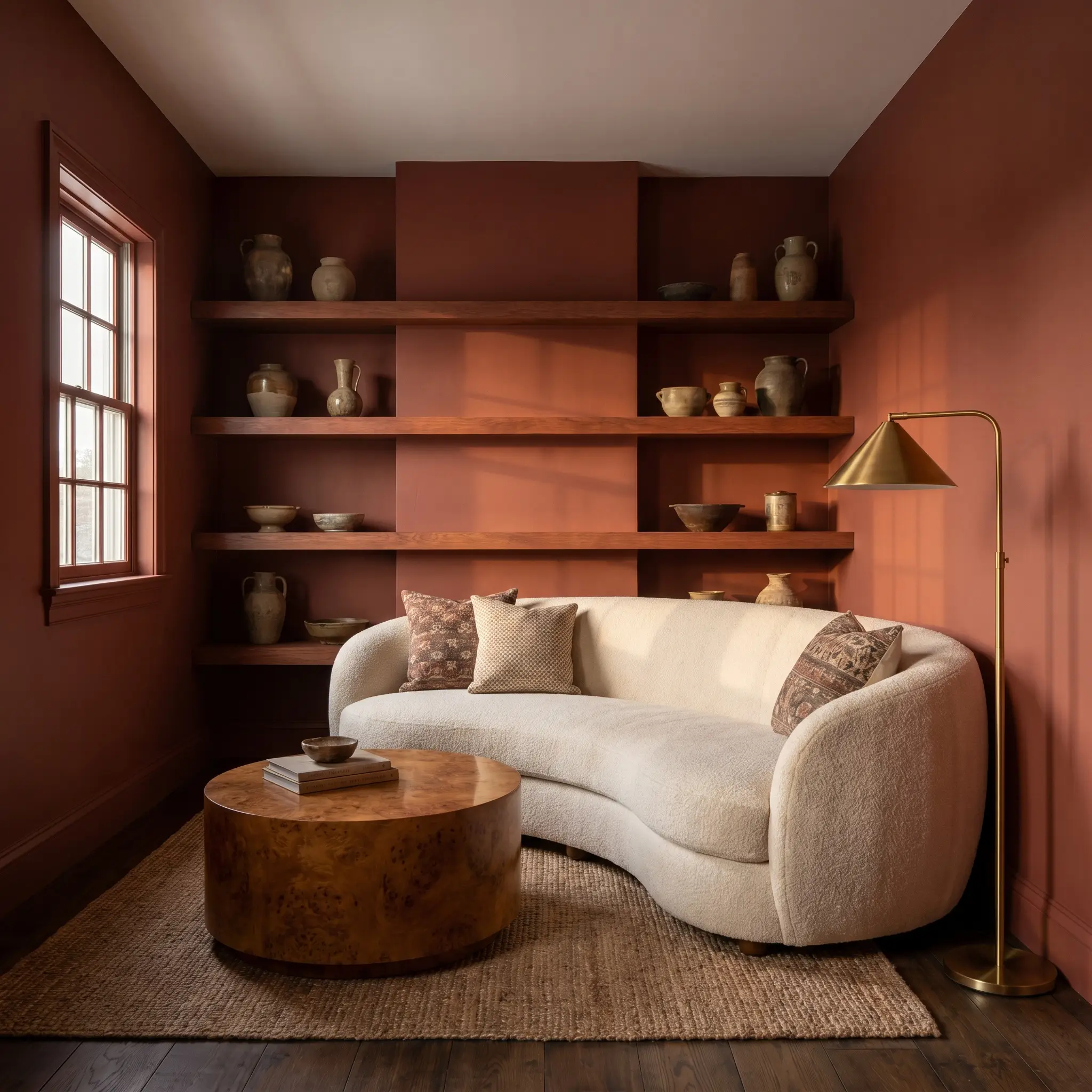
This shade naturally supports the quiet focus needed in a home library or evening lounge.
To modernize the application, avoid standard bookshelves and instead build out chunky, custom-milled floating shelves painted in the exact same hue to display a collection of vintage ceramics. Introduce textural contrast through a plush mohair sofa and a burl wood coffee table, balancing the historical charm of the paint with 1970s-inspired silhouettes.
Exterior Facades & Entryways
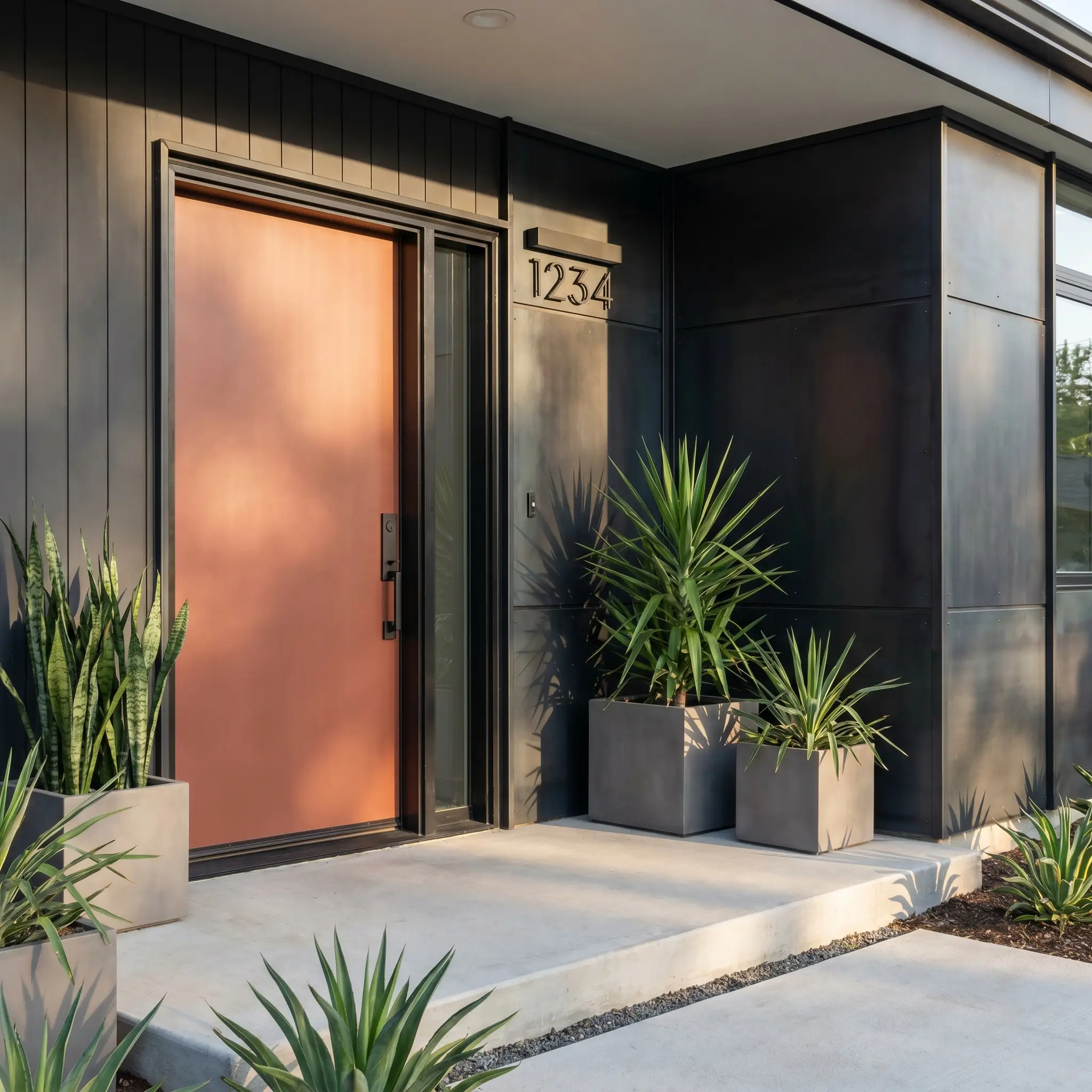
On an exterior, direct sunlight will significantly wash out the depth of the pigment, pushing it closer to a vibrant, sun-faded brick tone.
Use it as a striking contrast on a modern front door set against a blackened steel facade or dark charcoal siding.
Never apply this specific red directly next to traditional red or orange exterior brick; the competing undertones will create a muddy, discordant visual transition that ruins the crispness of your exterior.
Clash Warning (The Masonry Conflict)
Building a Cohesive Palette Around This Grounding Shade
This deeply saturated hue demands intentional surrounding elements that either absorb its heat or provide a crisp boundary. Its specific pigment structure requires adjacent materials to dictate whether the room feels softly atmospheric or sharply tailored.
Selecting Baseboards and Millwork
Tactile Hardware, Metals, and Textiles
Secondary Palette Integrations
Curated Visual Combinations
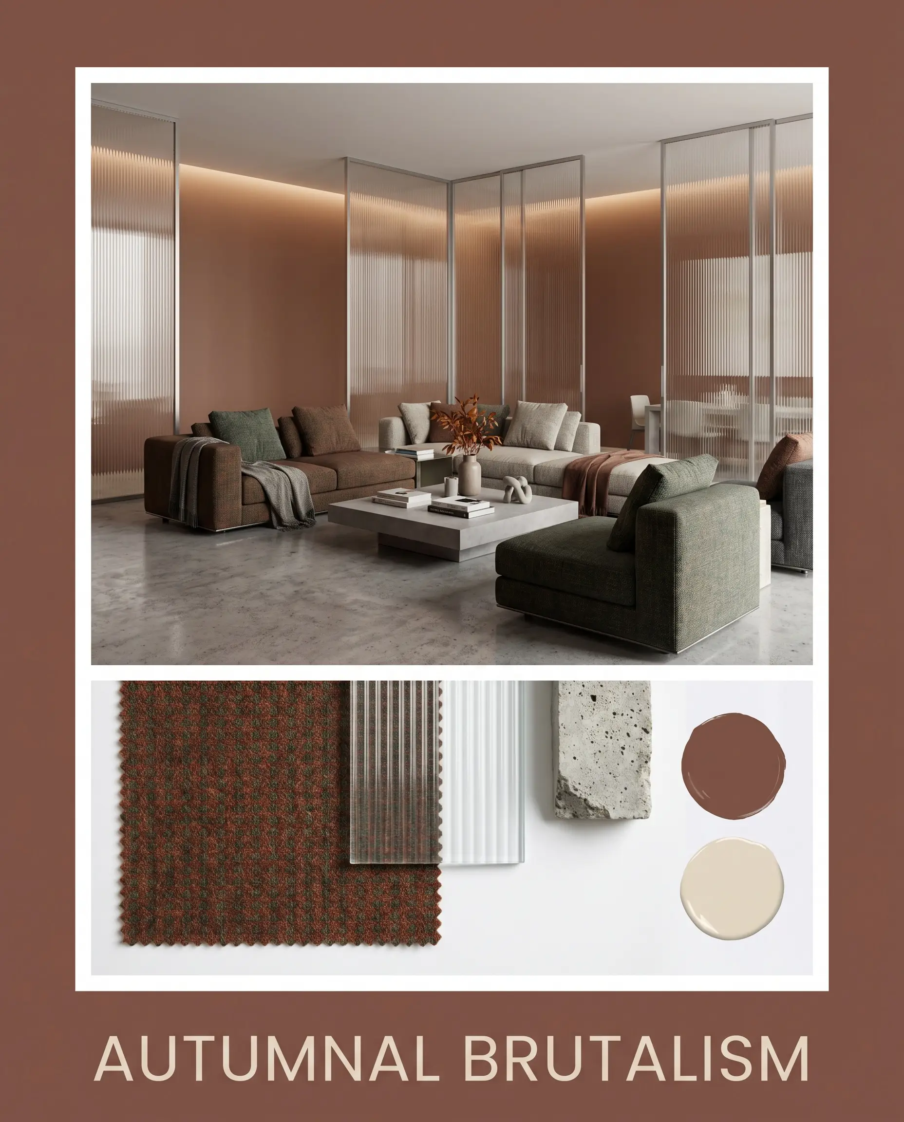
Autumnal Brutalism
This aesthetic relies on the tension between raw, hard materials and the enveloping warmth of the clay tones. Picture the walls deeply saturated against a backdrop of poured concrete floors and sleek, fluted glass partitions. Incorporating minimal, low-profile modular seating covered in worsted wool softens the sharp architectural edges, creating a space that feels both industrial and incredibly intimate.
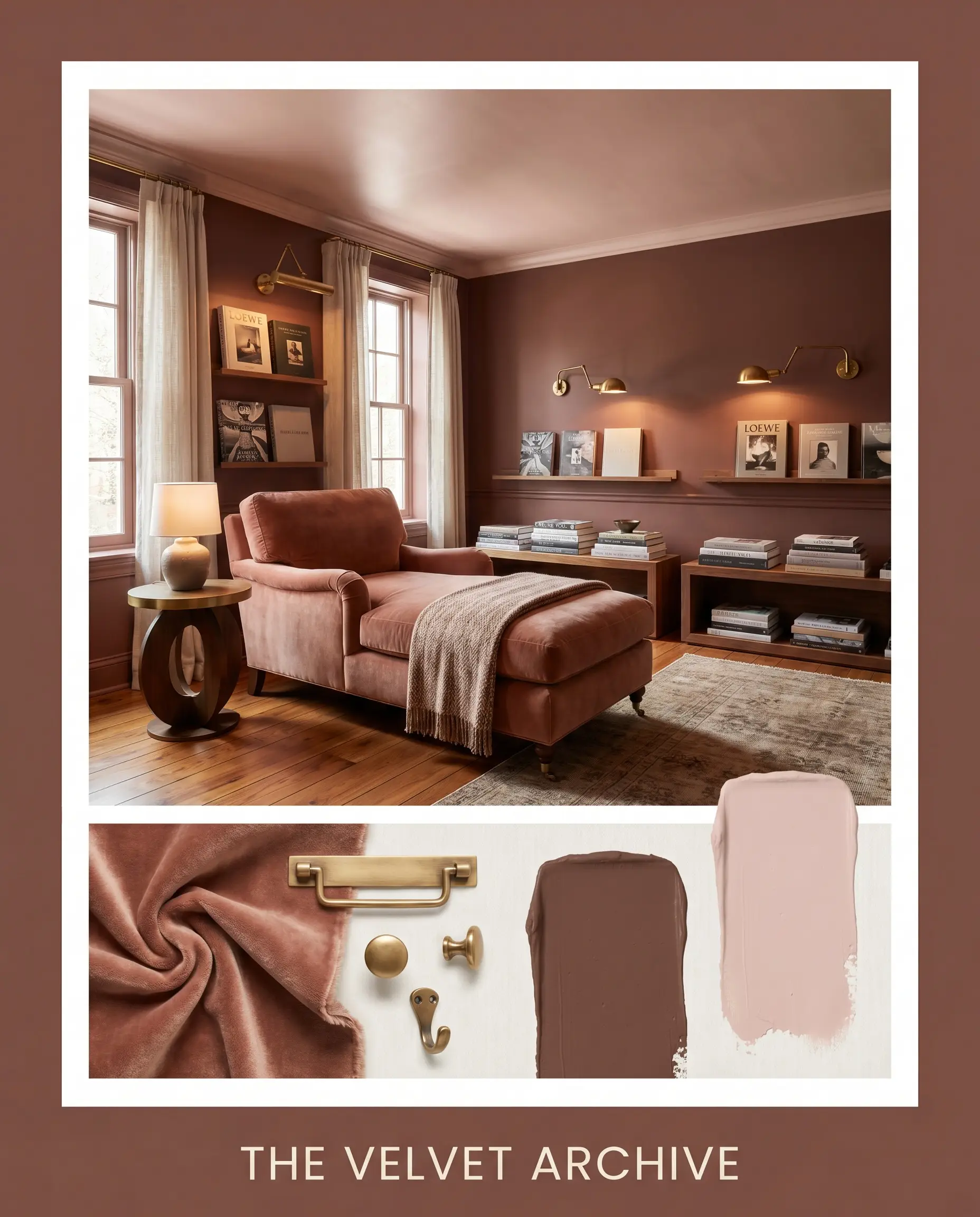
The Velvet Archive
Lean into a profoundly saturated, curatorial mood by utilizing this shade as a backdrop for rich, tactile layering. Unlacquered brass picture lights illuminate stacked art books and vintage ceramics resting on custom millwork. The introduction of Farrow & Ball Scallop on the ceiling draws the eye upward, while a mohair chaise lounge anchors the floor plan in uncompromising comfort.
Head-to-Head: Etruscan Red vs. Industry Alternatives
Certain architectural styles or specific lighting exposures may cause this earthy hue to lose its intended depth or pull too orange. When evaluating your final selection, comparing the underlying shifts against rival pigments is essential for a confident decision.
Farrow & Ball Etruscan Red 56 vs. Farrow & Ball Preference Red 297
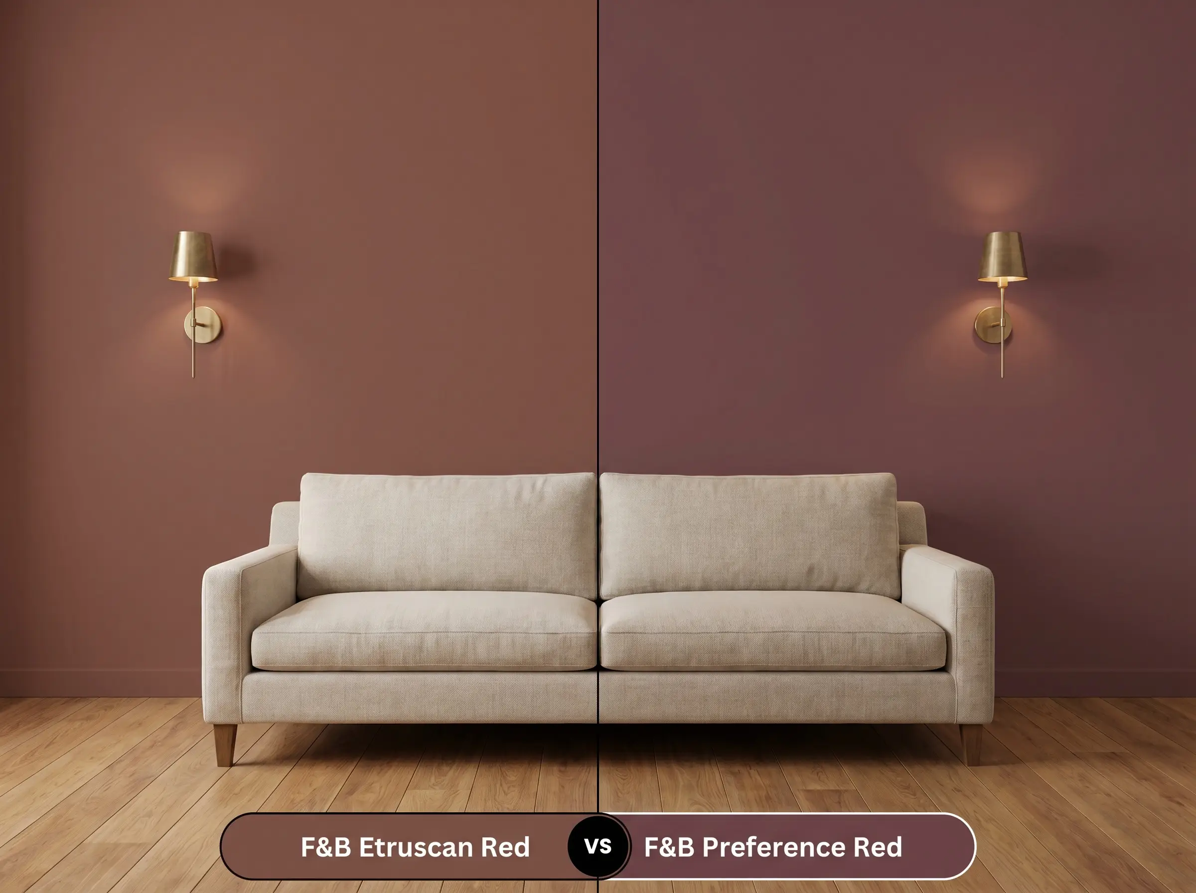
Preference Red is significantly deeper and leans distinctly into a rich, burgundy-plum profile. If your space lacks natural light and you want an unapologetically moody, enveloping atmosphere, Preference Red will deliver a more dramatic result. Etruscan Red 56, conversely, retains a sun-baked, terracotta quality that feels slightly more grounded and rustic.
Farrow & Ball Etruscan Red 56 vs. Farrow & Ball Picture Gallery Red 42
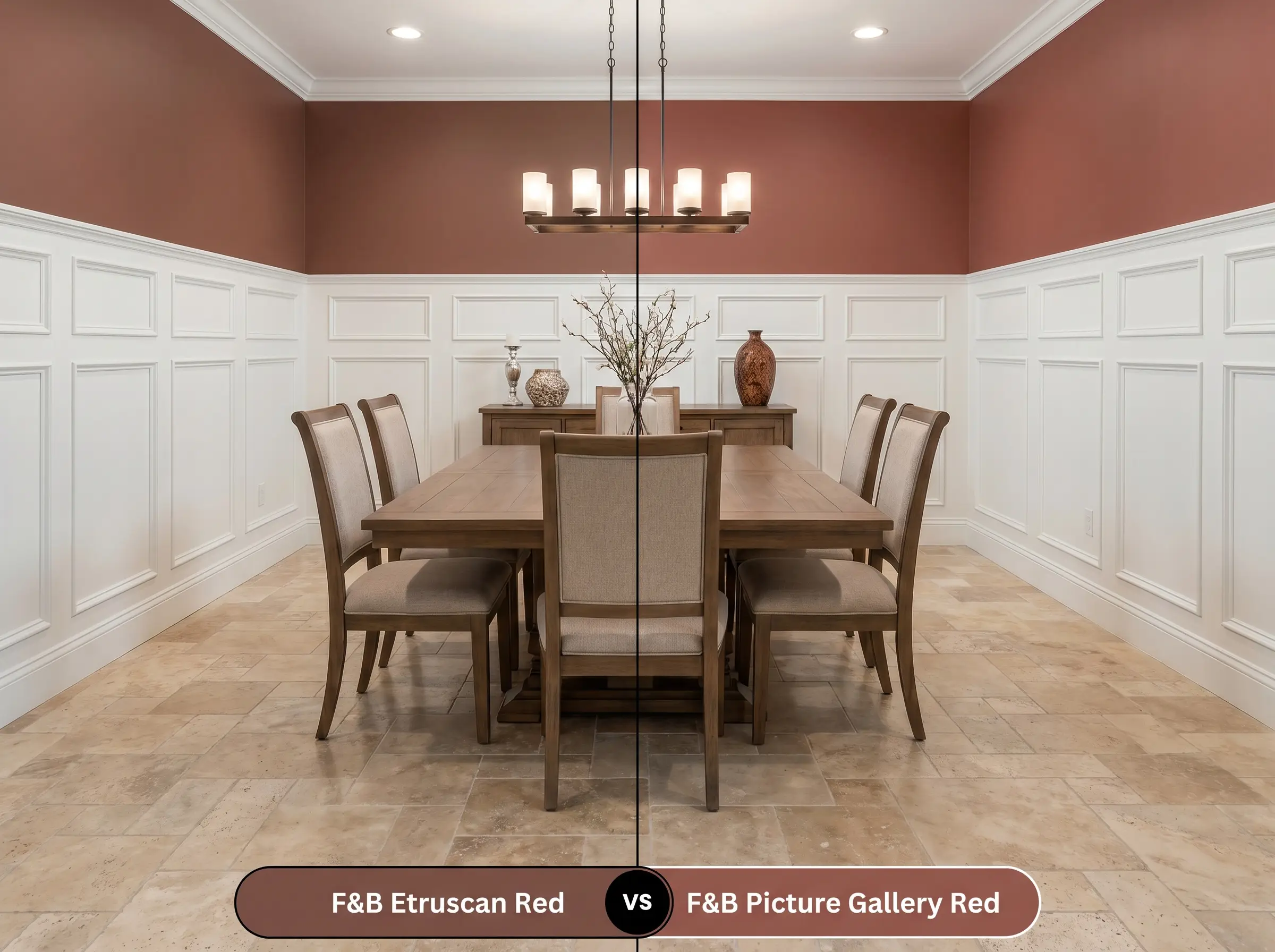
Picture Gallery Red completely drops the brown base, acting as a much more traditional, classic red. If you are working with historical wainscoting and need a vibrant, energetic pop of color that demands attention, Picture Gallery Red is the superior choice. Etruscan Red remains the better option for seamless color-drenching where a softer, tactile finish is required.
Exploring Alternatives to This Brown-Based Red
You may find that your specific room requires a slightly different light reflectance or a cooler undertone to achieve the perfect balance. Review these curated alternatives to fine-tune your architectural palette.
Farrow & Ball Catalog Matches
Matching Competitor Formulations
Professional Execution: Mastering This Earthy Clay
Translating this sophisticated pigment from a swatch to a flawless wall requires strict attention to your materials and application methods.
The Dynamic Sheen Guide:
Primer Strategy: This specific depth of color demands a high-quality, dark gray or red-tinted primer to establish a proper foundation. Using a standard white primer will aggressively fight the pigment, resulting in a chalky, uneven final appearance.
Coverage & Success Tips: Expect to apply a minimum of two generous coats to achieve full opacity and true color representation. Because dark, matte finishes are highly susceptible to “flashing” (visible roller marks), you must maintain a wet edge while painting and avoid aggressive touch-ups once the wall begins to dry.
Frequently Asked Questions
The pronounced texture of plaster beautifully enhances the raw, earthy nature of this hue, creating deep micro-shadows that make the walls look like authentic, aged terracotta. On smooth drywall, the color appears more tailored and modern, requiring strategic lighting to replicate that tactile depth.
The shared red undertones in both the paint and the wood can easily overwhelm a room, creating a muddy, visually dense environment. To successfully pair them, you must introduce a contrasting, cool-toned element like boldly veined marble or a large vintage rug to break up the saturated warmth.
Because of its incredibly low light reflectance, this shade actually thrives in windowless rooms when you intentionally lean into the moodiness. By implementing a comprehensive lighting plan with multiple warm sconces and picture lights, you transform a dark basement into an intimate, high-end retreat.
Constant exposure to direct UV light will naturally accelerate the fading process, gently pulling the vibrant terracotta notes forward while softening the brown base. This gradual shift often enhances the color’s historical charm, making the exterior feel intentionally sun-baked and established.
Carrying this saturated tone onto the ceiling completely blurs the architectural boundaries, which can actually make a room feel infinitely taller if the walls are painted to match. However, pairing a dark ceiling with light walls will immediately draw the eye downward, creating a cozy but noticeably compressed atmosphere.
The Final Verdict on Farrow & Ball Etruscan Red
Farrow & Ball Etruscan Red is an exceptional choice for homeowners who want to introduce profound warmth and architectural weight to their interiors. It seamlessly connects historical permanence with modern, tactile design. This pigment is ideal for enveloping dining rooms, tailored cabinetry, and intimate lounges where the goal is to create a highly curated, sophisticated atmosphere.
While this earthy hue is incredibly versatile, you must be highly strategic when pairing it with cool, stark white trim or cool gray flooring. The jarring transition between the baked heat of the wall and the icy nature of a pure white baseboard will immediately sever the visual flow of the room, making the paint feel disjointed and ungrounded. Instead, always support this color with warm, tonal off-whites or rich, organic materials that respect its stabilizing brown base.
Hackrea Design Secret (The Undertone Conflict)