Frost 57
BehrBehr Frost 57 is a crisp, cool-leaning off-white with subtle green-gray undertones. With an LRV of 87, it acts as a highly reflective, icy white that brings a clean, modern edge to interior walls, ceilings, and exterior siding.
Paint Technical Profile
| Color ID / SKU | 57 |
| HEX Code | #eff0ec |
| Light Reflectance (LRV) | 87 |
| Use | Interior, Exterior |
| Best Exposures | South-facing or East-facing |
| Best For | Ceilings, trims, modern minimalist walls, and well-lit living spaces |
Behr Frost: The Crisp Architectural White Redefining Modern Light
Selecting the right white paint is an exercise in mastering natural light. Some shades recede quietly into the background, while others actively shape the boundaries of a room. Behr Frost falls firmly into the latter category, acting as a brilliant, light-amplifying canvas that instantly modernizes tired architecture.
This specific shade delivers a highly intentional, luminous clarity to interior and exterior spaces. It strips away visual clutter, leaving behind a pristine foundation that forces your eye to focus on texture, form, and material quality.
If you are searching for a soft, creamy backdrop, this is not your color. Frost is designed for homeowners who want their spaces to feel crisp, expansive, and undeniably fresh.
Undertones & Light Reflectance Value of Behr Frost
Is Behr Frost warm or cool? It is definitively a cool-leaning neutral.
While it might look like a simple, bright white on a tiny paper swatch, its hidden DNA dictates exactly how it will behave once rolled across an entire room. Understanding this underlying structure is the only way to ensure your final design feels cohesive rather than sterile.
Here is the exact breakdown of this architectural finish:
At an LRV of 87, this shade is incredibly reflective.
This high light reflectance value means the paint bounces significant ambient light around the room, creating an immediate sense of ambient light expansion. It effectively pushes walls outward and raises ceilings visually, all without crossing into the stark, blinding territory of pure, un-tinted whites.
Never test a cool white against an existing warm, buttery wall. The old paint will manipulate your eye, making Frost look surprisingly blue or stark green. Always test your sample on a pure white poster board to see its true chromatic profile.
Hackrea Pro-Tip (The Swatch Test)
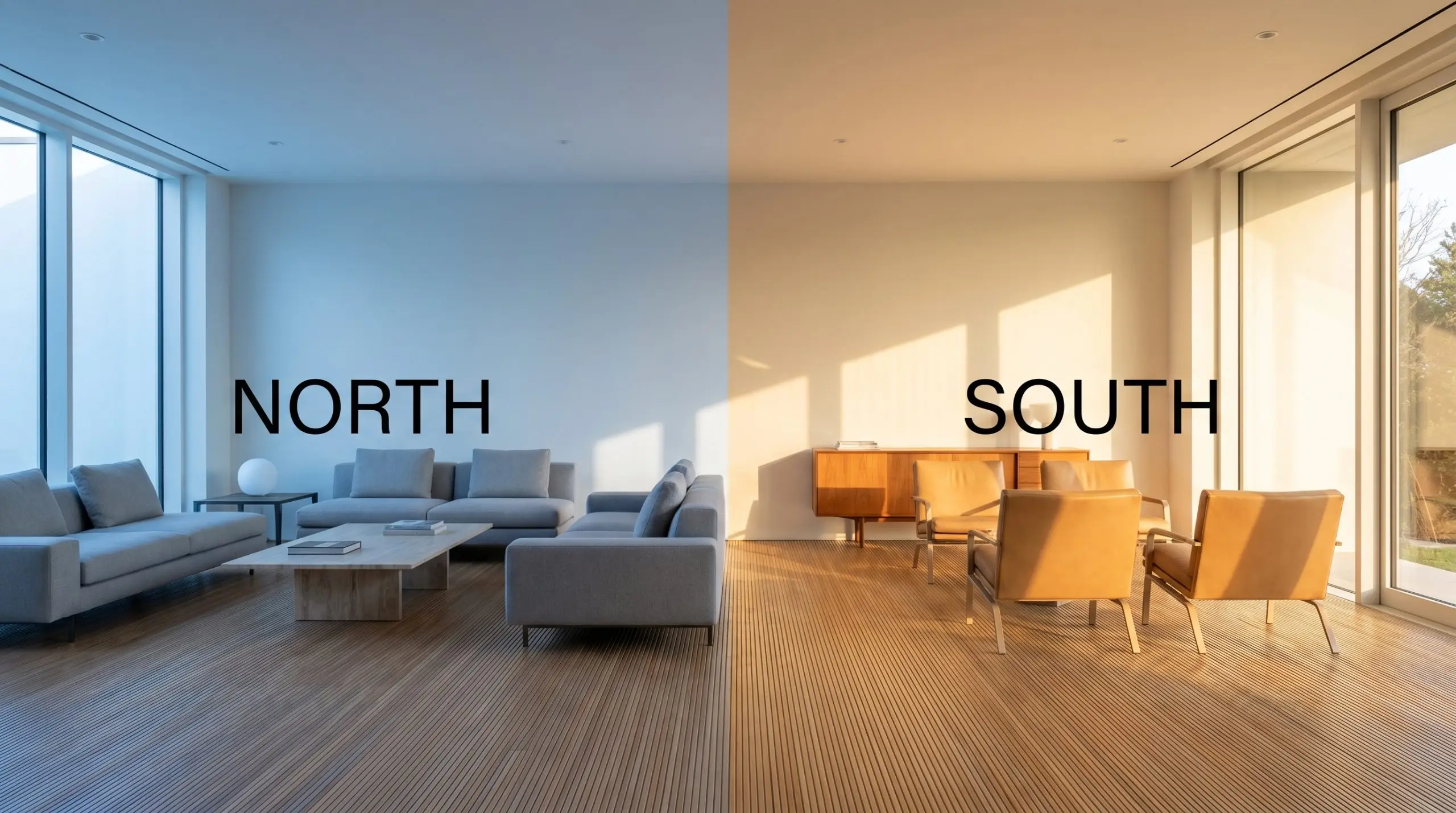
The Chameleon Factor: Manipulating This Chromatic Profile
The way sunlight travels through your windows will entirely alter how this shade presents on your walls. Because of its icy white cast, this paint is highly responsive to its environment.
Here is exactly how shifting light changes the aesthetic:
Transforming Everyday Architecture With This Cool Neutral
Understanding the data behind a paint color is only half the battle. The true magic happens when you pair that crisp foundation with the right textiles, hard finishes, and architectural details.
Because this shade is highly reflective, it acts as a magnificent amplifier for whatever materials you place in front of it.
Here is how to execute this brilliant white across various spaces in your home.
Culinary Spaces & Cabinetry
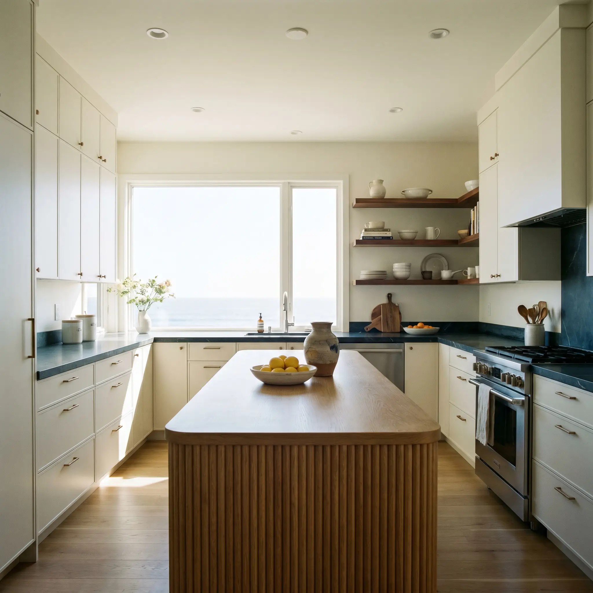
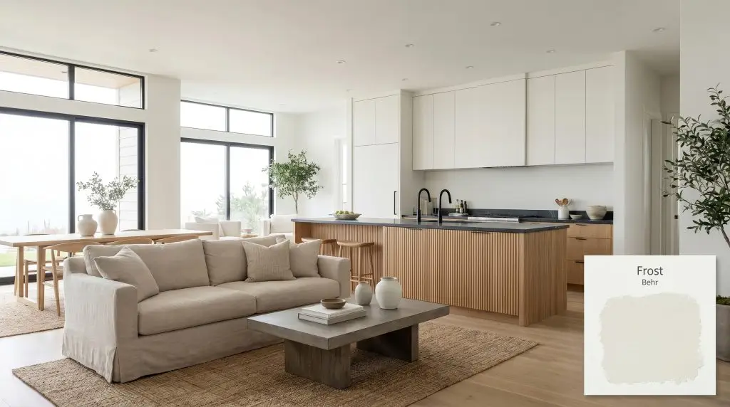
While often associated with ultra-sleek minimalist interiors, this crisp white is remarkably adaptable in the kitchen. For a busy household looking to brighten a dark, galley layout, applying this shade to both the upper cabinets and the surrounding walls creates a seamless, expansive envelope.
To prevent the room from feeling like a commercial kitchen, introduce significant organic warmth.
Pair the icy walls with fluted oak islands, floating walnut shelves, and honed soapstone countertops. The cool-leaning walls will beautifully balance the rich, natural wood tones, creating a coastal modern aesthetic that feels both clean and deeply inviting.
Tranquil Washrooms & Ensuites
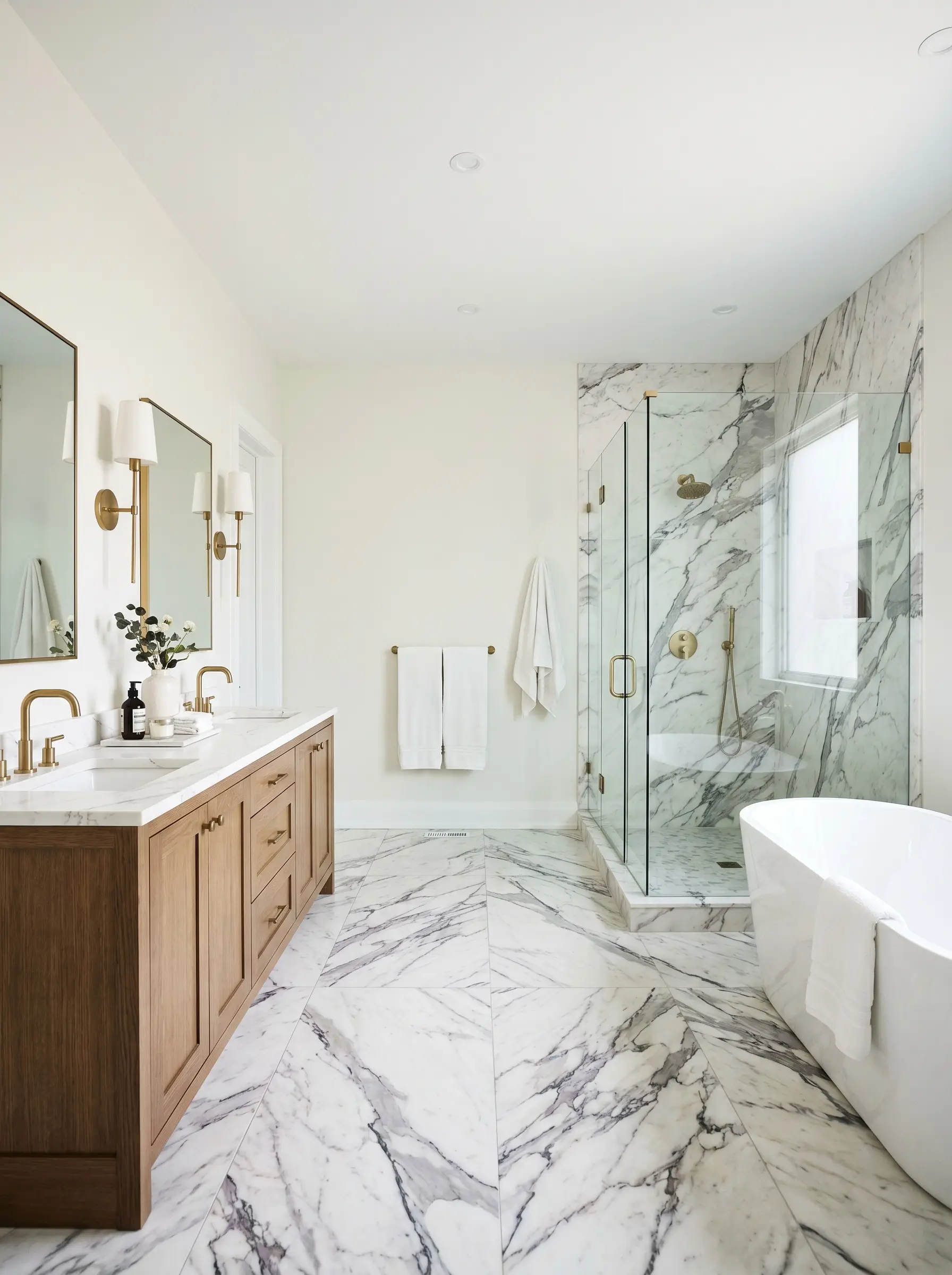
In bathrooms, this shade establishes a pristine, hygienic atmosphere without feeling excessively clinical. It is a phenomenal choice for windowless powder rooms or ensuites that rely entirely on artificial lighting, as its high LRV maximizes every lumen available.
Lean into a high-contrast transitional style by pairing the crisp walls with unlacquered brass plumbing fixtures and heavily veined marble floors. The metallic warmth of the brass cuts through the icy cast of the paint, resulting in a highly curated, custom-built environment.
Be incredibly careful when pairing this shade with existing bathroom tiles. If your shower surround or floor features warm, creamy travertine or beige ceramics, this cool white will clash, making the tile look dingy and the walls look overly blue.
Clash Warning (The Tile Trap)
Curated Gathering Spaces
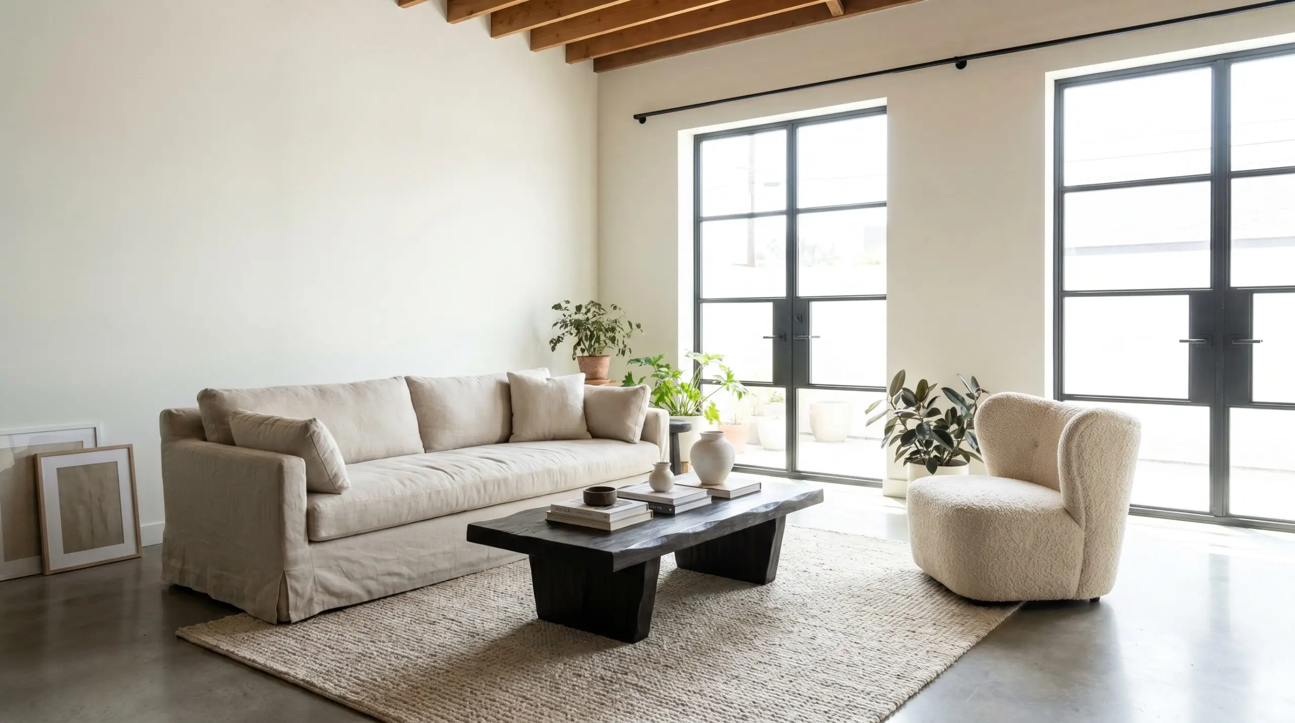
In a living room, this white serves as the ultimate gallery backdrop for an urban professional or design enthusiast. It allows your furniture and artwork to command the room’s attention.
Instead of defaulting to a predictable stark modernism, use this color to build a soft industrial or Scandinavian-inspired retreat. Layer the space with tactile fabrics like washed linen slipcovered sofas, chunky boucle accent chairs, and vintage, faded rugs.
Contrast is your best tool here. Introduce matte black hardware, blackened steel curtain rods, and brutalist coffee tables to secure the visual weight of the room against the highly reflective walls.
Elevated Millwork & Ceilings
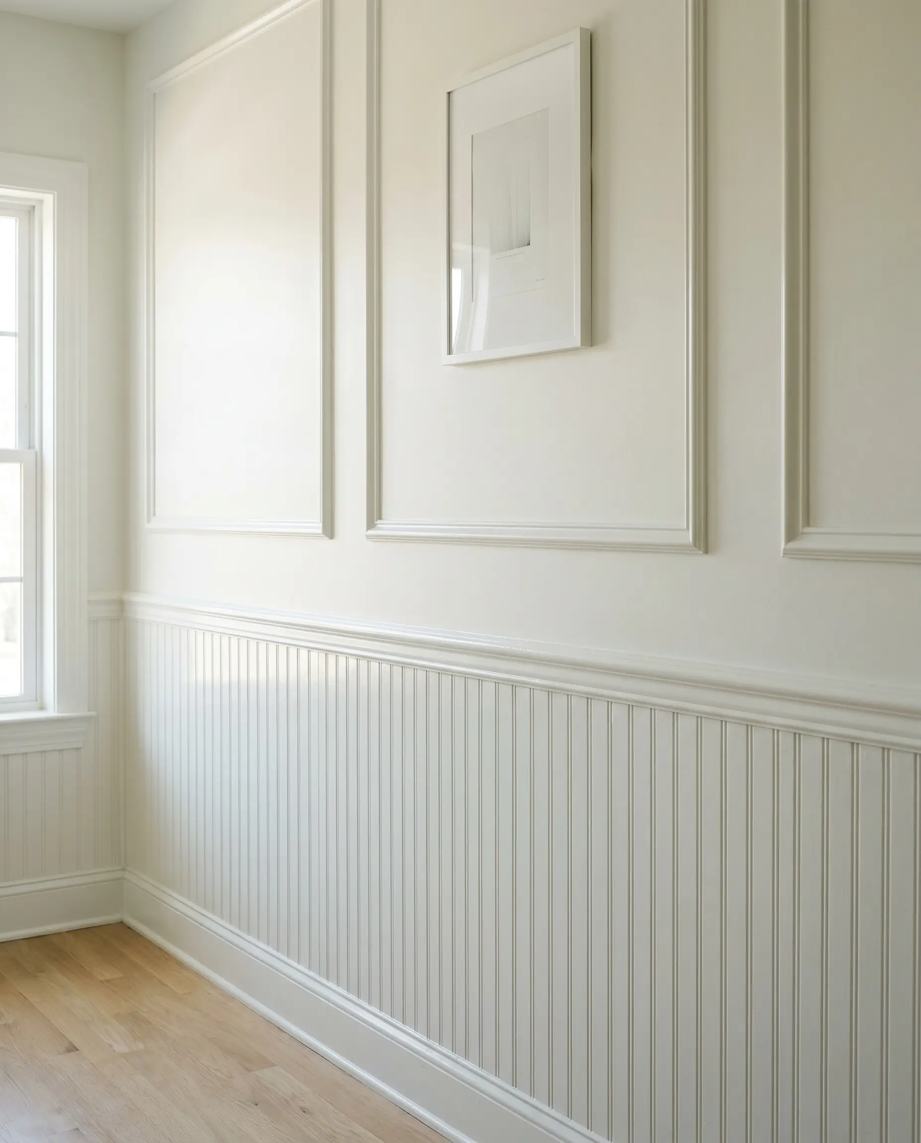
Using this shade strictly on architectural features is a brilliant way to frame a room. When applied to crown molding, baseboards, and interior doors, it creates a crisp, definitive border that sharpens the surrounding wall color.
To achieve premium millwork contrast, manipulate the paint’s sheen rather than its color. Paint your walls in a flat or matte finish, and apply the exact same shade in a semi-gloss to your picture frame molding or beadboard.
This subtle shift in finish catches the light differently, highlighting the architectural details and making standard suburban trim look incredibly intentional.
Exterior Facades & Stucco Applications
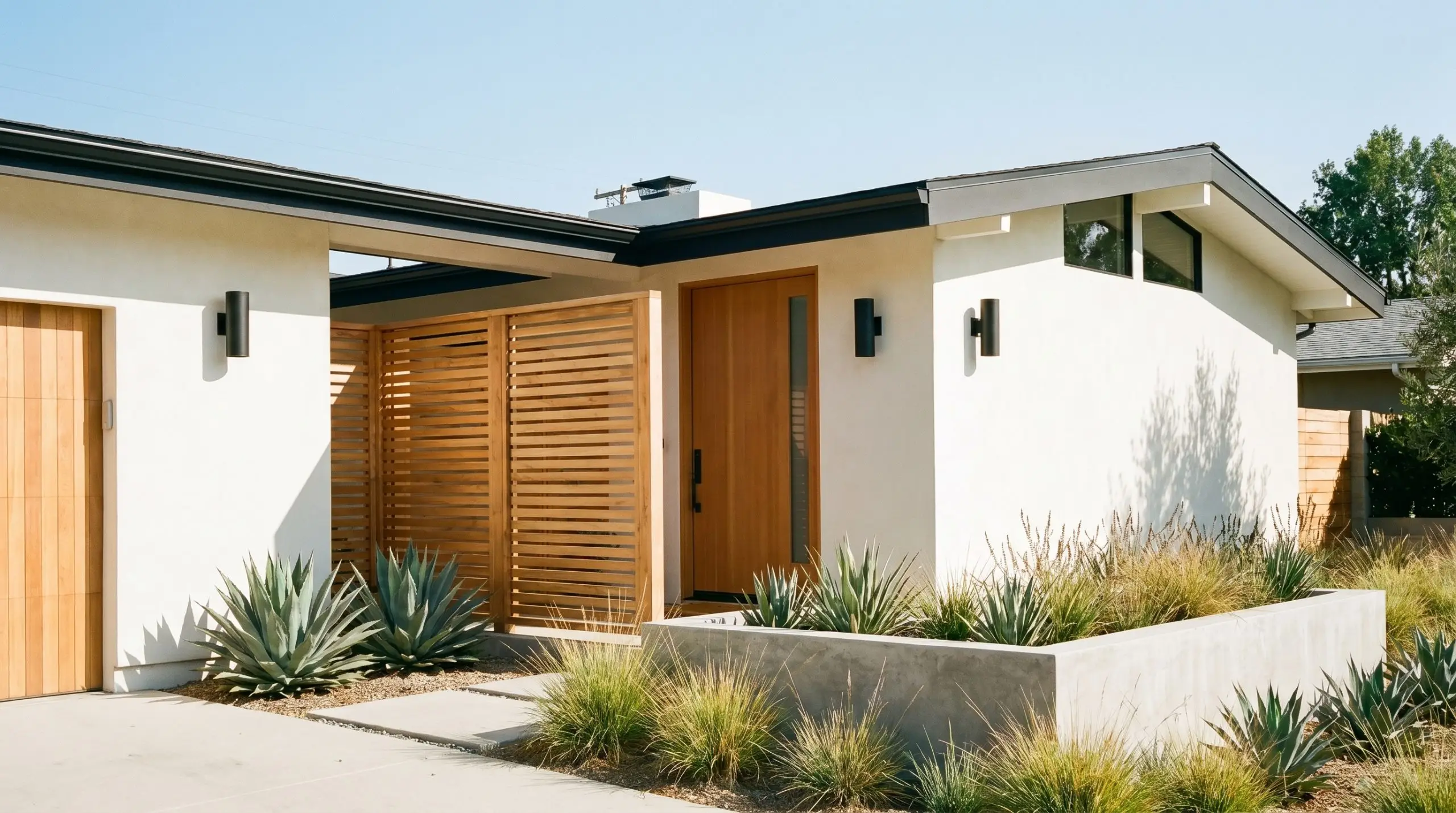
Taking this color outdoors requires a strategic understanding of natural light. Direct, unfiltered sunlight will significantly wash out the color, making it appear even brighter and closer to a pure white than it does indoors.
It is a stunning choice for an exterior stucco application, especially on mid-century or Mediterranean-inspired homes where clean lines are paramount. Pair the crisp facade with natural cedar accents, matte black exterior sconces, and structural, architectural landscaping like clustered planters of agave or trailing ivy.
Because of its 87 LRV, this shade will be highly reflective in full afternoon sun. To root the house visually, ensure you use a significantly darker, contrasting color on your roofline fascia, front door, and window trims.
Hackrea Design Secret (Exterior Glare)
Designing with Behr Frost: Coordinating Colors & Finishes
This icy white requires intentional contrast to hold its architectural shape in a room. Rather than letting it float aimlessly, you must ground its highly reflective nature with tactile materials and deliberate color shifts that respond beautifully to its subtle green-gray shadow.
Flawless Millwork Combinations
To make the walls look incredibly intentional, your trim needs to be noticeably crisper than the foundational wall color. Pairing Frost with an un-tinted, brilliant base like Behr Ultra Pure White 1850 creates a sharp, tailored boundary.
If you prefer a cross-brand option, Sherwin-Williams High Reflective White SW 7757 offers that exact same stark clarity. This distinct contrast forces the subtle green-gray notes in the wall color to step forward, preventing the entire room from feeling washed out or undefined.
Tactile Material Selections
Curated Palette Selections
Styling the Room
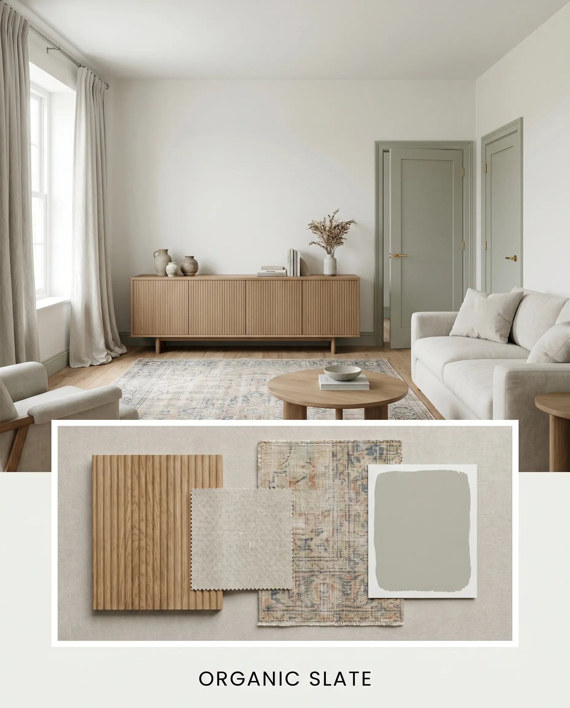
Organic Slate This aesthetic focuses on a serene, breathable environment by pairing the icy walls with the silvery sage notes of Benjamin Moore October Mist. Ground the lightness with fluted oak sideboards and expansive, vintage faded rugs to introduce a subtle sense of history. Draping the windows in washed linen completely softens the crisp architectural lines, resulting in a space that feels effortlessly calm and rooted in nature.
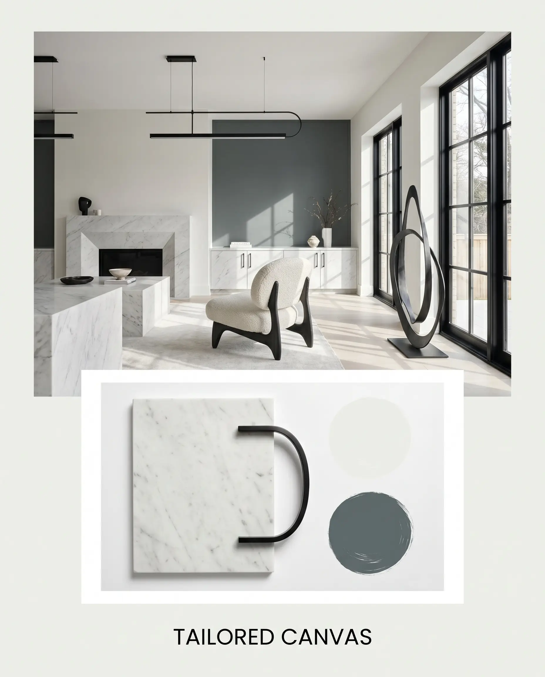
Tailored Canvas For a deeply curated, high-contrast environment, allow the walls to serve as a stark backdrop for the intense pigmentation of Farrow & Ball Inchyra Blue. Introduce honed marble surfaces and sculptural accent chairs to establish a premium, gallery-like sophistication. Matte black hardware is essential here. It punctuates the design, ensuring the transition between the dark teal and the brilliant white feels sharp, modern, and fiercely intentional.
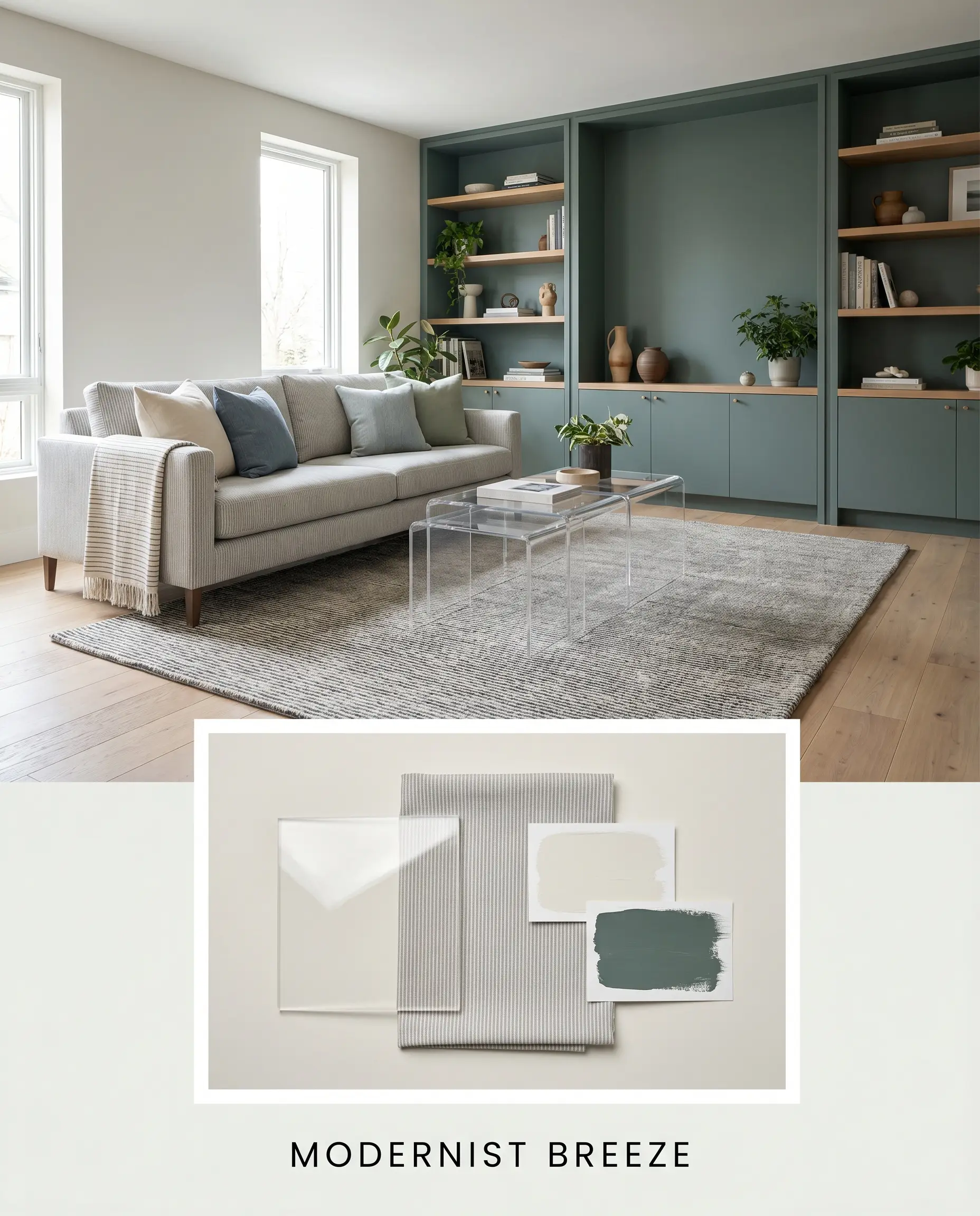
Modernist Breeze This approach leans into the paint’s inherently cool structure, utilizing Behr Meteorological to create a layered, stormy atmosphere. Incorporate sleek acrylic nesting tables and subtle pinstripe textiles to maintain a clean, structured visual flow. By keeping the furnishings low-profile and the decor minimal, the high light reflectance of the paint takes center stage, making the entire floor plan feel expansive and undeniably contemporary.
Navigating the White Spectrum: Head-to-Head Comparisons
Choosing a white paint often comes down to analyzing how its microscopic undertones behave in your specific lighting conditions. If your space lacks large windows or faces north, an icy shade might lean uncomfortably blue, pushing you toward a softer, creamier alternative to maintain a welcoming energy.
Behr Frost vs. Behr Swiss Coffee 12
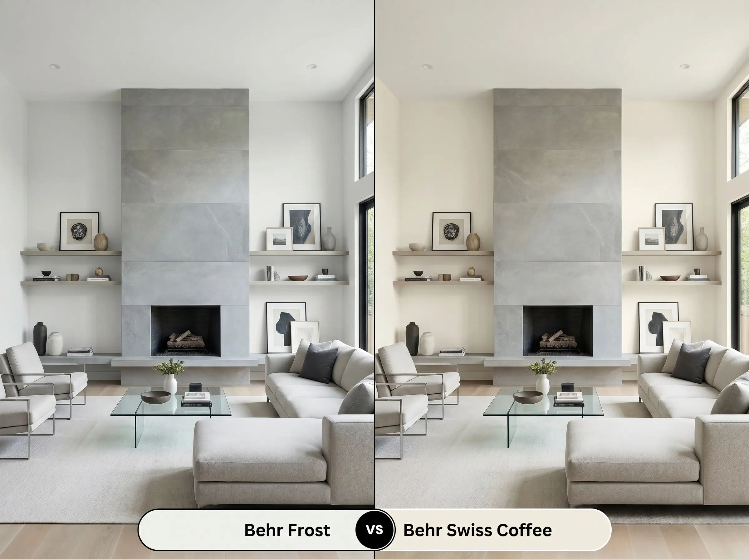
Swiss Coffee is famously creamy, carrying a distinct warmth that feels incredibly traditional and inviting. If your room features honey-toned floors or you want a cozy, sun-drenched glow, Swiss Coffee is undoubtedly the superior choice. Frost, by contrast, strips away that warmth entirely, offering a far sleeker, sharper aesthetic that is perfectly suited for contemporary lines and cool-toned stones.
Behr Frost vs. Benjamin Moore Decorator’s White CC-20
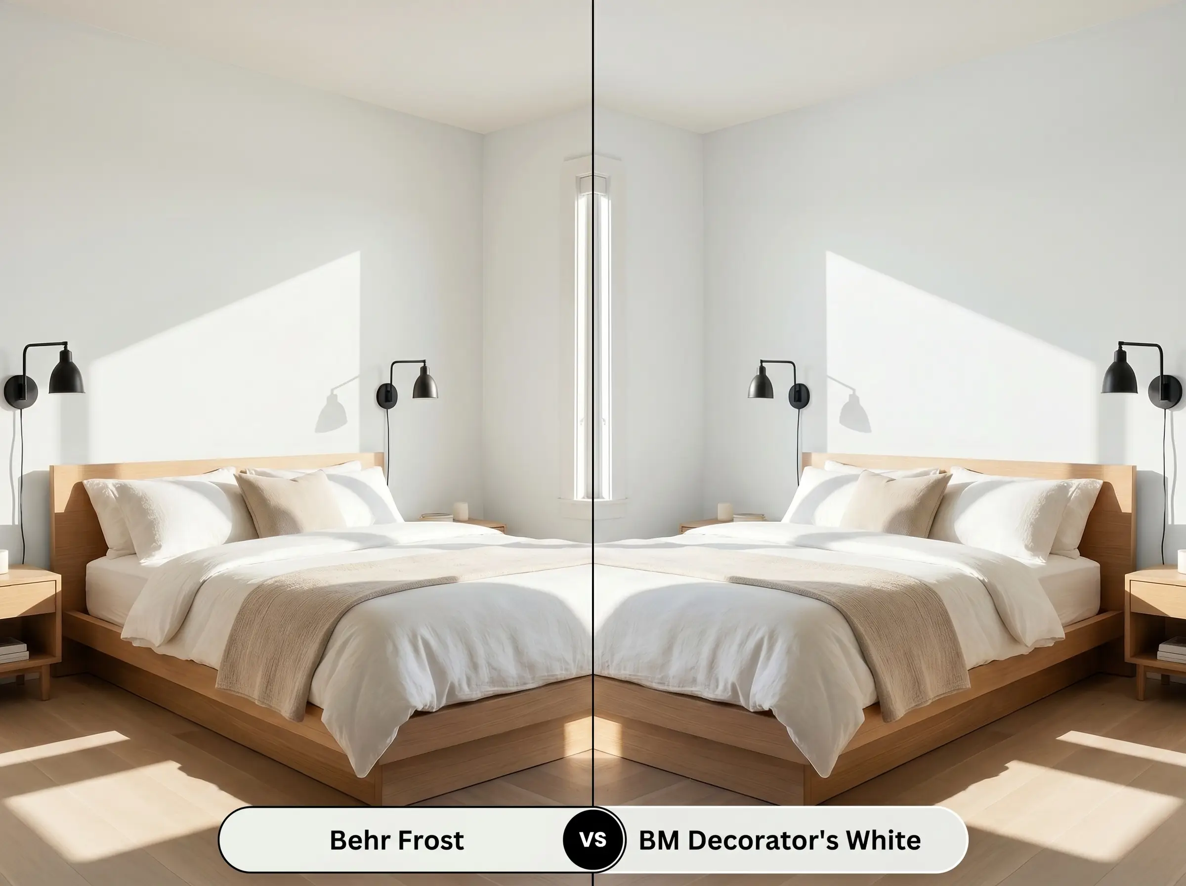
Both of these options are definitively cool-leaning, but Decorator’s White carries a subtle gray-purple undertone rather than a yellow-green one. If your room has strong southern light, Decorator’s White maintains its crispness beautifully without shifting green. However, Behr’s option offers just a touch more luminosity, making it the better candidate for spaces needing maximum light bounce.
Exploring Alternative Crisp Whites
Sometimes a color is almost perfect, but you realize you need a slight adjustment in depth, or you find yourself restricted to a different manufacturer’s product line.
Same-Brand Alternatives
Cross-Brand Matches
Executing This Luminous White Like a Professional
Transitioning this pristine vision from a tiny paper swatch to a finished wall requires strategic planning. The wrong finish or the absence of a proper base coat can instantly ruin the luminous, expansive effect of a high-reflectance white.
The Dynamic Sheen Guide
Primer Strategy
Because this shade has very little pigment to hide what is underneath, a high-quality, bright white stain-blocking primer is absolutely non-negotiable. If you are painting over a dark, vibrant, or heavily saturated color, using a premium tinted primer will save you from rolling endless, frustrating coats.
Coverage & Success Tips
Expect to apply at least two to three coats to achieve a truly opaque, professional finish, even over light surfaces.
Highly reflective whites are notorious for “flashing,” where uneven roller pressure leaves visible, shiny streaks across the drywall. To avoid this common pitfall, always maintain a wet edge, use a high-quality microfiber roller, and resist the urge to over-work the paint once it begins to tack up.
Frequently Asked Questions
Because of its high light reflectance, it actually performs beautifully in windowless spaces by maximizing whatever artificial light is available. To prevent the room from feeling clinical, simply introduce warm metallic hardware, like unlacquered brass, and organic textures to balance the icy undertone.
In intense, direct sunlight, its subtle green-gray shadow gets entirely washed out, making it read as a brilliant, highly reflective white. It is highly effective for a crisp, modern facade, but you must pair it with deeply saturated trim colors to ground the home visually and prevent glare.
Yes, the cool, icy cast of this paint will actively fight against the orange and yellow tones inherent in honey oak. This visual tension often makes the wood look dated and causes the walls to appear unpleasantly blue-gray.
The Final Verdict on Behr Frost
This paint is a phenomenal tool for homeowners and design enthusiasts who want to entirely refresh their architecture with a crisp, luminous foundation. Its absolute best application is in modern, light-filled spaces—such as contemporary kitchens, sleek urban apartments, or transitional living rooms—where its high light reflectance can actively expand the visual boundaries of the room. It is perfect for those who appreciate clean lines, high-contrast material pairings, and a truly pristine aesthetic.
While this shade excels in modern environments, it is fundamentally incompatible with heavily traditional, earth-toned homes. If your space features Tuscan-inspired travertine tile, warm beige carpeting, or extensive cherry wood cabinetry, this icy white will actively fight against those finishes. The cool green-gray undertone will clash with the warmth of your existing materials, leaving your walls looking stark, detached, and uncomfortably chilly. Reserve this brilliant canvas for spaces that are ready to embrace a sleek, tailored, and highly modern identity.
Hackrea Design Secret (The Warmth Warning)
Closest Cross-Brand Equivalents
The absolute closest scientific color matches for Frost across top paint brands.