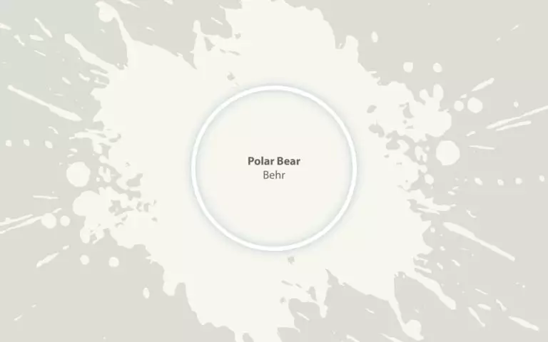
Polar Bear (Behr 75): what color is, review, and use
Paint manufacturers do not cease to impress us with outstanding shades of white, and it seems that they have been looking lately for inspiration at nature itself. There is no need to dive into the details of such a trend since everything that is traced to nature is today more relevant than ever when people try to integrate the principle of bringing the outdoors indoors. An indeed fabulous example in this sense is Polar Bear from Behr, a seemingly coolish shade of white with soft pinkish notes.
You probably wonder – why Polar Bear? Well, this is the essence of the shade itself. Whether the experts at Behr were inspired by the polar bear’s quite pinkish-white fur or the soft white grandeur of the polar sky at dawn, they definitely went far beyond the borders of their continent. We cannot help but wonder what else this unusual shade of white has in store for us. As usual, a thorough analysis will reveal its inner beauty.
Polar Bear paint color features
Polar Bear is a balance between a classic white that would rather be considered coolish if it were not for the subtle pink notes responsible for its slightly warm effect. One may even see these soft undertones as peachy, which is not at all wrong if we speak about airy and soothing peach notes. The name makes it clear from the start that this shade feels like a breath of polar air – fresh, invigorating, and crispy but no less calming, serene, and undoubtedly relaxing. The latter features are not only the result of the warm undertones but also of the setting they refer to. The place where polar bears thrive in their habitat is far from the crazy world we live in today. This color seems like an escape from reality.
We would also like to draw your attention to the environmental reason for naming this shade of white this way. We are all aware of the effect of human activities on the environment, and such species as the polar bears are at risk of extinction unless people tackle climate change. Probably, the colorists wanted to raise even more awareness in this sense by naming this color after a species that is still part of the polar ecosystem. Well, we are not sure about that, but we definitely know that this color should serve as an encouragement to be more responsible when it comes to environmental protection.
You can apply wallpapers, paints, etc. on walls and see how they look in various interiors.

Polar Bear: is it warm or cold?
It doesn’t matter how hard one can try to prove that Polar Bear is a cool shade, it is still warm, and the soft yet frosty pinkish-peachy notes are there to back this statement. Nevertheless, it is not that simple with this shade since you get confused as soon as you are surrounded by this color: is it more of a fresh or soft shade? Actually, it is a perfect balance between those two. The interesting part is that, regardless of the factors that slightly influence the appearance of this color, it still preserves this harmonious pairing.
How does lighting affect Polar Bear?
The mentioned balance may stay unchanged, but its intensity surely puts on different masks once lighting enters the play. In north-facing rooms, Polar Bear reveals its entire polar essence, appearing as a very stimulating and crispy shade of white, although not devoid of its hidden soft scents. At the same time, the south, west, and east-facing rooms reveal the warmest version of this shade. One should note that a slight shadowy touch may result in quite intense pinkish particles spread all over the surface, which can become warmer or cooler depending on the artificial lighting undertones.
Polar Bear LRV
This is when the soft undertones complement this rather classic shade of white since its light reflectance abilities resonate perfectly with a true white. Let’s get more specific! The LRV of Polar Bear is 90. A true white color has an LRV of 100. Now, you know what we mean by bringing Polar Bear close to a pure white. The result is self-explanatory. This beautiful shade from Behr is surely a source of light reflectance that will brighten up the space to the fullest and go far beyond the room limits.
Polar Bear undertones
We have already revealed to you the hidden notes of this shade this far. Let’s make it clear! Polar Bear is this shade of white that will definitely get you confused at every new glance, which is not a drawback but rather a reason to benefit from its uniqueness. The balance of a coolish base and rather pinkish or even peachy undertones is responsible for this unusual shade of white that feels like a breath of fresh air and a delicate touch of softness at the same time.
Similar colors
There is simply not a single shade that would reflect the same amount of refinement hidden in the inner beauty of Polar Bear. Still, the range of whites is so wide that you will surely find at least a few colors that slightly replicate a tiny part of the Polar Bear’s grandeur. Of course, you don’t have to look for them yourself. Take a look at the already prepared list of similar colors from Behr and other renowned manufacturers.
Coordinating colors
Polar Bear is both versatile and picky in this sense. While being friendly towards a wide range of colors, it is quite picky about their particular variation, pairing perfectly with neutrals, pastels, or soothing shades, and some bolder ones. There is no need to search for perfect companions when experts from Behr have already come up with an entire list of coordinating colors.
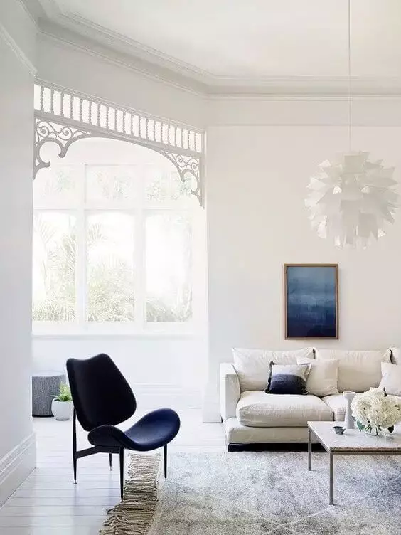
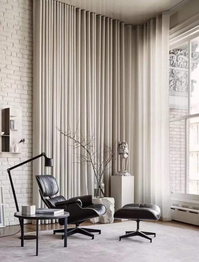
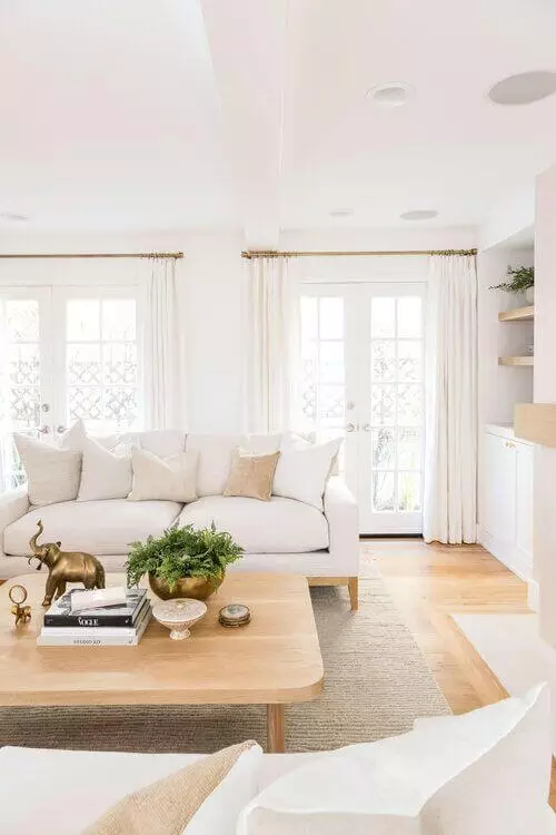
Use of Polar Bear in interior
Polar Bear is a perfect alternative to the classic white within interior design, offering a slightly softer variation that fills the space with a strong sense of ease and calmness, which homeowners strive for today. Therefore, any style that implies a neutral shade of white will surely benefit from a similar color that brings additional comfort. Let’s scroll through some design solutions!
New Scandi
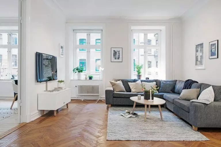
We are used to the rather coolish notes of Scandi backgrounds that perfectly replicate the cold weather of Nordic countries. Why not keep the functionality of this style while adding a few drops of softness? This way, you will stay true to the core values of Scandi and breathe fresh air into the way it feels. The irreplaceable monochromatic palette, the functional use of space, a few textile sources to ensure comfort, and undoubtedly Polar Bear for the background.
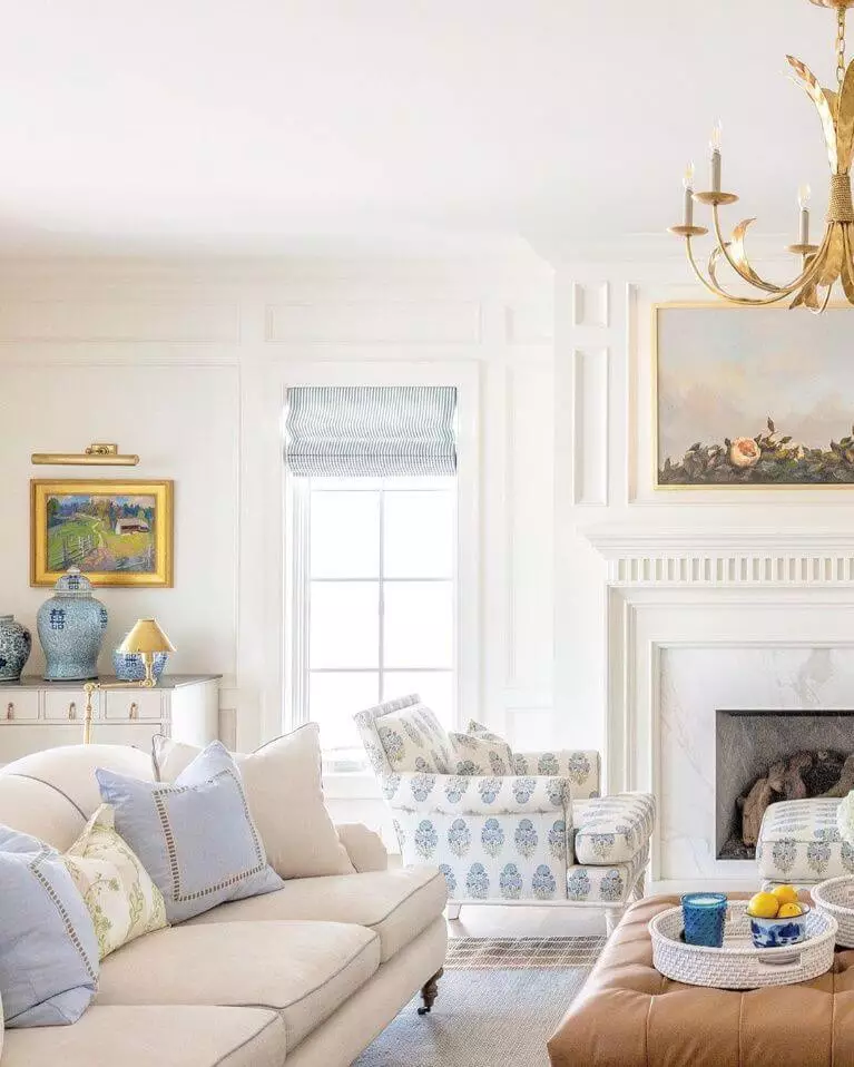
A new perspective on the classic
A similar approach to the previous one goes here. The renowned Neoclassical style has seen a lot of changes, particularly when it comes to the backdrop, from rather coolish grays to soothing blues and many more variations among these two extremities. Today, experts suggest opting for warmer neutrals that would not interfere at all with the basic elements of this style, although enriching them with a slight touch of comfort that we all like to return to after a busy working day.
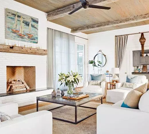
Unusual Coastal
It seems a bit strange to pair a style inspired by the breezy environment of south countries with the rather cool Polar Bear. Well, the warm undertones of this shade are the ones to ensure balance. The contemporary approach to Coastal supposes a quite monochromatic palette directed more towards beige, and this rather milky shade of white suits perfectly such requirements. Redefine the Coastal environment within your interior with an additional touch of softness.
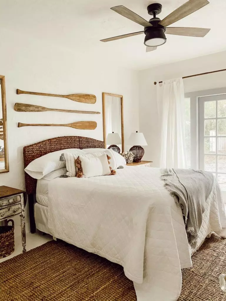
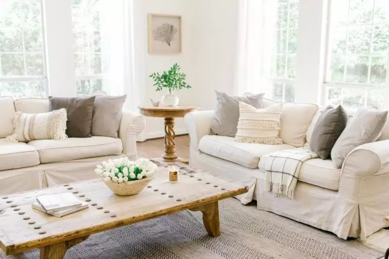
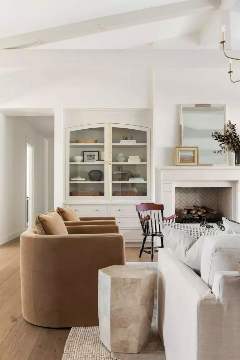
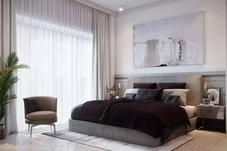
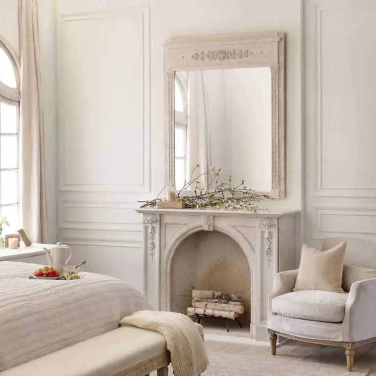
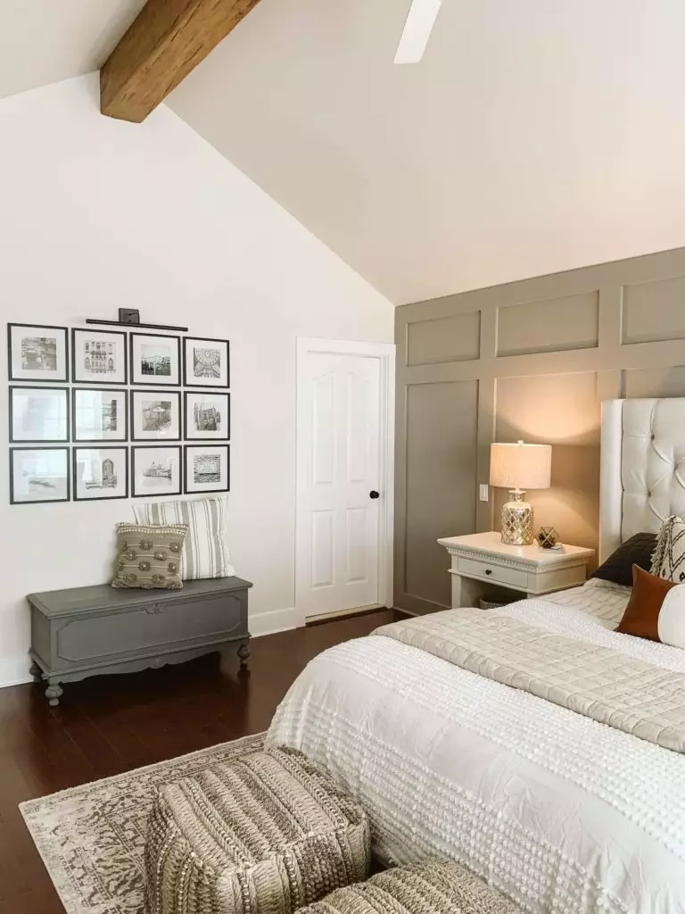
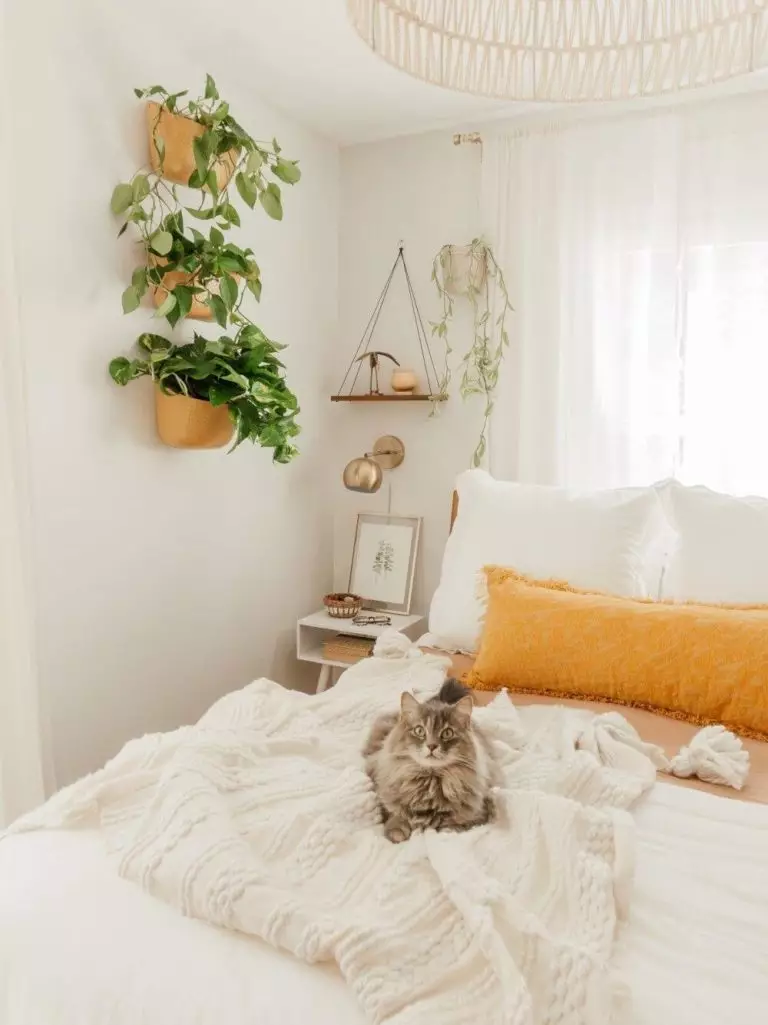
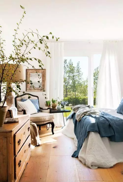
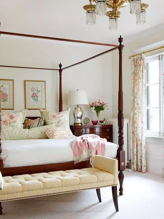
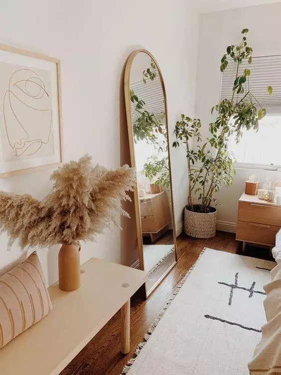
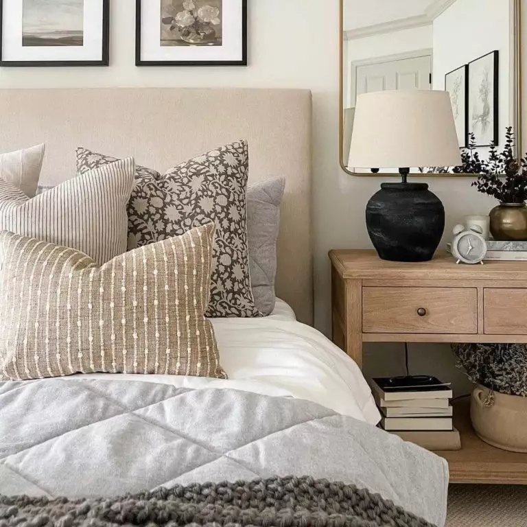
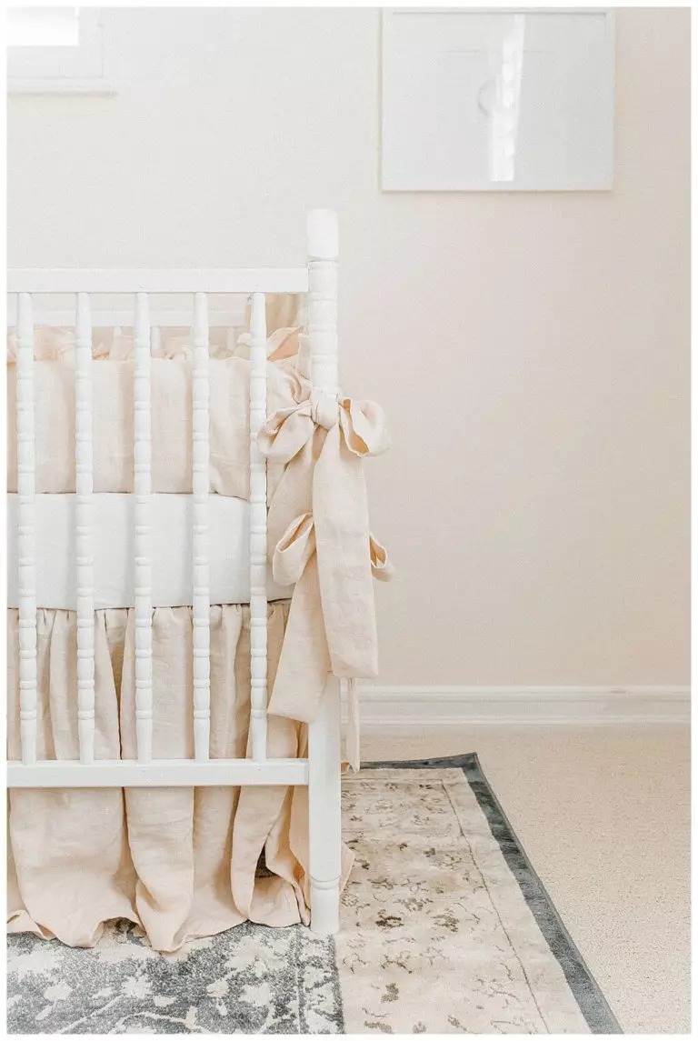
Bedroom
Would you like to fall asleep in an exceptionally comfy environment and wake up full of confidence for a new day? Well, believe it or not, the balance of freshness and softness developed by experts from Behr is exactly what your bedroom requires. Add a bit of wood for perfect harmony between the warm undertones of Polar Bear and the rich wooden texture. For a rather soothing effect, consider a balanced palette of pastels. Both cases will benefit from a milky white background, which will look no less impressive within a Boho style, enriched with beige notes, or a Vintage setting, diluted with slight scents of refinement.
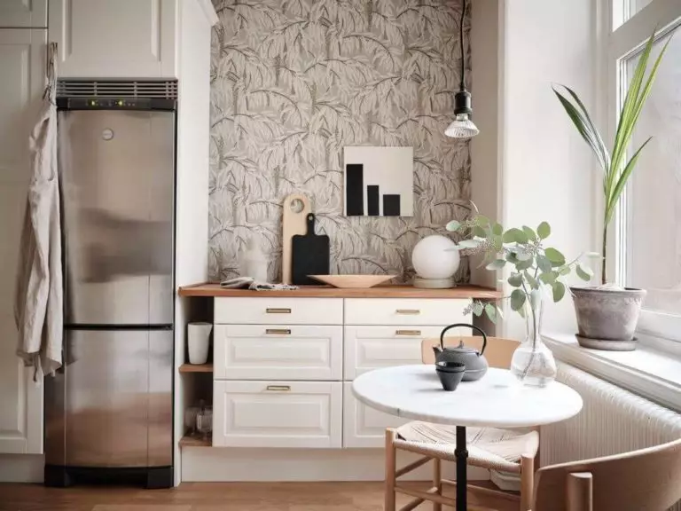
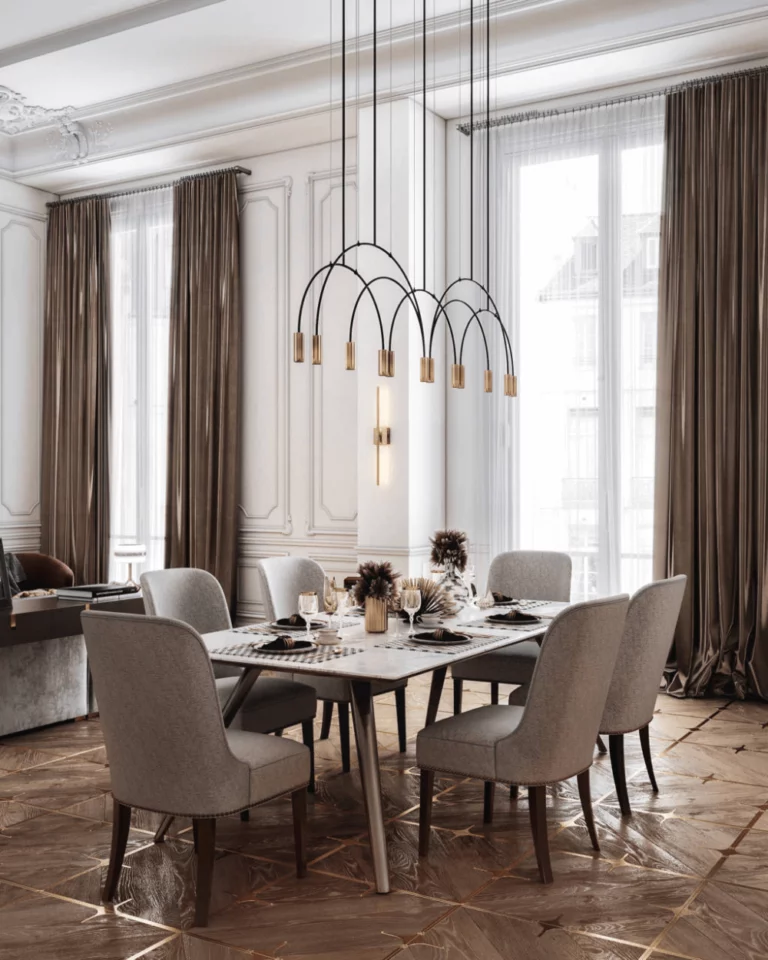
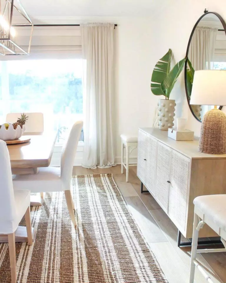
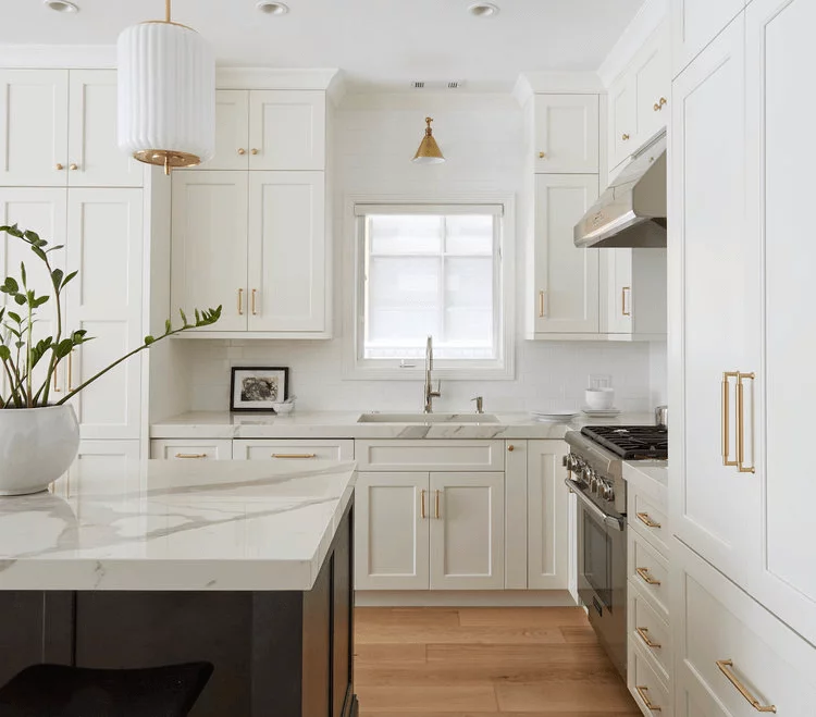
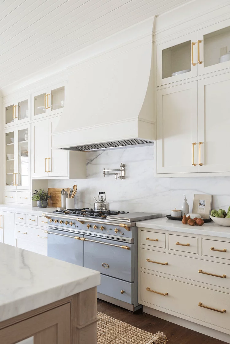
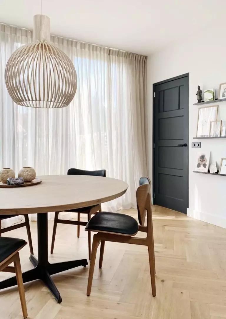
Kitchen and dining room
Usually, whites go with almost any style, which is also true for this shade. Nevertheless, nothing compares with a traditional or rather Farmhouse kitchen with cabinets painted in this charming shade, enriched with a few splashes of gold and a quite monochromatic palette. Sleek, functional, and not devoid of flair, your kitchen will become the pearl of your interior. Not far from a traditional approach goes the dining room, which implies a milky white background (of course, we mean Polar Bear) and natural wood furniture with Scandi finesse. Quite a simple arrangement, and do you know what makes it sparkle at its finest? Undoubtedly, Polar Bear is responsible for the overall harmony.
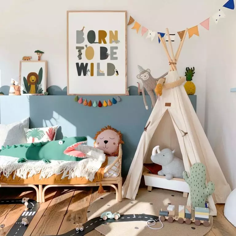
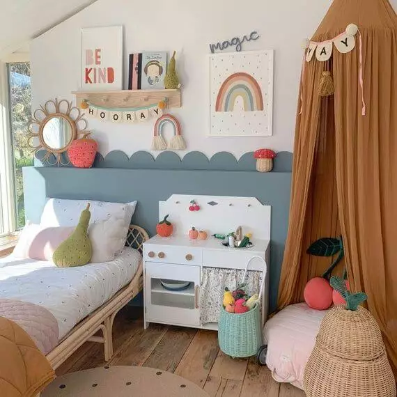
Kids’ room
Not all shades of white have this outstanding ability to stay fresh and warm at an equal level. Luckily, Polar Bear is all about that – a balance of undertones, balance of emotions, and not least balance within the interior. This is exactly what the little ones need – a calm environment for a safe and sound sleep after a day full of adventures. Furthermore, the enchanting pure effect and clean appearance of this shade are an additional compliment for a space like this. From an early age till becoming a teen, Polar Bear will serve as a perfect background for your kid’s room. Besides suiting the contrastive elements of this space that are usually bright-colored, the milky white will set a particular connection between your kid and nature, which is worth considering to ensure harmony with oneself.
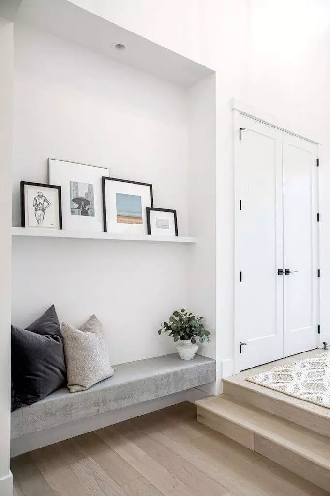
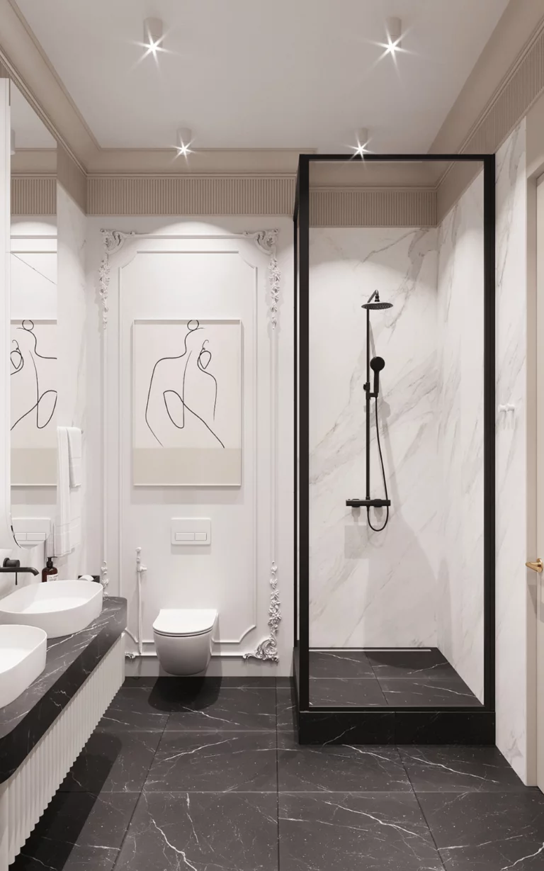
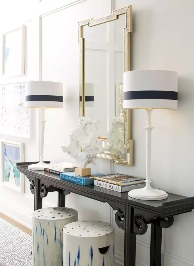
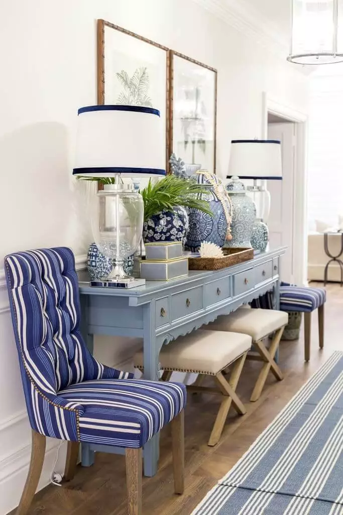
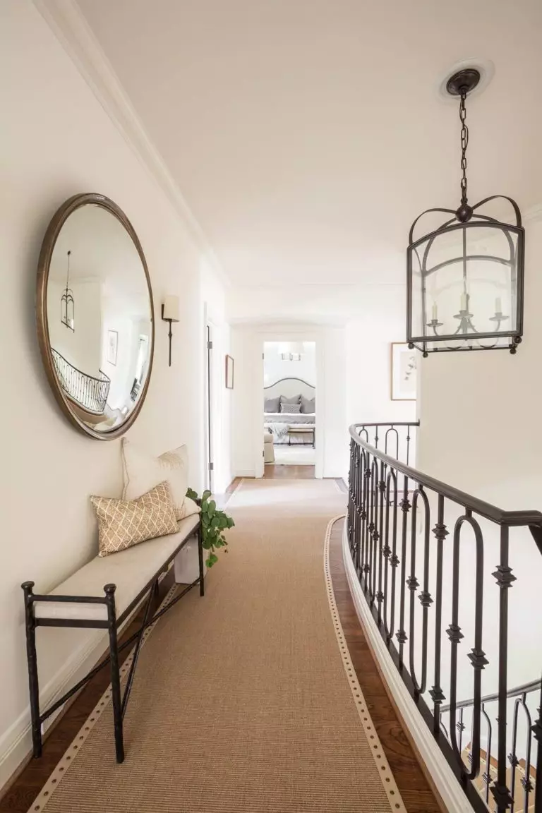
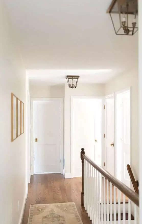
Hallway
If you thought that painting the hallway walls in a neutral color is a quite easy process, we hasten to assure you that this space requires as much attention. An extremely cool shade may seem rather cold or too formal, while an extra warm one may pass the limits of an appropriate level of welcoming effect. This is why you should stick to a balance, and what shade is known to reflect this concept to the fullest? Polar Bear! Furthermore, it works perfectly with sleek contemporary interiors and charming traditional settings; even a Vintage approach is no less impressive in this context.
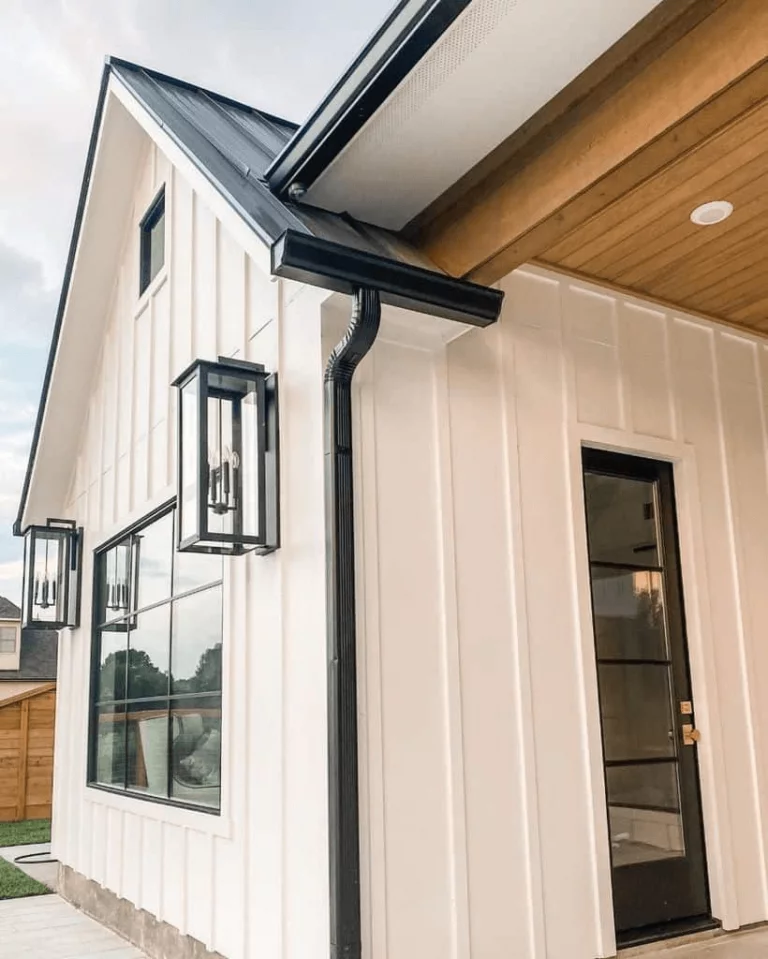
Use of Polar Bear for house exterior
Such light shades usually lead to a rather faded effect of the house exterior, but not this one. The seemingly subtle notes of softness are so confident and deep that once this shade is applied to the house walls the warm undertones spread all over the surface and offer the house an intense sense of aristocracy, not mandatory in a traditional way since such a feature can also be adapted to contemporary standards.
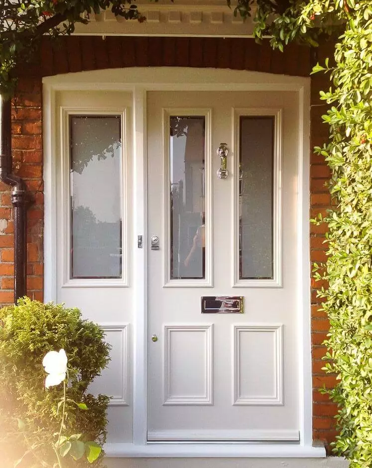
What about the front door? Well, if painting the entire house exterior in Polar Bear seems kind of risky to you, you have literally nothing to lose with a front door painted this way on a contrastive background, such as brick walls.

The Polar Bear paint color from Behr is the ultimate milky white that brings nature into the interior in the most unexpected neutral way, but once it slightly touches a particular room within the house, softness, invigoration, and limitless freedom to dive deep into your own world spread all over the space, complementing any style and adapting to any preferences.