Pink Rose SP2F4
DuluxDulux Pink Rose (SP2F4) is a soft, highly reflective pastel pink with a subtle cool violet undertone. With an LRV of 78, it brings a delicate, airy brightness to any space without feeling overly sweet or saccharine.
Paint Technical Profile
| Color ID / SKU | SP2F4 |
| HEX Code | #f8dbe5 |
| Light Reflectance (LRV) | 78 |
| Use | Interior, Exterior |
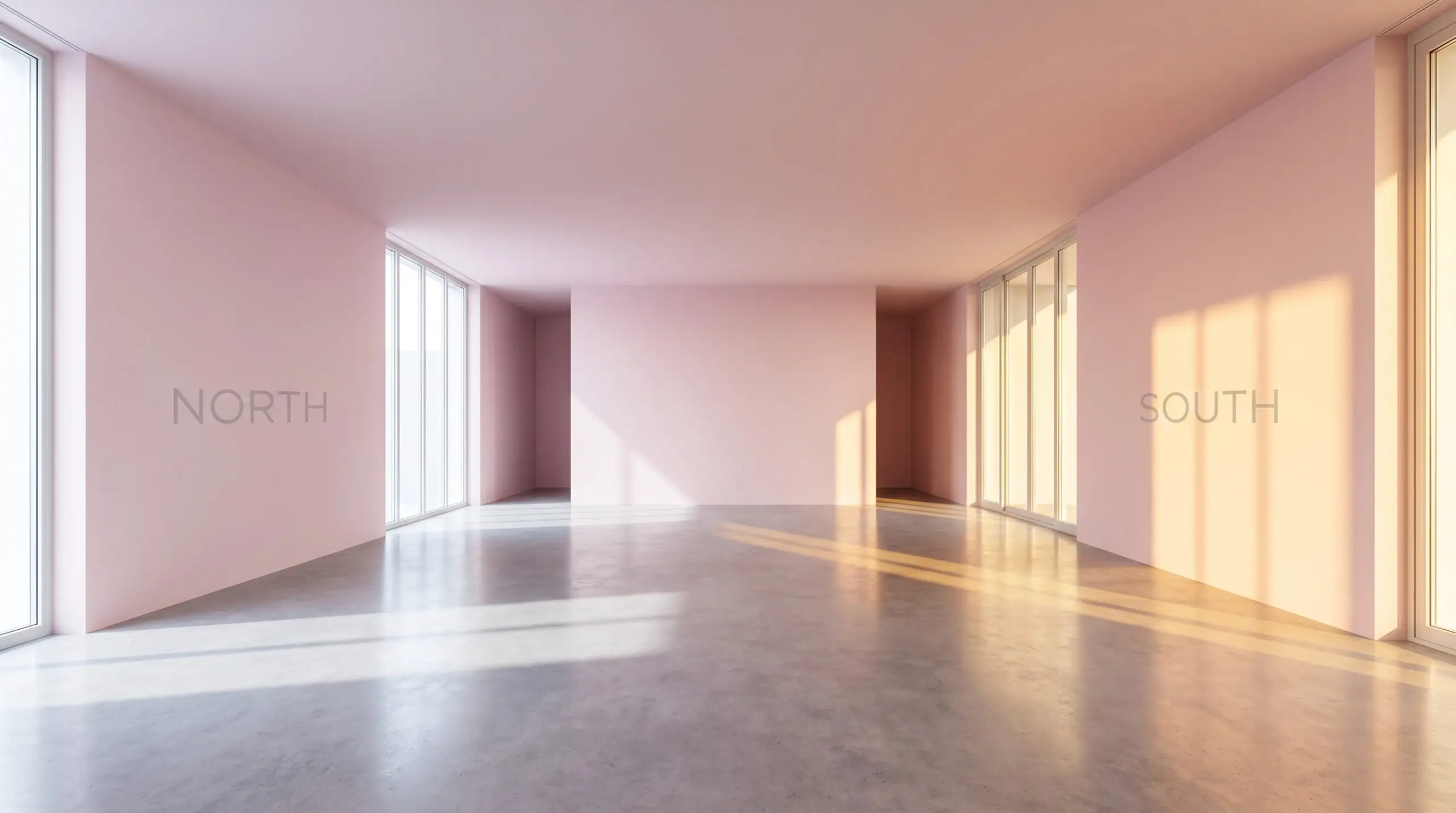
| Best Exposures | South, East |
| Best For | Bedrooms, Bathrooms, Dressing Rooms |
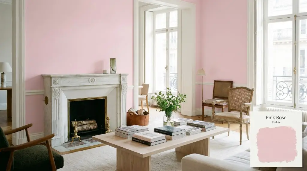
Dulux Pink Rose: The Violet-Infused Pastel Redefining Modern Blush
Finding a pink paint that feels genuinely sophisticated is a notorious design challenge. Too often, seemingly perfect swatches veer into saccharine territory on the wall, or they skew unexpectedly orange the moment the afternoon sun hits them. Homeowners frequently abandon the idea of blush interiors altogether, fearing the result will feel like a juvenile novelty rather than a curated sanctuary.
Dulux Pink Rose offers a brilliant exit strategy from that predictable trap. By relying on a highly specific color structure, it bypasses the sugary sweetness of traditional pinks entirely.
Instead of acting as a loud focal point, this cool-toned pink functions as a surprisingly versatile architectural finish. It provides a soft, atmospheric backdrop that elevates everyday materials while allowing your premium accents to take center stage.
Dulux Pink Rose: Undertones & LRV Breakdown
If you are wondering whether Dulux Pink Rose leans warm or cool, the answer is definitively cool. This shade completely avoids the peach and coral tendencies that plague so many popular blush paints. Instead, it relies on a sophisticated, icy foundation to maintain its crisp visual identity.
To truly understand how this color will behave on your walls, we have to look closely at its underlying chromatic profile:
Understanding the Light Reflectance Value (LRV) With an LRV of 78, this hue operates as a highly reflective pastel hue.
In practical design terms, this means the paint bounces a massive volume of light back into the room. It effectively minimizes ambient light absorption, ensuring your space feels expansive, airy, and effortlessly bright.
Lighting Effects: The Chameleon Factor
Because of that hidden violet influence, this paint is highly reactive to its environment. The temperature of the light hitting the surface will physically alter how you perceive the color throughout the day.
Here is exactly how the shade shifts across different lighting scenarios:
If you want to maintain the sophisticated, icy nature of this paint after the sun goes down, swap your standard warm bulbs for neutral 3000K to 3500K LEDs. This prevents the artificial light from turning your crisp walls into a muddy peach.
Hackrea Pro-Tip (The Bulb Strategy)
Popular Applications for This Cool-Toned Pink
When homeowners see a pastel blush, they often immediately restrict it to very specific, traditional roles. However, treating this highly reflective shade as a neutral architectural layer opens up incredible design possibilities.
Here is how to deploy this color effectively across different spaces, manipulating its cool undertones to fit a variety of modern aesthetics.
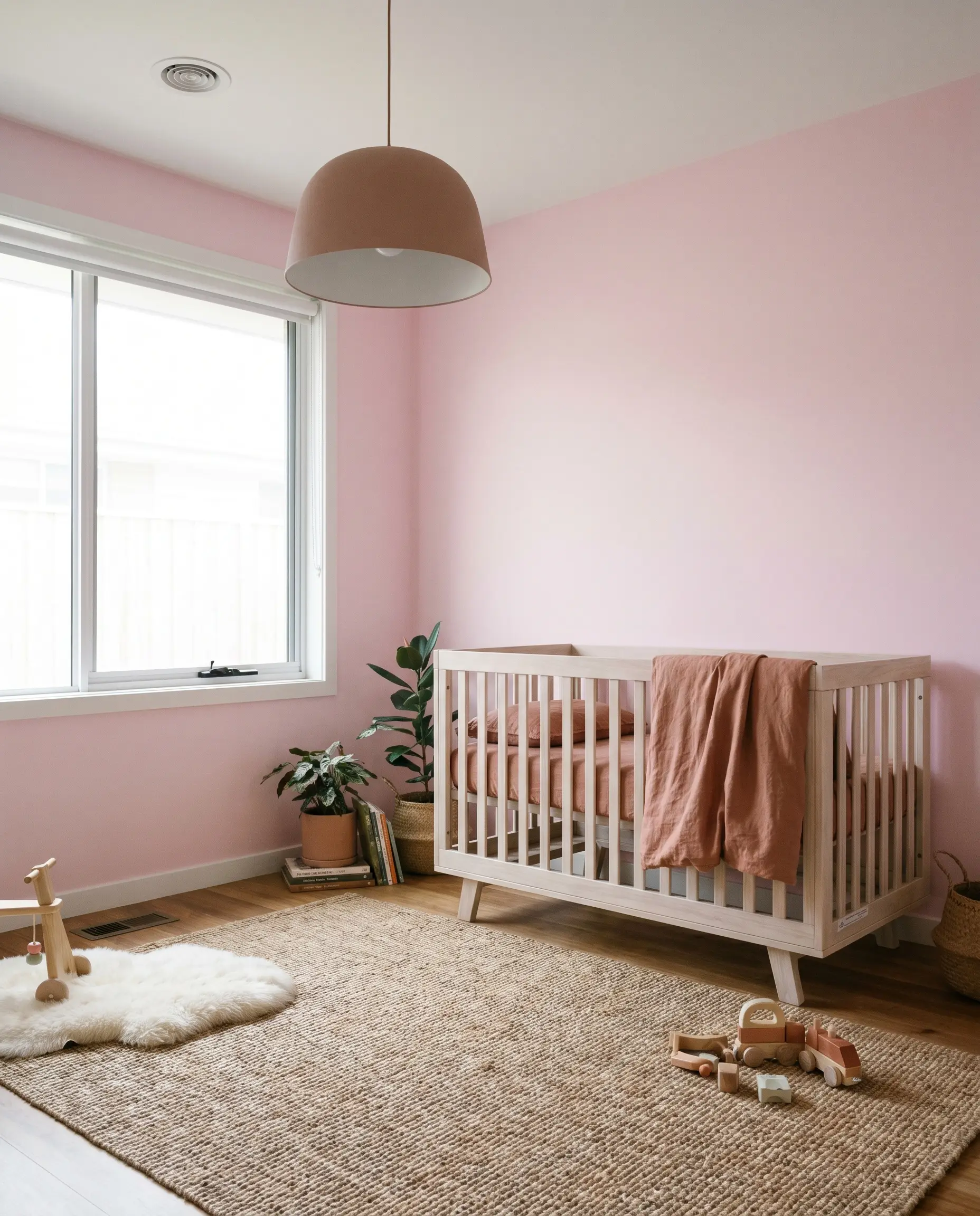
Nurseries and Children’s Rooms
It is incredibly easy to default to a traditional, overly sweet aesthetic when painting a nursery pink. To create a space that feels intentional and grows seamlessly with the child, pivot toward a Scandi-Chic or Warm Minimalism approach. Let the crisp, cool nature of the walls dictate a more restrained, sophisticated palette.
Anchor the room with accessible, everyday staples like a standard bleached ash crib and a simple jute rug. Then, elevate the entire design by investing in one premium focal point, such as a beautifully tailored bouclé glider or a high-end, oversized pendant light.
Layering washed linen bedding in muted terracotta or sage green creates a brilliant visual tension against the cool walls. Avoid matching your textiles perfectly to the paint. Introducing subtle, earthy contrasts prevents the room from feeling like a predictable, monochromatic box.
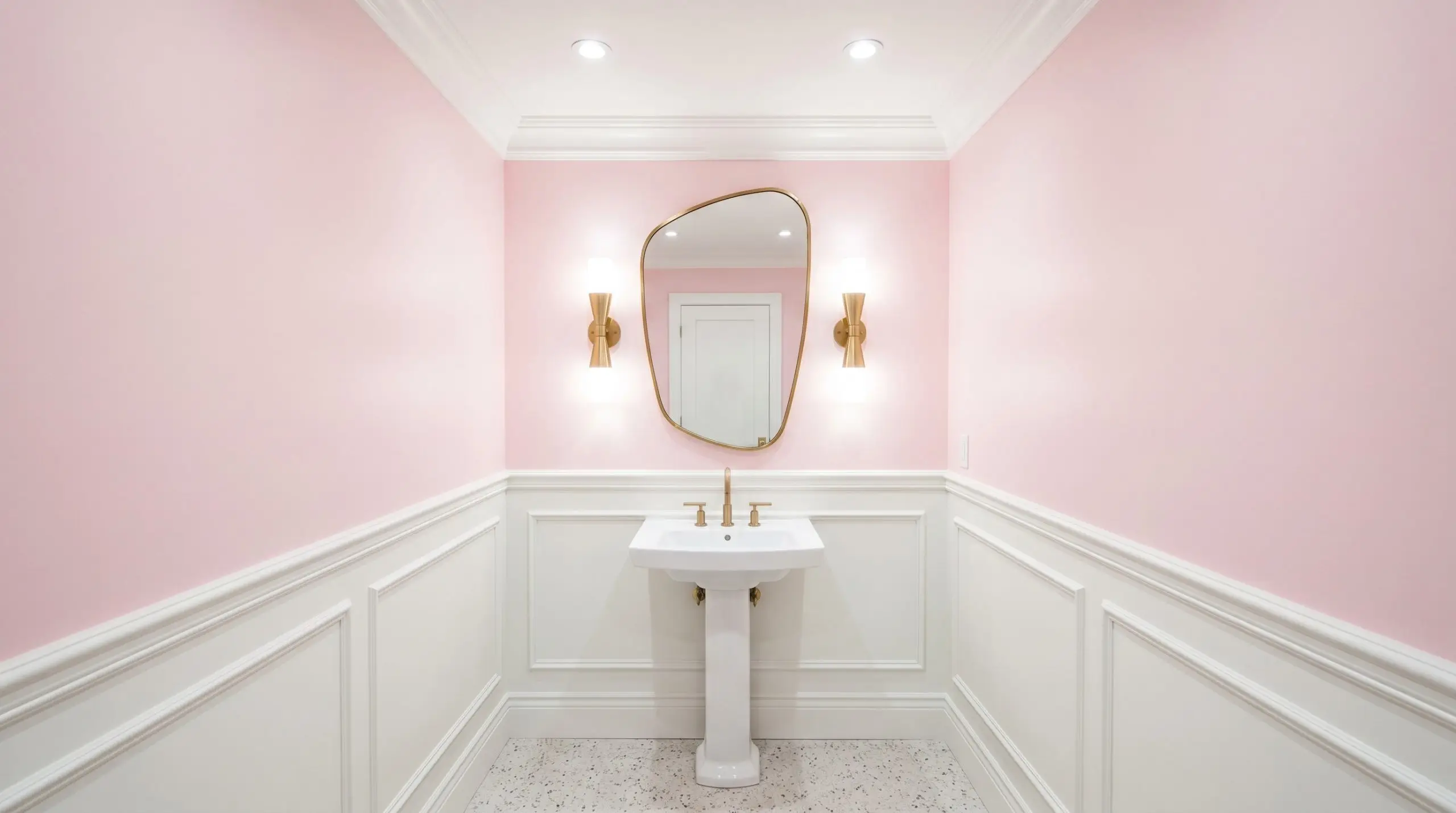
Powder Rooms and Guest Bathrooms
Powder rooms are the perfect architectural canvas for high-impact design. Because these spaces often lack abundant natural light, the paint’s high LRV works incredibly well to keep the tight quarters feeling open and luminous.
Lean into a New Deco aesthetic by pairing the softly tinted walls with classic, accessible wainscoting painted in a crisp white like Benjamin Moore Chantilly Lace.
To make the space feel custom-built, introduce contrasting textures. Unlacquered brass sconces, a simple pedestal sink, and a framed organic-shaped mirror will instantly warm up the cool violet undertones. If you have the capacity for a minor material upgrade, a small backsplash of honed Carrara marble or fluted glass accessories will beautifully echo the paint’s elegant, frosty nature.
Be incredibly cautious if your bathroom features existing beige, yellow-toned, or almond-colored tiles. The cool, magenta-blue structure of this paint will violently clash with yellow-based neutrals, making both surfaces look dingy. Always test a large swatch next to your hard finishes first.
Clash Warning (The Tile Trap)
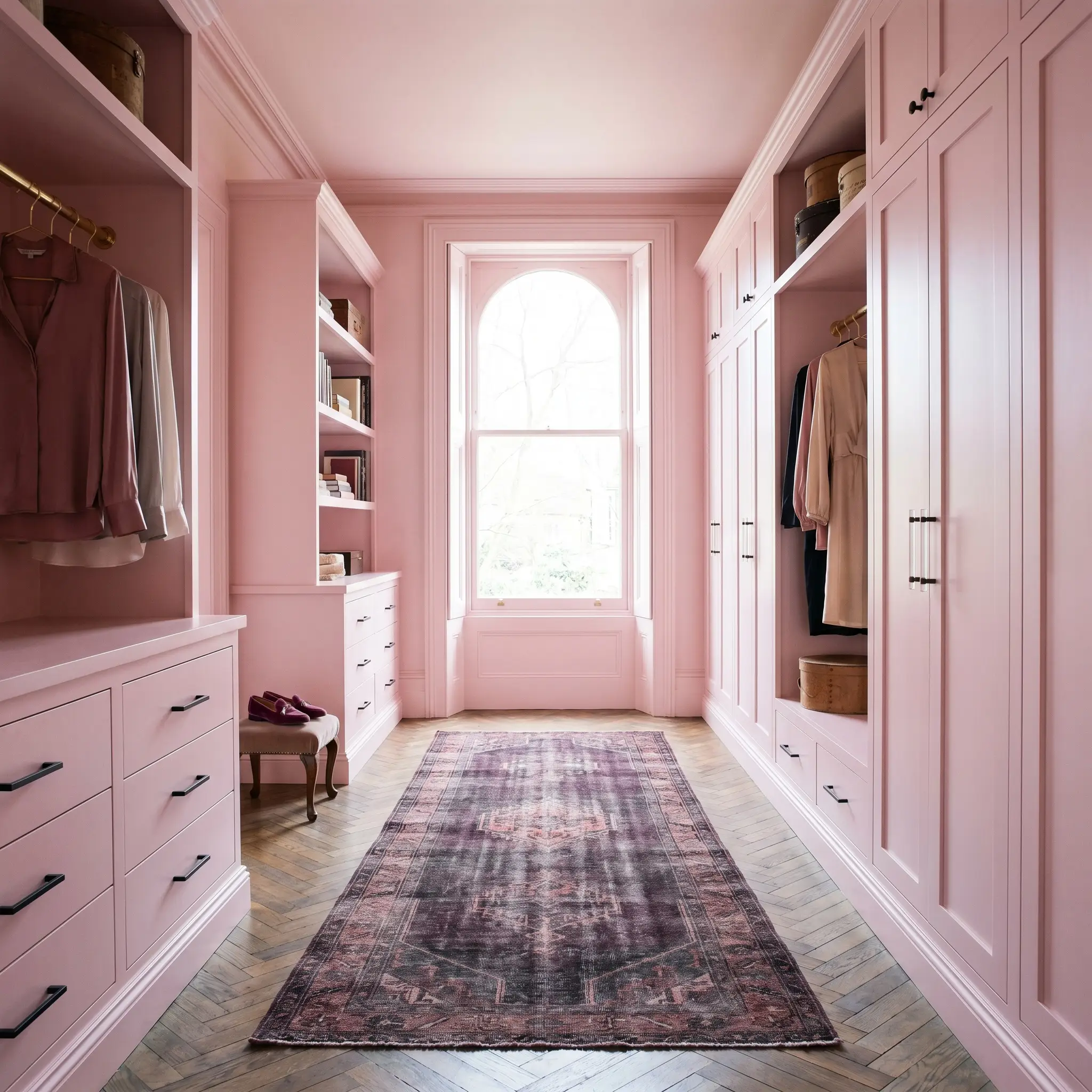
Dressing Rooms and Walk-in Closets
Applying this shade inside a dressing room instantly evokes the curated, luxurious feel of a Parisian Apartment. Instead of just painting the drywall, consider color-drenching the entire space. Painting the built-in wardrobes, the trim, and the ceiling in the same hue creates a seamless, jewel-box effect.
This application allows the clothing and accessories to act as the primary visual texture in the room. Pair the soft walls with a vintage runner rug featuring deep plum or charcoal gray to root the design.
For the hardware, mix accessible matte black steel pulls with one or two premium lucite or brushed nickel accents. This strategic combination of materials keeps the closet feeling highly sophisticated and modern, rather than overly delicate.
Upcycled Accent Furniture
For weekend DIYers looking to refresh an outdated piece of furniture, this shade offers a brilliant alternative to standard whites or grays. However, to keep the piece feeling contemporary, completely avoid distressed or shabby-chic painting techniques.
Instead, apply the paint in a sleek satin or high-gloss finish to a mid-century credenza, a vintage vanity desk, or a simple bistro table. The glossy sheen amplifies the paint’s modern, icy qualities.
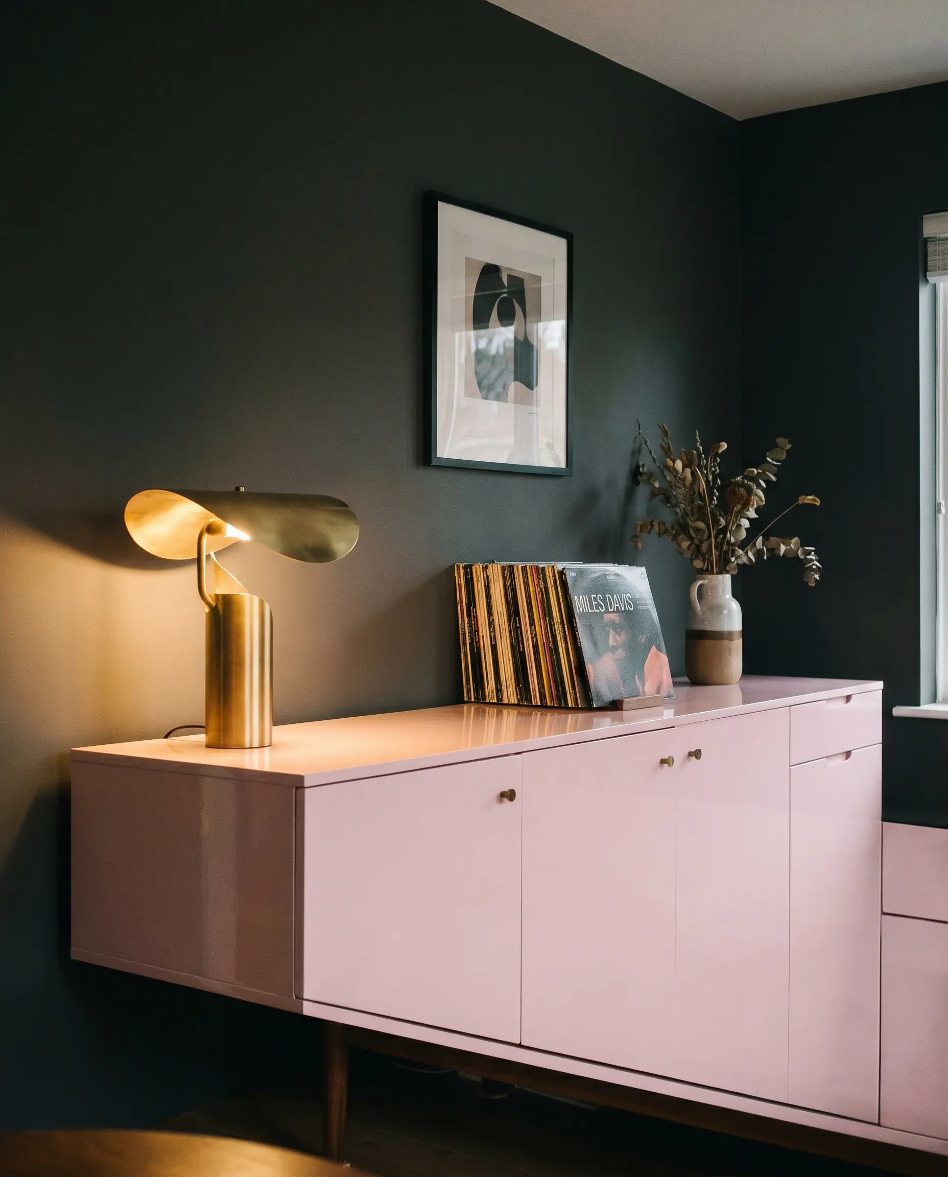
Place the newly upcycled piece against a dark, contrasting wall—like Sherwin-Williams Peppercorn—to make the pastel silhouette truly pop. The dark background establishes a moody, sophisticated frame, ensuring the pink furniture reads as a deliberate, high-end design choice rather than a leftover craft project.
Building a Palette Around Dulux Pink Rose
This specific pigment requires deliberate contrast to hold its elegant shape on the wall. Rather than letting it bleed softly into other pastels, framing it with crisp neutrals and tactile textures forces the hue to act as a sophisticated architectural layer.
Crisp Boundaries and Baseboard Strategies
To keep this cool-toned pink looking sharp and modern, you must pair it with an exceptionally clean white trim. Benjamin Moore Chantilly Lace offers a brilliant, stark contrast that prevents the pastel walls from feeling muddy.
If you prefer a slightly softer but equally bright transition, Sherwin-Williams High Reflective White beautifully frames the color. Always choose an un-tinted white for your baseboards to enhance the paint’s underlying frosty glow.
Tactile Elements and Hardware
Because this Dulux pastel reflects so much light, it craves materials that offer tangible visual weight. Introducing raw, poured concrete elements immediately neutralizes any lingering sweetness, providing a beautifully porous surface that roots the airy walls.
For your wood tones, bleached ash is a flawless companion. Its pale, desaturated grain introduces organic warmth without injecting the yellow undertones that typically clash with a magenta base.
To elevate the entire room, invest in a single architectural accent of boldly veined marble. The cool gray and charcoal striations within the stone perfectly echo the paint’s hidden violet nuances, creating a highly intentional, luxurious dialogue.
Complementary Tones
Curated Design Concepts
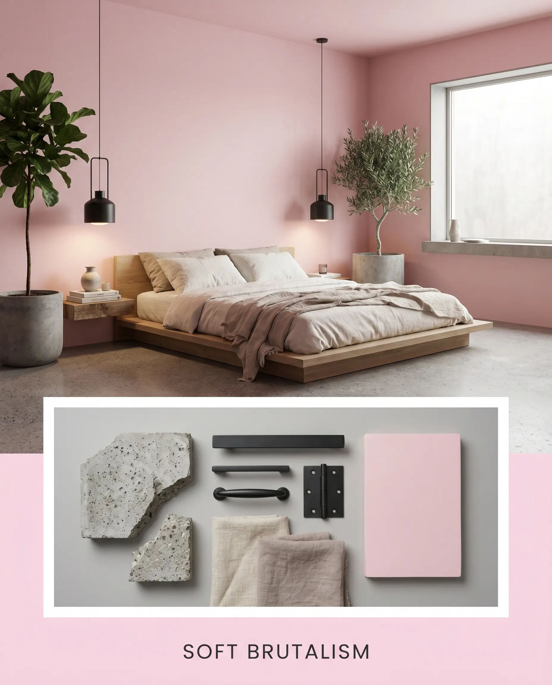
Soft Brutalism This aesthetic leverages intentional friction by pairing the delicate nature of the Dulux pastel with raw, unforgiving textures. Poured concrete planters and matte black steel light fixtures immediately strip away any traditional romance from the walls. Layering in a low-profile platform bed dressed in slub canvas bedding creates an atmosphere that feels remarkably utilitarian. The cool pink simply acts as a luminous backdrop, softening the hard industrial edges just enough to make the environment livable.
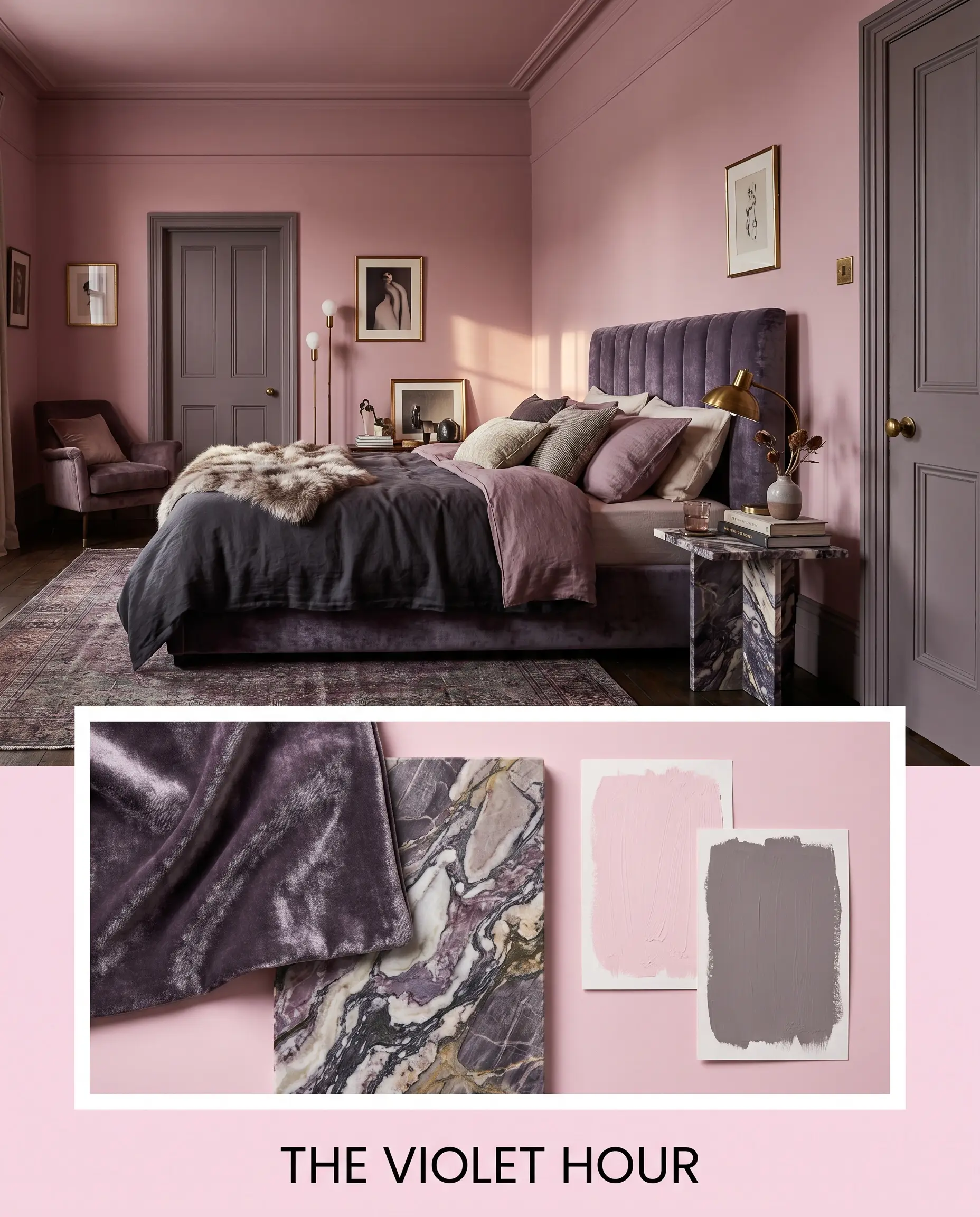
The Violet Hour Leaning into the paint’s hidden mauve undertones, this palette is all about creating a moody, enveloping energy. A channel-tufted headboard in crushed velvet beautifully catches the ambient light, echoing the frostiness of the walls. Introducing accents painted in Farrow & Ball Brassica adds a profound, shadowy depth to the room’s architecture. A single, boldly veined marble side table serves as the luxurious centerpiece, tying the cool tones together into a highly sophisticated, evening-ready retreat.
Head-to-Head: Dulux Pink Rose vs. Industry Alternatives
There are specific architectural scenarios where a cool-toned blush might fail to perform, particularly in north-facing rooms that already feel too chilly. When the natural light is working against you, shifting to a rival paint with a slightly different foundational structure is often the smartest design pivot.
Dulux Pink Rose vs. Farrow & Ball Middleton Pink
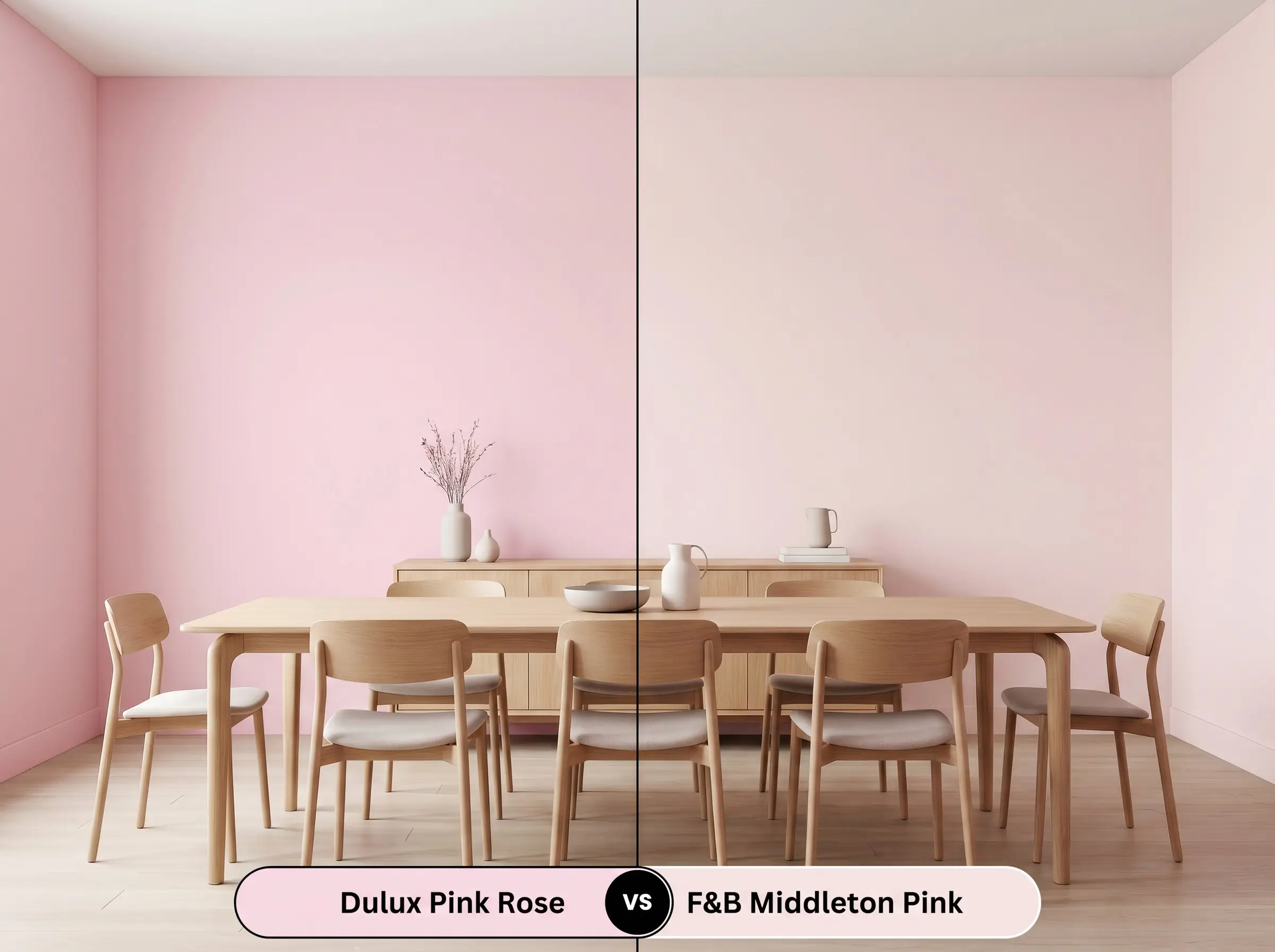
If your room receives incredibly stark, cold sunlight, Farrow & Ball Middleton Pink offers a much softer, prettier alternative. While the Dulux option relies on an icy magenta base, Middleton Pink carries a subtle, clean warmth that feels much more delicate on the wall. Choose the Farrow & Ball hue if you want a classic, uplifting blush, but stick with Pink Rose if you are intentionally trying to design a crisp, modern space with high contrast.
Dulux Pink Rose vs. Benjamin Moore First Light
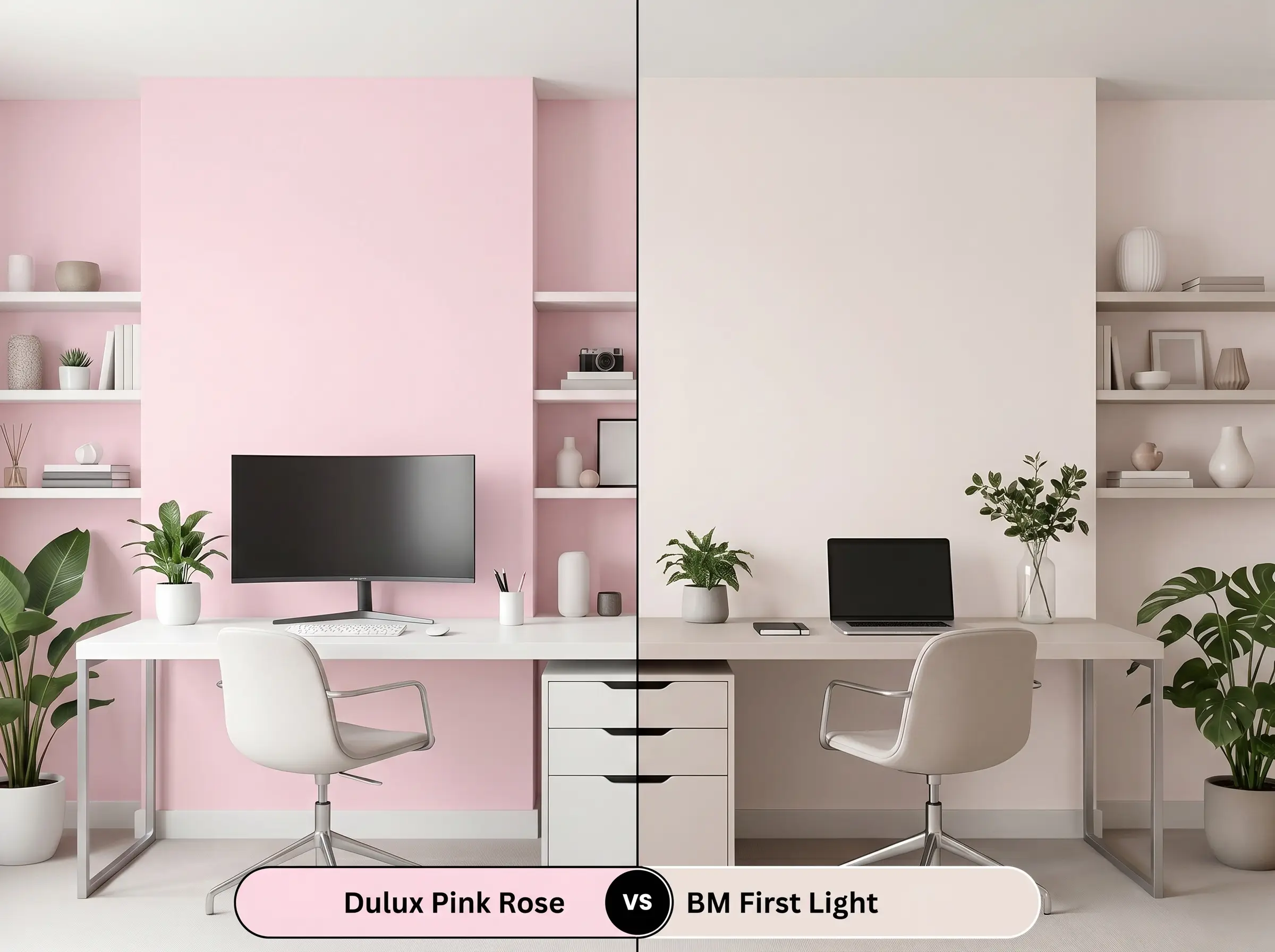
If you need a color that feels slightly more neutral and less undeniably pink, Benjamin Moore First Light is the better candidate. First Light features a highly muted, almost grayish undertone that allows it to act as a true background neutral in living spaces. In contrast, the Dulux paint retains a much clearer, more vibrant violet tint. Opt for the Benjamin Moore shade when you want a whisper of color, and choose Dulux when you want the walls to make a definitive structural statement.
Exploring Similar Tones and Brand Matches
Sometimes a paint is almost perfect, but you need a minor adjustment in depth or a slightly different light reflectance value to accommodate a shadowy hallway.
Next-Door Neighbors in the Dulux Catalog
Competitor Equivalents
Painting with This Cool-Toned Pastel: Execution and Finishes
Transitioning this beautiful color from a tiny paper swatch to a full architectural feature requires a strategic approach to preparation.
Selecting the Right Sheen
Prepping the Canvas
Because this is a highly reflective, light-toned paint, any dark stains or existing bold colors will easily bleed through the surface. You must lay down a high-quality, bright white latex primer to ensure the magenta base develops accurately. Skipping a premium primer will cause the final color to look muddy and lose its signature crispness.
Achieving a Flawless Finish
To achieve professional-level depth, plan for two generous coats over your primed surface. Because of its light reflectance value, this paint is somewhat prone to flashing if you apply it unevenly or overwork the roller. Maintain a wet edge as you paint, and avoid going back over semi-dry patches, which will leave visible, permanent streaks in the final sheen.
When working with highly reflective pastels, always use a premium 3/8-inch nap microfiber roller. This ensures an ultra-smooth, stipple-free texture that allows the light to bounce evenly across the entire wall.
Hackrea Design Secret (The Roller Rule)
Frequently Asked Questions
Because textured surfaces cast tiny micro-shadows, the paint’s cool violet base will actually appear much darker and more pronounced on an acoustic ceiling. To prevent the room from feeling chilly, ensure your walls are painted in a warm, luminous white to balance the shadowed pastel above.
The icy magenta foundation of this paint creates a brilliant, intentional design tension when paired with the earthy warmth of raw terracotta. The intense natural light in a sunroom will soften the paint’s frosty edges, allowing the cool walls and warm floors to balance each other beautifully.
Pastel hues with magenta bases are inherently vulnerable to fading under intense, direct sunlight over time. If you plan to use this color on exterior trim, you must select a premium exterior-grade enamel infused with UV protectants to maintain its crisp, cool vibrancy.
Wrapping a tight, windowless space in this specific color leverages its high light reflectance value to bounce available artificial light endlessly around the room. Instead of feeling confined, the boundaries of the walls visually recede, making the entire bathroom feel remarkably airy and expansive.
The Final Verdict on This Cool-Toned Pink
Dulux Pink Rose is a masterful architectural tool for homeowners who want the brightness of a pastel without the predictable, sugary warmth. Its high light reflectance value and sophisticated violet foundation make it the perfect candidate for modernizing tight spaces, elevating upcycled furniture, or serving as a luminous backdrop in a Parisian-inspired interior. When paired with high-contrast neutrals and raw, tactile materials, it completely redefines how a blush paint can function in a contemporary home.
However, you must be incredibly cautious when introducing this hue into homes dominated by warm, earthy architectural finishes. The crisp, icy nature of this magenta base will actively fight against golden oak floors, Tuscan-style stonework, or beige carpeting, causing those warm elements to look unexpectedly yellowed and dated. If your home relies on warm-toned woods and brown-based granites, this frosty shade will create an uncomfortable visual friction, and you should pivot toward a blush with a much warmer, peach-leaning foundation to ensure harmony.