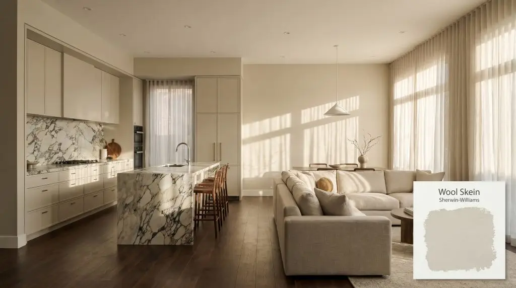
Wool Skein SW 6148
Sherwin-WilliamsSherwin-Williams Wool Skein (SW 6148) is a light, warm khaki neutral with an LRV of 63. Sitting comfortably between beige and greige, it features a yellow-orange base with a subtle green undertone that prevents it from reading overly yellow or pink.
Paint Technical Profile
| Color ID / SKU | SW 6148 |
| HEX Code | #D9CFBA |
| Light Reflectance (LRV) | 63 |
| Use | Interior, Exterior |
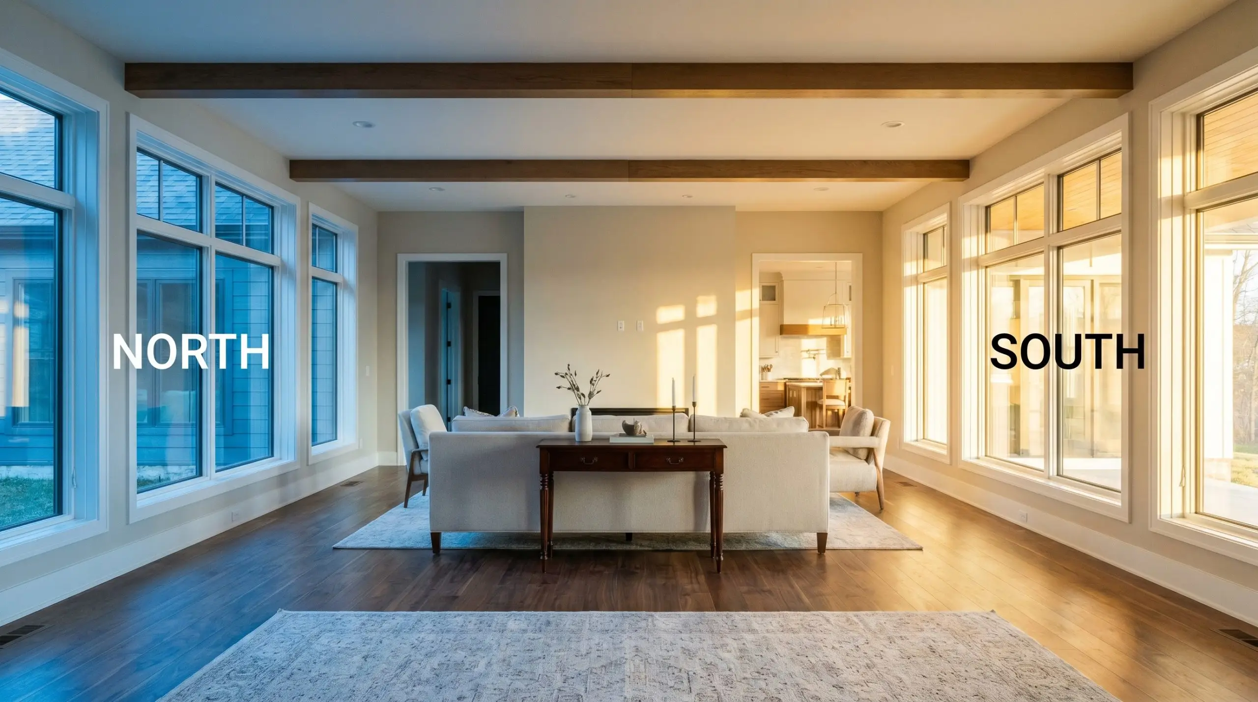
| Best Exposures | North-Facing, East-Facing |
| Best For | Open Concept Living Areas, Kitchen Cabinetry, Exteriors |
Sherwin-Williams Wool Skein: A Grounding Foundation for Sunlit Architecture
Finding a warm neutral paint that bridges the gap between cozy and crisp is one of the most common challenges in modern home renovations. When you want an open-concept space to feel inviting without leaning into heavy, dated yellows, you need a color built with intentional complexity.
Sherwin-Williams Wool Skein (SW 6148) offers exactly that balance, utilizing a mid-range light reflectance to soften expansive walls while maintaining enough pigment to beautifully frame everyday furnishings and premium accents alike. It is a brilliant, low saturation color that effortlessly adapts to shifting afternoon shadows.
Undertones & LRV of Sherwin-Williams Wool Skein
When evaluating whether this shade is warm or cool, the answer is definitively warm, though it carries a highly specific cooling agent. Understanding how green undertones affect beige paint is crucial here, as this structural nuance is exactly what makes the paint behave so beautifully across a variety of architectural styles.
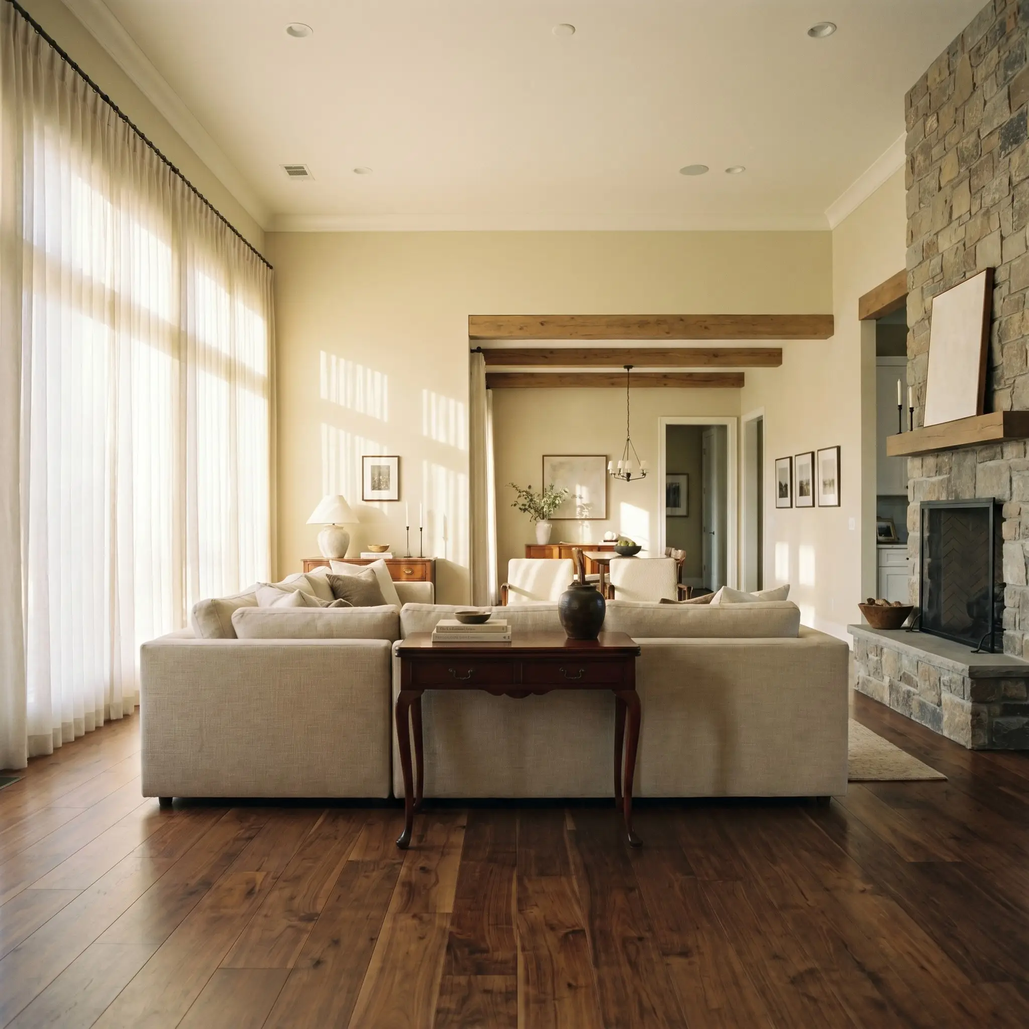
With a light reflectance value 63, this shade sits in the perfect mid-tone pocket. It absorbs just enough natural light to feel substantial against crisp white baseboards, yet reflects enough brightness to keep standard ceiling heights feeling airy and expansive.
Lighting Effects & The Chameleon Factor
The very green nuance that makes the beige vs greige debate so interesting also introduces its biggest environmental risk. If you place this shade in a heavily shaded room surrounded by dense exterior foliage, that subtle green can multiply, suddenly making your walls feel slightly murky rather than elegantly warm. Always test large swatches on multiple walls to see how the shifting sun alters its personality.
Transforming Spaces with SW 6148
This shade demands an environment where it can interact with natural textures and varied lighting. It brings a quiet, cohesive energy to a home, acting as a chameleon that effortlessly supports both minimalist styling and richly layered, traditional decor.
Open Concept Living Areas
In sprawling layouts, this color acts as a unifying thread that visually connects disparate zones without overwhelming the senses. It provides a stunning, muted canvas for a modern linen sofa, while simultaneously enriching darker, antique mahogany accent tables. To maximize its versatility, pair it with sheer, light-filtering window treatments that allow the sun to manipulate the paint’s warmth throughout the day.
Kitchen Cabinetry
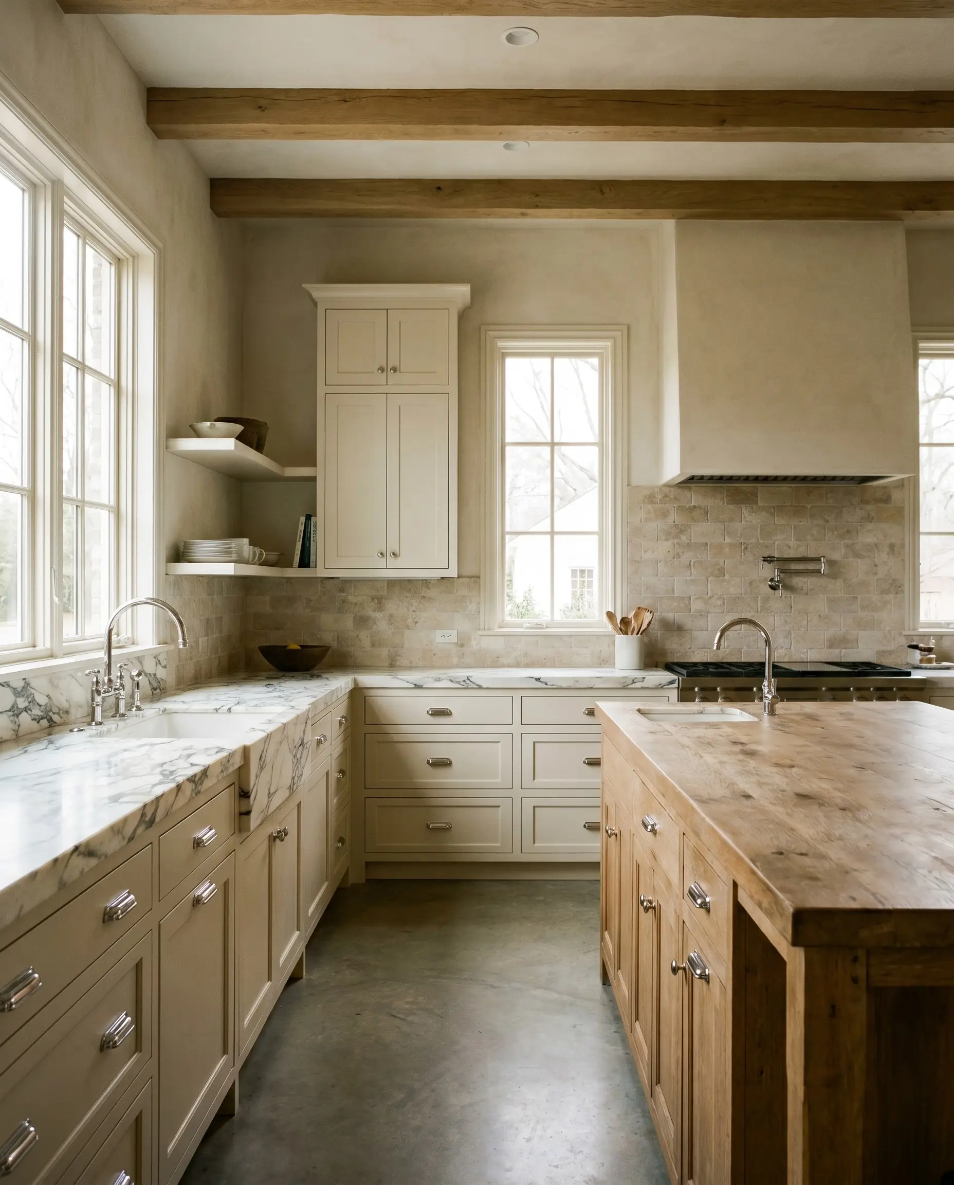
Moving away from stark white kitchens, applying this tone to upper and lower cabinets introduces a deeply custom, artisanal feel. It pairs beautifully with heavily veined marble countertops, offering a softer transition than a harsh, bright white would. This unique depth easily makes it one of the best khaki paint colors for kitchens on the market today.
When using this shade on kitchen cabinets, opt for a satin finish; the slight sheen will bounce under-cabinet lighting beautifully, highlighting the subtle green nuance rather than letting the corners fall flat.
Hackrea Pro-Tip (The Cabinetry Glow)
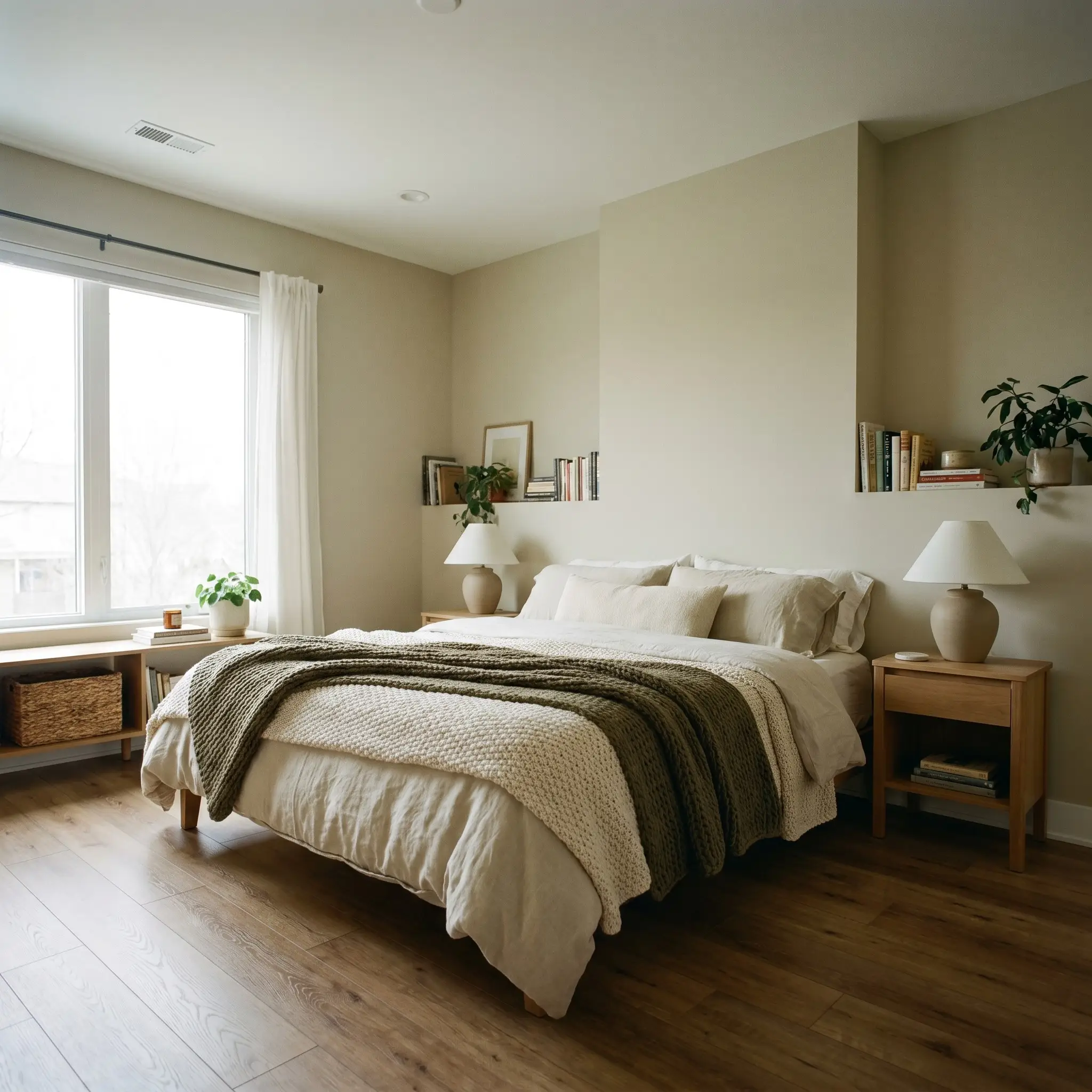
North-Facing Bedrooms
Bedrooms that lack direct southern sunlight often feel chilly, but this paint’s inherent yellow-orange base combats that icy light perfectly. The cooler shadows simply pull out its sophisticated khaki notes, creating a restful, restorative retreat. Layer the bed with chunky knit throws and matte ceramic bedside lamps to lean into an organic modern palette.
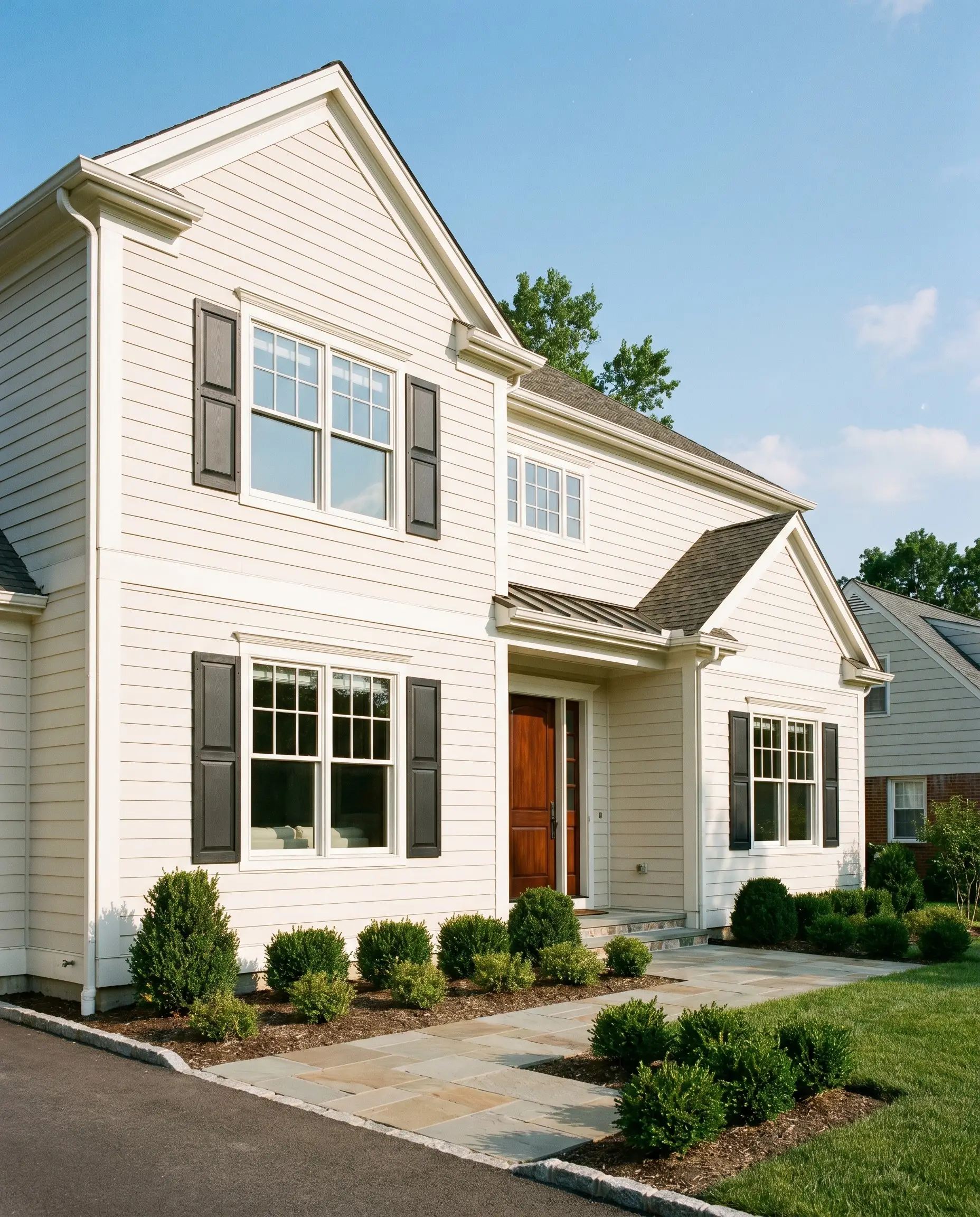
Exterior Siding and Trim
On an exterior facade, full sunlight will significantly wash out the color’s depth, making it appear much lighter and creamier than it does indoors. It serves as a brilliant, welcoming main body color for suburban homes, especially when grounded by dark, moody shutters or a richly stained mahogany front door.
Creative Ways to Use The Paint
Beyond standard drywall, this dynamic neutral thrives when applied to unexpected architectural features and highly curated weekend projects. Its muted complexity makes it an ideal candidate for spaces that require a touch of quiet sophistication.
The Rustic Modern Mudroom
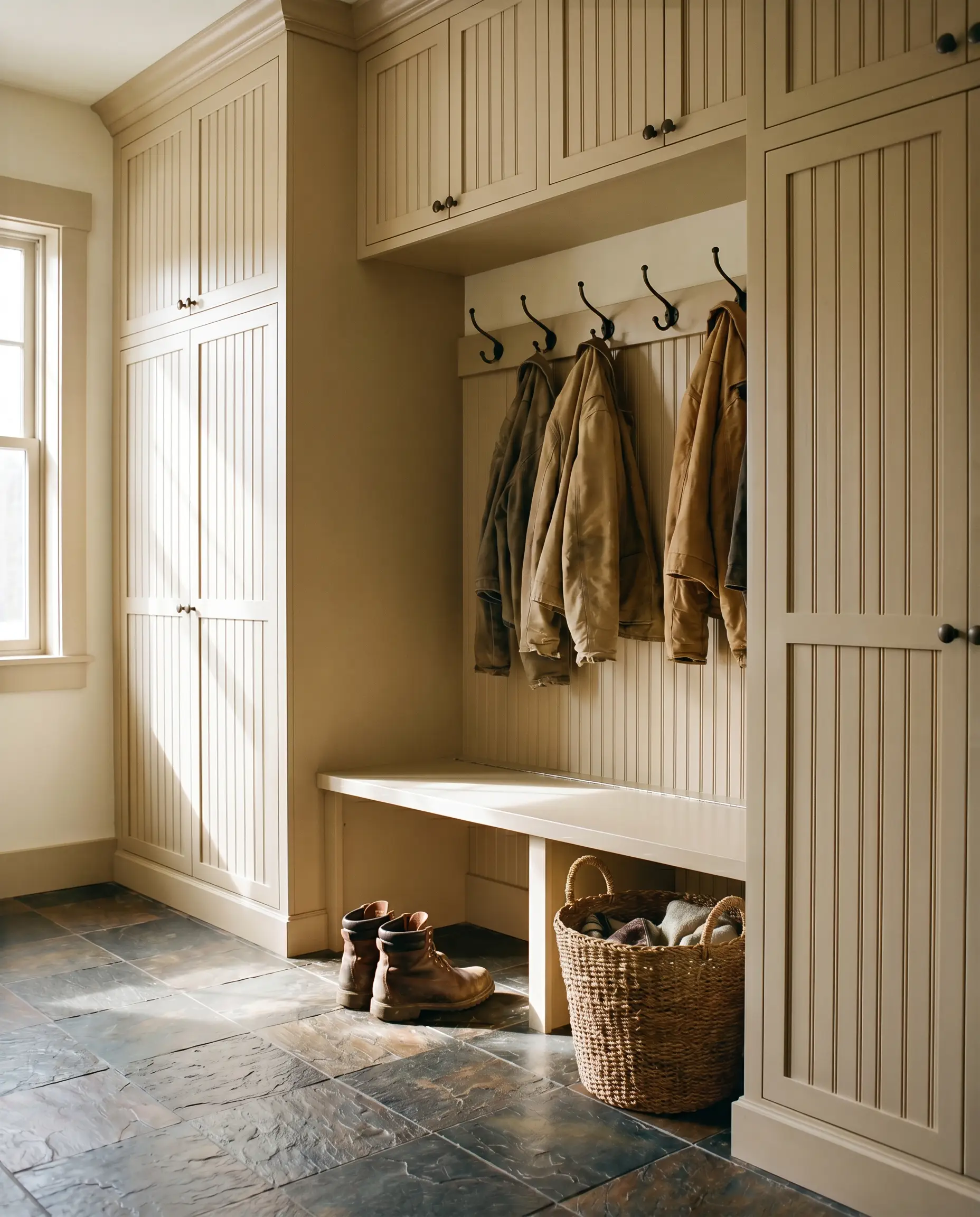
Transform a utilitarian drop zone by drenching floor-to-ceiling beadboard and built-in storage benches in this earthy tone. The color hides everyday scuffs far better than a stark white, while the subtle green notes connect beautifully with the outdoors. Pair it with heavily textured slate floor tiles and iron coat hooks for a rugged yet highly intentional aesthetic.
A Serene Wellness Retreat
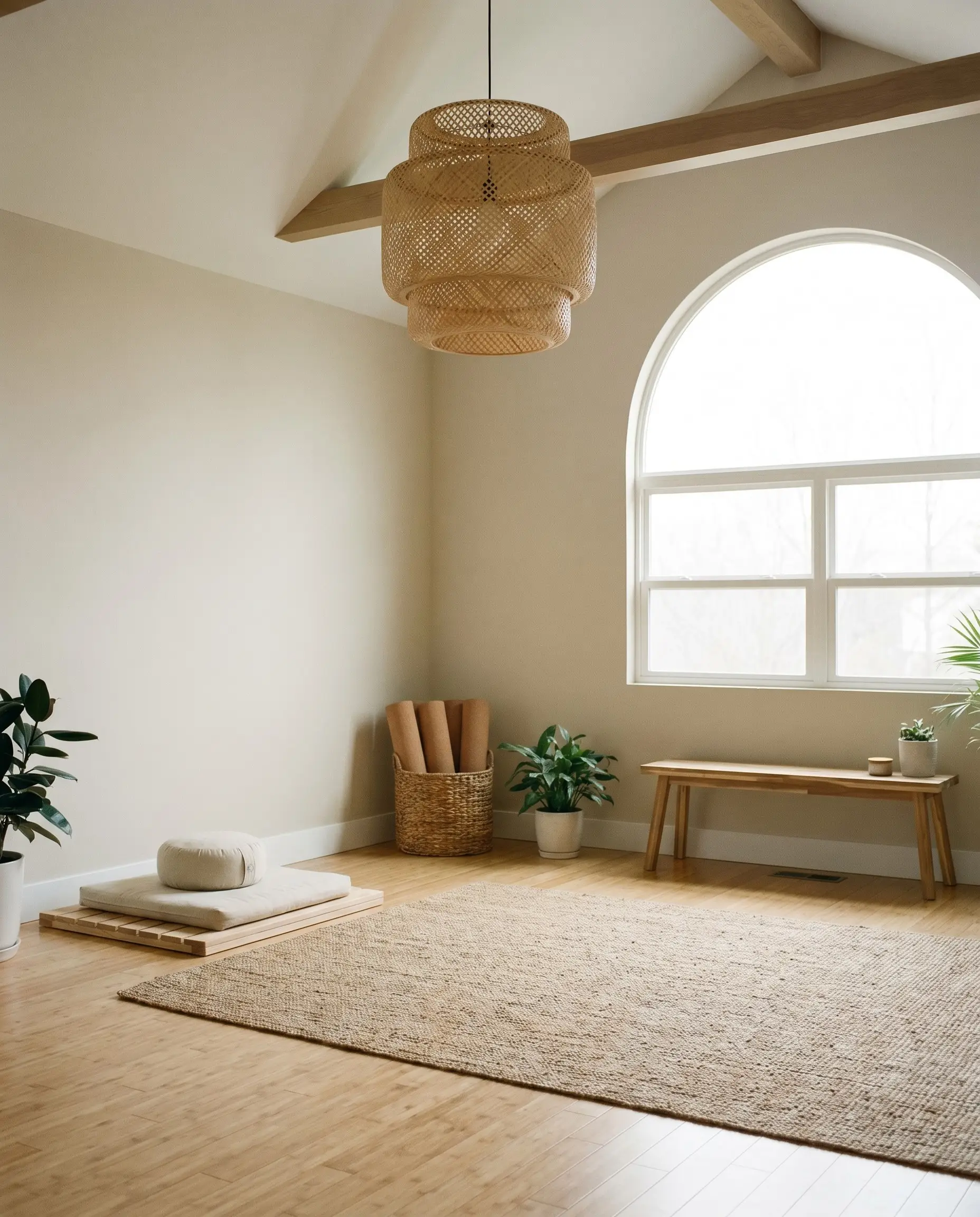
If you are converting a spare room into a home gym or meditation space, this paint establishes an immediately calming, grounded atmosphere. The low saturation color prevents visual fatigue, allowing the mind to rest. Introduce natural bamboo flooring and oversized woven rattan pendants to complete the restorative, spa-like environment.
Reviving Vintage Dining Furniture
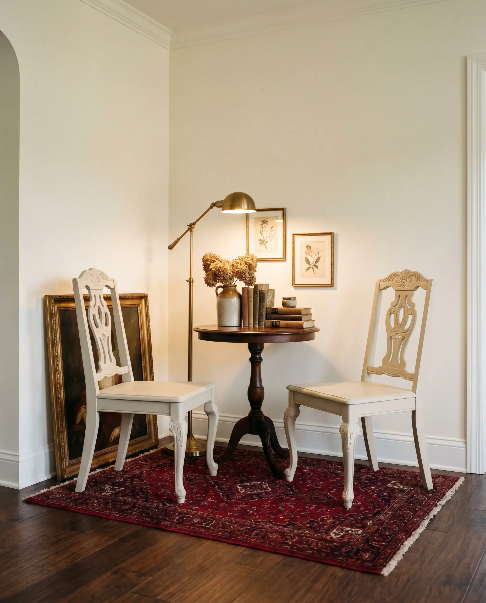
Breathe new life into a dated, heavily varnished wooden dining set by sanding it down and applying a flawless sprayed coat of this warm neutral. The resulting finish feels incredibly custom and European-inspired. When seated on a richly patterned, deep crimson Persian rug, the freshly painted chairs create a striking, high-contrast focal point in the dining room.
Hardware, Trim & Coordinating Colors
To truly elevate this shade, you must surround it with elements that respect its delicate balance of warmth and earthiness. Soft, tonal transitions allow the color to feel serene, while deliberate, dark accents can snap its subtle green notes into sharp focus.
Trim & Baseboards
For a seamless, atmospheric glow, Sherwin-Williams Alabaster (SW 7008) is the ultimate companion, as its own subtle warmth perfectly mirrors the wall’s energy without clashing. If you prefer a crisper, more tailored boundary that highlights the wall’s depth, Benjamin Moore White Dove (OC-17) provides a slightly cleaner contrast while still retaining a touch of softness.
Hardware, Wood & Material Pairings
Coordinating Colors
Designer Mood Boards
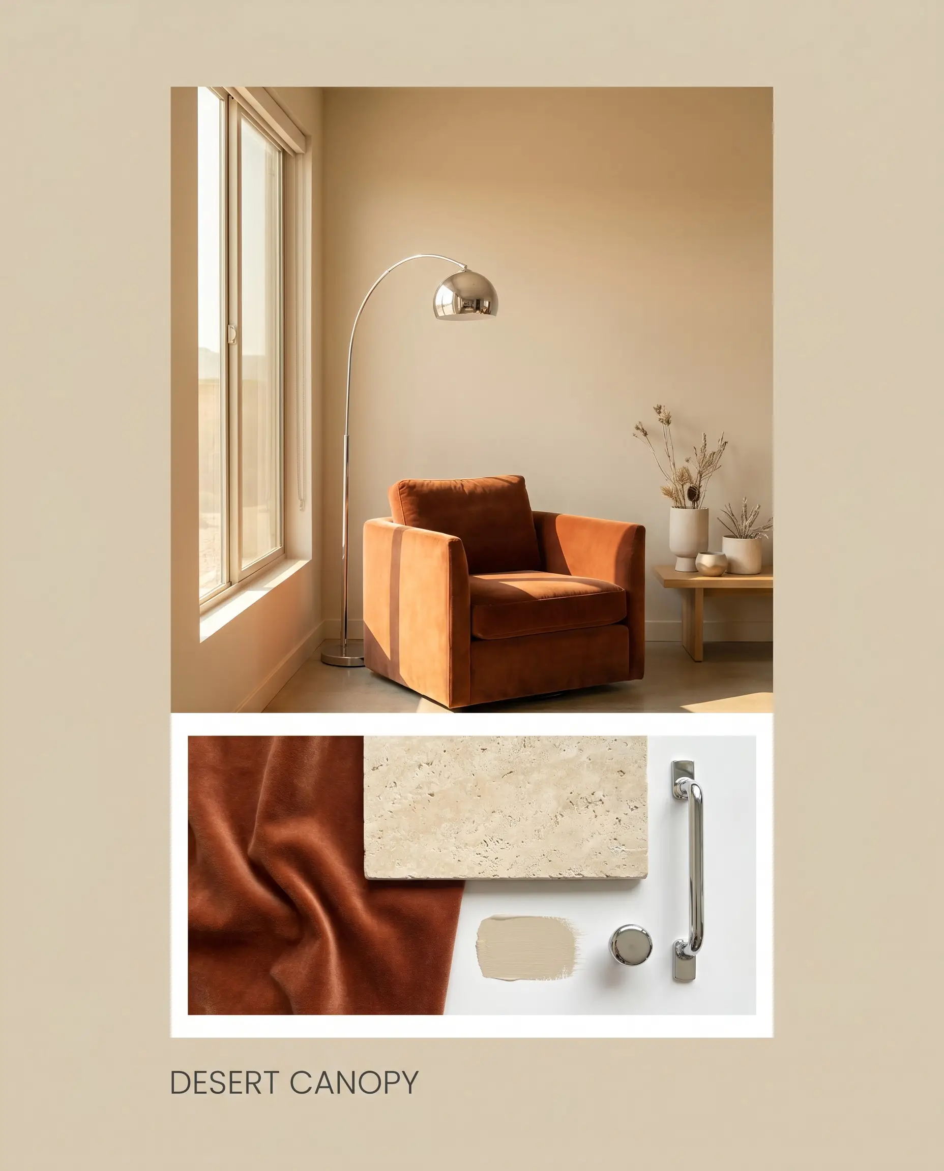
Desert Canopy: This palette leans heavily into the paint’s sunbaked warmth, blending the walls with tumbled travertine accents and a plush, rust-toned velvet armchair. A sleek polished chrome floor lamp provides a brilliant flash of modern tension, keeping the arrangement feeling fresh and contemporary.
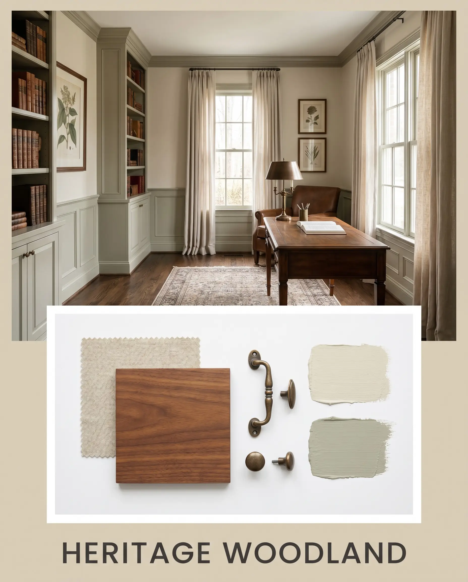
Heritage Woodland: Here, the focus shifts to the khaki and green interplay, anchoring the space with rich walnut hardwood and deep Benjamin Moore Gloucester Sage accents. Soft, natural linen drapery and aged bronze hardware complete this deeply traditional, deeply comforting aesthetic.
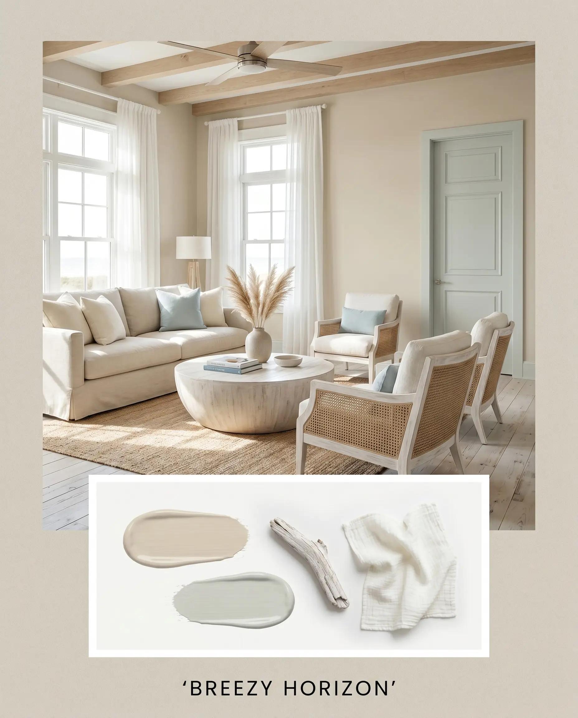
Breezy Horizon: Focusing on a lighter, more transitional energy, this board pairs the main walls with the crisp coolness of Sherwin-Williams Sea Salt. Light, whitewashed woods and airy cotton textiles create a serene, effortless vibe that feels incredibly inviting year-round.
Sherwin-Williams Wool Skein Head-to-Head Comparisons
Choosing the right foundation often comes down to understanding how a shade performs against its closest rivals under specific environmental pressures. If your room features challenging light or specific fixed elements, a slightly different undertone might be the key to success.
Sherwin-Williams Wool Skein vs. Sherwin-Williams Accessible Beige
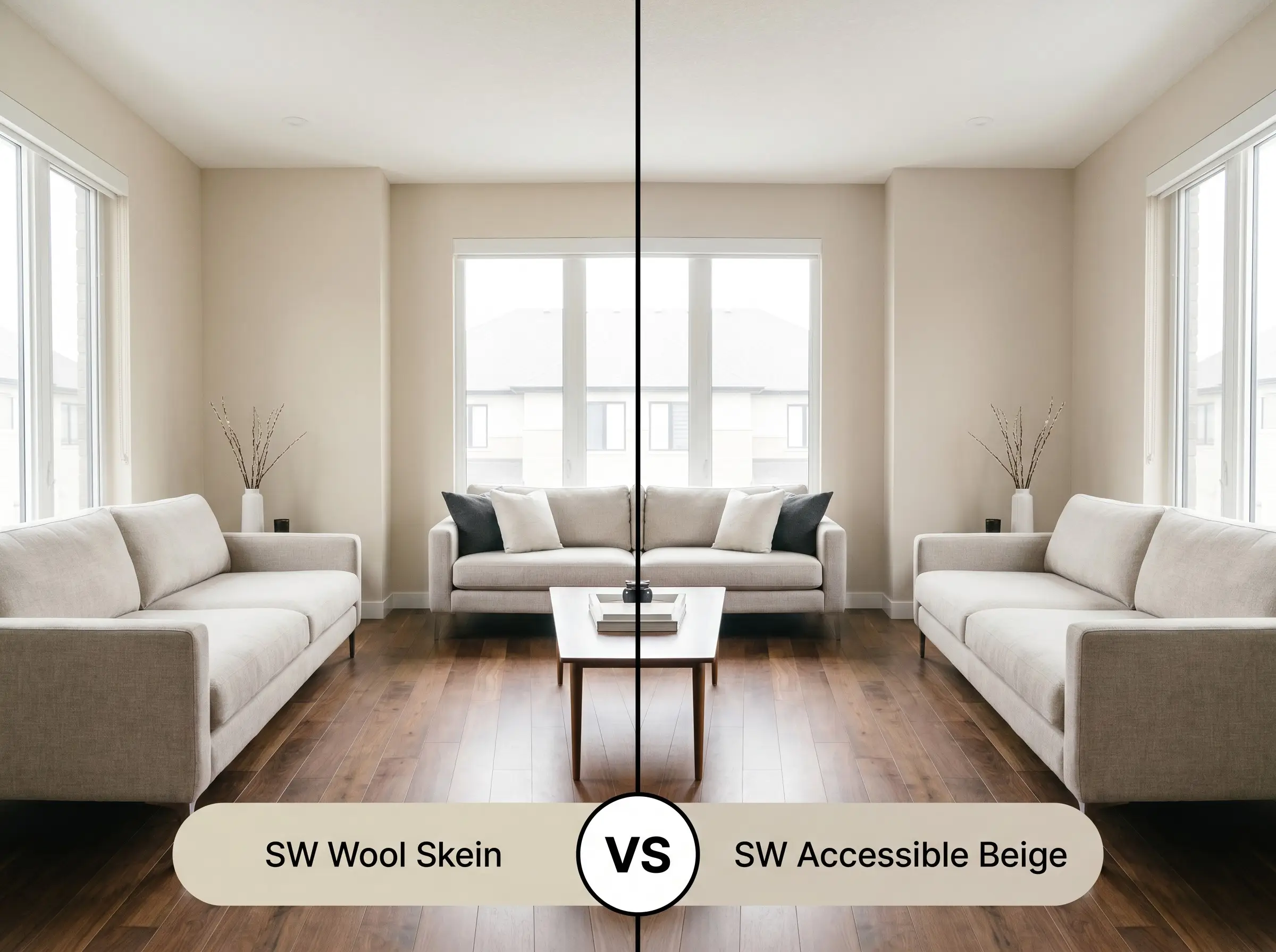
Accessible Beige (SW 7036) is universally beloved for its distinct gray undertones, making it a true greige. If your home features heavily cool-toned flooring or stark, modern architecture, Accessible Beige will bridge those elements more seamlessly. However, if you want a space that feels genuinely sunlit and earthy, SW 6148 provides a much richer, warmer base without crossing into yellow territory.
Sherwin-Williams Wool Skein vs. Sherwin-Williams Relaxed Khaki
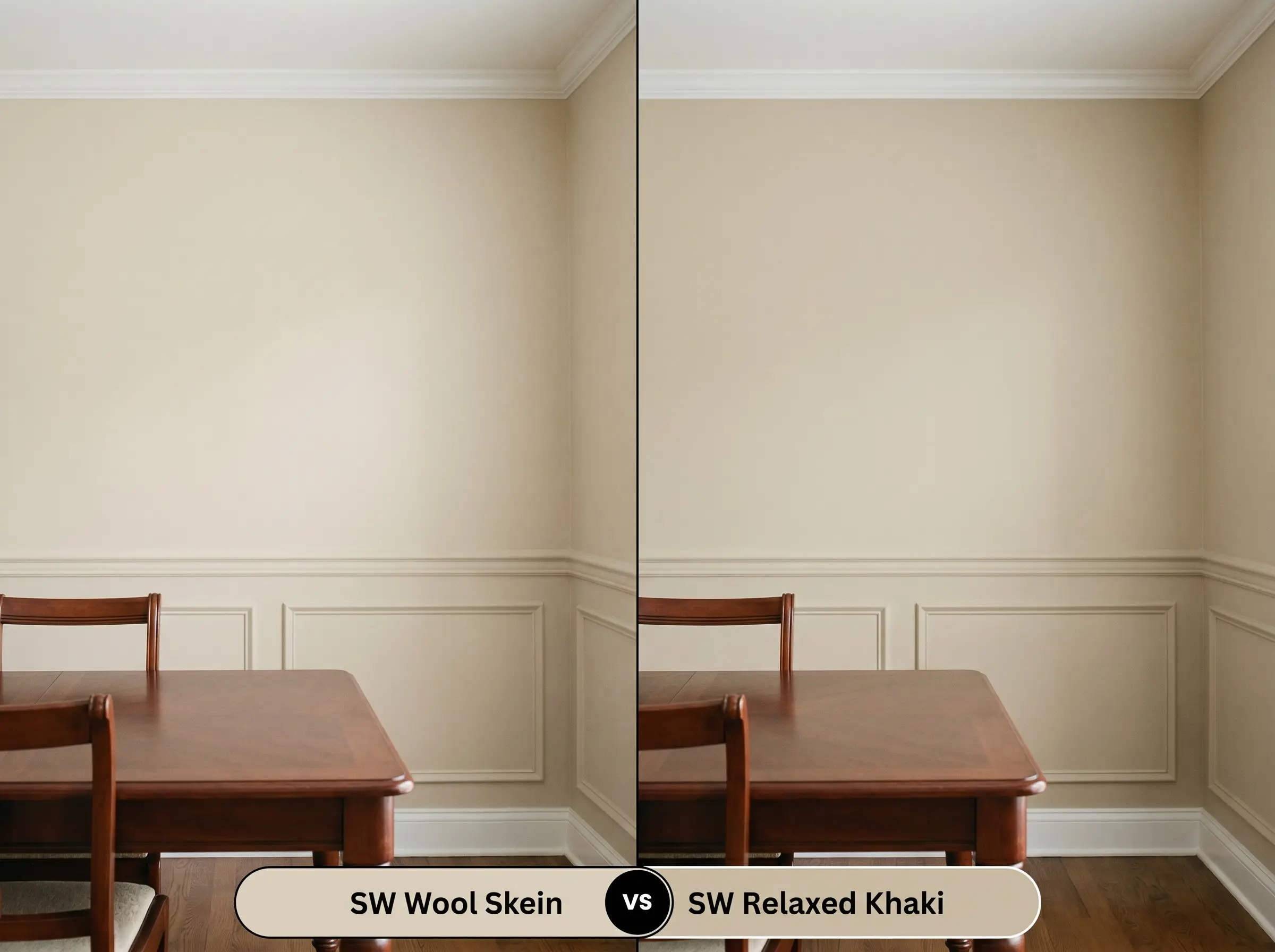
Relaxed Khaki (SW 6149) sits one step down on the color strip, offering a significantly lower light reflectance. If you are designing a cozy, intimate library or a moody dining space, Relaxed Khaki delivers that enveloping depth. Conversely, if you are painting a sprawling, open-concept layout and need the walls to feel expansive and breathable, the lighter, brighter SW 6148 is the superior choice.
Similar Colors & Brand Equivalents
Sometimes a color is almost perfect, but your specific lighting requires a slight adjustment in brightness or a subtle shift in temperature to achieve the exact mood you are envisioning.
Similar Colors
Cross-Brand Matches
Practical Application & DIY Advice
Translating a beautiful color from a tiny paper swatch to a massive architectural surface requires strategic planning. The finish and preparation you choose will dictate how luxurious the final result actually looks.
The Dynamic Sheen Guide
Primer Strategy
Because this shade sits comfortably in the mid-light range, a standard, high-quality white primer is generally sufficient over new drywall or light existing colors. However, if you are painting over a dark, saturated hue like navy or deep red, you must use a heavy-duty, stain-blocking primer to prevent the old color from bleeding through and muddying the delicate khaki notes.
Coverage & Success Tips
Expect to apply two full, even coats to achieve the true, complex depth seen on the manufacturer’s swatch.
When rolling broad, two-story walls, maintain a wet edge at all times. Because this paint has a distinct undertone, “flashing”—where overlapping dry and wet paint creates visible, uneven streaks—can easily disrupt the smooth, cohesive aesthetic you are trying to build.
Clash Warning (The Roller Mark Risk)
Frequently Asked Questions
Due to its subtle green undertone, heavy shade from exterior foliage can indeed amplify that coolness, occasionally making the walls feel a bit murky. To counter this, introduce warm, layered lighting and bright, reflective accents to keep the space feeling lively.
Its yellow-orange base harmonizes beautifully with the warm, golden tones of white oak, creating a seamless, organic flow. When paired with heavily pink or red oak, the paint’s green nuance acts as a complementary contrast, which can sometimes make the floor’s red tones appear more pronounced.
Direct exterior sunlight will significantly wash out its depth, and the yellow-orange base will absolutely become more prominent. If you want to avoid a distinctly yellow facade, you may need to sample a color with a slightly heavier gray or brown base to withstand the intense light.
Final Verdict & Expert Warnings
Sherwin-Williams Wool Skein is a brilliant, highly adaptable neutral perfectly suited for homeowners who want to inject genuine warmth into their spaces without resorting to outdated, heavy golds. Its absolute best application is in open-concept living areas or on custom kitchen cabinetry, where its delicate balance of earthy beige and subtle green can shift beautifully alongside natural daylight. It elevates transitional, rustic modern, and traditional aesthetics brilliantly, providing a sophisticated backdrop that makes both premium styling and everyday furnishings look incredibly intentional.
However, this nuanced shade is not a universal fix for every architectural scenario, particularly when it comes to specific fixed elements. You must exercise extreme caution if your home features heavily pink-toned ceramic tiles or stark, cool-gray luxury vinyl plank flooring, as the warm, yellow-orange base of the paint will aggressively fight against those cool, artificial tones, leaving the room feeling disjointed and visually confused. Furthermore, pairing this color with icy, blue-toned white trim will instantly make the walls look dingy and aged; it absolutely requires a creamy, warm white companion to maintain its luxurious, sunbaked glow.
Closest Cross-Brand Equivalents
The absolute closest scientific color matches for Wool Skein across top paint brands.