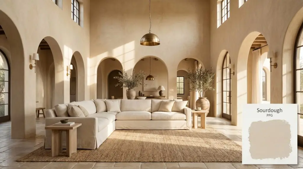
Sourdough PPG1084-3
PPGPPG Sourdough (PPG1084-3) is a soft, shaded, fresh warm beige with a subtle red-orange undertone. With an LRV of 62, it acts as a highly adaptable mid-tone neutral that brings cozy, sunny warmth to kitchens, living areas, and cabinetry.
Paint Technical Profile
| Color ID / SKU | PPG1084-3 |
| HEX Code | #ddcfbc |
| Light Reflectance (LRV) | 62 |
| Use | Interior, Exterior |
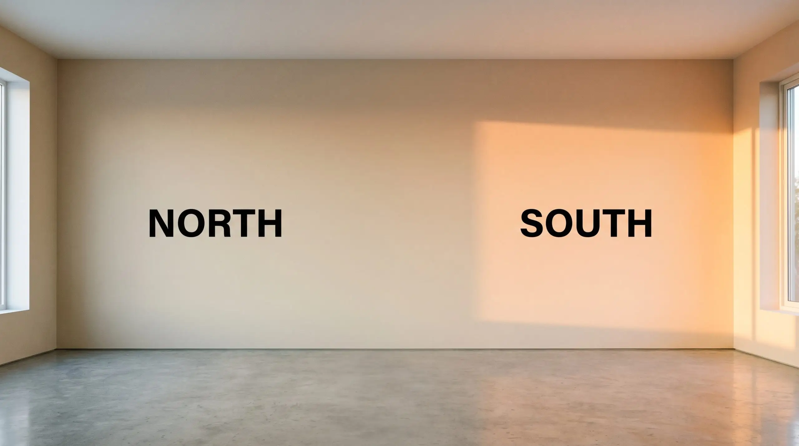
| Best Exposures | North, South |
| Best For | Kitchens, Living Rooms, Bedrooms, Cabinetry |
PPG Sourdough: Harnessing the Sun-Baked Warmth of this Mid-Tone Neutral
We are officially past the era of flat, lifeless neutrals that leave a room feeling like a sterile waiting area. Today’s most compelling interiors rely on foundational colors that actively interact with the light, bringing a quiet pulse of energy to the walls. When you need a shade that feels established, welcoming, and subtly complex, you start looking for pigments with hidden layers.
That is exactly where PPG Sourdough steps in to elevate your home. This is not a passive background color; it is a highly intentional architectural finish that fundamentally alters the temperature of a space. By wrapping a room in this specific shade, you instantly introduce a sun-baked, tactile quality that makes everyday furnishings look incredibly curated.
Let’s break down the core structure of this color to understand exactly how it behaves on the wall. We will explore how to manipulate its hidden tones, what materials make it sing, and how to execute a flawless application in your own space.
PPG Sourdough: Undertones & LRV
If you are trying to determine whether this paint leans warm or cool, the answer is definitively warm. This shade operates as a robust, welcoming foundation that actively combats chilly drafts or stark lighting. Its entire visual composition is built around radiating a gentle, radiant heat into the room.
To truly understand how this color will behave in your home, we have to look closely at its structural DNA:
When we evaluate its light reflectance value, this shade boasts an LRV of 62. This means it absorbs a moderate amount of light while reflecting just enough to keep your rooms feeling expansive and breathable. It operates perfectly as a mid-tone neutral, offering substantial visual contrast against crisp white trim without ever feeling overwhelming or dark.
The Chameleon Factor: Lighting Effects on PPG1084-3
Because of that lively hidden pigment, this color is highly responsive to its environment. The direction of your windows and the bulbs in your fixtures will physically shift how you perceive the paint throughout the day.
Here is exactly how you can expect the color to adapt:
Transforming Your Home: Popular Applications
Understanding how a color shifts in the light is only half the battle; the real magic happens when you apply it to a physical space. This specific pigment is incredibly versatile, but it demands thoughtful execution to truly shine. Instead of relying on predictable design tropes, let’s explore how to use this warm beige to craft highly intentional, custom-feeling rooms.
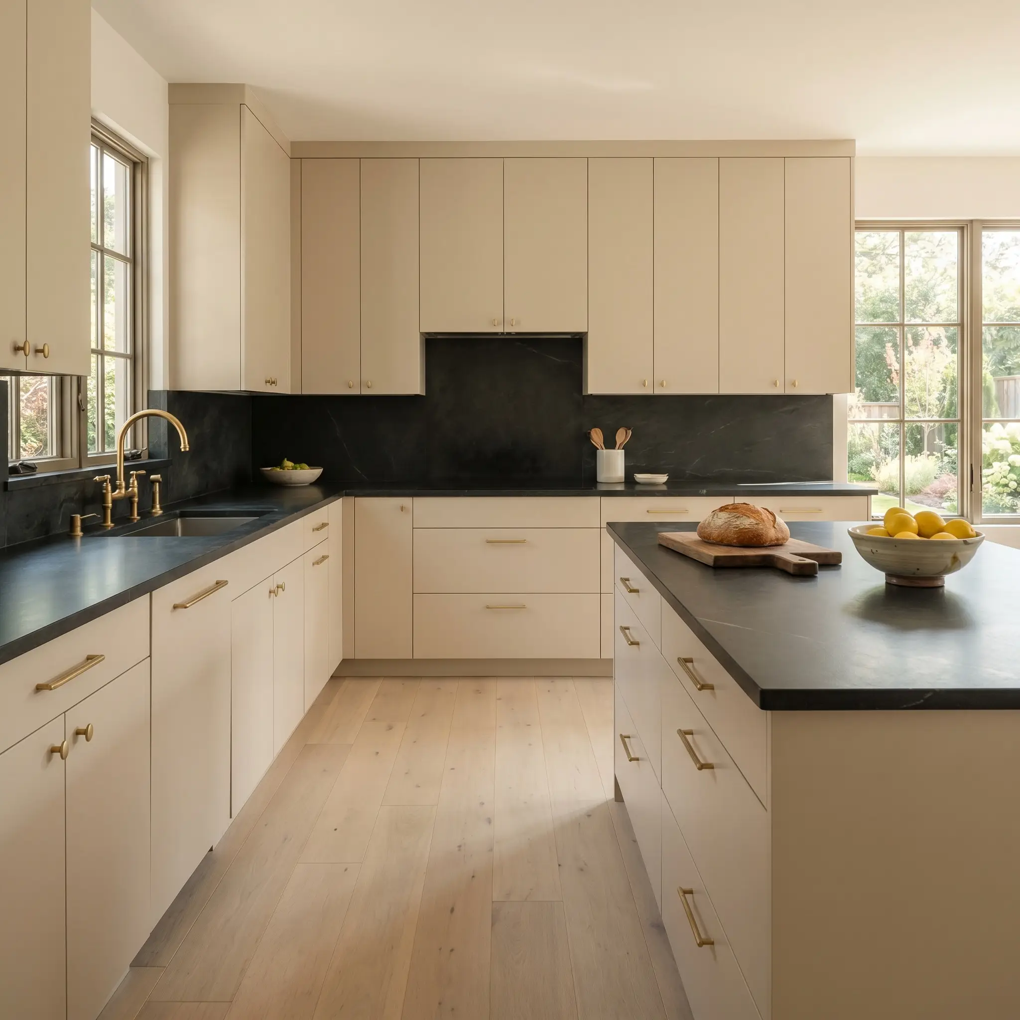
Kitchen Cabinetry
Using this shade as a cabinetry paint is a brilliant way to introduce warmth without committing to a dark, moody kitchen. Instead of defaulting to a predictable farmhouse aesthetic, push this color into an Organic Modern direction. Apply it to sleek, flat-panel doors or subtle shaker profiles to let the baked-clay warmth take center stage.
Pair the painted millwork with honed soapstone countertops and unlacquered brass hardware. The dark, matte stone settles the vibrant red-orange cast, while the living finish of the brass pulls out the paint’s subtle elegance. If your kitchen lacks natural light, use a satin finish on the cabinets to gently bounce your under-cabinet lighting around the room.
Open-Plan Living Areas
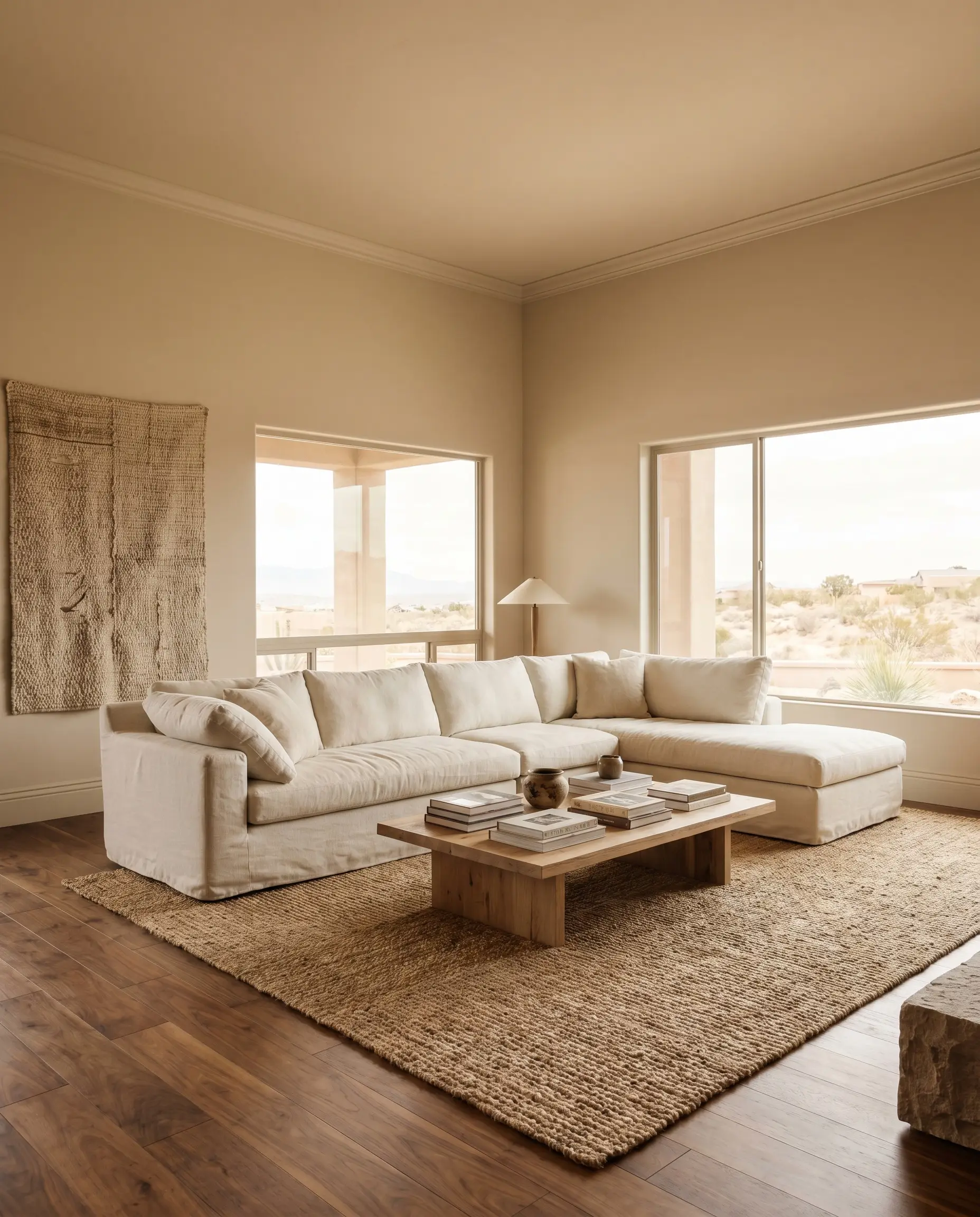
In sweeping, open-concept spaces, this shade acts as a unifying thread that wraps the room in a cohesive, sun-drenched glow. It excels in Desert Modern or Mediterranean Revival aesthetics where the walls need to feel tactile and established. Consider pairing the painted walls with oversized, slipcovered linen sectionals and a massive jute rug to emphasize a relaxed, organic texture.
In large living areas with varied ceiling heights, consider painting the baseboards, walls, and crown molding all the exact same color. This continuous wrap prevents the room from feeling visually chopped up and allows the warm beige to feel like a seamless architectural feature.
Hackrea Pro-Tip (The Architectural Wrap)
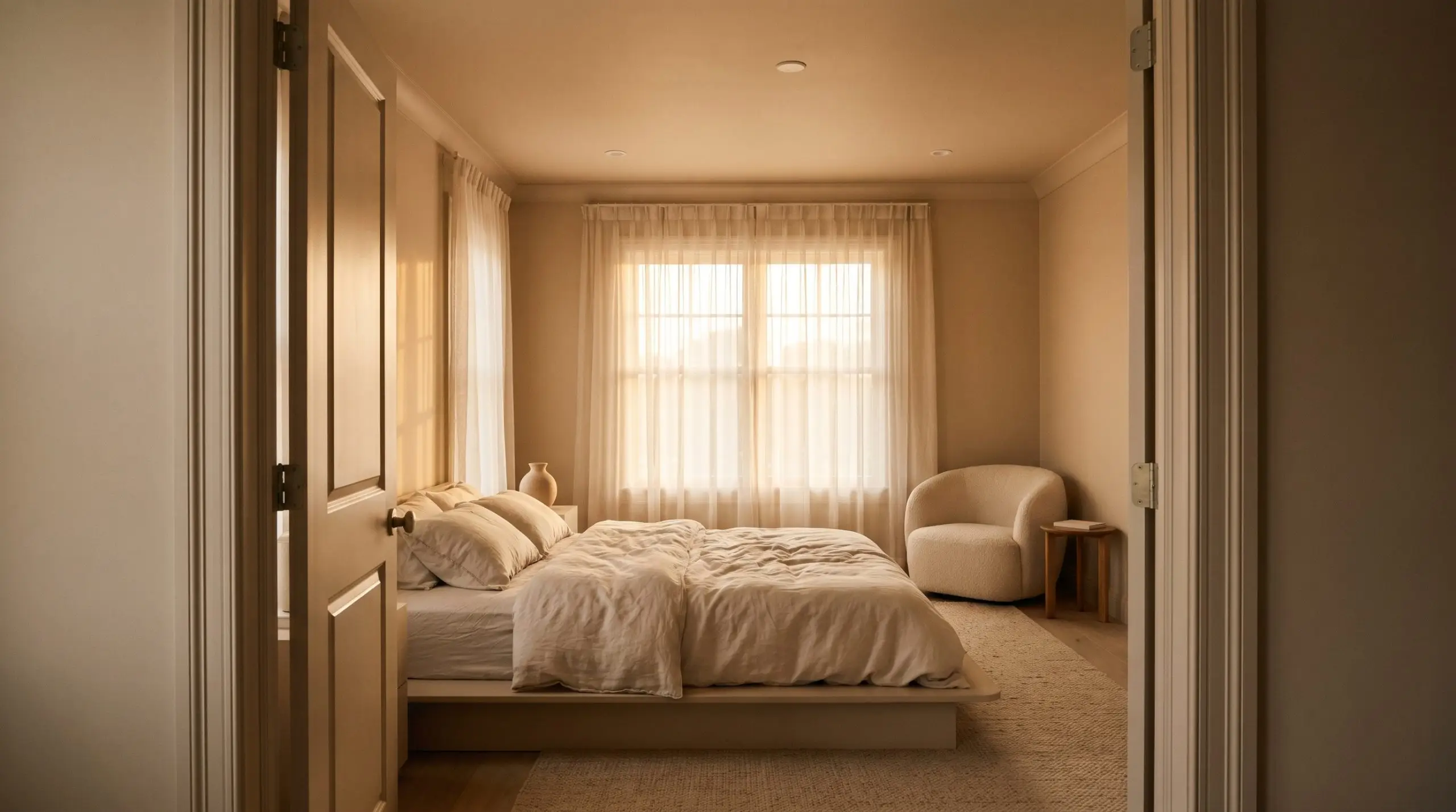
Cozy Bedrooms
This paint was practically engineered for intimate spaces where you want to foster a restful, settling energy. Lean into a Soft Minimalism style by color-drenching the room—painting the walls, trim, and interior doors. This technique blurs the hard architectural lines, making the bedroom feel like a soft, enveloping retreat.
Complement the walls with heavily textured textiles like a nubby boucle accent chair, washed linen bedding in muted ivory, and sheer organza window treatments. The soft, diffused natural light filtering through the sheers will beautifully highlight the paint’s subtle peach-leaning undertones during the early morning.
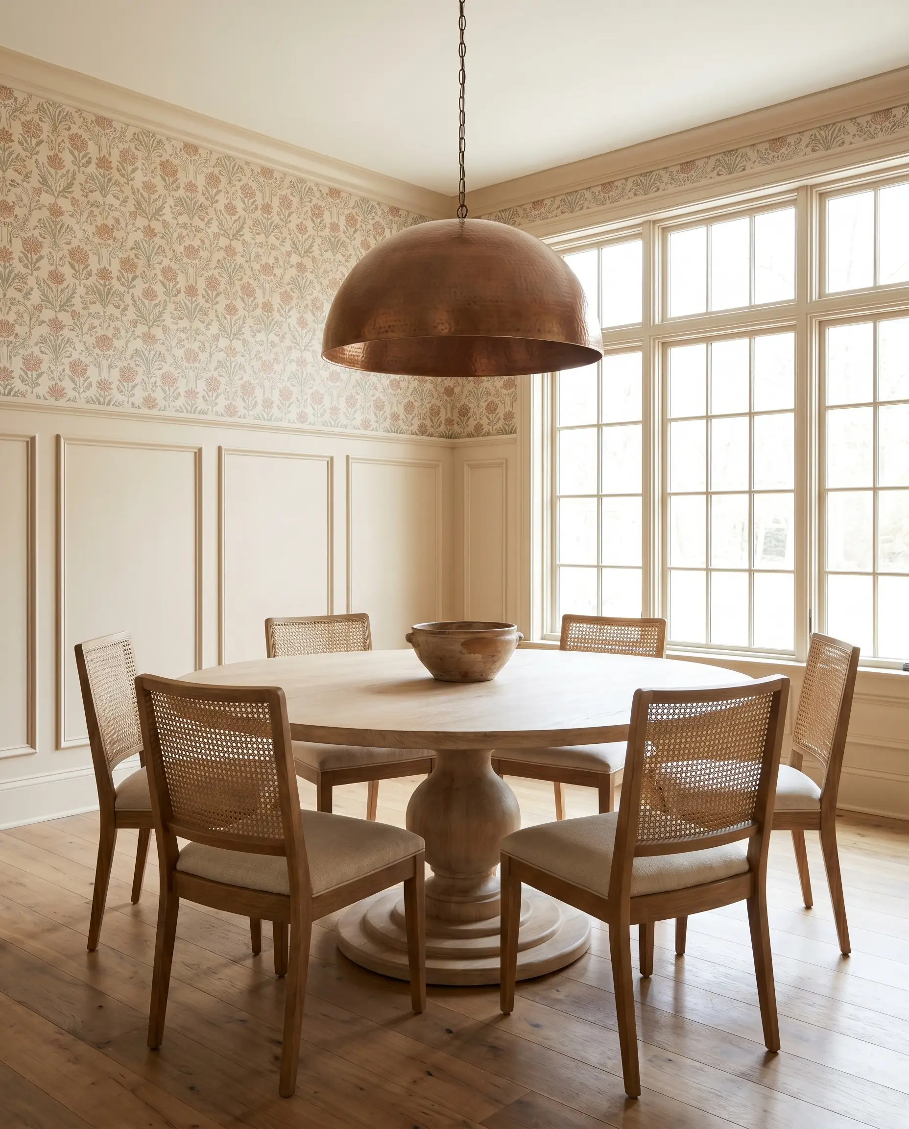
Dining Rooms
You can easily elevate a standard dining space by using this color to highlight classic architectural features. If you have picture frame molding or wainscoting, coat the lower half of the wall in this shade to create a substantial, weighty foundation for the room. Above the molding, install a subtle block-print wallpaper that incorporates hints of terracotta and sage green.
To keep the space feeling modern and fresh, surround a bleached oak pedestal table with cane-backed dining chairs. The pale wood tones harmonize with the paint’s earthy nature, while an oversized, hammered copper pendant light overhead will exaggerate the red-orange cast during evening dinner parties.
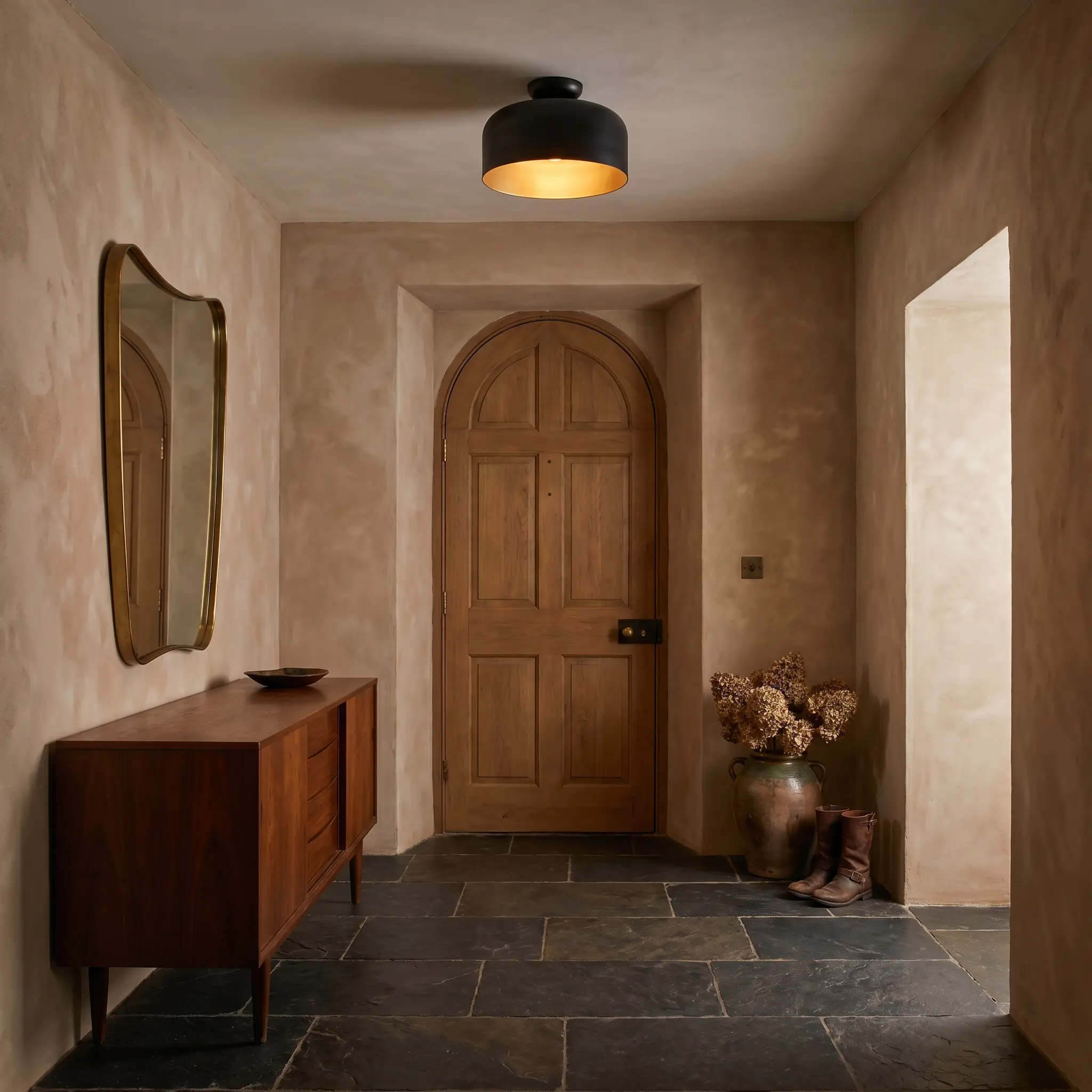
Entryways
Your foyer sets the immediate emotional tone for the rest of the house, making this welcoming neutral a perfect candidate. To create an unforgettable first impression, apply the paint using a subtle limewash technique to give the walls a beautifully mottled, plaster-like texture. This instantly transforms a basic drywall corridor into a space that feels rich with history.
Ground the airy warmth of the walls with tumbled limestone or deep slate floor tiles. Add a vintage mid-century credenza and an organic shaped mirror to bounce light around the tight space. Always ensure your entryway lighting uses warm 2700K bulbs to guarantee the color greets you with its coziest, most inviting profile.
Curating the Chromatic Profile: Pairings & Palettes
The true success of any paint color lies in how it communicates with the materials and hues placed directly next to it. Because this shade possesses such a lively internal warmth, it requires pairings that either crisp up its boundaries or lean into its organic nature. The goal is to build a cohesive visual dialogue across the entire room.
Trim & Baseboards
To keep this mid-tone neutral feeling fresh and intentional, you need a trim color that provides a sharp, clean break.
Hardware, Wood & Material Pairings
When selecting hard finishes to live alongside this paint, you must respect its earthy, baked-bread DNA. The right tactile elements will either cool down the vibrant undertones or beautifully enhance its organic warmth.
Coordinating Colors
Building a whole-room palette requires secondary colors that balance the energetic warmth of your primary wall shade.
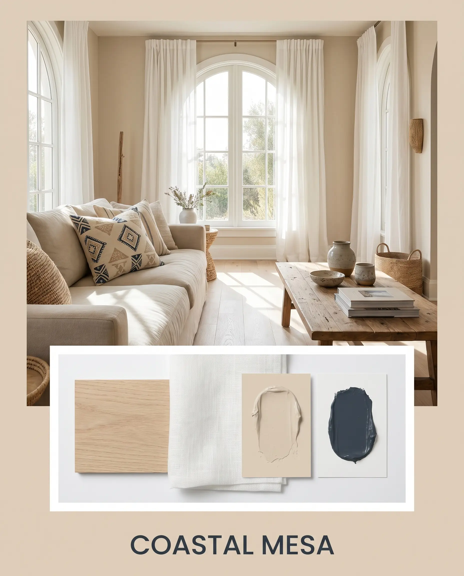
Designer Mood Boards
To help you visualize how these elements come together in a real space, here are three distinct aesthetic pathways you can take with this versatile neutral.
Coastal Mesa This palette captures the relaxed, sun-faded energy of a cliffside retreat. The warm beige walls provide the sun-baked foundation, while expansive bleached oak floors keep the visual weight incredibly light. Layer in accents of SW Naval through block-print throw pillows or a vintage rug to add a crisp, nautical contrast. Finish the styling with sheer linen drapery and oversized ceramic vessels filled with dried branches to emphasize a breezy, organic atmosphere.
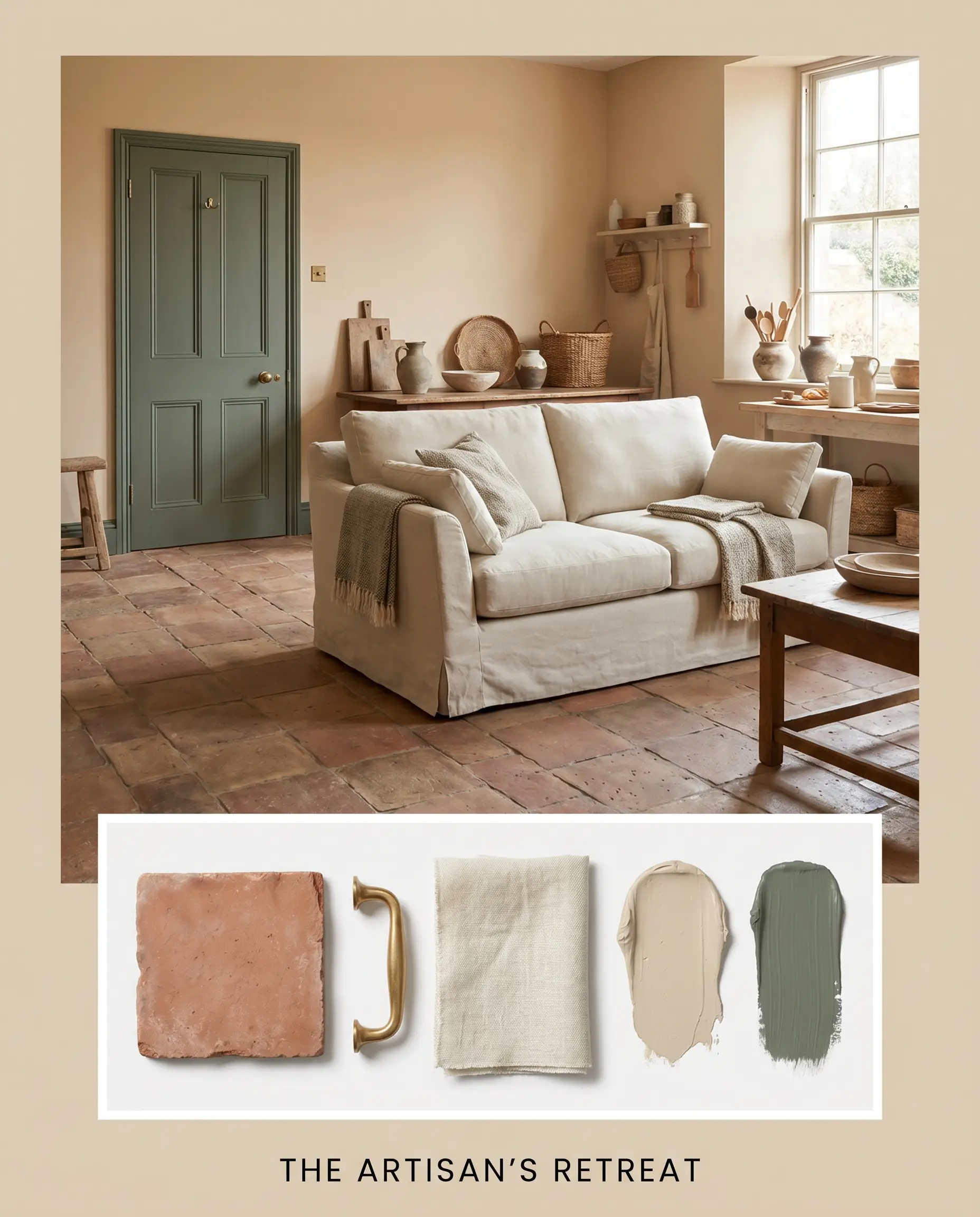
The Artisan’s Retreat Designed for the homeowner who appreciates tactile, handcrafted details, this mood board leans heavily into the paint’s earthy origins. Pair the walls with tumbled terracotta floors and rich, unlacquered brass hardware that will patinate beautifully over time. Introduce F&B Green Smoke on interior doors or a piece of painted furniture to ground the warm tones. Style the space with hand-thrown pottery, woven wall hangings, and a slipcovered sofa in a muted ivory linen.
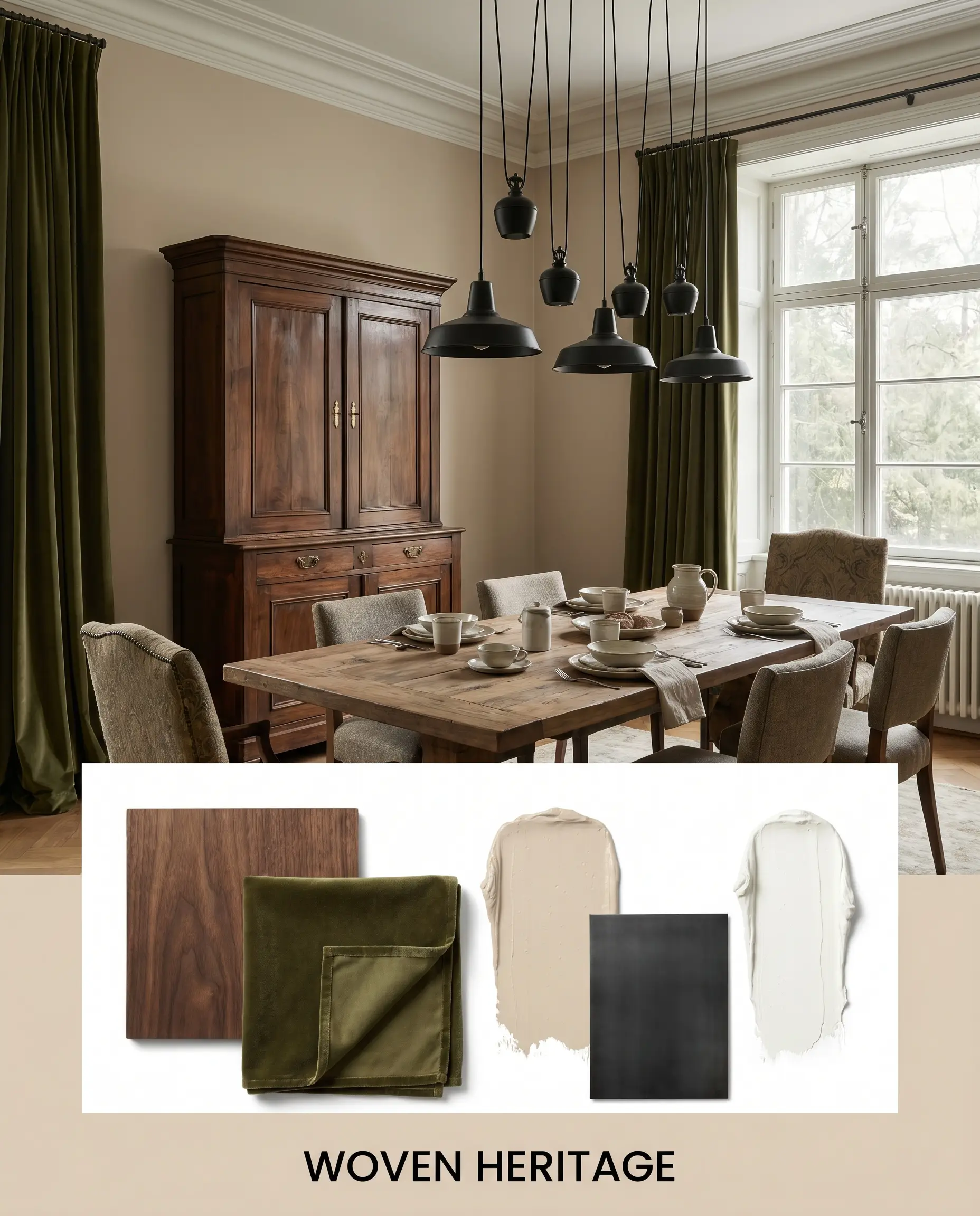
Woven Heritage This approach uses the paint to create a deeply established, historical narrative without feeling stuffy. The beige walls act as a warm backdrop for classic architectural moldings painted in a crisp white. Introduce matte black steel lighting fixtures to modernize the traditional shell. Bring in warmth through walnut antique furniture, layered vintage portraits in gilded frames, and heavy velvet drapery in deep olive or charcoal.
PPG Sourdough vs. Rival Earthy Neutrals
Sometimes a color looks perfect on a swatch but fails to perform under your specific lighting conditions or exterior exposures. When this happens, you need to know exactly how to pivot to a rival shade that corrects the issue. Here is how this paint stacks up against its closest competitors.
PPG Sourdough vs. Sherwin-Williams Accessible Beige
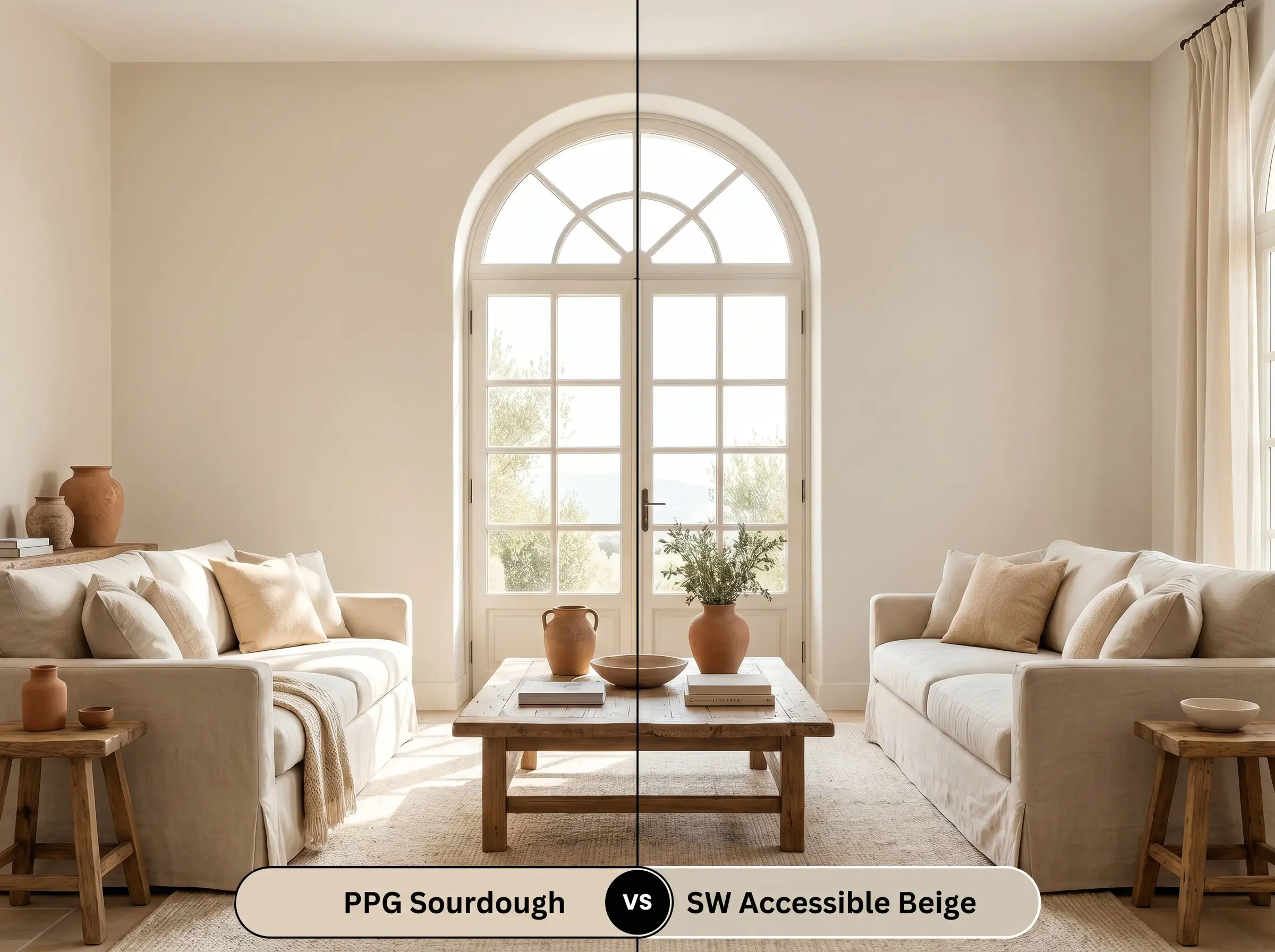
Accessible Beige is a legendary neutral, but it operates with a fundamentally different structural DNA. While the PPG option leans confidently into its red-orange warmth, Accessible Beige carries a distinct gray undertone that pulls it closer to a true “greige.” If your room is flooded with warm southern light, Accessible Beige will hold its shape beautifully without turning overly peach, whereas the PPG shade might feel too intensely warm.
PPG Sourdough vs. Benjamin Moore Shaker Beige
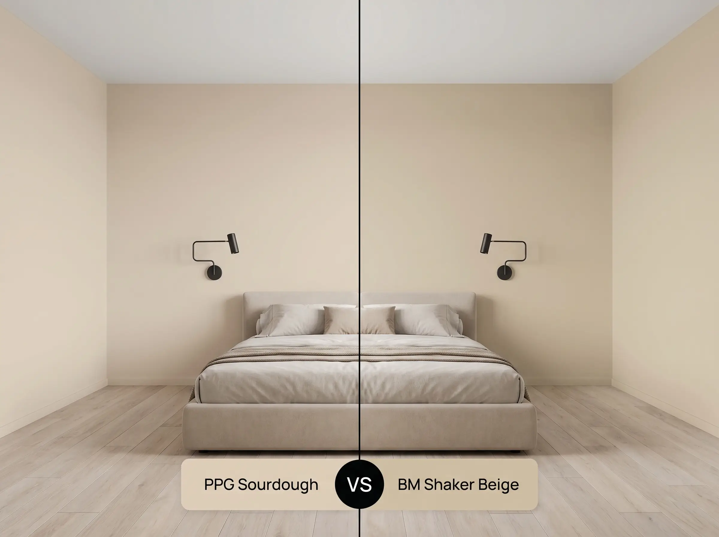
These two colors share a similar depth, but their hidden layers diverge significantly. Shaker Beige is a classic, sandy tan that lacks the lively red-orange cast found in the PPG finish. If you are trying to modernize a space with crisp black accents and sleek lines, the PPG option provides a fresher, more dynamic background, while Shaker Beige can sometimes read a bit heavy and traditional in dim lighting.
Navigating Similar Colors & Brand Matches
Whether you need a slight adjustment in light reflectance or you are restricted by the paint brands available at your local hardware store, having a backup plan is essential. Here are the closest alternatives to keep your project moving forward.
Same-Brand Alternatives
If you love the PPG formula but need a minor tweak in depth or temperature, consider these options from the same deck:
Cross-Brand Matches
If your contractor prefers a different manufacturer, these are the closest structural equivalents available:
Executing this Architectural Finish: Application & Sheens
Transitioning from design theory to the physical reality of painting requires strict attention to detail. The sheen you select and the preparation you put into the walls will ultimately dictate whether the final result looks premium or amateur.
When working with a color of this depth (LRV 62), a standard white primer is usually sufficient, but a high-quality bonding primer is non-negotiable if you are painting over a dark, glossy wall. Plan for two full coats to achieve total opacity and prevent the old wall color from altering the new red-orange undertones. Be incredibly mindful of your roller technique; maintaining a wet edge is critical to avoid “flashing,” where overlapping roller marks become visibly darker once the paint dries.
Frequently Asked Questions
Because direct exterior sunlight washes out a paint’s depth and amplifies its warmest undertones, the inherent red-orange cast in this shade will absolutely pull forward. On an exterior facade, especially facing south or west, it will likely read as a soft, sun-washed peach rather than a standard tan.
While its LRV of 62 reflects a decent amount of light, the lack of natural sun in a basement forces you to rely entirely on artificial fixtures. If you use cool LED bulbs, the color will look flat and slightly muddy; you must use warm 2700K lighting to activate its cozy, welcoming nature in windowless spaces.
This is generally a difficult pairing because the lively red-orange cast in the paint violently clashes with the blue or purple undertones found in cool gray luxury vinyl plank or tile. If you must work with gray floors, you are better off selecting a true greige wall color to bridge the temperature gap.
To create a harmonious space, pair this paint with pale, desaturated woods like bleached oak or white ash, which offer a quiet contrast. Alternatively, rich, dark woods like walnut provide a stunning, sophisticated grounding effect without competing with the paint’s internal warmth.
The Final Verdict: Mastering PPG1084-3
PPG Sourdough is a masterful, sun-baked neutral designed for the homeowner who wants to inject a quiet, organic vitality into their space. It is the perfect architectural finish for those embracing Mediterranean Revival, Organic Modern, or warm Transitional aesthetics. By leveraging its hidden red-orange cast, you can transform sterile, lifeless rooms into deeply welcoming environments that feel curated, tactile, and effortlessly sophisticated.
Because this paint relies so heavily on its baked, earthy warmth, it struggles immensely when forced into a room dominated by stark, icy finishes. Pairing this shade with cool-toned Carrara marble, blue-gray flooring, or harsh 5000K daylight bulbs will instantly drain the life from the pigment. The paint will read as dirty or muddy, while the cool finishes will look uncomfortably clinical. To succeed with this color, you must commit to a warm, organic materials palette that supports, rather than fights, its foundational DNA.
Clash Warning (The Temperature Conflict)
Closest Cross-Brand Equivalents
The absolute closest scientific color matches for Sourdough across top paint brands.