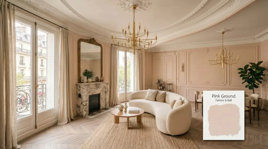
Pink Ground 202
Farrow & BallFarrow & Ball Pink Ground (202) is a soft, dusty blush pink with a heavy dose of earthy yellow pigment. This warm, plaster-like hue creates a soothing, sophisticated finish that never feels overly sweet or sugary, making it an ideal neutral alternative for elegant, modern interiors.
Paint Technical Profile
| Color ID / SKU | 202 |
| HEX Code | #ead4c6 |
| Light Reflectance (LRV) | 70.01 |
| Use | Interior, Exterior |
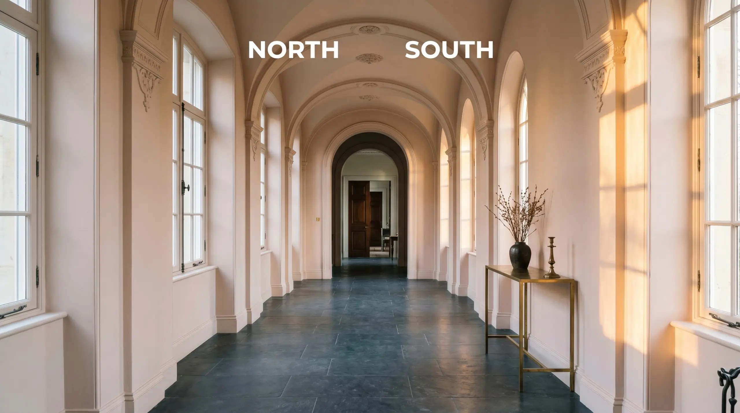
| Best Exposures | North, South, West |
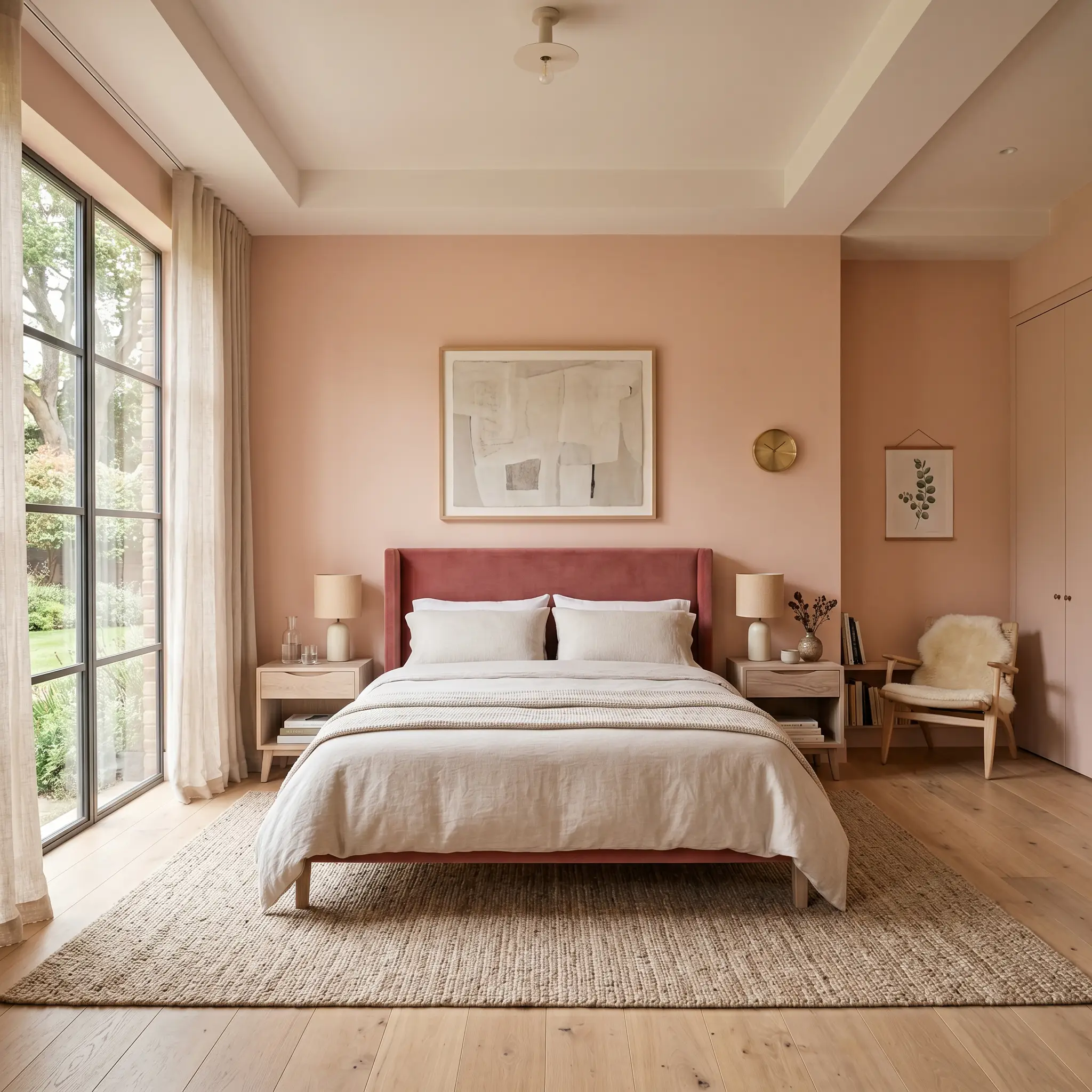
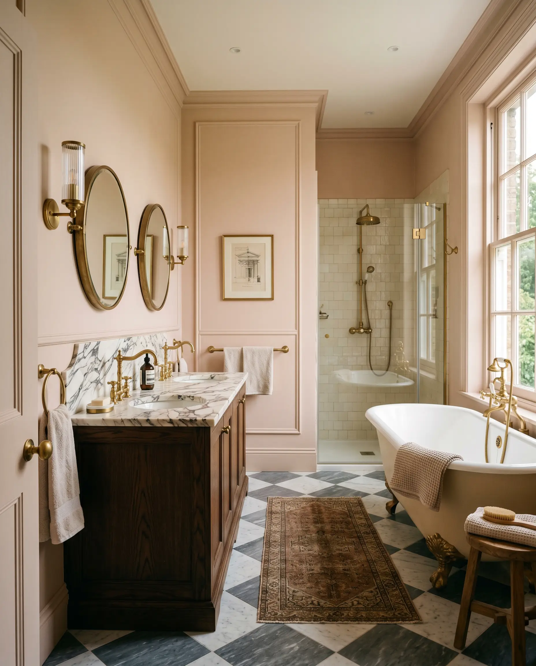
| Best For | Bedrooms, Bathrooms, Living Rooms, Cabinetry |
Farrow & Ball Pink Ground 202: The Ultimate Earthy Blush for Sophisticated Spaces
Let’s address the elephant in the room: painting a space pink often triggers immediate visions of juvenile, sugary-sweet nurseries or overly vibrant retro styling. Farrow & Ball Pink Ground 202 shatters that misconception entirely.
This is not a bubblegum pastel; it is a highly sophisticated, earthy blush engineered for elevated, beautifully curated interiors. It delivers that coveted Parisian aesthetic without ever feeling overly precious or saccharine, providing a deeply grounded foundation for your home.
The Color DNA of Farrow & Ball Pink Ground
Is this paint warm or cool? Farrow & Ball Pink Ground is undeniably warm, leaning heavily into a grounded, organic territory rather than a stark, icy pastel.
At an LRV of 70.01, it offers exceptional color reflectance. This means it bounces a substantial amount of light around the room, keeping your space feeling expansive and airy. It acts more like a warm neutral than a traditional pink, maintaining its rich plaster-like finish without washing out into a blinding white, even in sun-drenched spaces.
Lighting Effects & The Chameleon Factor
If you are terrified this shade will read too vibrant, understanding its reaction to light is your ultimate safeguard. Because of its complex construction, this earthy pink shifts dramatically throughout the day.
Popular Room Applications for Pink Ground 202
This rich, historic shade demands to be used intentionally, bringing a cohesive, enveloping energy to both modern and traditional homes. It provides a stunning backdrop that feels both historic and remarkably fresh.
Bedrooms & Nurseries
It creates a deeply restorative environment when wrapped around all four walls of a sleeping space. In a primary suite, it provides a stunning backdrop for rich velvet headboards or crisp, tailored linen bedding. In a child’s space, it avoids the typical sugary tropes, offering a mature foundation that easily transitions as they grow.
Bathrooms
This shade is an absolute secret weapon for flattering, ambient light in a washroom. It reflects a beautiful, healthy glow onto the skin, making it ideal for morning routines. Pair it with heavily veined marble countertops or classic checkerboard floor tiles to elevate a vintage or European-inspired layout.
Living Spaces
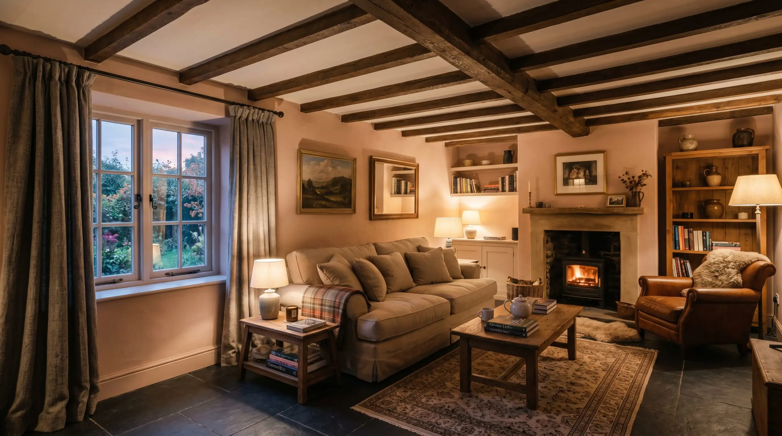
Rather than a stark white, use this dusty hue to wrap a main gathering space in warmth. It grounds heavy, structured furniture beautifully, acting as a soft counterpoint to rigid mid-century silhouettes or deep, overstuffed traditional sofas. Layering textured rugs and heavy drapes over this foundation creates an instantly inviting atmosphere.
Kitchens & Cabinetry
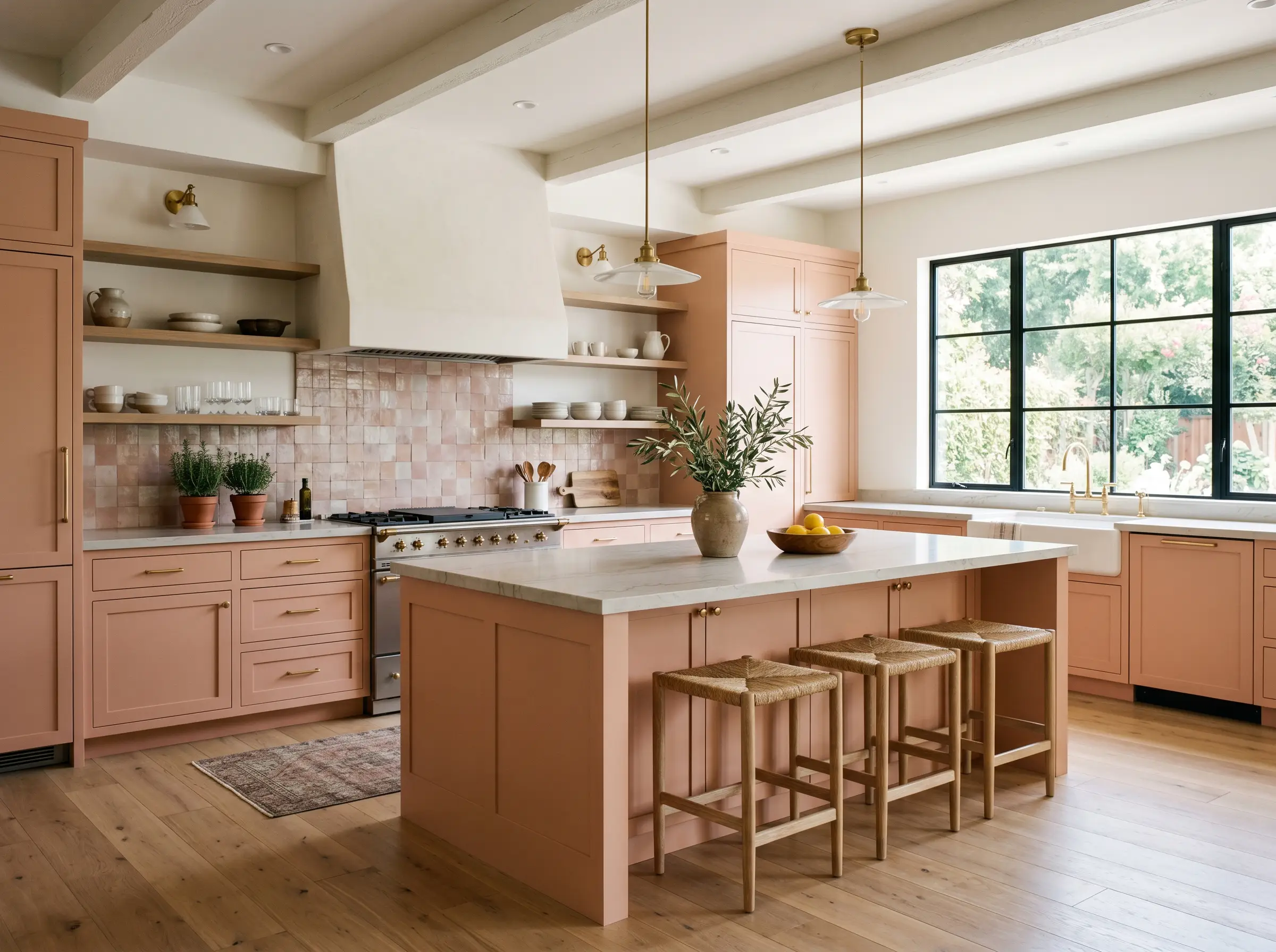
If you are tired of sterile culinary spaces, this shade offers incredible character for custom millwork. Applying it to a central island or lower cabinets introduces a soft, culinary warmth that pairs perfectly with handmade ceramic backsplashes and natural stone.
Unique Design Ideas & Inspiration
Moving beyond standard four-wall applications, this specific pigment profile thrives when pushed into unexpected architectural placements.
The Enveloped Reading Snug
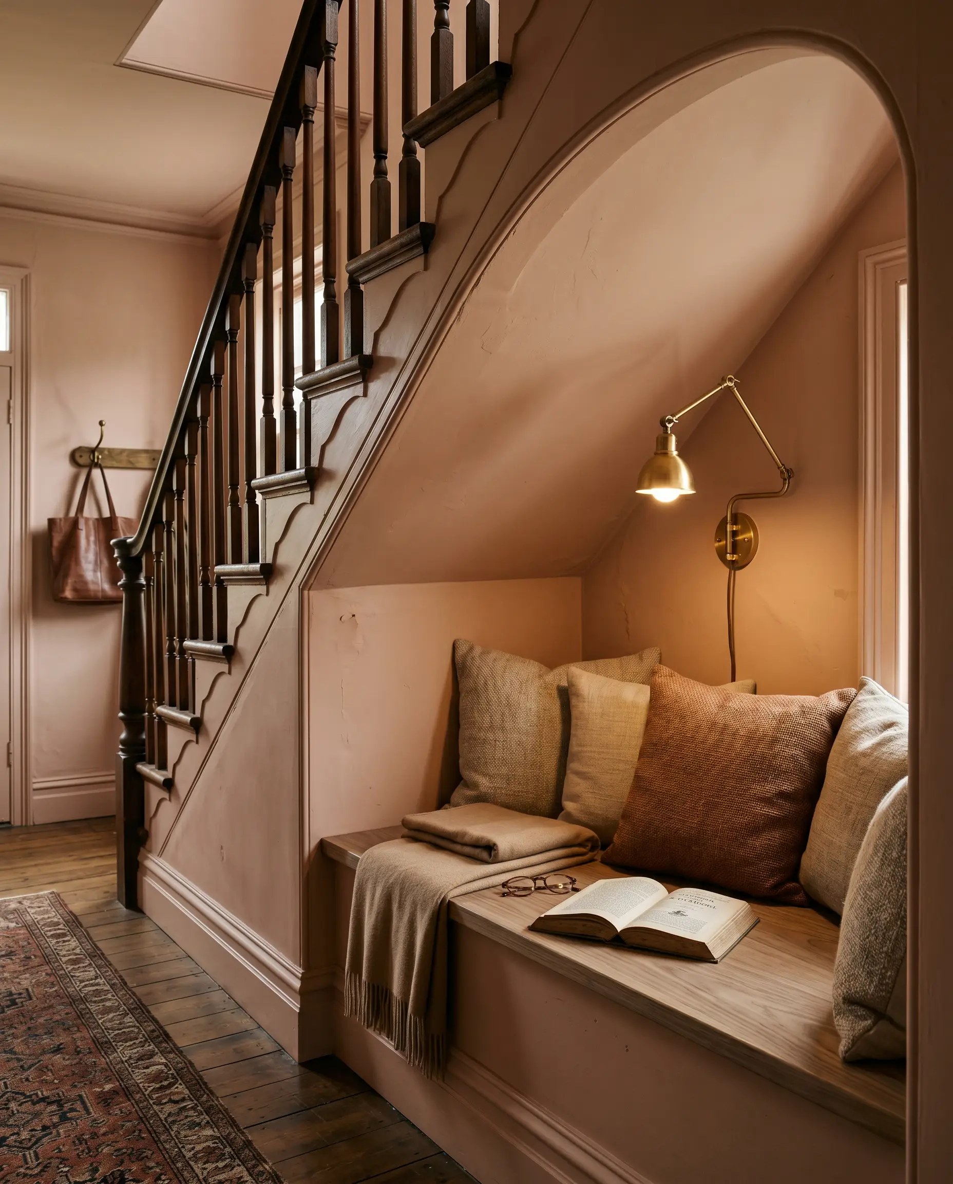
Transform a forgotten alcove or under-stair space into a deeply immersive retreat. By color-drenching the walls, ceiling, and baseboards in this earthy blush, you blur the structural boundaries. The resulting shadow play emphasizes the color’s ochre depth, creating a quiet, sophisticated hideaway that feels intentionally carved out of the home.
The “Fifth Wall” Ceiling Treatment
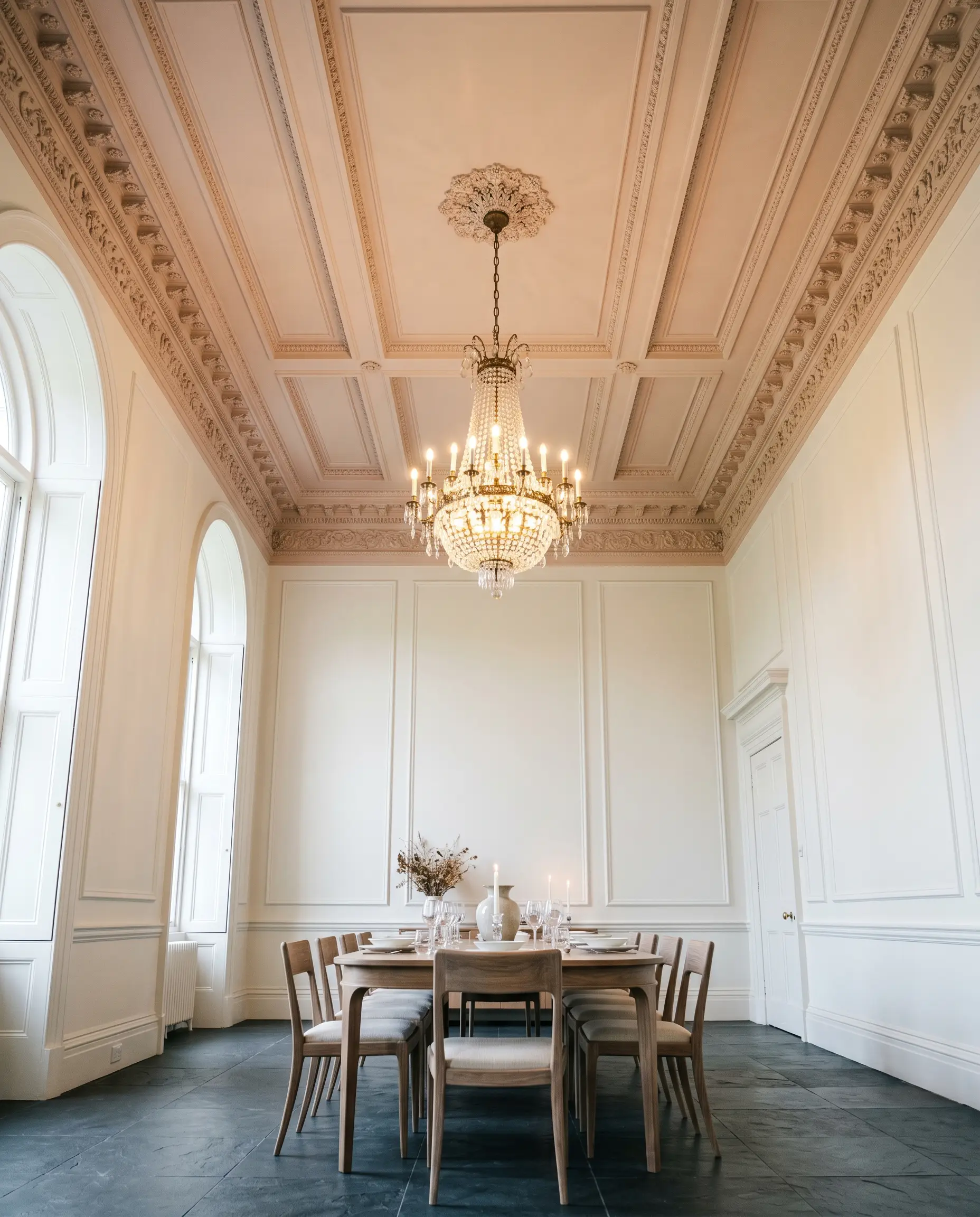
In rooms with tall, stark white walls, painting the ceiling this muted tone visually lowers the canopy, adding instant intimacy. It draws the eye upward and casts a subtle, warm glow over the entire space. This technique is especially striking in dining rooms outfitted with elaborate crown molding.
The Modern Color-Blocked Vestibule
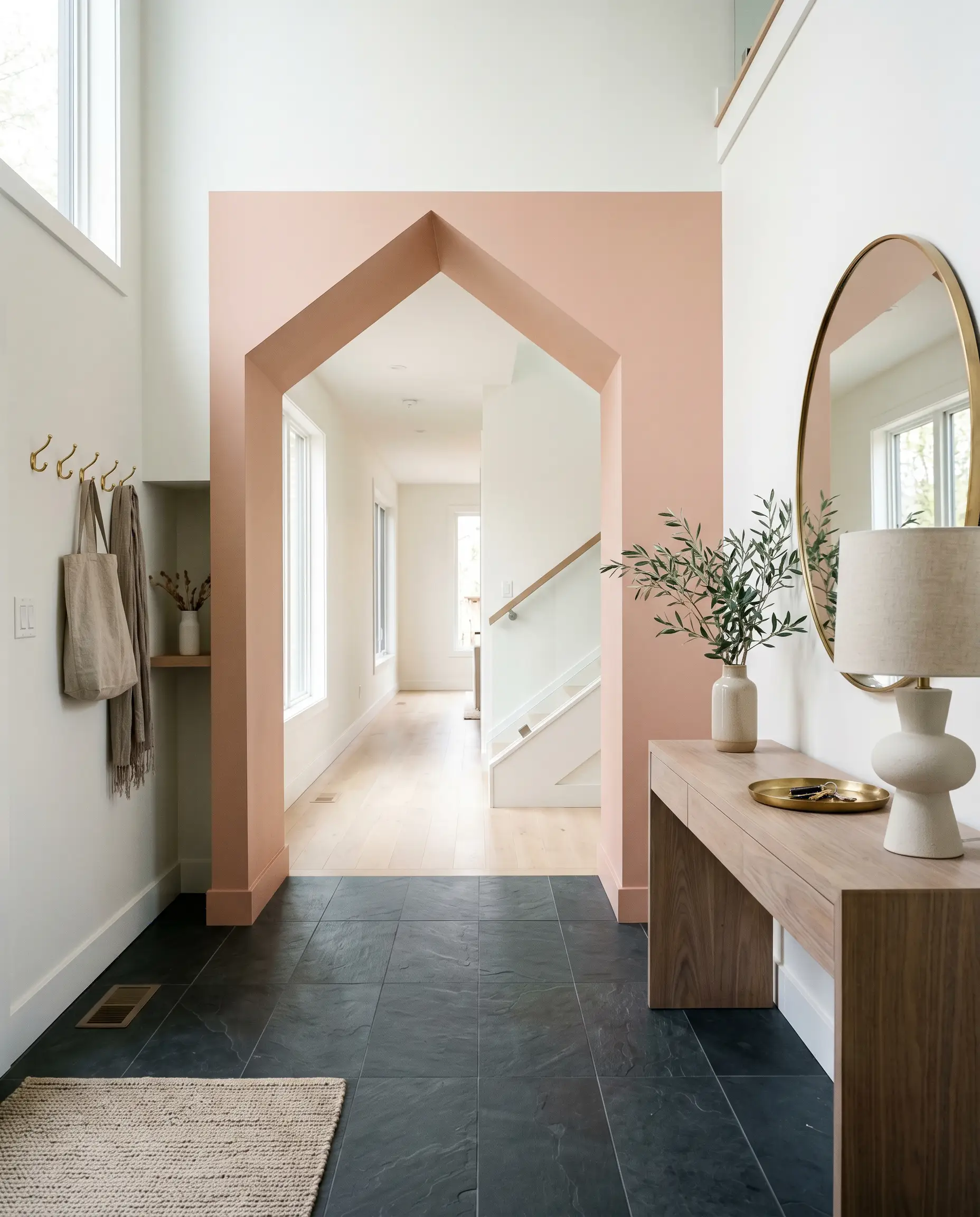
Use this warm neutral to define a transitional entryway. Painting a sharp, geometric archway or a solid half-wall block against a crisp white backdrop creates immediate architectural interest. It signals a premium, curated aesthetic the moment guests step through the front door.
Coordinating Colors & Best Pairings
To make this shade feel intentional and curated, it requires thoughtful contrast—either crisp, clean boundaries to highlight its warmth, or moody, saturated tones to ground its lightness.
Trim & Baseboards
The right trim dictates whether this hue feels modern or historic.
Hardware, Wood & Material Pairings
Coordinating Colors
Designer Mood Boards
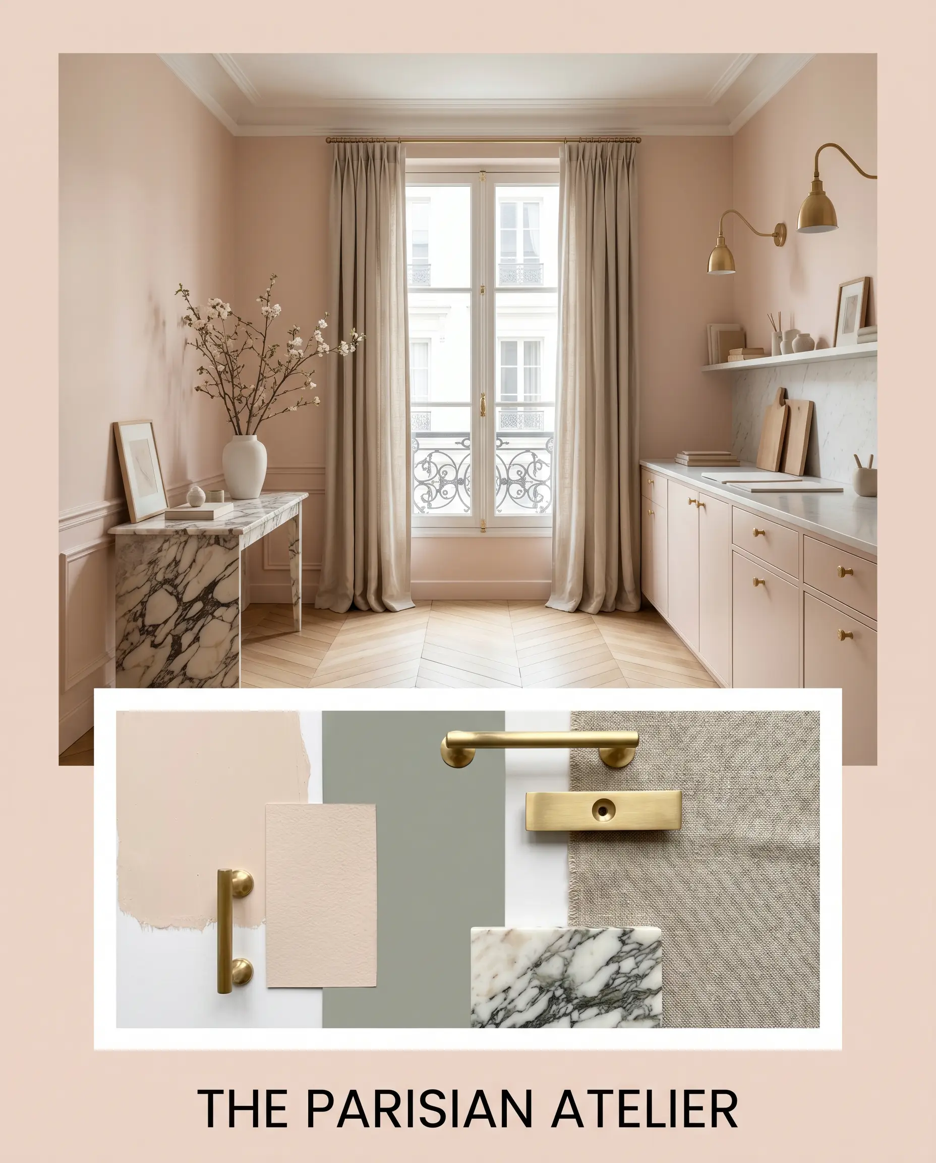
The Parisian Atelier
This palette marries the soft elegance of Pink Ground 202 with the moody depth of Farrow & Ball Pigeon 25. By incorporating polished unlacquered brass hardware and a vintage, heavily veined marble accent table, the energy feels distinctly European and effortlessly collected. A beautifully draped, heavy woven linen curtain completes the relaxed yet premium vibe.
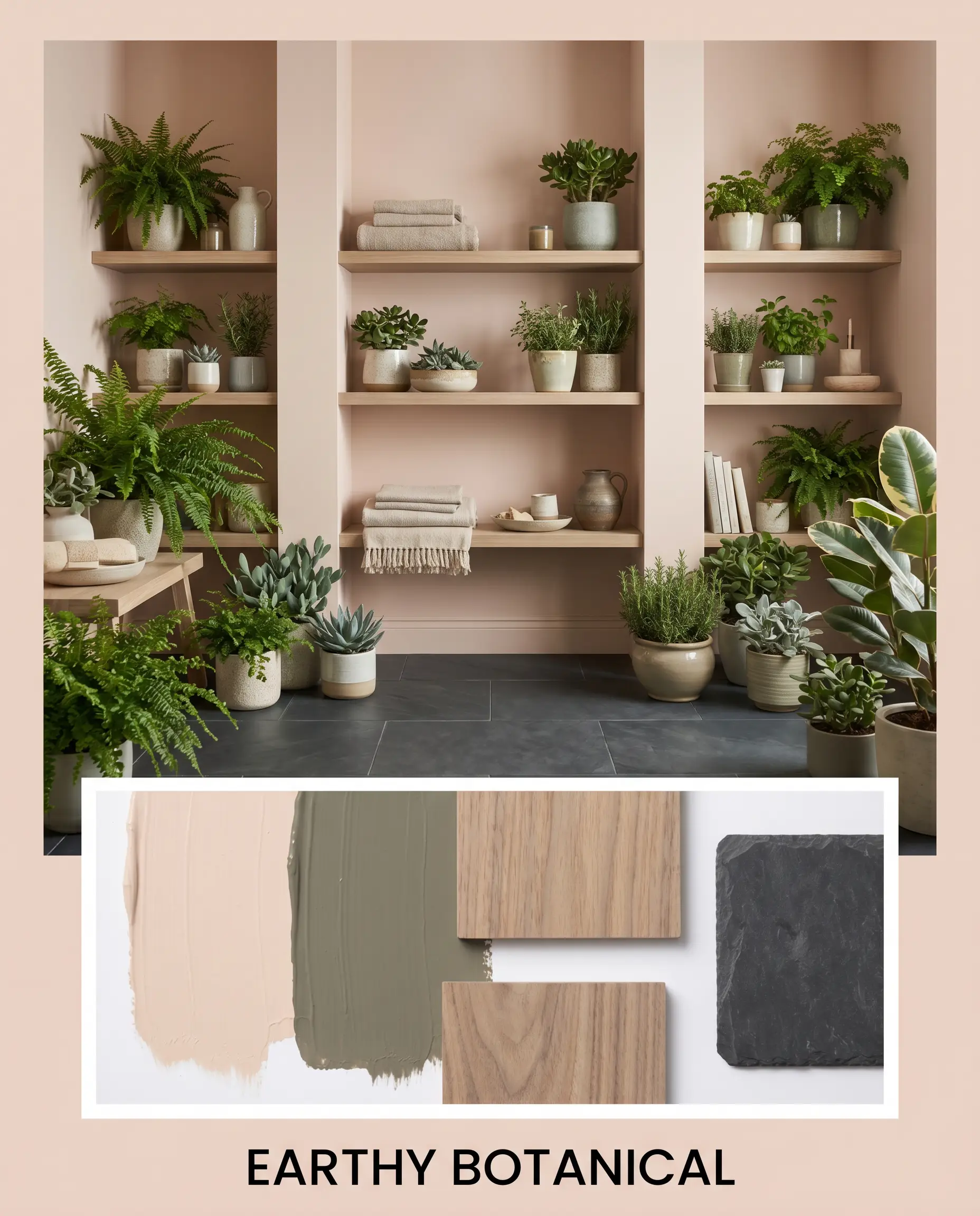
Earthy Botanical
Grounded by the historic richness of Benjamin Moore Gloucester Sage HC-100, this combination leans heavily into organic textures. Bleached walnut shelving and matte charcoal slate flooring provide a rugged, tactile foundation. The juxtaposition of the soft blush walls against these dark, natural materials creates a beautifully balanced, restorative atmosphere.
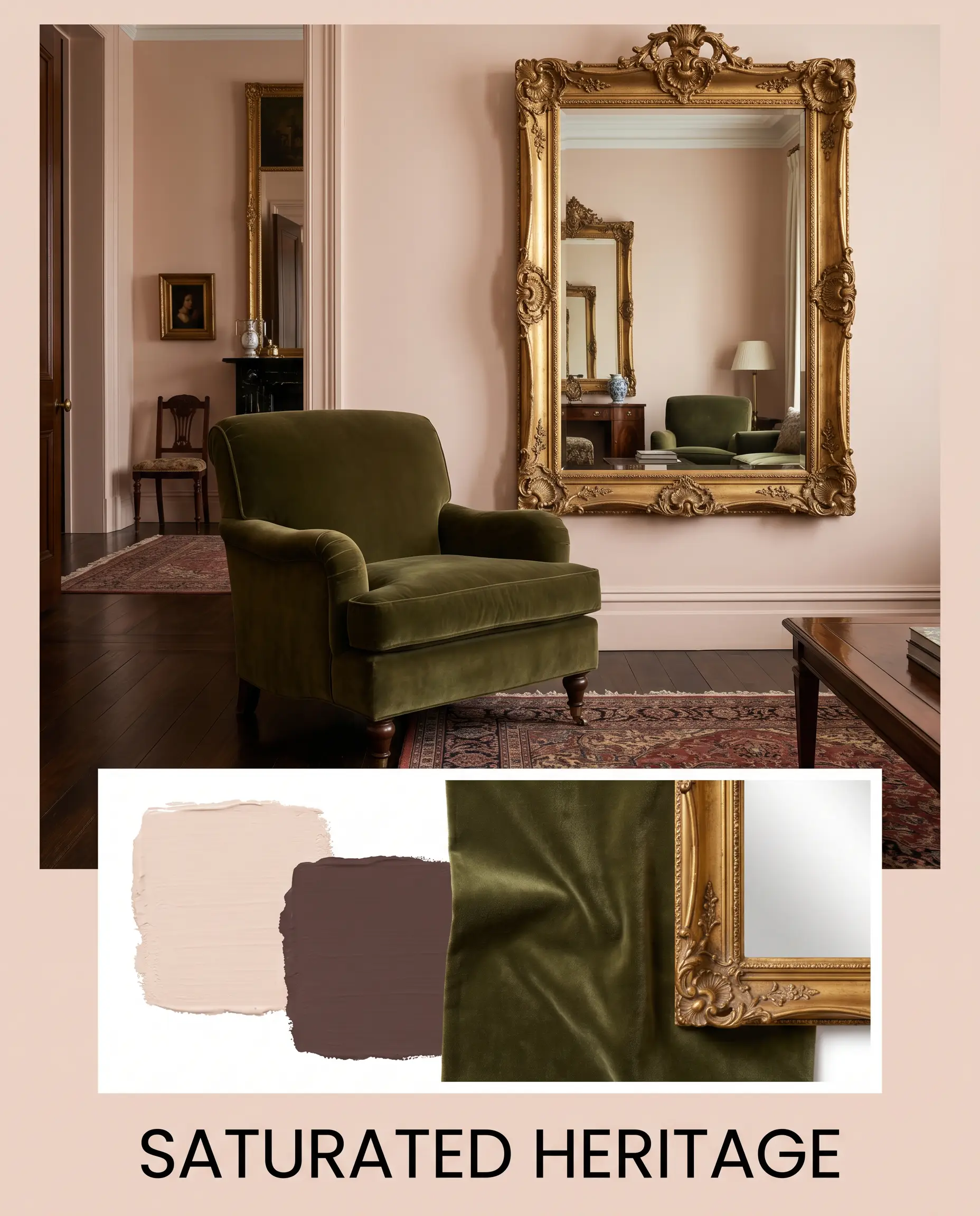
Saturated Heritage
For a fearless, high-contrast approach, we pair the main hue with the deep, enveloping tones of Sherwin-Williams Carnelian SW 7580. Adding a plush, deep olive velvet armchair and an oversized, gilded antique mirror elevates the drama. This palette feels incredibly rich, historic, and undeniably luxurious.
Head-to-Head Comparisons
Choosing the perfect blush often comes down to the specific lighting of your home and the exact architectural vibe you are trying to achieve. If the current hue feels slightly off, a direct rival might be the solution.
Farrow & Ball Pink Ground 202 vs. Farrow & Ball Setting Plaster 231
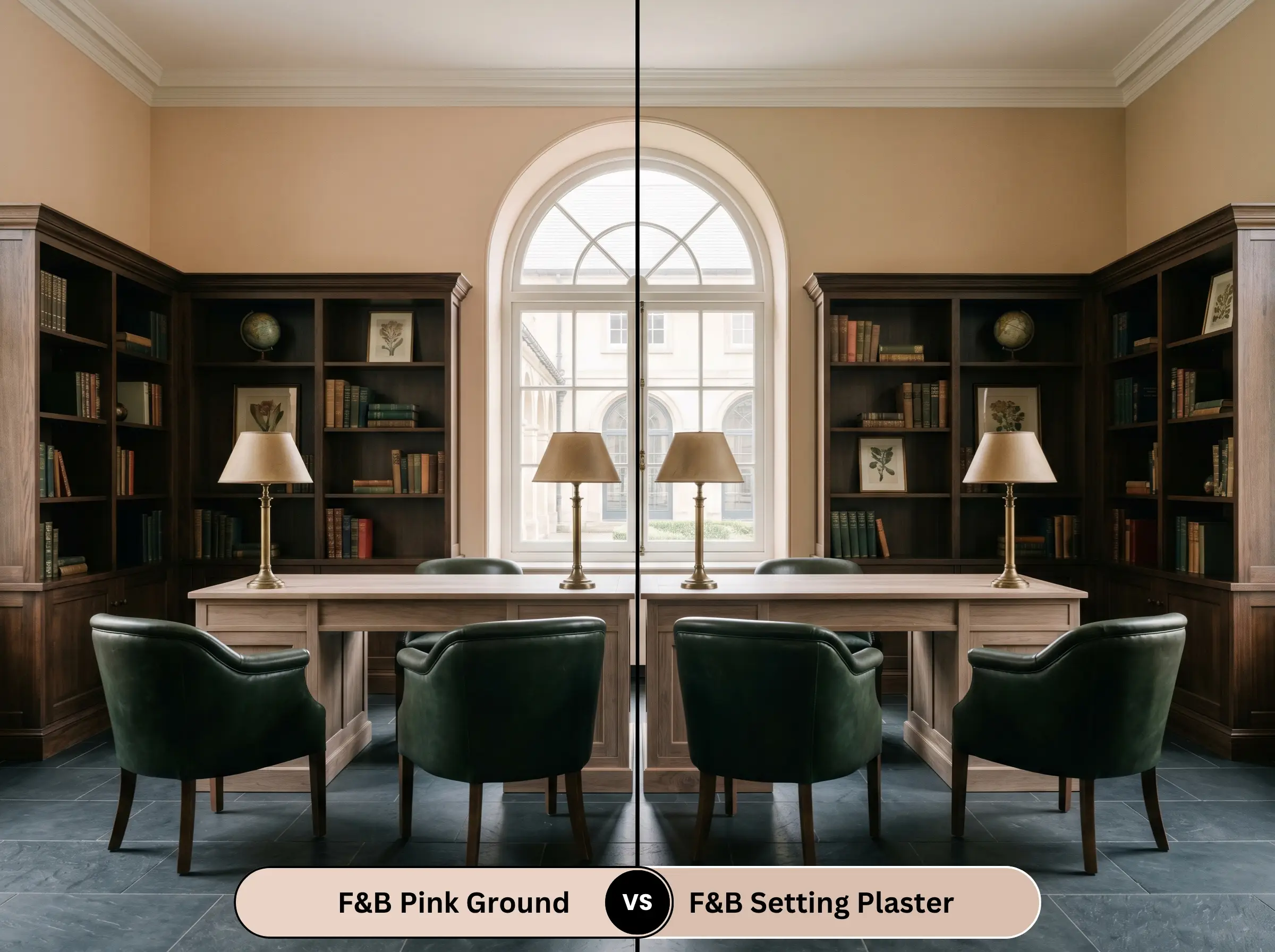
If you need a color that feels distinctly more historic and shadowed, Setting Plaster is the answer. While Pink Ground is lighter and slightly more delicate, Setting Plaster carries a heavier dose of brown pigment. It reads more like aged terracotta, making it ideal for naturally dark or moody spaces where you want to embrace the shadows.
Farrow & Ball Pink Ground 202 vs. Benjamin Moore First Light 2102-70
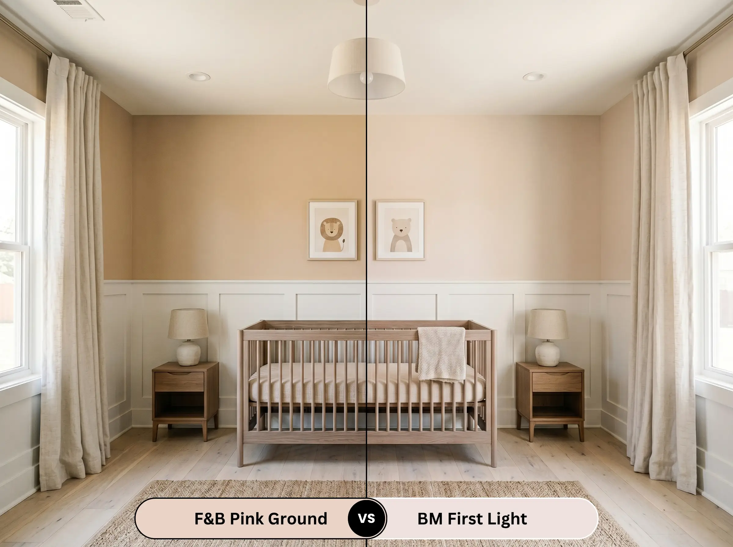
First Light is a much cooler, cleaner pink with a very subtle blue undertone. If your room receives heavy, warm Southern light that makes Pink Ground pull too orange or peachy, First Light will counteract that warmth, maintaining a crisper, more modern pastel appearance.
Farrow & Ball Pink Ground 202 vs. Sherwin-Williams Malted Milk SW 6057
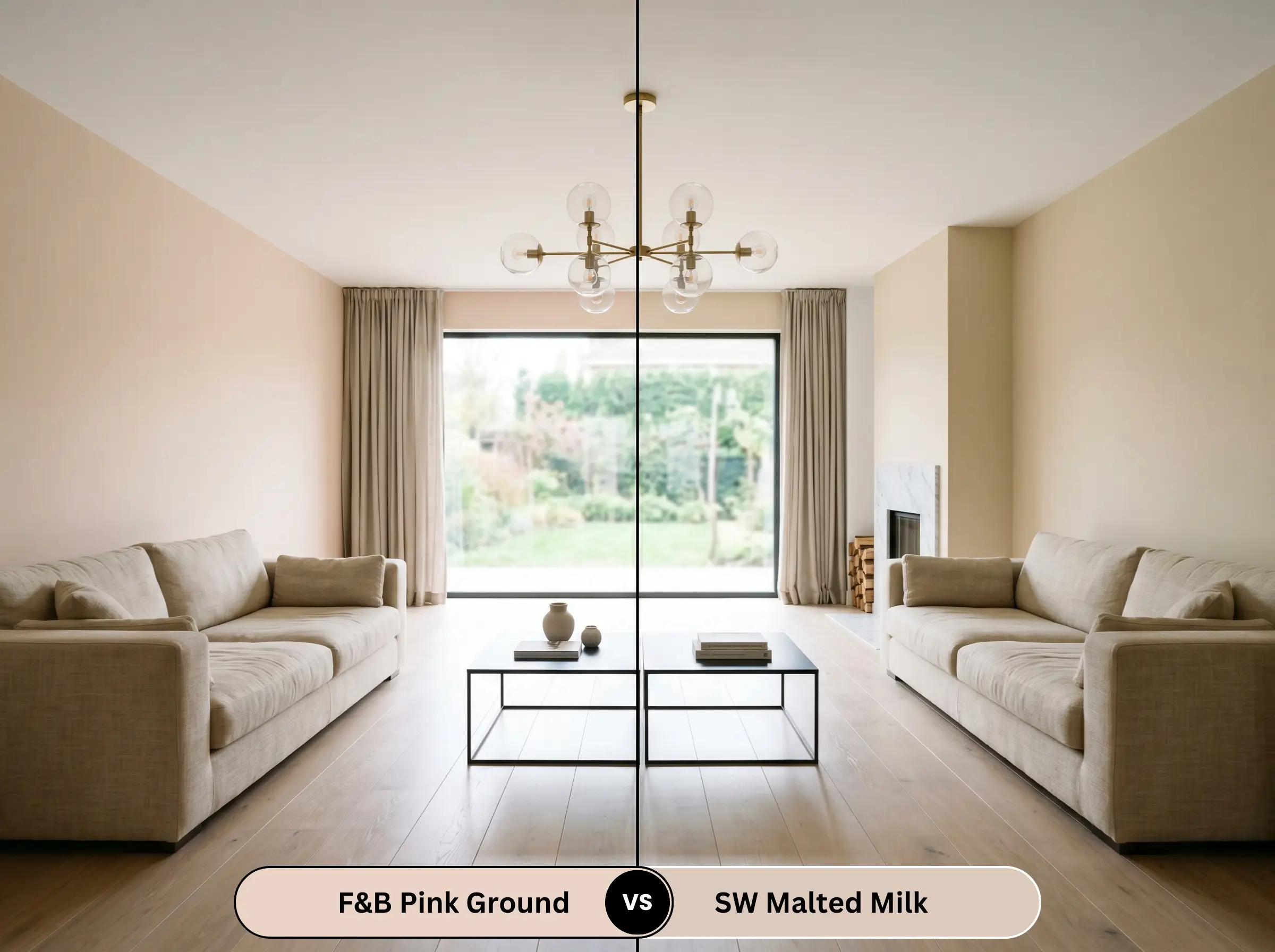
Malted Milk leans slightly more into a traditional beige-pink territory. If you are hesitant to commit to a true blush and want a safer, highly versatile neutral that just hints at warmth, Malted Milk is the more conservative choice for large, open-concept spaces.
Similar Colors & Farrow & Ball Equivalents
Whether you need a subtle shift in depth or require a match from a different manufacturer for your painting contractor, these alternatives offer excellent flexibility. For those exploring our curated list of the best earthy pink paints for adults, keeping it within the same heritage brand ensures that signature chalky finish.
Farrow & Ball Alternatives
Cross-Brand Matches
Practical Application & DIY Advice
Translating this premium color from a swatch to your walls requires strict attention to finishes and preparation to ensure a flawless, high-end result.
The Dynamic Sheen Guide
Primer Strategy
To achieve the true, complex depth of this shade, you must use a high-quality, warm-toned primer. Farrow & Ball recommends their Mid Tones Primer & Undercoat. Applying this hue over a stark white or cool gray builder-grade primer will instantly strip away its rich, earthy character, leaving the final result looking thin and washed out.
Coverage & Success Tips
Farrow & Ball paints are heavily pigmented and require a dedicated two-coat minimum over the proper undercoat.
Because of the ultra-matte finish of the Estate Emulsion, this paint is highly susceptible to “flashing”—those visible, uneven streaks that catch the light. You must maintain a wet edge while rolling and avoid over-working the paint once it begins to tack up.
Hackrea Pro-Tip (The Roller Rule)
Frequently Asked Questions
The underlying warmth of this shade harmonizes beautifully with aged, living metals. Rather than clashing, the green and brown patinas found in heavily oxidized copper provide a stunning, earthy contrast that actually enhances the historic, curated feel of the paint.
Absolutely. Because of its high light reflectance, it bounces a flattering, warm glow downward. This completely neutralizes the icy, clinical energy of heavy white stone, injecting a soft, spa-like intimacy into the washroom without making the space feel enclosed.
It requires careful balancing. While the yellow notes generally complement warm woods, the intense red undertones in heavy cherry or mahogany can sometimes compete, making the paint look slightly muddy. To bridge this gap, introduce highly contrasting textiles, like a cool slate-blue rug, to break up the visual heat.
When applied to exterior masonry using a dedicated exterior finish, direct, intense sunlight will wash out some of the subtle dustiness, making it read slightly brighter. In high-humidity zones, you must ensure the masonry is fully cured and primed with an appropriate stabilizing solution to prevent the chalky pigments from degrading or blistering over time.
Final Verdict & Expert Warnings
Farrow & Ball Pink Ground 202 is a triumph for homeowners seeking a sophisticated, mature alternative to stark neutrals. It is absolutely perfect for those wanting to cultivate a relaxed, European-inspired aesthetic or a deeply enveloping, historically rooted space. It shines brightest in bedrooms, curated living areas, and vintage-leaning bathrooms where its warm, plaster-like energy can take center stage.
However, this color demands intentional pairing. If your home features cool, gray-toned luxury vinyl plank flooring or highly reflective, polished chrome fixtures throughout, this earthy blush will severely clash. The warm, ochre-leaning undertones will fight aggressively against cool, artificial grays, making the paint look dirty and the flooring look cheap. It thrives alongside natural, authentic materials—so if your space is dominated by cool-toned, manufactured finishes, you are better off exploring other options within Farrow & Ball’s top warm neutrals.
Expert Warning (Clash Alert)
Closest Cross-Brand Equivalents
The absolute closest scientific color matches for Pink Ground across top paint brands.