Weimaraner AF-155
Benjamin MooreBenjamin Moore Weimaraner (AF-155) is a sophisticated, medium-dark taupe with an LRV of 30.99. Blending brown and gray with a subtle hint of violet, this earthy neutral excels in well-lit living rooms and cozy bedrooms, offering a grounded, elegant atmosphere without feeling excessively heavy.
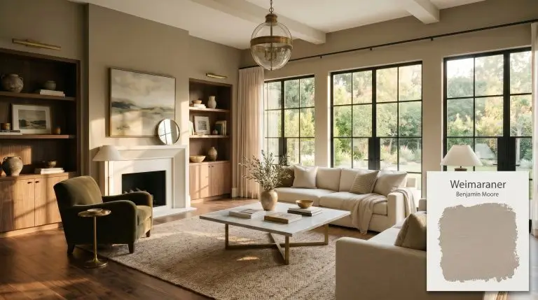
Benjamin Moore Weimaraner Review: Crafting a Sophisticated, Grown-Up Neutral
| Best Exposures | South, West, Well-lit East |
|---|---|
| Best For | Living Rooms, Bedrooms, Home Exteriors, Cozy Dens |
The modern design world is finally suffering from white-wall fatigue. Homeowners are desperately seeking a sophisticated, earthy aesthetic that feels grounding and cozy without crossing into stark minimalism or overly trendy mud-tones.
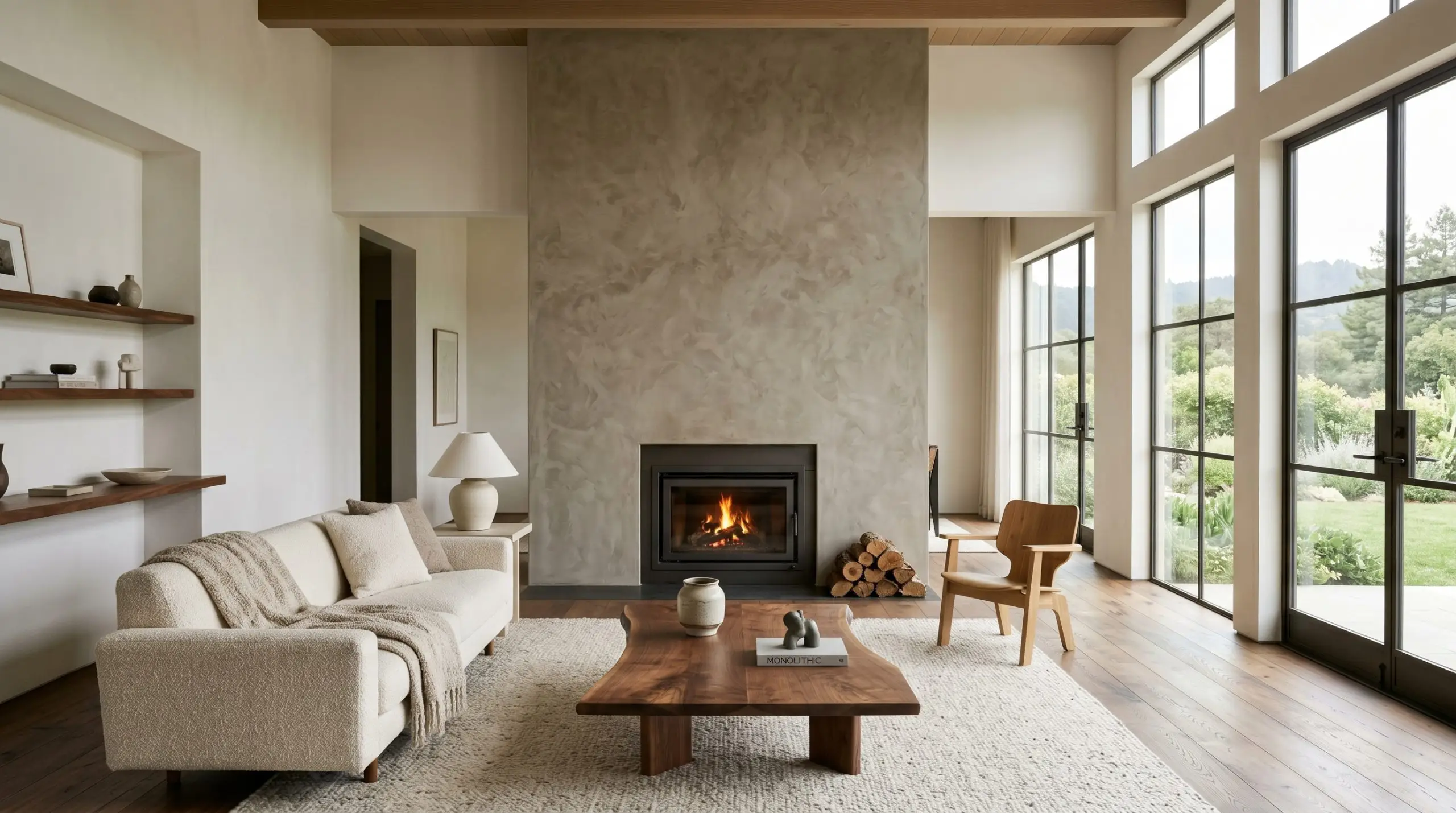
If you are hunting for the ultimate “grown-up” neutral, Benjamin Moore Weimaraner AF-155 is a structural masterpiece. Part of the exclusive Affinity Color Collection, this shade bridges the gap between atmospheric warmth and architectural weight.
However, this is not a beginner’s paint. It possesses a complex chemistry that demands absolute respect for lighting and surrounding materials.
If you miscalculate its environment, this gorgeous shade can quickly turn muddy. We are going to break down the exact color science behind this medium-dark taupe so you can wield it like a professional.
The Color DNA: Undertones & LRV
To understand how this shade will behave on your walls, we have to look past the marketing terminology and examine the raw color data. Every paint has a foundational base and a hidden structure that dictates its behavior.
Because of its light reflectance value of 30.99, Weimaraner absorbs a massive 69% of the light that hits it.
This is a light-devouring color. It creates incredible intimacy and architectural weight, but it relies entirely on external illumination to survive. If you starve this paint of light, it will physically shrink your space and collapse into a flat, lifeless shadow.
You can apply wallpapers, paints, etc. on walls and see how they look in various interiors.

Lighting Effects & The Chameleon Factor
The biggest anxiety surrounding this paint is the fear that it will look unexpectedly purple or uncomfortably muddy. This is a valid fear, but it is entirely controllable.
Because of its specific color temperature, this shade acts as a chameleon, radically shifting its identity based on the light source hitting the wall.
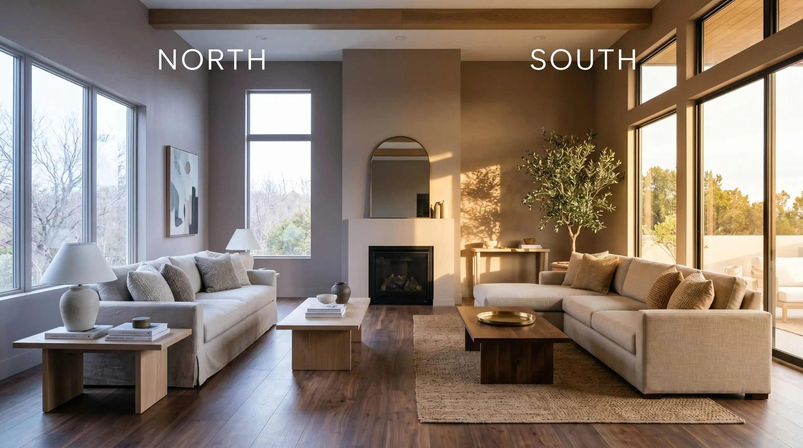
Never use this paint in windowless powder rooms, narrow interior hallways, or poorly lit basements. Without sufficient light to activate the undertones, the color will feel oppressive and dingy.
Clash Warning
Popular Spatial Applications
This is not a universally versatile greige that you can blindly spray across an entire floor plan. It is a highly intentional architectural color that thrives when given a specific job to do.
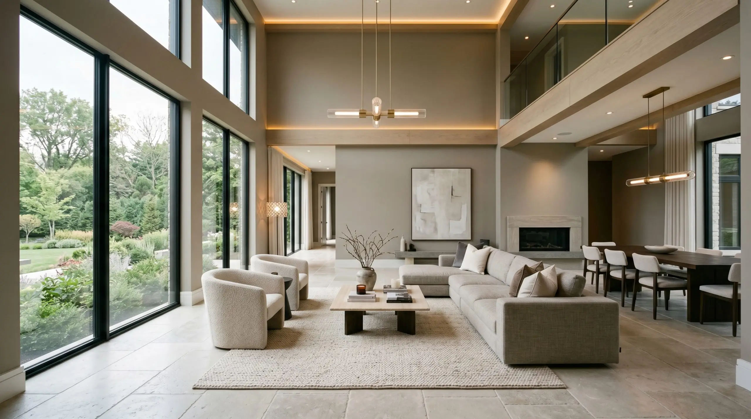
Enveloping Gathering Spaces
When applied to expansive living areas, this shade acts as a visual anchor. Its low LRV pulls the walls inward, creating a sense of intimate enclosure that is perfect for spaces meant for evening relaxation.
To prevent the room from feeling cavernous, the space must feature large-scale windows or a meticulously layered artificial lighting plan. Pair the dark walls with light-reflecting textiles and broad, pale flooring to maintain visual buoyancy.
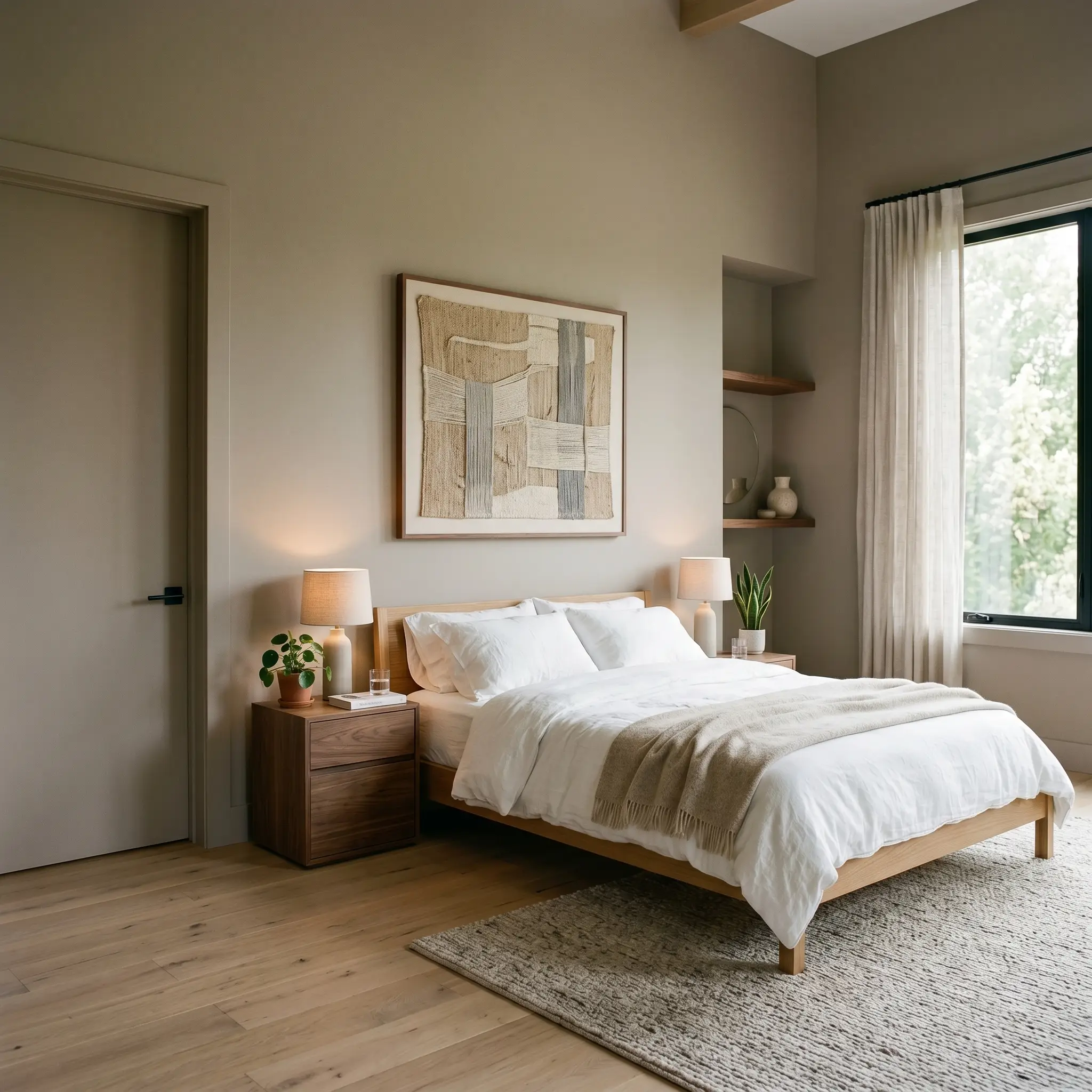
Restorative Sanctuaries
In resting environments, the color’s inherent visual weight promotes a profound sense of calm. The violet micro-undertone subtly cools the brown base, preventing the room from feeling overly warm or stifling.
This shade works beautifully when wrapping the entire space—walls, baseboards, and doors—in a single, unified blanket of color. By eliminating high-contrast trim, the eye is allowed to rest, amplifying the restorative psychological mood.
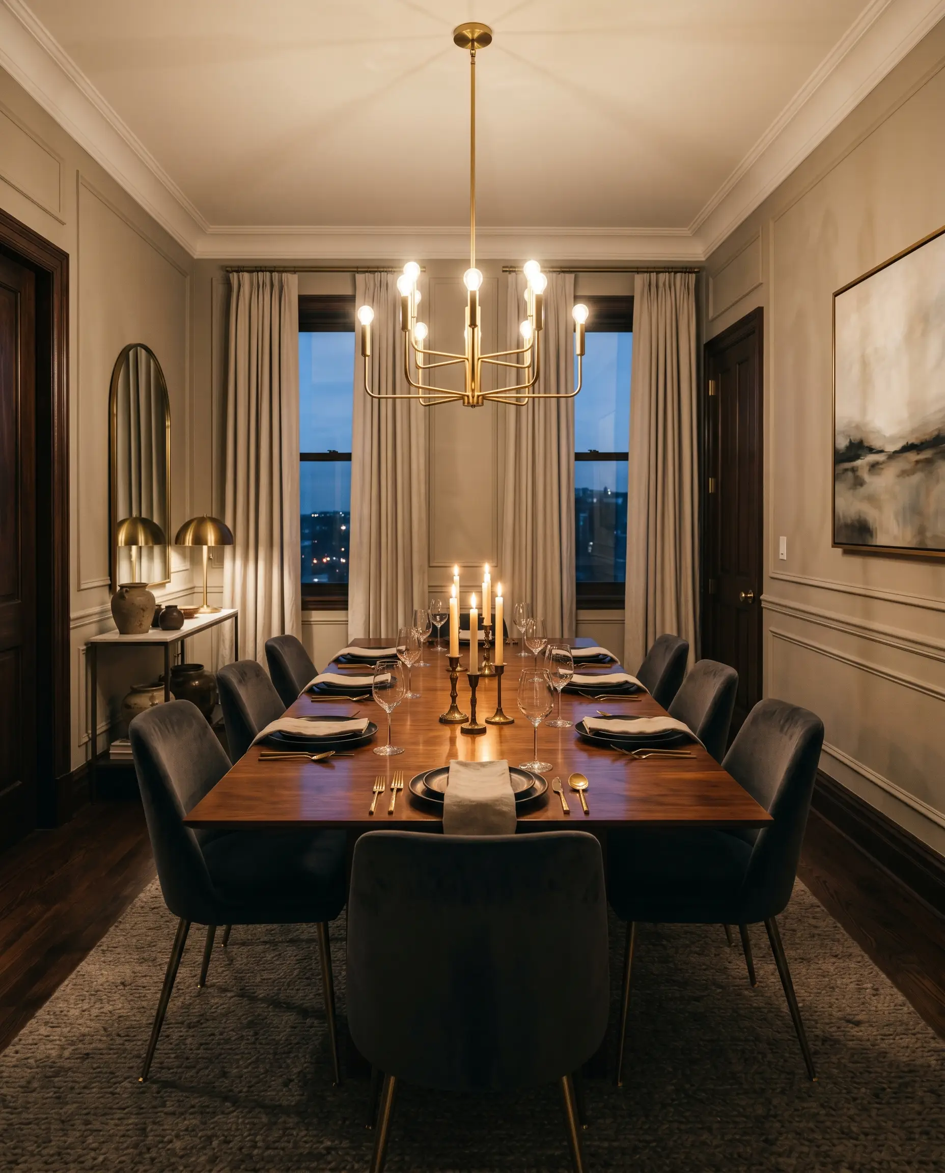
Formal Dining Environments
This shade is engineered for spaces that come alive after dark. In a formal dining setting, the rich depth of the taupe creates a dramatic, moody backdrop for evening entertaining.
Because the color absorbs so much light, it practically begs for reflective metallic accents and warm candlelight. The key here is manipulating the sheen; using an eggshell or satin finish on the walls will help bounce ambient light around the room, keeping the atmosphere dynamic rather than dead.
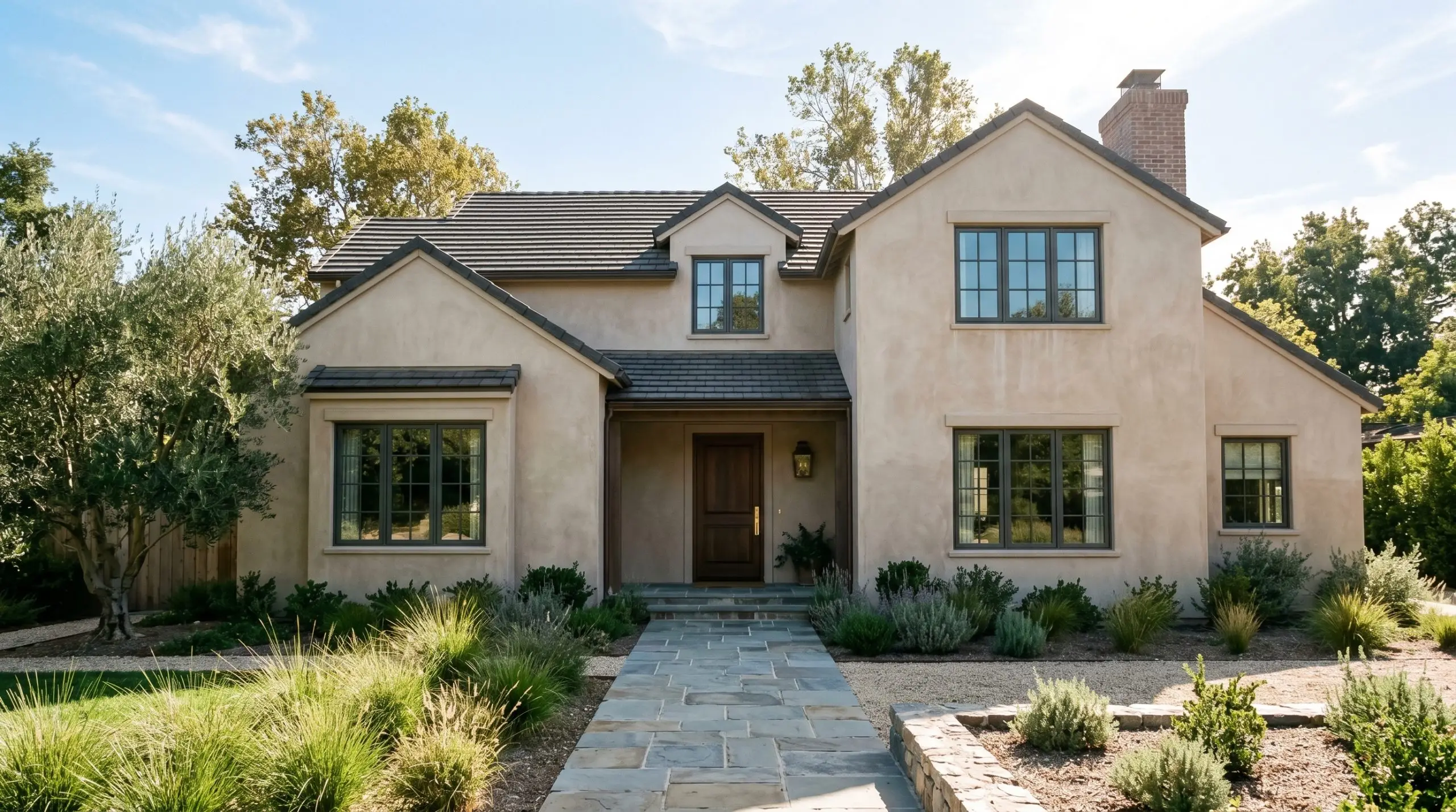
Exterior Facades & Stucco
When taken outside, the sheer volume of direct sunlight completely alters the paint’s perceived depth. The harsh UV light washes out the darkness, making the 30.99 LRV read much lighter and softer than it does indoors.
It serves as a phenomenal, sophisticated field color for transitional or historic architecture. However, you must carefully evaluate your regional lighting; in heavily overcast climates, the violet undertone will be far more prominent on the exterior than in sun-drenched southern regions.
Signature Design Ideas for Benjamin Moore Weimaraner
Moving beyond broad wall applications, this paint truly excels when used as a deliberate architectural tool. Its specific depth and undertones make it perfect for manipulating spatial geometry.
Color-Drenched Millwork & Built-Ins
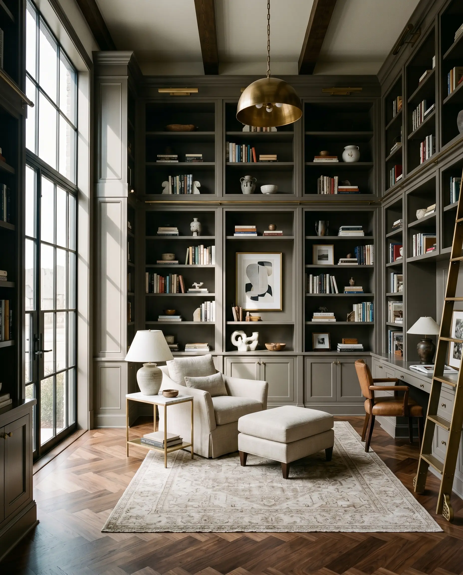
When applied to extensive floor-to-ceiling cabinetry or library shelving, this shade transforms basic carpentry into high-end, bespoke furniture. The trick is to use a high-quality satin or semi-gloss finish.
The increased sheen catches the light on the hard edges of the millwork, highlighting the architectural details while the recessed areas fall into a deep, rich shadow. This application grounds the room without requiring you to commit to dark walls.
The High-Contrast Wainscoting Frame
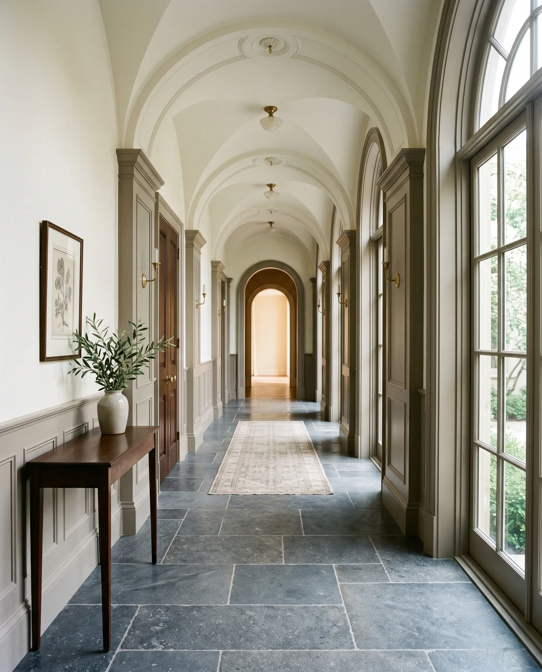
If you want to utilize the color’s depth without shrinking the perceived height of a room, apply it exclusively to the lower third of the architecture. Painting heavy wainscoting, beadboard, and baseboards in this rich taupe anchors the room’s geometry.
By pairing it with a stark, high-LRV white on the upper walls and ceiling, you force the eye upward. This spatial illusion makes standard ceilings feel significantly taller while keeping the room’s foundation feeling heavy and historically rooted.
Limewash-Effect Fireplace Surrounds
This color’s earthy nature makes it an incredible candidate for heavily textured, matte applications like Roman clay or limewash techniques. When applied to a central architectural feature like a fireplace surround, the varied texture breaks up the color’s density.
The light hits the high points of the plaster, revealing the warm brown, while the low points shadow into the cooler violet-gray. It creates a monolithic, organic focal point that feels ancient yet entirely modern.
Do not attempt to paint a standard, flat 8-foot ceiling with this color. The 30.99 LRV will visually crush the room downward, making the space feel like a descending cave unless counterbalanced by massive skylights.
The Failure State
The Pairings & Accents Guide
A paint color never exists in a vacuum. The success of this earthy neutral relies entirely on the tactile materials and coordinating colors you place next to it.
Trim & Baseboard Combinations
Because of the complex undertone, your trim color must be chosen with absolute precision.
Architectural Materials (Tactile Pairings)
To guarantee a flawless design execution, you must pair this paint with materials that respect its undertones.
Coordinating Colors
When building a multi-room palette, use these proven companions to guide your transitions.
Curated Mood Boards
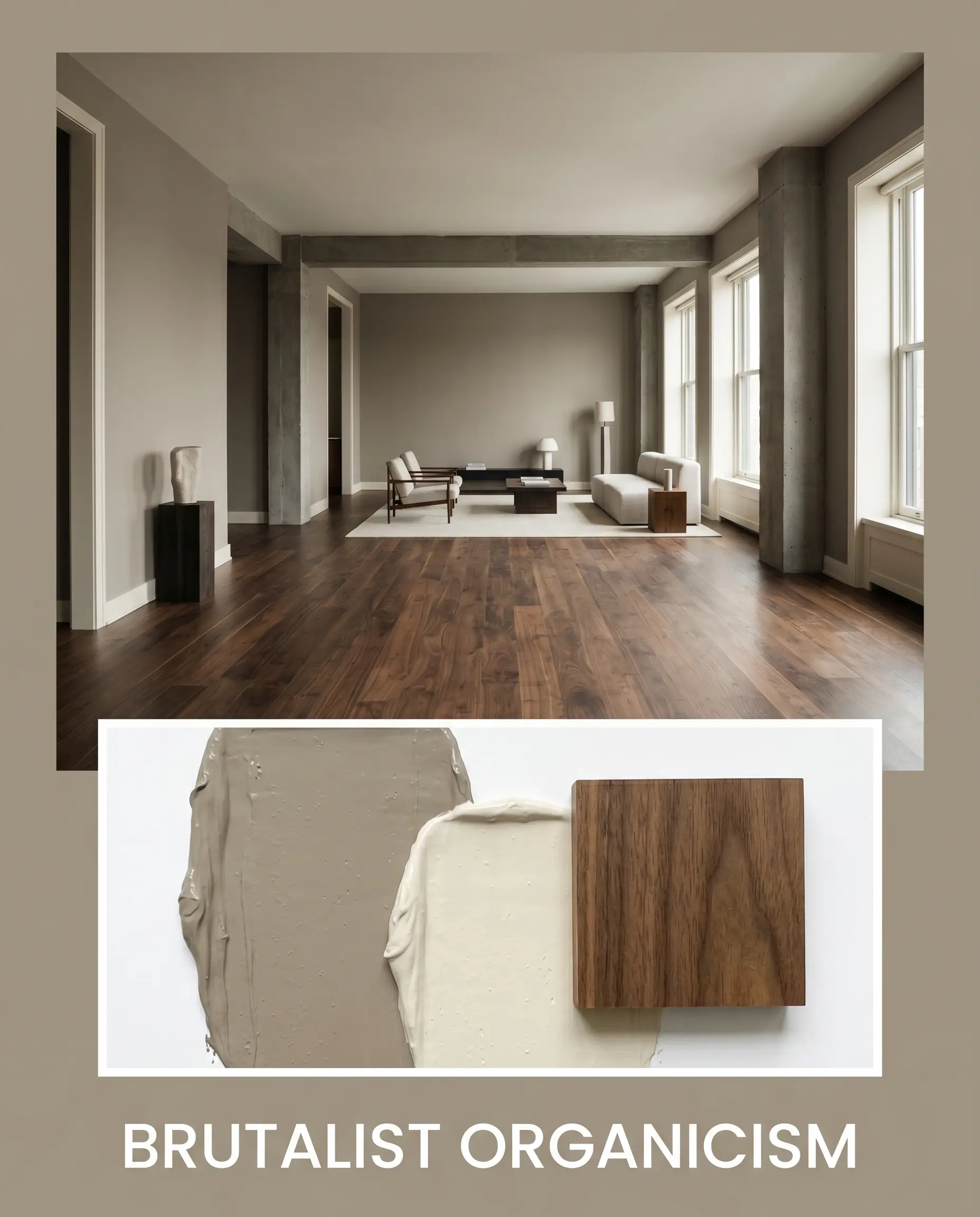
Brutalist Organicism: This atmospheric mood relies on the tension between raw, matte textures and profound color depth. By combining the heavy taupe walls with chalky Slipper Satin trim and expansive Smoked European Walnut flooring, the palette feels grounded and ancient. The absence of high-gloss finishes or bright whites allows the violet micro-undertone to read as a natural shadow, creating an environment that is deeply calming and structurally severe.
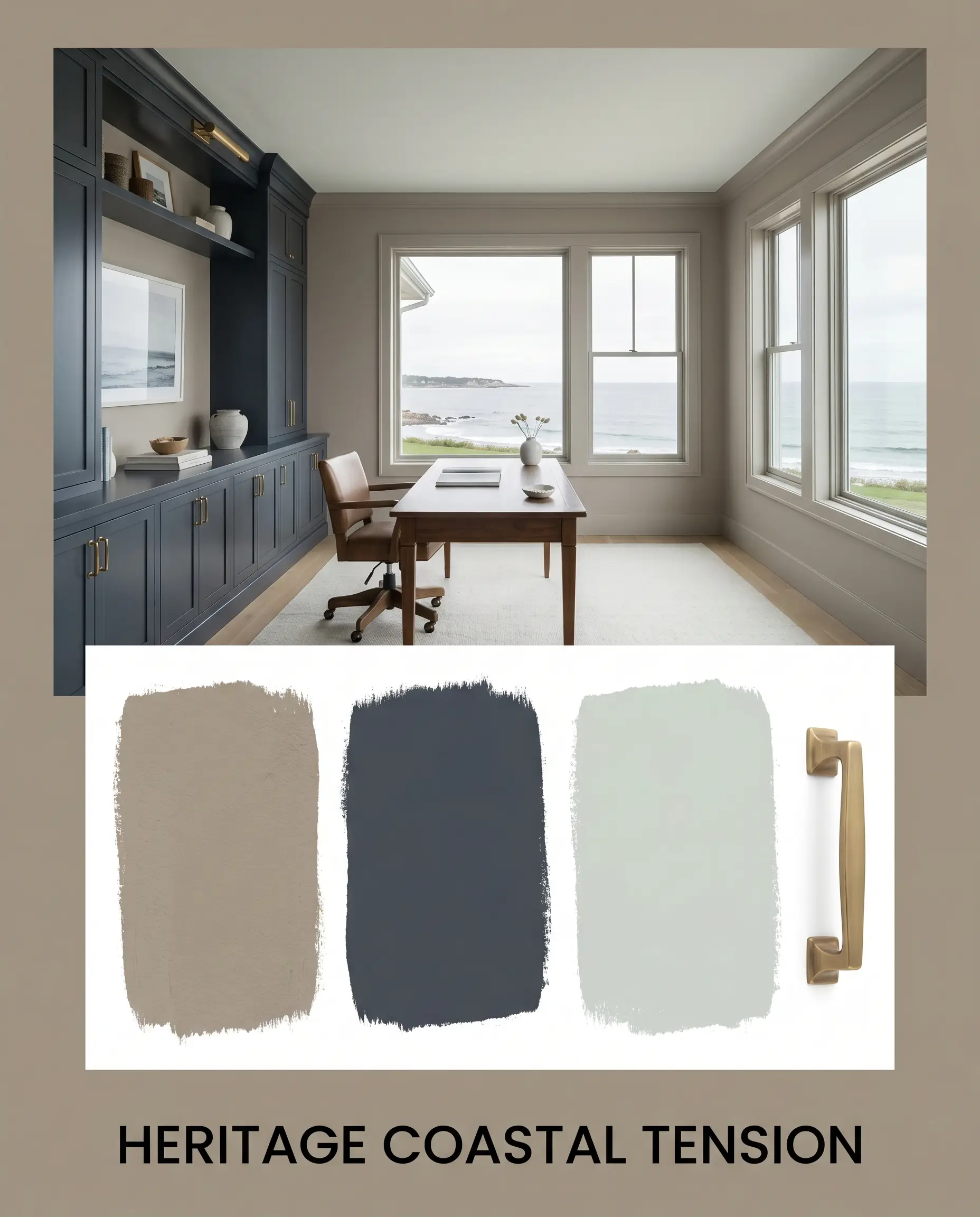
Heritage Coastal Tension: Moving away from predictable beach palettes, this aesthetic uses color theory to evoke a stormy, sophisticated shoreline. The interplay between the earthy taupe, the crisp green-blue of Sea Salt, and the anchoring weight of Hale Navy creates a dynamic visual rhythm. Unlacquered Aged Brass hardware cuts through the cool tones, injecting a necessary flash of historic warmth that prevents the palette from feeling cold or institutional.
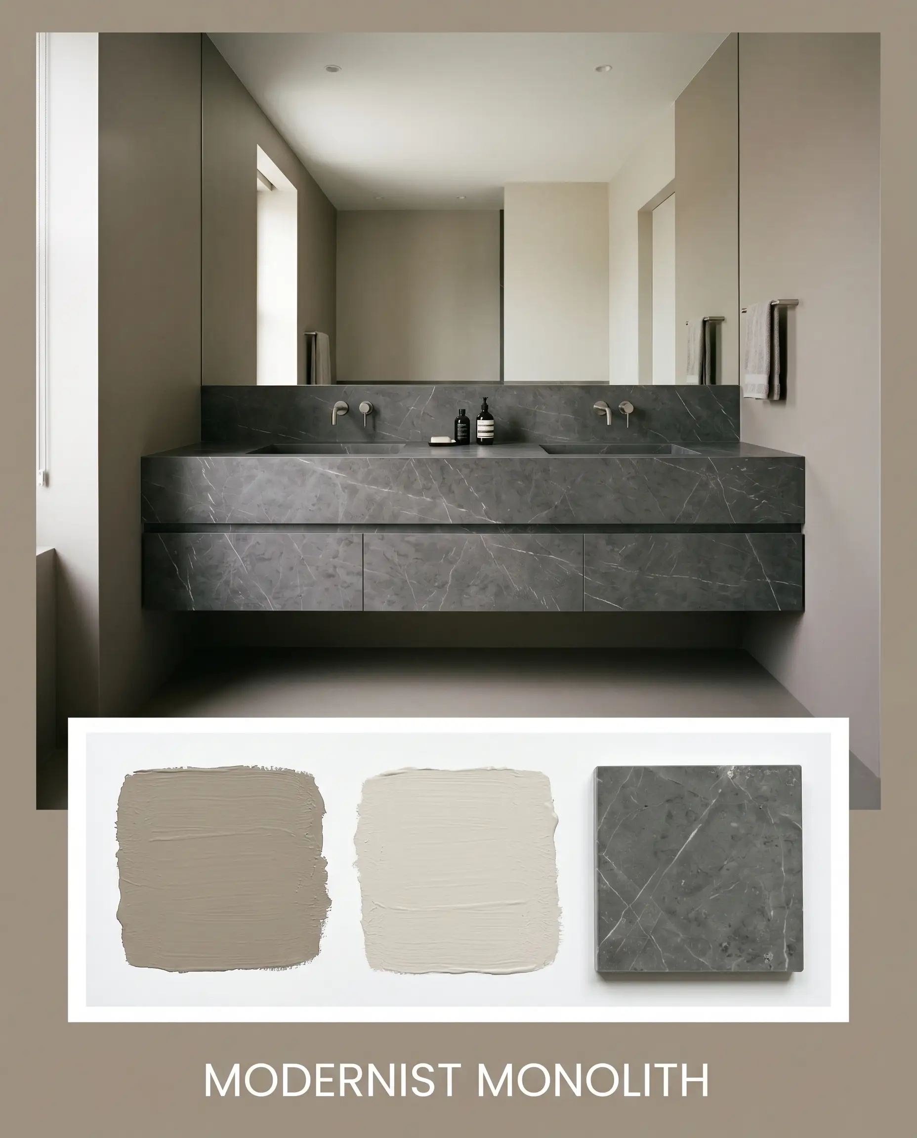
Modernist Monolith: Designed for absolute seamlessness, this monochromatic approach minimizes visual clutter. By utilizing Balboa Mist as a secondary field color and incorporating Honed Pietra Grigio Marble, the palette relies on subtle shifts in LRV rather than jarring color changes. The result is a highly tailored, quiet atmosphere where the architecture itself takes center stage, supported by a continuous flow of warm, stony neutrals.
Head-to-Head Comparisons
When selecting a premium neutral, you must evaluate how it stacks up against its closest market rivals.
Benjamin Moore Weimaraner vs. Benjamin Moore Pashmina
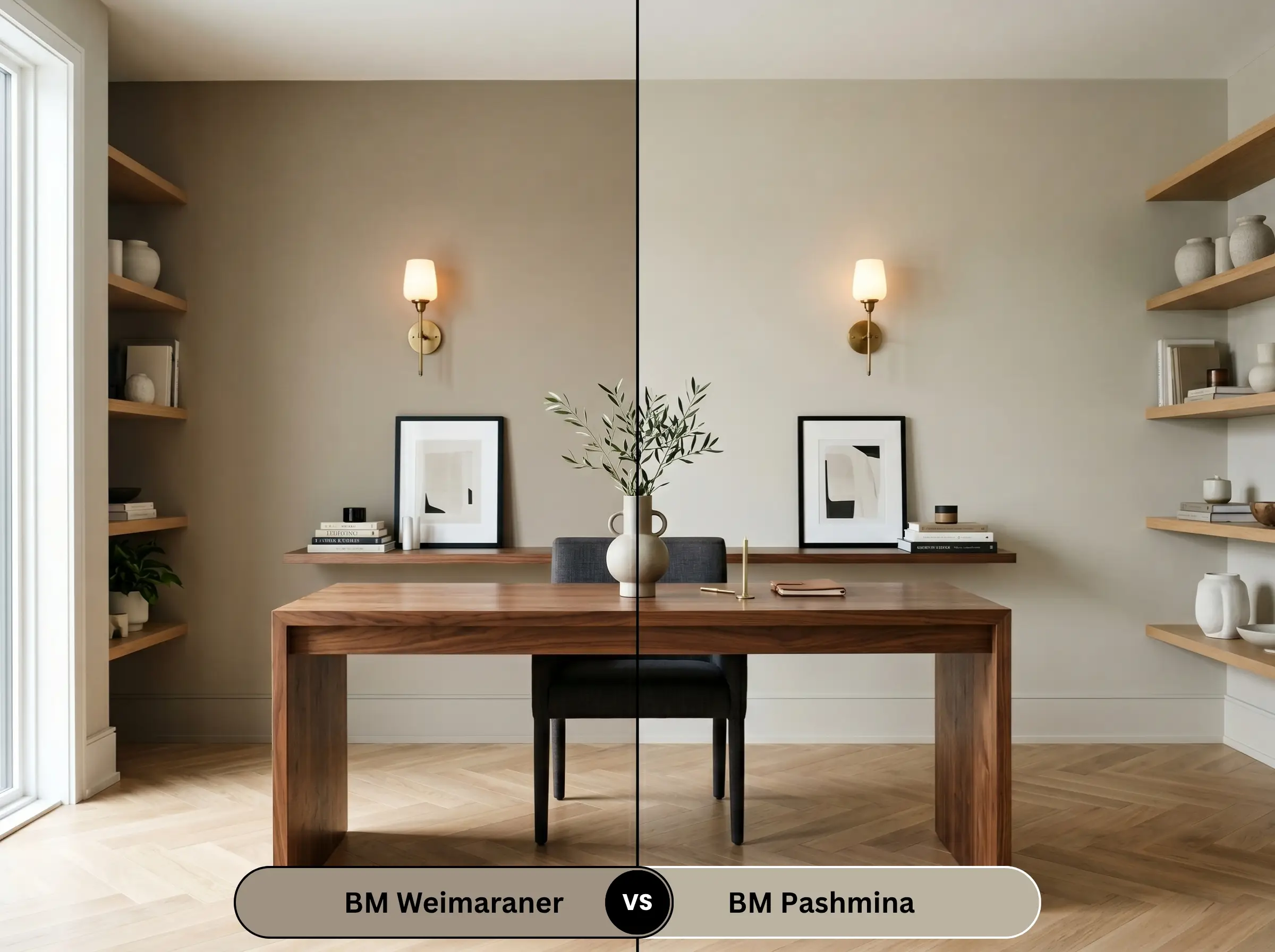
Pashmina (AF-100) is the lighter, slightly more agreeable sibling. While both belong to the Affinity Collection, Pashmina has a higher LRV (43.62) and leans slightly greener in its undertone. If your room lacks abundant natural light, Pashmina is the safer choice, but it lacks the dramatic, architectural weight of its darker counterpart.
Benjamin Moore Weimaraner vs. Sherwin-Williams Moth Wing
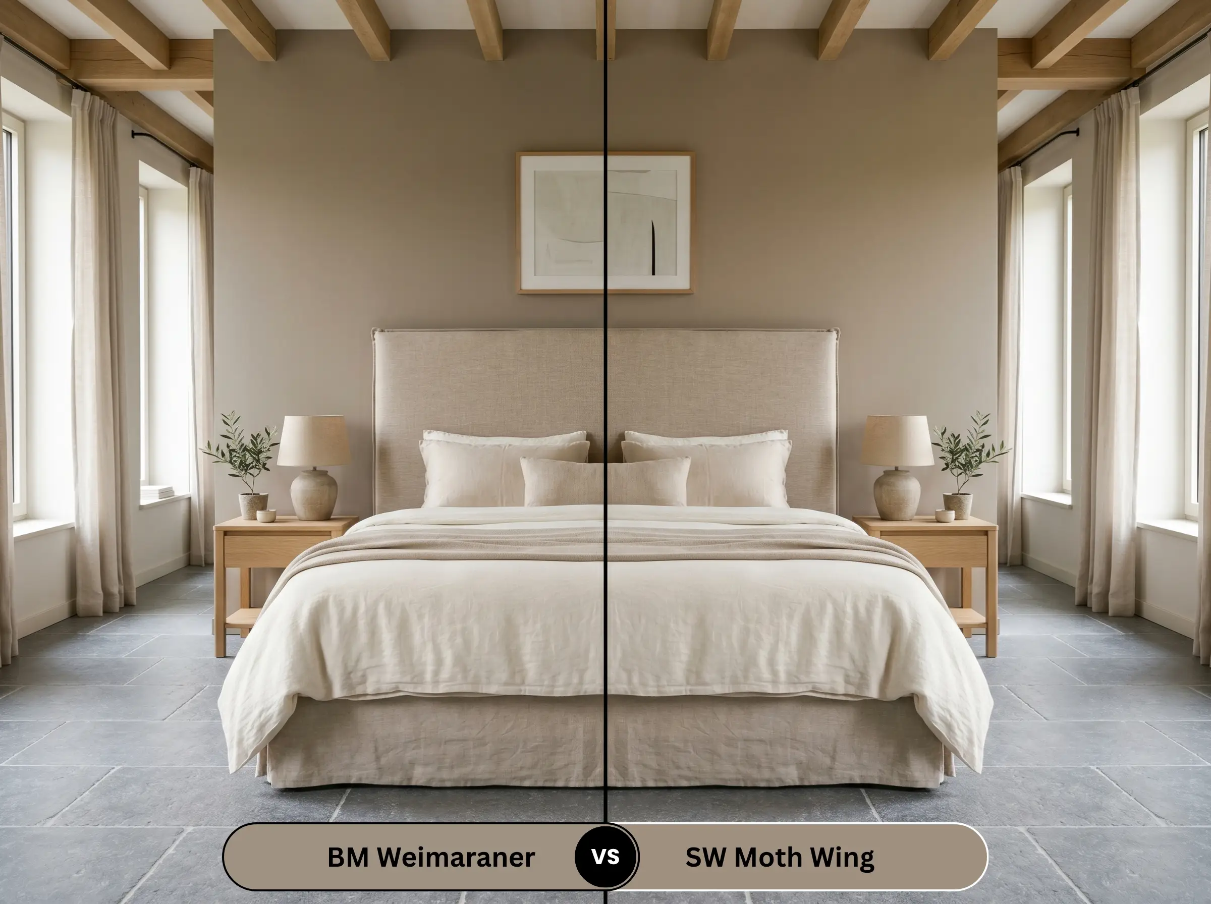
Sherwin-Williams Moth Wing (SW 9174) is a much warmer, more traditional beige-brown. It completely lacks the hidden violet micro-undertone that makes the Benjamin Moore shade so complex. If you want a straightforward, cozy brown without the risk of a purple shift in north-facing light, Moth Wing is the better candidate.
Benjamin Moore Weimaraner vs. Farrow & Ball Elephant’s Breath
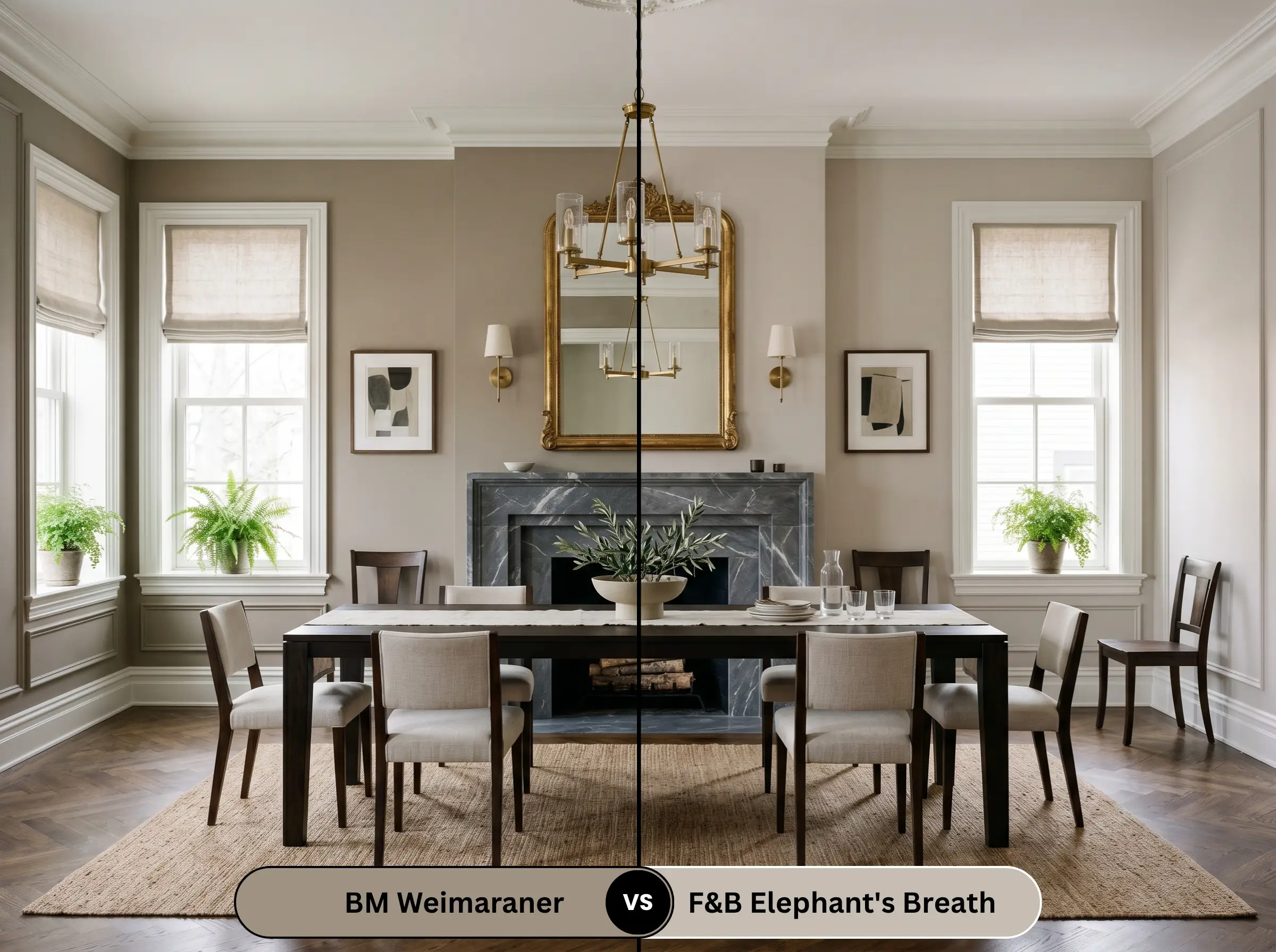
Elephant’s Breath (No. 229) is famous for its distinct magenta undertone. While both colors share a complex, shifting nature, the Farrow & Ball option is significantly lighter and reads much more like a contemporary, cool greige. The Benjamin Moore option is heavier, browner, and feels more historically rooted.
Similar Colors & Brand Equivalents
If the specific lighting constraints of this shade don’t work for your space, consider these alternatives.
Same-Brand Alternatives
Cross-Brand Matches
Practical Application & DIY Advice
Executing a flawless paint job requires more than just picking the right color; it requires contractor-level strategy.
The Dynamic Sheen Guide
Primer Strategy
Do not attempt to paint this medium-dark shade over a stark white wall without preparation. You must use a high-quality, tinted gray primer. A gray foundation reduces the number of topcoats required and ensures the deep taupe achieves its true, saturated depth without looking streaky.
Coverage & Touch-Ups
Expect to apply a minimum of two generous coats. Because of the color’s depth and the recommended flat sheen, this paint is highly susceptible to “flashing” (visible roller marks where the paint dried at different rates). You must maintain a wet edge while rolling and avoid going back over semi-dry areas.
Frequently Asked Questions
Direct sunlight aggressively washes out the paint’s depth, making the 30.99 LRV read much lighter. On exterior stucco, it transforms into a stunning, soft mushroom color, but be aware that the violet undertone may become more pronounced during overcast days.
Yes, absolutely. Because it absorbs 69% of the light, applying this color to a low-ceiling, poorly lit basement will visually crush the space, making it feel like a heavy, oppressive cave.
No. 3000K LED lighting is the ideal temperature for this shade, as it provides enough warmth to enhance the brown base without being so yellow that it turns muddy. It keeps the violet undertone perfectly hidden.
It is a phenomenal choice for high-contrast trim. Painting your baseboards, casing, and doors in this rich taupe while keeping the walls off-white creates a grounded, historically inspired architectural frame.
Final Verdict & Expert Warnings
Benjamin Moore Weimaraner is an elite, highly sophisticated color, but it is not for the faint of heart. It is the absolute perfect choice for design enthusiasts looking to create a moody, enveloping living room or a dramatic, color-drenched home office that receives abundant natural light.
However, you must respect the undertones. If your home features yellow-leaning travertine tiles, Tuscan-style granites like Santa Cecilia, or heavily orange/red brick fireplaces, you must avoid this paint entirely. The yellow and orange fixed elements will violently clash with the paint’s violet undertone, resulting in a chaotic, amateurish aesthetic. Stick to cool stones, smoked woods, and muted metals, and this earthy neutral will reward you with unparalleled elegance.