Taos Taupe 2111-40
Benjamin MooreBenjamin Moore Taos Taupe (2111-40) is a rich, medium-dark taupe with an LRV of 23.65. Sitting perfectly between warm brown and cool gray, it features a subtle violet undertone. This earthy neutral excels in well-lit living spaces and as a sophisticated exterior siding color.
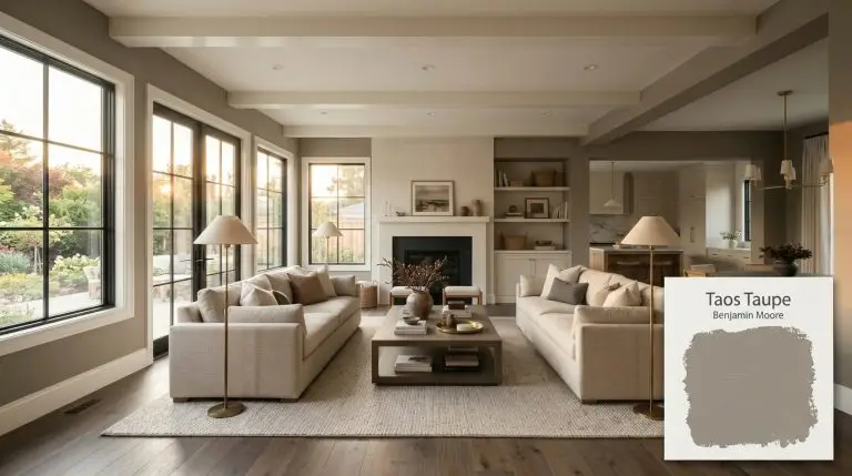
Benjamin Moore Taos Taupe: The Ultimate Grounding Neutral for Sophisticated Warmth
| Best Exposures | South, West |
|---|---|
| Best For | Living Rooms, Bedrooms, Exteriors, Cabinetry |
We are officially done with the sterile, icy grays of the last decade. But as the design world pivots back to warmth, a new danger has emerged: the dreaded return of muddy, flat 90s beige.
If you want a space that feels grounded, earthy, and undeniably high-end, you need a transitional shade that bridges the gap between brown and gray with absolute precision.
Benjamin Moore Taos Taupe (2111-40) is exactly that shade. This enveloping neutral from the brand’s Color Preview Collection is currently dominating high-end residential interiors because it delivers intense, sophisticated warmth without feeling dated.
But it is not a beginner’s paint.
To use this color successfully, you must master its hidden tonal profile and understand exactly how it manipulates the visual weight of your architecture. Here is how to harness its depth like a seasoned designer.
The Color DNA: Undertones & LRV
Every paint color has a hidden backbone that dictates how it behaves on a wall. Taos Taupe is a true, medium-dark neutral perfectly suspended between brown and gray, but its secret lies in a very specific micro-tint.
Understanding its light reflectance value is the single most important step before buying a sample.
With an LRV of 23.65, this earthy taupe absorbs a massive amount of light. It is not a bright, bouncing backdrop. It is a boundary-maker. It pulls walls inward and creates an immediate sense of intimacy, making it a brilliant tool for large spaces but a potential hazard in tight, dimly lit corridors.
You can apply wallpapers, paints, etc. on walls and see how they look in various interiors.

Lighting Effects & The Chameleon Factor
If you are terrified that using a dark taupe will turn your living room into a muddy, purple-hued dungeon, your fear is entirely valid.
Because of its specific pigment profile, this Benjamin Moore shade is a notorious chameleon. Its violet notes will flash aggressively if you place it in the wrong lighting environment. You must control the light to control the mood.
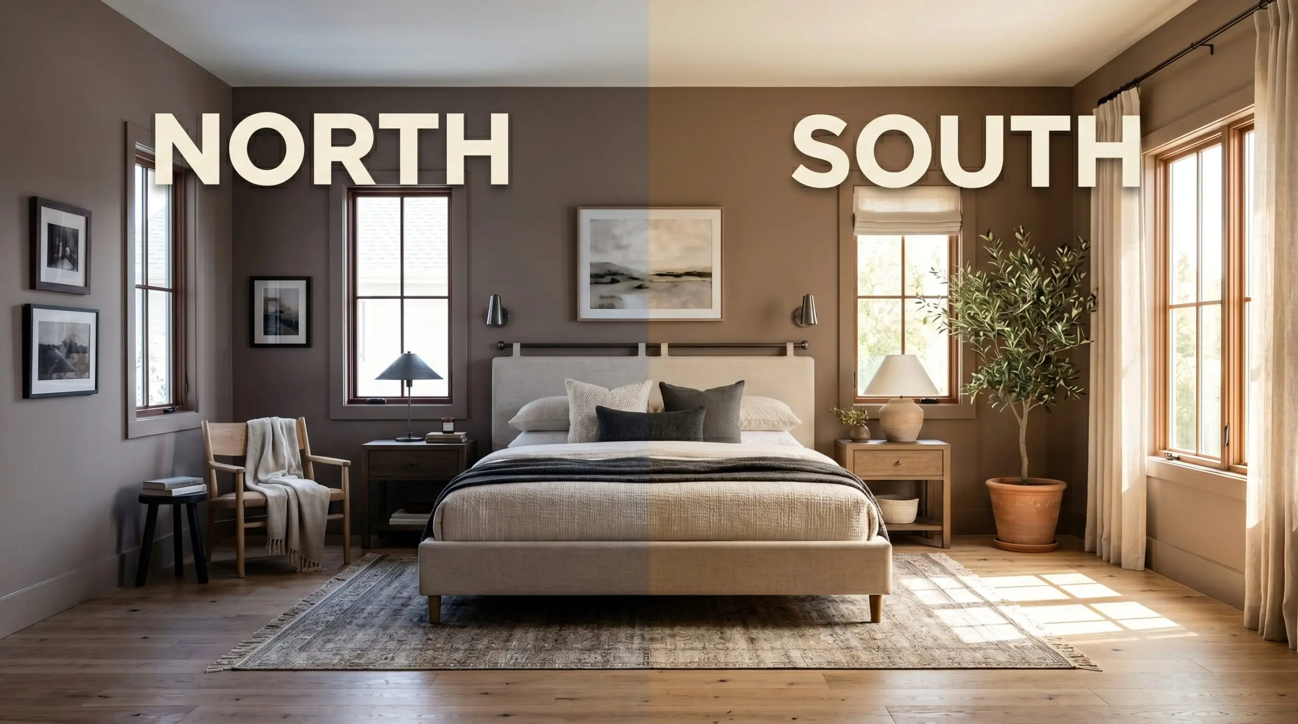
Never judge this color at noon. You must paint a large sample board and observe the color temperature shift specifically during the golden hour, as this is when the latent purple notes are most likely to reveal themselves.
The Undertone Trap
Popular Room Applications
This is not a “paint the whole house” neutral. Its heavy light absorption demands highly intentional placement.
If you attempt to force this shade into a small, windowless basement with low ceilings, it will fail catastrophically and make the architecture feel claustrophobic. But when given room to breathe, it transforms standard rooms into tailored, high-end sanctuaries.
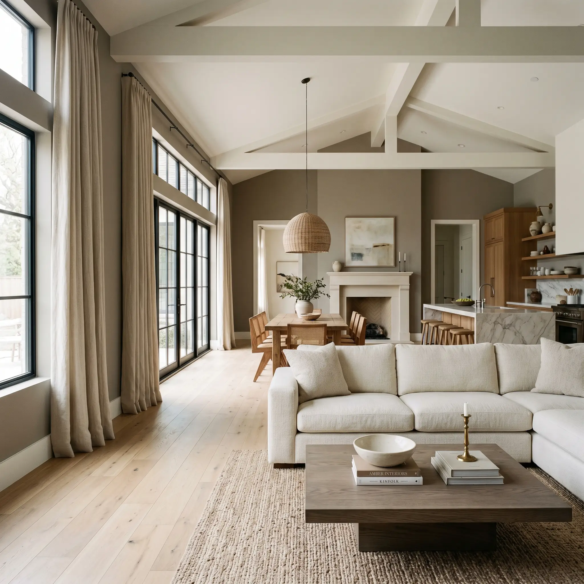
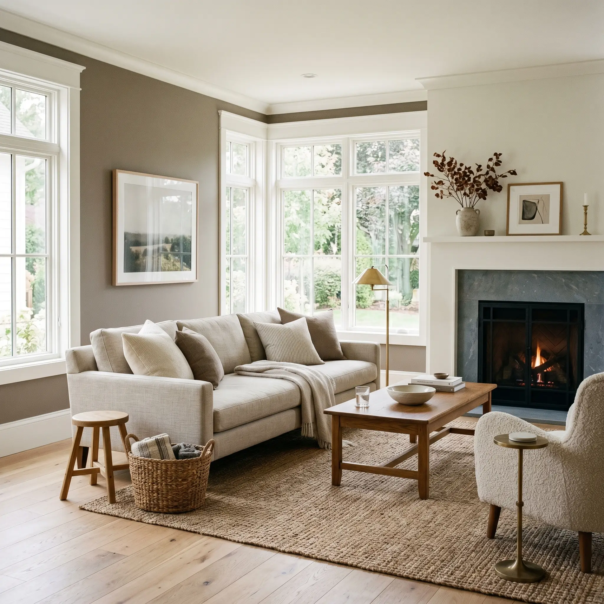
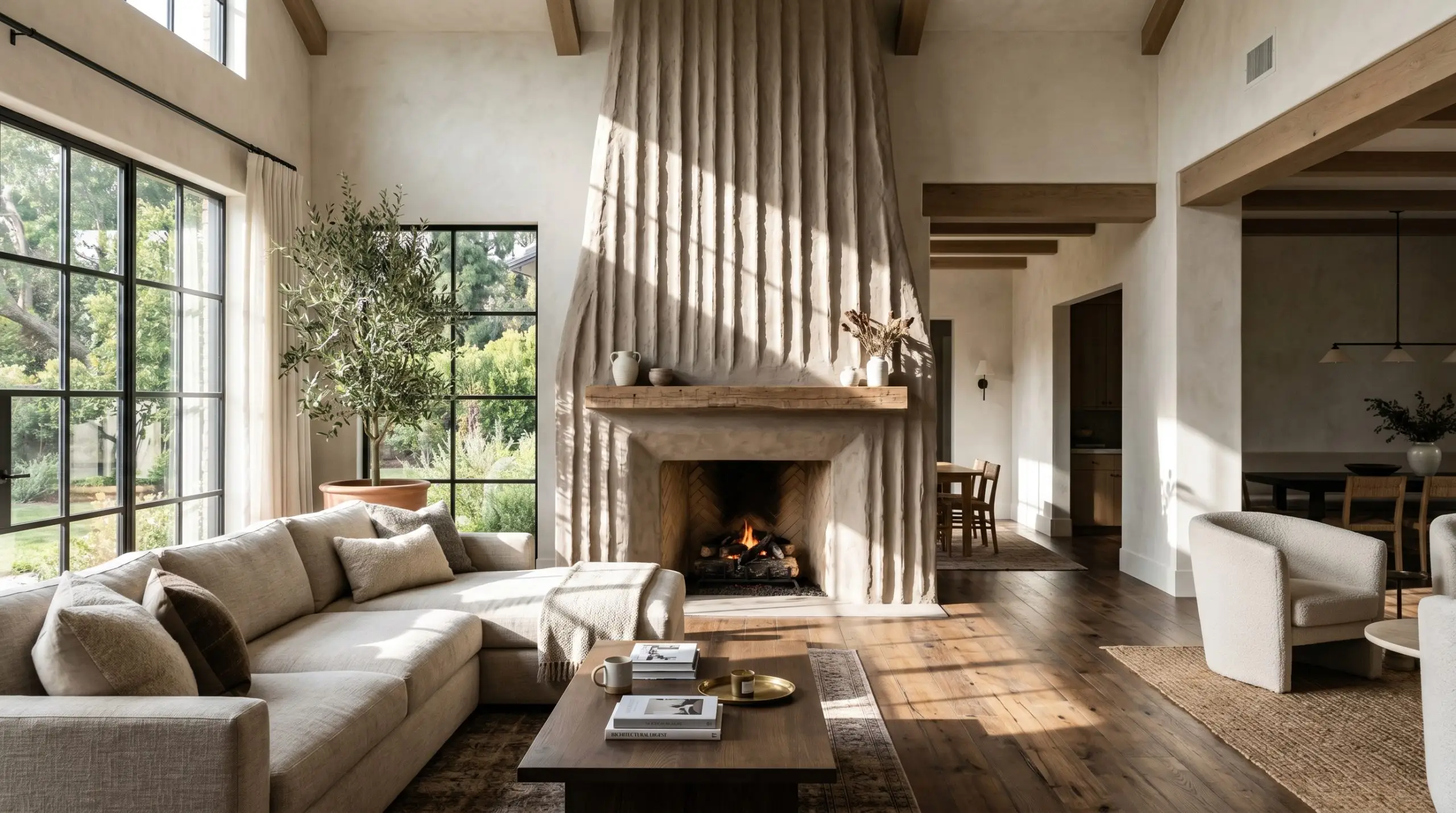
Living Spaces & Great Rooms
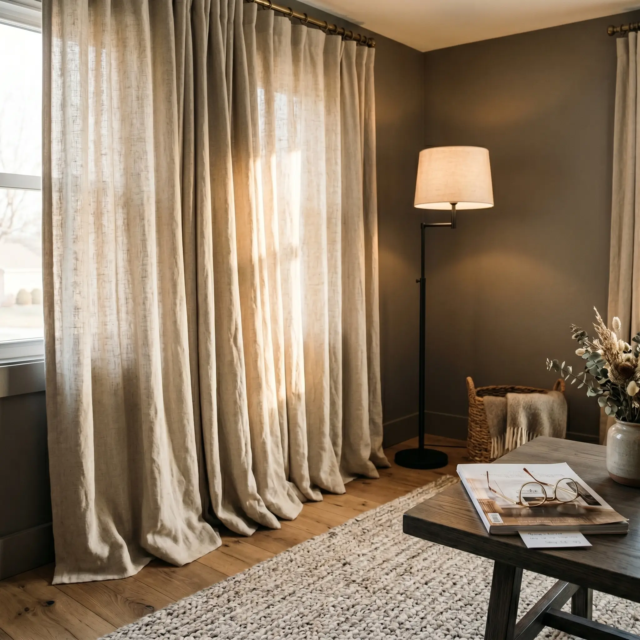
In expansive, open-concept living areas, stark white walls often feel cavernous and unmooring. Using this rich shade grounds the floating furniture arrangements. It visually lowers soaring ceilings and wraps the room in a tailored, quiet luxury. Pair it with massive, light-filtering linen drapery to balance the visual weight of the walls with soft, airy textures.
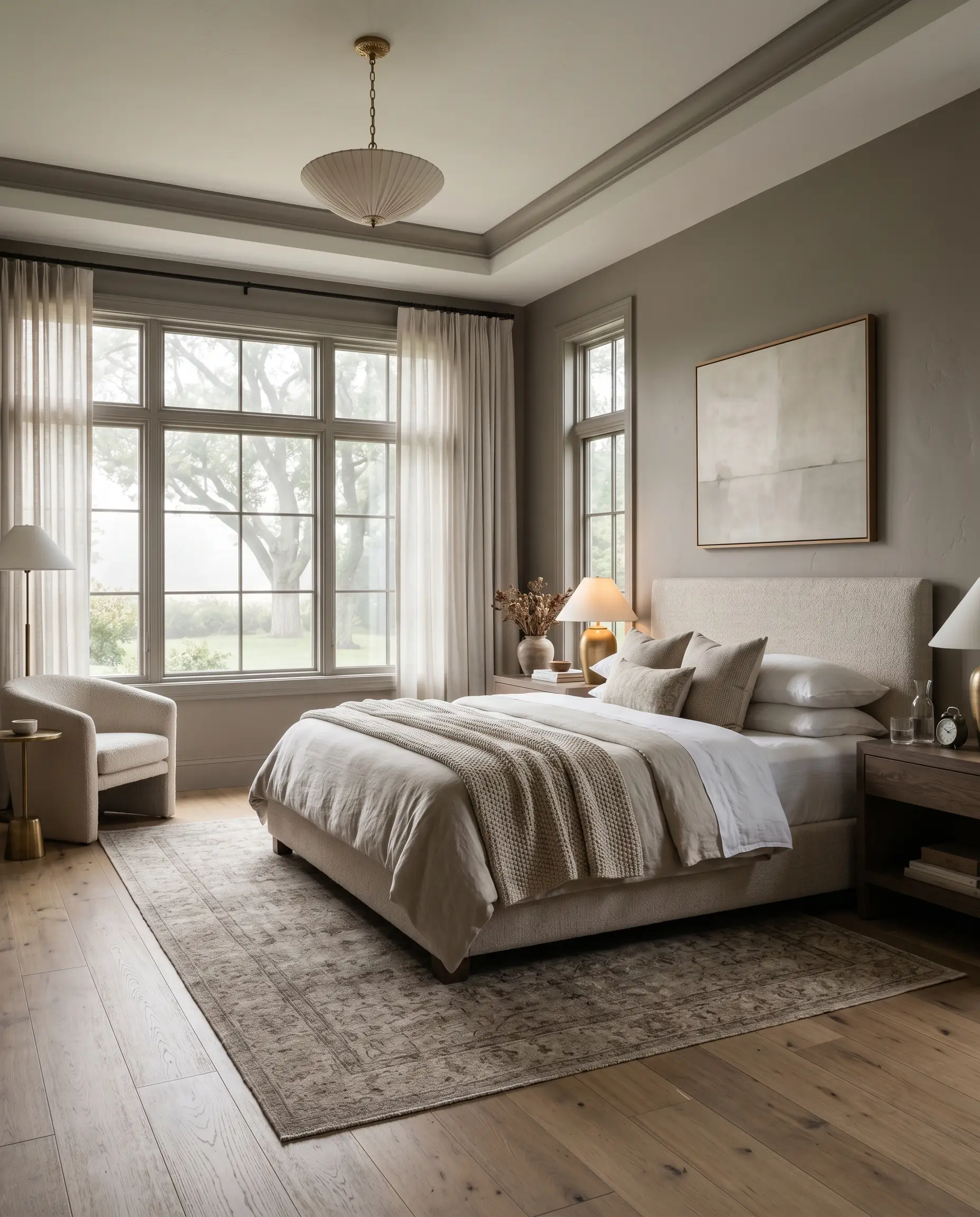
Primary Suites & Guest Bedrooms
This hue thrives in spaces designed for rest and decompression. The light-absorbing depth naturally triggers a psychological sense of winding down. To maximize this effect, run the color continuously over the baseboards and window casings to eliminate high-contrast lines, allowing the eye to rest completely.
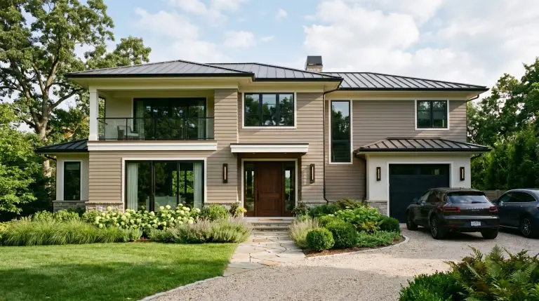
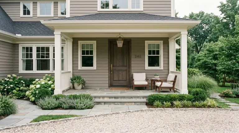
Exterior Facades
Direct sunlight aggressively washes out paint colors. What looks dark and moody on an interior wall will lighten by several shades outside. On a home’s exterior, this shade softens into a highly sophisticated, historic greige. It sits beautifully against natural landscaping and avoids the stark, blinding glare of modern white exteriors.
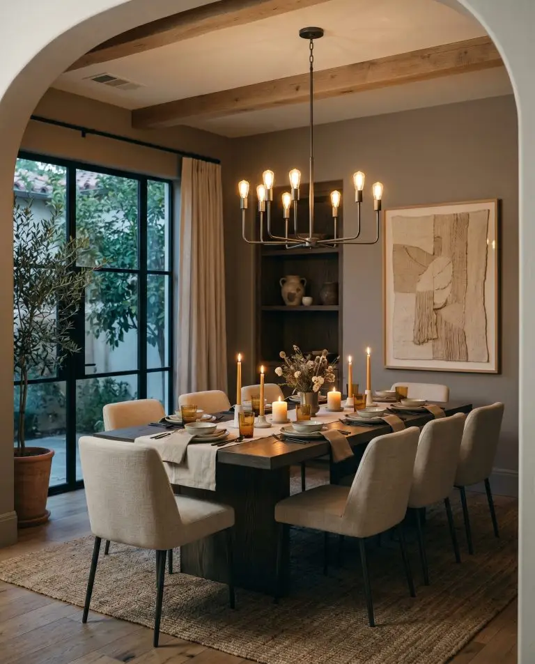
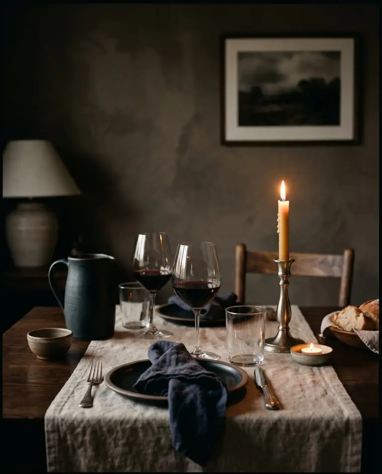
Formal Dining Enclaves
Dining spaces are the perfect laboratory for dramatic, low-LRV paints. Because these rooms are typically used in the evening, the deep gray-brown base creates a phenomenal backdrop for glowing candlelight and reflective glassware. The shadowy perimeter forces the focus onto the dining table, engineering a highly intimate, conversational atmosphere.
Signature Design Ideas for Benjamin Moore Taos Taupe
Moving beyond basic drywall, this color’s true power is unlocked when you apply it to specific structural features.
Here are the absolute best architectural use cases for this specific tonal profile.
Monolithic Wainscoting & Millwork
Why it works: Applying this shade to lower-third architectural features—like traditional wainscoting or beadboard—anchors the room perfectly.
The Illusion: By keeping the dark shade on the bottom and pairing it with a high-LRV white on the upper walls, you explicitly manipulate the room’s geometry. The heavy bottom layer grounds the space, while the stark contrast makes the ceiling feel exponentially higher than it actually is.
Color-Drenched Library Ceilings
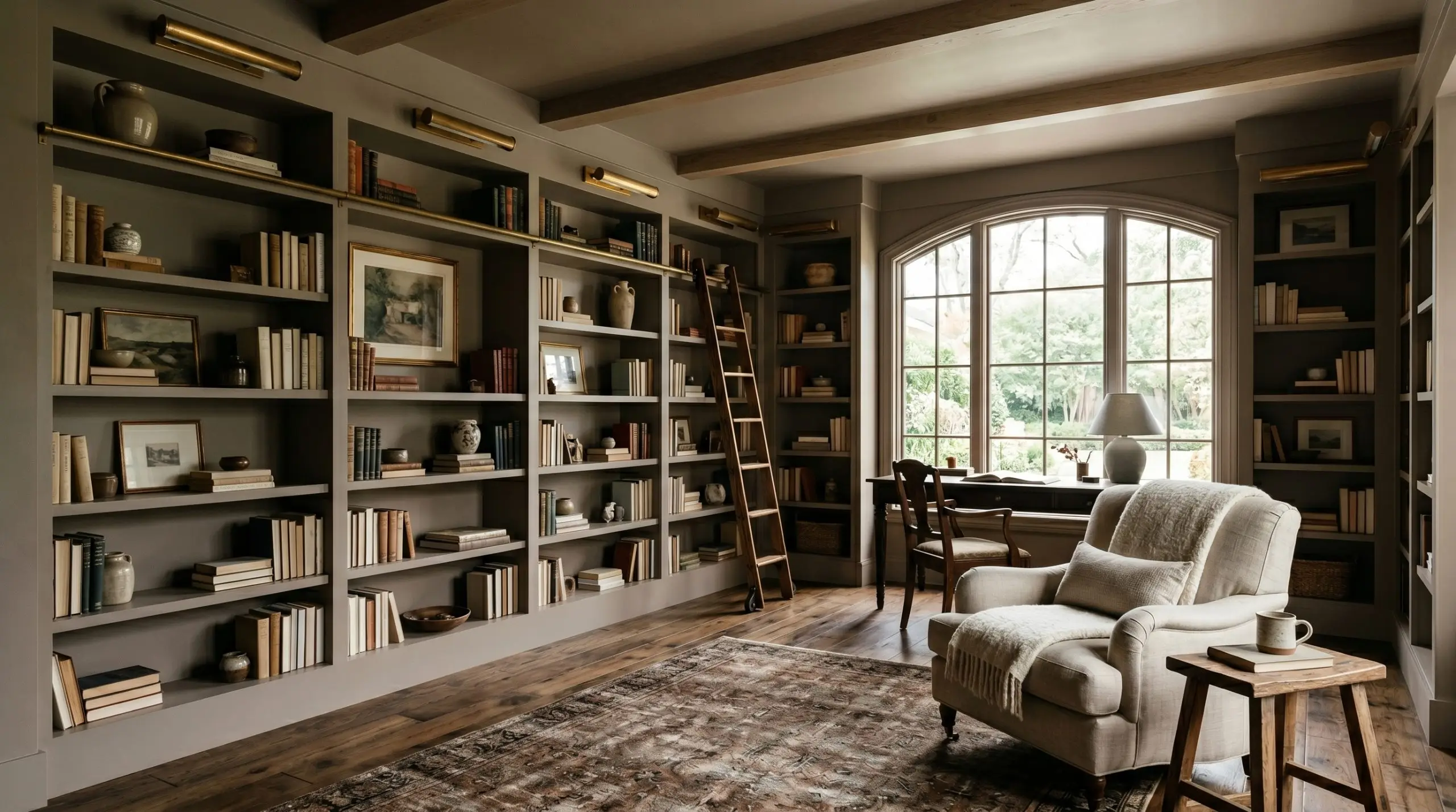
Why it works: Taking this deep neutral across all four walls and directly over the ceiling is a masterstroke for home offices or dens.
The Technique: Using a dead-flat finish on the ceiling and an eggshell finish on the walls creates a subtle textural shift while maintaining the unbroken color block. This application entirely erases the sharp corners of the room, creating a seamless, enveloping jewelry-box effect.
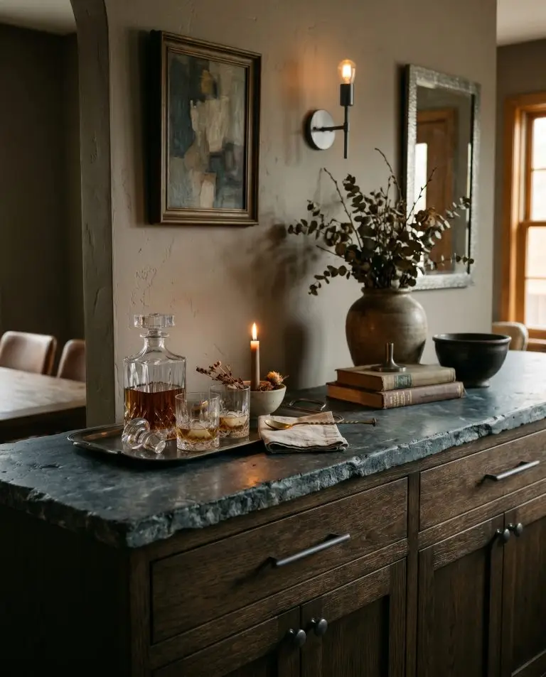
Brutalist Fireplaces & Stucco Features
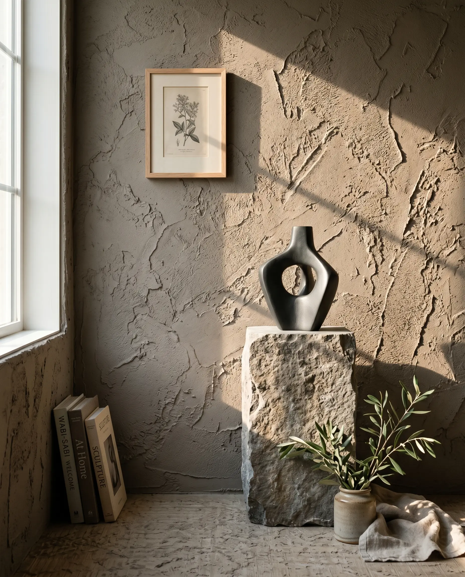
Why it works: This earthy taupe begs for texture. Applying it to a smooth, standard drywall is fine, but applying it to a rough, tactile surface is breathtaking.
The Focal Point: If you have a large, Roman clay fireplace surround or a textured stucco accent wall, the natural ridges in the material will catch the light differently. The shadows will pool in the recesses, highlighting the cooler gray notes, while the raised surfaces will catch the light and read as warm brown.
The Pairings & Accents Guide
A paint color is only as successful as the materials placed next to it. You must build a cohesive ecosystem to support this medium-dark neutral.
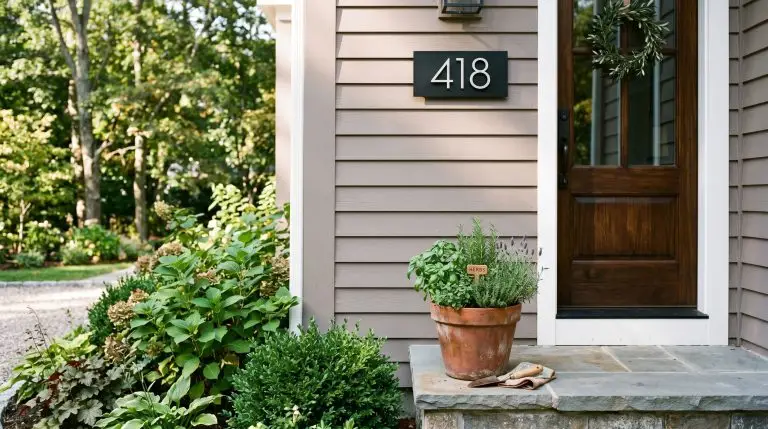
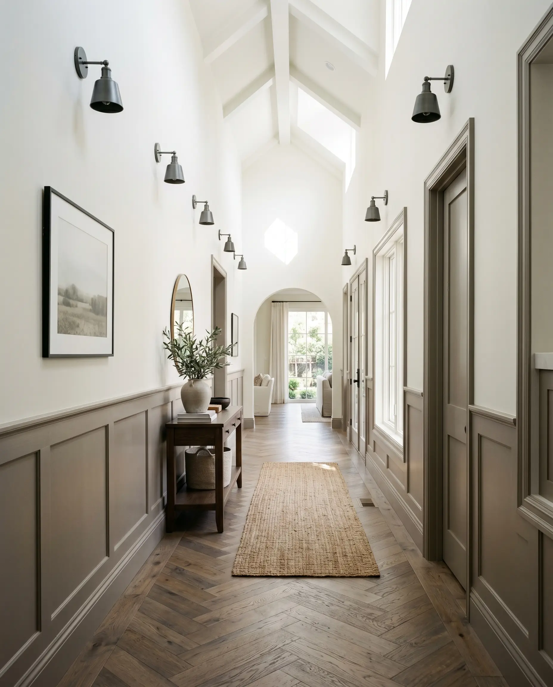
Trim & Baseboards
To keep the room feeling crisp and intentional, you need a high-contrast, warm white trim.
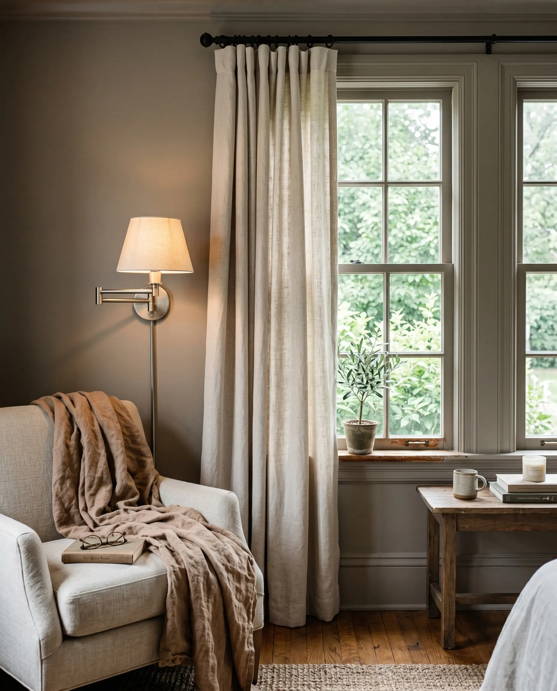
Tactile Finishes & Textiles
To balance the violet-leaning chemistry of this paint, we must introduce contrasting tactile elements that ground the space.
Coordinating Colors
Curated Mood Boards
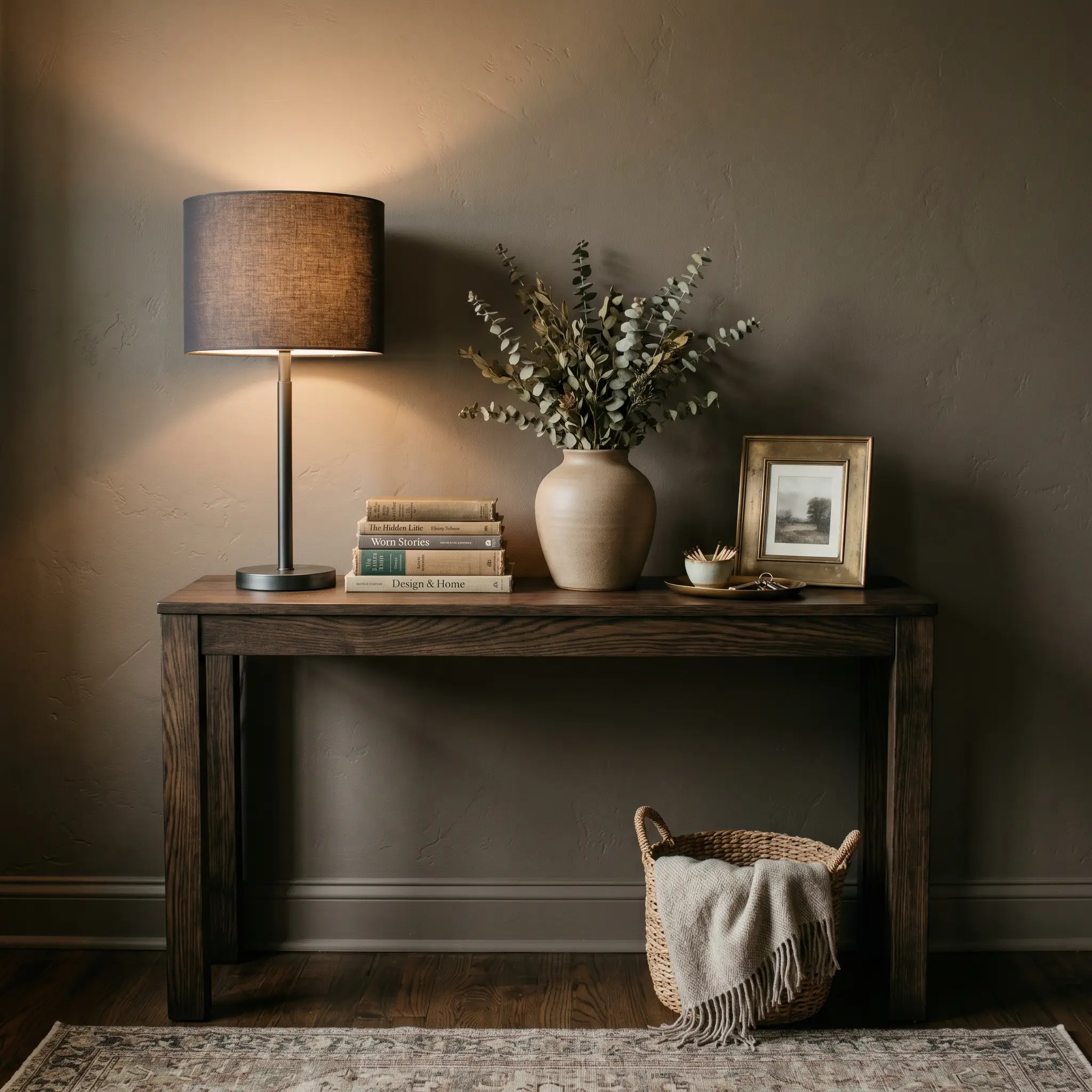
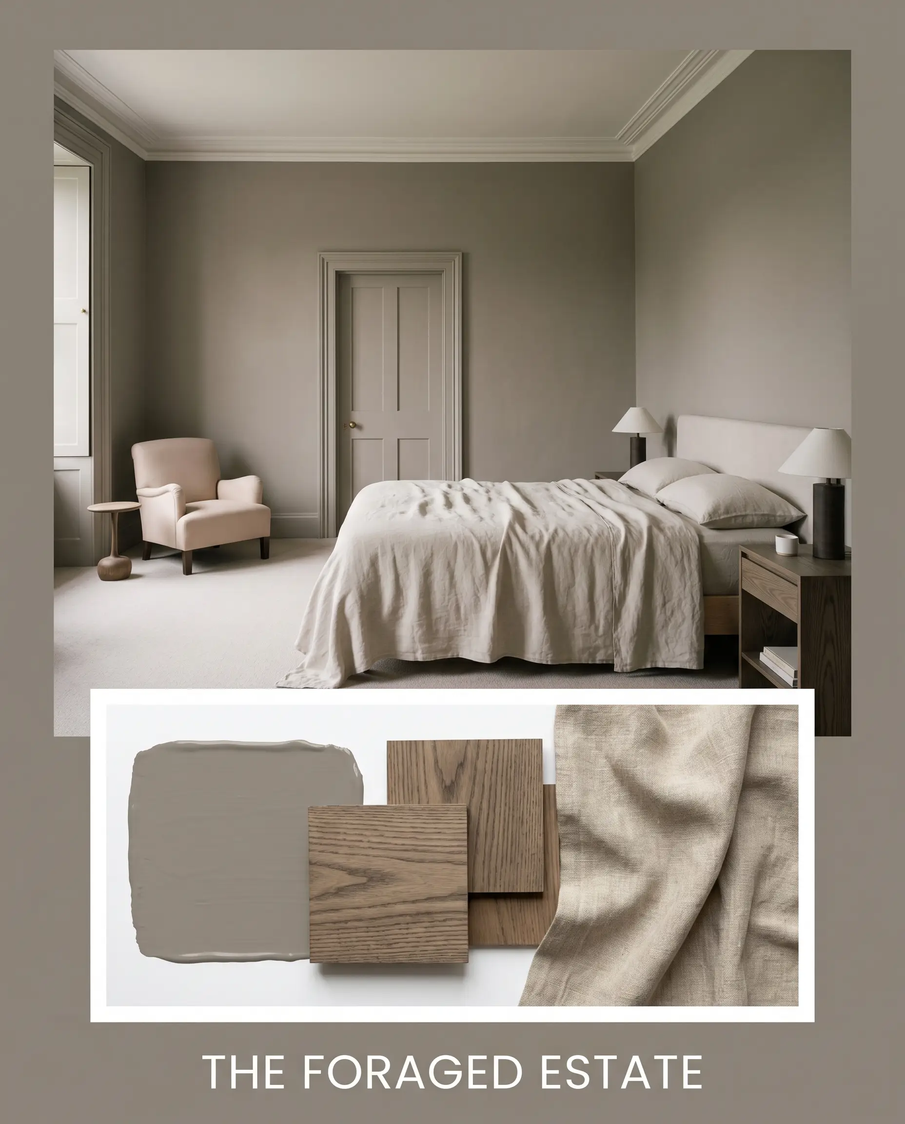
The Foraged Estate: This palette leans heavily into the paint’s earthy, grounded nature. By combining the deep taupe walls with Farrow & Ball Setting Plaster, raw Smoked Ash wood, and draped oatmeal linen, the aesthetic becomes incredibly tactile and historic. The vibe is quiet, collected, and deeply rooted in natural materials, relying on muted tones and matte finishes to create a sense of enduring calm.
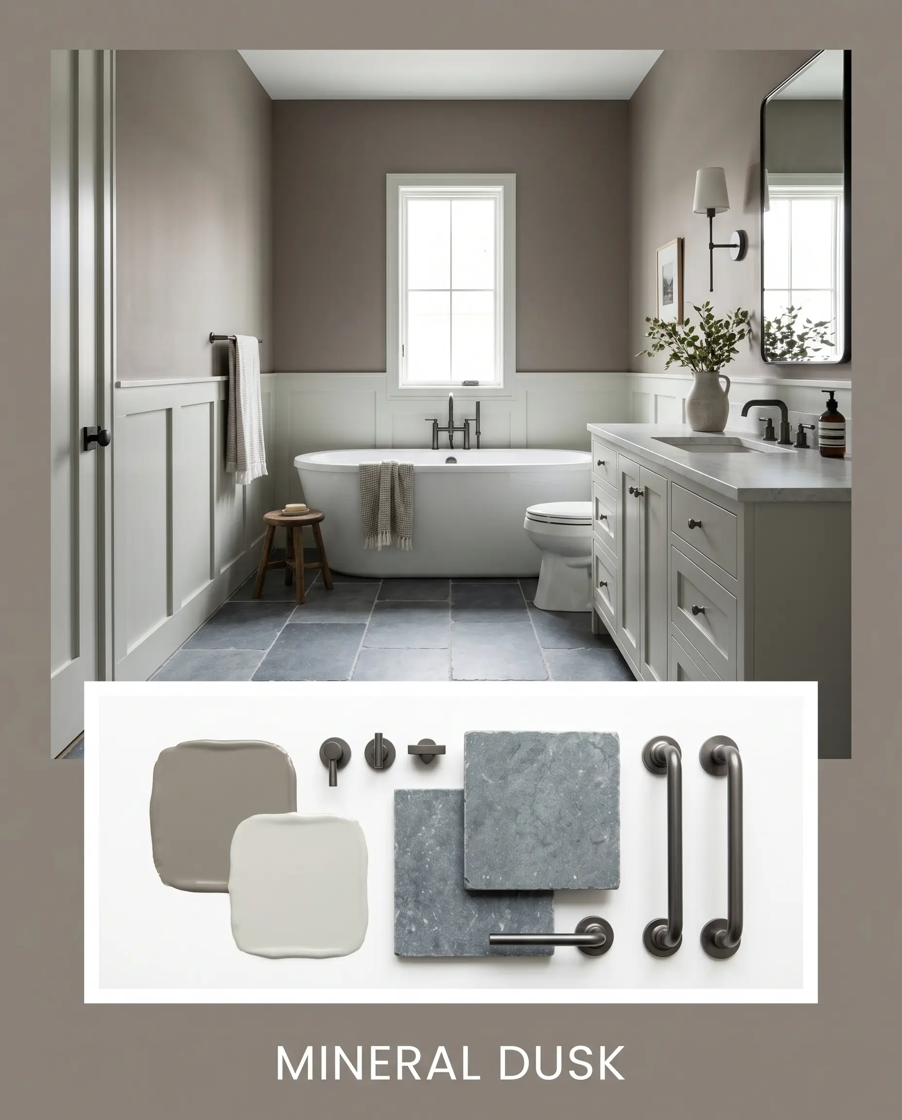
Mineral Dusk: This palette exploits the cooler, shadowy side of the paint. By pairing it with Sherwin-Williams Sea Salt, Tumbled Belgian Bluestone, and sharp gunmetal accents, the atmosphere shifts into something much moodier and more architectural. The tension between the heavy brown-gray walls and the watery, reflective stone creates a crisp, sophisticated environment that feels highly tailored and slightly industrial.
Head-to-Head Comparisons
When selecting a neutral with this much depth, microscopic differences in pigment matter. Here is how it stacks up against its biggest rivals.
Benjamin Moore Taos Taupe vs. Sherwin-Williams Poised Taupe SW 6039
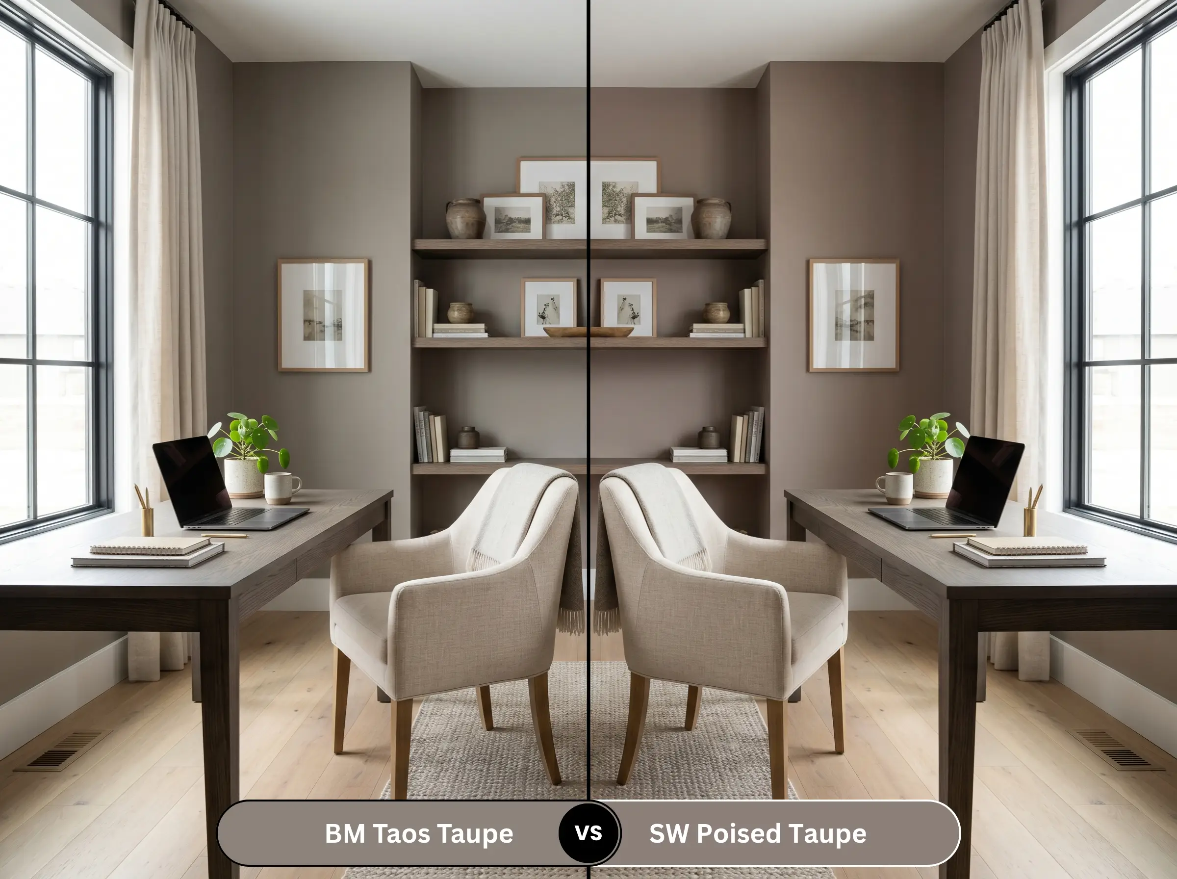
Poised Taupe shares a very similar depth, but it is significantly cooler and leans much harder into its purple and gray undertones. If you want a truly warm, earthy brown base, the Benjamin Moore option is far superior. Poised Taupe can easily read as a dusty plum in cool lighting, whereas Taos retains its muddy, organic grounding.
Benjamin Moore Taos Taupe vs. Benjamin Moore Weimaraner AF-155
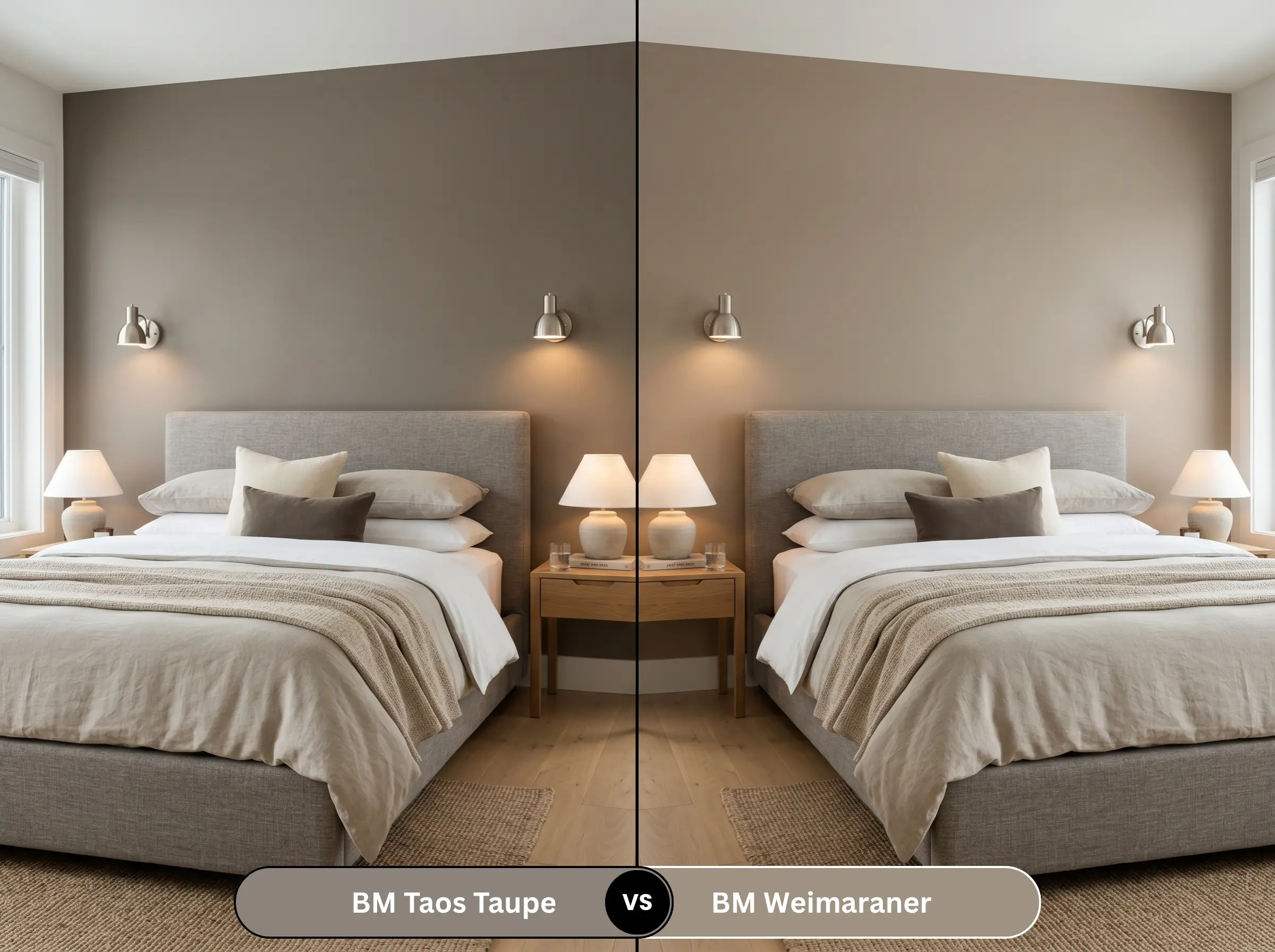
Weimaraner is a cult-favorite warm greige, but it is noticeably lighter and heavily favors a green-brown undertone rather than a violet one. If your room features a lot of warm, yellow-toned woods or brick, Weimaraner is the safer bet. However, it lacks the dramatic, shadowy depth that makes the darker taupe feel so high-end and enveloping.
Similar Colors & Brand Equivalents
If the specific lighting in your home is fighting the undertones, consider these highly targeted alternatives.
Same-Brand Alternatives
Cross-Brand Matches
Practical Application & DIY Advice
Executing a flawless paint job with a dark, light-absorbing color requires specific technical foresight.
The Dynamic Sheen Guide
Primer Strategy
Do not skip the primer with a color this deep. You must use a high-quality, tinted gray primer. Applying a dark taupe directly over a stark white wall or builder-grade beige will require three to four coats to achieve true color depth. A gray primer ensures the rich brown-gray base reaches full opacity in exactly two coats.
Coverage & Touch-Ups
Darker colors with matte finishes are notoriously unforgiving when it comes to “flashing”—the visible, shiny marks left behind by overlapping roller strokes. You must maintain a wet edge while painting.
Touch-ups on a deep taupe wall will almost always be visible if you just dab it with a brush. If a wall gets scuffed, you will likely need to re-roll the entire wall corner-to-corner to maintain a flawless finish. For high-traffic areas, be sure to read our guide on choosing the right cabinet paint and durable finishes.
Hackrea Pro-Tip
Frequently Asked Questions
Yes, it absolutely can. Because natural sunlight washes out the brown base, the latent violet notes become much more prominent outdoors. Always test a massive swatch on the exterior siding facing the street before committing.
It performs poorly if you want a bright, airy space. The low LRV will absorb all the artificial light, making the bathroom feel small and heavy. A lighter greige is a much safer, more reflective choice for windowless architecture.
It will visually lower the ceiling and pull the walls inward. If your goal is a cozy, den-like atmosphere, this is a massive benefit. If your goal is to make the room feel expansive and towering, this color will actively fight your intentions.
Satin is the absolute best choice. It provides enough durability to protect against scuffs from dining chairs, while offering a subtle, elegant sheen that catches the glow of evening lighting without looking overly glossy.
Final Verdict & Expert Warnings
Benjamin Moore Taos Taupe is a masterclass in sophisticated color design, provided you know exactly how to handle it.
It is the ultimate grounding neutral for homeowners who want a deeply cozy, high-end aesthetic that completely avoids the sterile trap of modern gray. Thanks to the brand’s Gennex Color Technology, its depth is unparalleled. It is absolutely perfect for open-concept living rooms with massive windows, moody formal dining rooms, and enveloping primary suites.
However, we must issue a strict clash warning.
If your home features yellow-toned travertine tile, Tuscan-style warm granites, heavily orange brick masonry, or cherry and mahogany flooring, you must avoid this paint entirely. The orange and yellow tones in these fixed elements will violently clash with the paint’s violet undertone, resulting in a muddy, discordant disaster. Furthermore, strictly avoid polished brass or bright yellow-gold fixtures, which will look harsh and cheap against the walls. Stick to brushed nickel, matte black, or aged antique brass, and let this stunning taupe do the heavy lifting.