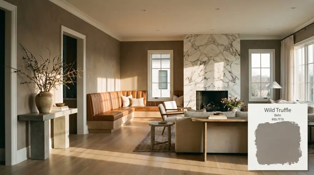
Behr Wild Truffle (HDC-NT-27B) is a medium-dark, warm taupe with an LRV of 22. Blending rich brown with a muted gray influence, it functions as a sophisticated, earthy neutral that brings grounded elegance to cabinetry, millwork, and intimate living spaces.
Will Wild Truffle clash with your room?
Paint Technical Profile
| Color ID / SKU | HDC-NT-27B |
| HEX Code | #8B7F76 |
| Light Reflectance (LRV) | 22 |
| Use | Interior, Exterior |
| Best Exposures | North, East |
| Best For | Cabinetry, Accent Walls, Cozy Studies, Exterior Trim |
Behr Wild Truffle: The Art of Crafting Grounded, Tactile Interiors
Some paints possess a rare ability to mimic the visual weight of raw, tactile materials, entirely transforming the perceived value of a standard room.
Behr Wild Truffle acts less like a traditional wall color and more like a layer of crushed velvet or aged suede draped across your architecture. By actively absorbing ambient light rather than bouncing it around, this complex shade manipulates shadows to make standard drywall feel incredibly intentional and custom-built.
Decoding the Chromatic Profile of Behr Wild Truffle: Undertones & LRV
If you are trying to determine how this color will dictate the temperature of your room, know that Behr Wild Truffle is definitively warm. It establishes a highly tactile, moody depth that immediately subdues the energy of a space. To truly harness its potential, we have to look closely at how this earthy neutral base is constructed.
Because it absorbs a significant amount of light, this shade will not visually expand the boundaries of your room. Instead, it acts as an enveloping force, pulling the walls inward slightly to create a profound sense of intimacy and quiet focus.
How Ambient Lighting Shifts This Architectural Finish
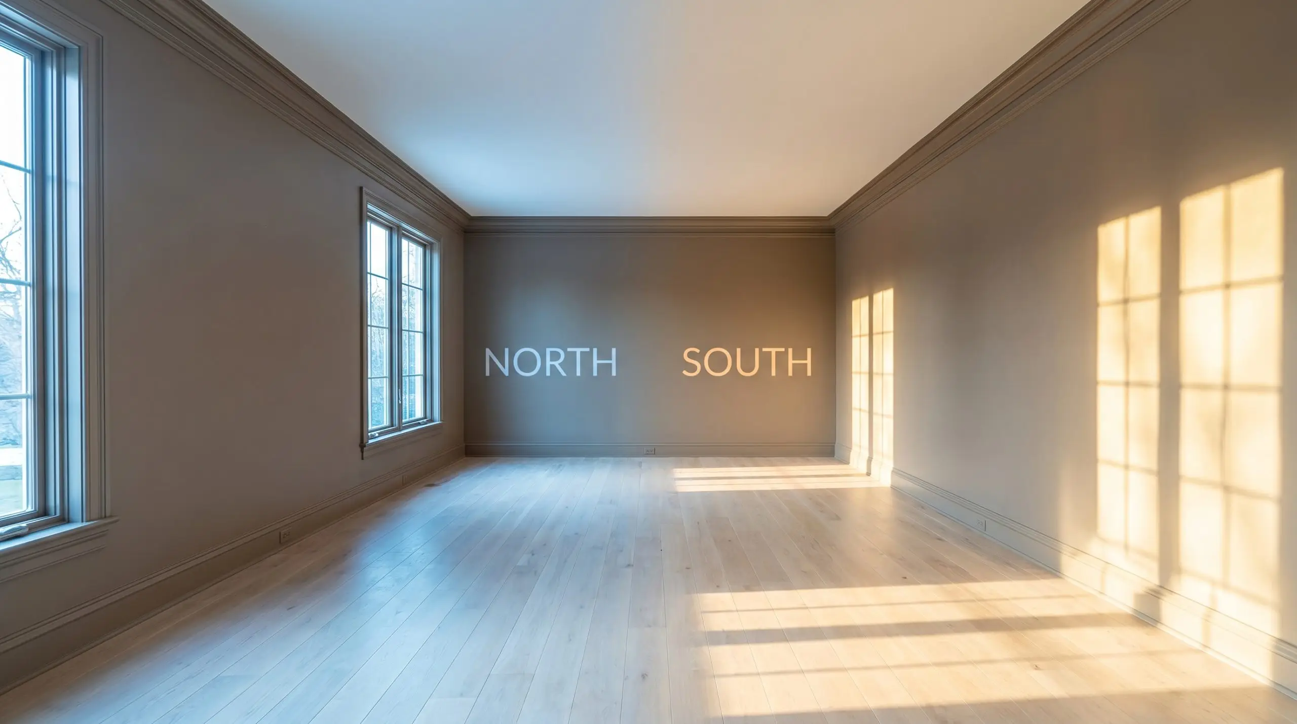
The most crucial step in interior color planning is acknowledging that a paint’s DNA is entirely at the mercy of your light bulbs and window placements. Behr’s rich taupe is highly reactive, shifting its personality depending on the temperature of the light hitting the wall.
If you apply this shade in a room dominated by cool, north-facing light and pair it with stark, cool-toned LED bulbs, you will accidentally strip away its beautiful cocoa warmth. The resulting color will pull the mauve undertones forward too aggressively, leaving you with a flat, bruised purple-gray rather than a sophisticated taupe.
Hackrea Pro-Tip (The Lighting Washout Risk)
Saturating the Home: Where to Apply This Enveloping Shade
This specific color structure brings a profound sense of calm and permanence to residential architecture. Instead of demanding attention, it lowers the visual noise of a room, allowing your furniture silhouettes and material textures to take center stage. When applying this shade, think about where you want to encourage a slower, more deliberate pace of living.
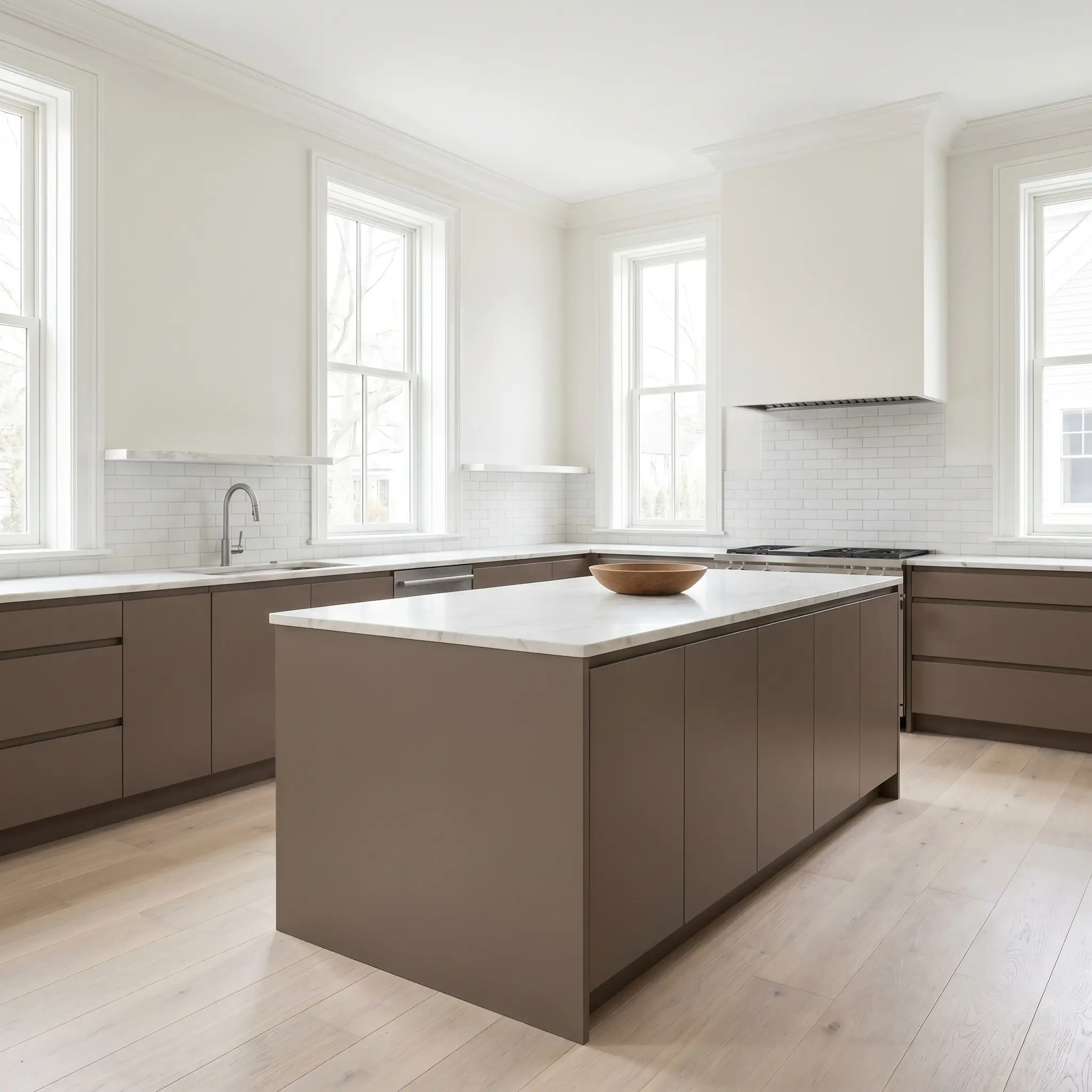
Kitchen Cabinetry & Islands
Coating standard flat-front or shaker cabinets in this warm taupe instantly gives a kitchen a bespoke, European-inspired aesthetic. The color grounds the lower half of the room beautifully, especially when contrasted against lightly veined marble countertops or simple, matte white subway tile. It hides everyday scuffs effortlessly while providing a much softer alternative to harsh black or stark navy cabinetry.
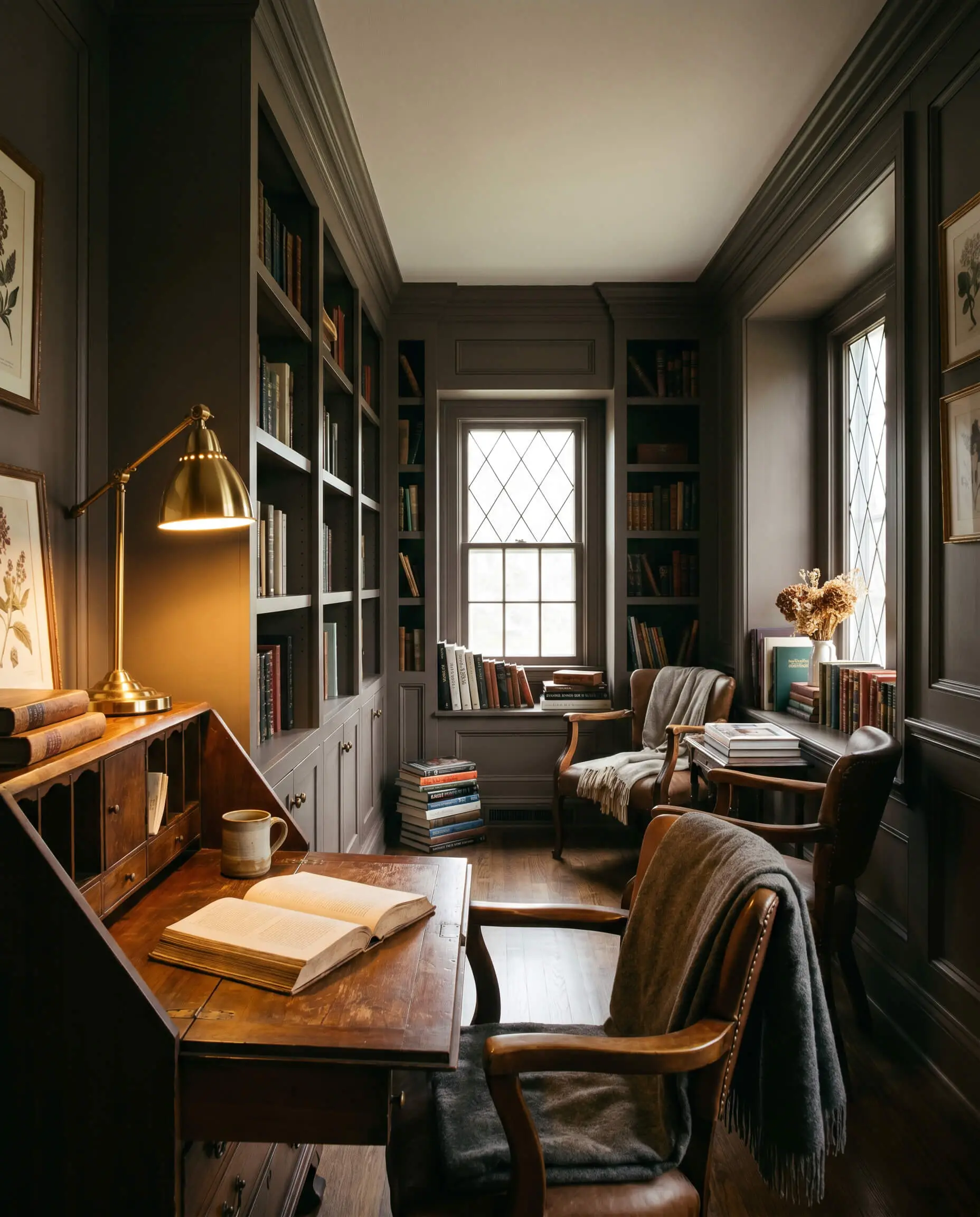
Home Offices & Libraries
In a space dedicated to focus, you want an environment that reduces eye strain and limits distractions. Painting basic pine bookshelves and the surrounding walls in this unified shade creates a library-like atmosphere that feels incredibly studious. The muted brown-gray cast provides a gorgeous backdrop for stacked art books, vintage oil portraits, and the warm glow of a brass desk lamp.
Powder Rooms
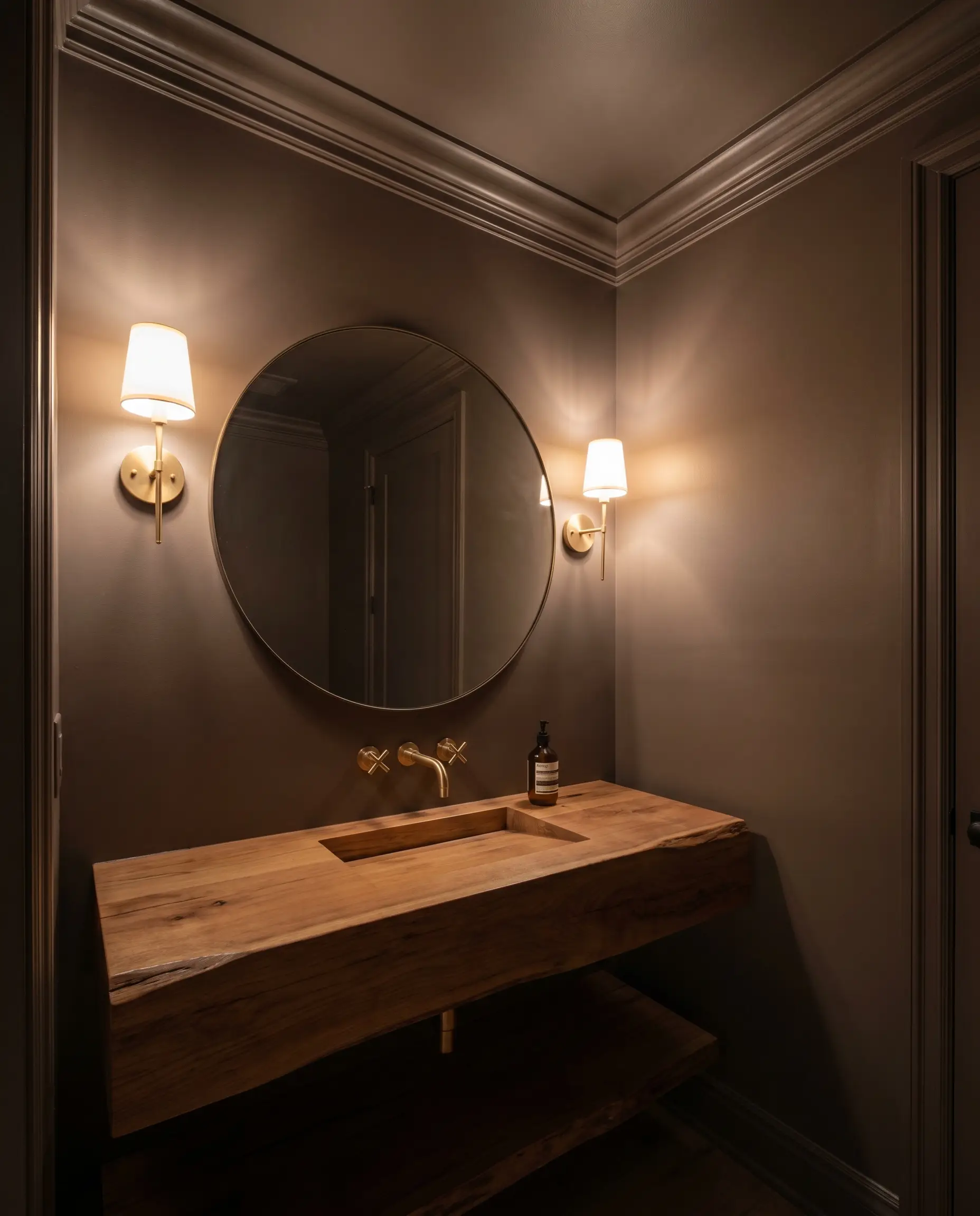
Windowless powder rooms are the perfect laboratory for leaning into light absorption. Color-drenching the entire space—walls, ceiling, and trim—in this deep hue creates a jewel-box effect that feels highly curated. Pair it with a floating timber vanity and a heavily textured mirror frame to maximize the tactile experience for your guests.
Bedroom Accent Walls
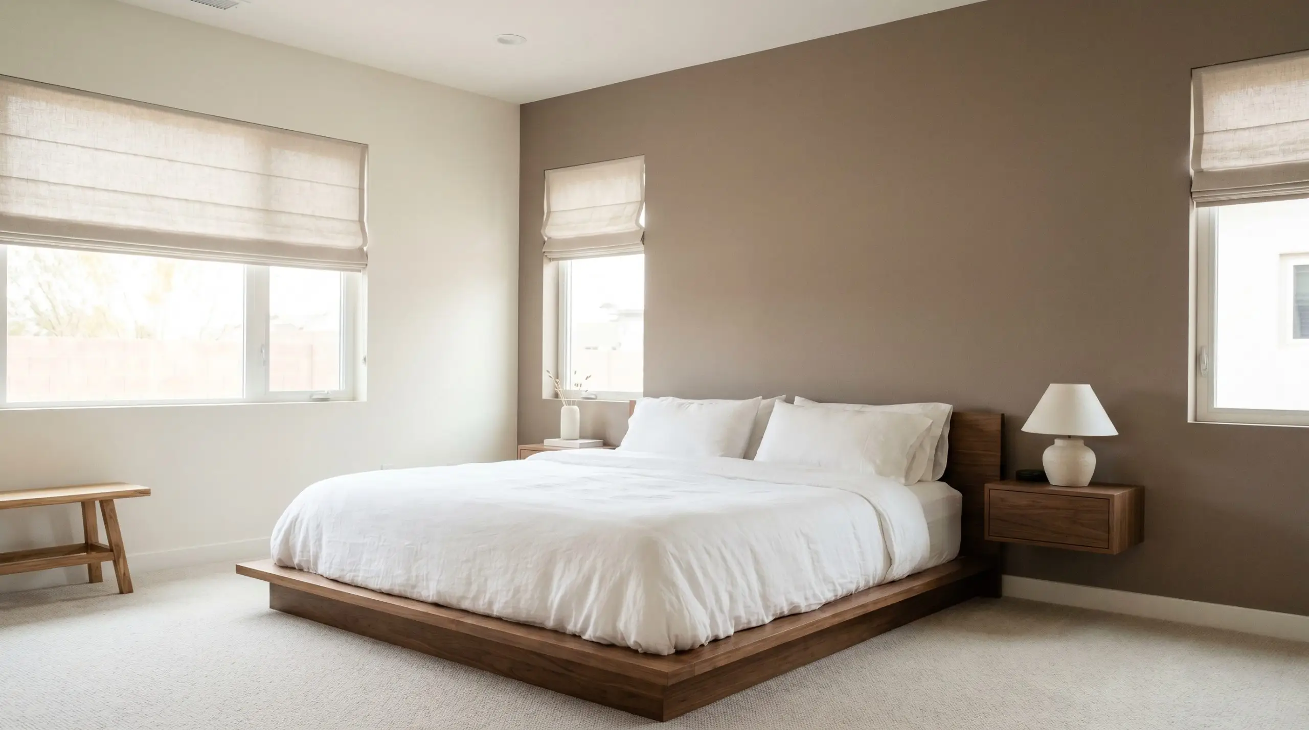
If you are hesitant to commit to a fully dark bedroom, applying this shade exclusively behind the headboard establishes a strong focal point. It provides a quiet, restful backdrop that makes crisp white bedding and soft linen Roman shades pop dramatically. The earthy neutral base essentially acts as a visual anchor, keeping the room’s energy grounded for better sleep.
Exterior Shutters & Trim
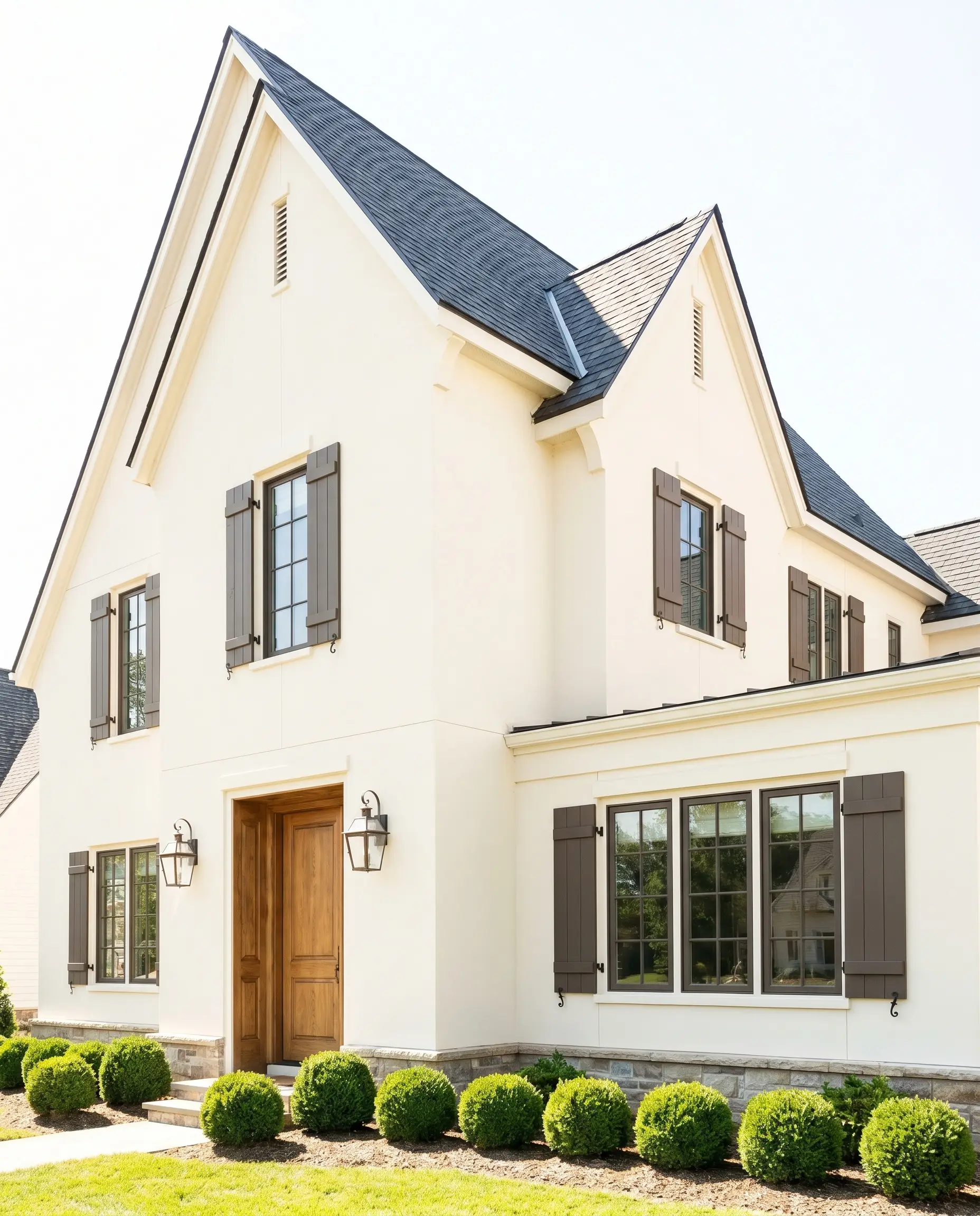
On a home’s exterior, direct sunlight washes out paint colors significantly, making this medium-dark shade appear slightly softer and more approachable. It works brilliantly on shutters and window sashes, offering a warm, earthy contrast against creamy white or soft sage siding. However, remember that highly textured masonry or stucco will cast micro-shadows, making the paint appear slightly darker than it looks on a smooth interior swatch.
Curatorial Concepts: Elevating Architecture with Behr Wild Truffle
When you treat paint as a foundational architectural material rather than just a decorative afterthought, entirely new functional possibilities emerge. The complex nature of this specific pigment allows it to solve unique design challenges, transforming overlooked areas into highly intentional, curated moments.
The Low-Light Tasting Alcove
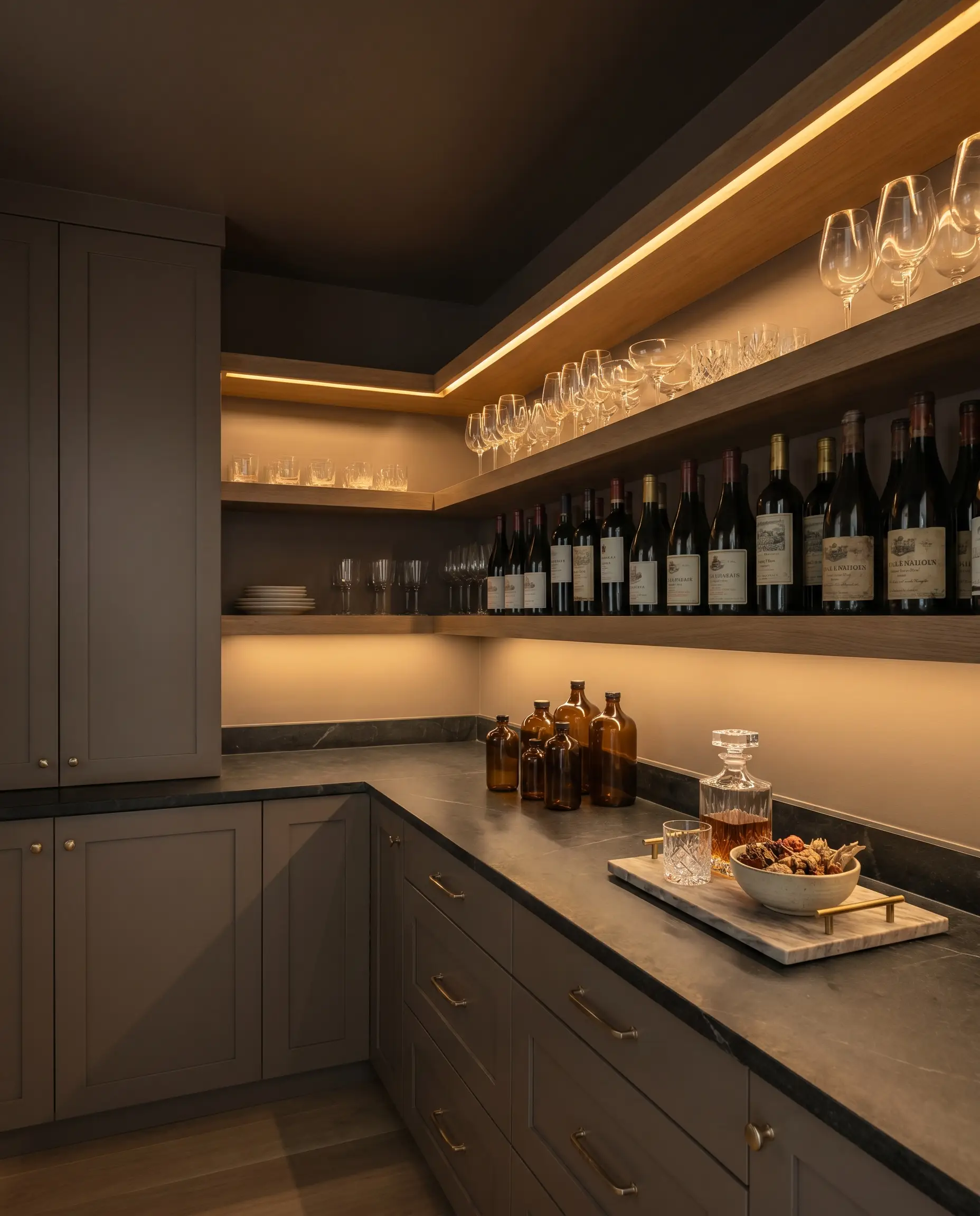
By color-drenching the cabinetry, shelving, and ceiling of a windowless butler’s pantry, you create a dramatic, low-light environment that forces focus onto illuminated glassware and wine labels. The medium-dark light reflectance thrives in these shadowy corners, creating an infinite, boundaryless feel that reads incredibly high-end. This approach turns a standard storage closet into a moody, experiential destination for pouring a glass of wine at the end of the day.
The Grounded Transition Zone
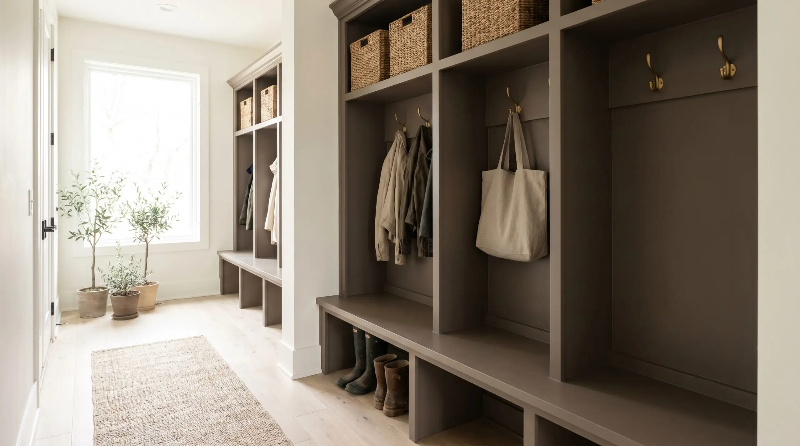
Applying this deep taupe to built-in mudroom cubbies establishes a visually quiet, grounding transition zone between the chaotic outside world and the serene home interior. The warm, muted nature of the hue significantly lowers visual noise, avoiding the stark contrast of pure whites or the overstimulation of bright colors. It is an incredibly effective strategy for creating a sensory-calm environment that instantly signals the mind to relax upon walking through the door.
The Transitional Hallway Embrace
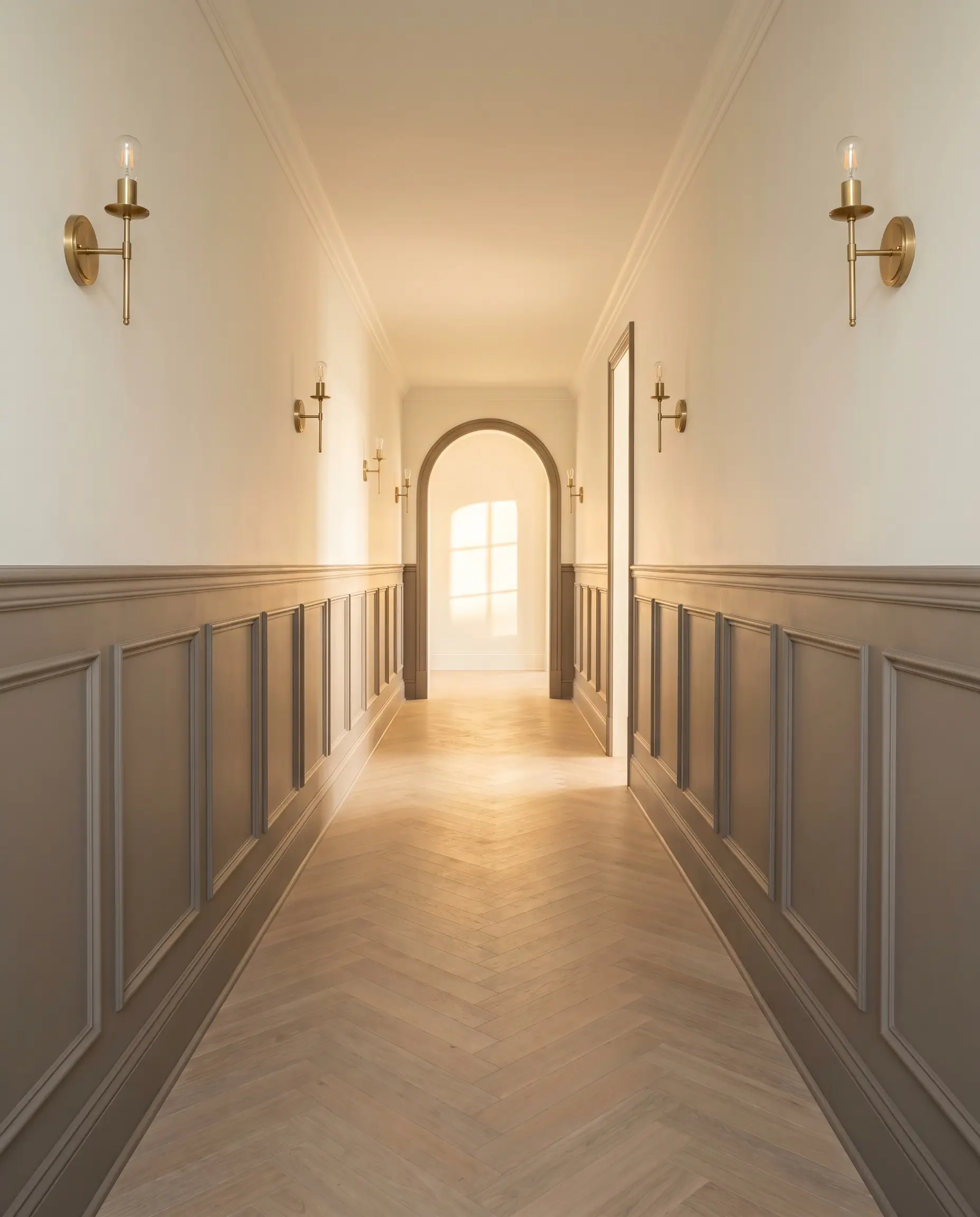
Coating high-profile wainscoting in a flat finish allows this earthy neutral to contrast sharply with unlacquered brass sconces or vintage hardware. This specific application brilliantly bridges traditional, heritage-style architecture with a much more modern, earthy palette. The subtle mauve undertone in the taupe base acts as the exact mathematical complement to the yellow-green aging process of raw brass, making the metal fixtures sing against the muted wall.
Material Dialogues & Coordinating Colors
The true success of any room design relies entirely on how the primary wall color interacts with the physical materials placed next to it. Behr Wild Truffle requires intentional pairings; it thrives when placed alongside elements that either pull out its underlying warmth or offer a crisp, clean boundary to maintain its shape.
Trim & Baseboards
To keep this deep taupe looking intentional and tailored, you need a trim color that provides enough contrast without feeling icy or sterile.
Hardware, Wood & Material Pairings
Coordinating Colors
Curated Atmospheres: Styling the Warm Taupe Hue
The Woven Earth Palette
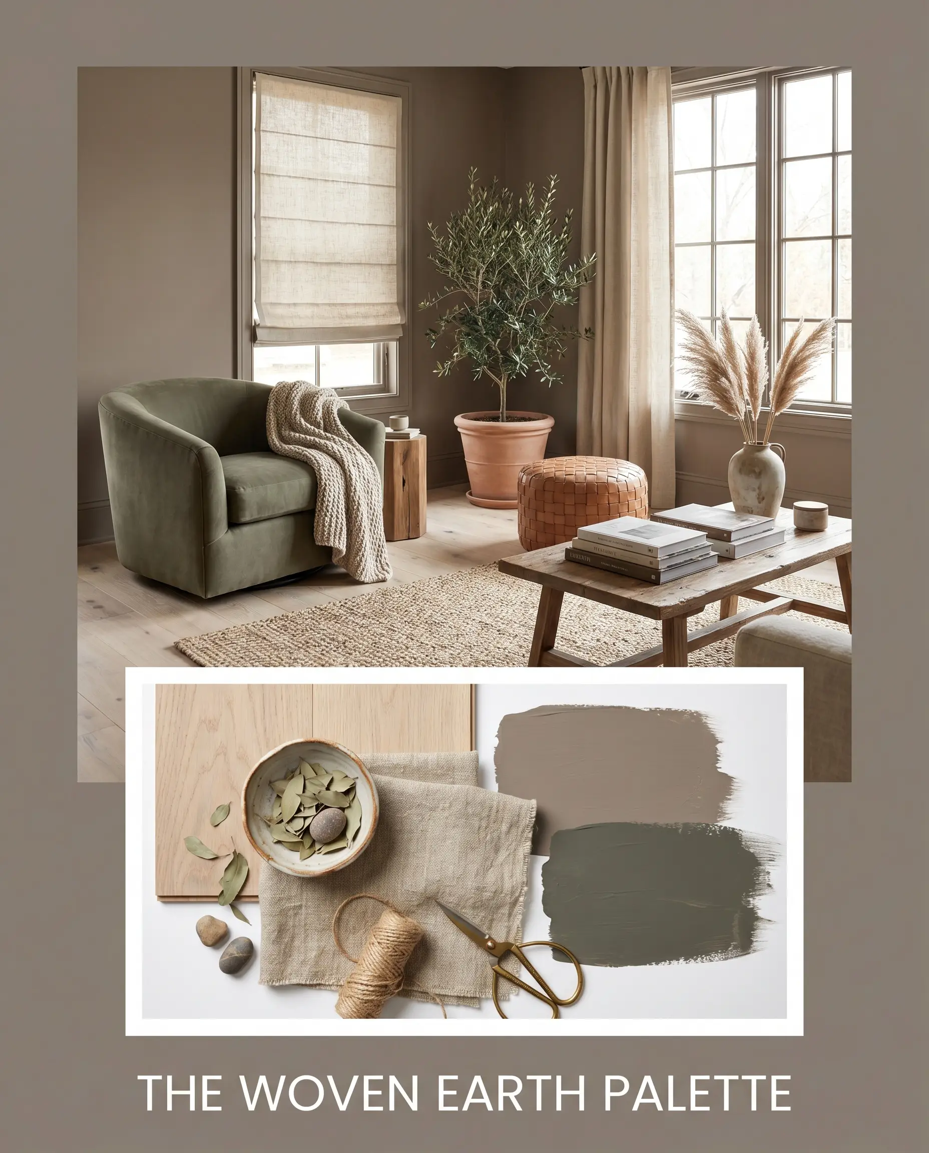
This aesthetic relies on heavy textural layering to bring the earthy neutral base to life without relying on bright accent colors. By pairing the taupe walls with bleached white oak flooring and accents of Benjamin Moore Vintage Vogue, the environment feels deeply connected to nature. Introduce raw linen Roman shades, hand-thrown pottery, and an oversized jute rug to maximize the tactile, organic energy of the space.
The Tactile Study
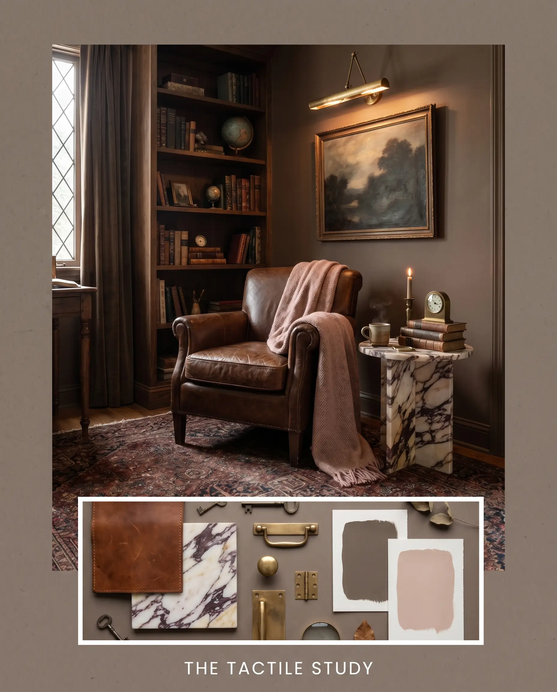
Focusing on a more structured, Dark Academia-inspired vibe, this palette utilizes the paint’s moody depth to create an atmosphere of quiet luxury. The taupe acts as a rich backdrop for an unlacquered brass picture light, heavily veined Calacatta Viola marble trays, and a worn saddle leather reading chair. Subtle touches of Farrow & Ball Setting Plaster in the textiles or artwork soften the masculine edge, resulting in a perfectly balanced, scholarly retreat.
Navigating the Nuances: Behr Wild Truffle vs. Industry Rivals
When deciding on the perfect medium-dark neutral, the final choice often comes down to how the paint behaves in your specific lighting conditions. If your room lacks natural light or features challenging fixed elements, you may need to pivot to a rival shade to achieve your desired aesthetic.
Behr Wild Truffle vs. Sherwin-Williams Poised Taupe (SW 6039)
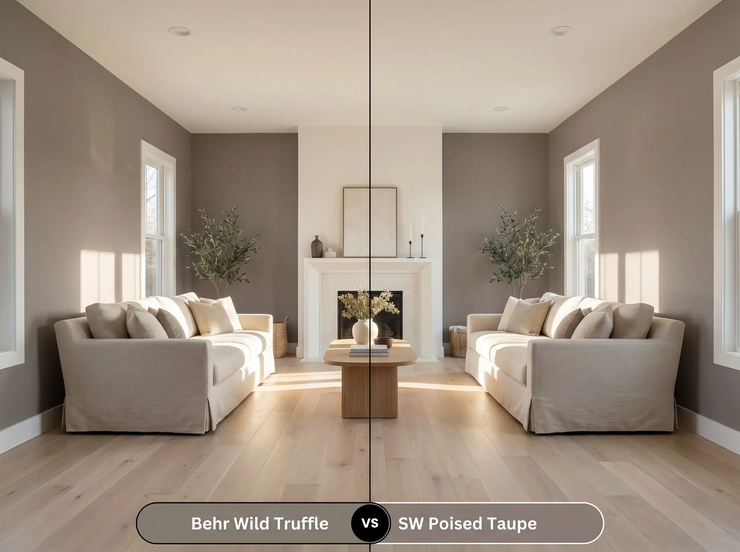
If you are working in a south-facing room flooded with warm light, Wild Truffle will lean heavily into its brown cocoa base. Sherwin-Williams Poised Taupe, however, carries a much more pronounced purple-gray undertone. If you want to ensure the color retains a cooler, more modern edge despite the warm sunlight, Poised Taupe is the safer, more rigid choice.
Behr Wild Truffle vs. Benjamin Moore Plymouth Rock (1543)
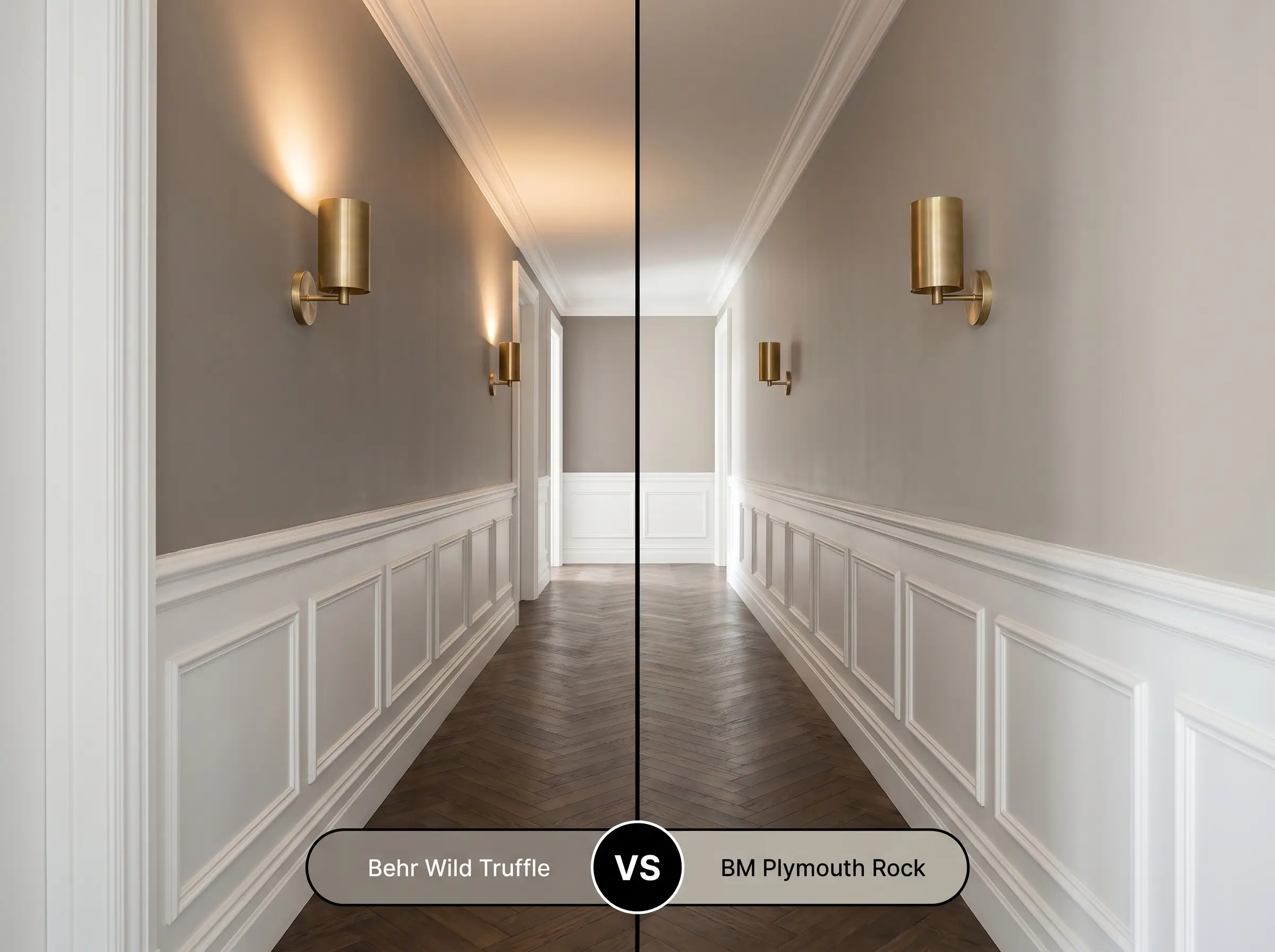
While both colors share a similar earthy DNA, Plymouth Rock sits slightly lighter on the LRV scale and features a more balanced greige profile. If you are painting a long, narrow hallway where Wild Truffle might absorb too much light and feel slightly oppressive, Plymouth Rock offers a similar aesthetic while keeping the space feeling a bit more open and breathable.
Exploring the Color Structure: Alternatives to This Moody Depth
Sometimes you fall in love with a color’s structural DNA, but the specific shade is just slightly too dark, too warm, or simply unavailable at your local hardware store. Here are the closest structural matches to help you pivot successfully.
Same-Brand Siblings
Cross-Brand Equivalents
Execution Strategy: Rolling Behr Wild Truffle Like a Pro
Transitioning from design theory to the physical act of painting requires an understanding of how this specific pigment profile interacts with different finishes and primers. A medium-dark shade requires careful preparation to ensure a flawless, professional-looking result.
The Dynamic Sheen Guide
Primer Strategy
Because of its significant light absorption and deep cocoa base, applying this paint over standard white drywall or light builder-grade beige can be challenging. You must use a high-quality primer tinted to a medium gray. This crucial step reduces the number of topcoats required and ensures the final color achieves its true, intended depth without looking streaky.
Coverage & Success Tips
Even with a tinted primer, expect to apply a minimum of two generous coats to achieve a fully opaque, luxurious finish.
Deep, flat-finish paints are notorious for “flashing”—leaving visible, shiny roller marks if the paint dries unevenly or if you press too hard on the roller. To avoid this, maintain a wet edge as you work across the wall, load your roller generously, and let the paint level itself naturally without over-working it.
Hackrea Design Secret (The Flashing Warning)
Frequently Asked Questions
Yes, because its color structure is rooted in taupe, it contains a latent mauve cast. In cool, north-facing rooms or under heavily filtered artificial light, this subtle purple nuance can become much more pronounced, especially when contrasted against stark white trim.
In spaces devoid of natural light, this paint will aggressively absorb artificial illumination, making the room feel noticeably darker and more enclosed. While this is highly effective for creating moody, intentional color-drenched spaces, it requires layered ambient lighting—like sconces and picture lights—to prevent the room from feeling cavernous.
While the hue itself is an excellent, grounding earth tone for exteriors, applying it to highly textured masonry requires caution. The micro-shadows cast by the texture of brick or stucco will cause the color to appear slightly darker and heavier than it looks on a smooth interior swatch.
To avoid a muddy, monochromatic clash, you should pair this deep taupe with woods that offer distinct contrast. Mid-century walnut provides a rich, harmonious warmth, while pale, bleached white oak offers a striking, modern Scandinavian contrast that lifts the room’s energy.
The Final Verdict
Behr Wild Truffle is an incredibly sophisticated, grounding neutral perfect for homeowners who want to introduce moody, tactile depth into their spaces without committing to stark blacks or aggressive jewel tones.
It excels in intimate, focus-driven environments like home libraries, tasting alcoves, and sensory-calm transition zones, seamlessly elevating standard architecture into something that feels highly curated. Its ability to shift between a rich cocoa mushroom in warm light and a stony, reserved taupe in cool light makes it a brilliant chameleon for Transitional, Organic Modern, and Dark Academia design styles.
However, this enveloping shade is not universally forgiving. You will run into significant visual friction if you attempt to pair this muted mauve-taupe with heavily yellow-toned woods, like aged 1990s honey oak floors, or overly warm, Tuscan-style travertine tile. These aggressively yellow and orange fixed elements will actively fight the sophisticated brown-gray cast, causing the paint to look bruised and dingy rather than luxurious. If your home is dominated by these bright, warm finishes, you will need to pivot to a much warmer, golden-based greige to maintain a cohesive, elegant aesthetic.
Real-World Inspiration Be the first to upload a real photo of Wild Truffle!
No Photos Yet
Includes +20 First Upload Bonus!
Real Experiences
Insights from people who have used Wild Truffle.No reviews yet
Be the first to share your experience with Wild Truffle.
Earn 15 points instantly!
Closest Cross-Brand Equivalents
The absolute closest scientific color matches for Wild Truffle across top paint brands.