Behr Moth Gray (N200-1) is a sophisticated, warm greige paint color with an LRV of 66. Blending soft gray with subtle beige undertones, it acts as a highly versatile neutral that warms up cool northern light while maintaining its depth in bright, south-facing rooms.
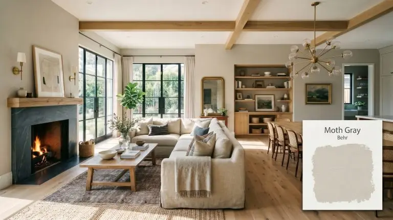
Behr Moth Gray: The Ultimate Warm Greige for Modern Sophistication
Finding a neutral that feels simultaneously modern and deeply inviting is a notoriously frustrating design challenge. You want the crispness of a contemporary gray, but you refuse to live in a sterile, icy box.
You crave warmth, but the moment you lean toward traditional beige, your walls risk looking like a dated 1990s tract home. Behr Moth Gray (N200-1) is the precise answer to this exact dilemma.
This is a highly sophisticated warm greige that masters the delicate balance between cool restraint and earthy comfort. We view this shade not just as a wall color, but as a foundational architectural material that bridges contrasting design elements.
It is a wildly popular choice for a reason, but it is not foolproof. To harness its full potential, you must understand exactly how its core pigment profile interacts with the tangible world around it.
The Color DNA: Decoding Behr Moth Gray
Every successful room begins by respecting the raw data of the paint. You cannot force a color to be something it is not, which is why understanding the hidden layers of Behr N200-1 is mandatory before opening a single can.
With a light reflectance value (LRV) of 66, this shade sits perfectly in the light-medium category. It bounces enough natural light to keep your space feeling expansive and breathable, yet it retains enough inherent shadow to provide a sharp, luxurious contrast against pure white trim.
If you are struggling to grasp how these hidden pigments manipulate a room, we highly recommend reviewing our foundational guide on understanding paint undertones before finalizing your palette.
You can apply wallpapers, paints, etc. on walls and see how they look in various interiors.

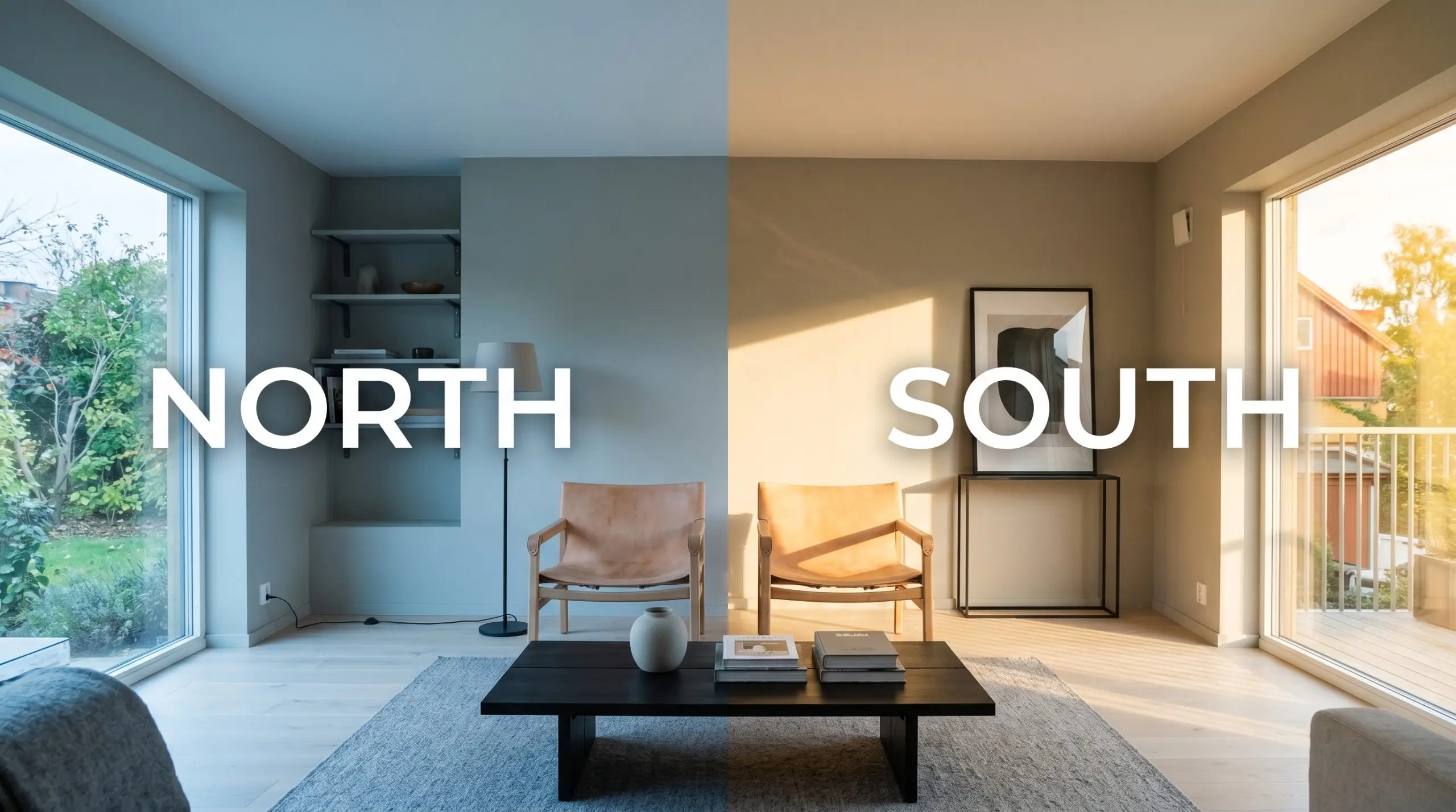
Lighting Effects & The Chameleon Factor
The biggest fear we hear regarding greige paint is the dreaded purple shift. Homeowners are terrified that their soft neutral will suddenly flash a bruised, dingy plum in the late afternoon.
You can breathe a sigh of relief. The subtle yellow-green anchor in Behr Moth Gray actively neutralizes any risk of pink or purple flashing, making it one of the most stable neutrals on the market. However, its color temperature will still shift dramatically depending on the sun.
Shaping the Space: Broad Applications
Let us be brutally honest: while Behr N200-1 is highly adaptable, it is not a magic wand. Its success is entirely dependent on the specific geometry and light exposure of your room.
When applied in the right environment, it creates a flawless backdrop. When forced into the wrong space, it falls entirely flat.
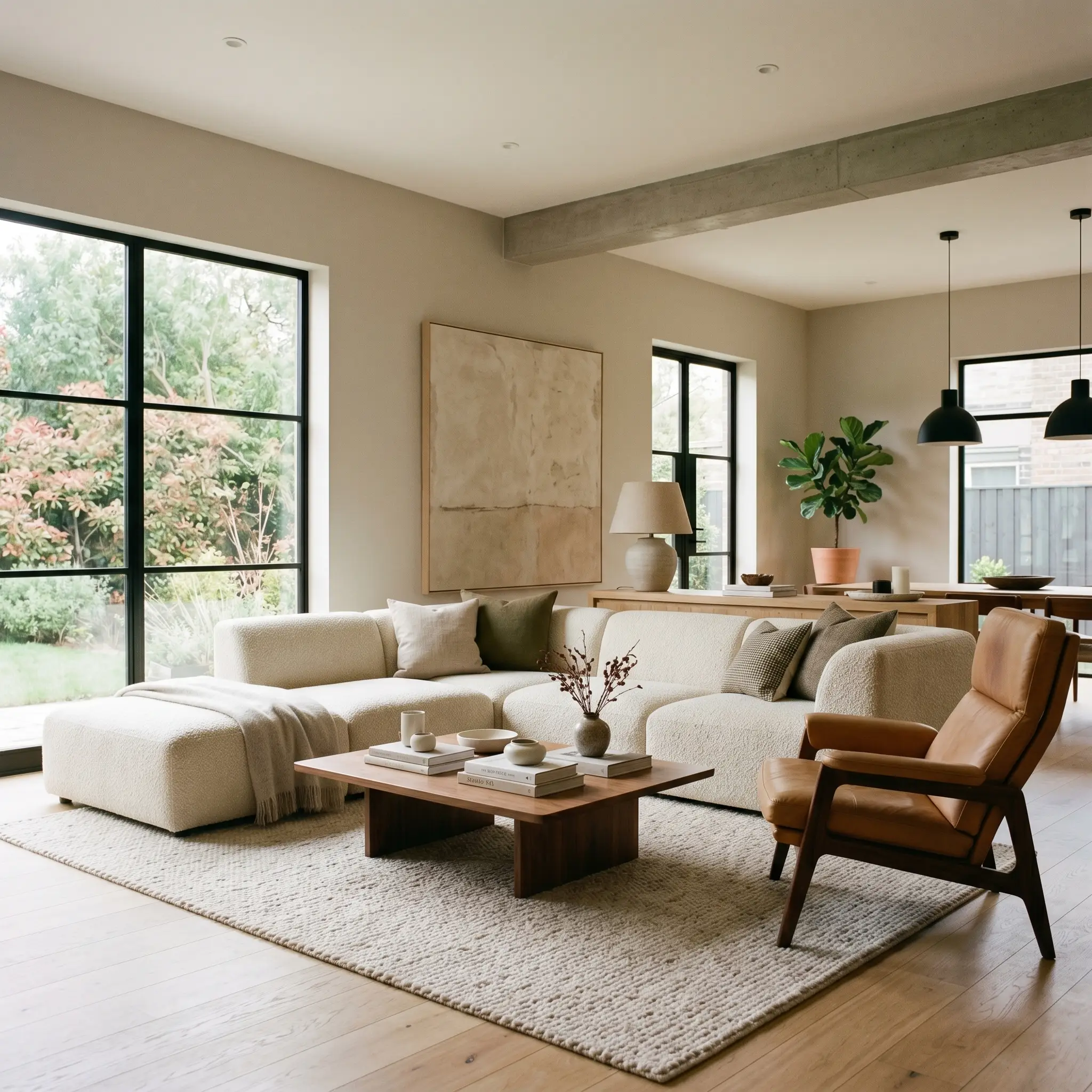
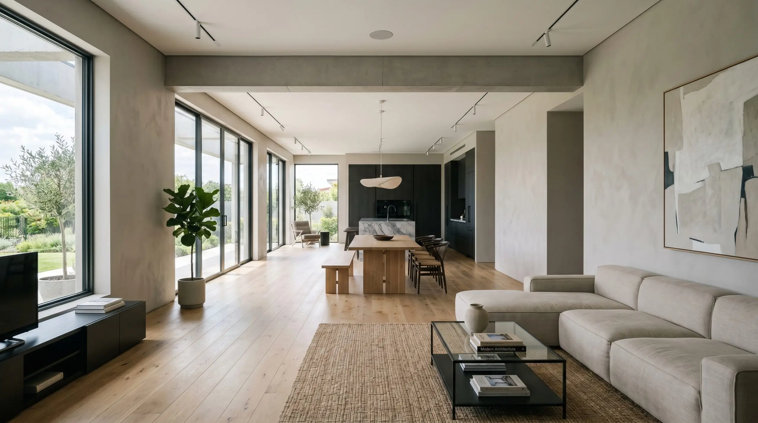
The Living Room Ecosystem
This is where this warm greige truly sings. It provides enough visual weight to ground large, overstuffed upholstery, yet remains light enough to let statement art and dramatic lighting fixtures take center stage.
Avoid matching your furniture exactly to the walls. Instead, use this shade as a quiet canvas to bounce light around heavy, contrasting textures like raw leather, bouclé, and darkened steel. The subtle earthy notes in the paint thrive when surrounded by organic, layered styling.
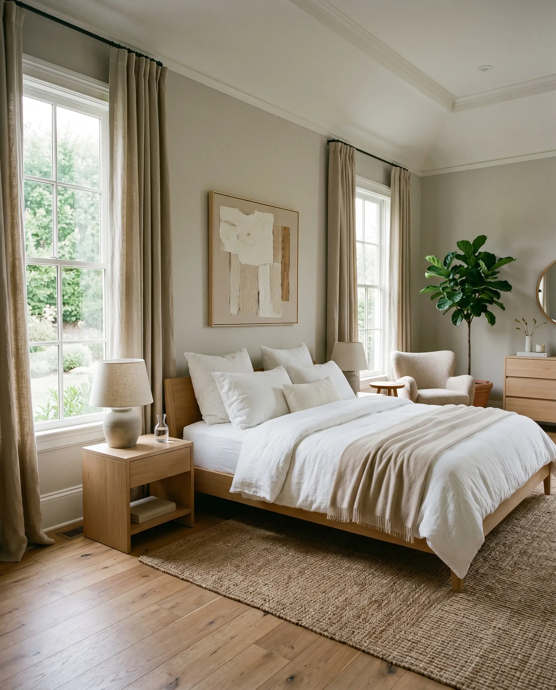
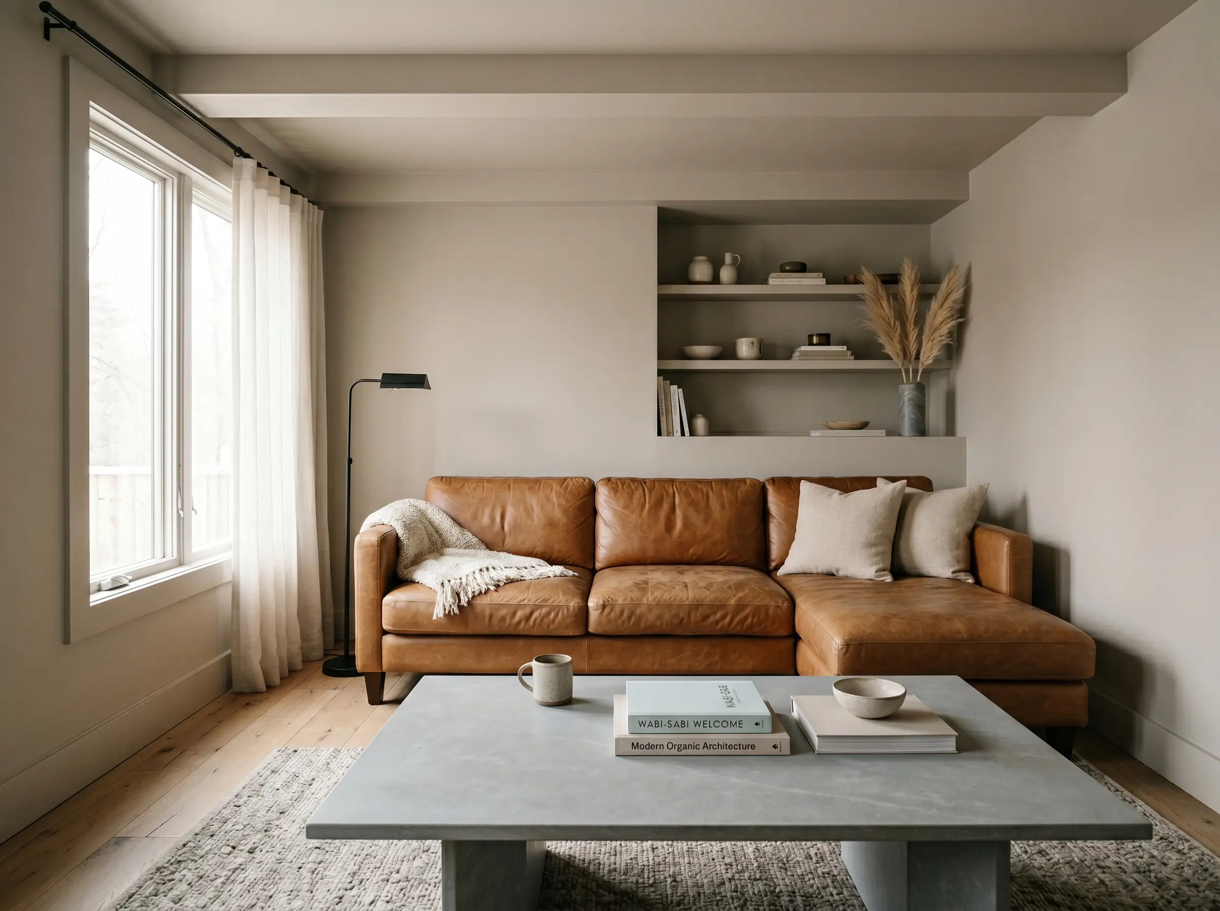
The Bedroom Sanctuary
In spaces designed for rest, the psychological impact of your wall color is paramount. This shade creates a deeply calming, restorative mood without feeling cold or cavernous.
Because bedrooms often rely on heavy drapery and soft textiles, the paint acts as a stabilizing force. It absorbs the morning light beautifully, creating a soft, enveloping warmth that feels incredibly luxurious when paired with crisp white bedding.
Open-Concept Flow
Navigating a sprawling, multi-use layout requires a neutral that refuses to look chaotic as shadows shift throughout the day. The light-medium depth of this paint carries beautifully across long expanses of drywall.
It defines the boundaries of the architecture without ever feeling heavy or oppressive. If you are tackling a massive renovation, ensuring you are choosing the right sheen for open concept homes is just as critical as the color itself.
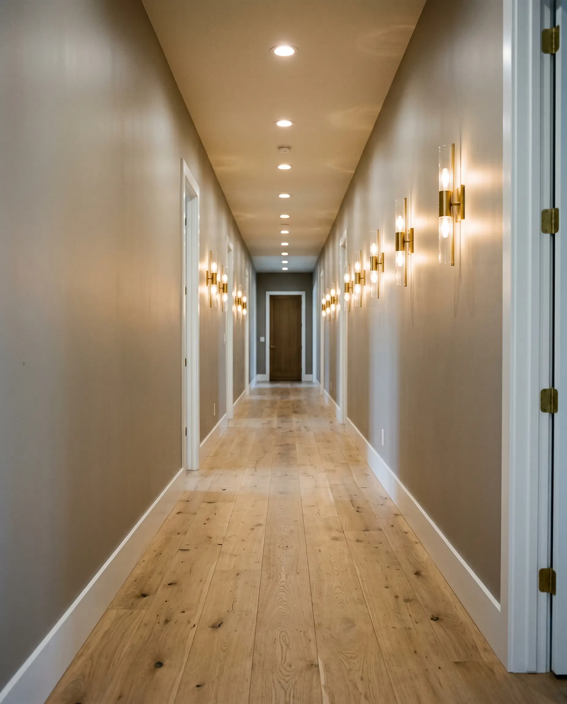
Transitional Hallways
Hallways are the ultimate test of a paint’s resilience. Behr Moth Gray requires adequate lumens to survive here.
Hackrea Pro-Tip
If your hallway is entirely windowless and relies on weak overhead lighting, this paint will look dingy and flat. The beige undertones need natural light to activate. If you lack windows, you must compensate with brilliant, layered artificial lighting to keep the color alive.
Signature Architectural Concepts
Moving beyond broad drywall, the true magic of this color is revealed when you apply it strategically to specific structural elements. This is where high-end design separates from amateur DIY.
Expanding Low Ceilings
Never underestimate the power of spatial geometry. If you are dealing with oppressive, low ceilings, wrapping the entire room—walls, baseboards, and the ceiling itself—in Behr Moth Gray creates a stunning optical illusion.
By eliminating the harsh, high-contrast line of white crown molding, the eye is no longer drawn to the exact height of the room. The color blurs the architectural boundaries, making the ceiling feel significantly taller and the space infinitely more cohesive.
Color-Drenched Wainscoting
Applying this shade to traditional wainscoting or board-and-batten instantly modernizes classic architectural features.
When you use a satin or semi-gloss finish on the lower millwork, the sheen catches the light, highlighting the crisp gray notes. Pairing this with a dead-flat application of the exact same color on the upper drywall creates a subtle, tactile tension that feels incredibly bespoke.
Exterior Shutters & The Foliage Trap
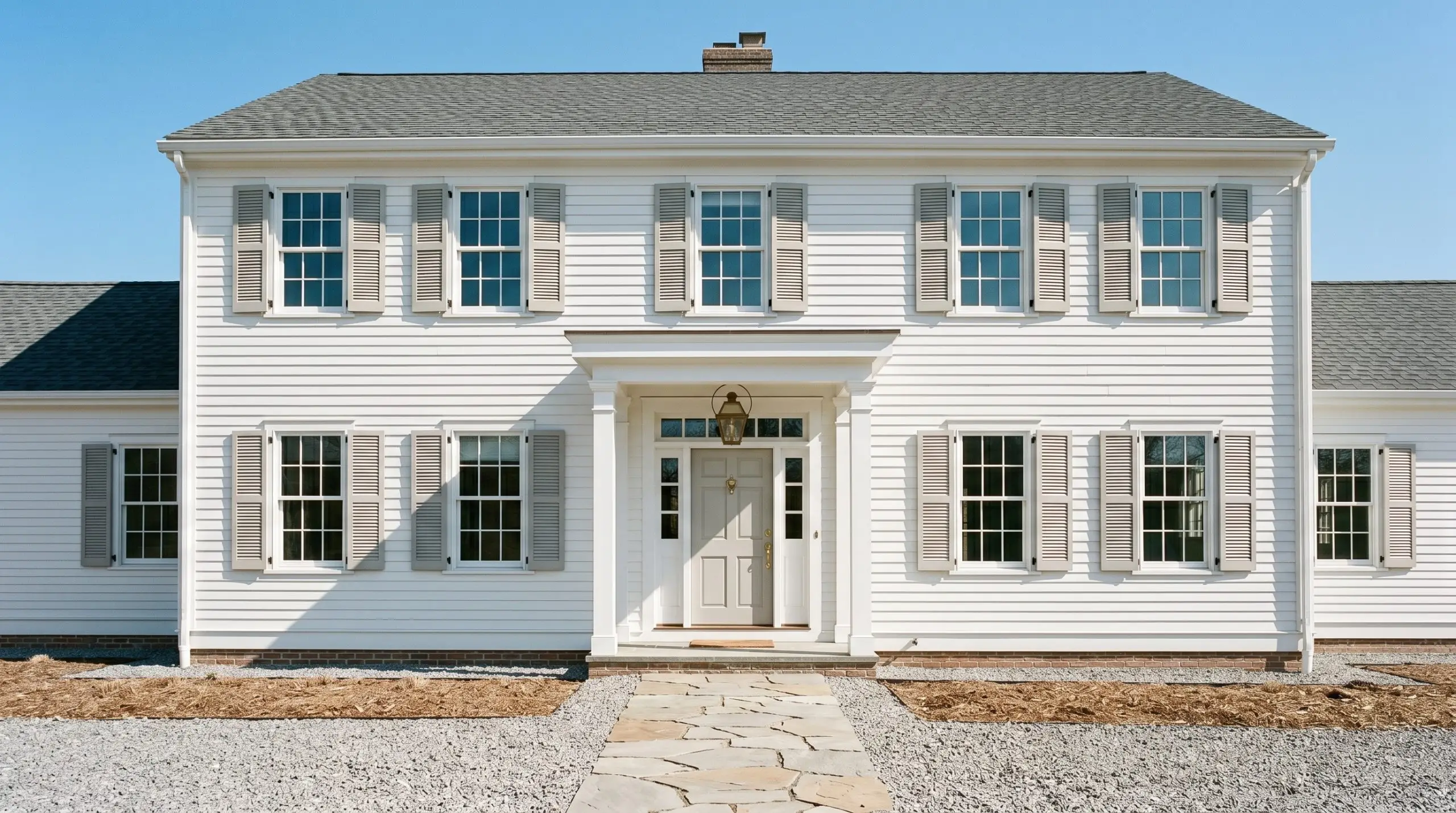
Using this greige on exterior trim or shutters comes with a massive environmental caveat.
Clash Warning
Because of its hidden yellow-green micro-undertone, this paint is highly reactive to its surroundings. If you have heavy, lush green foliage directly outside your windows or surrounding your porch, the green light bouncing off the leaves will aggressively pull the green out of the paint. What looks like a beautiful greige on a swatch can suddenly cast a sickly, muddy green hue on your exterior architecture.
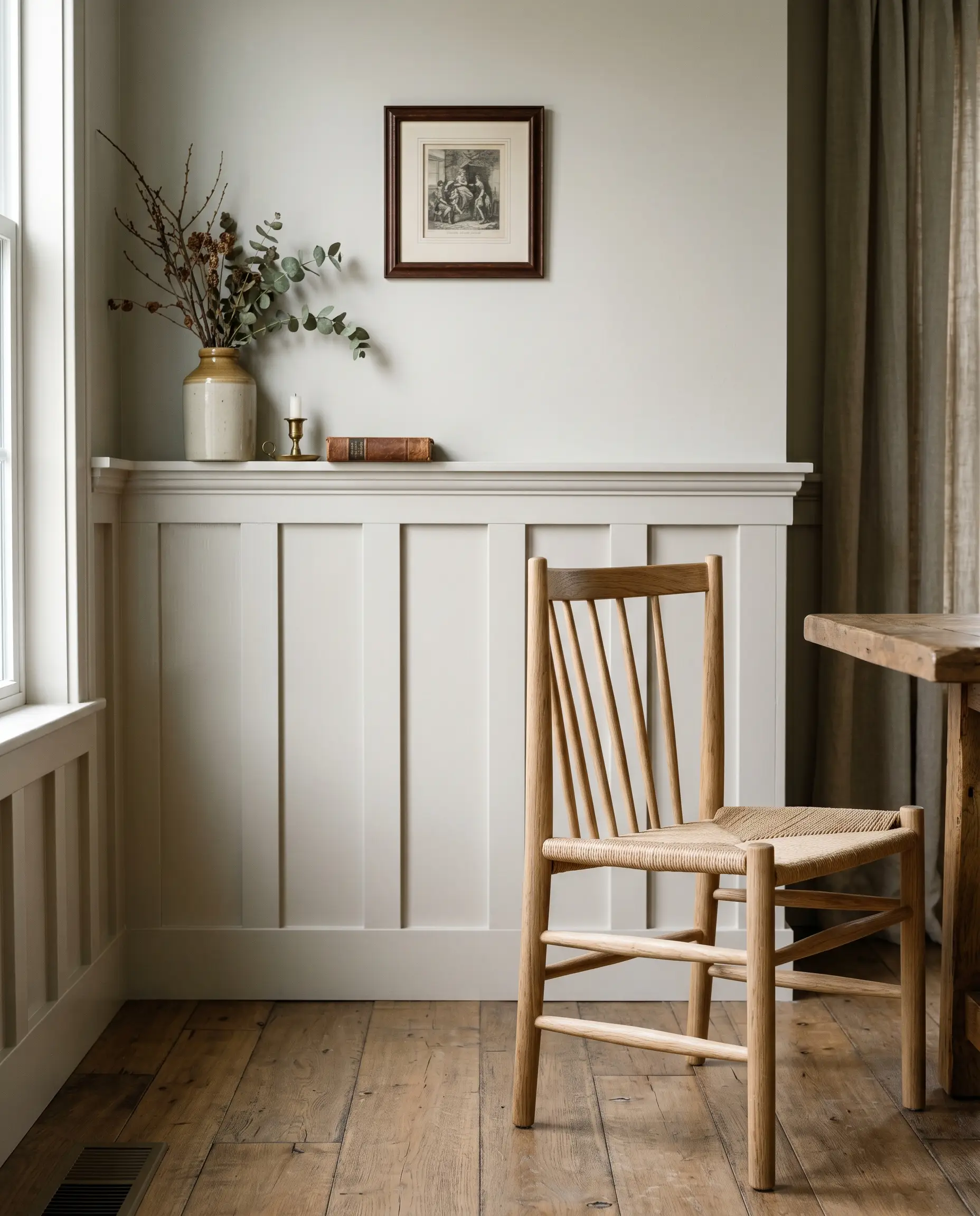
Tactile Pairings & The Accents Guide
A paint color never exists in a vacuum. Its success is entirely dictated by the hard finishes, textiles, and secondary colors you force it to interact with.
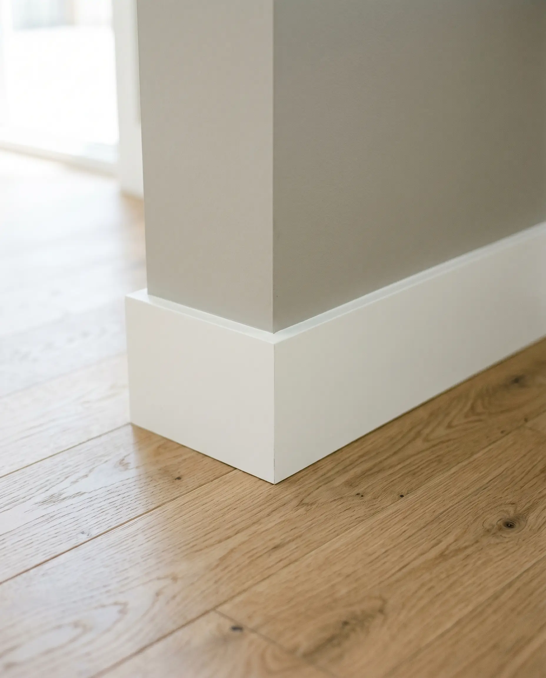
Crisp Trim & Baseboards
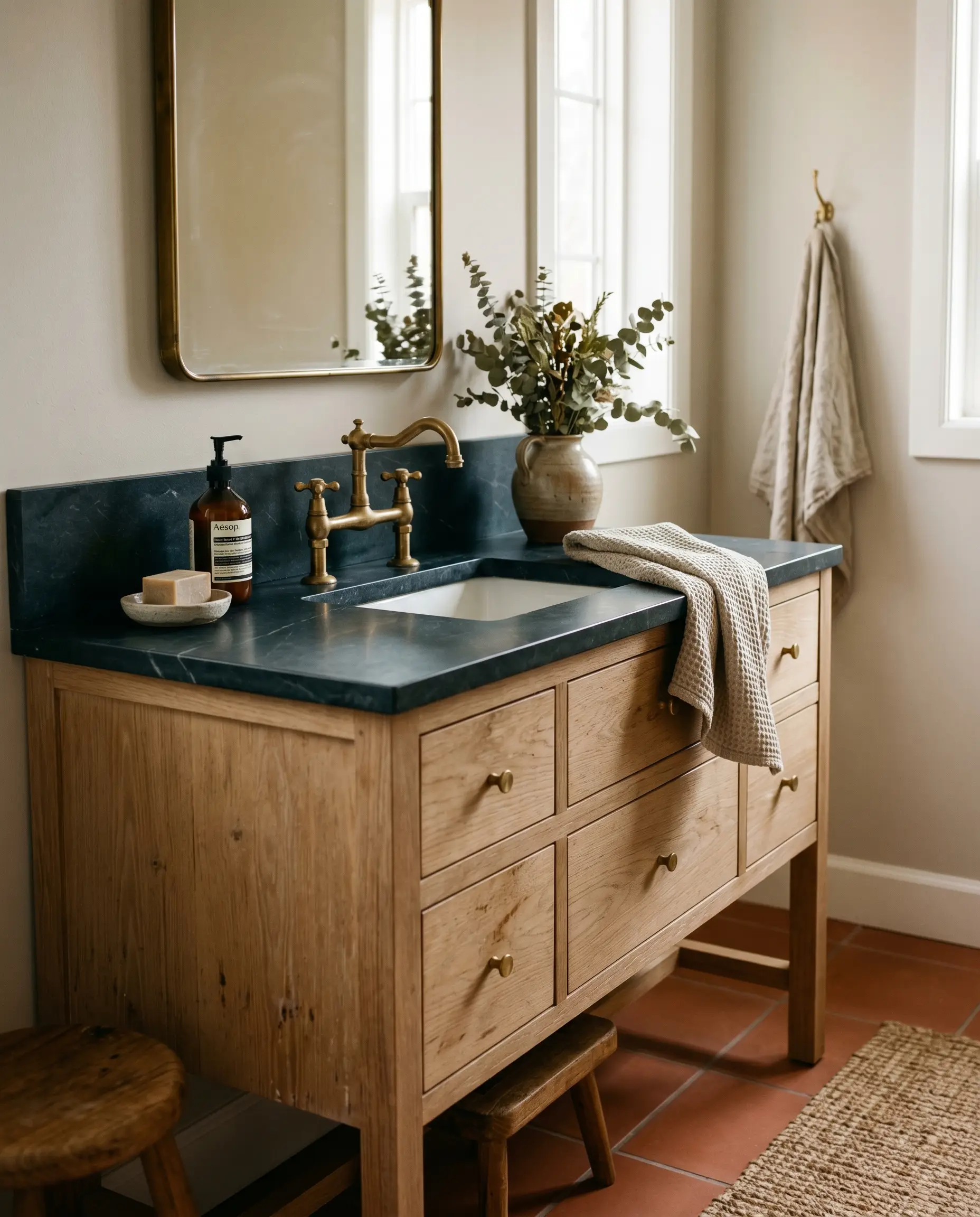
Hardware, Stone & Timber
Do not sabotage your walls with the wrong hard finishes. The specific earthy profile of Behr N200-1 demands careful curation.
Avoid polished chrome at all costs. The icy, blue-toned reflection of cheap chrome violently clashes with the earthy warmth of this paint. Likewise, you must strictly avoid stark Carrara marble (which makes the paint look dirty) and pinkish-beige travertine (which fights a brutal war against the paint’s yellow-based undertones). Furthermore, cherry or red-toned mahogany woods will pull out the hidden green in the paint, creating a muddy, discordant mess.
Instead, pair it with these specific tactile elements:
Coordinating Colors
Curated Aesthetic Palettes
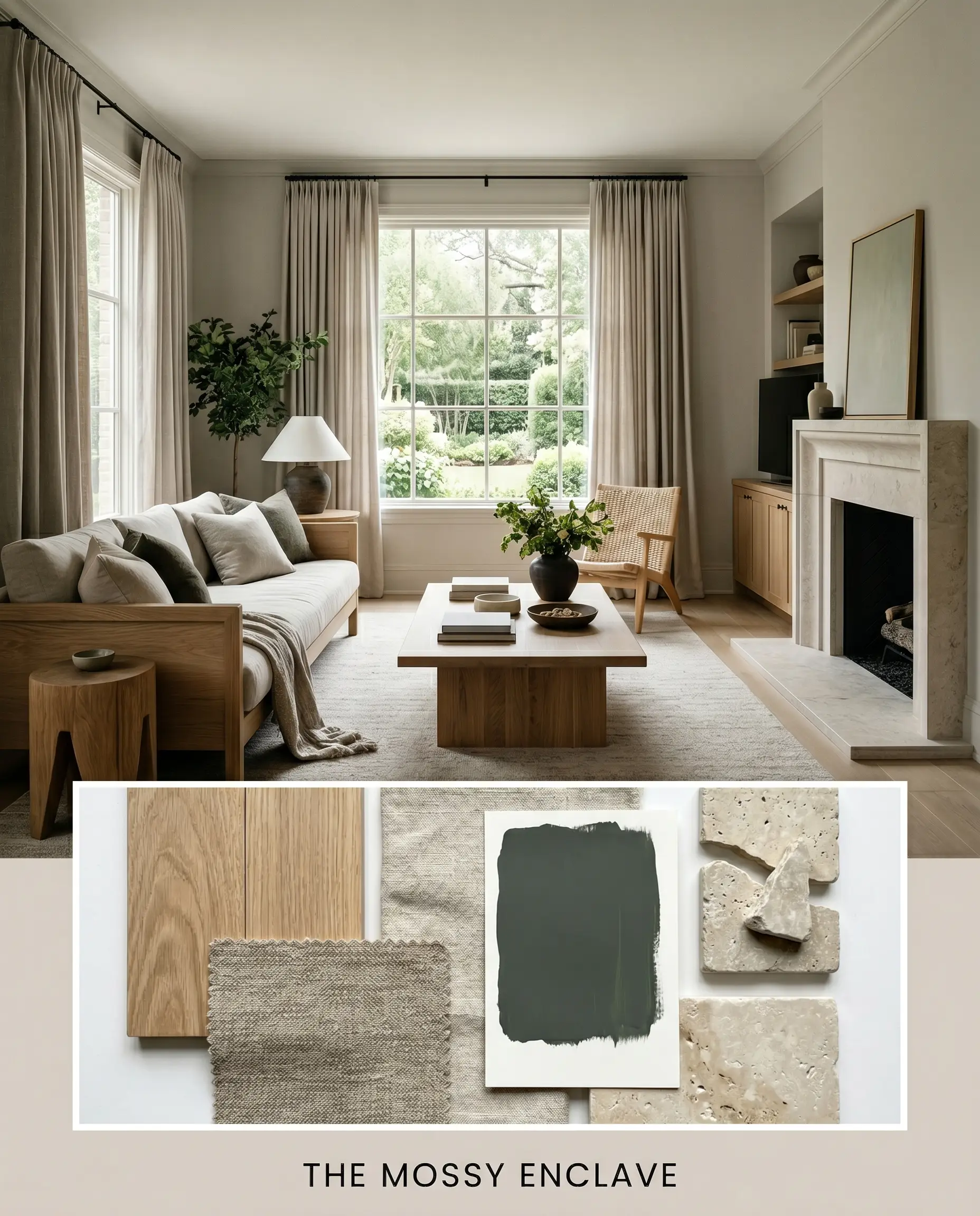
The Mossy Enclave: This palette leans entirely into the earthy, grounded nature of the paint. By surrounding the greige with Farrow & Ball Studio Green, raw white oak, and tumbled limestone, the hidden yellow-green notes are gently coaxed forward. The resulting mood is incredibly quiet, rooted, and steeped in natural materiality. Heavy linen drapery and matte ceramics complete this restorative, nature-inspired vibe.
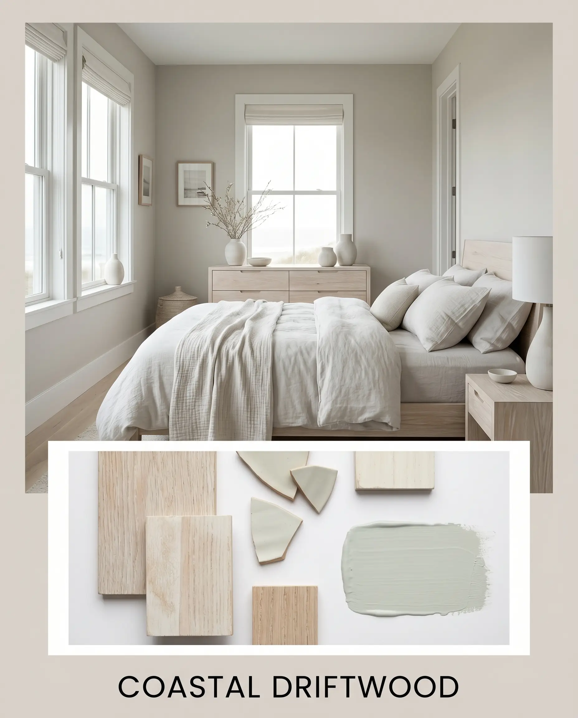
Coastal Driftwood: A masterclass in restraint and tension. By introducing Sherwin-Williams Sea Salt alongside bleached woods and matte chalk ceramics, the washed-out gray aspects of the main paint take absolute priority. The cool, watery accent colors neutralize the heavy beige, creating an atmosphere that feels windswept, airy, and effortlessly sophisticated without ever resorting to literal nautical clichés.
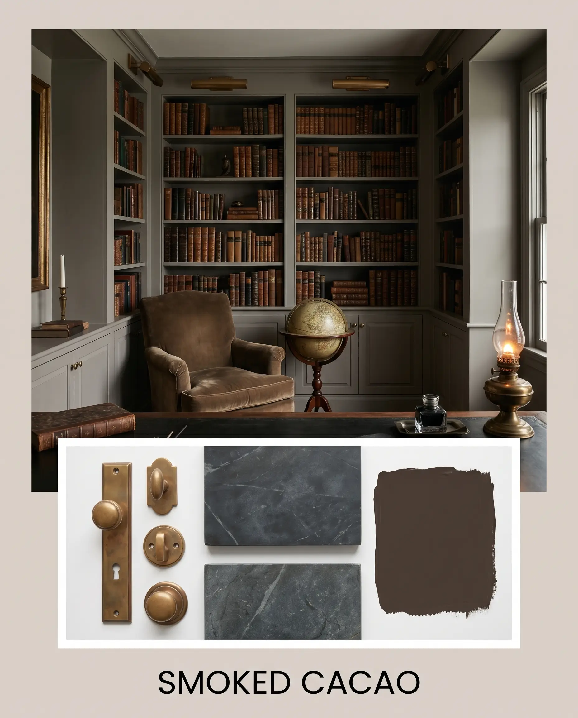
Smoked Cacao: This is where the paint gets moody and luxurious. Pairing the walls with Behr Dark Truffle, burnished unlacquered brass, and honed soapstone creates a space defined by deep shadows and rich metallic reflections. The dark, light-absorbing accents force the greige to act as the primary light source in the room, resulting in an atmosphere that is deeply intimate, historic, and undeniably high-end.
Behr Moth Gray vs. The Industry Titans
When finalizing a neutral, you must compare it against its direct rivals to understand exactly what you are putting on your walls.
Behr Moth Gray vs. Sherwin-Williams Agreeable Gray
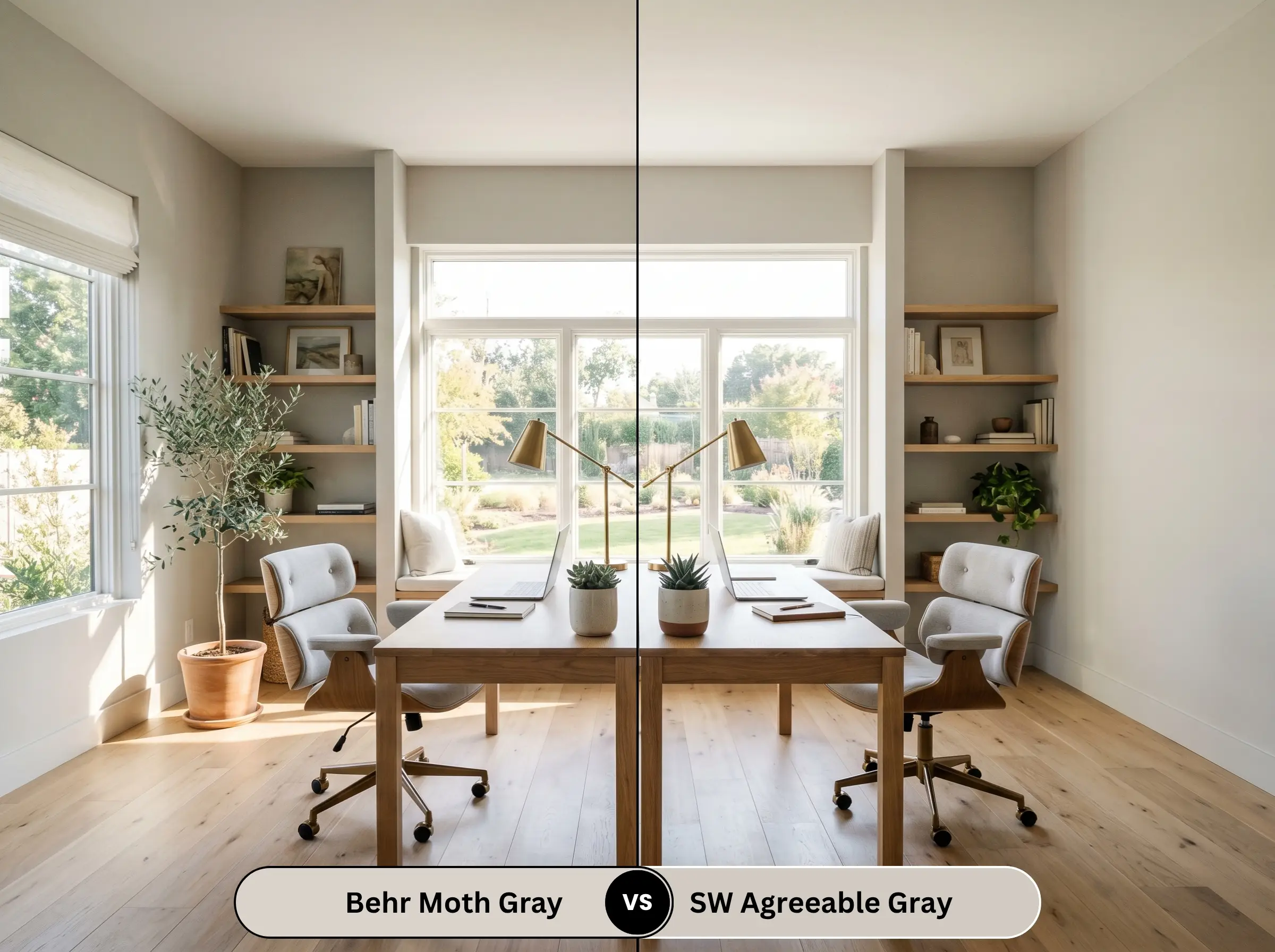
Agreeable Gray is arguably the most famous greige in existence, but it carries a distinctly warmer, almost peachy undertone in certain lighting. Moth Gray is noticeably cooler and more muted. If your room gets blasted with intense southern light and you want to avoid your walls looking vaguely pink or tan, the Behr option is the far safer, more sophisticated choice.
Behr Moth Gray vs. Benjamin Moore Revere Pewter
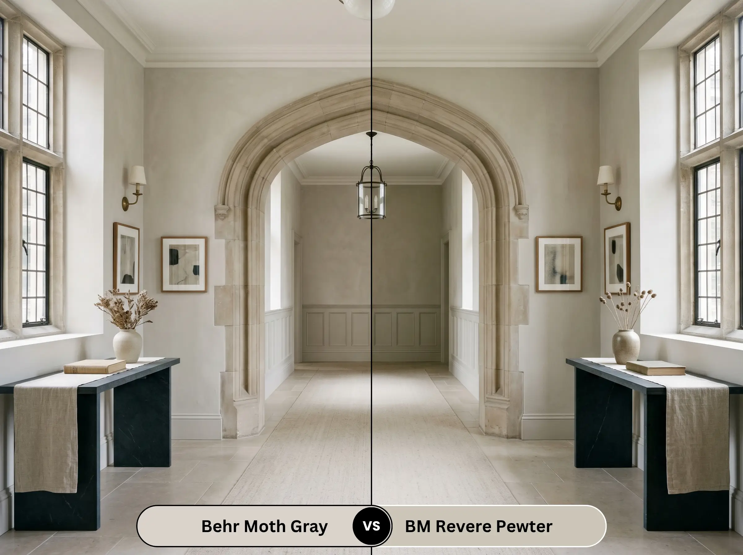
Revere Pewter is an absolute heavyweight, but it is significantly darker and carries a much more aggressive muddy-green undertone. Moth Gray feels lighter, cleaner, and more adaptable. If you want the historic gravity of Revere Pewter but your room lacks the massive windows required to support it, Behr N200-1 provides a similar aesthetic with much less risk of looking like a cave.
Alternative Shades & Brand Equivalents
If the specific nuances of this color are not quite right for your architecture, you need to pivot to adjacent options.
Same-Brand Alternatives
Cross-Brand Matches
For a deeper dive into how these specific alternatives stack up across the industry, explore our comprehensive breakdown of the best greige paint colors.
Application Strategy & DIY Directives
Understanding the theory is only half the battle. Executing the application flawlessly requires contractor-level foresight.
The Dynamic Sheen Guide
Primer Protocol
Do not skip the primer. Because this shade sits right in the middle of the light reflectance spectrum, it needs a pristine, stark white base to show its true colors. If you are painting over raw drywall or a dark, existing color, a high-quality, stain-blocking white primer is mandatory. Failing to prime will allow the old wall color to bleed through and completely warp the delicate beige undertones.
Coverage & Touch-Up Realities
Expect to apply two full coats. While Behr offers excellent coverage, a single coat will leave the pigment looking thin and uneven.
Be incredibly careful with touch-ups. Because of the delicate balance of gray and beige, touching up a scuff mark a year later with a brush will almost certainly result in “flashing” (a visible difference in texture and sheen). If a wall gets damaged, you are often better off repainting the entire plane from corner to corner.
Frequently Asked Questions
Direct, high-UV sunlight is ruthless. It will aggressively wash out the subtle nuances of the paint, stripping away the cozy beige and leaving the stucco looking like a stark, almost blinding off-white gray. If you want the true greige look on an exterior, you must drop down to a significantly darker shade on the same color card to compensate for the sun’s bleaching effect.
Yes, if the lighting is inadequate. In a narrow hallway lacking natural light, the beige undertones fall entirely flat, making the walls feel heavy and encroaching. To prevent claustrophobia, you must flood the space with high-quality, 3000K artificial lighting to activate the lighter gray notes.
It is highly reflective of environmental light, meaning it will absolutely absorb the tint of your windows. Low-E glass notoriously casts a subtle blue or green filter into a room. This cool, filtered light will immediately amplify the hidden yellow-green micro-undertone in the paint, potentially making the walls look cooler and more sterile than intended.
Texture creates thousands of microscopic shadows. When applied to heavily troweled plaster, these micro-shadows trap the light, forcing the paint to look significantly darker, earthier, and more rustic than it does on smooth drywall. The texture amplifies the beige, creating a highly tactile, old-world aesthetic.
The Hackrea Verdict & Final Warnings
Behr Moth Gray (N200-1) is an absolute triumph of color engineering. It successfully bridges the gap between modern crispness and traditional warmth, making it one of the most reliable and sophisticated neutrals available.
Its absolute best application is in expansive, open-concept living areas flooded with natural light, where it can act as a stabilizing, luxurious canvas for rich woods and heavy textiles. It is perfect for the homeowner who wants a tailored, contemporary space that still feels deeply inviting.
However, it is not for everyone. If your home features pinkish-beige travertine floors, stark Carrara marble countertops, or an abundance of polished chrome cabinet hardware, you must avoid this paint entirely. The resulting clashes will make your expensive hard finishes look cheap and discordant. Respect the architecture, control your lighting, and this warm greige will completely transform your home.