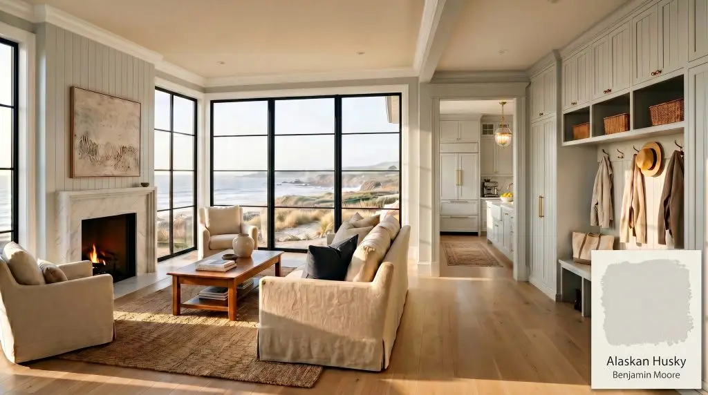
Alaskan Husky 1479
Benjamin MooreBenjamin Moore Alaskan Husky (1479) is a light, cool-leaning gray with an LRV of 66.52. Despite its frosty name, its color DNA reveals a subtle green undertone, preventing it from feeling icy or stark. It excels in south-facing rooms and coastal contemporary spaces.
Paint Technical Profile
| Color ID / SKU | 1479 |
| HEX Code | #D4D7D2 |
| Light Reflectance (LRV) | 66.52 |
| Use | Interior, Exterior |
| Best Exposures | South-facing, East-facing |
| Best For | Bedrooms, living rooms, spa-like bathrooms, kitchen cabinets |
Benjamin Moore Alaskan Husky: The Ultimate Calming Gray for Airy, Sophisticated Spaces
We are constantly searching for that elusive, perfect pale gray. You want a color that feels airy and refined, but you are terrified of accidentally turning your living room into a sterile hospital ward.
Benjamin Moore Alaskan Husky is the architectural solution to that exact anxiety.
While amateur designers often assume this shade is a pure, icy blue-gray based on its frosty name, the actual color science tells a completely different story. It is a highly nuanced neutral that bridges the gap between modern crispness and organic warmth.
If you are navigating the complexities of the Benjamin Moore Classic Color Collection Guide, this specific formulation deserves your immediate attention.
The Color DNA of Benjamin Moore Alaskan Husky
To understand why this silvery gray succeeds where so many others fail, we have to ignore the paint chip and look at the raw color math.
Mathematically, this paint sits at a hue angle of approximately 98 degrees. This places its hidden DNA firmly in the yellow-green spectrum.
Because of its Light Reflectance Value of 66.52, this hue bounces a massive amount of ambient light around a room. It possesses just enough depth to hold its own against crisp white trim without washing out into nothingness.
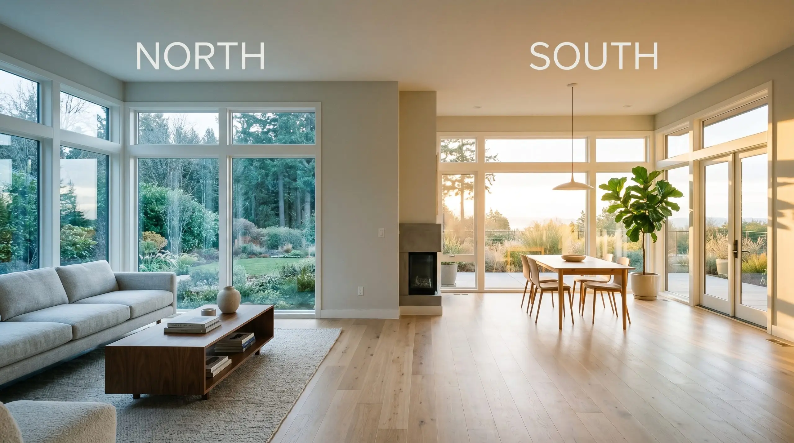
Lighting Effects & The Chameleon Factor
Homeowners often panic that a color named “Husky” will flash an icy, lifeless blue. The secret weapon here is the green undertone, which acts as a built-in warming agent to prevent that cement-like flatness.
Lighting dictates absolutely everything about how this paint behaves in a physical space.
Evaluating Alaskan Husky in Everyday Spaces
This is not a universally foolproof neutral that you can slap blindly onto every wall. It requires deliberate lighting considerations and strict adherence to specific material pairings to succeed.
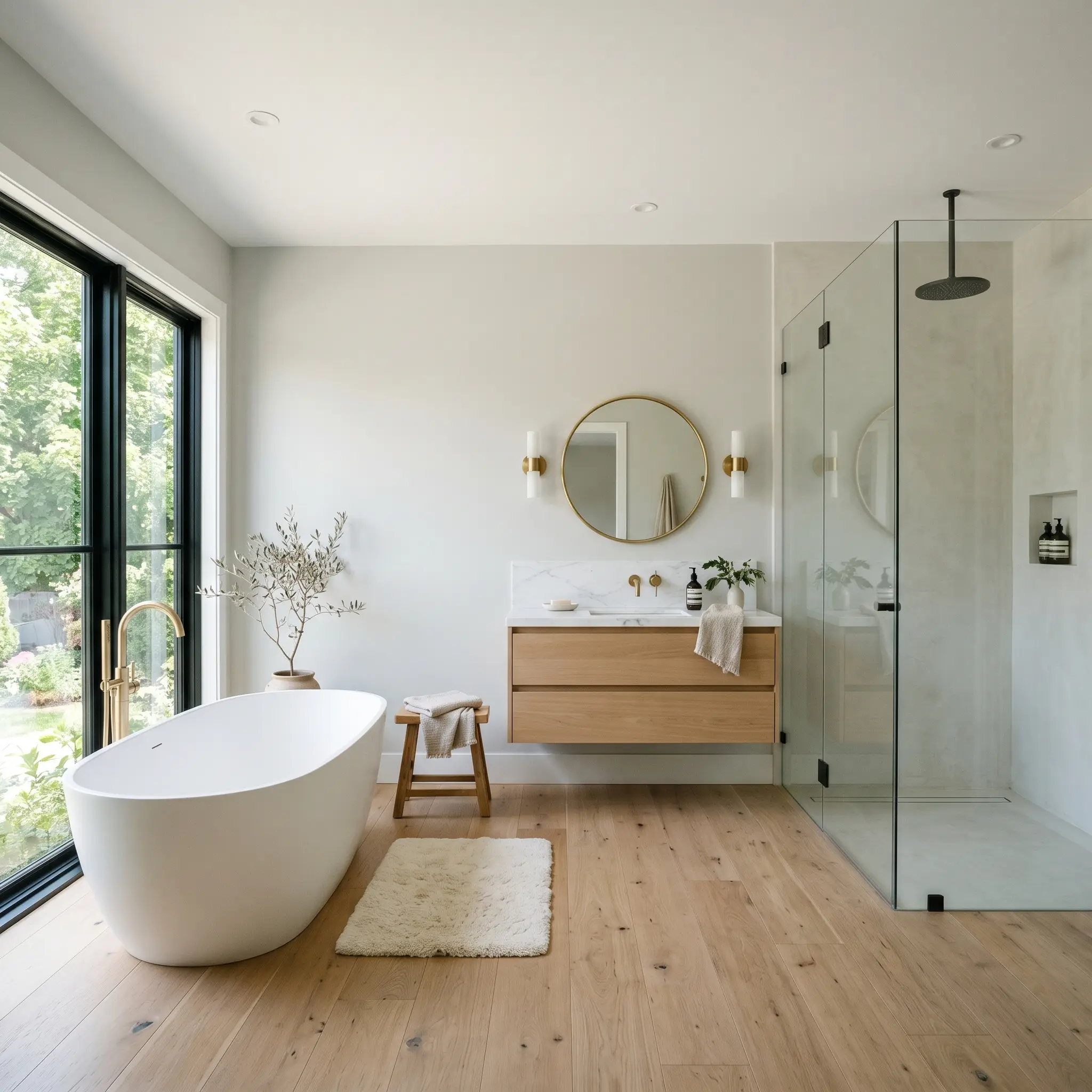
Primary Bathrooms
If you want a spa-like retreat, this shade excels when paired with abundant natural light and reflective surfaces. It acts as a serene, cooling backdrop that makes white porcelain fixtures look exceptionally crisp. You must ensure your bathroom lighting leans neutral (around 3000K-3500K) to keep the walls looking fresh rather than dingy.
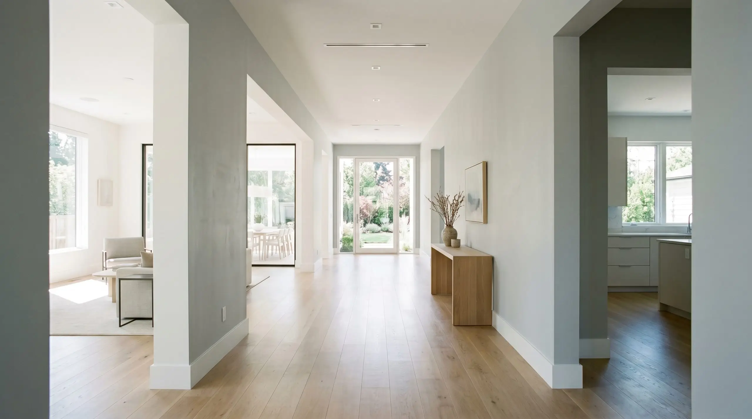
Living Rooms
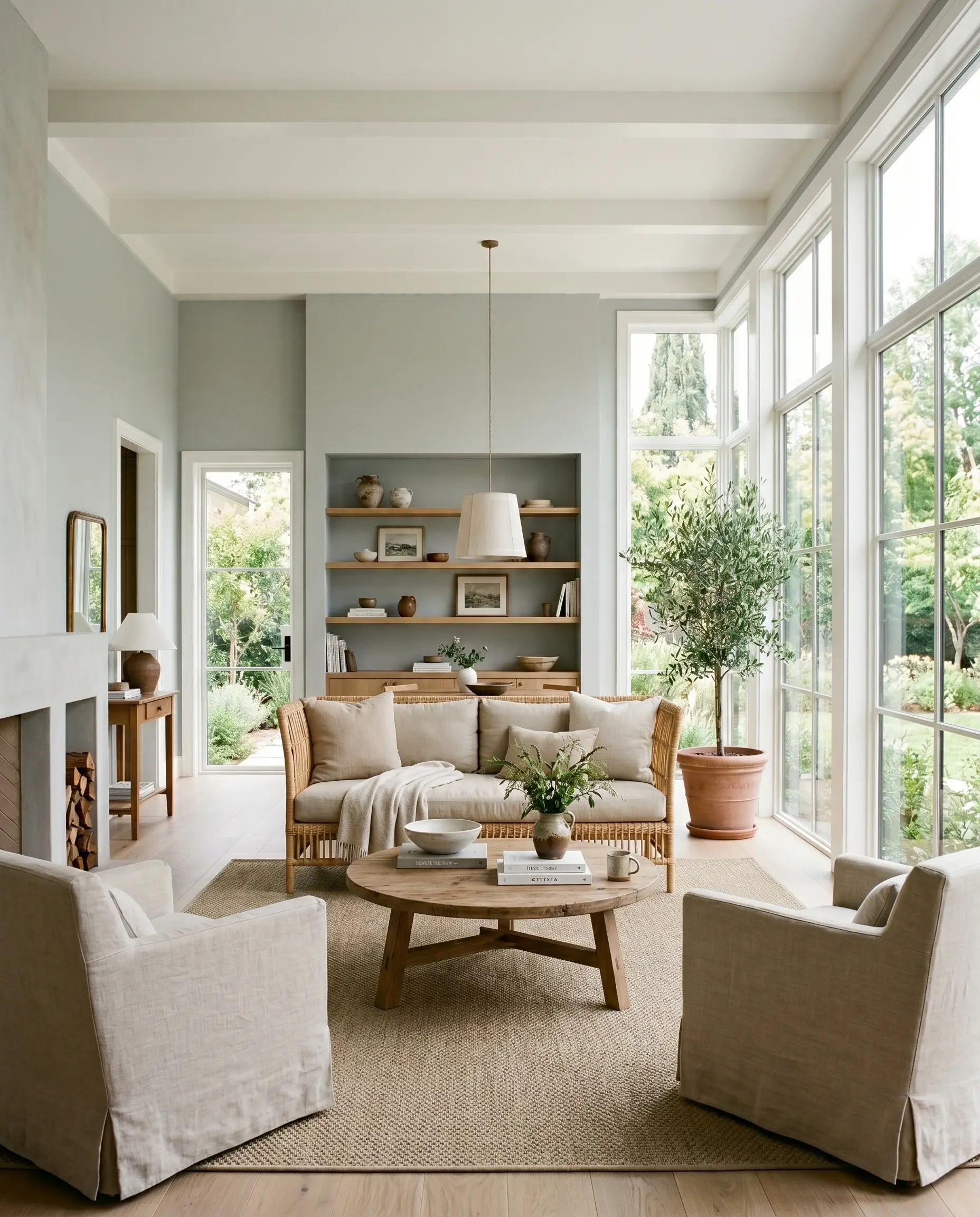
In coastal contemporary living spaces, this color thrives alongside breezy linen fabrics and massive windows. It provides a sophisticated foundation that allows natural textures to take center stage. If your living room lacks natural light, be prepared for the gray to lean heavily into its cooler, shadow-like tendencies.
Hallways & Corridors
Open-concept hallways benefit massively from the 66.52 LRV. The high reflectivity bounces available light from adjoining rooms, preventing narrow corridors from feeling like dark tunnels. Use a flat finish here to minimize the glare from overhead recessed lighting.
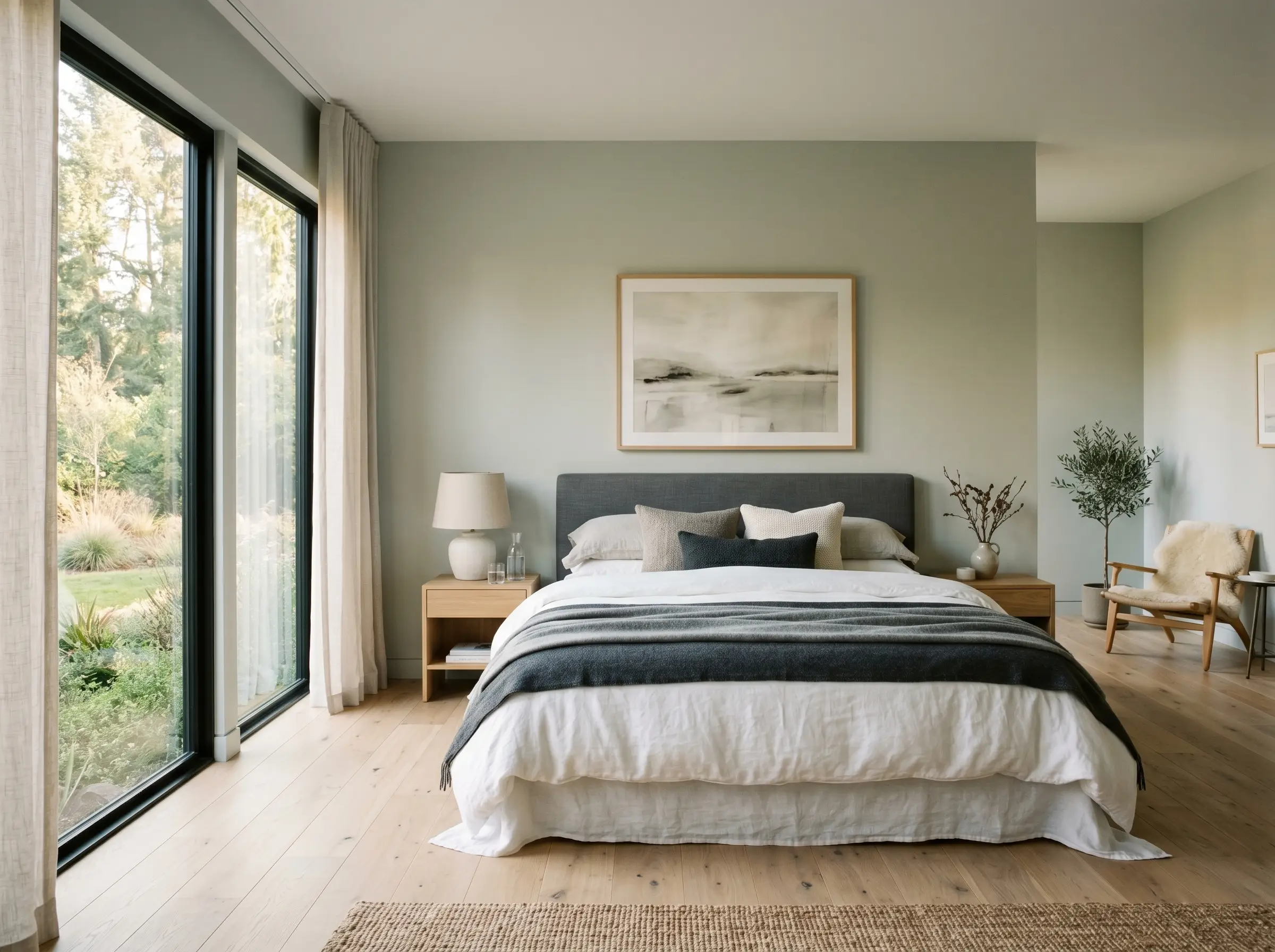
Bedrooms
For serene bedroom walls, this shade offers a calming, restorative atmosphere. It pairs beautifully with layered, textural bedding in varying shades of charcoal and soft white. Because the color shifts with the sun, your bedroom will feel crisp and energizing in the morning, yet soft and muted by nightfall.
Signature Design Ideas & Architectural Inspiration
Moving beyond standard drywall, this specific color chemistry truly dominates when applied to deliberate architectural features.
Coastal Mudroom Millwork
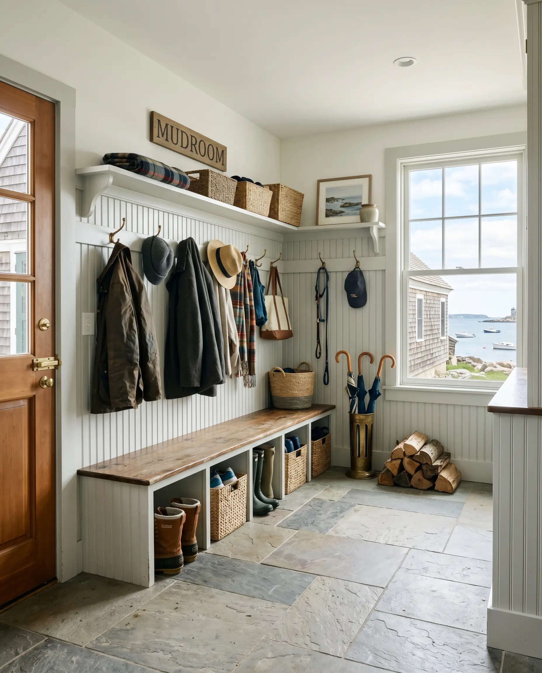
The 66.52 LRV hides scuffs far better than pure white, making it an incredibly functional choice for high-traffic beadboard or wainscoting. The green-gray DNA naturally masks the dirt and organic debris brought in from the outdoors.
If you pair this millwork with red-toned brick floors, the complementary contrast will pull an aggressive, sickly green out of the paint. Stick to neutral slate or white oak.
Failure State Warning
Upper Kitchen Cabinetry
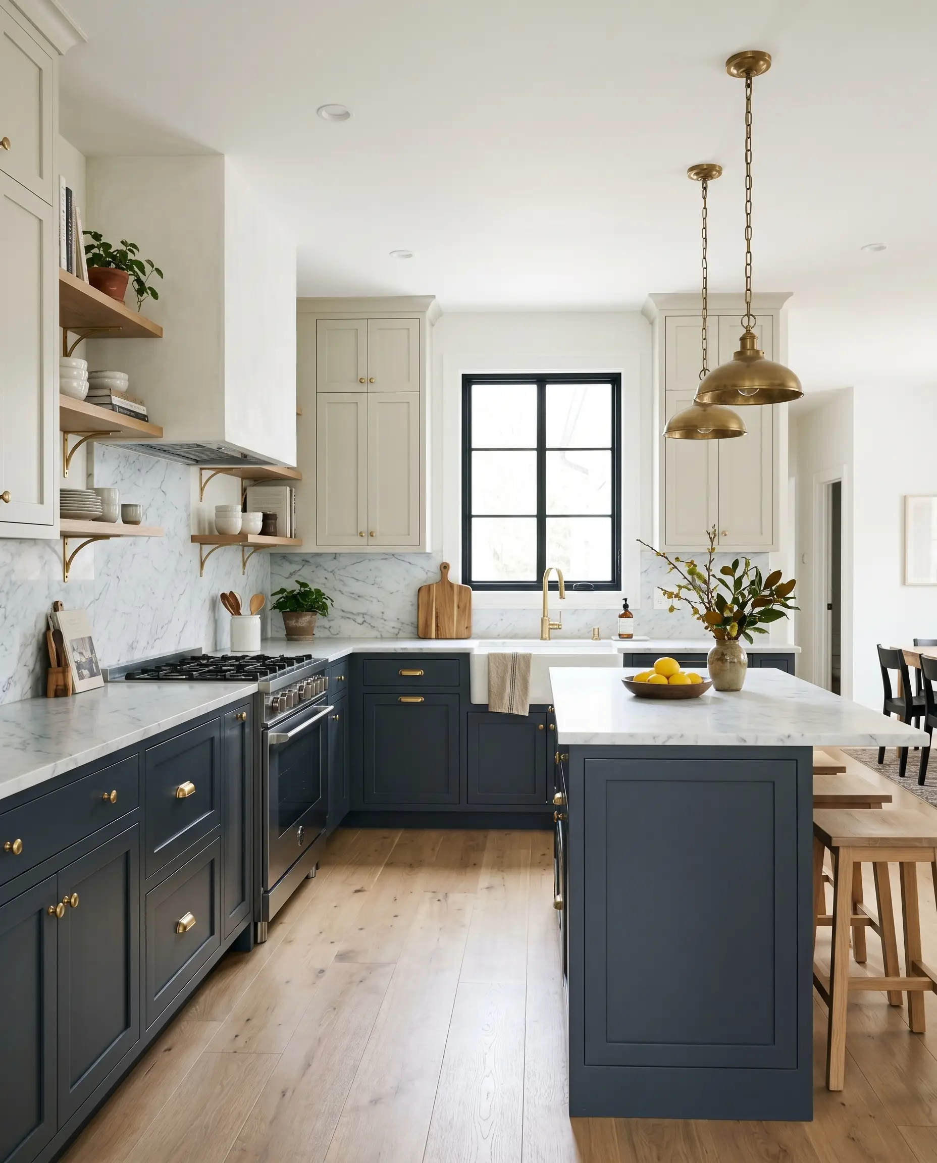
When designing a two-tone kitchen, use this shade on the upper cabinets alongside deep navy or forest green lowers. It acts as a soft, non-stark bridge to the ceiling. This draws the eye upward without the harsh, blinding contrast of pure white cabinetry.
Sunroom Vaulted Ceilings
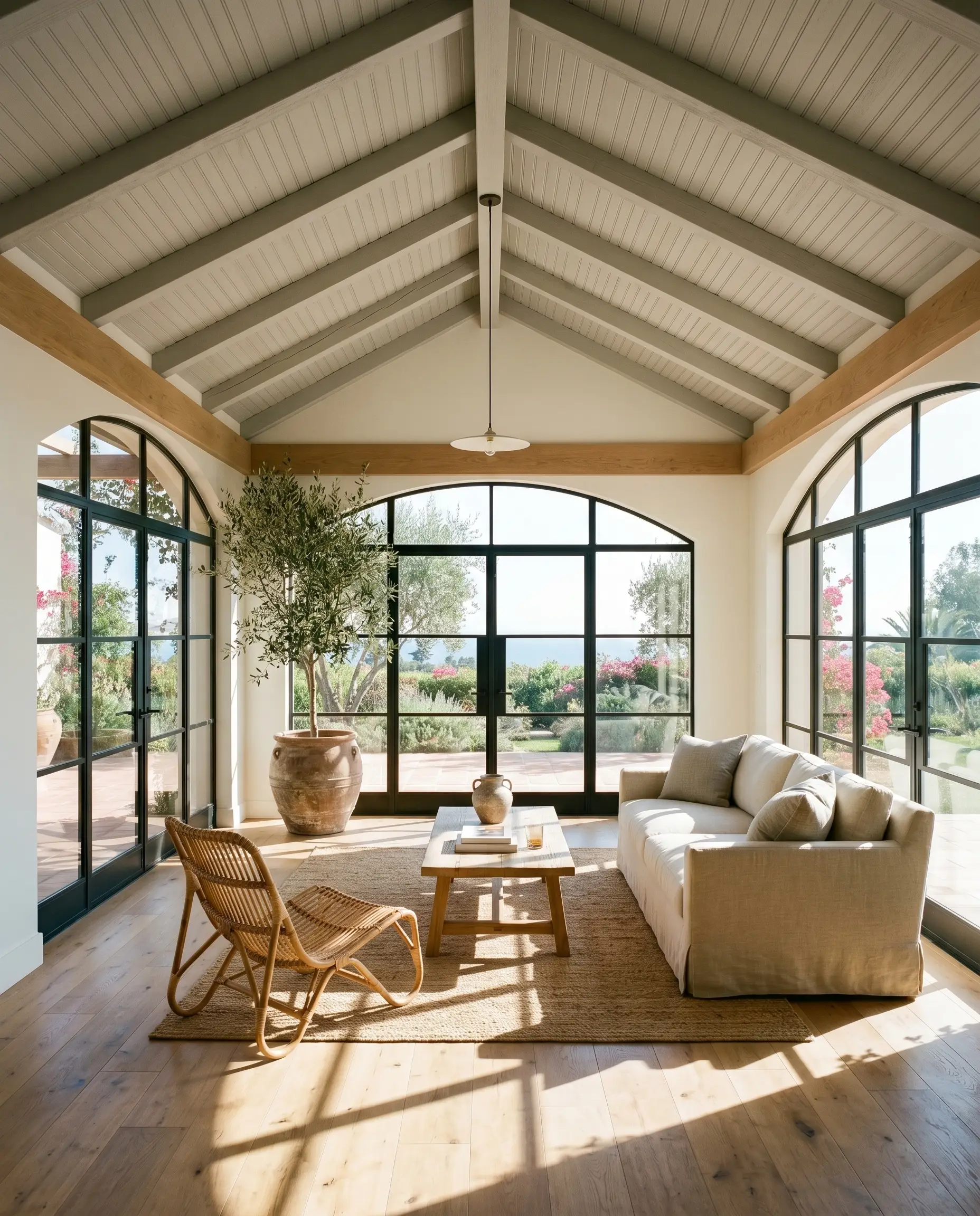
Instead of defaulting to stark white, applying this shade to beadboard ceilings mimics the look of an overcast sky. This subtle psychological trick reduces glare in rooms with excessive southern exposure. It effectively cools the perceived temperature of a hot, sun-drenched space.
Exterior Window Sashes
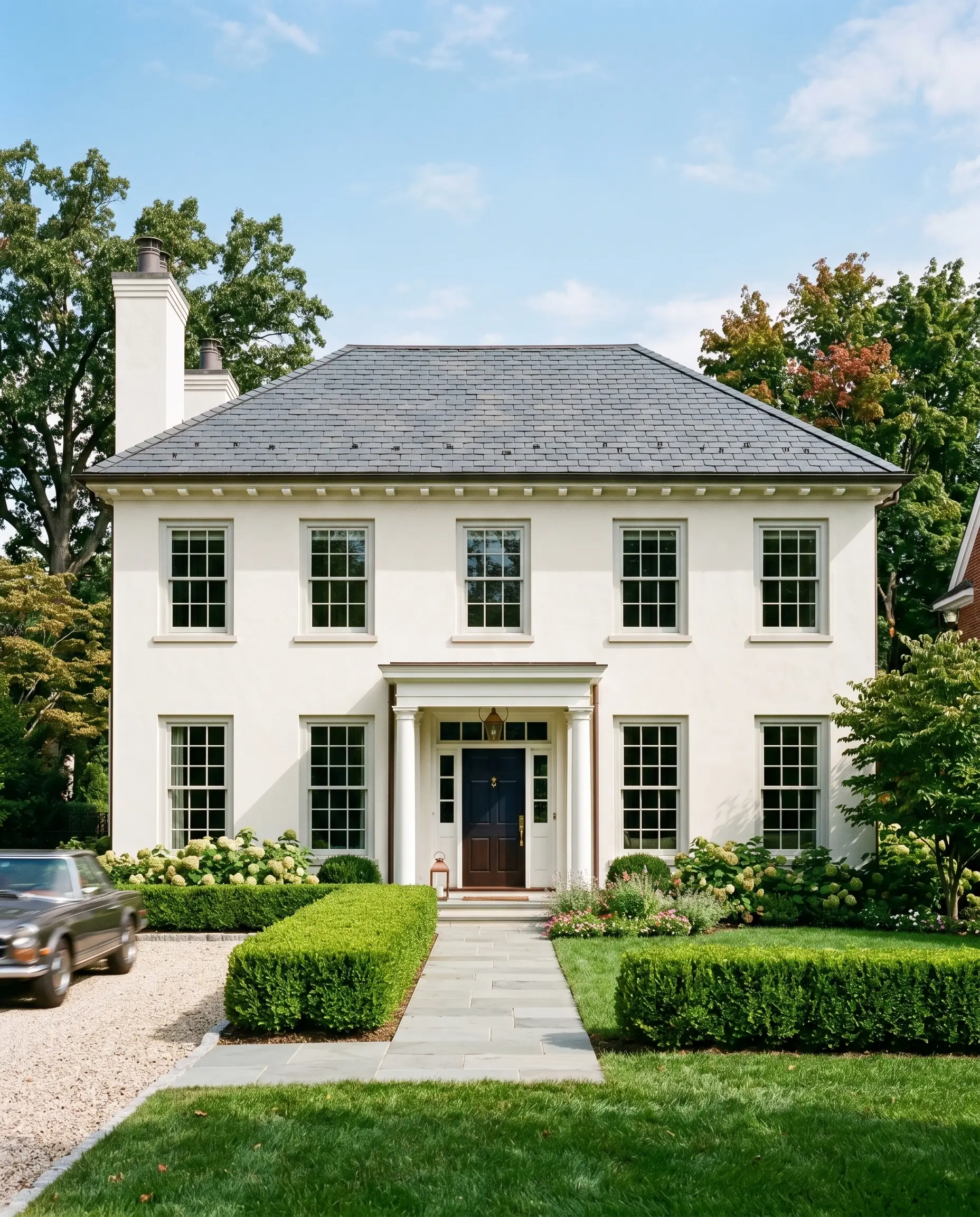
This color provides a subtle, sophisticated contrast against warm white stucco exteriors. It completely avoids the harsh, high-contrast severity of modern black or charcoal sashes. This application nods to classic transitional design, offering a timeless, historic pedigree to modern facades.
The Pairings & Accents Guide
A paint is only as successful as the materials placed immediately next to it.
Trim & Baseboards
Hardware & Architectural Materials
Unlacquered brass hardware is non-negotiable; it injects necessary warmth to balance the cool walls. Pair this with white oak flooring finished in a matte clear-coat to ground the space organically. For stonework, Carrara marble is flawless, as its natural gray veining speaks directly to the paint’s base color.
Coordinating Color Palette
Curated Mood Boards
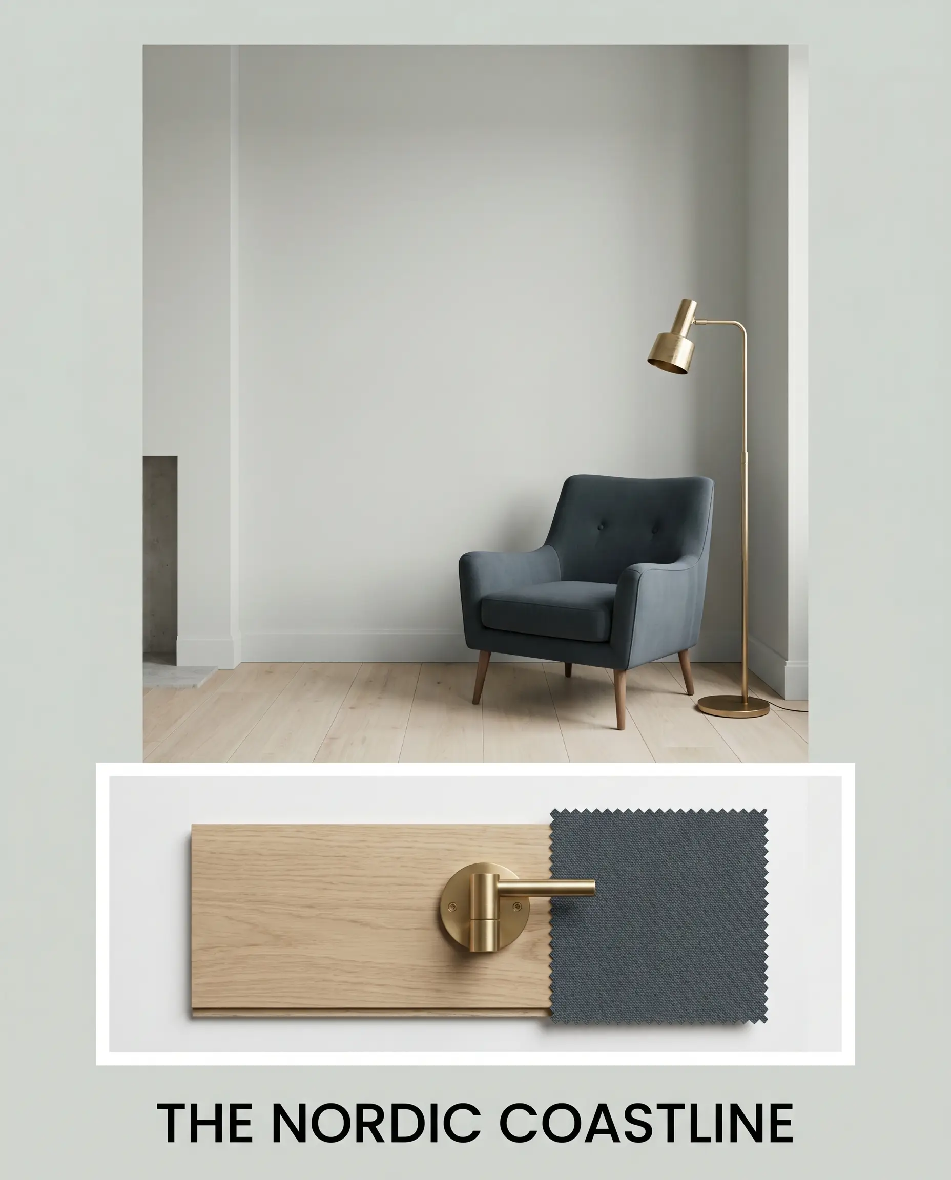
The Nordic Coastline: This palette relies on the intense atmospheric tension between pale, silvery shadows and deep, moody oceanic blues. By anchoring the space with matte white oak and accents of Hague Blue, the environment feels raw, organic, and effortlessly sophisticated. The unlacquered brass acts as the sole source of visual heat.
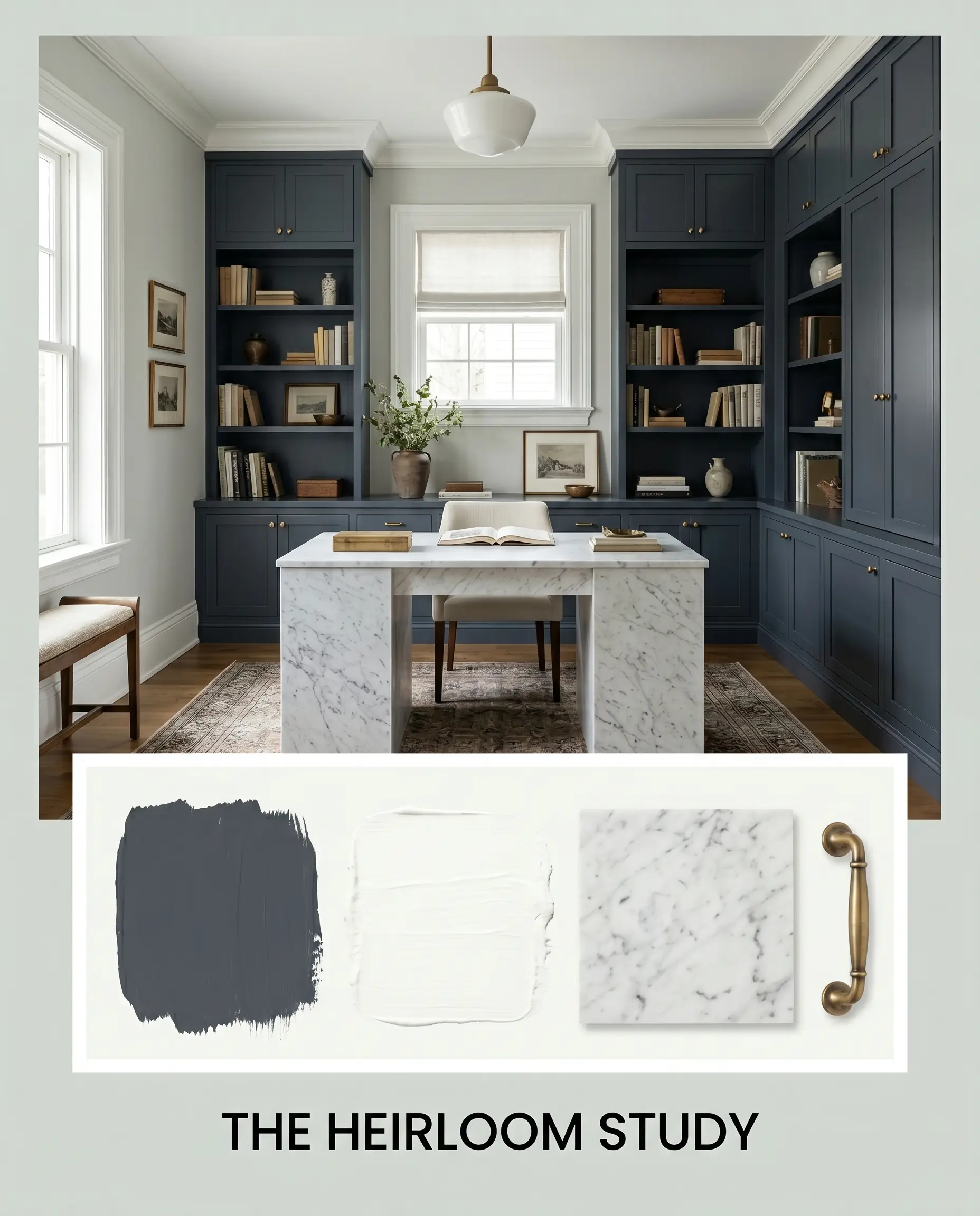
The Heirloom Study: A master study in refined, historic contrast. Hale Navy serves as the heavy, grounding force, while the crisp Chantilly Lace trim sharpens the boundaries of the room. The silvery gray acts as a mediator, allowing the rich patina of aged brass and the subtle veining of Carrara marble to dictate a mood of quiet luxury.
Head-to-Head Comparisons
Choosing the right gray often comes down to microscopic differences in chroma and undertone.
Benjamin Moore Alaskan Husky vs. Benjamin Moore Stonington Gray
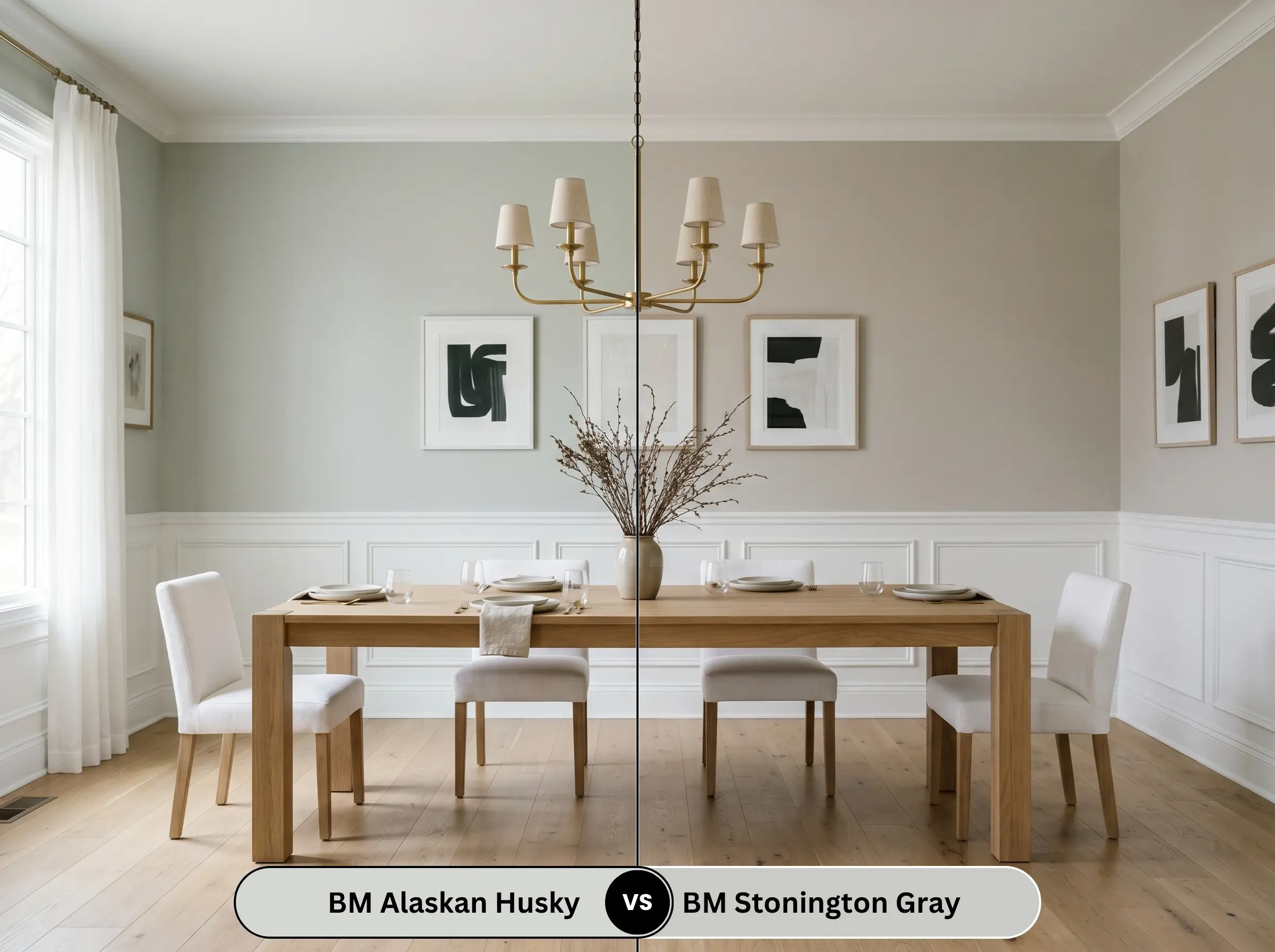
Stonington Gray is noticeably darker and leans significantly bluer. If you are terrified of green undertones and want a true, traditional cool gray, Stonington is the safer choice. However, Stonington can easily turn icy in north-facing rooms, whereas Alaskan Husky retains its softness.
Benjamin Moore Alaskan Husky vs. Benjamin Moore Gray Owl
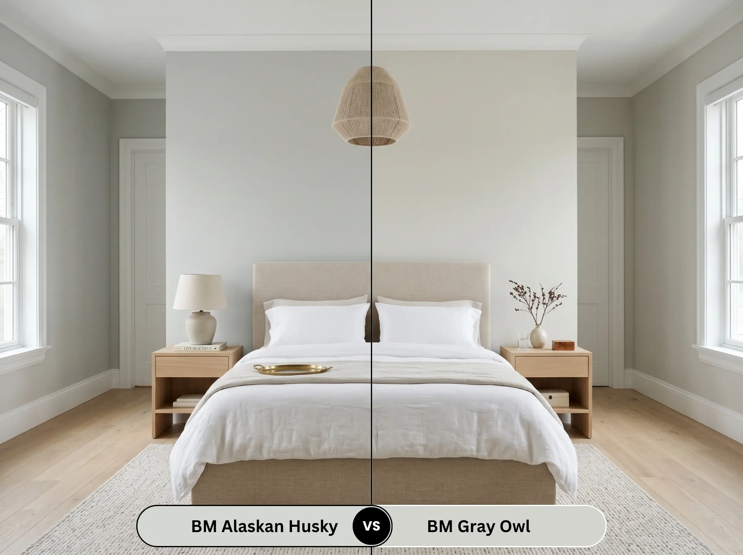
Gray Owl is the undisputed king of green-grays, but it carries far more yellow in its DNA. Gray Owl will read noticeably warmer and greener on the wall. If you want a silvery finish, stick to Alaskan Husky; if you want a warmer, more earthy gray, choose Gray Owl.
Benjamin Moore Alaskan Husky vs. Sherwin-Williams Repose Gray
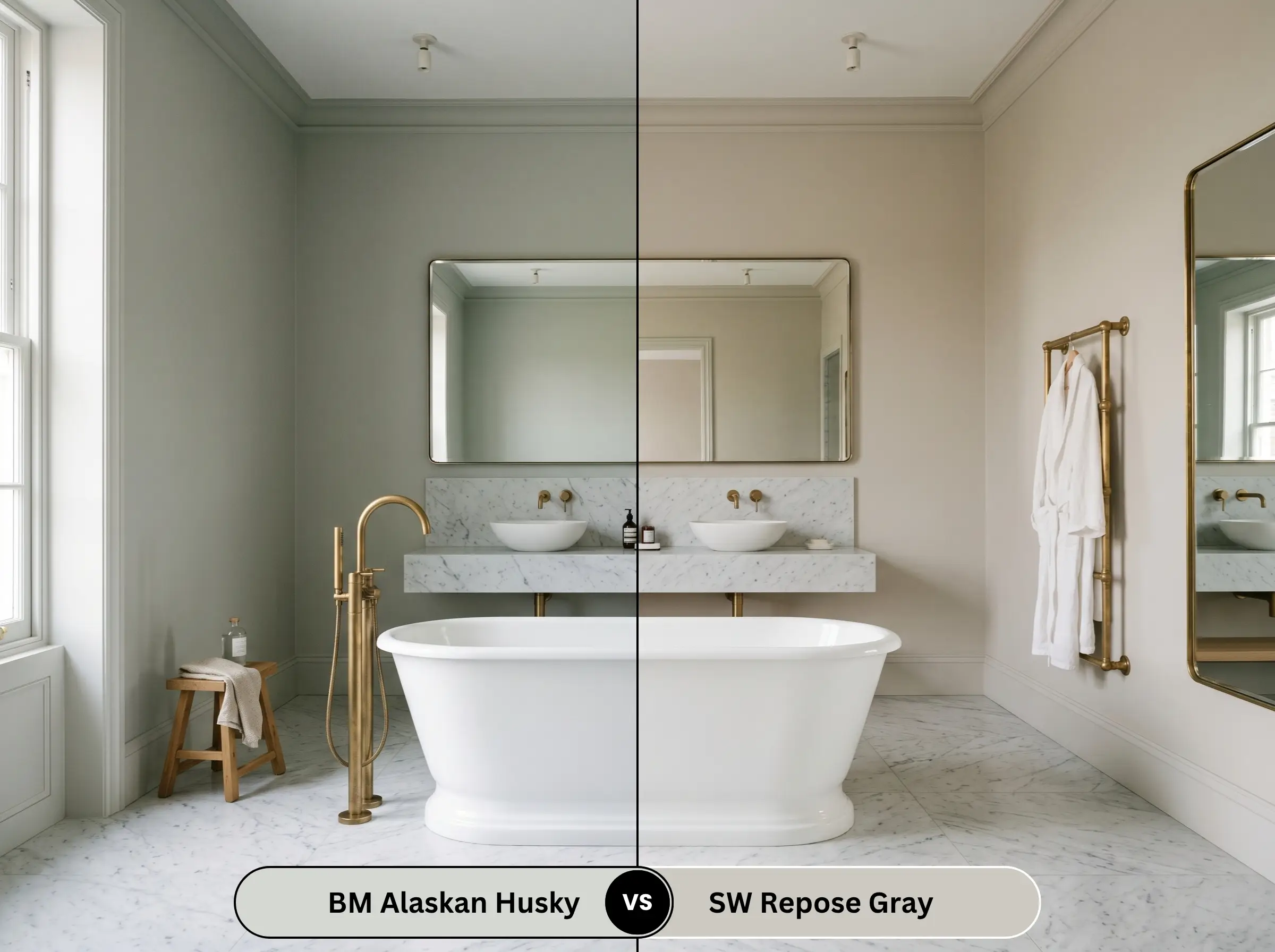
These two serve entirely different purposes. Repose Gray is a true greige with distinct taupe and brown undertones. It is substantially warmer and heavier. Alaskan Husky is far crisper, cooler, and more reflective.
Similar Colors & Cross-Brand Equivalents
If you need a slight pivot in depth or are locked into a different paint manufacturer, here are the closest mathematical alternatives.
Same-Brand Alternatives
Rival Brand Matches
Practical Application & DIY Advice
Translating color theory into a flawless physical finish requires strict adherence to proper painting mechanics.
The Dynamic Sheen Matrix
Primer Strategy
Because this is a highly reflective, pale gray, a high-quality, bright white stain-blocking primer is mandatory. Do not use a tinted gray primer. A white base ensures the subtle green undertones remain clean and luminous rather than muddy.
Coverage & Touch-Ups
Expect to apply two full coats for absolute opacity. Because it is a lighter color, touch-ups are generally forgiving in an Eggshell or Matte finish. However, if you apply this to smooth cabinetry in a Satin finish, beware of “flashing” (visible roller marks)—always use a high-density foam roller or an HVLP sprayer for millwork.
Frequently Asked Questions
Low-E glass naturally casts a faint blue-green tint into a room. This filtered light will explicitly amplify the hidden green undertones in the paint, pushing it further away from a crisp silver and closer to a soft, aquatic gray.
Yes, it is highly likely. Heavy textures cast thousands of micro-shadows. Because this gray relies on high light reflectance to look airy, those shadows will trap the light, making the ceiling look darker, heavier, and potentially muddy.
Absolutely. When translated into a mineral-based limewash, the chalky, matte finish enhances the silvery-green DNA beautifully. It creates a stunning, mottled texture that feels historically accurate for transitional or coastal estates.
Snow acts as a massive, cool-toned reflector. The intense white glare bouncing off the snow and through the windows will strip away the warming green undertones, causing the paint to read exceptionally cool, crisp, and predominantly blue-silver.
Final Verdict & Expert Warnings
Benjamin Moore Alaskan Husky is an elite, architectural-grade neutral. It is the absolute best choice for homeowners who want the crisp, airy feeling of a modern gray without the sterile, lifeless dread of an icy blue. Its finest application is on coastal mudroom millwork or in heavily windowed, south-facing living rooms where its complex green-gray DNA can truly breathe.
However, this paint is not invincible.
Clash Warning: You must ruthlessly avoid fixed architectural materials with pink or red undertones. Pink-beige travertine, heavily veined Tuscan granites, and red-brick fireplaces will forcibly extract the green from this paint via the color wheel’s rules of complementary contrast.
Furthermore, banish polished chrome from the room—it looks far too “hospital-like” against this cool gray. Finally, beware of Brazilian cherry or mahogany flooring. The intense red-orange of these woods sits directly opposite this shade, creating a jarring visual clash that turns the walls a sickly, neon-leaning hue.
If you understand how green undertones shift in gray paint, and you control your wood tones and lighting, this color will deliver an effortlessly sophisticated, high-end finish.
Closest Cross-Brand Equivalents
The absolute closest scientific color matches for Alaskan Husky across top paint brands.