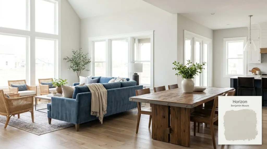
Benjamin Moore Horizon (OC-53) is a pale, effortless light gray with subtle blue and green-yellow undertones. With an LRV of 72.82, it acts as a fresh, cool-leaning neutral that bridges the gap between off-white and soft gray, making it incredibly versatile for interior spaces.
Will Horizon clash with your room?
Paint Technical Profile
| Color ID / SKU | OC-53 |
| HEX Code | #DFE1DB |
| Light Reflectance (LRV) | 72.82 |
| Use | Interior |
| Best Exposures | South-facing, East-facing |
| Best For | Living rooms, bedrooms, bathrooms, open-concept spaces |
Benjamin Moore Horizon: Cultivating Luminous Restraint in Sunlit Intersections
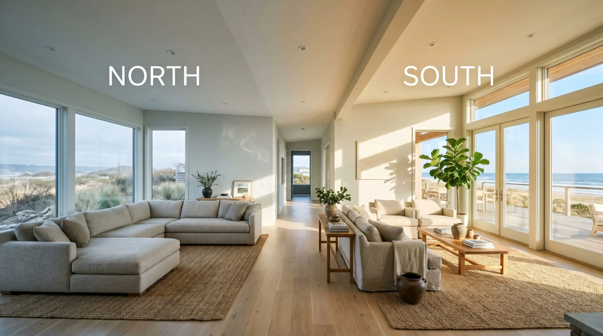
When sunlight hits a sprawling, undefined contemporary floor plan, it often strips the walls of their personality, leaving behind a stark, glaring shell. Benjamin Moore Horizon OC-53 acts as a brilliant counterbalance to this overexposure, capturing shifting light and pulling it back into a soft, structured glow.
This pale effortless gray actively cools down overheated rooms and lends a sophisticated, tailored edge to basic residential architecture. By shifting effortlessly between silver and misty blue, it provides a highly intentional backdrop that makes everyday furnishings feel incredibly curated.
Benjamin Moore Horizon OC-53: Undertones & LRV
Is this paint warm or cool? Horizon 1478 is definitively a cool gray paint, characterized by a crisp, refreshing temperature that invigorates rather than envelops.
With a light reflectance value 72.82, this shade hovers gracefully at the upper limits of the off-white collection before crossing into true gray. This means it will bounce an immense amount of illumination around an enclosed room, though it may wash out slightly into a stark white on a sun-drenched exterior facade.
Capturing Light: How the Environment Shifts the Pigment
Because it sits on a delicate fulcrum between green-yellow and blue, this color is highly reactive to its environment. If placed in an icy, shadow-heavy room with deep blue furnishings, this shade can quickly plunge into a frosty, uninviting chill. Always test your swatches, as the shifting sun will dramatically alter its perceived warmth throughout the afternoon.
Will Horizon work with your specific lighting, floor, or furniture?
Transforming Everyday Residential Architecture
This highly adaptable neutral brings a sense of quiet clarity to a home, gently defining boundaries without demanding constant attention. It softens the harsh angles of modern construction while providing a clean, luminous backdrop for daily living.
Living Rooms
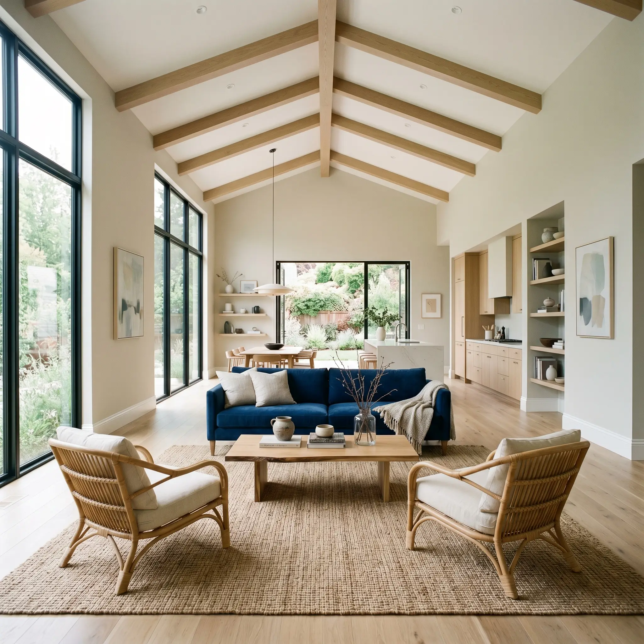
For sprawling, open-concept living areas that suffer from a lack of architectural definition, this shade provides a gentle visual anchor. It wraps basic drywall in a soft, cooling mist, allowing you to layer rich textures like velvet upholstery or woven rattan without the walls feeling heavy. The crisp pigment cuts through the visual noise, making the room feel expansive and deeply intentional.
Bathrooms
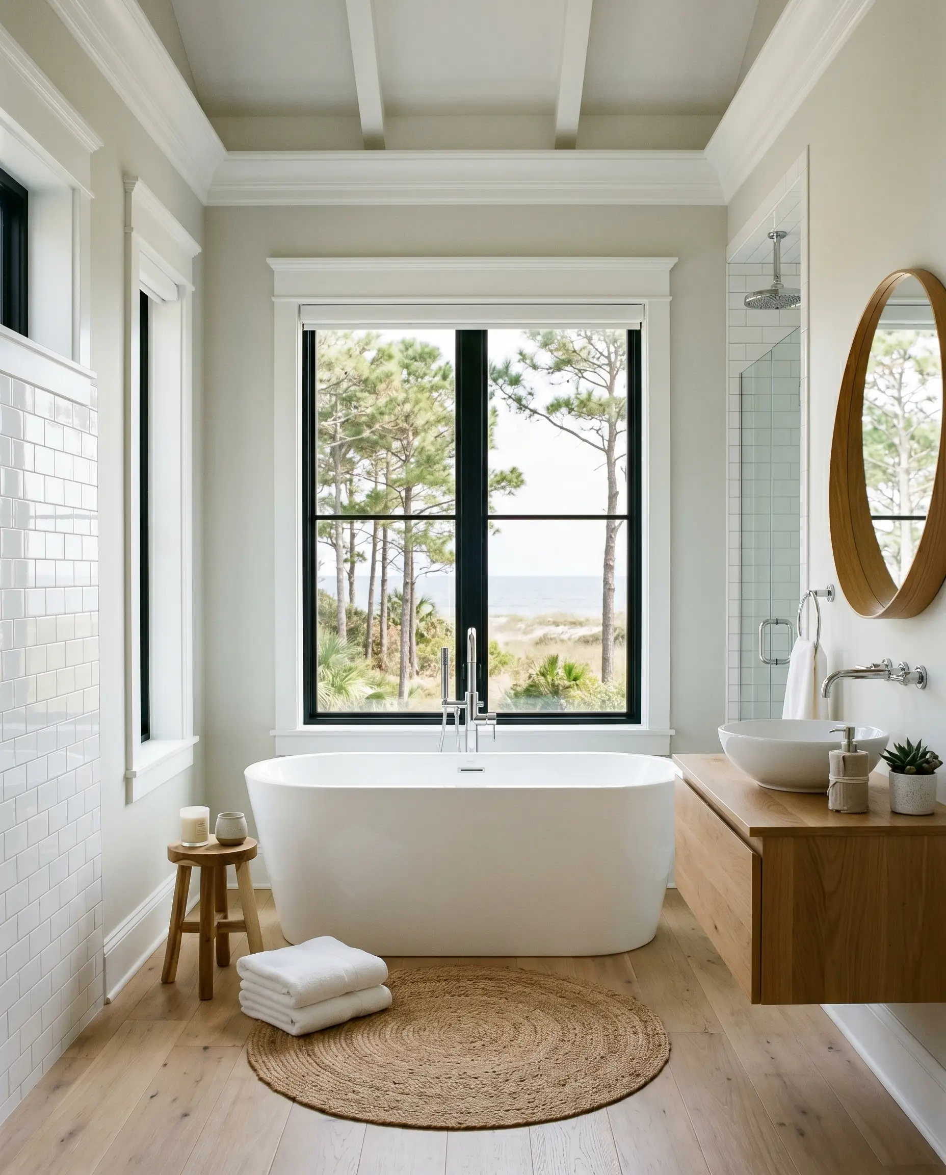
In heavily tiled, moisture-rich environments, you want a color that feels inherently clean. This crisp hue effortlessly establishes a spa-inspired retreat, especially when paired with polished chrome fixtures and stark white subway tiles. The highly reflective nature of the paint ensures even windowless bathrooms feel bright and refreshing.
Bedrooms
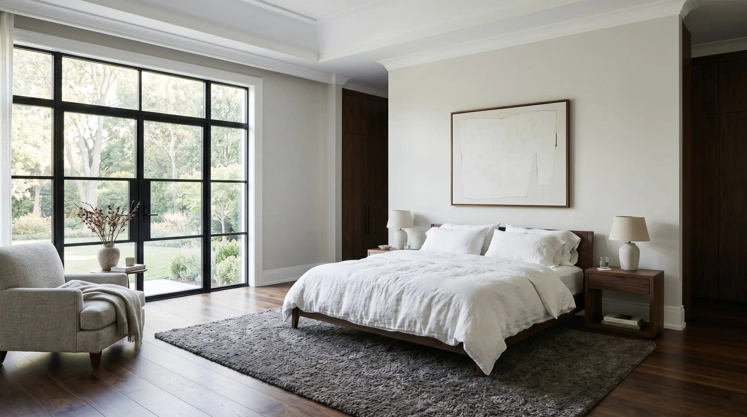
To cultivate a serene primary bedroom, lean into the color’s cooling properties to promote rest and relaxation. Layering the bed with heavy linen duvets and grounding the room with a plush, charcoal-toned rug prevents the pale gray from floating away. The subtle blue notes capture the gentle morning light, creating a peaceful, restorative atmosphere.
Kitchens
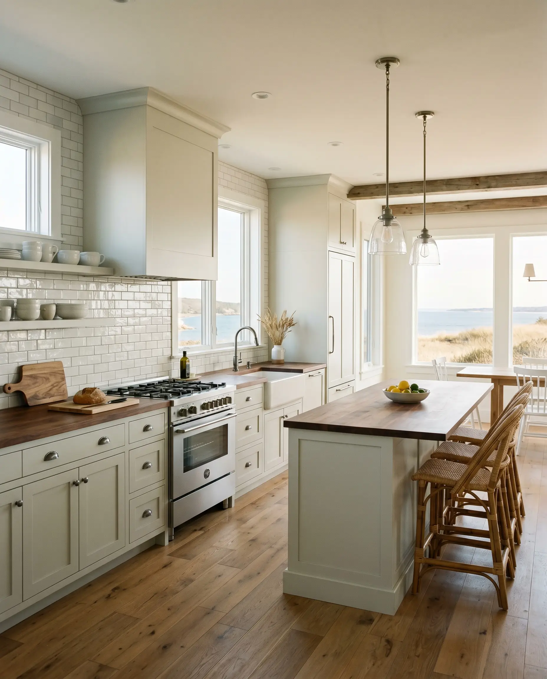
This shade brings a tailored crispness to stock cabinetry in coastal or transitional kitchens. By pairing it with a glossy glazed backsplash and rich walnut butcher block counters, you create a dynamic tension between the cool walls and the warm, inviting work surfaces. It acts as the perfect neutral bridge between heavy appliances and everyday culinary chaos.
Will Horizon work with your specific lighting, floor, or furniture?
Creative Executions for Benjamin Moore Horizon
Stepping away from broad wall applications reveals the true versatility of this crisp neutral. Its highly reactive pigment profile inspires custom, highly intentional curatorial moments throughout the home.
The Luminous Beadboard Ceiling
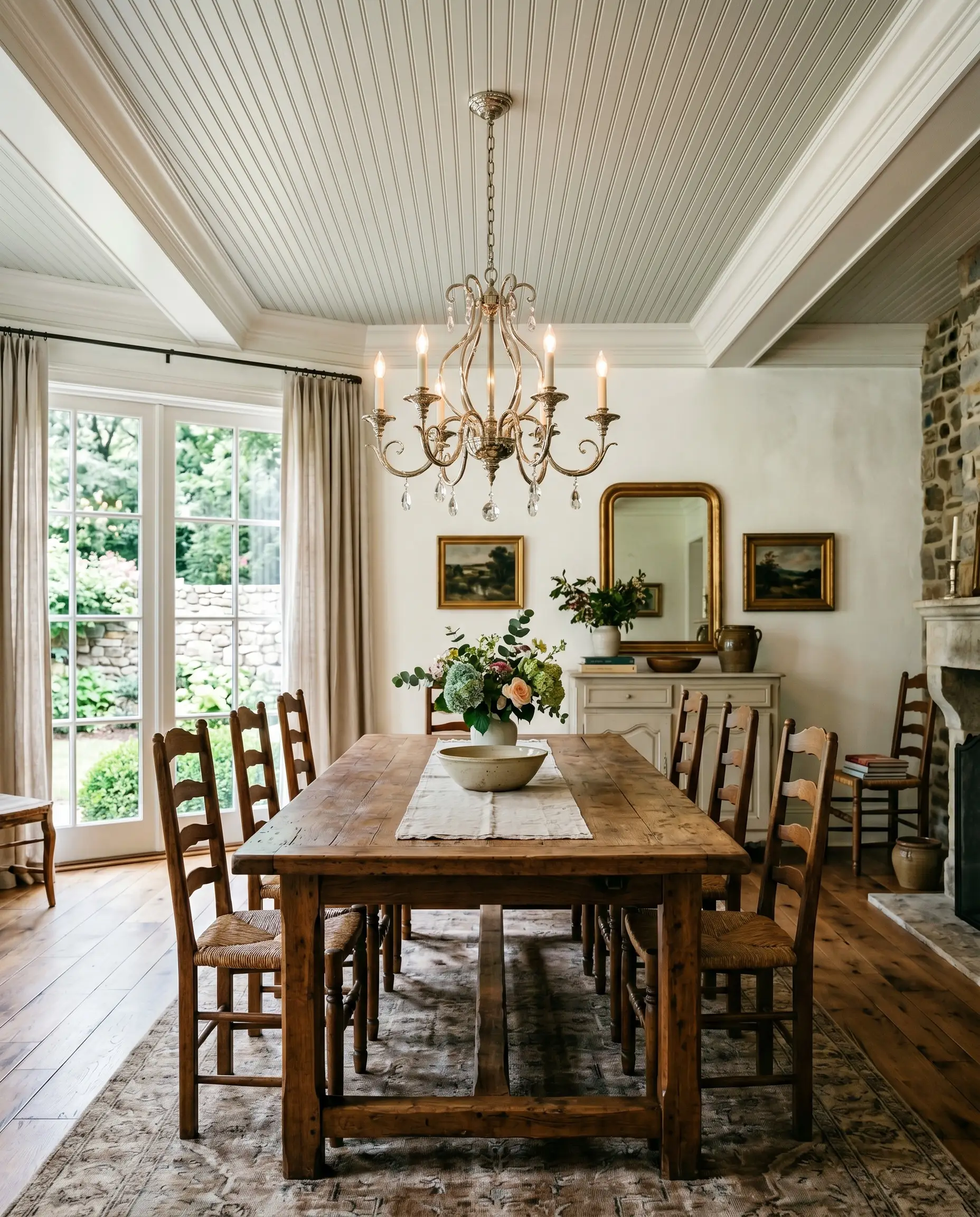
Applying this shade above the crown molding on a beadboard ceiling draws the eye upward, mimicking the expansive feel of an overcast sky. Paired with a glowing polished nickel chandelier in a French Country dining space, the subtle blue notes catch the metallic reflections. This simple application adds immense vertical height to a cramped, light-starved room.
Tailored Mudroom Cabinetry

For a high-traffic entryway, coating built-in storage cubbies in this resilient gray establishes an immediate sense of order and cleanliness. The cool pigment cuts through the visual clutter of daily life, providing a sharp, refreshing backdrop for an active family’s gear. It feels incredibly crisp against muddy boots and heavy winter coats.
Illuminating Windowless Corridors
Will Horizon work with your specific lighting, floor, or furniture?
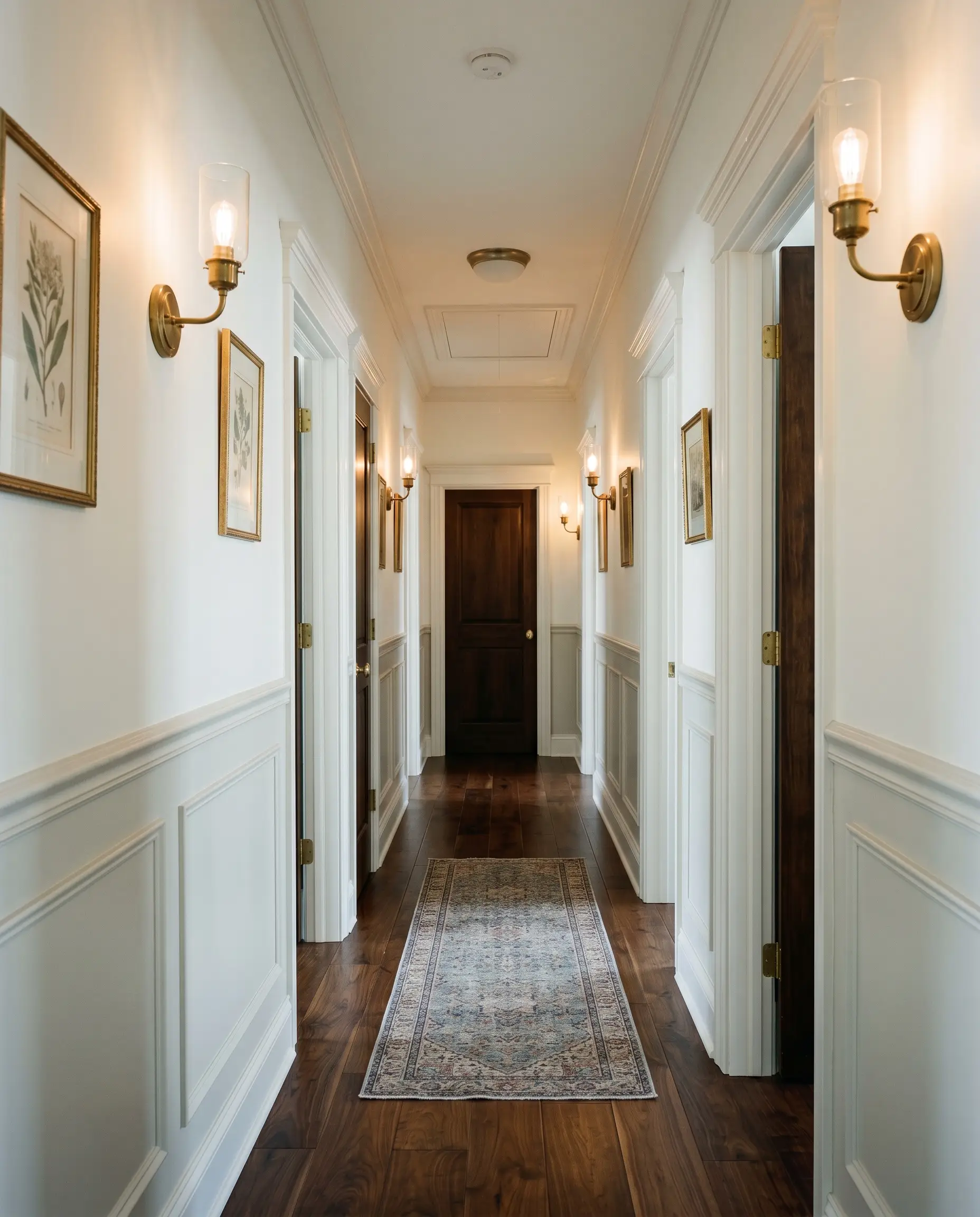
Dark, narrow hallways often feel oppressive, but wrapping traditional picture-frame wainscoting in this highly reflective hue changes the entire visual flow. The paint captures the ambient glow from overhead sconces, pushing the walls outward. This clever trick makes the tight passage feel intentionally curated rather than forgotten.
Curating Interior Design Color Palettes
To make this crisp neutral feel intentional, it requires surrounding elements that either lean into its cool clarity or offer a deliberate, warming contrast.
Trim & Baseboards
The right trim pairings dictate whether the walls feel softly blended or sharply tailored. Because of the subtle blue notes, you need a clean, un-muddled white to create a crisp architectural boundary.
Hardware & Tactile Material Pairings
Coordinating Color Palettes
Designer Mood Boards
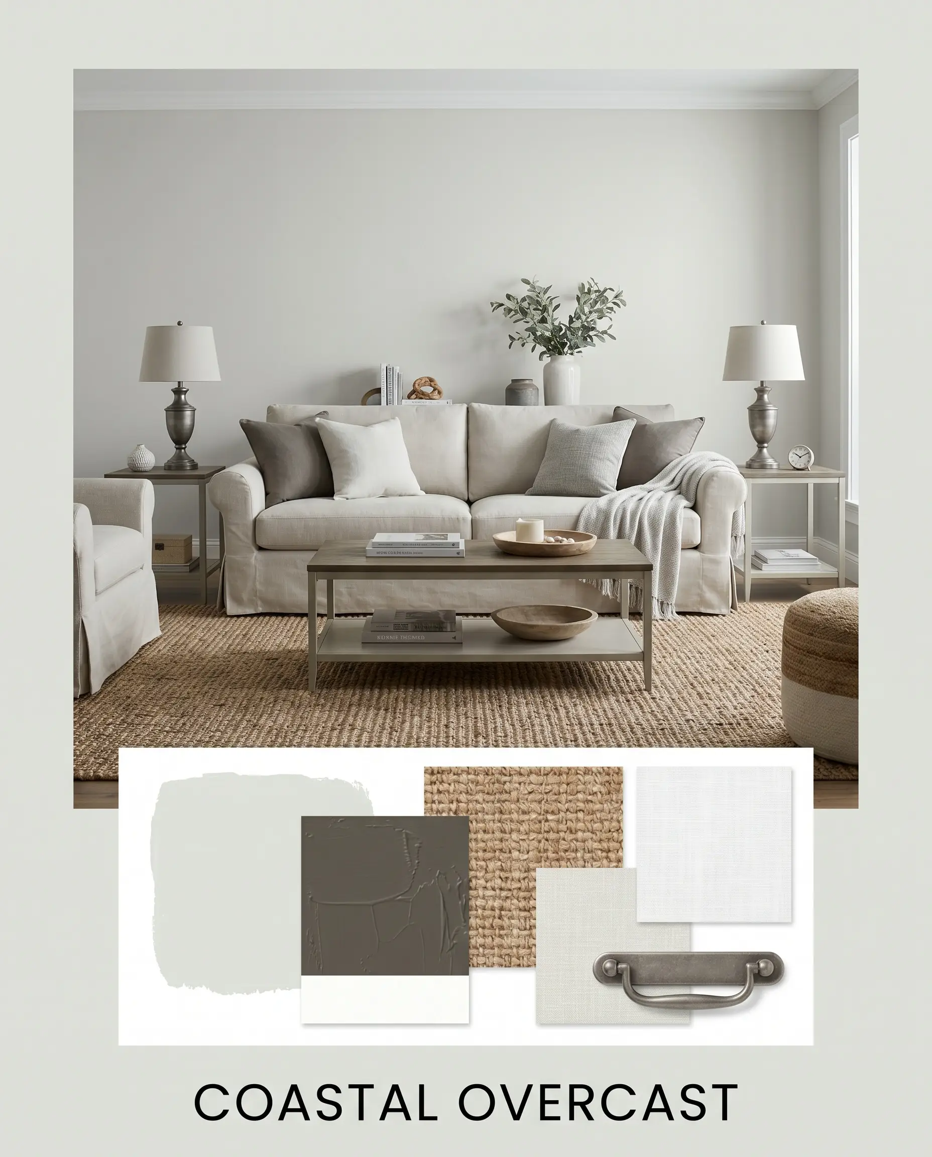
Coastal Overcast
This aesthetic channels the quiet energy of a misty morning by blending the primary gray with the deep, grounding presence of Sherwin-Williams Urbane Bronze. Layering in heavily textured woven jute rugs and a slipcovered linen sofa keeps the atmosphere relaxed and inviting. Finally, aged pewter table lamps add a touch of quiet, metallic structure to the soft surroundings.
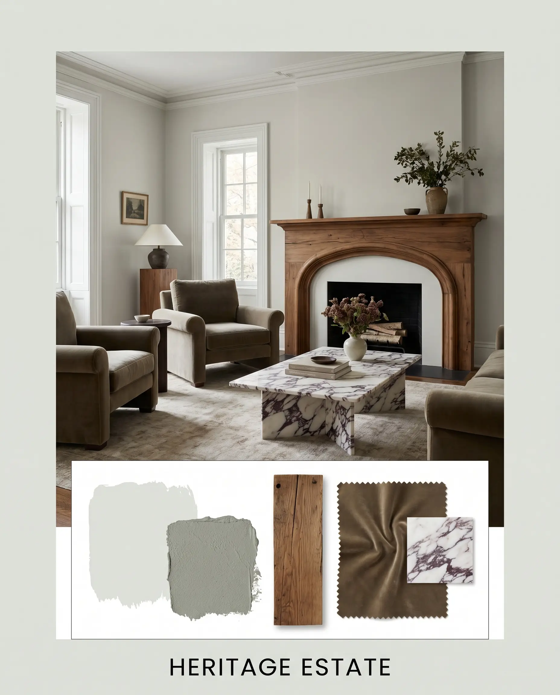
Heritage Estate
Rooted in historical elegance, this palette uses the rich, complex depth of Farrow & Ball Pigeon to frame the lighter walls. A sweeping mantle crafted from reclaimed chestnut wood injects raw, organic warmth, beautifully offset by a pair of velvet armchairs. A statement coffee table topped with Calacatta Viola marble provides a premium, aspirational focal point that brilliantly contrasts the cool gray backdrop.
Will Horizon work with your specific lighting, floor, or furniture?
Analyzing Benjamin Moore Horizon Against Rival Grays
When narrowing down the perfect neutral, subtle shifts in the pigment profile dictate which shade will thrive in your specific lighting conditions. If your room features heavy eastern exposure or warm-toned flooring, a rival option might provide a more balanced result.
Benjamin Moore Horizon vs. Benjamin Moore Gray Owl OC-52
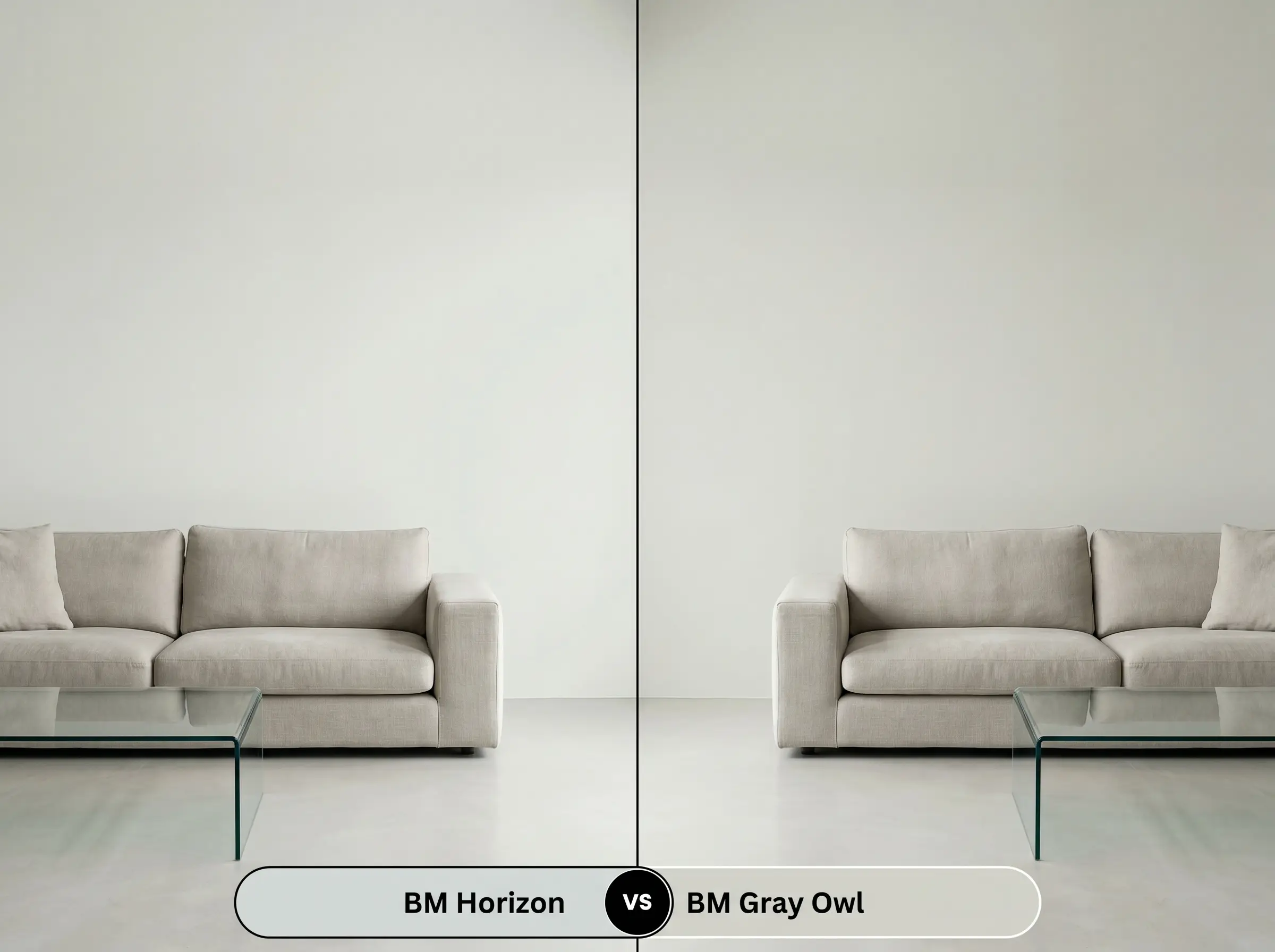
While both are incredibly popular light grays, the gray owl comparison reveals a distinct difference in temperature. Gray Owl leans heavily into its green-yellow base, making it noticeably warmer and more adaptable in north-facing rooms. Choose Horizon if you want a crisper, more modern edge with distinct cooling properties.
Benjamin Moore Horizon vs. Benjamin Moore Silver Satin OC-26
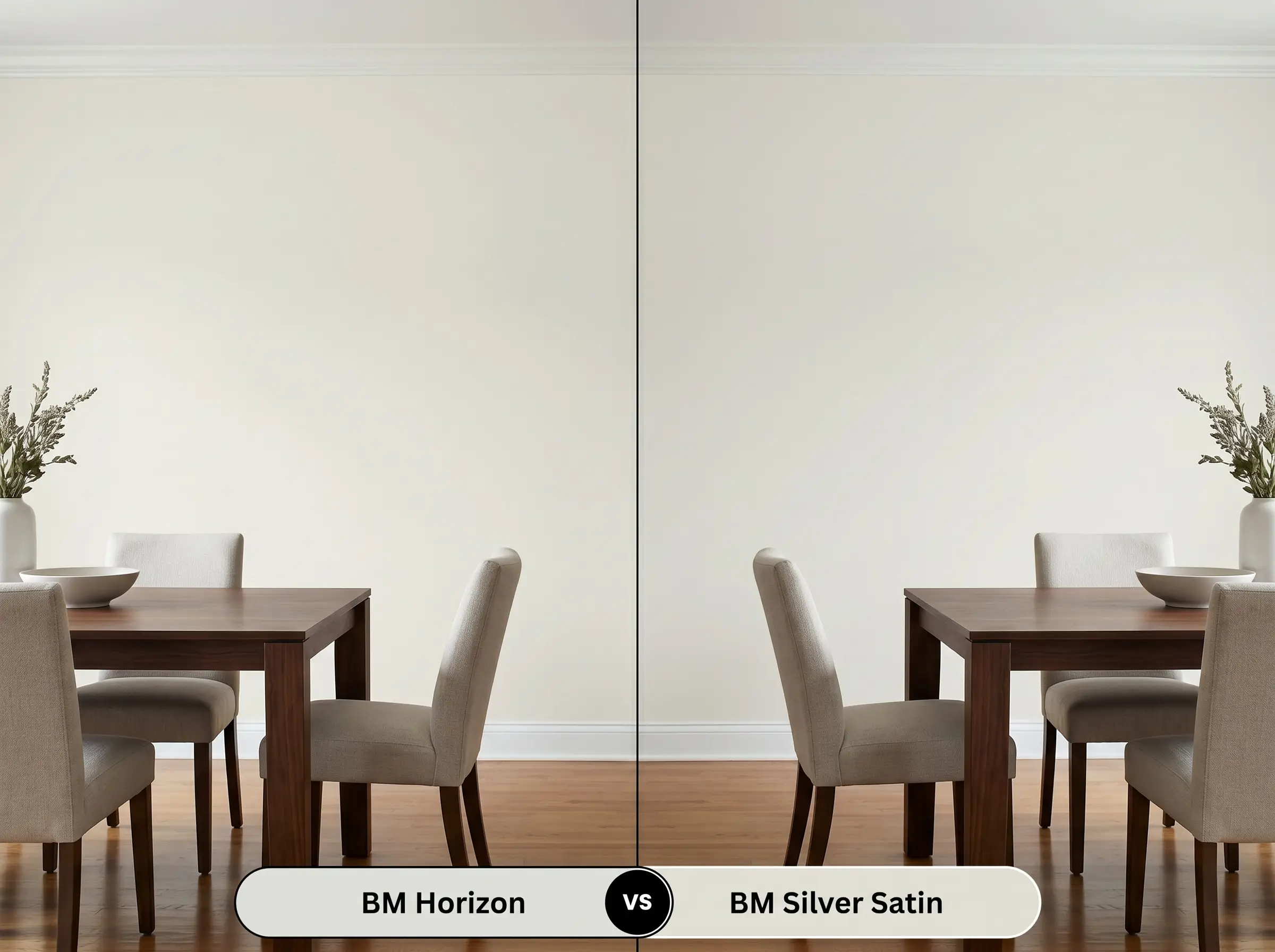
Silver Satin is a warm, ethereal greige with a faint purple undertone, sitting much closer to a true off-white. If your space features stark, cool-toned furnishings, Horizon will harmonize beautifully. Conversely, Silver Satin provides a softer, more romantic glow that excels alongside creamy textiles.
Benjamin Moore Horizon vs. Sherwin-Williams Sea Salt SW 6204
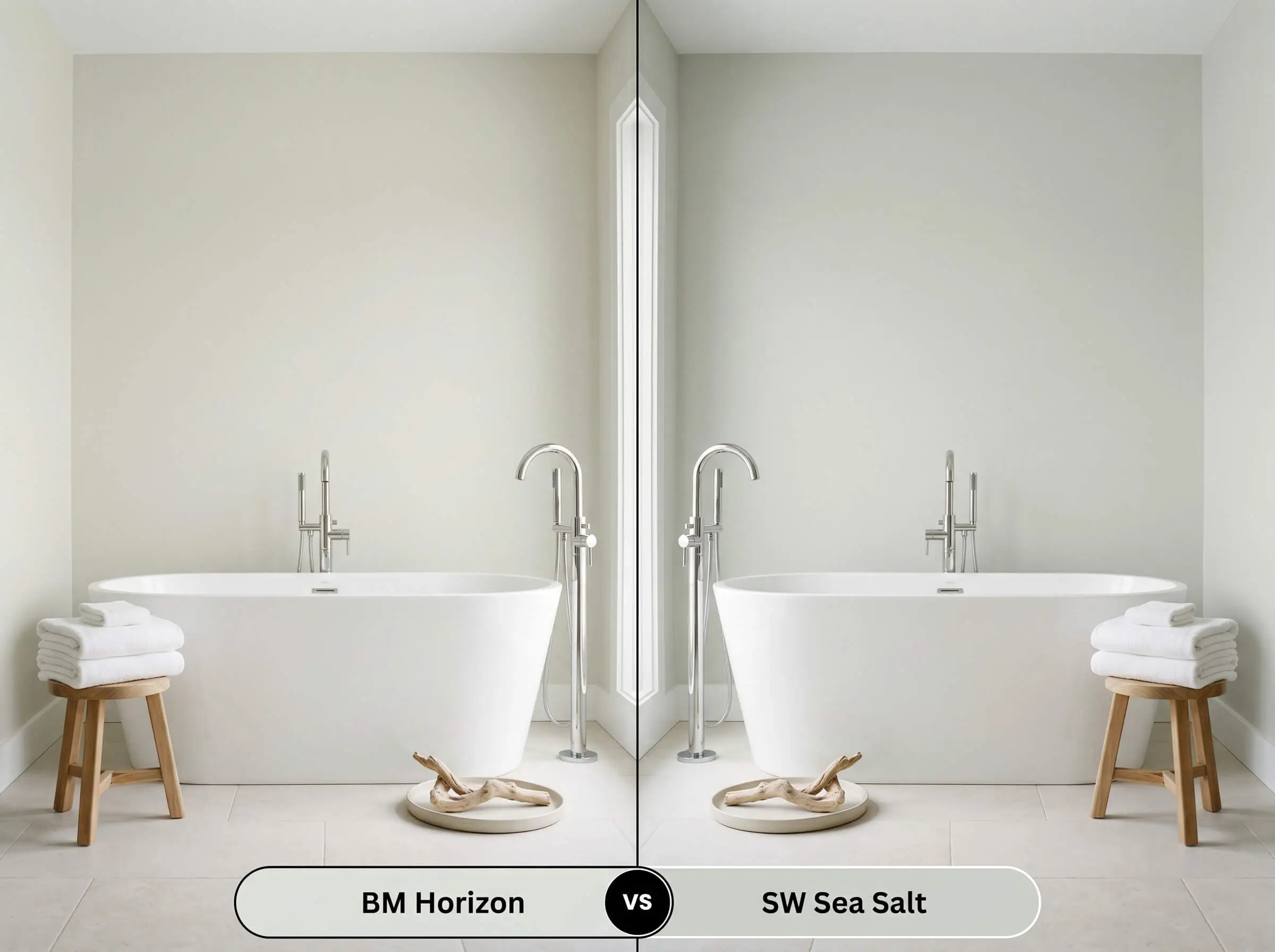
Will Horizon work with your specific lighting, floor, or furniture?
Sea Salt is a highly pigmented, muted green-blue that acts more like a soft pastel than a true neutral. If you are looking for a definitive pop of coastal color, Sea Salt delivers a beautiful, watery aesthetic. However, if you need a flexible, highly reflective architectural backdrop, Horizon remains the superior choice.
Similar Colors & Cross-Brand Matches
Finding the exact right nuance often requires exploring slight variations in depth or crossing over to a different manufacturer to accommodate local availability.
Same-Brand Alternatives
Cross-Brand Matches
Practical Application & DIY Strategies
Translating this beautiful color from a swatch to a finished room requires specific application techniques to ensure the pigment cures correctly and maintains its luminous quality.
The Dynamic Sheen Guide
Primer Strategy
Because this shade is highly reflective and relatively sheer, achieving its true, crisp tone requires a high-quality, bright white primer. Applying it directly over dark, existing colors without a stain-blocking base coat will cause the old hue to bleed through. This instantly muddies the delicate gray and destroys its clean, icy finish.
Coverage & Success Tips
Formulated with Gennex Color Technology, this paint applies smoothly, but its pale nature typically demands two full, even coats for complete opacity. Always maintain a wet edge while rolling to prevent flashing, as highly reflective grays will quickly highlight uneven roller marks or heavy-handed touch-ups.
When applying pale grays with subtle blue notes, ensure you cut in your edges and roll the walls on the same day. Letting the brushed edges dry overnight before rolling the center can create a faint, darker “picture frame” effect around your room.
Hackrea Pro-Tip (The Cut-In Warning)
Frequently Asked Questions
Because windowless bathrooms rely entirely on artificial lighting, the color’s appearance depends heavily on your bulbs. If you use cool, 4000K+ LEDs, the blue undertones will definitely sharpen, but swapping to warmer 2700K bulbs will pull the green-yellow base forward, keeping it a soft, balanced gray.
The highly cool, blue-leaning nature of this gray creates a stark contrast against orange or red-toned woods. Instead of neutralizing the floors, the icy walls will actually make the red oak appear warmer and more vibrant, which can feel visually jarring if you prefer a seamless, tonal aesthetic.
It performs beautifully on cabinetry, especially when applied in a durable satin finish. While intense under-cabinet task lighting might momentarily wash out the color to a stark off-white, the paint will retain its crisp, tailored depth across the rest of the kitchen.
Brass hardware introduces a sharp, warming contrast that highlights the paint’s cool blue notes, making the gray feel crisper and more modern. Brushed nickel, on the other hand, harmonizes with the cool undertones, creating a seamless, icy, and understated look.
The Final Verdict on Horizon
Benjamin Moore Horizon is a masterfully balanced, highly reflective neutral perfect for homeowners seeking a crisp, tailored atmosphere. It excels in modern, light-filled layouts where its cooling properties can actively tame harsh sunlight and provide a sophisticated backdrop for layered, textural design.
While incredibly versatile, this paint is not for every environment, particularly spaces dominated by heavy, yellow-leaning finishes. Pairing this icy gray with highly saturated Tuscan-style travertine tile, deep cherry wood cabinetry, or overly warm beige carpeting will force the paint’s blue undertones into overdrive, creating a discordant, visually jarring clash. The cool walls will actively fight against the earthy, orange-toned fixed elements, leaving the room feeling disjointed and confused rather than intentionally curated.
Room Compatibility & Clashes Diagnoses
Hackrea's reports evaluating the compatibility of Horizon in real rooms.No compatibility tests for Horizon yet.
Be the first to see how this color reacts to your space. Run a free architectural diagnostic now.