The Designer’s Guide to Pairing Curtains With Emerald Green Walls
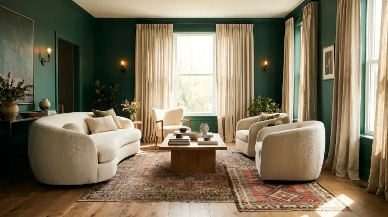
Emerald green is a commanding, high-impact color choice that demands respect. If you have painted your walls this rich jewel tone, you already know the primary fear: choosing the wrong textiles and accidentally transforming your space into a dark, suffocating cave or a highly saturated holiday display.
Curtains serve as the crucial filtering mechanism for natural light in a dark room. Choosing the perfect drape for emerald walls is not simply about consulting the color wheel; it requires a strict evaluation of fabric texture, opacity, and your overall structural goal.
You must first decide if you intend to color-drench the room for maximum drama, or if you need to provide necessary visual relief from the heavy, dark paint.
| Design Strategy | Vibe & Atmosphere | Ideal Fabrics | Ideal Room Orientation |
|---|---|---|---|
| The Jewel Box Approach (High Drama) | Immersive, cinematic, and deeply saturated. Blurs the boundaries of the room. | Matte velvets, heavy wools, raw silks. | South or West-facing (requires abundant natural light to prevent feeling cavernous). |
| The Relief Approach (High Contrast) | Tailored, transitional, and crisp. Breaks up the heavy paint with intentional lightness. | Slubby linens, sheer cottons, textured boucles. | North or East-facing (maximizes and diffuses limited natural sunlight). |
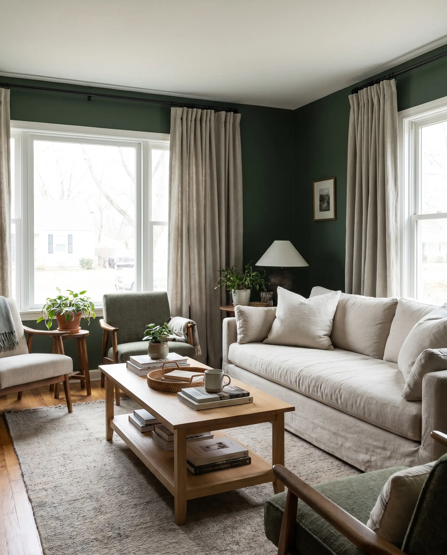
Neutral & Diffused Curtains (Providing Visual Relief)
Stark, cheap white fabrics look intensely jarring against deep emerald walls. The secret to providing visual relief without losing sophistication lies in manipulating the Light Reflectance Value (LRV) through heavy, slubby textures that successfully bridge the gap between the dark paint and the incoming natural light.
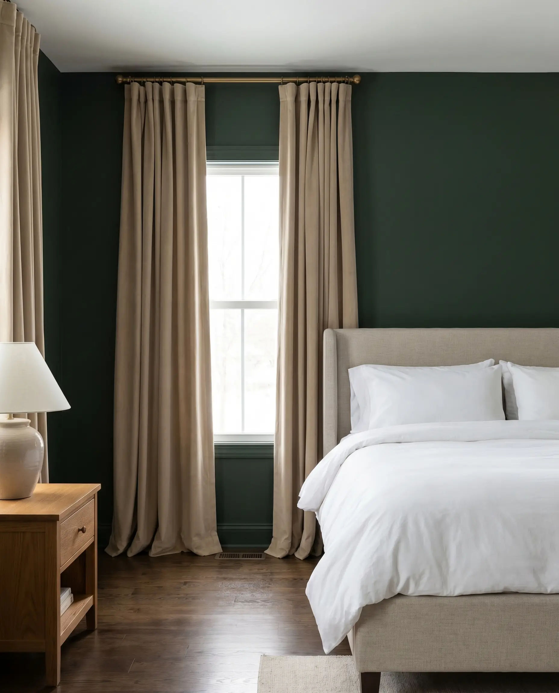
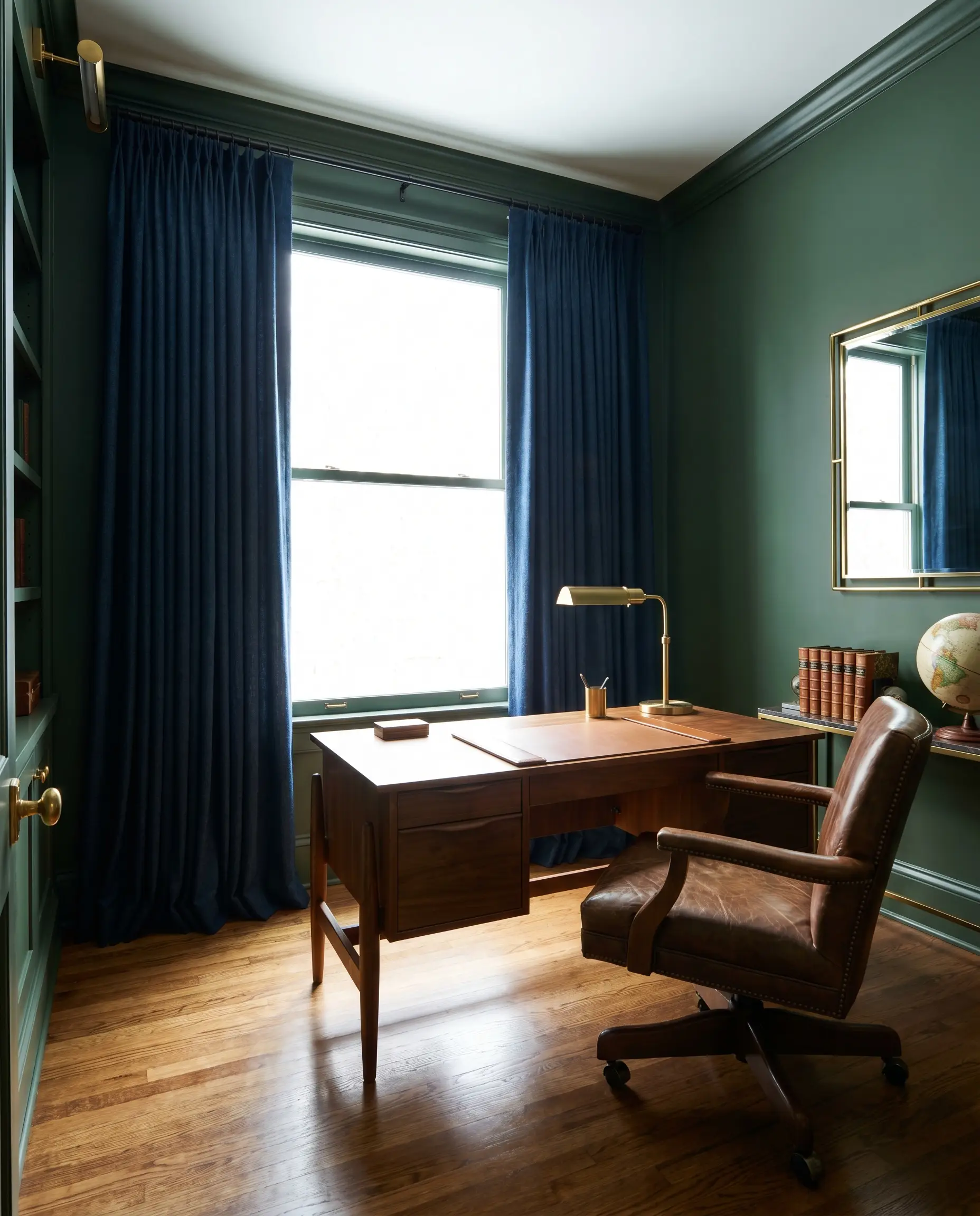
Alabaster Pinch-Pleat Belgian Linen
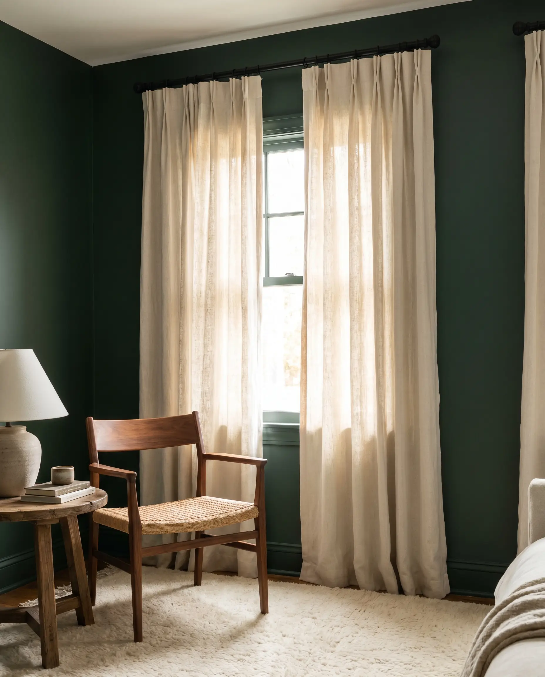
A slubby, unbleached linen creates a soft, organic transition from the heavy green wall, allowing natural light to filter through without starkness. The pinch-pleat header maintains a tailored, bespoke architecture that prevents the relaxed fabric from looking sloppy.
- Vibe: Organic Modern elegance.
- Key Materials: Heavyweight Belgian linen.
- Paint Match: Benjamin Moore Hunter Green.
- Hardware Check: Pair with a matte black iron rod to ground the airy fabric and echo the room’s darker undertones.
Stark Optic White Sheer Cotton
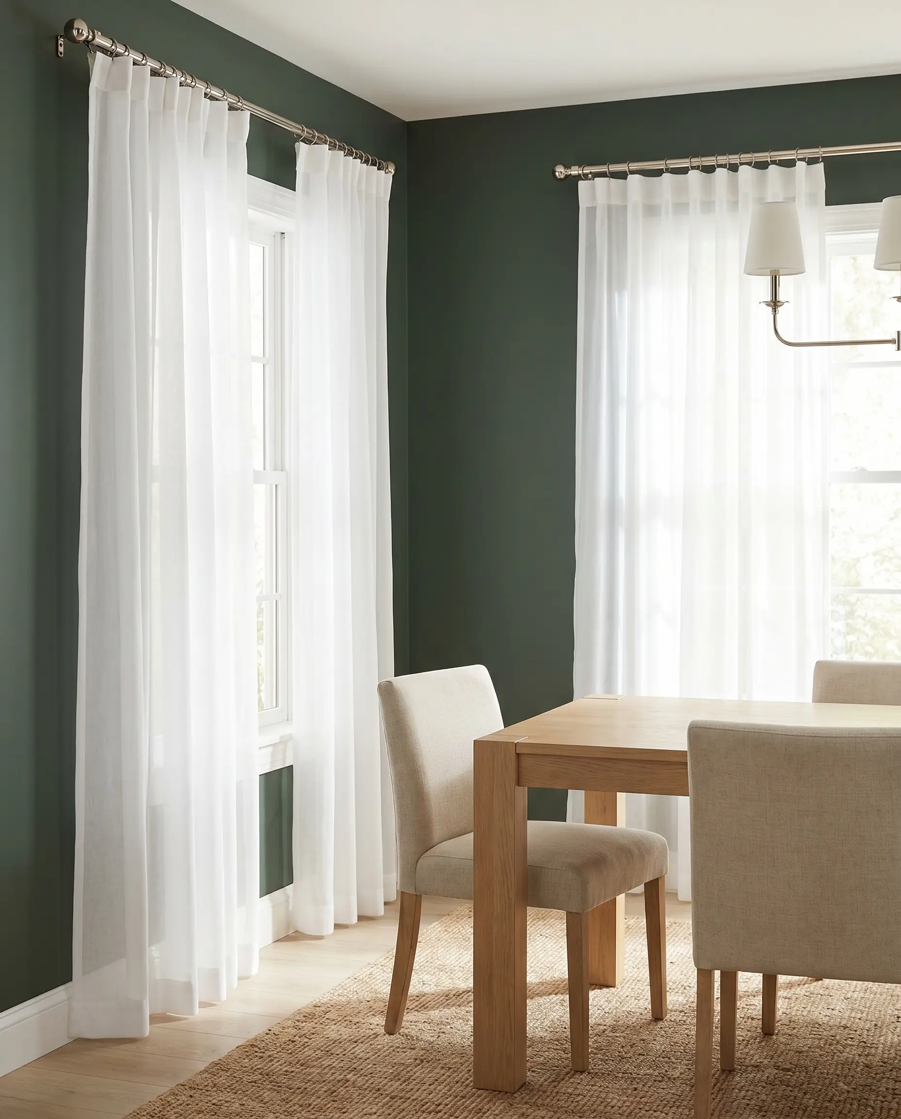
If you require maximum sunlight retention, completely avoid shiny synthetics and source a high-quality sheer cotton with a visible weft. The crisp white provides sharp, transitional contrast, while the matte weave prevents it from looking inexpensive against the rich wall color.
- Vibe: Crisp Transitional.
- Key Materials: 100% Cotton voile or sheer linen blend.
- Paint Match: Sherwin-Williams Dard Hunter Green.
- Hardware Check: Suspend from a polished nickel French return rod for a clean, uninterrupted line.
Warm Oatmeal Textured Boucle
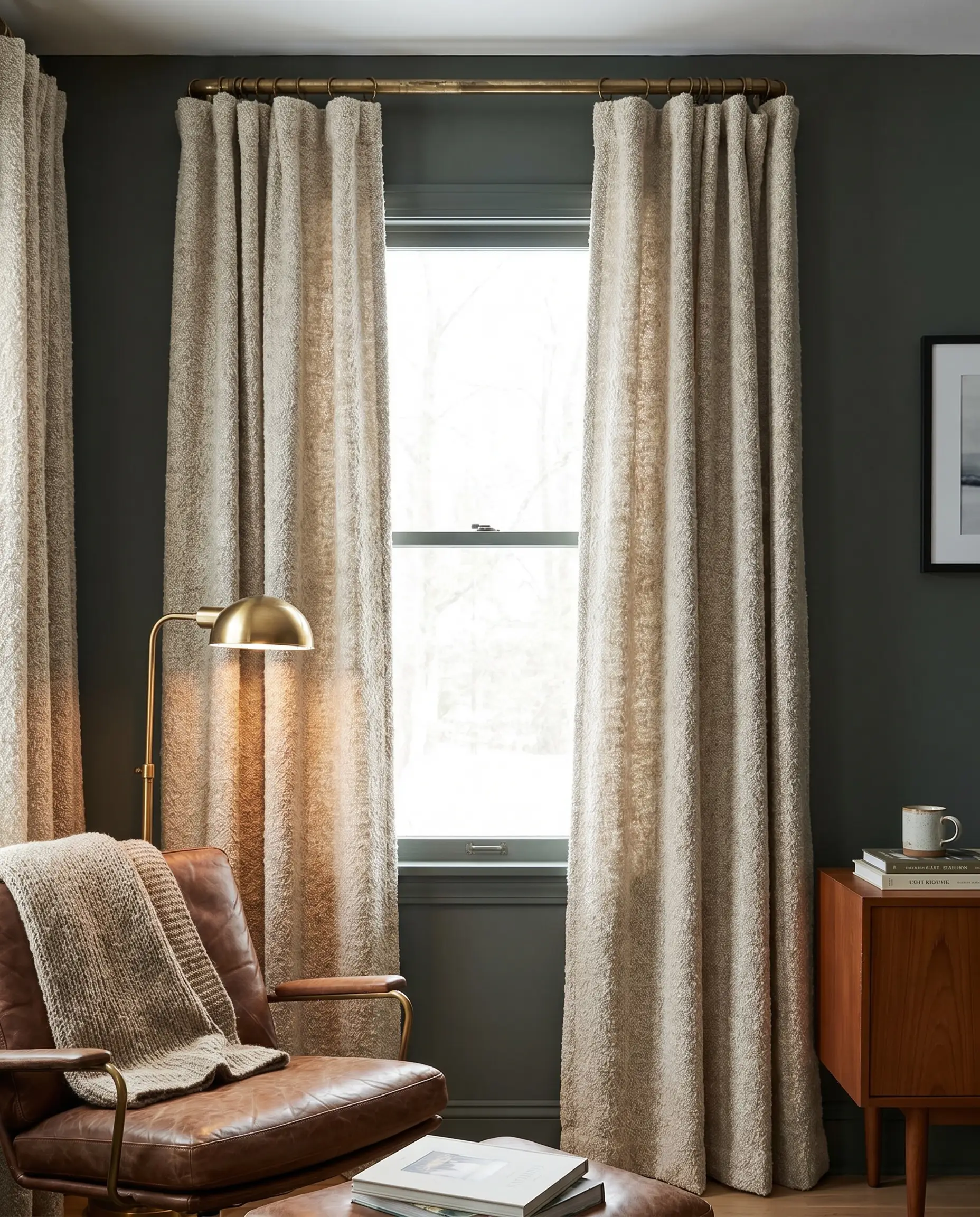
Boucle introduces a highly tactile, nubby surface that absorbs light beautifully, softening the cool, blue-based undertones of emerald. This heavy drape physically anchors the window frame while offering a soothing, neutral break for the eye.
- Vibe: Tactile Mid-Century warmth.
- Key Materials: Heavyweight boucle or wool-blend.
- Paint Match: Farrow & Ball Studio Green.
- Hardware Check: Utilize an unlacquered brass rod to amplify the warm, earthy tones of the oatmeal yarn.
Warm Beige Matte Velvet
A flat, matte velvet in a warm beige acts as a luxurious, light-absorbing sponge that rivals the visual weight of the green paint. It delivers the opulence of the jewel box aesthetic while keeping the room from feeling completely enclosed by dark tones.
- Vibe: Accessible Luxury.
- Key Materials: Cotton matte velvet (strictly avoid polyester blends).
- Paint Match: Benjamin Moore Essex Green.
- Hardware Check: Install on an antique gold finish to highlight the rich, sandy beige undertones.
Greige Woven Cotton Blends
Greige strikes the perfect balance between warm beige and cool grey, harmonizing seamlessly with emerald’s complex color profile. The woven cotton introduces an approachable, relaxed drape that feels intentionally unstudied.
- Vibe: Relaxed Sophistication.
- Key Materials: Heavyweight cotton basketweave.
- Paint Match: Sherwin-Williams Isle of Pines.
- Hardware Check: Use a matte black French return rod to add structural definition to the relaxed fabric.
You can apply wallpapers, paints, etc. on walls and see how they look in various interiors.

High-Contrast & Warm Tones (The Complementary Approach)
Utilizing the color wheel to pair reds and yellows with emerald green creates striking, complementary energy. To avoid accidentally creating a holiday-themed room, we firmly dictate muting the saturation of these warm tones through heavily textured, light-absorbing fabrics.
Deep Mustard Yellow Velvet
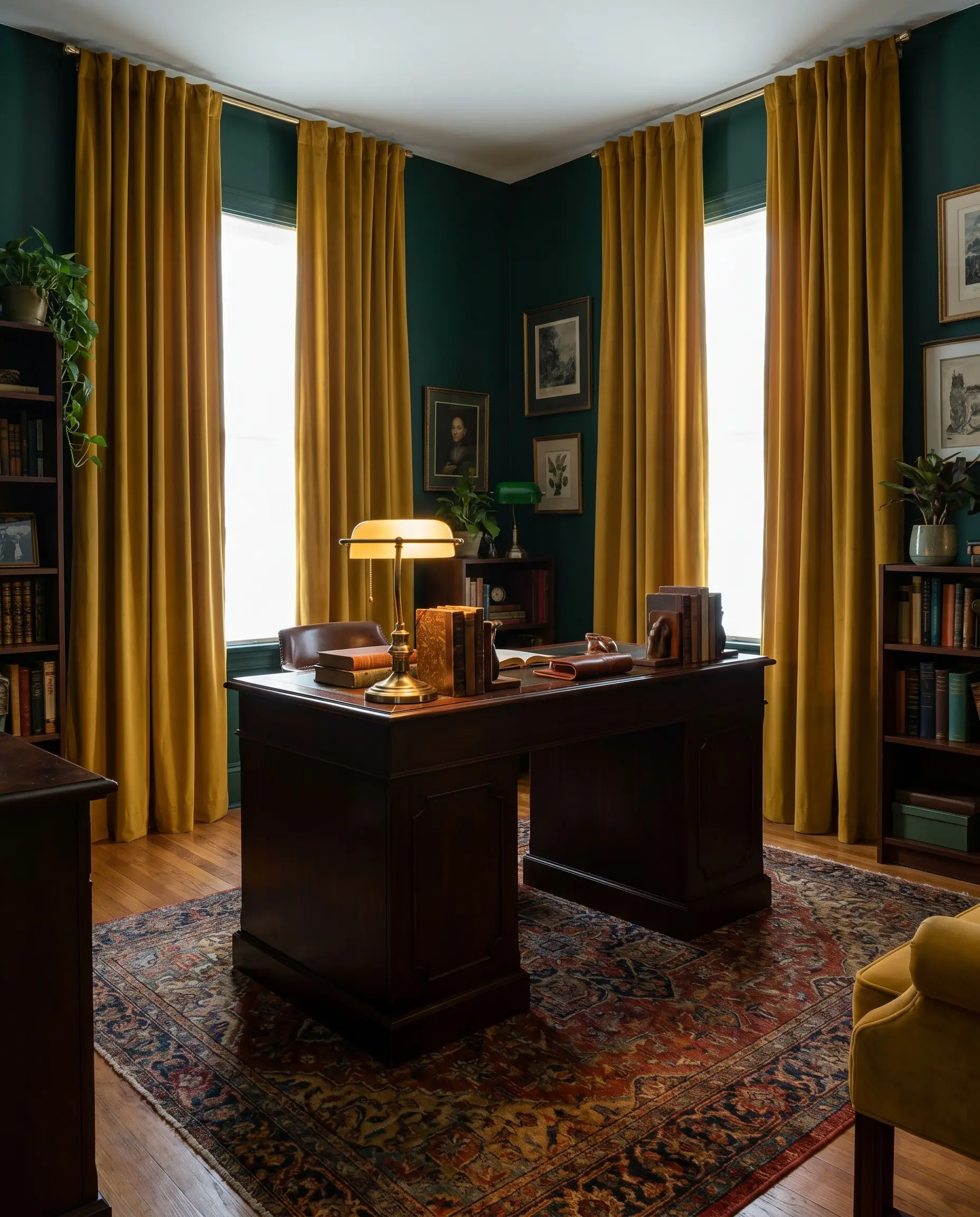
Mustard yellow brings a sharp, acidic warmth that cuts perfectly through the cool depths of dark green. The heavy velvet pile ensures the yellow reads as sophisticated and historic rather than overly bright or primary.
- Vibe: Moody Maximalism.
- Key Materials: 100% Cotton Velvet.
- Paint Match: Benjamin Moore Chrome Green.
Ensure the velvet is tightly woven with a matte finish; a shiny, crushed velvet will immediately cheapen the high-contrast pairing and reflect harsh glares against the matte walls.
Texture Pairing
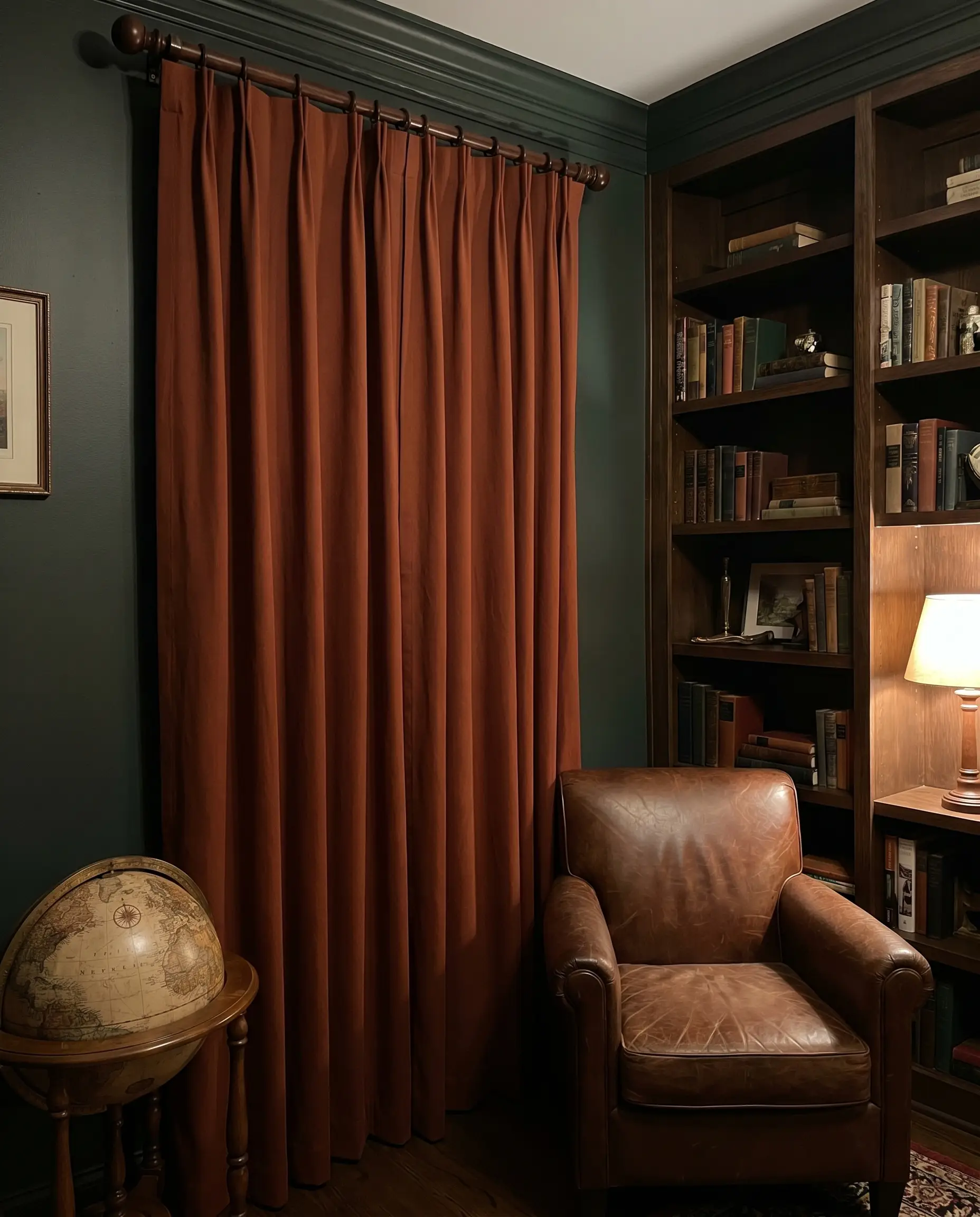
Burnt Terracotta Heavy Linen
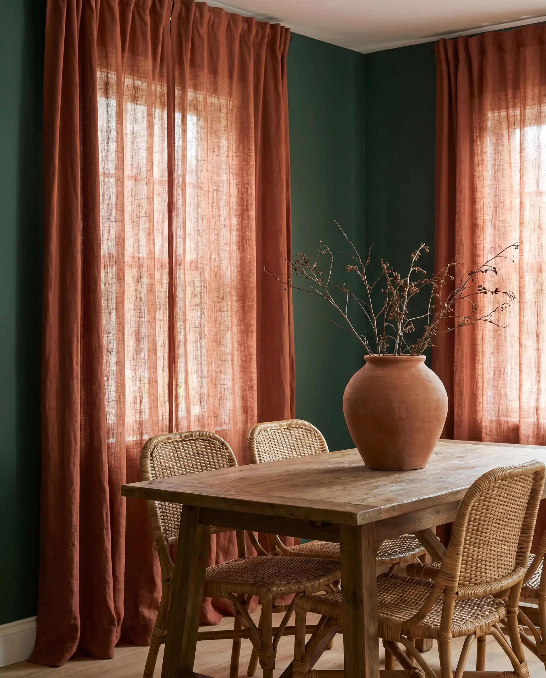
Terracotta introduces an earthy, grounded rust tone that complements green beautifully without leaning into pure red. The natural variations in the linen yarn help diffuse the color, making the contrast feel organic and lived-in.
- Vibe: Organic Mediterranean.
- Key Materials: Slubby, heavyweight linen.
- Paint Match: Sherwin-Williams Hunt Club.
The visible weft of the linen breaks up the terracotta pigment, preventing it from appearing as a solid, overwhelming block of orange against the dark green.
Texture Pairing
Soft Blush Pink Silk
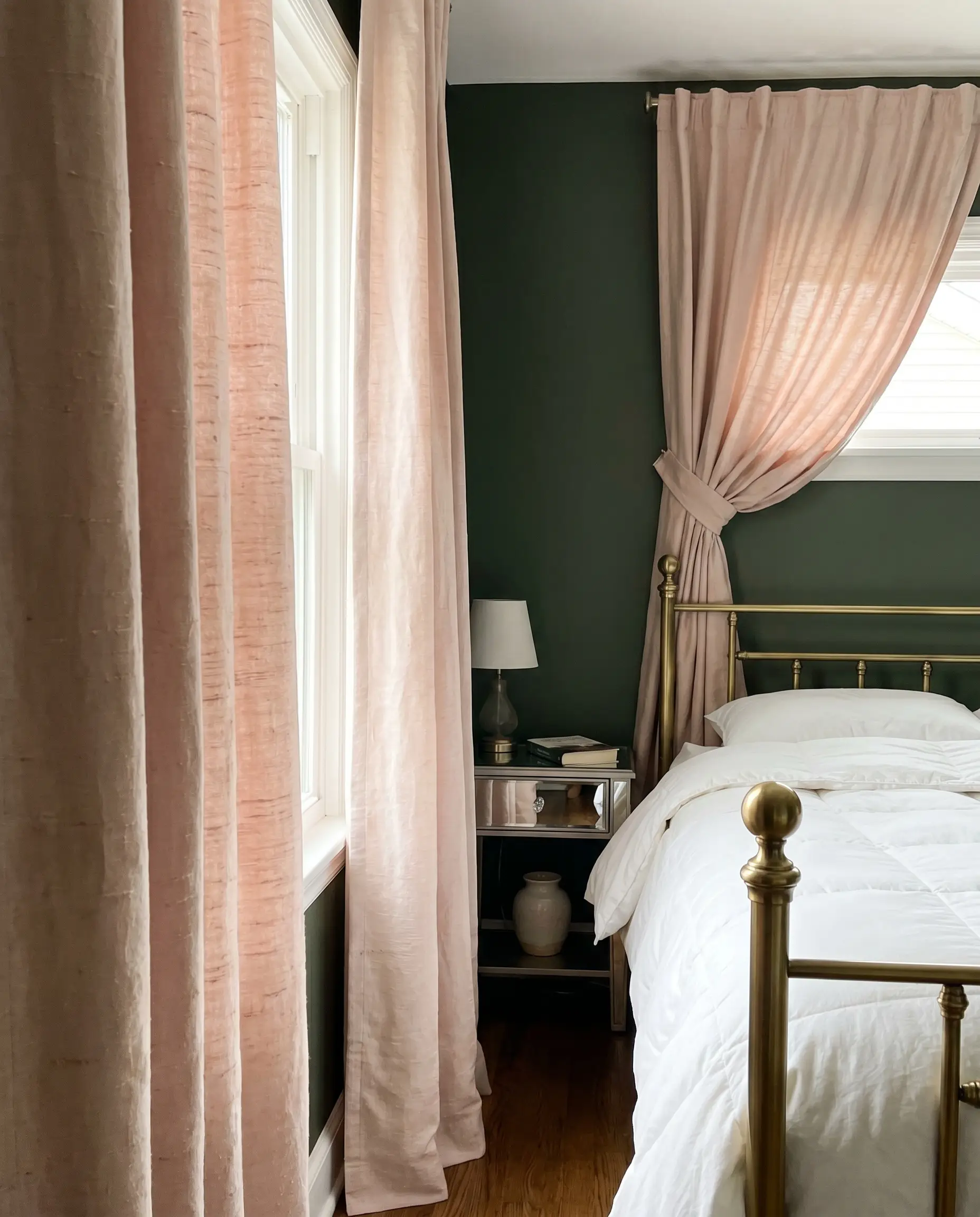
A barely-there blush pink offers a delicate, highly tailored contrast that softens the masculine energy of a dark green room. Silk reflects light, creating a luminous, ethereal glow that acts as a subtle jewelry piece for the windows.
- Vibe: Hollywood Regency chic.
- Key Materials: Heavyweight raw silk or silk taffeta.
- Paint Match: Farrow & Ball Beverly.
Opt for raw silk with slight imperfections in the thread; this subtle textural grit grounds the feminine pink and stands up to the visual weight of the emerald wall.
Texture Pairing
Deep Rust Heavyweight Cotton
Rust provides the necessary red-complementary contrast but relies on heavy brown undertones to keep the space grounded. A thick cotton canvas ensures the drape hangs with architectural rigidity, offering a highly structured aesthetic.
- Vibe: Dark Academia.
- Key Materials: Cotton canvas or twill.
- Paint Match: Benjamin Moore Salamander.
A dense, matte cotton twill absorbs light completely, ensuring the rust tone reads as a moody, historic accent rather than a vibrant, distracting primary color.
Texture Pairing
Muted Peach Chiffon
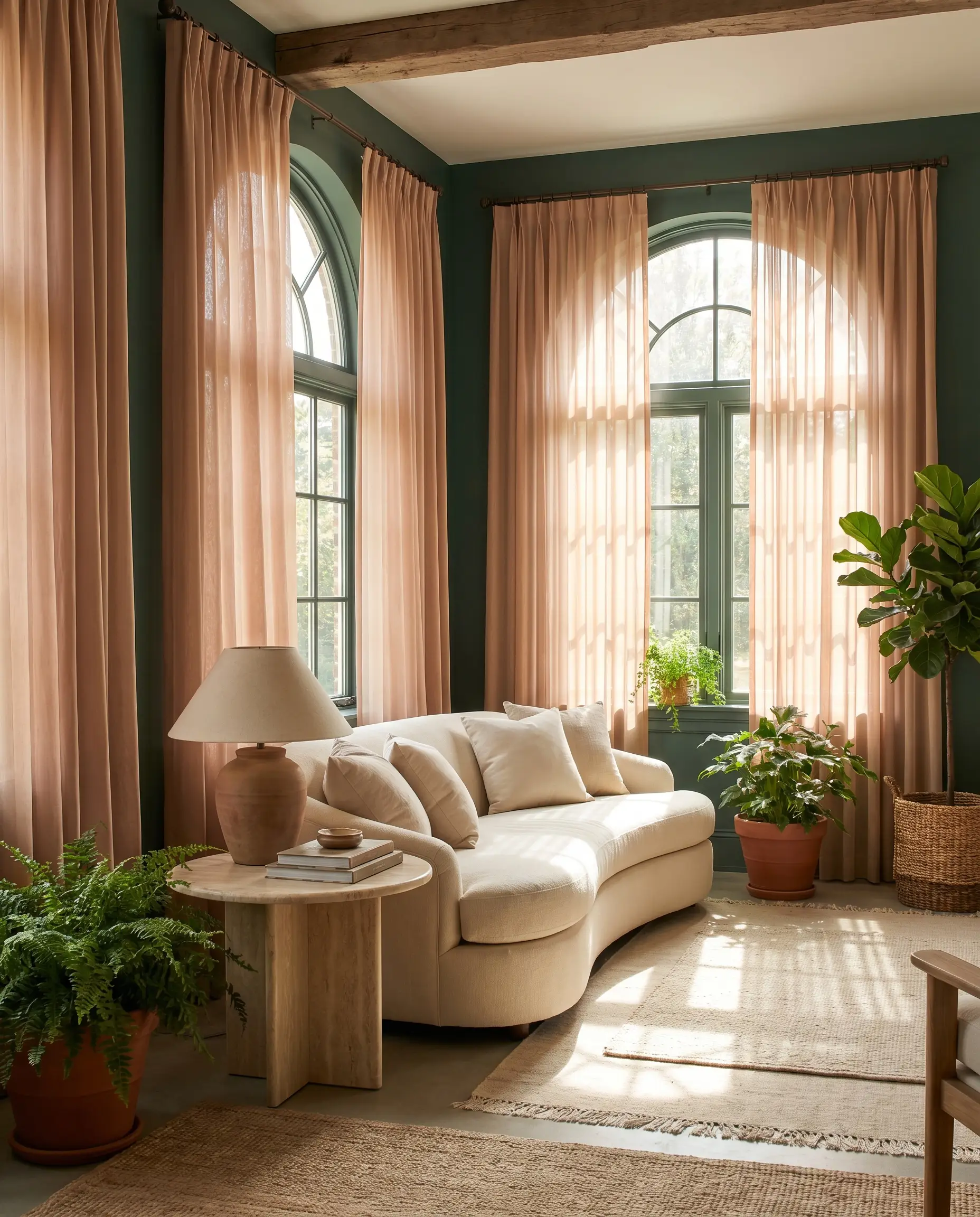
Muted peach is a masterclass in subtle color theory, offering a warmer, more saturated alternative to blush pink while remaining completely airy. Chiffon allows dappled sunlight to cast a warm, flattering glow across the dark emerald room.
- Vibe: Ethereal elegance.
- Key Materials: High-quality matte chiffon.
- Paint Match: Sherwin-Williams Billiard Green.
Select a matte-finish chiffon to avoid any synthetic glare, allowing the sheer fabric to act as a gentle, diffused color wash over the window frame.
Texture Pairing
Antique Gold Jacquard
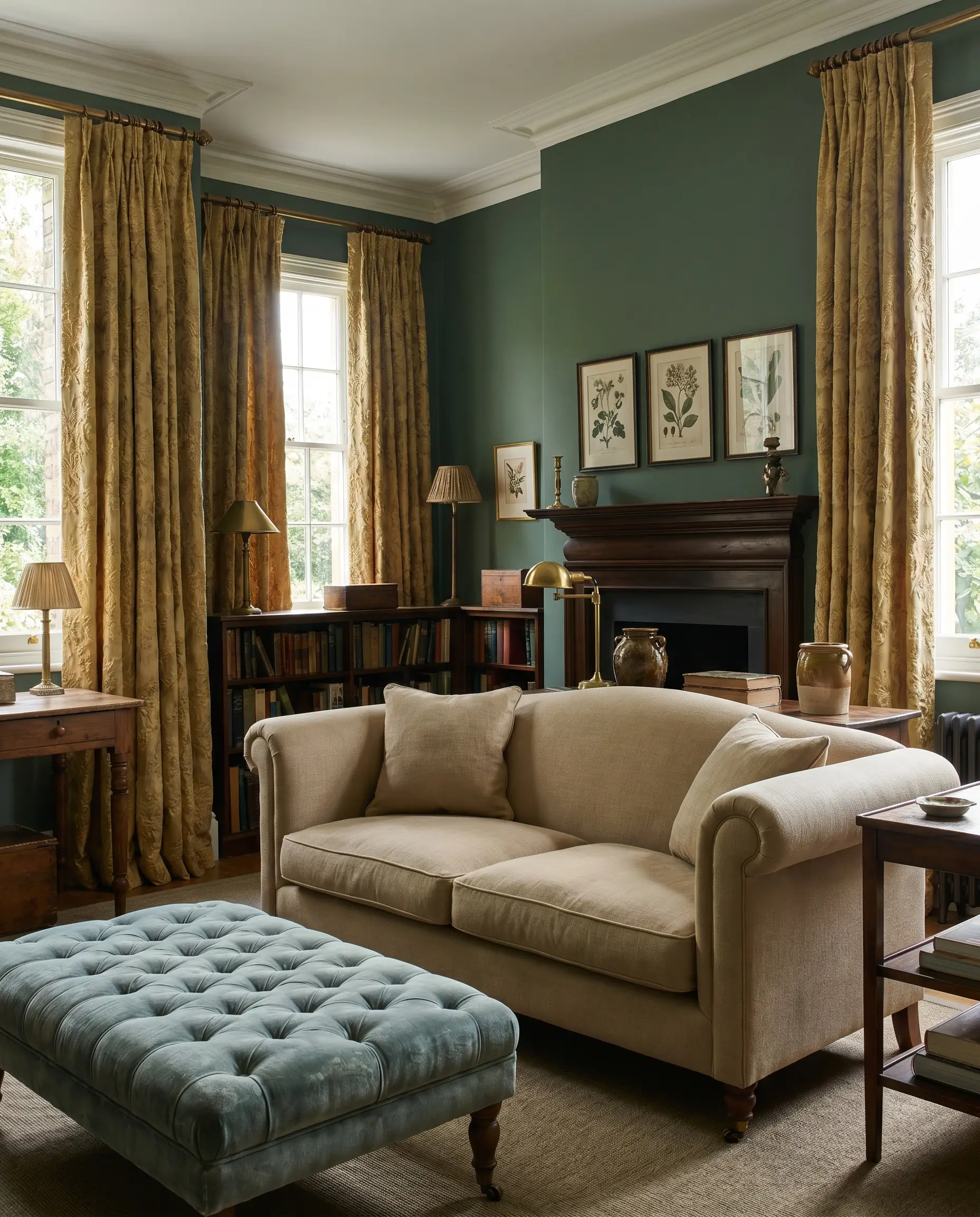
Antique gold introduces a metallic warmth that feels inherently tied to the historic grandeur of emerald green. The woven pattern of a jacquard adds necessary depth, catching the natural light dynamically throughout the day.
- Vibe: Bespoke Traditional.
- Key Materials: Silk or cotton-blend jacquard.
- Paint Match: Farrow & Ball Duck Green.
The raised, woven pattern of the jacquard fabric creates micro-shadows that temper the gold, keeping the metallic sheen sophisticated and deeply dimensional.
Texture Pairing
Moody, Monochromatic & Jewel Tones (The Jewel Box Effect)
Color-drenching transforms a room into an immersive, cinematic experience. When matching dark fabrics to dark emerald walls, you must rely entirely on textural contrast to ensure the window treatments do not disappear completely into the shadows.
Exact-Match Emerald Velvet (Color Drenching)
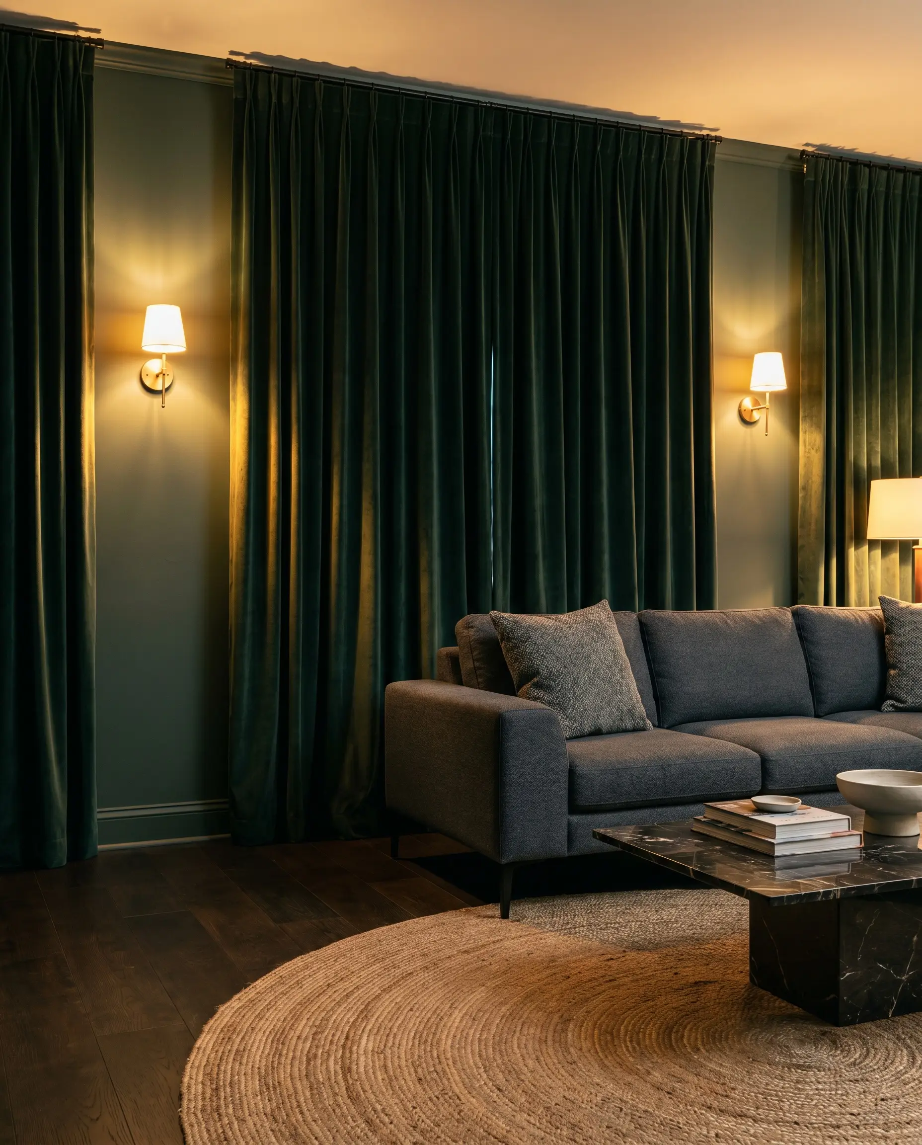
Matching your curtains precisely to your wall paint creates a seamless, enveloping boundary that blurs the structural edges of the room. The plush pile of the velvet catches the light differently than the flat wall paint, providing crucial visual separation.
- Vibe: Maximum Cinematic Drama.
- Key Materials: Custom-dyed cotton velvet.
- Paint Match: Benjamin Moore Vintage Vogue.
- Lighting Requirement: This requires robust, layered ambient lighting (sconces, picture lights) to prevent the room from feeling like a black hole after sunset.
Inky Navy Blue Heavyweight Drape
Navy blue and emerald green sit adjacent on the color wheel, creating an analogous palette that feels incredibly rich and intentional. The dark blue drape anchors the window while maintaining the room’s deeply saturated, tonal mood.
- Vibe: Sophisticated Gentleman’s Club.
- Key Materials: Heavyweight wool or wool-blend.
- Paint Match: Sherwin-Williams Courtyard.
- Lighting Requirement: Best executed in rooms with large, unobstructed windows facing East or West, ensuring the navy is legible during daylight hours.
Aubergine and Deep Plum Silk
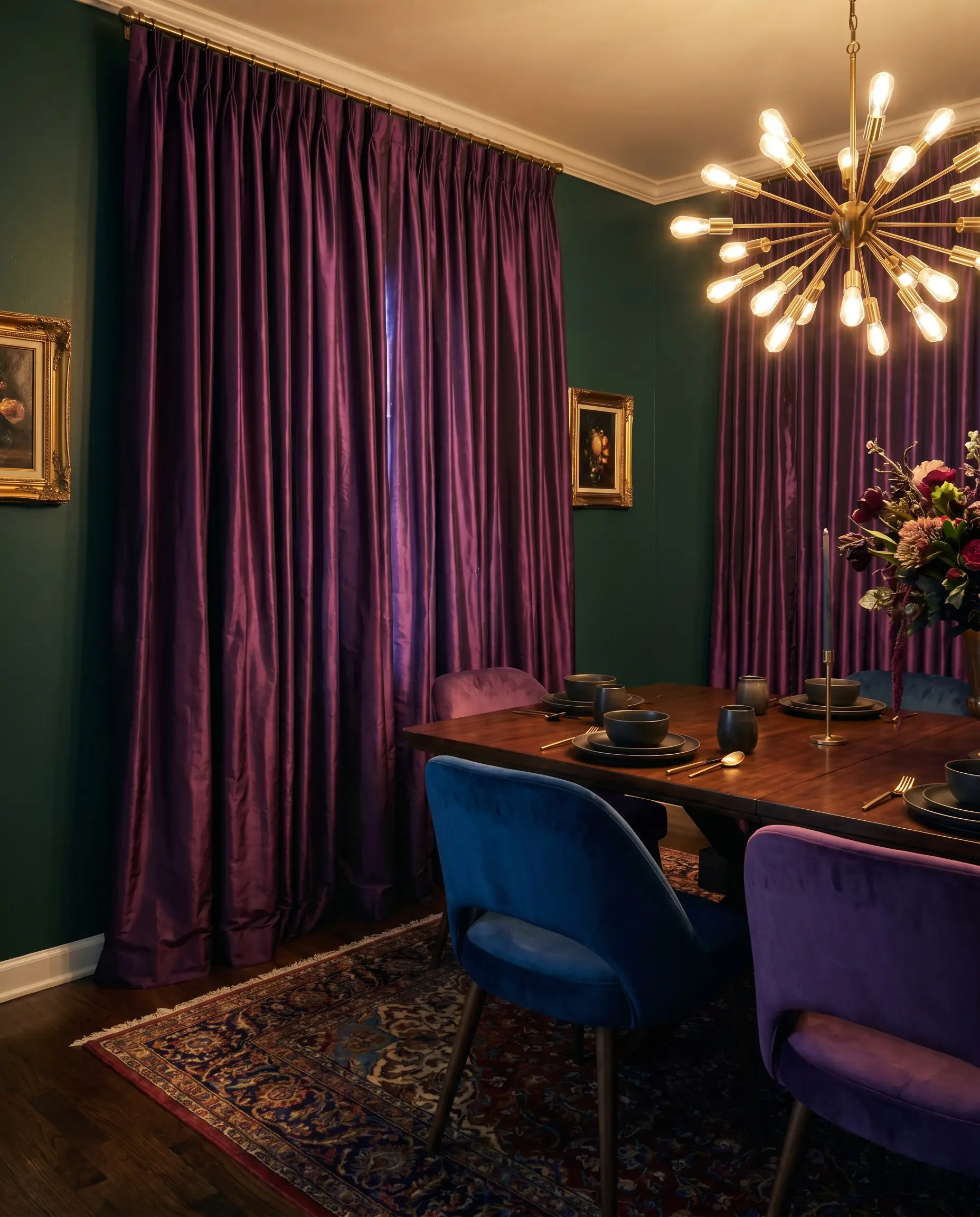
Deep plum offers a luxurious, royal contrast to emerald, leaning into the jewel-tone theme with unapologetic opulence. Silk taffeta provides a crisp, rustling drape that reflects light, highlighting the rich purple undertones against the green.
- Vibe: Eccentric Luxury.
- Key Materials: Silk taffeta.
- Paint Match: Benjamin Moore Tarrytown Green.
- Lighting Requirement: Highly dependent on warm, 2700K artificial lighting in the evening to pull the rich red tones out of the dark plum fabric.
Charcoal Grey Wool Blend
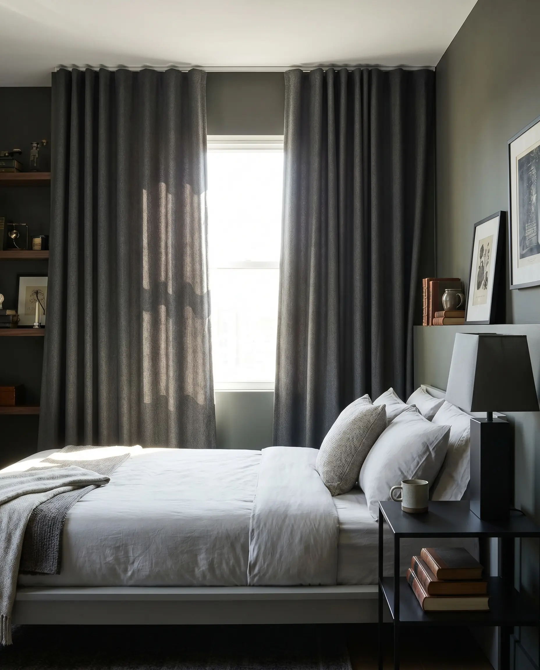
Charcoal grey acts as the definitive moody neutral, providing a serious, tailored edge to the vibrant jewel tone of the walls. The dense, suiting-like texture of a wool blend introduces a handsome, architectural weight to the window.
- Vibe: Modernist Dark Academia.
- Key Materials: Worsted wool blend.
- Paint Match: Sherwin-Williams Pewter Green.
- Lighting Requirement: Requires bright, direct Southern exposure to prevent the charcoal from flattening into a drab, lifeless black.
Matte Black Washed Linen
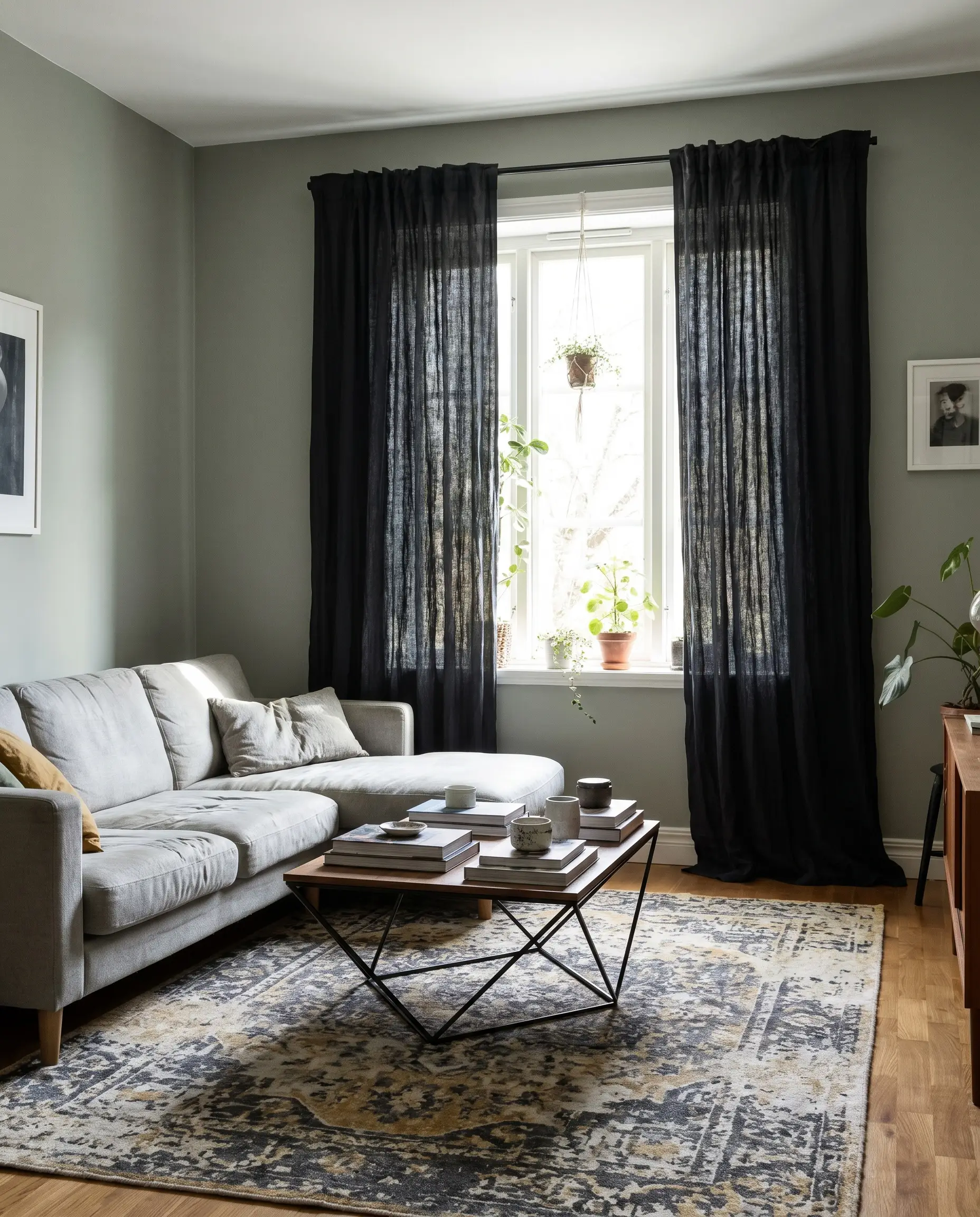
Black linen delivers a stark, graphic punch that instantly modernizes a historic emerald green wall. The washed, wrinkled texture of the linen keeps the black from feeling too severe or gothic, adding an air of effortless cool.
- Vibe: Edgy Transitional.
- Key Materials: Pre-washed, heavyweight Belgian linen.
- Paint Match: Farrow & Ball Green Smoke.
- Lighting Requirement: Only attempt the Matte Black linen if the room faces South and receives abundant natural light; otherwise, the space will feel aggressively enclosed.
Patterned & Botanical Drapes (Maximalist & Traditional Styling)
Because green is inherently tied to nature, botanical prints, stripes, and damasks act as a brilliant stylistic bridge. These patterns introduce dynamic movement to the solid, dark walls, ideally featuring tiny flecks of the exact emerald hue to tie the narrative together.
William Morris-Inspired Arts & Crafts Florals
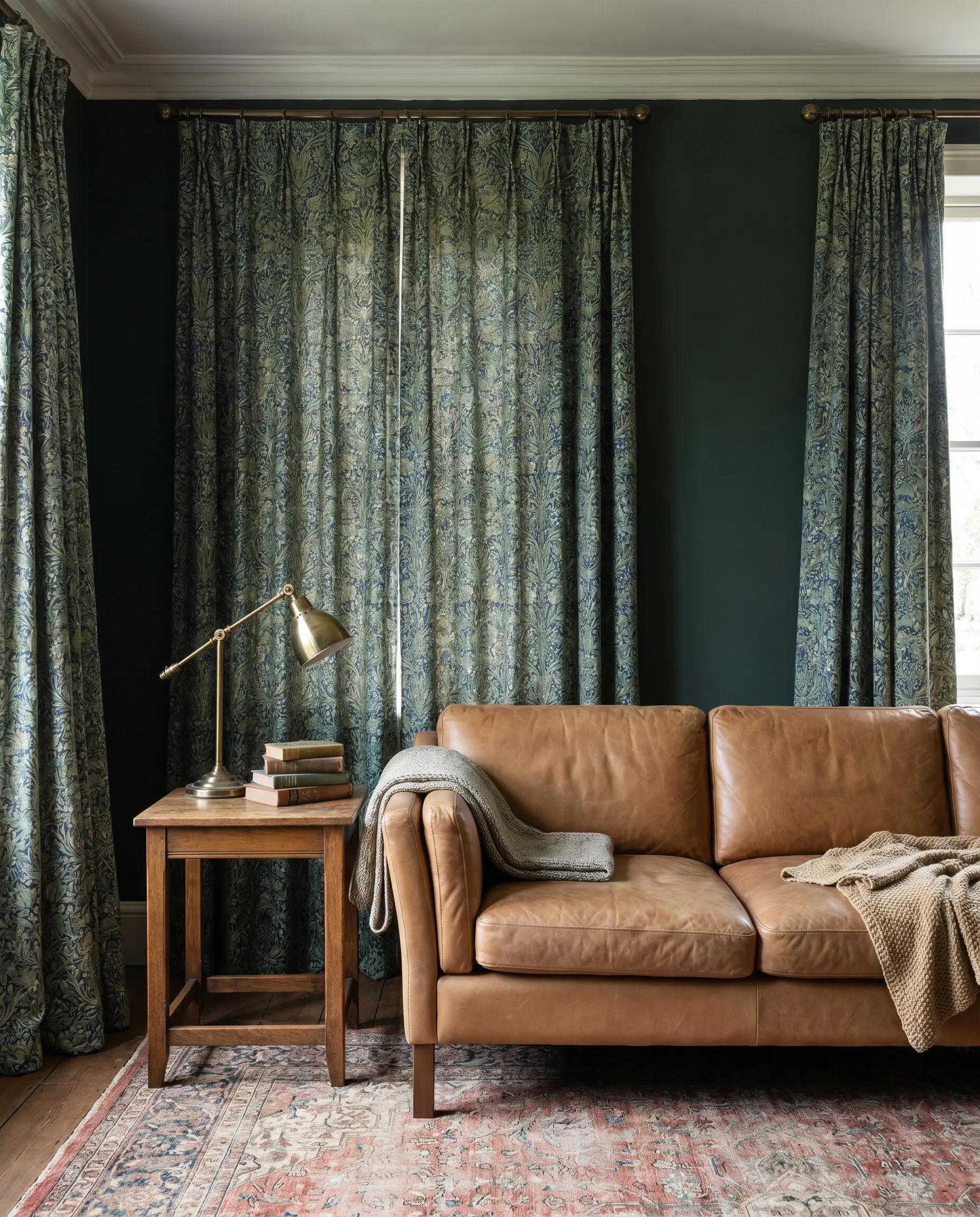
Intricate, historic floral patterns lend an established, collected-over-time authenticity to the space. The dense, interwoven natural motifs break up the solid color blocking of the room while celebrating the emerald palette.
- Vibe: Historic English Estate.
- Key Materials: Printed linen-cotton blend.
- Paint Match: Benjamin Moore Cushing Green.
- Styling Pro-Tip: Ensure the floral print is oversized so it doesn’t look busy, vibrating, or cluttered against a solid dark wall.
Black and White Cabana Stripes
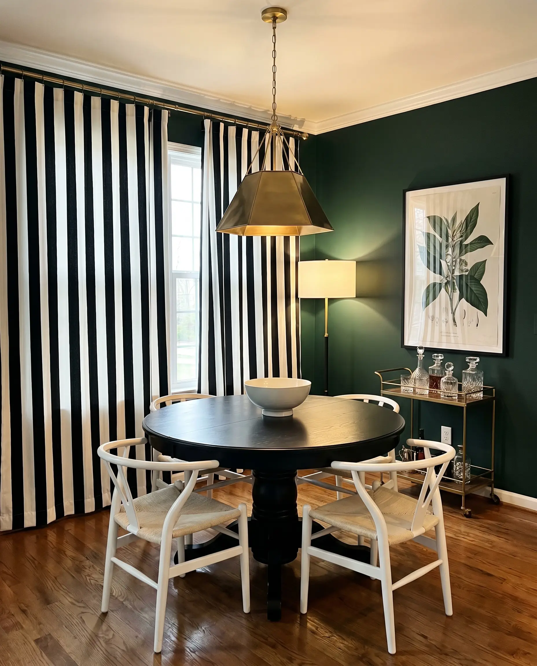
A bold, vertical cabana stripe introduces a sharp, geometric counterpoint to the organic feel of a green room. The high-contrast black and white instantly draws the eye upward, exaggerating the ceiling height.
- Vibe: Playful Hollywood Regency.
- Key Materials: Heavyweight cotton canvas.
- Paint Match: Sherwin-Williams Jasper.
- Styling Pro-Tip: The stripe must be at least three to four inches wide; narrow pinstripes will visually blur and clash with the commanding wall color.
Tonal Green Subtle Damask
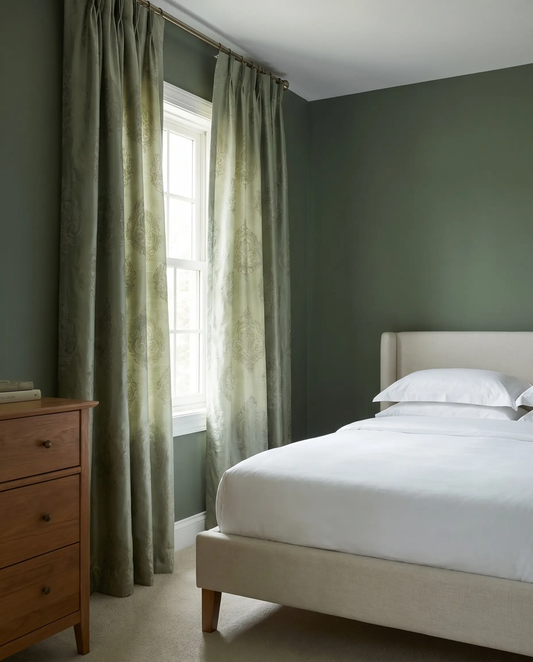
A tonal damask offers a whisper of pattern, revealing its intricate scrolling design only when the light hits it at the exact right angle. It is the perfect compromise for those who want texture and historical reference without the visual noise of contrasting colors.
- Vibe: Quiet Luxury.
- Key Materials: Silk or viscose blend damask.
- Paint Match: Benjamin Moore Peale Green.
- Styling Pro-Tip: Scale the damask pattern to the size of the window; massive, sweeping windows can handle large, repeating medallions, while standard windows require a tighter repeat.
Geometric Gold Foil on Cream Backing
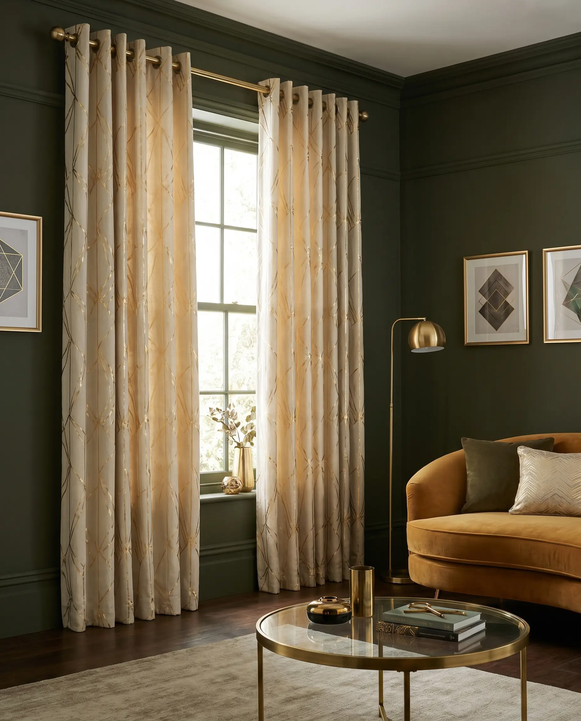
Gold foil geometrics on a cream background inject a dose of sharp, Art Deco glamour into the moody environment. The cream base provides visual relief, while the metallic lines catch the light and echo brass room accents.
- Vibe: Art Deco Revival.
- Key Materials: Embroidered or foil-printed linen.
- Paint Match: Farrow & Ball Bancha.
- Styling Pro-Tip: Keep the geometric lines relatively thin to maintain an elegant, refined aesthetic rather than an overpowering, retro motif.
Chinoiserie Bird and Branch Motifs
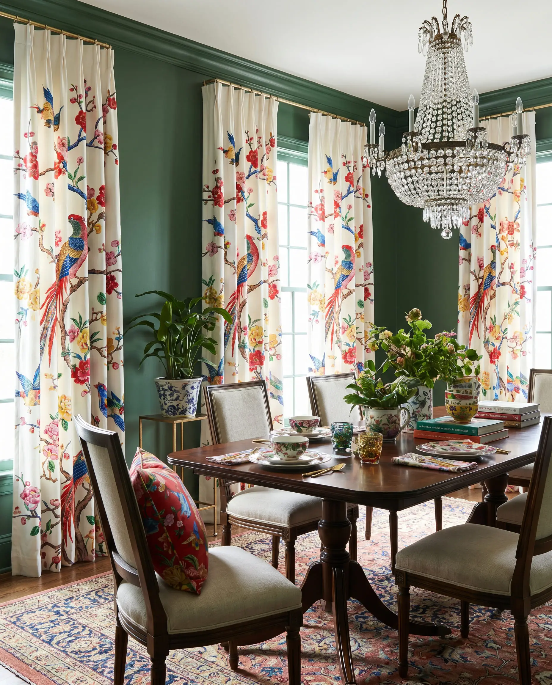
Chinoiserie panels introduce a sweeping, romantic narrative to the walls, often featuring vibrant birds and blossoming branches that pop against the emerald. This highly decorative choice treats the window treatment as a piece of large-scale art.
- Vibe: Maximalist Grandeur.
- Key Materials: Printed silk or polished cotton.
- Paint Match: Sherwin-Williams Rookwood Dark Green.
- Styling Pro-Tip: The scale of the branches should be asymmetrical and sprawling; avoid tightly repeating, small-scale motifs that lack visual drama.
Traditional Tartan Plaid with Green Undertones
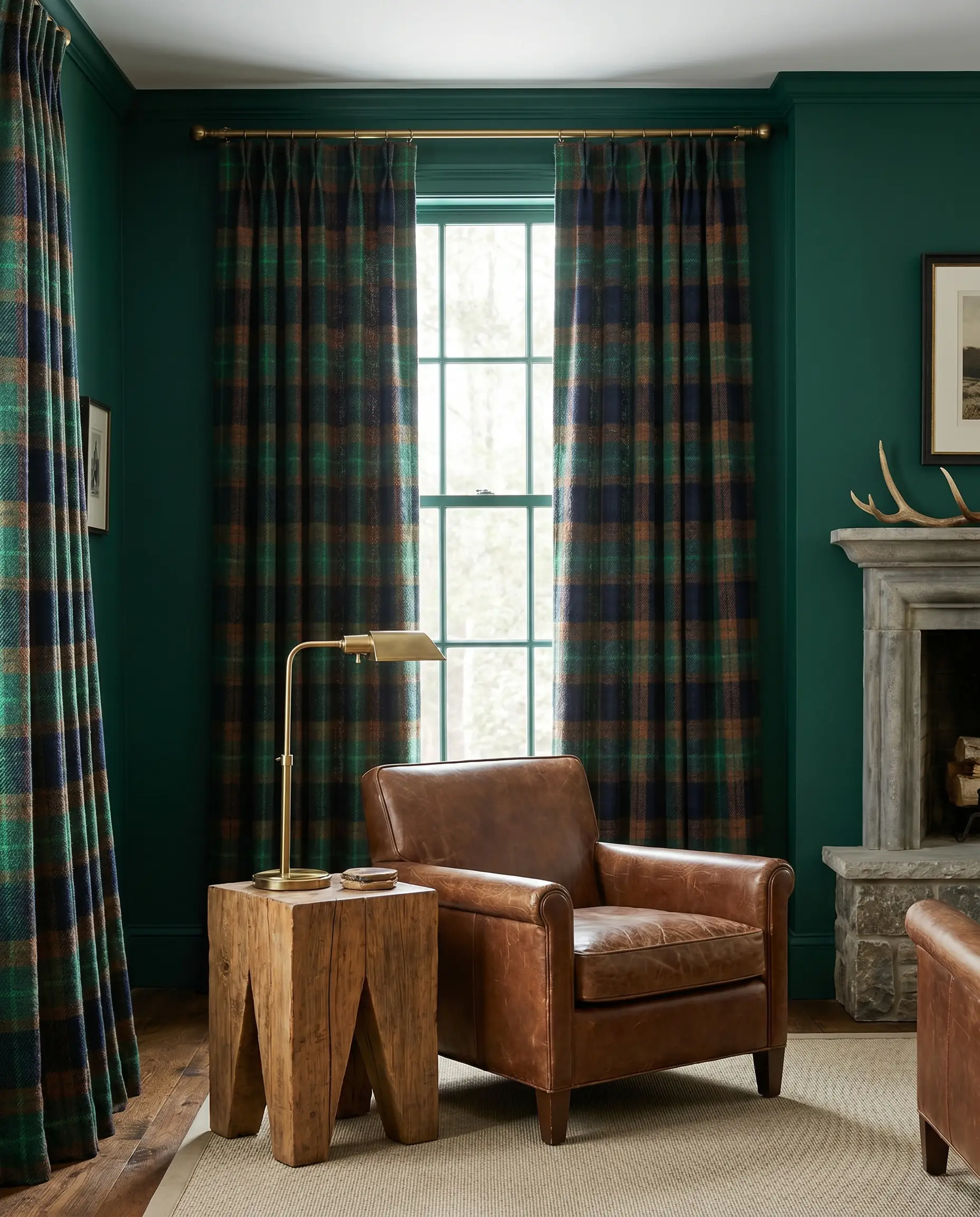
A heavy tartan plaid instantly grounds the room with a sense of heritage and rugged, masculine comfort. By ensuring the plaid features a thread of the exact wall color, the pattern feels deeply integrated rather than applied.
- Vibe: Refined Hunting Lodge.
- Key Materials: Woven wool or heavy cotton flannel.
- Paint Match: Benjamin Moore Forest Green.
- Styling Pro-Tip: Opt for a large-scale, windowpane-style plaid to ensure the pattern remains legible and striking from across the room.
Finishing the Look: Hardware Rules for Emerald Walls
The rod finish is just as critical as the drape itself when designing a jewel-toned space. The hardware dictates the overarching style, and in dark rooms, utilizing a French return rod—where the metal curves flush into the wall—is non-negotiable to eliminate harsh light bleed from the edges.
- Unlacquered Brass: Introduces a living patina that warms up the cool, blue-based emerald, creating a deeply historic, collected-over-time mood.
- Matte Black Iron: Grounds the space with a sharp, graphic edge, pushing the room toward a more modern, transitional, and architectural aesthetic.
- Lucite/Acrylic with Brass Fittings: Injects a dose of Hollywood Regency glamour, allowing the heavy wall color to shine through the rod for a lighter, more ethereal visual footprint.
The Final Review: Evaluating Your Room’s Light
Emerald green is a notorious shape-shifter, appearing vibrant at noon and nearly black by midnight. Before you commit to custom drapes, you must tape large fabric swatches directly to your painted wall. Observe how the fabric’s opacity and the wall’s LRV interact at 10 AM in full sun, at 3 PM as shadows lengthen, and at 8 PM under artificial ambient lighting. The right textile will hold its own in every scenario.
Once your windows are perfectly framed, the next step is grounding the floorplan. Explore our comprehensive guide on selecting the proper living room rug to anchor your newly designed, jewel-toned space.
The Hackrea Style Desk treats interior decoration as an exact visual science. Rather than focusing on demolition or floor plans, this desk masters the art of color theory, undertone matching, material pairings, and spatial proportion. From balancing the visual weight of mixed metals to finding the perfect bridging tone between disparate wood species, this desk provides the rigorous aesthetic rules needed to achieve high-end, editorial-quality harmony in any space.