If you’ve been scrolling through Instagram or Pinterest lately, you’ve likely noticed a shift. The era of the clinically cold, high-gloss white kitchen is officially behind us. In 2026, the kitchen is no longer just a showroom; it’s a sanctuary.
This year, kitchen design is defined by “Warm Minimalism.” We are trading stark greys for “mushroom” putties, and bright whites for creamy, lived-in neutrals.
Whether you are planning a full renovation or a weekend DIY refresh, choosing the right cabinet paint is the highest ROI decision you can make. But with over 1,700 Sherwin-Williams colors to choose from, where do you start?
As design experts, we’ve tested the swatches, watched the trends, and compiled the definitive guide to the 15 best Sherwin-Williams cabinet paint colors for 2026.
Quick Guide: The 2026 Top Picks
In a rush? Here is the “Cheat Sheet” of our top-performing colors this year.
| Color Name | SW Code | Undertone | Best Used For | 2026 Vibe |
| Universal Khaki | SW 6150 | Warm Beige/Tan | All Cabinets or Island | Color of the Year |
| Pure White | SW 7005 | Neutral (No Yellow) | Upper Cabinets / Trim | The Modern Classic |
| Shiitake | SW 9173 | Warm Greige | Full Cabinetry | The “Mushroom” Trend |
| Pewter Green | SW 6208 | Cool Grey-Green | Lower Cabinets / Island | Nature-Inspired |
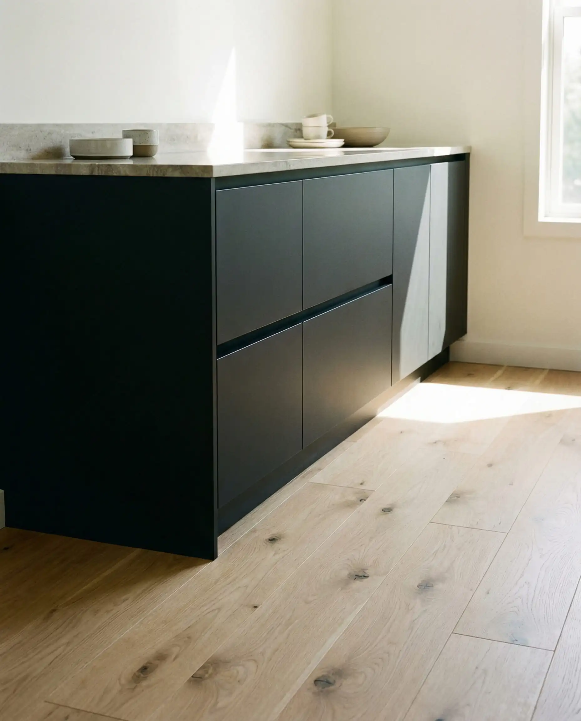
| Urbane Bronze | SW 7048 | Brown-Black | Island / Pantry | Moody & Grounded |
| Natural Linen | SW 9109 | Yellow-Beige | Small Kitchens | Airy & Organic |
The 2026 Color of the Year
1. Universal Khaki (SW 6150)
LRV: 40 | Undertone: Warm Beige/Tan
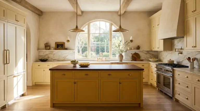
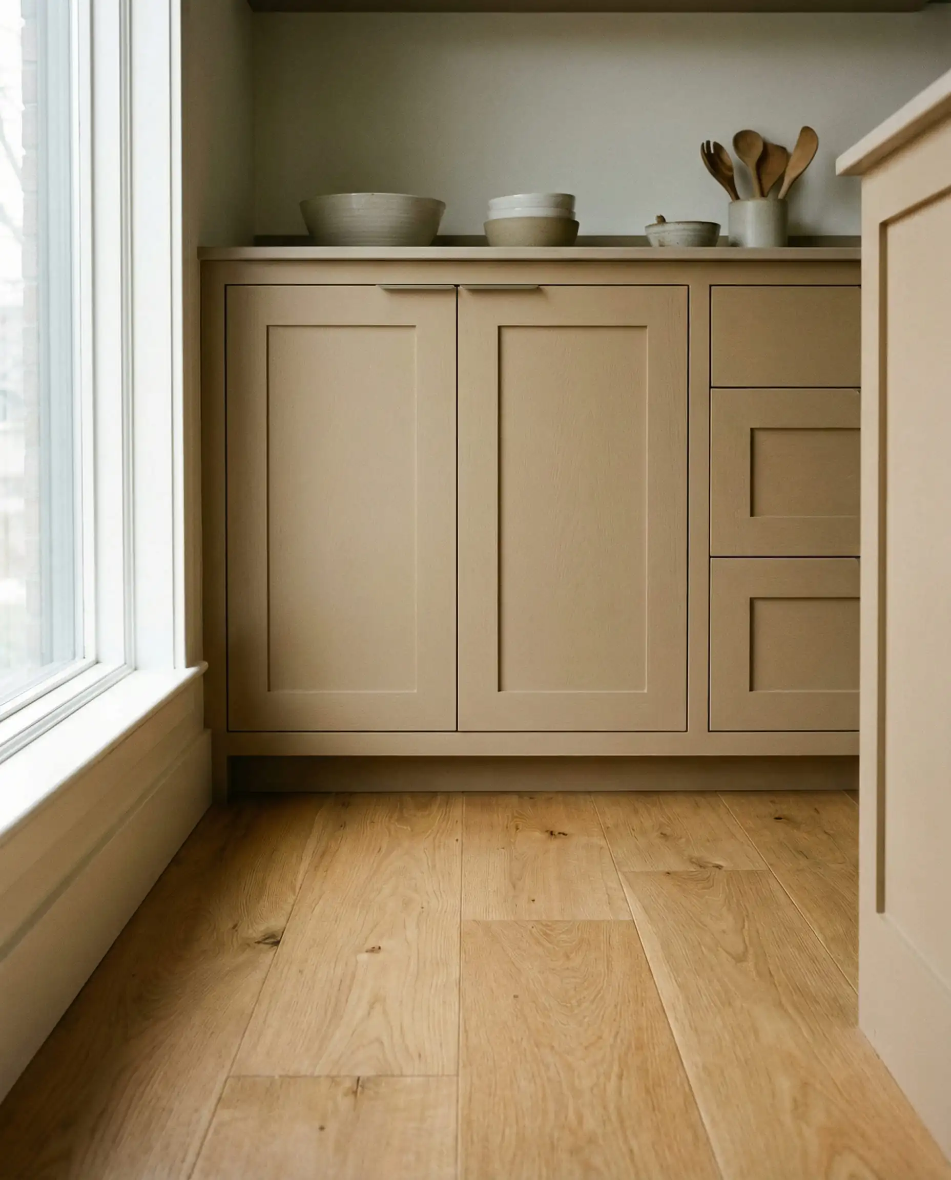
If you only remember one color from this list, make it Universal Khaki. As the Sherwin-Williams 2026 Color of the Year, this shade represents the pivot point for interior design this decade.
For years, we were afraid of “beige” because we remembered the builder-grade yellow-tans of the 1990s. Universal Khaki is different. It is a sophisticated, grounded neutral that bridges the gap between a warm stone grey and a rich tan.
Why It Works for Cabinets:
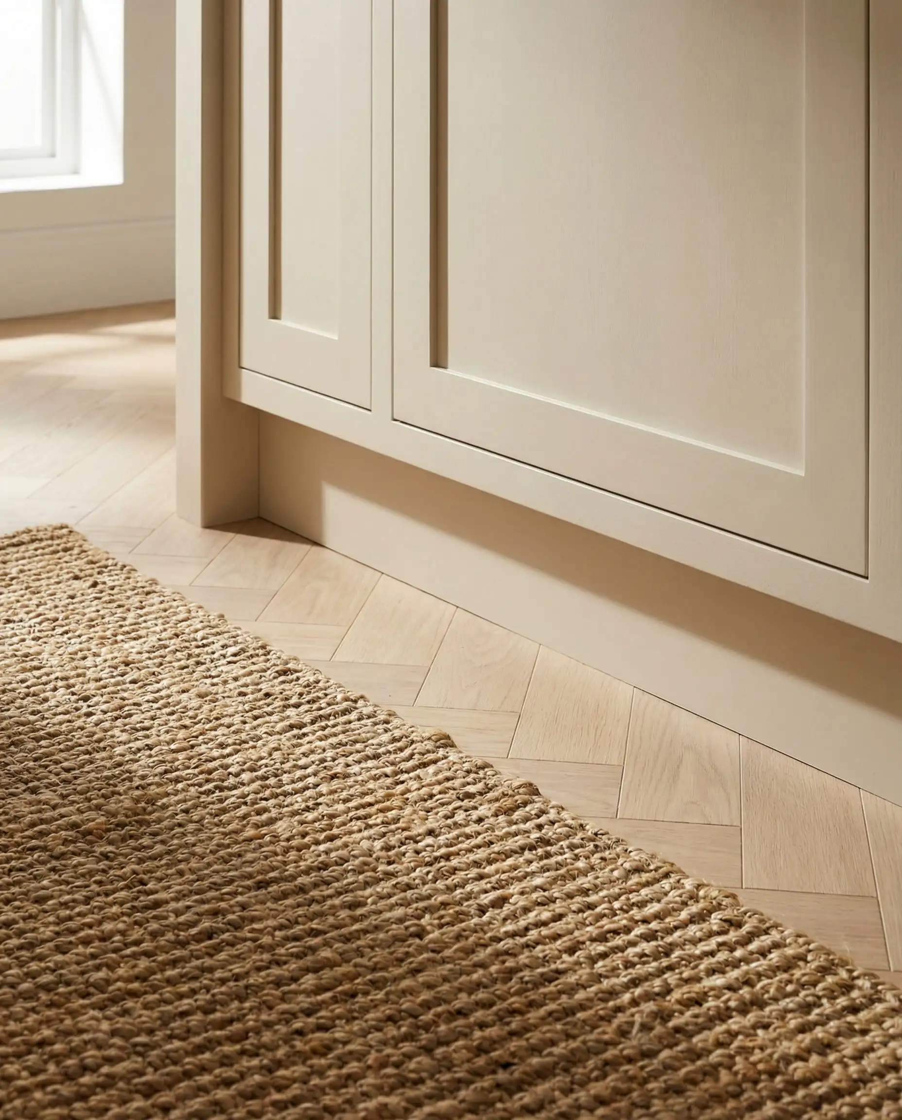
It pairs flawlessly with the other massive trend of 2026: natural wood. If you have White Oak floors or a Walnut butcher block island, Universal Khaki provides enough contrast to let the wood shine without clashing.
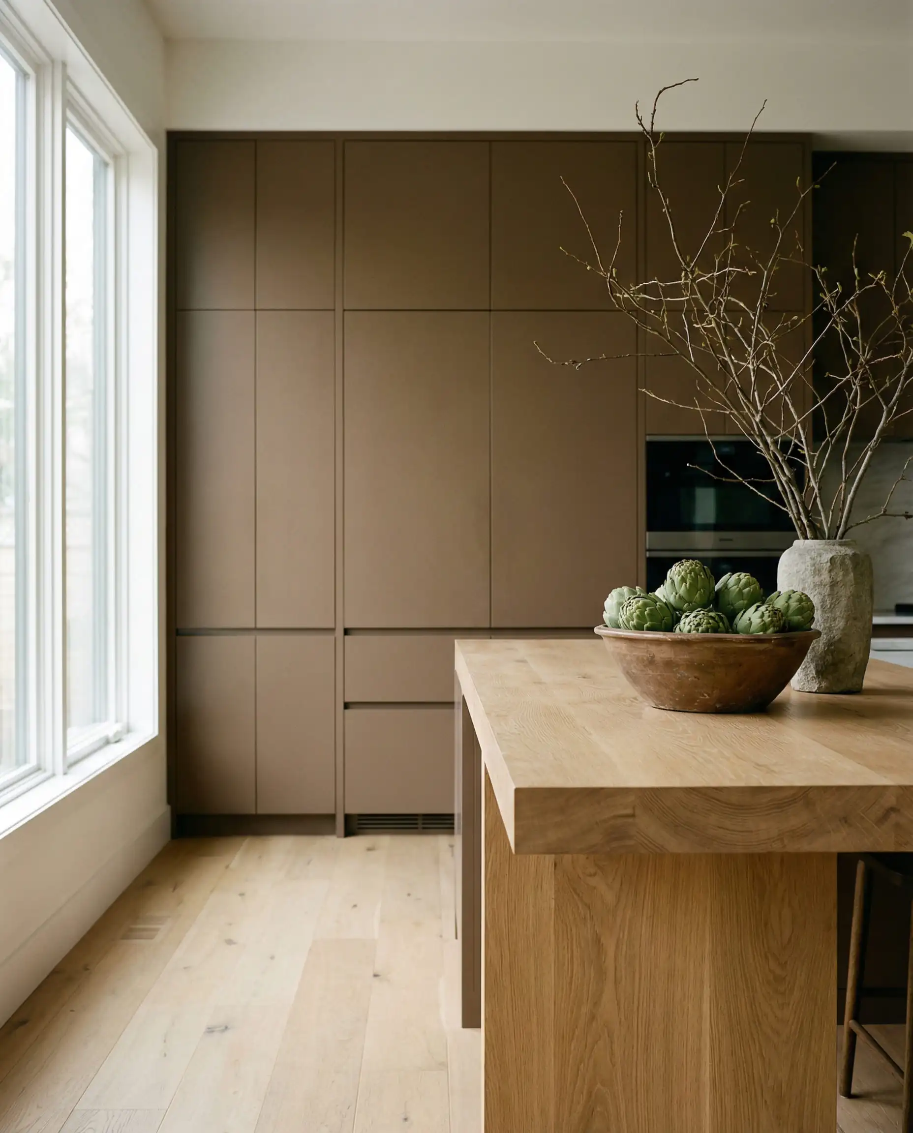
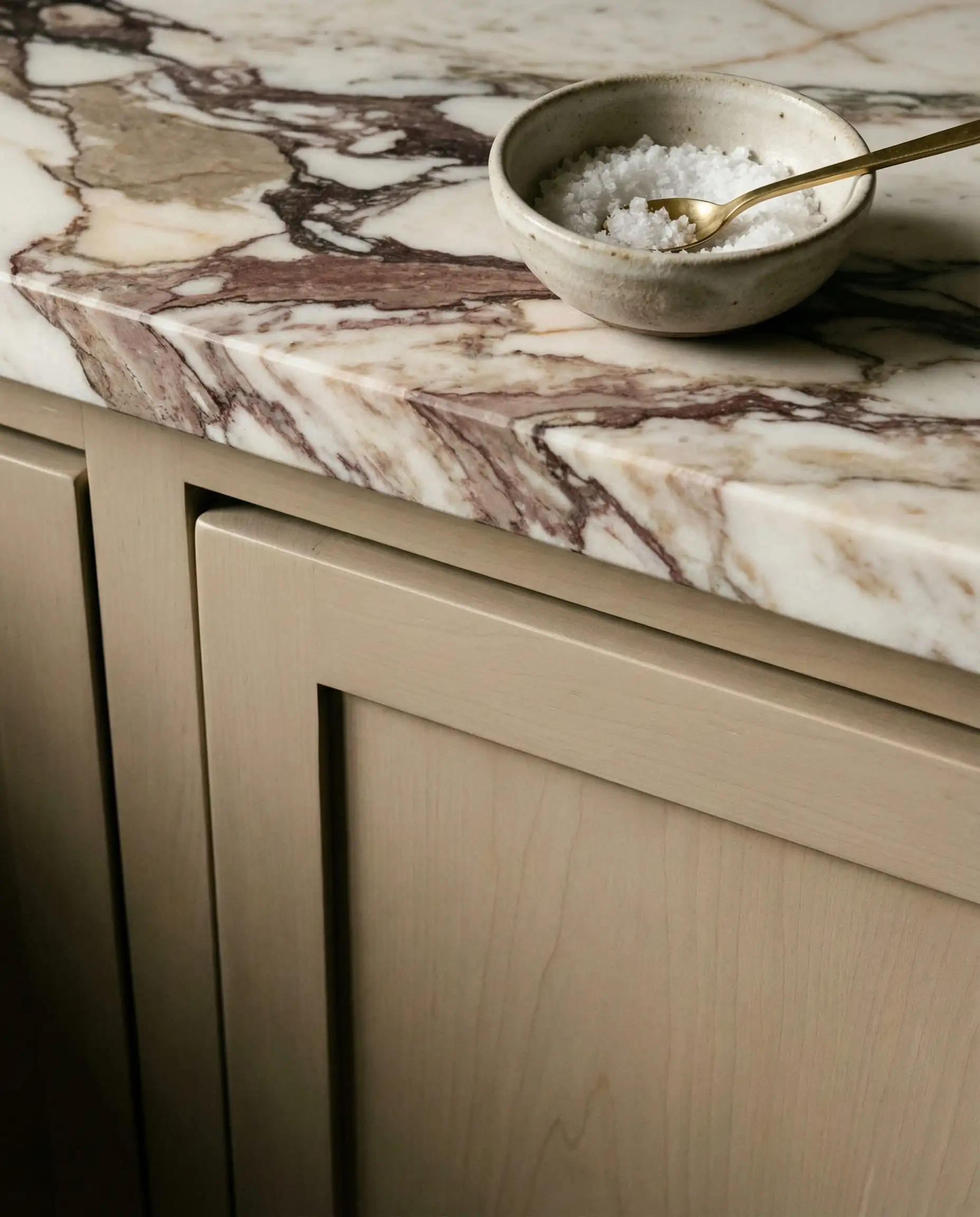
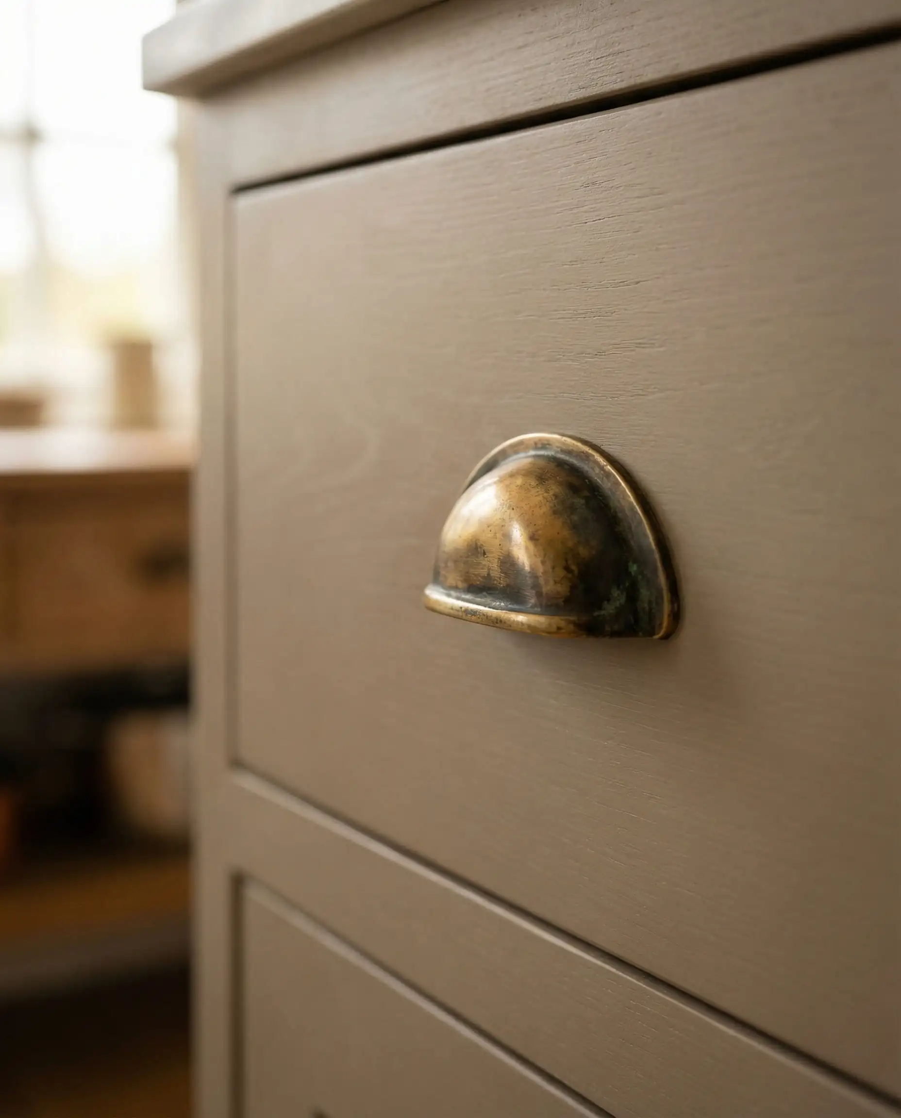
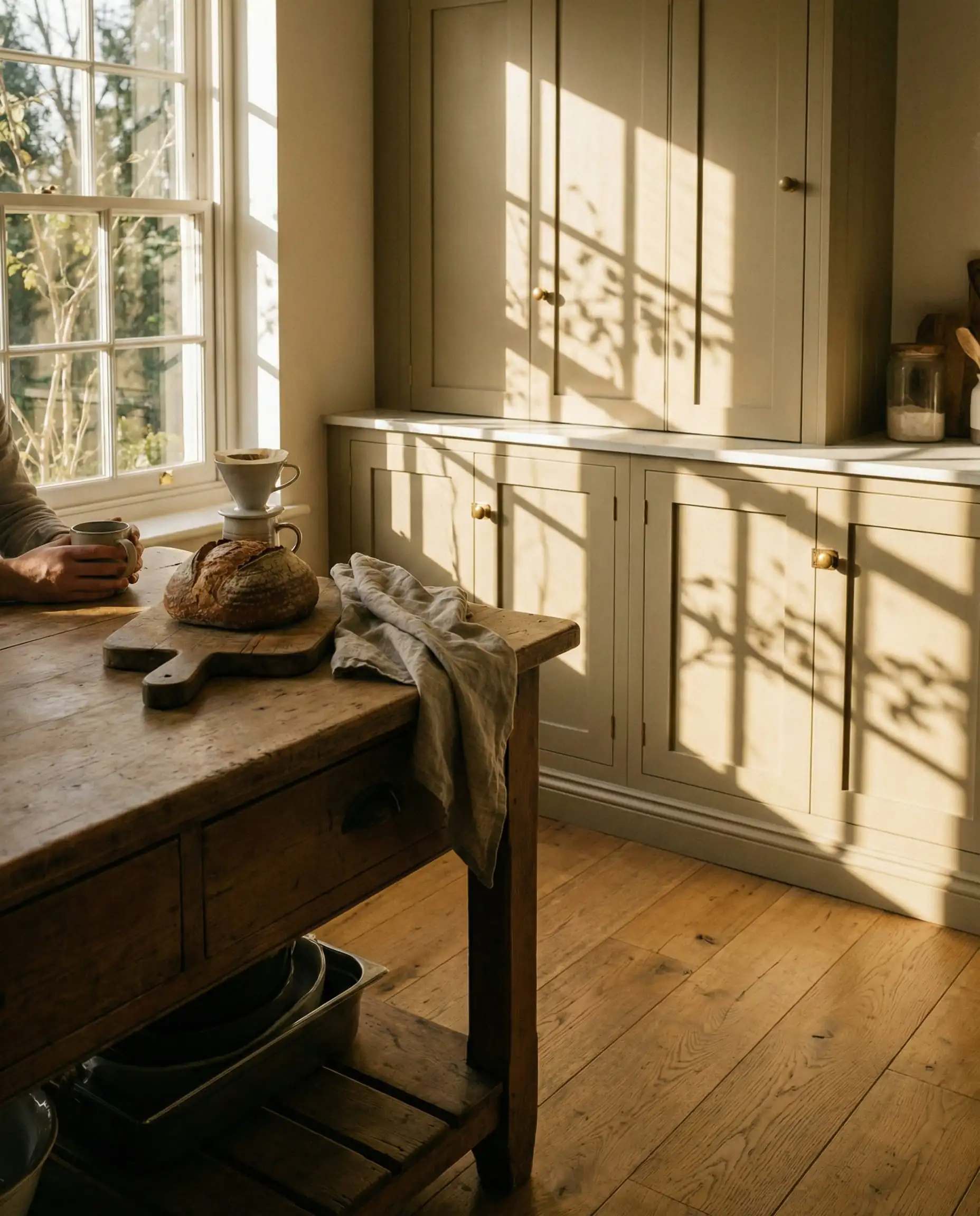
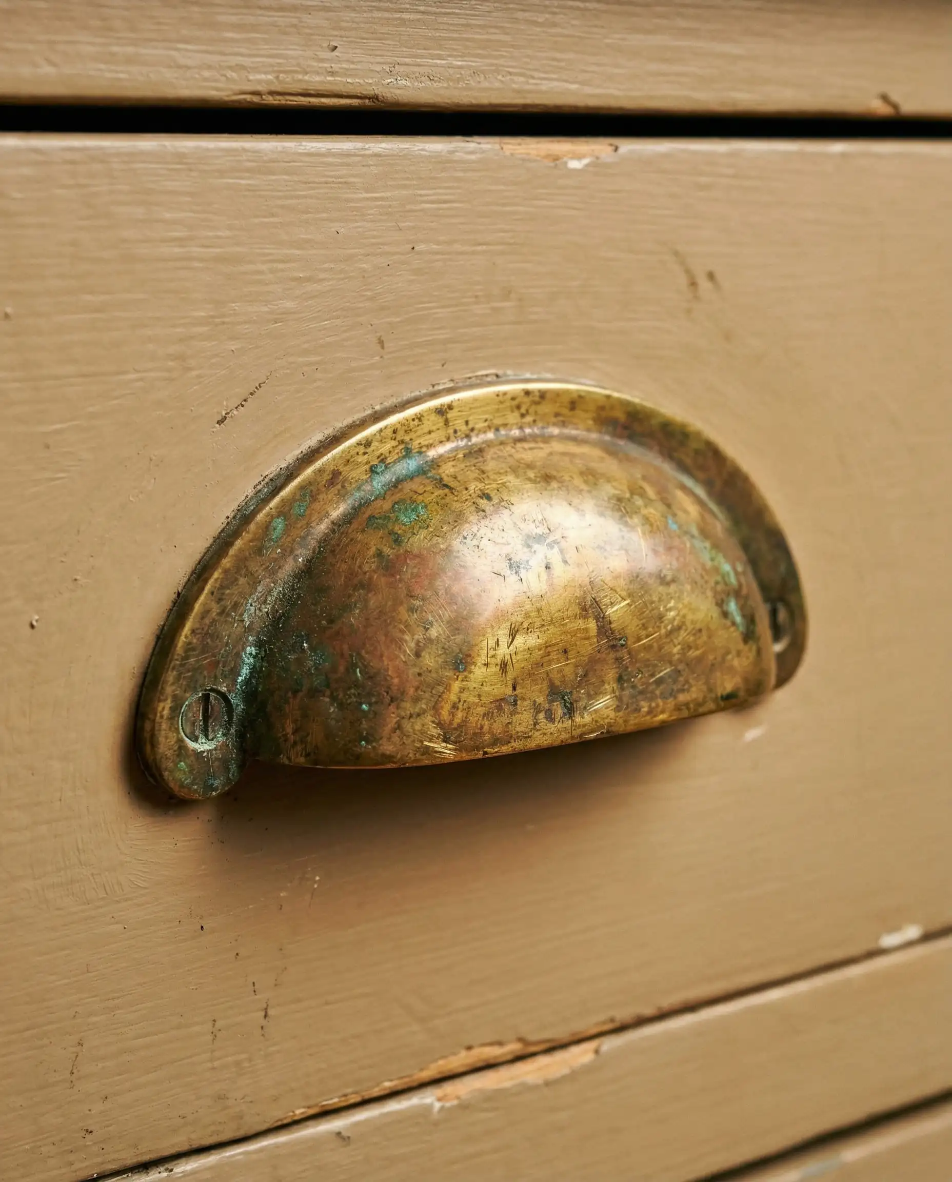
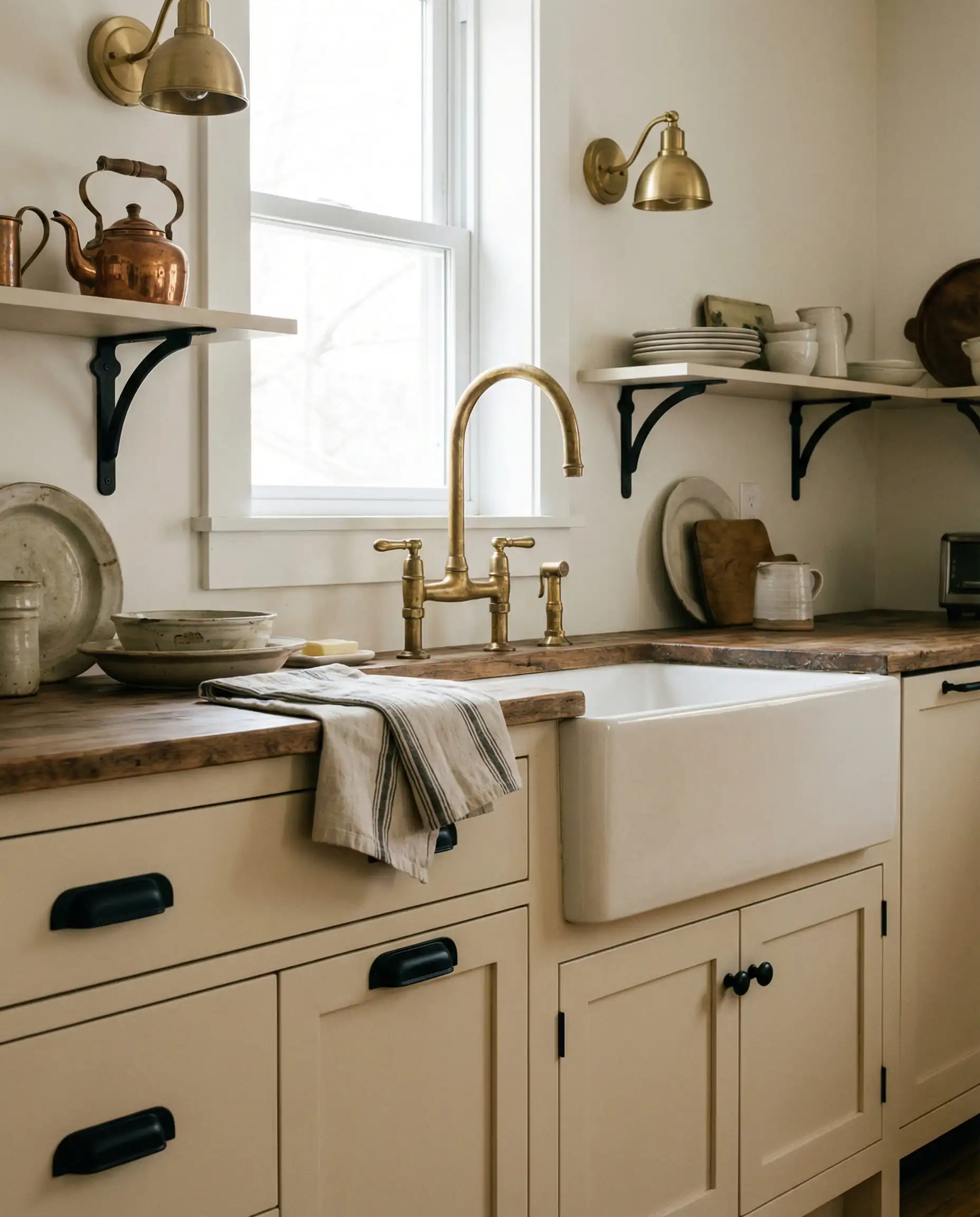
Universal Khaki looks absolute luxury when paired with Unlacquered Brass hardware. The living finish of the brass ages alongside the warm tones of the paint, creating a kitchen that feels like it’s been there for 100 years.
🎨 Designer Tip
The “Mushroom” & Putty Neutrals (The Top Trend)
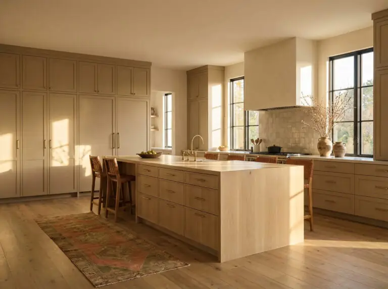
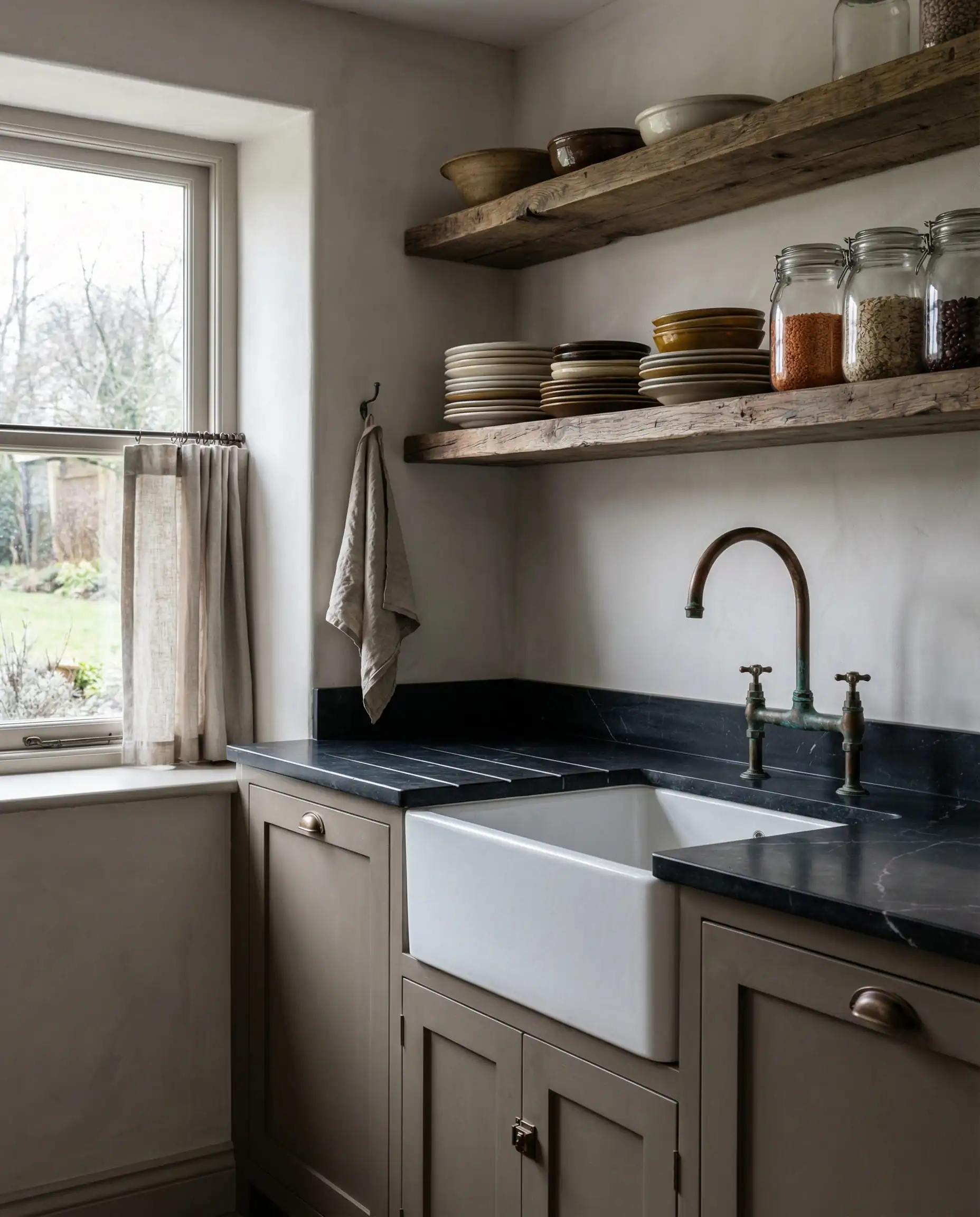
In 2026, “Greige” has evolved. We aren’t looking for grey-beige anymore; we are looking for “Mushroom.” These are colors found in nature—stones, clay, and earth.
2. Accessible Beige (SW 7036)
LRV: 58 | Undertone: Warm Grey/Taupe
You cannot write a cabinet paint guide without mentioning the king of neutrals. Accessible Beige is iconic for a reason. Unlike generic beiges, it has a grey undertone that prevents it from looking too yellow. It is the safest choice if you want warmth but are afraid of committing to a full color.
Best For: North-facing kitchens that need visual warmth without looking “muddy.”
3. Shiitake (SW 9173)
LRV: 51 | Undertone: Stone/Khaki
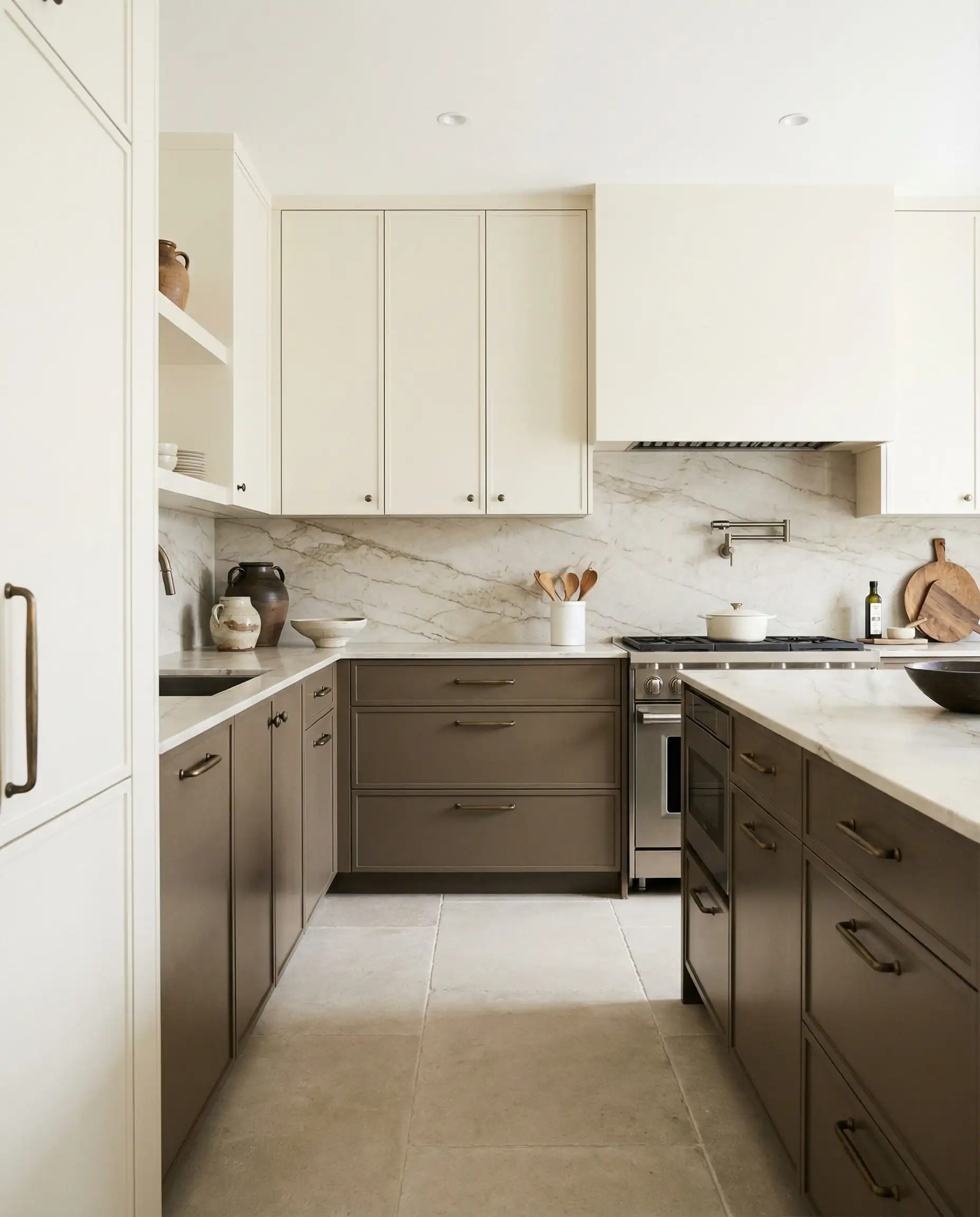
This is the “It Girl” color for 2026 renovations. Shiitake is darker and moodier than Accessible Beige. It reads as a true “putty” color. It sits right in that sweet spot where it creates a soft contrast against white marble countertops.
Best For: A two-tone kitchen. Try Shiitake on the cabinets and a creamy white on the walls.
4. Natural Linen (SW 9109)
LRV: 66 | Undertone: Yellow-based Neutral
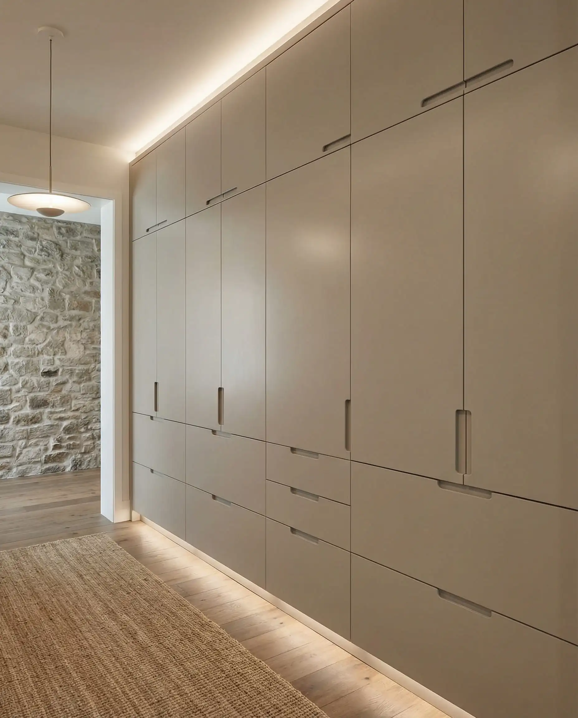
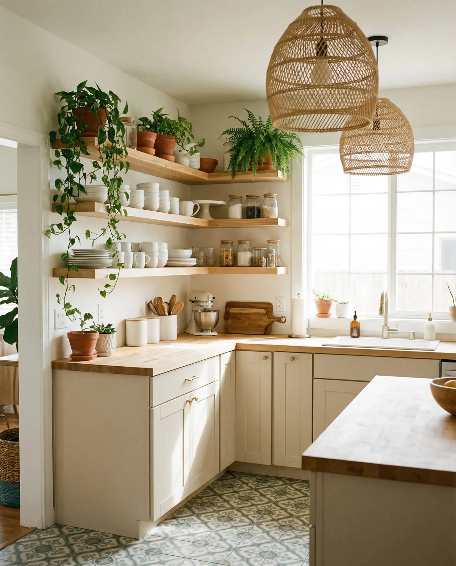
If you find Accessible Beige too dark, look at Natural Linen. It is light, airy, and breathes life into a space. It mimics the look of raw canvas. It creates a “Scandi-Boho” vibe that is very popular right now.
Best For: Smaller kitchens where you want the expansive feel of white, but with more soul.
5. Loggia (SW 7506)
LRV: 48 | Undertone: Warm Taupe
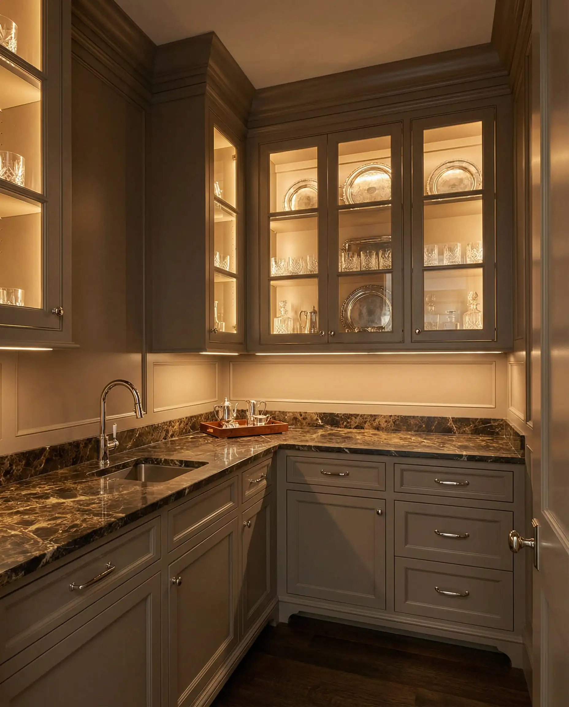
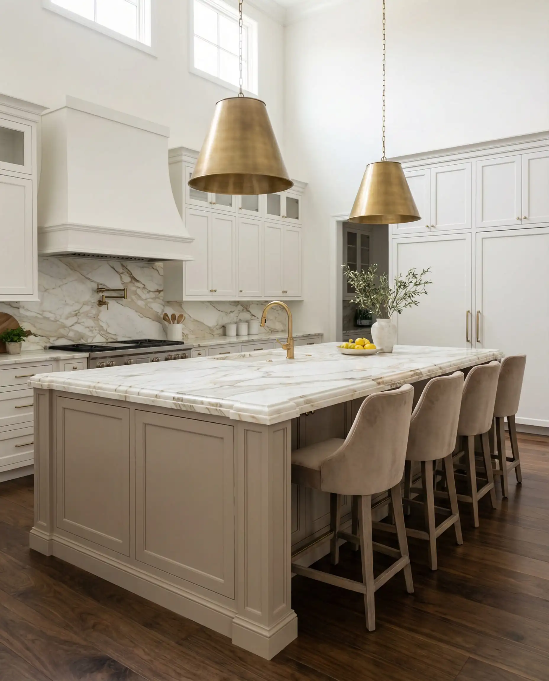
Loggia is for those who want their cabinets to make a statement without shouting. It is a medium-dark taupe that looks incredibly expensive. It’s what we call a “heritage” color.
Best For: Butler’s pantries or large kitchen islands.
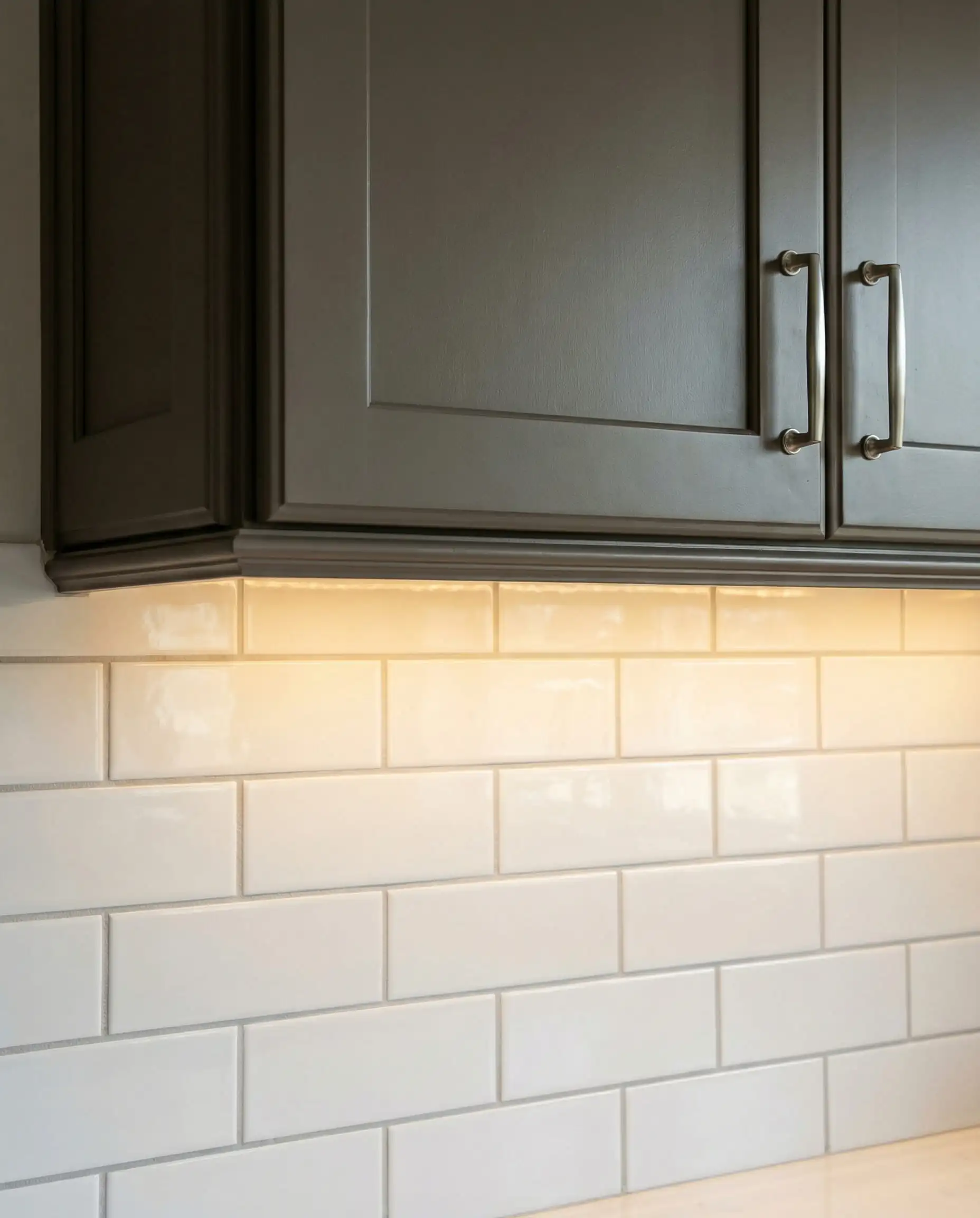
When using these mushroom tones, avoid bright white subway tile with dark grout. Instead, opt for a Zellige tile in a similar creamy tone for a textured, monochromatic look. 🧱
🎨 Designer Tip
The Best Whites for Cabinets (Soft & Creamy)
Is the white kitchen dead? No. But the stark white kitchen is. In 2026, we are avoiding whites with blue undertones (like Extra White (SW 7006)) and opting for whites that feel soft to the touch.
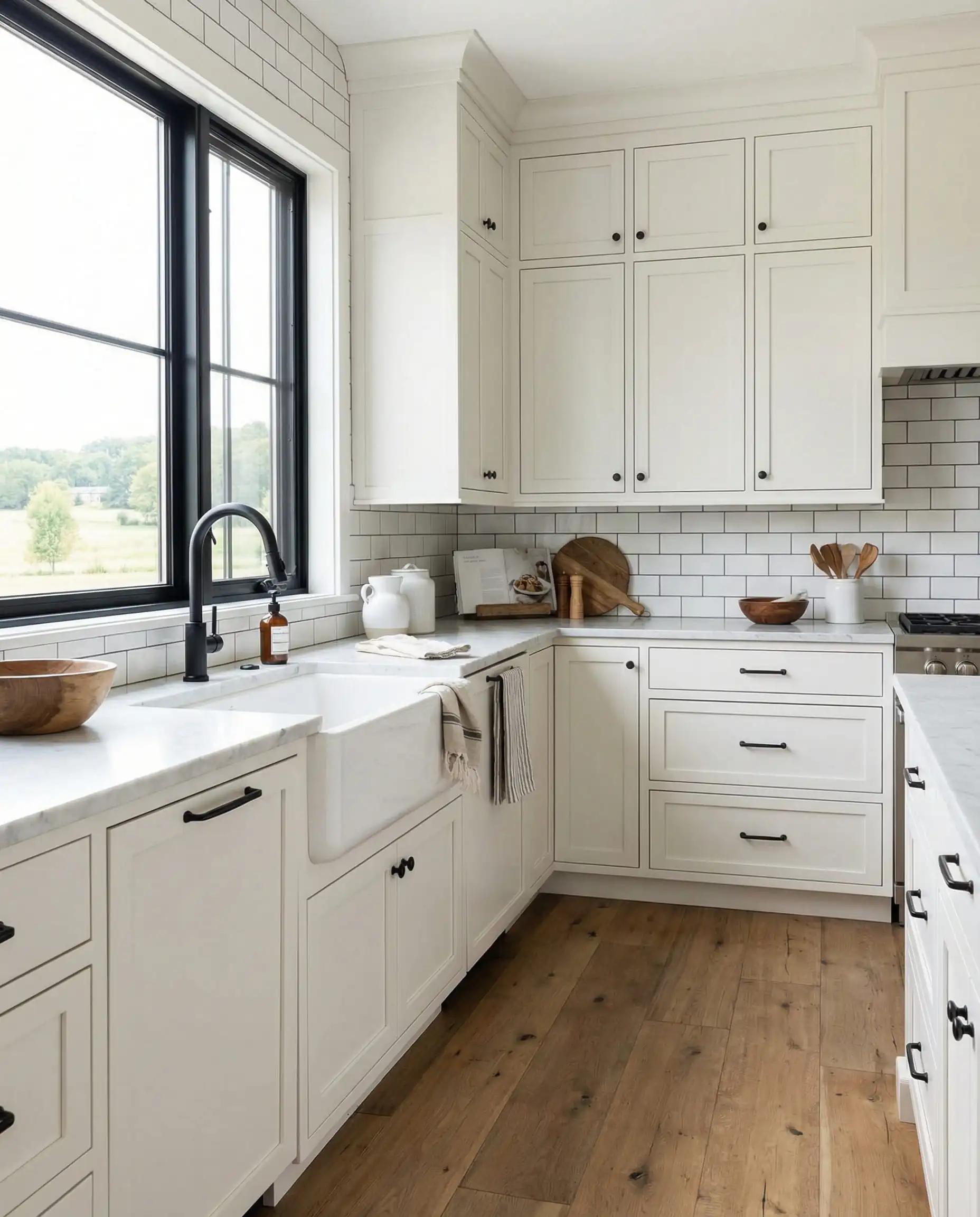
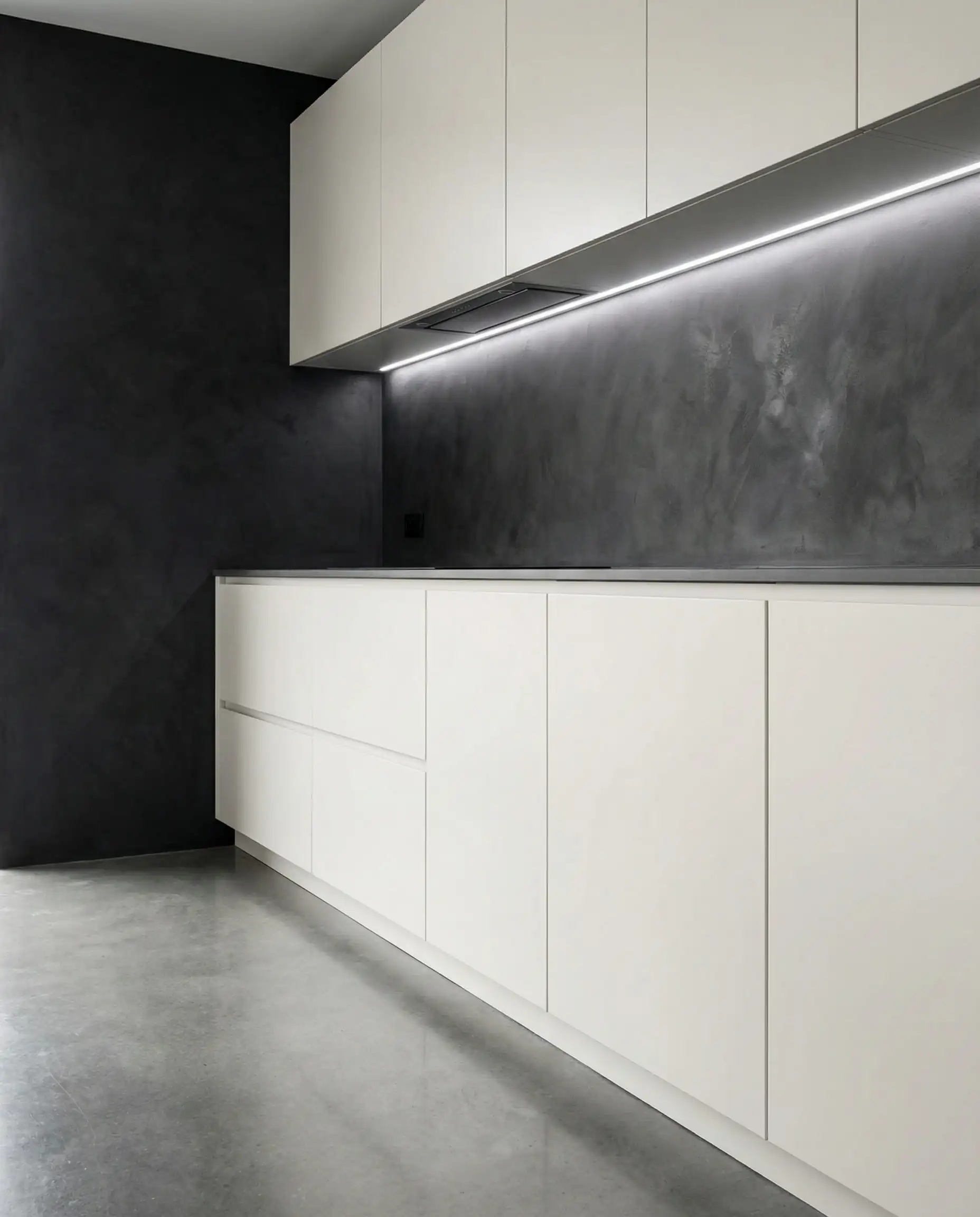
6. Pure White (SW 7005)
LRV: 84 | Undertone: Minimal/Neutral
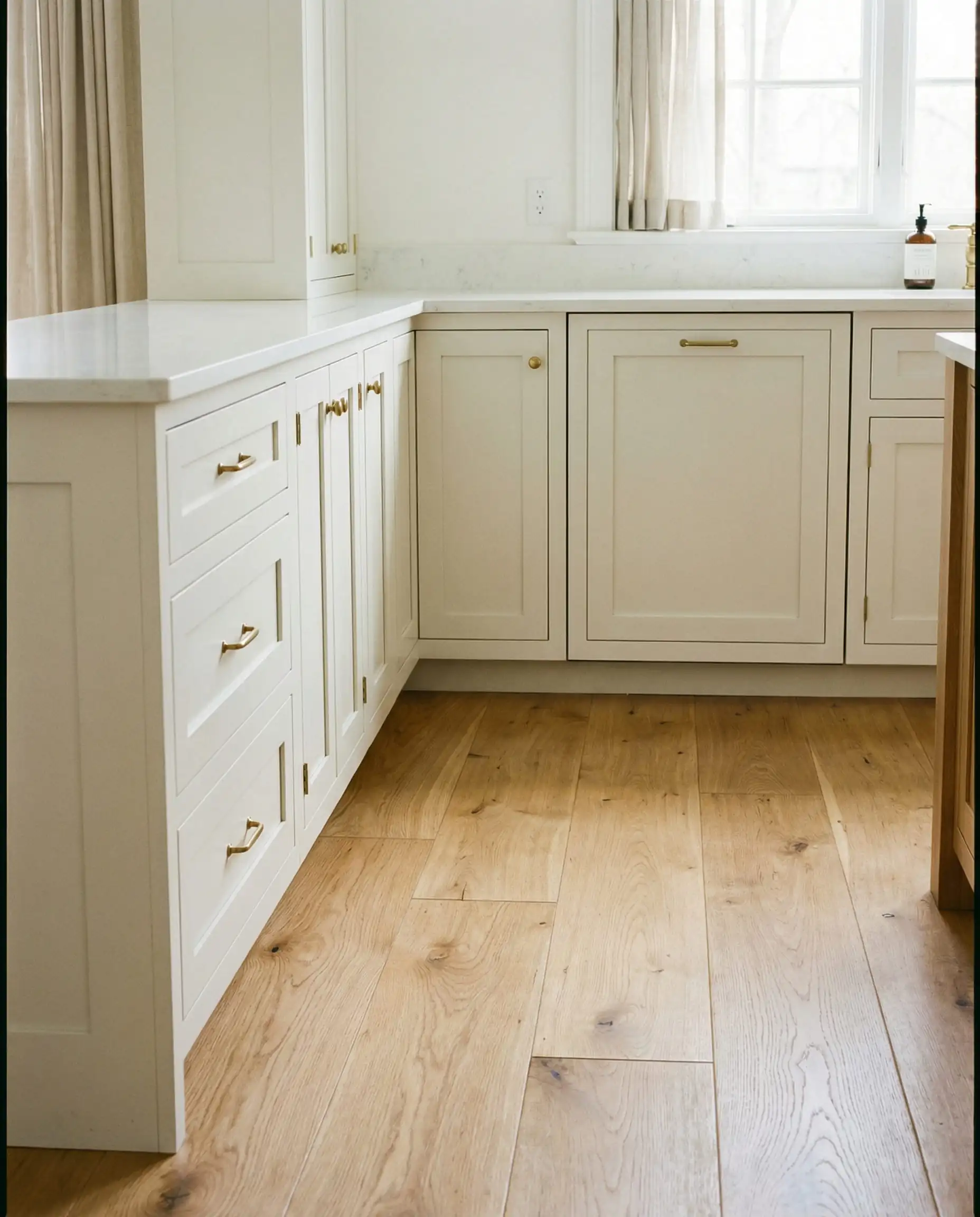
This is our #1 recommendation for clients who just want “White.” It is softer than the stock white out of the can, but it doesn’t lean yellow like Alabaster. It is crisp, clean, and flexible. It won’t clash with your backsplash or your countertops.
Best For: Modern Farmhouse or Contemporary styles.
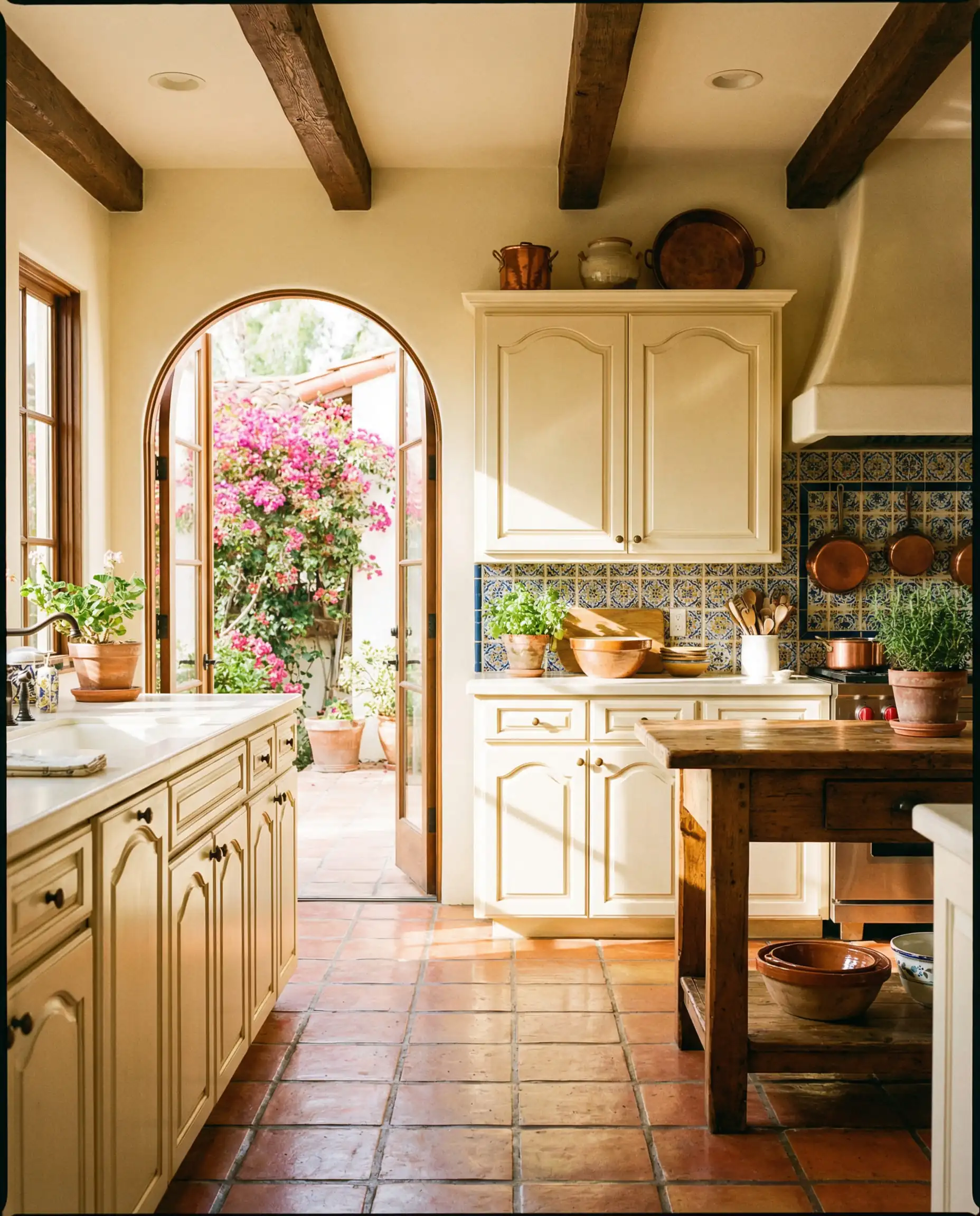
7. Greek Villa (SW 7551)
LRV: 84 | Undertone: Yellow/Green (very subtle)
Greek Villa is like pure sunlight. It is undeniably warm. If you have a kitchen that lacks natural light, this color can trick the eye into thinking it’s a sunny day. It feels significantly softer than Pure White.
Best For: Mediterranean or Spanish-style homes, or cozy cottages.
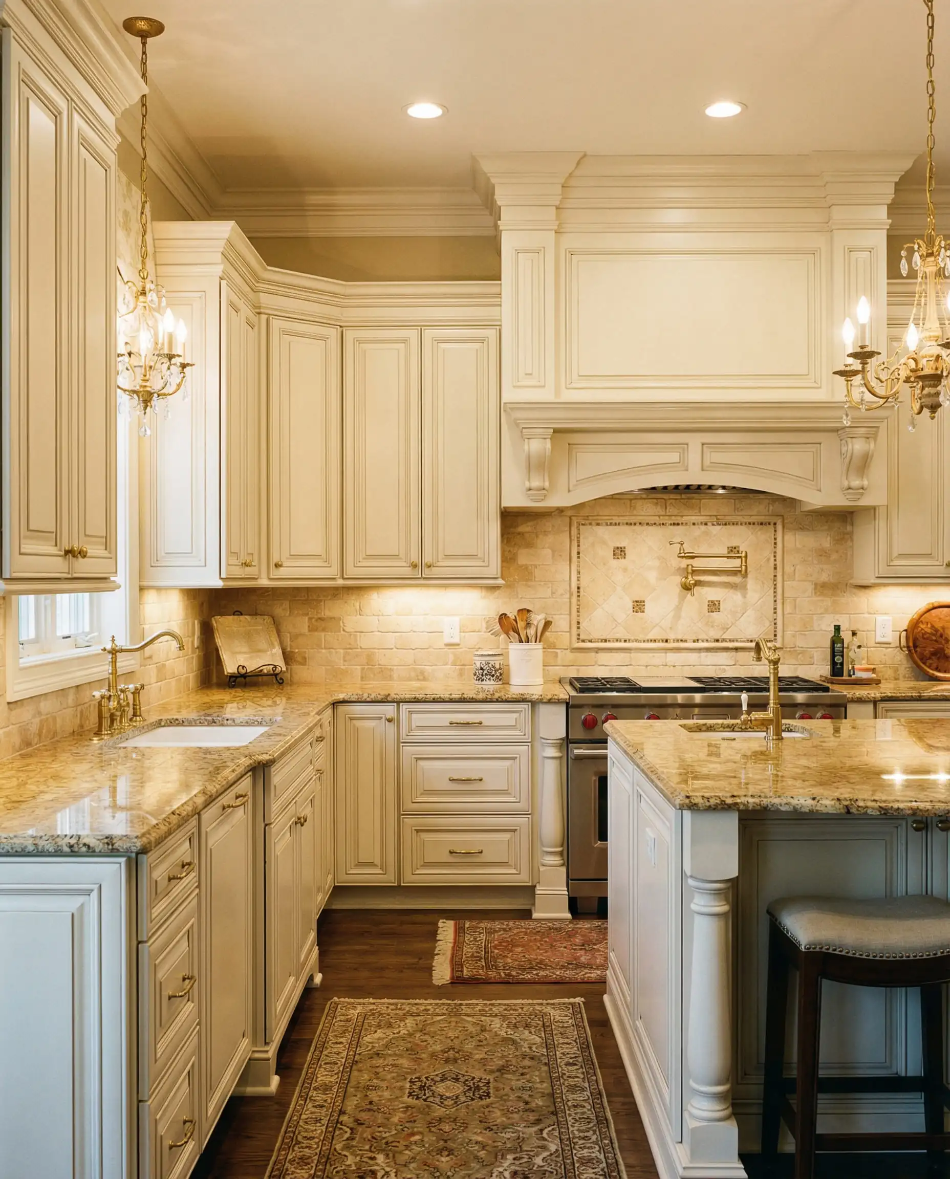
8. Alabaster (SW 7008)
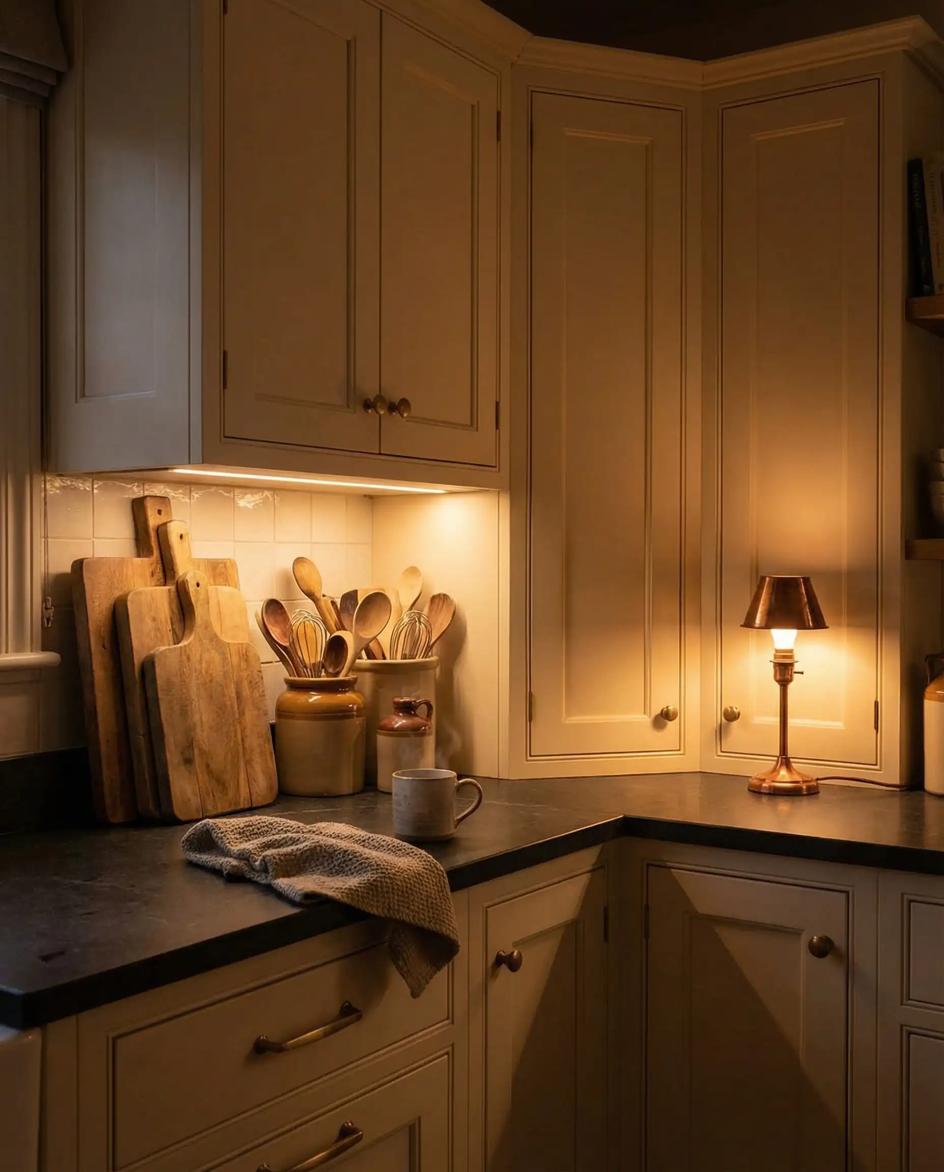
LRV: 82 | Undertone: Warm Cream
The legend. Alabaster was a Color of the Year years ago, and it hasn’t lost its steam. It is creamy, bordering on off-white. Warning: If you put this next to a cool grey Carrara marble, it might look slightly yellow. Always test your swatch against your countertop!
Best For: Traditional kitchens with warm granite or quartz.
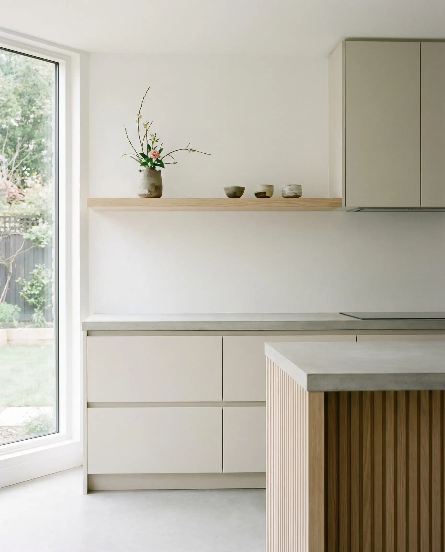
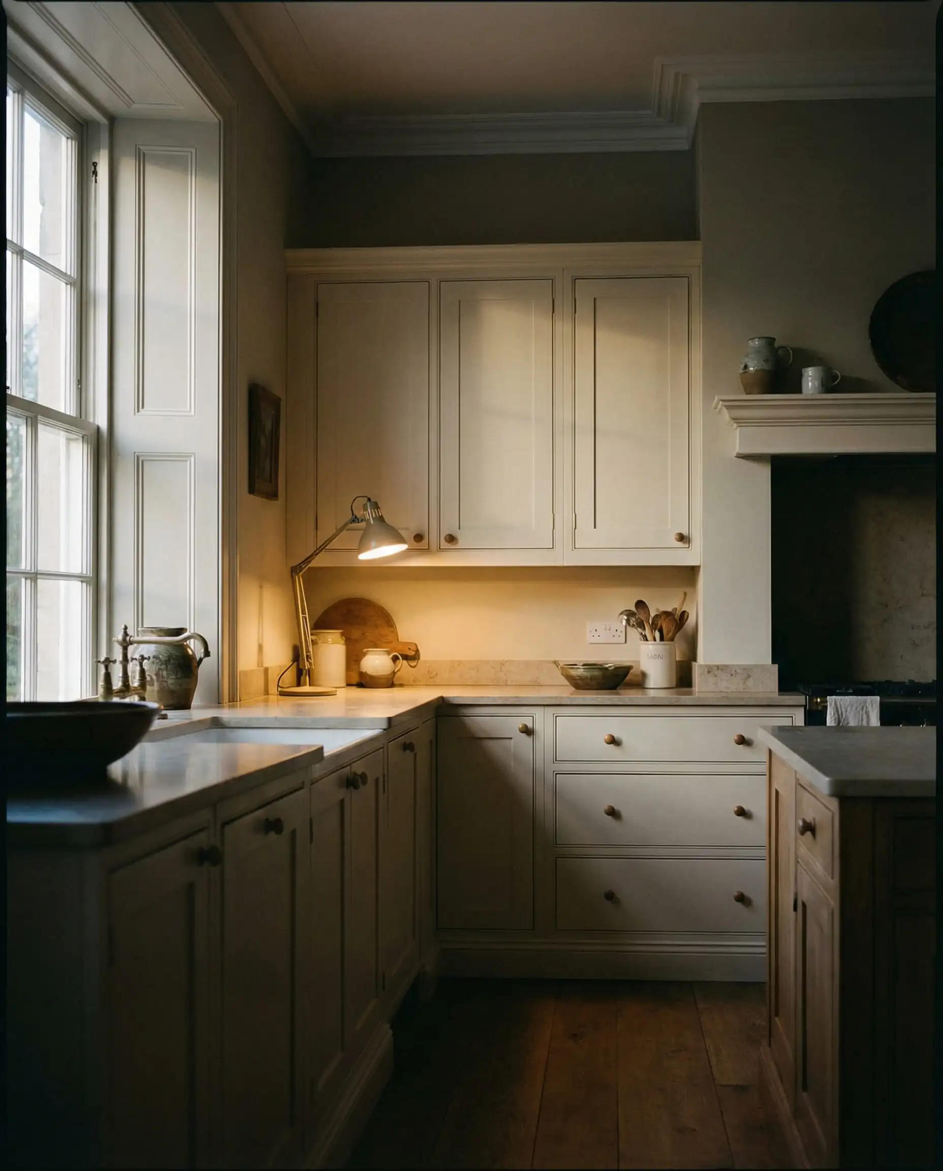
9. Shoji White (SW 7042)
LRV: 74 | Undertone: Greige/Cream
Shoji White blurs the line between white and beige. In a bright room, it looks like a soft cream. In a dim room, it looks like a pale greige. This complexity makes it perfect for the 2026 “Japandi” (Japanese-Scandinavian) aesthetic.
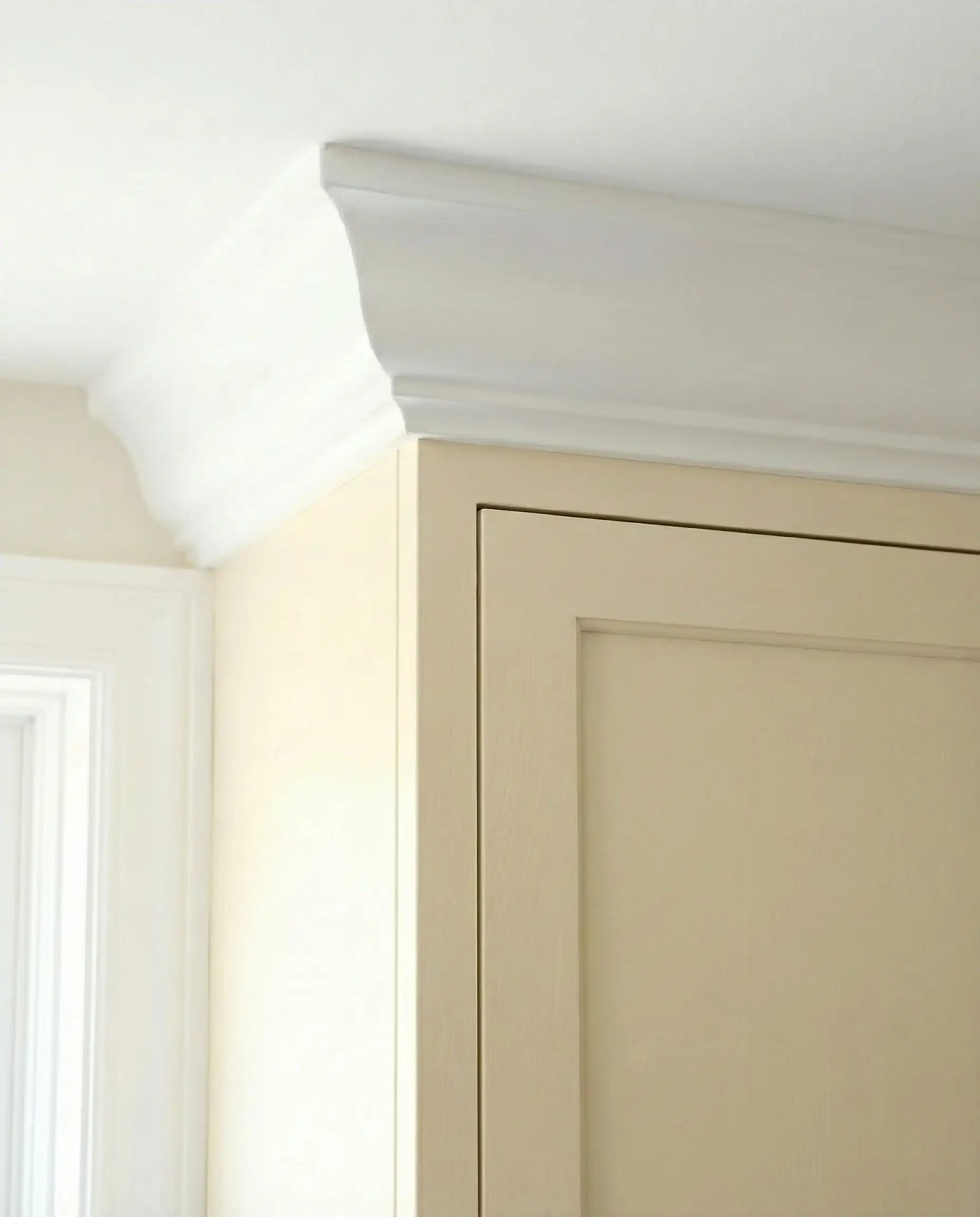
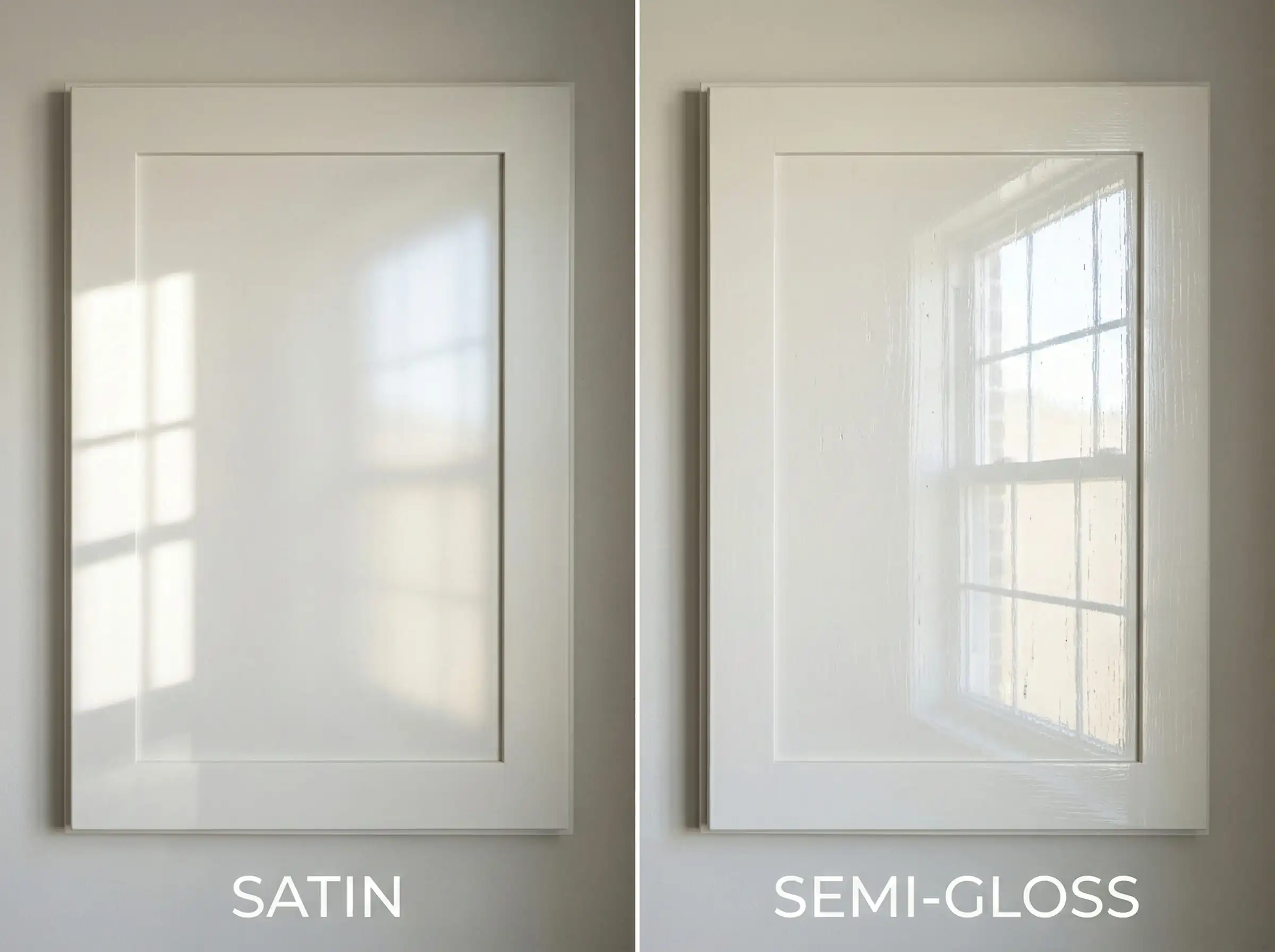
If you choose a creamy white like Alabaster or Shoji White, paint your trim the exact same color but in a different sheen (Semi-Gloss for trim, Satin for cabinets). This makes the ceilings look higher! 📏
🎨 Designer Tip
Moody & Nature-Inspired Accents
The most popular kitchen layout in 2026 is the “Tuxedo” or mixed-finish kitchen. This usually means light uppers and dark, grounding lowers (or a dark island).
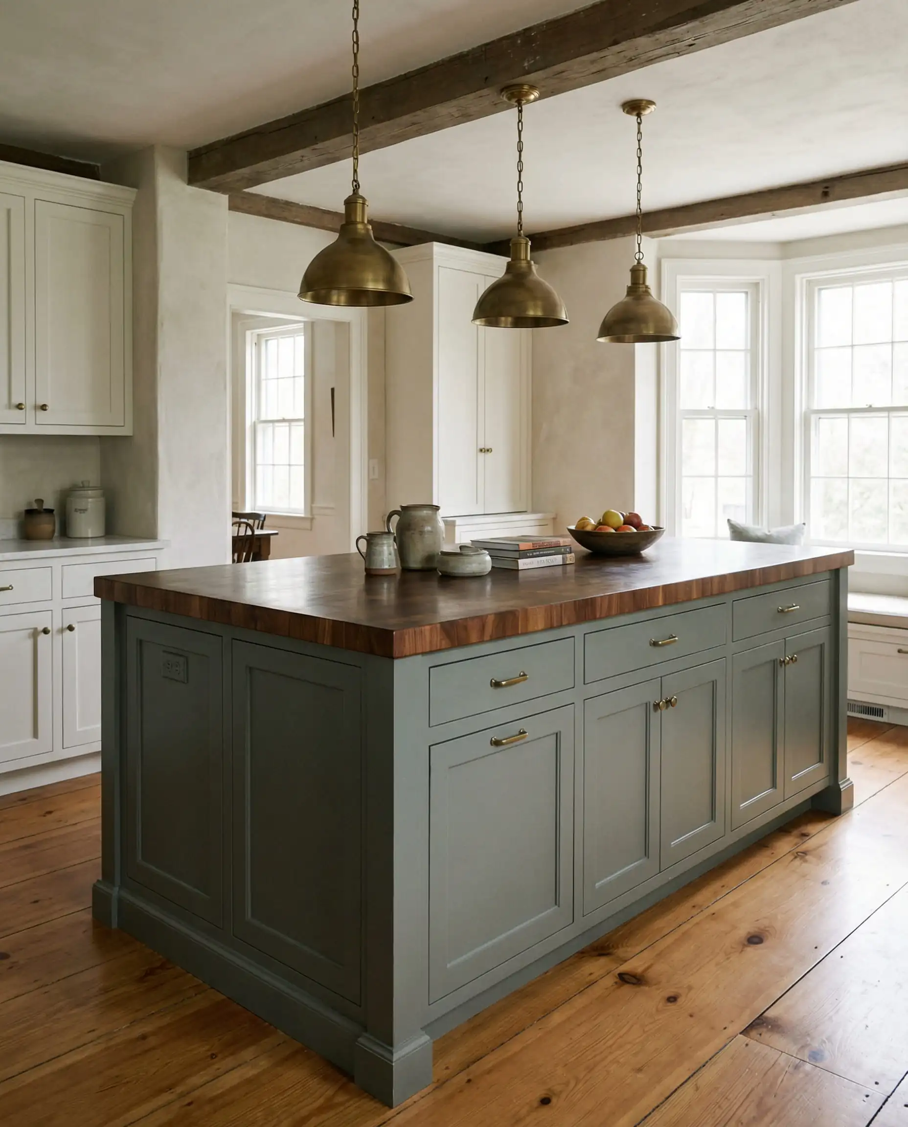
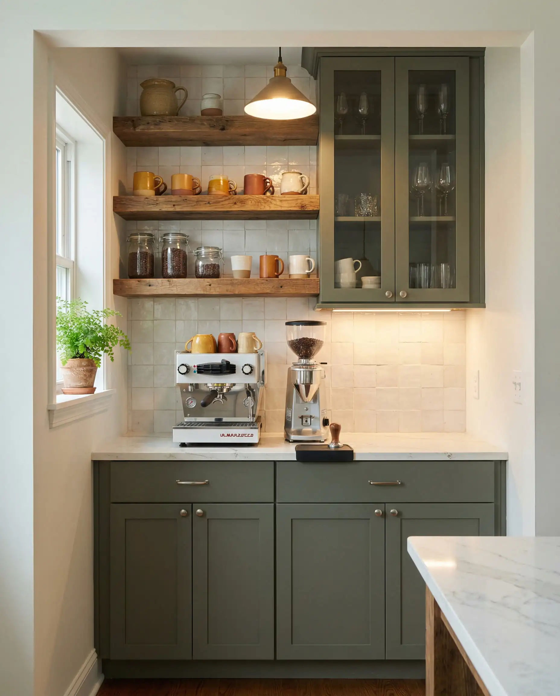
10. Pewter Green (SW 6208)
LRV: 12 | Undertone: Cool Grey-Green
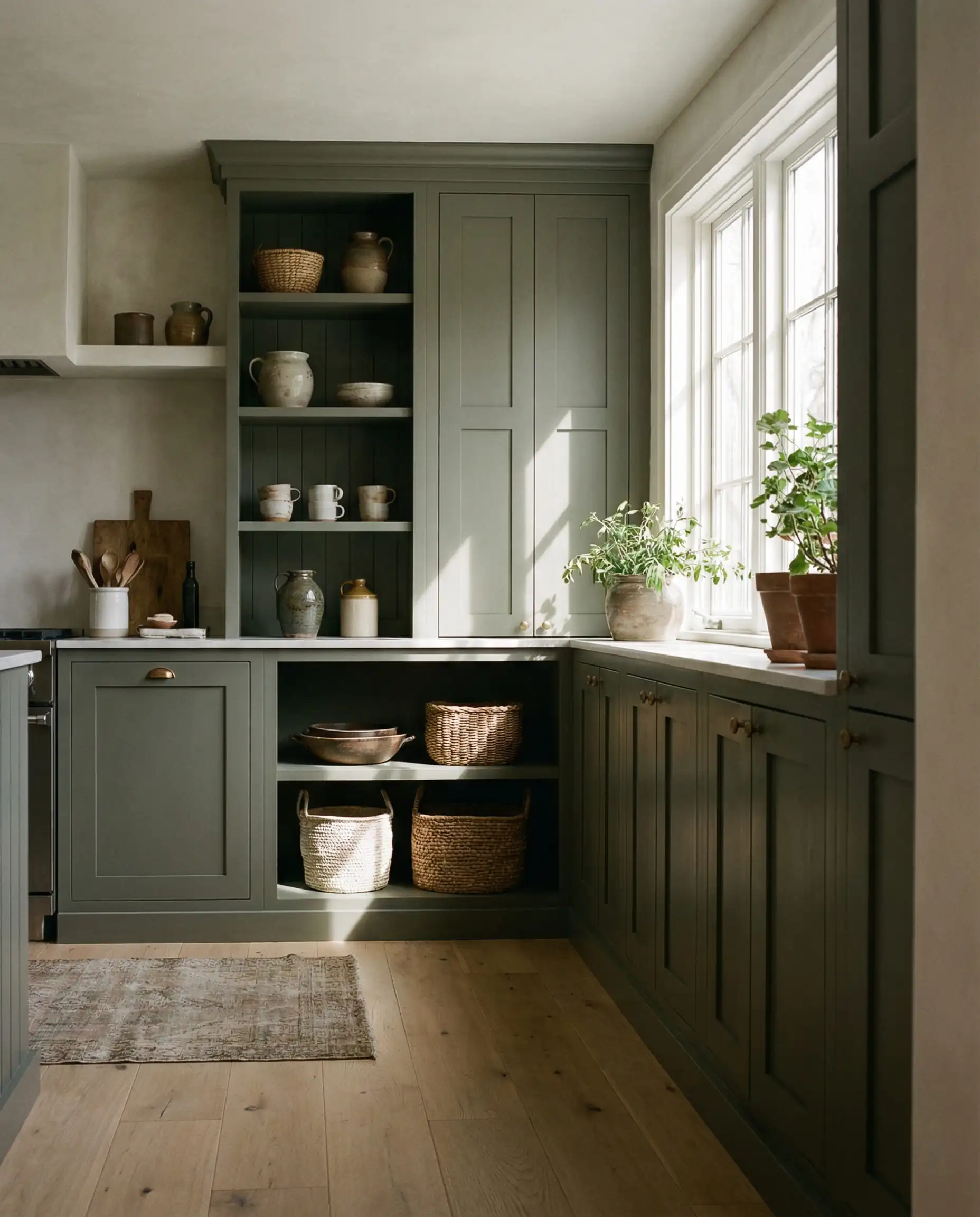
Green is the “new neutral.” Pewter Green is fantastic because it isn’t a bright, grassy green. It is muted and dusty. It pairs beautifully with brass hardware and oak floors. It brings the outdoors in, which is central to the wellness trend.
Best For: Kitchen islands or a dedicated coffee bar.
11. Evergreen Fog (SW 9130)
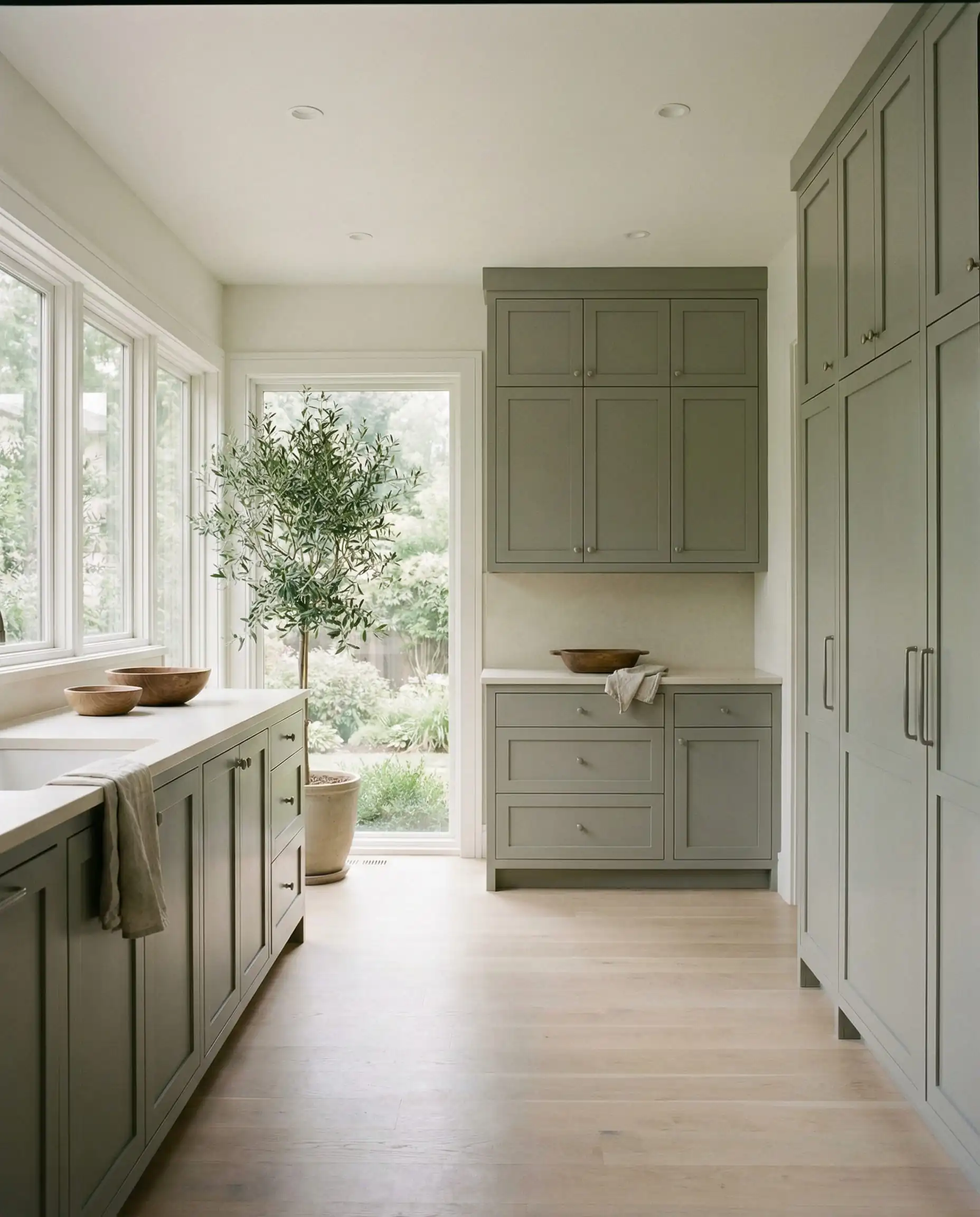
LRV: 30 | Undertone: Grey-Green
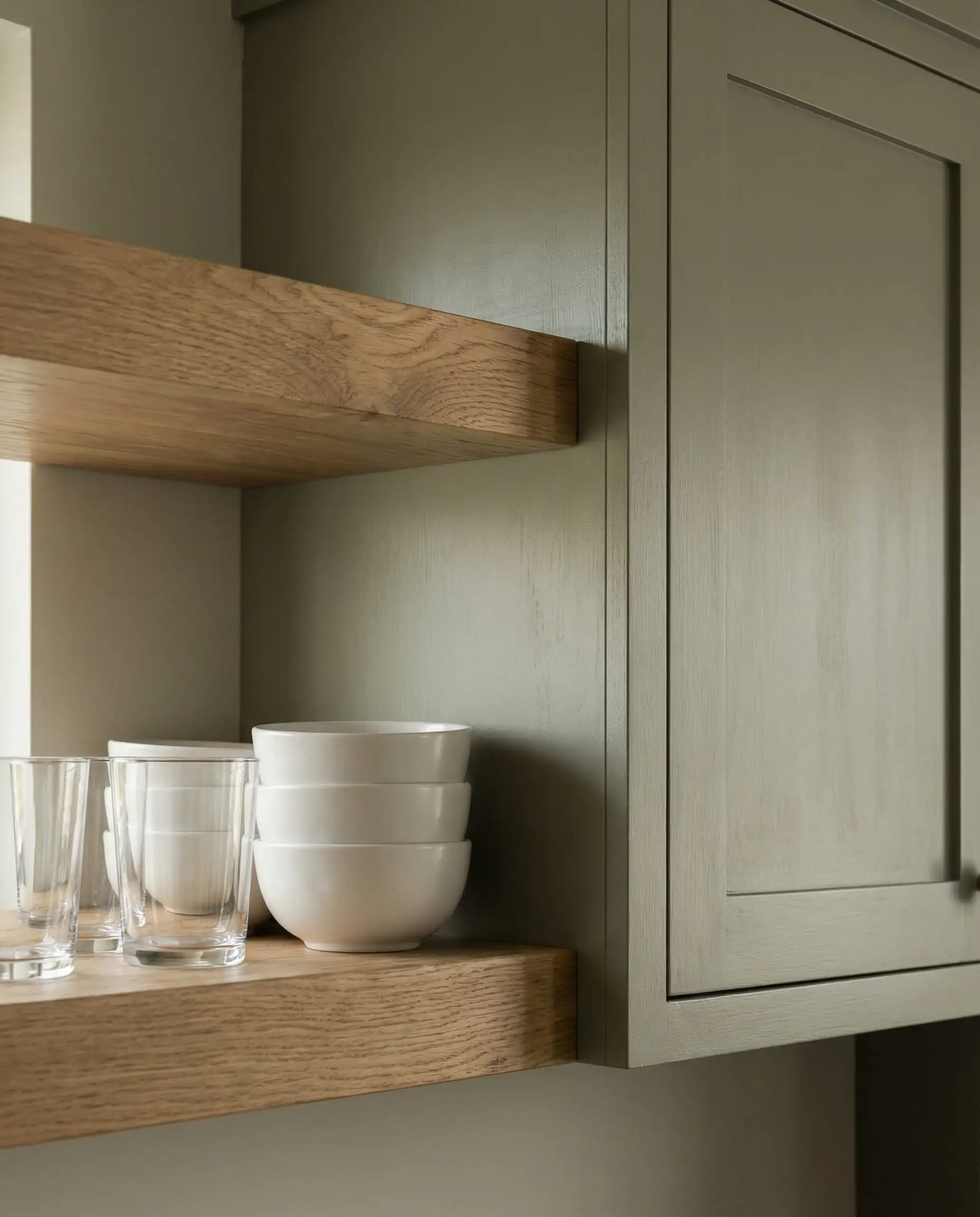
A former Color of the Year that has solidified its place as a classic. Evergreen Fog is lighter and more versatile than Pewter Green. It’s a true chameleon color—sometimes it looks green, sometimes grey. It is soothing and perfect for a full-cabinetry look (uppers and lowers).
Best For: A “spa-like” retreat kitchen.
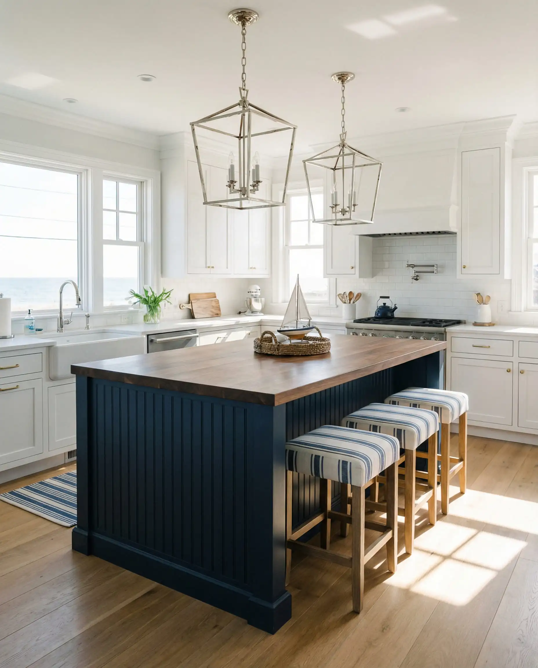
12. Naval (SW 6244)
LRV: 4 | Undertone: Deep Blue
While green is the main character this year, a classic Navy never dies. Naval is Sherwin-Williams’ most confident blue. It pairs incredibly well with the 2026 trend of warm butcher block countertops. If you want a nautical or “Hamptons” vibe, this is the one.
Best For: A large island in an all-white kitchen.
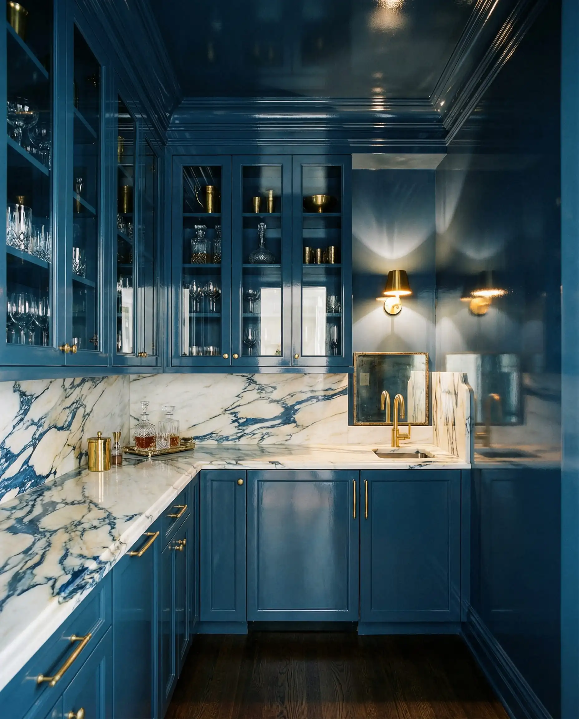
13. Urbane Bronze (SW 7048)
LRV: 8 | Undertone: Brown-Grey
Before Universal Khaki, there was Urbane Bronze. It is deep, rich, and sophisticated. It isn’t a harsh black; it has a bronze/brown base that makes it feel warm and welcoming.
Best For: A dramatic, moody statement island.
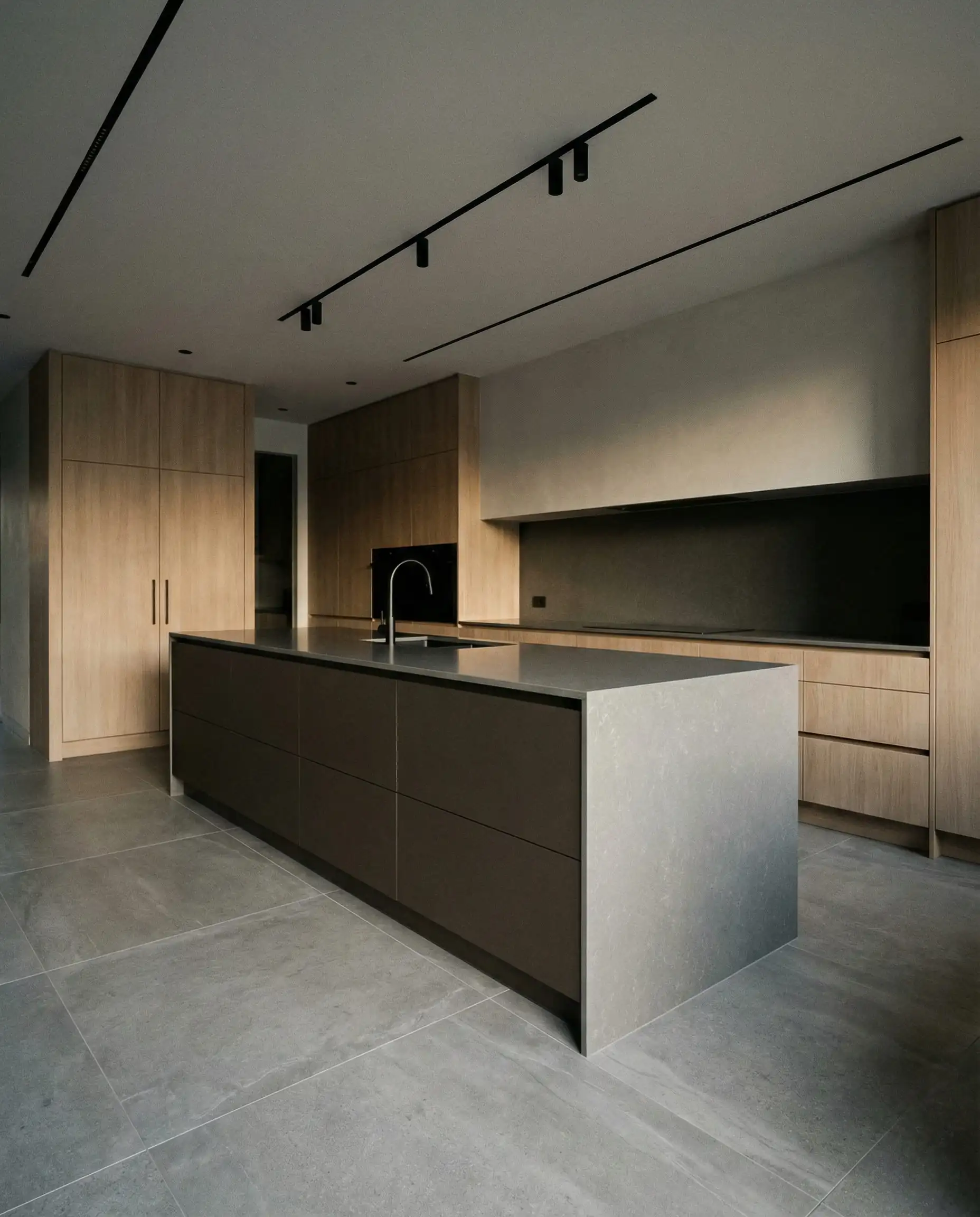
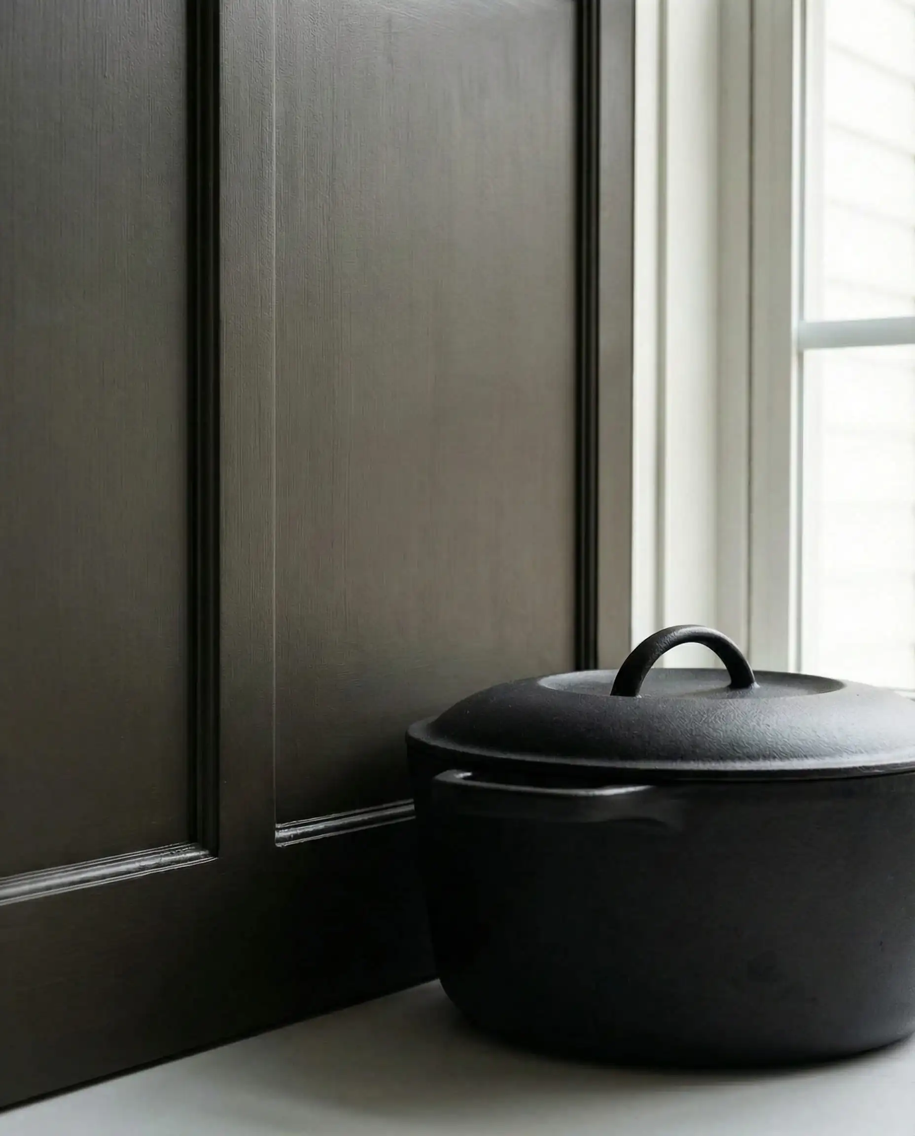
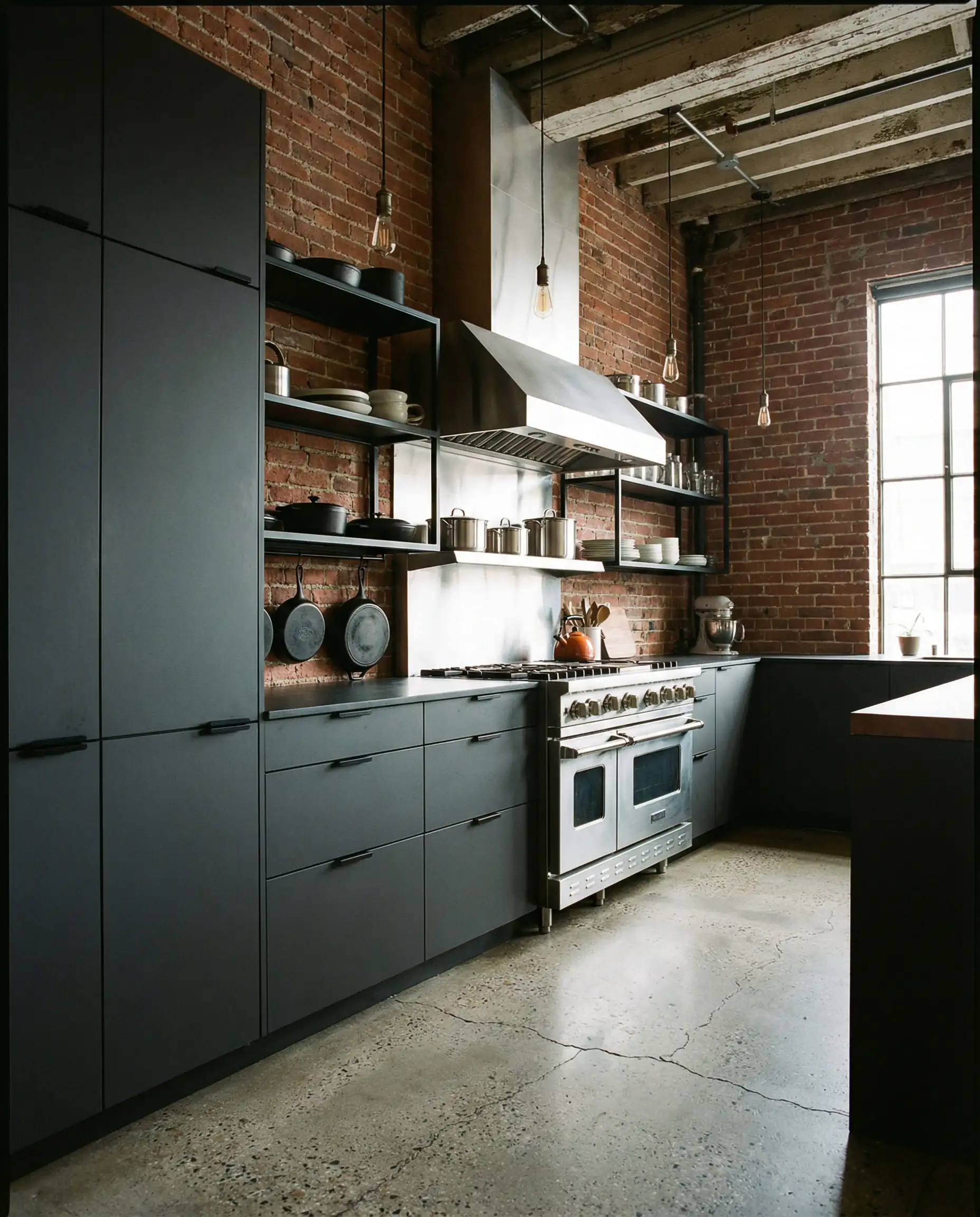
14. Iron Ore (SW 7069)
LRV: 6 | Undertone: Charcoal
If Tricorn Black (SW 6258) feels too intense for you, Iron Ore is the solution. It’s a soft charcoal that reads as black, but without the “inkiness.” It looks stunning in modern industrial kitchens.
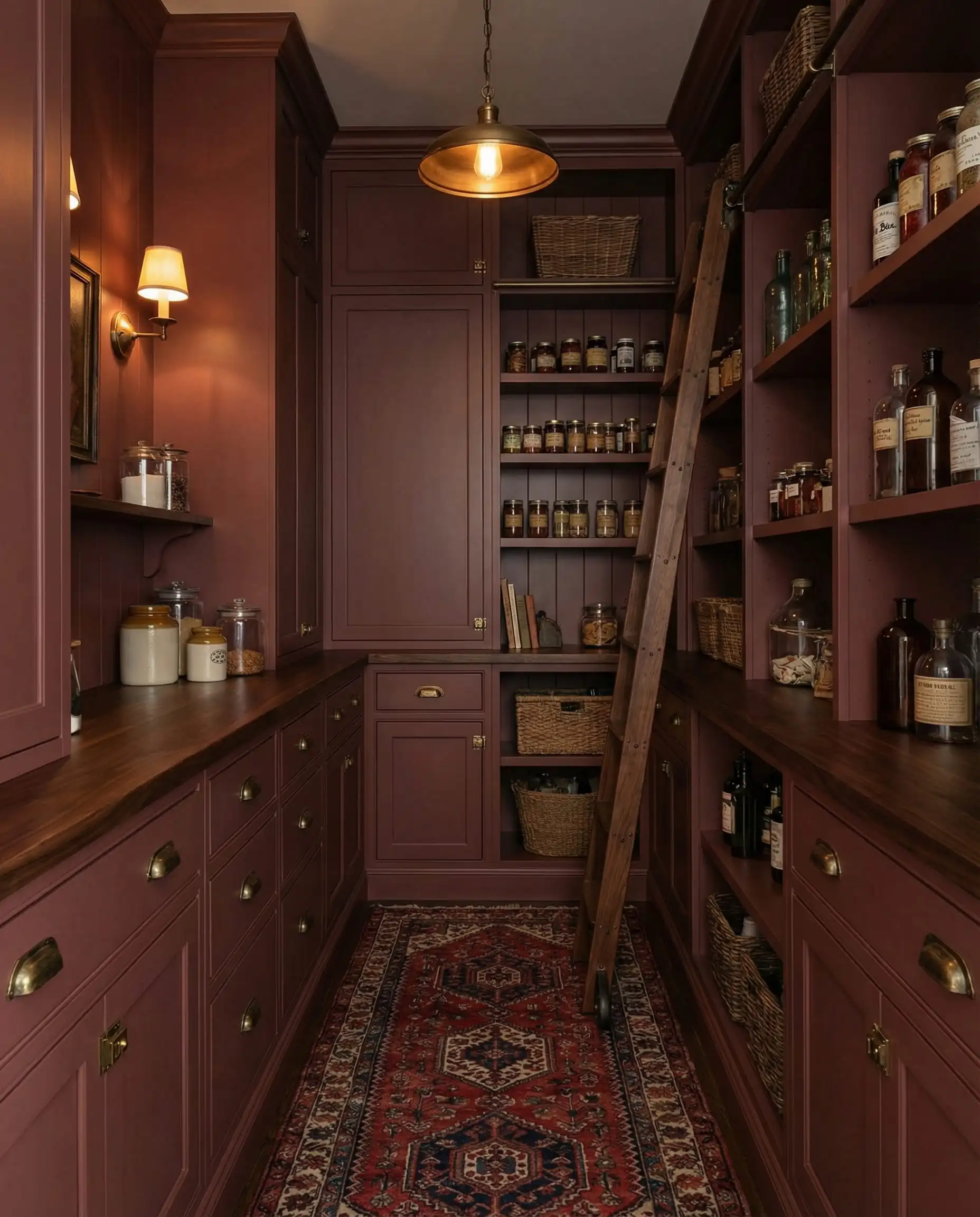
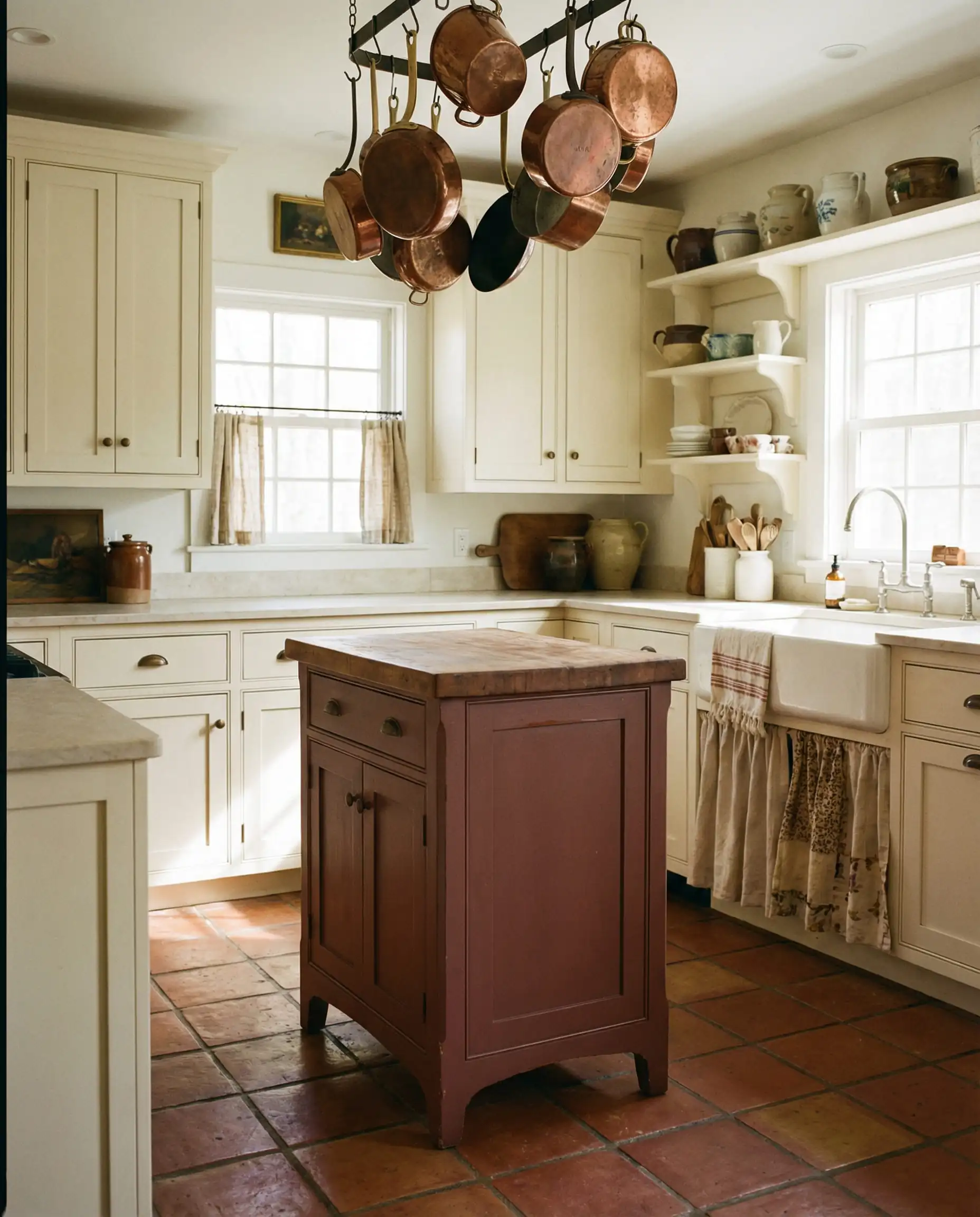
15. Carnelian (SW 7571)
LRV: 5 | Undertone: Violet-Red
Trend Alert: We are seeing a resurgence of deep, earthy reds and burgundies. Carnelian is a bold choice, but when done on a small scale (like a pantry or a small island), it is breathtaking. It feels old-world and regal.
Pairing Guide: Metals & Woods
A paint color never lives in isolation. To get that “designer look,” you have to consider what sits next to the paint.
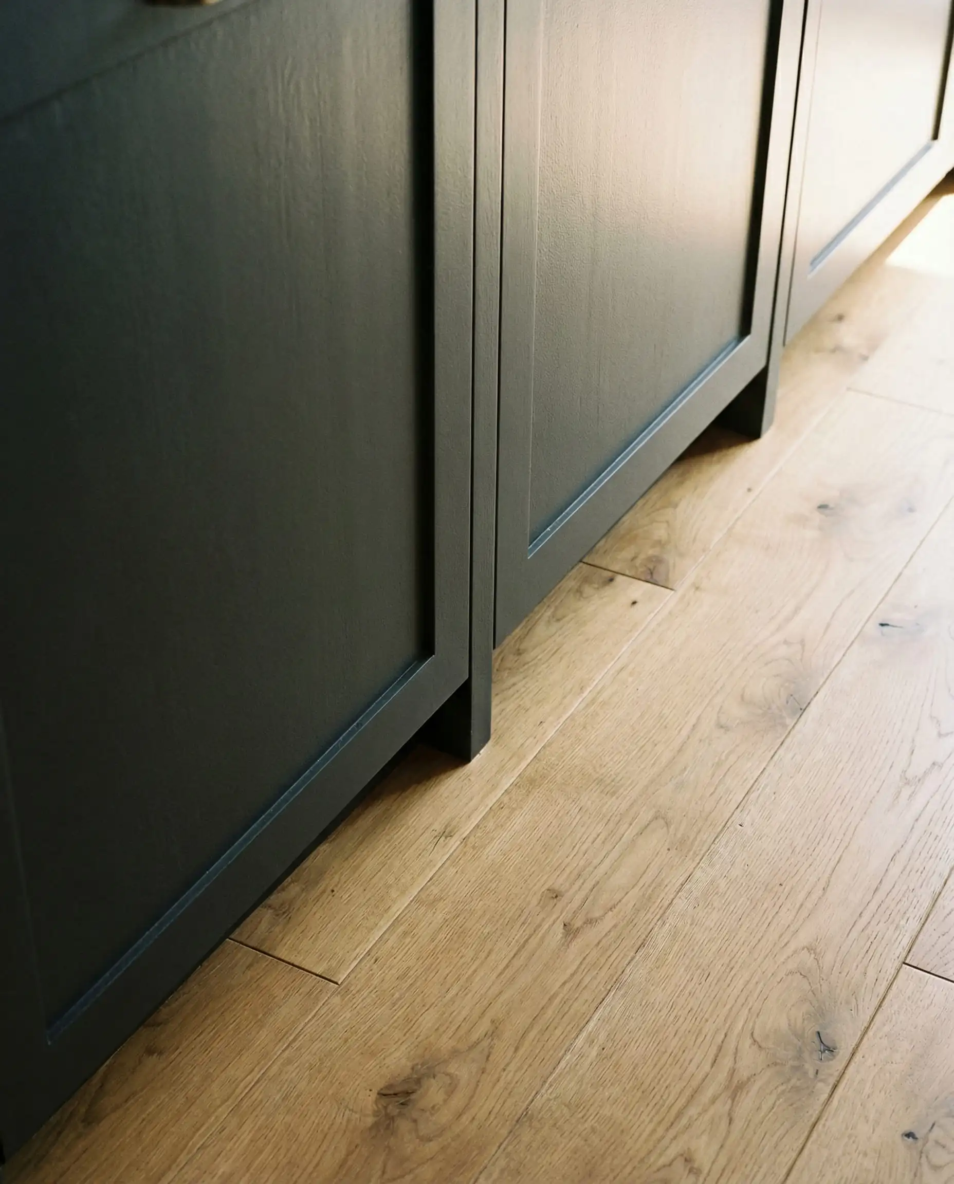
Best Colors for White Oak Floors
White Oak is the dominant flooring choice for 2026. Because it has a neutral-to-warm tone, you need colors that won’t pull out the pink in the wood.
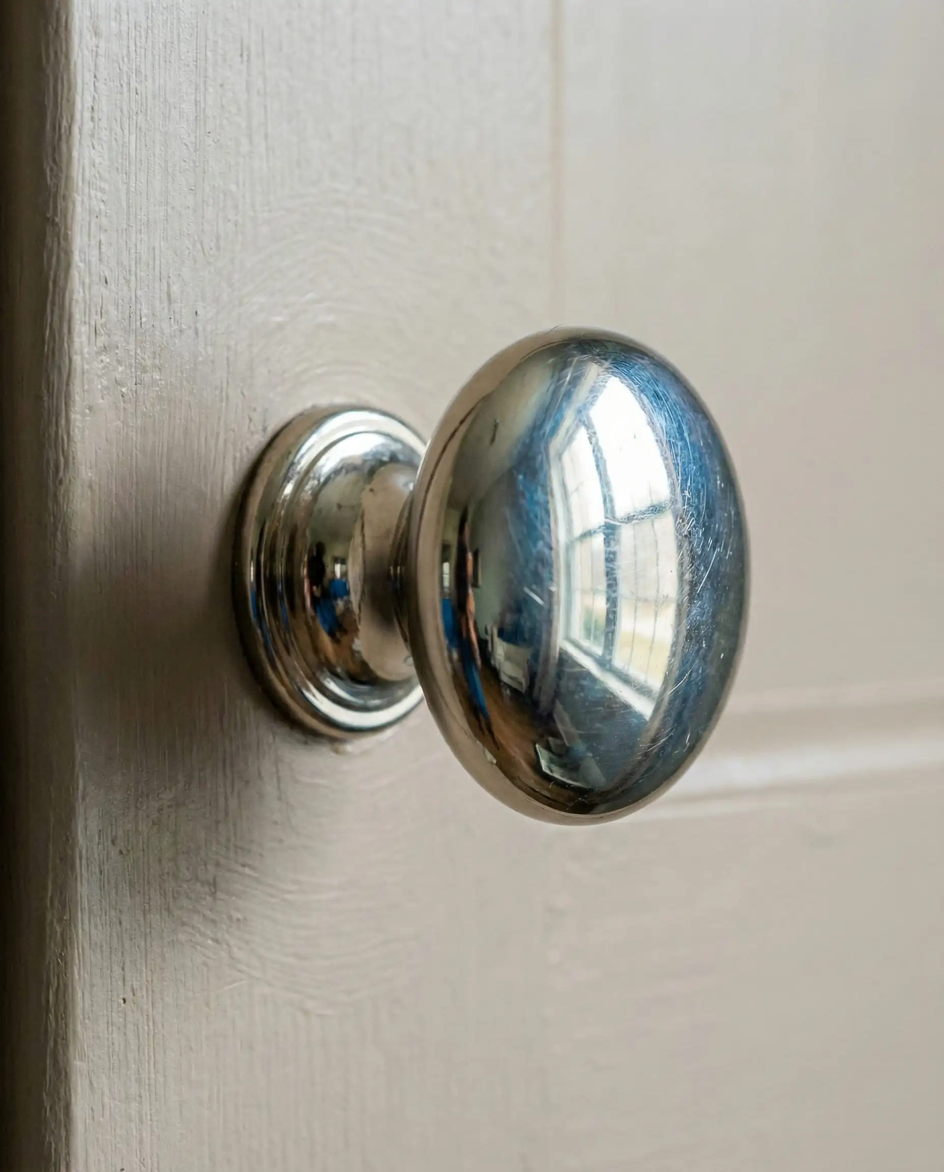
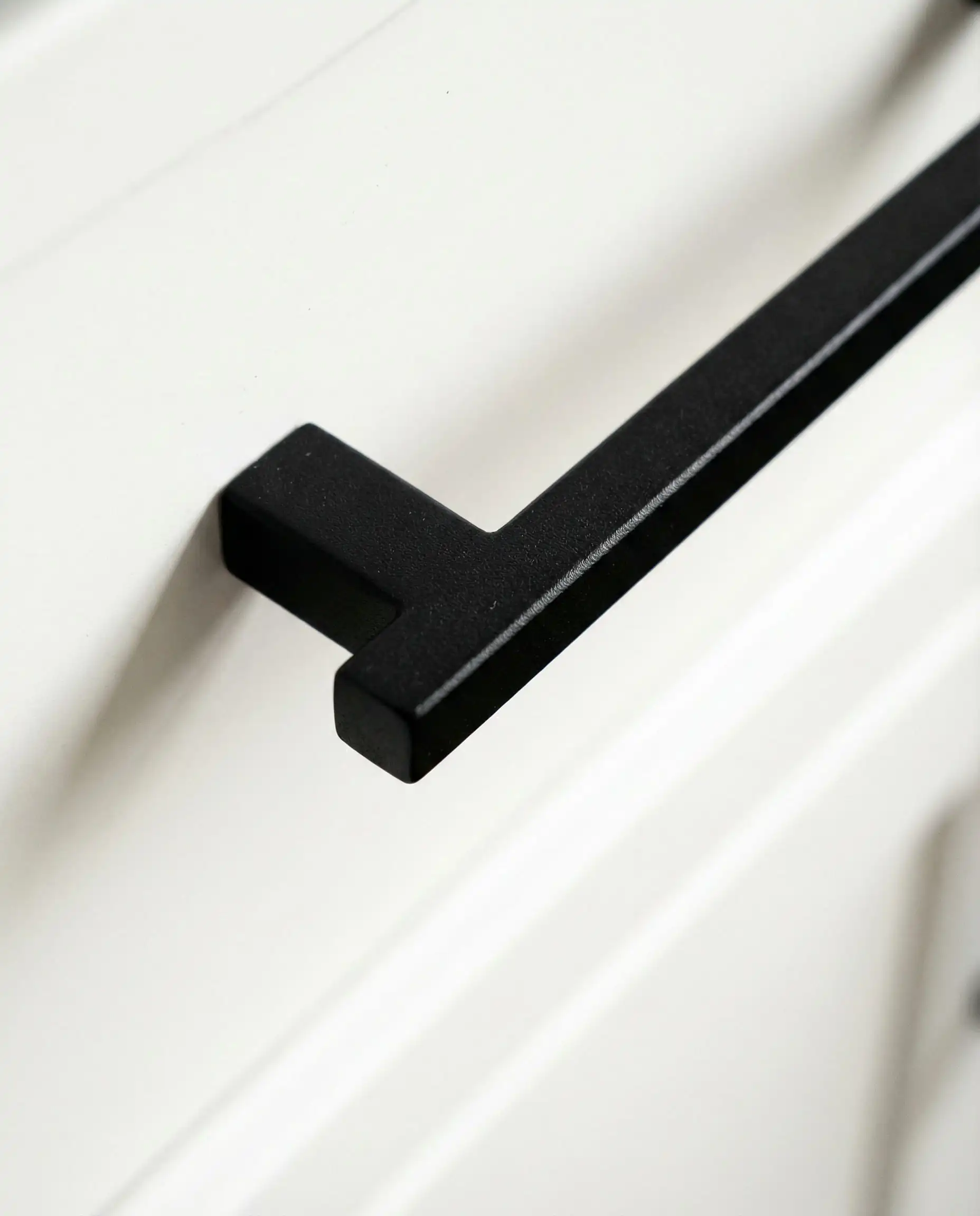
Hardware Finishes
Technical Guide: Sheen & Durability
You’ve picked the color—now you need the right product. Kitchen cabinets take a beating. They deal with grease, wet hands, and slamming doors.
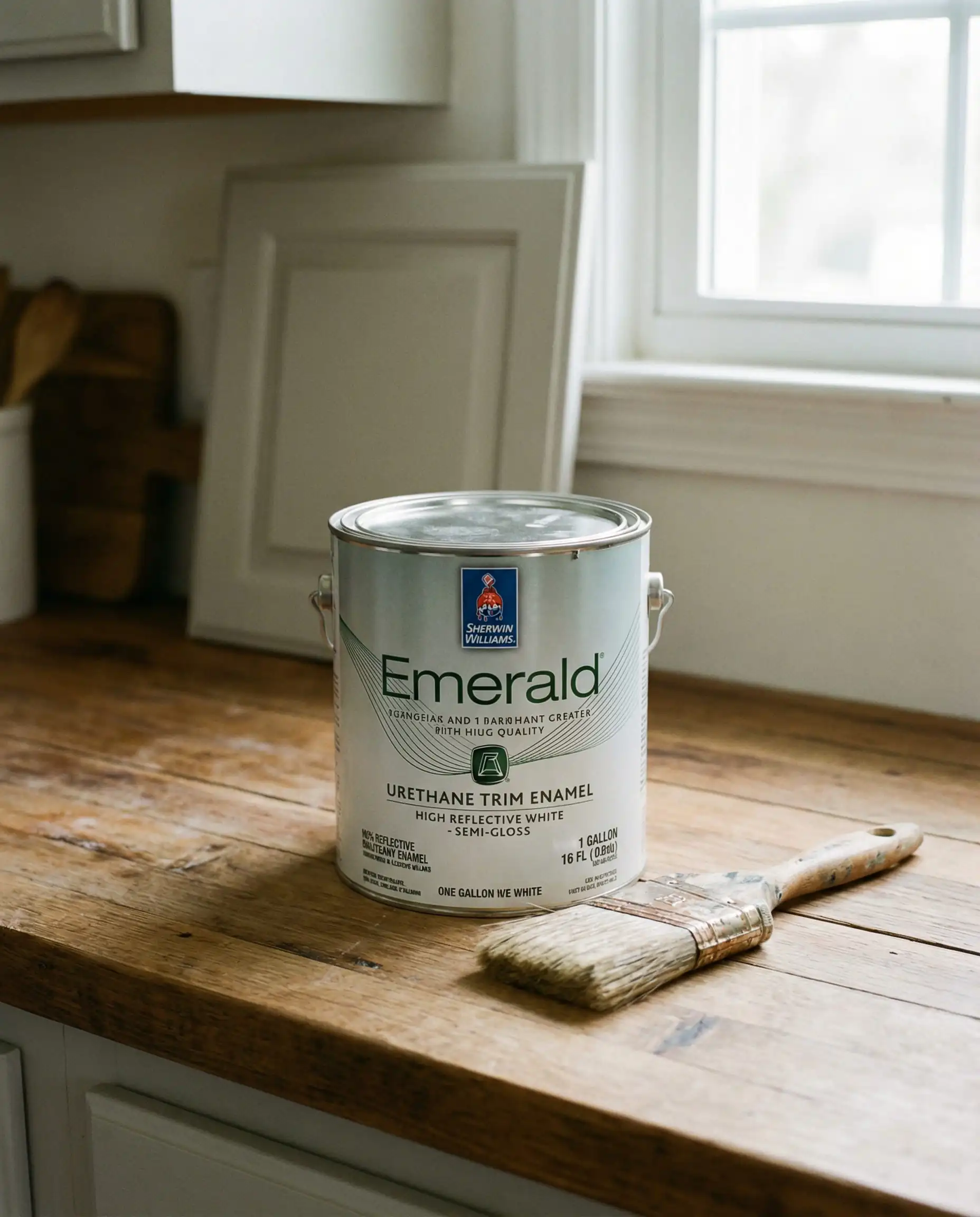
The Paint: Emerald Urethane Trim Enamel
Do not use standard wall paint. We repeat: Do not use wall paint.
For Sherwin-Williams, the gold standard is Emerald Urethane Trim Enamel.
Why? It is a water-based alkyd, meaning it applies like latex (easy cleanup) but cures hard like an oil-based paint. It resists blocking (sticking) and yellowing.
The Sheen: Satin vs. Semi-Gloss
Frequently Asked Questions (FAQ)
A: Cool, icy greys are on the decline. However, warm greys (greiges) like Accessible Beige and Shiitake are more popular than ever. The trend has just shifted from “steel” to “stone.”
A: Yes! Even if the paint says “Paint & Primer in One,” cabinets require a dedicated bonding primer. We recommend Extreme Bond Primer by Sherwin-Williams to ensure the paint sticks to the slick cabinet surface.
A: Pure White (SW 7005) remains the top seller because it is the most flexible. It doesn’t lean too yellow or too blue, making it a safe bet for resale value.
A: Do not paint directly on your cabinet door. Buy Samplize peel-and-stick samples or paint a large poster board. Tape it to your cabinet and look at it at three times of day: Morning, Noon, and Night. Lighting changes everything!
Final Thoughts
Updating your kitchen cabinets is a journey, but it completely transforms the energy of your home. Whether you embrace the earthiness of Universal Khaki or stick to the timeless elegance of Pure White, the key for 2026 is warmth.
Your kitchen is the heart of your home—make it beat with a color that makes you feel good.
Need help matching your countertop? Check out our guide on countertop trends in 2026.