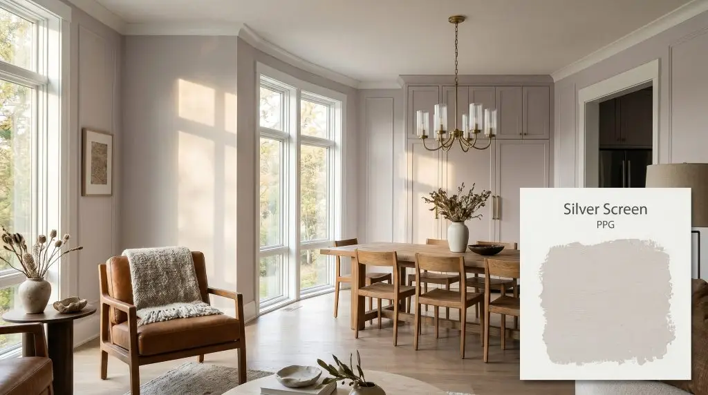
Silver Screen PPG1014-3
PPGPPG Silver Screen (PPG1014-3) is a soft, luminous silver-gray with distinct lavender and purple undertones. With an LRV of 73, it acts as a highly reflective, elegant neutral that shifts between a crisp silver and a delicate mauve depending on the lighting.
Paint Technical Profile
| Color ID / SKU | PPG1014-3 |
| HEX Code | #e0dddd |
| Light Reflectance (LRV) | 73 |
| Use | Interior, Exterior |
| Best Exposures | South-Facing, West-Facing |
| Best For | Bedrooms, Bathrooms, Elegant Living Spaces |
Designing with PPG Silver Screen: A High-Reflectance Neutral with a Lavender Secret
Finding a gray paint that doesn’t feel like a sterile office building is one of the most common challenges in residential design. So often, homeowners reach for a standard cool tone, only to realize the final result feels stark, uninviting, and utterly devoid of personality. The true magic of a well-crafted neutral lies in the hidden pigments that sit just beneath the surface.
PPG Silver Screen is a masterclass in this kind of subtle complexity. From the esteemed PPG Voice of Color collection, this particular shade initially presents as a clean, architectural finish. Yet, as the day progresses and the shadows shift, it reveals a remarkably soft, almost romantic interior life.
This is not a flat, one-dimensional color. It is a highly responsive backdrop that softens hard architectural edges while maintaining a crisp, tailored elegance throughout your home.
Demystifying the Color Structure of PPG Silver Screen
When homeowners ask if a paint is warm or cool, the answer is rarely a simple binary. PPG Silver Screen is definitively a cool-leaning gray, but it harbors a surprisingly warm, delicate pulse that completely alters its behavior on your walls. This unique tension is exactly what makes it so incredibly versatile.
To truly understand how this paint will operate in your space, we have to look at its foundational DNA:
With an LRV (Light Reflectance Value) of 73, this high-reflectance neutral bounces a tremendous amount of light around the room. It possesses just enough pigment to contrast beautifully against pure white trim and baseboards. At the same time, it remains remarkably buoyant, ensuring even smaller spaces feel expansive and breathable rather than enclosed.
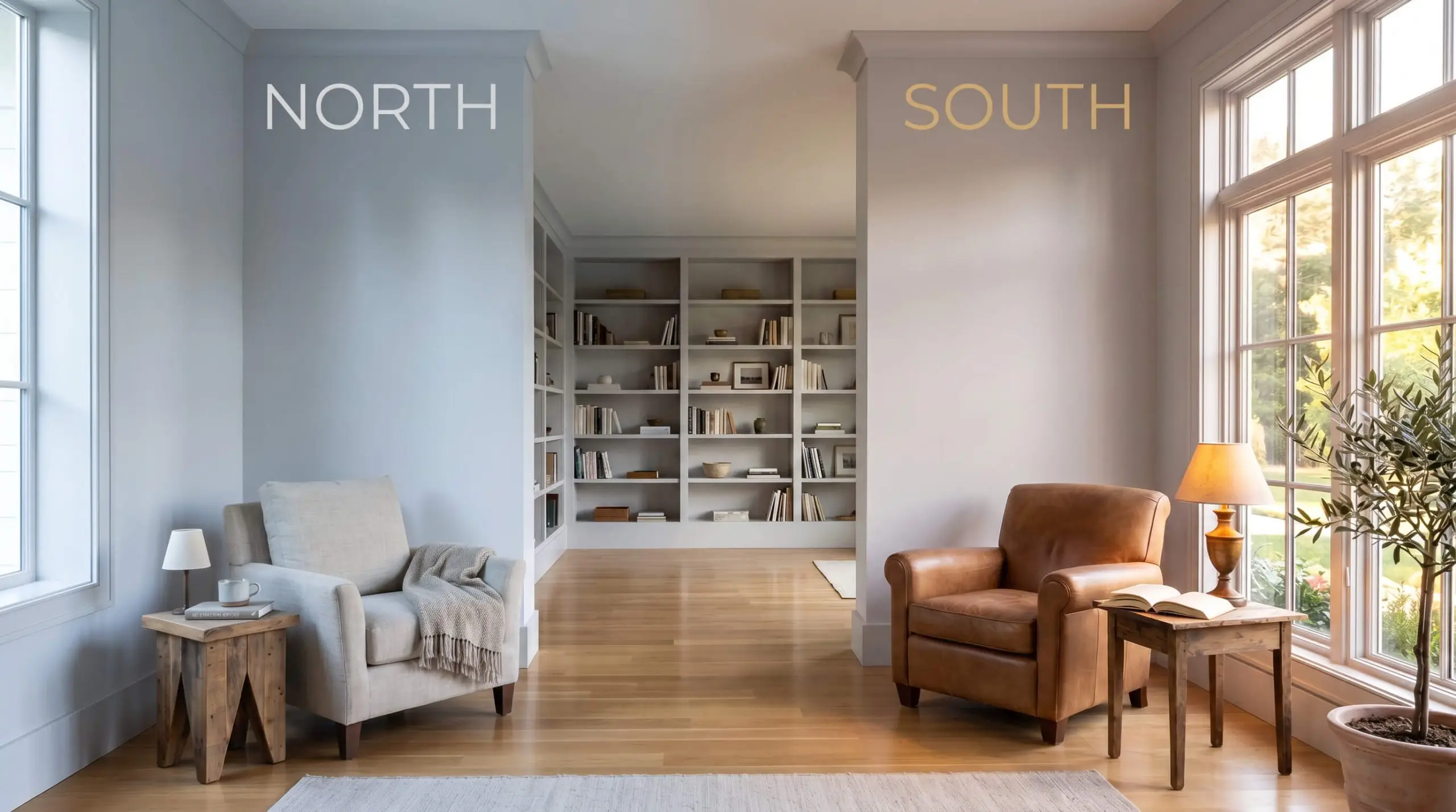
How Shifting Light Manipulates This Silvery Gray
The most fascinating aspect of this color structure is its dramatic chromatic shift throughout the day. Because of that underlying red and mauve influence, the final aesthetic is entirely at the mercy of your home’s natural and artificial lighting.
Here is exactly how the lighting in your home will pull those undertones forward or push them back:
If you want to maintain the crispness of the silver without completely losing the mauve cast at night, aim for artificial lighting in the 3000K to 3500K range. This temperature provides a clean, neutral glow that won’t aggressively skew the paint into either an icy blue or a muddy purple.
Hackrea Pro-Tip (The Bulb Strategy)
Curating Rooms with PPG’s High-Reflectance Neutral
Because this shade balances a crisp exterior with a soft, warm pulse, it serves as an incredibly adaptable foundation for the entire home. It doesn’t force you into a single stylistic corner. Instead, it acts as a responsive canvas, allowing your choice of materials, textiles, and architectural details to dictate the final mood of the space.
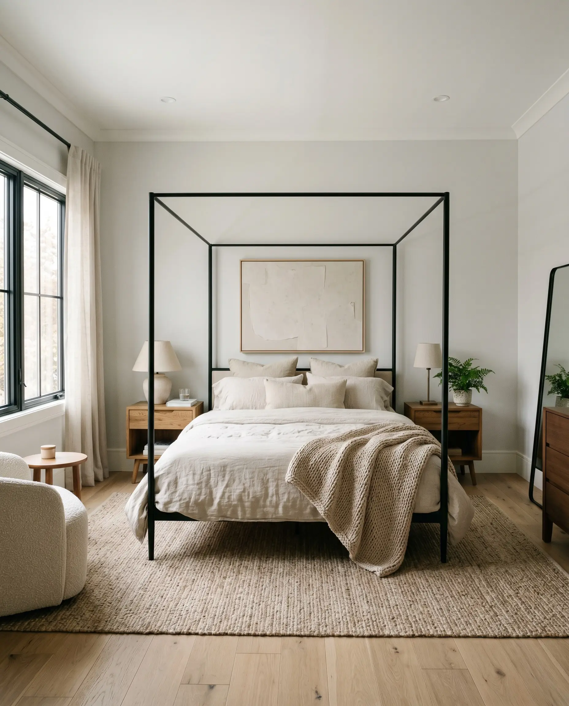
Primary Bedrooms
For busy professionals seeking a true visual retreat at the end of the day, this soft hue is incredibly effective when applied through the lens of Soft Minimalism. The key to making a cool-leaning neutral feel inviting in a bedroom is layering an abundance of tactile, organic textures. By pairing the silvery walls with layered textiles, you establish a profoundly calming environment that never feels stark.
Consider bringing in a low-profile canopy bed dressed in rumpled washed linen and a chunky worsted wool throw. Introduce a pair of mid-century credenzas or nightstands in warm, reclaimed oak to beautifully counteract the cooler tones of the paint. You can completely transform the energy of the room by simply swapping out crisp percale sheets for a dusty rose or sage green linen set.
If your bedroom receives heavy afternoon sun, embrace the way the mauve cast softens the room’s edges. Lean into that romantic shift by incorporating a tufted ottoman in a subtle pinstripe or adding sheer organza window treatments that filter the light.
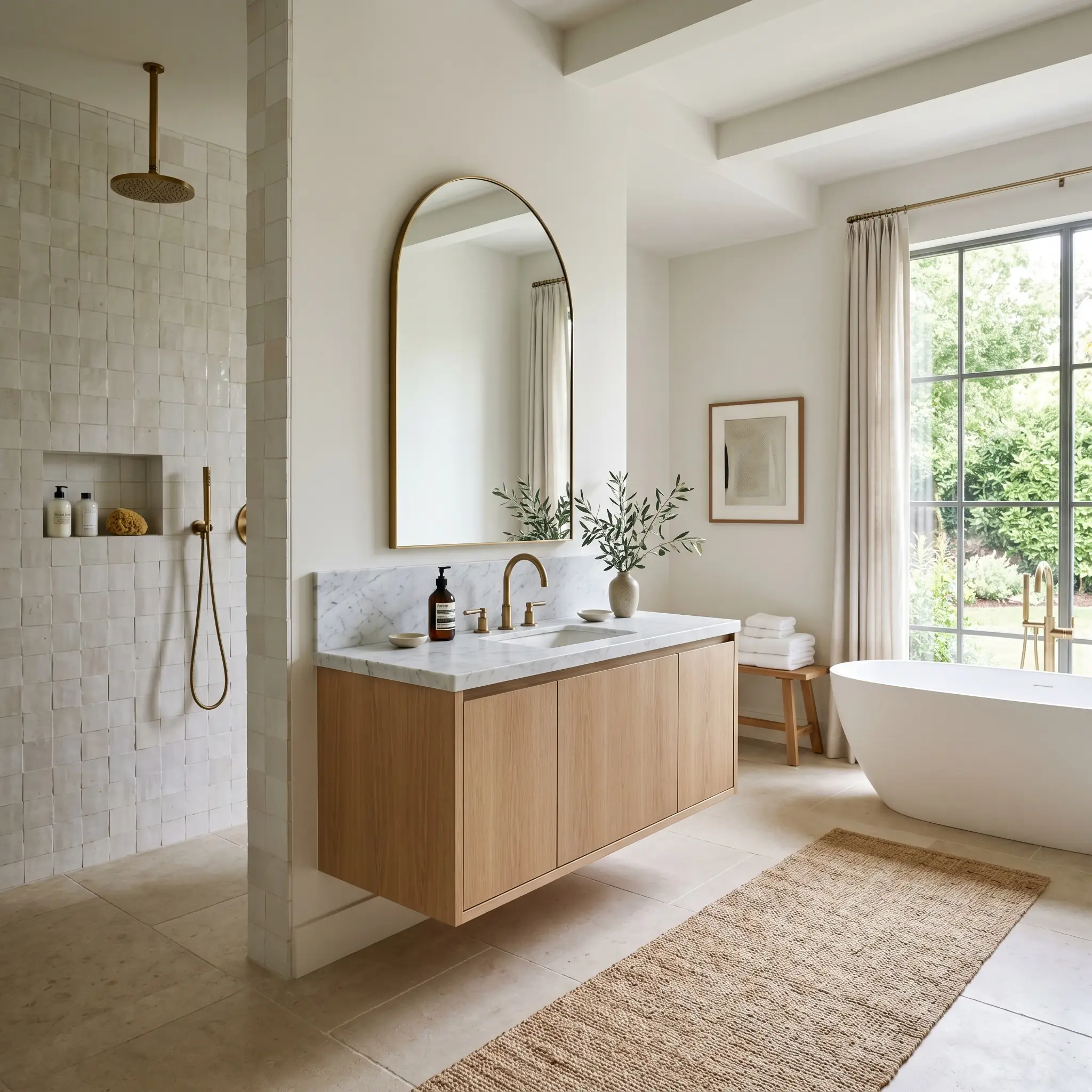
Spa-Inspired Bathrooms
Bathrooms are often dominated by hard, reflective surfaces like porcelain, glass, and mirror, which can make gray walls feel incredibly sterile. To counteract this, use this shade as the backdrop for an Organic Modern aesthetic. The subtle lavender undertone naturally softens the harshness of the room, creating a serene, restorative atmosphere perfect for a long soak.
Elevate the space by pairing the painted walls with a premium focal point, such as a honed marble vanity top or an unlacquered brass widespread faucet. These living finishes will patina over time, adding a layer of warmth and history that grounds the airy wall color. Complement this with accessible, highly textured elements like a shower clad in handmade zellige tiles or a simple jute runner across the floor.
Be incredibly careful when pairing this specific paint with stark, blue-white subway tiles. The high-contrast, icy white can pull out the purple undertones in the gray in a way that feels unintentional and jarring. Instead, opt for tiles in a warm white or a soft, earthy terracotta to keep the palette harmonious.
Clash Warning (The Tile Temperature)
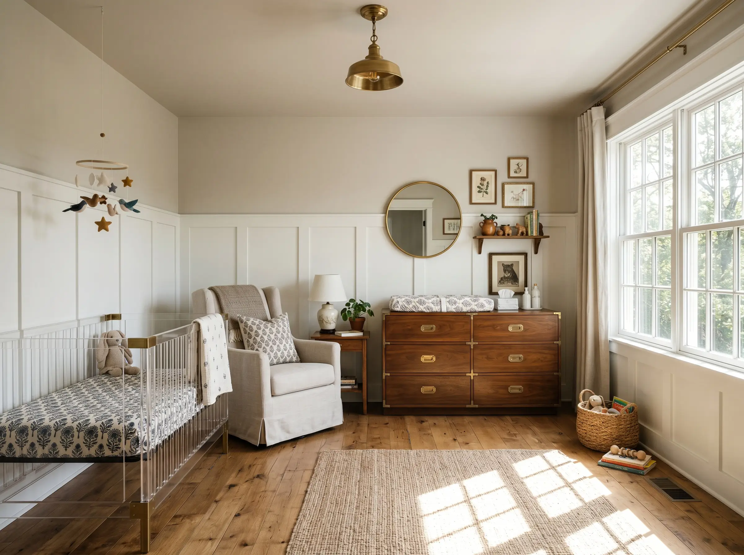
Nurseries and Children’s Rooms
When designing a space for a growing family, you want a color that feels youthful but has enough sophistication to transition gracefully as the child ages. This hue is a brilliant alternative to traditional pastels. It provides a soft, whimsical backdrop that feels inherently peaceful without resorting to predictable baby blues or standard pinks.
To give the room a Whimsical Vintage feel, consider applying a classic board and batten treatment to the lower two-thirds of the wall, painted in a crisp white, while taking the silvery gray up to the ceiling. This architectural detail adds immediate character and establishes a beautiful canvas for block print textiles and vintage ceramics.
Furnish the space with a mix of old and new—a modern acrylic crib paired with a slipcovered glider and a vintage campaign dresser used as a changing table. The paint’s high reflectivity ensures the room feels bright and joyful during morning playtimes, while its muted nature helps settle the energy for evening routines.
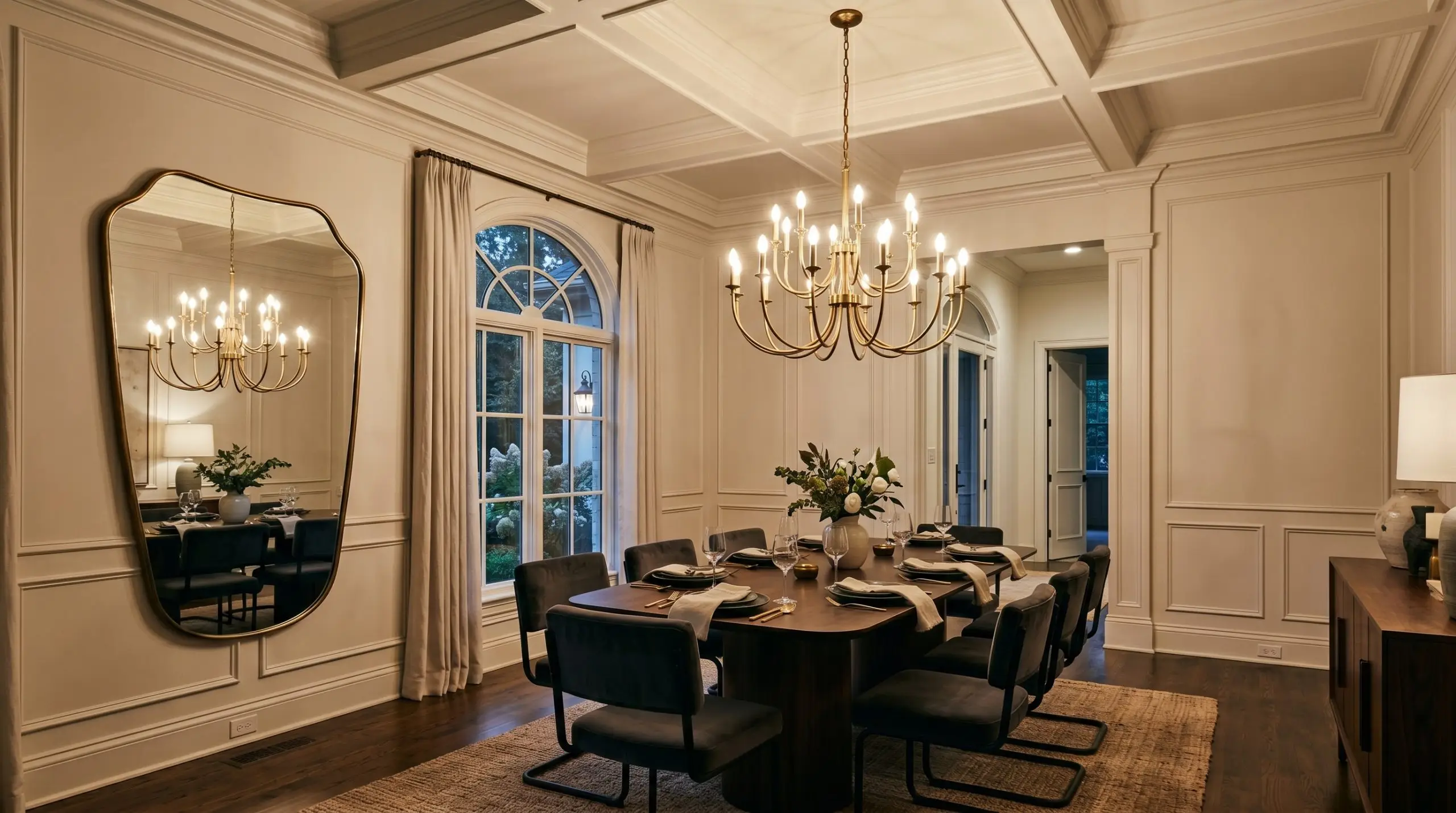
Elegant Dining Rooms
In spaces designed for hosting and gathering, you can afford to lean into a more dramatic, tailored aesthetic. This shade beautifully supports a Modern French Chic design, especially when applied across all the architectural millwork in the room. Color drenching the walls, trim, and baseboards in this single hue creates a seamless, highly sophisticated envelope that feels incredibly custom.
If your dining room features classic picture molding or a coffered ceiling, this paint will highlight those shadows and dimensional details brilliantly. Center the room with an oversized, sculptural unlacquered brass chandelier to serve as a stunning metallic contrast against the cool walls.
Surround a sleek pedestal table with velvet cantilever chairs in a rich charcoal or deep navy to bring a dense, weighted texture to the airy room. Finish the styling with a massive, asymmetrical mirror and a simple marble tray holding oversized branches, proving that an elegant dining space doesn’t need to feel stuffy or overly formal to be breathtaking.
Coordinating Colors & Material Pairings
The true strength of this silvery hue lies entirely in its relational boundaries. Because of its delicate mauve cast, it requires highly intentional surrounding elements to prevent it from losing its shape on the wall. You must decide whether to frame this shade with sharp, high-contrast borders or let it bleed softly into deeply saturated tonal colors.
Framing the Walls: Ideal Trim Pairings
A crisp, brilliant white trim acts as a visual palate cleanser for this nuanced paint. Benjamin Moore Chantilly Lace OC-65 provides a stark, clean edge that forces the lavender undertones to recede slightly, creating a highly tailored finish.
If you prefer a slightly brighter, unyielding boundary, Sherwin-Williams High Reflective White SW 7757 bounces maximum light against the gray. This brilliant white ensures the walls maintain their structural crispness even in dim corners. Both options establish a firm architectural border that prevents the room from feeling murky.
Tactile Elements for a Silvery Foundation
To bring out the absolute best in this PPG color, you must introduce textures that create a deliberate dialogue with its cool-leaning base.
Building the Palette: Best Coordinating Colors
You cannot pair this complex neutral with just any random accent shade. The secondary colors in your room must either lean into its romantic side or provide a sharp, grounding contrast.
Curated Design Aesthetics
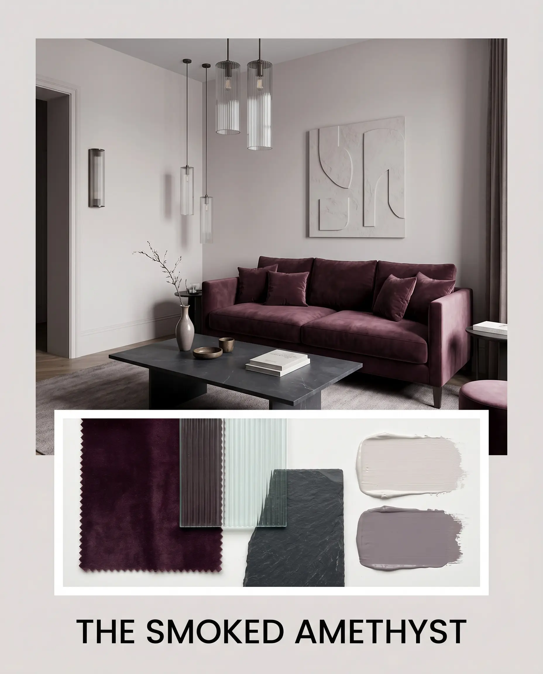
The Smoked Amethyst This aesthetic relies on deep, tonal layering to create an environment that feels intensely intimate and sophisticated. The silvery walls serve as a luminous shell, allowing a plush velvet sofa in Farrow & Ball Brassica No. 271 to command the center of the space. To keep the room from feeling overly dark, incorporate sleek fluted glass lighting fixtures that bounce illumination into the shadows. Finish the styling with abstract plaster art and a dark, honed slate coffee table to ground the romantic purple tones with a firm, tactile edge.
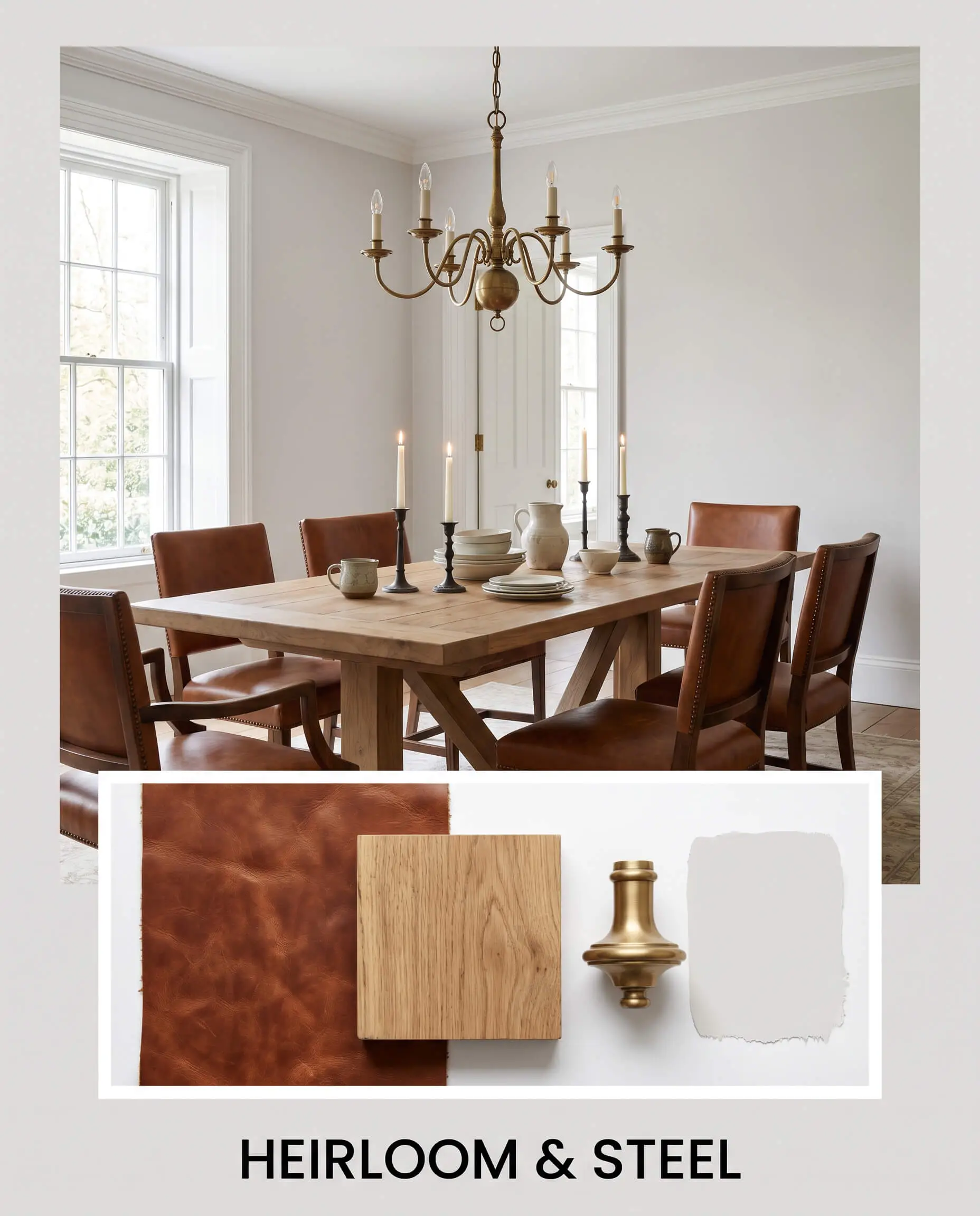
Heirloom & Steel This approach balances the cool, architectural finish of the paint with rugged, time-worn textures. The walls provide a clean, modern backdrop for classic saddle leather seating and a reclaimed oak trestle table. Introduce a premium, unlacquered brass chandelier overhead to inject a vital spark of metallic warmth. By styling the surfaces with vintage ceramics and forged iron candlesticks, you create a space that feels deeply rooted in history yet entirely fresh.
Analyzing the Alternatives: Head-to-Head Comparisons
Selecting the perfect neutral often comes down to understanding how a color behaves under stress. If your room features challenging lighting or you desire a slightly different atmospheric energy, you must compare this shade against its closest rivals.
PPG Silver Screen vs. Sherwin-Williams Passive SW 7064
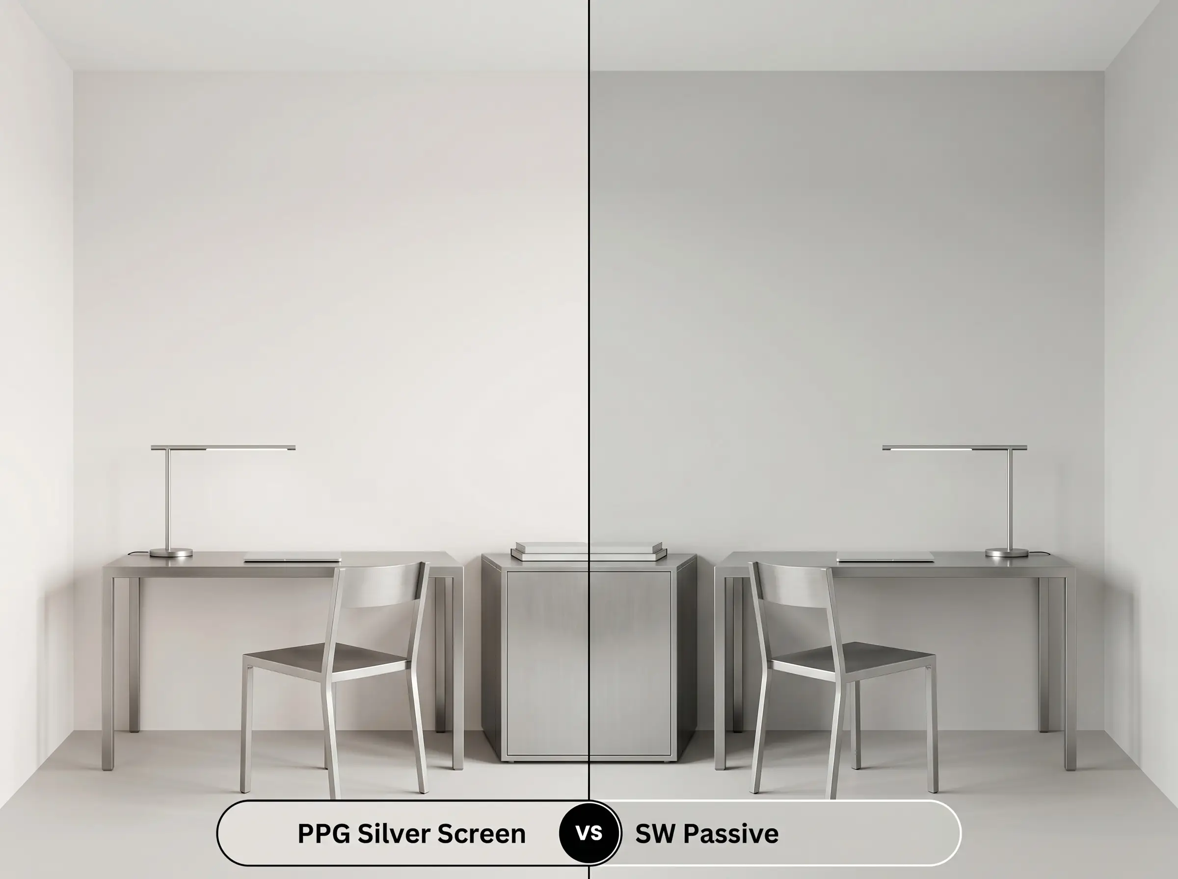
If you want a true, unyielding modern aesthetic, you must evaluate the underlying pigments. Sherwin-Williams Passive SW 7064 is a significantly cooler, more traditional gray that lacks the red-based warmth found in the PPG option. If your space features stark, minimalist architecture and you want to completely avoid any purple flashes, Passive is the superior choice. However, if you crave a softer, more welcoming environment that shifts throughout the day, the PPG shade provides much more emotional depth.
PPG Silver Screen vs. Benjamin Moore Cement Gray 2112-60
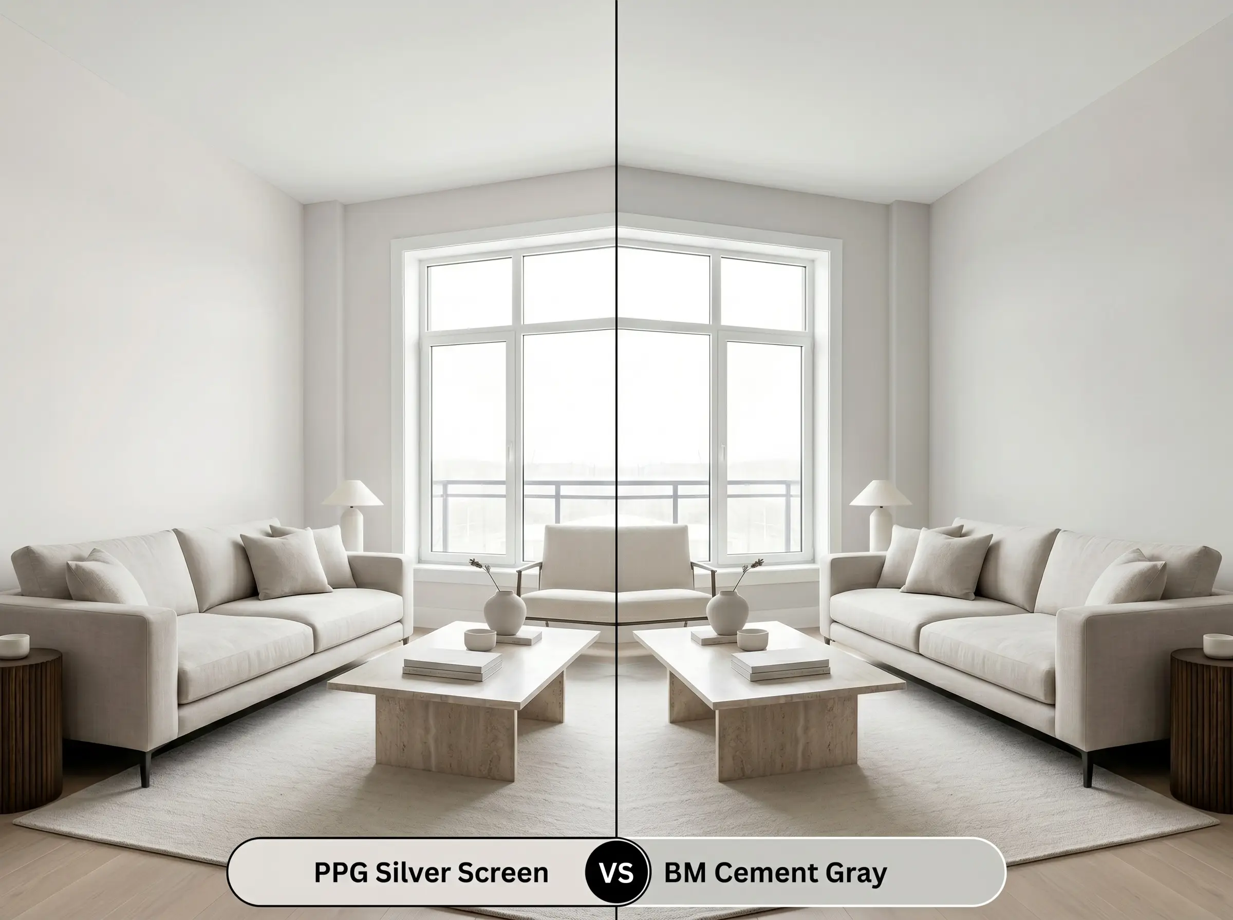
This comparison is an exercise in light absorption versus reflection. Benjamin Moore Cement Gray 2112-60 is a denser, more weighted color with a lower light reflectance, making it feel far more grounded and traditional. If you are painting a high-glare, south-facing room where a bright silver might wash out, Cement Gray will hold its form beautifully. Conversely, if you are trying to lift a dim space and make it feel expansive, the buoyancy of the PPG paint is absolutely necessary.
Exploring Tonal Shifts and Brand Matches
Sometimes a paint is incredibly close to your vision, but you need a minor adjustment in depth or a direct match from a different manufacturer.
Staying Within the Brand: Similar PPG Options
Crossing the Aisle: The Benjamin Moore Match
The Reality of the Roll: Application Strategies
Transitioning this complex color from a tiny paper swatch to a massive wall requires a precise application strategy. The way light interacts with the final dried surface will dictate the success of your entire design.
Because this is a high-reflectance neutral, it is highly susceptible to “flashing”—visible, uneven roller marks that catch the light. To achieve a flawless finish, you must maintain a wet edge while rolling and commit to two full, even coats, even if the first coat appears to cover the old color.
Hackrea Design Secret (The Flashing Phenomenon)
To support the crispness of this shade, always start with a high-quality, pure white primer. Using a dark or heavily tinted primer will inevitably muddy the final finish, dragging the delicate silver down and making it look dingy.
Frequently Asked Questions
Yes, it absolutely does. Because green and red/purple are complementary colors, lush green foliage outside your window will bounce light indoors that actively intensifies the mauve and lavender undertones on your walls.
The deep shadows created by textured stucco will significantly darken the perceived color. While the high points of the stucco will flash a bright silver in direct sunlight, the shadowed crevices will pull the deeper, cooler gray tones forward, creating a highly dimensional look.
It relies heavily on the temperature of your bulbs. If you use warm, amber-toned lighting (under 2700K), the color can indeed lose its crispness and lean muddy. To keep it looking fresh and intentional in a windowless space, utilize crisp 3000K to 3500K LED bulbs.
The Hackrea Verdict: Who Should Use This Paint?
PPG Silver Screen is an exceptionally sophisticated choice for the homeowner who finds standard grays too cold and traditional beiges too dated. It is the ultimate foundational layer for spaces that require a clean, modern aesthetic but still demand a welcoming, romantic energy. This paint truly shines in bedrooms, restorative bathrooms, and elegant living spaces where its delicate chromatic shifts can be fully appreciated throughout the day.
However, this nuanced shade requires a highly controlled environment to succeed. You must exercise extreme caution if your home features an abundance of yellow-toned, honey oak flooring or cabinetry. The stark, warm yellow will violently clash with the cool lavender undertones, making the wood look overly orange and the paint look like a bruised, unintentional purple. Similarly, avoid pairing this color with stark orange-red brick fireplaces, as the aggressive warm tones will overpower the delicate silver, completely destroying the serene atmosphere you worked so hard to build.