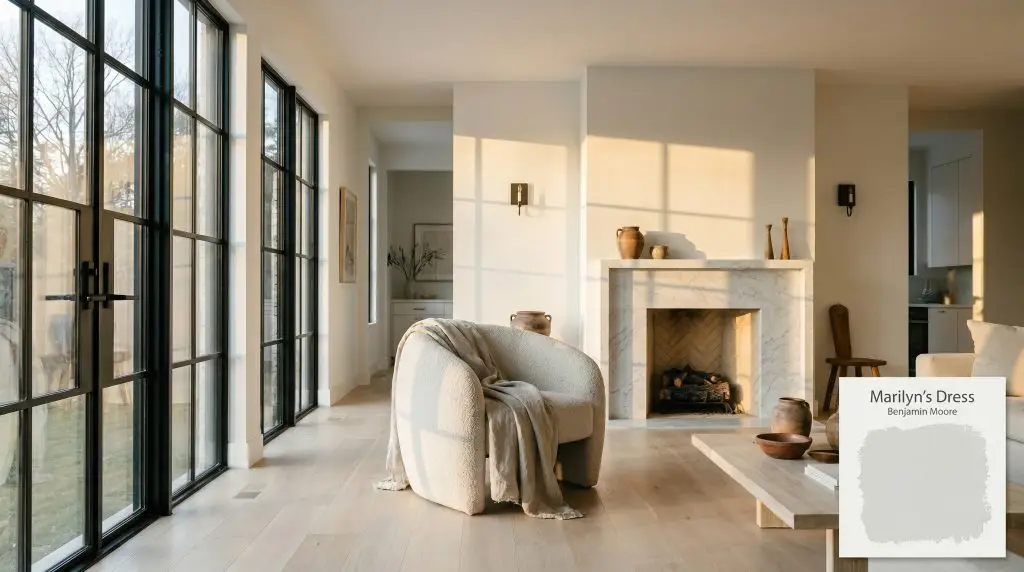
Marilyn's Dress by Benjamin Moore (2125-60) is a buoyant, cool off-white that leans heavily into pale gray with distinct icy blue undertones. With an LRV of 75.59, it acts as a breezy, sophisticated neutral that brings a crisp, airy feel to well-lit spaces.
Will Marilyn's Dress clash with your room?
Paint Technical Profile
| Color ID / SKU | 2125-60 |
| HEX Code | #E0E4E4 |
| Light Reflectance (LRV) | 75.59 |
| Use | Interior |
| Best Exposures | South-facing or West-facing |
| Best For | Primary Bedrooms, Spa-like Bathrooms, Ceilings |
Mastering Benjamin Moore Marilyn’s Dress: The Cool Off-White That Shifts With the Sun
Selecting the right pale neutral often feels like walking a tightrope between sterile hospital walls and dingy, shadowed corners. You want a color that feels remarkably clean, yet carries enough pigment to establish a distinct mood in the room. This is exactly where Benjamin Moore Marilyn’s Dress 2125-60 steps in to solve the problem.
This specific paint acts as a highly responsive architectural finish rather than a flat background layer. It possesses a fascinating color structure that reacts dramatically to the shifting daylight in your home. By understanding how its underlying pigment behaves, you can turn a basic room into a highly curated, intentional space.
Undertones & LRV of Benjamin Moore Marilyn’s Dress
When evaluating the temperature of Marilyn’s Dress, the verdict is decisively cool. This is not a creamy, forgiving neutral that wraps a room in warmth. Instead, it is a crisp, refreshing cool off-white that brings a sense of tailored elegance to your walls.
To truly understand how this paint will look in your home, we have to look closely at its foundational pigment profile:
The light reflectance value (LRV) of this shade sits at an impressive 75.59. This means it bounces a significant amount of light back into the room, making it a brilliant, breezy neutral for spaces that need a visual lift. It provides enough ambient light absorption to prevent the room from feeling blindingly bright, while still maintaining enough contrast to pop beautifully against pure white trim.
Lighting Effects & The Chameleon Factor
Because of its delicate chromatic profile, this cool off-white is highly reactive to its environment. The direction of your windows will completely alter how the pigment presents itself throughout the day.
Here is exactly how you can expect the color to shift:

If you love the crispness of this paint but want to prevent it from feeling too chilly in the evening, swap your standard bulbs for 3000K to 3500K LEDs. This temperature provides a clean, neutral light that preserves the color’s integrity without pushing it into a sterile zone.
Hackrea Pro-Tip (The Bulb Strategy)
Elevating Spaces with Marilyn’s Dress
The secret to successfully placing this color lies in leveraging its reactivity. Because it shifts so fluidly between silver, gray, and icy blue, you can use it to manipulate the perceived temperature and volume of different spaces.
Primary Bedrooms
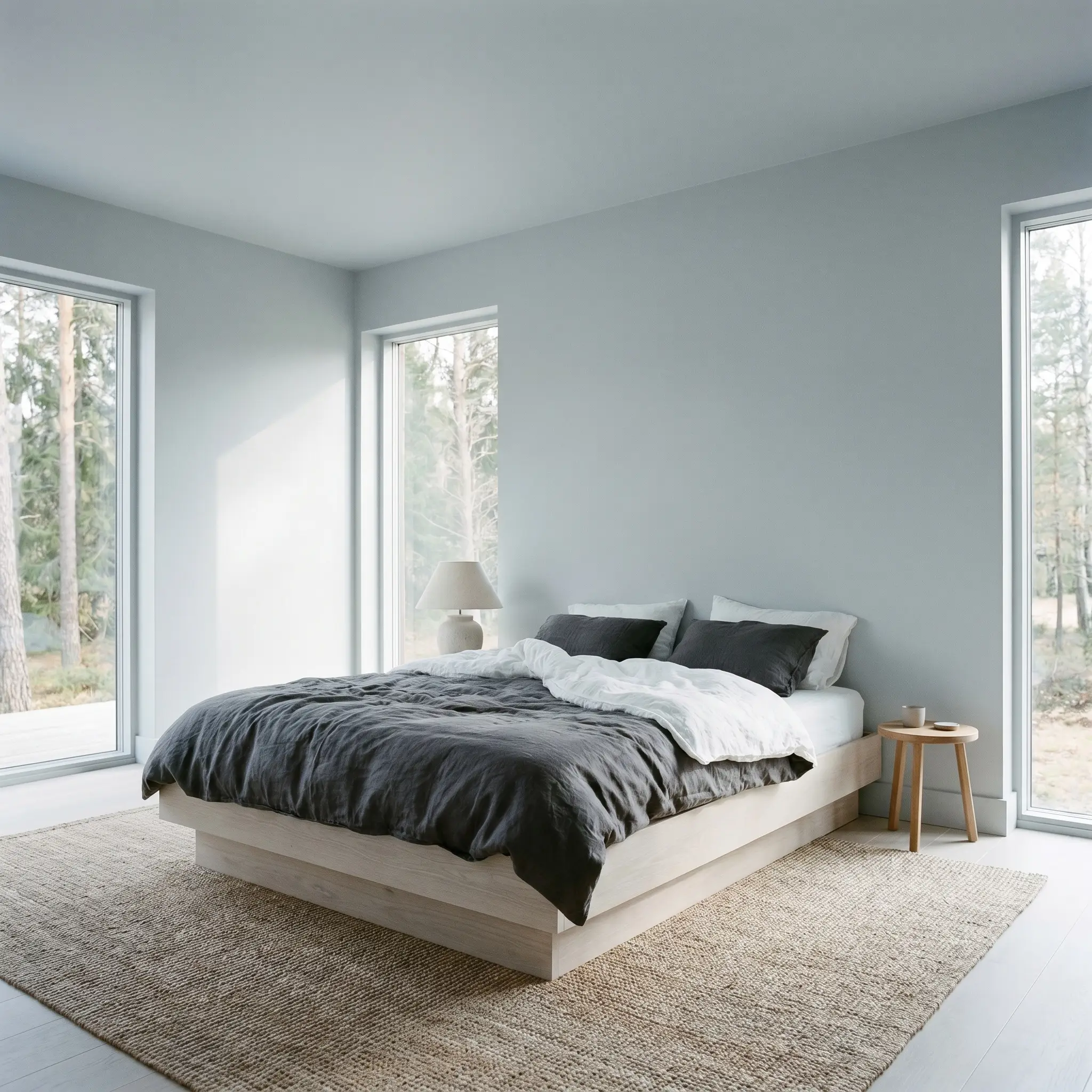
Rather than defaulting to a predictable, soft romantic aesthetic, use this shade to cultivate a sense of Scandinavian Crisp design. Paint the walls and the baseboards in the same finish to create a seamless, modern envelope. Introduce low-profile platform beds crafted from bleached white oak to bring in organic warmth without clashing with the cool walls. Layer the bed with washed linen in charcoal and crisp white to establish a tailored, highly intentional contrast.
Will Marilyn's Dress work with your specific lighting, floor, or furniture?
Spa-like Bathrooms
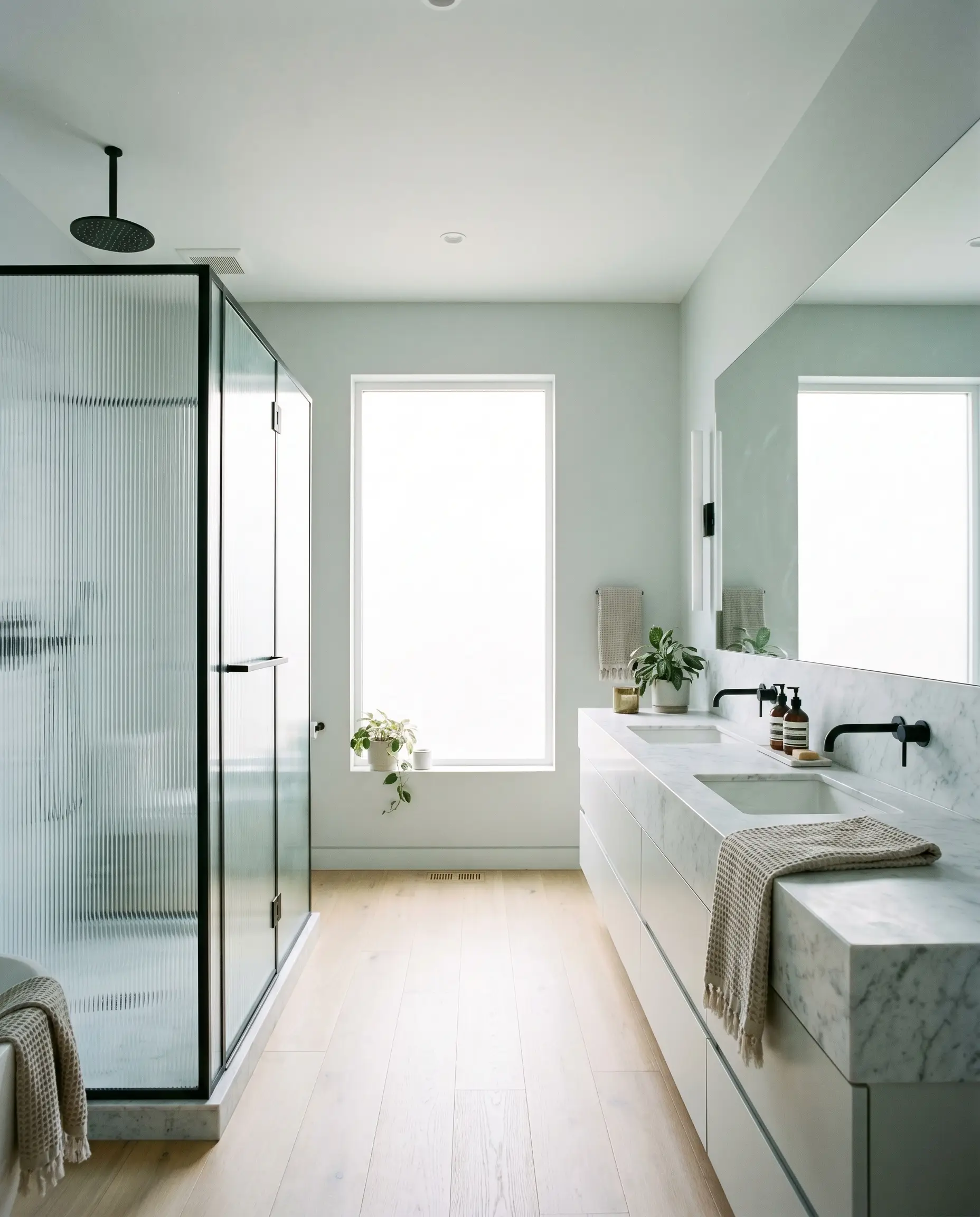
This paint excels in bathrooms, but it requires the right hard finishes to avoid feeling like a sterile utility room. Lean into an Urban Modern aesthetic by pairing the icy walls with matte black steel fixtures and fluted glass shower enclosures. The dark metal provides a crucial visual weight that stabilizes the airy paint. To elevate the luxury factor, incorporate a floating vanity topped with honed Carrara marble, which naturally echoes the subtle gray-blue veining of the wall color.
Sunlit Living Rooms
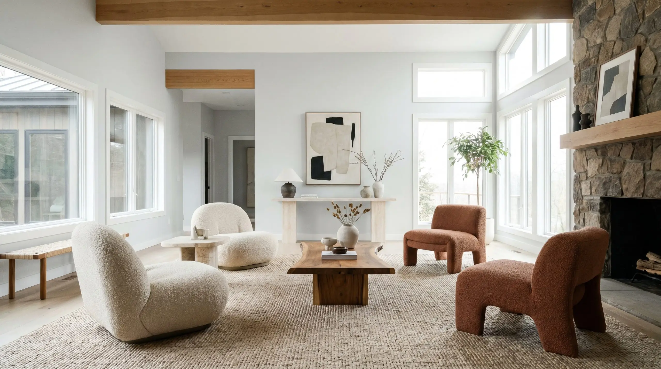
In a living room with expansive windows, the paint acts as a brilliant canvas for an Organic Modern approach. The bright daylight will wash out some of the blue, leaving a soft, luminous gray that pairs beautifully with textural elements. Introduce sculptural accent chairs wrapped in nubby bouclé and a large-scale woven rug to add tactile interest.
Ceilings
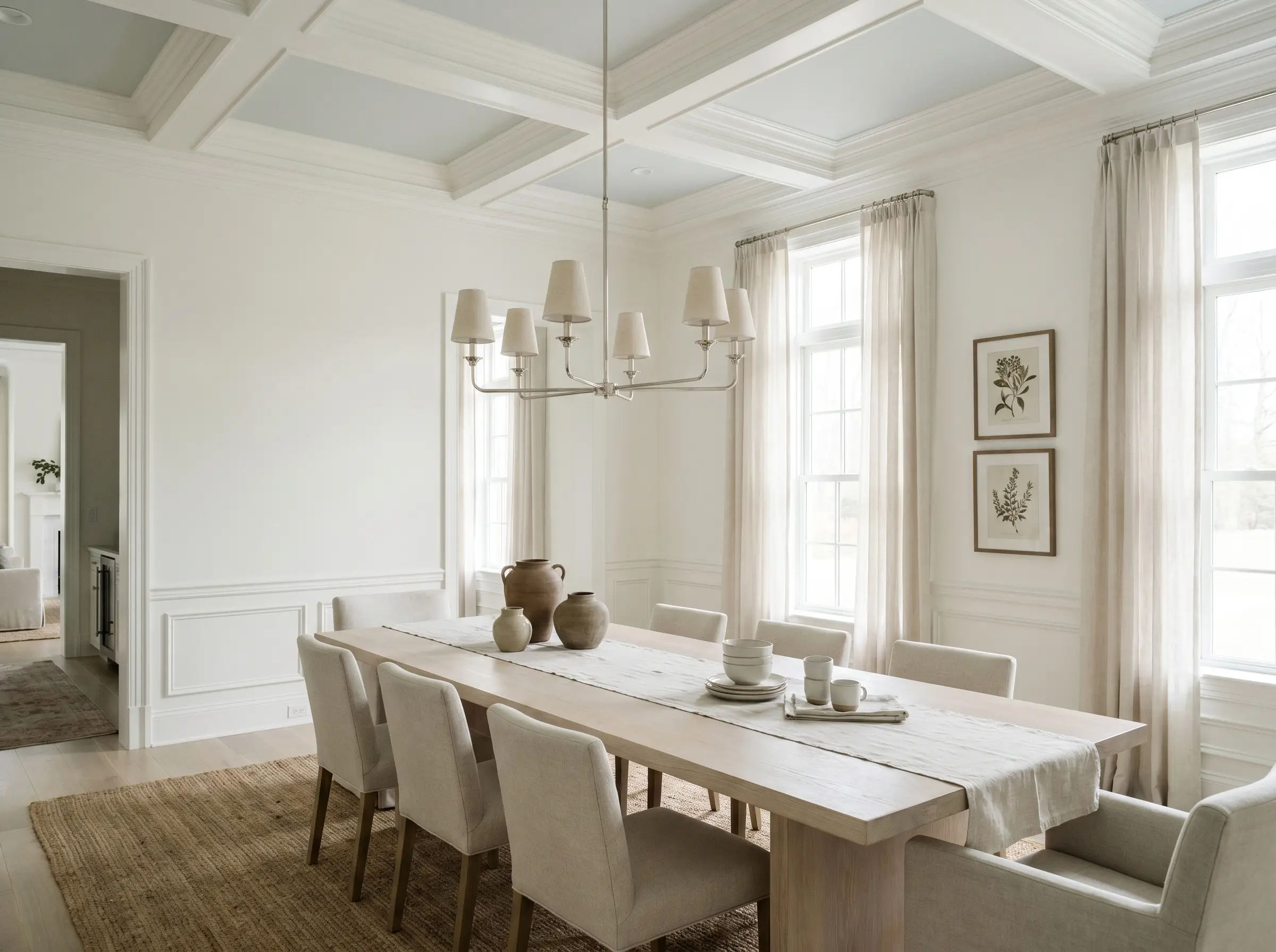
Using this shade on the ceiling is a brilliant architectural trick to draw the eye upward. It serves as a sophisticated alternative to standard flat white, subtly echoing the sky and making the room feel taller.
If you apply this to the ceiling, keep your primary walls a crisp, pure white. The subtle contrast will highlight the crown molding and give the entire room a custom, designer-finished appearance.
Hackrea Design Secret (The Ceiling Contrast)
Will Marilyn's Dress work with your specific lighting, floor, or furniture?
Coordinating Colors & Material Pairings
This specific pigment profile requires intentional companions to truly shine. It thrives when placed next to elements that either match its crispness or offer a profound, textural contrast.
Trim & Baseboards
To maintain the architectural integrity of this cool off-white, you must pair it with a trim color that provides a sharp, clean boundary.
Hardware, Wood & Tactile Pairings
The materials you introduce will dictate whether the room feels inviting or detached. By mixing accessible textures with one premium focal point, you can curate a highly sophisticated environment.
The Coordinating Palette
When building a broader color scheme, look for shades that offer deep contrast or unexpected warmth.
Curated Aesthetic Concepts
These design concepts illustrate how the individual elements of your palette seamlessly merge to create a specific atmosphere.
Nordic Frost & Shadow
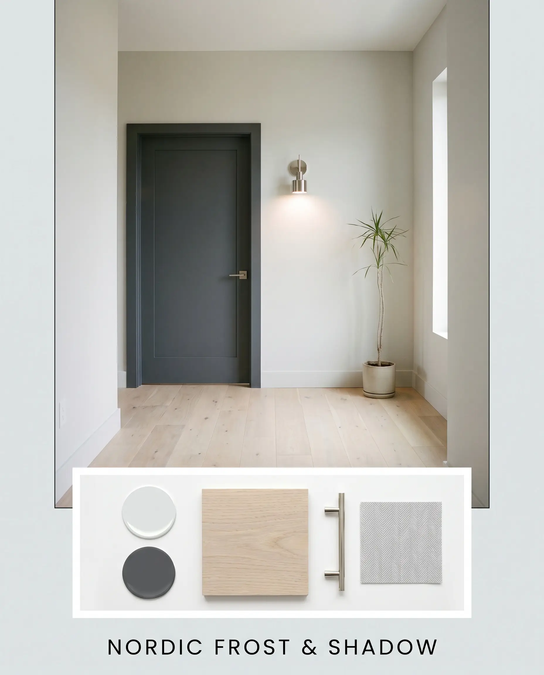
This aesthetic relies on high-contrast, minimalist principles to create a striking, serene environment. The walls are bathed in our featured icy gray, while interior doors and window sashes are painted in the profound, moody tones of Deep Space. Bleached white oak flooring provides a quiet, organic base that softens the high-contrast paint choices. To finish the look, introduce sleek polished nickel lighting fixtures and subtle herringbone textiles to add tactile interest without cluttering the visual field.
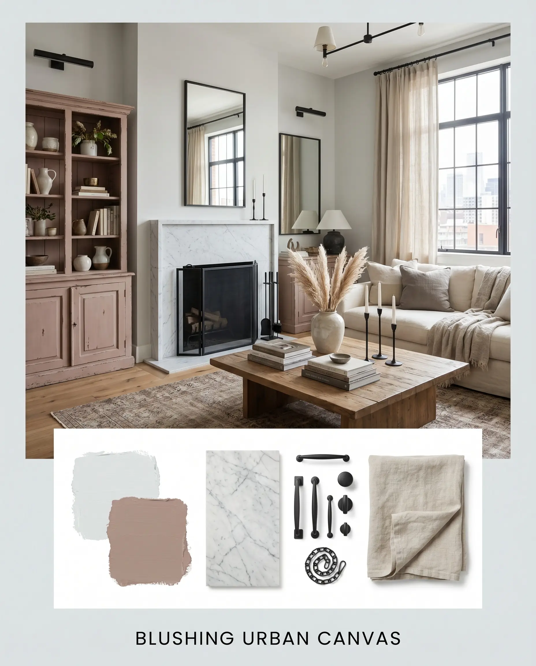
Blushing Urban Canvas
Will Marilyn's Dress work with your specific lighting, floor, or furniture?
For a more layered, transitional vibe, this concept introduces unexpected warmth to the cool foundation. The crisp walls serve as a gallery-like backdrop for an accent piece—perhaps a vintage apothecary cabinet or a custom built-in—painted in the earthy, muted tones of Sulking Room Pink. Incorporate a honed Carrara marble focal point, like a fireplace surround or a pedestal table, to elevate the luxury of the space. Draped washed linen throws and matte black steel accents complete the look, balancing the soft pinks and cool grays with a touch of industrial edge.
Head-to-Head Paint Comparisons
Choosing the perfect neutral often comes down to analyzing how two similar colors behave in your specific lighting conditions. If you are debating between options, understanding their subtle differences is crucial.
Benjamin Moore Marilyn’s Dress vs. Sherwin-Williams Passive SW 7064
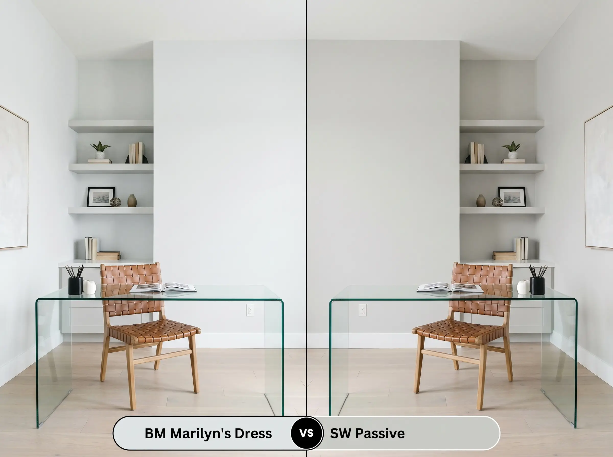
If your space receives an abundance of cool northern light, Passive might be the safer choice. Passive is a more traditional gray with slightly less blue in its DNA, making it less likely to read as a pastel in chilly lighting. However, if you want that crisp, architectural cyan edge to brighten up a room, the Benjamin Moore option remains superior.
Benjamin Moore Marilyn’s Dress vs. Benjamin Moore Gray Cloud 2126-60
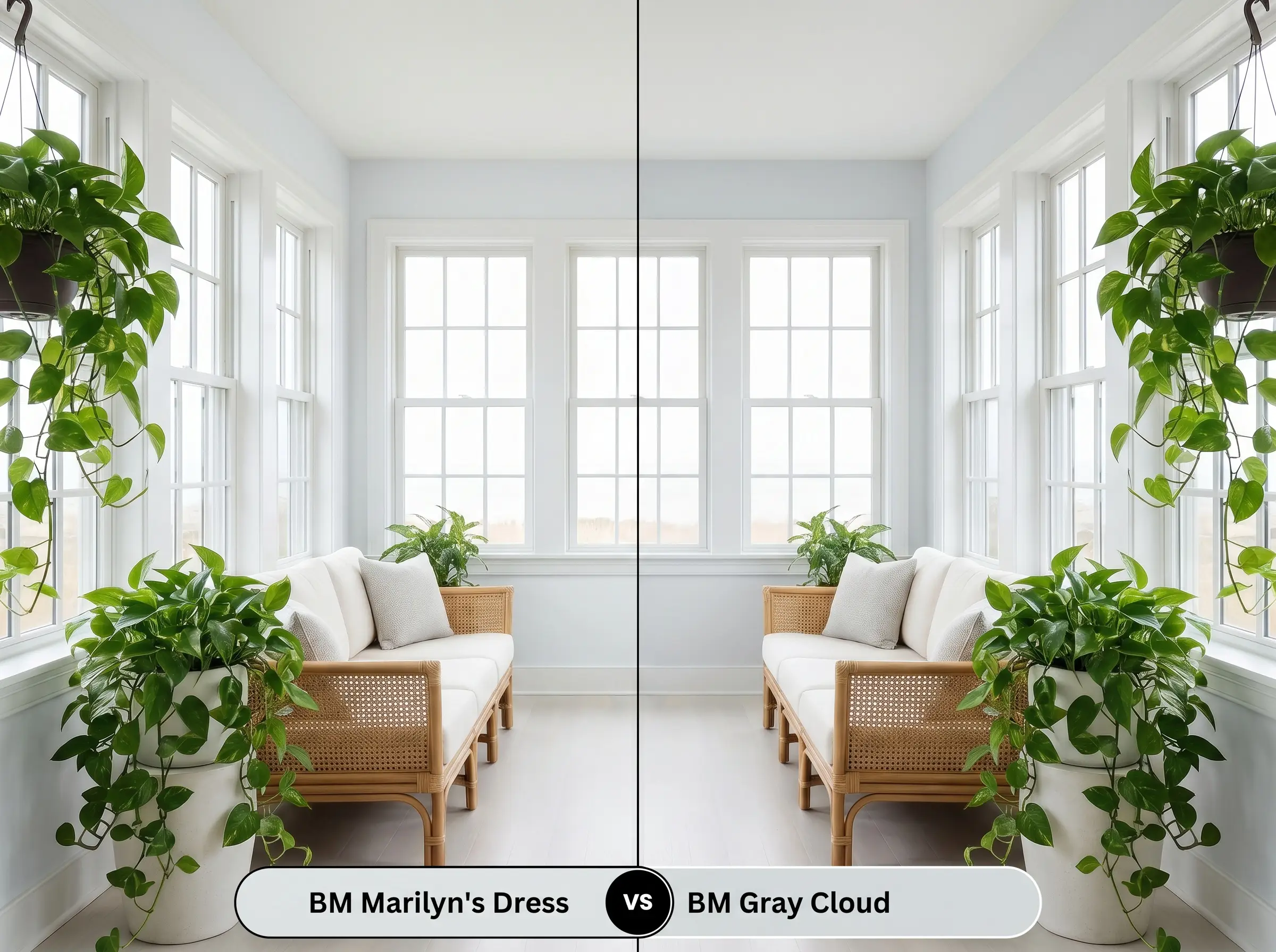
These two are incredibly close, but Gray Cloud carries a slightly lower LRV, meaning it absorbs more light and feels slightly more substantial on the wall. If you are painting a large, sun-drenched room and fear your paint might wash out entirely, Gray Cloud offers a bit more depth. Conversely, for smaller spaces that need maximum light reflection, stick with the brighter choice.
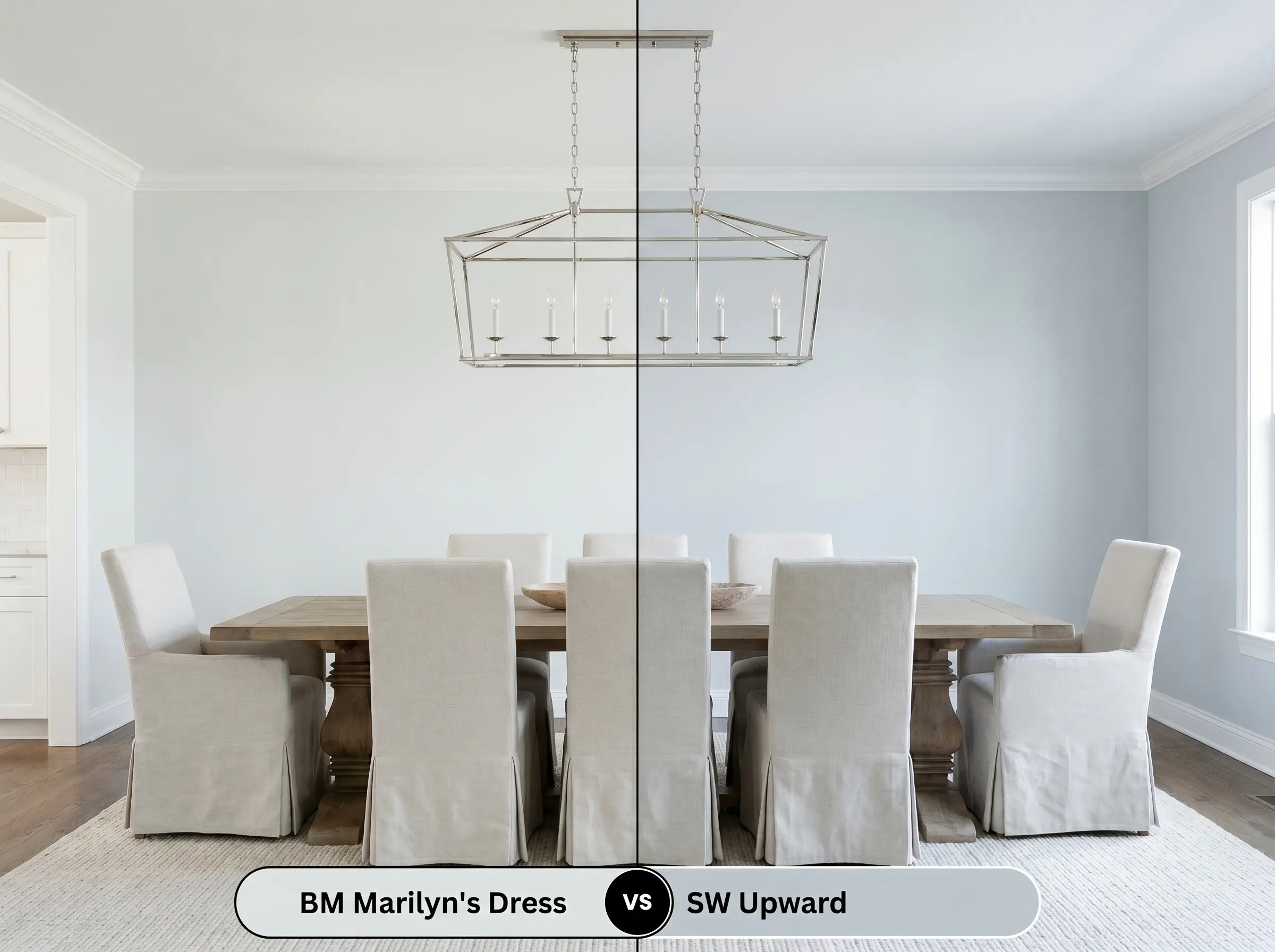
Benjamin Moore Marilyn’s Dress vs. Sherwin-Williams Upward SW 6239
Will Marilyn's Dress work with your specific lighting, floor, or furniture?
Upward is undeniably a blue paint with gray undertones, whereas our featured color is a gray paint with blue undertones. If you want a definitive, colorful presence on your walls, Upward delivers a stronger punch of pigment. If you prefer a subtle, shifting neutral that only hints at color, Marilyn’s Dress is the far more sophisticated route.
Alternatives & Cross-Brand Matches
Sometimes a color is almost perfect, but you need a slight adjustment in depth or you require a different brand for logistical reasons.
Same-Brand Alternatives
If you want to stay within the Benjamin Moore ecosystem but need a slight variation, consider these options:
Cross-Brand Equivalents
If you need to color-match with a different manufacturer, these shades offer the closest visual approximation:
Practical Application Guide
Translating a beautiful color from a swatch to your walls requires a strategic approach to finishes and preparation. The sheen you choose will directly impact how the color is perceived.
Because this is a pale, highly reflective shade, achieving a flawless finish is generally straightforward, but it requires the right foundation. You must use a high-quality, pure white primer to ensure the delicate cyan notes aren’t distorted by the old wall color bleeding through.
When rolling this specific depth of color, maintain a wet edge and avoid over-working the paint. Touching up small areas after the wall has dried can lead to “flashing”—visible, shiny streaks that catch the light and ruin the seamless architectural finish.
Hackrea Pro-Tip (The Flashing Warning)
Frequently Asked Questions
Because of its high light reflectance value and delicate pigment profile, direct exterior sunlight will completely wash out the subtle gray and blue notes. On a facade, it will simply read as a glaring, stark white rather than the sophisticated off-white you see indoors.
In a windowless room relying on artificial light, the yellow tones of unlacquered brass will aggressively highlight the cool cyan notes through complementary contrast. This creates a vibrant, almost energetic tension, which works beautifully if you want a bold, modern powder room.
Yes, the icy blue undertones directly oppose the intense red-orange of Brazilian Cherry, which can make the walls look artificially baby blue and the floors look aggressively red. To bridge this gap, you must introduce large, neutralizing area rugs in charcoal or warm taupe to separate the two surfaces.
Absolutely. The subtle blue-green edge mimics the traditional southern ‘haint blue’ porch ceilings perfectly, but its gray foundation keeps the look modern and subdued rather than overly pastel.
The Final Verdict
Benjamin Moore Marilyn’s Dress 2125-60 is a masterful, architectural finish designed for homeowners who want a crisp, modern aesthetic without resorting to sterile white walls. Its true brilliance lies in its responsiveness; it is perfect for sunlit living spaces, contemporary primary bedrooms, and spa-like bathrooms where its icy blue undertones can breathe and shift throughout the day. It excels in Soft Minimalism and Coastal Modern designs, providing a tailored, highly intentional backdrop that makes contrasting materials like matte black steel and bleached white oak truly stand out.
However, this paint requires careful placement to succeed. If you are updating a historic home with heavy, red-toned woodwork, or if you are painting a north-facing room with minimal natural light, this color will likely fail you. In those environments, the lack of warmth in the pigment will cause the paint to read as a chilly, uninviting concrete gray. It demands a space with ample lighting and a commitment to crisp, intentional design to unlock its full potential.
Room Compatibility & Clashes Diagnoses
Hackrea's reports evaluating the compatibility of Marilyn's Dress in real rooms.South-Facing Urban Living Room
"The cool blue-gray undertones of this paint create chromatic tension against the warm parquet flooring and oatmeal seating, although abundant southern daylight helps soften the contrast."
South-Facing Primary Bedroom
"The icy-blue undertone of Marilyn's Dress creates pronounced friction against the expansive warm sandy carpet, requiring deliberate rug layering to prevent a disjointed temperature clash."
Closest Cross-Brand Equivalents
The absolute closest scientific color matches for Marilyn's Dress across top paint brands.