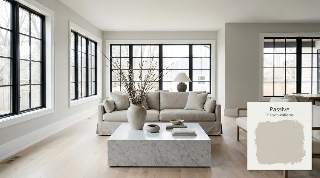
Sherwin-Williams Passive (SW 7064) is a crisp, light-to-medium cool gray with an LRV of 60. Known for its subtle blue and green undertones, it acts as a calming neutral that thrives in modern, airy spaces without feeling overly icy or sterile.
Will Passive clash with your room?
Paint Technical Profile
| Color ID / SKU | SW 7064 |
| HEX Code | #CBCCC9 |
| Light Reflectance (LRV) | 60 |
| Use | Interior, Exterior |
| Best Exposures | South-facing, West-facing |
| Best For | Living rooms, modern kitchens, open-concept spaces |
The Tailored Neutral: Mastering Sherwin-Williams Passive in Modern Homes
Some paint colors quietly command a room without ever raising their voice. When you are searching for a neutral that feels crisp, intentional, and entirely sophisticated, the sheer volume of available grays can feel overwhelming. You need a shade that provides a clean slate without turning your living room into a sterile waiting area.
Sherwin-Williams Passive steps into this exact role with remarkable grace. It acts as a brilliant architectural palate cleanser for spaces that need a refreshing lift. By striking a delicate balance between structure and softness, this popular neutral elevates everyday rooms into curated, intentional retreats.
Sherwin-Williams Passive: Undertones & LRV Breakdown
If you are wondering, “Is this paint warm or cool?”, Sherwin-Williams Passive is definitively a cool gray neutral. It possesses a crisp, tailored energy that instantly clarifies a room’s atmosphere. Understanding the specific color structure beneath the surface is the key to manipulating this shade successfully.
With a Light Reflectance Value (LRV) of 60, this shade sits comfortably in the light-to-medium category. It reflects enough natural daylighting to keep a room feeling open and expansive, yet it holds enough pigment to establish a firm visual presence on the wall. This specific depth means it will never wash out into a generic off-white, allowing it to frame your furniture and artwork beautifully.
Mastering the Light: How SW 7064 Shifts Throughout the Day
The secret to this color’s sophisticated appeal is how its subtle cyan undertones interact with the shifting color temperature of your home’s lighting. It behaves like a chameleon, cooling down or warming up depending on the angle of the sun.
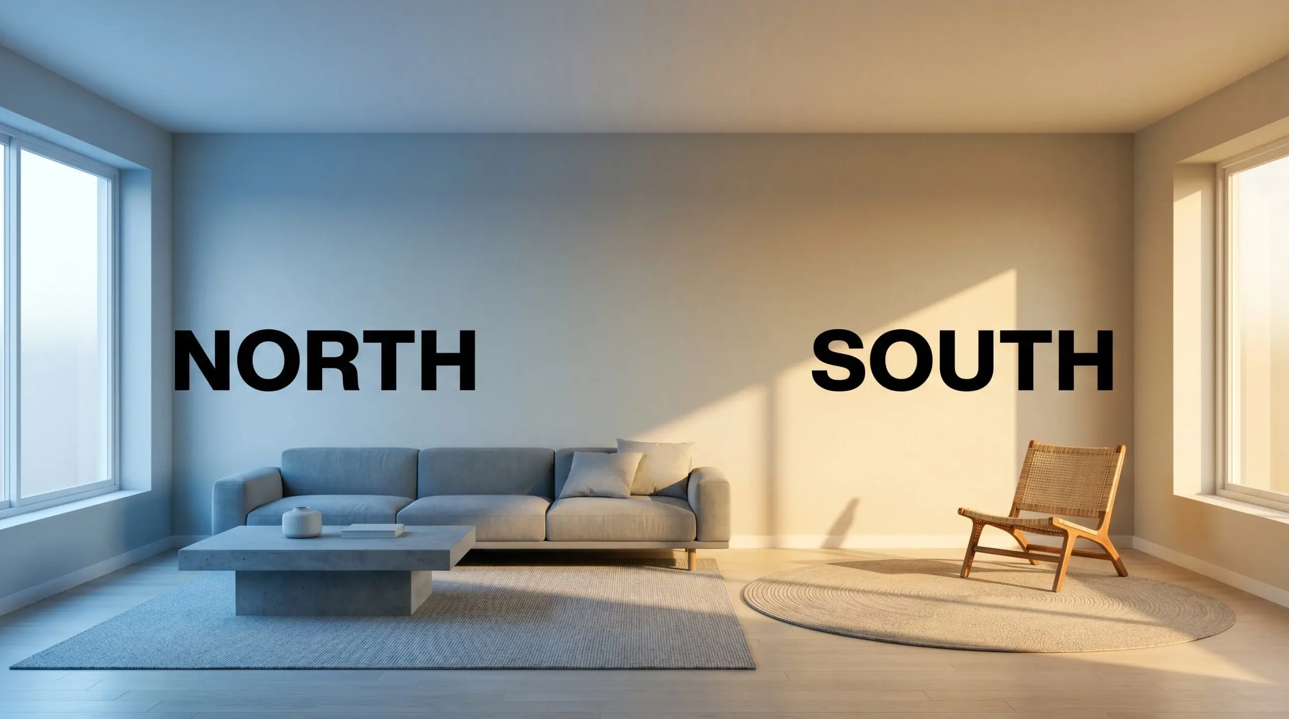
Will Passive work with your specific lighting, floor, or furniture?
If you love the crispness of this gray but want to keep it from feeling too chilly in the evenings, swap your standard bulbs for 3000K LEDs. This specific temperature provides a clean, neutral glow that maintains the paint’s true color without exaggerating the blue.
Hackrea Pro-Tip (The Bulb Strategy)
Bringing Sherwin-Williams Passive to Life: Room-by-Room Strategies
Understanding a paint’s DNA is only half the battle; the real magic happens when you apply it to a physical space. Because this cool gray acts as a sophisticated architectural finish, it adapts beautifully across a wide range of interior styles. Let’s explore how to manipulate this color to elevate your home’s most important rooms.
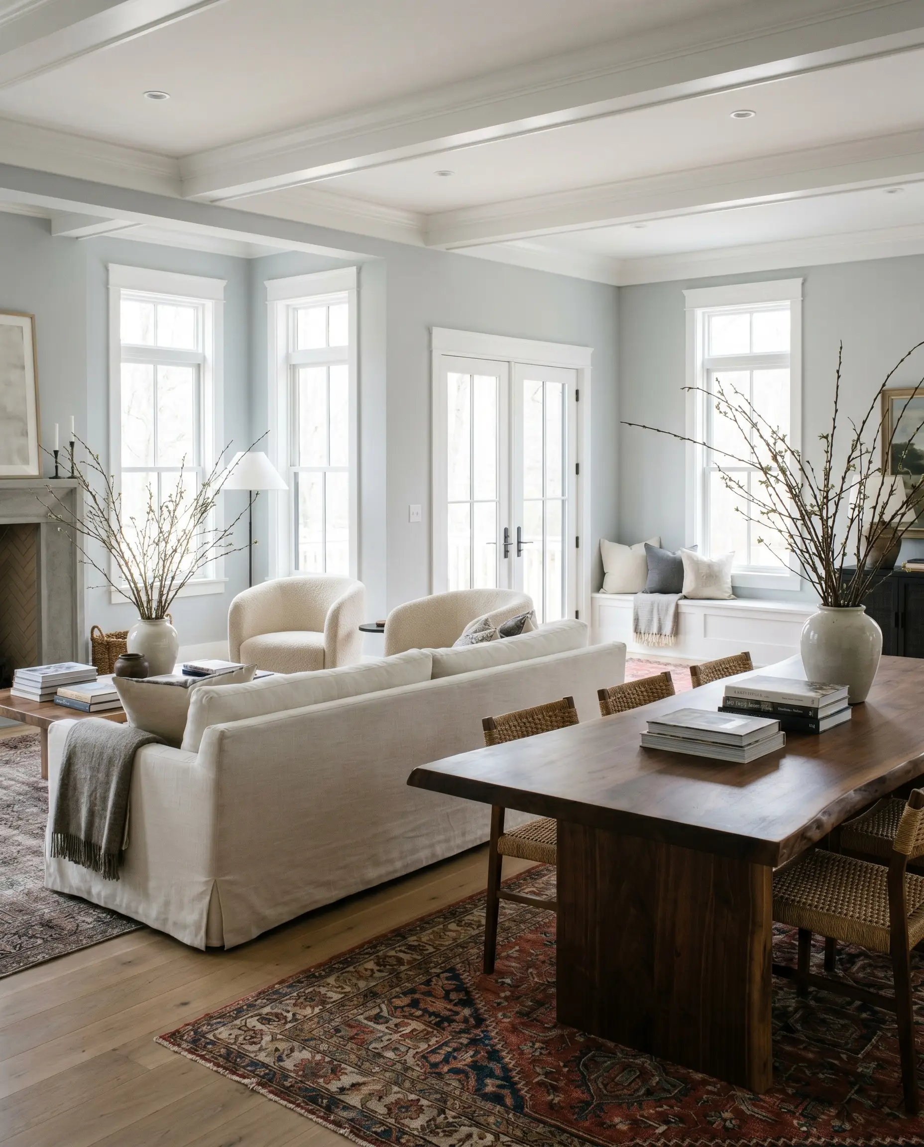
Open-Concept Living Areas
In sprawling, multi-use spaces, you need a color that establishes a cohesive flow without overwhelming the eye. This specific shade excels here, providing a tailored backdrop that feels incredibly intentional. Lean into a Transitional aesthetic by pairing the crisp walls with slipcovered sofas, a live-edge walnut dining table, and textural bouclé accent chairs.
The gray provides the perfect structural contrast to these softer, warmer furnishings. To keep the expansive walls from feeling flat, introduce oversized branches in ceramic vases and layer vintage rugs to add tactile warmth. The result is an open-concept space that feels simultaneously curated and deeply livable.
Modern Kitchens (Cabinets & Walls)
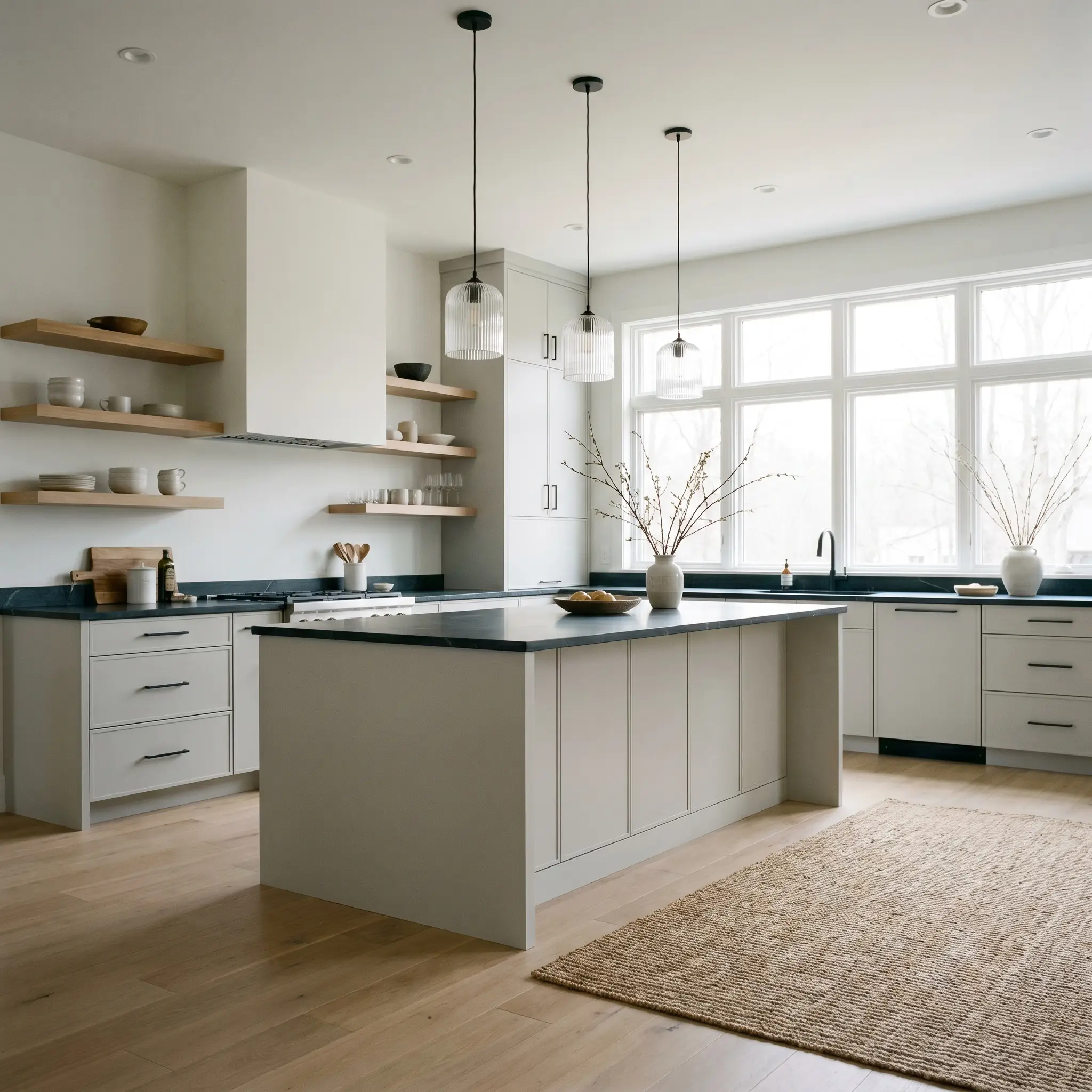
Move away from predictable all-white kitchens and use this shade to introduce a Soft Minimalist vibe. When applied to flat-panel cabinetry, the color reads as a premium, custom finish that pairs flawlessly with honed soapstone countertops. If you prefer it on the walls, it serves as a brilliant contrast against matte black steel hardware and floating white oak shelves.
Consider incorporating fluted glass pendants over the island to bounce light beautifully against the crisp gray backdrop. The subtle coolness of the paint will make your metallic fixtures pop, creating a kitchen that feels effortlessly high-end.
Serene Primary Bedrooms
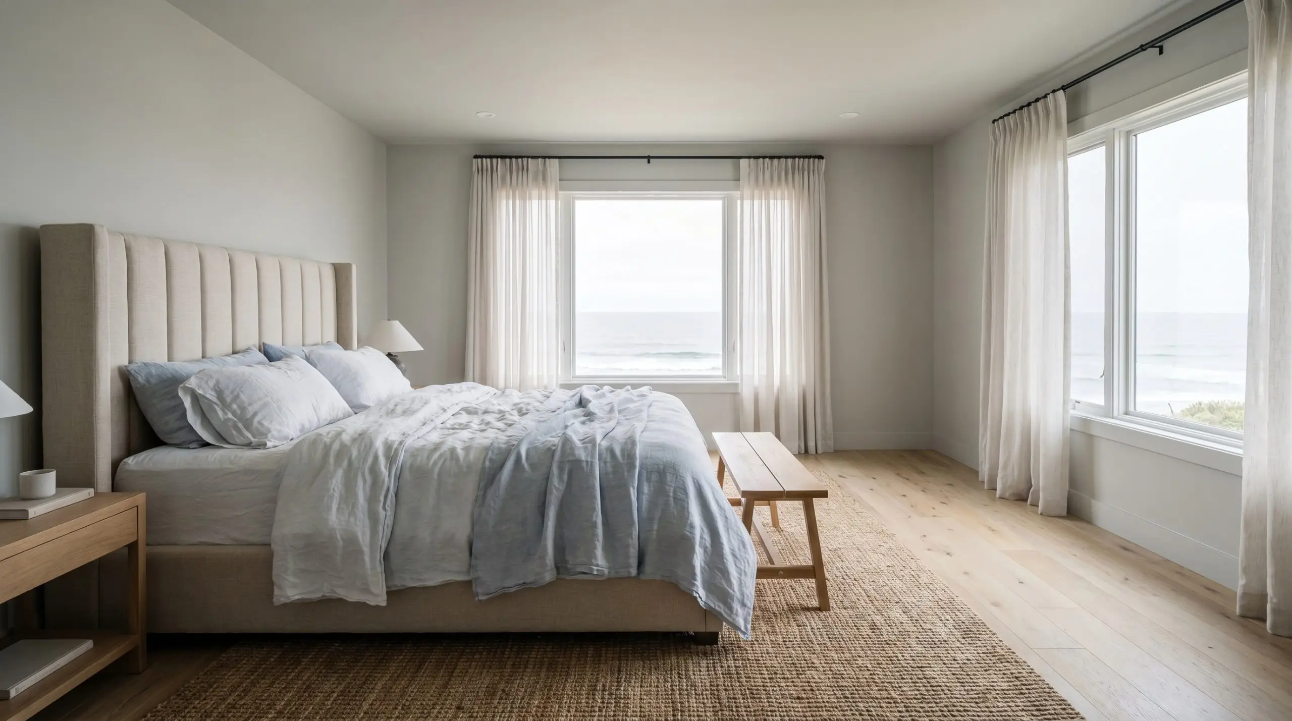
A bedroom should feel like a retreat, and the subtle blue-green undertones of this paint naturally evoke a sense of calm. Channel a Coastal Modern aesthetic by layering the bed with washed linen sheets, an alpaca throw, and a channeled headboard. The crispness of the walls prevents the coastal vibe from feeling cliché, keeping the atmosphere refined.
To heighten the serenity in a primary bedroom, do not leave the ceiling stark white. Paint the ceiling one shade lighter than the walls to create a soft, tonal canopy that gently envelops the room.
Hackrea Design Secret (The Tonal Ceiling)
Bathrooms with Abundant Natural Light
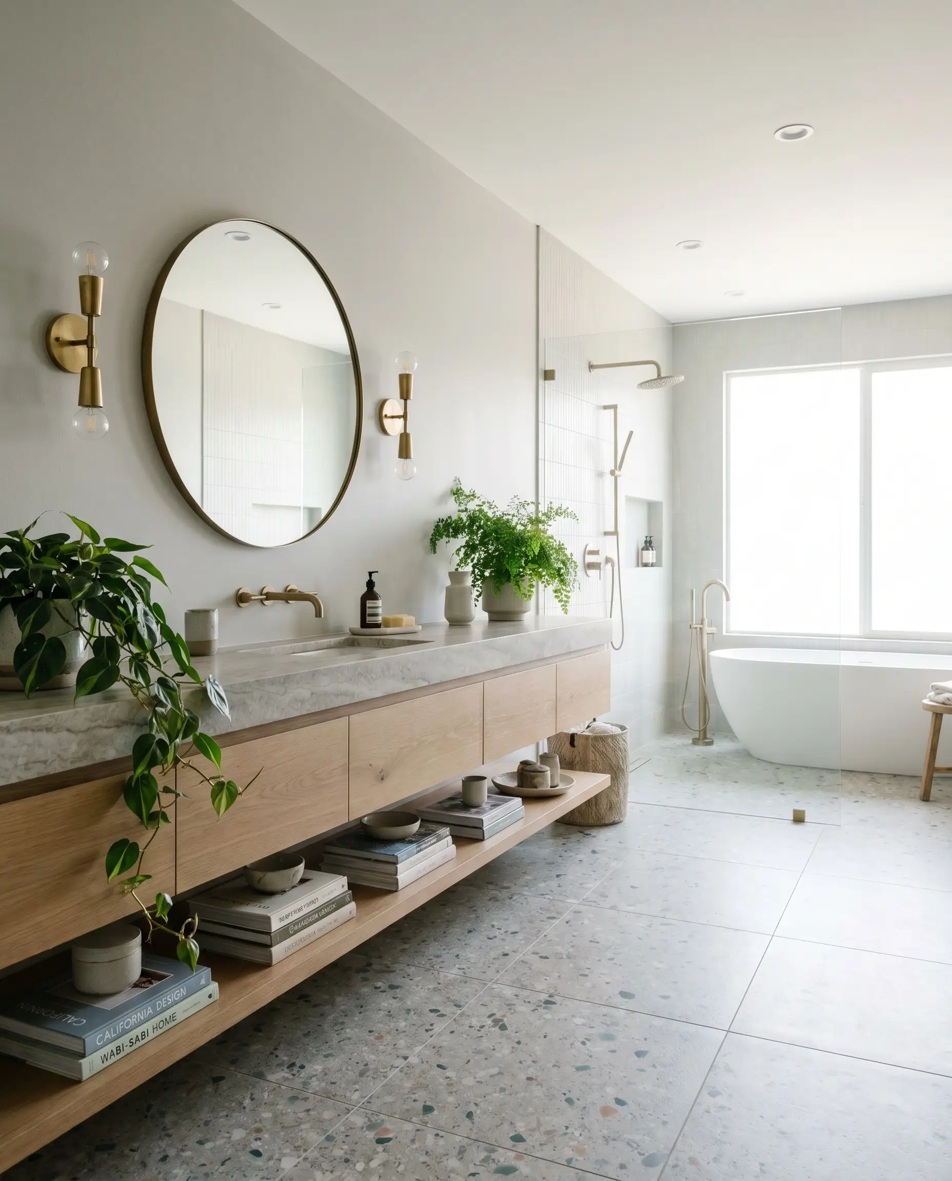
In a bathroom flooded with morning sun, this neutral transforms the space into a spa-like sanctuary. The natural daylighting illuminates the color’s crisp profile, making the room feel immaculately clean and expansive. Pair the painted walls with terrazzo floor tiles and unlacquered brass sconces for a brilliant study in material contrast.
The warmth of the living brass will beautifully offset the cool gray walls. Add trailing greenery and stacked art books on a floating shelf to soften the hard architectural lines.
Will Passive work with your specific lighting, floor, or furniture?
Exteriors (Siding and Trim)
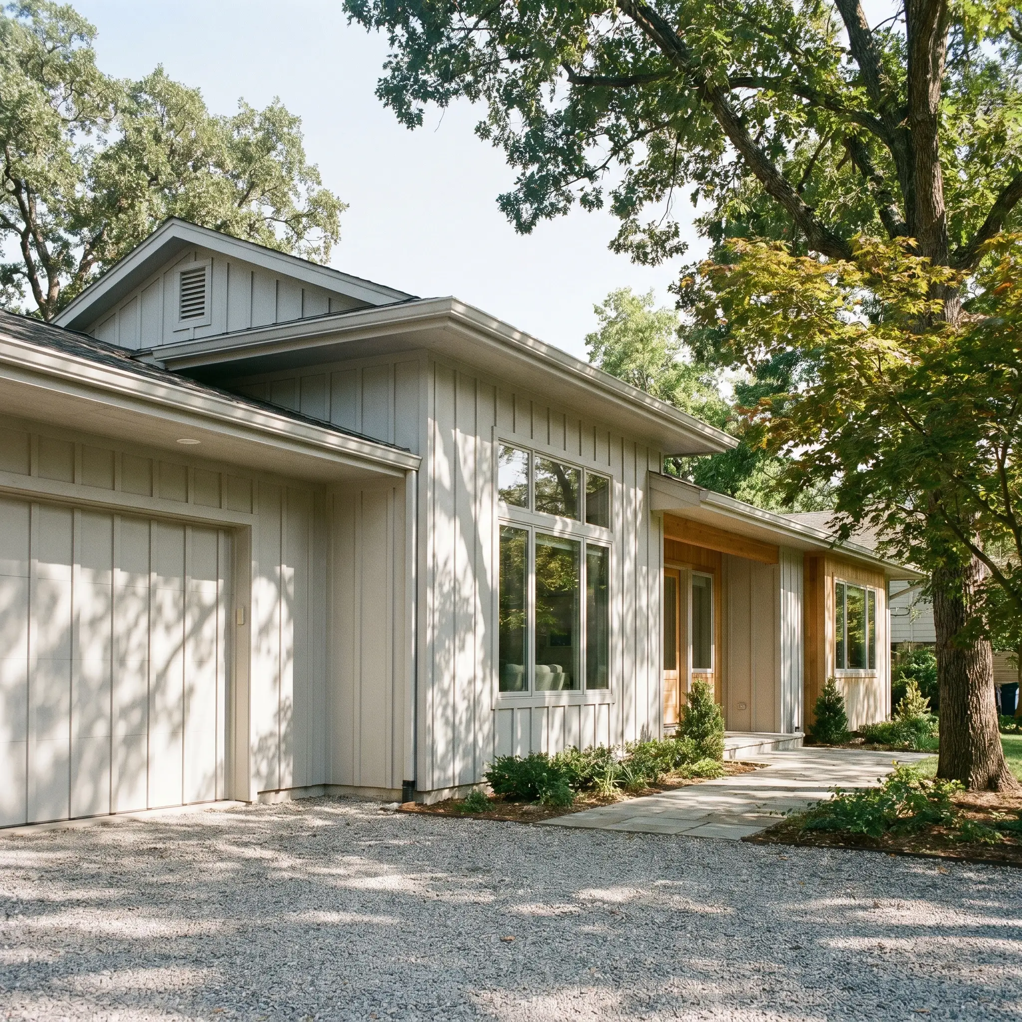
Taking this color outdoors requires a strategic understanding of how sunlight strips away pigment. In direct, bright sunlight, the high reflectance will cause the color to lose some of its depth, often reading much lighter than it does indoors. To combat this, use it on homes with prominent architectural shadows, like deep eaves or textured board and batten siding.
A crucial warning: If your home has a stark, flat facade with no mature trees to provide shade, this color may wash out and appear nearly white during the peak of the day. Always test a large swatch on both the north and south sides of your exterior before committing.
Curating the Palette: Materials & Colors That Elevate Passive
The true success of this cool gray relies entirely on what you place next to it. Because it is a highly structural, crisp neutral, it thrives on intentional contrast. It requires materials and secondary colors that either sharply define its boundaries or introduce much-needed tactile warmth.
Tailoring the Trim & Baseboards
To maximize the tailored sophistication of this paint, you must pair it with a stark, uncompromising white. A crisp trim contrast acts like a picture frame, sharpening the gray and preventing the room from feeling hazy.
Tactile Pairings: Woods, Metals & Textures
This specific shade of gray is inherently cool, which means your material selections must actively work to balance the visual temperature of the room.
The Coordinating Color Palette
Aesthetic Blueprints: Styling SW Passive
To truly understand how these elements come together, we must look at the holistic design. These curated blueprints demonstrate how to manipulate the paint’s cool undertones to achieve distinctly different atmospheric moods.
The Tailored Slate
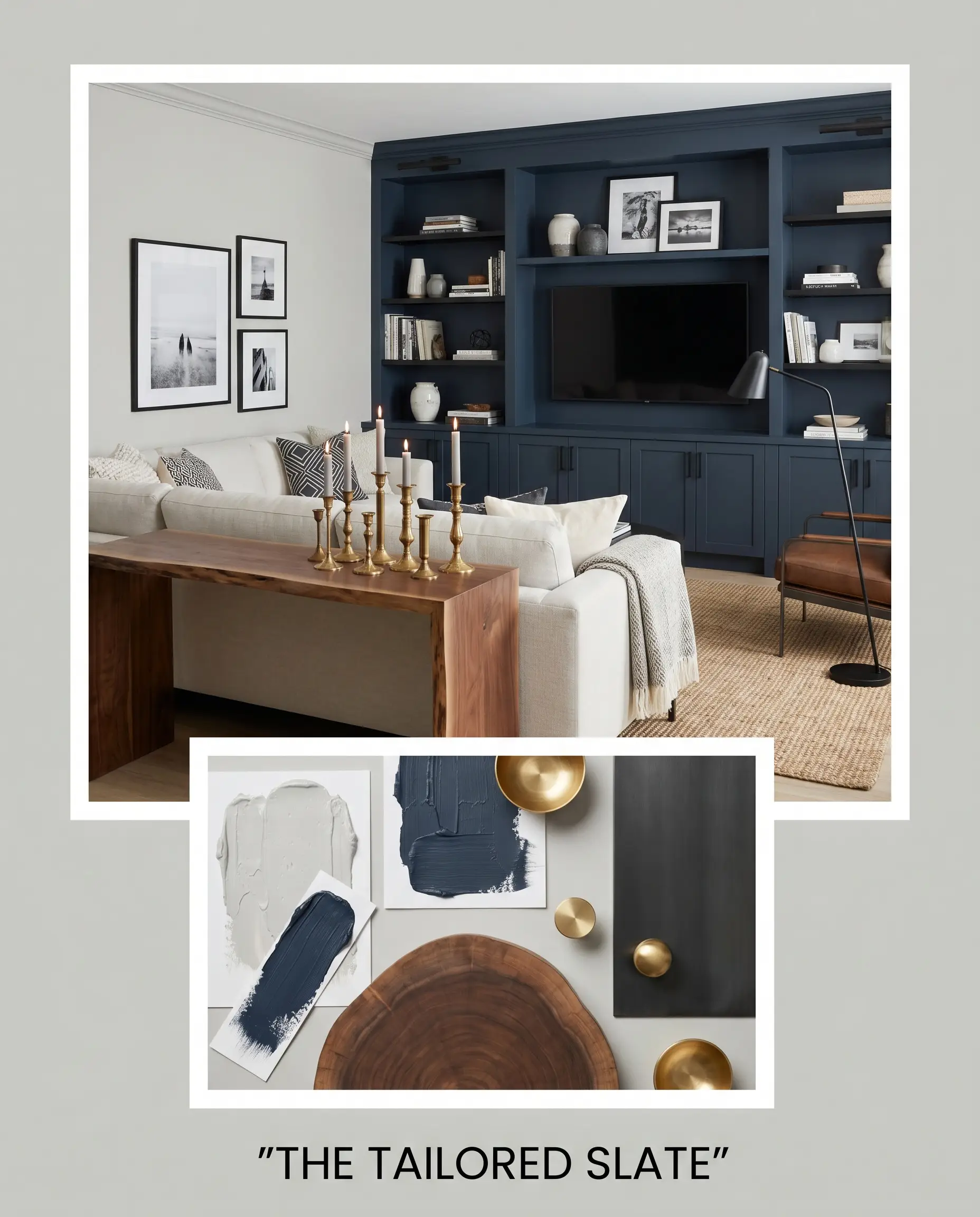
This palette is designed for the homeowner who craves crisp, high-contrast modernism. The walls provide a clean, architectural backdrop for striking matte black steel accents and minimalist, abstract geometric prints.
By introducing Benjamin Moore Hale Navy on a prominent accent wall or custom built-in, you instantly steady the lighter gray, giving the space a definitive focal point. Warmth is introduced strategically through a live-edge walnut console and clustered brass candlesticks, ensuring the high-contrast aesthetic remains inviting rather than clinical.
Coastal Fog & Linen
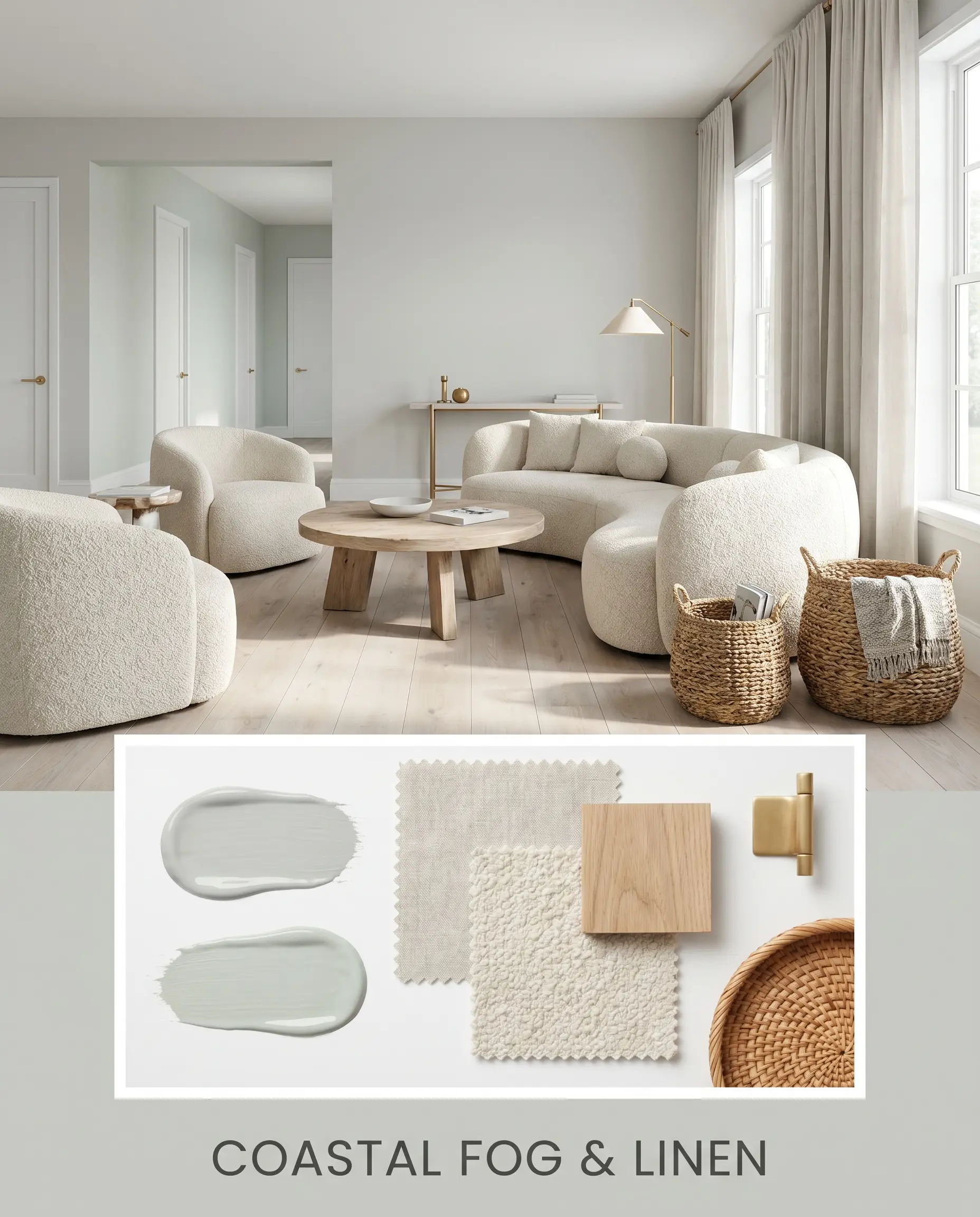
Will Passive work with your specific lighting, floor, or furniture?
Here, the goal is to soften the paint’s crisp edges and lean into its serene, atmospheric qualities. The walls act as a gentle morning mist, paired with the tonal flow of Sherwin-Williams Sea Salt spilling in from an adjacent hallway.
The styling relies heavily on organic textures: expansive washed linen drapery, nubby bouclé seating, and wide-plank white oak flooring. Unlacquered brass hardware and oversized woven baskets add just enough earthy warmth to balance the cool tones, resulting in a space that feels effortlessly relaxed and deeply restorative.
The Neutral Showdown: Passive vs. Industry Rivals
Choosing the perfect neutral often comes down to a matter of degrees. Depending on your home’s natural daylighting and your specific architectural finishes, a subtle shift in undertone can make or break the design. Let’s compare this shade to its closest competitors to ensure you make the right choice.
Sherwin-Williams Passive vs. Sherwin-Williams Repose Gray
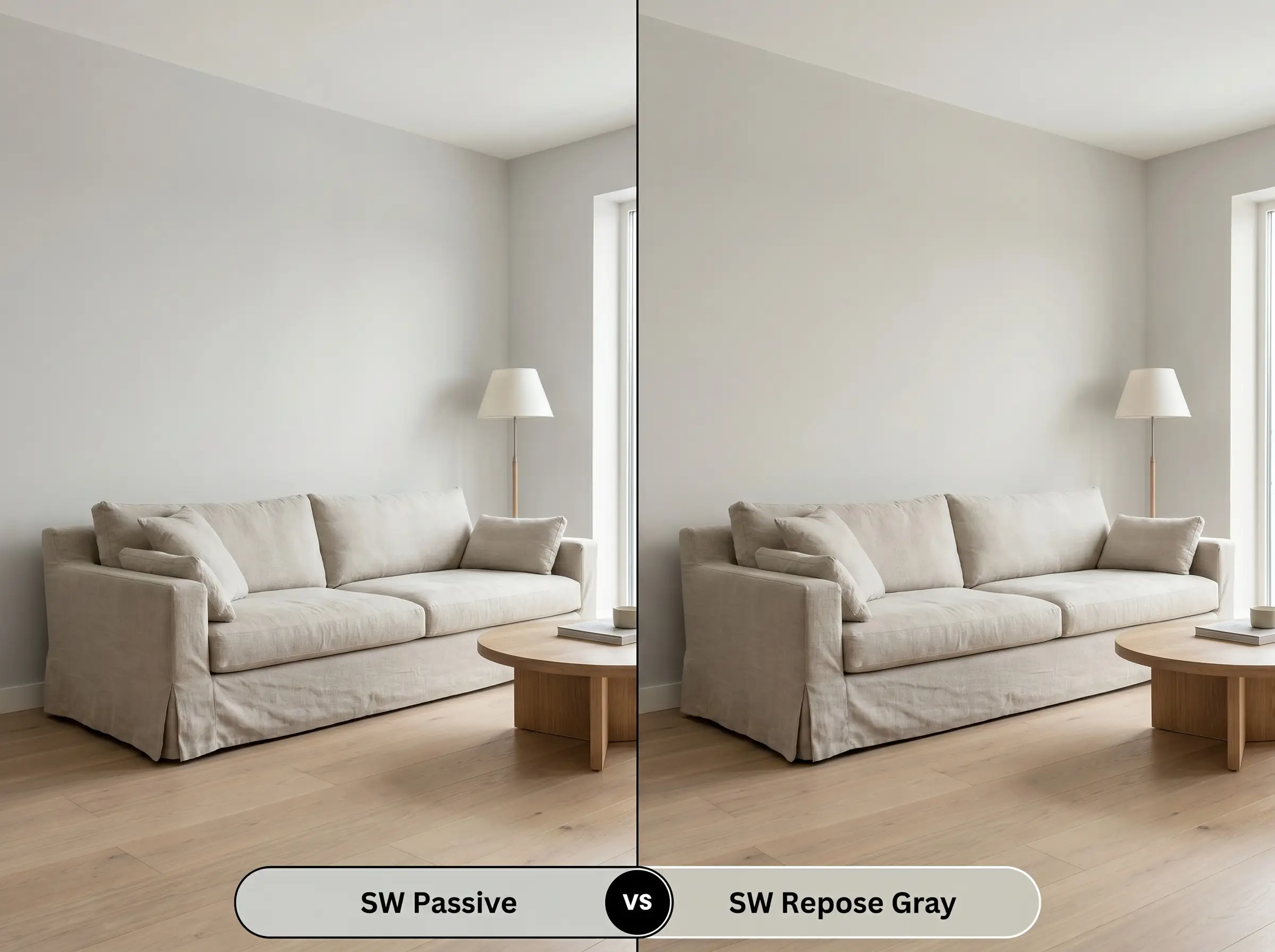
If your space faces north and feels a bit too chilly, Repose Gray might be the better candidate. While SW 7064 leans definitively cool with its blue-green micro-nuance, Repose Gray features a slightly warmer, greige undertone. Use Repose Gray when you need a neutral that bridges the gap between warm and cool, but stick with the current shade if you want a truly crisp, tailored aesthetic.
Sherwin-Williams Passive vs. Benjamin Moore Stonington Gray
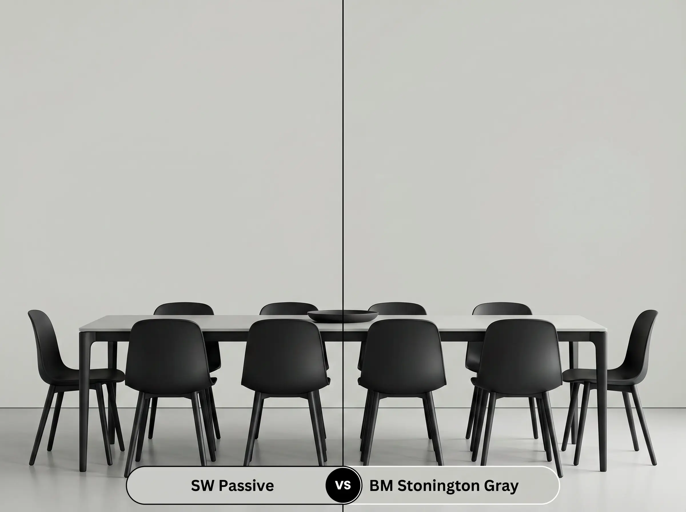
These two colors are incredibly close, but their underlying structures behave differently under artificial lighting. Stonington Gray is slightly more balanced, lacking the prominent cyan push that defines its Sherwin-Williams rival. If you have cool LED lighting that might aggressively exaggerate blue tones, Stonington Gray offers a slightly safer, more muted alternative.
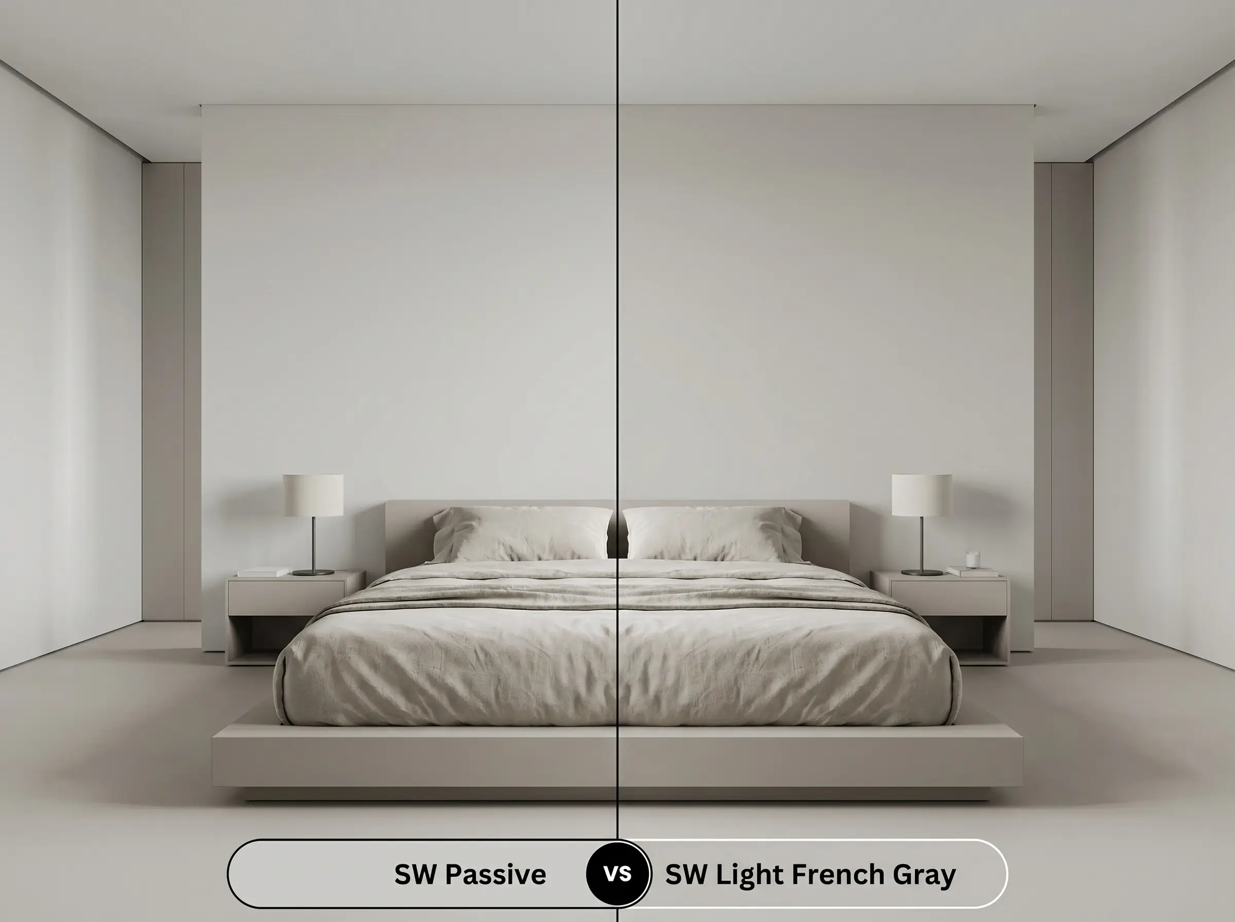
Sherwin-Williams Passive vs. Sherwin-Williams Light French Gray
Will Passive work with your specific lighting, floor, or furniture?
This comparison is entirely about visual weight and depth. Light French Gray is notably darker (LRV 53) and features a more pronounced, traditional gray profile without the airy blue-green lift. Choose Light French Gray for expansive, south-facing rooms that can handle a heavier pigment, but opt for the lighter alternative in smaller spaces where preserving light is essential.
Exploring Alternatives: Matches & Subtle Shifts
Sometimes a color is almost perfect, but you need a microscopic adjustment to accommodate your home’s unique lighting. Whether you need a slight shift in depth or are looking for a cross-brand equivalent due to local availability, these alternatives deliver a similar sophisticated energy.
Staying Within the Brand
Crossing the Aisle
Execution Strategy: Getting SW 7064 on the Wall
Moving from design theory to physical application requires precision. The finish you choose will dramatically impact how this cool gray reflects light and interacts with your room’s architecture.
Because this is a light-to-medium neutral, a standard high-quality white primer is usually sufficient to prep your drywall. However, if you are painting over a very dark or highly saturated color (like a deep red or navy), use a primer tinted to a light gray. This ensures you will achieve full, accurate color coverage in just two coats.
When rolling this color on expansive, open-concept walls, you must maintain a wet edge to avoid “flashing.” Flashing occurs when the paint dries unevenly, leaving visible, overlapping roller marks that ruin the tailored look of the gray. Work in manageable sections and avoid the temptation to touch up partially dried spots, as the sheen will dry differently and highlight the mistake.
Frequently Asked Questions
Because 3500K lighting sits right in the middle of the temperature spectrum, it will render this paint as a very clean, true gray. The lack of natural light means the color will rely entirely on your bulbs, so ensure your recessed lights are evenly spaced to prevent shadows from making the hue feel heavy.
There is a strong risk of this happening. The prominent orange/red tones in the oak will aggressively pull out the contrasting blue-green undertones in the paint, often making the walls read much cooler and bluer than intended.
Yes, it frequently does. With an LRV of 60, direct exterior sunlight strips away its subtle depth, causing it to look like a stark, glaring white rather than a tailored gray.
It is generally not recommended. The crisp, cool cyan micro-nuance in the paint will clash with the earthy warmth of the beige veining, making the cabinets look icy and the countertops appear muddy.
The Final Verdict on Sherwin-Williams Passive
Sherwin-Williams Passive is an exceptional architectural tool for homeowners who want to introduce crisp, tailored sophistication into their spaces. It is the perfect choice for south-facing rooms, modern kitchens, and anyone looking to execute a high-contrast, modern aesthetic without resorting to stark white walls. When paired with matte black metals, honed stone, and clean white trim, it establishes an incredibly premium, intentional atmosphere.
However, its specific color structure requires careful handling when paired with heavily bossy, warm finishes. If your home features expansive red oak hardwood floors or prominent warm beige stone fireplaces, this paint is likely not for you. The intense warmth of those materials will aggressively pull the blue-green undertones forward, causing the walls to read as a chilly baby blue rather than a refined gray, ultimately fracturing the cohesive flow of your design.
Room Compatibility & Clashes Diagnoses
Hackrea's reports evaluating the compatibility of Passive in real rooms.No compatibility tests for Passive yet.
Be the first to see how this color reacts to your space. Run a free architectural diagnostic now.
Closest Cross-Brand Equivalents
The absolute closest scientific color matches for Passive across top paint brands.