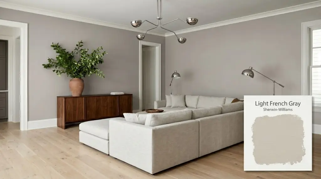
Light French Gray SW 0055
Sherwin-WilliamsSherwin-Williams Light French Gray (SW 0055) is a versatile, mid-tone neutral gray with an LRV of 53. While mathematically rooted in a warm base, it frequently exhibits a subtle, sophisticated violet or cool-blue undertone depending on the room's ambient lighting conditions.
Paint Technical Profile
| Color ID / SKU | SW 0055 |
| HEX Code | #C2C0BB |
| Light Reflectance (LRV) | 53 |
| Use | Interior, Exterior |
| Best Exposures | South, West, or well-lit North |
| Best For | Living Rooms, Open-Concept Spaces, Exteriors, Cabinets |
Sherwin-Williams Light French Gray: The Atmospheric Power of a Perfectly Balanced Mid-Tone
Finding a gray that feels substantial without turning a room into a gloomy cavern is one of the most common challenges in interior design. Many popular neutrals simply wash out under intense sunlight or turn uncomfortably icy the moment the sun dips below the horizon. Sherwin-Williams Light French Gray defies these common pitfalls by offering a beautifully weighted, tactile presence that physically changes the atmosphere of your home.
This mid-tone neutral gray behaves less like a standard wall color and more like a premium architectural finish. It brings an immediate sense of permanence and structure to a room, mimicking the sophisticated, settling energy of aged stone. When applied thoughtfully, SW 0055 establishes a room’s boundaries with quiet authority.
By striking a near-perfect equilibrium between light and shadow, this shade allows your furnishings and materials to command attention. It is the ultimate supporting character for a beautifully curated home, seamlessly adapting to everything from raw, rustic textures to highly polished metals.
Sherwin-Williams Light French Gray: Undertones & LRV
If you are wondering whether Light French Gray leans warm or cool, the answer is a fascinating study in perception: it fundamentally reads as a slightly cool, neutral gray in most environments, despite being built on a remarkably warm base. This hidden tension is exactly what gives the paint its sophisticated, multi-dimensional appeal.
To understand how this color will actually behave on your walls, we have to look closely at its underlying color structure:
This paint has a light reflectance value (LRV) of 53. In the design world, an LRV sitting right in the middle of the 0-100 scale represents the ultimate sweet spot for a mid-tone. It absorbs just enough light to feel rich and immersive, yet reflects enough ambient brightness to maintain a crisp, clean contrast against bright white trim or ceilings.
Lighting Effects & The Chameleon Factor
A paint’s true personality is entirely dictated by the light that hits it. Because SW 0055 balances warm structural roots with cool visual casts, it acts as a highly responsive chameleon, dramatically shifting its mood depending on the sun’s trajectory and your home’s light fixtures.
Here is exactly how you can expect this mid-tone to behave across different lighting scenarios:
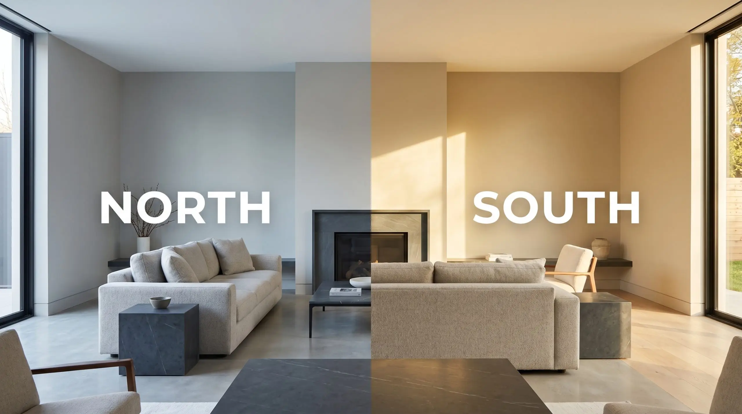
If you love the neutral balance of this gray but your room faces north, swap your standard lightbulbs for 3000K LEDs. This specific temperature provides just enough warmth to counteract the icy natural light without turning your beautiful gray walls yellow.
Hackrea Pro-Tip (The Bulb Strategy)
Popular Applications for This Mid-Tone Gray
The true value of a perfectly balanced mid-tone lies in its architectural flexibility. Because it doesn’t aggressively demand attention, it can be pushed into entirely different design styles simply by swapping out the surrounding textures and materials.
Here is how to leverage the settling energy of this gray across the most critical spaces in your home.
Expansive Open-Concept Living Areas
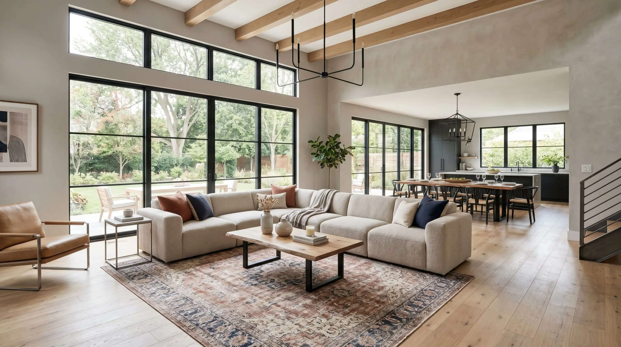
In large, open-concept spaces, stark white walls can often feel cavernous and unfinished, while dark colors can quickly overwhelm the floor plan. Light French Gray steps in as the perfect stabilizing force, providing enough visual weight to make a sprawling suburban living room feel intentional and cozy. It acts as a unifying thread that visually connects the kitchen, dining, and lounging zones.
To push this color into a contemporary Scandinavian aesthetic, pair the walls with wide-plank white oak flooring and heavily textured textiles. A sprawling modular sectional in a slub cotton or light bouclé creates a stunning, tactile contrast against the smooth, stormy gray walls. Introduce warmth through natural materials like a stained walnut credenza or an oversized terracotta vessel filled with fresh branches.
If your architecture leans more toward soft industrial, this gray is an incredible backdrop for blackened steel accents and matte black iron lighting fixtures. The cool-blue cast of the paint highlights the raw, utilitarian edge of the metals, while a layered vintage rug in muted rust and navy will beautifully counteract the cooler tones of the walls.
Custom Kitchen Cabinetry & Islands
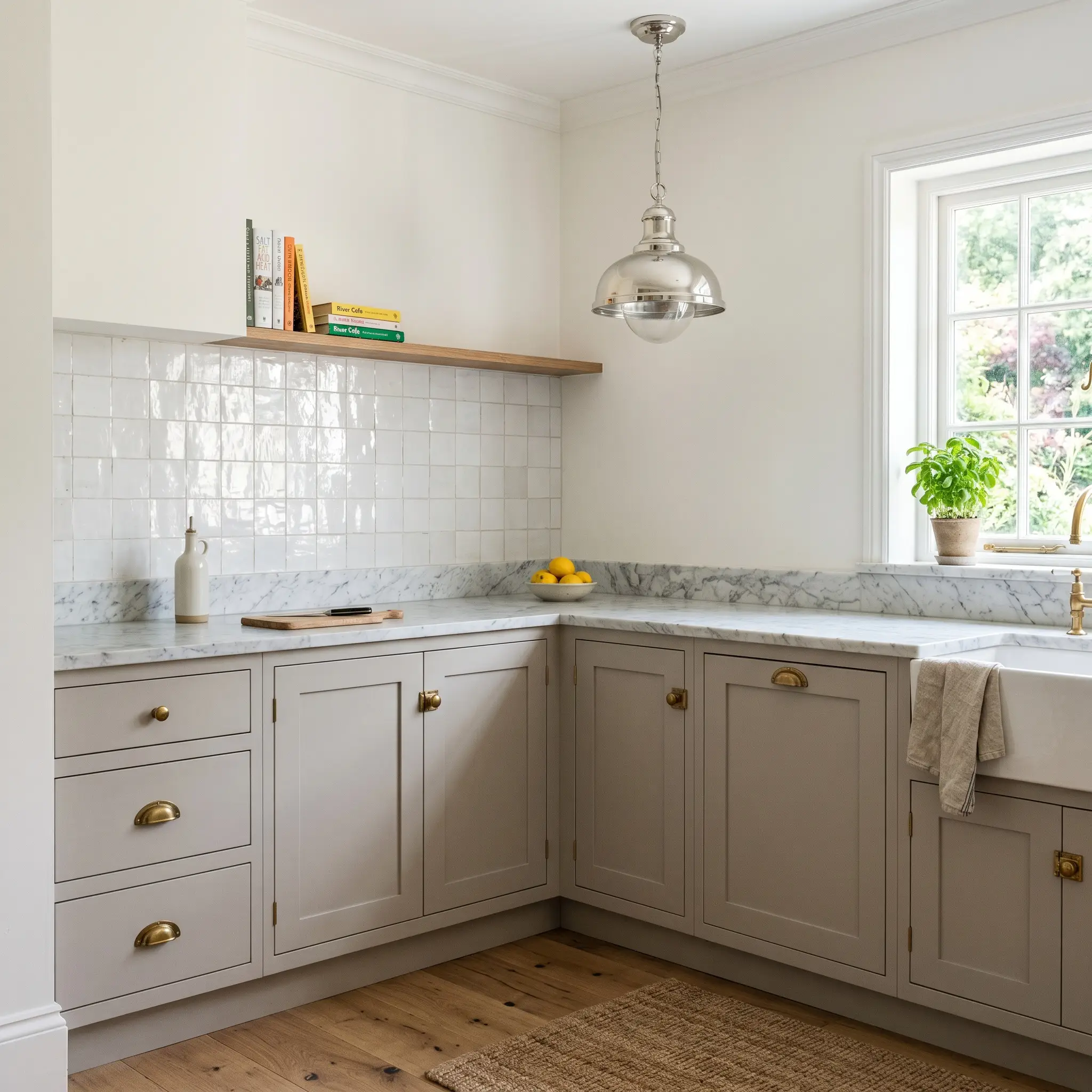
Painting kitchen cabinets is a significant commitment, and this specific shade offers a timeless alternative to the ubiquitous all-white kitchen. When applied to shaker or flat-panel cabinetry, it delivers a sophisticated, bespoke look that easily hides everyday scuffs and fingerprints—a massive win for busy households. The wet cement aesthetic feels incredibly high-end when paired with the right hardware.
To instantly elevate gray cabinetry, install unlacquered brass hardware. The living finish of the warm, aging brass creates a breathtaking, high-contrast pairing against the cool, violet undertones of the doors.
Hackrea Design Secret (The Metal Mix)
For a truly aspirational focal point, pair these gray lower cabinets with a heavily veined, honed Carrara marble countertop and a backsplash of glossy, hand-fired zellige tiles. The organic imperfections in the tile will bounce the ambient lighting around the room, preventing the mid-tone gray from feeling flat or heavy. Keep the upper walls in a crisp, warm white to maintain a sense of vertical height and breathability.
Restorative Primary Bedrooms
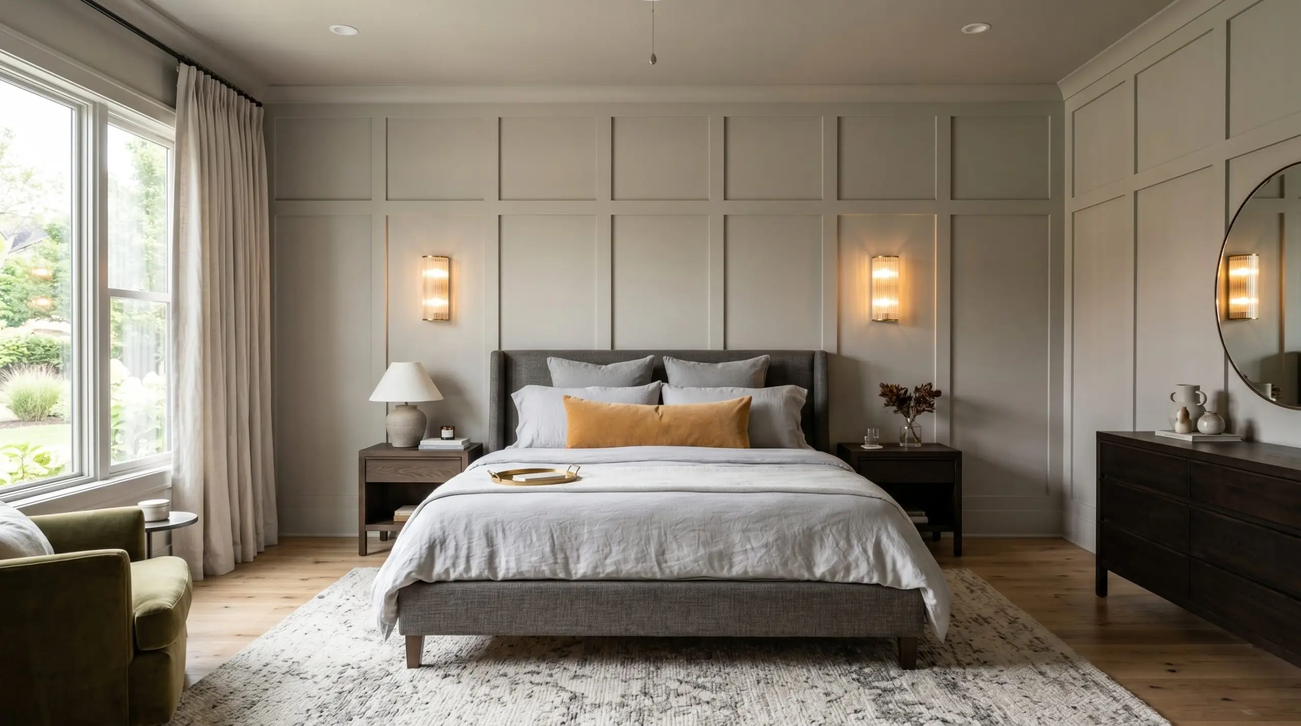
Your primary bedroom should be a sanctuary, and the profound, settling nature of this color makes it an ideal candidate for a restful retreat. Instead of just painting the drywall, consider adding picture frame molding or a classic board and batten treatment before applying the gray. The subtle shadows created by the millwork will beautifully highlight the paint’s shifting undertones throughout the day.
Lean into a soft minimalist approach by embracing a monochromatic layering strategy. Pair the painted walls with an upholstered bed frame in a slightly darker charcoal linen, and dress the bed in layers of washed, pale gray bedding. This subtle variation in tone creates a deeply immersive, cocoon-like environment that feels incredibly luxurious.
To prevent the cool-toned room from feeling chilly, introduce strategic warmth through your lighting and styling. Fluted glass sconces with warm 2700K bulbs will cast a soft, golden glow against the stormy walls each evening. A vintage, muted tartan throw blanket at the foot of the bed or a warm ochre velvet lumbar pillow will provide the perfect punch of unexpected color.
Exterior Facades, Siding & Stucco
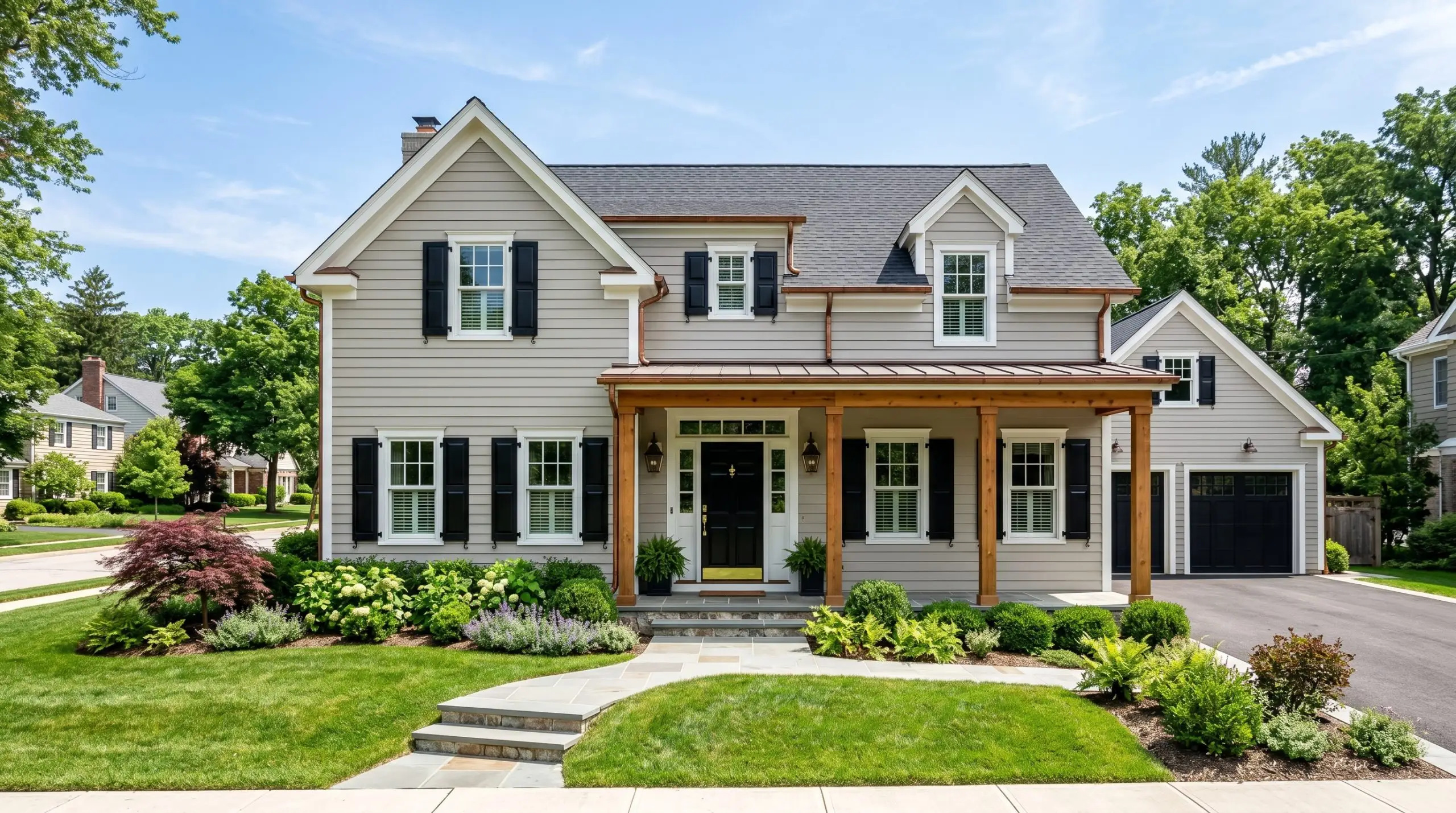
Taking this color outdoors requires an understanding of how intense, direct sunlight impacts its visual weight. On an exterior facade, the brilliant natural light will wash out a significant portion of its depth, causing it to read much lighter than it does on an interior swatch. This makes it an exceptionally safe, elegant choice for updating dated stucco or traditional clapboard siding.
To modernize a traditional suburban exterior, pair the gray siding with crisp, bright white trim around the windows and roofline to highlight the architectural geometry. Then, introduce intense contrast by painting the front door, shutters, or garage hardware in a saturated, glossy black. This high-contrast trio—gray, white, and black—guarantees massive curb appeal.
If you want to soften the exterior and integrate it more naturally into a wooded landscape, incorporate natural wood elements. A stained cedar front door, exposed timber columns on the porch, or copper gutter accents will beautifully draw out the hidden warm base of the paint, creating a welcoming, organic facade.
Transitional Corridors & Hallways
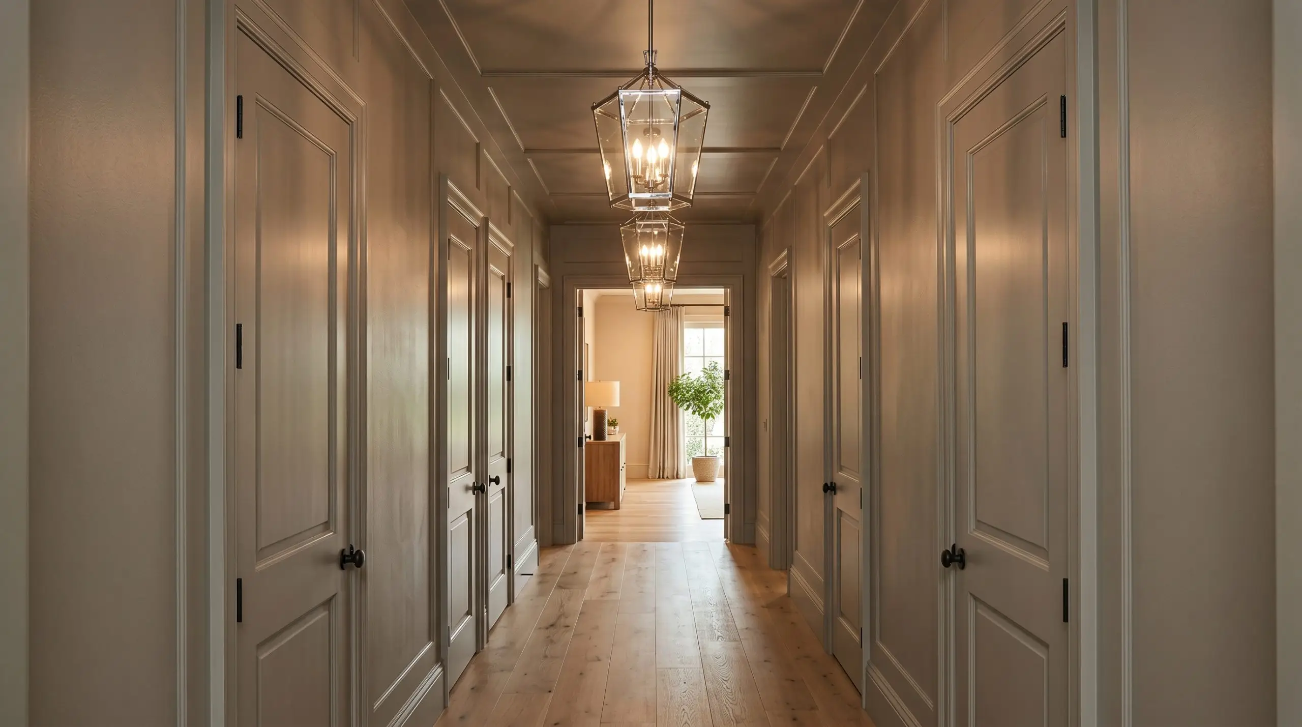
Hallways are frequently neglected, treated merely as functional pass-throughs rather than intentional design moments. Because these spaces often lack natural light, homeowners typically default to bright white, which ironically highlights the shadows and makes the corridor feel dingy. Instead, use this mid-tone gray to lean into the moodiness.
For a dramatic, custom look, utilize a color-drenching technique. Paint the hallway walls, the baseboards, the interior doors, and even the ceiling in the exact same finish. This seamless application blurs the sharp edges of the narrow space, making the ceiling feel infinitely higher and transforming a boring hallway into an immersive, jewel-box experience.
To complete the transformation, swap out standard flush-mount builder lights for a series of polished chrome or brushed nickel pendant lanterns. The reflective metallic finishes will sparkle beautifully against the desaturated, stormy backdrop, guiding the eye down the corridor with serious style.
Perfect Pairings & Coordinating Colors for Light French Gray
The unique chromatic profile of this mid-tone neutral demands structural contrast to truly thrive on your walls. Rather than blending softly into surrounding tones, its specific pigment performs best when given crisp, intentional boundaries that let its cool-blue cast shine.
Selecting the Right Millwork and Trim
Framing this stormy gray requires a trim color that provides a definitive edge without turning the room stark. The undertones of your baseboards and crown molding will dictate exactly how the wall color is perceived.
Tactile Materials and Hardware Finishes
To elevate SW 0055 beyond a standard wall application, you must surround it with materials that engage in a visual dialogue with its light reflectance value. The goal is to balance its smooth, wet cement aesthetic with highly tactile, varied surfaces.
Building a Cohesive Interior Palette
Curated Aesthetic Concepts
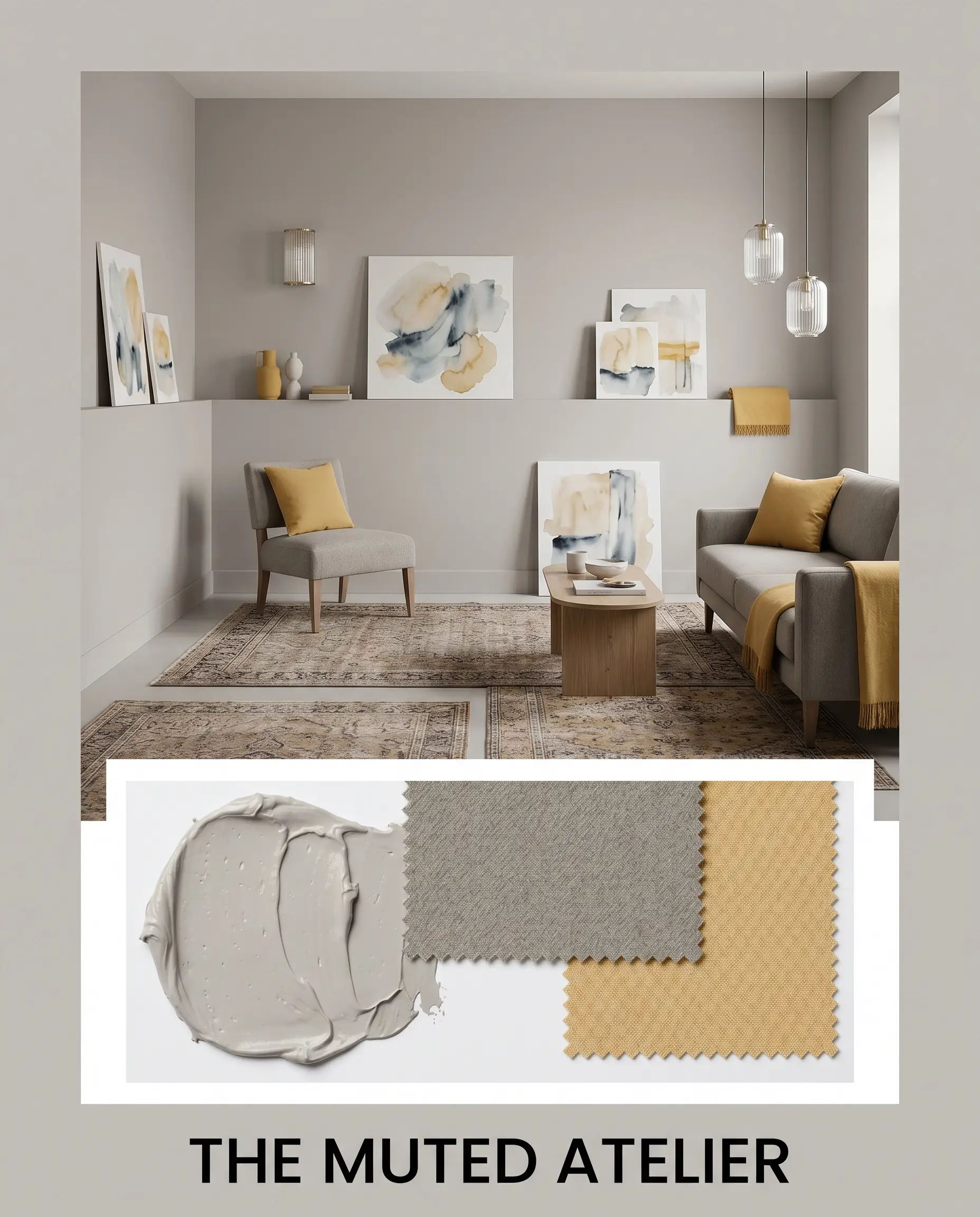
The Muted Atelier This concept is designed for those who crave a serene, highly intentional atmosphere that feels both collected and deeply restful. The walls are wrapped in the mid-tone gray, serving as a quiet backdrop for vintage rugs and abstract watercolor art leaning casually on ledges. We introduce worsted wool seating and strategic accents of Benjamin Moore Dijon to inject a pulse of warm, creative energy. Fluted glass lighting fixtures cast a soft glow, ensuring the cool undertones remain gentle and inviting.
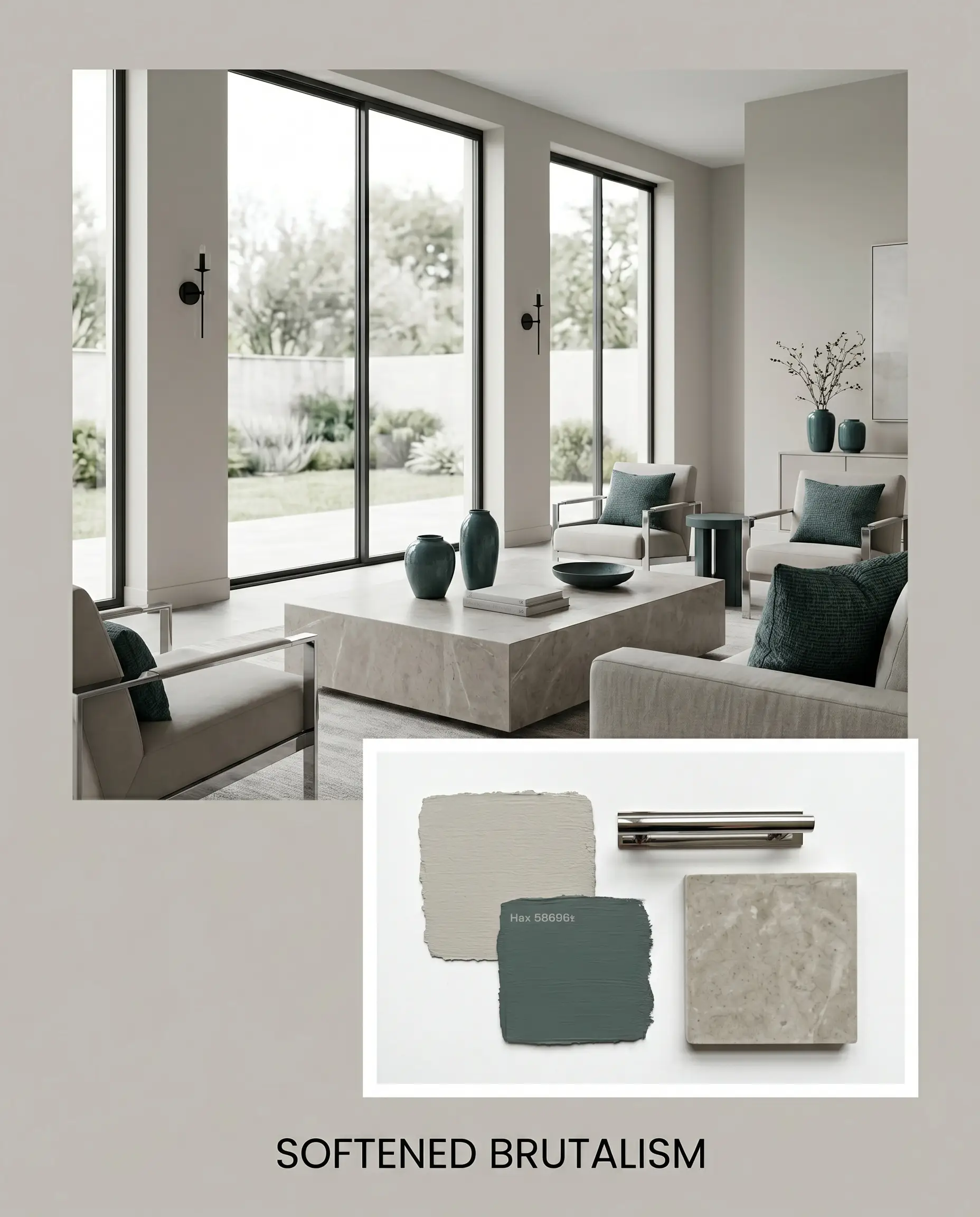
Softened Brutalism For a more architectural, edge-driven vibe, this palette embraces the paint’s wet cement aesthetic while stripping away any harshness. The gray is paired with expansive, unadorned windows and monolithic stone coffee tables to establish a sense of permanence. Polished chrome hardware and matte black iron sconces provide sharp, utilitarian contrast. To keep the energy from feeling sterile, we layer in deep accents of Farrow & Ball Inchyra Blue and organic shapes, creating a beautifully balanced tension.
Sherwin-Williams Light French Gray Direct Comparisons
Understanding how a paint behaves in isolation is helpful, but comparing it directly against its closest rivals is how you make a confident, final decision. If your home features challenging exposures or highly specific fixed finishes, you may need to pivot to a color with a slightly different structural DNA.
Sherwin-Williams Light French Gray vs. Sherwin-Williams Repose Gray
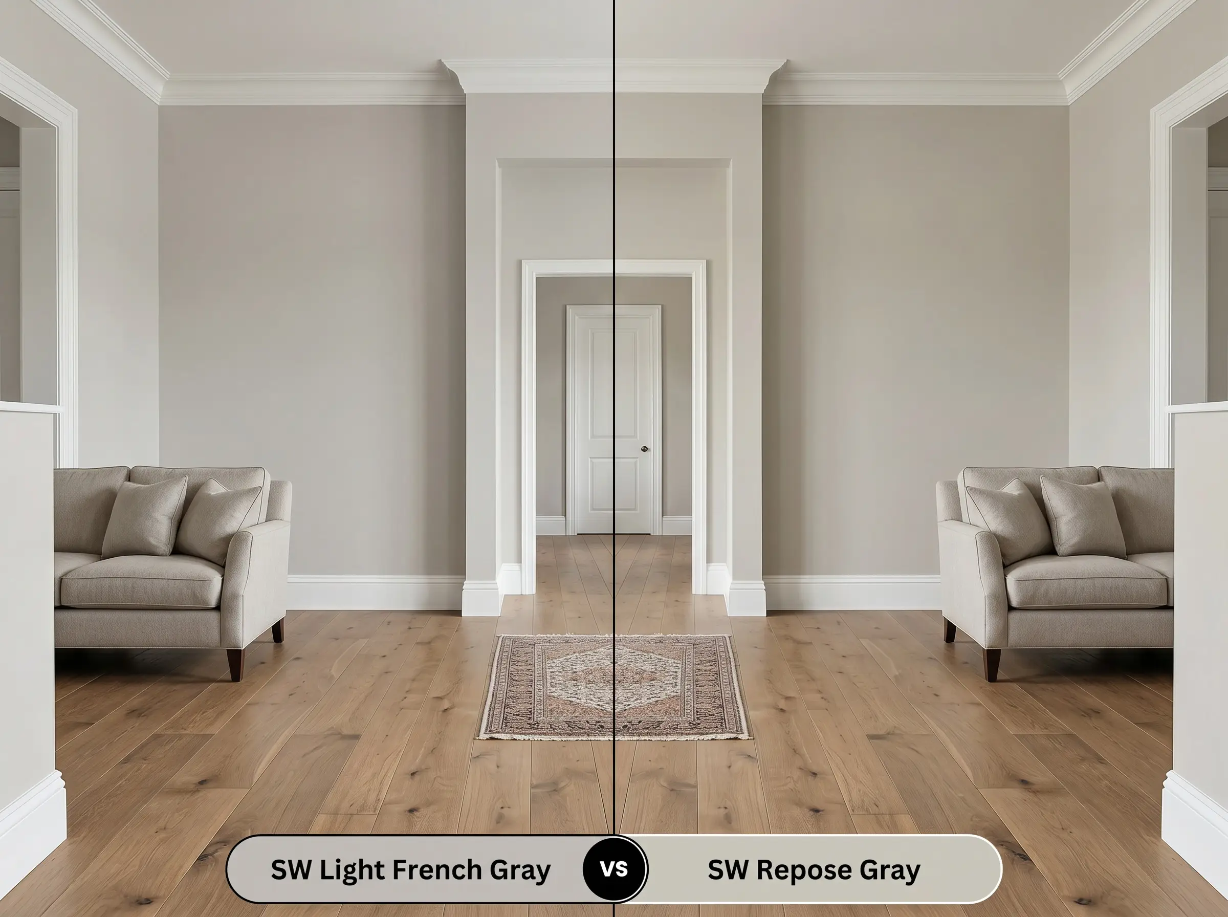
This is the ultimate battle of the mid-tone neutrals. While SW 0055 relies on a cool-blue and violet cast, Repose Gray is constructed with a significantly warmer, slightly taupe undertone. If your room faces north and you are worried about the walls reading too icy, Repose Gray is the safer choice. However, if you want a true, crisp gray that sharpens against pure white trim, Light French Gray holds its neutral shape far better under warm artificial lighting.
Sherwin-Williams Light French Gray vs. Sherwin-Williams Mindful Gray
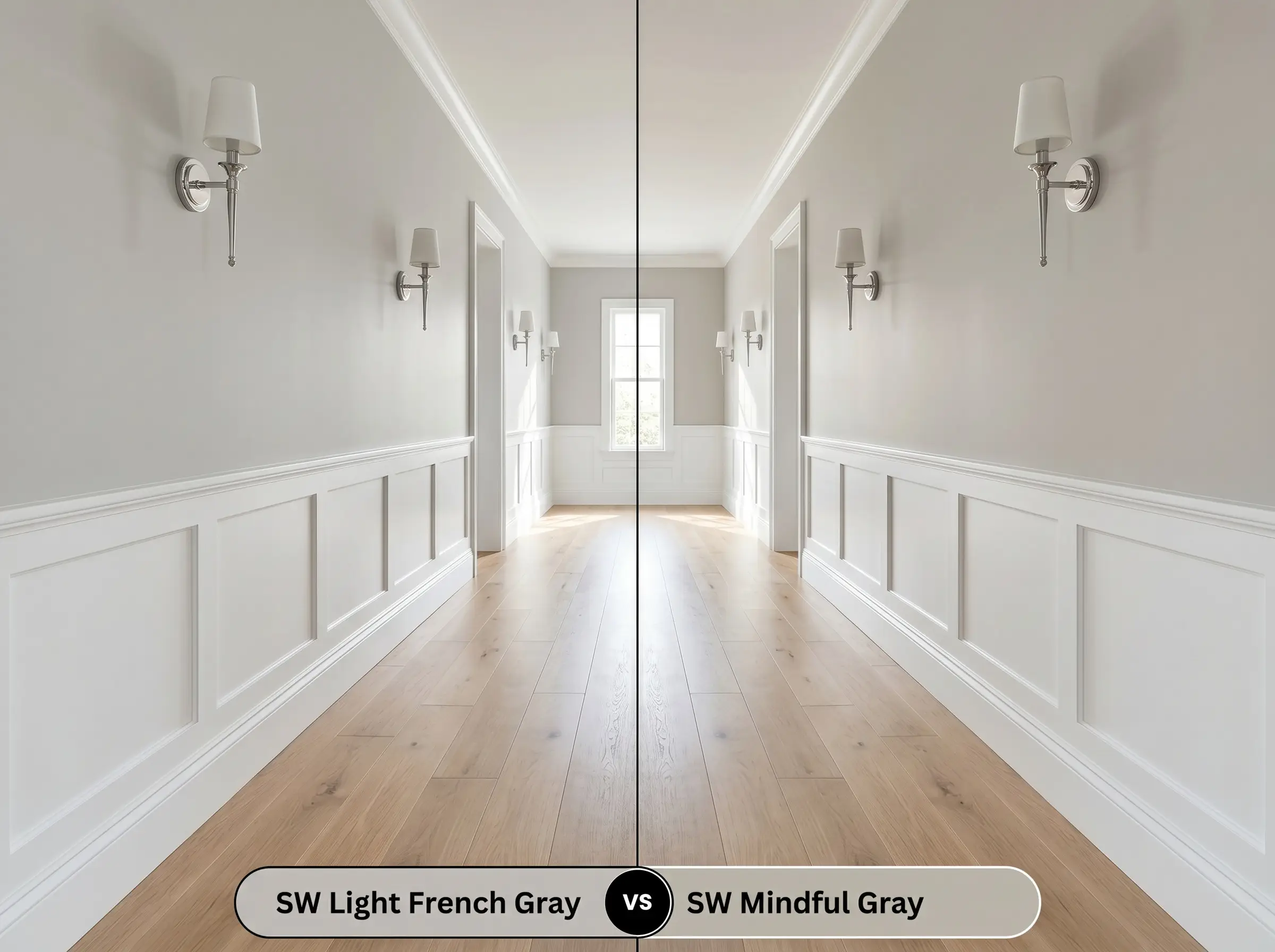
Mindful Gray sits a full step darker on the LRV scale and brings a much stronger dose of foundational warmth. If you are painting a room flooded with intense, direct southern sunlight, Light French Gray might wash out and lose its structural impact. In that specific high-light scenario, Mindful Gray provides the necessary visual weight to anchor the space. Conversely, in a standard hallway or a room with standard windows, Mindful Gray can feel overly dense, making Light French Gray the superior, more breathable option.
Exploring Alternative Mid-Tone Neutrals
Sometimes a color looks perfect on the swatch but behaves slightly off once tested on your actual walls. If you love the general vibe of this stormy gray but need a subtle shift in undertone or light reflectance, these curated alternatives will keep your design on track.
Closest Matches Within the Same Catalog
Competitor Paint Equivalents
Professional Execution Strategies for SW 0055
Transitioning a beautiful color from a tiny paper swatch to a finished wall requires a strict, practical strategy. The specific sheen you choose and the way you prepare the drywall will fundamentally alter how this mid-tone absorbs and reflects light in your home.
Optimizing Your Finish Selection
Preparation and Coat Requirements
Because this shade sits right in the middle of the LRV scale, it requires a high-quality, tinted primer to ensure the violet undertones develop correctly. Attempting to paint this directly over a dark or highly saturated wall will cause the new gray to look muddy and bruised.
This specific depth of color is highly susceptible to “flashing”—visible, uneven streaks that occur if you roll back over paint that has already started to dry. Always maintain a wet edge while rolling, and commit to two full, even coats for a flawless, professional result.
Hackrea Pro-Tip (The Flashing Warning)
Common Questions About Light French Gray
Intense, direct sunlight has a tendency to wash out the darker foundational base of this paint, which can push the hidden violet undertones to the surface. On heavily textured stucco, the shadows created by the rough surface will further amplify this cool shift, making it essential to test a large swatch outdoors before committing.
Because 4000K LEDs emit a very crisp, cool light, they will instantly pull the silvery-blue notes out of the gray. This creates a highly energized, exceptionally clean aesthetic that works beautifully in bathrooms, provided you warm up the space with tactile towels or brass hardware.
The strong, warm orange tones inherent in red oak flooring will create a high-contrast relationship with the cool violet cast of the walls. While not a direct clash, this pairing highlights the underlying tension between warm and cool, requiring you to bridge the gap with transitional elements like neutral rugs or warm wood furniture.
This is a breathtaking pairing. The mid-tone gray provides a sophisticated, grounding base for the cabinetry, while its subtle cool undertones perfectly highlight the delicate gray veining running through the warm Calacatta marble.
The Final Design Verdict on Sherwin-Williams Light French Gray
Sherwin-Williams Light French Gray is a masterclass in balanced neutrality, offering a profound, stabilizing presence that elevates everyday architecture. It is the perfect choice for homeowners who want to move away from stark whites but fear the overwhelming darkness of charcoal. By acting as a sophisticated, chameleonic backdrop, it seamlessly supports both the relaxed textures of transitional design and the crisp lines of contemporary spaces.
You must exercise extreme caution when introducing this specific gray into spaces dominated by highly saturated, warm earth tones. If your home features Tuscan gold tile, red-toned cherry cabinetry, or vibrant terracotta floors, the cool violet undertone of this paint will actively fight against those finishes. Instead of looking elegant, the gray will read as strangely bruised or icy, creating an uncomfortable visual tension that is incredibly difficult to correct with styling alone.
Clash Warning (The Warmth Conflict)