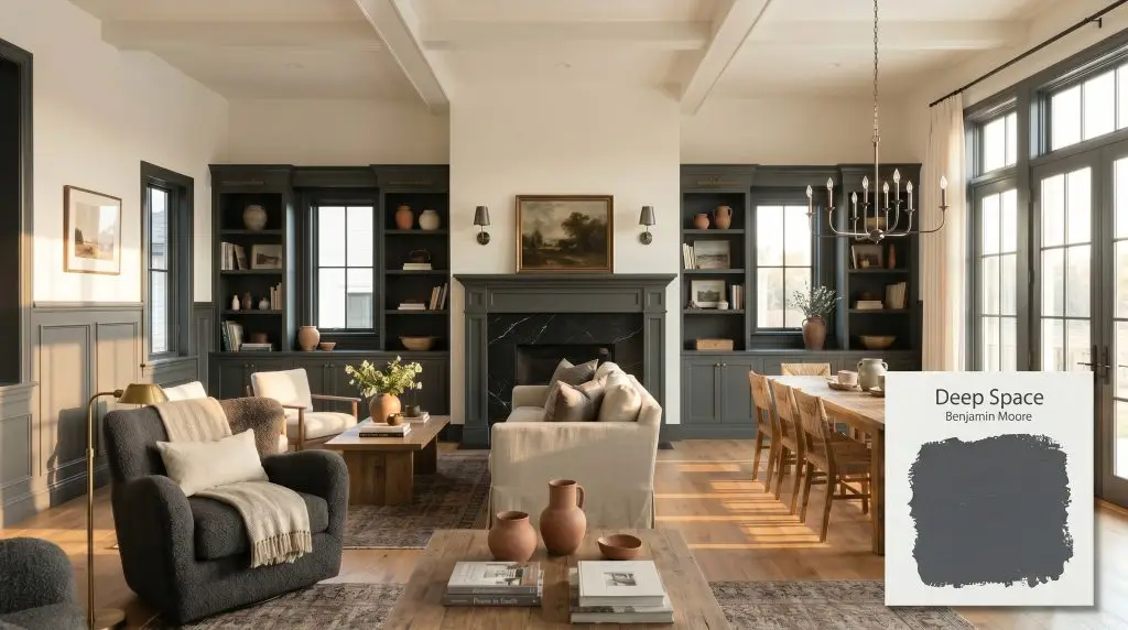
Deep Space 2125-20
Benjamin MooreBenjamin Moore Deep Space (2125-20) is a sophisticated, dark charcoal gray with prominent cool blue undertones. With an LRV of 10.8, it acts as a softer, chromatic alternative to stark black, bringing moody elegance to cabinetry, accent walls, and exteriors without feeling overwhelmingly heavy.
Paint Technical Profile
| Color ID / SKU | 2125-20 |
| HEX Code | #52565A |
| Light Reflectance (LRV) | 10.8 |
| Use | Interior, Exterior |
| Best Exposures | South-facing or well-lit West-facing |
| Best For | Cabinets, accent walls, moody powder rooms, exterior trim |
Benjamin Moore Deep Space: The Ultimate Guide to Curated Charcoal Drama
Most homeowners assume that achieving a truly moody interior requires painting a room in stark, unyielding black. That assumption often leads to spaces that feel flat, heavy, and completely devoid of life. Benjamin Moore Deep Space (2125-20) shatters that misconception by offering a rich, dimensional alternative that breathes alongside your architecture.
As a standout in Benjamin Moore’s Color Preview collection, this shade operates as a sophisticated shadow. It provides the grounding anchor of a dark palette while retaining enough hidden pigment to interact beautifully with shifting sunlight. If you want high-end contrast without the severity of a pure, light-devouring void, this highly curated shade is your answer.
Benjamin Moore Deep Space: Undertones & LRV
Understanding the structural DNA of this paint is the only way to harness its full potential.
With an LRV (Light Reflectance Value) of 10.8, Deep Space falls firmly into the dark category, characterized by heavy ambient light absorption. While it is significantly lighter than a true zero-LRV black, it still possesses a soft, velvety depth that will visually pull walls inward if not balanced correctly. You must treat this color as an active architectural element, using layered lighting and thoughtful material pairings to keep the room feeling expansive rather than enclosed.
Lighting Effects & The Chameleon Factor
The most common fear designers hear about this specific shade is that it will either turn your room into a claustrophobic cave or unexpectedly shift into a bright, “smurfy” blue. Both of these outcomes are entirely preventable. Because this is a true chromatic black, its cyan-blue core is highly reactive to the temperature of the light hitting it.
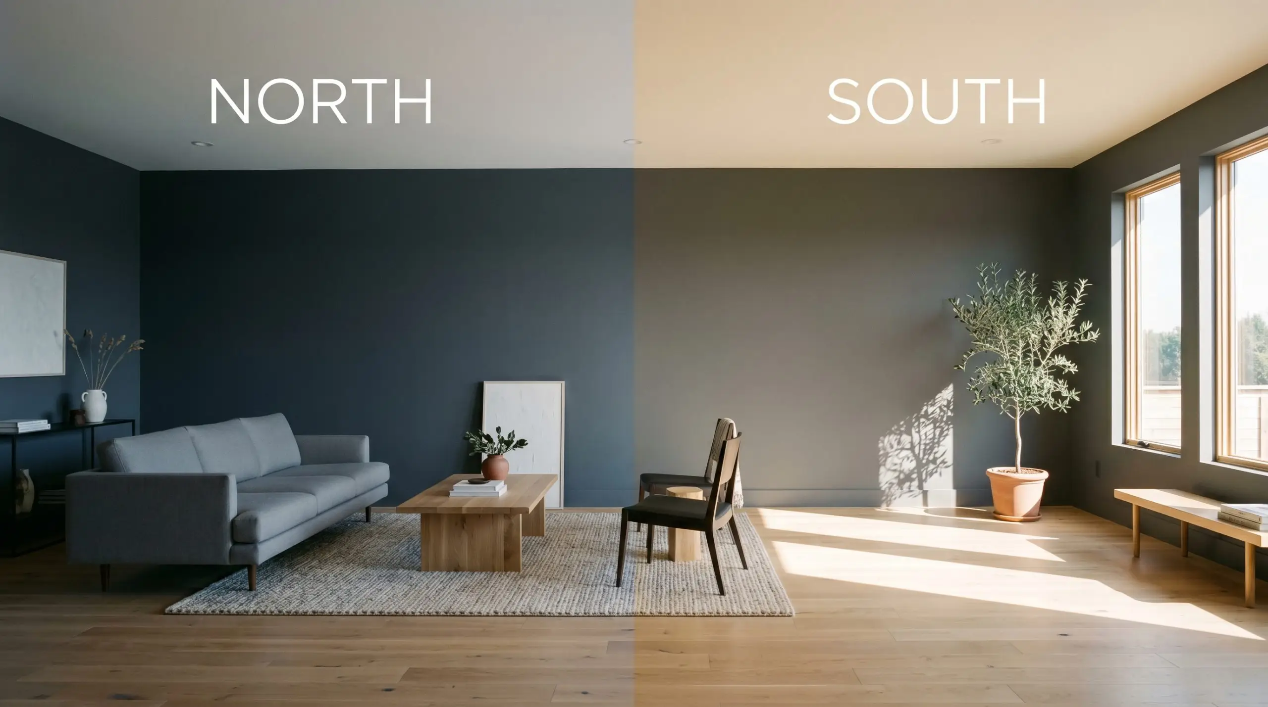
If you love the depth of Deep Space but are terrified of the blue undertones taking over, read our guide on how lighting affects paint undertones to master the exact bulb temperatures needed to lock this color into a neutral state.
Hackrea Pro-Tip
Shaping Atmospheres with Deep Space
This cool charcoal demands a specific type of spatial energy. It excels in environments where drama is the explicit goal, or where abundant natural light prevents its 10.8 LRV from visually flattening the room.
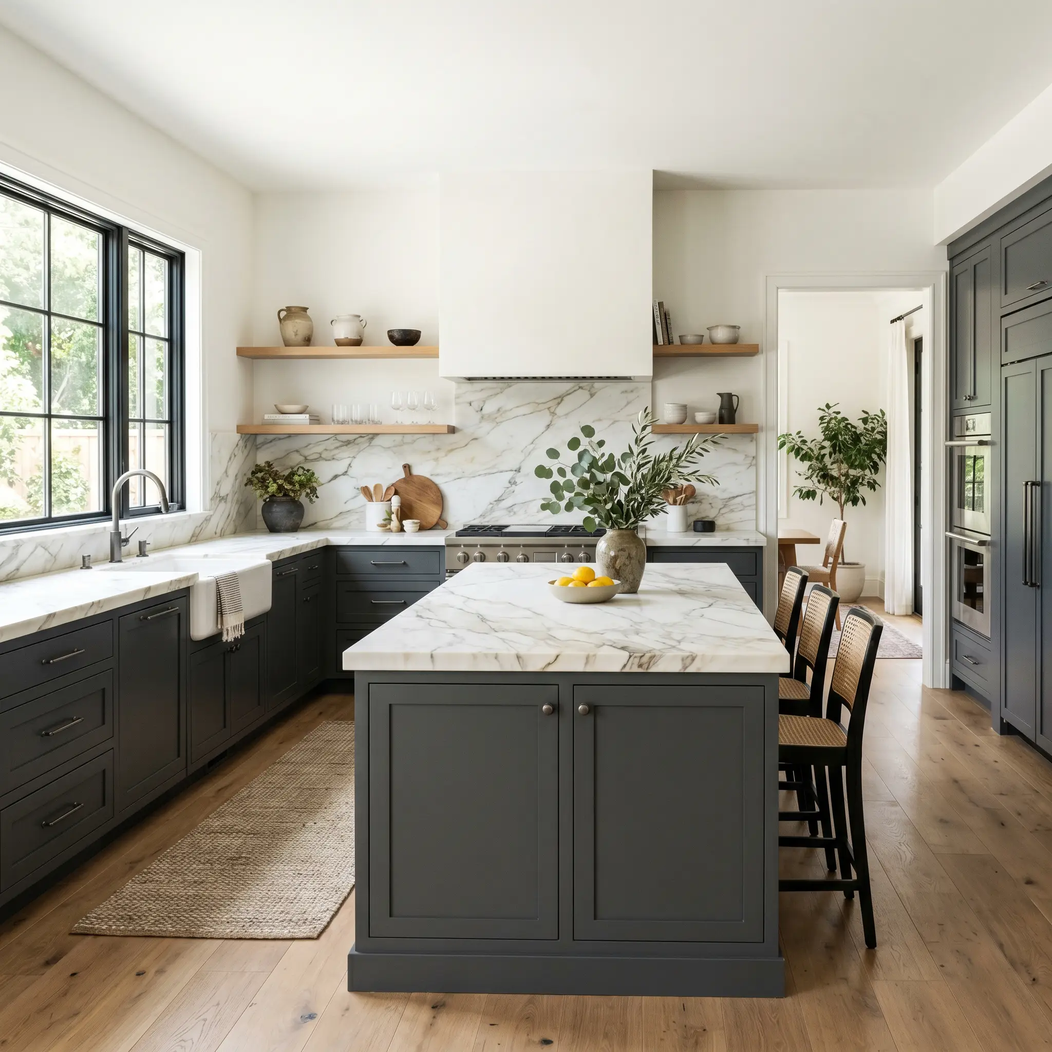
Kitchens
Dark cabinetry requires intentional contrast to avoid feeling heavy. When applying this shade to lower cabinets or an oversized island, it acts as a grounding anchor that beautifully offsets crisp white upper walls or heavily veined marble countertops. To prevent the kitchen from feeling sterile, ensure your hardware and lighting fixtures introduce warmth. If you are debating between this shade and a true black for your renovation, reviewing the best black paint colors for kitchen cabinets will help clarify your ultimate design direction.
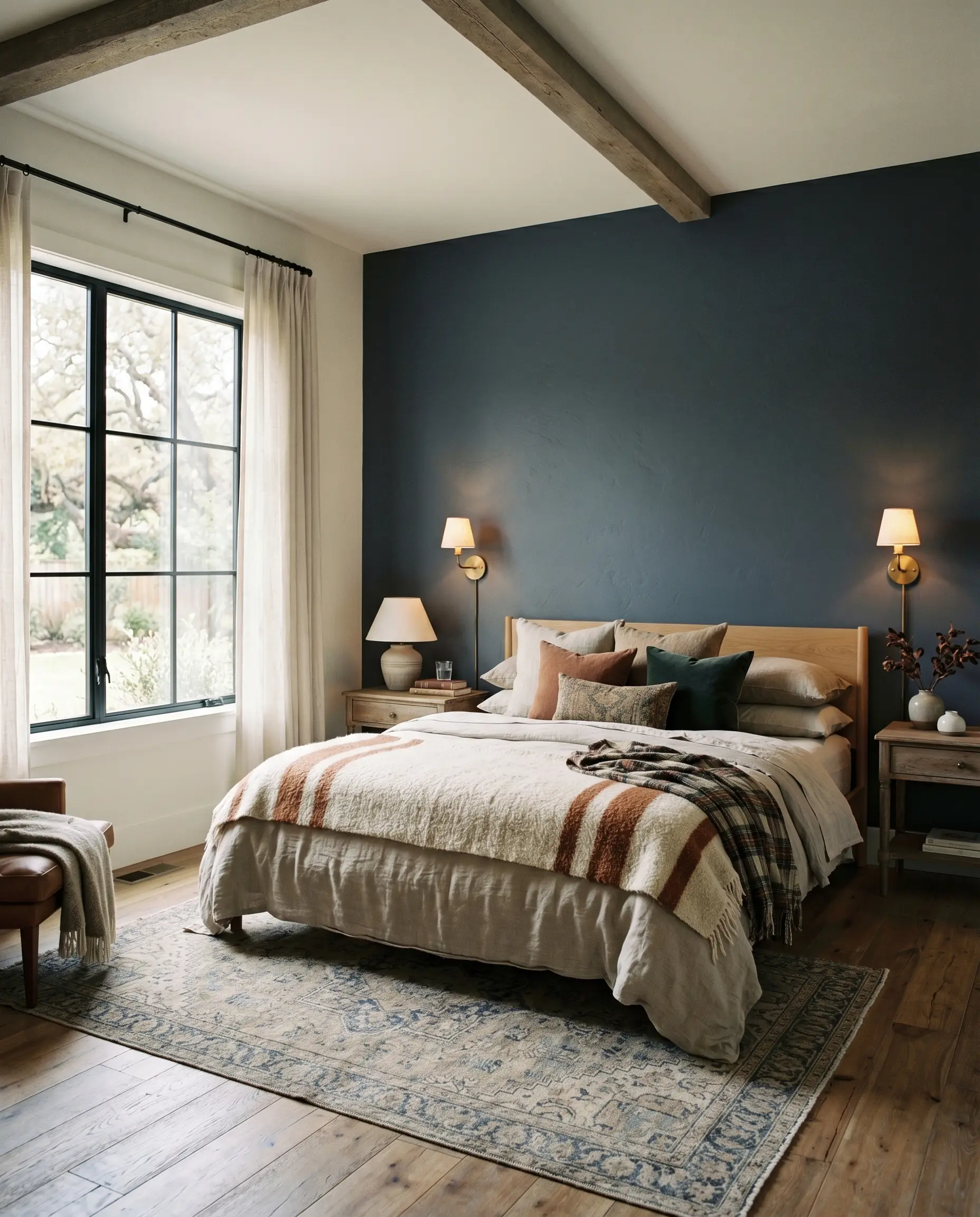
Bedrooms
In a resting space, this color creates a deeply cocooning effect. Rather than painting all four walls, consider using it as an anchoring feature behind the headboard, allowing the desaturated cyan-blue to softly emerge in the morning light. Pair it with layered, tactile bedding to soften the visual weight of the dark pigment. The key to success here is ensuring your bedside lighting casts a warm glow, neutralizing the cooler tendencies of the paint at night.
Powder Rooms
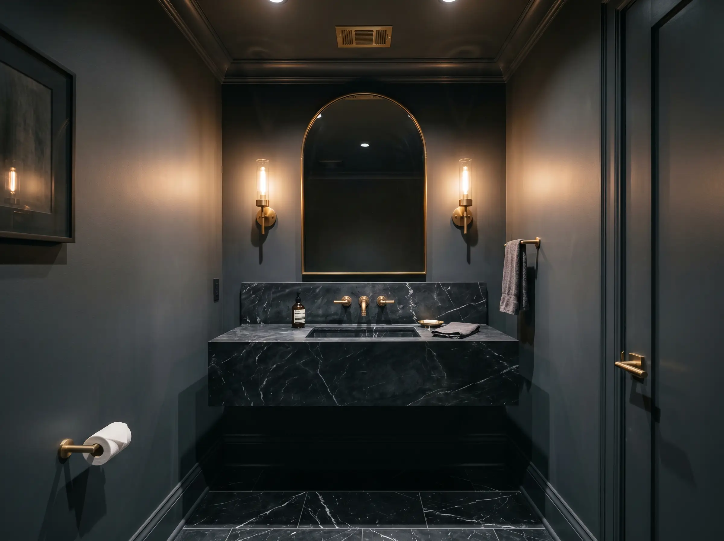
Powder rooms are the perfect playground for high-light-absorption colors. Because these spaces are inherently small and often windowless, fighting the lack of light with pale colors is a losing battle. Instead, leaning into the darkness with this rich charcoal creates a jewel-box effect. Wrap the entire room—walls, trim, and ceiling—in the color to blur the spatial boundaries, making the tiny room feel infinitely deep and incredibly chic.
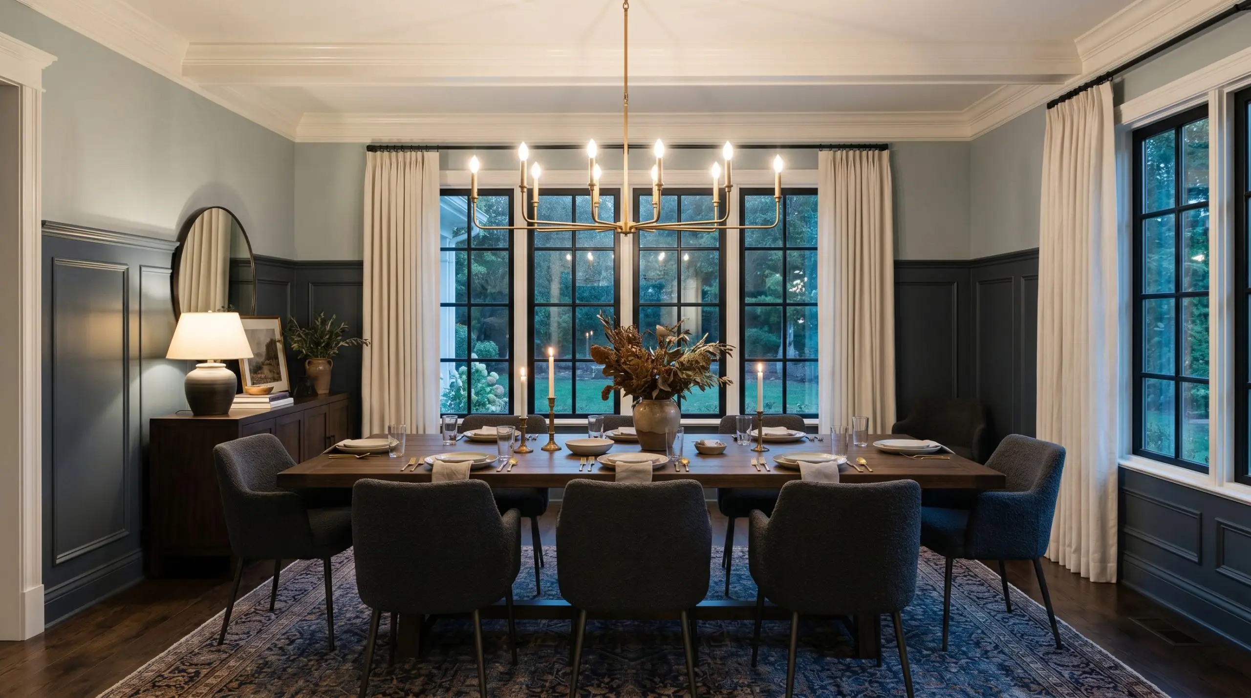
Dining Rooms
Formal dining spaces thrive on atmospheric tension. Applying this cool charcoal across traditional wainscoting or lower millwork grounds the space, providing a sharp, tailored contrast to a softer, lighter upper wall. The subtle blue shift under evening chandelier light adds a layer of conversational elegance that a standard gray simply cannot achieve.
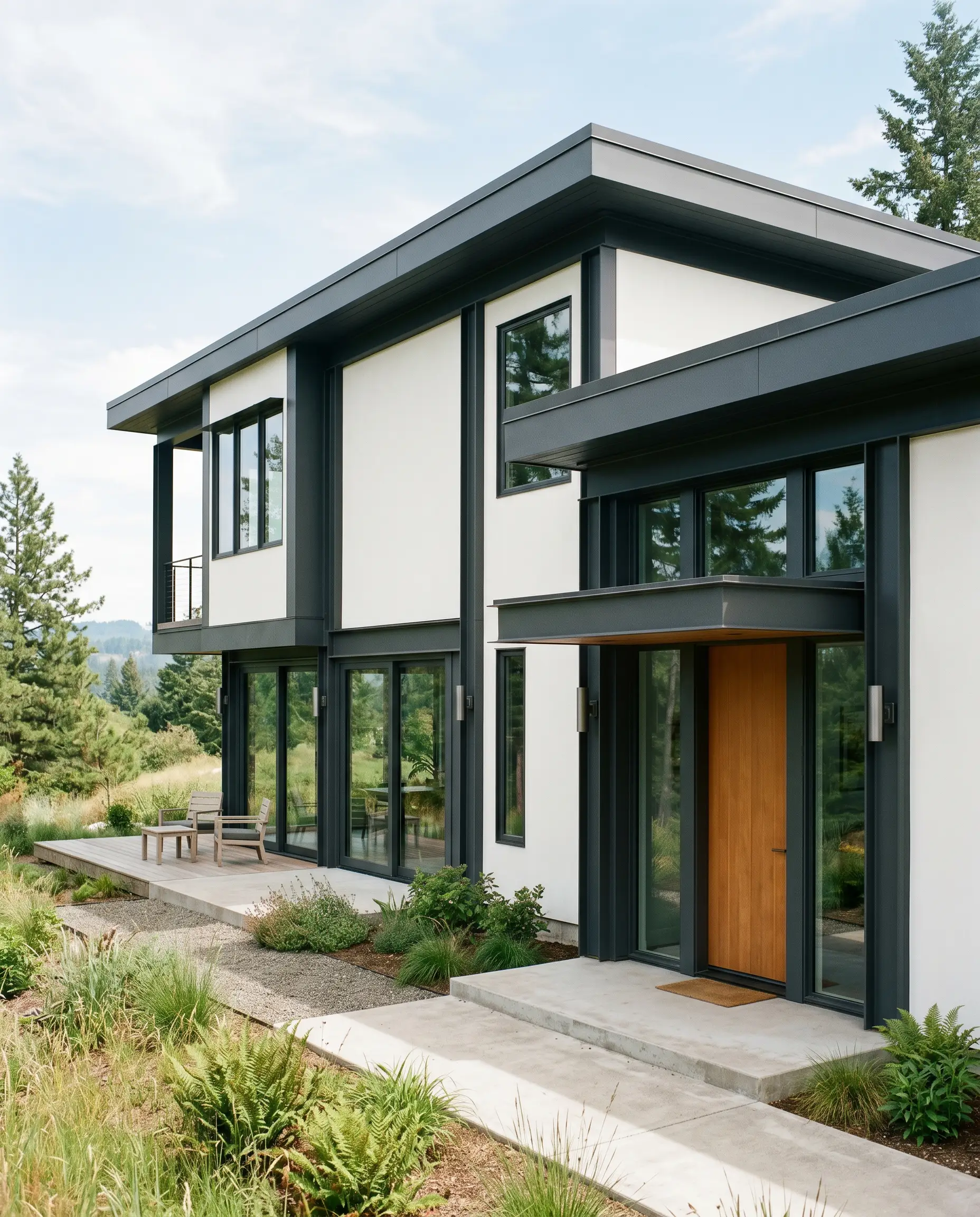
Home Exteriors
On an exterior facade, natural sunlight washes out dark colors significantly. Deep Space performs brilliantly here, losing its heavy interior density and reading as a crisp, tailored slate. It is an exceptional choice for modern architectural framing, striking front doors, or contrasting trim against a crisp white stucco. Be mindful of your regional sunlight; a southern exposure will render it quite neutral, while heavy tree cover will pull the blue forward.
Creative Ways to Use Benjamin Moore Deep Space
When you move beyond standard walls and basic trim, this paint becomes a tool for structural manipulation. Its specific density allows you to play with visual depth in highly curated ways.
Monolithic Floating Staircases
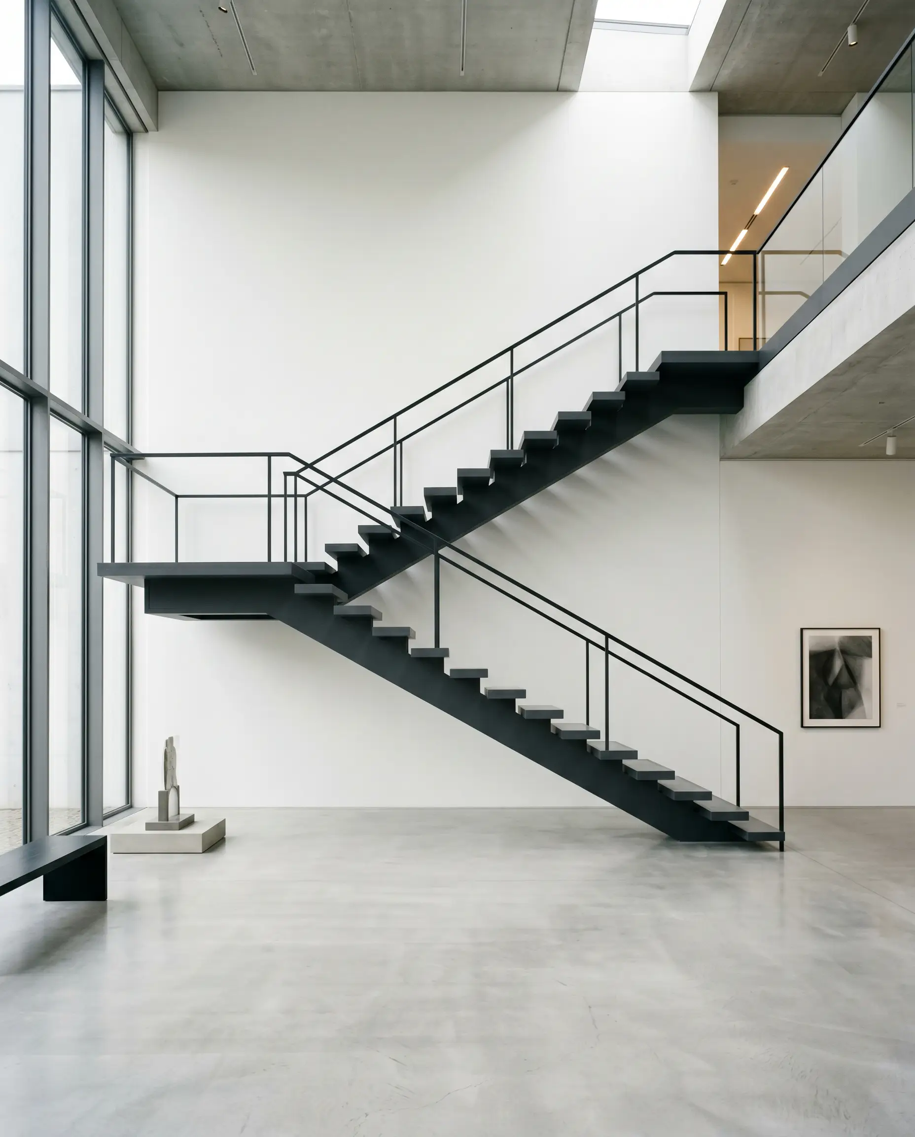
Instead of standard wood treads, imagine a modern, open-riser staircase where the entire structural stringer and the treads are drenched in this dark, cyan-tinged charcoal. The high ambient light absorption of the paint turns the staircase into a sculptural, graphic silhouette against a stark white gallery wall. The cool undertone prevents the structure from looking like a heavy industrial beam, giving it a sleek, tailored edge.
The Modernist Wine Vault
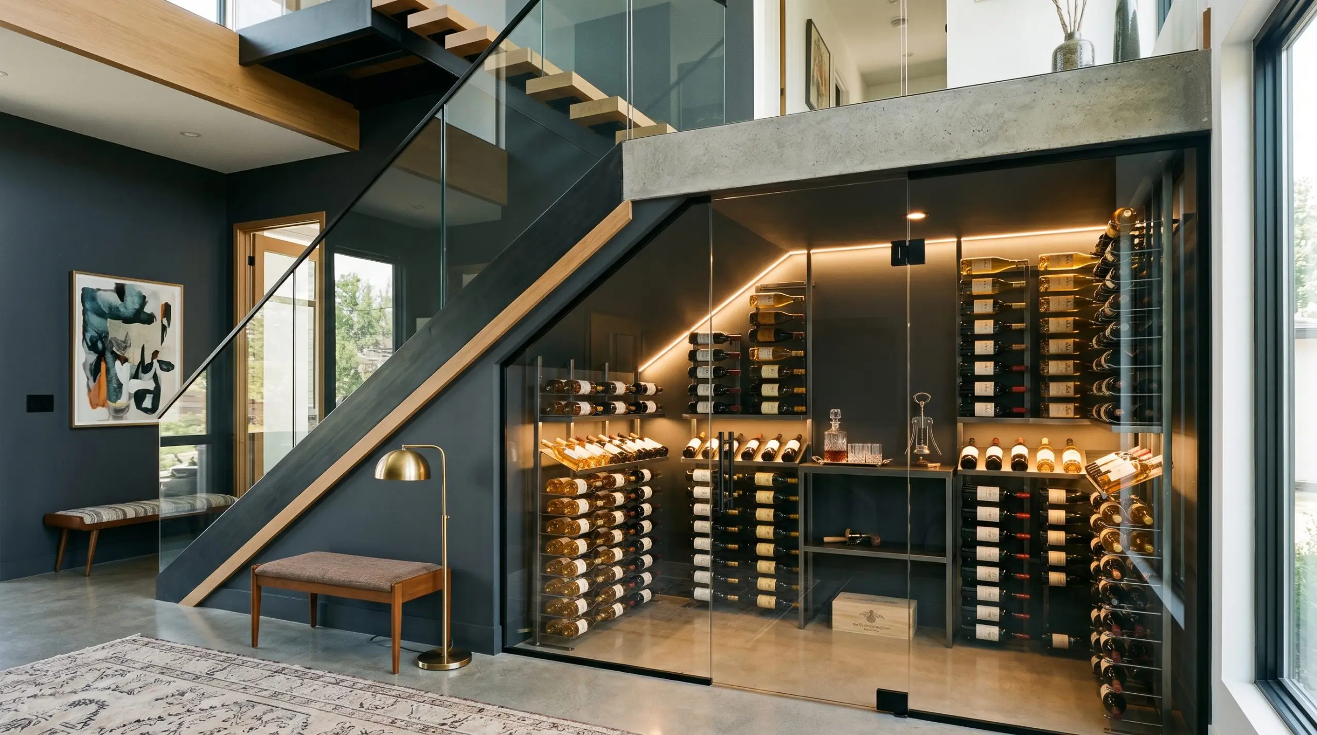
Transform a standard walk-in pantry or under-stair storage into a temperature-controlled, glass-enclosed wine vault. By painting the entire interior envelope—walls, ceiling, and shelving—in Deep Space, the bottles and integrated warm LED strip lighting become the sole focal points. The dark, cool background recedes entirely, creating an illusion of endless depth while making the amber tones of the wine and the glow of the lights incredibly vibrant.
The Architectural Ceiling Drop
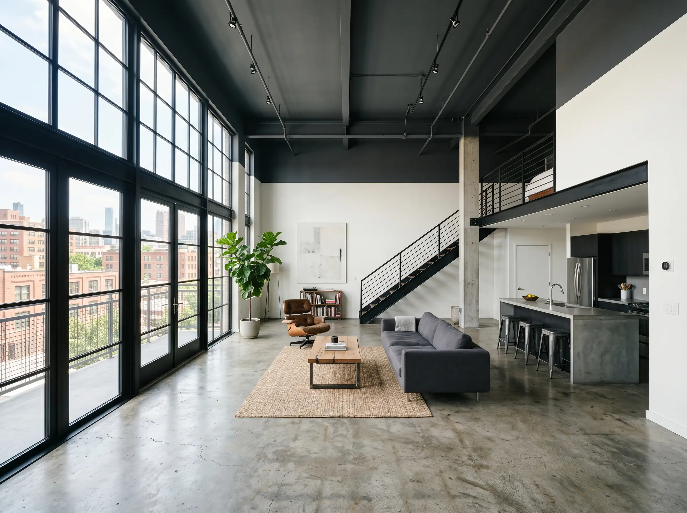
In open-concept lofts or spaces with excessively high ceilings that feel cold and uninviting, use this color to manipulate the vertical volume. Painting the ceiling and bringing the dark color exactly two feet down the upper walls creates a striking visual canopy. This technique instantly lowers the perceived height of the room, turning a cavernous, echoing space into a grounded, intimate environment.
The Pairings & Accents Guide for Deep Space
Styling a chromatic black requires a delicate balance of tension and harmony. Because this paint leans cool, it demands tactile materials and contrasting hues that either lean into its moody chill or deliberately interrupt it with necessary warmth.
Trim & Baseboards
To contain the energy of this dark shade, you need a crisp, highly reflective boundary.
Tactile Finishes & Textiles
The success of this paint relies heavily on the physical materials it touches. To bridge the gap between its cool undertones and the need for a livable space, introduce these specific textures:
Coordinating Colors
To build a cohesive palette, you must balance the cool depth of the main wall with supporting players that either warm it up or harmonize with its blue base.
Curated Mood Boards
Synthesizing these elements creates distinct, highly atmospheric aesthetics that can be applied to any spatial envelope.
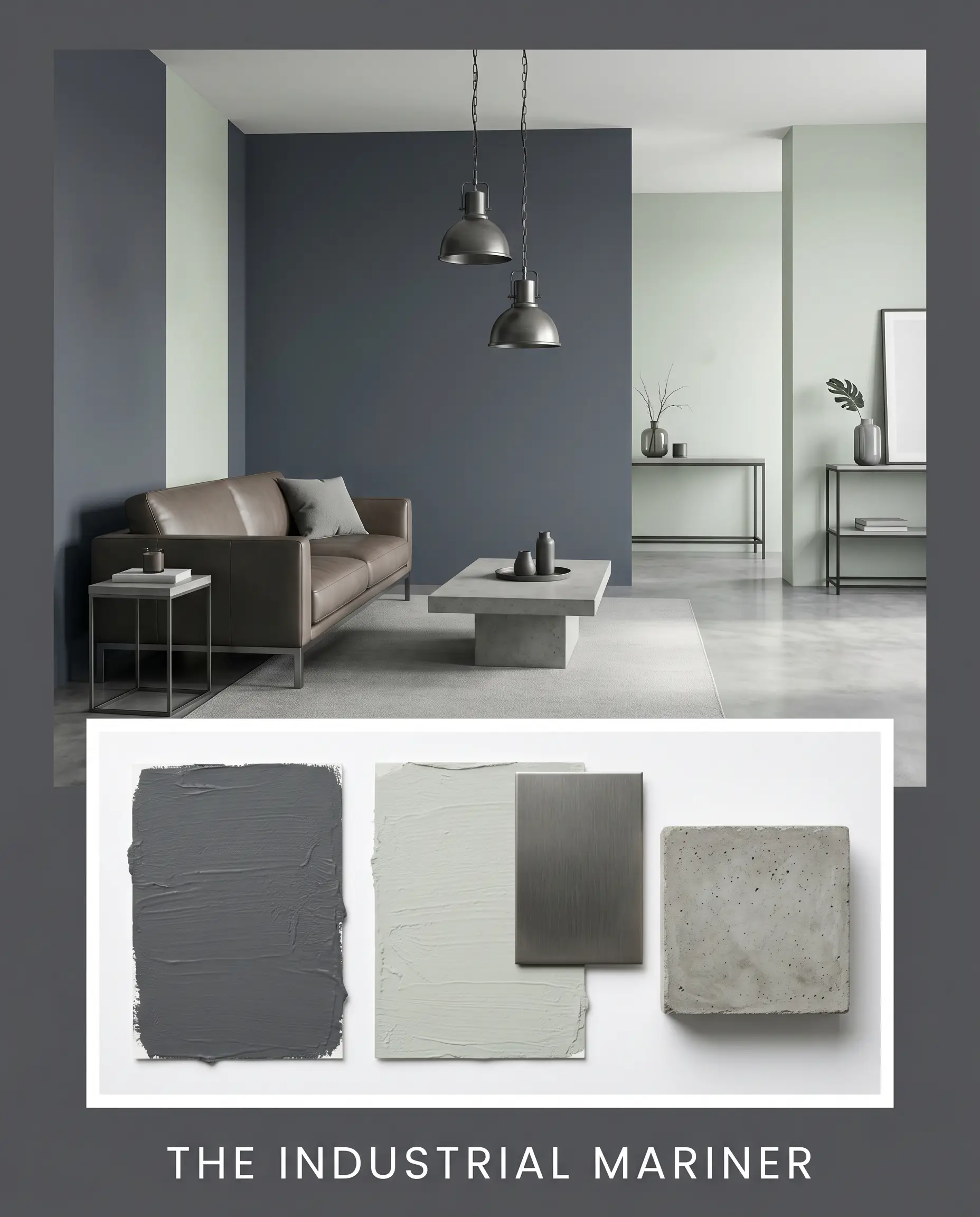
The Industrial Mariner: This palette leans heavily into the cool, structural nature of the paint. By pairing the deep charcoal walls with adjoining spaces in Sherwin-Williams Sea Salt (SW 6204), the environment feels crisp and tailored. The integration of brushed gunmetal hardware and raw, poured concrete accents reinforces a sleek, modern edge. Low-profile, minimalist furniture silhouettes and large-scale abstract monochromatic art complete this highly disciplined, light-absorbing aesthetic.
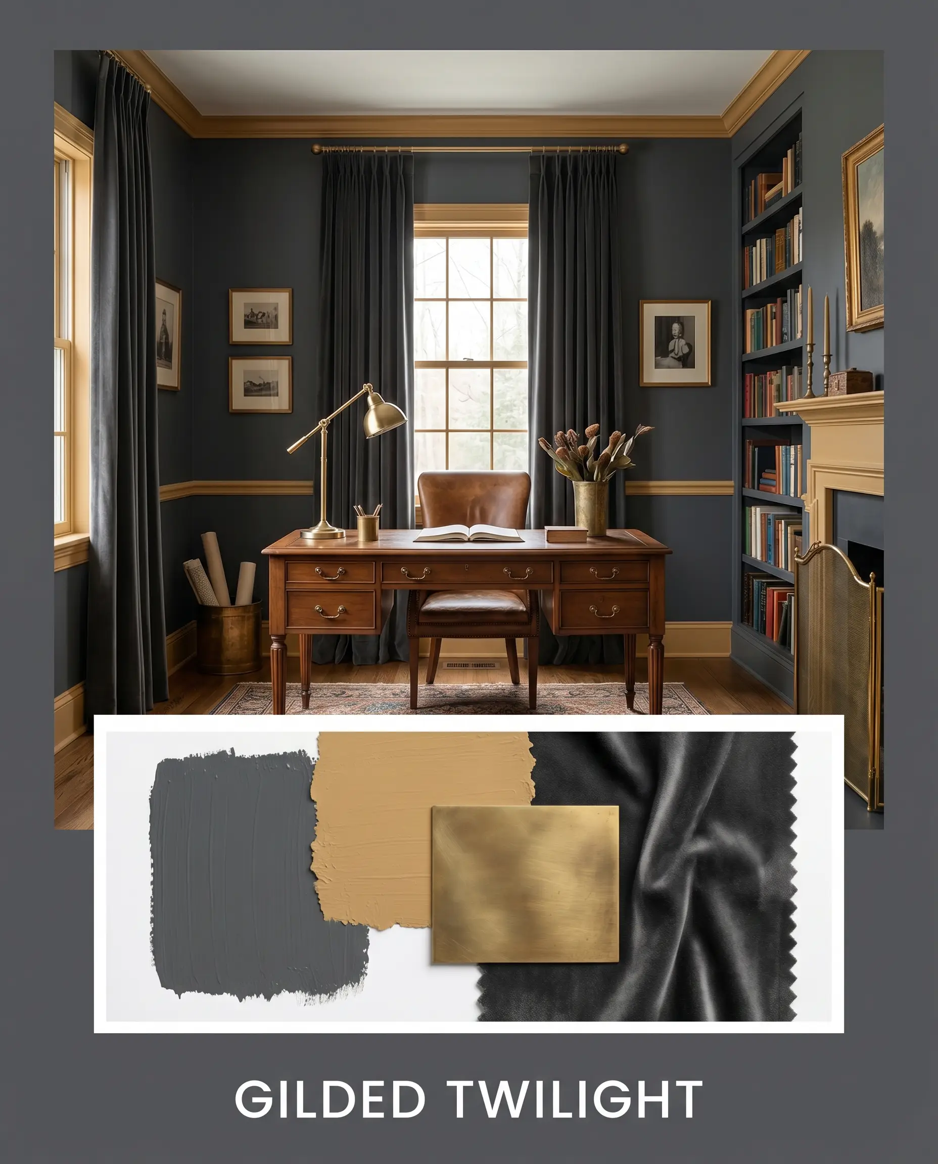
Gilded Twilight: For a richer, more opulent atmosphere, this palette uses tension to its advantage. The cool dark walls are interrupted by accents of Farrow & Ball India Yellow (No. 66), introducing a layer of historic warmth. Unlacquered brass lighting fixtures add a reflective, evolving patina that dances against the dark paint. The styling relies on heavy velvet textiles, traditional architectural moldings, and vintage, warm-toned rugs to create an environment that feels both deeply established and undeniably bold.
Deep Space vs. Top Competitors
When a designer abandons this specific charcoal, it is usually because the lighting conditions force the hidden undertones to behave unpredictably. Here is how it stacks up against its closest rivals.
Benjamin Moore Deep Space vs. Benjamin Moore Hale Navy (HC-154)
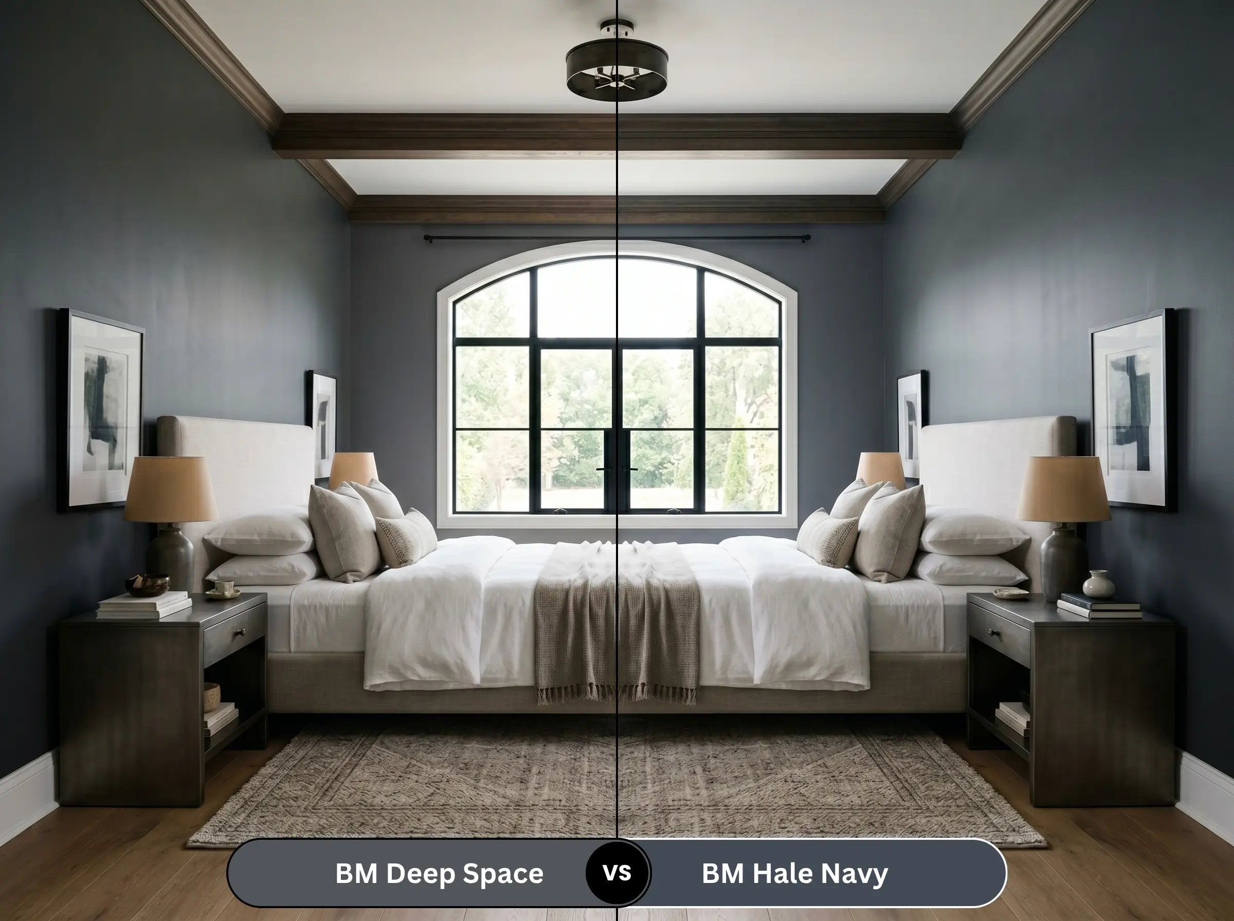
If you are terrified of your room looking too gray, Hale Navy is the pivot. While Deep Space is a charcoal with a blue undertone, Hale Navy is a definitive, undeniable navy blue with a gray undertone. Hale Navy feels distinctly more traditional and nautical, whereas the charcoal base of Deep Space provides a much sharper, contemporary edge.
Benjamin Moore Deep Space vs. Benjamin Moore Wrought Iron (2124-10)
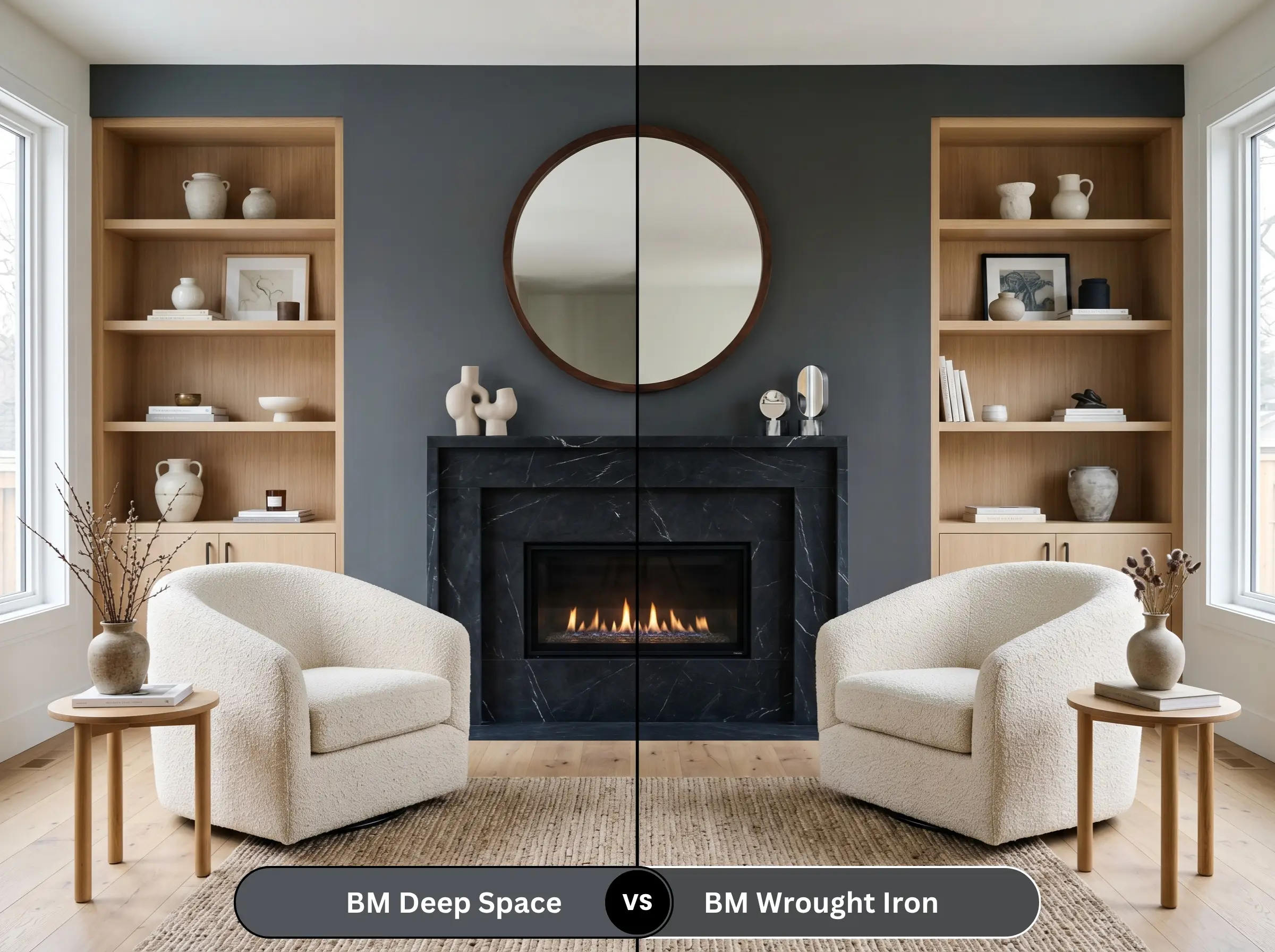
This is the battle of the dark neutrals. Wrought Iron (LRV 8.17) is darker and sits much closer to a true, neutral black-gray. It lacks the distinct cyan-blue chemistry of Deep Space. If your north-facing room is pulling too much blue out of Deep Space, switching to Wrought Iron will give you that desired moody depth without the icy color shift.
Benjamin Moore Deep Space vs. Sherwin-Williams Cyberspace (SW 7076)
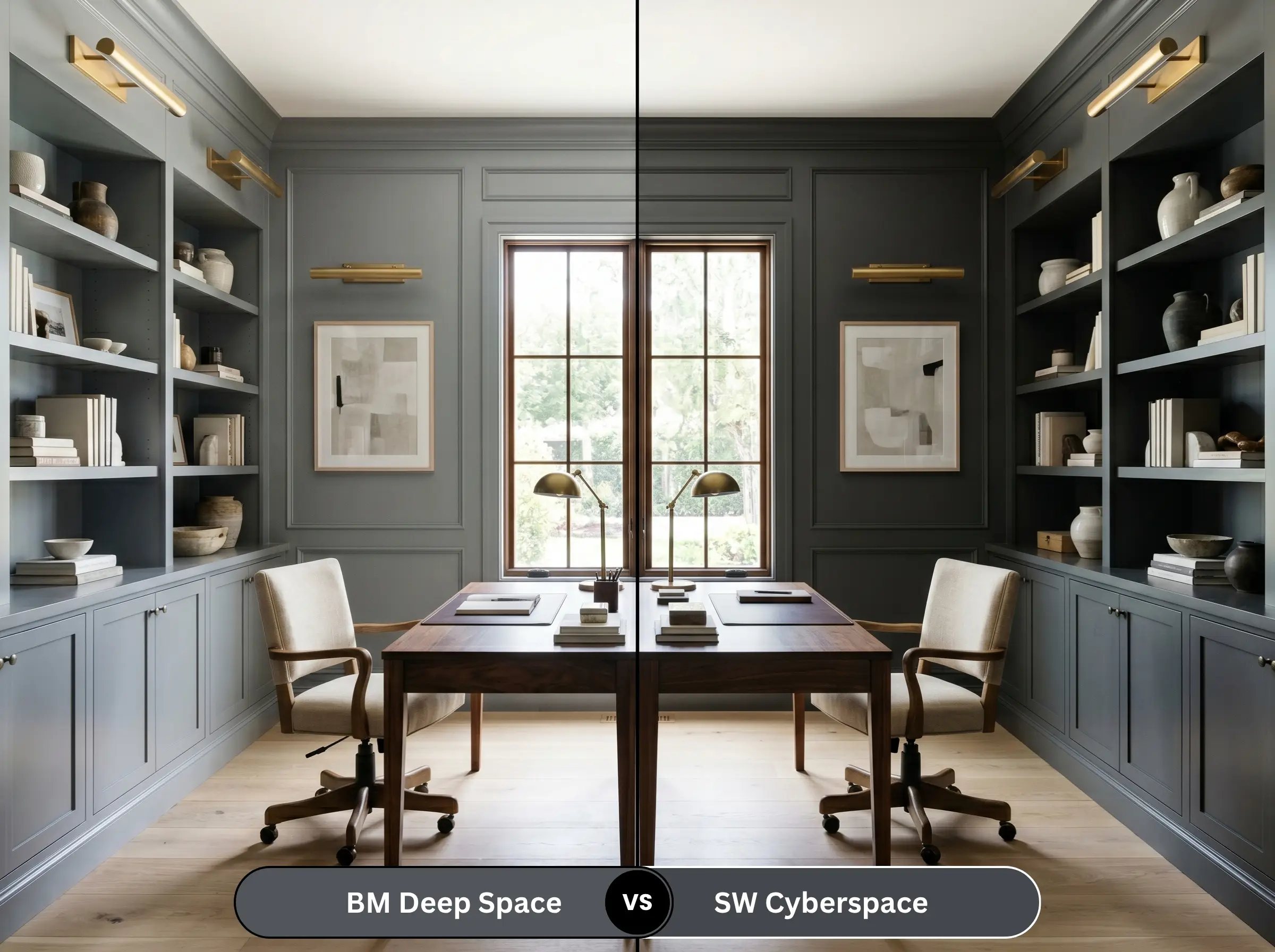
These two are incredibly similar, both operating as cool, deep charcoals. However, Cyberspace leans slightly more into a classic navy-slate, whereas Deep Space retains a touch more of that desaturated cyan. If you want the color to read slightly softer and more washed in bright light, Deep Space is the winner.
Alternative Chromatic Blacks & Matches
If you need to tweak the depth or switch brands entirely, these are the closest structural matches.
Same-Brand Alternatives
Cross-Brand Matches
Executing Benjamin Moore Deep Space Like a Pro
The difference between a high-end designer finish and a patchy DIY job comes down to how you physically apply a dark, light-absorbing pigment to the wall.
The Dynamic Sheen Guide
Dark colors highlight every single flaw in your drywall. To ensure a flawless finish, follow these sheen rules:
Primer Strategy
You cannot paint this over a standard white wall without a primer. The high contrast will require endless coats to achieve true opacity. You must use a deep-tinted gray primer. This builds the necessary base depth, allowing the cyan-blue undertones of the charcoal to render accurately without a chalky, washed-out appearance.
Coverage & Touch-Ups
Expect to apply two full coats over your tinted primer. Be highly cautious of “flashing”—visible roller marks that occur when you press too hard or roll over partially dried paint. Because you are using a dark color in a matte finish, touch-ups are notoriously difficult. If the wall gets scuffed later, you will likely need to repaint the entire wall corner-to-corner, as spot touch-ups will almost always show a different sheen level.
Frequently Asked Questions
No, it does not have a red or violet base. Because its core undertone is a desaturated cyan-blue, it will shift toward a slate-navy or a cool charcoal outdoors, but it will not pull purple.
It performs exceptionally well. While a true zero-LRV black can feel like a flat, heavy void in a windowless space, the subtle blue pigment in this shade catches artificial vanity lighting, providing a sense of depth and dimension that keeps the room feeling chic rather than oppressive.
Yes, if you paint the ceiling stark white. The sharp contrast creates a harsh horizontal line that visually chops the room. To prevent this, paint the baseboards, walls, and crown molding all in the same dark color to blur the boundaries, which actually makes the ceiling feel taller.
Benjamin Moore’s proprietary Gennex Color Technology removes the chemicals that typically cause dark paints to degrade rapidly. This means the deep charcoal and cool blue pigments will resist UV fading and chalking significantly longer than standard exterior paints, even under harsh southern sun.
The Final Verdict on Deep Space
Benjamin Moore Deep Space is an architectural tool designed for spaces that demand sophisticated, intentional drama. It is the perfect selection for the homeowner who craves the grounding authority of a dark palette but possesses the design savvy to know that a true, flat black is often too harsh. It excels in intimate powder rooms, tailored dining spaces, and sleek exterior facades where its cool, cyan-blue undertone can act as a dynamic, shifting feature rather than a static backdrop.
However, this color requires careful environmental control. If you attempt to use this shade in a dimly lit, narrow hallway paired with warm, yellow-toned oak floors and beige travertine tiles, the cool blue core of the paint will clash uncomfortably with the earthy yellows, creating a muddy, discordant atmosphere. It also demands a strict commitment to proper lighting; failing to layer your ambient and task lighting will allow the heavy light absorption to overwhelm the room. When paired with crisp whites, cool metals, and intentional lighting, it delivers a deeply curated, high-end finish that standard grays simply cannot touch.