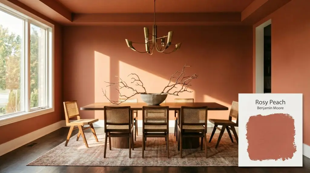
Rosy Peach 2089-20
Benjamin MooreBenjamin Moore Rosy Peach (2089-20) is a warm, medium-deep peachy rose with earthy red-brown depth. It acts as a muted, charismatic terracotta-pink that avoids looking like a bright coral, bringing a grounded, friendly vibrance to interior spaces.
Paint Technical Profile
| Color ID / SKU | 2089-20 |
| HEX Code | #B55E4F |
| Light Reflectance (LRV) | 18.97 |
| Use | Interior |
| Best Exposures | South, West |
| Best For | Dining Rooms, Libraries, Accent Walls, Bathrooms |
Benjamin Moore Rosy Peach 2089-20: How to Master This Earthy Terracotta-Pink
Homeowners often avoid the peach and pink color families, fearing a room that feels overly sweet or uncomfortably juvenile. Benjamin Moore Rosy Peach 2089-20 completely shatters that hesitation. This is not a sugary pastel; it is a highly sophisticated, baked terracotta-pink that acts as a substantial architectural finish.
Part of the renowned Color Preview Collection, this shade relies heavily on Benjamin Moore’s Gennex Color Technology to maintain its complex chromatic profile. It brings an incredible, steadying warmth to a room without screaming for attention. When paired with the right materials, it transforms standard drywall into something that feels intentional, tactile, and rooted in nature.
Whether you are updating a suburban dining room or adding character to a mid-century fixer-upper, this color demands a thoughtful approach. We are going to break down exactly how this earthy hue behaves, how sunlight manipulates its surface, and the most effective ways to style it across your home.
Undertones & LRV of Benjamin Moore Rosy Peach
When clients ask if Benjamin Moore Rosy Peach is warm or cool, the answer is definitively, undeniably warm. The entire color structure is built on a foundation of baked earth and sun-drenched clay. To use this shade successfully, you must understand the hidden pigments that keep it from looking like a bright, tropical coral.
Here is the exact DNA of this color:
With a light reflectance value (LRV) of 18.97, this specific paint absorbs a significant amount of light. It sits firmly in the medium-dark category, meaning it carries substantial visual weight.
You cannot treat an 18.97 LRV like a passive neutral. It will advance toward the eye, making large rooms feel more intimate and small rooms feel incredibly cozy. Because it absorbs so much illumination, you must plan your artificial lighting layout carefully to prevent the space from feeling dim or shadowy in the evenings.
Lighting Effects: The Chameleon Factor
Every paint color shifts throughout the day, but complex terracotta shades are notorious shape-shifters. The specific direction of your windows will either pull the brown undertones forward or ignite the underlying orange.
Here is exactly how Rosy Peach 2089-20 reacts to different lighting scenarios:
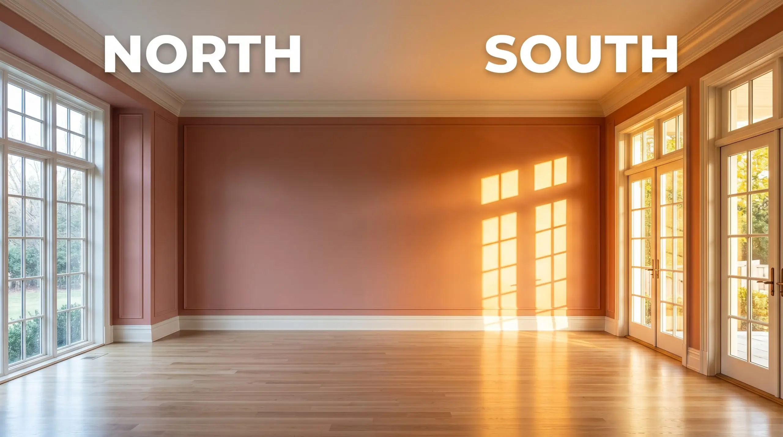
If you are using this color in a room with limited natural light, strictly avoid daylight bulbs. Stick to 3000K bulbs for a clean, balanced glow that honors the earthy pink without turning it overly yellow or washing it out.
Hackrea Pro-Tip (The Bulb Rule)
Popular Applications for Rosy Peach 2089-20
The true beauty of this muted warmth lies in its physical application. Because it possesses such a strong architectural finish, it rarely looks good when slapped onto a single random wall without context. It requires intentional pairings, contrasting textures, and thoughtful styling to truly shine.
Here is how to successfully integrate this earthy terracotta-pink into real-world spaces.
Dining Rooms
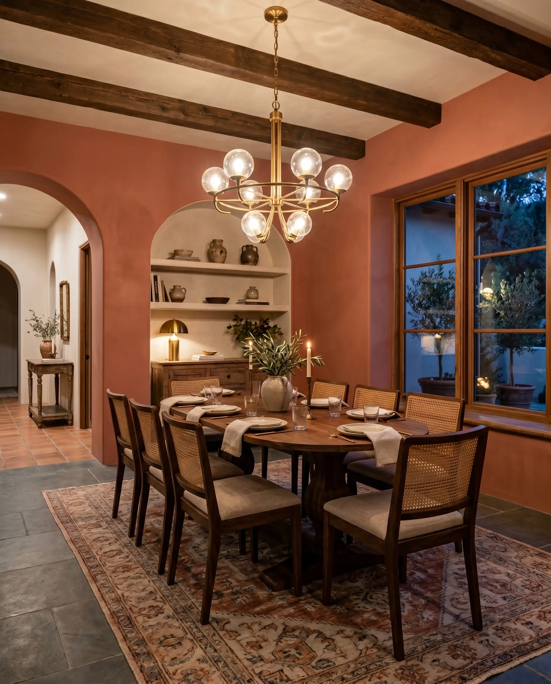
A dining room is the perfect canvas for a medium-dark, resonant color because these spaces are typically used in the evening when ambiance is the priority. Instead of standard wainscoting, consider wrapping the entire room in a matte finish to create a soft, velvet-like backdrop. This approach beautifully supports a Mediterranean or warm modern aesthetic.
To balance the visual weight of the walls, introduce organic, high-contrast materials. A large walnut pedestal table paired with cane-back chairs instantly grounds the room. Hang an unlacquered brass chandelier overhead; the raw metal will naturally complement the earthy red-brown depth of the paint.
If you want to keep the styling accessible but elevated, focus on your textiles. Drape the table in washed linen napkins, style a stoneware bowl filled with oversized branches, and layer a vintage rug underneath. The resulting space feels curated, intimate, and effortlessly ready for a dinner party.
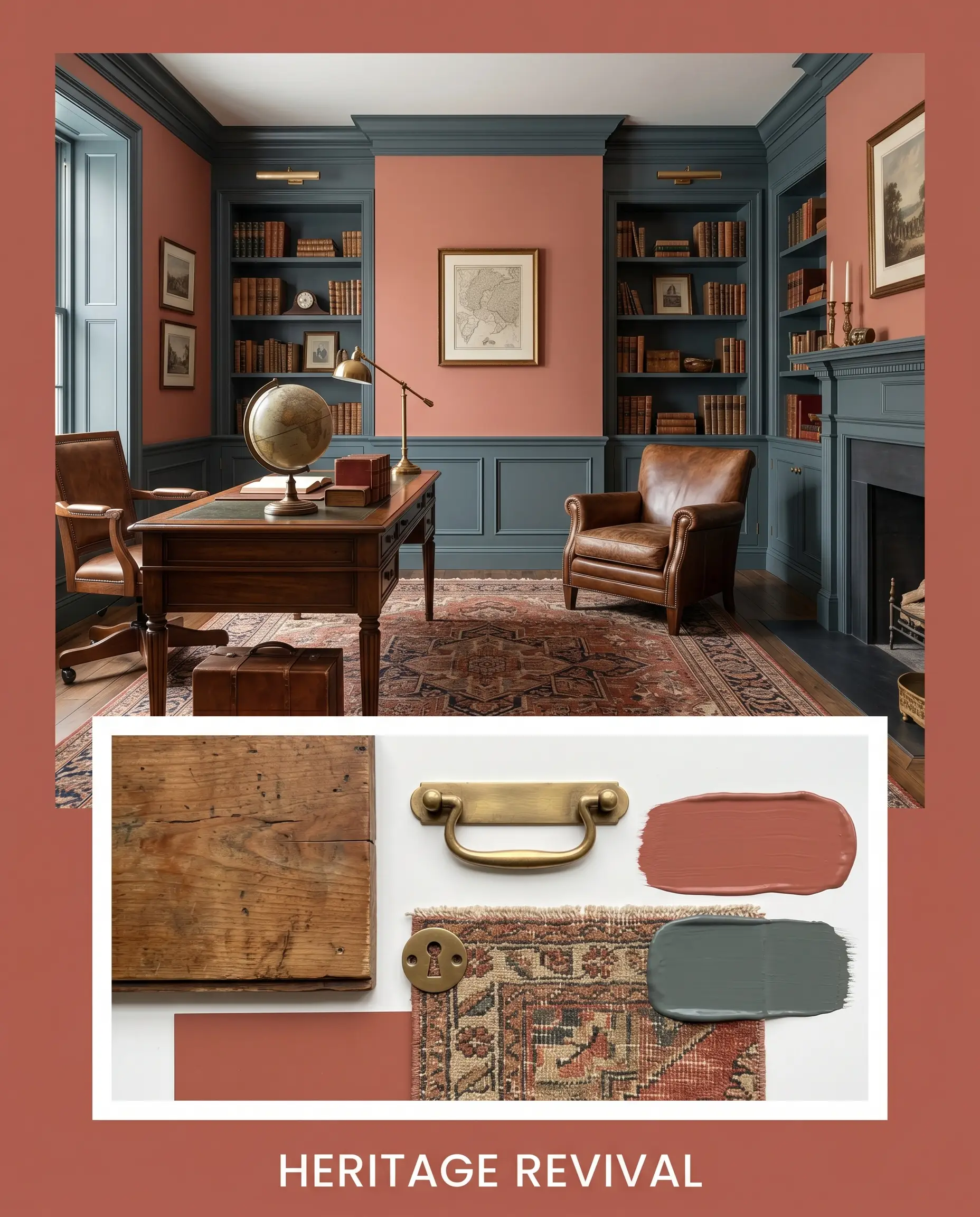
Libraries and Studies
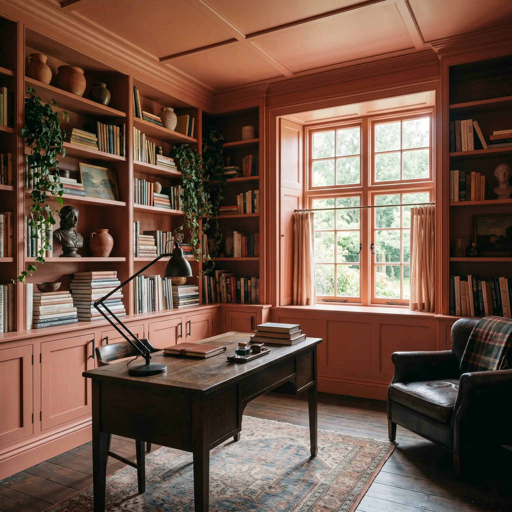
When designing a home office or study, many homeowners default to predictable navy blues or forest greens. Using this peachy rose cast instead offers a brilliant, unexpected twist on the classic moody library. It provides a steadying, creative energy that looks fantastic behind a zoom camera.
For maximum impact, execute a full color-drenching strategy. Paint the walls, the baseboards, the window casings, and the built-in bookcases all in the same shade. This erases the visual boundaries of the room, allowing the books and artwork to pop against the terracotta background.
Style the shelves with stacked art books, sculptural ceramics, and trailing ivy to break up the solid color. Introduce a blackened steel desk lamp or matte black cabinet hardware to provide a sharp, modern contrast that keeps the room from feeling too soft or overly traditional.
Accent Walls and Ceilings
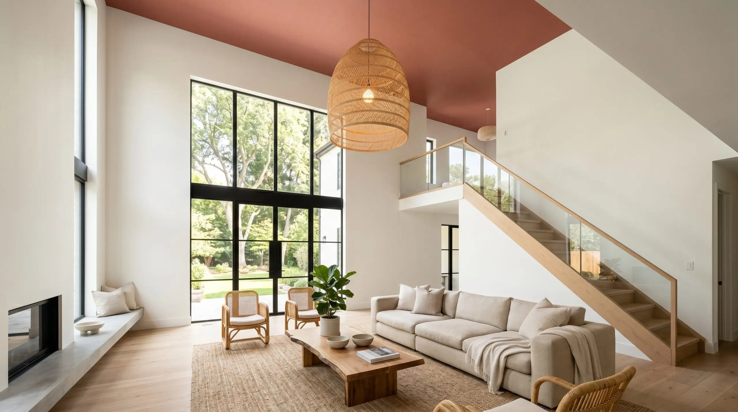
While we generally advise against isolated accent walls, this specific color structure works beautifully when used to highlight a specific architectural feature. Instead of painting a flat, featureless wall, use it to define an arched doorway, a recessed alcove, or a built-in banquette seating area.
If you have a room with crisp, warm white walls (like Benjamin Moore White Dove), painting just the ceiling in this muted terracotta draws the eye upward and makes a tall, cavernous room feel incredibly cozy and enveloped.
Hackrea Design Secret (The Fifth Wall)
When using it as a ceiling accent, ensure your lighting fixtures are doing the heavy lifting. A large, textured pendant light—like a woven rattan shade or a pleated fabric drum—will cast a beautiful, diffused glow against the pink ceiling, enhancing the sunset-like atmosphere of the room.
Bathrooms
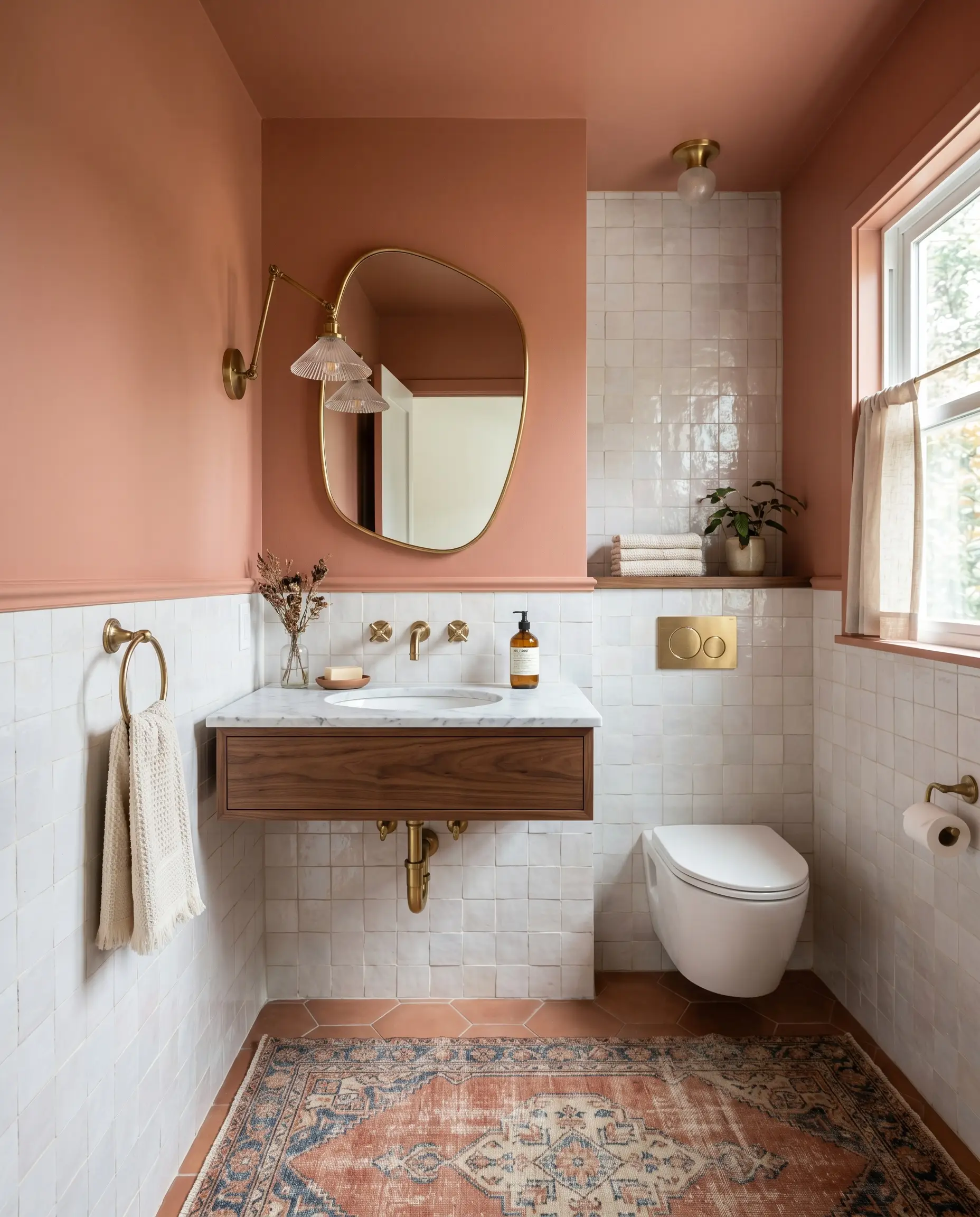
Bathrooms often suffer from an excess of cold, hard materials like porcelain, glass, and chrome. Introducing this earthy pink to the walls instantly injects much-needed warmth and softens the harsh acoustics of the space. It is particularly effective in a powder room where you want to create a jewel-box effect.
To elevate the design, pair the painted drywall with highly tactile materials. A backsplash of perfectly imperfect, pearlescent zellige tiles will bounce light around the room, counteracting the paint’s light-absorbing qualities. Swap out standard builder-grade mirrors for an asymmetric brass design to add a touch of organic modernism.
If a full bathroom renovation isn’t in the cards, you can achieve a massive transformation through styling. Keep your existing white subway tile, paint the upper walls in this rich shade, and bring in a vintage runner rug and soft, slub cotton towels. The contrast between the crisp white tile and the baked clay walls is striking and highly intentional.
Interior Cabinetry Backings
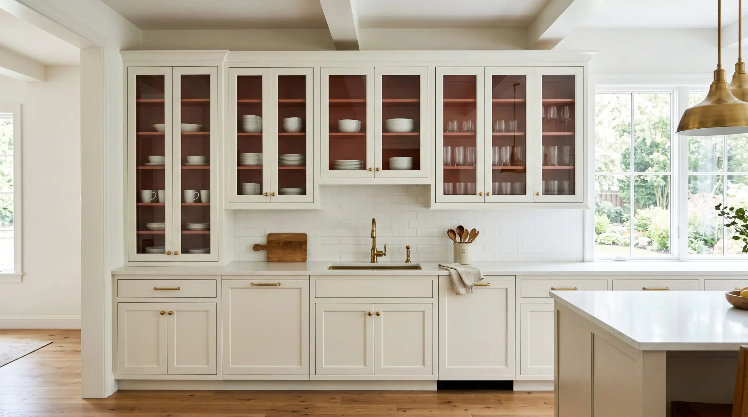
If you love the idea of this color but aren’t ready to commit to a full room, applying it to the interior backing of cabinetry is a brilliant, low-risk strategy. This technique works wonders inside glass-front kitchen cabinets, open floating shelves, or an antique armoire used for linen storage.
The unexpected flash of terracotta-pink creates a beautiful backdrop that makes everyday objects look like curated art. Crisp white dishware, clear reeded glass, and silver serving pieces will stand out brilliantly against the dark, warm background.
This is also a fantastic weekend project that requires minimal paint but delivers maximum visual reward. Just ensure you use a durable, cabinet-grade finish so the surface holds up to the daily friction of plates and glassware sliding across it.
Designing with Benjamin Moore Rosy Peach: Pairings and Palettes
This specific terracotta-pink requires intentional boundaries to hold its shape against competing elements in a room. Rather than letting it bleed into stark, icy whites, it thrives when framed by nuanced neutrals and grounded by highly tactile organic textures.
Perfecting the Trim and Baseboards
When selecting a trim color, you must look for whites that share a similarly warm, earthy undertone. Benjamin Moore White Dove OC-17 is an exceptional choice because its subtle greige base melts beautifully into the pink, creating a soft, tailored boundary. It provides enough contrast to look crisp without jarring the eye.
If you prefer a slightly creamier transition, Sherwin-Williams Alabaster SW 7008 offers a warm, diffused glow that prevents the trim from looking overly modern. For a truly seamless, historic feel, Farrow & Ball Pointing No. 2003 is a brilliant match. Because Pointing has a faint red-based undertone, it physically harmonizes with the rosy clay walls, resulting in a cohesive, enveloping atmosphere.
Tactile Finishes and Hardware Pairings
To truly elevate this color structure, you must introduce materials that engage in a visual dialogue with its baked-clay origins. Unlacquered brass hardware is the ultimate companion for this shade. As the raw metal develops a living patina over time, it pulls out the subtle orange notes in the paint, creating a brilliantly curated, aged aesthetic.
To ground the room’s medium-dark light reflectance value, introduce matte soapstone surfaces. The charcoal, chalky finish of the stone absorbs light just like the paint does, establishing a beautifully moody and substantial foundation. This prevents the pink from feeling too airy or unmoored.
Finally, soften the architectural finish with organic, accessible textures. Natural rattan furniture or woven cane accents introduce necessary friction and break up the solid blocks of color. Layering in textiles like oatmeal-colored washed linen will instantly relax the room, making the sophisticated terracotta feel welcoming and lived-in.
Building a Cohesive Palette
Styling the Aesthetic
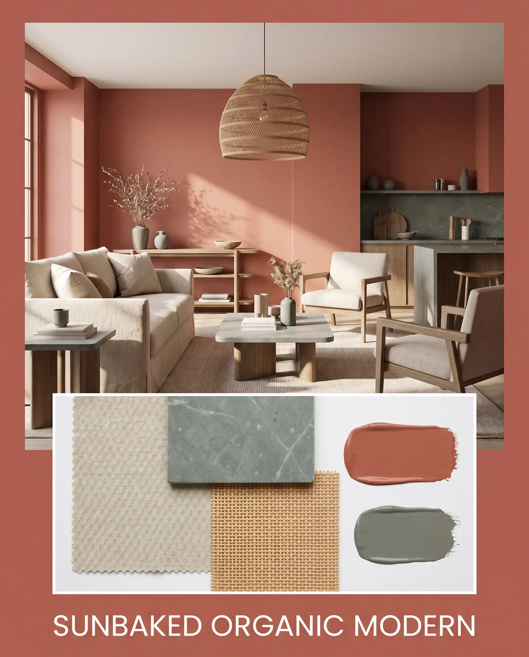
Sunbaked Organic Modern This palette strips away traditional fussiness and leans entirely into raw, tactile warmth. The walls provide a steadying, baked-clay foundation that pairs flawlessly with minimalist silhouettes and natural fibers. Layering oatmeal washed linen upholstery against the muted pink creates a relaxed, sun-drenched energy.
To keep the look sharp and intentional, introduce matte soapstone surfaces and subtle accents of Sherwin-Williams Retreat SW 6207. A woven rattan pendant overhead and scattered sculptural ceramics complete the vibe. The resulting atmosphere feels like an upscale, earthy retreat that prioritizes comfort and organic texture.
Heritage Revival For a more historic, collected atmosphere, this palette uses the paint’s earthy red-brown depth to mimic the look of aged plaster. The walls serve as a moody, sophisticated backdrop for antique woods and rich, layered styling. Unlacquered brass hardware is essential here, providing a glint of historic charm that bounces light around the space.
Contrast the warm walls with deep, moody accents painted in Farrow & Ball Inchyra Blue No. 289 to establish a sense of refined drama. Style the environment with vintage rugs, stacked art books, and framed botanical prints. The tension between the warm terracotta and the stormy blue creates a beautifully curated, timeless energy.
Benjamin Moore Rosy Peach vs. Rival Terracotta Paints
Choosing the right terracotta often comes down to the specific lighting conditions and architectural flow of your home. While our primary shade offers a balanced, historic pink, certain exposures or styling goals might require a color with a slightly different chromatic profile. If your space lacks natural light or if you want a more literal clay aesthetic, you may need to pivot.
Benjamin Moore Rosy Peach vs. Benjamin Moore Baked Terra Cotta 1202
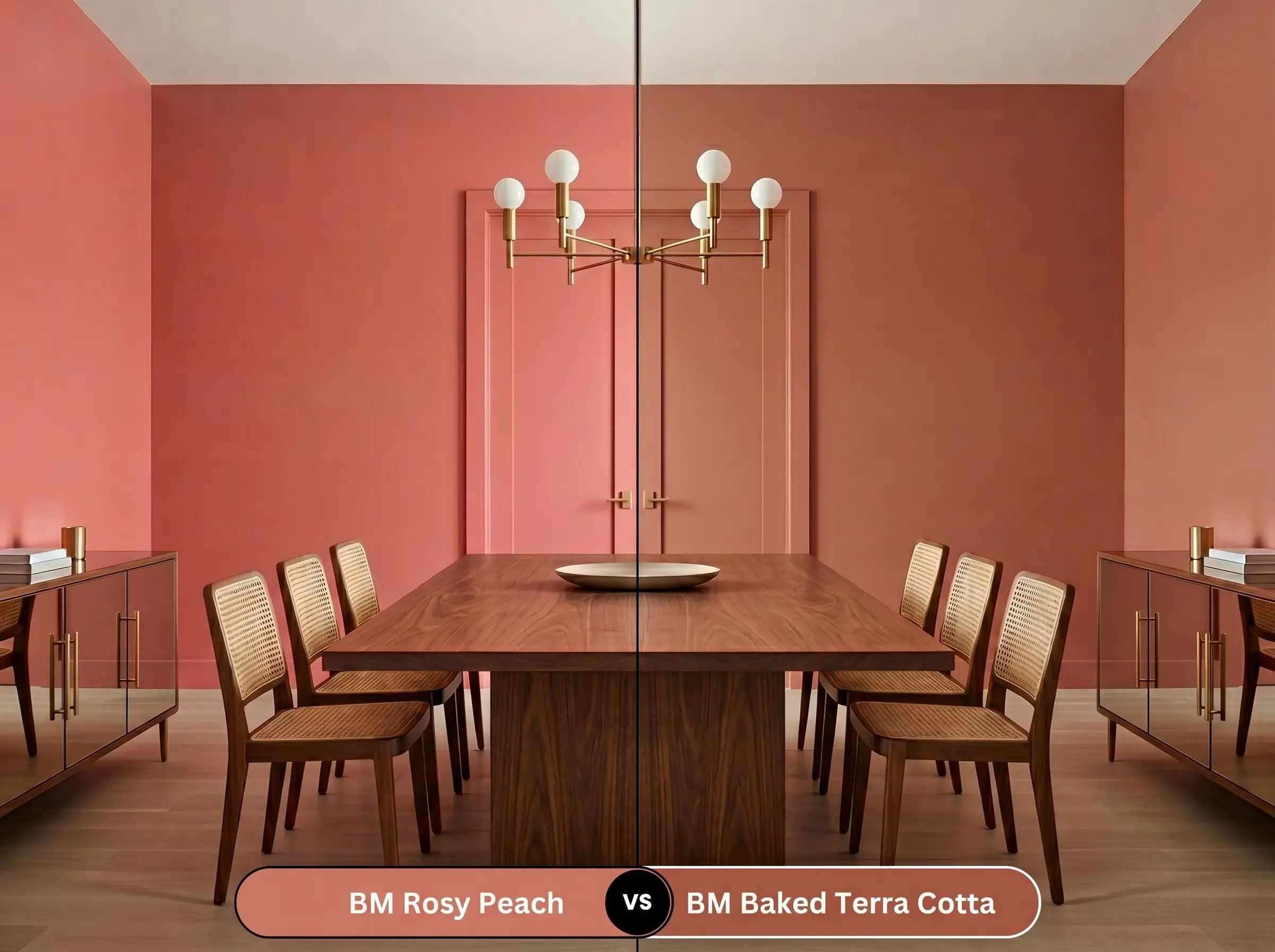
If you are looking for a literal, unyielding clay pot aesthetic, Benjamin Moore Baked Terra Cotta 1202 is the more aggressive choice. It strips away the soft pink notes entirely and leans heavily into a robust, rusty brown. This makes it significantly darker and more dominant on the wall.
Choose the rosy alternative if you want a softer, more atmospheric glow that flatters adjacent rooms. However, if you are designing a highly dramatic, moody space with abundant south-facing light, Baked Terra Cotta 1202 will deliver that uncompromising, earthy punch.
Benjamin Moore Rosy Peach vs. Sherwin-Williams Cavern Clay SW 7701
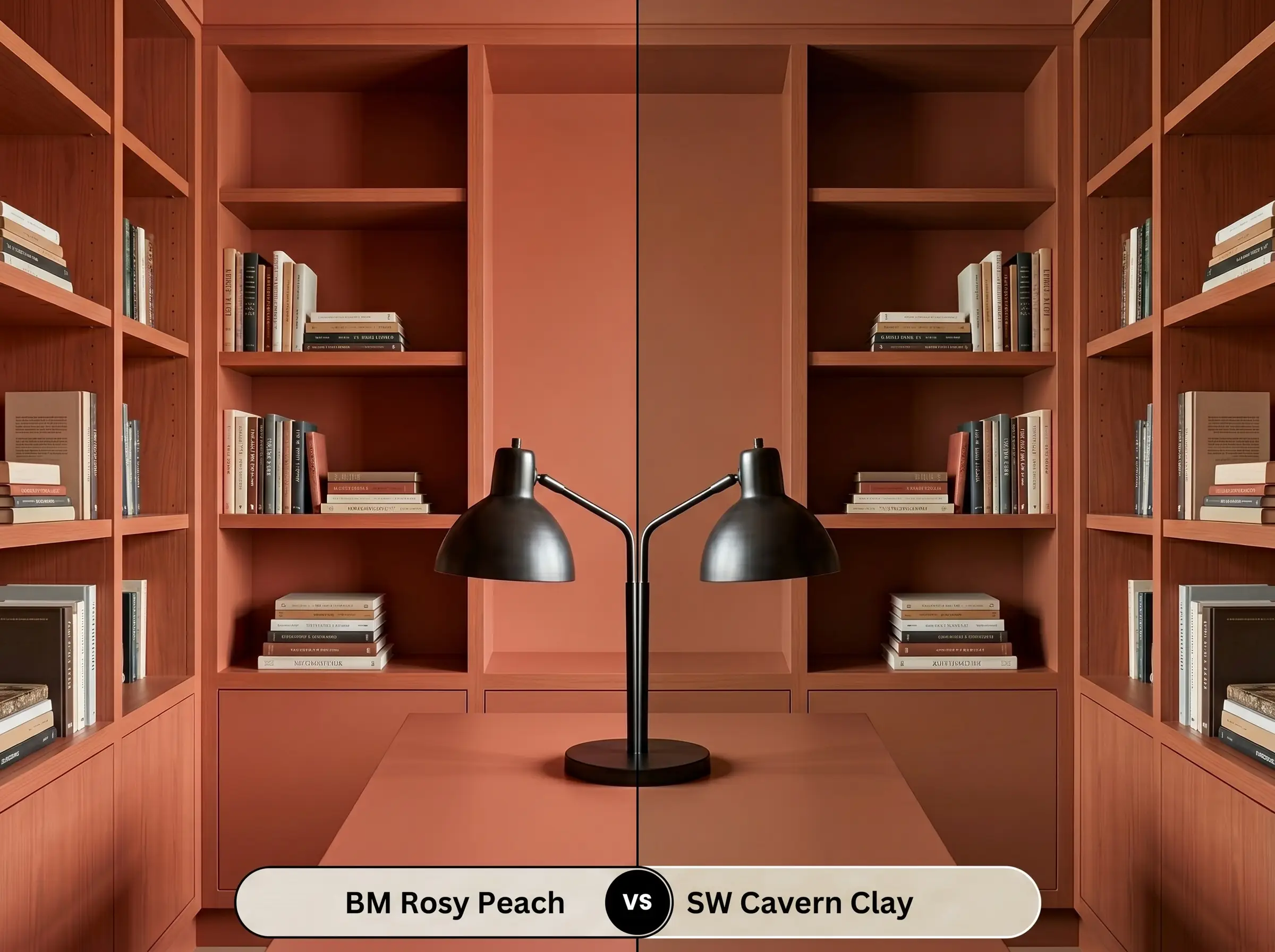
Sherwin-Williams Cavern Clay SW 7701 gained massive popularity for its vibrant, undeniable Southwestern energy. It contains far more orange pigment, making it noticeably brighter and more energetic than its Benjamin Moore rival.
If you are dealing with a chilly, north-facing room that desperately needs an injection of heat, Cavern Clay SW 7701 will force that warmth into the space. Conversely, if you prefer a more subdued, historic elegance that acts as a quiet backdrop rather than a loud focal point, stick with the muted warmth of Benjamin Moore.
Exploring Alternatives to This Earthy Red-Brown Depth
Homeowners often fall in love with the idea of a baked clay wall but realize they need a slight adjustment in tone or brightness once they test it in their specific lighting. Whether you need a touch more orange to combat cool shadows or a slightly different brand formulation, these alternatives provide excellent secondary options.
Staying Within the Benjamin Moore Catalog
Color Matching Across Rival Brands
Applying Rosy Peach 2089-20 Like a Pro
Transitioning from color theory to the physical reality of painting requires a strategic approach. Because this specific hue carries a medium-dark depth and complex pigments, how you prep and apply the paint will dictate the final aesthetic. A poor application will make this beautiful color look uneven and muddy.
Selecting the Right Finish
Priming for Deep Hues
You cannot skip the priming stage when working with a color of this depth. Applying it directly over builder-grade white or a previously dark wall will force you to use four or five coats. You must use a high-quality primer tinted to a light gray or a warm beige. This creates a neutral foundation that allows the true chromatic profile to develop evenly on the first topcoat.
Achieving a Flawless Coat
To achieve a professional, opaque finish, plan for two generous coats over your tinted primer. Because of its earthy red-brown depth, this color is highly susceptible to “flashing”—visible, uneven streaks that occur when you roll over semi-dry paint.
To prevent flashing and roller marks, always maintain a “wet edge” as you paint. Work in small, three-foot vertical sections, and never go back to touch up a spot that has already started to dry. Let the entire wall cure completely before assessing if you need a third coat.
Hackrea Pro-Tip (The Wet Edge Strategy)
Frequently Asked Questions
Because of its medium-dark LRV, it will certainly make a small space feel more intimate. However, when paired with strategic lighting and reflective surfaces like unlacquered brass or zellige tile, it creates a beautifully moody, jewel-box effect rather than feeling restrictive.
A flat or matte finish will absorb light and emphasize the dusty, historic brown notes, giving it a plaster-like feel. If you choose a higher sheen like eggshell or satin, the surface will reflect more light, which tends to amplify the vibrant, peachy-orange characteristics.
This color actually thrives on textured surfaces. The physical texture of plaster or Roman clay creates natural highlights and shadows that beautifully enhance the earthy, baked-terracotta origins of the paint.
Red oak floors naturally pull warm, pinkish-orange tones, which can sometimes compete with a terracotta wall. To ensure they harmonize, anchor the space with a large, neutral rug to provide a visual break between the floor and the painted baseboards.
The Final Verdict on Benjamin Moore Rosy Peach
Benjamin Moore Rosy Peach 2089-20 is an incredibly sophisticated architectural tool for homeowners who want to inject genuine, rooted warmth into their spaces. It excels in environments that prioritize tactile materials, vintage curation, and organic modernism. When applied with a matte finish and paired with natural textures like soapstone, linen, and raw brass, it transforms standard rooms into intimate, sun-baked retreats. It is the perfect choice for dining rooms, moody libraries, and curated bathrooms where ambiance is the primary goal.
However, this earthy hue requires a specific environmental context to succeed. It will actively fight against stark, cool-toned gray flooring or icy, blue-based white trim. Placing this baked clay color next to sterile, cool-toned elements strips away its historic charm, leaving the walls looking muddy and discordant. To unlock its full potential, you must commit to a palette of warm neutrals, rich organic greens, and deep, stormy blues that respect its grounded, natural origins.