Misty Lilac 2071-70
Benjamin MooreBenjamin Moore Misty Lilac 2071-70 is a soft, highly reflective pale violet with an LRV of 77.95. Featuring subtle gray-blue undertones and a whisper of pink, this cool-leaning hue provides an airy, romantic cast that adapts dynamically to changing light conditions.
Paint Technical Profile
| Color ID / SKU | 2071-70 |
| HEX Code | #EAE3F0 |
| Light Reflectance (LRV) | 77.95 |
| Use | Interior |
| Best Exposures | South, East, or North (depending on desired warmth) |
| Best For | Nurseries, powder rooms, home offices, and accent furniture |
Benjamin Moore Misty Lilac: Mastering the Modern Ethereal Wash
Forget everything you think you know about purple paint. The era of overly sweet, one-dimensional pastels has quietly ended, replaced by incredibly nuanced shades that act as sophisticated backdrops for modern living. Benjamin Moore Misty Lilac 2116-70 is leading this shift, proving that a soft color can carry immense curatorial weight.
When applied thoughtfully, this shade transitions from a simple wall color into a compelling architectural finish. It is the kind of hue that makes unlacquered brass hardware gleam a little brighter and honed marble countertops look significantly more expensive. By treating this pale violet as a foundational layer rather than a mere accent, you open up entirely new pathways for high-end, tailored design.
The secret to its success lies in its restraint. Rather than dominating a room, Misty Lilac establishes a calm, tailored atmosphere that adapts beautifully to a wide mix of furnishings. Whether you are updating a mid-century fixer-upper or refreshing a classic suburban home, this color provides a fresh alternative to the standard off-white.
Decoding the Chromatic Profile: Undertones & LRV of Benjamin Moore Misty Lilac
When homeowners first test this color, the immediate question is always: “Is this paint warm or cool?” Benjamin Moore Misty Lilac is definitively a cool-leaning hue, yet it is dynamically balanced to avoid ever feeling icy or sterile. It achieves this delicate temperature balance through a highly specific blend of hidden pigments that stabilize the overall color structure.
To truly understand how this shade will behave on your walls, we have to look closely at its internal anatomy. The color is built upon a complex foundation:
Because of that hidden gray-blue cast, this color looks exceptionally crisp when framed by a pure, un-tinted white trim. Avoid creamy off-whites on your baseboards, as they can make the violet base look accidentally muddy.
Hackrea Pro-Tip (The Trim Strategy)
With an official Light Reflectance Value (LRV) of 77.95, this tint sits firmly in the high-reflective category. This means it absorbs very little natural light, allowing it to bounce illumination generously across a room and visually expand tighter boundaries. Despite this impressive light reflectance, it retains just enough pastel saturation to provide a distinct, intentional contrast against your ceilings and doors.
Navigating the Color Structure Across Different Lighting
Every paint color is at the mercy of the sun, and a complex shade like BM 2116-70 is especially reactive to shifting light. Because its chromatic profile contains both cool and warm micro-nuances, the color will physically transform throughout the day. Understanding this chameleon effect is the key to placing it in the right room.
Here is exactly how the surrounding light will manipulate the final aesthetic:
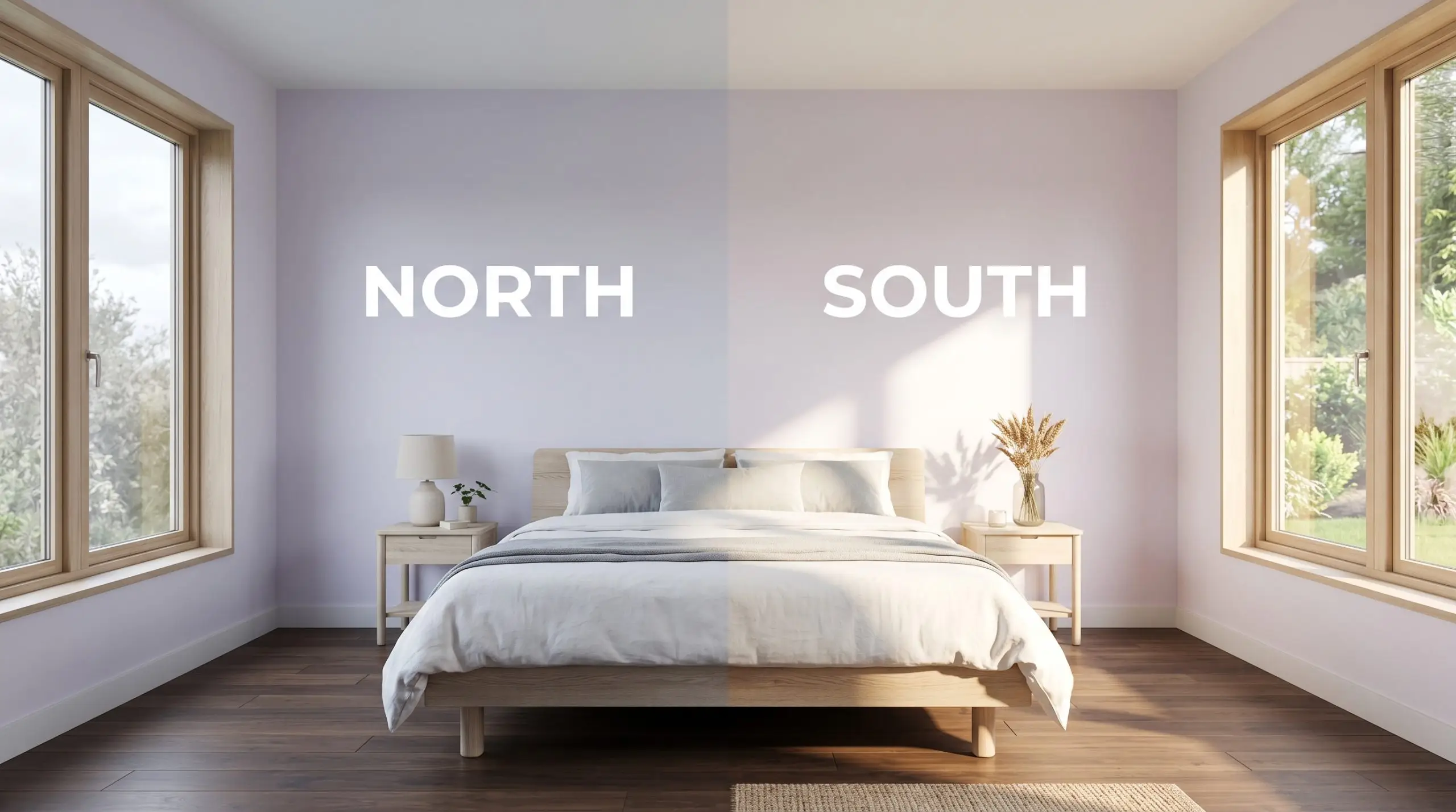
If you are using this color in a room with mixed lighting (like a bedroom with both overhead LEDs and warm bedside lamps), the paint will look like two completely different colors at night. Standardize your bulbs to around 3000K to maintain a consistent, beautiful tone.
Clash Warning (The Bulb Temperature Trap)
Transforming Your Home with This Ethereal Wash
The true test of any premium paint is how gracefully it adapts to different architectural challenges and functional spaces. While a pale violet might seem like a niche choice, its high LRV and stabilizing gray undertones make it surprisingly versatile. Below, we explore how to utilize this shade across various rooms, proving that intentional color placement can redefine the entire atmosphere of your home.
Growing Up with Sophistication in Youth Spaces
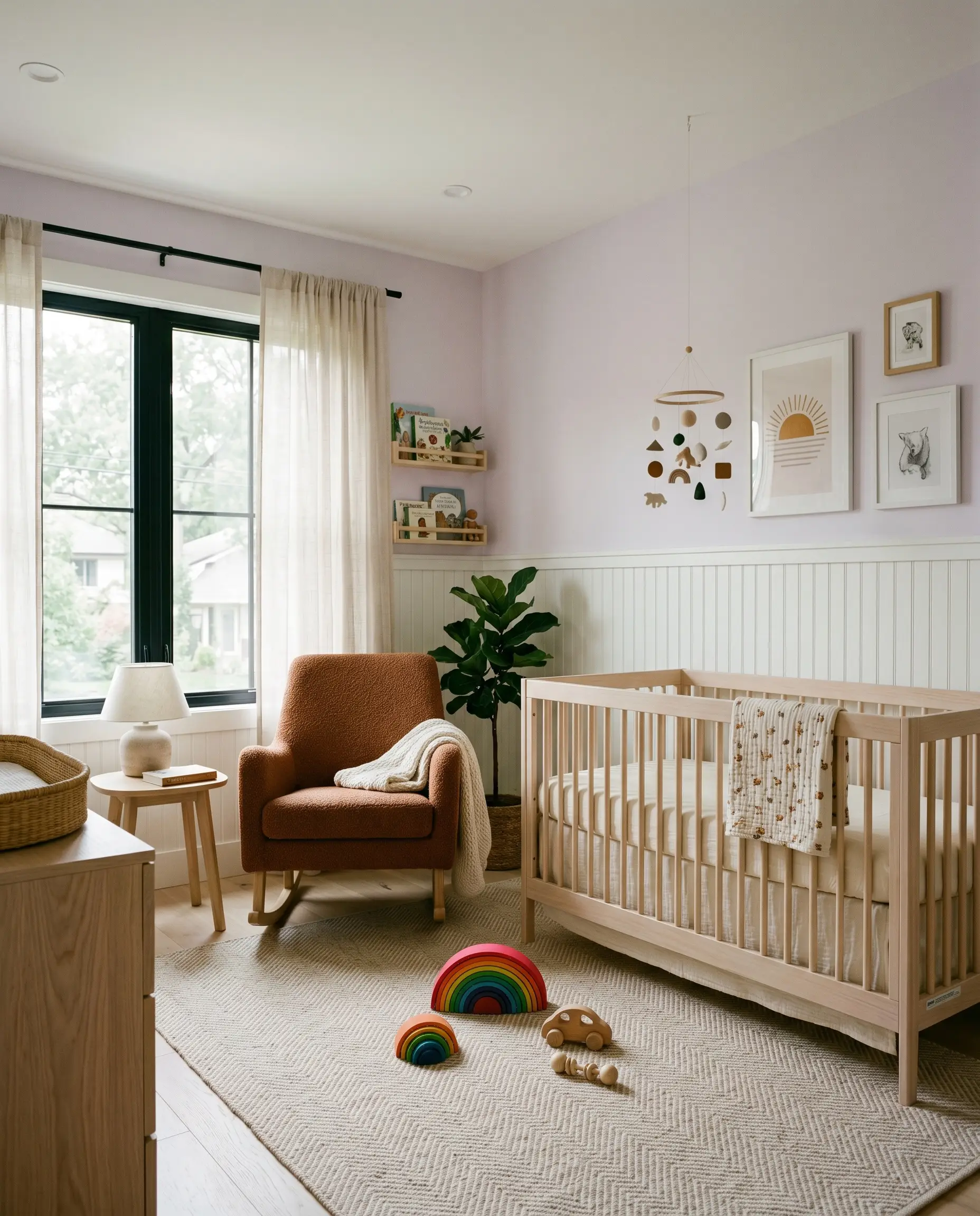
The traditional approach to nurseries often relies on overly saccharine, temporary color palettes that a child quickly outgrows. By utilizing this muted violet, first-time parents can establish a calm, refined foundation that easily transitions from a baby’s room to a sophisticated teenager’s retreat. The key is to pair the wall color with mature, tactile materials rather than standard juvenile decor.
Consider contrasting the soft walls with a streamlined bleached oak crib or platform bed, layering the floor with a subtle herringbone rug. You can introduce unexpected warmth through textiles, using mustard yellow corduroy throw pillows or a rust-toned bouclé rocking chair. This intentional friction between the cool walls and warm furnishings creates a beautifully balanced, modern Scandinavian aesthetic.
To add architectural interest without a massive renovation, try a half-wall application. Install simple beadboard paneling on the lower third of the wall painted in a crisp white, and sweep the lilac across the upper portion and ceiling. This technique visually raises the roofline while keeping the room feeling incredibly bright and tailored.
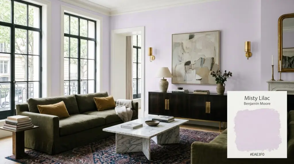
Curating a Jewel Box in Enclosed Baths
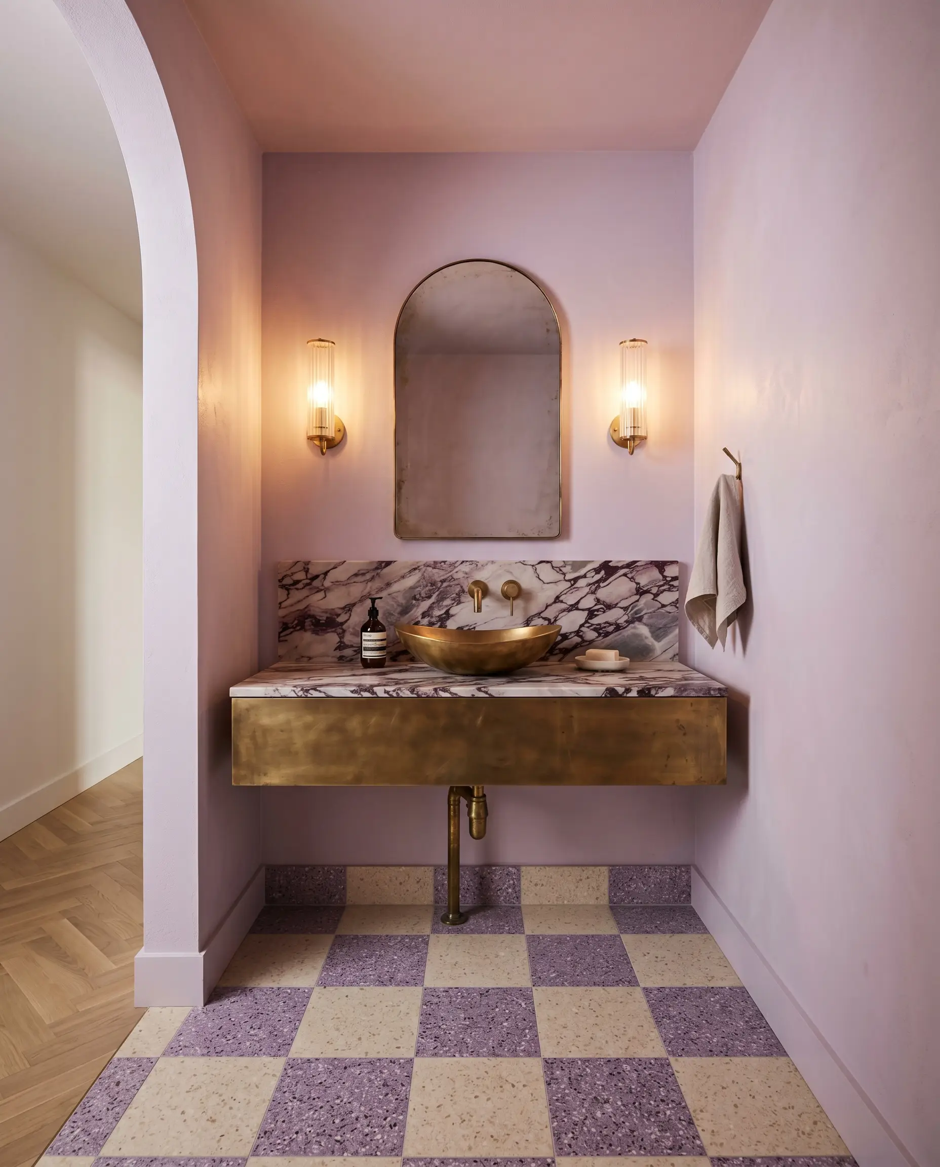
Windowless powder rooms present a unique design opportunity because you completely control the lighting environment. Instead of fighting the lack of natural sun with sterile white paint, use this shade to create a deliberate, intimate jewel box. In these enclosed spaces, the warm glow of artificial sconces will pull out the dusty mauve-gray qualities of the paint.
To elevate the design, pair the painted walls with an unlacquered brass floating vanity and fluted glass lighting fixtures. The metallic warmth of the brass cuts through the cool violet base, creating a highly curated, Parisian-inspired tension. Do not shy away from bold contrasts here. Incorporating a heavily veined honed marble countertop or a checkerboard terrazzo floor will instantly make the small footprint feel like a premium, custom-built space.
In tight, windowless rooms, painting the ceiling the exact same color as the walls blurs the boundary lines. This color-drenching technique tricks the eye, making a cramped powder room feel significantly taller and more expansive.
Hackrea Design Secret (The Ceiling Trick)
Fostering Focus in the Workspace
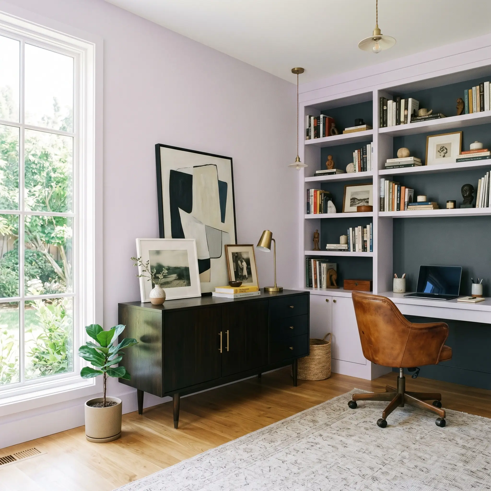
For graphic designers, writers, or anyone spending long hours in a home office, the psychological impact of wall color is crucial. This shade provides a serene, distraction-free backdrop that feels much more inspiring than a standard beige. Because it is highly reflective, it maximizes whatever natural light your office receives, keeping energy levels high throughout the workday.
To prevent the room from feeling too delicate, introduce robust, stabilizing materials. A streamlined mid-century credenza in ebonized walnut or a vintage saddle leather desk chair provides the necessary visual weight to tether the airy walls. You can further modernize the space by framing your artwork in matte black steel, which adds a crisp, graphic edge against the soft pastel.
If your office features built-in bookcases, consider painting the interior backings in a deep aubergine or charcoal. This tonal layering adds profound depth to the room and highlights your stacked art books and sculptural ceramics, turning everyday storage into a curated display.
Elevating the Utility Zone
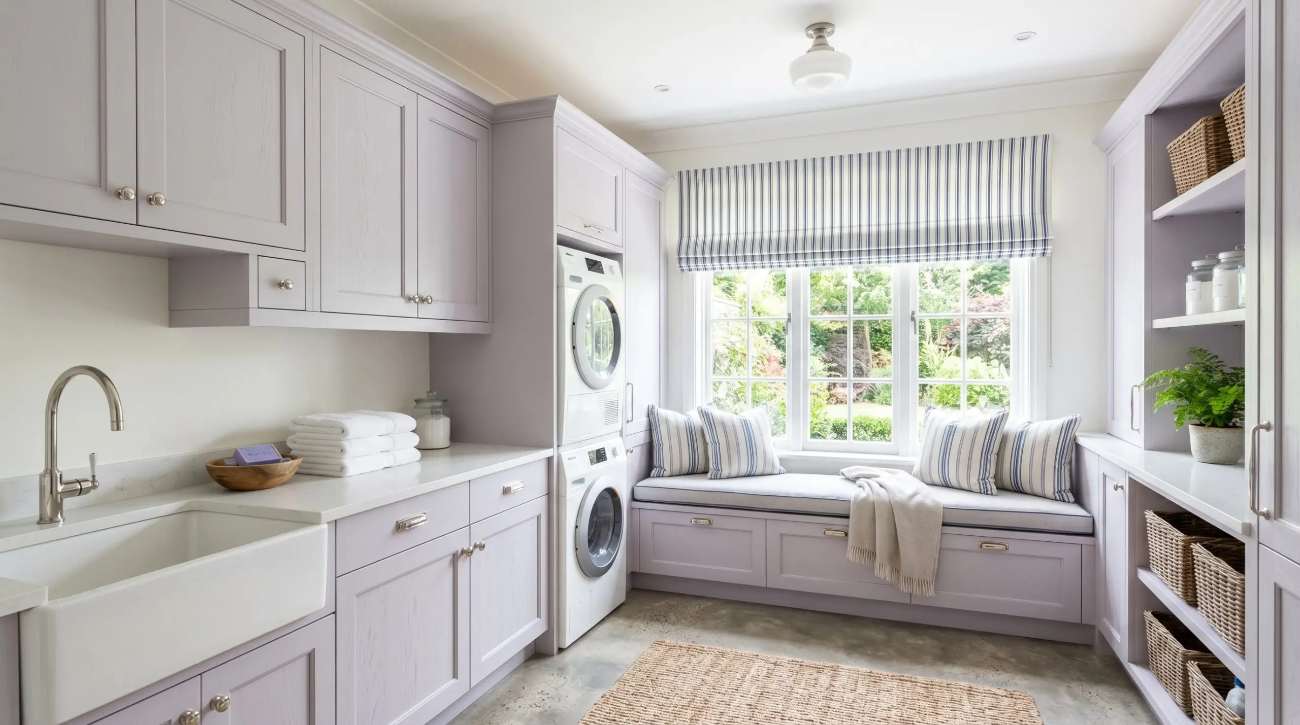
Laundry rooms are historically the most neglected spaces in a home, often finished in leftover builder-grade white. Injecting this soft, gray-blue tinted violet into the utility zone completely changes the chore experience, turning a purely functional room into a calming retreat. It is a highly practical update that yields a massive aesthetic return.
If you aren’t ready to paint the entire room, focus solely on the cabinetry. Painted upper and lower cabinets in this shade look incredibly fresh against raw concrete floors or warm terracotta tiles. Swap out standard builder hardware for polished nickel pulls to give the room a clean, tailored finish.
You can also use the paint to highlight specific architectural features, such as a beadboard ceiling or a custom window seat for folding clothes. Pairing the painted woodwork with a classic toile or ticking stripe roman shade introduces a subtle, traditional charm without feeling dated.
Highlighting Millwork and Standalone Pieces
You do not need to commit to a full room makeover to harness the power of this color. Using it on accent furniture or specific architectural trim is a brilliant way to introduce a premium focal point into an otherwise neutral space. It is the perfect weekend update for a weekend DIYer looking to revive a thrifted find.
For an antique armoire or a campaign dresser, consider applying the paint in a high-gloss lacquered finish. The glossy sheen amplifies the light reflectance and gives the piece a highly bespoke, modern edge that looks stunning against a matte wall. Pair the newly painted piece with warm burl wood accessories or hammered copper trays to enhance the tactile collision.
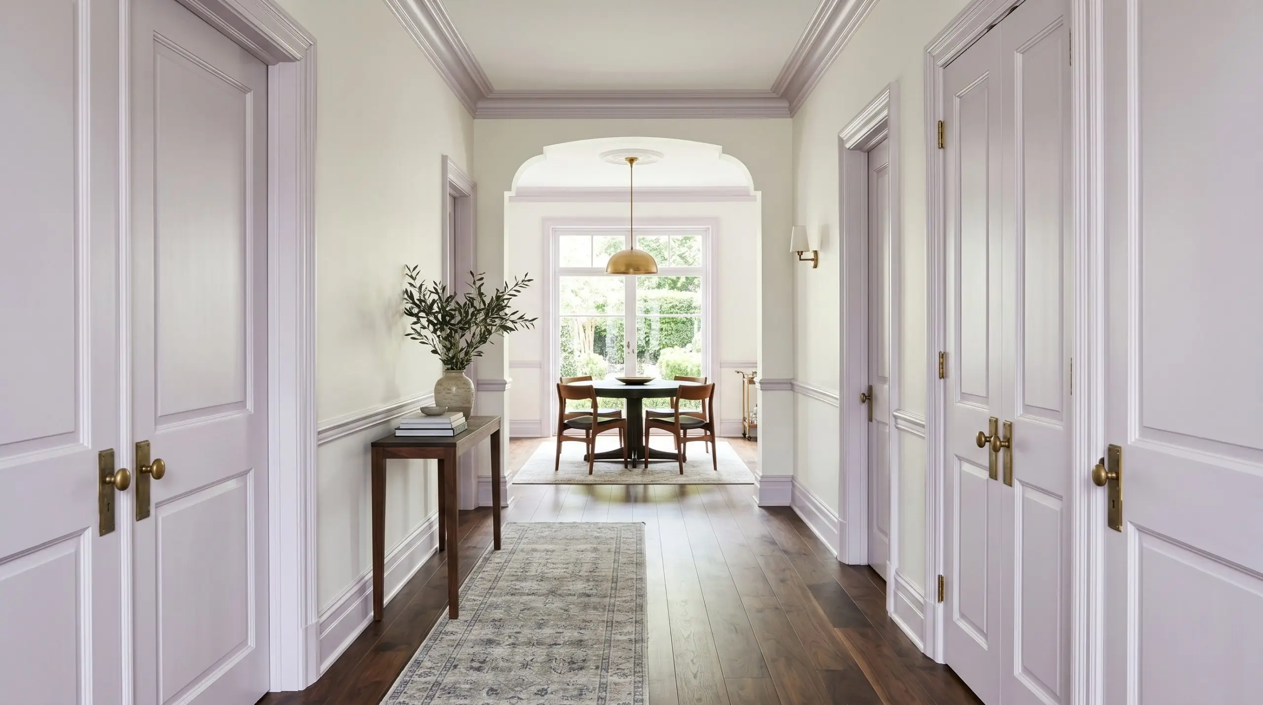
Alternatively, use the color to highlight the architectural framework of a hallway or dining room. Painting only the baseboards, crown molding, and interior doors in this pale violet—while keeping the walls a warm, soft white—creates a striking, tailored outline. It is an unexpected curatorial choice that immediately signals a high-end, professionally designed home.
Curating the Perfect Palette for Benjamin Moore Misty Lilac
When integrating this ethereal wash into a broader room design, understanding its relational behavior is absolutely critical. This specific pigment does not thrive in soft, tonal bleeds where it can easily lose its identity and feel muddy. Instead, it requires crisp boundaries and highly intentional material pairings to hold its refined shape and assert its sophisticated presence.
Defining the Boundaries with Trim
To honor the delicate color structure of this paint, your trim must act as a sharp, defining frame. Because of its stabilizing gray-blue cast, pairing this shade with creamy, yellow-leaning off-whites will immediately make the walls look dirty. You need a pure, untinted white to force the violet base to read as a clean, intentional architectural finish.
Tactile Elements and Hardware Pairings
The true magic of this pastel saturation is unlocked when it physically interacts with the hard finishes in your room. To prevent the color from feeling too delicate or juvenile, you must introduce tactile materials that provide significant visual weight.
Secondary Tones to Anchor the Room
Three Distinct Curated Aesthetics
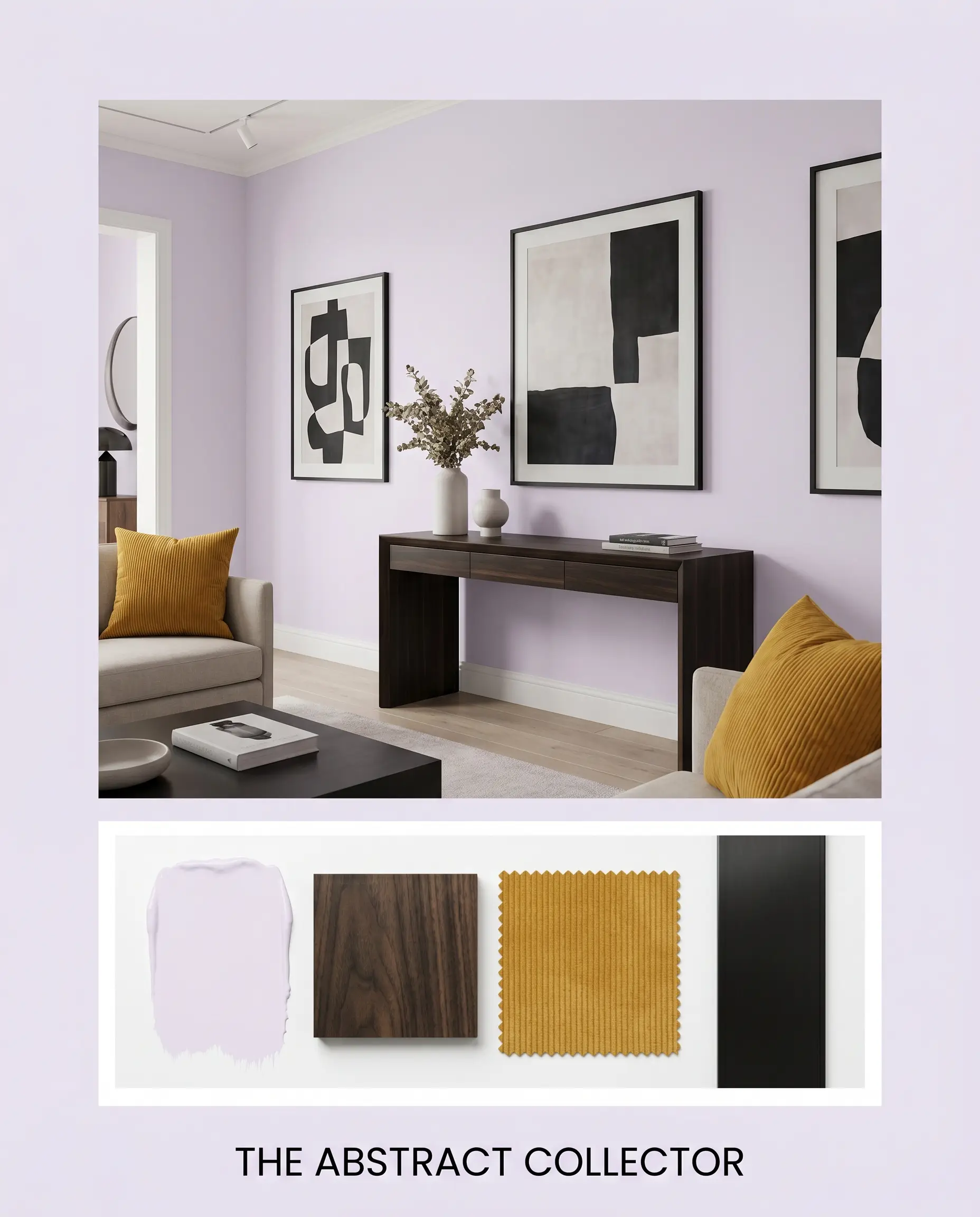
The Abstract Collector This aesthetic leverages the pale violet as a gallery-like backdrop for bold, eclectic curation. By pairing the walls with a streamlined ebonized walnut console and framing asymmetrical art in matte black steel, the space feels instantly sharp and graphic. The energy here is highly intentional and slightly avant-garde. Throw pillows in mustard yellow corduroy and a vintage layered rug introduce just enough warmth to keep the cool walls from feeling unapproachable.
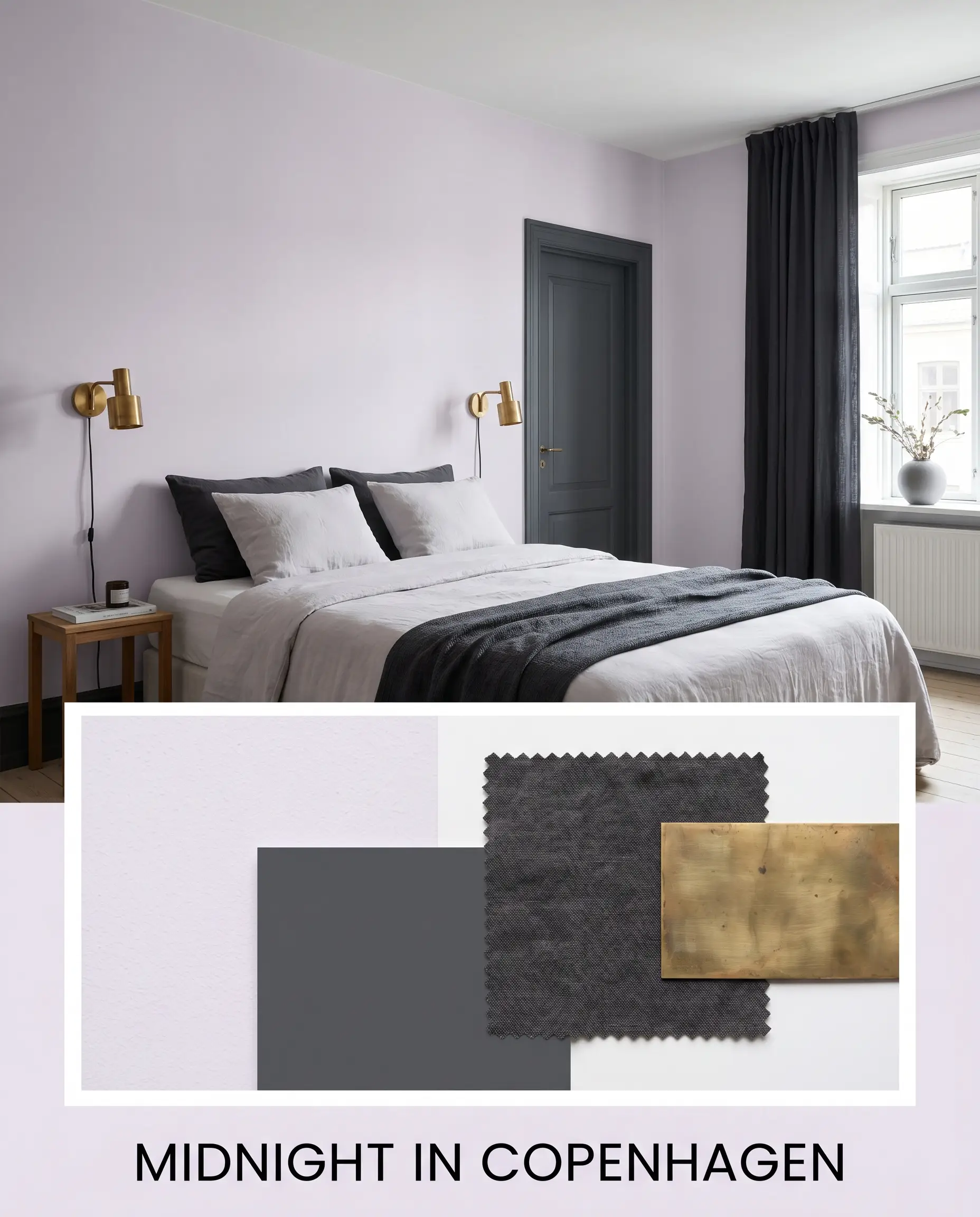
Midnight in Copenhagen Rooted in cozy, modern Scandinavian principles, this palette relies on tonal contrast to create a deeply calming atmosphere. The walls are grounded by deep, charcoal washed linen drapery and accents painted in Benjamin Moore Deep Space 2125-20. To prevent the dark additions from feeling heavy, we introduce unlacquered brass sconces that bounce warm, ambient light across the room, resulting in a vibe that is moody, tailored, and effortlessly sophisticated.
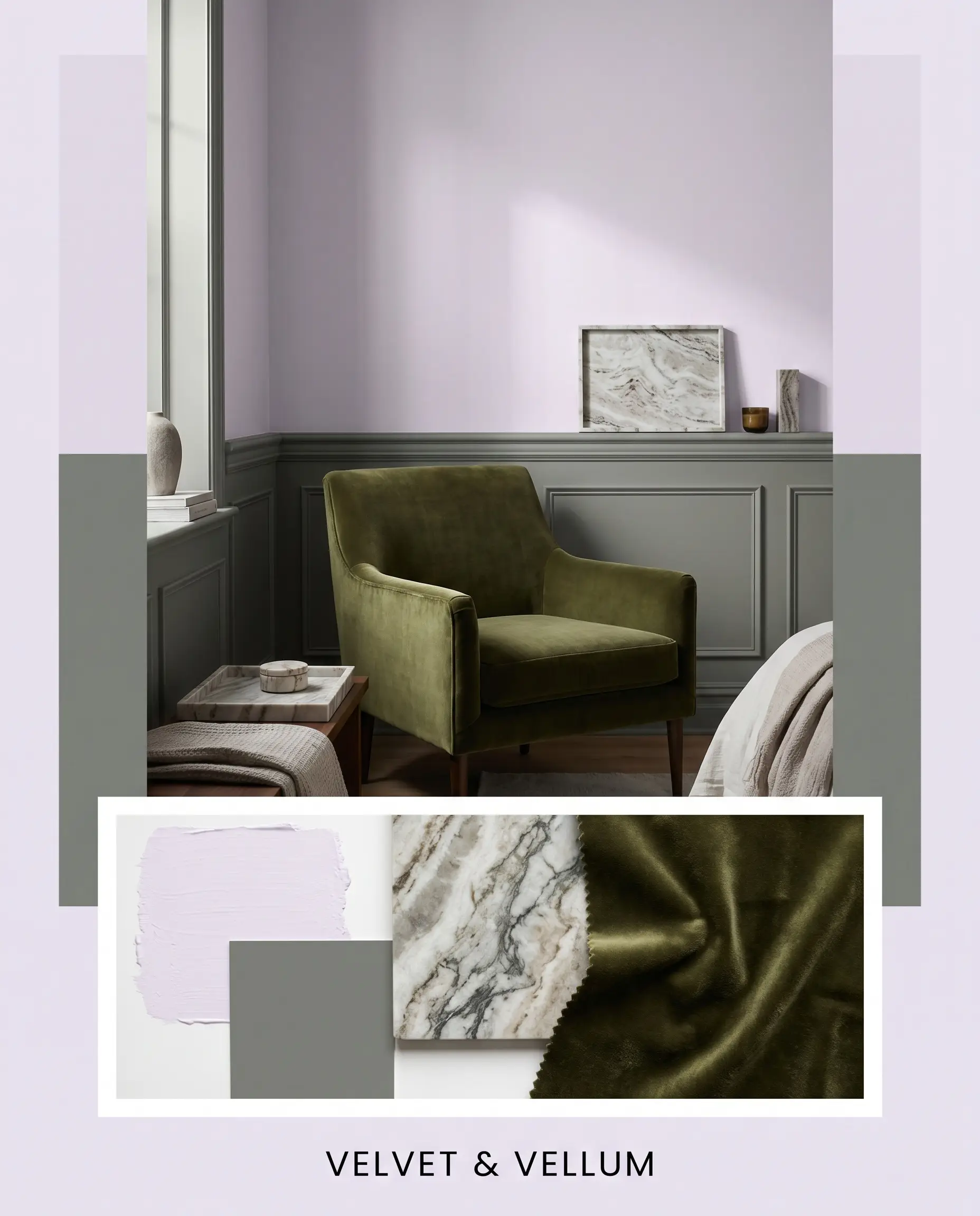
Velvet & Vellum For those who crave a softer, more romantic energy without reverting to traditional stereotypes, this approach balances tactile luxury with organic hues. The high light reflectance of the paint is softened by pairing it with Sherwin-Williams Retreat SW 6207 on adjacent millwork or wainscoting. Incorporating a honed marble tray, stacked art books, and a deep olive velvet accent chair creates a highly sensory, enveloping environment that feels both expensive and deeply relaxing.
Head-to-Head Comparisons: Evaluating the Market
Even the most beautiful color can fail if placed in the wrong lighting conditions or architectural context. If your room receives an overwhelming amount of blinding southern light, or if you are fighting against heavily shaded, cool northern exposures, you may need to pivot. Below, we examine exactly how this Benjamin Moore favorite stacks up against its closest rivals so you can make a confident final decision.
Benjamin Moore Misty Lilac 2116-70 vs. Benjamin Moore Lily Lavender 2071-60
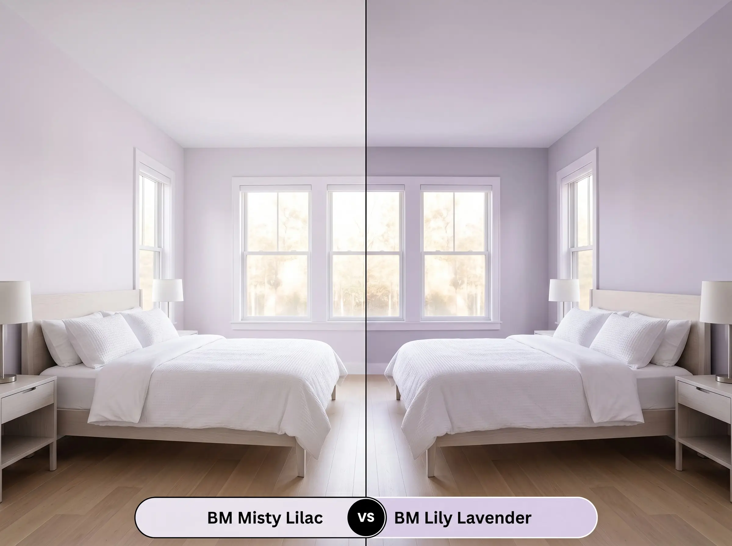
When testing these two side-by-side, the difference comes down to pure pigment saturation. Lily Lavender holds significantly more color weight, meaning it reads as a definitive, undeniable purple even in glaring sunlight. If your room is flooded with bright, warm light that completely washes out the subtle ethereal wash of BM 2116-70, pivoting to Lily Lavender will ensure the walls retain their intended depth and personality.
Benjamin Moore Misty Lilac 2116-70 vs. Sherwin-Williams Inspired Lilac SW 6820
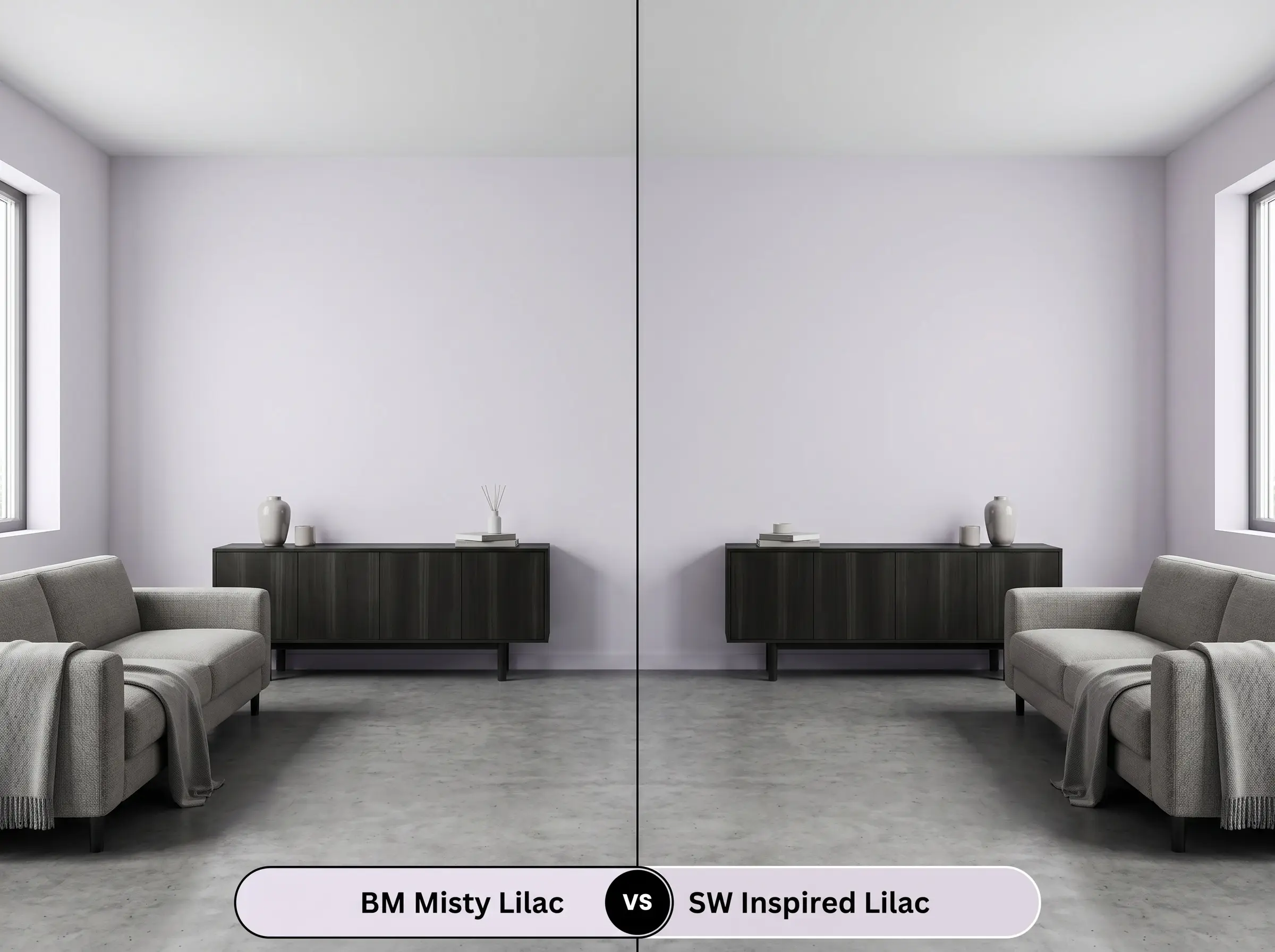
This comparison highlights a crucial shift in foundational undertones. While our primary color leans into a cool, gray-blue cast to maintain its neutrality, SW Inspired Lilac contains a much stronger pink micro-nuance. If your space feels excessively cold or shadowy, SW Inspired Lilac is the better choice. Its inherent warmth will physically heat up the room, whereas the Benjamin Moore option might lean slightly too chilly in a north-facing, heavily shaded environment.
Exploring Alternatives to This Ethereal Wash
Sometimes a color is almost perfect, but you need a slight adjustment in depth or you are restricted by the brands available at your local hardware store. Whether you need a touch more light reflectance for a tight hallway or a slightly richer tone to anchor a large, open floor plan, these alternatives provide excellent secondary options.
Same-Brand Variations
Cross-Brand Matches
Practical Application for This Architectural Finish
Transitioning from design theory to the physical reality of a paint roller requires a strategic approach. Because this shade relies heavily on its subtle undertones, selecting the wrong sheen or skipping the preparation phase can completely alter the final aesthetic.
The Dynamic Sheen Guide
Never paint a pale, cool-toned violet directly over a warm beige or yellow wall. The underlying warmth will bleed through the fresh paint, neutralizing the cool undertones and leaving you with a muddy, lifeless gray. Always use a high-quality, pure white primer to reset the canvas.
Hackrea Pro-Tip (The Primer Requirement)
Primer Strategy and Coverage Tips
Achieving a flawless, professional finish with a high-LRV pastel requires patience and the correct application technique. Due to its light pigment load, this shade typically demands a minimum of two generous coats to reach full opacity. Do not stretch the paint on your roller. Pushing the product too thin will result in “flashing”—visible, uneven streaks where the light catches the roller marks, completely ruining the smooth, ethereal wash.
Frequently Asked Questions
Because of its impressive light reflectance, this shade actually thrives in tight, enclosed spaces. However, you must be mindful of your bulbs; standard warm incandescent lighting will pull out the paint’s gray undertones, shifting the color from a crisp lilac to a moody, dusty mauve.
Using this shade outdoors requires caution because intense, south-facing sunlight will aggressively amplify its hidden pink micro-nuance. While it can look stunning on a front door, expect the color to read significantly warmer and brighter on an exterior than it does on an interior color swatch.
Yes, the cool, muted nature of this paint creates an unintentional visual friction when placed directly against heavy, orange-toned woods. If you cannot change your honey oak floors, you must use a large, neutral area rug to create a visual buffer between the cool walls and the warm wood.
Unlike vibrant, high-energy colors that can induce visual fatigue, the stabilizing gray-blue cast in this shade establishes a deeply serene and focused atmosphere. It provides a calm, distraction-free backdrop that feels far more intentional and inspiring than a standard builder-grade neutral.
Final Verdict & Expert Warnings
Benjamin Moore Misty Lilac 2116-70 is an absolute triumph for homeowners ready to move beyond the safety of standard whites and grays. It is the perfect architectural finish for modern, transitional, and softly eclectic homes, providing a tailored, high-end backdrop that elevates everything placed in front of it. Its true brilliance lies in its ability to bounce light generously while maintaining a mature, sophisticated presence, making it ideal for spaces that require both calm energy and curatorial weight.
However, this refined shade demands a specific environment to succeed. If your home is dominated by highly saturated, warm-toned fixed elements—such as unpainted honey oak cabinets, heavy terracotta floors, or dated beige carpets—this color will struggle immensely. The cool, gray-blue foundation of the paint will fight against those heavy orange and yellow tones, making the walls look uncomfortably icy while simultaneously making your wood finishes appear dated and glaringly orange. To truly harness the beauty of this muted violet, you must commit to framing it with crisp whites, grounding it with rich, dark woods, and illuminating it with carefully controlled, neutral lighting.