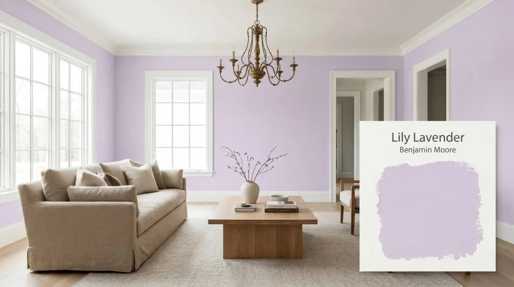
Lily Lavender 2071-60
Benjamin MooreBenjamin Moore Lily Lavender (2071-60) is a soft, blush-tinged mid-tone purple with a subtle gray influence. Boasting an LRV of 64.33, it acts as a luminous, sophisticated lavender that avoids looking overly juvenile, shifting between cool violet and warm lilac depending on the light.
Paint Technical Profile
| Color ID / SKU | 2071-60 |
| HEX Code | #DBCEE8 |
| Light Reflectance (LRV) | 64.33 |
| Use | Interior |
| Best Exposures | North, East |
| Best For | Bedrooms, Nurseries, Accent Walls, Bathrooms |
Benjamin Moore Lily Lavender: How a Sophisticated Lilac Reshapes Modern Interiors
Purple is often the most misunderstood pigment in the architectural deck. For decades, it has been unfairly relegated to novelty spaces or overly themed bedrooms, leaving its immense potential for sophisticated design largely untapped. Benjamin Moore Lily Lavender shatters this outdated limitation by offering a highly tailored, nuanced take on pastel.
This isn’t a loud, candy-colored hue competing for attention. Instead, it operates with a quiet, refined energy that instantly softens rigid architectural lines and elevates standard builder-grade finishes. By weaving a subtle gray cast into a vibrant violet core, the brand has formulated a mid-tone lavender that feels surprisingly grown-up.
When you wrap a room in this blush-tinged purple, the atmosphere instantly shifts toward relaxed elegance. It acts as a stunning backdrop for the high/low mix of daily living, allowing everyday furniture to look intentional and curated. Whether you are updating a quirky historic home or injecting personality into a stark new build, this color provides a fresh, modern foundation.
Decoding Lily Lavender: Undertones & LRV
If you are wondering whether this specific shade reads warm or cool on the wall, Lily Lavender functions primarily as a cool-leaning neutral. It elegantly straddles the line between crisp and cozy, relying on a complex pigment structure to maintain its balance. The beauty of this color lies entirely in what is hiding just beneath the surface.
To truly understand how this paint will behave in your home, we have to look at its underlying DNA:
With a light reflectance value (LRV) of 64.33, this architectural finish bounces a generous amount of light around the room. It sits perfectly in the mid-to-light category, meaning it possesses enough visual weight to contrast sharply against crisp white trim. Yet, it remains highly luminous, ensuring your spaces feel expansive and breathable rather than enclosed.
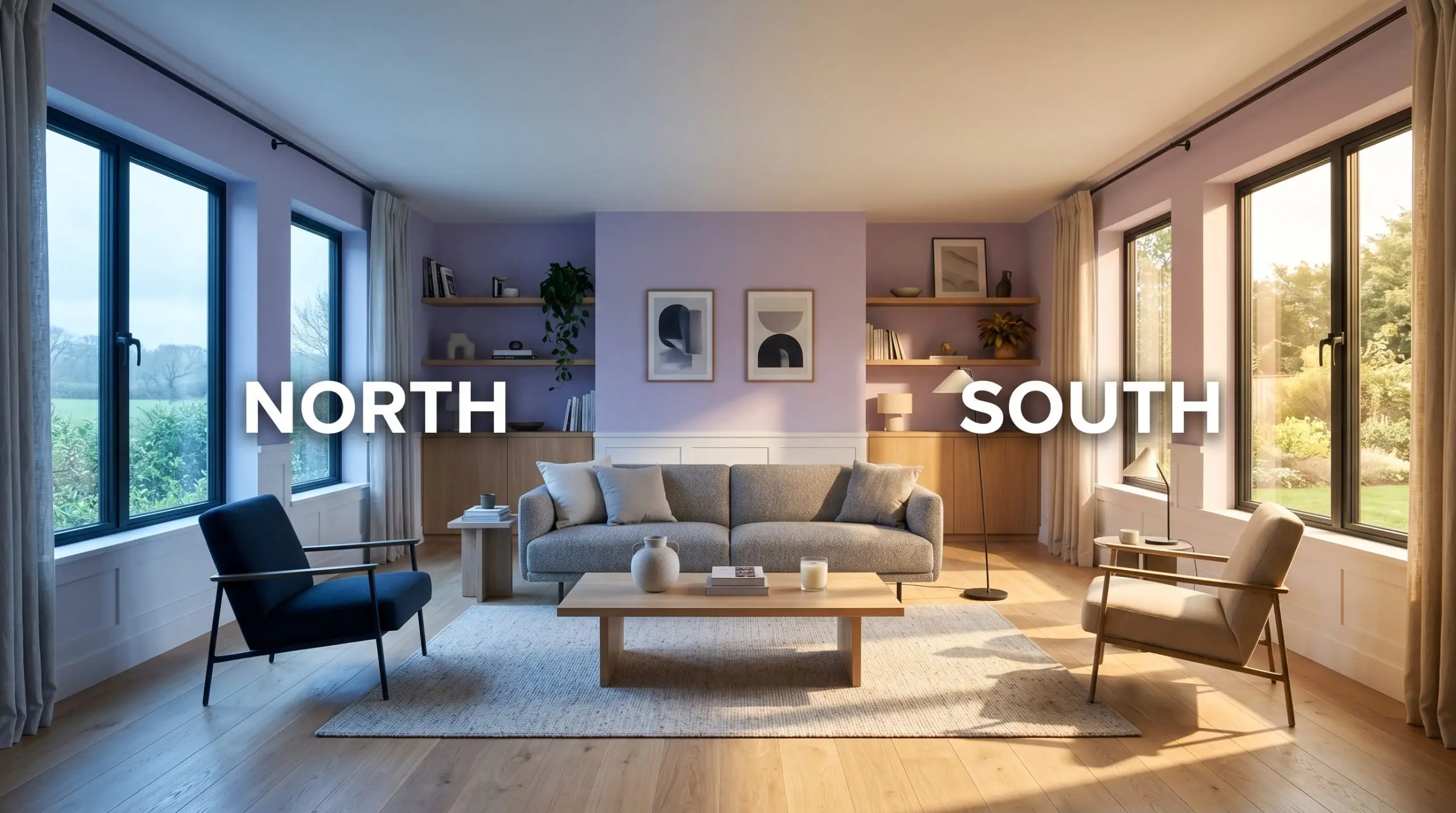
The Chameleon Factor: How Light Alters This Sophisticated Lilac
Because of its complex gray and red influences, this paint is highly reactive to the sun’s daily movement. You will never experience the exact same shade at breakfast as you do during the late afternoon. Always test large swatches on multiple walls to track these dramatic shifts.
Here is exactly how the environment manipulates the final aesthetic:
If you want to maintain the crisp, tailored look of the gray undertones well into the evening, swap your standard warm bulbs for neutral 3000K to 3500K LEDs. This keeps the color from veering too far into pink territory after dark.
Hackrea Pro-Tip (The Bulb Strategy)
Transforming Your Home: Popular Applications for a Mid-Tone Lavender
Ready to move past the swatch? This versatile shade is capable of completely redefining the atmosphere of a room when paired with the right architectural elements and styling.
Nurseries and Children’s Bedrooms
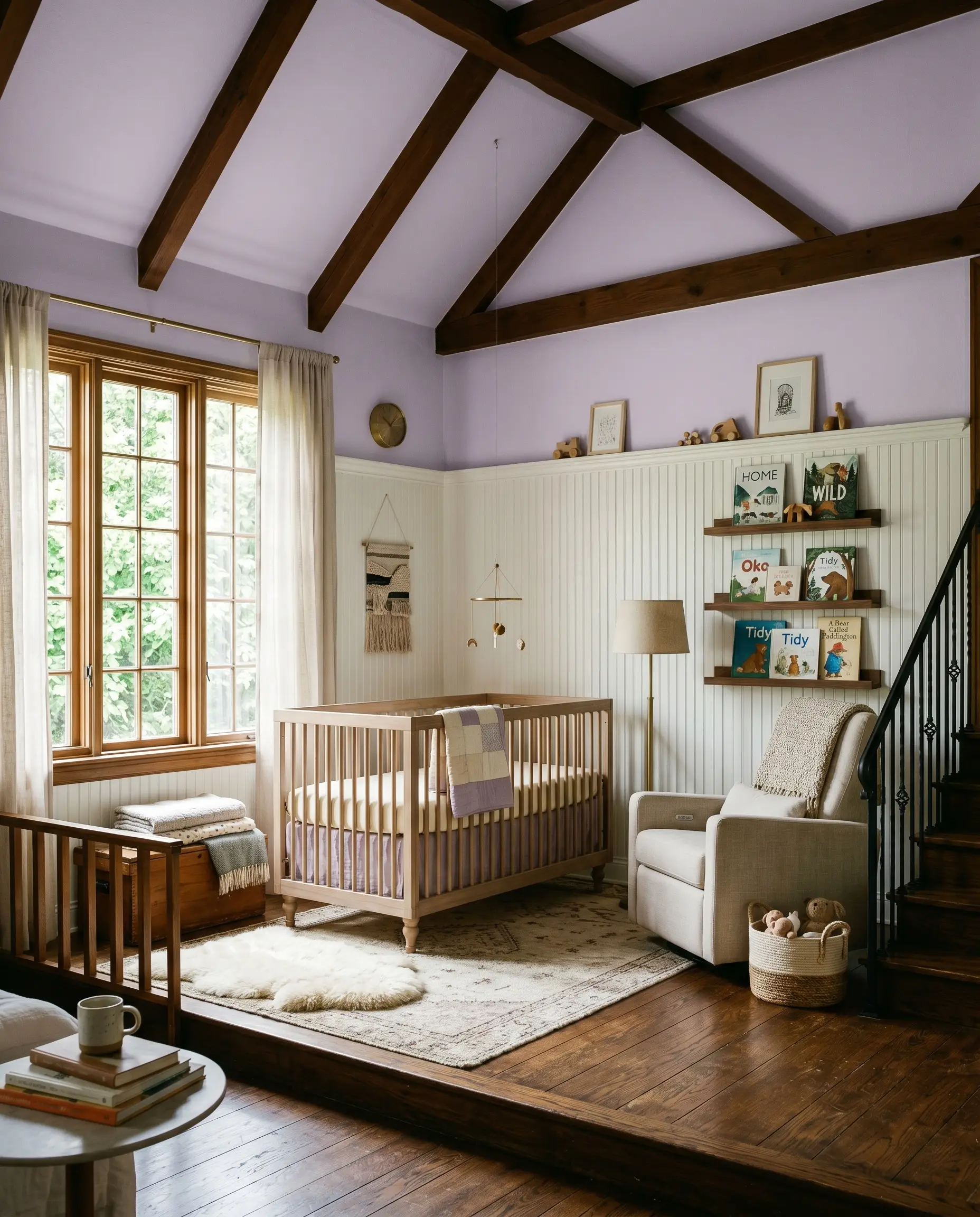
When designing spaces for younger family members, the instinct is often to reach for bright, primary colors. However, utilizing a muted, gray-leaning purple creates a calming environment that easily transitions as a child grows.
Instead of standard drywall, consider applying classic beadboard to the lower two-thirds of the room, painting it in a crisp white, and floating this soft lilac on the upper walls and ceiling.
This application looks incredibly elevated when styled with bleached walnut furniture, washed linen crib sheets, and minimalist floating ledges for books. The subtle gray cast prevents the room from feeling overly saccharine, resulting in a soft, eclectic space that feels incredibly intentional.
Guest Bathrooms
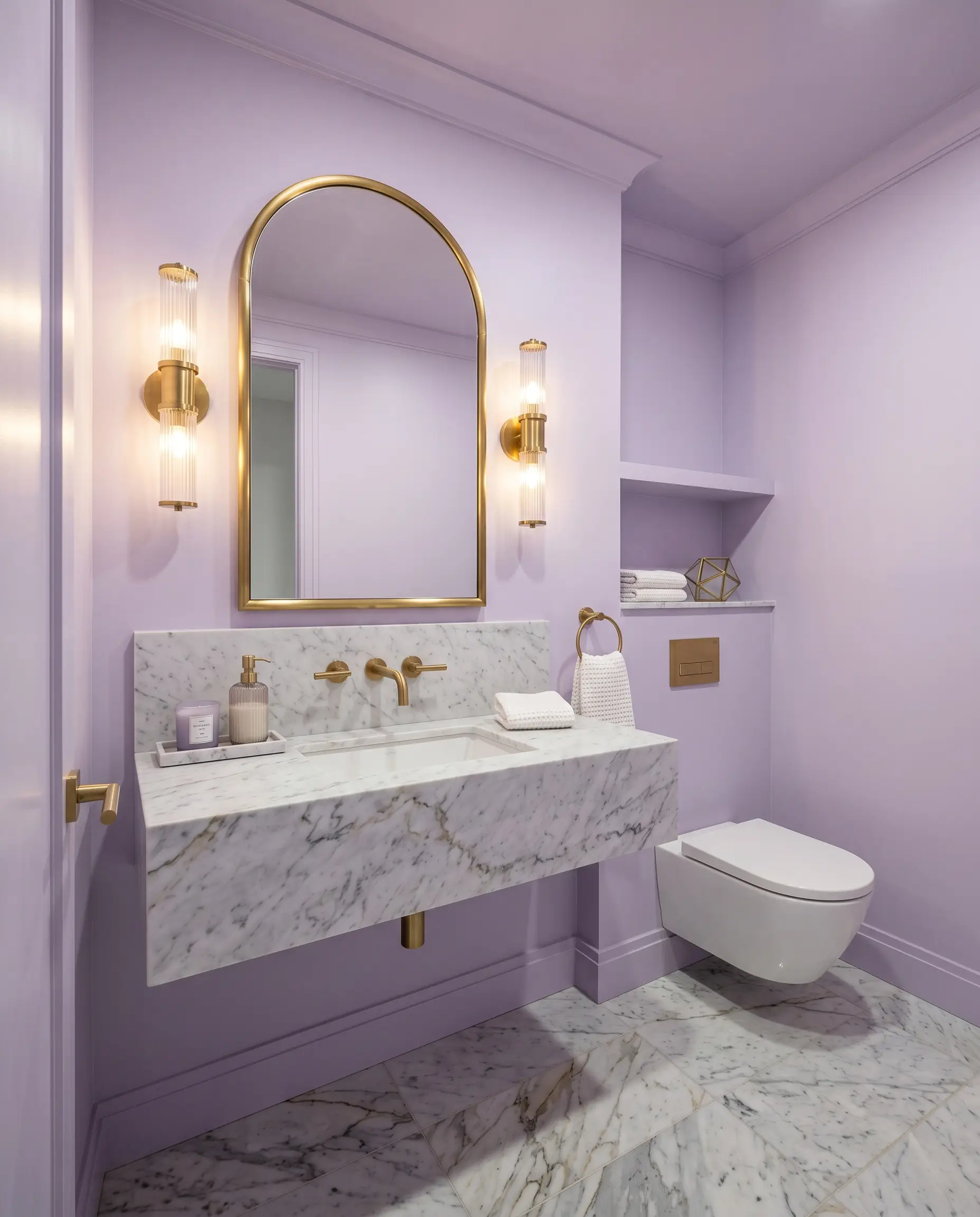
Small, windowless bathrooms are the perfect canvas for experimenting with unexpected color. This shade instantly turns a standard guest bath into a memorable, jewel-box moment for visitors.
Pair it with honed Carrara marble floor tiles and unlacquered brass sconces to lean into a Contemporary Art Deco aesthetic. The cool metallic veining in the marble speaks directly to the paint’s gray undertones, while the brass adds necessary warmth.
For a truly custom look, extend the color onto the ceiling. This simple technique visually heightens the room and envelops guests in a flattering, blush-tinged glow.
Be incredibly mindful of your vanity lighting in a bathroom painted this color. If your sconces use ultra-warm Edison bulbs, the walls will reflect an intense pink cast onto the skin, which can distort makeup application and mirror reflections.
Clash Warning (The Vanity Trap)
Kitchen Accent Walls
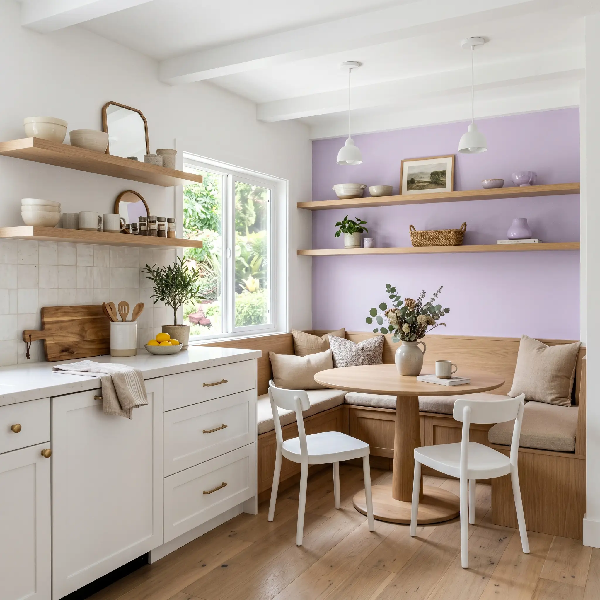
While kitchens are typically dominated by whites, greens, and blues, a splash of sophisticated lilac offers a brilliant, unexpected focal point. It works exceptionally well to highlight specific architectural features, like a breakfast nook or a custom pantry door.
To keep the design rooted, surround the accent color with organic, tactile materials. White oak open shelving, handmade zellige backsplash tiles, and brushed gold hardware provide a gorgeous textural contrast against the smooth, painted surface.
If an entire wall feels like too much of a commitment, try utilizing this shade exclusively on the base of a kitchen island. It provides just enough visual interest to break up monotone rooms without overwhelming the culinary workspace.
Creative Home Offices
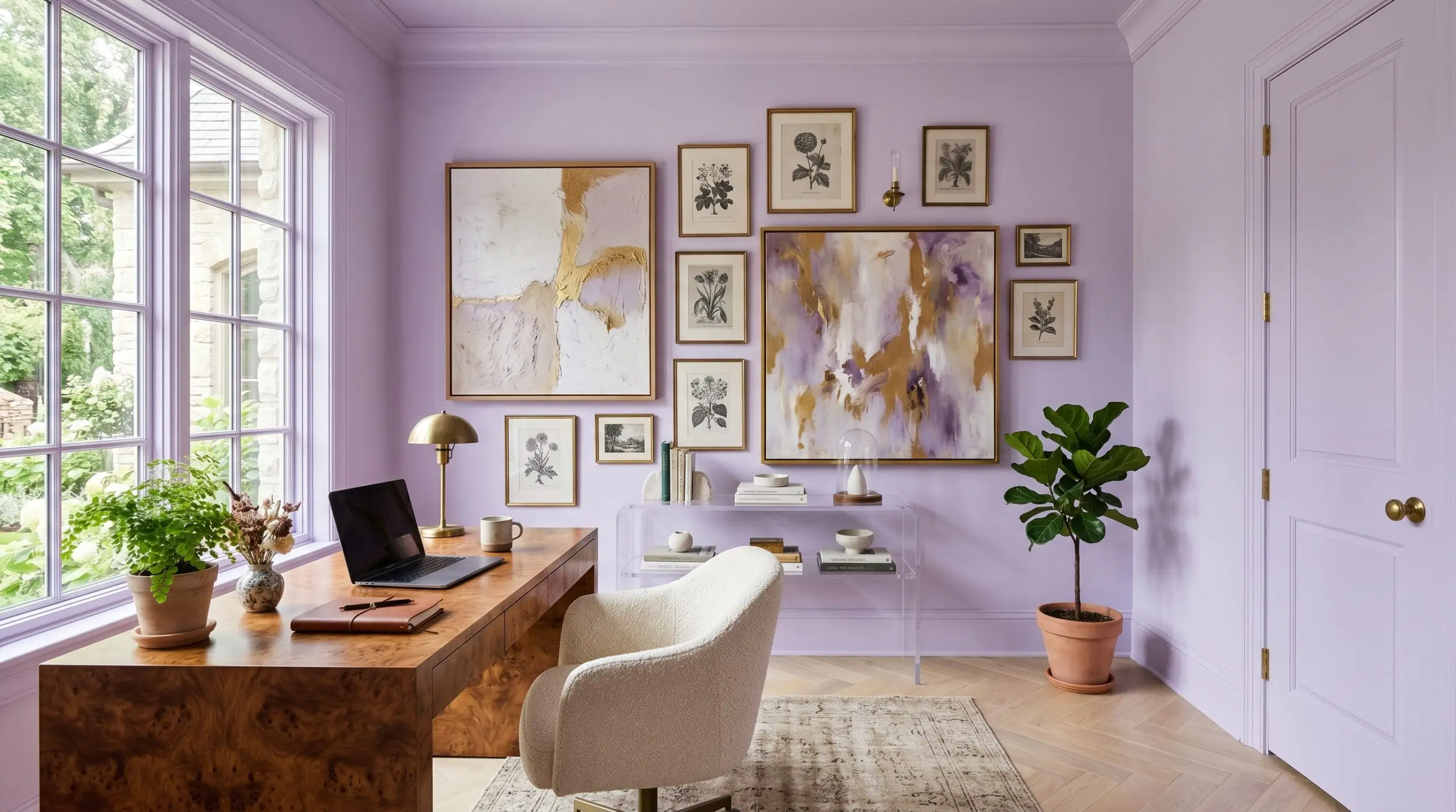
For remote workers and creatives, the home office needs to strike a balance between stimulating and serene. This specific hue fosters focus while injecting a dose of high-end personality into the daily grind.
Embrace the color-drenching technique here. Paint the baseboards, walls, window trim, and interior doors all in the exact same finish using Benjamin Moore’s Gennex Color Technology for maximum durability. This seamless application blurs the boundaries of the room, making standard, boxy bedrooms feel like tailored creative studios.
Break up the expanse of color with an asymmetrical gallery wall featuring oversized abstract canvases and vintage botanical prints. Center the space with a burl wood desk and a sleek acrylic console to masterfully execute the high/low mix.
Walk-in Closets
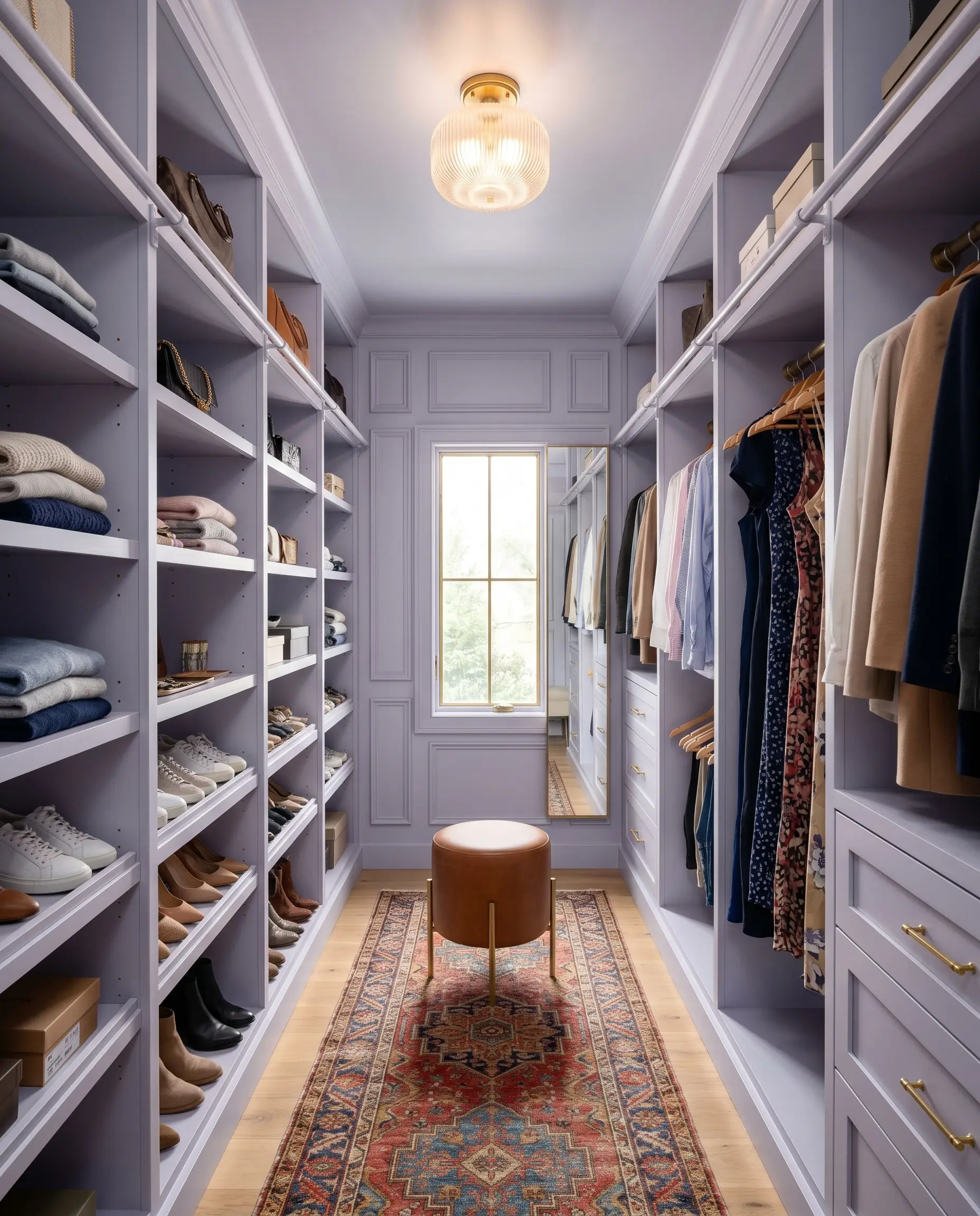
You do not need a massive renovation budget or custom mahogany cabinetry to create a boutique-style dressing room. Paint is the ultimate tool for elevating standard, big-box MDF shelving systems.
Coating the entire closet interior—shelves, brackets, and walls—in this luminous shade creates a cohesive, high-end backdrop for your wardrobe. The generous light reflectance value ensures the small space remains bright enough to easily distinguish between navy and black fabrics.
Complete the transformation by swapping out basic builder-grade lighting for a beautiful fluted glass flush mount. Add a vintage runner rug and a small saddle leather ottoman to introduce rich, tactile contrast against the soft, pastel walls.
Coordinating Colors & Material Pairings for BM Lily Lavender
Instead of demanding rigid boundaries, this blush-tinged purple thrives on gentle transitions and soft tonal bleeds. It pulls the underlying warmth out of neighboring materials while relying on crisp whites to maintain its tailored edge.
Selecting the Right White Trim
When framing this sophisticated lilac, your trim color dictates whether the room feels sharp and modern or softly atmospheric.
Tactile Finishes and Hardware
Curated Palette Companions
Designer Mood Boards
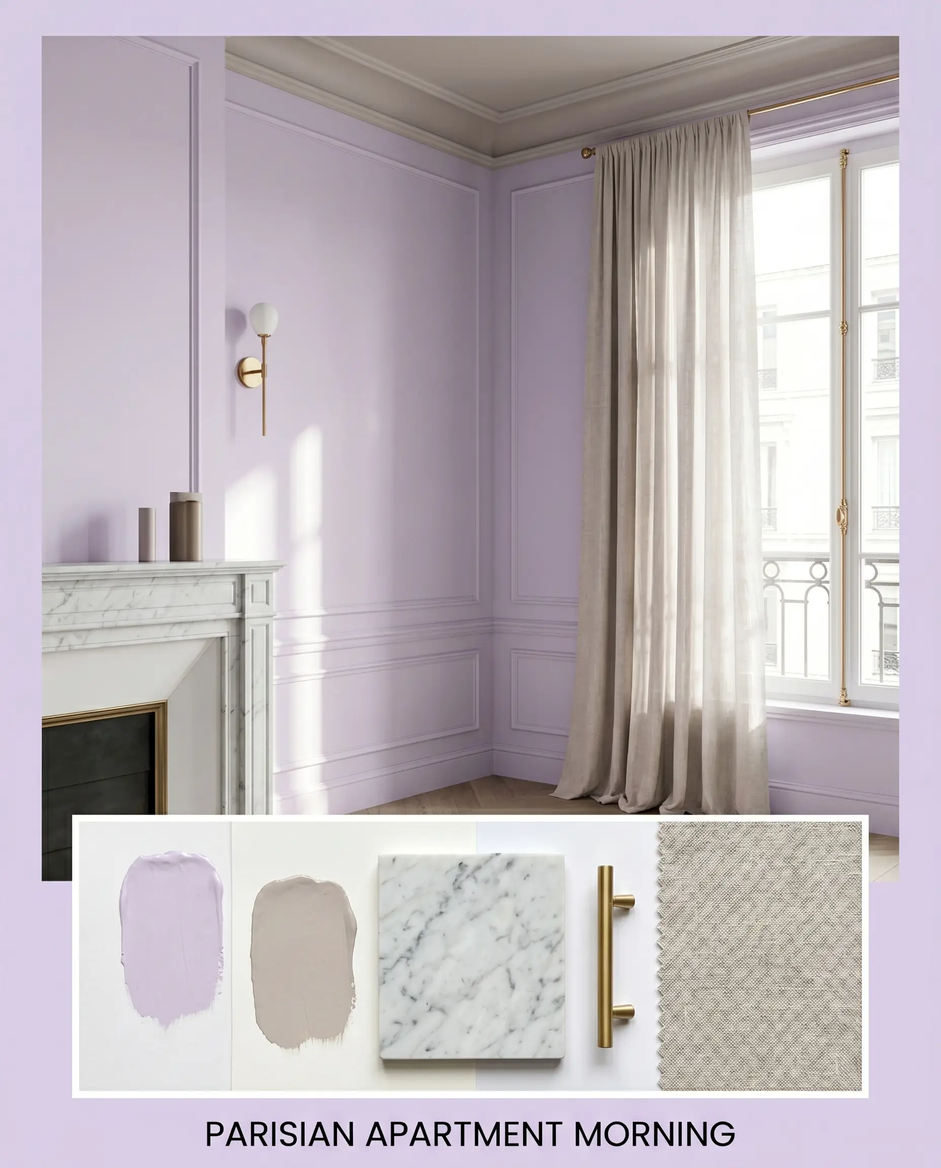
Parisian Apartment Morning This aesthetic captures the quiet, refined energy of a European flat, relying on the paint to cast a flattering, blush-tinged glow across the space. Pair the walls with unlacquered brass hardware and a breathtaking slab of honed Carrara marble to establish a sense of enduring history. Flowing slub linen drapery, subtle fluted glass accents, and a ceiling painted in Farrow & Ball Peignoir complete this deeply romantic, highly curated atmosphere.
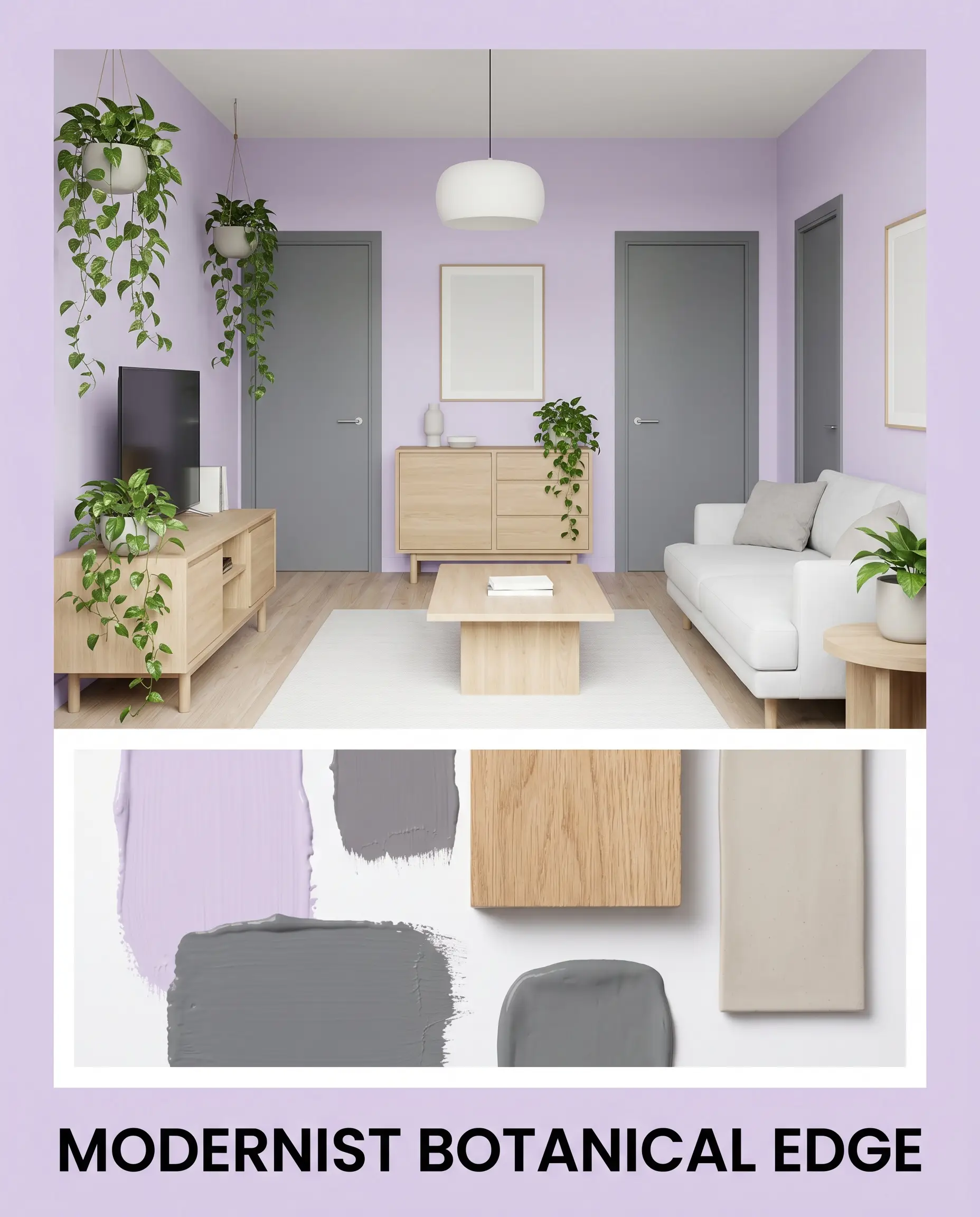
Modernist Botanical Edge For a distinctly contemporary vibe, use this mid-tone lavender as a crisp backdrop for organic, sculptural silhouettes. Anchor the airy walls with the intense depth of Benjamin Moore Charcoal Linen on your interior doors or window sashes. Introduce white oak furniture, trailing pothos in matte ceramic planters, and asymmetrical gallery walls to strike a perfect balance between tailored structure and relaxed, natural energy.
Comparing Mid-Tone Lavenders: Head-to-Head Matchups
Lighting conditions and existing architectural finishes will ultimately decide which variation of purple belongs on your walls. If your room lacks natural light or features competing undertones, you may need a shade that shifts slightly warmer or cooler to achieve your desired aesthetic.
Benjamin Moore Lily Lavender 2071-60 vs. Sherwin-Williams Rhapsody Lilac SW 6828
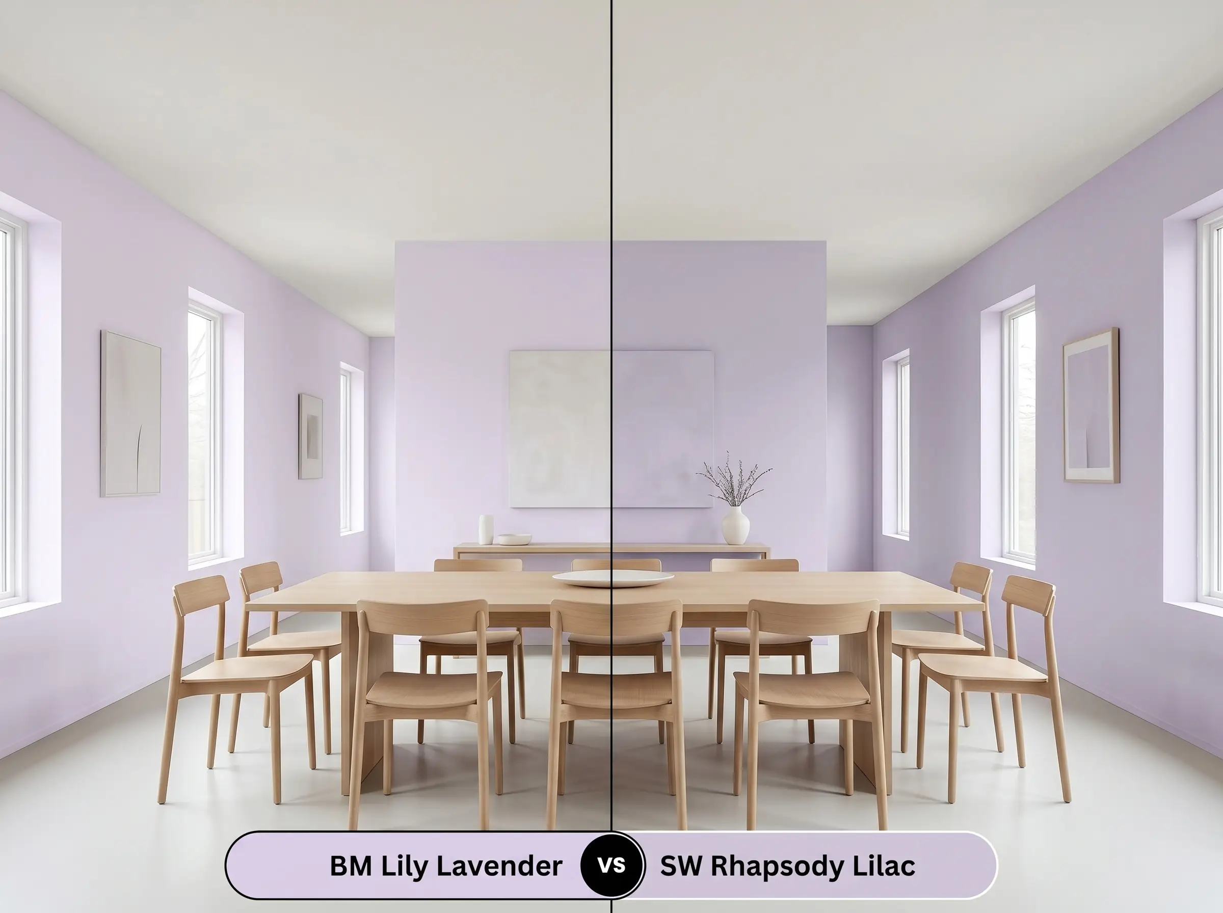
If your space requires a highly saturated, energetic focal point, then Sherwin-Williams Rhapsody Lilac SW 6828 is the superior option. It strips away the neutralizing gray base found in the Benjamin Moore option, resulting in a much cleaner, brighter violet. Choose the Sherwin-Williams iteration for playful accent pieces, but stick with BM 2071-60 if you want to wrap an entire room without overwhelming the eye.
Benjamin Moore Lily Lavender 2071-60 vs. Benjamin Moore Lavender Mist 2070-60
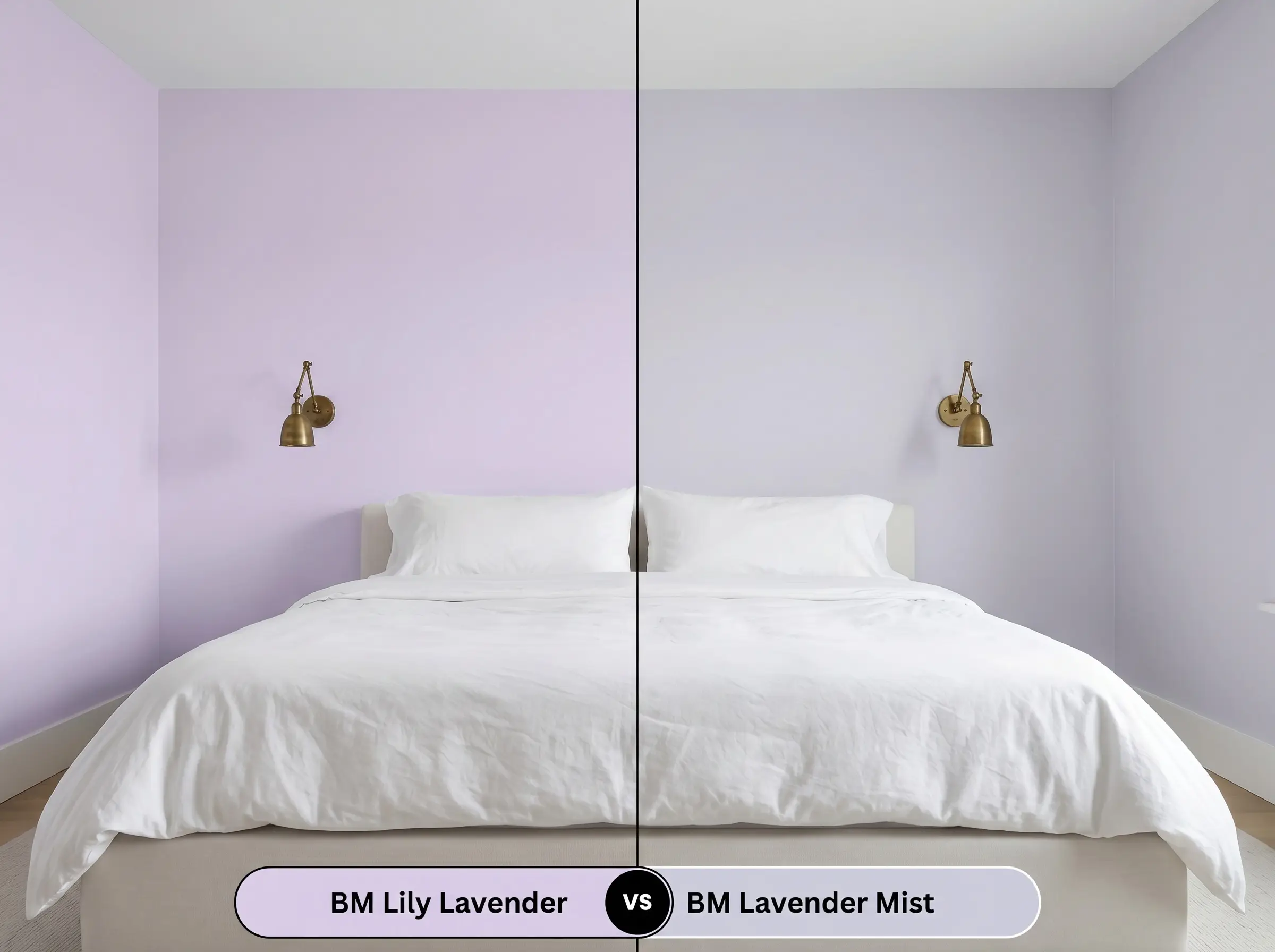
If you are designing a low-light space and need maximum luminosity, then Benjamin Moore Lavender Mist 2070-60 offers a noticeable shift. It reflects significantly more light and reads as a whisper-soft pastel, whereas its darker sibling holds its shape and depth much better in brightly lit rooms. Opt for Lavender Mist to create a faint, airy glow, but rely on the deeper shade when you need the color to act as a definitive architectural feature.
Benjamin Moore Lily Lavender 2071-60 vs. Farrow & Ball Calluna 270
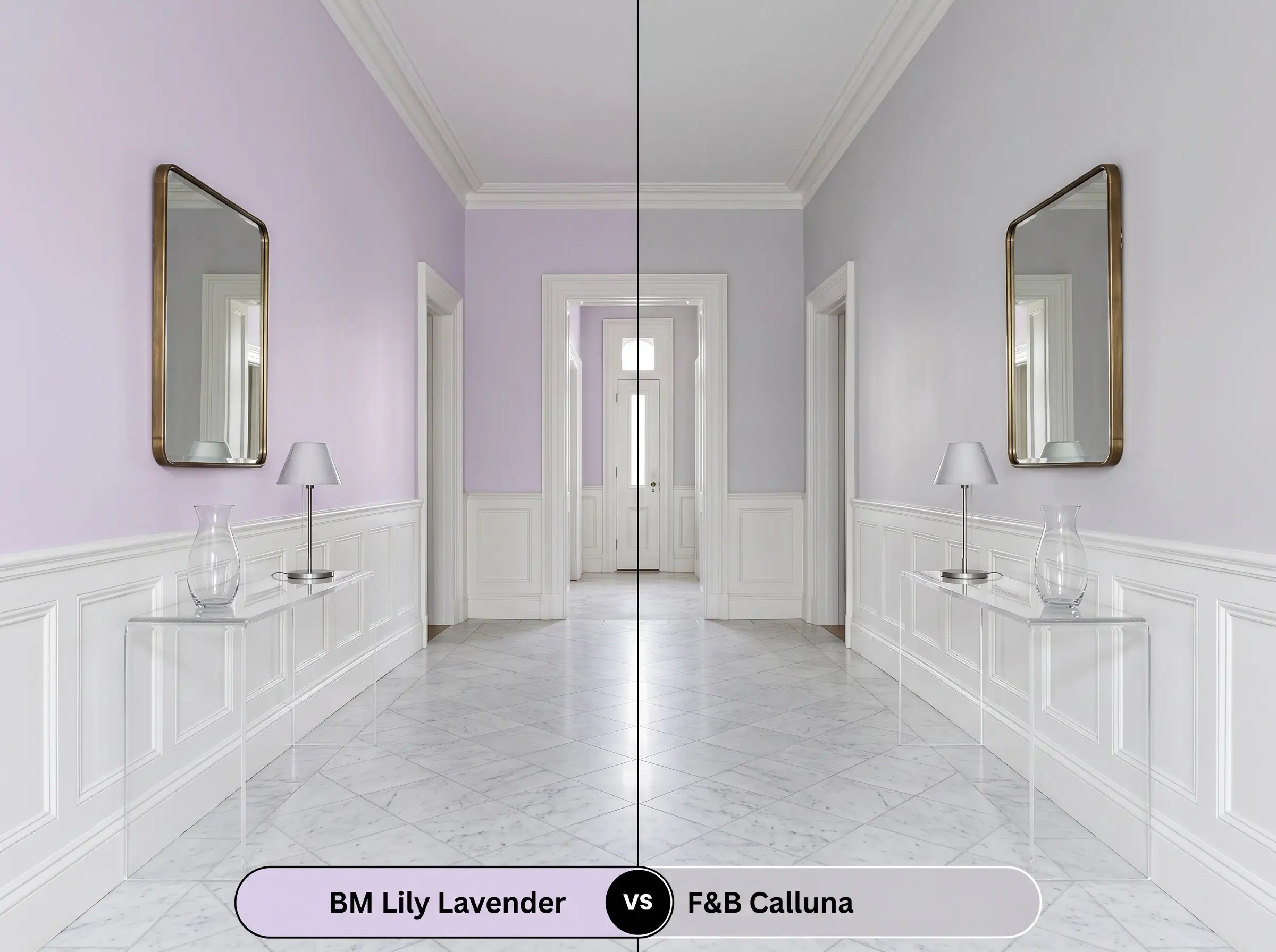
If you fear your room will look too sweet or pastel, then Farrow & Ball Calluna 270 provides an incredibly sophisticated alternative. Calluna leans heavily into its gray and black pigments, reading almost as a moody heathered neutral rather than a true purple. Select the Farrow & Ball color for historic homes needing a muted backdrop, but use the Benjamin Moore shade when you want a lively, blush-tinged atmosphere.
Finding the Perfect Match: Alternatives to BM 2071-60
Sometimes a color is nearly perfect, but you need a minor adjustment in brightness or a direct match from a different manufacturer to accommodate your renovation timeline.
Exploring the Same Color Family
Rival Brand Color Matches
Executing Lily Lavender: Practical Application Guide
Transitioning from curated mood boards to the physical reality of a paint roller requires a solid execution strategy. The way this color absorbs and reflects light is entirely dependent on your choice of sheen and surface preparation.
Selecting the Ideal Sheen
Primer and Coverage Strategy
Because this is a mid-tone pastel with a complex pigment structure, a high-quality, bright white primer is absolutely non-negotiable. If you paint directly over existing warm or dark colors, those old tones will bleed through and distort the delicate gray balance.
Expect to roll two full coats for a truly professional, opaque finish. Be incredibly mindful of your roller pressure; pastels can occasionally show flashing if the final coat is applied unevenly. Maintain a wet edge across the entire wall to ensure the color dries into a flawless, unified surface.
Frequently Asked Questions
Because south-facing light naturally amplifies warm red tones, this color will definitely shift toward a softer, pinkish lilac during the afternoon. To counteract this, balance the room with crisp white trim and cool metallic hardware to keep the aesthetic feeling tailored rather than overly sweet.
A 3000K LED bulb provides a clean, neutral light that beautifully highlights the gray undertones, preventing the color from turning muddy or overly vibrant. This specific lighting setup allows the paint to maintain its sophisticated, crisp edge even without natural sunlight.
When grounded by organic textures like white oak flooring and honed marble countertops, this shade transforms cabinetry into a stunning, highly curated focal point. The key is to use a durable satin or semi-gloss finish and pair it with modern, clean-lined hardware to firmly anchor the design in the present.
Placing this soft purple next to a deep, saturated green creates a brilliant, high-contrast relationship that immediately elevates both colors. The green acts as a profound, stabilizing force that makes the lighter lavender feel incredibly intentional and luminous by comparison.
The Final Verdict on This Sophisticated Lilac
Benjamin Moore Lily Lavender is an exceptional tool for homeowners who want to introduce soft, highly tailored color without overwhelming their daily living spaces. It performs brilliantly in transitional and soft modern environments, acting as a luminous, blush-tinged backdrop that elevates everyday furnishings. This color is perfect for those who appreciate the high/low mix, allowing standard architectural updates to feel deeply intentional and custom.
While this shade is beautifully adaptable, it strongly resists being paired with stark, ultra-warm earth tones. If you attempt to use this delicate purple alongside vibrant terracotta tiles, yellow-leaning oak floors, or rich cherry wood cabinets, the competing warm and cool undertones will actively fight each other. The yellow and orange influences in those finishes will forcefully pull the gray out of the lavender, causing the paint to look flat, muddy, and entirely disconnected from the room. Always surround this color with clean neutrals, cool stones, or muted organic woods to ensure it retains its refined, luminous glow.
Hackrea Design Secret (The Undertone Clash)