Lavender Mist 2070-60
Benjamin MooreBenjamin Moore's Lavender Mist (2070-60) is a gentle, airy shade of violet with a distinct blue-violet undertone and a soft gray cast. With an LRV of 63.19, it acts as a sophisticated, cool-leaning pastel perfect for serene bedrooms and elegant bathrooms.
Paint Technical Profile
| Color ID / SKU | 2070-60 |
| HEX Code | #CFCFE0 |
| Light Reflectance (LRV) | 63.19 |
| Use | Interior |
| Best Exposures | South-facing or West-facing |
| Best For | Bedrooms, Bathrooms, Nurseries, Accent Ceilings |
Benjamin Moore Lavender Mist: The Architectural Lilac Redefining Modern Rest
For decades, the design world has unfairly relegated soft purples to the realm of nurseries and fleeting spring trends. Benjamin Moore Lavender Mist shatters that outdated narrative by offering a highly sophisticated, muted lilac that acts as a legitimate architectural finish. This isn’t a sugary, juvenile hue; it is a meticulously balanced color structure designed for real-world homes.
By relying on a stabilizing gray cast, 2070-60 delivers a serene atmosphere without ever feeling overly sweet. It serves as a brilliant alternative to the ubiquitous cool grays and standard builder whites that often leave a room feeling flat.
If you are ready to introduce a nuanced chromatic profile into your space, this shade provides a remarkably elegant foundation. It rewards thoughtful material pairings and intentional lighting, proving that pastels can absolutely command a mature, high-end room.
Benjamin Moore Lavender Mist: Undertones & LRV
When evaluating a nuanced shade like Lavender Mist, the first question is always whether it leans warm or cool. This specific formulation is decidedly cool-toned, relying on a crisp foundation to maintain its modern edge. Understanding this underlying temperature is the secret to pairing it successfully with your hard finishes and avoiding unintentional color clashes.
Sitting at a light reflectance value (LRV) of 63.19, this shade reflects a moderate amount of ambient lighting back into the room. It possesses enough visual weight to stand out crisply against bright white trim, yet it remains airy enough to prevent smaller spaces from feeling enclosed.
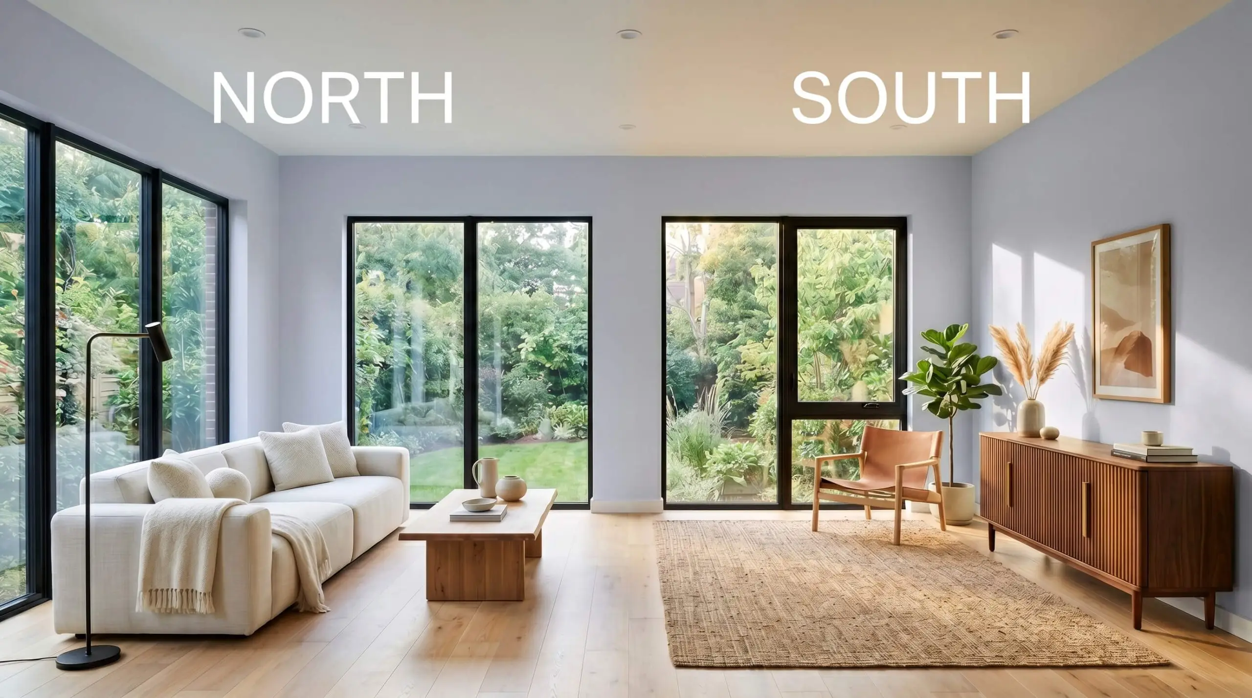
Lighting Effects & The Chameleon Factor
Because this cool-toned pastel relies heavily on its neutralizing gray base, it is highly reactive to the shifting sun. The color you paint on the wall at dawn will look entirely different by dusk. Here is exactly how your home’s lighting will manipulate this shade throughout the day.
Transforming Your Home with Lavender Mist
The true magic of this muted lilac lies in its ability to adapt to incredibly diverse architectural environments. While it certainly excels in spaces dedicated to rest, its complex pigment profile allows it to travel far beyond the expected zones. Let’s explore how to intentionally deploy this shade across your home.
Master Bedrooms
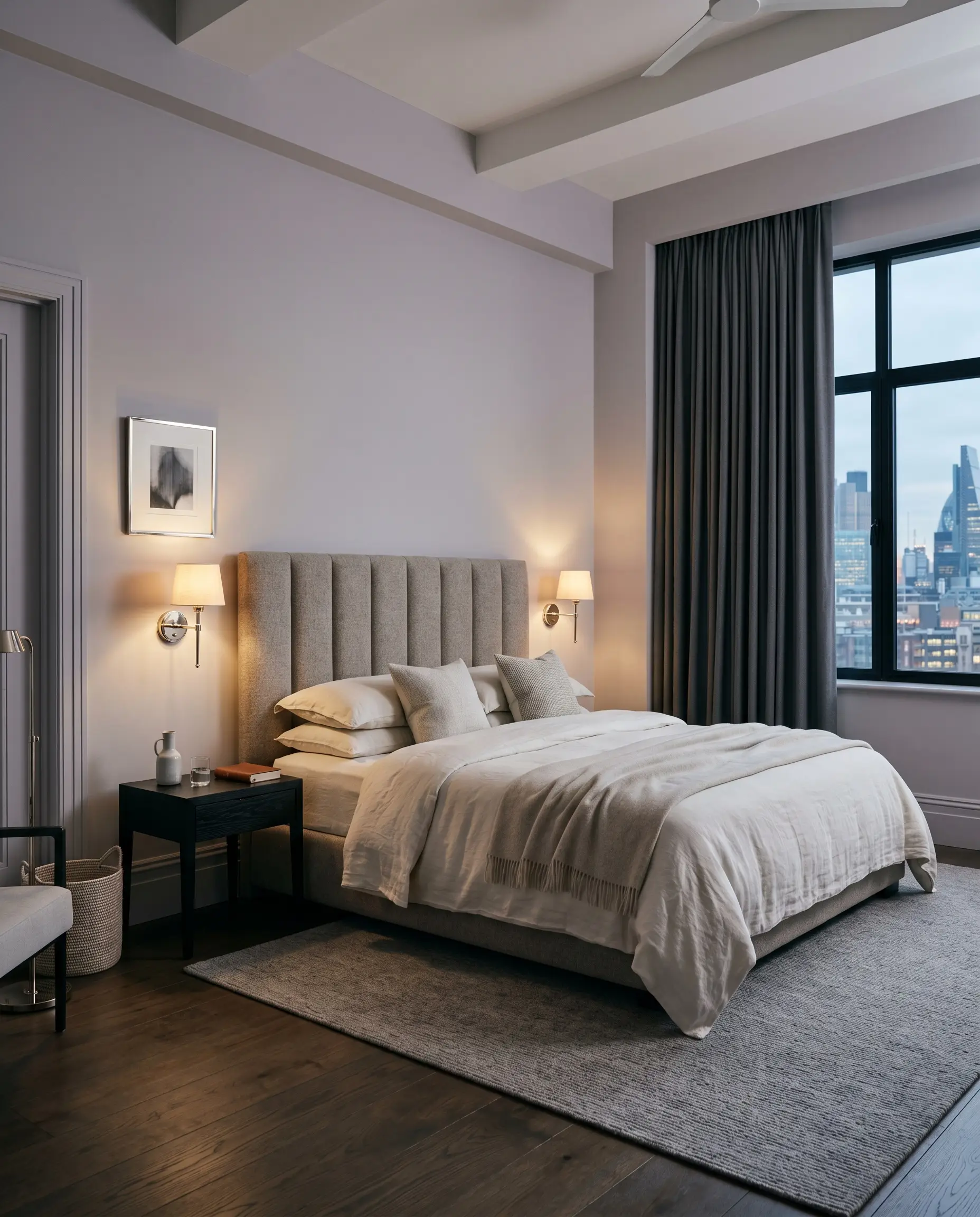
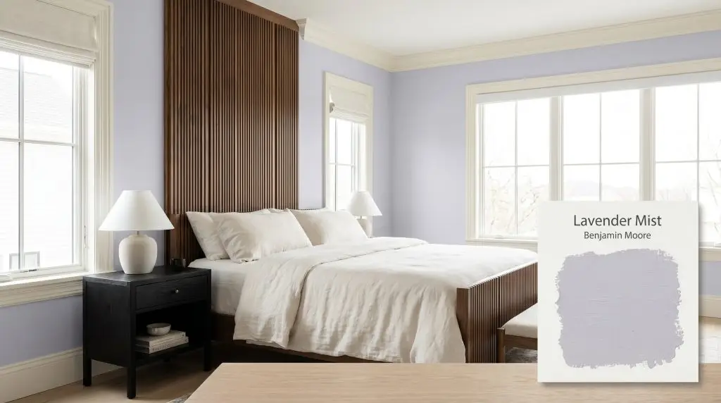
To create a primary suite that feels like a curated boutique hotel, avoid pairing this shade with overly fussy, traditional bedding. Instead, contrast the soft violet walls with crisp, tailored elements like a channel-tufted headboard or a sleek, ebonized ash nightstand. The tension between the delicate wall color and sharp, modern furniture creates a highly intentional design narrative for an urban professional seeking a tactile retreat.
Consider wrapping the entire room—including the baseboards and trim—in a flat finish for a seamless, velvet-like envelope. Layer the space with washed linen sheets in soft ivory and heavy worsted wool drapery to add necessary tactile warmth. If your bedroom lacks natural light, lean into the resulting icy periwinkle tone by introducing polished nickel sconces to bounce ambient illumination around the room.
When using cool pastels in a bedroom, unlacquered brass hardware is your best friend. The living finish of the raw brass introduces a necessary visual warmth that prevents the gray-lavender walls from feeling sterile.
Hackrea Design Secret (The Hardware Contrast)
Nurseries and Children’s Rooms
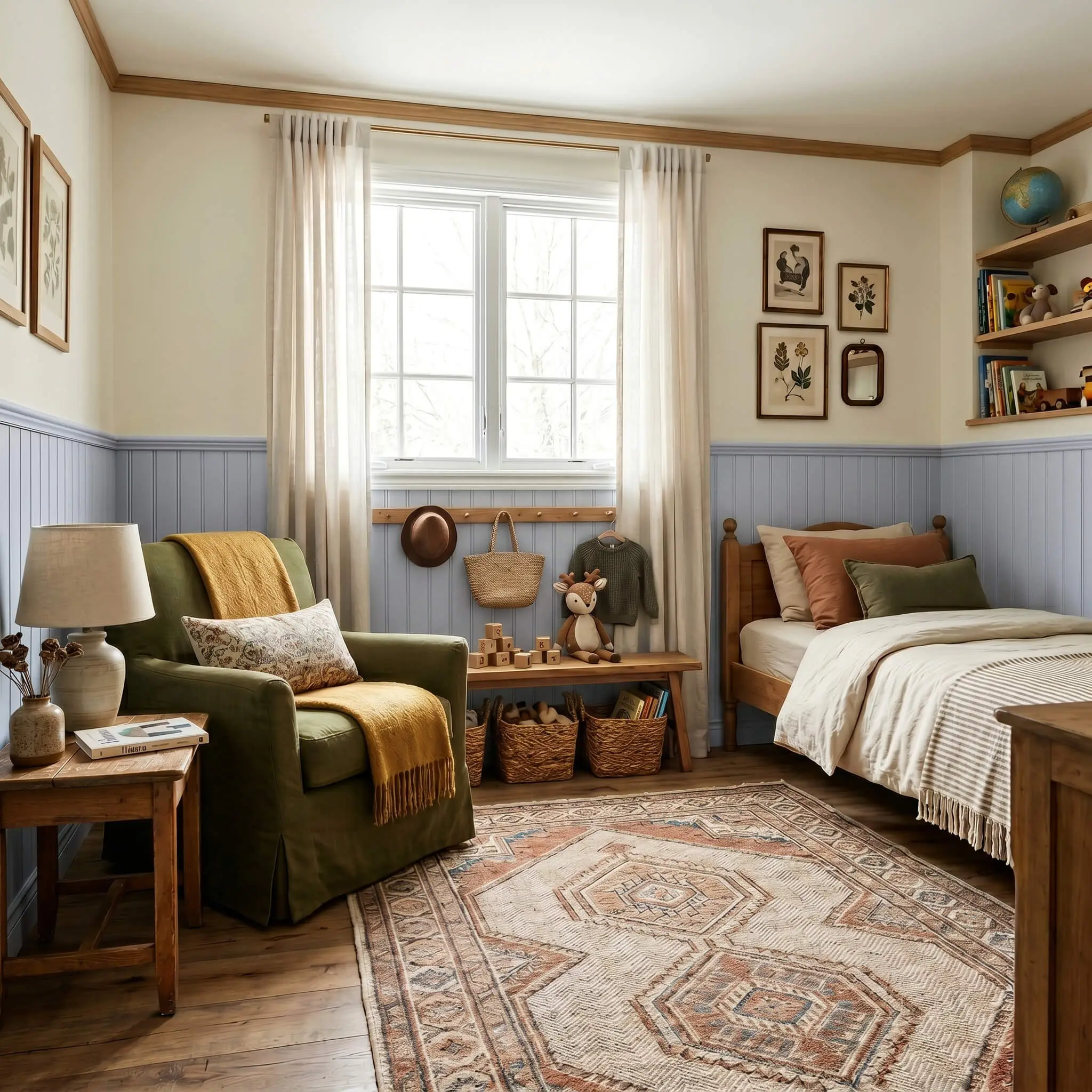
This shade offers a brilliant strategy for parents who want a serene environment that a child won’t immediately outgrow. Rather than painting the entire room, apply Benjamin Moore Lavender Mist halfway up the wall using classic beadboard paneling, leaving the upper half a crisp, gallery white. This establishes a structured, architectural foundation that easily transitions from a crib setup to a teenager’s study space.
Avoid defaulting to predictable pastel pink pairings; instead, introduce earthy contrasts like a mustard yellow throw blanket or a rich, olive green slipcovered armchair. Settle the room with a durable, vintage-inspired herringbone rug to add an element of heritage. This approach respects the home’s overall aesthetic while still providing a playful, imaginative backdrop.
Spa-like Bathrooms
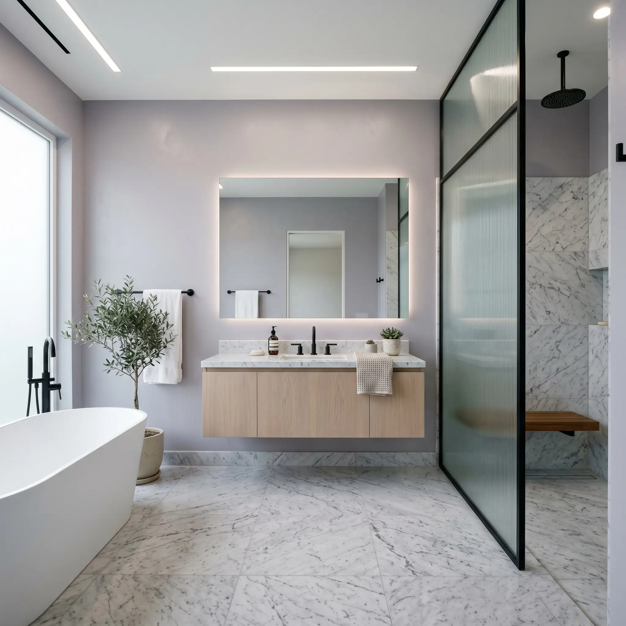
Bathrooms are the perfect canvas for this color because the natural reflectivity of tile and glass beautifully offsets the paint’s matte finish. To elevate the space beyond a basic suburban bathroom, pair the walls with heavily veined, honed Carrara marble floors. The gray cast within the paint will seamlessly speak to the gray veining in the stone, creating a cohesive, custom-built look.
Incorporate a floating vanity in bleached oak to introduce a subtle, organic warmth that balances the cool-toned walls. Keep the window treatments minimal—perhaps a simple reeded glass privacy screen—to let the morning light manipulate the violet hues naturally.
Be incredibly mindful of your vanity lighting. If you install heavily yellow, low-kelvin bulbs (under 2700K) directly above the mirror, the blue-violet undertones will instantly muddy, leaving your walls looking like a bruised, dingy gray. Always opt for crisp, daylight-mimicking bulbs in a bathroom.
Clash Warning (The Lighting Washout)
Painted Ceilings
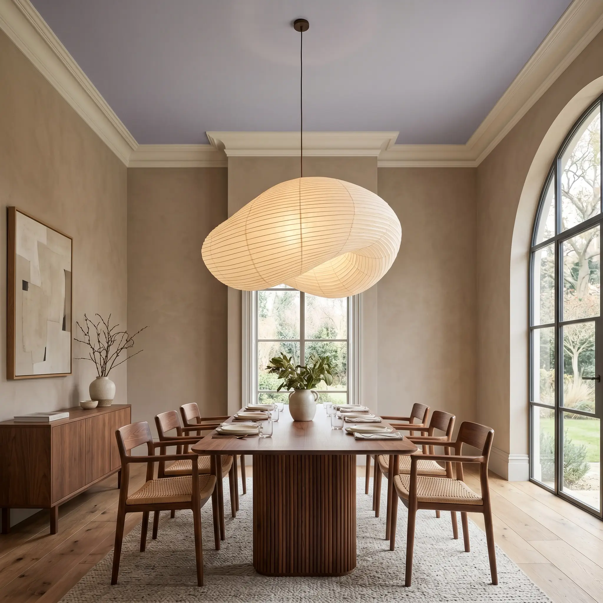
Treating the ceiling as the fifth wall is a premium curatorial trick that completely redefines the scale of a room. Using this muted lilac overhead serves as a highly sophisticated haint blue alternative, drawing the eye upward and mimicking the expansive feeling of a dusk sky. It is particularly striking in spaces with tall crown molding or classic tray ceilings.
If you have a dining room or a sunroom painted in a warm taupe or soft ivory, brushing this cool violet onto the ceiling introduces a brilliant, unexpected layer of design tension. Keep the ceiling finish completely flat to hide drywall imperfections and allow the pigment to absorb the light softly. Finish the look by suspending an oversized, sculptural paper lantern or a blackened steel chandelier to contrast the delicate canopy above.
Selecting Materials & Colors for Benjamin Moore Lavender Mist
This delicate violet requires intentional boundaries to hold its shape on the wall. Placed next to muddy or overly warm tones, it loses its crisp edge, but paired with sharp contrasts and organic textures, it transforms into a deeply sophisticated backdrop.
Crisp White Trim Pairings
Benjamin Moore Chantilly Lace OC-65 provides a stark, brilliant border that forces the lilac to read as a deliberate color rather than a washed-out neutral. If your home has limited natural light, Sherwin-Williams High Reflective White SW 7757 is an excellent alternative that aggressively bounces available illumination to keep the room feeling bright. Both options lack sneaky yellow undertones, ensuring the cool-toned pastel stays incredibly clean and tailored.
Tactile Materials and Hardware Finishes
Building a Cohesive Palette
Curated Aesthetic Concepts
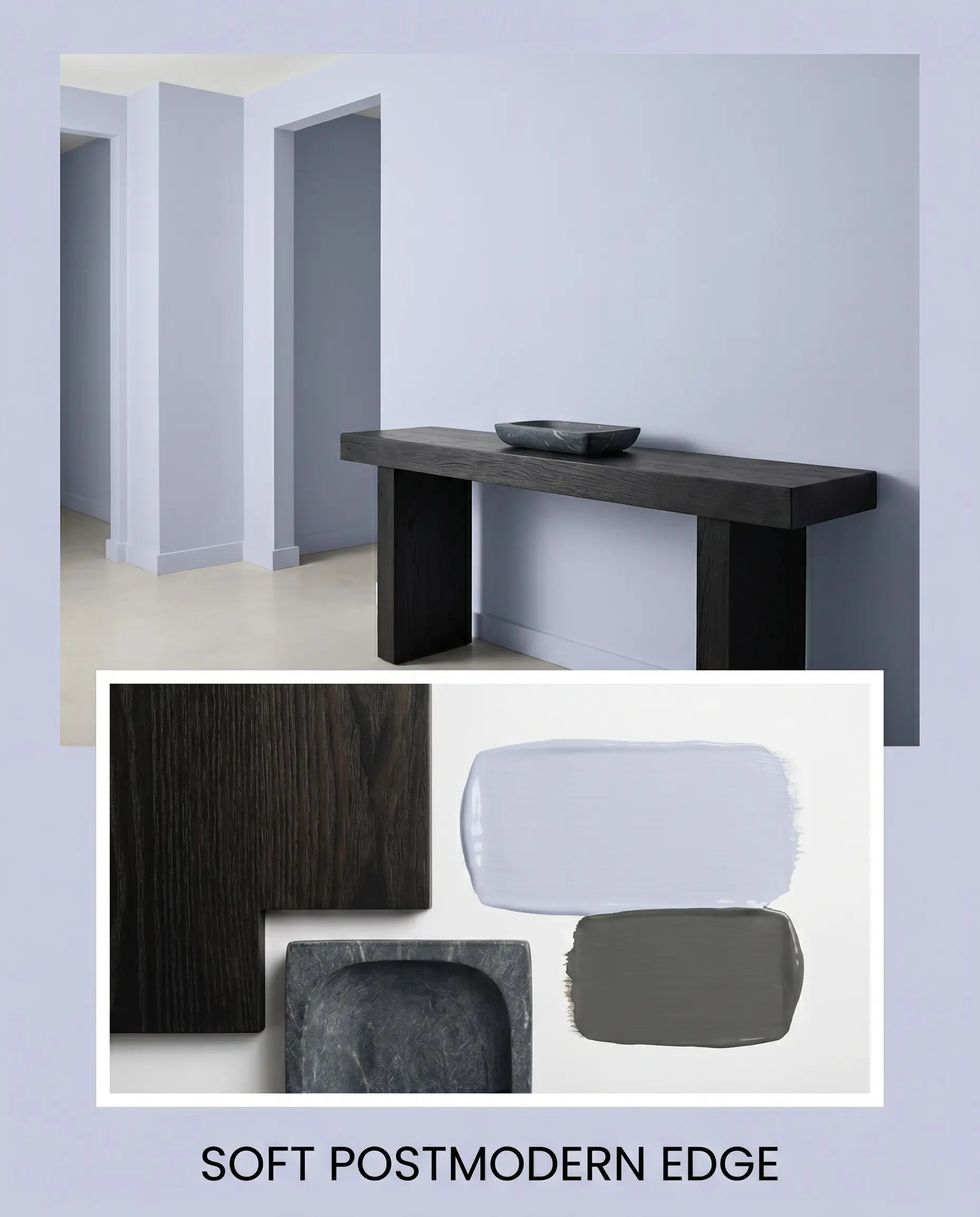
Soft Postmodern Edge: This look thrives on the tension between delicate color and stark, geometric silhouettes. Pair the muted lilac walls with a chunky, ebonized ash console table and a heavily veined charcoal soapstone catchall. Layer in abstract geometric art and minimal window treatments to keep the energy sharp, modern, and highly curated.
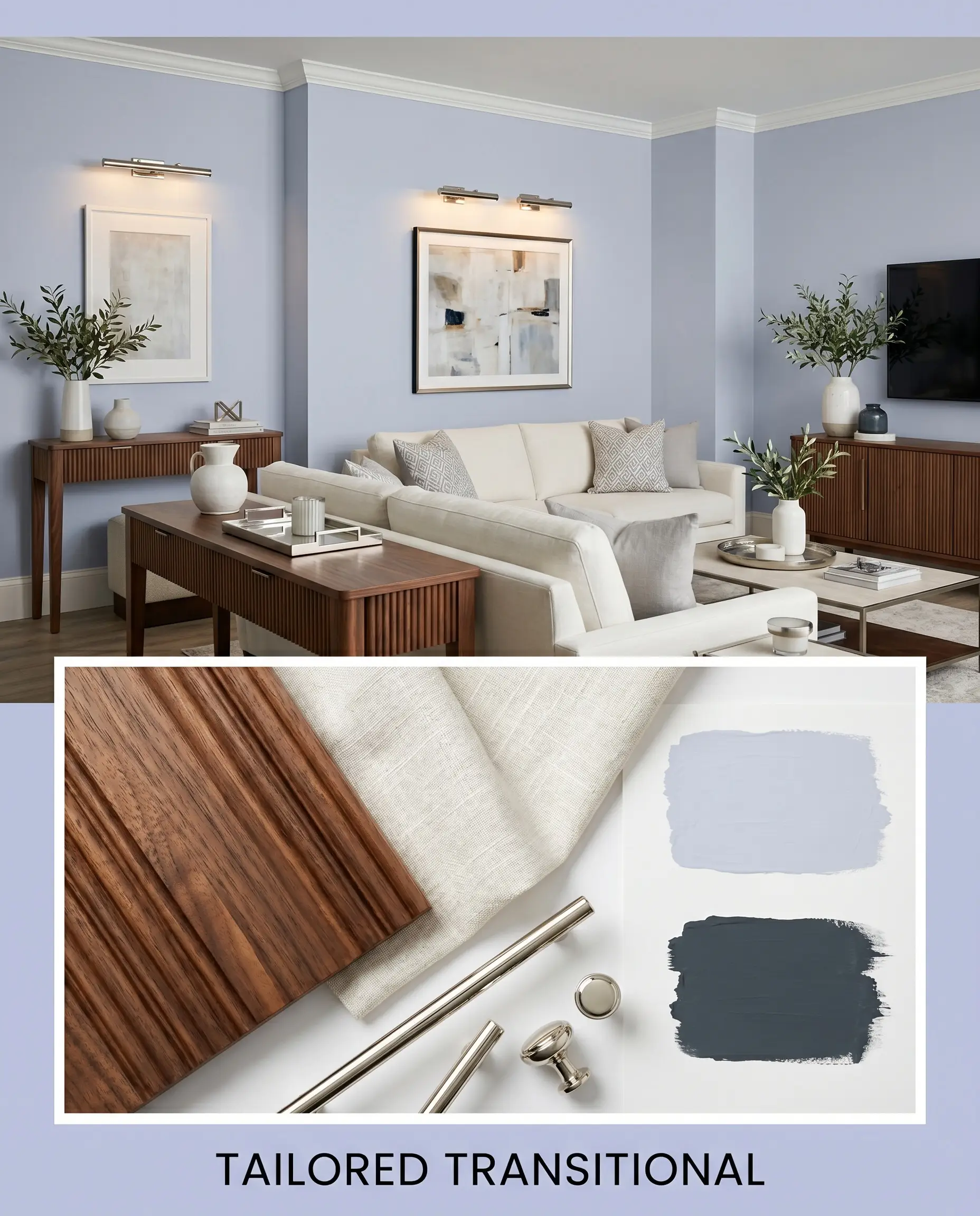
Tailored Transitional: For a more classic approach that still feels fresh, use fluted walnut furniture to bring an earthy, approachable warmth to the cool-toned foundation. Introduce soft ivory washed linen upholstery to soften the room’s edges and invite relaxation. Finish the space with polished nickel picture lights and vintage oil portraits to bridge the gap between historic charm and contemporary crispness.
Sculptural Serenity: This aesthetic focuses entirely on creating a calm, tactile retreat using organic shapes and quiet contrasts. Anchor the room with a plush, worsted wool rug in a soft cream, allowing the violet walls to provide a gentle wash of color. Add warmth through unlacquered brass candlestick holders and oversized branches in simple glass vases, ensuring the space feels grounded and restorative.
Benjamin Moore Lavender Mist Color Comparisons
Choosing the perfect pastel often comes down to evaluating your specific lighting conditions and architectural style. When a color fails to perform, it is usually because its hidden undertones are fighting the environment, making a side-by-side comparison absolutely vital to your design’s success.
Benjamin Moore Lavender Mist vs. Benjamin Moore Lily Lavender 2071-60
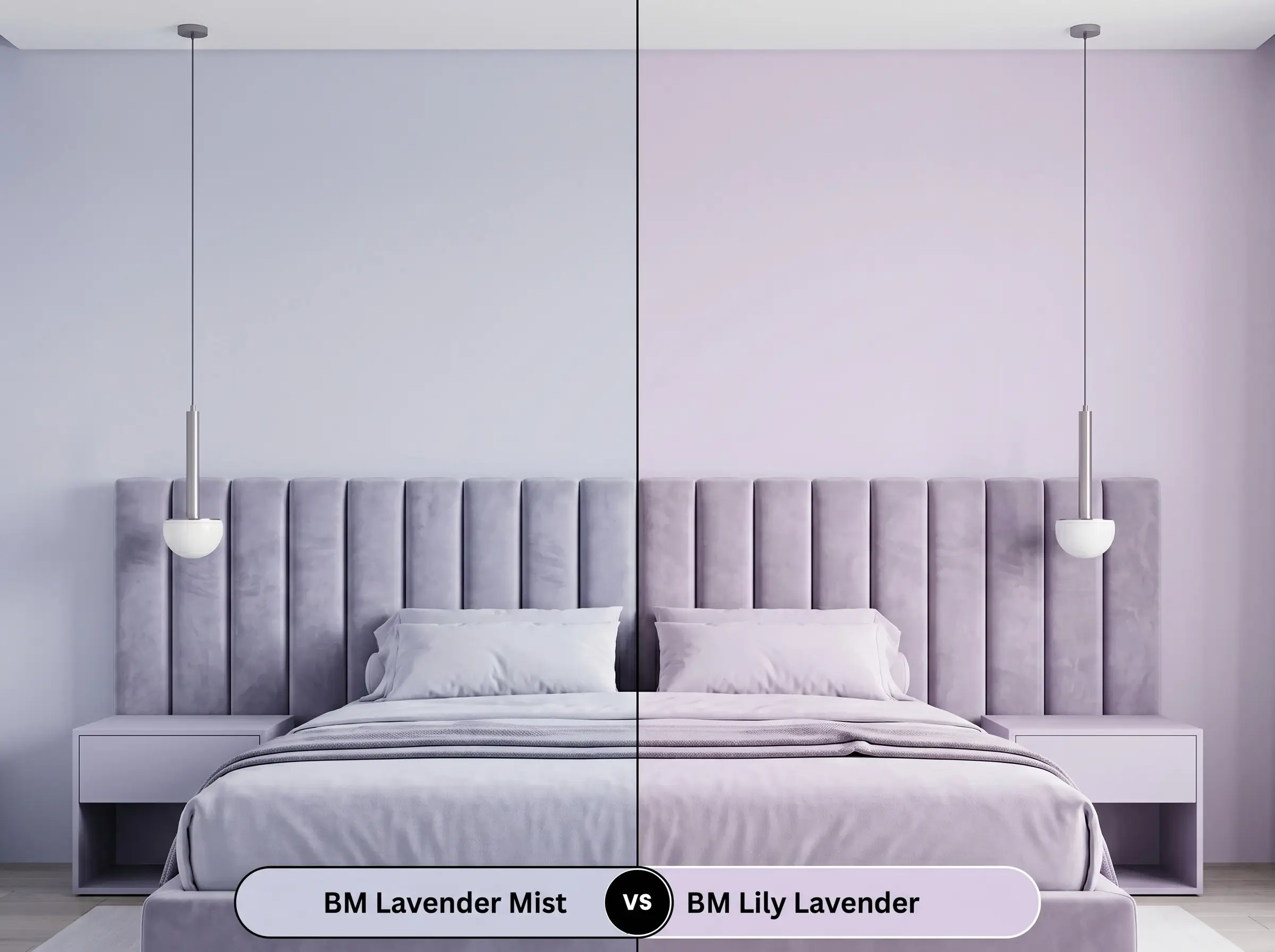
Lily Lavender 2071-60 carries a slightly more saturated, traditional purple pigment compared to our primary shade. If your room receives an abundance of warm southern light, Lily Lavender will read as a much sweeter, truer violet. However, if you want a more subdued, architectural finish that acts like a neutral, Lavender Mist 2070-60 retains that crucial gray shadow to prevent the walls from looking overly vibrant.
Benjamin Moore Lavender Mist vs. Sherwin-Williams Breathtaking SW 6814
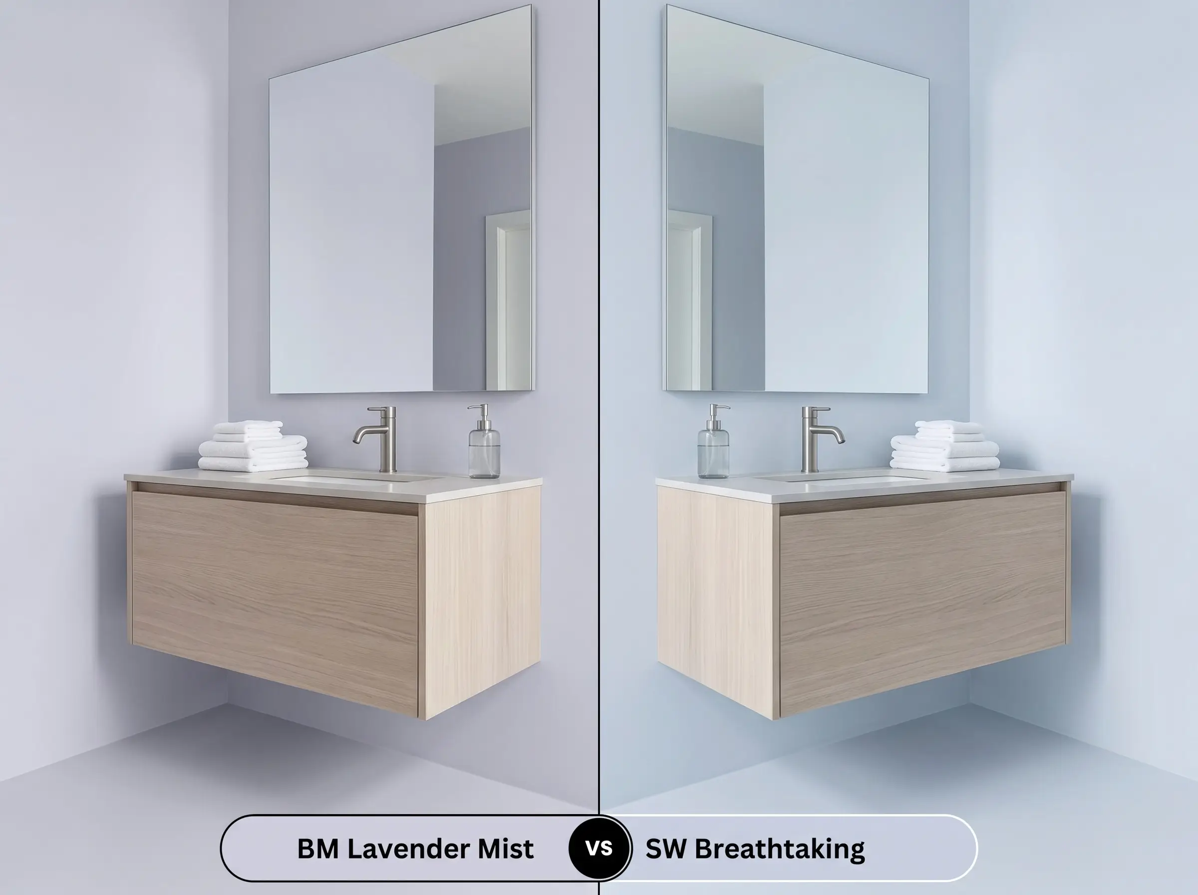
Sherwin-Williams Breathtaking SW 6814 leans noticeably further into a cool, icy blue-violet territory. If you are working with a north-facing room, Breathtaking can easily shift into a chilly periwinkle, which might feel too stark for a cozy retreat. The Benjamin Moore shade provides just enough of a muted lilac base to maintain a softer, more inviting energy while still offering that crisp, modern edge.
Exploring Alternative Muted Lilacs
Sometimes you fall in love with a color’s structural DNA but need a minor adjustment in depth or require a match from a different manufacturer. Whether you need a slightly higher light reflectance value for a dim hallway or are shopping across brands, these targeted alternatives provide excellent solutions.
Benjamin Moore Shade Variations
Color Matches from Rival Brands
Painting with Lavender Mist: Execution Tips
Transitioning a beautiful color from a swatch to a finished wall requires strategic planning. The sheen you select and the primer you apply will directly influence how this cool-toned pastel ultimately performs in your home.
The Dynamic Sheen Guide
Primer and Coverage Strategy
Because this hue relies on a delicate balance of gray and violet, any existing wall color will drastically alter its final appearance. You must use a high-quality, bright white primer to create a blank canvas, completely blocking out any old yellow or beige tones that could muddy the finish.
Expect to apply two full, even coats to achieve the true depth and opacity of Benjamin Moore 2070-60.
Hackrea Pro-Tip (Avoiding Roller Flashing): Light pastels with gray bases are notorious for “flashing,” where uneven roller pressure leaves visible, shiny streaks on the wall. Always maintain a wet edge while rolling, and never go back over a partially dry section to touch up a spot.
Frequently Asked Questions
Because textured surfaces create thousands of tiny micro-shadows, this shade will naturally look slightly darker and grayer on a heavily textured ceiling than it does on smooth drywall. If you want the true, airy lilac to shine through, smoothing the ceiling first will yield a much cleaner, more high-end result.
Yes, the cool gray and blue-violet notes in the paint sit opposite the yellow-orange tones of honey oak on the color wheel. In low-light environments, this combination creates an uncomfortable visual tension, often making the walls look icy and the floors look aggressively orange.
It absolutely can, provided you install the correct artificial lighting to support the color structure. You must use crisp, daylight-mimicking LED bulbs (around 4000K) to keep the violet looking fresh; warm, yellow bulbs will immediately turn the vanity into a muddy, bruised gray.
Modern low-E windows often have a subtle green or blue tint designed to block UV rays and heat. During peak afternoon sun, this tinted glass will filter the incoming light and actually amplify the blue undertones in the paint, pushing the walls slightly closer to a cool periwinkle.
The Final Verdict on Benjamin Moore 2070-60
Benjamin Moore Lavender Mist is an exercise in restraint, offering a highly sophisticated take on pastel decor. It is perfect for design enthusiasts who want to introduce a serene, chromatic profile into their homes without sacrificing a modern, tailored aesthetic. When grounded by rich woods and crisp white trim, it elevates bedrooms, bathrooms, and transitional spaces with an elegant, calming energy.
While its gray cast makes it versatile, this color requires intentional styling to succeed. If you pair this cool violet with warm, yellow-leaning woods like honey oak or earthy, Tuscan-style granites, the competing undertones will actively fight each other. The orange notes in those finishes will pull the blue out of the paint in an unflattering way, making the walls look uncomfortably icy and the hard finishes look dated. Stick to crisp whites, dark stones, or neutral walnuts to ensure the room feels cohesive, intentional, and beautifully curated.