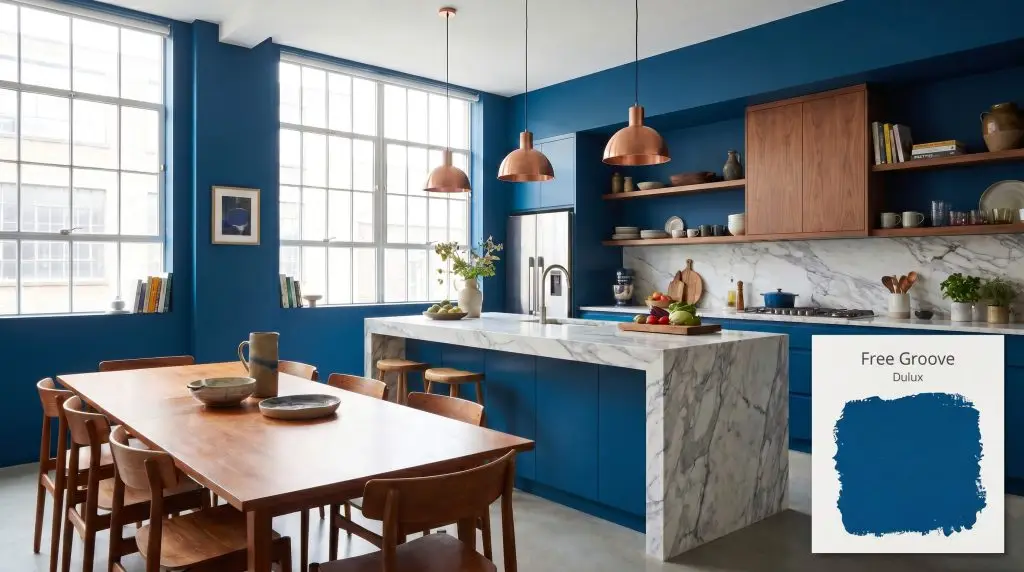
Free Groove 62BB 08/369
DuluxDulux Free Groove (62BB 08/369) is a vibrant, expressive deep indigo-cyan with an LRV of 6.7. Part of the 2026 Rhythm of Blues collection, it features heavy teal undertones that create a bold, energizing atmosphere in well-lit rooms and a moody depth in shadowed spaces.
Paint Technical Profile
| Color ID / SKU | 62BB 08/369 |
| HEX Code | #024A7F |
| Light Reflectance (LRV) | 6.7 |
| Use | Interior, Exterior |
| Best Exposures | South-Facing or Well-Lit Spaces |
| Best For | Accent walls, kitchen islands, dining rooms, and hospitality spaces |
Dulux Free Groove: How This Vibrant Indigo Transforms Everyday Architecture
There is a distinct energy that happens when a paint color refuses to sit quietly in the background. As a standout in the Dulux Colour of the Year 2026 lineup, Dulux Free Groove (62BB 08/369) completely redefines how we approach dark, saturated walls in residential spaces. It strips away the dusty, traditional feel of standard navy and replaces it with an electric, highly curated depth.
For homeowners looking to move away from safe neutrals, this vibrant indigo paint offers a brilliant architectural tool. It actively changes the perceived boundaries of a room, softening harsh drywall angles while injecting a sophisticated, enveloping mood. If you want to understand how to decorate with the Dulux 2026 Rhythm of Blues collection, mastering this specific shade is the perfect starting point.
Because it carries such a complex pigment profile, this color requires intentional styling and thoughtful lighting to reach its full potential. We are going to break down exactly how this dynamic blue behaves on the wall, and how you can seamlessly integrate it into your own home alongside accessible furnishings and premium accents.
Dulux Free Groove: Undertones & LRV
When evaluating the temperature of Free Groove, it reads as a definitively cool shade, yet it hums with a highly vibrant, energetic warmth underneath. This prevents the color from feeling icy or uninviting when applied across large surface areas.
To understand how this color will actually look in your home, we have to look closely at its structural DNA:
With an LRV of just 6.7, Free Groove absorbs a massive amount of light. Instead of bouncing illumination around the room, it acts as a visual anchor, pulling walls inward to create a deeply dramatic atmosphere. This low LRV blue is designed to wrap a space in heavy shadow, making it incredibly effective for rooms where you want to foster intimacy.
How Light Manipulates This Vibrant Indigo
The biggest environmental risk with this specific paint is placing it in heavily shaded, cool-lit corners without adequate contrast. Without enough natural or artificial light to activate its teal micro-nuances, the high green-to-red ratio can cause the color to feel heavy and aquatic rather than crisp and intentional.
Testing this color on multiple walls is non-negotiable because its appearance shifts dramatically as the sun moves.
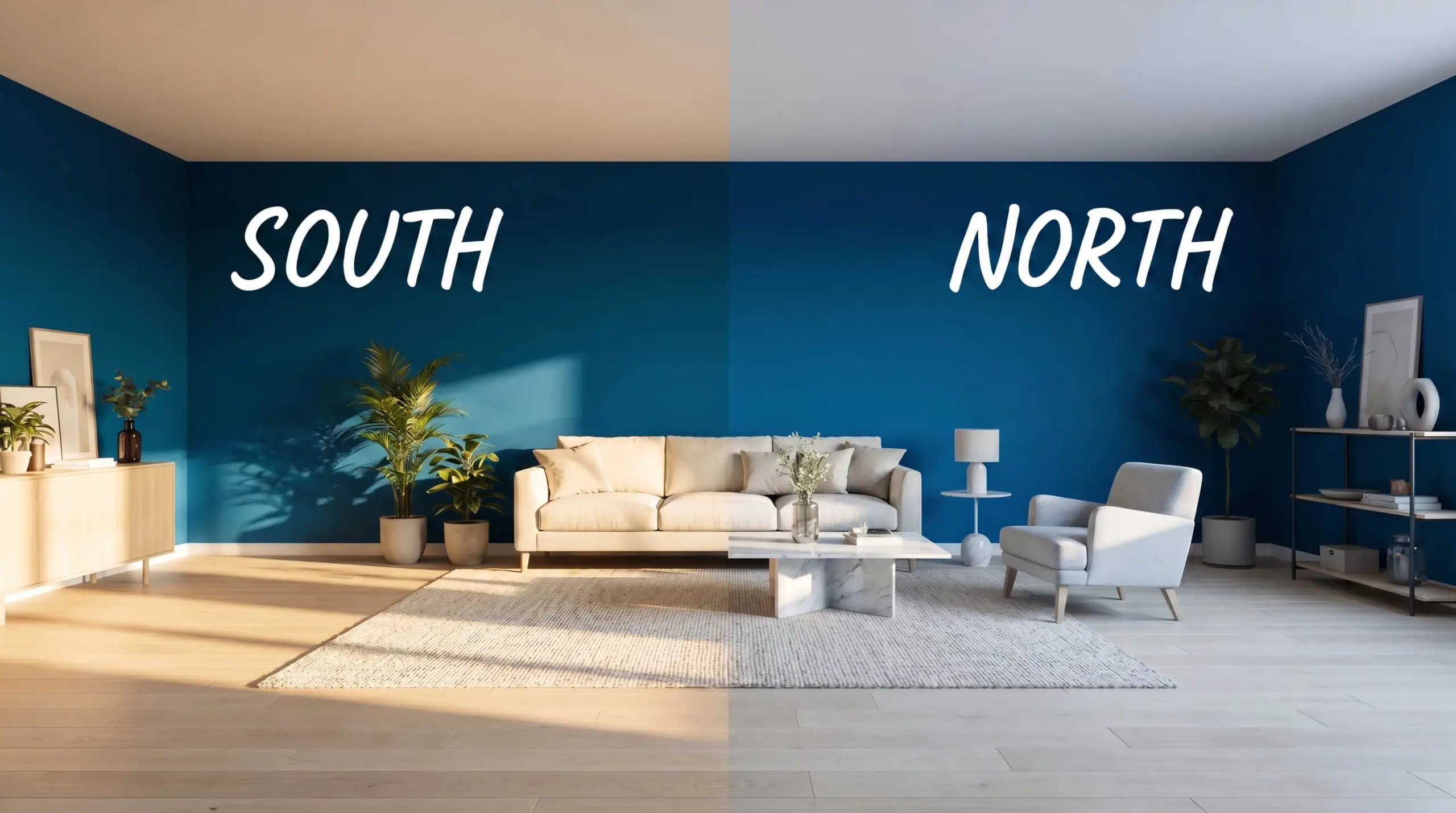
To maintain the crisp, modern edge of this indigo at night, upgrade your room’s lighting to 3000K or 3500K LED bulbs. This specific temperature provides enough clarity to keep the cyan undertones vibrant without turning the room sterile.
Hackrea Pro-Tip (Lighting Control)
Everyday Room Applications
This shade brings a remarkably cohesive, grounding energy to residential architecture. Instead of dictating a single aesthetic, its rich pigment adapts beautifully to the materials placed around it, shifting effortlessly from sleek modernism to relaxed transitional styling.
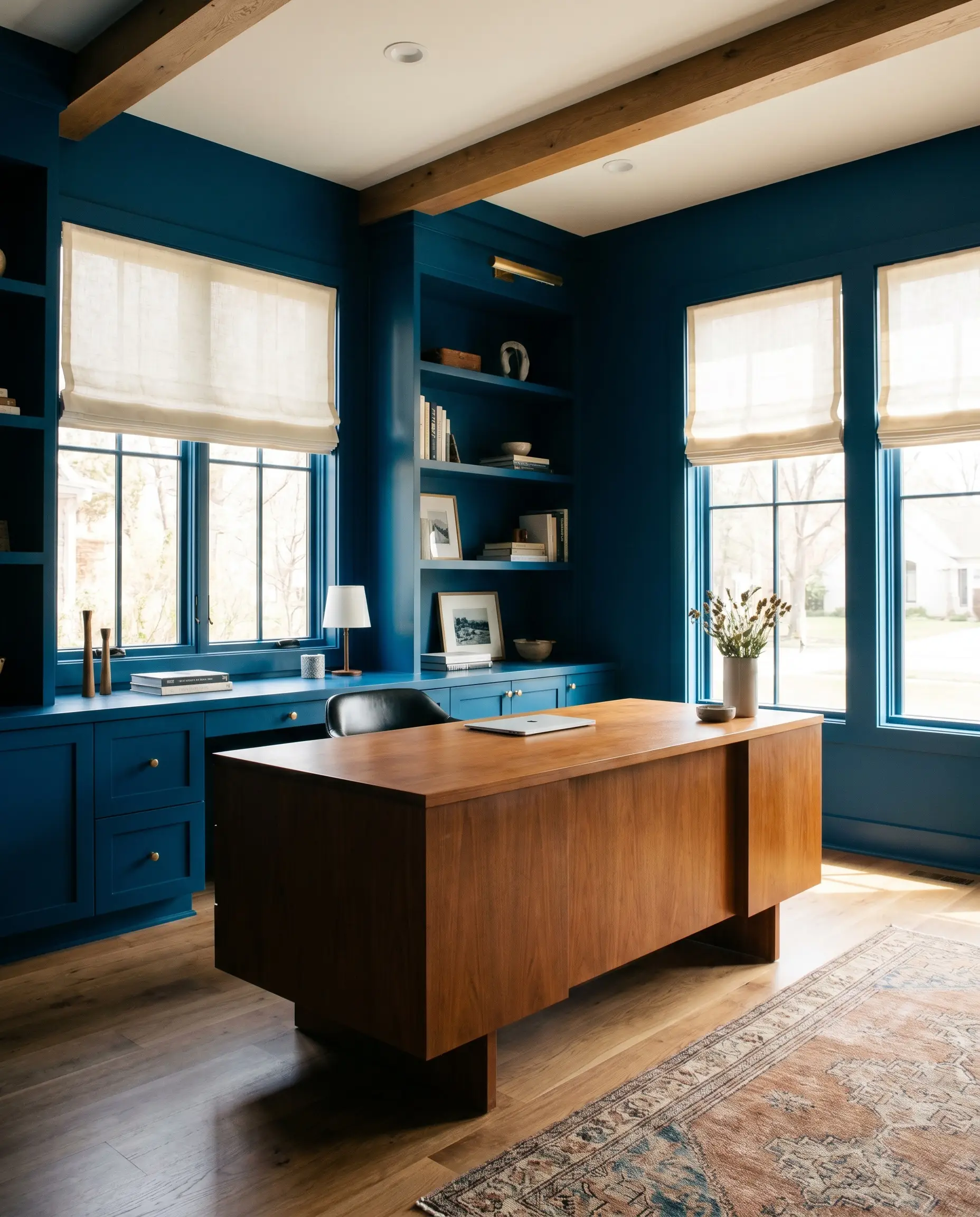
Home Offices
In a dedicated workspace, this color excels at establishing a focused, distraction-free wellness zone. Wrapping the entire room—including stock cabinetry or basic shelving—in this deep blue creates an immersive environment that feels highly intentional. Pair it with warm, mid-tone wood desks and simple linen window treatments to balance the heavy saturation and keep the room feeling fresh.
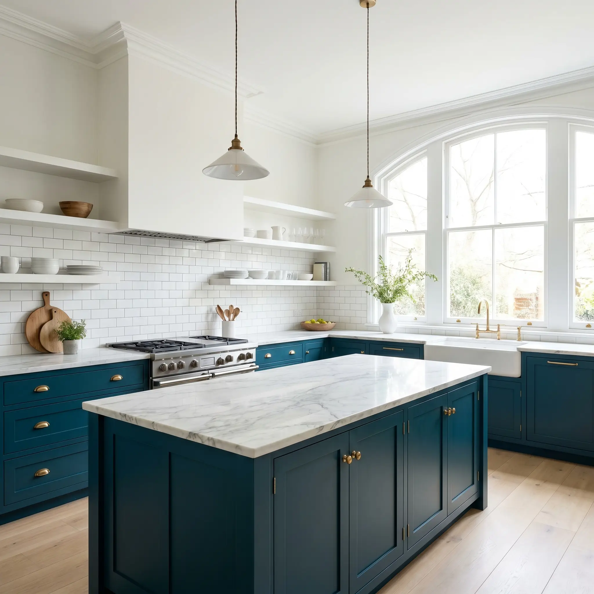
Kitchen Cabinetry
Using this vibrant indigo on islands or lower base cabinets is a brilliant way to anchor a light-filled kitchen. The rich color grounds the lower half of the room, allowing standard white upper cabinets or open shelving to feel airy and expansive. For a beautifully curated mix, combine the painted base cabinets with accessible subway tile and one premium, statement-making stone countertop.
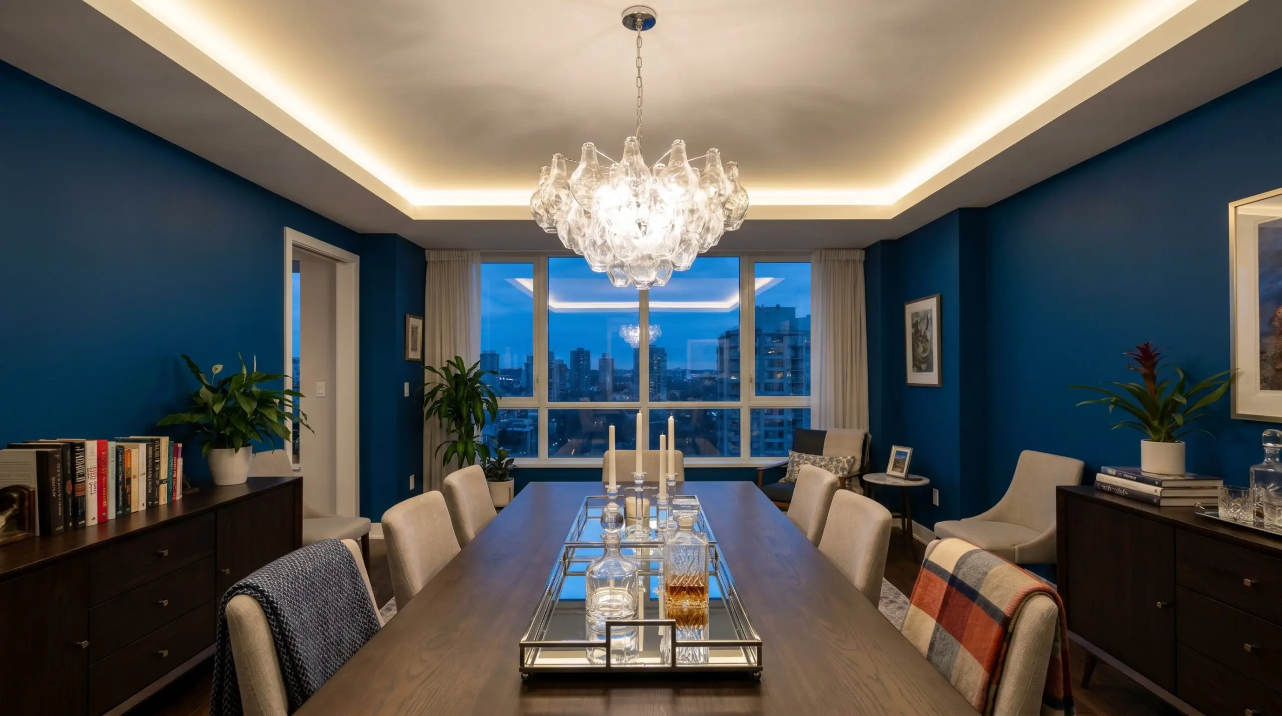
Dining Rooms
This paint thrives in spaces designed for evening entertaining. By absorbing the ambient light, it creates a moody interior design that makes dining spaces feel intimate and cinematic. Keep the ceiling bright to prevent the room from feeling enclosed, and introduce reflective accents like mirrored trays or glass lighting fixtures to bounce a soft glow around the table.
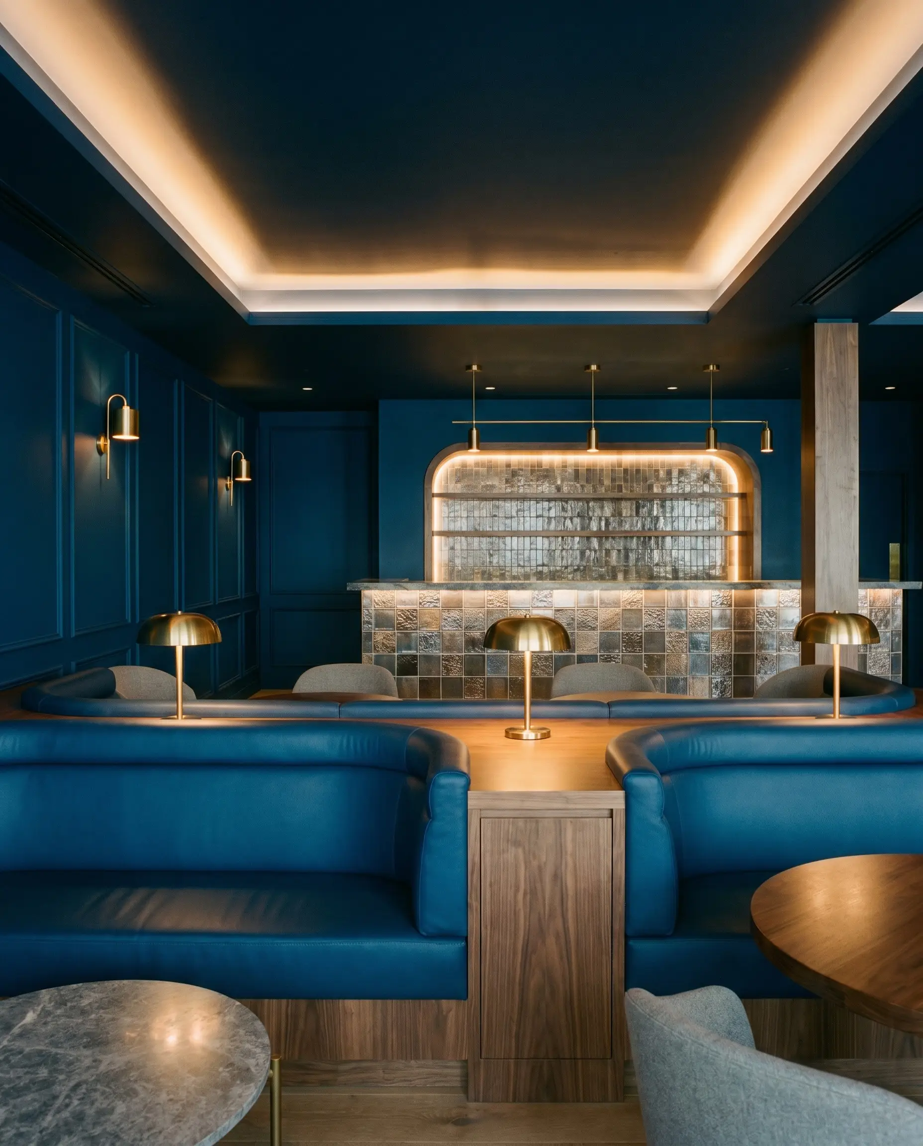
Commercial & Hospitality
In high-traffic environments, this shade provides instant architectural weight and sophistication. It is highly favored for hospitality design accents, particularly on built-in banquettes, tiled bar fronts, or within VIP lounges. The color hides scuffs beautifully while providing a rich, photogenic backdrop that feels incredibly premium.
Bespoke Architectural Concepts
When you look beyond standard four-wall applications, the heavy saturation of this Dulux pigment inspires highly custom, out-of-the-box design moments.
The Immersive Corridor
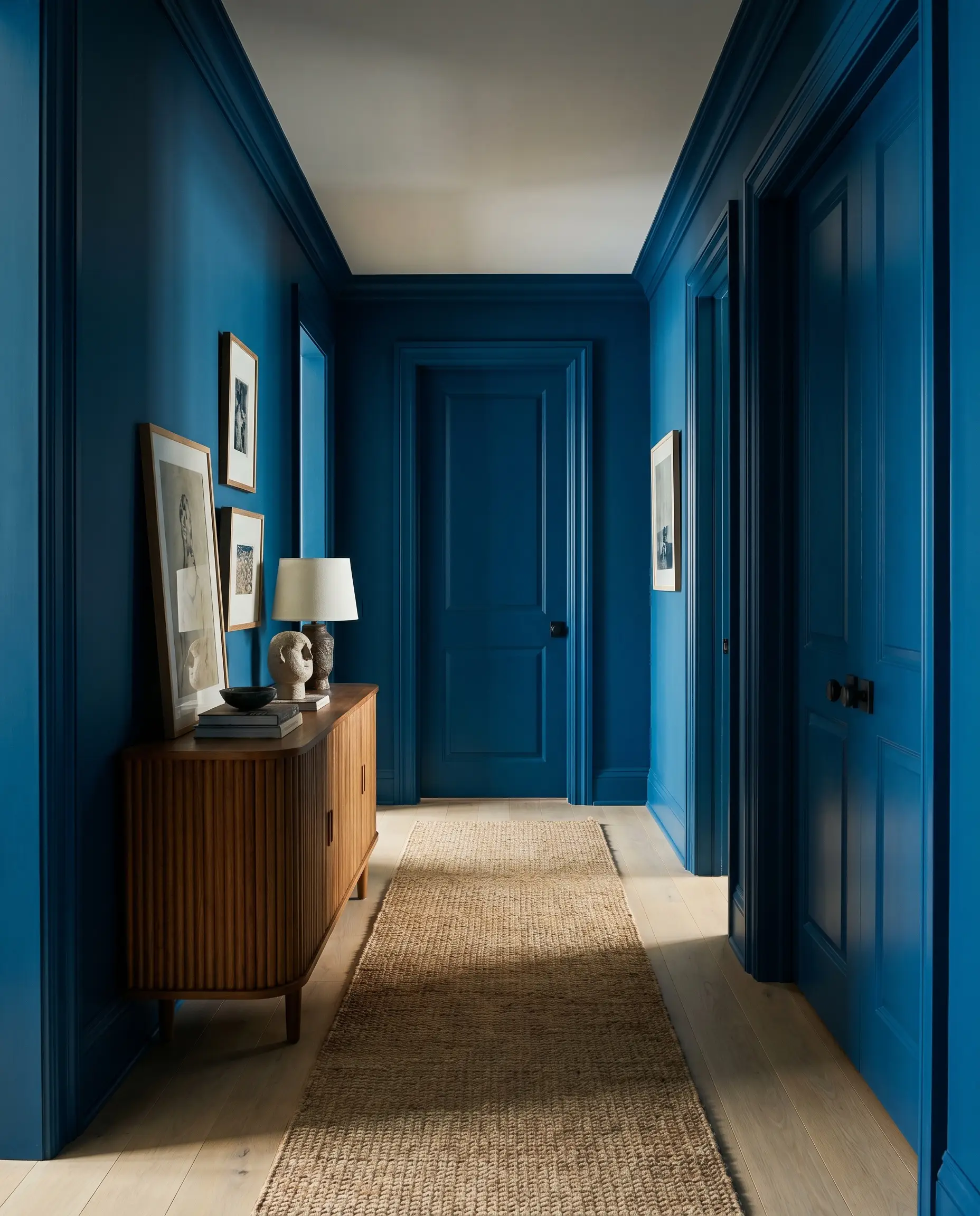
Standard hallways often suffer from a lack of architectural interest, making them feel like sterile transition zones. By painting the walls, trim, and interior doors entirely in Free Groove, you transform a forgotten corridor into a moody, gallery-like experience. Introduce fluted teak consoles or woven runner rugs to add necessary tactile warmth to the heavily saturated space.
Saturated Window Casings
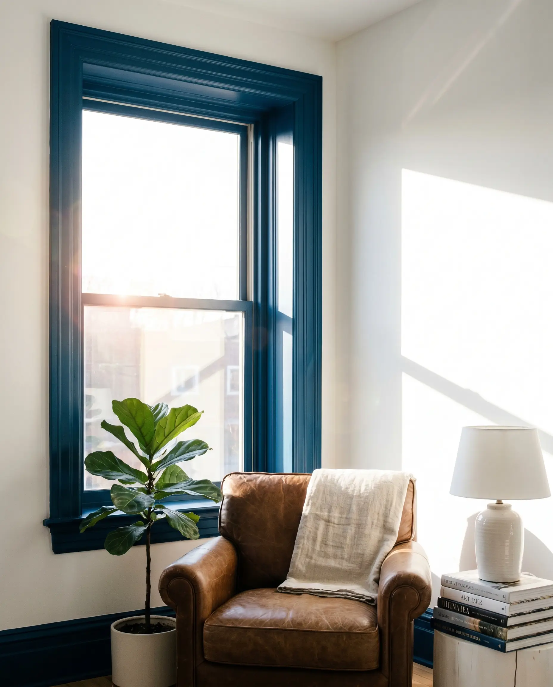
If you have a room that receives harsh, blinding western glare, using this deep cyan around the window frames acts as a brilliant visual filter. The dark pigment absorbs the intense sunlight right at the architectural boundary, softening the light before it enters the room. This technique frames the exterior view beautifully while cooling down the overall temperature of the space.
The Monochromatic Ceiling Drop
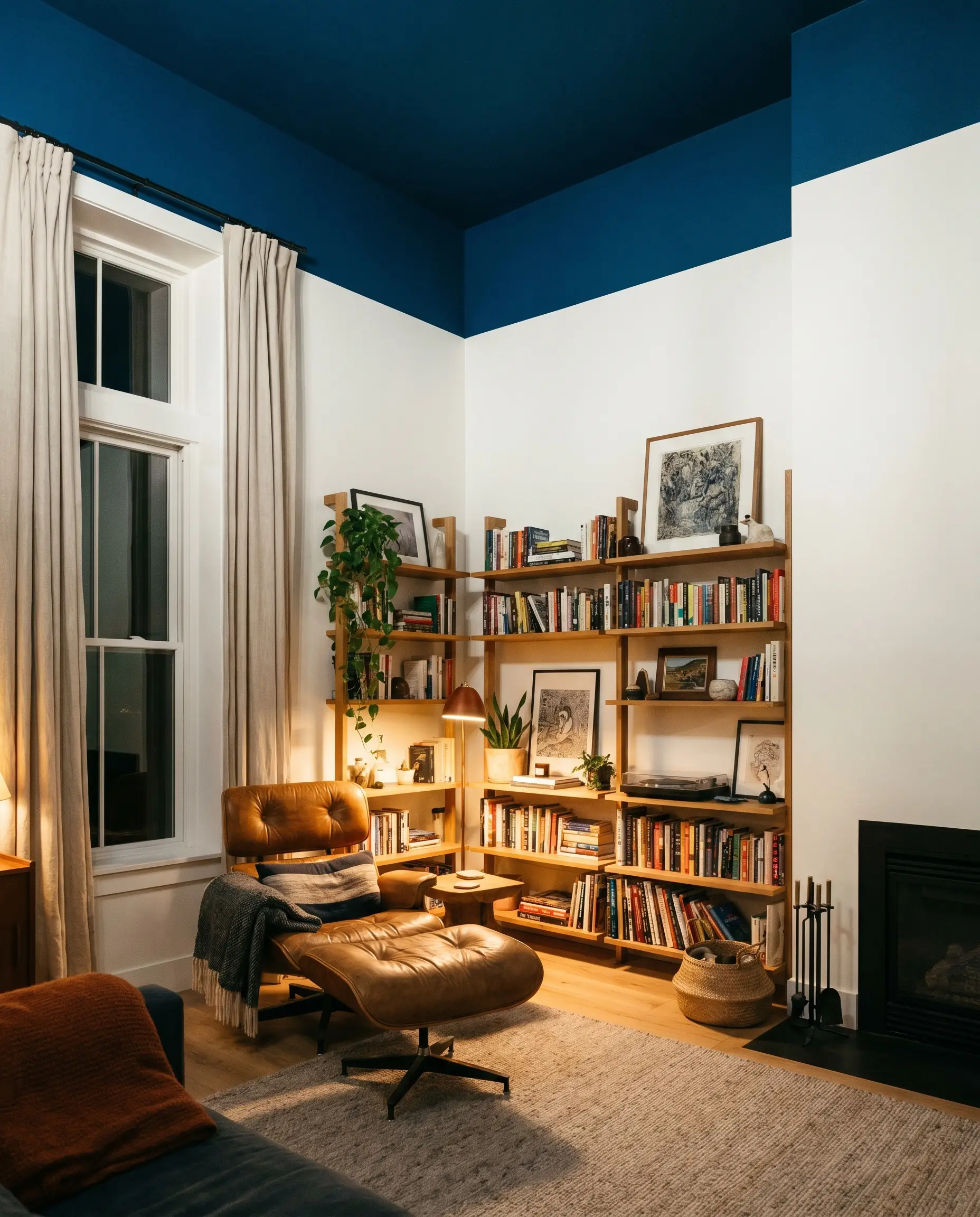
For rooms with awkwardly high ceilings that feel cavernous and uninviting, applying Free Groove exclusively to the ceiling creates a dramatic, grounding effect. The dark color visually lowers the ceiling height, inducing a sense of intimacy and deep relaxation. This is an incredible strategy for creating a “night sky” effect in windowless media rooms or cozy reading nooks.
Material Pairings & Coordinating Palettes
The secret to integrating this deep blue successfully lies in how you manage its visual weight alongside other tactile elements. It requires thoughtful material pairings to either enhance its crispness or soften its vibrant edge.
Crisp Trim & Baseboards
Hardware, Wood & Tactile Pairings
Coordinating Colors
Designer Mood Boards
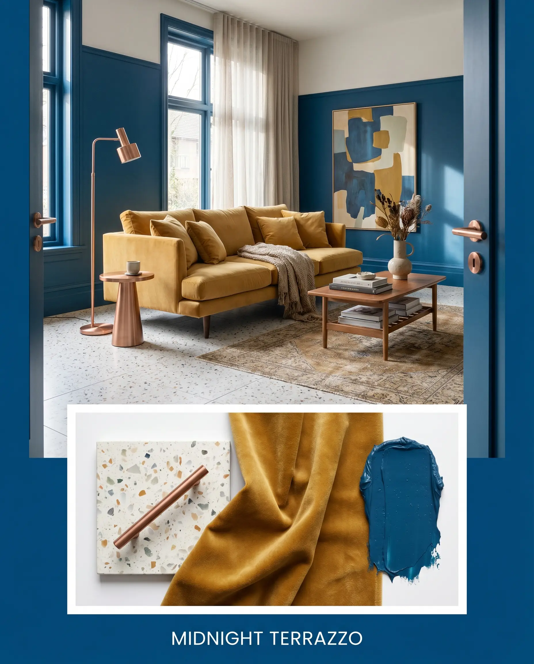
Midnight Terrazzo: A highly energetic palette featuring Free Groove on the lower walls, balanced by a light terrazzo floor and brushed copper hardware. Introduce a low-profile velvet sofa in a soft mustard tone to create a vibrant, contemporary living space.
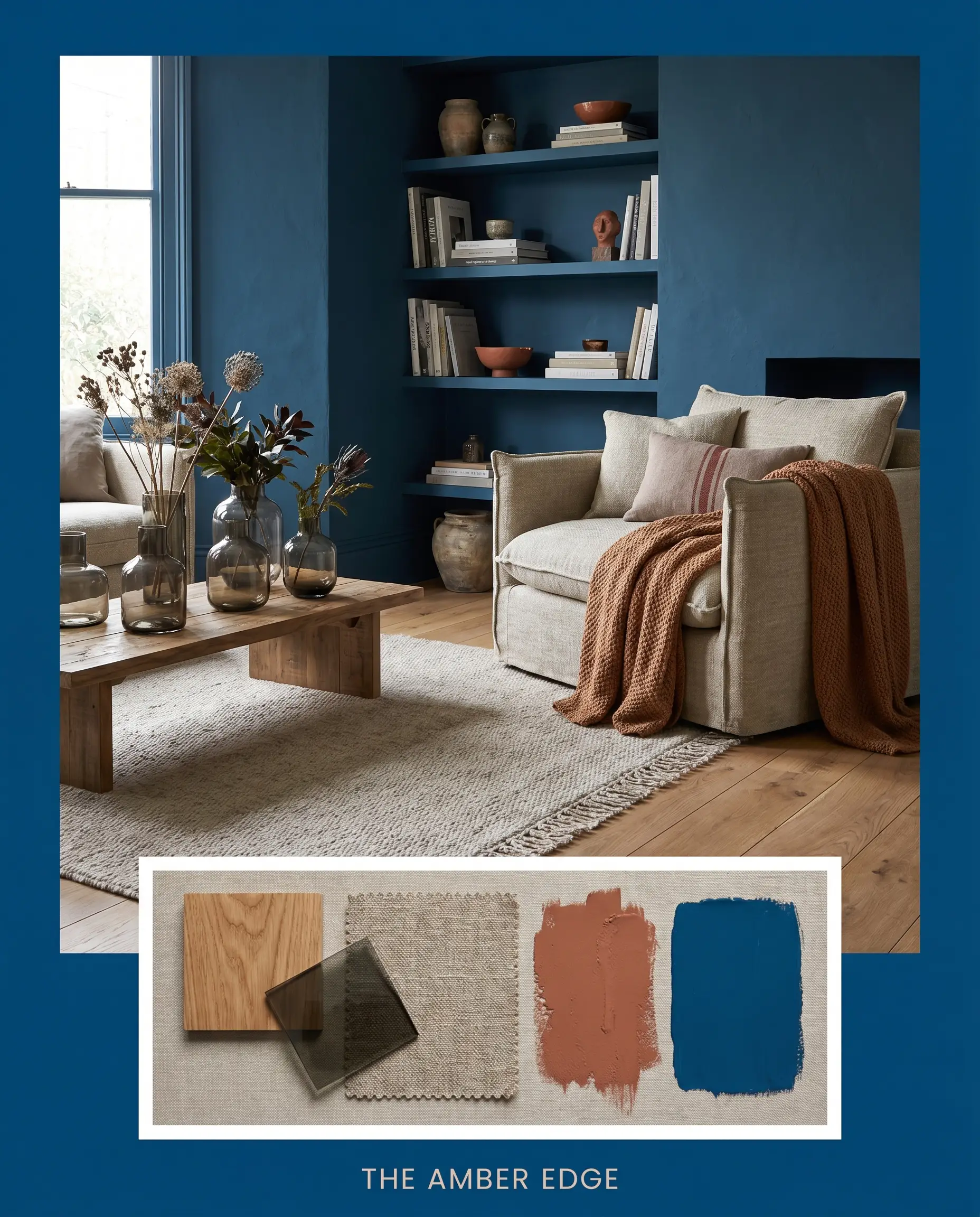
The Amber Edge: A deeply relaxing combination that pairs the heavy indigo walls with warm white oak flooring and Cavern Clay accents. Add smoked glass vases and soft, woven linen throws to keep the atmosphere feeling incredibly organic and grounded.
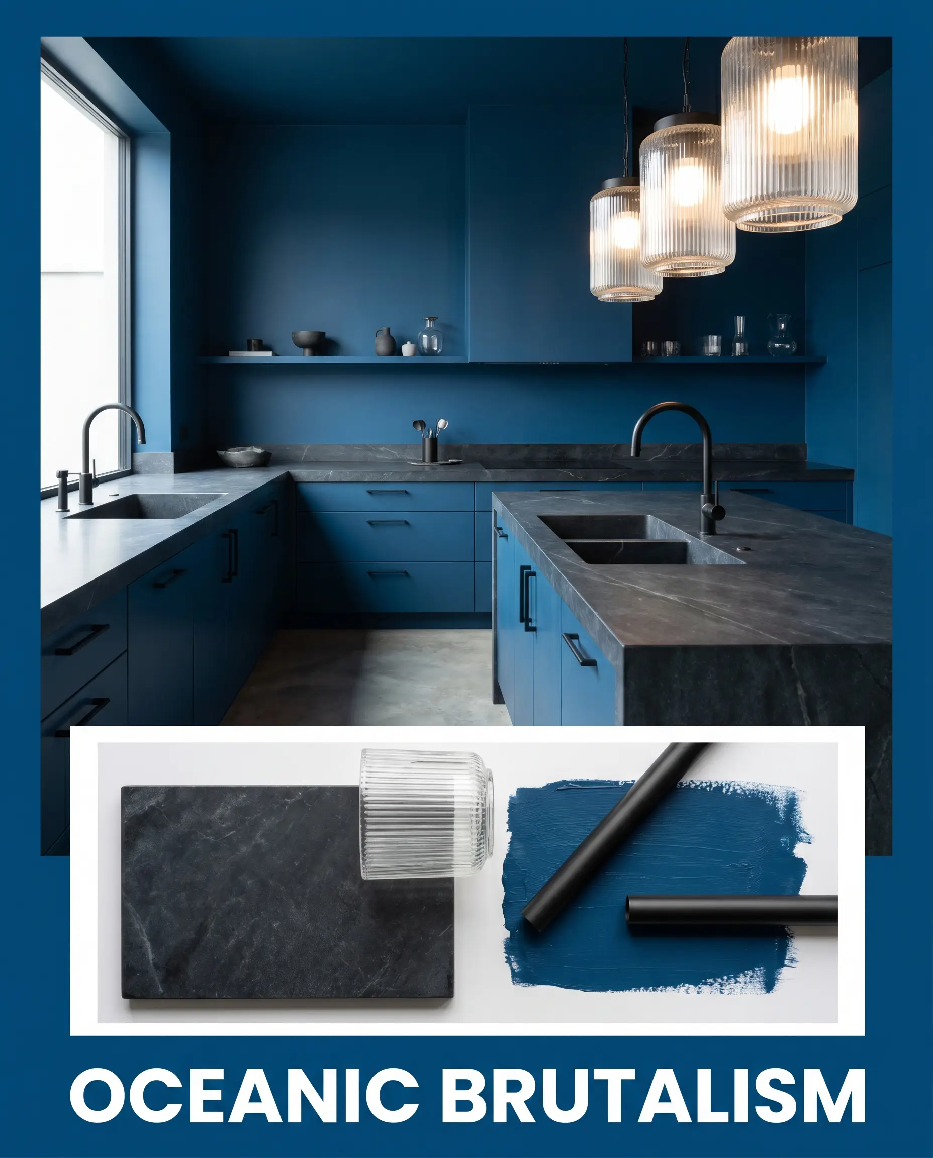
Oceanic Brutalism: A sleek, texture-forward approach utilizing the dark paint alongside honed soapstone countertops and ribbed glass lighting. Keep the styling minimal with matte black fixtures to allow the teal micro-nuances to dominate the visual landscape.
Head-to-Head Comparisons
When selecting the perfect dark blue, understanding how different undertones react to your specific lighting is crucial. If you are struggling to commit, comparing these rival paints will help you make a confident final decision.
Dulux Free Groove vs. Farrow & Ball Hague Blue No. 30
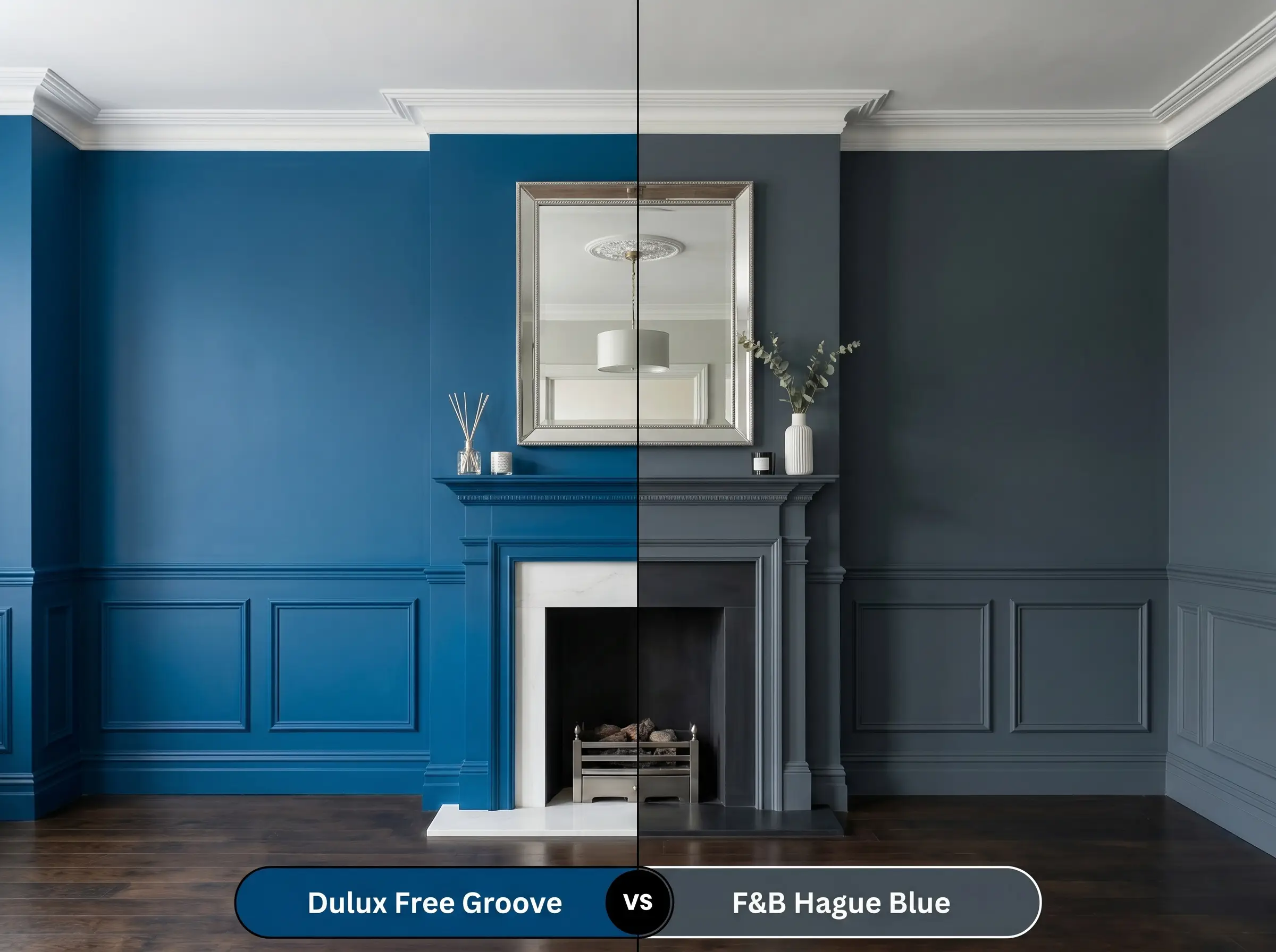
Hague Blue is famous for its distinct, historic green undertone that feels deeply traditional. If your home features classic architecture and you want a rich, aged aesthetic, Hague Blue is the superior choice. However, if you are aiming for a crisper, more modern energy with a vibrant cyan edge, the Dulux option will perform much better.
Dulux Free Groove vs. Benjamin Moore Hale Navy HC-154
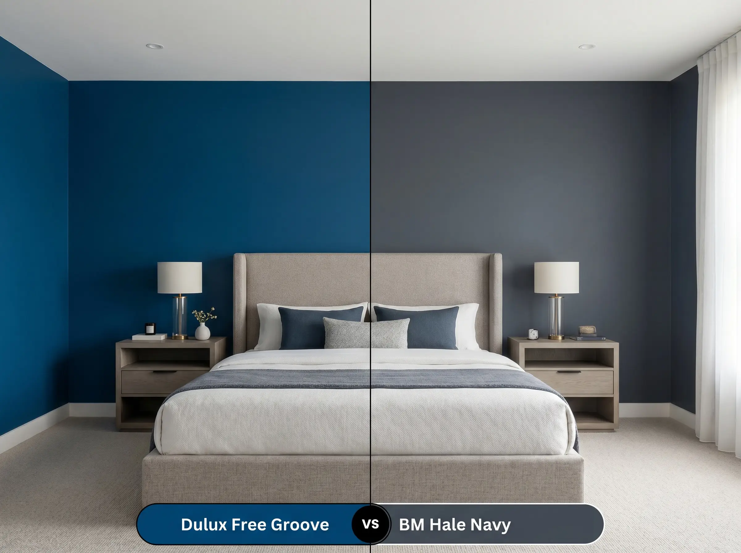
Hale Navy is the ultimate transitional neutral, carrying subtle gray undertones that make it incredibly safe and predictable in almost any lighting. If you are afraid of your walls pulling too green or teal, Hale Navy is the reliable, classic alternative. Choose Free Groove only if you intentionally want that vibrant, oceanic color-casting to energize the room.
Dulux Free Groove vs. Sherwin-Williams Naval SW 6244
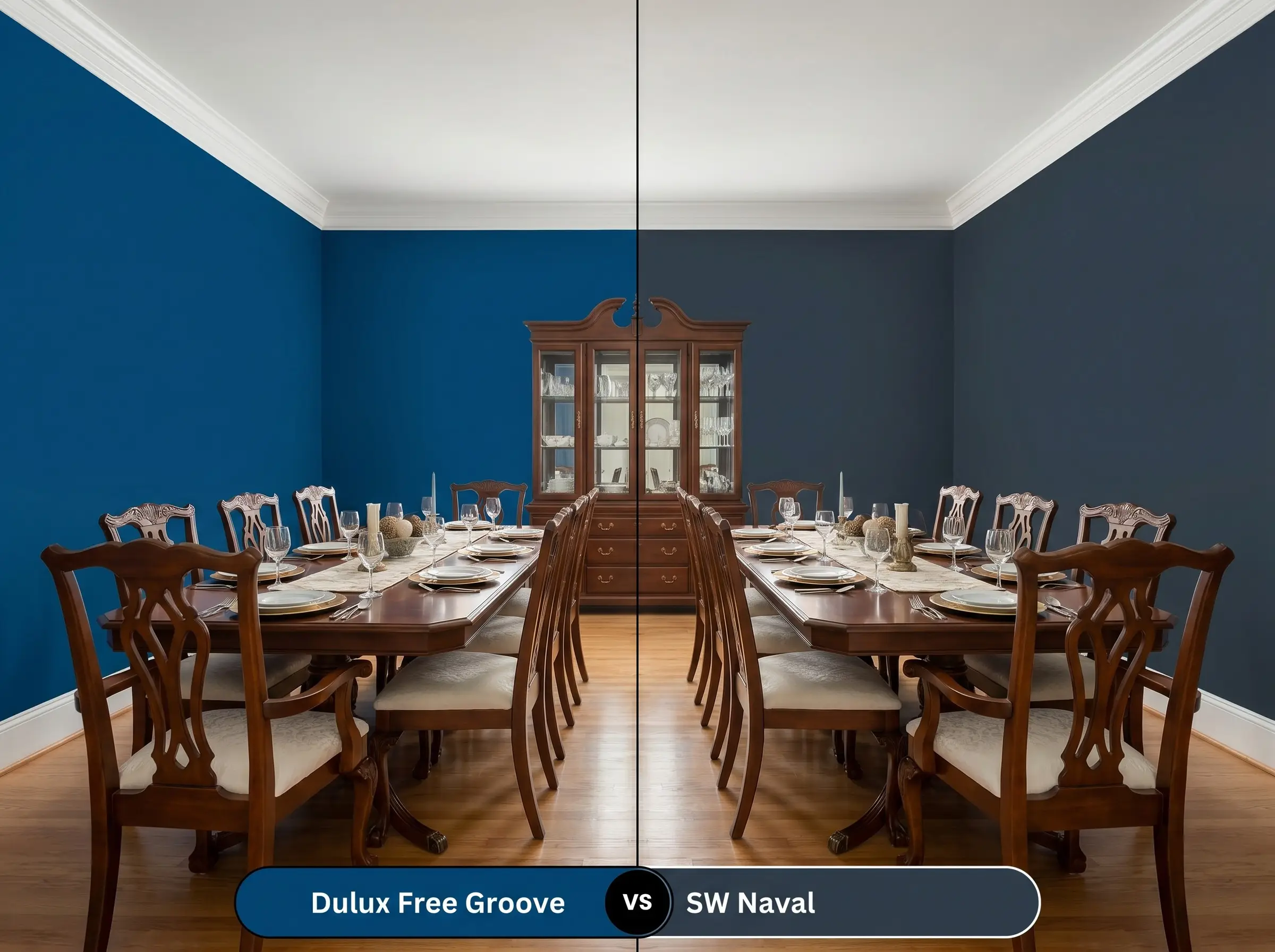
Naval is a much straighter, truer navy with a slightly lower LRV, meaning it reads blacker in the shadows. It lacks the playful green micro-nuances found in the Dulux shade. If you need a formal, anchoring color for a traditional dining room, Naval is excellent, but if you want the paint to feel alive and shifting under natural light, stick with the cyan-heavy Dulux.
Brand Equivalents & Alternatives
If you need to adjust the depth of your color slightly, or if you are shopping across different manufacturers, these carefully selected alternatives provide excellent pathways to a similar aesthetic.
Similar Colors
Cross-Brand Equivalents
Practical Application & DIY Advice
Executing a dark, saturated color requires a completely different approach than rolling on a standard white. To achieve a flawless, premium finish, you must prepare the surface properly and choose the correct sheen for your architecture.
The Dynamic Sheen Guide
Primer Strategy
You cannot skip primer when applying a color this deep over light walls or raw wood. You must use a high-quality primer tinted to a dark gray. A tinted primer reduces the number of expensive topcoats required and ensures the final indigo achieves its true, saturated depth without looking streaky.
Coverage & Success Tips
Dark blues are notoriously difficult for DIYers because they are highly prone to “flashing”—visible, uneven roller marks that show up when light hits the wall. To avoid this, you must maintain a wet edge while rolling and avoid pressing too hard on the roller nap. Expect to apply a minimum of two generous coats, and always cut in your edges carefully, as dark paint highlights sloppy brushwork immediately.
Never attempt to spot-touch a dark matte wall months later with a brush, as the new paint will dry slightly differently and leave a visible patch. If a wall gets heavily scuffed, you will likely need to reroll that entire specific wall from corner to corner for a seamless finish.
Hackrea Design Secret (Touch-Ups)
Frequently Asked Questions
Because of its heavy green and cyan micro-nuances, direct afternoon sun will heavily activate the teal tones, making the door look much brighter and more electric than it appears on an interior swatch. Ensure you use a high-quality, UV-resistant exterior finish to prevent the vibrant pigments from fading prematurely.
Absolutely. The low LRV of 6.7 allows the paint to absorb ambient light from screens, visually lowering the ceiling and creating a deeply immersive, distraction-free environment perfect for cinematic viewing.
The crisp, cool white background of Calacatta marble provides a sharp contrast that actually enhances the vibrancy of the cyan undertones. The gray veining in the stone ties the palette together, resulting in a highly sophisticated, premium aesthetic.
Yes, heavily saturated blues and teals will reflect their pigment onto surrounding surfaces, including skin, which can create an unflattering, cool-toned cast. If using this in a bathroom, you must counteract the color-casting by installing bright, 3000K to 3500K lighting directly around the vanity mirror.
Final Verdict & Expert Warnings
Dulux Free Groove is an architectural powerhouse for homeowners who want to inject sophisticated, modern drama into their spaces without relying on stark blacks or predictable grays. It performs beautifully in light-starved rooms where you want to lean into the shadows, or in bright, south-facing spaces where its electric cyan energy can truly shine. If you are looking for best deep indigo & navy paints for moody interiors, this specific formulation offers a unique, vibrant twist that elevates standard cabinetry, dining rooms, and home offices with incredible confidence.
However, this highly saturated pigment requires careful curation to succeed. You must avoid pairing this color with heavily red-toned cherry woods, as the intense contrast between the red wood and the green-blue paint will create a vibrating, visually overwhelming clash. Similarly, stark, cool-toned grays will drain the life out of the indigo, making the room feel sterile and corporate rather than inviting. Keep your material pairings warm, organic, and intentional, and this vibrant shade will reward you with a deeply customized, premium atmosphere.