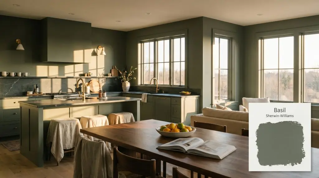
Basil SW 6194
Sherwin-WilliamsSherwin-Williams Basil SW 6194 is a muted, medium-dark earthy green with subtle olive-yellow undertones and a noticeable gray cast. With an LRV of 15, it acts as a deeply grounding, sophisticated hue that bridges the gap between nature-inspired calm and luxurious depth.
Paint Technical Profile
| Color ID / SKU | SW 6194 |
| HEX Code | #626E60 |
| Light Reflectance (LRV) | 15 |
| Use | Interior, Exterior |
| Best Exposures | South, West, East |
| Best For | Kitchen Cabinets, Accent Walls, Home Offices, Exteriors |
Sherwin-Williams Basil SW 6194: A Grounding Anchor for Organic Interiors
When you need to anchor a sprawling, sun-drenched living room without resorting to stark black, a heavily saturated, light-absorbing green becomes your most powerful architectural tool. Sherwin-Williams Basil SW 6194 provides exactly this kind of intentional, grounding weight. It visually pulls expansive walls inward, creating an immediate sense of intimacy while maintaining a deep connection to the outdoors.
At Hackrea, we consistently rely on this complex shade to bridge the gap between premium, high-contrast modernism and approachable, everyday comfort. It is an incredibly adaptable foundation that elevates standard builder-grade finishes while easily holding its own next to high-end, aspirational materials.
Whether you are wrapping a suburban home office in moody color or grounding an airy, open-concept kitchen, this specific green shifts beautifully depending on its surroundings. Let’s break down exactly how this color behaves, where it thrives, and how to style it for maximum impact.
Sherwin-Williams Basil: Undertones & LRV
Is Sherwin-Williams Basil SW 6194 warm or cool? This highly versatile shade is a definitively warm earthy green, though it walks a brilliant, nuanced line. It carries a heavy, grounding depth that prevents it from ever feeling like a bright, primary color, making it an incredibly sophisticated choice for modern interiors.
To truly understand how this paint behaves on your walls, we have to look at its underlying structure:
With a Light Reflectance Value (LRV) of 15, this shade sits firmly in the dark category. It absorbs a significant amount of light, giving it a rich, enveloping presence that visually grounds a room. Because it reflects so little light back into the space, it relies heavily on your home’s natural and artificial lighting to reveal its subtle botanical warmth.
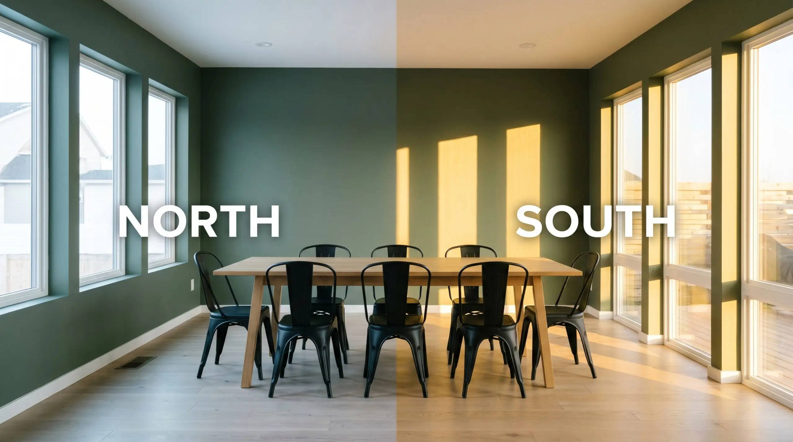
Lighting Effects & The Chameleon Factor
The biggest risk when using a deeply saturated, low-LRV paint is placing it in a heavily shaded, light-starved corner where it can quickly turn flat and muddy. Because this shade relies on its olive-yellow undertone for warmth, it needs adequate light to push that vibrancy forward. Without it, the heavy gray cast takes over, turning the walls into a muted, stony shadow.
Always test large swatches on multiple walls to see how your specific lighting manipulates its hue angle throughout the day. Here is exactly how it shifts:
Where to Use Sherwin-Williams Basil SW 6194
This deep, grounding shade demands to be used intentionally, bringing a cohesive, stabilizing energy to any home. It thrives when used to create deliberate visual weight, whether that means anchoring the lower half of a room or wrapping an entire space in moody, atmospheric color.
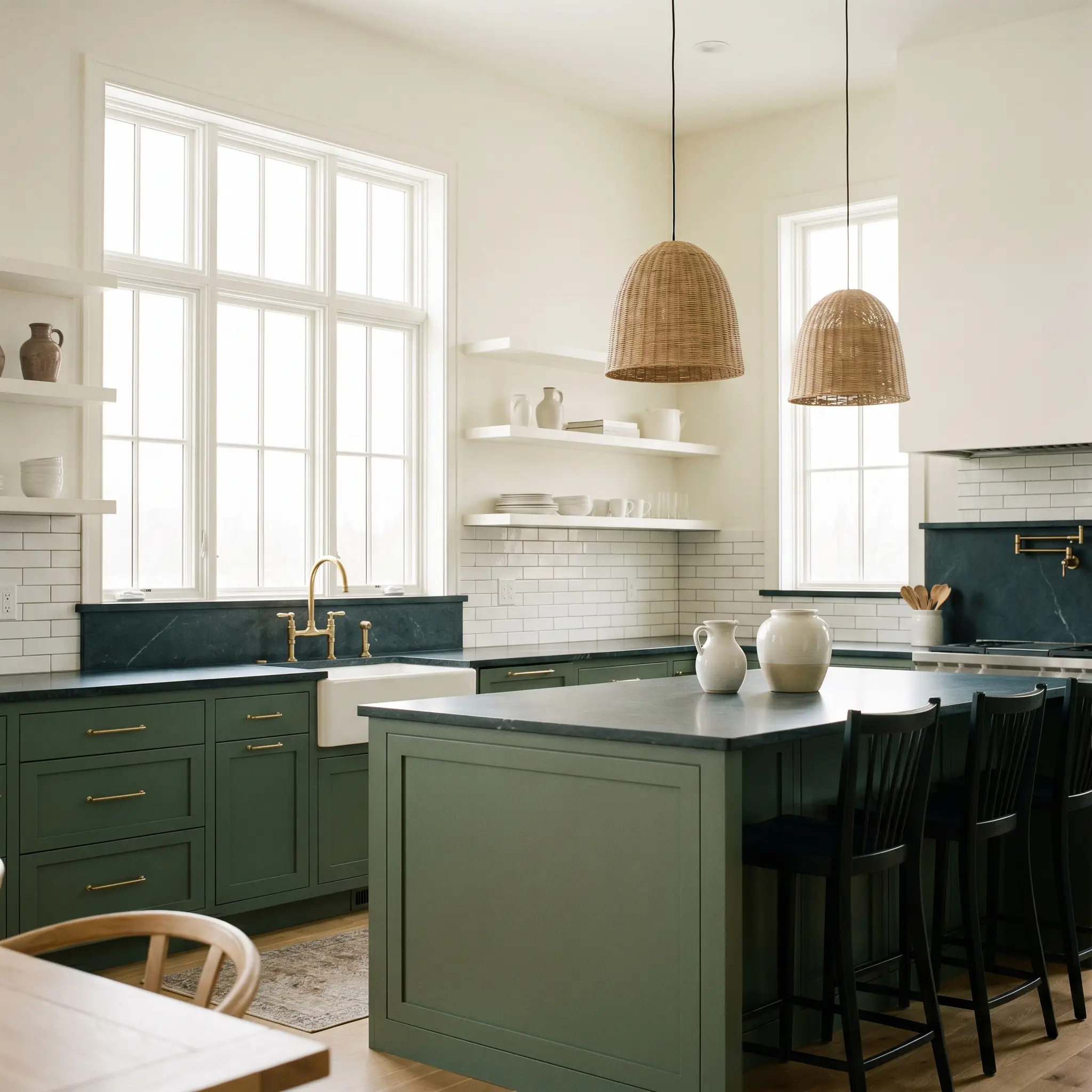
Kitchens
This hue is a brilliant choice for lower kitchen cabinetry or a large central island, especially in transitional homes. It anchors the workspace beautifully, providing a rich foundation that allows lighter upper cabinets or expansive white walls to breathe. Pair it with standard, accessible subway tile and elevate the entire room with one premium focal point, like a honed soapstone countertop or an unlacquered brass faucet.
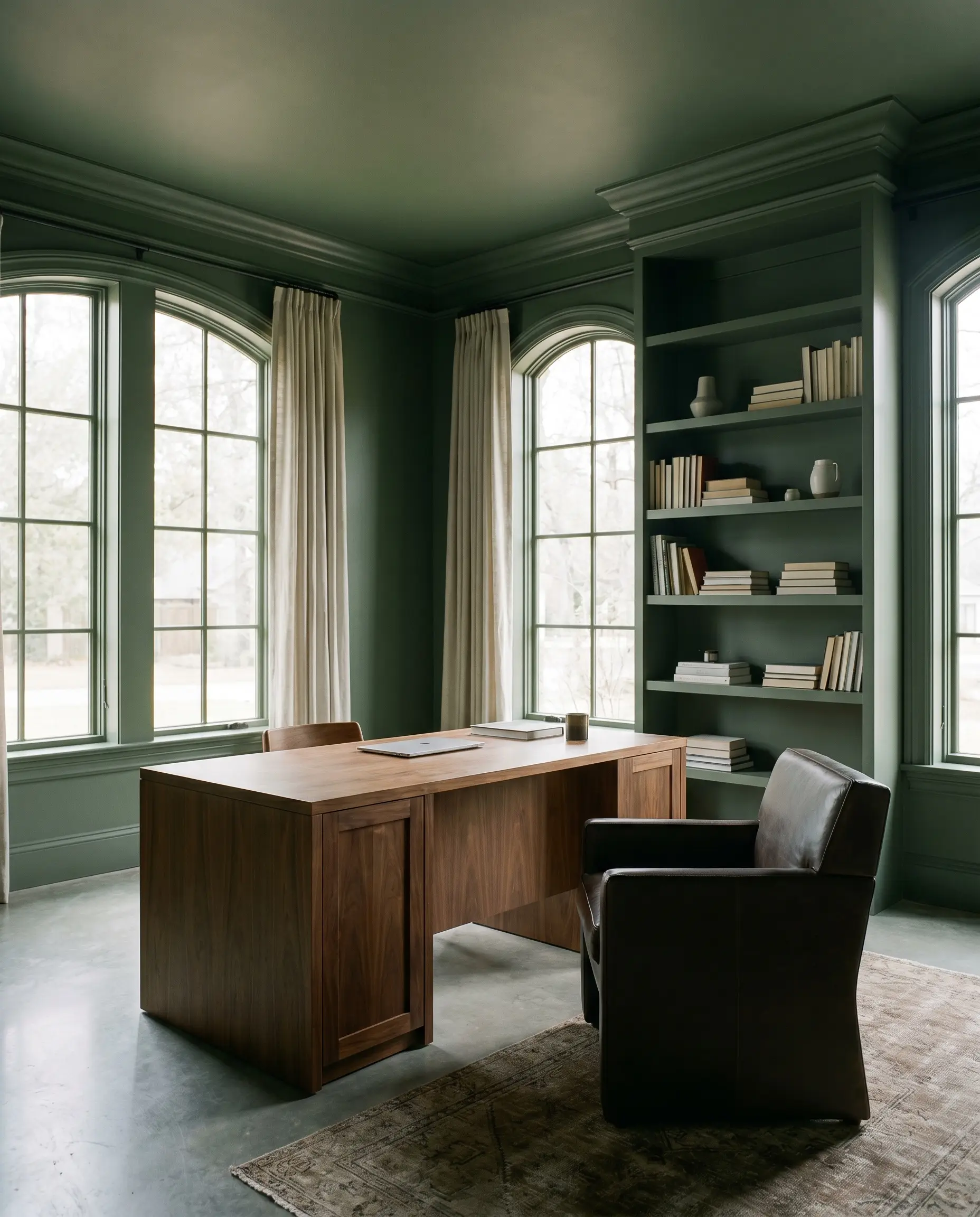
Workspaces
In a home office or study, wrapping the walls, trim, and built-in shelving in this single, continuous color creates a deeply focused, distraction-free environment. The muted green reduces visual clutter and fosters a sense of calm concentration. It acts as a stunning, sophisticated backdrop for a warm walnut desk and a classic, structured leather chair.
Bedrooms
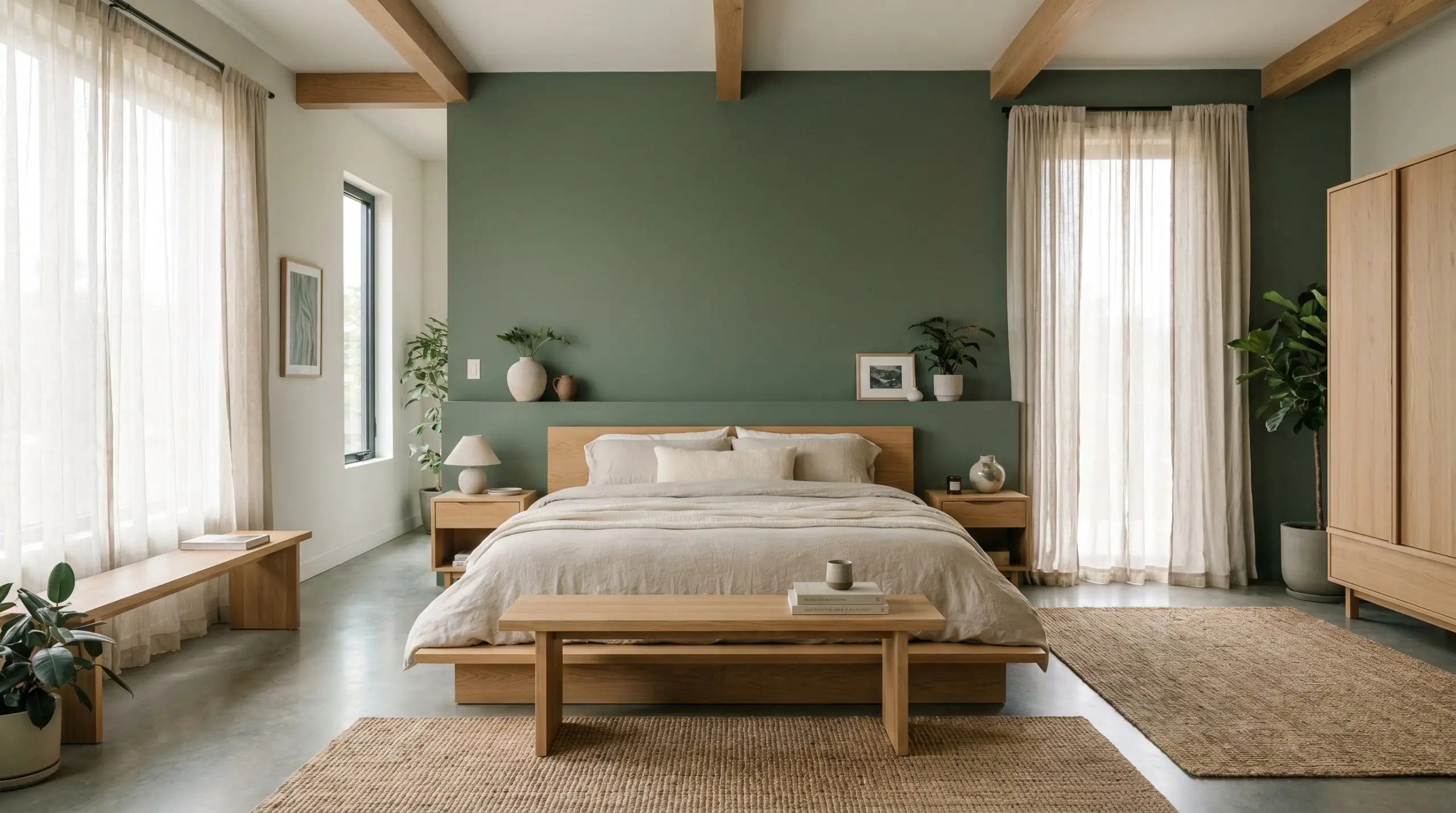
For a serene, Japandi-inspired bedroom retreat, use this color on a single, strategic accent wall behind the bed. The organic warmth of the green pairs effortlessly with low-profile, light oak furniture and soft, breathable linen bedding. It brings just enough color temperature to the room to feel cozy without disrupting the minimalist, uncluttered aesthetic.
Exteriors
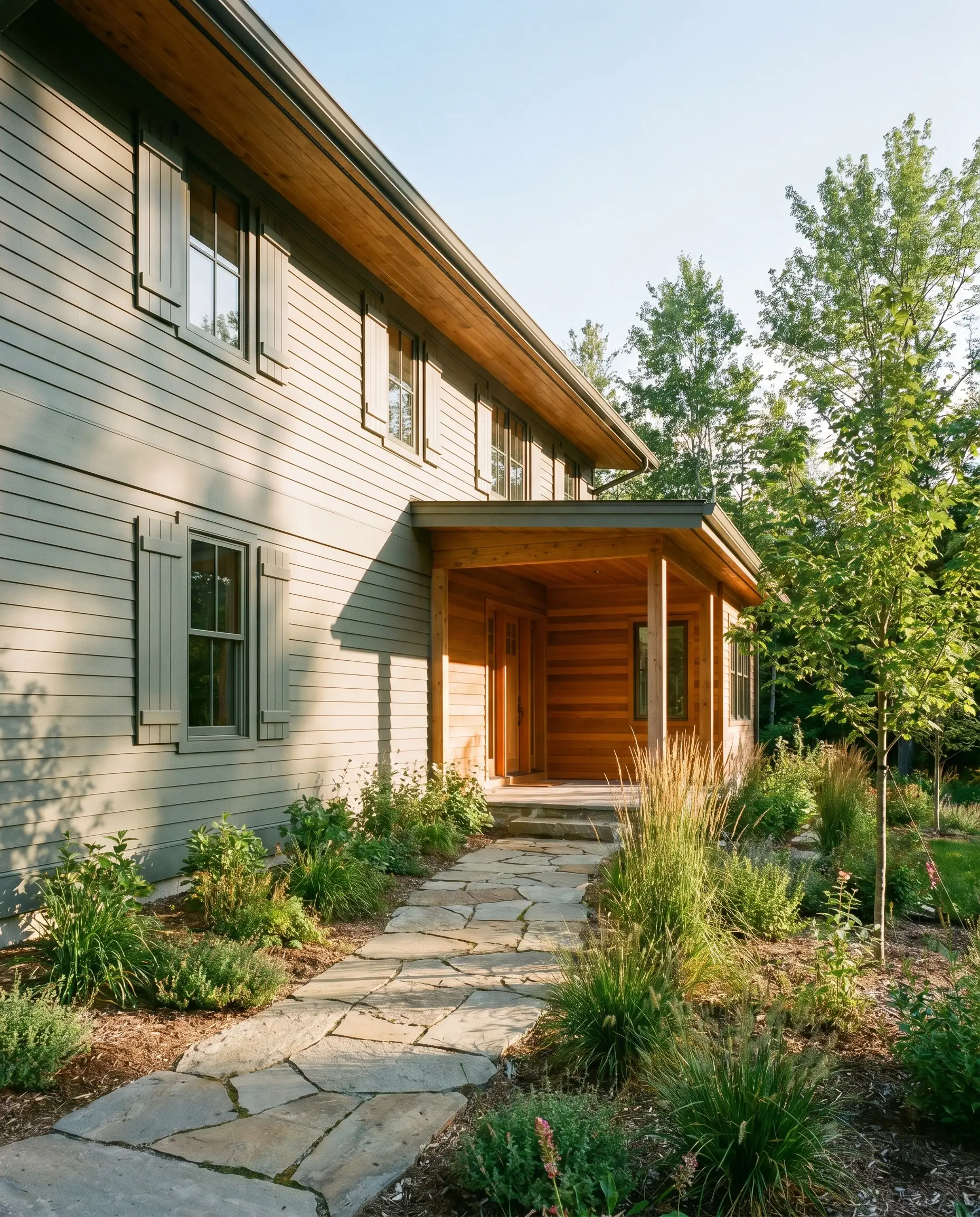
When taken outside, the direct sunlight washes out a portion of its depth, making it read slightly lighter and surprisingly vibrant on siding or architectural shutters. It is the ultimate choice for a modern woodland aesthetic, blending seamlessly into natural landscaping. Pair it with natural stone pathways and warm cedar accents for a welcoming, organic facade.
Utility Spaces
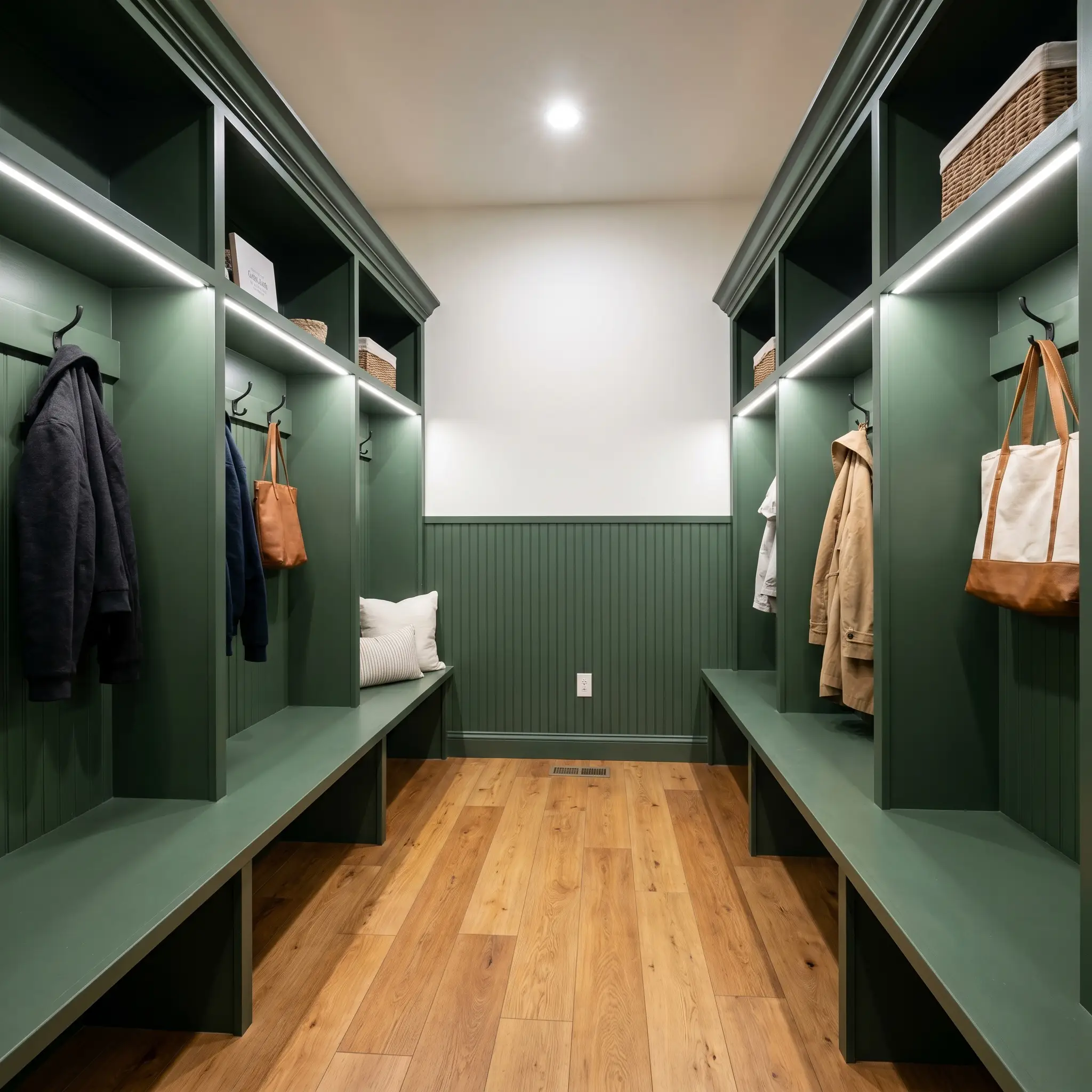
Mudrooms and laundry rooms are the perfect places to experiment with heavier chroma and deep, saturated color. Using this shade on custom cubbies or beadboard wainscoting instantly elevates a highly functional room into a curated design moment. The dark hue is also incredibly practical here, easily hiding everyday scuffs and dirt while maintaining a premium look.
Creative Ways to Use Sherwin-Williams Basil
If you want to push beyond standard wall applications, this adaptable green is an incredible tool for highly curated, specific design projects.
The Upcycled Mid-Century Casework
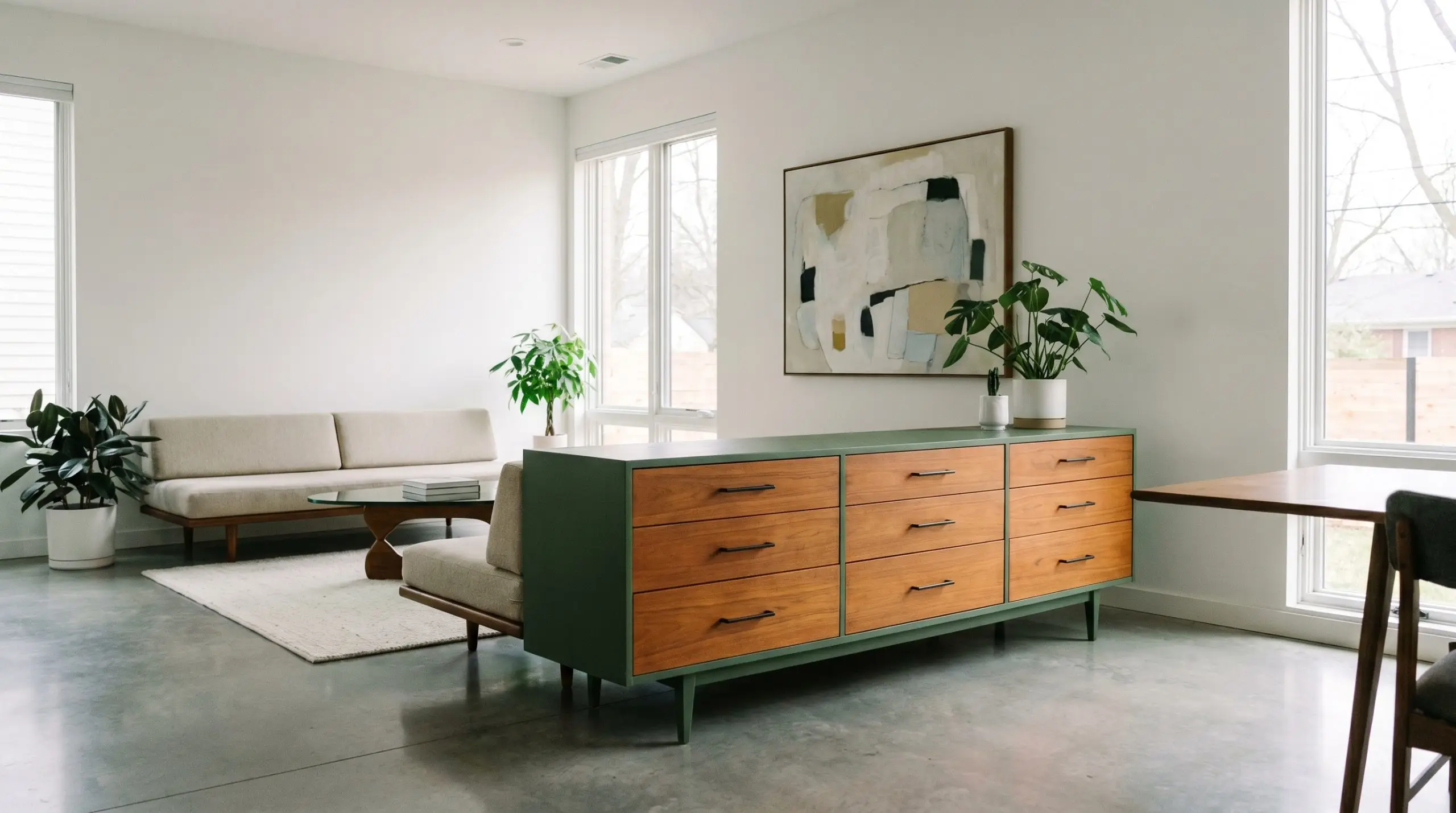
Transform a thrifted, standard-issue mid-century credenza by painting the exterior casing in this rich green while leaving the original warm teak or walnut drawer fronts exposed. The crisp, tailored contrast between the earthy green shell and the natural wood grain feels incredibly custom. Finish it with sleek, matte black hardware to modernize the silhouette for a contemporary living room.
A Moody Powder Room Retreat
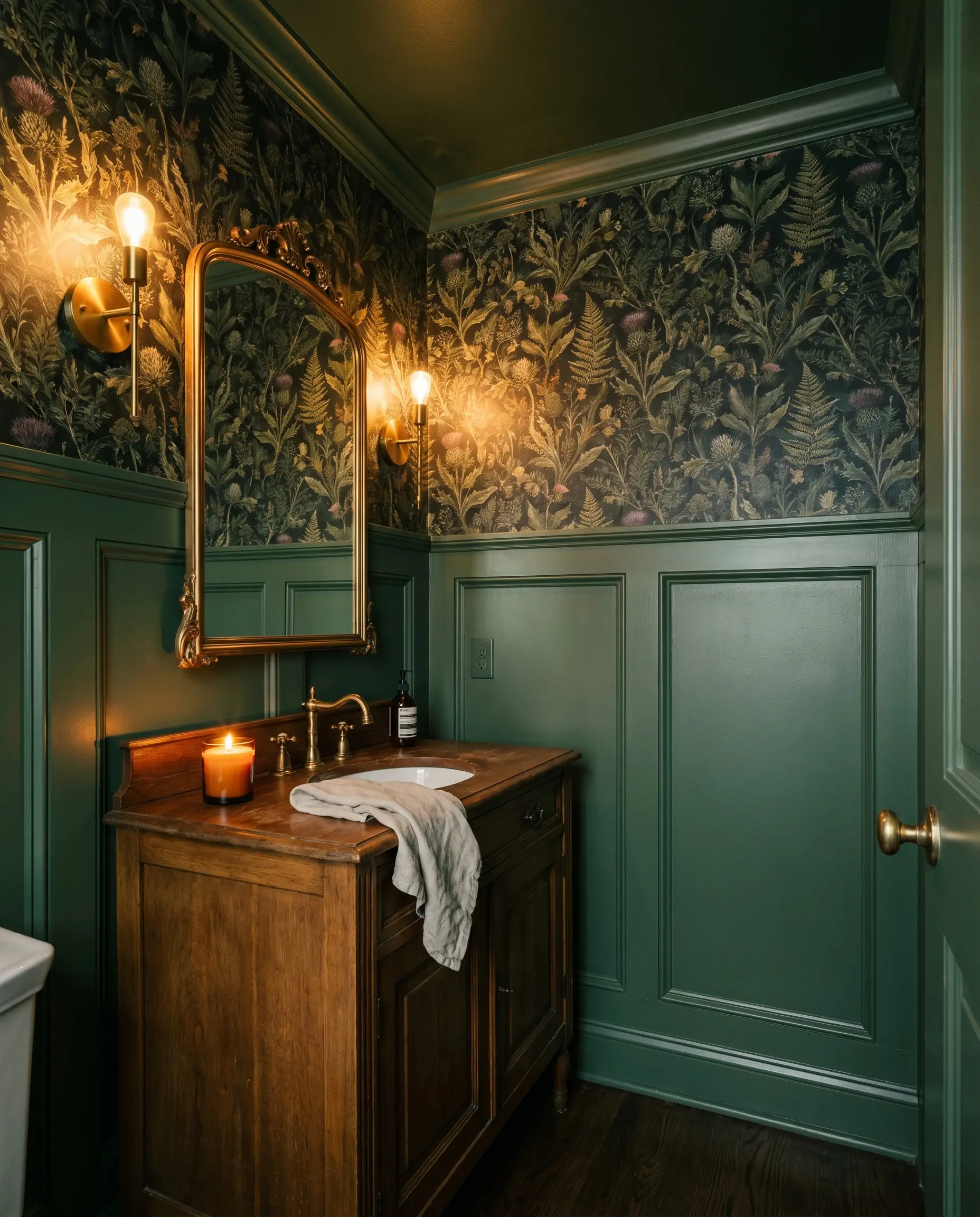
Powder rooms are the ideal environment to embrace dark, enveloping color. Paint the walls, trim, and ceiling in this shade, and pair it with a heavily patterned, vintage-inspired botanical wallpaper on the upper half of the walls. The deep green grounds the busy pattern, creating a jewel-box effect that feels like a hidden, high-end speakeasy lounge.
The Color-Blocked Archway
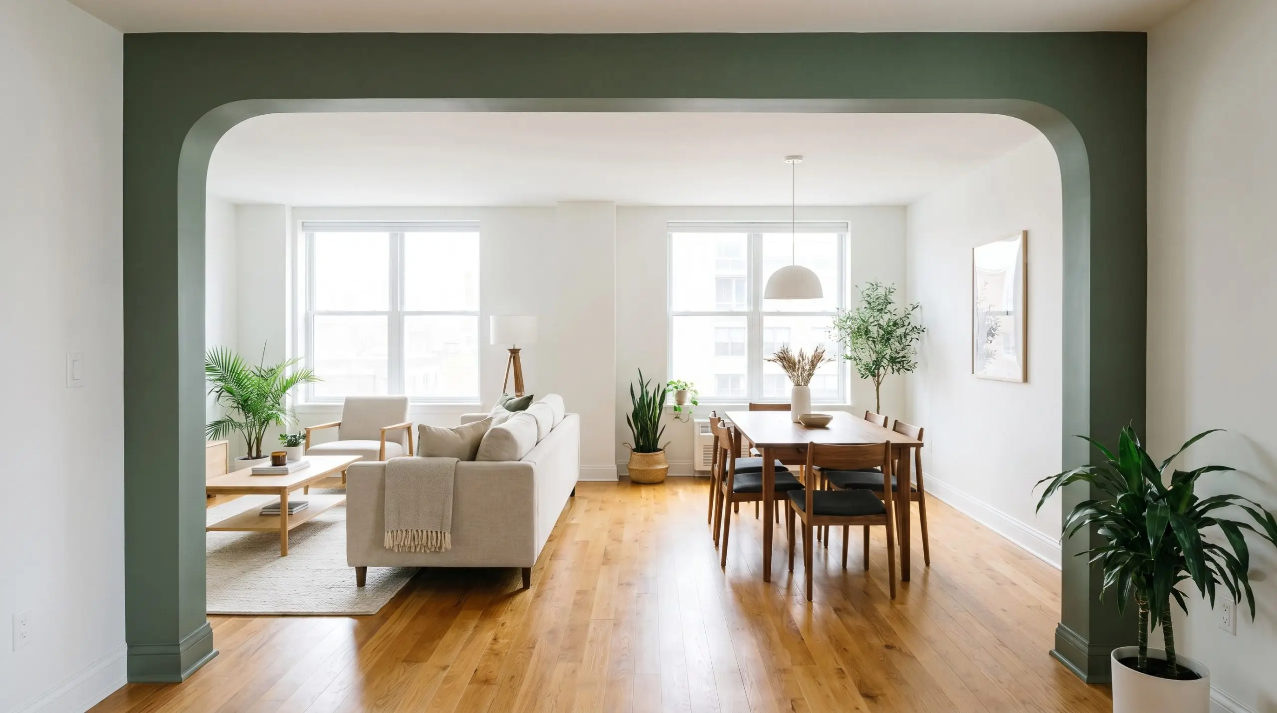
In an open-concept apartment, use this shade to paint the interior framing of a transitional archway or a structural support column. This simple technique creates a distinct visual boundary between two zones, like a living area and a dining space, without requiring any physical walls. The dark green acts as a handsome architectural frame, guiding the eye smoothly from one room to the next.
Coordinating Colors & Best Pairings
The secret to styling this deep green is managing its visual weight through highly intentional contrast. It needs crisp, clean boundaries to feel tailored, or soft, tonal layers to feel organic and serene.
Trim & Baseboards
Because of its dark LRV and heavy gray cast, this paint requires architectural trim that provides a clean break without feeling stark or blindingly sterile.
Hardware, Wood & Material Pairings
To master the high/low mix, blend accessible, everyday textures with one or two aspirational finishes that play off the paint’s natural warmth.
Coordinating Colors
Designer Mood Boards
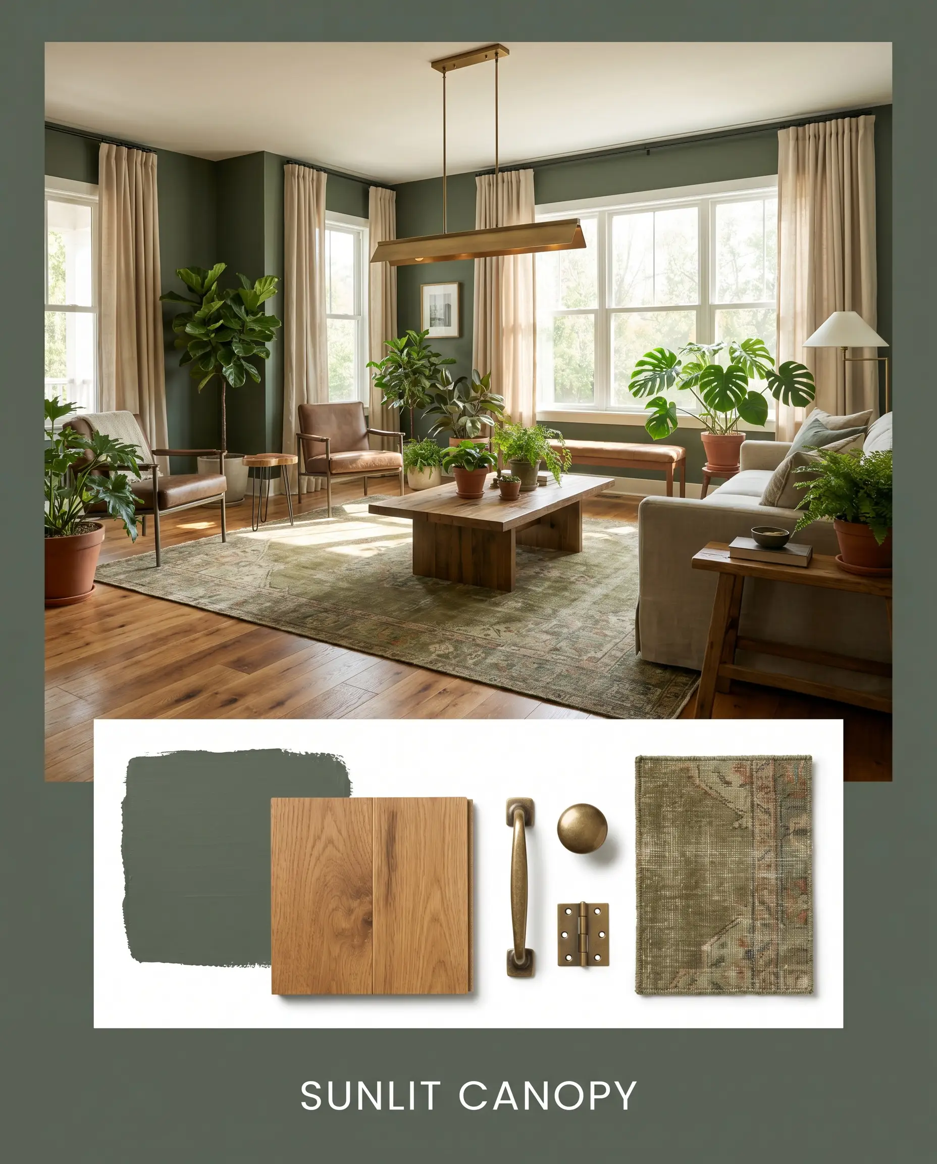
Sunlit Canopy This palette leans heavily into biophilic design, bringing the energy of the outdoors inside. Anchor the room with walls in Sherwin-Williams Basil, paired with breezy Sherwin-Williams Natural Linen curtains and warm honey oak flooring. Add a premium, aged brass linear pendant and a plush, olive-toned vintage rug to create a space that feels deeply restorative, sun-drenched, and alive.
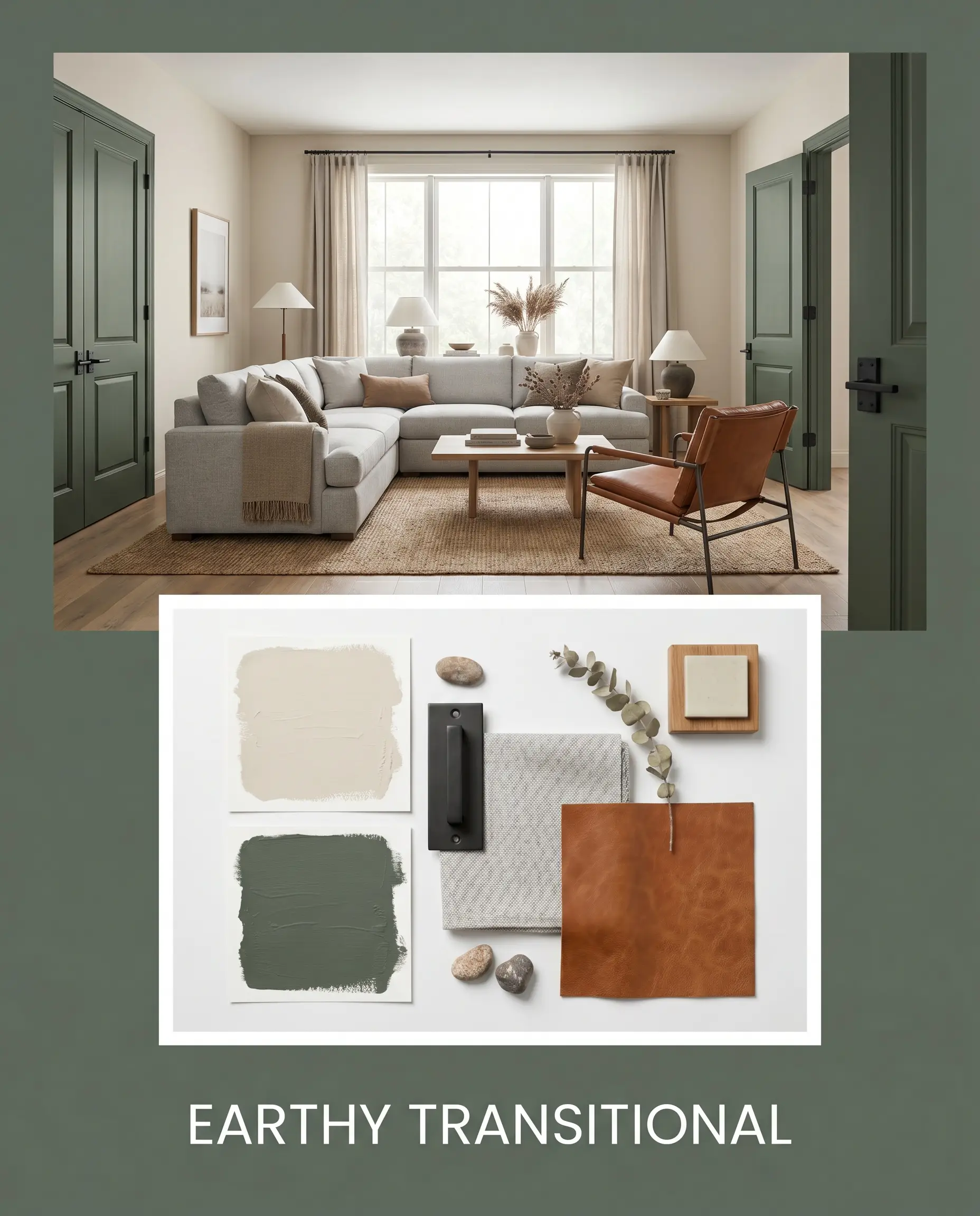
Earthy Transitional A masterclass in the high/low mix, this combination balances modern structure with approachable warmth. Use Benjamin Moore Pale Oak as the primary wall color, reserving the deep green for heavy interior doors or built-in cabinetry. Introduce accessible matte black steel hardware, a standard light gray sectional, and elevate the entire vignette with a single, highly curated cognac leather sling chair.
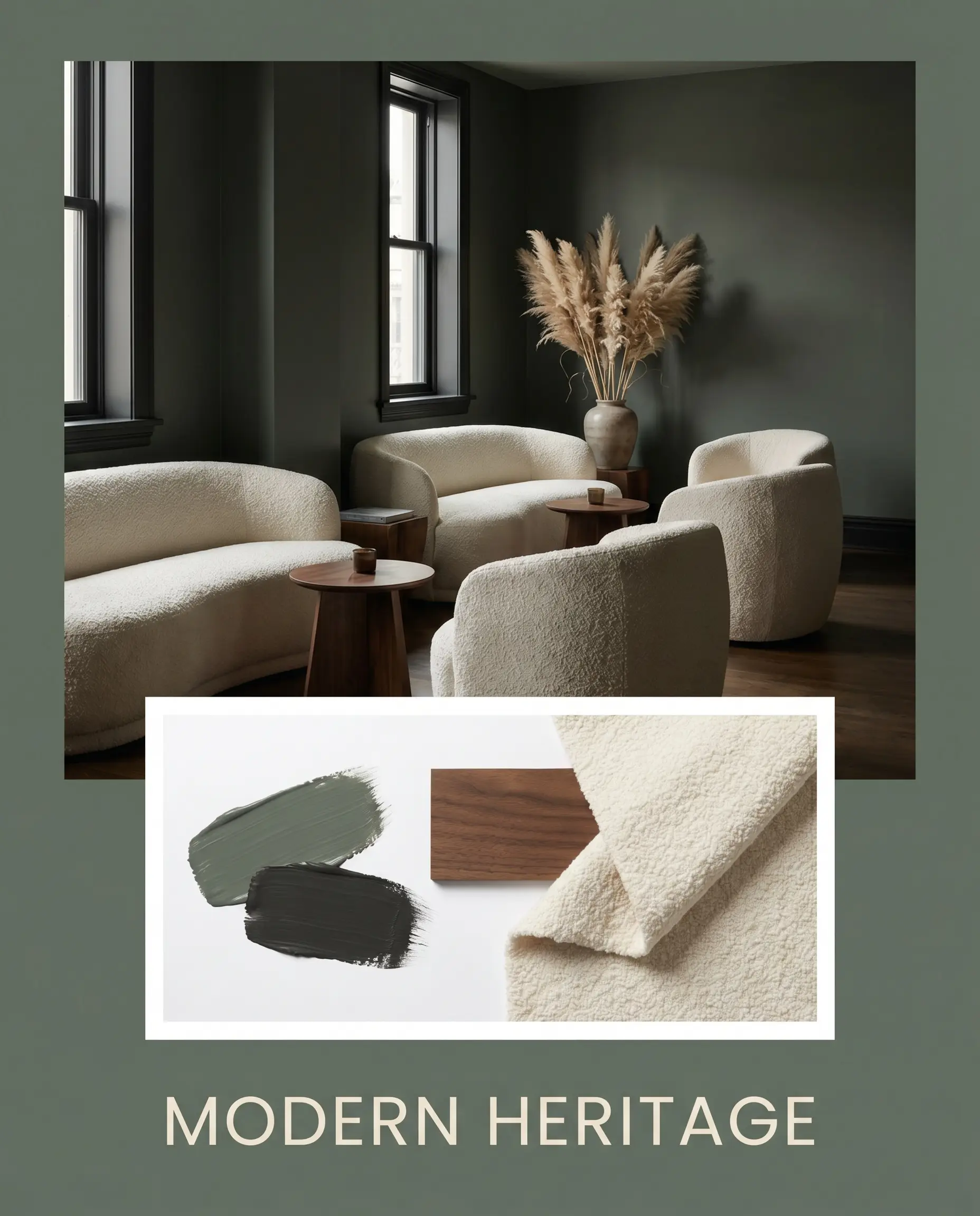
Modern Heritage This moody, sophisticated palette is designed for intimate, low-light spaces. Wrap the room entirely in the dark green, utilizing Sherwin-Williams Tricorn Black on the window trims for a sharp, tailored border. Soften the heavy architecture with nubby cream boucle seating, dark walnut side tables, and dried pampas grass in a simple ceramic vase to add organic texture.
Sherwin-Williams Basil vs. Rival Greens
Choosing the right deep green often comes down to understanding how a color reacts to your specific lighting and architectural constraints. Here is how this shade stacks up against its closest competitors.
Sherwin-Williams Basil vs. Sherwin-Williams Retreat
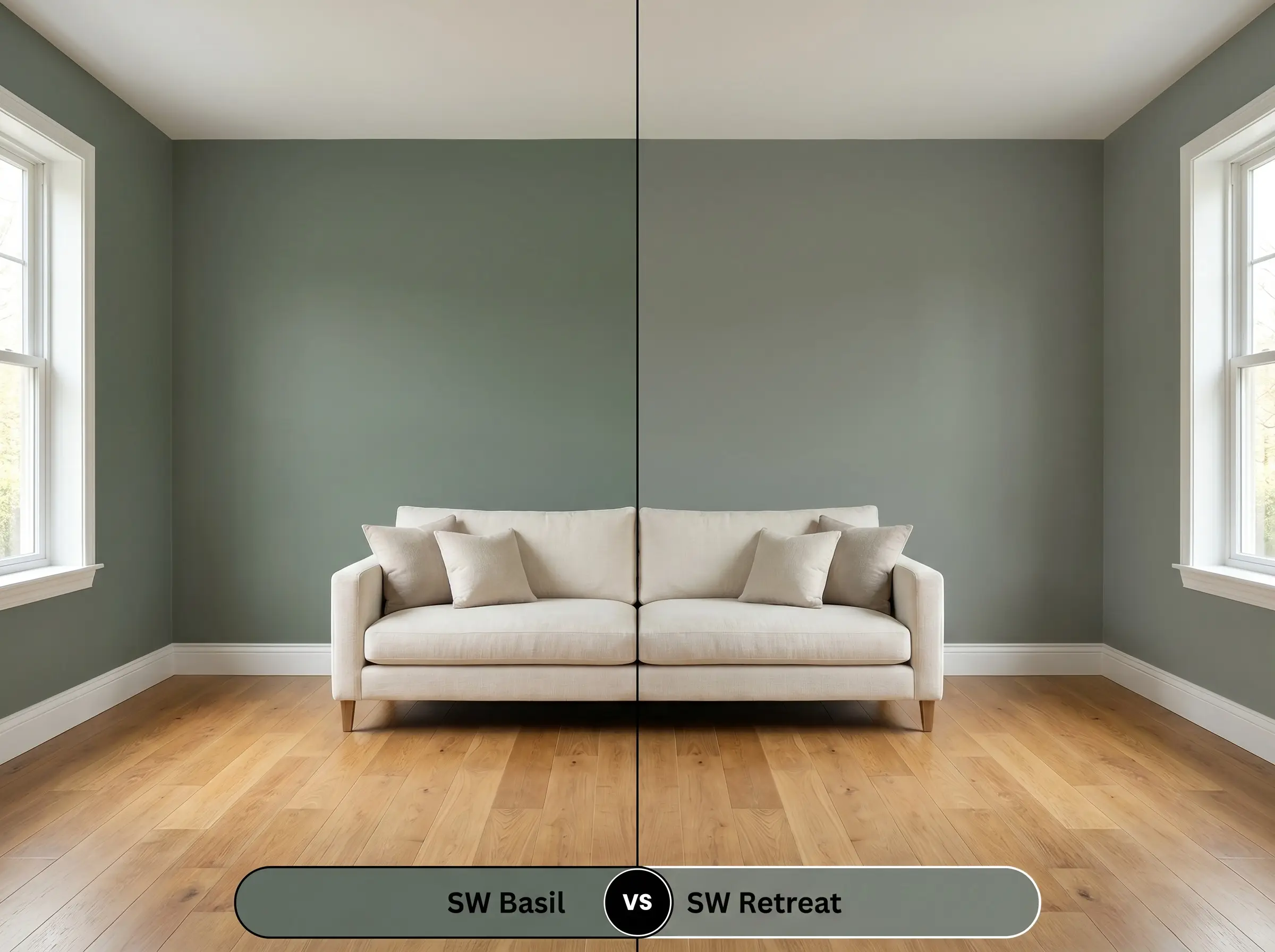
If your room lacks natural light and you are worried about the walls feeling too heavy, Sherwin-Williams Retreat SW 6207 is often the safer choice. Retreat carries a slightly higher LRV and leans noticeably cooler, with a stronger blue-gray influence that feels breezy and coastal. If you want a warmer, more enveloping woodland feel, stick with Basil; if you need a crisper, more relaxed green, pivot to Retreat.
Sherwin-Williams Basil vs. Sherwin-Williams Evergreen Fog
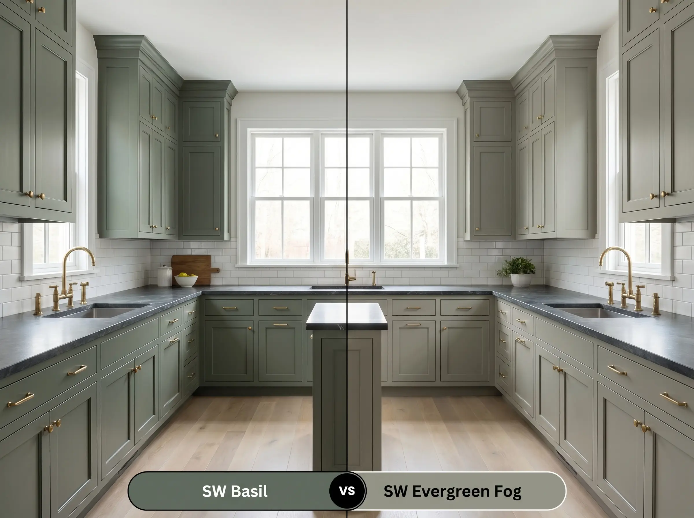
Evergreen Fog SW 9130 is significantly lighter and much more muted than Basil, acting more like a mid-tone neutral than a dramatic focal point. If you are painting an entire open-concept living space and want a soft, ambient wash of color, Evergreen Fog is highly forgiving and universally flattering. However, if you are looking to create high-impact contrast on kitchen cabinetry or an accent wall, Basil provides the necessary architectural depth that Evergreen Fog lacks.
Similar Colors & Brand Equivalents
If you love the general aesthetic of this shade but need a slight adjustment in depth or temperature, here are the best alternatives.
Sherwin-Williams Alternatives
Cross-Brand Matches
Practical Application & DIY Advice
Executing a flawless finish with a dark, low-LRV paint requires a specific strategy. Here is how to ensure your application looks professional and intentional.
The Dynamic Sheen Guide
Primer Strategy
You cannot skip primer when working with a color this dark. Because it absorbs so much light, applying it directly over builder-grade white or a light existing color will result in a streaky, uneven finish.
Always ask your paint counter to mix a tinted gray primer before applying this specific shade. A gray base dramatically reduces the number of topcoats required and ensures the deep olive-yellow undertones develop their true, rich opacity.
Hackrea Pro-Tip (The Tinted Base)
Coverage & Success Tips
Expect to apply a minimum of two generous coats over your tinted primer to achieve full, professional coverage. Because dark paints contain more colorant, they take slightly longer to cure and are highly susceptible to “flashing”—visible, shiny roller marks caused by uneven application or touching up half-dry paint. To avoid this, always maintain a wet edge while rolling, work in continuous vertical strokes from ceiling to floor, and never go back over a section that has already begun to tack up.
Frequently Asked Questions
Because of its dark LRV, it will absorb significant heat, which can cause standard exterior paints to fade or chalk prematurely in intense, direct sunlight. If you use it on a high-UV exterior, you must upgrade to a premium, UV-resistant architectural coating to protect the integrity of the olive-yellow undertone.
Absolutely, provided you lean into the mood rather than fighting it. By pairing it with warm 2700K artificial lighting, highly reflective polished brass fixtures, and a crisp white ceiling, the dark green creates a sophisticated, jewel-box atmosphere rather than a gloomy cave.
The gray cast acts as a beautiful neutralizing agent against heavy red or orange wood tones. It cools down the visual heat of the floors, creating a balanced, earthy contrast that feels intentional rather than overwhelmingly warm.
It pairs wonderfully with Carrara marble. The cool, crisp white and gray veining of the marble provides a stunning, high-contrast break against the warm, earthy depth of the green cabinetry, resulting in a highly tailored, premium aesthetic.
Final Verdict & Expert Warnings
Sherwin-Williams Basil SW 6194 is an incredibly powerful, grounding architectural tool designed for homeowners who want to infuse their spaces with organic warmth and sophisticated depth. Its absolute best application is acting as a heavy visual anchor—whether on lower kitchen cabinetry, wrapping a focused home office, or providing a moody backdrop in a Japandi-inspired bedroom. It is the perfect paint for those who want the dramatic impact of a dark color without the stark, cold severity of pure black or charcoal.
However, this deeply earthy hue requires careful curation to succeed. You must avoid pairing this shade with stark, cool-toned gray flooring or icy, blue-tinted white trims. When placed next to sterile, cool-leaning grays, the beautiful olive-yellow warmth of the paint is completely suffocated, causing the green to look sickly, muddy, and entirely out of place. To keep this paint feeling premium and alive, you must always support it with warm, natural materials, creamy off-whites, and lighting that honors its botanical roots.