The 2026 Guide to Thanksgiving Decor: 21 Ways to Style a Warm, Sophisticated Home
We all know the panic of walking down a seasonal craft store aisle, confronted by shelves of neon orange plastic turkeys and artificial maple leaves. You want your holiday gathering to feel warm and intentional, not like a heavily themed children’s party. The transition from early fall to late November requires a curated, sensory-driven approach we call the “Transitional Harvest.” This 2026 aesthetic leans heavily into the English Countryside movement, prioritizing organic textures, saturated earth tones like chocolate and caramel, and foraged elements that feel effortlessly expensive. Let’s look at the foundational color palette that makes this high-end, transitional style possible.
The 2026 Thanksgiving Palette: Beyond Basic Orange
Trading default neon orange for deep, muddy earth tones instantly gives your home a custom, designer-curated patina. These saturated hues create a grounding, sophisticated environment that looks beautiful from the first week of November well into December.
| Base Color | Accent Color | Metal Pairing |
|---|---|---|
| Chocolate Brown | Muted Plum / Aubergine | Vintage Brass |
| Matte Terracotta | Soft Sage Green | Tarnished Bronze |
| Creamy Ivory | Burnt Caramel | Forged Iron |
1. Anchor the Room in Chocolate Brown
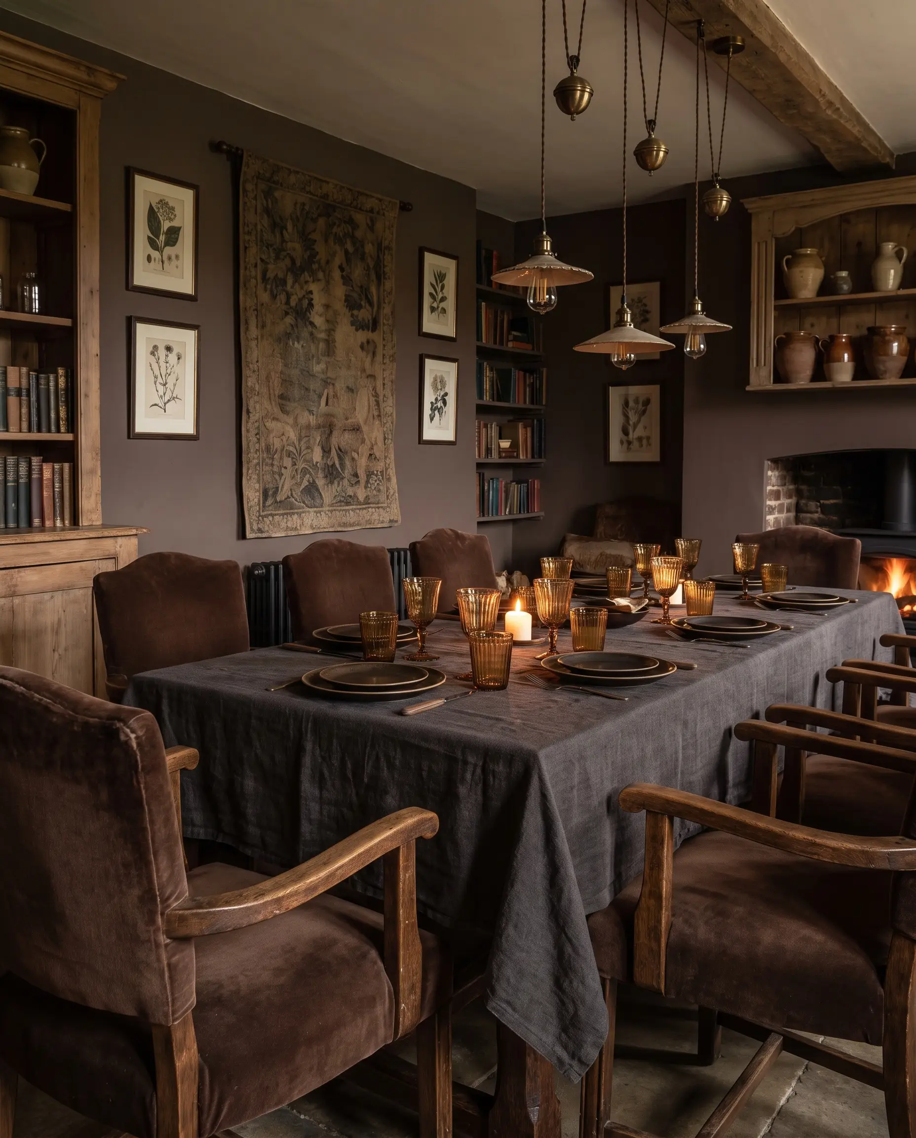
Chocolate brown is the defining neutral of 2026, acting as a softer, warmer alternative to stark black. Using this saturated shade in heavy textiles instantly grounds the dining space and provides a rich backdrop for lighter ceramics.
- Vibe: Moody English Countryside.
- Key Materials: Heavyweight velvet, raw linen, dark walnut wood.
- Paint Match: Farrow & Ball London Clay.
- Material Contrast: Pair light-absorbing matte brown textiles with light-reflecting amber glassware to create visual friction.
2. Layer Matte Terracotta with Soft Sage
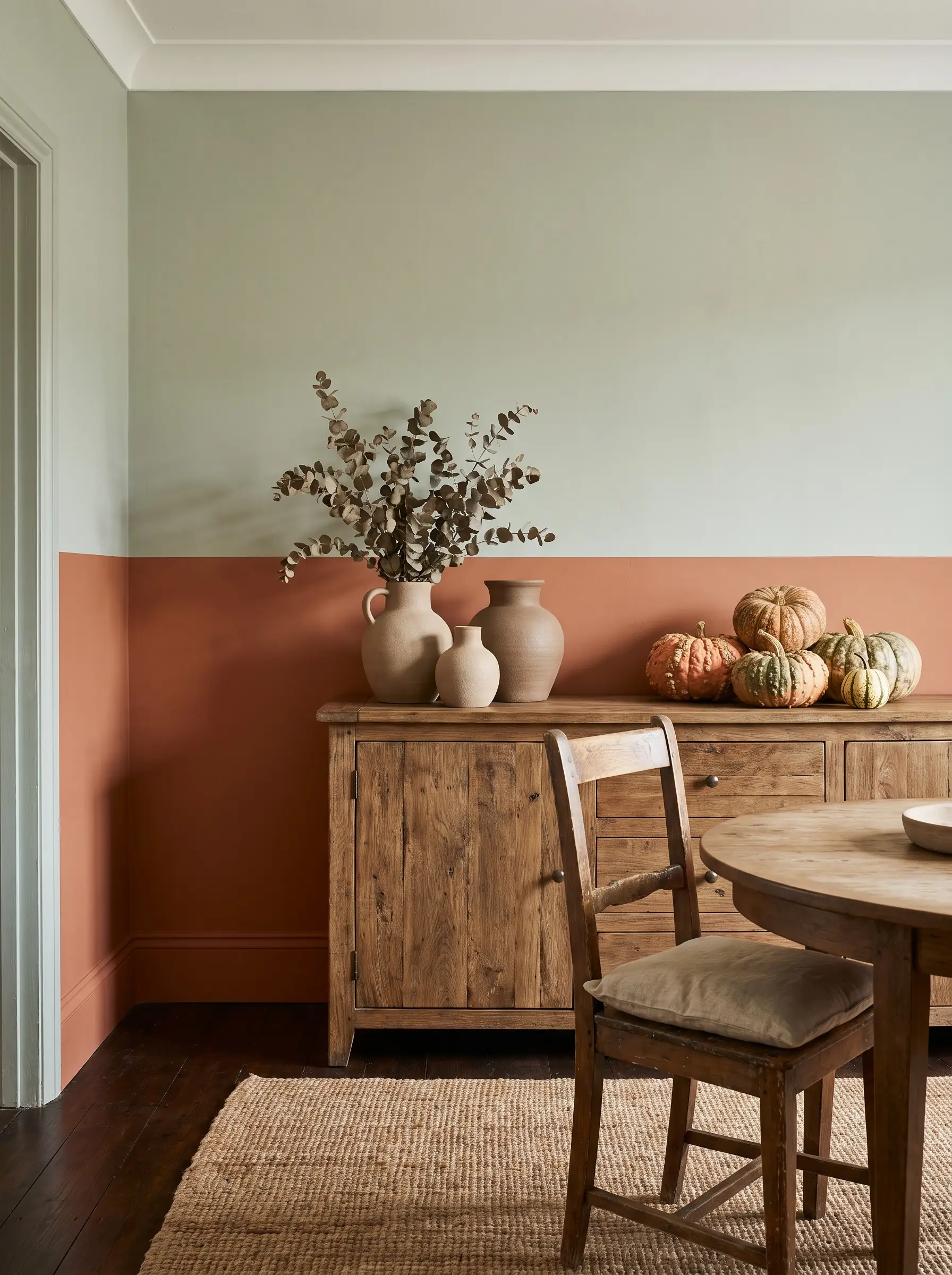
The earthy warmth of terracotta balances perfectly with the muted coolness of sage green, avoiding the cliché orange-and-black contrast. This combination feels incredibly organic, especially when introduced through heirloom pumpkins and foraged greenery.
- Vibe: Accessible Luxury & Elevated Organic.
- Key Materials: Unglazed ceramic, dried eucalyptus, heirloom squash.
- Paint Match: Sherwin-Williams Cavern Clay (Terracotta) and Sherwin-Williams Retreat (Sage).
3. Introduce Aubergine and Plum for Depth
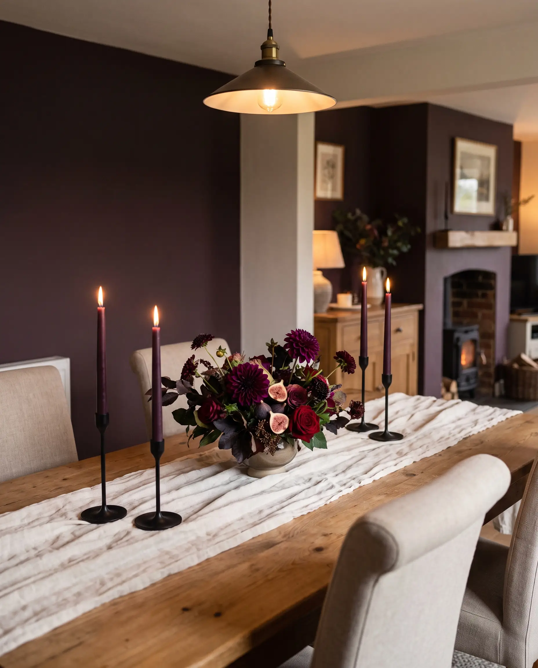
Push the boundaries of traditional autumn hues by layering in deep purples and plums. These romantic, moody shades add a sophisticated edge when incorporated through fresh florals or tapered candles.
- Vibe: Romantic, transitional dining.
- Key Materials: Fresh figs, dyed taper candles, dark floral centerpieces.
- Color Match: Benjamin Moore Caponata.
4. Swap Bright Gold for Burnished Vintage Brass
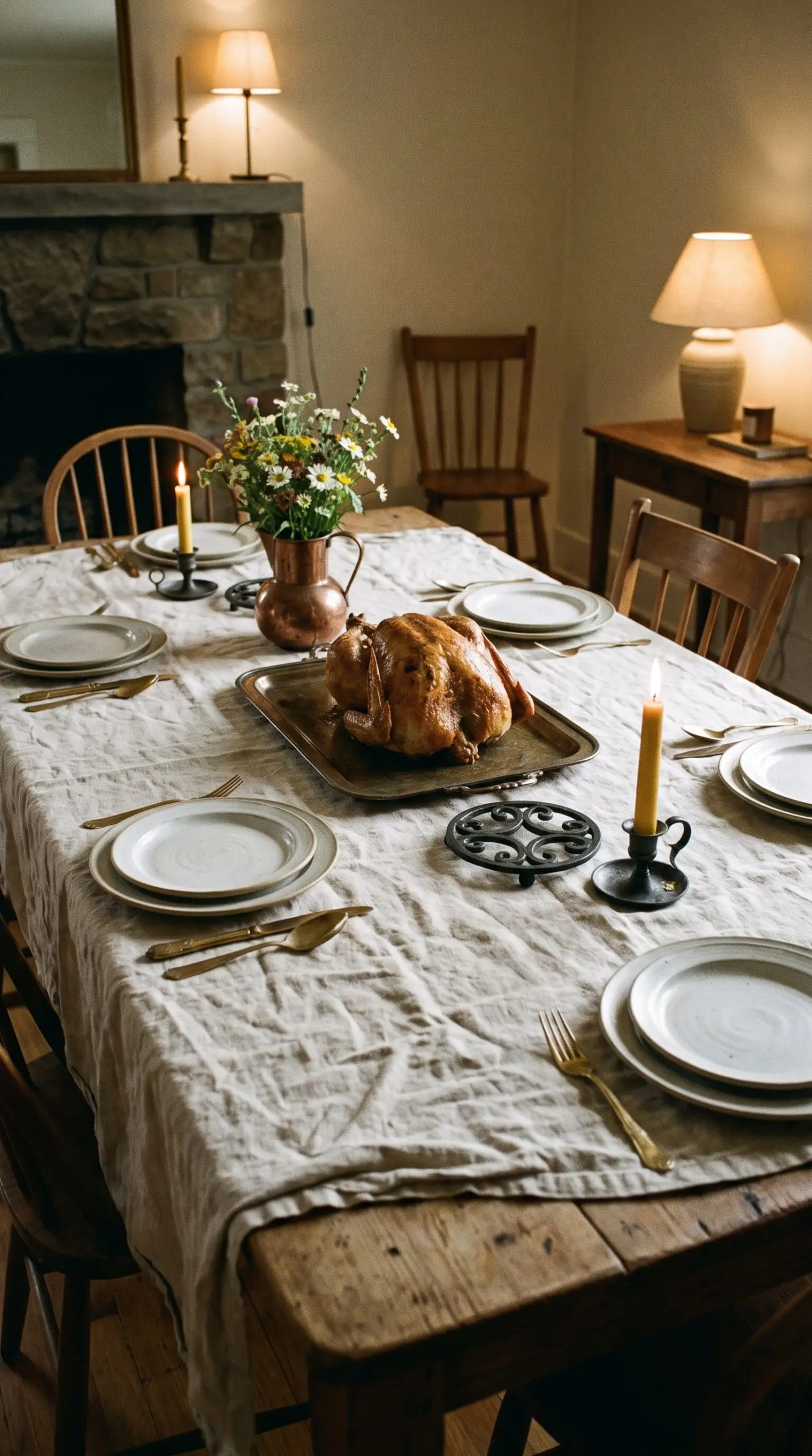
Shiny, lacquered gold finishes can quickly cheapen a carefully curated table setting. Instead, anchor your tablescape with the historical patina of vintage brass flatware, candlestick holders, and serving trays to capture that authentic Cotswolds aesthetic.
- Vibe: Historic, lived-in luxury.
- Key Materials: Antiqued brass, tarnished bronze, forged iron.
- Material Contrast: The dull warmth of burnished metal against crisp, natural linen creates the ultimate high-low tactile experience.
5. Use Creamy Ivory as a Breathable Base
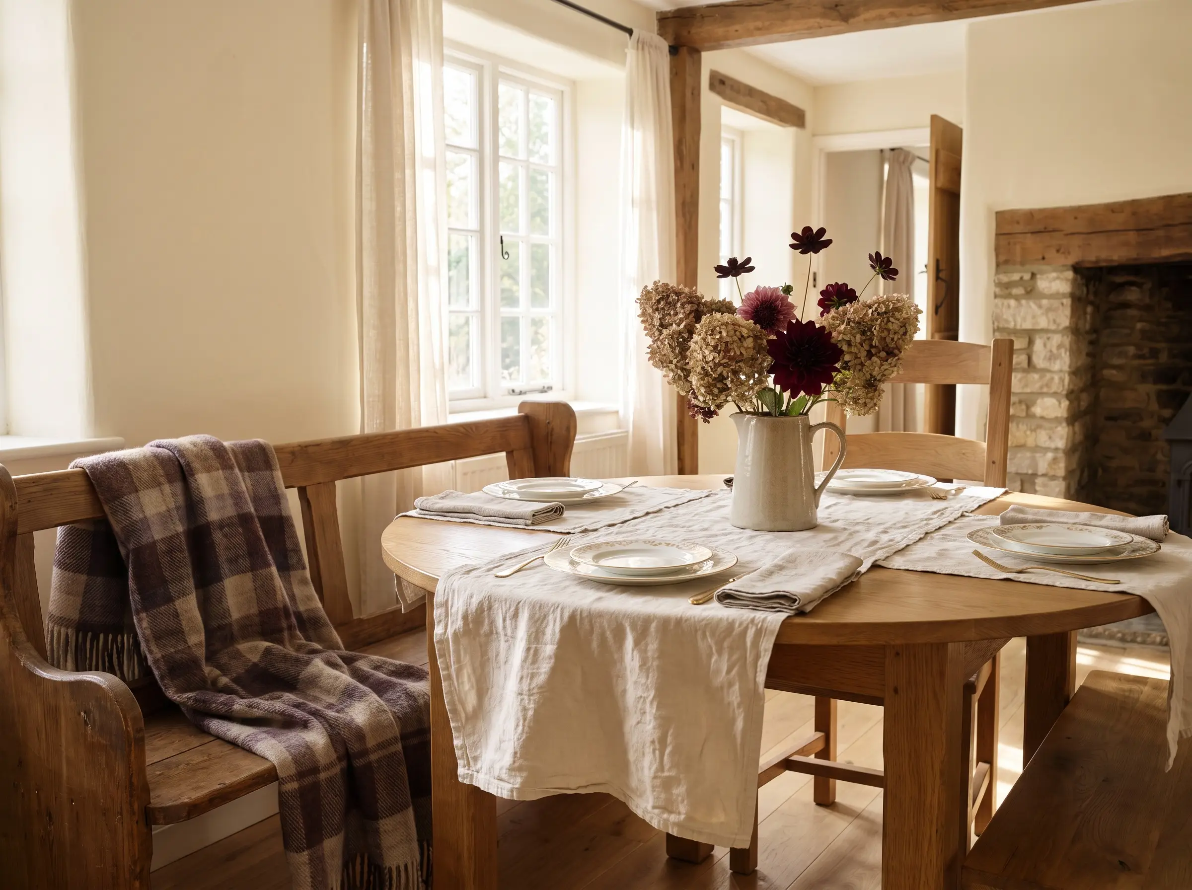
Heavy, saturated autumn colors require a warm, breathable foundation to prevent the room from feeling claustrophobic. Warm ivory dinnerware and soft wall hangings allow those rich chocolate and aubergine tones to command attention.
- Vibe: Soft, accessible luxury.
- Key Materials: Bone china, wool throws, unbleached cotton.
- Paint Match: Benjamin Moore Swiss Coffee.
Never use stark hospital white alongside muddy earth tones; always match the undertone of your lightest neutral to the warmth of your darkest accent to maintain visual harmony.
Styling Rule
Modern Tablescape Architecture & Place Settings
A truly sophisticated tablescape relies on varying heights, intentional negative space, and contrasting textures, not just flat objects placed on a runner. The physical construction of your table should encourage conversation and invite guests to linger comfortably.
6. Build an Edible Centerpiece with Figs and Artichokes
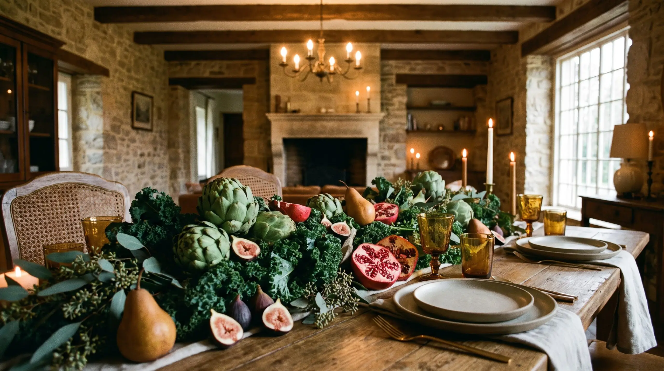
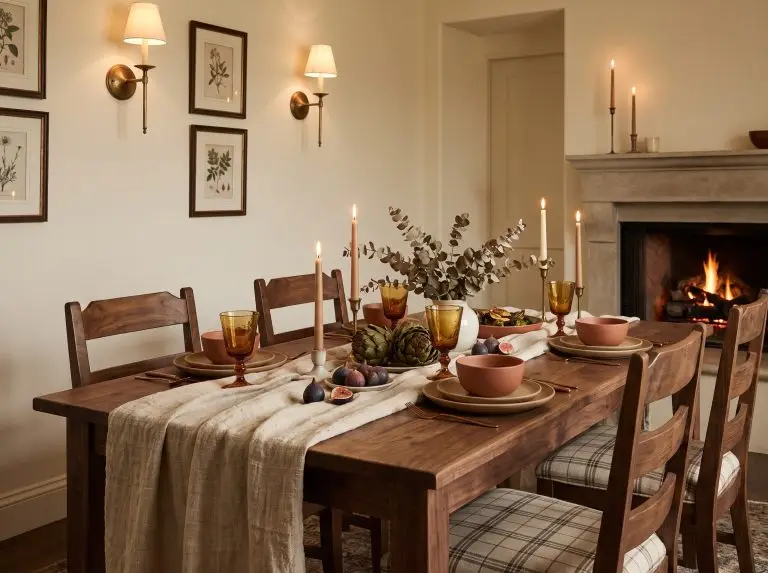
Abandon the dusty plastic foliage and create an organic, Dutch-master-painting vibe by scattering fresh figs, halved pomegranates, and raw artichokes down the center of the table. This foraged centerpiece provides an interactive, tactile experience that feels fresh and abundant.
- Vibe: Abundant, organic harvest.
- Key Materials: Raw artichokes, fresh figs, pomegranates, Bosc pears.
- Material Match: Anchor the fruit on a bed of dark, leafy greens like kale or seeded eucalyptus.
7. Ground the Table with Heavyweight Linen
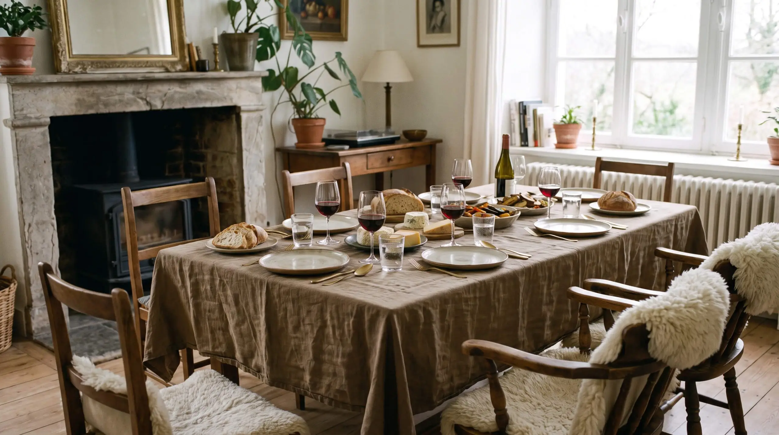
A raw, un-ironed heavyweight linen tablecloth or runner establishes a foundation of quiet luxury. The natural wrinkles and heavy drape provide a relaxed, effortless atmosphere that stiff cotton simply cannot achieve.
- Vibe: Relaxed European dining.
- Key Materials: 100% European flax linen in muddy earth tones.
- Care Tip: Wash and tumble dry on low, pulling it out while slightly damp to encourage a soft, natural wave rather than a hard crease.
8. Mix Ribbed Amber Glassware with Matte Stoneware
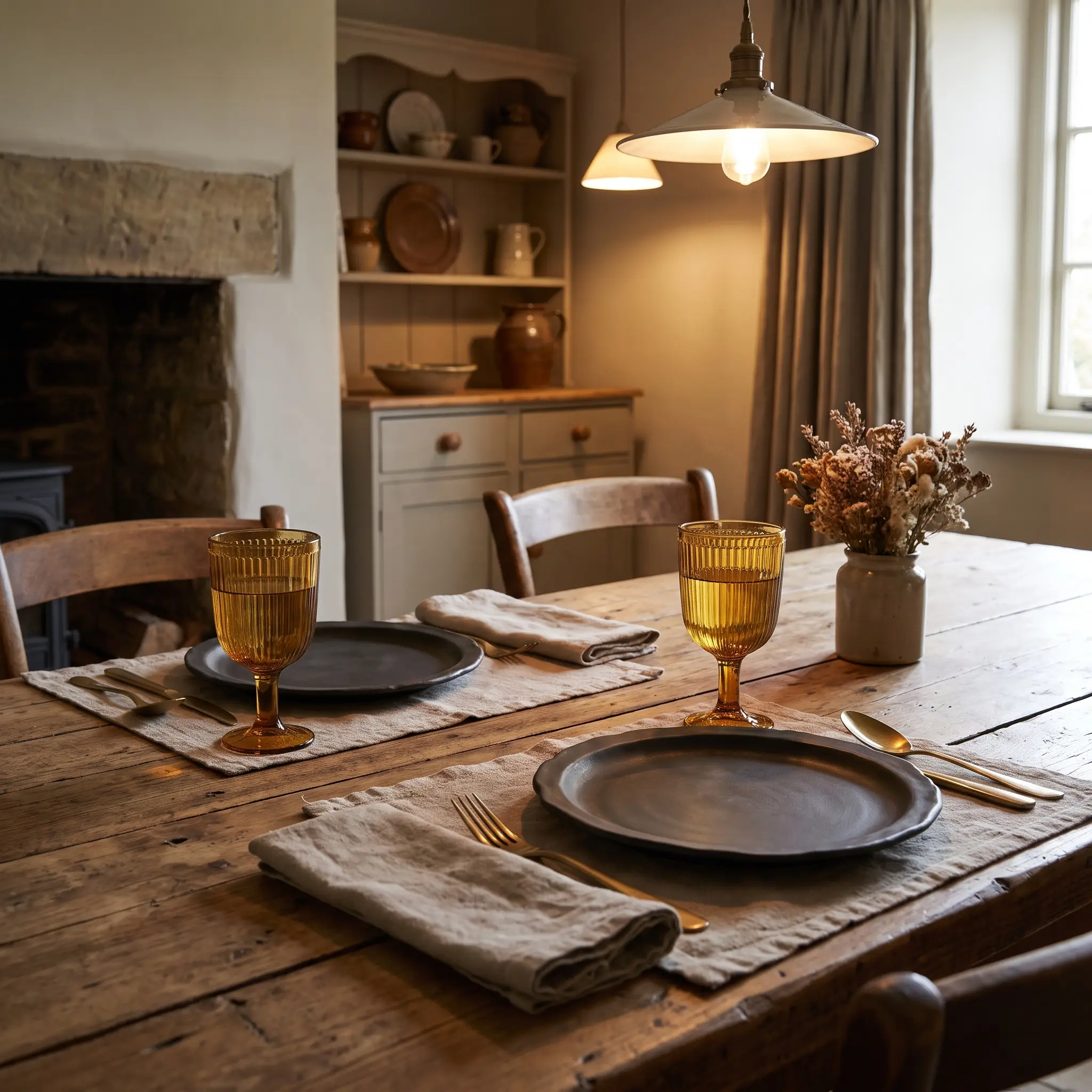
Creating a dynamic place setting is entirely about material friction. The light-catching, vertical lines of ribbed amber glass water goblets contrast beautifully against the flat, light-absorbing surface of matte stoneware dinner plates.
- Vibe: Earthy, tactile sophistication.
- Key Materials: Ribbed amber glass, unglazed or matte-glazed ceramic.
- Material Contrast: Pair the sharp, rigid structure of ribbed glass with the imperfect, organic edges of handmade stoneware.
9. Utilize the “Hanging Napkin” Drape Technique
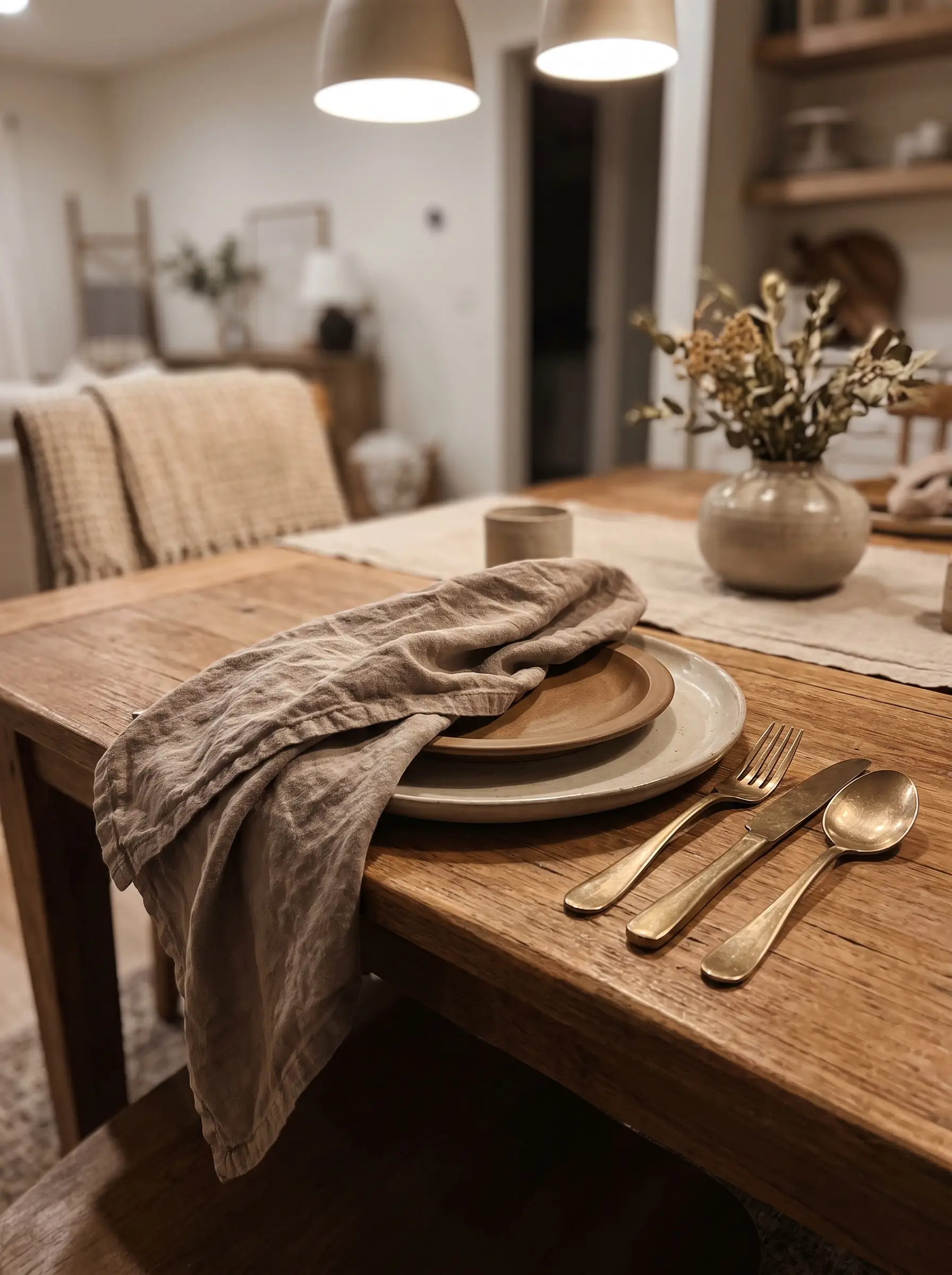
Skip the rigid, formal napkin rings that feel overly manufactured. Instead, drape a soft linen napkin loosely between the dinner plate and the salad plate, allowing it to cascade casually off the edge of the table.
- Vibe: Effortless, deconstructed luxury.
- Key Materials: Oversized linen or washed cotton napkins.
- Styling Pro-Tip: Let the fabric fall asymmetrically to break up the harsh circular geometry of the dinner plates.
10. Incorporate Handwritten Place Cards on Foraged Elements
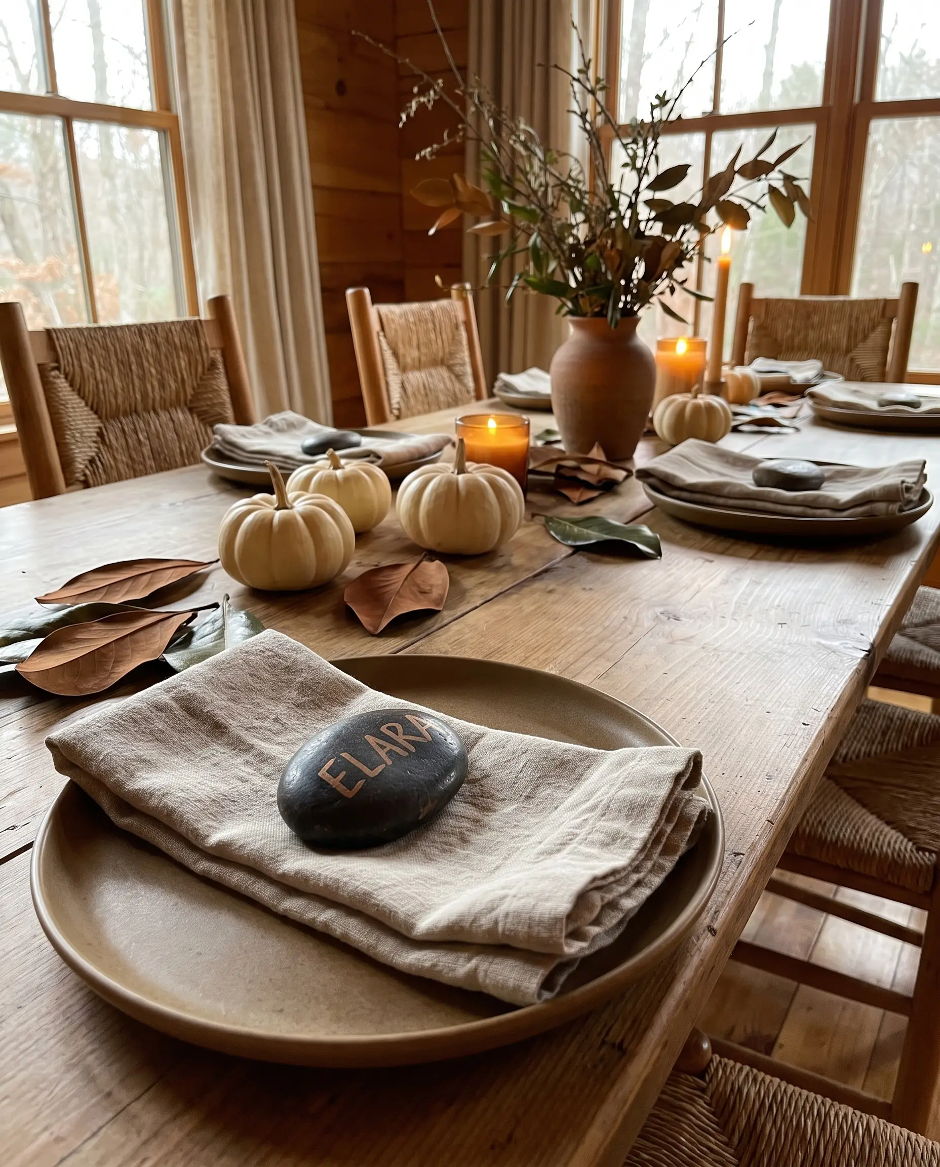
Personalized touches do not require expensive stationery. Use a fine-tip metallic paint pen to write your guests’ names on dried magnolia leaves, smooth dark river stones, or miniature white pumpkins for a grounding, low-cost detail.
- Vibe: Thoughtful, earthy personalization.
- Key Materials: Foraged magnolia leaves, river stones, metallic oil-based markers.
- Color Match: Use a muted copper or bronze pen rather than bright yellow gold.
11. Scatter Gooseberries and Pinecones for Low-Profile Texture
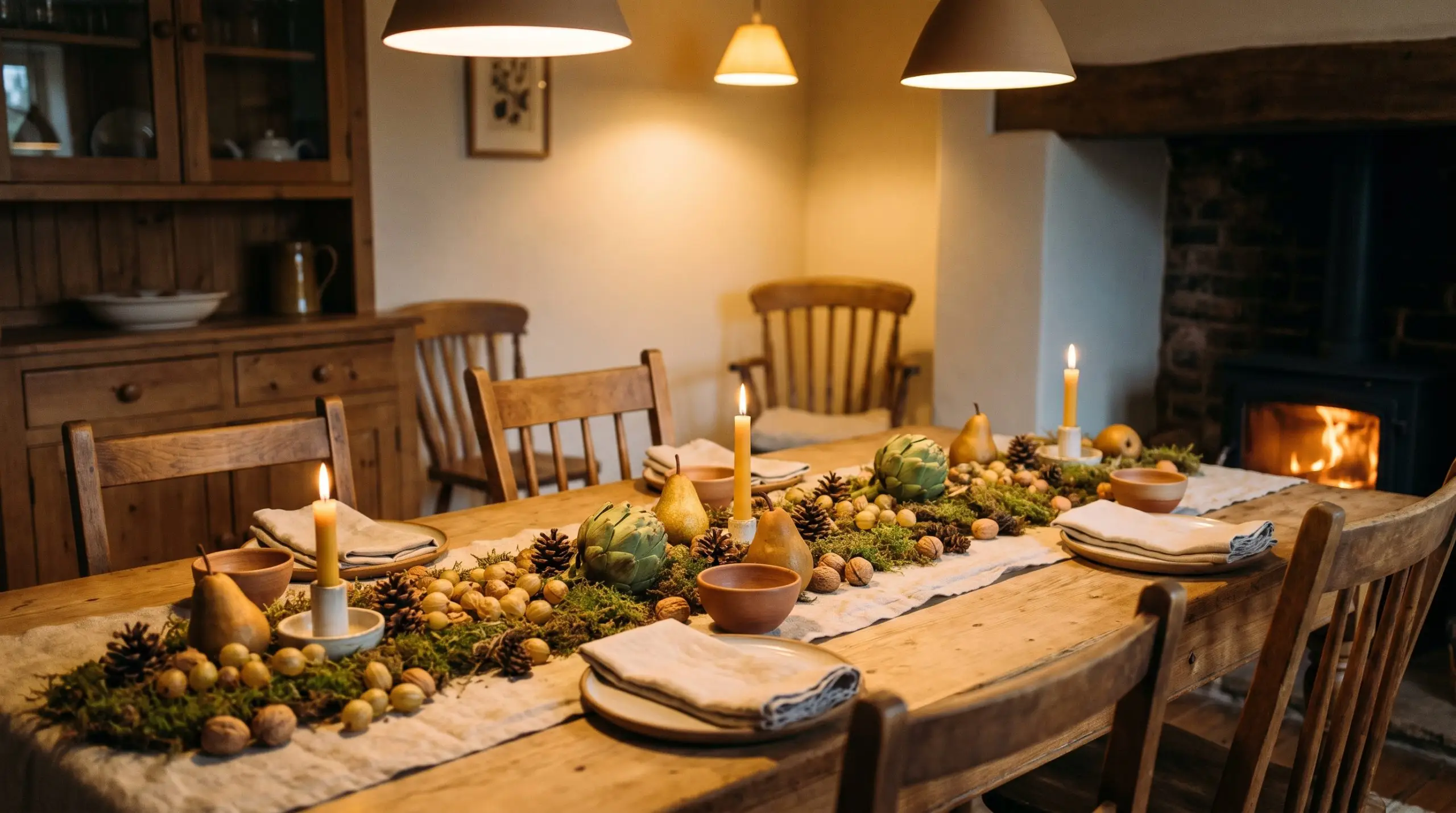
Massive floral arrangements block cross-table sightlines and stifle conversation. Scattering low-profile elements like dried gooseberries, miniature pinecones, and whole walnuts creates a rich visual landscape that keeps the focus on the guests.
- Vibe: Intimate, conversational dining.
- Key Materials: Dried gooseberries, foraged pinecones, unshelled nuts.
- Layout Strategy: Weave these smaller elements into the negative space between your larger edible centerpiece items.
Always keep your central dining table decor below chin level when guests are seated; if they have to lean around a vase to speak, the layout has failed.
Pro Tip
Transitional Decor: Styling Beyond the Dining Room
Entertaining does not start and end at the dining table; your guests will spend 70% of their time moving through the rest of your home. Extending the sensory experience into the living room and entryway ensures the entire house feels curated and welcoming.
12. Style a Cozy Guest Coffee Station with Caramel Hues
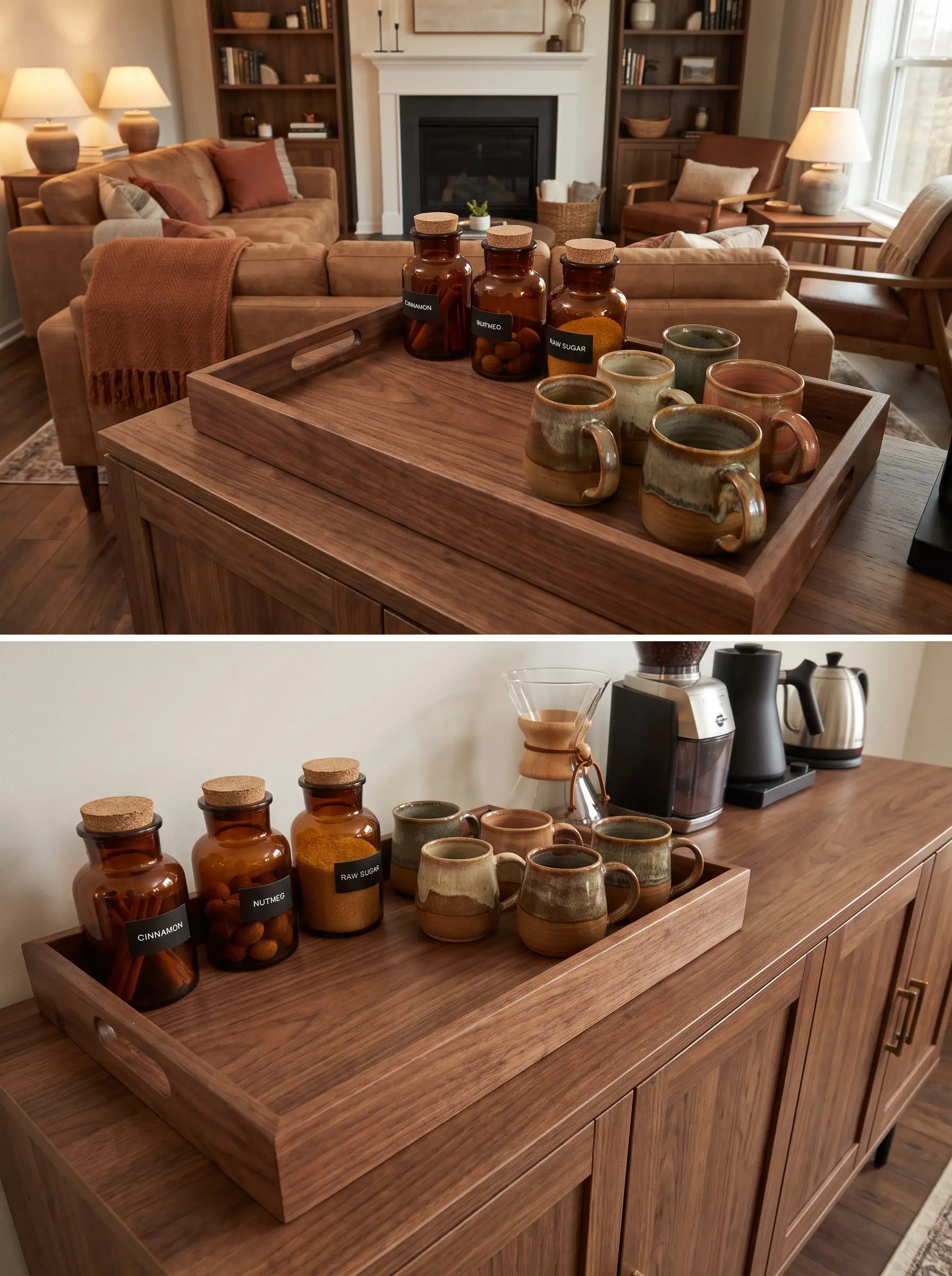
Anticipate the morning-after hosting duties by setting up a self-serve coffee bar layered in warm caramel and wood tones. This dedicated zone gives guests autonomy while maintaining the home’s cohesive, earthy aesthetic.
- Vibe: Welcoming, boutique hotel hospitality.
- Key Materials: Walnut trays, handmade ceramic mugs, amber glass jars.
- Styling Pro-Tip: Store cinnamon sticks, whole nutmeg, and raw sugar in small amber apothecary jars to tie into the dining room’s glassware.
13. Transition the Entryway with Heirloom Pumpkins
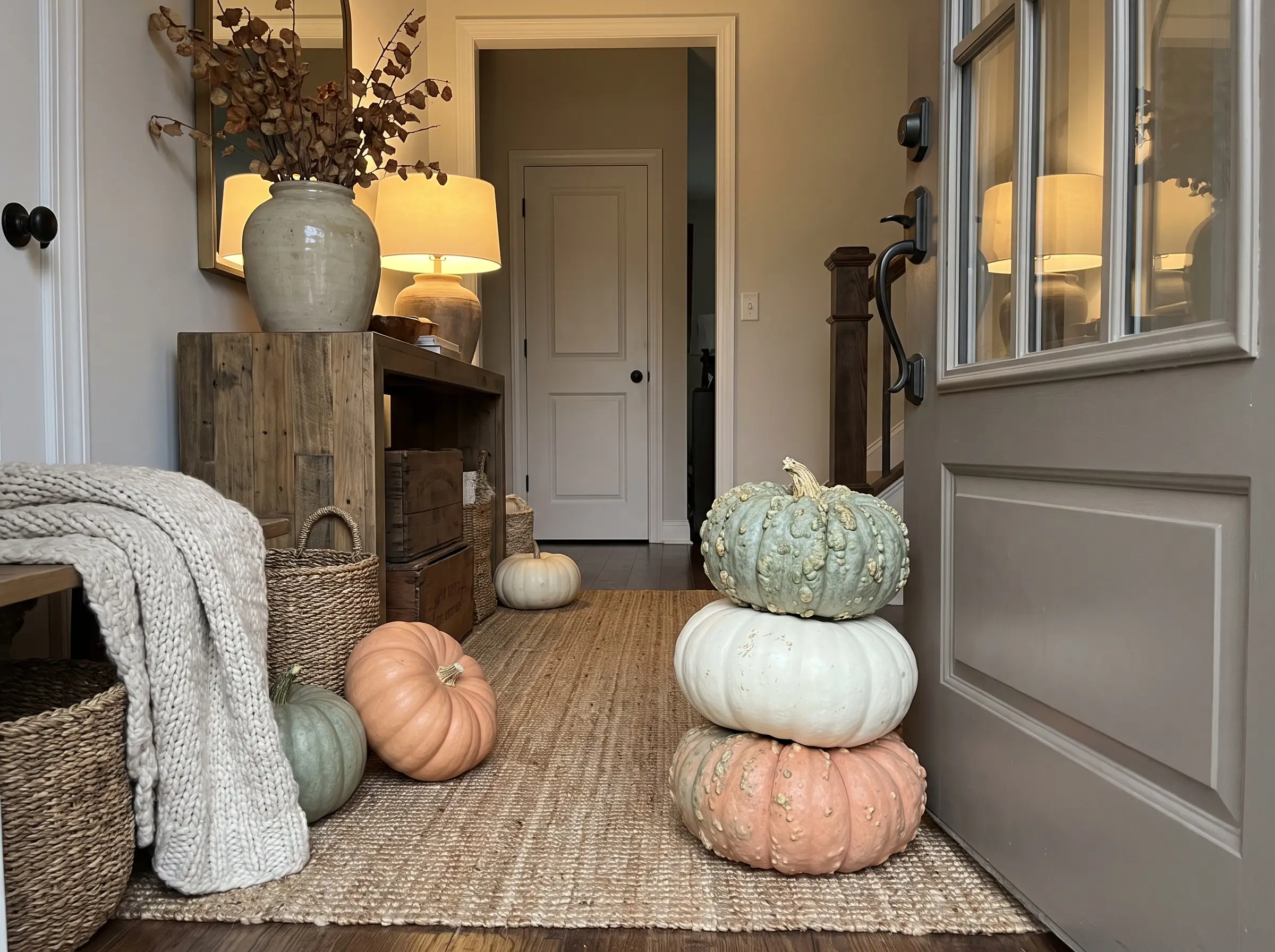
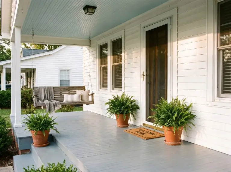
Set a sophisticated tone the moment the front door opens by abandoning perfectly round, bright orange carving pumpkins. Stack warty, asymmetrical heirloom pumpkins in shades of muted green, ghost white, and dusty peach directly on the porch and entryway floor.
- Vibe: Curated autumnal harvest.
- Key Materials: Jarrahdale, Cinderella, and Lumina pumpkin varieties.
- Material Contrast: Rest smooth heirloom pumpkins against heavily textured woven seagrass baskets or vintage wooden crates.
14. Drape Plaid and Faux Fur Throws over Leather Seating
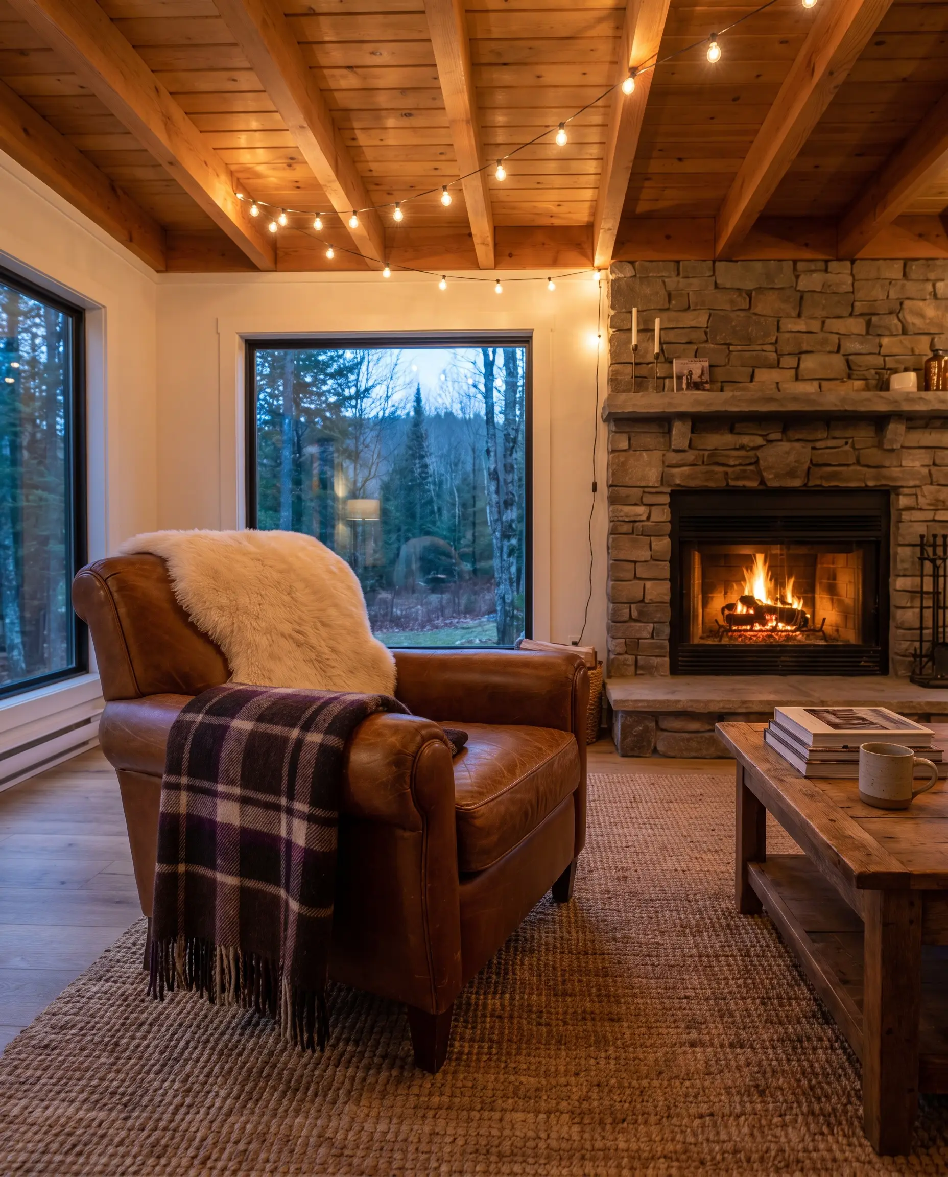
Soften the rigid, cold surfaces of leather sofas and armchairs by casually draping heavy textiles over the arms or backrests. This introduces immediate tactile comfort, inviting guests to linger long after dinner is finished.
- Vibe: Modern cabin comfort.
- Key Materials: Heavyweight plaid wool, high-quality faux fur, bouclé.
- Color Match: Pull tones from your dining table—like chocolate brown or aubergine—into the plaid pattern to unify the spaces.
15. Swap Everyday Art for Moody, Autumnal Landscapes
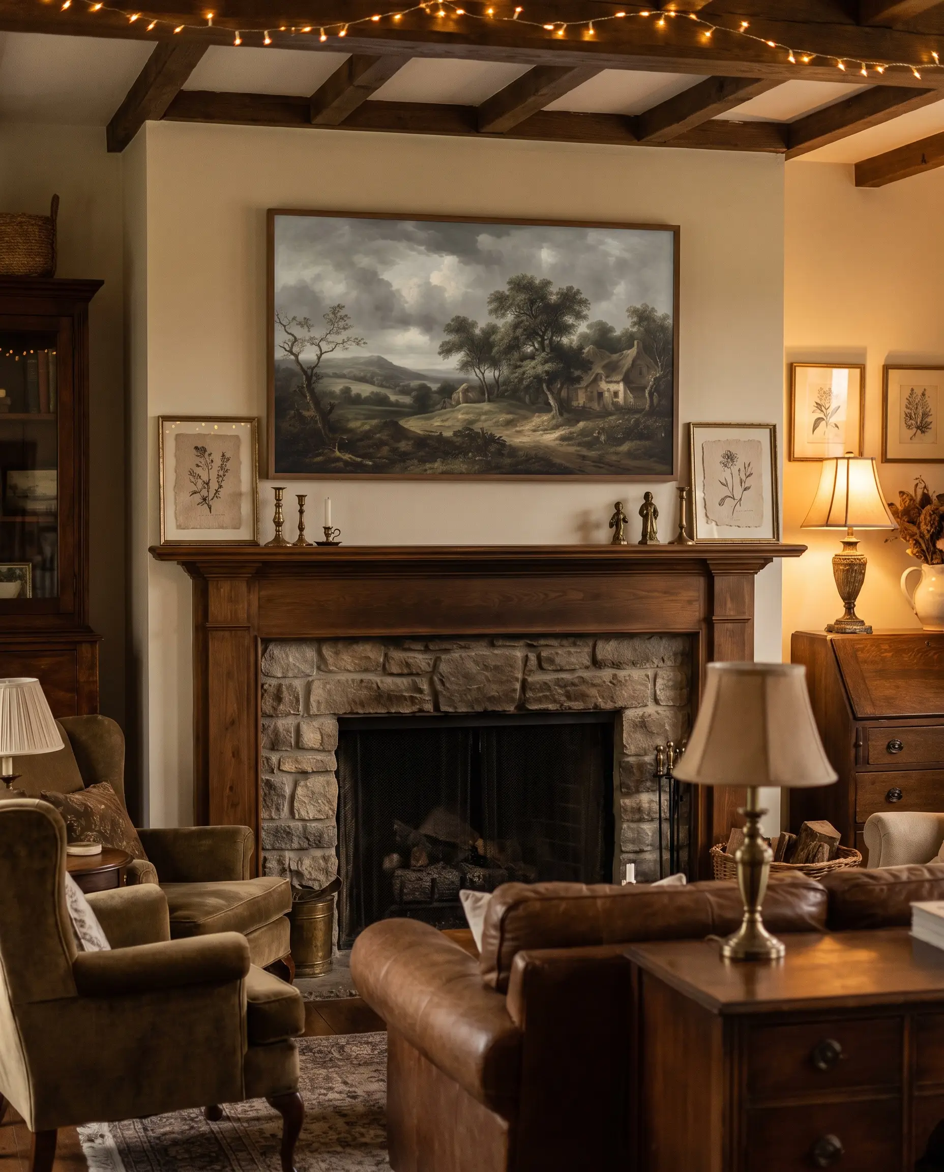
Changing your artwork is a high-impact, low-effort way to shift the entire mood of a living room. Utilize a digital frame TV or print affordable digital downloads of vintage, pastoral landscapes to instantly achieve that moody, English Countryside atmosphere.
- Vibe: Moody, historic elegance.
- Key Materials: Frame TVs, vintage digital downloads, matte textured paper.
- Styling Pro-Tip: Look for public domain oil paintings featuring overcast skies, muted greens, and deep browns.
16. Create a Simmering Potpourri Station on the Stove
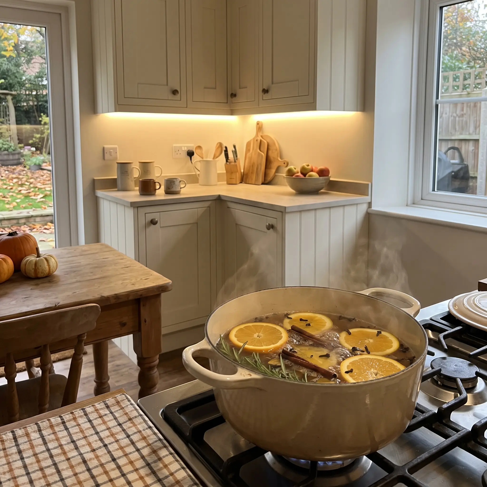
The olfactory experience is just as crucial as the visual layout when welcoming guests out of the cold. A simmering pot on the back burner ensures the house smells incredible and intentional the second the doorbell rings.
- Vibe: Warm, sensory-driven hospitality.
Key Ingredients:
- Thickly sliced oranges
- Whole cinnamon sticks
- A handful of whole cloves
- Fresh rosemary sprigs
Lighting and Sensory Details
Lighting is the single most critical element of evening entertaining; a poorly lit room will ruin even the most beautifully constructed tablescape. Layering warm, localized light sources creates an intimate, flattering environment that encourages guests to relax.
17. Cluster Taper Candles in Asymmetrical Brass Holders
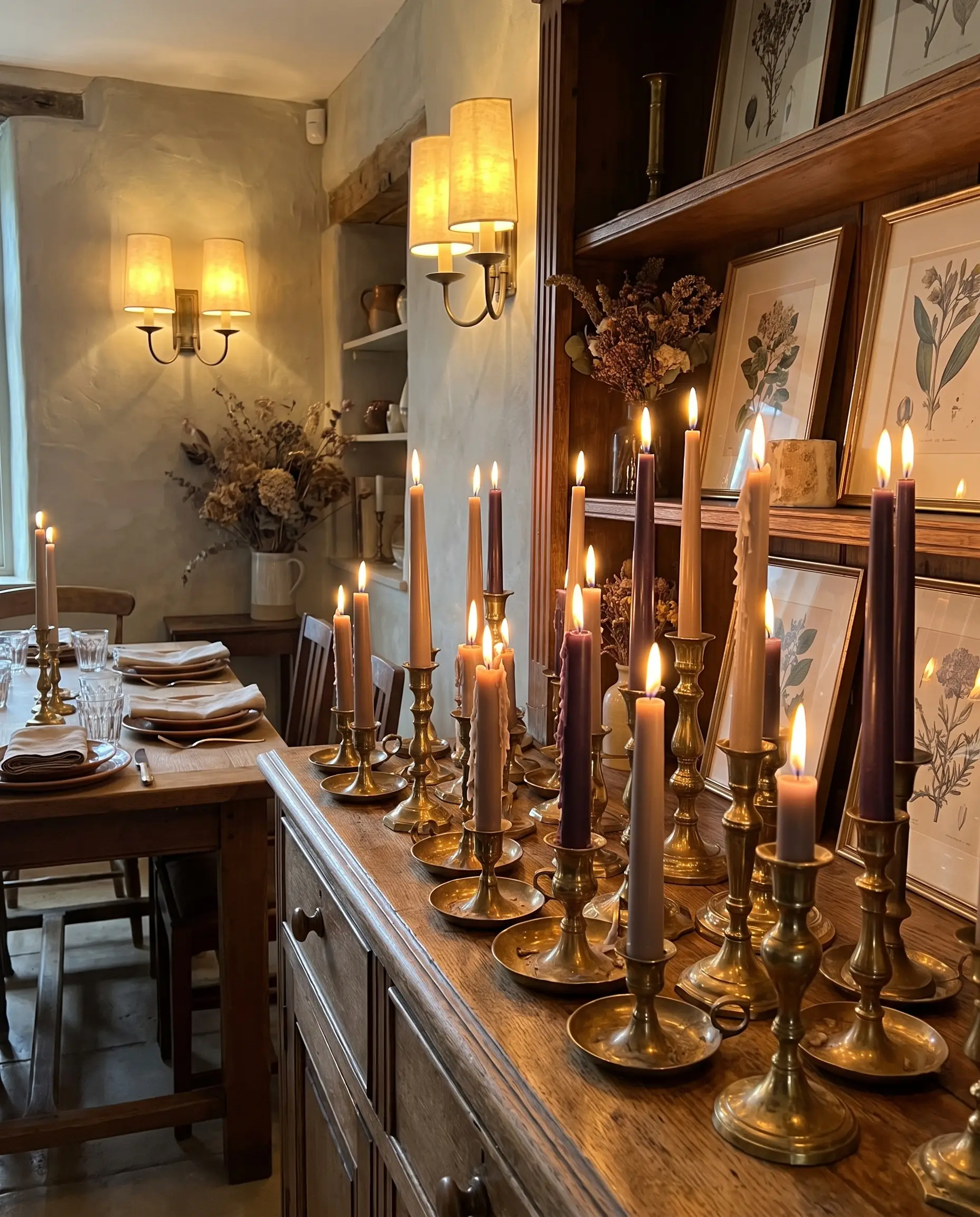
Perfect symmetry can feel stiff and overly formal. Grouping taper candles of varying heights in mismatched brass holders creates a fluid, organic lighting landscape that feels collected over time.
- Vibe: Lived-in, romantic ambiance.
- Key Materials: Vintage brass holders, dripless beeswax candles.
- Color Match: Taupe, aubergine, or natural beeswax yellow.
18. Introduce Woodsmoke and Cedar Ambient Scents
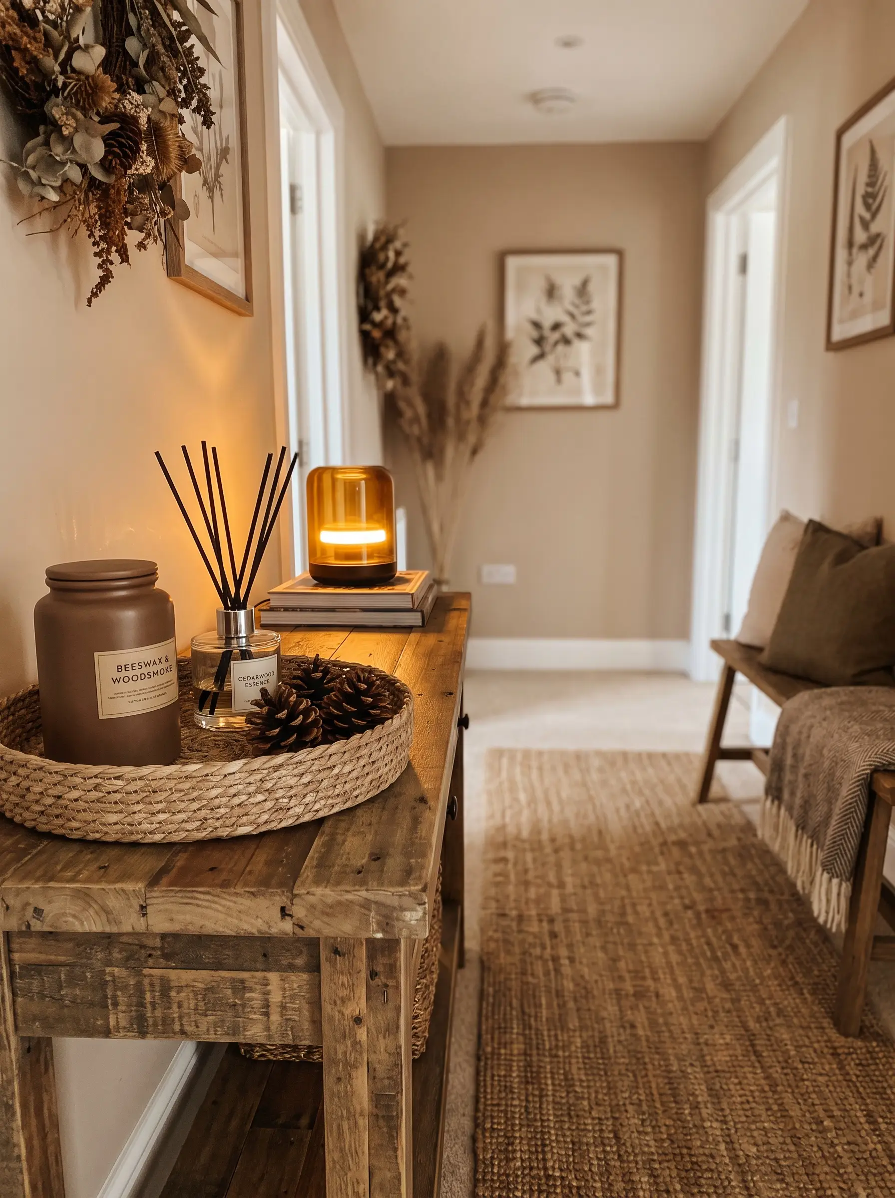
Layering non-intrusive, earthy scents in peripheral rooms like the entryway or guest bathroom builds a subconscious sense of warmth. Woodsmoke, cedar, and tobacco notes perfectly complement the crisp November air outside.
- Vibe: Earthy, sophisticated cabin.
- Key Materials: High-quality soy or beeswax scented candles, reed diffusers.
Never place a scented candle on or near the dining table; artificial fragrances will completely overpower the aroma of the meal and ruin the tasting experience.
Styling Rule
19. Soften Harsh Corners with Warm-Toned Ambient Light
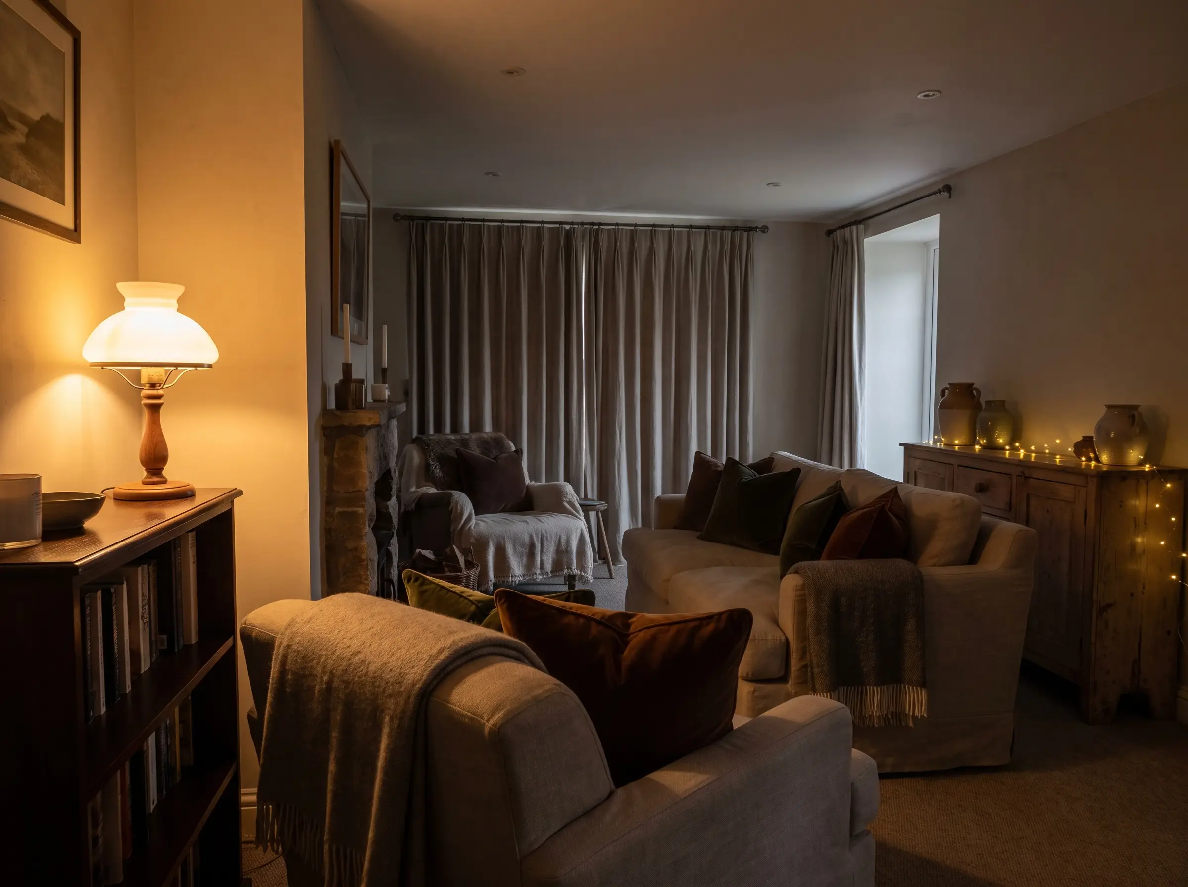
Eliminate the dreaded, unflattering glare of overhead lighting by turning off ceiling fixtures entirely. Rely strictly on table lamps, wall sconces, and hidden warm-LED string lights draped over mantels to cast a soft, horizontal glow across the room.
- Vibe: Intimate, flattering glow.
- Key Materials: 2700K warm-white LED bulbs, frosted glass shades.
- Styling Pro-Tip: Place small, battery-operated accent lamps on bookshelves or sideboards to illuminate dark corners without requiring an outlet.
20. Contrast Smooth Ceramics with Velvet Accents
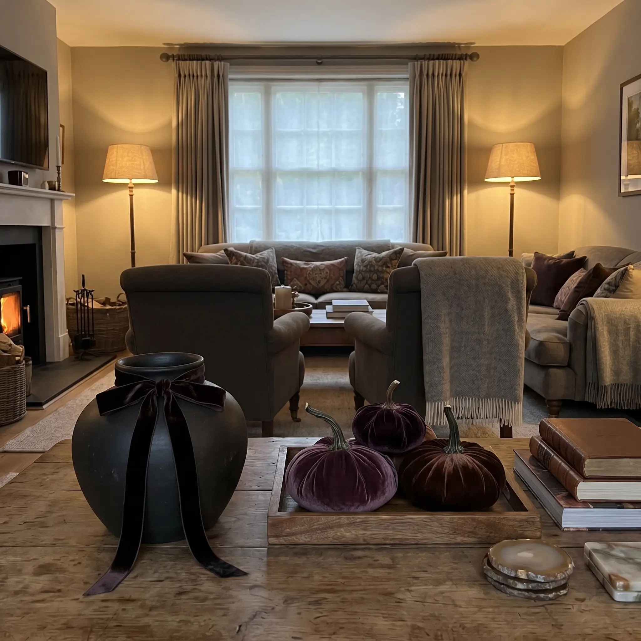
Visual interest relies heavily on tactile friction, especially in spaces dominated by hard surfaces. Mixing plush velvet pumpkins or tying heavy velvet ribbon around smooth ceramic vases softens the room and adds a layer of undeniable luxury.
- Vibe: Saturated, tactile luxury.
- Key Materials: Silk velvet ribbon, matte ceramic vases.
- Material Contrast: The light-absorbing, dense pile of the velvet perfectly offsets the cold, hard surface of the stone or ceramic.
21. Layer Woven Placemats Under Heavy Dinnerware
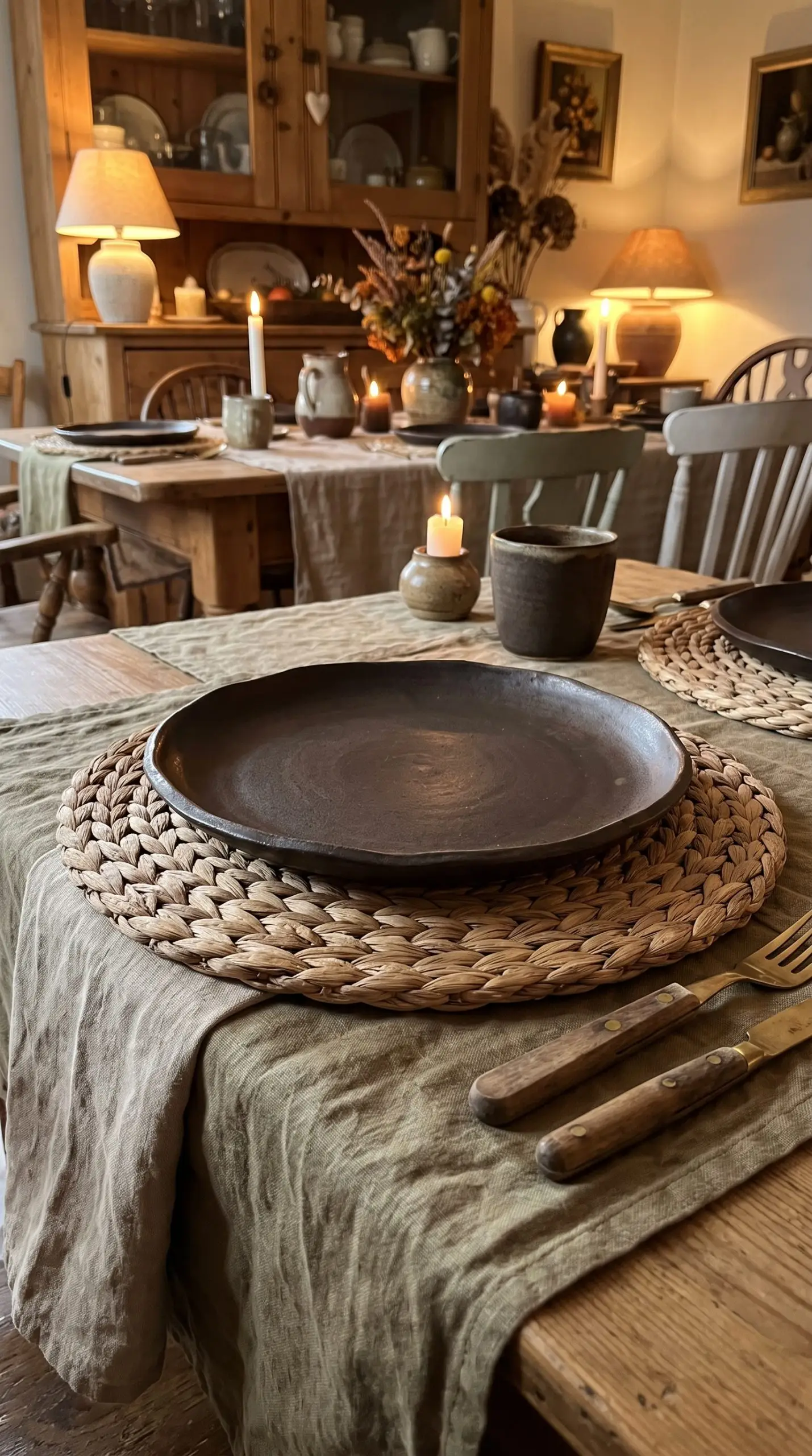
A thick, braided jute or water hyacinth placemat acts as a crucial textural bridge between a soft tablecloth and a heavy dinner plate. This structural layer grounds the place setting and reinforces the organic, foraged aesthetic of the room.
- Vibe: Grounded, earthy foundation.
- Key Materials: Natural jute, water hyacinth, woven seagrass.
- Material Contrast: The rough, fibrous texture of the woven mat prevents the smooth ceramic plates from feeling too delicate against the linen.
The Host’s Final Checklist: Preparing for Arrival
A beautifully executed Thanksgiving is about curated warmth, not chaotic clutter. By leaning into rich earth tones, tactile friction, and foraged elements, you create a space that feels deeply intentional and effortlessly welcoming. Start foraging for your edible centerpieces now, secure your vintage brass, and finalize your linen washes a week in advance so you can actually enjoy the holiday alongside your guests.
Which color pairing are you bringing to your table this season? Let us know in the comments below!

The Hackrea Style Desk treats interior decoration as an exact visual science. Rather than focusing on demolition or floor plans, this desk masters the art of color theory, undertone matching, material pairings, and spatial proportion. From balancing the visual weight of mixed metals to finding the perfect bridging tone between disparate wood species, this desk provides the rigorous aesthetic rules needed to achieve high-end, editorial-quality harmony in any space.