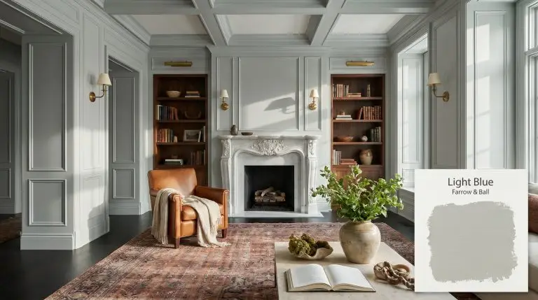
Light Blue No. 22
Farrow & BallFarrow & Ball Light Blue No. 22 is a sophisticated, silvery light blue with pronounced grey and green undertones. Boasting an LRV of 49.12, this mid-tone hue shifts beautifully in changing light, reading as a serene silver-grey in shaded spaces and a calming, muted blue in well-lit rooms.
| Temperature | Cool |
|---|---|
| Primary Undertone | Grey |
| Hidden Undertones | Green, Silver |
| Best Exposures | South-facing or West-facing |
| Best For | Internal halls, living rooms, bedrooms, bathroom vanities, paneled libraries |
Hackrea Review
Light Blue No. 22 is a masterclass in Farrow & Ball's signature complexity. It is not just a blue; it is a chameleon that dances between silver, grey, and green. While it requires careful lighting considerations to avoid falling flat, when paired with the right soft whites, it delivers an unmatched, old-world elegance.The Clash Warning
Architectural Applications for Farrow & Ball Light Blue No. 22
Internal Hallways and Entryways
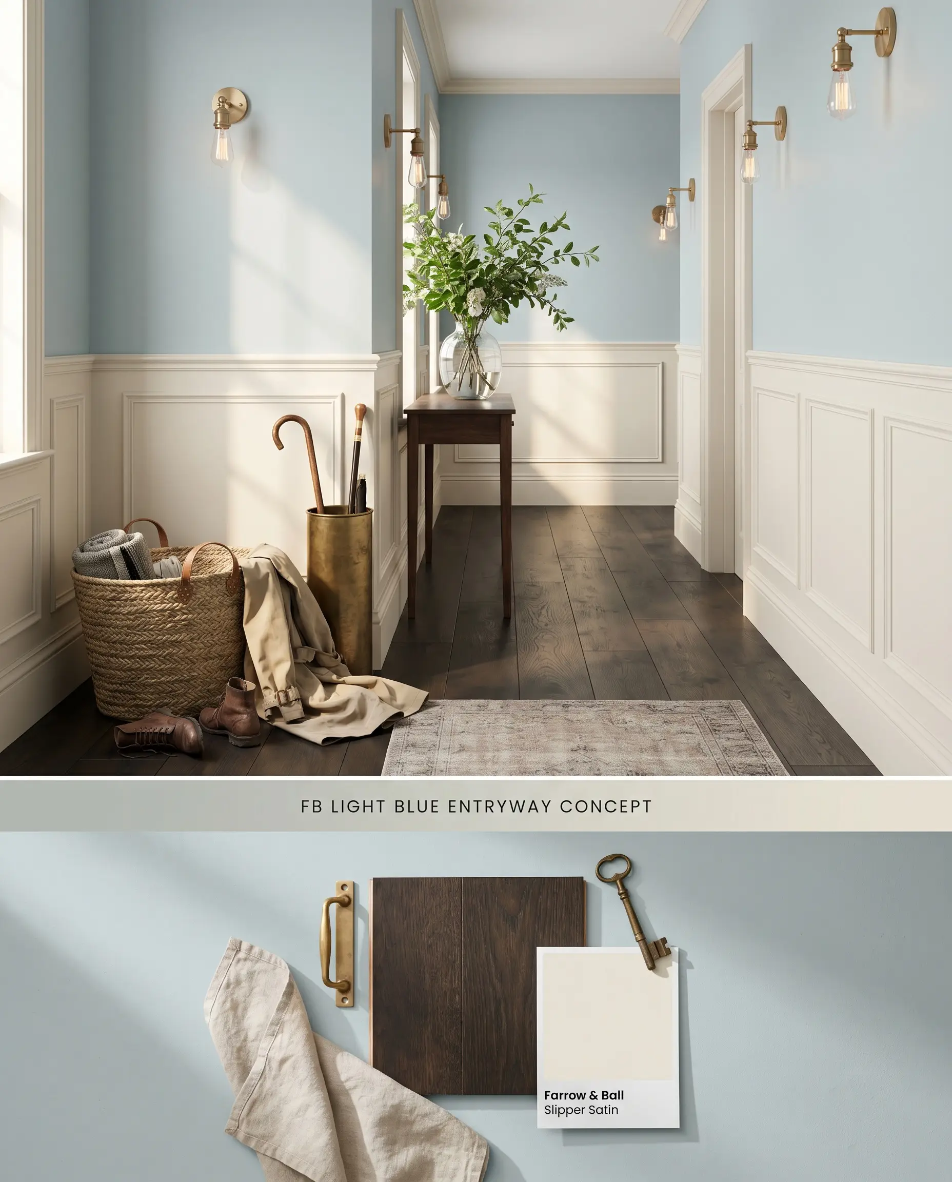
The silver-grey cast of this mid-tone range color acts as a transitional anchor, absorbing shadows in narrow corridors without reading as a dense, flat grey. By pairing it with crisp, low-contrast wainscoting, the ambient lighting pulls forward the underlying green undertones, visually expanding tight transitional zones. The color structure relies on an absence of yellow-dominant woods, requiring cooler or significantly darker flooring to maintain its crispness.
Dead Flat ($$$$ (Boutique/Luxury Tier)). A multi-surface, ultra-matte finish that offers exceptional scuff resistance and washability, making it the premier choice for busy hallways, kids’ rooms, and continuous color-drenching.
The Consultant’s Finish
Bedroom Walls
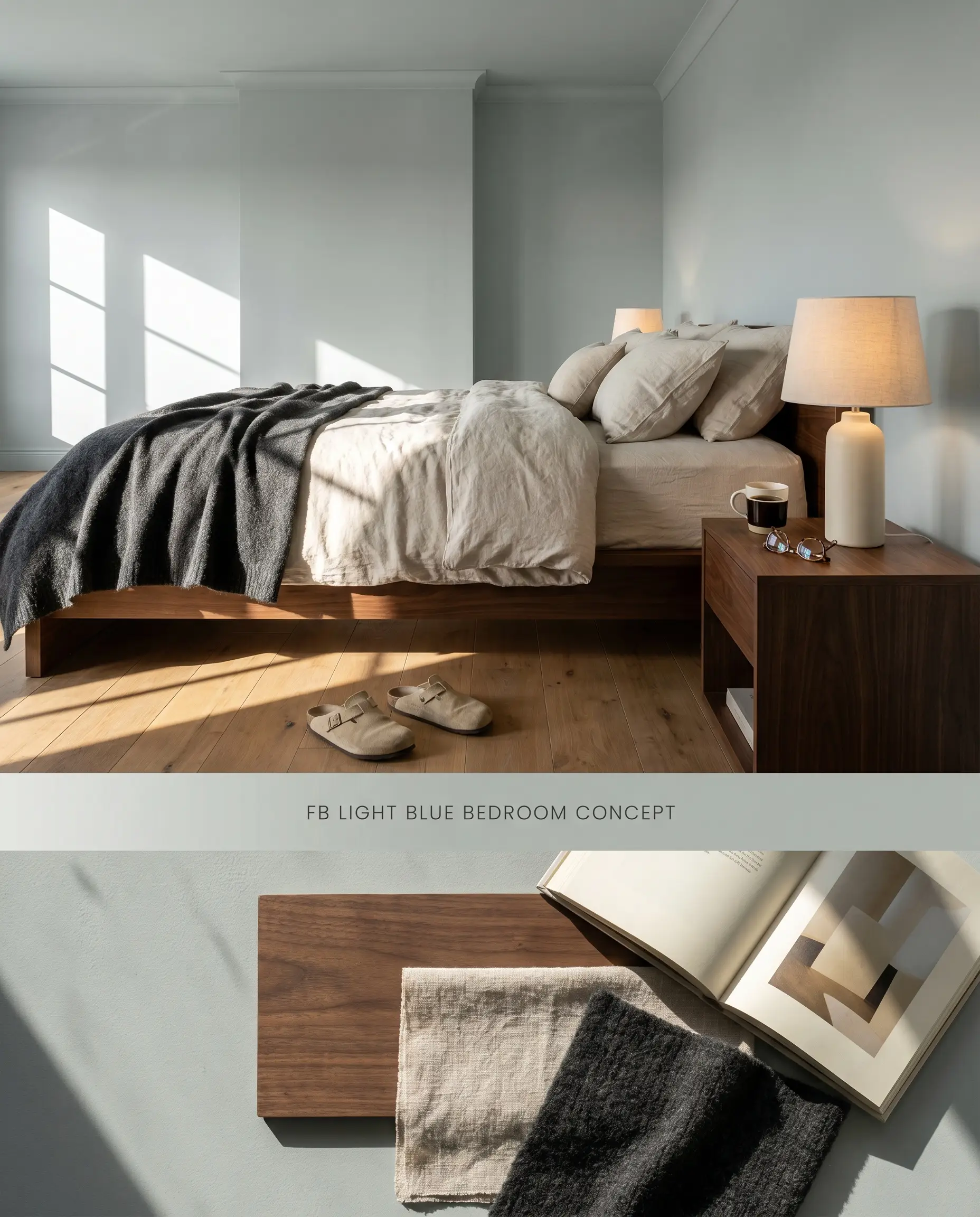
Applying this silvery blue across all four walls creates an immersive, low-stimulation environment reliant on its muted chromatic profile. The color shifting properties respond directly to fabric textures, where matte linens and velvet upholstery absorb surrounding light, softening the architectural finish. This physical light absorption pulls the hue toward a tranquil, dusty aquamarine rather than a stark nursery blue.
Estate Emulsion ($$$$ (Boutique/Luxury Tier)). Delivers Farrow & Ball’s signature, chalky matte finish with unparalleled depth of color, perfect for formal living rooms and master bedrooms where aesthetic impact is prioritized over frequent scrubbing.
The Consultant’s Finish
Bathroom Vanities and Cabinetry
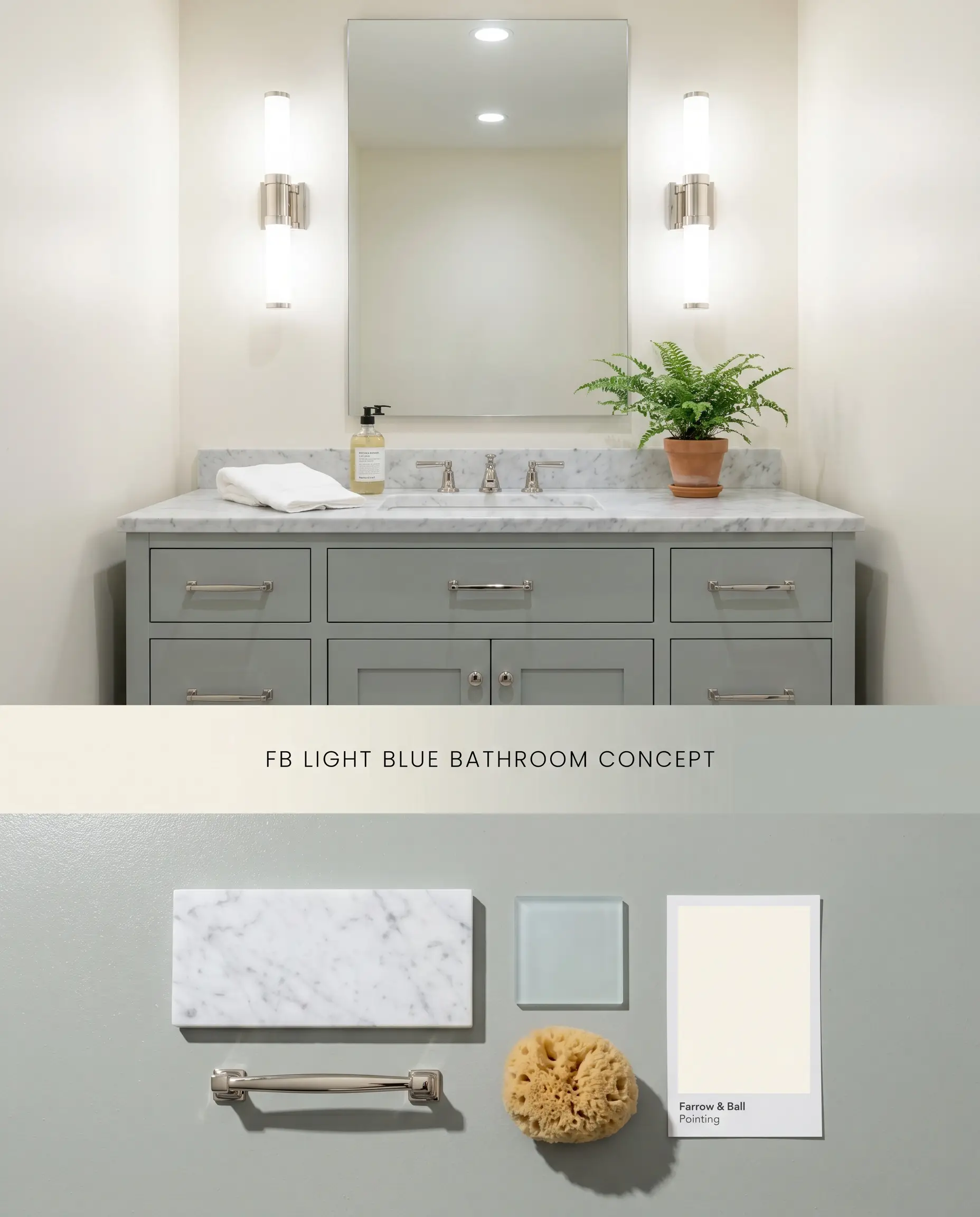
Grounding a vanity in this hue injects a refined, historical weight that balances highly polished stone and reflective glass. The green undertones emerge strongly when positioned against Carrara marble, utilizing the stone’s natural grey veining to bridge the gap between the cabinetry and the surrounding warm white walls. Polished metals bounce light back onto the painted surface, highlighting the underlying silver-grey cast.
Modern Eggshell ($$$$ (Boutique/Luxury Tier)). An exceptionally durable, mid-sheen waterborne finish designed to withstand the daily friction of cabinetry, doors, and millwork, ensuring a flawless, long-lasting surface.
The Consultant’s Finish
Paneled Libraries and Studies
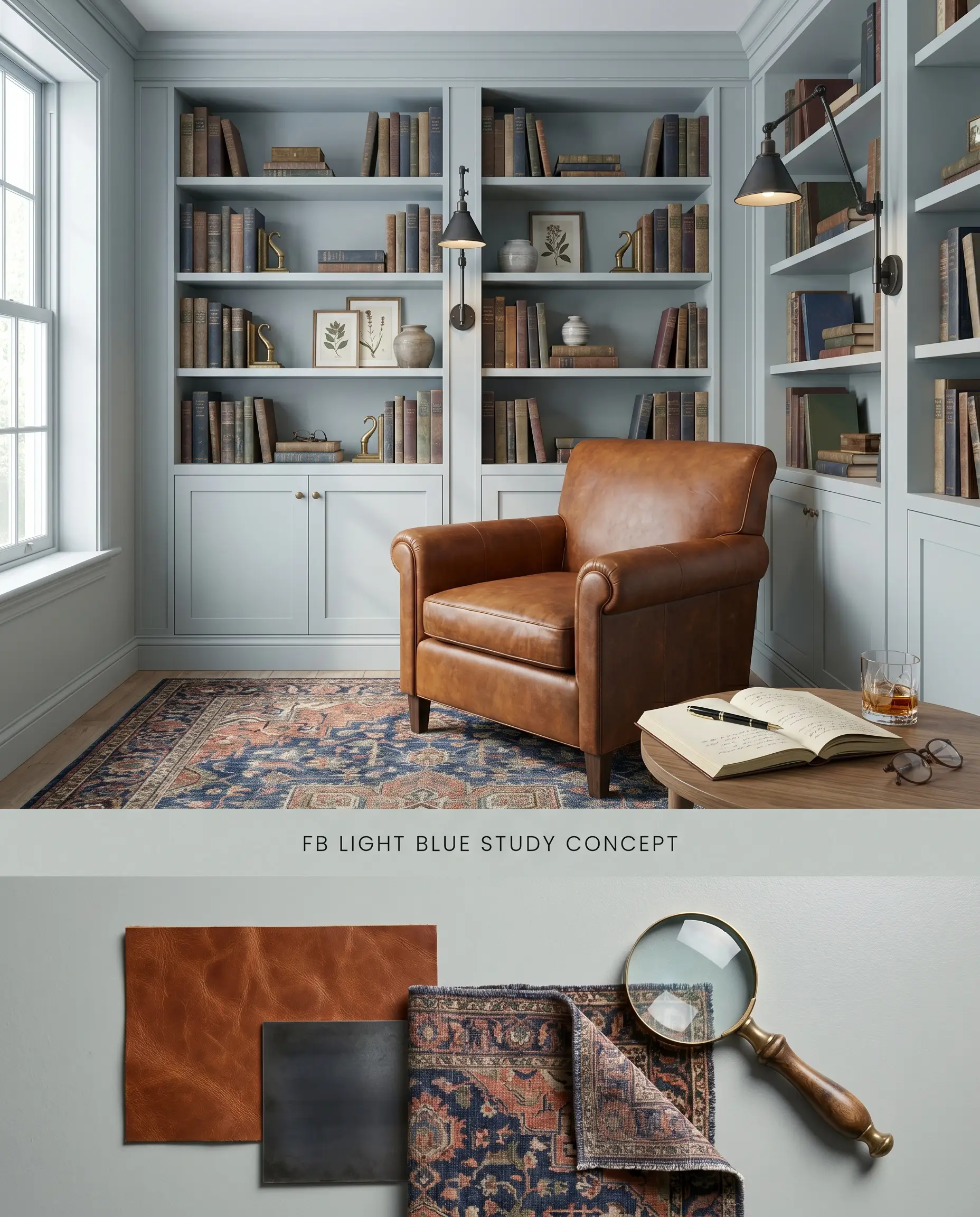
Utilizing this paint on floor-to-ceiling millwork transforms a traditional study by replacing predictable dark tones with a complex, light-reflecting envelope. The color structure interacts dynamically with the shadows created by paneling profiles, deepening the silver-grey cast within the recesses while highlighting the silvery blue on the raised stiles. This localized contrast provides architectural depth without requiring secondary accent colors.
Modern Eggshell ($$$$ (Boutique/Luxury Tier)). An exceptionally durable, mid-sheen waterborne finish designed to withstand the daily friction of cabinetry, doors, and millwork, ensuring a flawless, long-lasting surface.
The Consultant’s Finish
Exterior Trim and Front Doors
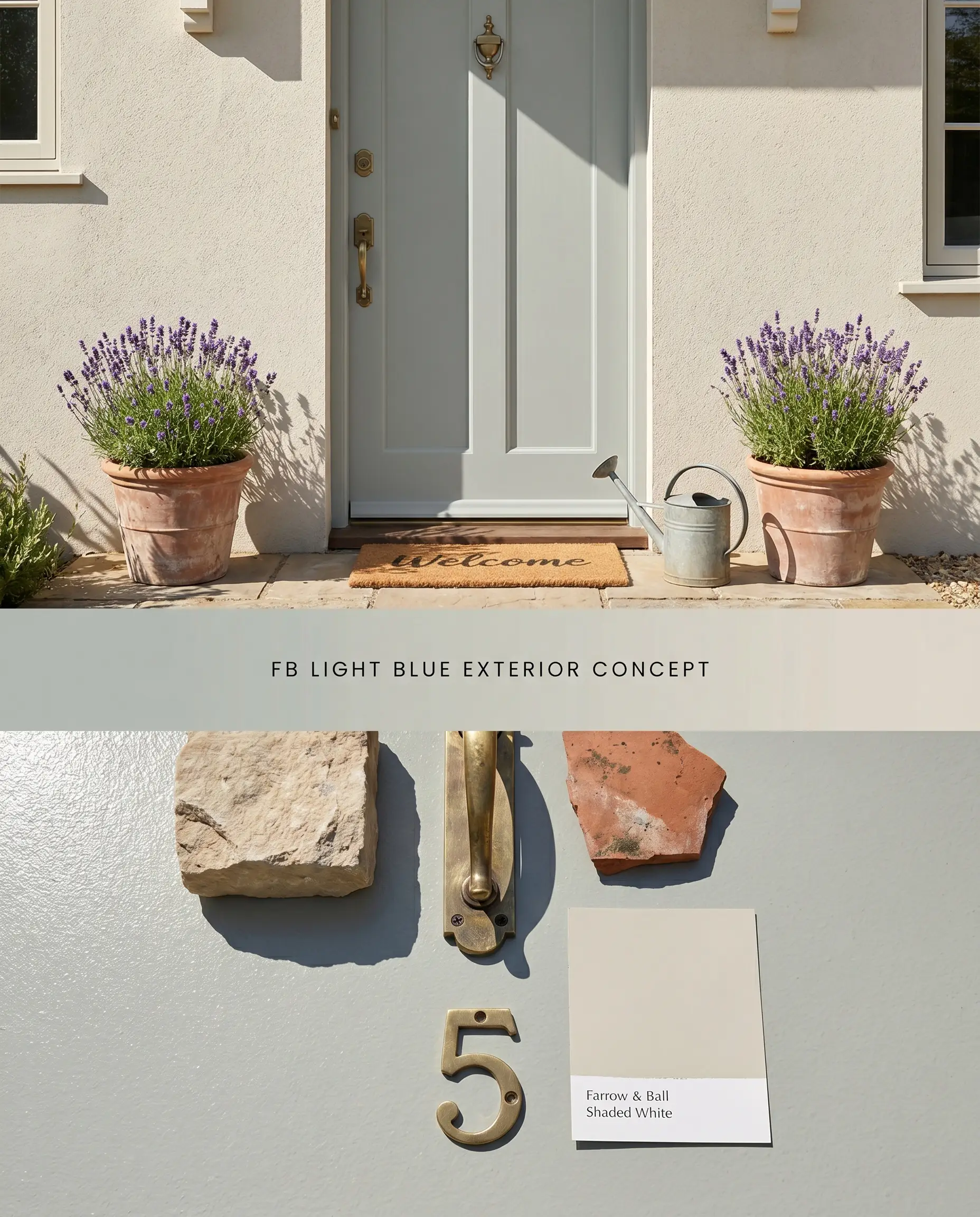
Against a natural stone or pale stucco facade, this muted chromatic profile acts as a sophisticated, historical accent that does not compete with the surrounding landscape. The high UV exposure washes out the delicate green undertones, leaving a crisp, silvery-blue architectural finish that defines entry points with subtle contrast. The matte nature of exterior masonry allows the slight sheen of the door to pull focus naturally.
Exterior Eggshell & Masonry ($$$$ (Boutique/Luxury Tier)). Highly breathable, fungal-resistant formulas that provide a flexible, durable shield against the elements, ensuring heritage colors remain vibrant outdoors.
The Consultant’s Finish
You can apply wallpapers, paints, etc. on walls and see how they look in various interiors.

Comparative Color Theory: Shifting Green Undertones and Silver-Grey Casts
Farrow & Ball Light Blue No. 22 vs. Farrow & Ball Mizzle No. 266
Both sit in the mid-tone range, but Mizzle No. 266 (LRV 43) leans definitively into a dusty sage, whereas Light Blue No. 22 maintains a cooler, silver-blue dominance. Mizzle contains a higher concentration of black pigment, making it feel denser and more grounded in spaces with limited natural light. Choose Light Blue No. 22 for south-facing rooms where its airy silver-grey cast can expand the space, and reserve Mizzle No. 266 for north-facing rooms that require a stronger, earthier green to combat flat lighting.
Farrow & Ball Light Blue No. 22 vs. Sherwin-Williams Sea Salt SW 6204
Sea Salt SW 6204 (LRV 63) is significantly lighter and more reflective, presenting as a highly mutable pale green-grey compared to Light Blue’s grounded, historical depth (LRV 49.12). The Sherwin-Williams option possesses a cleaner, more translucent base that flashes mint in bright sunlight, lacking the dense, chalky color structure of the Farrow & Ball formulation. Specify Sea Salt SW 6204 for contemporary, high-contrast coastal interiors, while deploying Light Blue No. 22 in traditional, extensively paneled rooms that demand a richer architectural finish.
Farrow & Ball Light Blue No. 22 vs. Benjamin Moore Quiet Moments 1563
Quiet Moments 1563 (LRV 60.73) operates as a soft, blue-grey pastel, missing the complex, muddy green undertones that define Light Blue No. 22. Benjamin Moore’s formulation reflects significantly more ambient lighting, making it an easier, more forgiving drop-in for standard residential bedrooms. However, Light Blue No. 22 is the necessary choice when integrating with complex natural stones like Carrara marble, as its denser silver-grey cast anchors the stone’s veining rather than washing out beside it.
Technical FAQs: Mastering the Muted Chromatic Profile
In north-facing exposures, the cool ambient lighting suppresses the green undertones, pulling the silver-grey cast to the forefront. To prevent the architectural finish from feeling flat, pair it with warm-toned metallic hardware and rich textiles that inject the warmth absent from the natural light.
Yes, the muted chromatic profile of Light Blue No. 22 clashes directly with yellow-dominant woods like golden oak and honey pine, creating a muddy, visually discordant effect. Always anchor this paint with cooler, matte-finished white oak, deep walnut, or ebonized flooring to maintain a crisp spatial balance.
Under standard 3000K warm LED lighting, the silvery blue base neutralizes, often shifting the paint toward a muted, dusty teal. If you want to preserve the crisp silver-grey cast during evening hours, specify 4000K neutral bulbs to accurately render the color structure.
Light Blue No. 22 avoids a minty appearance due to its high concentration of black pigment, which grounds the hue in a sophisticated silver-grey cast. When applied to cabinetry, contrasting it with honed dark soapstone countertops or deep charcoal slate floors further suppresses any residual pastel qualities.
Similar Paint Colors
Same Brand
Cross-Brand Equivalents