Try Graceful Green paint in a room with Hackrea Visualizer
Graceful Green (Dulux): what color is, review, and use
Gray-green shades are at the peak of popularity today, which means that we can meet them in the current palettes of almost all paint manufacturers. Of course, Dulux could not stay away from this beautiful trend, and therefore it is simply impossible not to study the versions of cool and refreshing shades of green offered by the company.
The gray-green shades of each brand have their unique characteristics, but it seems to us that only Dulux turns out to be just so fantastic – light and at the same time expressive, natural and at the same time refined, cool to the point of crystal, but not devoid of warm undertones … However, you can endlessly describe them, but it is better to see everything with your own eyes using the example of one of our favorite shades – the delightful and relevant Graceful Green.
Color features
Even though from the name it can already be assumed that Graceful Green from Dulux is primarily green, a whole range of complex sensations arises when looking at it. To some, it may seem like mint, to someone close to sage, someone sees it rather silvery-gray, and to someone, it even reminds of dew drops on green leaves. It is noteworthy that all of these opinions will be correct, as Graceful Green is truly multifaceted thanks to the amazing color scheme and combination of undertones, which we will talk about later.
You can apply wallpapers, paints, etc. on walls and see how they look in various interiors.

Graceful Green: is it warm or cold?
The shade of green from Dulux is also unique in that it is difficult to tell if it is warm or cold immediately. Indeed, it has enough gray and blue tones to look cool. Still, at the same time, one cannot overlook the slight influence of creamy and yellowish undertones, which, under specific lighting, give Graceful Green confident, warm notes that are somewhere even on the verge of pistachio. That is why using this green color, you can experiment with lighting, creating a particular atmosphere in a room with surfaces painted in this color.
How does lighting affect Graceful Green?
The fact that Graceful Green is a complex color hardly remains a secret for those who managed to get to know it. This means that the proper lighting can work wonders with it. It is enough to make it a little lighter or a little darker. Choose warm or cold artificial light – and it will open up in a completely new way.
So, under the influence of bright daylight, Graceful Green becomes relatively light and cool, approaching a light mint shade. However, if the light is not enough, warm tones appear in it, and this green from Dulux becomes even more cozy and natural. Warm yellow light bulbs can also bring out creamy tones in Graceful Green, while cool white light bulbs help enhance grays and blues.
LRV
The LRV coefficient of light reflection for Graceful Green is approaching the golden mean and is equal to 52. This indicator is typical for colors related to medium-light tones, but our gray-green is closer to the upper border, beyond which light colors already begin.
In general, Graceful Green can reflect a sufficient amount of light, and due to its light, slightly smoky character, it makes it feel like walls painted in this color are visually moving apart. This effect is difficult to maintain without light, but a room decorated in such a pleasant gray-green will still look very cozy.
Graceful Green undertones
Gray and bluish tones still play a key role in creating the character of Graceful Green, thanks to which it retains this freshness and watercolor haze. However, suppose you consider the RGB model. In that case, you can see that this shade has a relatively high content of red, and, after observing it a little, you can notice the very creamy and yellowish tones that we talked about earlier. And even if there are quite a few of them, a couple of warm notes will never be excessive.
Similar colors
We have already said that today paint manufacturers are sincerely in love with gray-green tones, which means that Graceful Green has many “relatives” both within the Dulux catalog and in the palettes of other brands. And we are more than sure that you would like to meet at least some of them:
Coordinating colors
Graceful Green has a rather complex nature, but it shows itself as a pretty friendly partner in the interior. You can try the combination with soft and cool whites, warm browns and beige, and refreshing grays, or try something more exciting and vibrant. If you don’t know how to take the first step and where to start choosing a palette in which Graceful Green will play the first violin, begin with the colors recommended by the Dulux experts:
The use of Graceful Green in interior
Like most shades of gray-green, Graceful Green is very welcome in trendy interiors – and even quite widely used in outdoor decoration. Indeed, the ambiguity and complexity of the shade do not allow you to get bored, and sufficient lightness does not allow you to get discouraged even on cloudy days. However, you can philosophize for a long time, but instead, let’s take a closer look at the most popular solutions with this wonderful shade from Dulux.
New Neoclassical
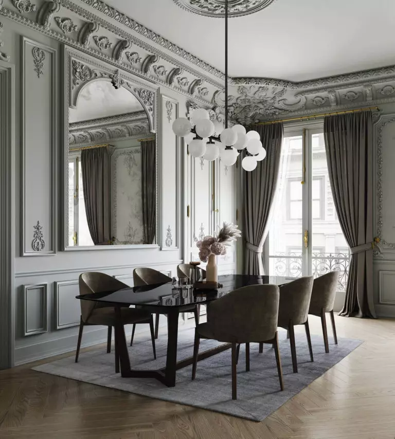
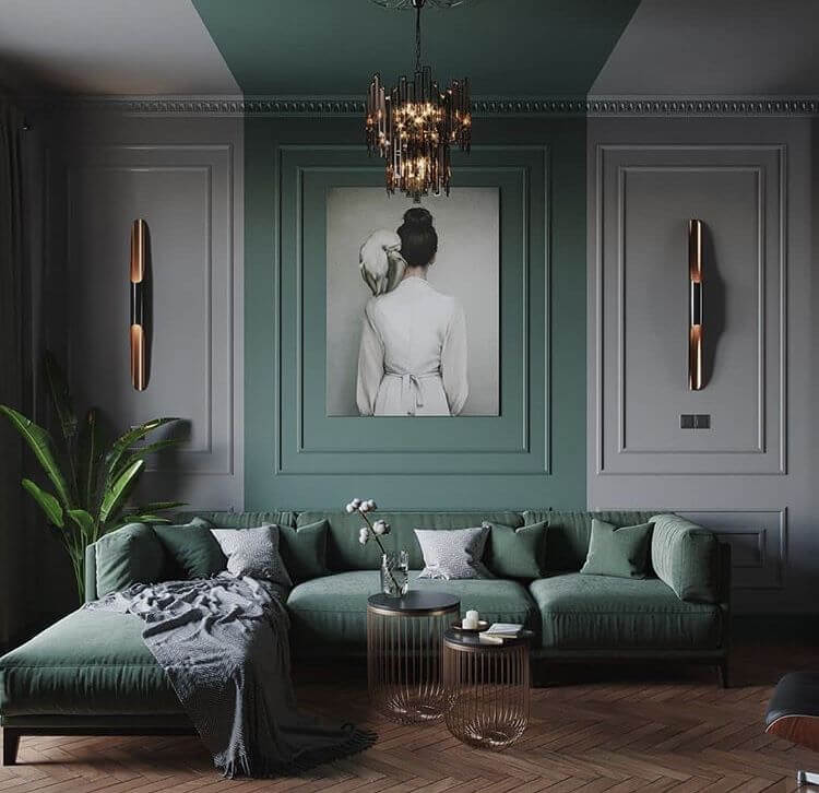
A few years ago, a dusty blue hue reigned undividedly in neoclassical interiors, but today it is confidently being replaced by the same gray-greens and, in particular, Graceful Green. However, this is not surprising: it not only pleases with freshness and naturalness but also looks extremely sophisticated, including with characteristic baseboards and ceilings in soft white tones, dark polished wood, furniture with a diamond pattern, and luxurious bronze lamps and crystal chandeliers.
Total Green
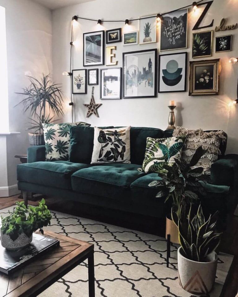
One of the most exciting solutions offered by modern eco-trends is to decorate a room (preferably a living room) completely in green tones. In this case, Graceful Green can act as a base one since it is the lightest and most balanced. Furniture, accents, and finishes, in this case, acquire richer variations of green – for example, it can be the same Pixie Green from the Dulux palette, as well as something emerald, pistachio, or blue-green. At the same time, do not forget about living plants. There should be as many of them as possible: in this case, the atmosphere of unity with nature will be perfectly recreated.
Matching textiles
Graceful Green fascinates designers so much that they even suggest matching textiles of the same shade to surfaces painted in this color. In a room where walls, curtains, rugs, tablecloths, and bedspreads form such consonance, all-natural, dark, and neutral tones look great, as well as pale pink and blue palettes.
Bedroom
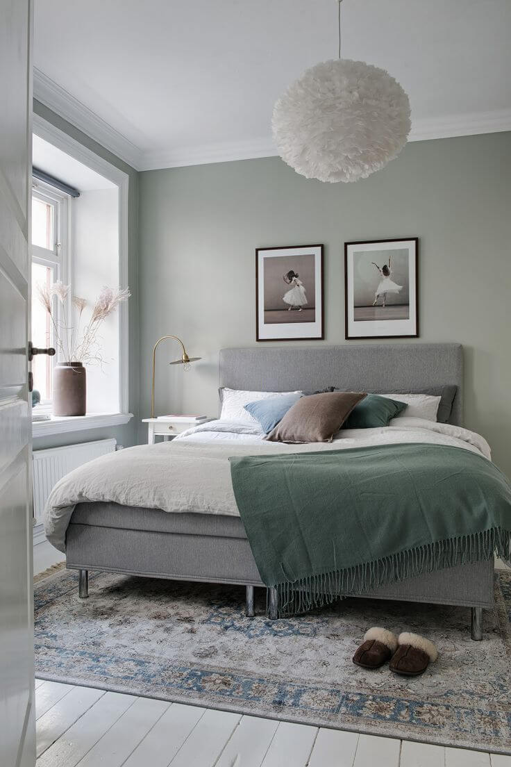
To fall asleep with joy and wake up with pleasure – today, almost everyone dreams of this. If you decide to decorate your bedroom in Graceful Green, then your dream will certainly come true. This calm, airy, and balanced color will bring coolness in the hot season and conquer with cheerfulness in the cloudy winter season. In addition, stylish beds made of honey-colored wood, natural textiles, fluffy blankets, and trendy ceiling pendants with metal lattice lampshades look great against the background of gray-green walls.
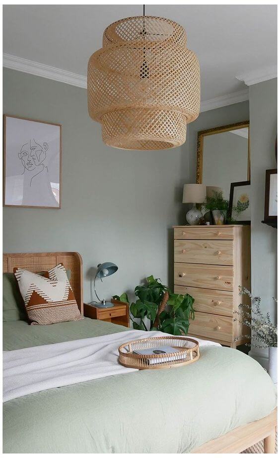
Another option for using Graceful Green in the bedroom is minimalism on the verge of oriental asceticism. There is nothing extra in such a room – only a low comfortable bed, a wicker lampshade of a chandelier, and, possibly, tall plants in floor pots. Don’t be afraid that the interior will look sparse: a complex gray-green background color will create a rich texture.
Kitchen
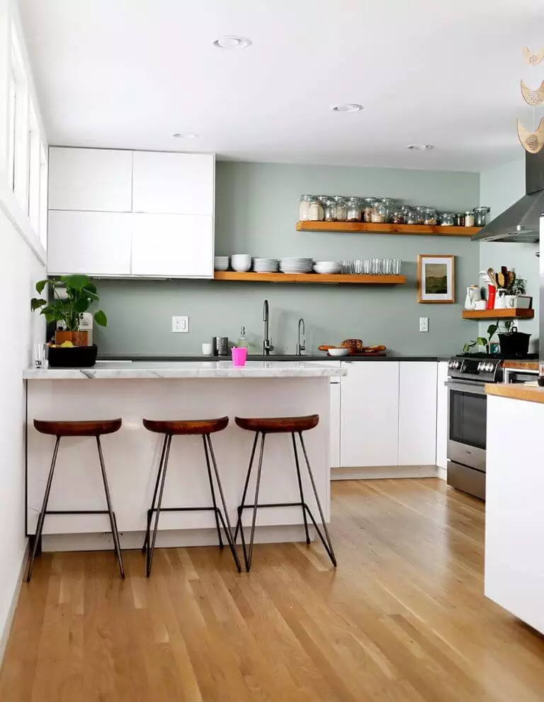
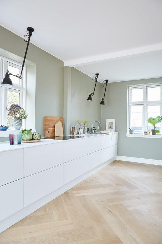
In the kitchen, Graceful Green behaves rather neutral – it does not seem cool, and at the same time, its warming effect becomes relatively moderate. That is why you can safely use it as a base for laconic minimalism or eco. In the first case, white kitchen cabinets, light wood or tiled floors, and sparkling chrome plumbing will come to your rescue. In the second case, it is worth picking up a massive table from a fairly dark brown color and chairs to match and decorate with all living plants – against the background of a wall in Graceful Green, they will look even fresher and brighter.
Bathroom
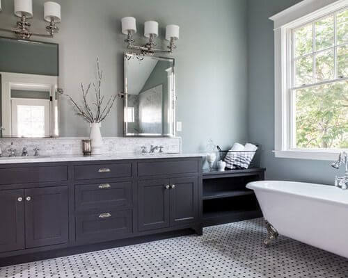
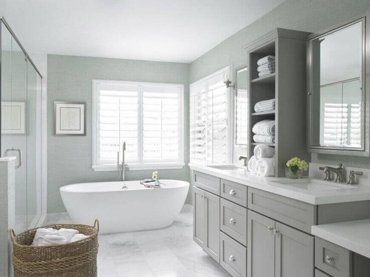
Use Dulux Graceful Green to visually expand your bathroom space for a natural and charming look. Surrounded by this shade, snow-white or milky-white plumbing, cute retro-style mirrors, brass elements, and a gray-tiled floor will look good. However, you can add more black accents – in this case, the bathroom will look more impressive and stylish, like from the cover of a fashion magazine on interior design.
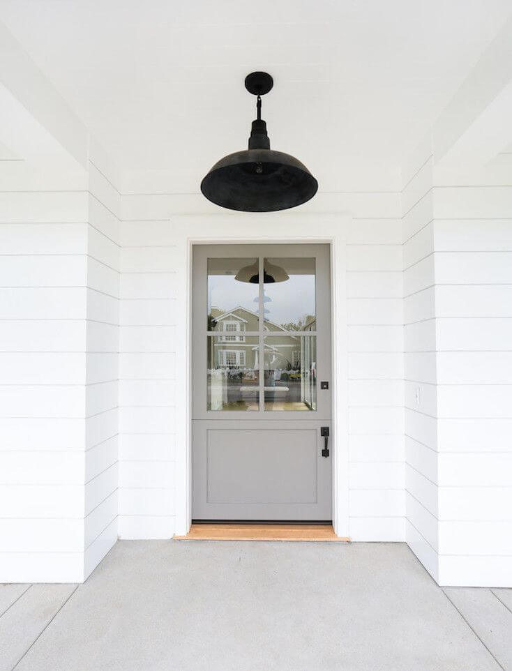
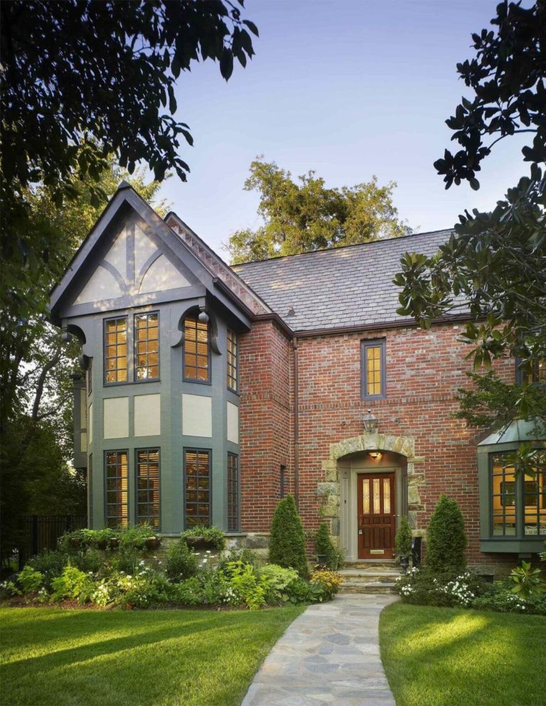
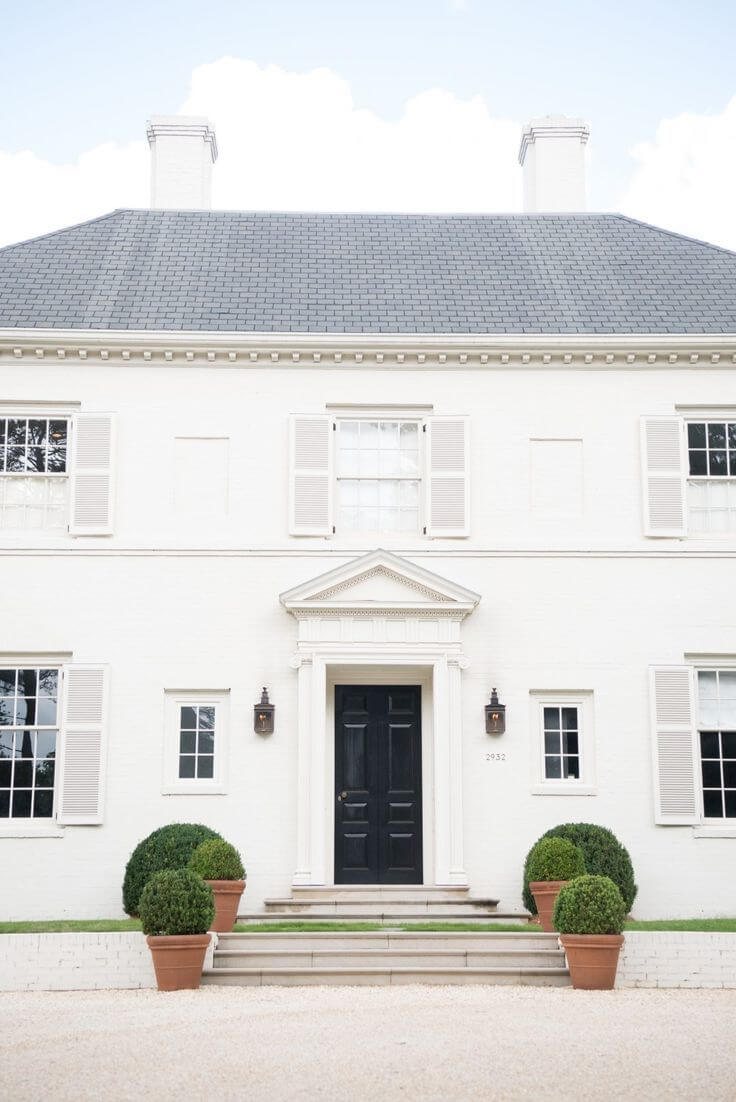
The use of Graceful Green for house exterior
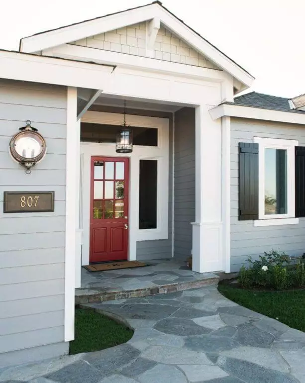
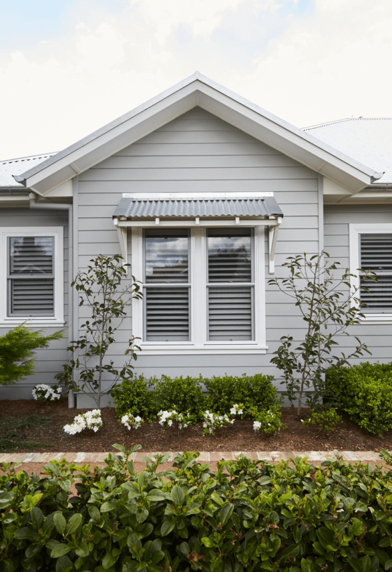
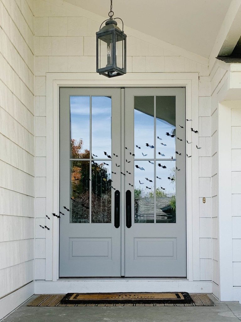
This excellent gray-green shade can be called a kind of leader among the paints of the same tone used in the exterior design of the house. In this case, you can move in any of three directions:
Dulux’s Graceful Green is one of the most compelling examples of a versatile gray-green shade that combines relevance, neutrality, and distinctiveness. Thanks to its friendliness, you practically don’t need anyone’s advice to use it: just act as your taste tells you – and the result will please you anyway!

