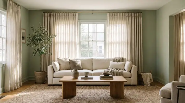
Sage green is nature’s perfect neutral, but executing this color on your walls introduces a complex lighting tension. It is a chameleon hue that shifts dramatically throughout the day—reading as a cool, silver-green in crisp morning sunlight and transforming into a warm, grounded olive by late afternoon. Because of this reactivity, choosing window treatments is not simply about picking a complementary color off a wheel. It requires a strategic understanding of how specific fabric weights absorb or reflect light, and how hardware finishes physically interact with the undertones of the paint.
Our curatorial approach looks past generic pairings, focusing strictly on the tactile intersections of textiles, Light Reflectance Value (LRV), and bespoke hardware to give your sage green space a highly intentional, architectural finish.
The Organic Neutrals: Grounding Sage with Earthy Tones
Warm, earthy neutrals are the undisputed table stakes for sage green spaces, creating a seamless, nature-inspired visual flow. However, you must actively avoid stark, synthetic hospital-white fabrics, which read as cheap and sterile against earthy paint. Instead, rely on natural fibers with heavy visible weaves to introduce necessary physical texture.
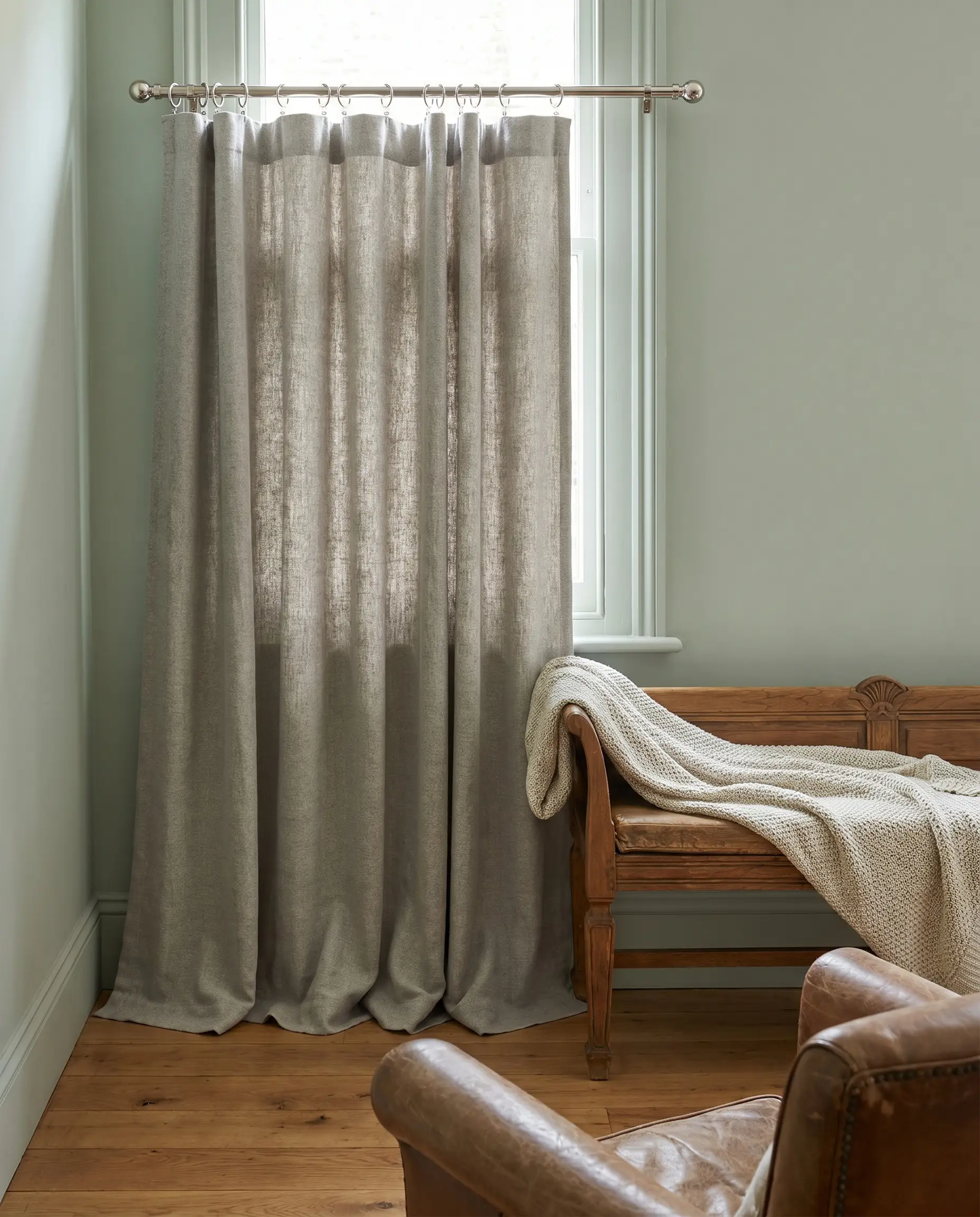
1. Unbleached Oatmeal Linen with Pinch Pleats
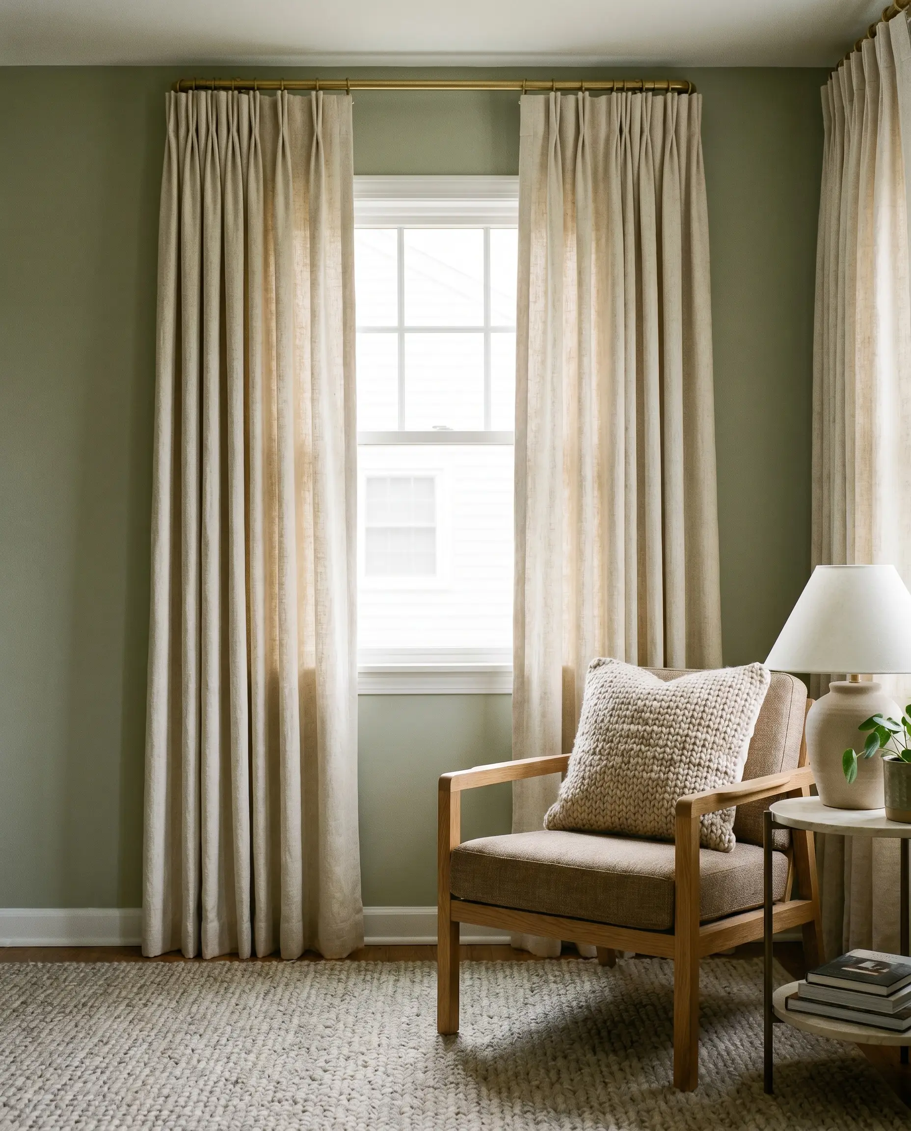
The visible slub in unbleached linen adds critical physical texture that prevents flatly painted green walls from feeling one-dimensional. Utilizing a tailored pinch pleat header transforms this inherently casual, organic material into a highly bespoke architectural feature.
- Vibe: Organic Modern
- Key Material: Heavyweight unbleached slub linen
- Hardware Pairing: Unlacquered brass French return rod
- Paint Recommendation: Benjamin Moore October Mist
Train your linen pleats with zip ties for 48 hours immediately after hanging to create a crisp, custom memory fold that mimics professional drapery.
Designer Secret
2. Crisp Off-White Sheers on Matte Black Hardware
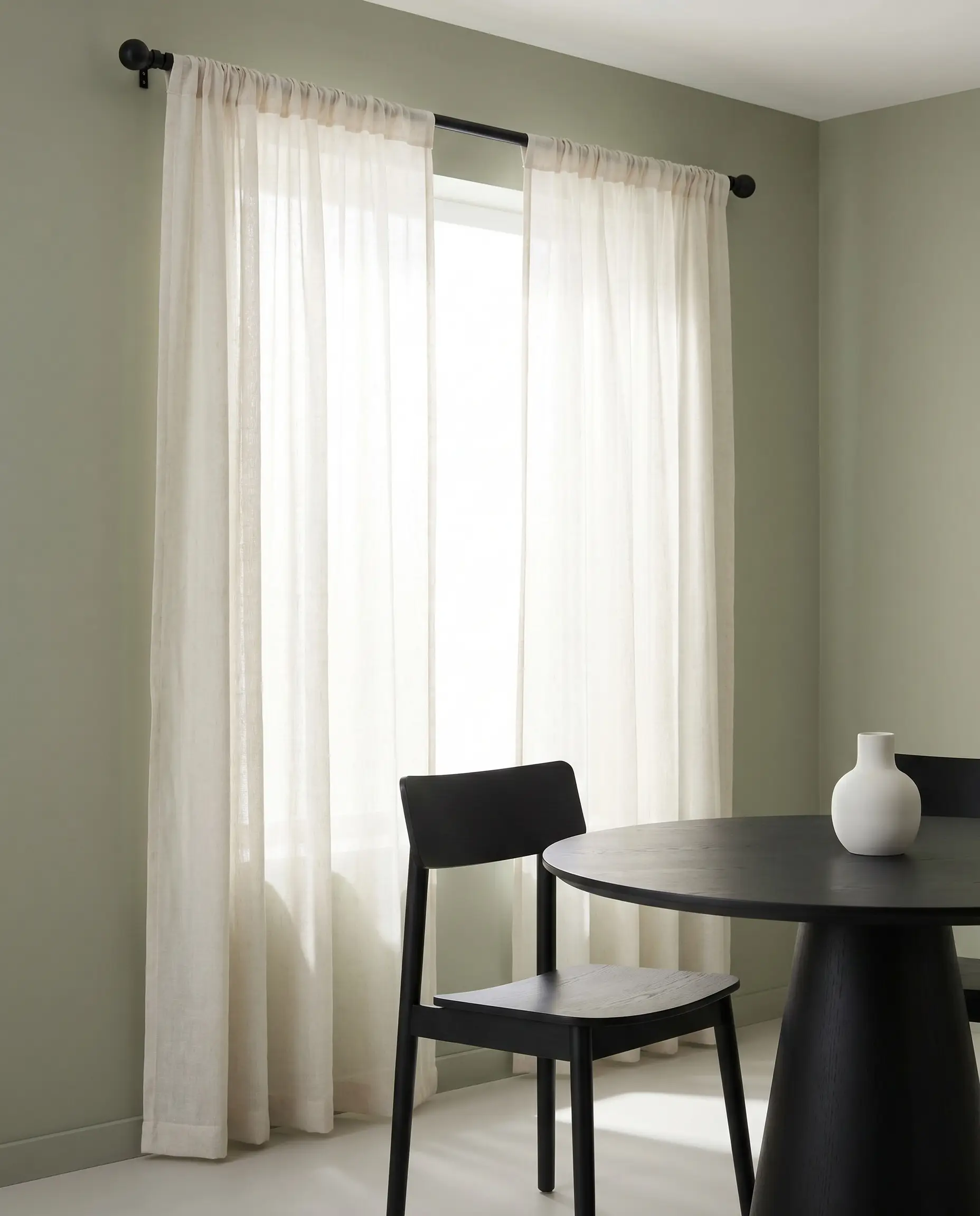
Alabaster and off-white sheers filter harsh directional sunlight without introducing the sterile, blue-toned cast of pure white synthetics. The stark, graphic contrast of a matte black rod acts as a necessary visual punctuation mark, firmly anchoring the soft green walls.
- Vibe: Crisp Minimalist
- Key Material: Alabaster linen-blend sheer
- Hardware Pairing: Matte black French return rod
- Light Filtration: High (ideal for softening direct South-facing light)
3. Layered Woven Bamboo Shades with Cream Drapery
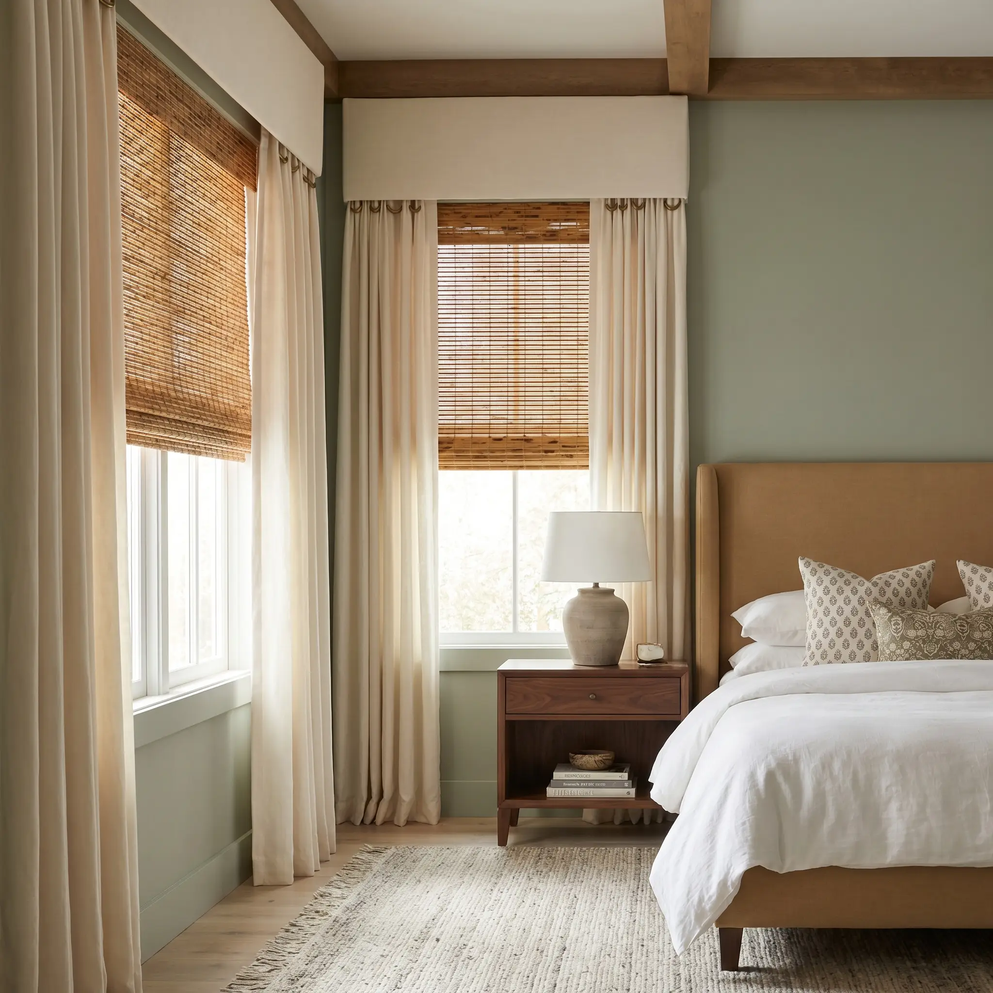
Flanking an inside-mounted woven wood shade with soft cream light-filtering drapery creates immense architectural depth. The warm honey tones of the natural bamboo physically draw out the subtle yellow undertones inherent in sage green paint.
- Vibe: High-End Transitional
- Key Material: Tortoise bamboo shade layered beneath cream cotton panels
- Hardware Pairing: Antique brass rings on a hidden ceiling track
Mount the woven shade two to three inches above the actual window glass to fake a taller window casing and maximize the exposed green wall space.
Hackrea Styling Tip
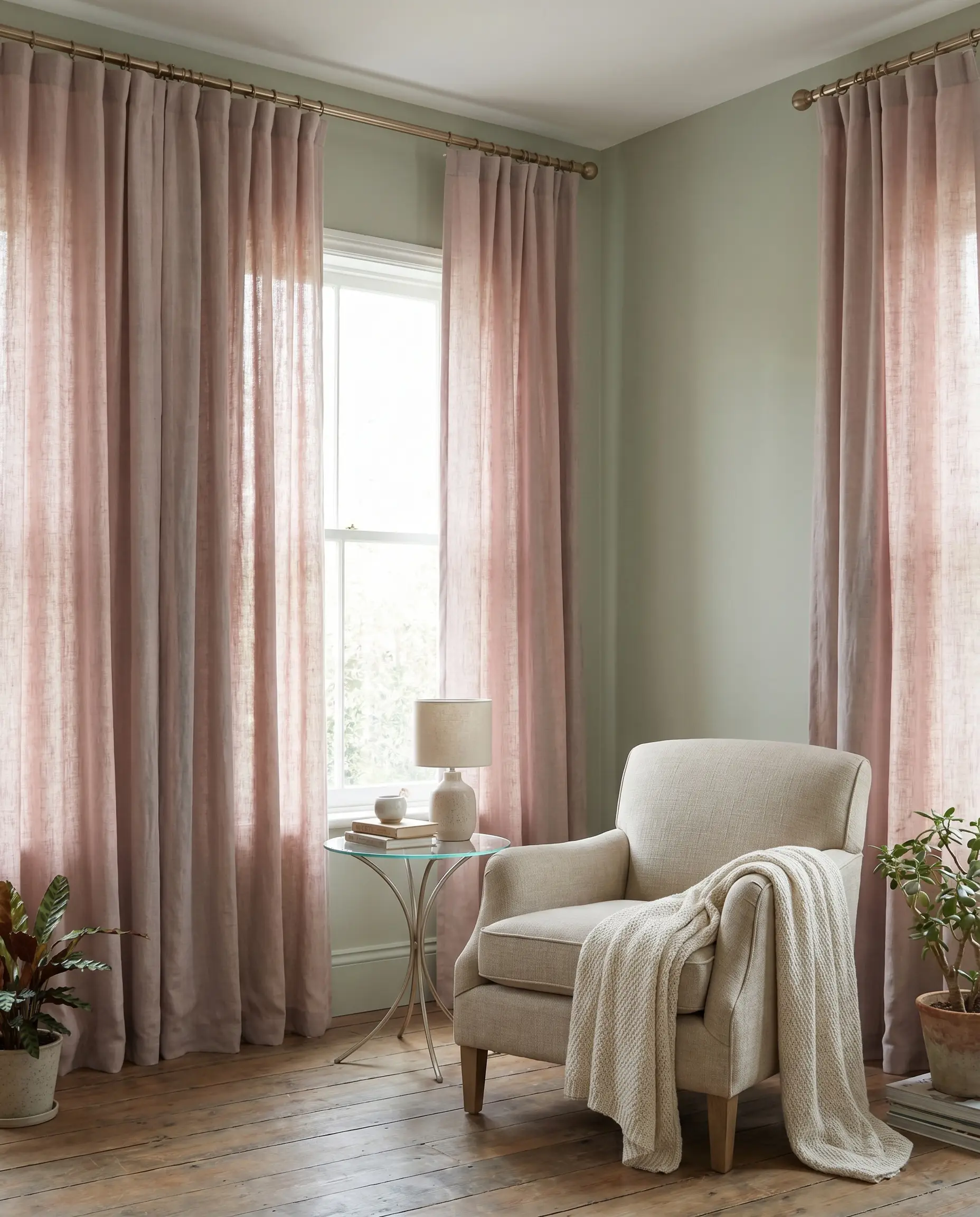
4. Warm Taupe Cotton-Blend Panels
Taupe acts as a masterstroke bridge between brown and grey, effortlessly pulling out the earthy brown undertones of sage green. This pairing is incredibly grounding for a cozy, low-light den or an evening-focused living room that requires visual warmth.
- Vibe: Moody Transitional
- Key Material: Heavyweight taupe cotton-poly blend
- Hardware Pairing: Oil-rubbed bronze straight rod
- Paint Recommendation: Sherwin-Williams Clary Sage
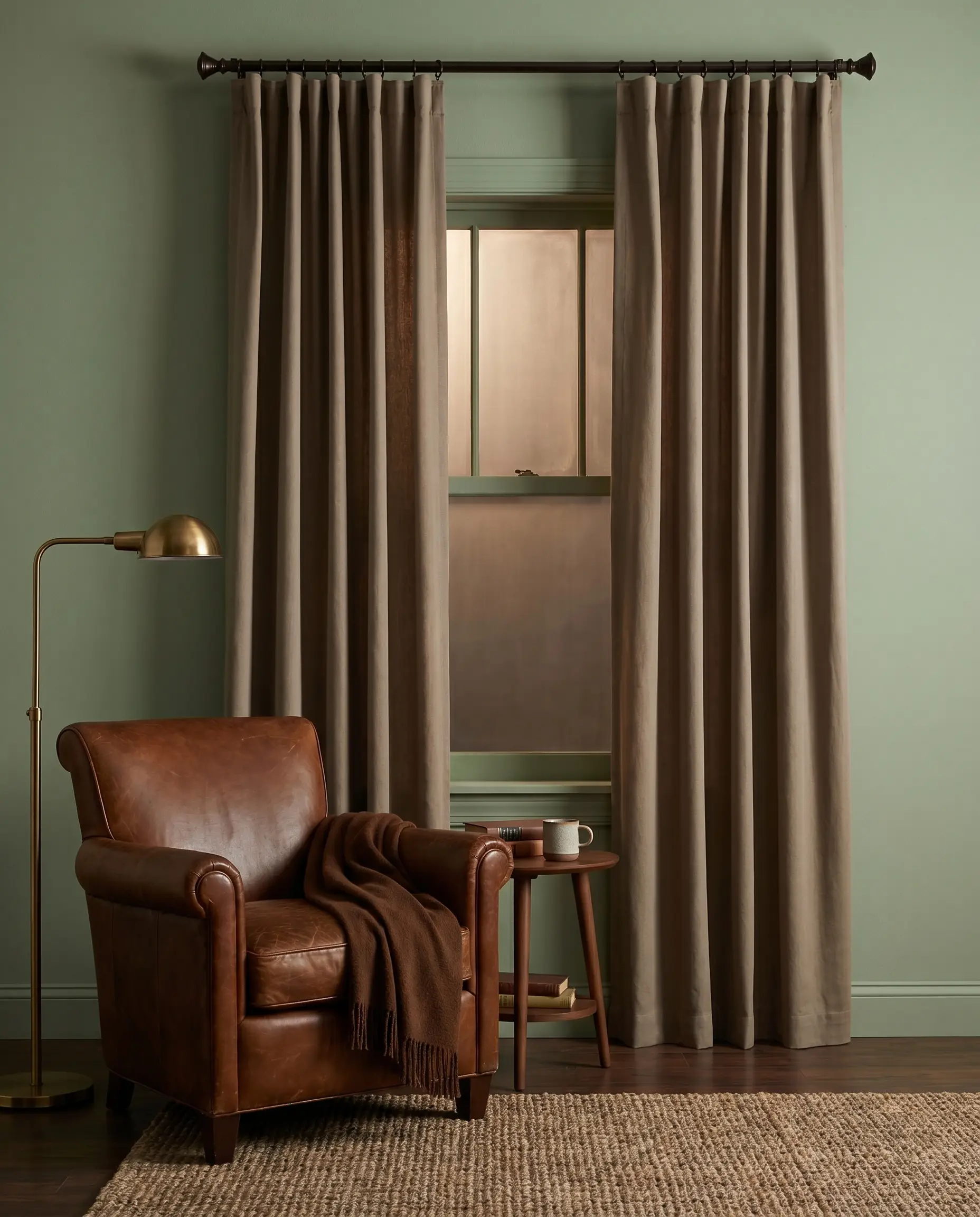
5. Heathered Greige with a Subtle Puddle
Greige softens the harsh transition from the floorboards to the painted wall, offering a romantic, European-inspired drape. Allowing the fabric to break slightly on the floor creates a relaxed yet highly intentional silhouette.
- Vibe: European Heritage
- Key Material: Heathered greige mid-weight linen
- Hardware Pairing: Polished nickel rod with matching C-rings
- Styling Pro-Tip: Allow exactly 1 to 2 inches of excess fabric to create a controlled “puddle” on the floor.
You can apply wallpapers, paints, etc. on walls and see how they look in various interiors.

The High-Contrast Warmth: Complementary Color Pairings
When muted down to rust, terracotta, and mustard, the colors sitting opposite green on the color wheel create a sophisticated, high-energy contrast. These muddy, complementary pairings provide incredible visual warmth without devolving into a primary-color clash.
6. Rust and Terracotta Matte Velvet
Heavyweight matte velvet actively absorbs light, creating an incredibly grounded, intimate atmosphere in north-facing rooms that lack natural sunlight. The rich terracotta warmth perfectly counters the cool, shadowed undertones of the sage green.
- Vibe: Historic Moody
- Key Material: Matte cotton velvet in rust
- Hardware Pairing: Antique brass pole with heavy-duty brackets
- Paint Recommendation: Farrow & Ball Green Smoke
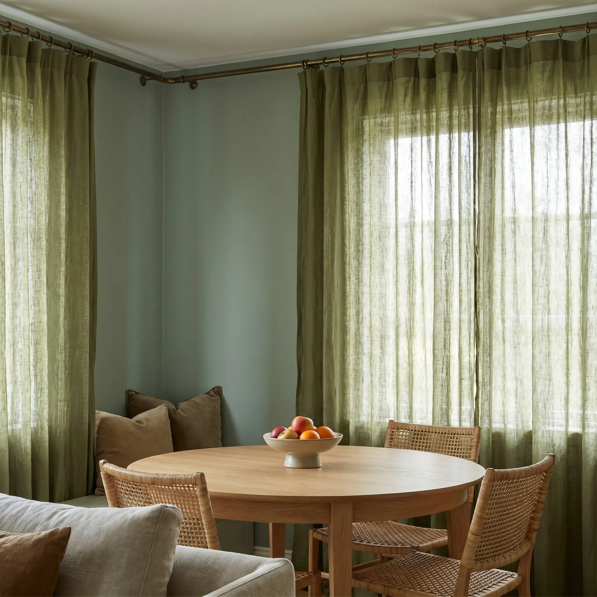
7. Ocher and Muted Mustard Slub Cotton
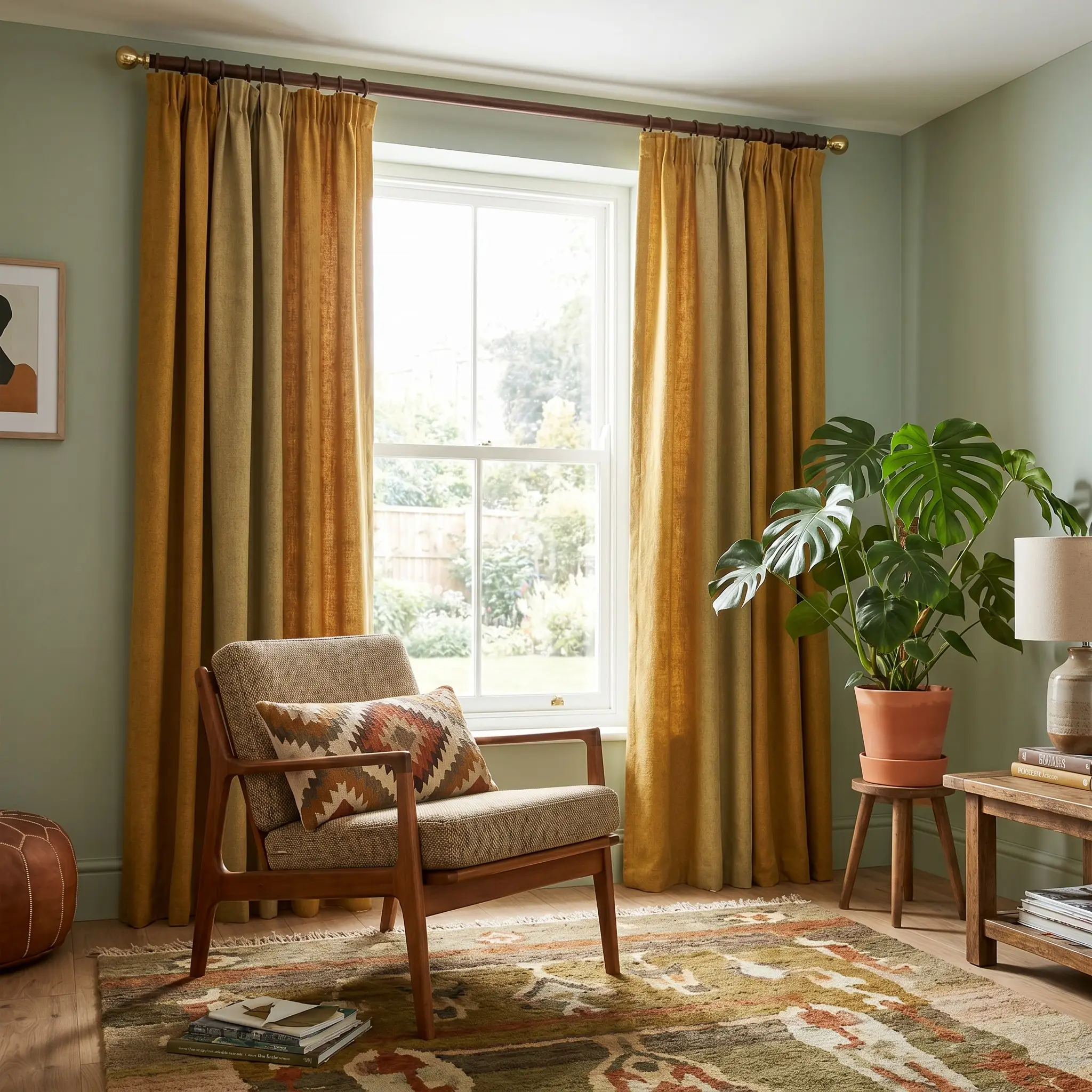
This palette channels a sophisticated 1970s revival while bypassing retro kitsch. Utilizing a highly tactile slub cotton ensures the muted mustard feels contemporary and grounded against the muted green paint.
- Vibe: Mid-Century Eclectic
- Key Material: Ocher slub cotton canvas
- Hardware Pairing: Warm walnut wood pole with brass end-caps
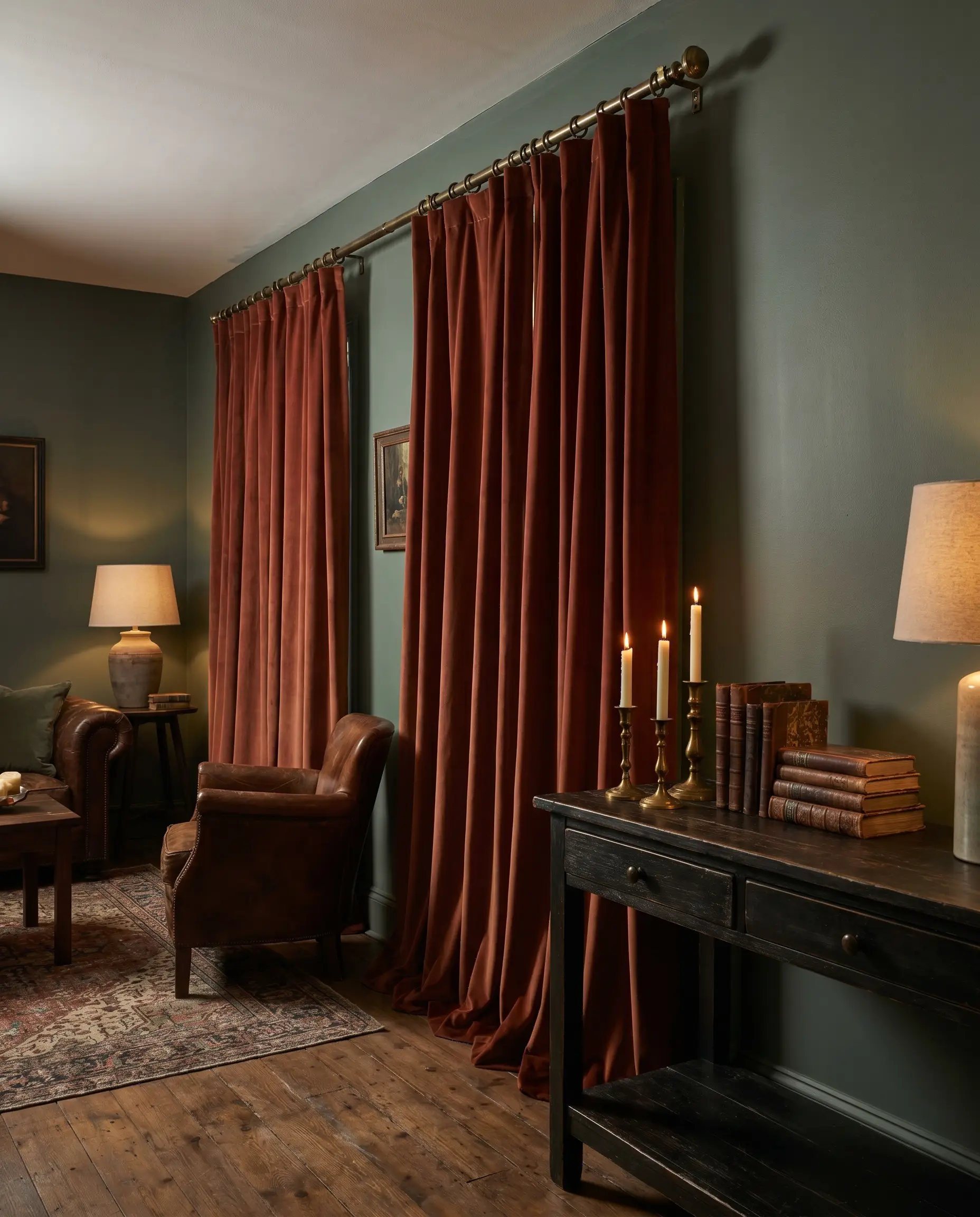
8. Deep Burgundy Light-Filtering Panels
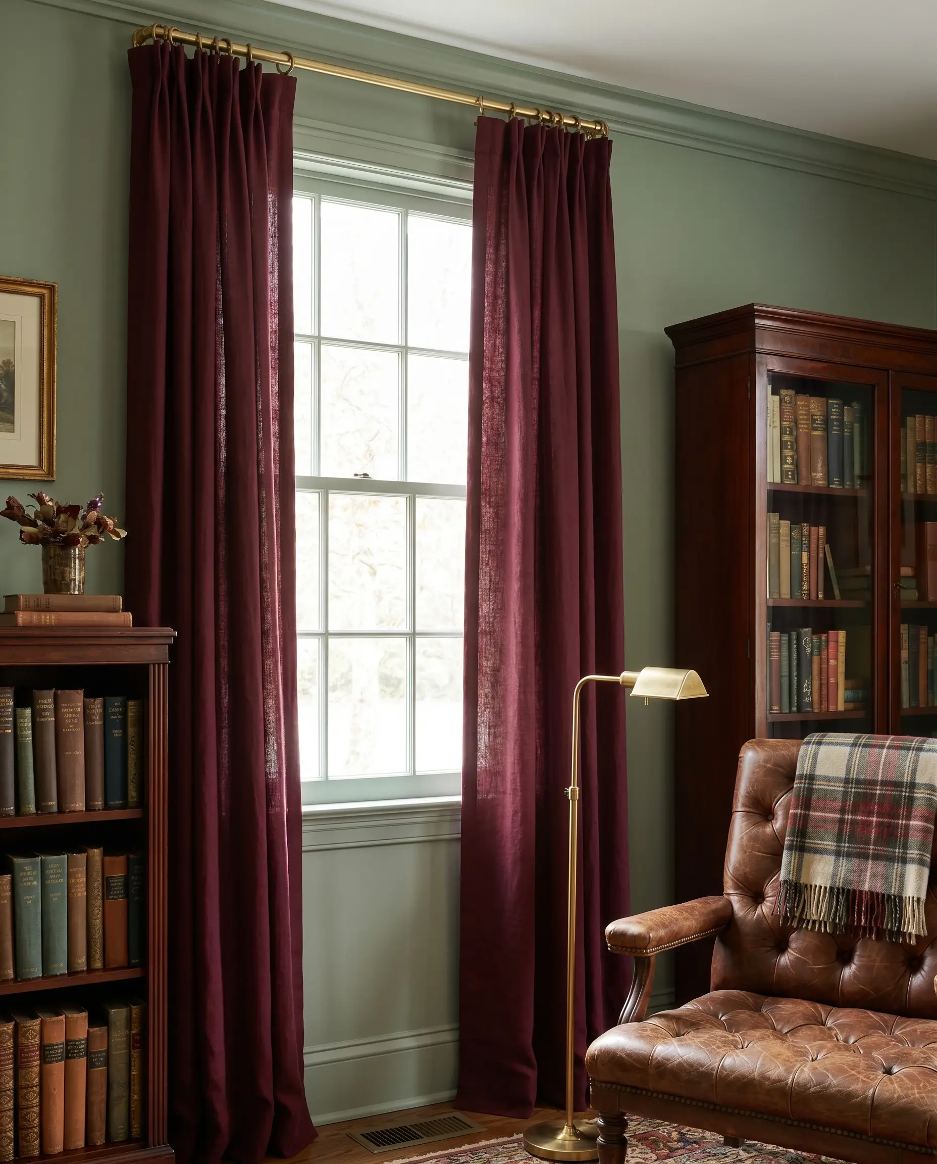
Inspired by traditional English interiors, pairing deep burgundy with sage establishes a deeply traditional, library-esque environment. Specifying a light-filtering fabric prevents the dark color block from feeling visually oppressive.
- Vibe: English Cottage Maximalism
- Key Material: Burgundy linen-viscose blend
- Hardware Pairing: Unlacquered brass rings
Ensure the burgundy textile has a distinct brown or brick undertone rather than a bright cherry red, which will clash aggressively with muted sage.
Color Theory Warning
9. Warm Leather-Trimmed Canvas
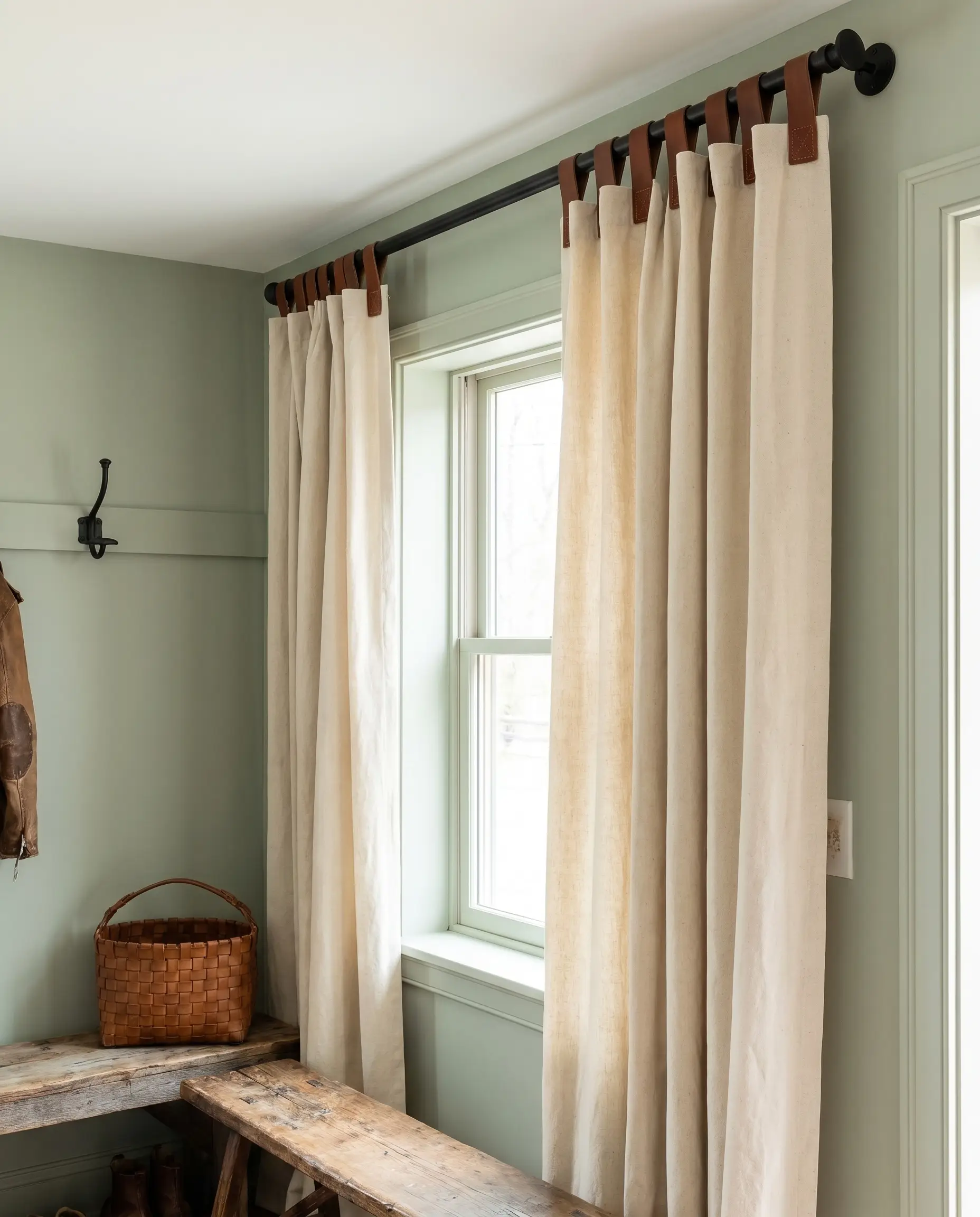
Introducing a natural, masculine material like saddle leather against a soft green wall creates a brilliant, unexpected bespoke detail. Heavy cotton canvas provides the necessary structural weight and neutral backdrop to support the leather hanging tabs.
- Vibe: Equestrian Modern
- Key Material: Heavyweight unbleached canvas with saddle leather tabs
- Hardware Pairing: Matte black iron rod
The Monochromatic & Moody Approach: Tonal Layering
Color-drenching a room in varying shades of green makes the space feel expansive, as the eye is not forced to stop at the window frame. This tonal layering relies entirely on manipulating fabric weight and Light Reflectance Value to succeed.
10. Matching Sage Green for a Color-Drenched Look
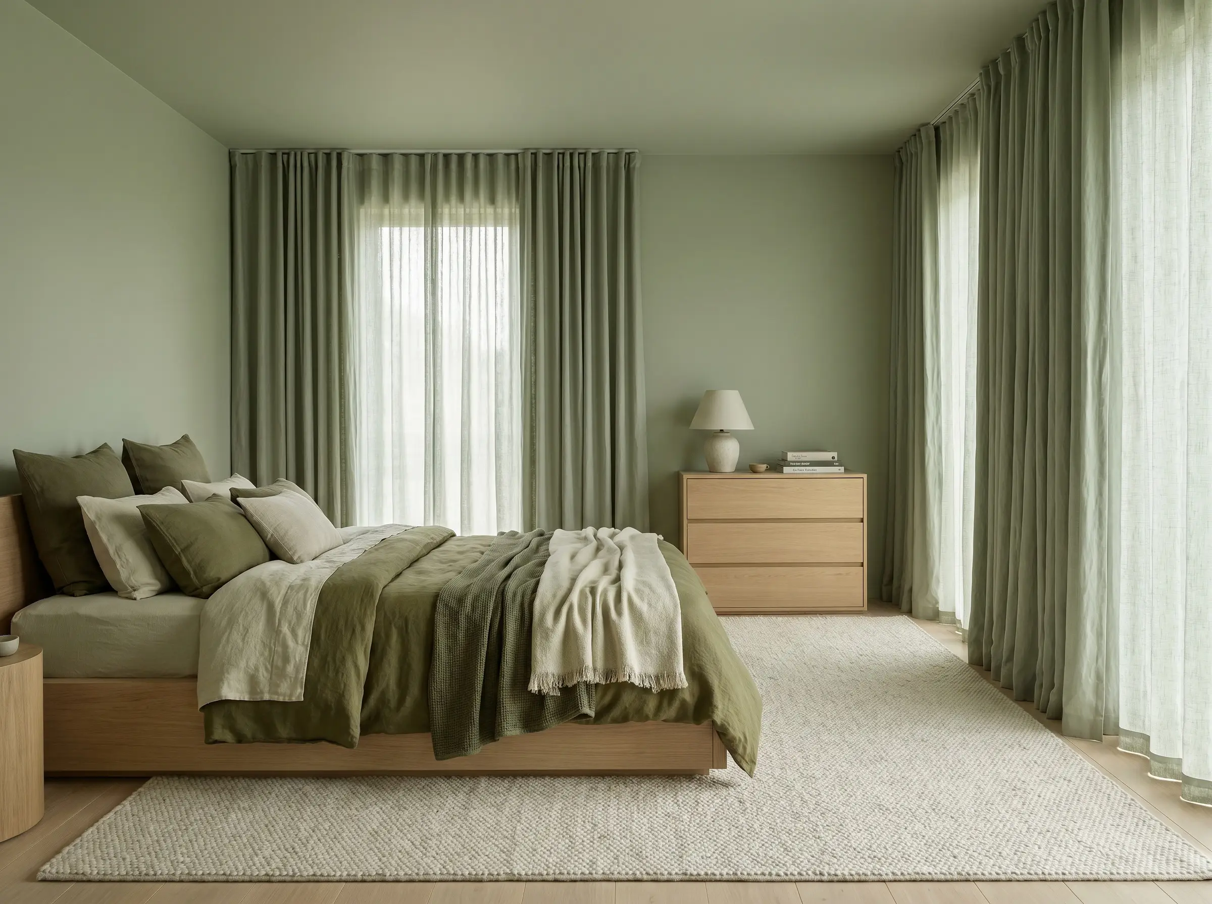
Matching your fabric dye directly to the wall’s LRV creates an immersive, seamless architectural wrap. Source a fabric exactly one shade lighter or darker than the paint chip to prevent the room from reading as entirely flat.
- Vibe: Immersive Tonal
- Key Material: Sage green washed linen
- Hardware Pairing: Custom color-matched rod or hidden track
- Paint Recommendation: Benjamin Moore Saybrook Sage
11. Dark Forest Green Velvet for Depth
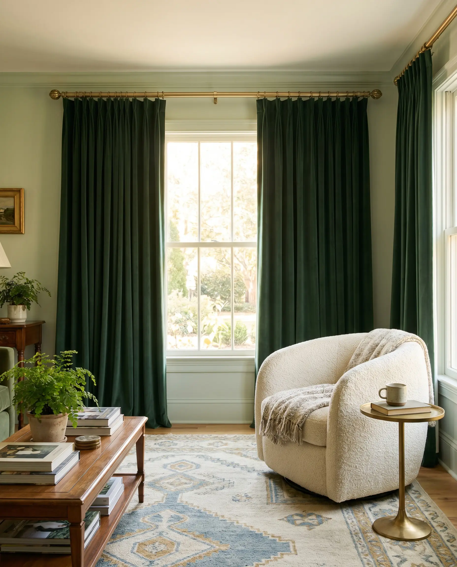
Anchoring light sage walls with heavy forest or emerald green drapery dramatically draws the eye outward, framing the window like a piece of art. The stark tonal contrast provides necessary depth in heavily sunlit, south-facing rooms.
- Vibe: Jewel-Box Transitional
- Key Material: Heavyweight forest green matte velvet
- Hardware Pairing: Brushed gold rod with decorative finials
12. Soft Olive Linen with Unlacquered Brass Rods
Olive introduces strong yellow and brown undertones that immediately warm up a cooler sage wall. Over time, the unlacquered brass hardware will develop a rich patina, perfectly complementing the organic, earthy greens.
- Vibe: Earthy Organic
- Key Material: Soft olive medium-weight linen
- Hardware Pairing: Living-finish unlacquered brass French return rod
Unlacquered brass is a “living finish,” meaning the oils from your hands and the ambient moisture in the room will naturally darken and age the metal over time, enhancing the room’s organic appeal.
Hardware Secret
The Soft & Romantic Textures: Light, Airy, and Unexpected
For bedrooms, nurseries, or quiet living spaces, sage green acts as a restorative backdrop for delicate textures and subtle patterns. These pairings prioritize soft light filtration and gentle visual transitions.
13. Dusty Blush Pink Chiffon or Slub Linen
The muted grey undertones in a dusty pink textile speak directly to the grey undertones inherent in true sage. This pairing offers a highly sophisticated, soft complement without ever reading as bubblegum or neon.
- Vibe: Restorative Romantic
- Key Material: Dusty blush slub linen or heavy chiffon
- Hardware Pairing: Champagne bronze rod
- Paint Recommendation: Sherwin-Williams Sea Salt
14. Tactile Cream Bouclé Panels
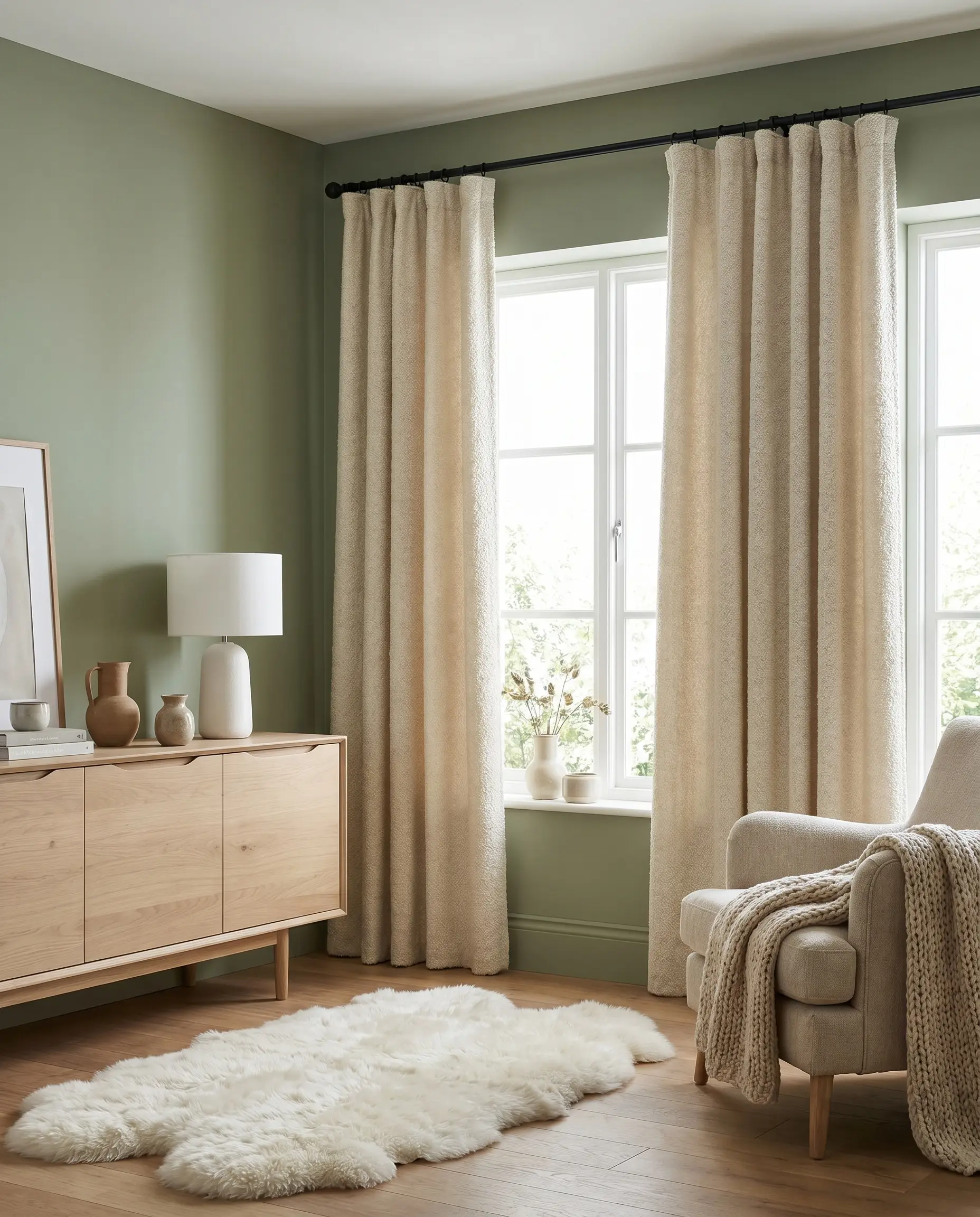
Moving bouclé from heavy upholstery to your window treatments injects incredible physical texture against a flatly painted wall. A cream bouclé curtain adds a layer of cozy, Scandinavian-inspired warmth that softens room acoustics beautifully.
- Vibe: Scandinavian Warmth
- Key Material: Heavyweight cream bouclé
- Hardware Pairing: Matte black slim-profile rod
15. Subtle Botanical Block-Prints
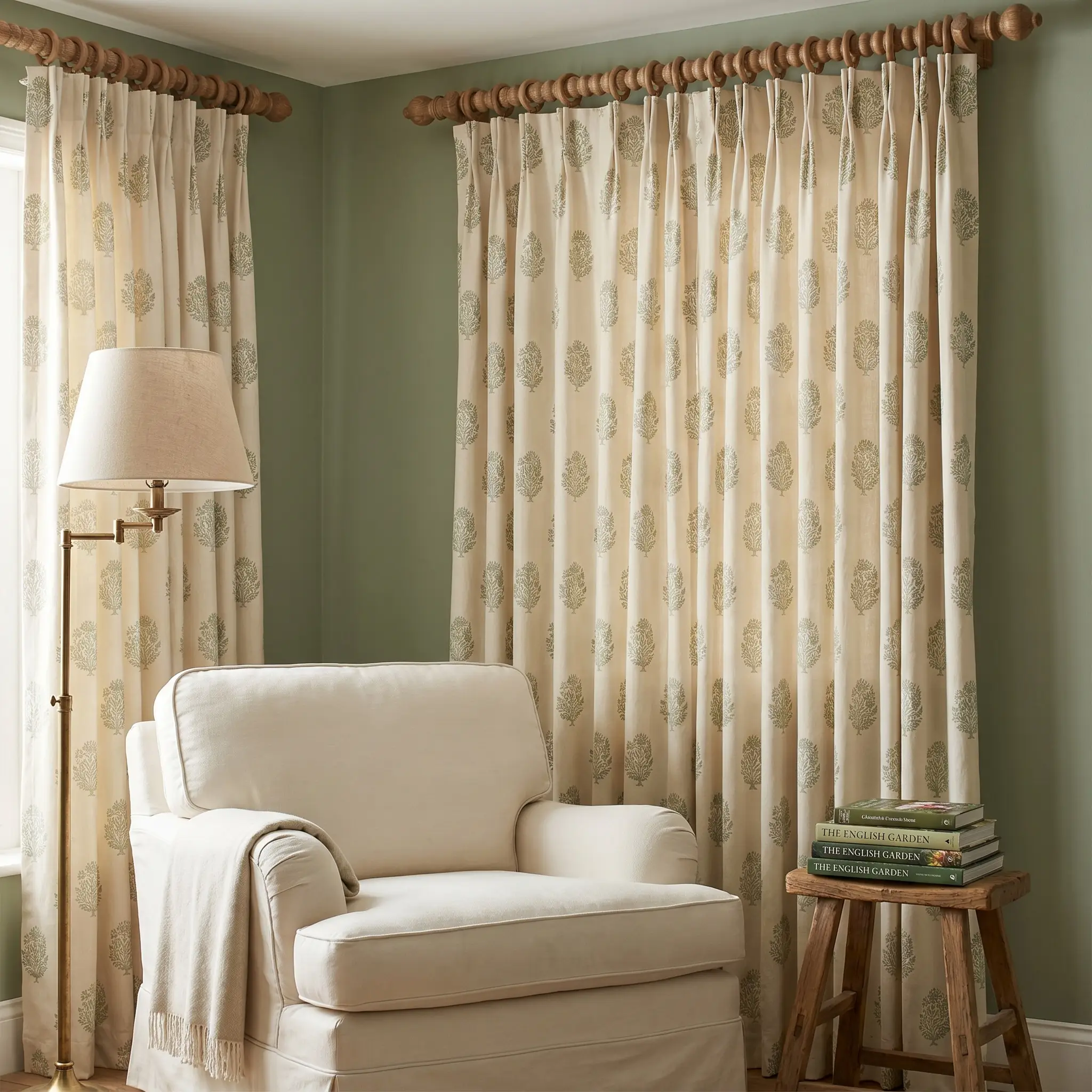
A block-print fabric featuring a cream background with small sage green motifs ties the wall color into the textile organically. This introduces patterned visual interest without overwhelming a tranquil space.
- Vibe: English Heritage
- Key Material: Printed cotton or linen-blend
- Hardware Pairing: Carved wooden spindle rod with wooden rings
16. Pale French Blue Linen
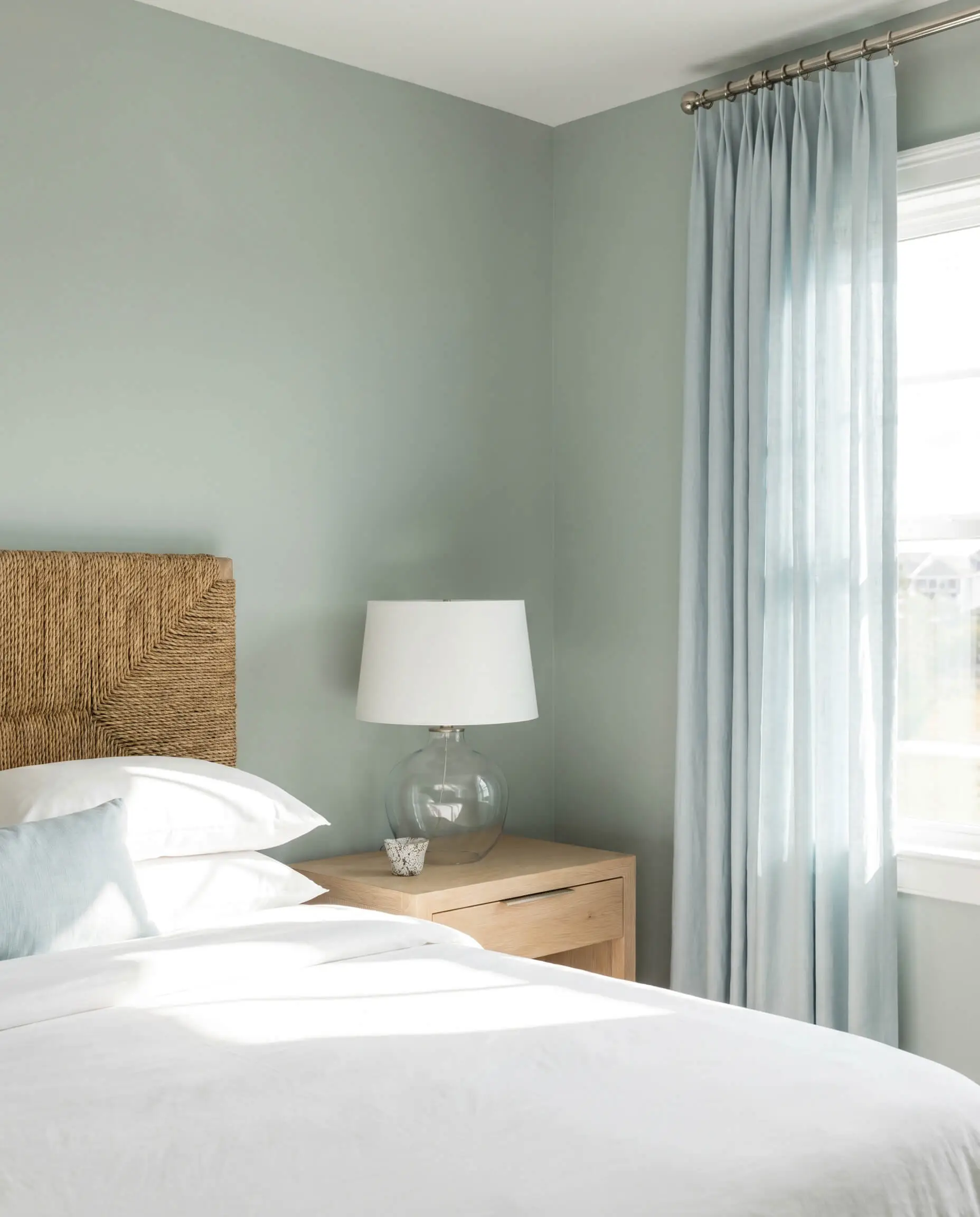
Sage green and French blue create a highly sophisticated, slightly coastal palette for well-lit, south-facing rooms. Both hues remain cool-toned but are distinct enough to establish gentle, intentional visual interest.
- Vibe: Refined Coastal
- Key Material: Pale French blue lightweight linen
- Hardware Pairing: Polished nickel French return rod
- Paint Recommendation: Farrow & Ball Cromarty
Fabric Weight & Hardware: The Sage Green Palette
The interaction between your hardware finish and the sage green paint is just as critical as the textile itself. Utilize this breakdown to ensure your metal finishes align perfectly with your desired room aesthetic.
| Hardware Finish | Vibe it Creates with Sage | Recommended Fabric Pairing | Avoid If… |
|---|---|---|---|
| Unlacquered Brass | Warms up cool undertones, organic, bespoke | Unbleached linen, dark velvet | Your space has cool grey floors or stark chrome fixtures. |
| Matte Black | Crisp, modern, high-contrast punctuation | Alabaster sheers, cream bouclé | You want a completely soft, romantic, or traditional aesthetic. |
| Polished Nickel | Traditional, reflective, clean | Heathered greige, French blue | The room lacks natural light; the highly reflective metal can read cold. |
| Warm Walnut Wood | Mid-Century, earthy, grounded | Muted mustard, taupe cotton | You are using highly formal, shiny silks or synthetic fabrics. |
Executing the Look: The Hackrea Installation Checklist
The difference between basic window treatments and a bespoke architectural feature lies entirely in the installation. Execute these final structural rules to maximize the impact of your sage green walls:
- Hang High and Wide: Never let the rod sit directly on the window trim. Push the rod entirely up to the ceiling (or just below the crown molding) to force the green walls to look taller.
- Extend the Bracket: Extend your rod 8 to 12 inches past the left and right edges of the window frame. When the curtains are open, they should frame the glass, not block the natural light.
- Mandatory Steaming: Regardless of your budget, you must steam your curtains after hanging them. Wrinkled fabric immediately degrades the visual quality of the room.
- Train the Folds: Use pleat tape or manually fold and tie the fabric at the base for a few days to establish a professional, uniform drape.
Which textile and hardware pairing are you leaning toward to ground your sage green space?
The Hackrea Style Desk treats interior decoration as an exact visual science. Rather than focusing on demolition or floor plans, this desk masters the art of color theory, undertone matching, material pairings, and spatial proportion. From balancing the visual weight of mixed metals to finding the perfect bridging tone between disparate wood species, this desk provides the rigorous aesthetic rules needed to achieve high-end, editorial-quality harmony in any space.