The Designer’s Guide to Beige Wall Paint: Swatches, Undertones, and Modern Applications
The sterile grey trend has officially passed, leaving many homeowners eager to bring warmth back into their interiors. However, the search for the perfect beige wall paint often triggers an understandable anxiety: the fear of accidentally painting a living room a fleshy pink, a sickly yellow, or a flat, uninspired tan. We are moving past those basic, one-dimensional neutrals to embrace what we consider Architectural Beige—highly curated pigments that rely on complex undertones and the precise behavior of natural light to create depth.
To avoid an expensive mistake, you must treat paint as a foundational architectural finish rather than just a color. Throughout this guide, we break down the exact designer-favorite shades, their Light Reflectance Values (LRV), and how cardinal light direction dictates their success. Choosing beige is an exercise in mastering light and shadow.
Warm, Sun-Baked Beige Paint Ideas (Best for Cool or North-Facing Rooms)
North-facing rooms receive cool, bluish light that easily turns neutral paint dreary. Warm beiges formulated with subtle yellow or red undertones actively counteract this chilly cardinal light, bringing necessary artificial warmth to the space.
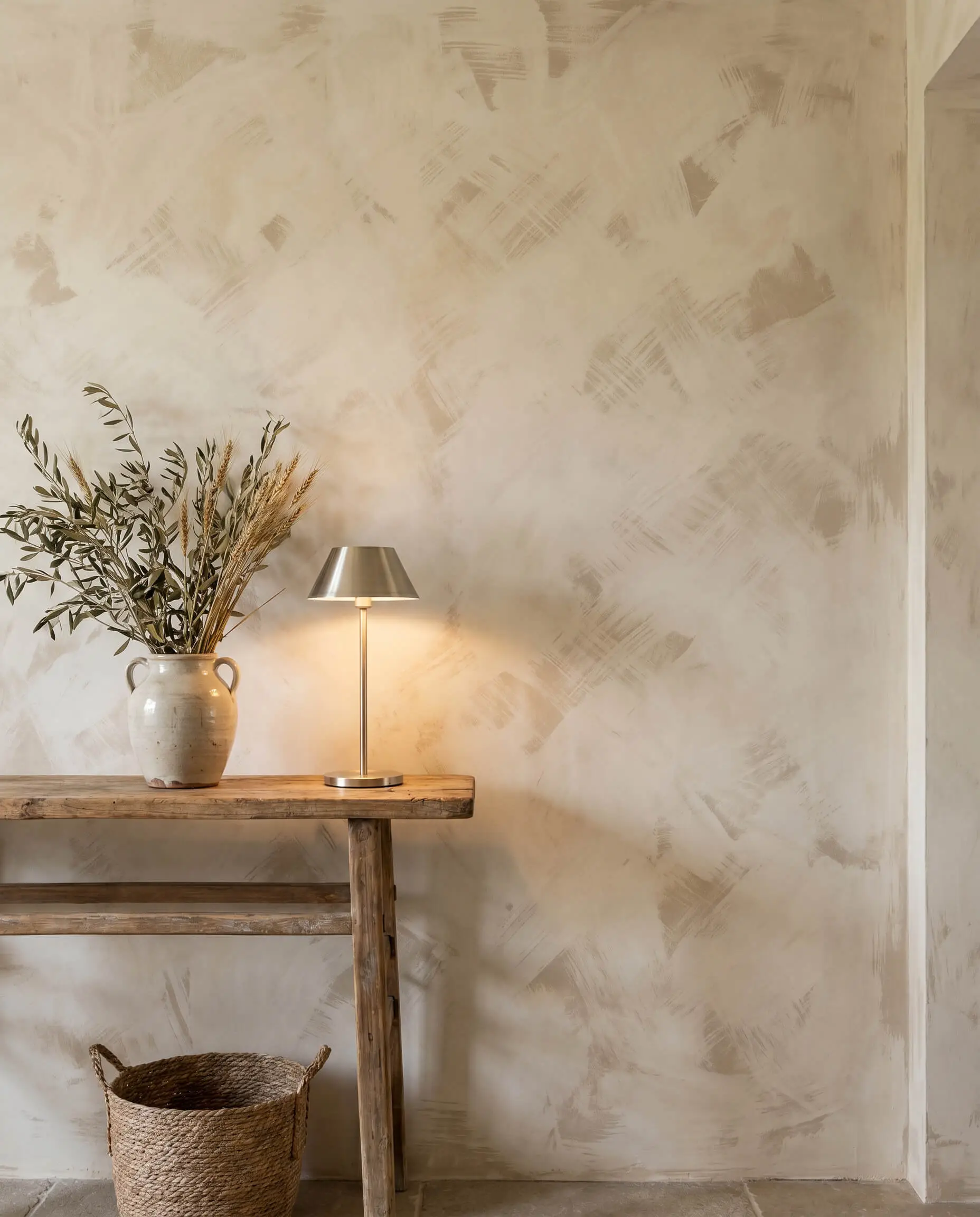
Farrow & Ball Jitney for a Sandy, Earthy Finish
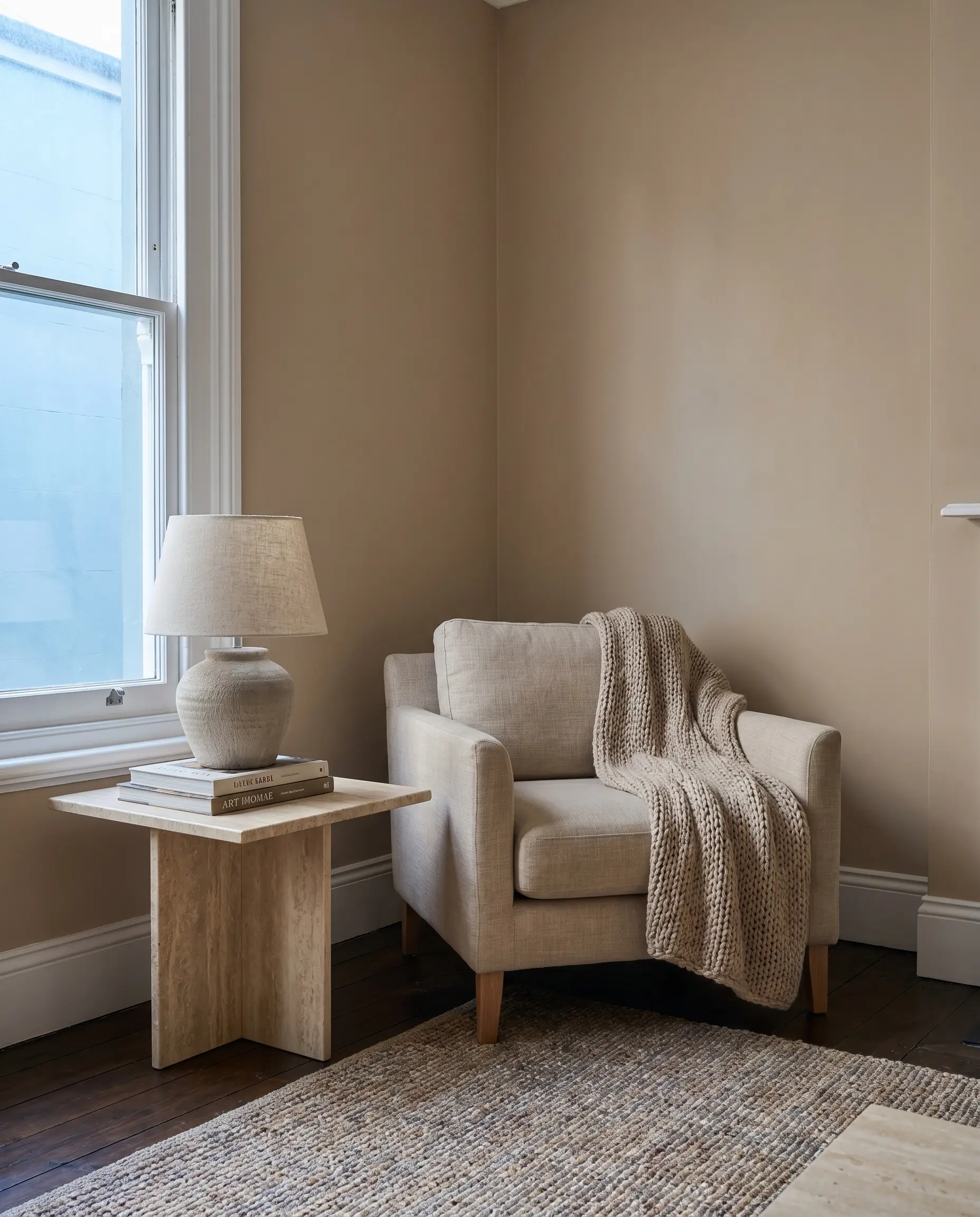
This muted, sandy shade brings a grounded, sun-baked quality to a room without skewing overtly yellow. Its highly complex pigmentation actively shifts from a soft tan in the morning to a richer earth tone by dusk, making it a brilliant backdrop for organic textures.
- Brand & Name: Farrow & Ball Jitney
- Undertone: Brown/Earthy
- Best For: North-facing living rooms
- Material Pairings: Natural linen upholstery and honed travertine tables.
Benjamin Moore Manchester Tan for Classic Khaki Elegance
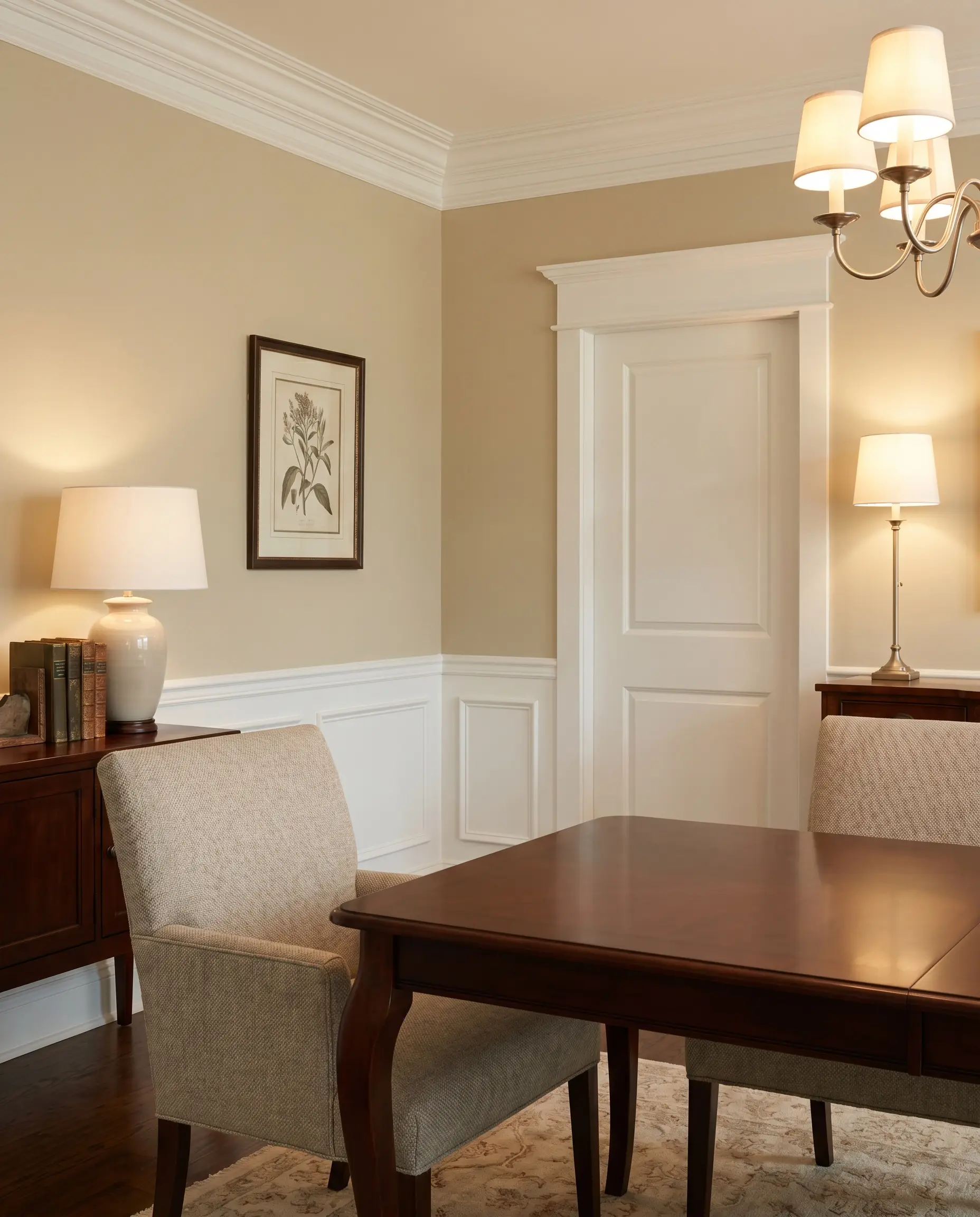
A staple in transitional design, this highly accessible shade offers timeless sophistication with a perfectly balanced green-yellow base. That specific base prevents the pigment from ever reading pink, allowing it to frame crisp architectural trim beautifully.
- Brand & Name: Benjamin Moore Manchester Tan
- Undertone: Green/Yellow
- Best For: Transitional hallways and formal dining spaces
- Trim Recommendation: Crisp white like Benjamin Moore Chantilly Lace.
Sherwin-Williams Accessible Beige for Foolproof Warmth
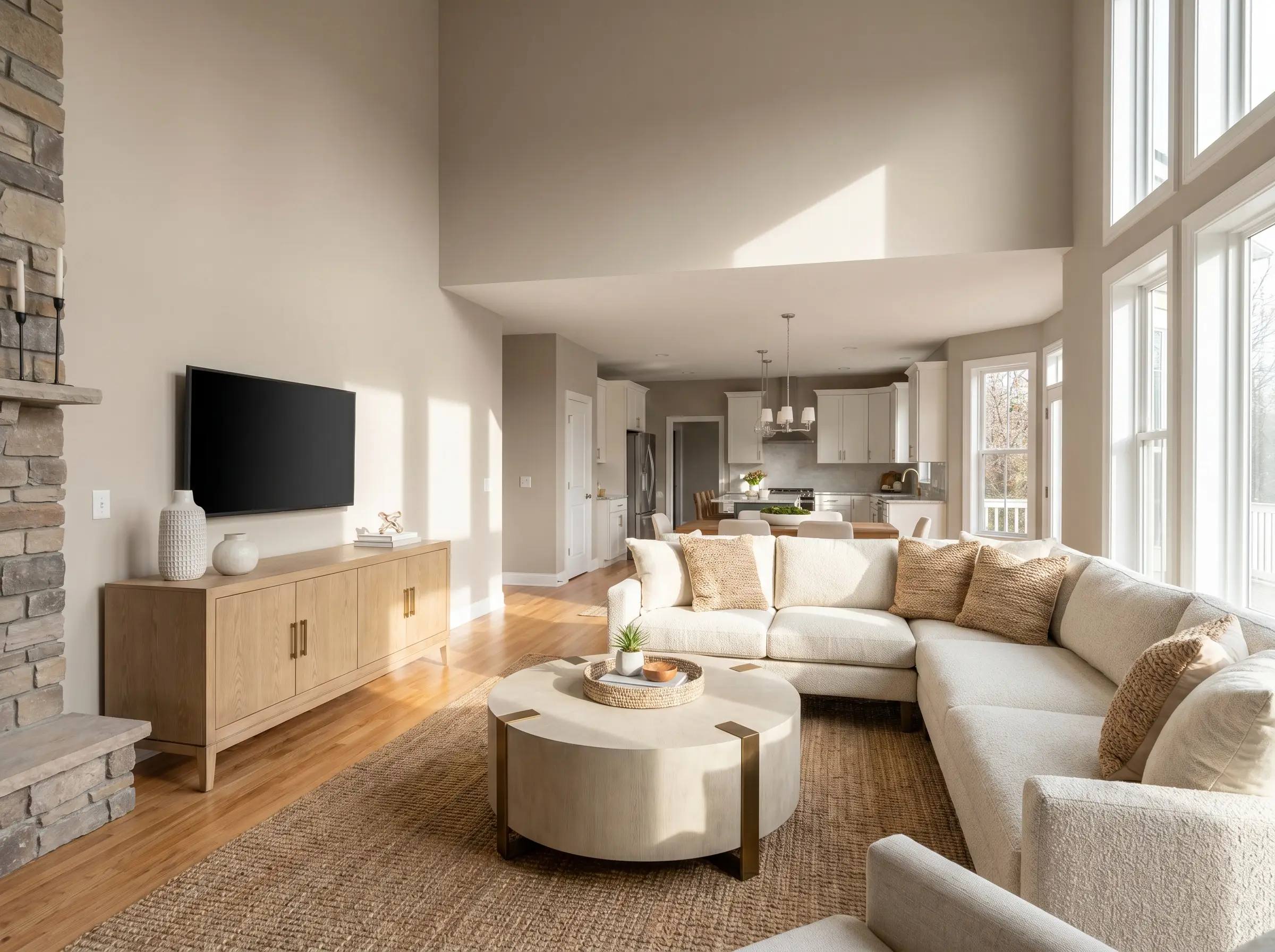
As one of the most mathematically popular neutrals on the market, this shade succeeds because it utilizes a touch of grey to ground the warmth. This structural balance prevents the dreaded “fleshy” look while maintaining an inviting, soft atmosphere.
- Brand & Name: Sherwin-Williams Accessible Beige
- Undertone: Warm Grey/Taupe
- Best For: Open-concept main floors
- LRV Intel: With an LRV of 58, it reflects a moderate amount of light, keeping the space bright but grounded.
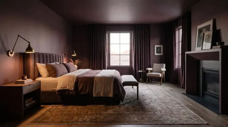
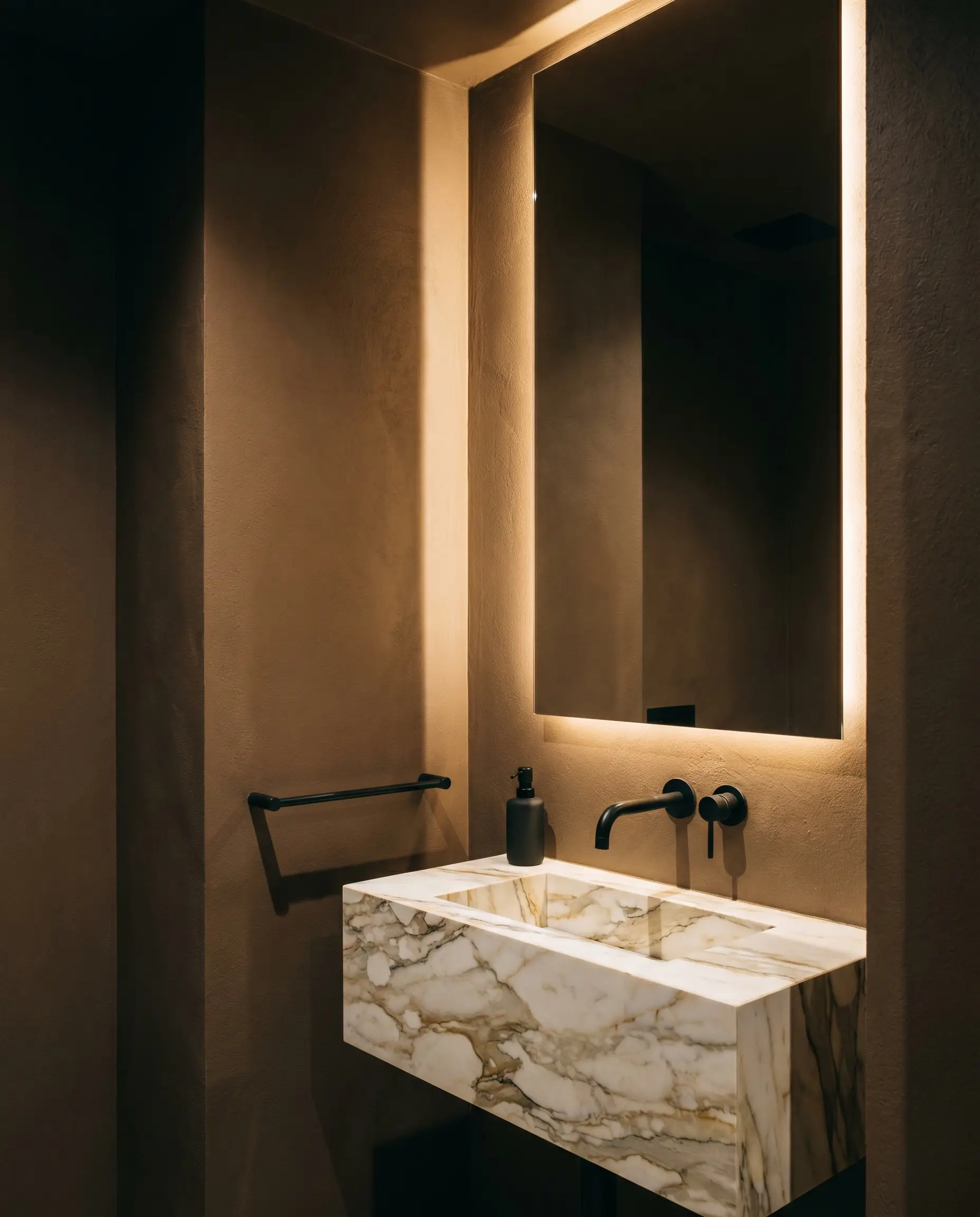
Portola Paints Roman Clay in Nude for Plaster Texture
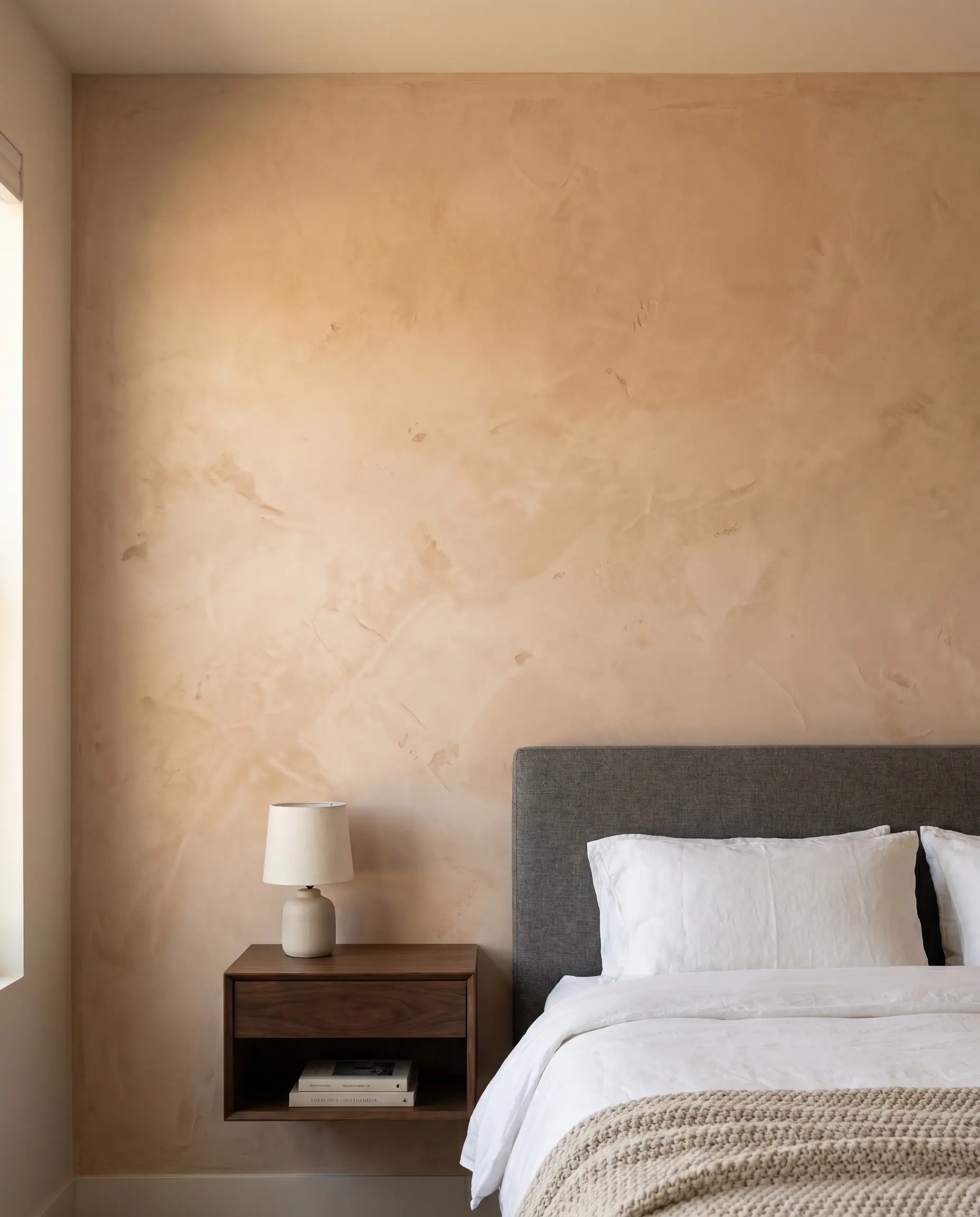
Pushing beyond flat drywall, this Roman clay finish provides a high-end, tactile alternative that catches the light and adds instant architectural gravitas. The “Nude” shade creates a mottled, suede-like surface that feels immensely warm and bespoke.
- Brand & Name: Portola Paints Roman Clay in Nude
- Undertone: Warm Peach/Earthy Beige
- Best For: Accent walls, fireplace surrounds, or primary bedrooms
- Texture Profile: Applied via trowel for a sweeping, matte plaster effect.
You can apply wallpapers, paints, etc. on walls and see how they look in various interiors.

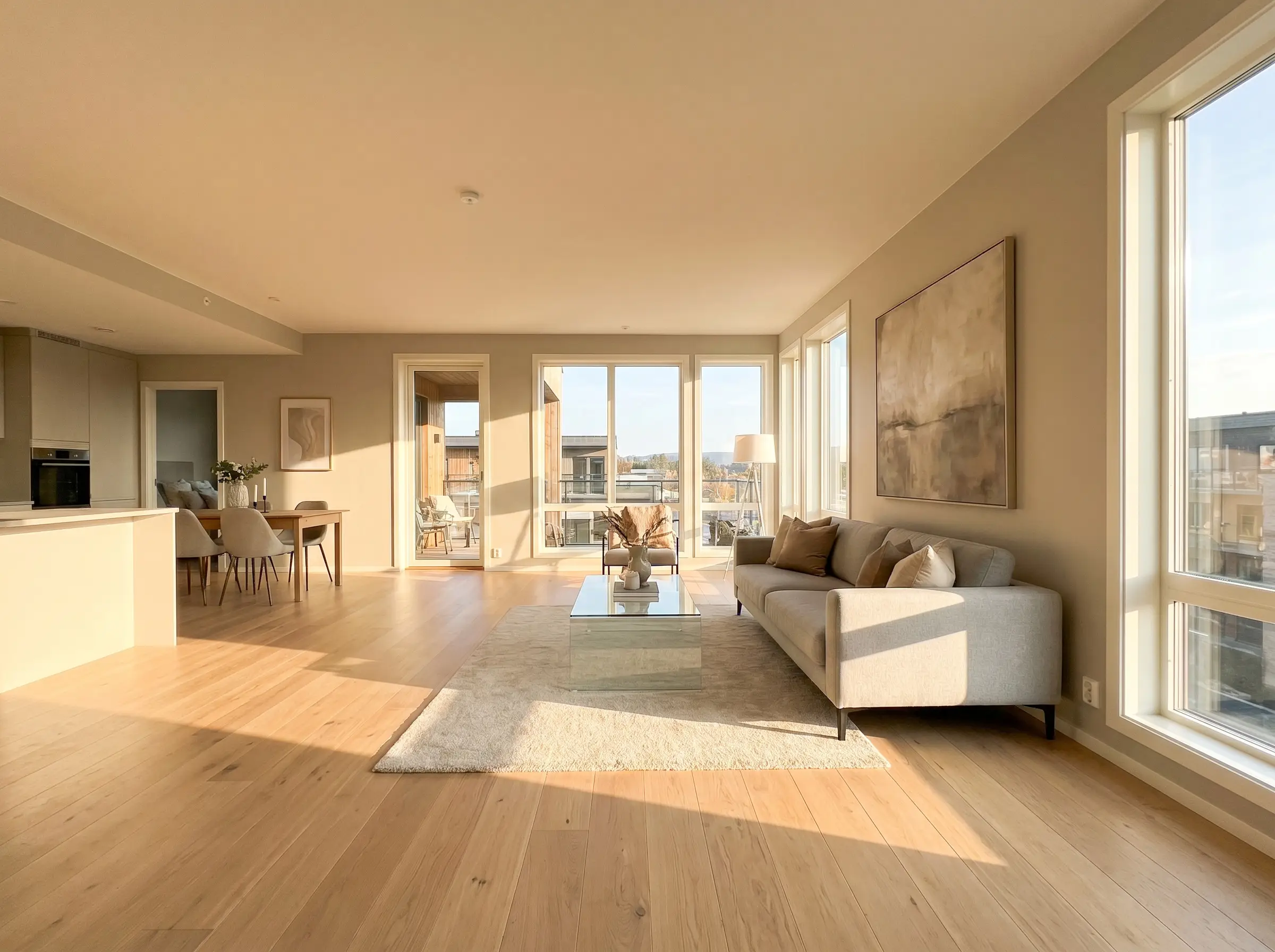
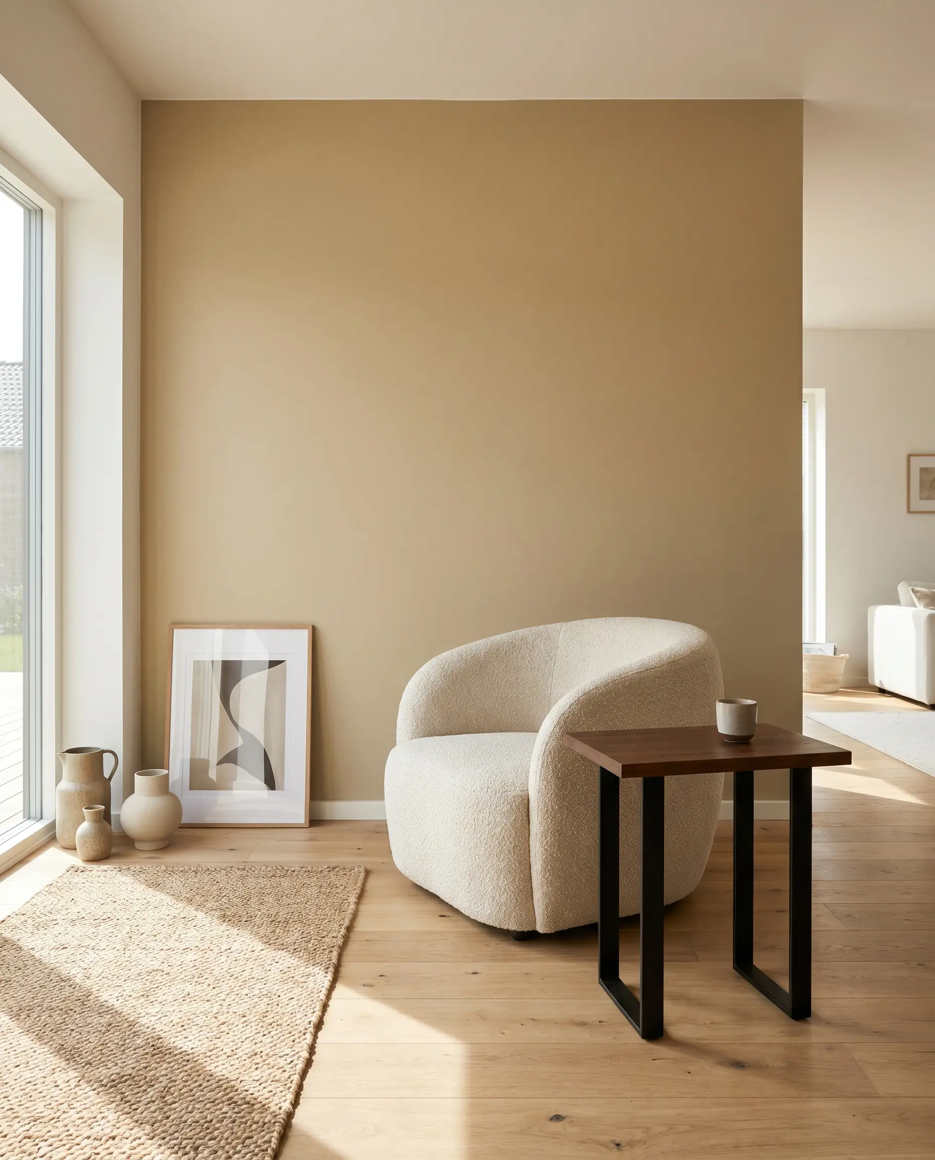
Greige and Cool Beige Tones (Best for Warm, South-Facing Rooms)
South and West-facing rooms receive intense, warm sunlight that can turn standard warm beiges overtly yellow or orange. Cool beiges and greiges neutralize this intense light, keeping the room looking sophisticated and balanced throughout the afternoon.
Greige is the highly engineered intersection of grey and beige. It is specifically formulated with green or blue-grey undertones to absorb and neutralize heavy, warm sunlight, preventing a room from feeling overly saturated.
Hackrea Design Definition
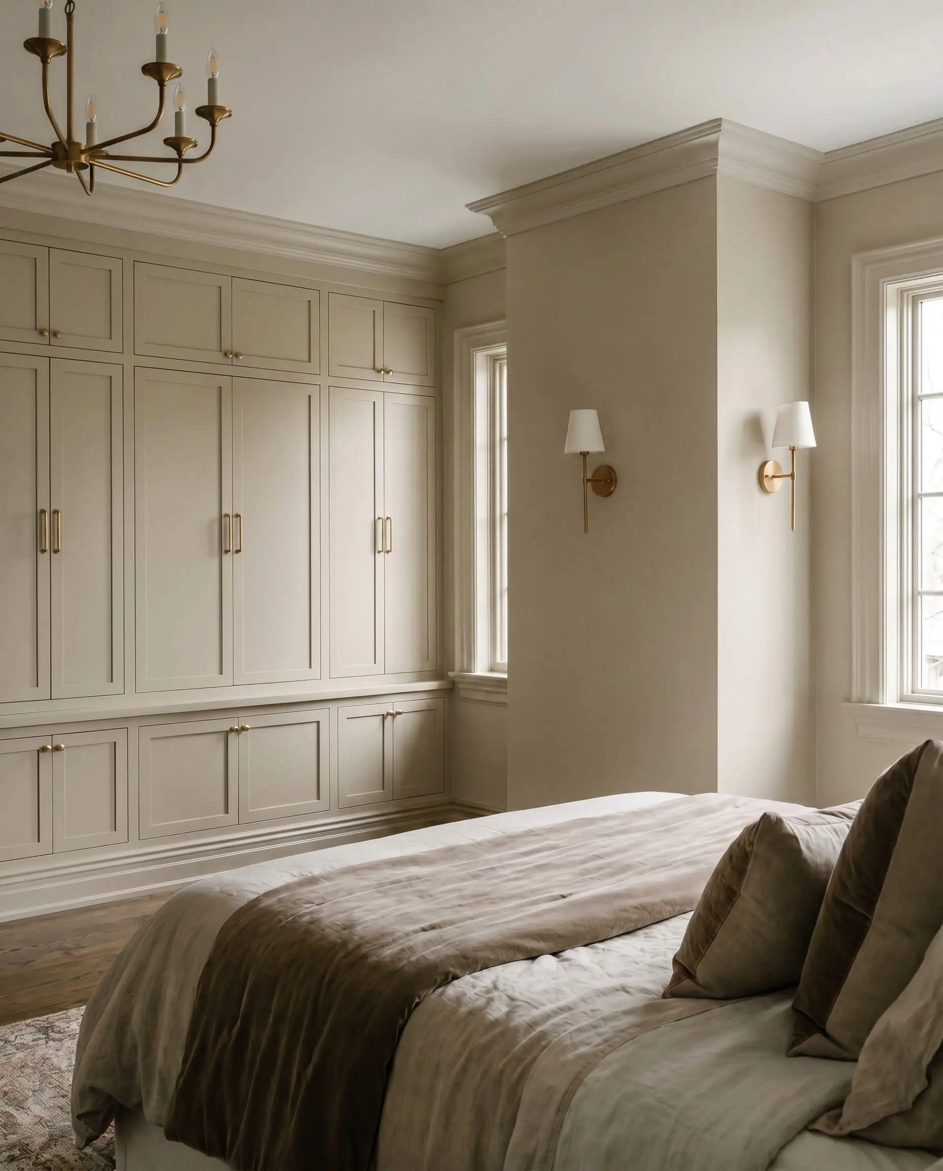
Benjamin Moore Pale Oak for a Whisper of Grey
This light, airy neutral leans slightly grey, serving as the perfect transition color for bright, open-concept homes. Its high Light Reflectance Value keeps the architecture feeling expansive while offering far more personality than a stark white.
Always swatch Pale Oak against your furniture; its subtle pink/purple undertone can aggressively reveal itself in certain artificial evening lighting.
Designer Warning
- Brand & Name: Benjamin Moore Pale Oak
- Undertone: Cool Grey/Subtle Pink
- Best For: South-facing living areas
- LRV Intel: 69.89 (Highly reflective and bright)
Farrow & Ball Drop Cloth for Muted, Shadowy Depth
Avoiding the extremes of yellow and grey, this mid-tone beige beautifully mimics the shadowy depth of an aged linen sheet. It brings an unparalleled sense of history and quiet luxury to character-rich spaces.
We consider this a designer secret for older homes—it respects historical millwork while feeling distinctly modern.
Hackrea Styling Tip
- Brand & Name: Farrow & Ball Drop Cloth
- Undertone: Muted Grey/Green
- Best For: Historic homes, studies, or rooms with heavy wainscoting
- Material Pairings: Aged brass sconces and mohair upholstery.
Sherwin-Williams Aesthetic White for High-LRV Lightness
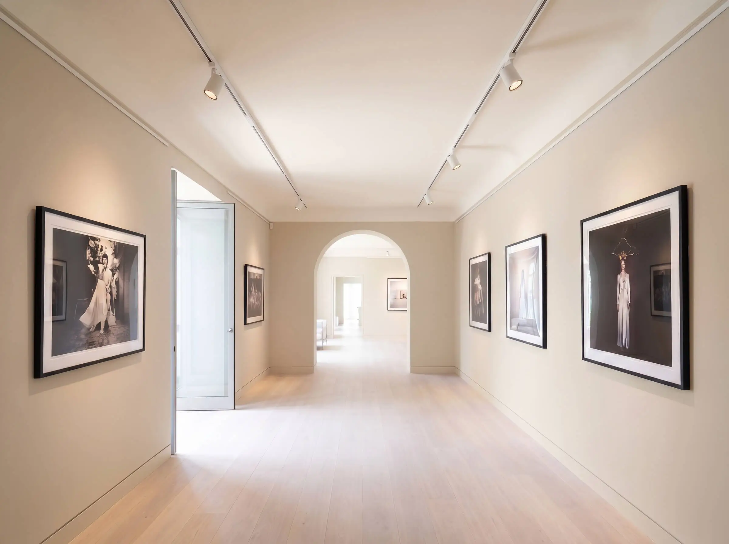
Despite the misleading name, this pigment reads as a very pale, cool beige rather than a true white. It is the superior choice for minimalist, gallery-like spaces where you require visual warmth without the heaviness of a mid-tone tan.
- Brand & Name: Sherwin-Williams Aesthetic White
- Undertone: Cool Violet/Grey
- Best For: Minimalist interiors and art-heavy corridors
- Styling Strategy: Contrast this with pure white ceilings to emphasize its soft beige nature.
Clare Paint Turbinado for a Modern Neutral
This rich, golden greige from a modern direct-to-consumer brand feels distinctly contemporary and highly saturated. It anchors organic modern interiors flawlessly by providing a strong visual counterweight to natural, unfinished textures.
- Brand & Name: Clare Paint Turbinado
- Undertone: Golden Greige
- Best For: Organic modern living rooms
- Material Pairings: Raw oak flooring, matte black hardware, and bouclé fabrics.
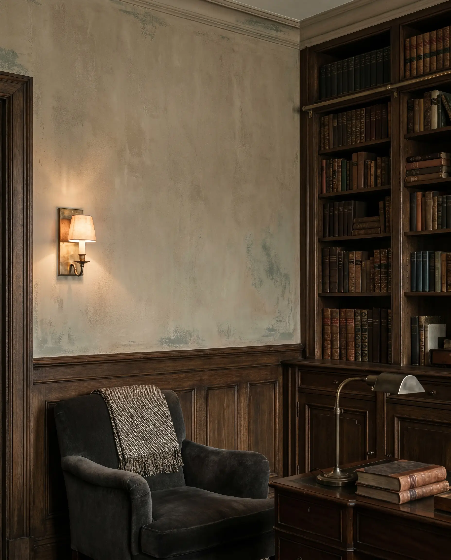
Moody Taupe and Deep Mushroom Ideas
Beige does not have to be light, airy, or passive. Deep mushroom and taupe tones offer a moody, enveloping aesthetic that brings incredible intimacy and high-contrast luxury to dining rooms, bedrooms, or home libraries.
Farrow & Ball Dead Salmon for Earthy, Pink-Leaning Depth
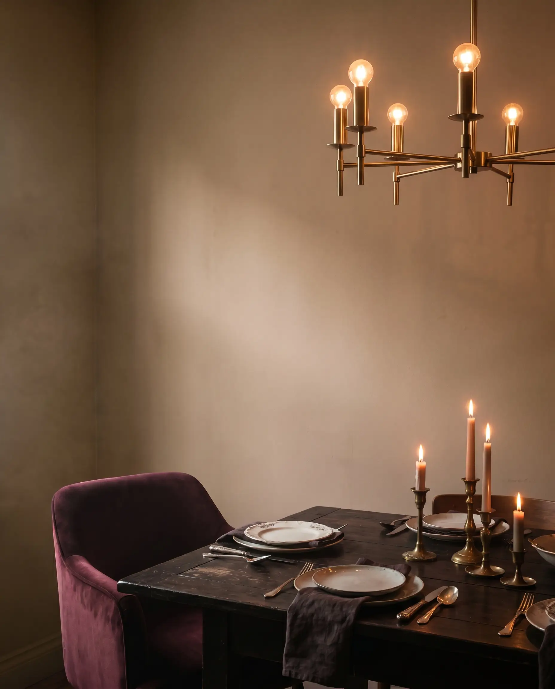
This deep, aged beige acts as a complex chameleon, shifting toward a dusty mushroom or rich pink depending on the hour and light source. It creates an undeniably romantic, enveloping atmosphere that excels under dim, warm lighting.
- Brand & Name: Farrow & Ball Dead Salmon
- Undertone: Dusty Pink/Mushroom
- Best For: Candlelight dining rooms and cozy studies
- Vibe: Intimate, historic, and undeniably bespoke.
Benjamin Moore Pashmina for Rich Muddy Elegance
Providing perfectly balanced suspension between brown, grey, and green, this muddy neutral delivers an incredibly sophisticated, dark aesthetic. It serves as a brilliant anchor color that makes metallic accents and crisp architectural lines jump off the wall.
- Brand & Name: Benjamin Moore Pashmina
- Undertone: Muddy Green/Grey
- Best For: Primary bedrooms or custom built-in cabinetry
- Material Pairings: Warm brass lighting fixtures and stark white architectural trim.
Sherwin-Williams Tiki Hut for High-Contrast Architecture
Bridging the gap between deep beige and rich chocolate, this near-brown hue creates a grounding, earthy anchor for bold architectural statements. It is heavily saturated, making it an exceptional choice to intentionally lean into the moodiness of small or windowless spaces.
- Brand & Name: Sherwin-Williams Tiki Hut
- Undertone: Warm Brown
- Best For: Powder rooms and dramatic accent walls
- Styling Strategy: Use in spaces lacking natural windows to create a jewel-box effect.
Modern Beige Paint Application Trends
Selecting the perfect pigment is only half the battle; the physical application dictates the final aesthetic tier. Modern designers utilize specific finishes, layering techniques, and contrast strategies to turn standard beige into a bespoke architectural feature.
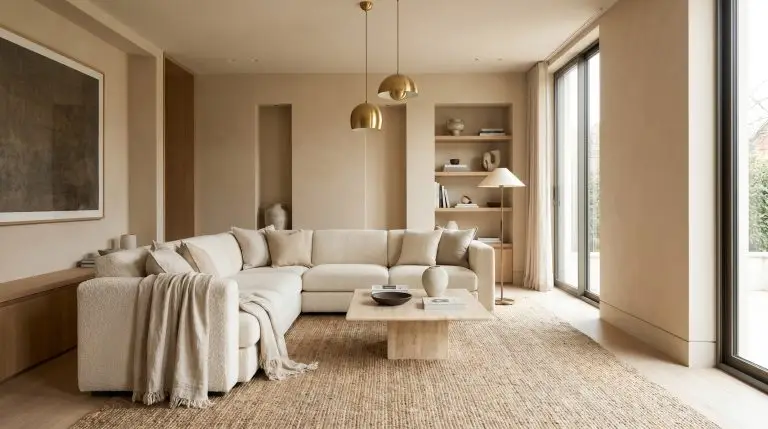
The Color-Drenched Beige Room (Walls, Trim, and Ceiling)
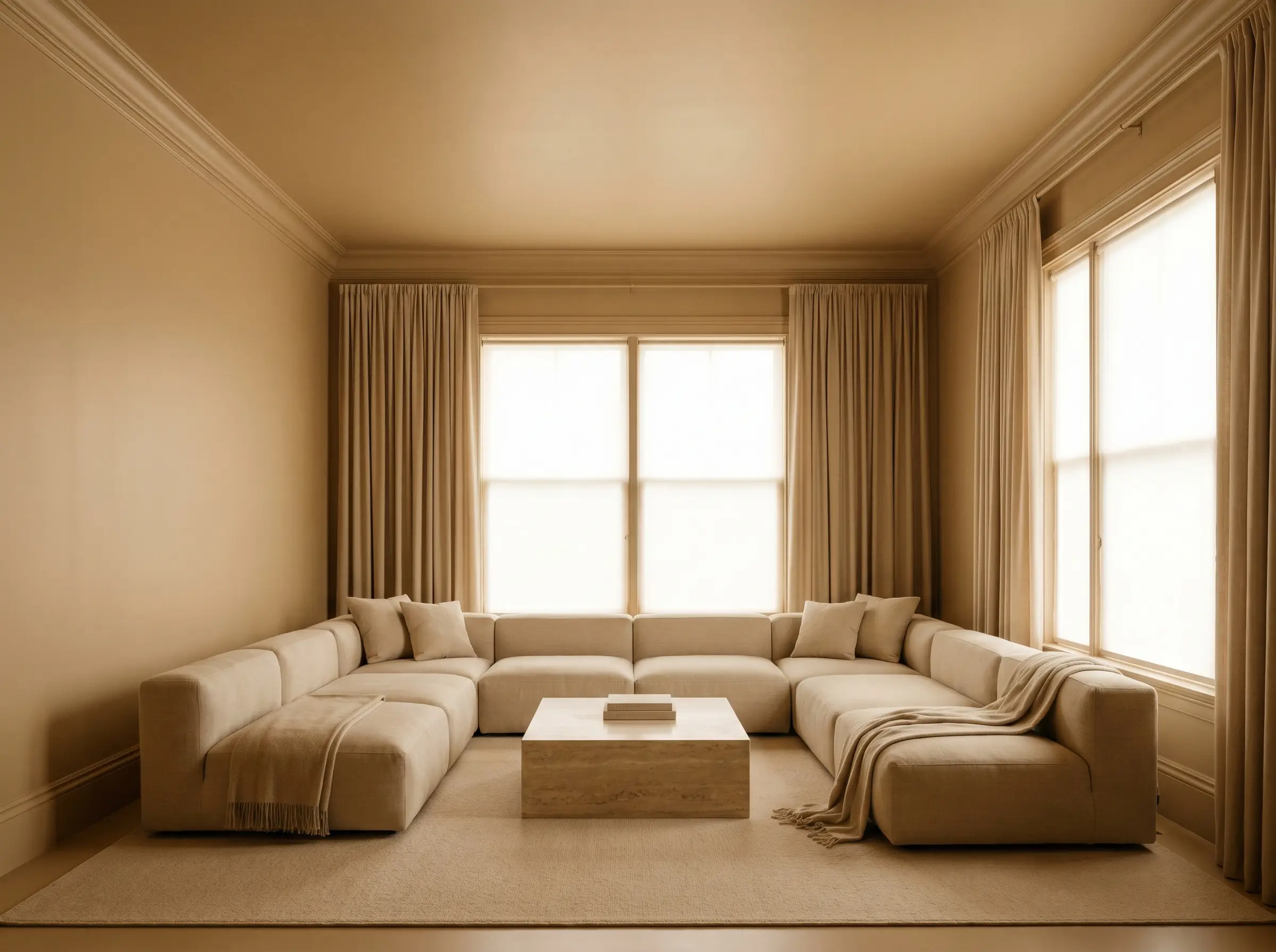
Painting the baseboards, crown molding, walls, and ceiling the exact same beige shade is the defining trend in current luxury interiors. This continuous saturation erases visual boundaries, effectively tricking the eye to make ceilings feel significantly taller.
- Application Strategy: Color Drenching
- Key Benefit: Erases spatial boundaries and elongates wall height.
- Vibe: Highly bespoke, seamless, and enveloping.
Two-Tone Beige and Cream Limewash Layering
Limewash brings an Old-World patina to flat drywall through a specialized, textural application. By utilizing a darker beige base and a lighter cream topcoat, you create a cloudy, multidimensional surface that feels organically aged.
- Step 1: Apply a base layer of dark beige limewash using a block brush in a cross-hatch motion.
- Step 2: Allow the base to partially cure, establishing the deep shadow tones.
- Step 3: Layer a lighter cream wash over top, blending the edges to create a soft, mottled cloud effect.
High-Gloss Beige Trim Against Flat Matte Walls
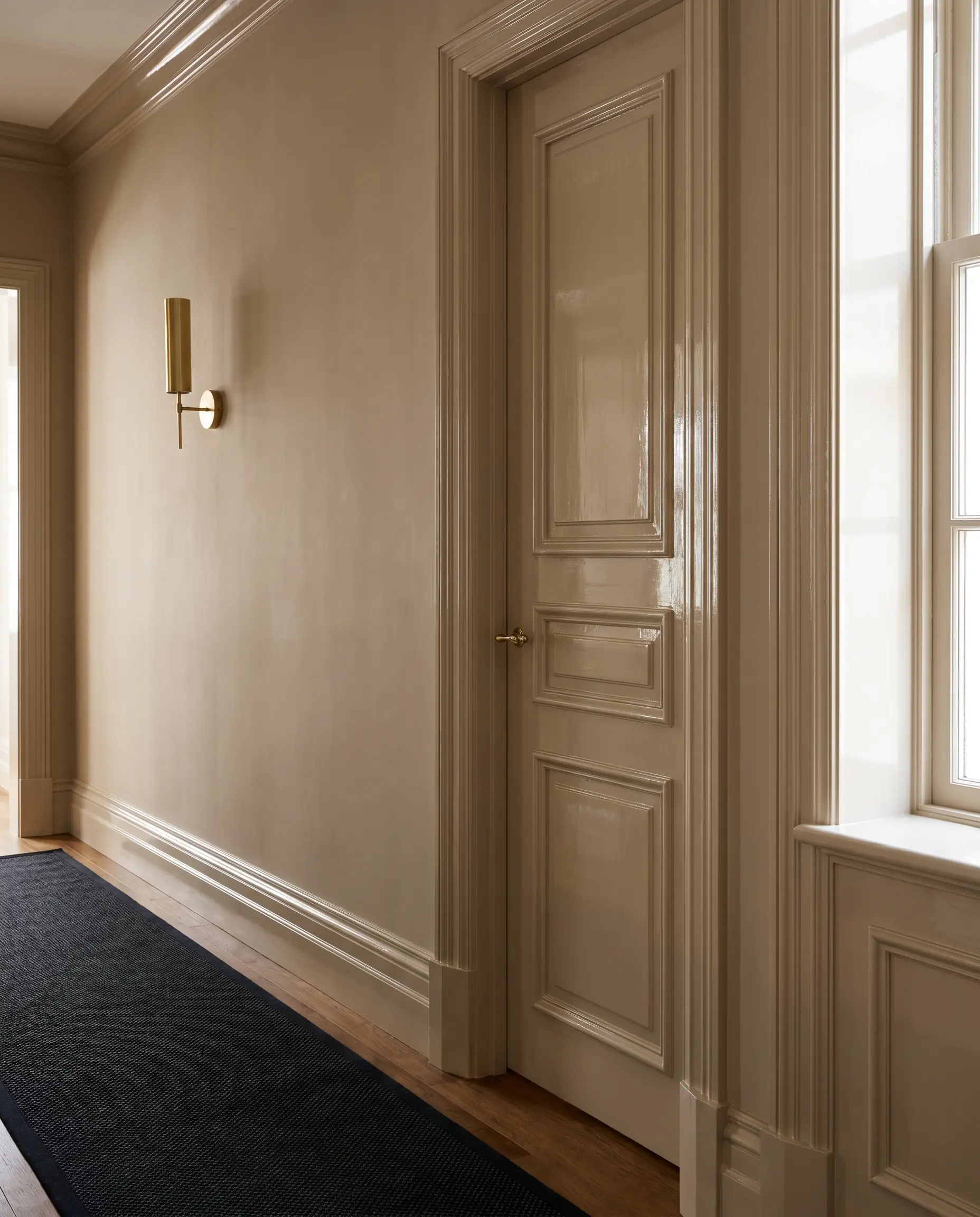
Instead of relying on a stark white trim for contrast, use the exact same beige paint color but drastically alter the sheen. The high-gloss woodwork catches natural light, creating a subtle, highly sophisticated textural pop against the velvety walls.
- Wall Finish: Flat Matte (absorbs light, hides drywall imperfections).
- Trim & Door Finish: High-Gloss Lacquer (reflects light, highlights millwork).
- Styling Pro-Tip: This requires flawless trim carpentry, as high-gloss finishes highlight every surface bump.
Pairing Beige Walls with Dark Wood Architectural Features
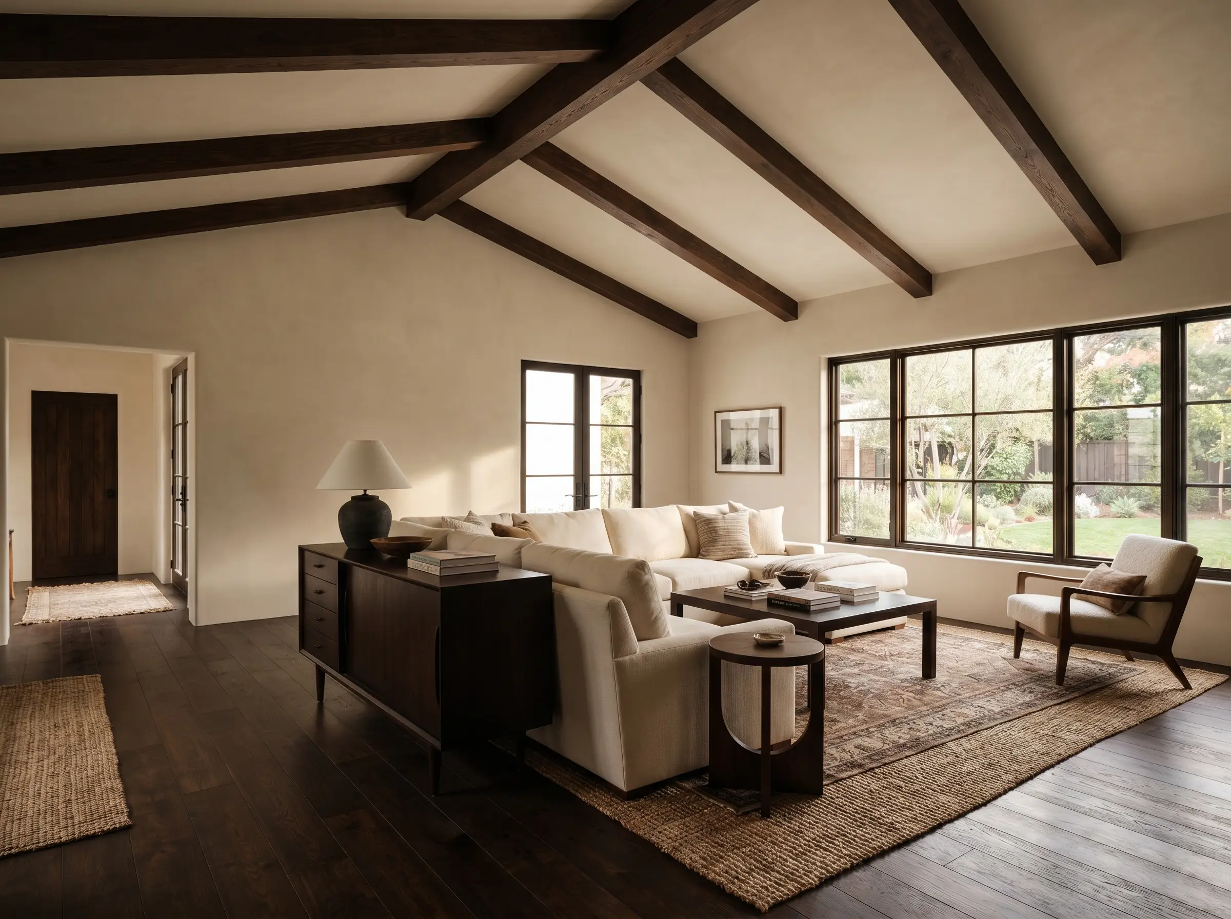
Light beige walls run the risk of feeling washed out or floating without a heavy grounding element to provide visual tension. Integrating rich, dark wood tones through flooring, exposed ceiling beams, or heavy furniture anchors the room beautifully.
- Design Principle: Visual Weight & Contrast
- Material Pairings: Dark walnut credenzas or espresso-stained oak flooring.
- Key Benefit: Prevents the room from feeling overly sterile or overwhelmingly light.
Mastering the Swatch Test Before You Paint
Before committing to gallons of premium paint, you must rigorously test how the specific undertones react to your home’s unique cardinal light direction. Professional installers rely on a highly controlled testing methodology to guarantee the pigment performs flawlessly at all hours.
- Do Not Paint the Drywall: Never paint swatches directly onto your existing wall; the current color will bleed through and visually alter your perception of the new beige.
- Use Foam Boards: Paint two coats of the sample on large, movable white foam boards.
- Morning Observation: Place the board on the wall receiving direct morning sunlight to check for aggressive yellowing.
- Afternoon Shadow: Move the board to the darkest corner of the room in the afternoon to see if the beige turns muddy or cement-like.
- Evening Artificial Light: Observe the swatch at night under your specific lamps and overhead fixtures to monitor for hidden pink or green undertones.
Once you finalize your swatch, ensure your artificial lighting is optimized by visiting Hackrea’s guide on choosing the right lighting temperatures (Kelvins) to complement your new beige walls.