Gray 2121-10
Benjamin MooreBenjamin Moore Gray (2121-10) is a deep, sophisticated charcoal with an LRV of 11.51. Mathematically a pure neutral, this rich, dark shade acts as a softer alternative to stark black, making it perfect for dramatic accent walls, interior doors, and modern cabinetry.
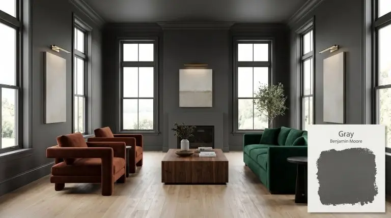
Benjamin Moore Gray 2121-10: The Pure Charcoal Alternative to Stark Black
A pure, uncompromised charcoal is one of the most powerful tools in a designer’s arsenal. Benjamin Moore Gray 2121-10 strips away the complicated color shifts that plague most dark neutrals, leaving behind a perfectly balanced, achromatic shadow. This highly light-absorbent architectural finish defines boundaries and creates profound contrast without the punishing harshness of absolute black.
By absorbing natural light rather than fighting it, this specific shade establishes an incredibly sophisticated color structure. It allows you to build a moody aesthetic that feels intentional rather than accidental. Whether you are framing a scenic window or wrapping an entire room, this charcoal base provides the ultimate foundation for high-contrast design.
Temperature, Undertones & LRV of Benjamin Moore Gray
Is this paint warm or cool? Gray 2121-10 is a definitive, pure neutral that leans neither warm nor cool. Because it is completely devoid of hidden color bias, it acts as a structural chameleon that simply reflects the color temperature of its surrounding environment.
With a light reflectance value (LRV) of 11.51, this paint is highly light-absorbent and carries significant visual weight. It will dramatically darken a room, making it a softer, much more forgiving alternative to stark black.
You can apply wallpapers, paints, etc. on walls and see how they look in various interiors.

The Chameleon Factor: Lighting Interactions
Because this pure charcoal lacks a definitive chromatic bias, its ambient light absorption changes entirely based on your home’s natural exposures. It acts as a blank slate, taking on the subtle characteristics of the sunlight or fixtures illuminating the room.
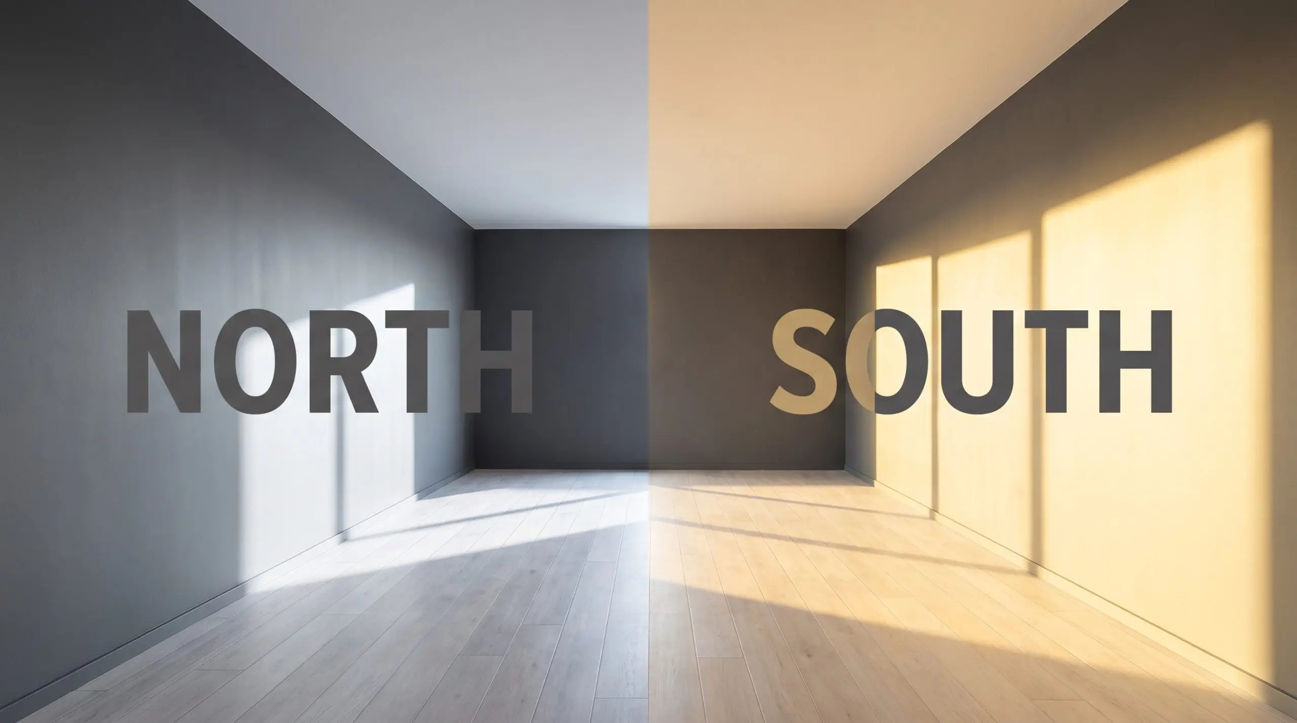
Always test this charcoal base with your specific interior lighting before committing. If your room relies on overhead recessed lighting, swap your bulbs to 3000K to maintain the pure neutral balance without pushing the paint too warm or too clinical.
Hackrea Pro-Tip (The Bulb Rule)
Popular Architectural Applications
Understanding how this pure charcoal behaves in different lighting scenarios is only half the strategy. The true magic happens when you apply this intense visual weight to specific architectural features and functional rooms.
Interior Doors and Trim
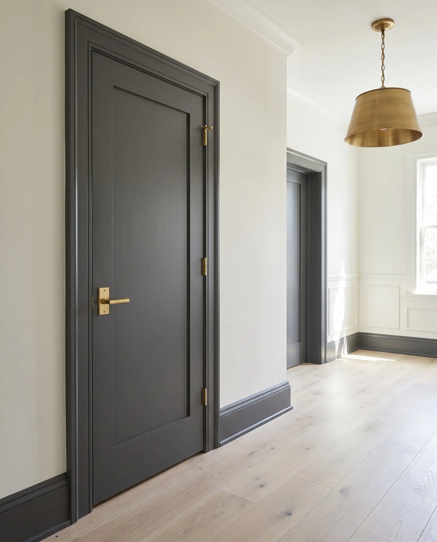
Using Gray 2121-10 on your interior doors and baseboards is a brilliant way to establish architectural definition in a standard, builder-grade home. Instead of defaulting to predictable white trim, this dark neutral frames your entryways like a piece of art.
Pair this application with crisp white walls and unlacquered brass door hardware to create a high-contrast, transitional aesthetic. The dark trim instantly draws the eye upward, making standard ceilings feel taller while adding a layer of custom sophistication to the hallway.
If you prefer a softer minimalist approach, pair these dark interior doors with muted alabaster walls and bleached oak flooring. The resulting tension between the pale wood and the stark charcoal creates a beautifully curated, modern atmosphere.
Moody Dining Rooms
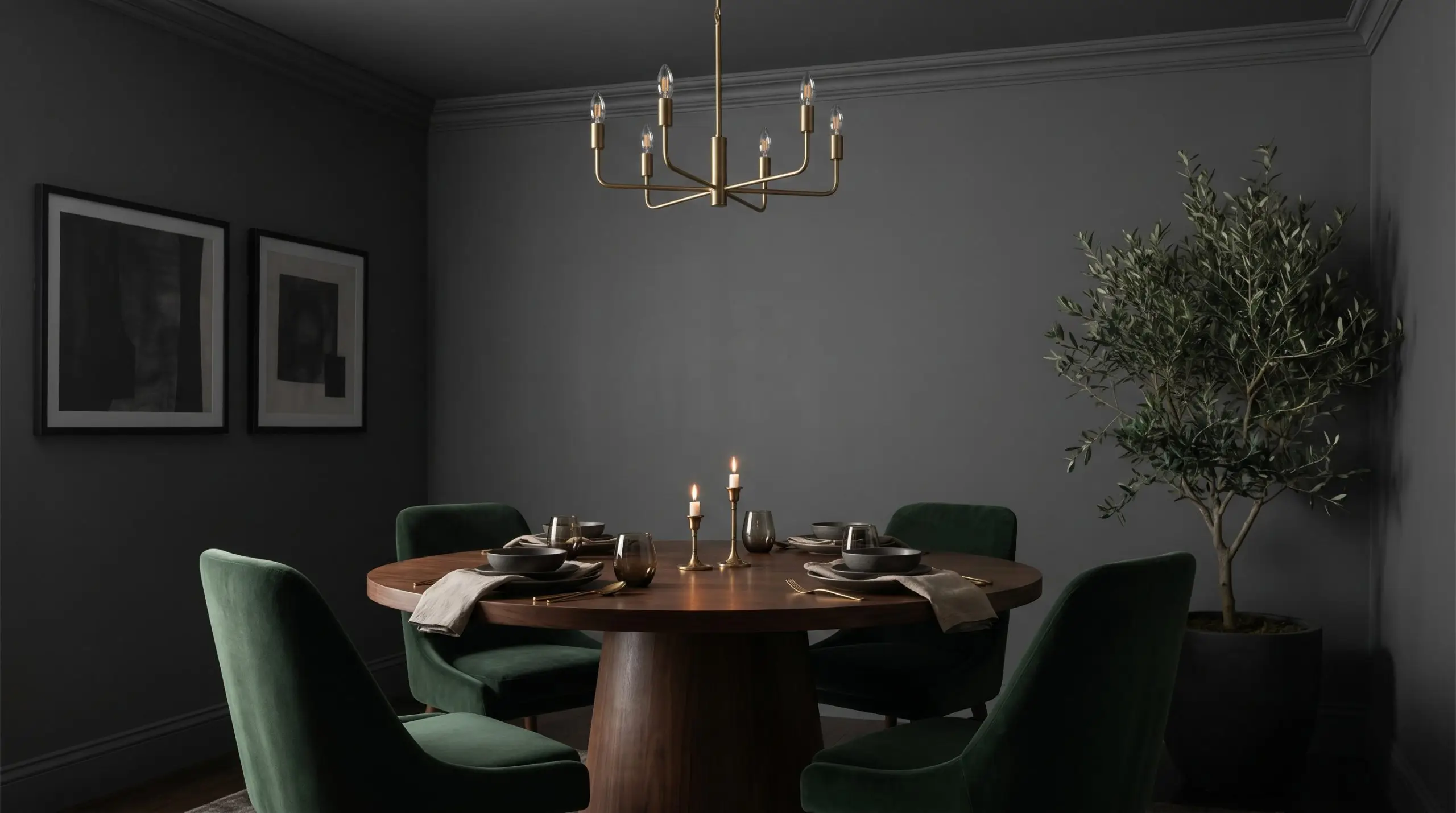
This paint thrives in spaces designed for evening entertainment and intimate dinner parties. By color-drenching a dining room—painting the walls, baseboards, and crown molding in the same charcoal finish—you blur the hard corners of the room.
This monochromatic palette creates a seamless, enveloping backdrop that makes your furnishings the absolute center of attention. Introduce a rich walnut pedestal table and plush velvet seating to soften the intense visual weight of the walls.
Avoid high-gloss finishes when wrapping an entire room in this dark shade. A matte or eggshell sheen is mandatory here; a glossy finish will reflect every single lightbulb, ruining the sophisticated, velvety shadow effect you are trying to achieve.
Clash Warning (The Glare Effect)
Kitchen Cabinetry and Islands
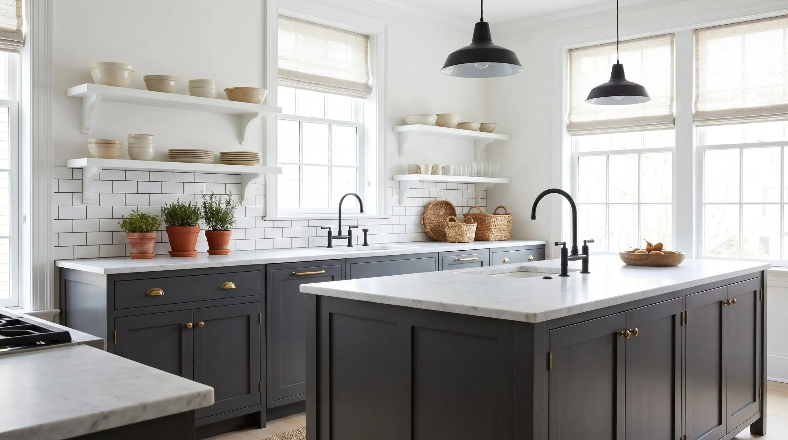
A pure charcoal island or lower cabinet run is a phenomenal way to introduce a moody aesthetic into a kitchen without sacrificing brightness. Because it lacks hidden undertones, this shade pairs effortlessly with a massive variety of countertop materials.
Combine these dark lower cabinets with honed marble countertops and open shelving to achieve a classic, curated mix. The intense charcoal base centers the kitchen, allowing you to use standard subway tile on the backsplash while still achieving a premium look.
For a more industrial edge, pair this cabinet color with matte black steel fixtures, concrete floors, and warm terracotta accents. The resulting design feels highly intentional, blending raw textures with a tailored, architectural finish.
Modern Home Offices
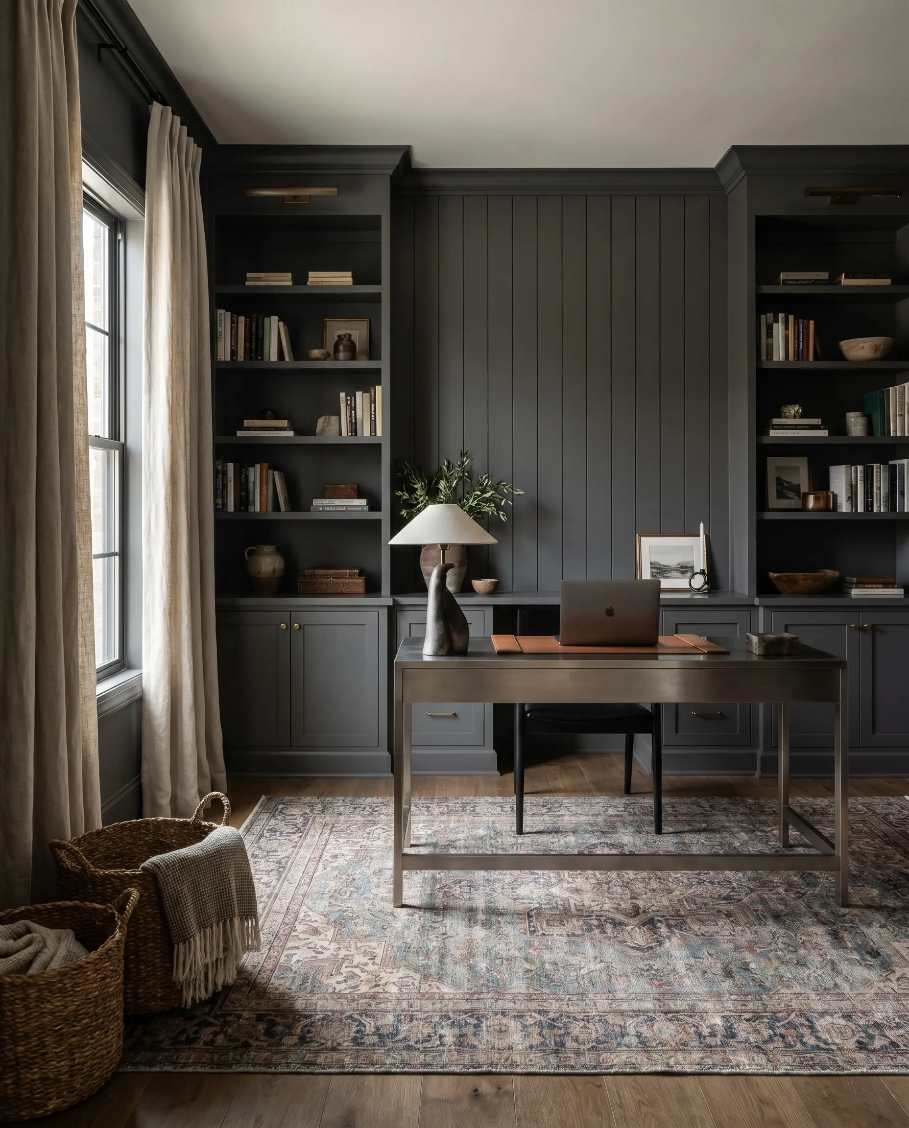
In a dedicated workspace, Gray 2121-10 provides a profound sense of focus and structure. Applying this shade to custom built-in bookcases or a slatted wood accent wall creates a sophisticated backdrop for remote work.
Balance the dark walls with a sleek metal console desk and a vintage, faded rug to inject personality into the room. The key is texture: incorporate woven baskets and linen window treatments to ensure the dark office feels inspiring rather than restrictive.
Media Rooms
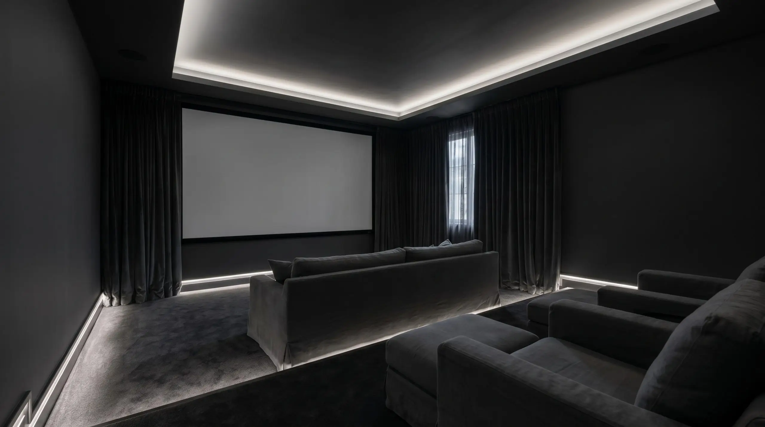
This highly light-absorbent paint is the ultimate functional choice for a dedicated media room or home theater. By painting both the walls and the ceiling in this pure neutral, you drastically reduce ambient light reflection and screen glare.
Furnish the space with low-profile, slipcovered seating and thick, blackout drapery to maximize the cinematic experience. The dark, seamless envelope allows the screen to pop against the pure neutral background.
Coordinating Palettes for Benjamin Moore Gray
This pure charcoal requires intentional contrast to truly shine, demanding either razor-sharp white boundaries to emphasize its modern edge or muted tonal bleeds to create a seamless, enveloping shadow.
Tailored Trim and Baseboards
Tactile Materials and Hardware Finishes
Secondary Palette Selections
Curated Designer Mood Boards
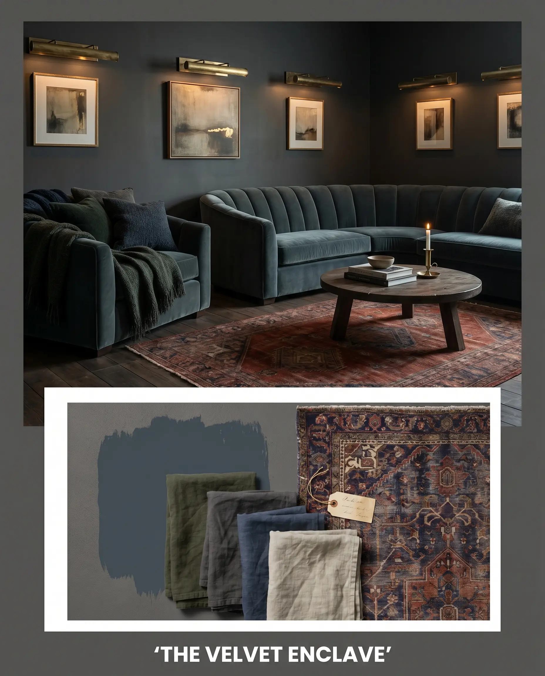
The Velvet Enclave This aesthetic layers the dense charcoal foundation with the dramatic depth of Hague Blue to create a highly saturated, enveloping experience. Weave in thick washed linen drapery and unlacquered brass picture lights to bounce warm, metallic reflections around the room. The styling relies on low-profile, channel-tufted seating and curated vintage rugs to make the dark, moody atmosphere feel incredibly plush and inviting.
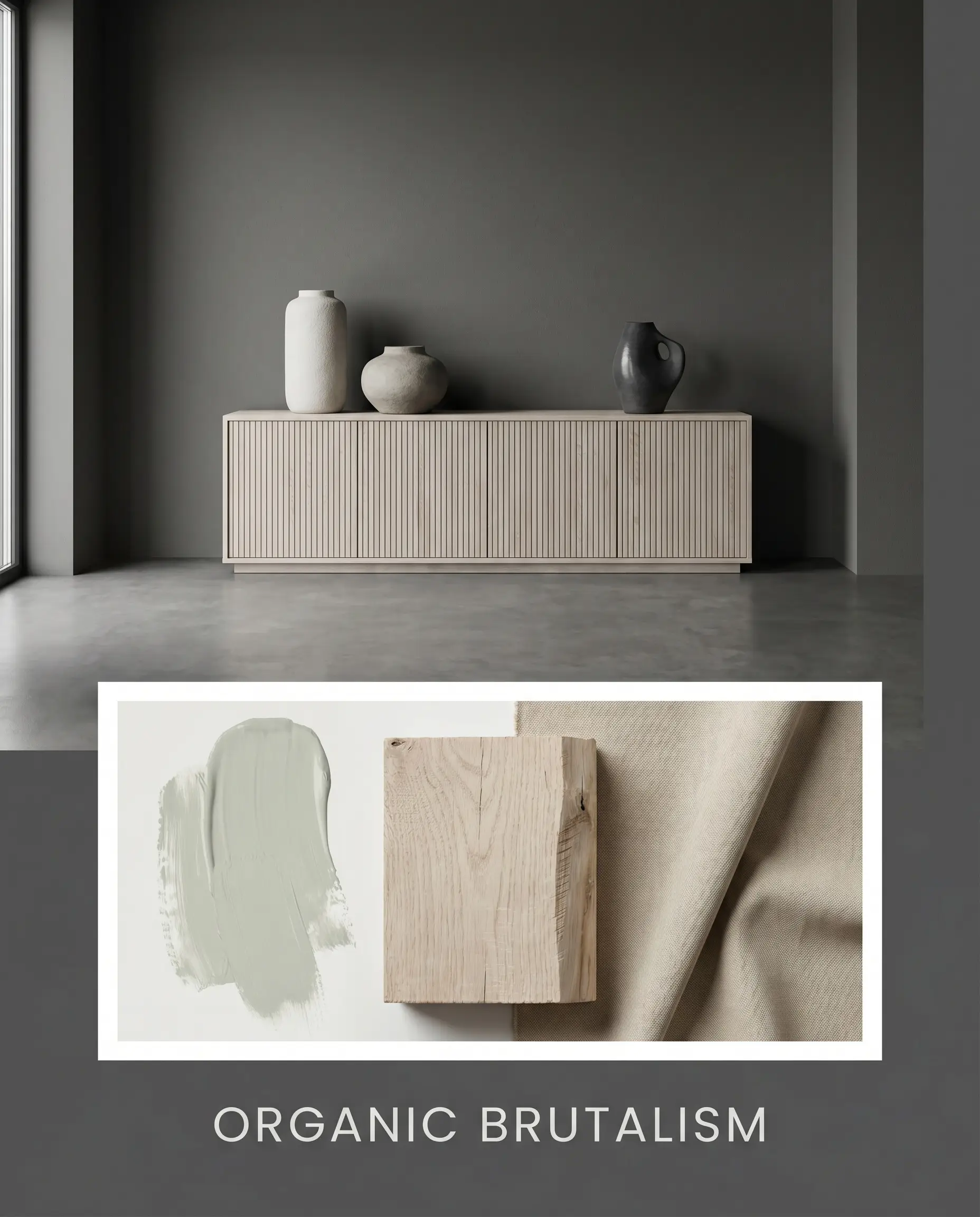
Organic Brutalism Stripping away excess, this approach pairs the dark architectural finish with raw, textural elements like fluted bleached oak and oversized minimalist ceramics. The contrast between the pale wood and the dark walls establishes a striking visual tension that feels both grounded and modern. Incorporating soft, misty accents of Sea Salt through matte canvas art prevents the stark contrast from feeling cold.
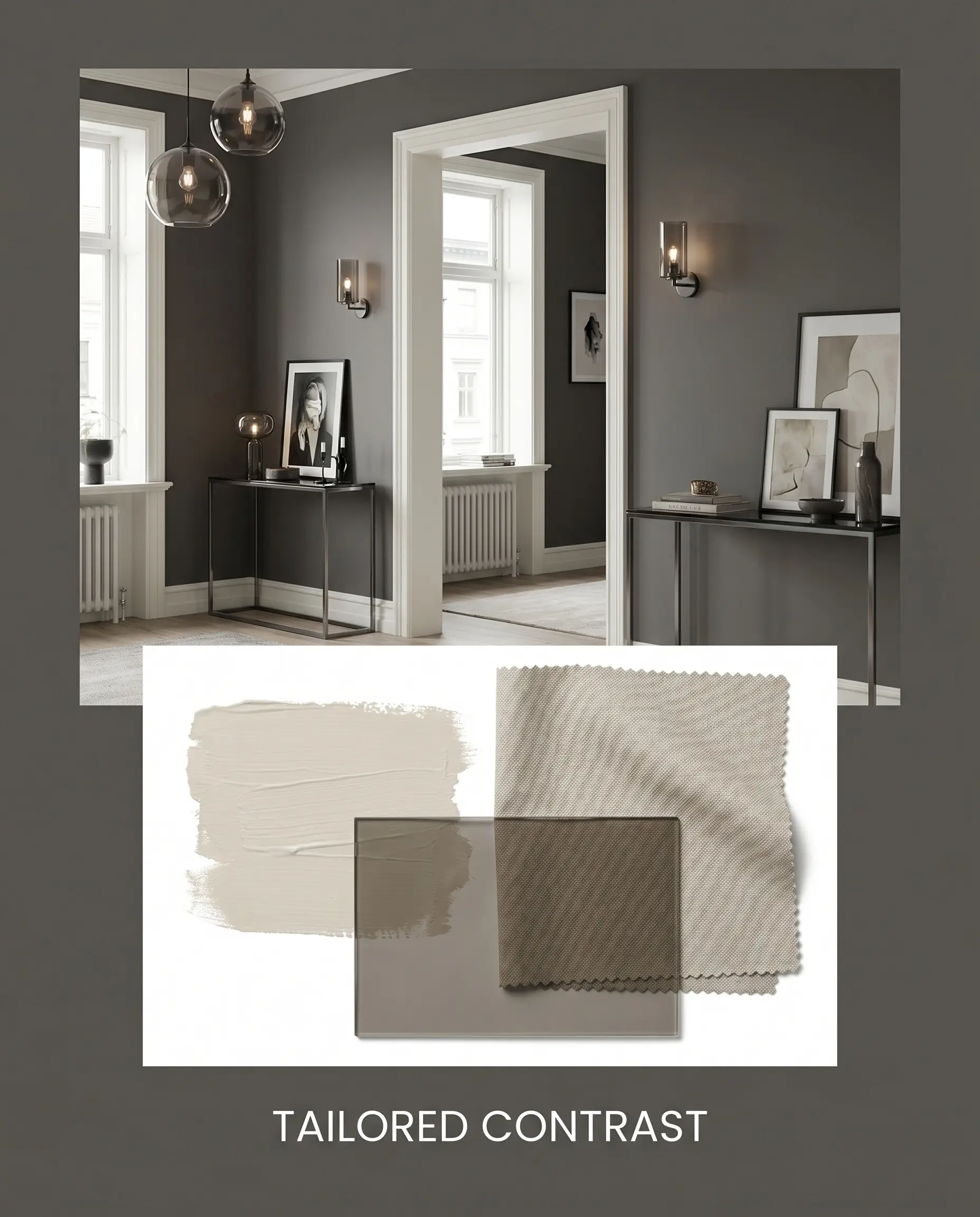
Tailored Contrast An exercise in crisp, transitional styling, this palette relies on the razor-sharp boundaries created by Chantilly Lace trim. Introduce smoked glass fixtures and sleek metal consoles to emphasize the modern edge of the charcoal base. Soften the rigid architecture with slipcovered seating in Classic Gray, ensuring the space remains comfortable and exceptionally chic.
Comparing Benjamin Moore Gray Against Alternative Charcoals
While a pure neutral is incredibly versatile, certain architectural styles or specific lighting exposures demand a charcoal with a distinct, deliberate undertone. If your room feels too stark or lacks natural warmth, you may need to pivot to a shade that carries a subtle color bias to achieve the right atmosphere.
Benjamin Moore Gray 2121-10 vs. Benjamin Moore Kendall Charcoal HC-166
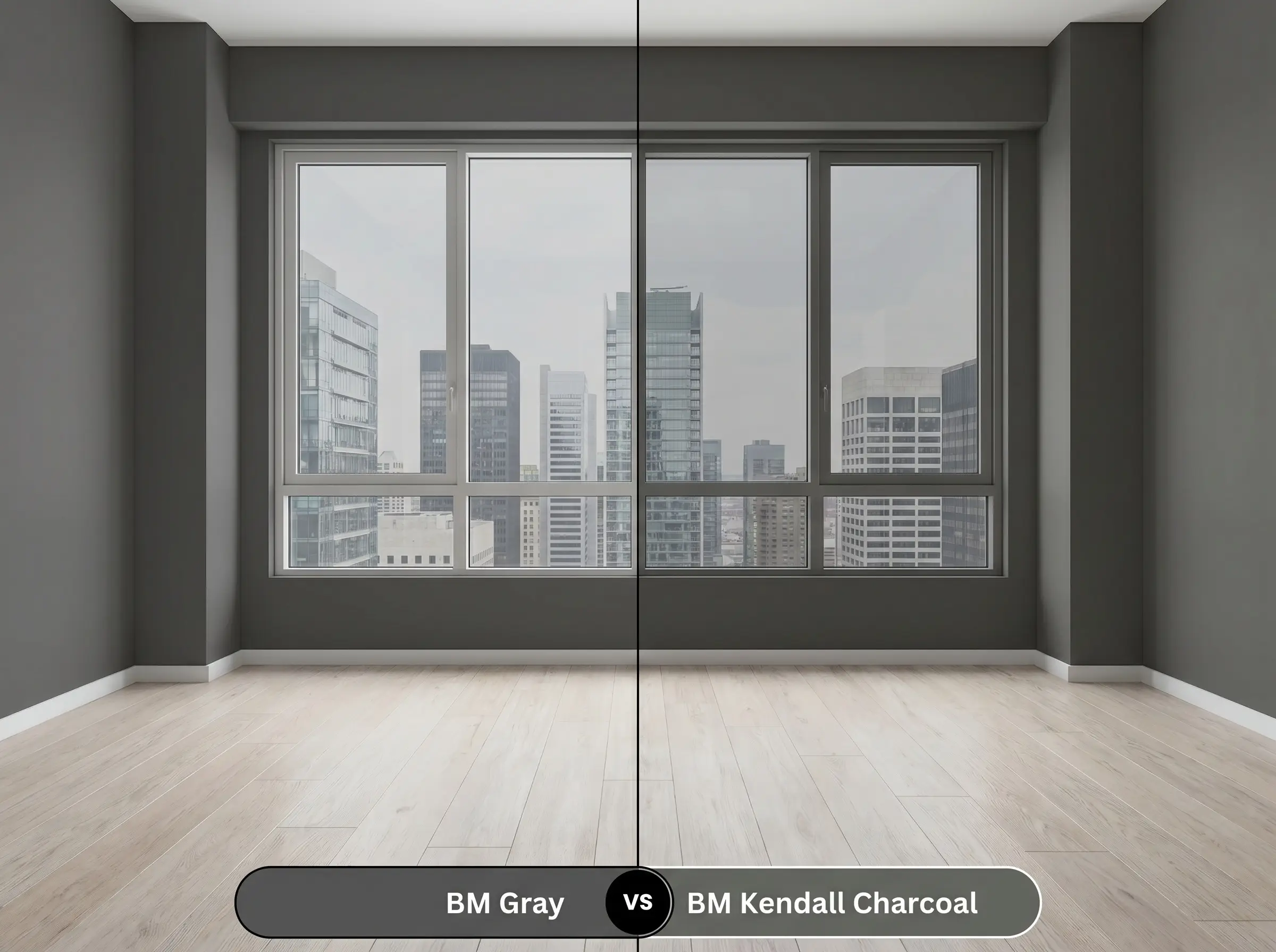
If you are designing a space with abundant cool, north-facing light, Gray 2121-10 can sometimes pull slightly icy. Then, Kendall Charcoal becomes the superior choice, as its distinct olive-green undertone injects a layer of earthy warmth that beautifully neutralizes chilly daylight. However, if your goal is a stark, modern aesthetic without any green interference, stick with the pure neutral.
Benjamin Moore Gray 2121-10 vs. Sherwin-Williams Cyberspace SW 7076
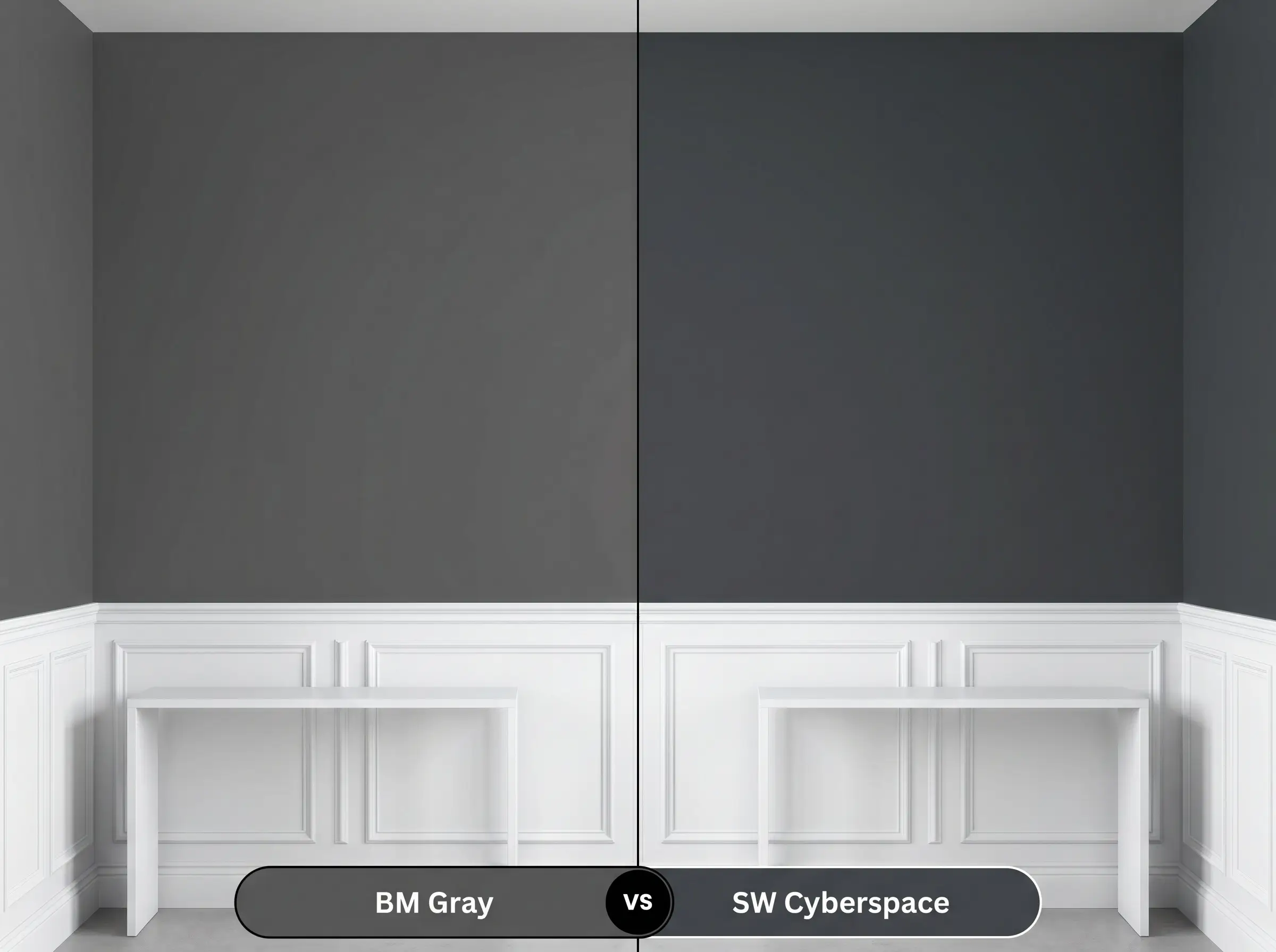
If your design requires a dark neutral that actively participates in a cool-toned palette, then Cyberspace is the answer. It carries a profound, undeniable navy blue undertone that completely changes its character, making it feel like a rich, stormy night sky. In contrast, Gray 2121-10 remains completely impartial, offering a flat, shadow-like depth that never leans into blue territory.
Benjamin Moore Gray 2121-10 vs. Benjamin Moore Iron Mountain 2134-30
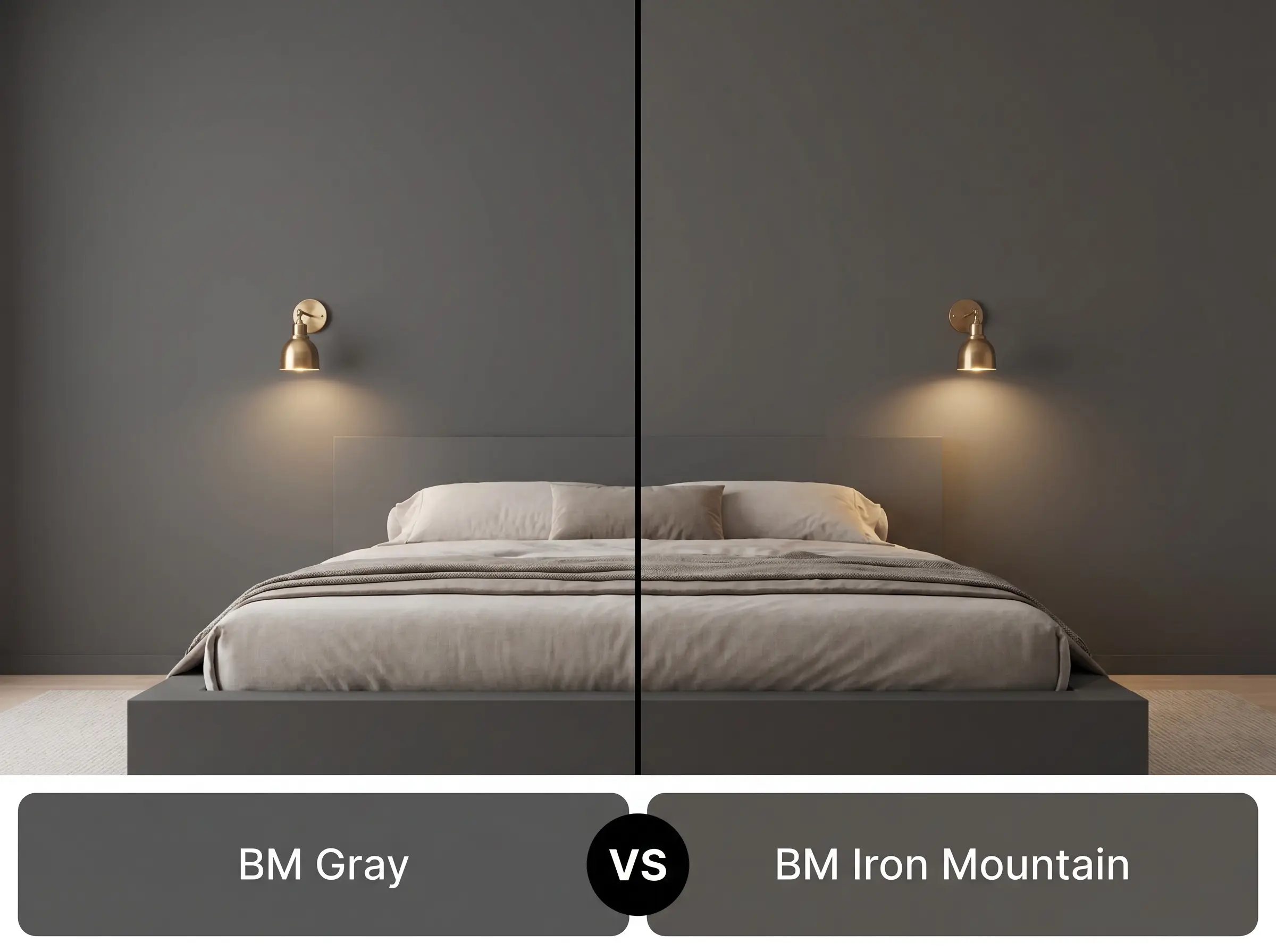
If you want the drama of a dark hue but fear a room feeling too severe, Iron Mountain offers a softer, more approachable alternative. It features a beautifully complex, warm brown undertone that makes the charcoal feel slightly aged and incredibly inviting. Choose Gray 2121-10 only when you need a crisp, uncompromised, and strictly achromatic foundation.
Exploring Similar Shades and Cross-Brand Matches
Finding the exact right depth of a dark neutral often requires subtle tweaking. Whether you need a slightly lighter wash of shadow for a dim hallway or a direct match from a different paint supplier, these alternatives offer excellent flexibility.
Same-Brand Alternatives
Rival Brand Equivalents
Real-World Execution for the Perfect Charcoal
Translating a dark, highly saturated architectural finish from a paint swatch to a physical wall requires precise execution.
The Dynamic Sheen Strategy
Primer Requirements
A high-quality, deep gray tinted primer is absolutely mandatory when applying this level of pigment. Attempting to roll this pure charcoal over a standard white primer will result in a chalky, uneven finish that completely ruins the intended depth.
Coverage and Flashing Warnings
Even with a tinted primer, expect to apply a minimum of two generous coats to achieve full, opaque saturation.
Always maintain a wet edge while rolling dark colors. If the paint begins to dry unevenly during application, you will experience “flashing,” leaving highly visible, permanent roller streaks that disrupt the smooth, moody aesthetic.
Hackrea Design Secret (The Roller Technique)
Frequently Asked Questions
Because it lacks natural light to reflect, this pure charcoal will read incredibly dark and dense in a windowless bathroom. It is highly effective when paired with bright 3000K sconces and prominently veined marble to create a dramatic, jewelry-box effect.
Painting a ceiling this dark is a brilliant architectural trick that immediately absorbs light and visually brings the ceiling down, making oversized rooms feel much more intimate. However, a flat finish is crucial to ensure the existing texture does not catch unwanted glare.
A deep gray tinted primer is essential for this specific depth of color. Skipping this step forces you to apply three or four coats of expensive topcoat and often results in a patchy, uneven finish.
A high-gloss sheen completely transforms the behavior of this paint, turning the flat shadow into a highly reflective, mirror-like surface. This finish intensifies the color and adds a layer of premium, formal sophistication, provided the door itself is perfectly smooth.
Final Verdict & Expert Warnings
Benjamin Moore Gray 2121-10 is the ultimate architectural tool for homeowners seeking profound contrast without the uncompromising severity of stark black. Its pure, achromatic structure makes it incredibly versatile, effortlessly transitioning from crisp, modern industrial spaces to plush, transitional dining rooms. This paint is perfect for those who want to establish a strong, moody aesthetic that relies on lighting and tactile materials to dictate the room’s energy.
While this pure neutral is a phenomenal design asset, it is completely unforgiving in spaces that lack both natural light and a deliberate artificial lighting plan. If you apply this dense charcoal to a dimly lit, north-facing room with only a single overhead fixture, the paint will immediately flatten out, making the space feel incredibly gloomy and restrictive rather than intentionally moody. Furthermore, pairing this shade with large expanses of cool-toned, gray wood-look flooring creates a visually exhausting, monochromatic trap that strips all life from the room. You must intentionally introduce warm metals, varied textiles, or pale, natural woods to ensure the dark walls feel curated and alive.
Clash Warning (The Low-Light Restraint)