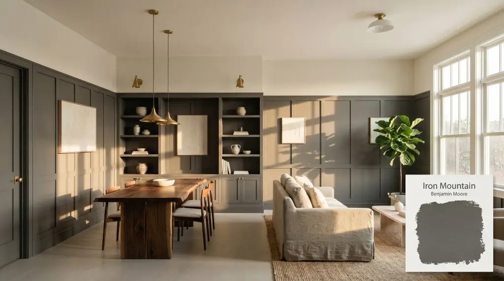
Iron Mountain 2134-30
Benjamin MooreBenjamin Moore Iron Mountain (2134-30) is a warm, deeply saturated soft black or charcoal gray. With an LRV of 10.96, it absorbs significant light while its subtle brown and bronze undertones prevent it from feeling stark or cold, making it incredibly versatile.
Paint Technical Profile
| Color ID / SKU | 2134-30 |
| HEX Code | #575553 |
| Light Reflectance (LRV) | 10.96 |
| Use | Interior, Exterior |
| Best Exposures | South-Facing, West-Facing, or Well-Lit North-Facing |
| Best For | Exteriors, Kitchen Cabinets, Accent Walls, Interior Doors, Trim |
Benjamin Moore Iron Mountain 2134-30: The Architectural Power of a Bronze-Tinted Charcoal
True black paint can often feel like a visual void, absorbing the energy of a room and leaving behind a stark, unforgiving perimeter. Benjamin Moore Iron Mountain 2134-30 offers a brilliant alternative, acting as a rich, earthy shadow rather than a total eclipse.
This moody neutral delivers all the high-contrast drama of a dark hue, but its complex color structure infuses the space with a subtle, enveloping warmth. Thanks to Benjamin Moore’s proprietary Gennex Color Technology, the pigment retains its incredible richness without fading into a flat, sterile gray.
Whether you are redefining a suburban exterior or wrapping an intimate study in saturated color, this shade provides profound visual weight while remaining effortlessly inviting.
Benjamin Moore Iron Mountain: Undertones & LRV Profile
When homeowners ask if Benjamin Moore Iron Mountain is warm or cool, the answer is a definitive, undeniable warm. While it initially presents as a sophisticated soft black, its underlying chromatic profile is built on a foundation of earthy, heated tones. This underlying warmth is exactly what prevents the paint from feeling industrial or overly severe in a residential setting.
With a light reflectance value (LRV) of 10.96, this paint absorbs nearly 90% of the light it encounters. This means it will dramatically darken a room, yet it reflects just enough ambient light to maintain its charcoal identity. It successfully avoids feeling like a featureless cavern, allowing shadows and highlights to play beautifully across your walls.
The Chameleon Factor: Lighting this Warm Charcoal
Because this earthy cast relies on its hidden brown and bronze notes, the way you light the room will completely dictate its final personality.
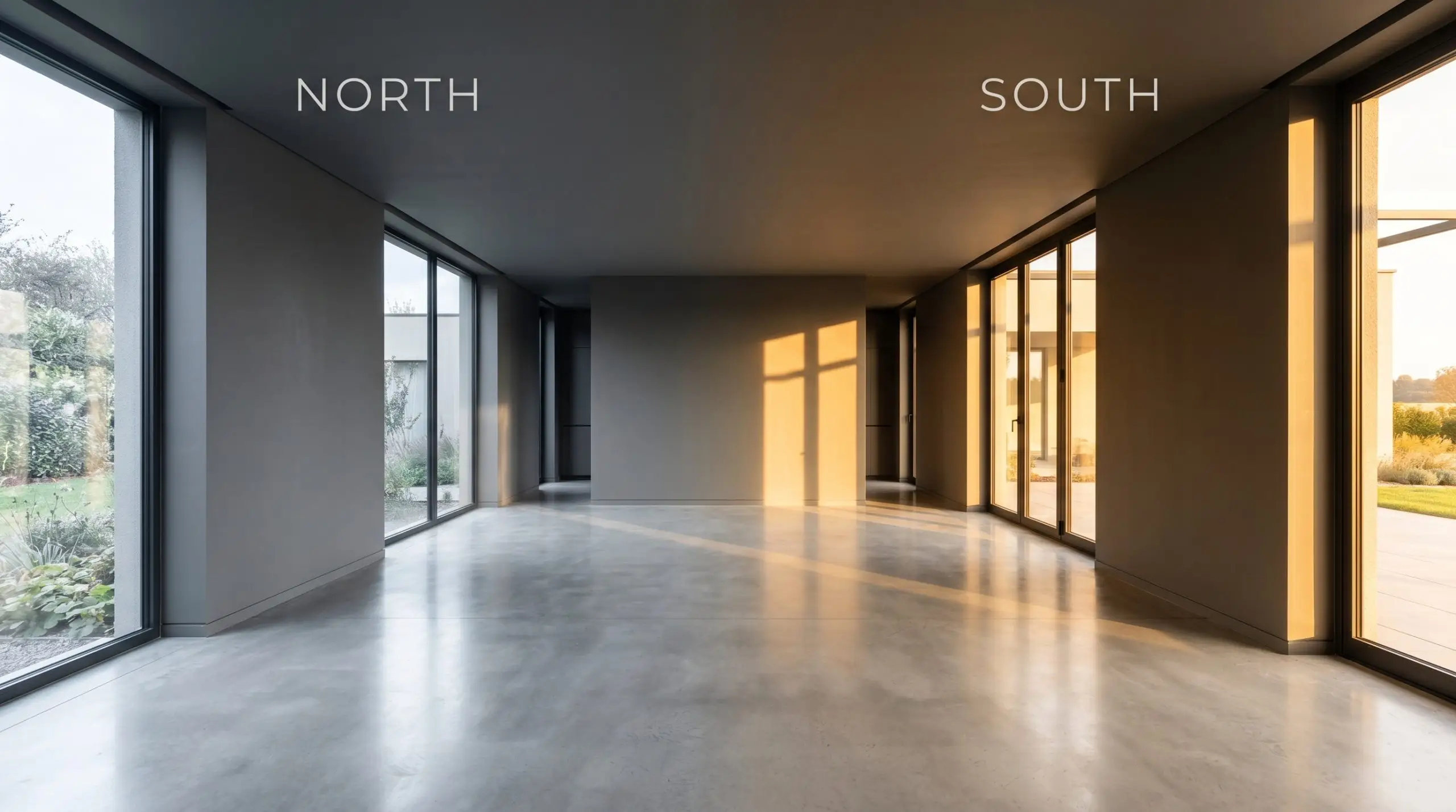
When using Iron Mountain 2134-30 as an exterior siding color, remember that full, direct sunlight strips away visual weight. On a bright, unshaded facade, this soft black will often read a full shade lighter, appearing as a medium-dark gray rather than a profound charcoal.
Hackrea Design Secret (The Exterior Washout)
Popular Applications for Iron Mountain
The brilliance of this bronze-tinted charcoal lies in its ability to scale effortlessly from a subtle architectural accent to a fully immersive room experience. Whether you are brushing it across a prominent exterior or wrapping an intimate study, this shade adapts beautifully to its surroundings.
Redefining Exterior Siding and Trim
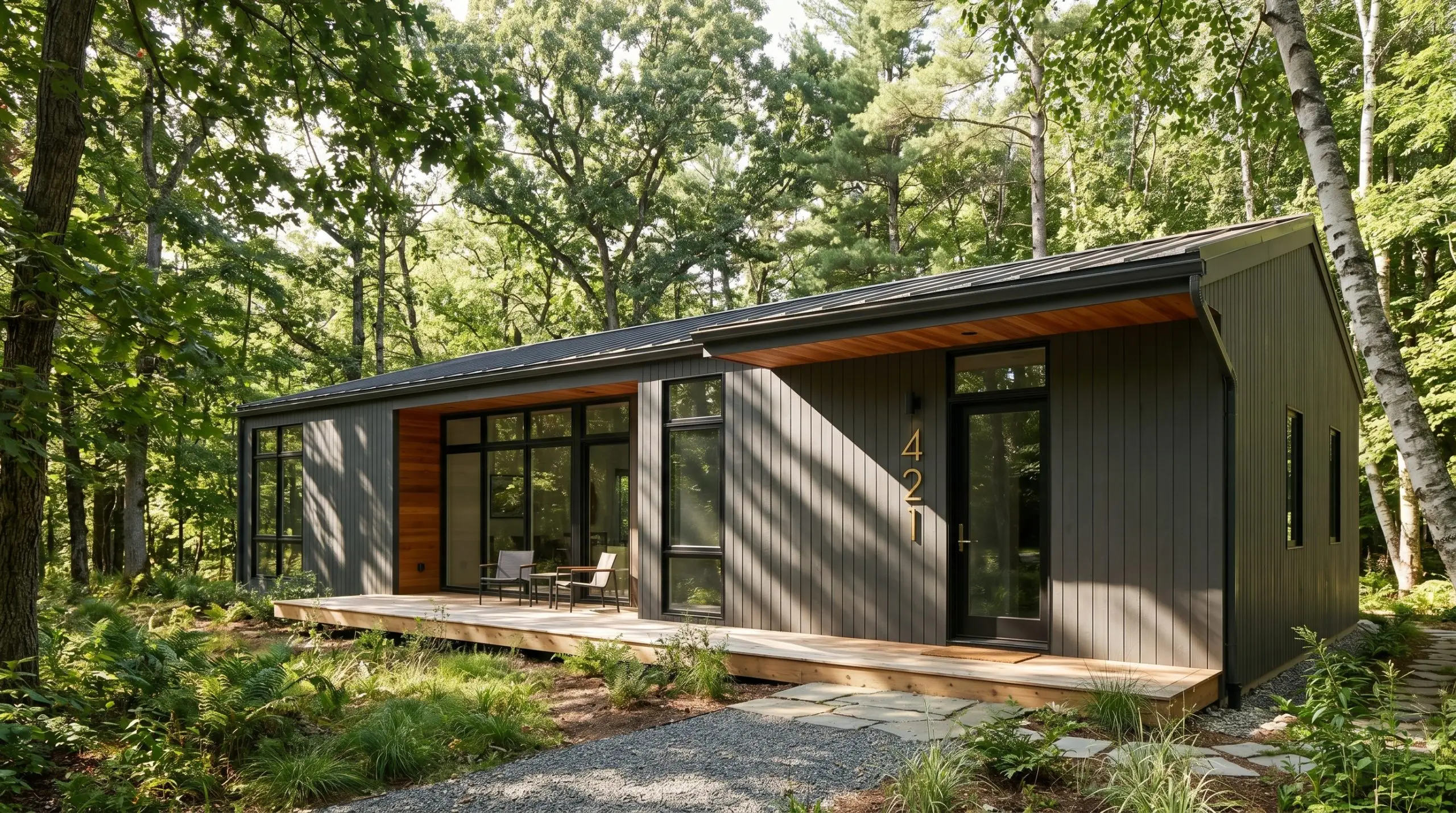
Swathing your home’s exterior in this saturated hue creates an immediate sense of established permanence. For a modern woodland aesthetic, pair it with natural cedar soffits and unlacquered brass house numbers to highlight the paint’s earthy cast.
If you prefer a crisp, European transitional look, use this soft black exclusively on the trim and window shutters against a creamy, warm white stucco facade. The contrast provides a tailored, high-end definition without the stark harshness of a pure jet black.
Elevating Kitchen Islands & Lower Cabinetry
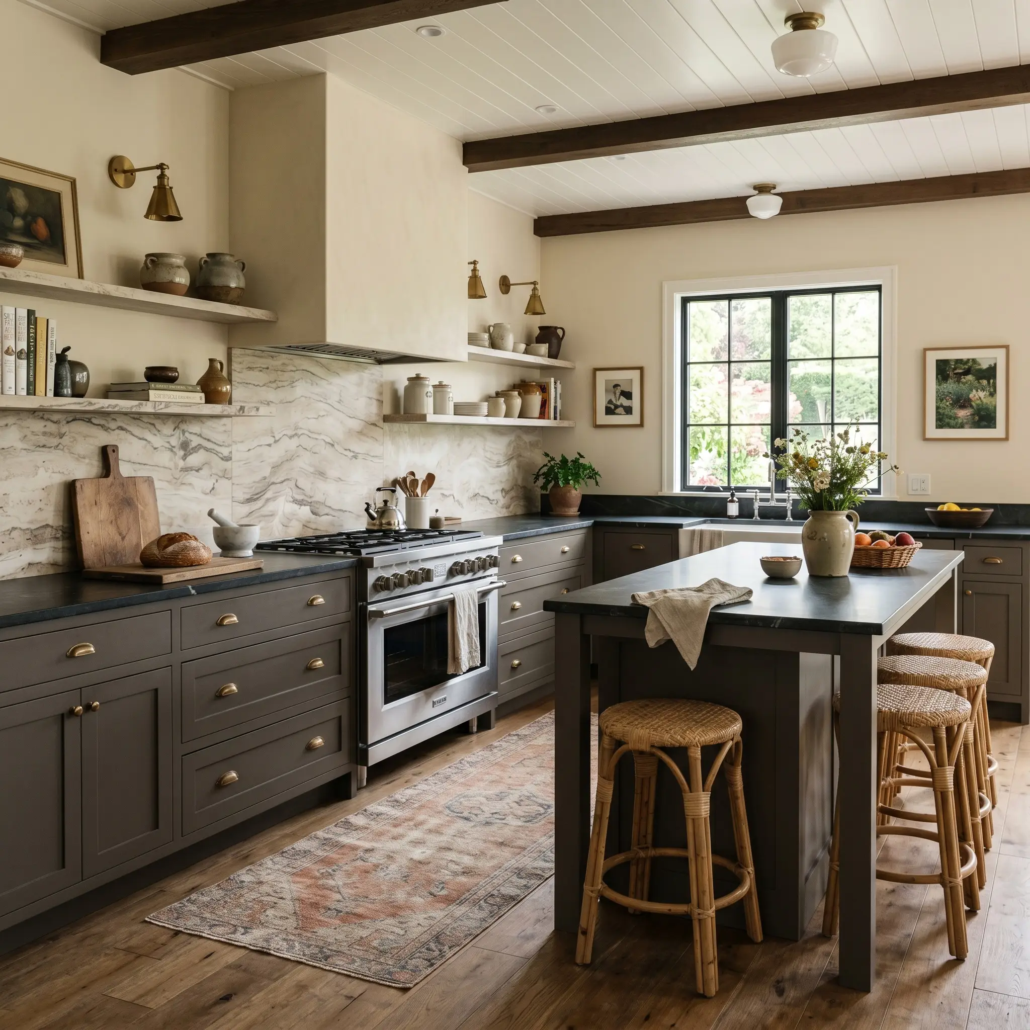
Applying this specific cabinetry hue to your lower units is a brilliant way to visually stabilize a large, airy kitchen without resorting to predictable navy blues. The hidden brown base harmonizes flawlessly with honed soapstone countertops and dramatically veined travertine backsplashes.
To balance the visual weight, keep the upper walls light and introduce woven rattan barstools or a faded Oushak runner for a layer of tactile warmth. This combination marries premium stone finishes with accessible, everyday textures for a perfectly curated high/low mix.
Immersive Home Offices & Libraries
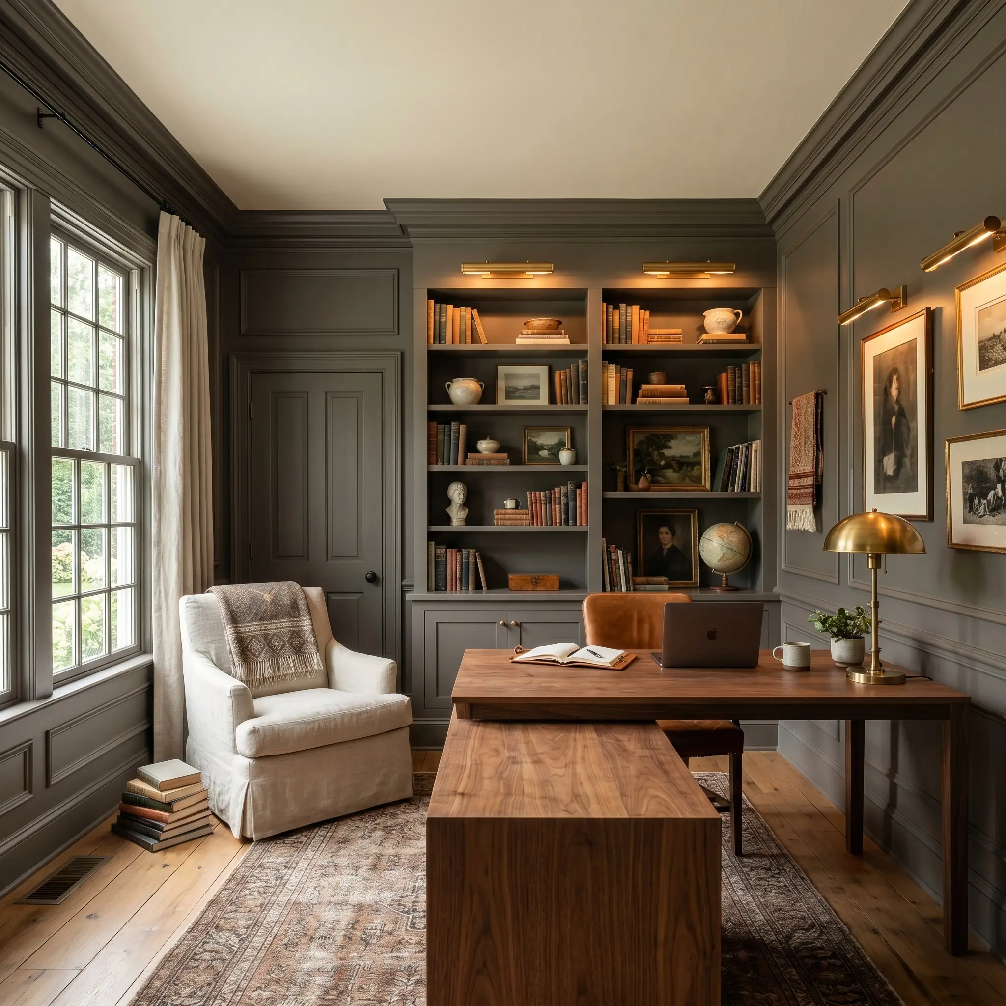
For a truly enveloping atmosphere, commit to color-drenching an entire home office—painting the walls, baseboards, and crown molding in the exact same finish. This continuous application erases the visual boundaries of the room, turning a standard spare bedroom into a sophisticated, focused retreat.
Style the space with a sleek walnut desk, a slipcovered washed linen reading chair, and antique brass picture lights to reflect a soft, golden glow against the dark walls.
If your library features ceilings lower than eight feet, avoid bringing this dark charcoal all the way overhead. Instead, paint the ceiling a complimentary warm greige to maintain the intimate mood while preventing the room from feeling visually oppressive.
Hackrea Pro-Tip (The Ceiling Strategy)
Accenting Interior Doors & Window Sashes
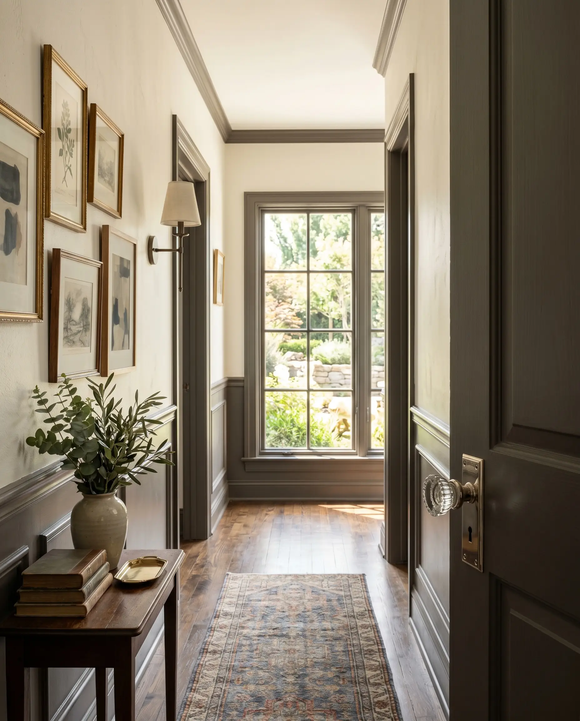
Coating your interior doors and window sashes in this saturated tone is a high-impact strategy that instantly elevates the perceived value of your home’s architecture. The dark framing draws the eye outward, acting like a matting around a photograph and making the view beyond the glass appear more vibrant.
Pair these dark doors with polished nickel hardware and reeded glass knobs to create a beautiful, high-end tension between the shadowy paint and the sparkling metal. It is a simple weekend update that permanently alters the flow and sophistication of a hallway or living space.
Modern Fireplace Surrounds & Focal Points
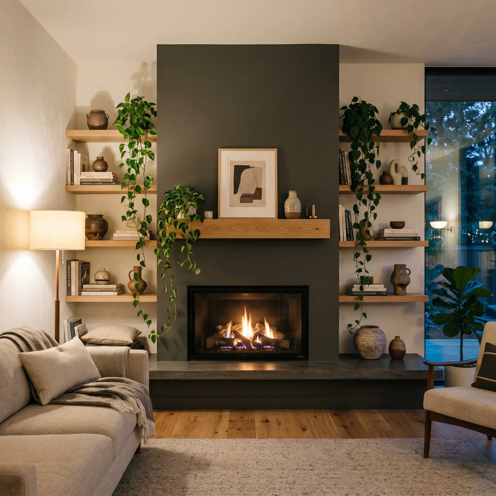
A fireplace surround painted in this rich hue commands attention, establishing a natural gathering point in an open-concept living area. The bronze undertone beautifully complements natural firelight, making the entire wall feel alive and dynamic during the evening hours.
To soften the contrast, flank the fireplace with floating white oak shelves. Display a curated mix of stacked art books, sculptural ceramics, and trailing ivy to bring organic life against the structural charcoal backdrop.
Building a Cohesive Palette with Iron Mountain
This bronze-tinted charcoal demands surrounding colors and materials that either share its earthy DNA or offer a stark, luminous contrast to define its edges. Rather than fighting its underlying warmth, the most successful designs lean into it, creating an environment that feels intentionally rich. The pigment requires thoughtful pairings to prevent it from absorbing all the energy in the room.
Ideal Trim and Baseboard Combinations
When framing this dark neutral, Sherwin-Williams Alabaster SW 7008 provides a beautifully soft, creamy boundary. The slight warmth in this off-white prevents a jarring, sterile clash, ensuring the transition between dark walls and light trim feels organic.
If you prefer a more seamless, atmospheric vibe, Farrow & Ball School House White No. 291 is an exceptional choice. This muted, slightly shadowy shade blurs the crisp architectural lines, allowing the saturated wall color to gently bleed into the trim for a highly sophisticated finish.
Tactile Material Integrations
To truly elevate this moody neutral, you must introduce textures that communicate with its specific color structure.
Harmonizing Paint Matches
Curating the Vibe: Designer Palettes
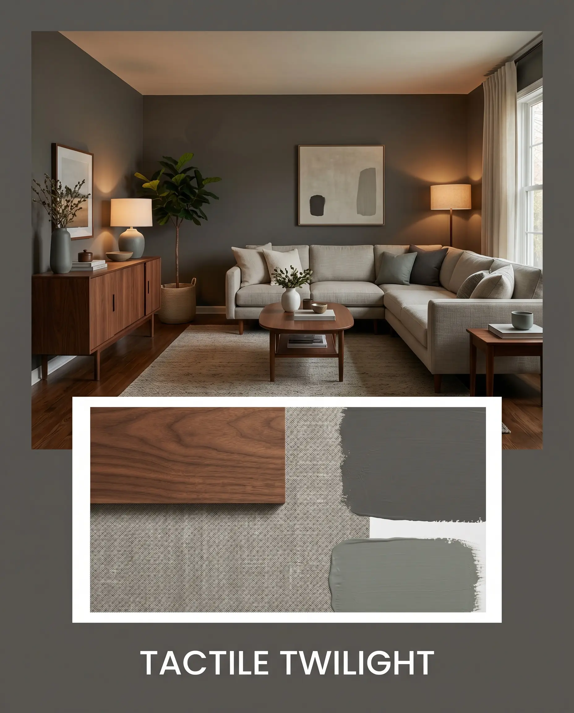
Tactile Twilight This palette thrives on the tension between profound depth and relaxed, everyday comfort. By wrapping the walls in Benjamin Moore Iron Mountain, you establish a secure, enveloping boundary that feels instantly calming. Layer in a track-arm sectional upholstered in washed slub cotton, a sleek walnut mid-century credenza, and subtle accents of Sherwin-Williams Retreat to bring a breath of organic life into the shadowy space. The result is an effortlessly curated environment that feels both protective and highly styled.
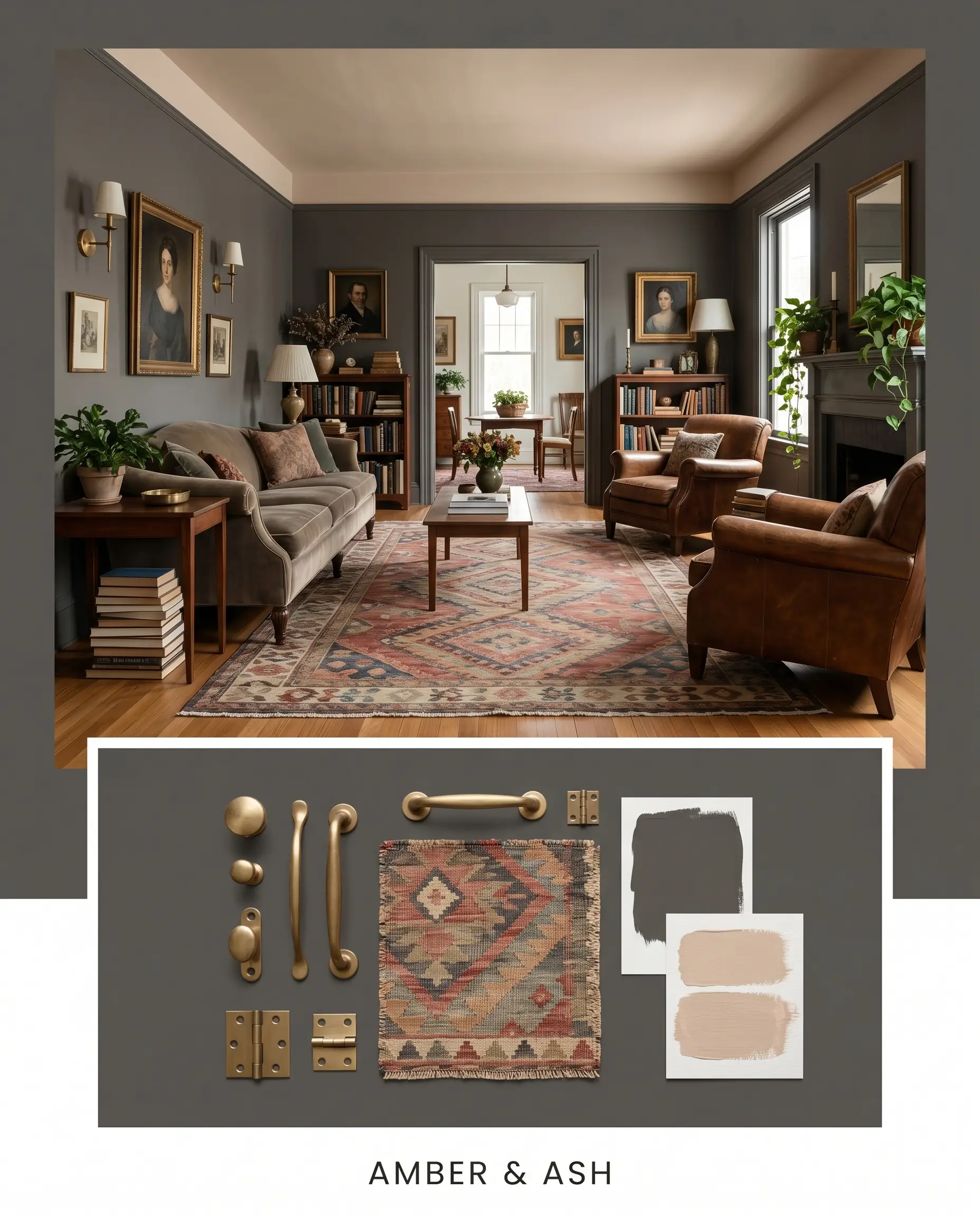
Amber & Ash Designed for the homeowner who appreciates a touch of romantic drama, this combination uses warmth to completely transform the dark architectural finish. Anchor the room with the soft black paint, but introduce Farrow & Ball Setting Plaster on the ceiling or surrounding trim to cast a flattering, rosy glow over the space. Add unlacquered brass wall sconces, vintage portraiture, and a faded geometric kilim rug to amplify the historic, collected energy. The metallic finishes will catch the ambient light, bouncing a beautiful golden reflection against the charcoal backdrop.
Head-to-Head Comparisons
Choosing the right dark neutral often comes down to the specific lighting exposure and the existing hard finishes in your home. If your room lacks natural light or your flooring leans particularly cool, you might need to pivot to a rival shade that behaves differently under pressure. The following comparisons will help you finalize your decision based on strict color theory.
Benjamin Moore Iron Mountain vs. Benjamin Moore Kendall Charcoal HC-166
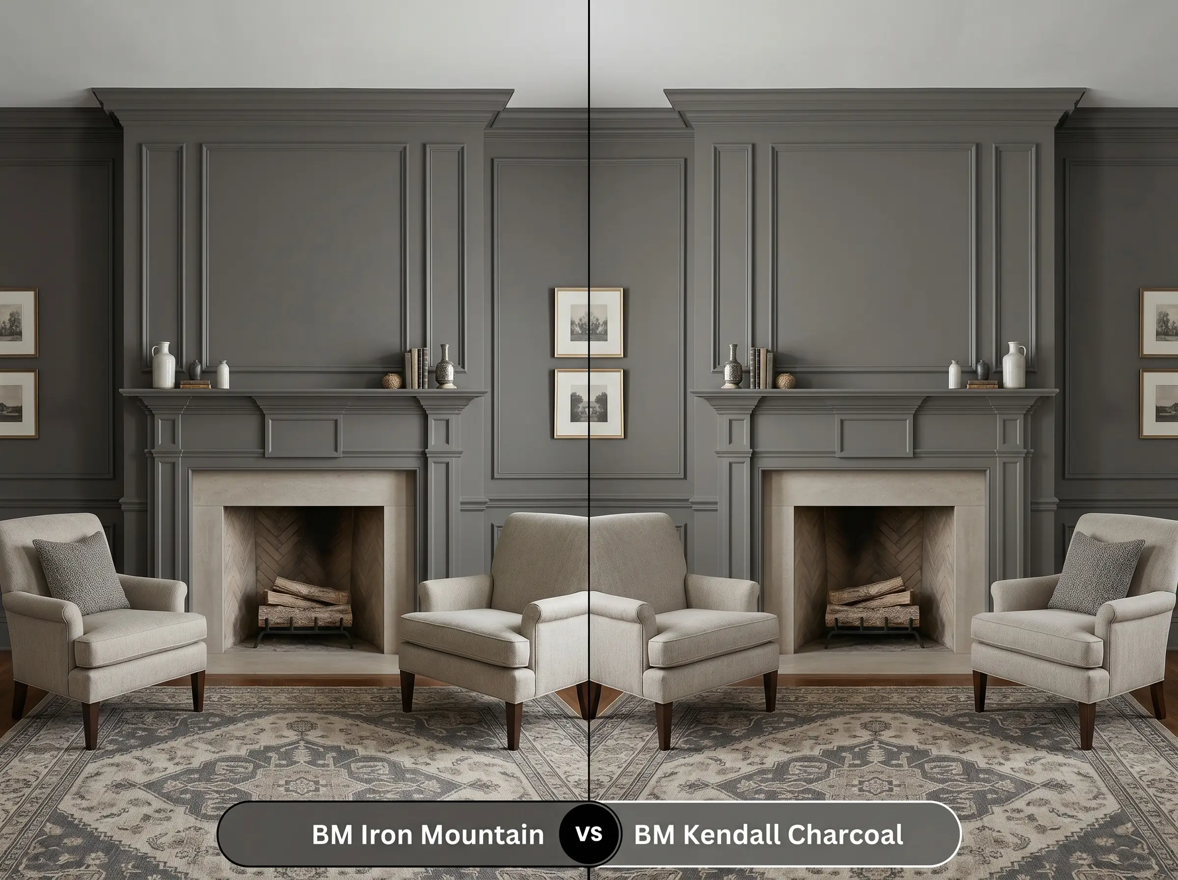
Kendall Charcoal is noticeably lighter and leans heavily into a distinct green undertone, whereas Iron Mountain 2134-30 is rooted in brown. If your room features cool-toned stone fireplaces or receives chilly, north-facing light, Kendall Charcoal provides a more traditional, slightly crisper gray finish. However, if you want a softer, more organic shadow, the bronze warmth of the 2134-30 formulation is the superior choice.
Benjamin Moore Iron Mountain vs. Sherwin-Williams Iron Ore SW 7069
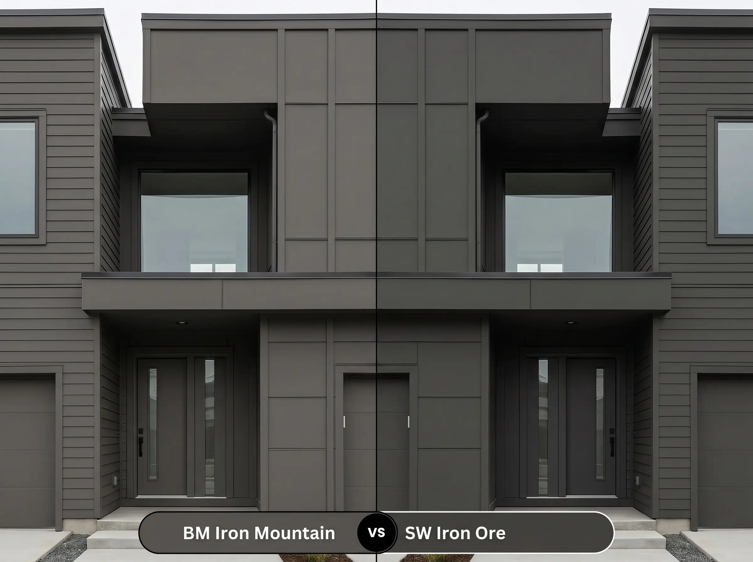
With an incredibly low light reflectance value, Iron Ore reads much closer to a true, stark black on the wall. If you want a sharp, modern contrast for sleek exterior styling without any distinct brown warmth, Iron Ore delivers a cooler, more absolute edge. Conversely, if you fear a true black will feel too harsh or industrial, the earthy cast of Benjamin Moore’s version provides a much gentler transition.
Benjamin Moore Iron Mountain vs. Benjamin Moore Wrought Iron 2124-10
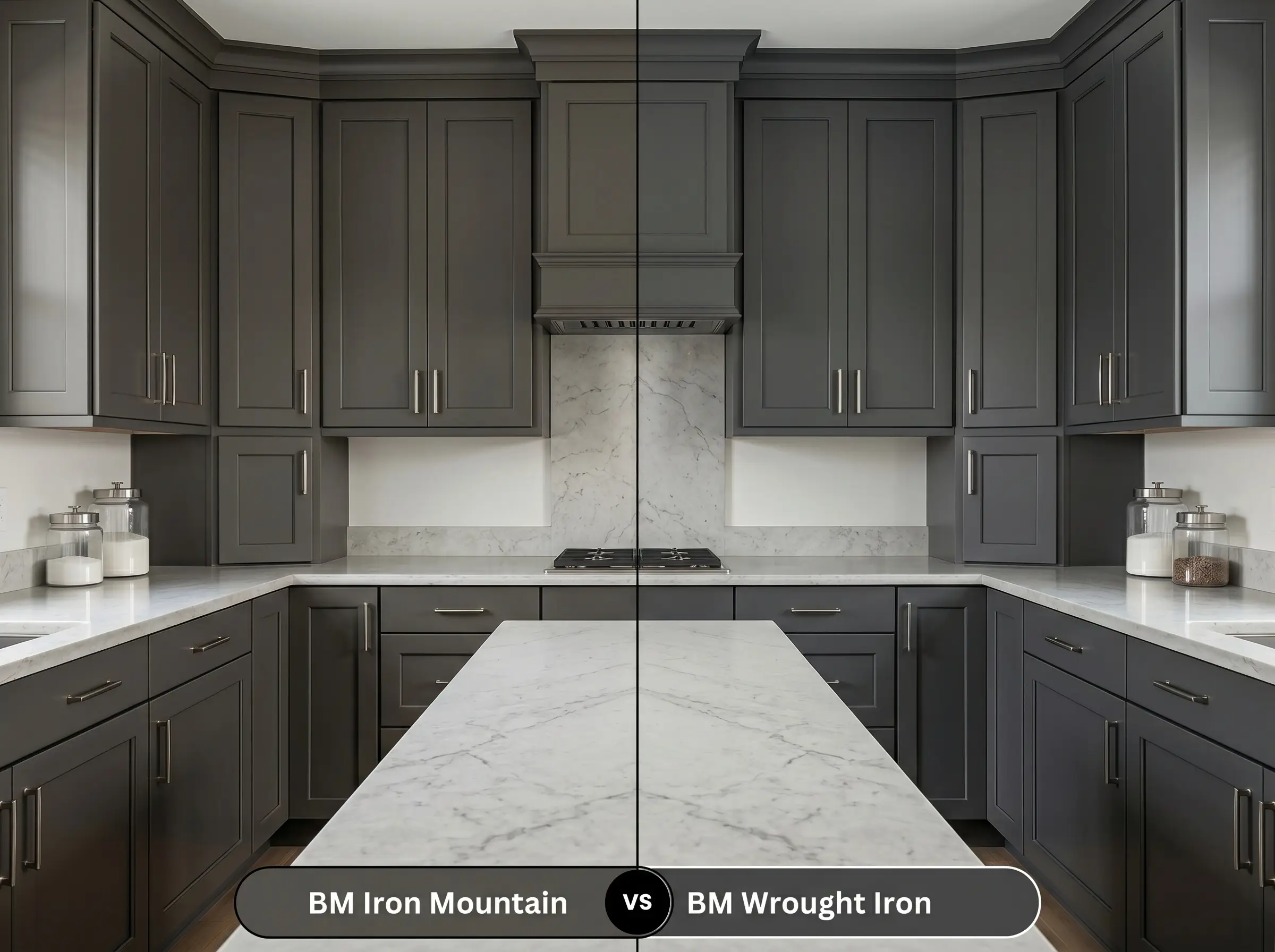
While both paints share a similar saturated depth, Wrought Iron carries a subtle navy-blue undercurrent instead of a heated bronze base. If you are pairing the paint with crisp white marble countertops or polished chrome hardware, Wrought Iron will feel significantly more tailored and cohesive. You should stick with the brown-based charcoal only if your design plan includes warm woods, brass, or terracotta tiles.
Alternative Options for this Moody Neutral
Sometimes a color is almost perfect, but your specific lighting requires a slight shift in depth or a different underlying tone to truly harmonize with your home. If you love the concept of a soft black but need a minor adjustment, here are the closest alternatives to explore.
Same-Brand Alternatives
Cross-Brand Matches
Executing Your Dark Architectural Finish
Transitioning from color theory to the physical act of rolling paint requires a strategic approach, especially with highly saturated hues. Dark colors are notoriously unforgiving of rushed prep work and improper sheen selection.
To ensure this deep pigment develops properly without looking muddy, you must use a deep-tinted gray primer before applying the topcoat.
Expect to apply at least two generous coats to achieve full opacity and true color representation.
When rolling deep charcoals, maintain a strict “wet edge” and avoid over-rolling partially dried sections. If you rush the application, you will experience “flashing”—visible, uneven roller marks that catch the light and ruin the seamless finish. Take your time, apply generous coats, and let the paint level itself naturally.
Clash Warning (The Flashing Phenomenon)
Frequently Asked Questions
Direct, intense sunlight will absolutely amplify its hidden brown base, making it read warmer and slightly lighter than an interior swatch. If your home faces south or west with no tree cover, expect a rich, earthy charcoal rather than a stark, modern black.
Because it relies on ambient light to showcase its bronze nuances, a windowless space will flatten the color into a very dark, immersive charcoal. To prevent it from feeling claustrophobic, use warm LED sconce lighting (2700K) to artificially pull the warmth back out of the pigment.
Painting a towering ceiling in this saturated hue is a brilliant architectural trick to visually pull the ceiling down, making a vast space feel much more intimate and grounded. Just ensure you carry the color down onto the upper trim or crown molding to create a seamless, intentional transition.
The orange and red tones in traditional brick will physically draw out the earthy, brown cast within the paint. This creates a highly cohesive, warm exterior palette that feels established and historic, rather than creating a harsh, modern clash.
The Definitive Ruling on Iron Mountain
Benjamin Moore Iron Mountain 2134-30 is a phenomenal design tool for homeowners who crave the high-contrast drama of a dark neutral but want to maintain a welcoming, organic atmosphere. Its true brilliance lies in its versatility; it serves just as beautifully as a grounding cabinetry hue in an organic modern kitchen as it does wrapping an immersive, moody home office. This paint is perfect for those utilizing the high/low mix, as its rich, bronze-tinted depth instantly elevates accessible textiles and standard architectural features, making the entire room feel intentionally curated.
However, this earthy cast is not suited for every environment. If your home is heavily styled with stark, icy white LED lighting, cool blue-gray furnishings, or highly reflective chrome, the brown base within this soft black will visually clash, often appearing muddy or dirty rather than sophisticated. To guarantee success, you must surround this shade with warm woods, tactile fabrics, and lighting that respects its beautifully complex, heated core.
Closest Cross-Brand Equivalents
The absolute closest scientific color matches for Iron Mountain across top paint brands.