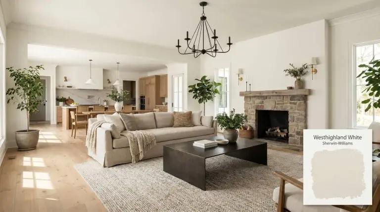
Westhighland White SW 7566
Sherwin-WilliamsSherwin-Williams Westhighland White (SW 7566) is a bright, warm off-white with a Light Reflectance Value of 86. It features a soft, creamy color structure with subtle yellow undertones, providing a luminous and inviting glow without appearing overly yellow in balanced lighting.
The Golden Hour Glow: Translating Sherwin-Williams Westhighland White Into Everyday Living
Finding a white paint that feels genuinely welcoming without crossing into butter-yellow territory is one of the most common hurdles in residential design.
Sherwin-Williams Westhighland White steps into this exact void, offering a remarkably soft, creamy architectural finish that instantly warms up a room. It acts as a gentle filter for your home, capturing both natural and artificial light to create a consistently inviting atmosphere.
This shade proves that you do not need stark, hospital-grade whites to make a space feel clean and expansive. By introducing a subtle layer of warmth, it turns bare walls into a tactile, glowing backdrop for the rest of your materials.
Sherwin-Williams Westhighland White: Temperature, Undertones & LRV
Homeowners constantly ask if this specific shade leans warm or cool once it actually goes up on the wall. Westhighland White is undeniably a warm off-white, structured specifically to bring a soft, sunlit energy into your home without overpowering your decor.
With a light reflectance value (LRV) of 86, Sherwin-Williams #F3EEE3 is highly reflective and absorbs very little light. This sits in the functional sweet spot of being bright but not blinding. It bounces ambient illumination efficiently around the room while maintaining its soft chromatic profile, ensuring your walls never look sterile or flat.
You can apply wallpapers, paints, etc. on walls and see how they look in various interiors.

Lighting Shifts & The Chameleon Factor
Because of its specific color structure, this paint acts like a subtle mood ring, shifting its temperature based on the sun’s trajectory and your home’s bulb choices.
Designing with Westhighland White: Popular Applications
Translating this warm off-white from a tiny paper swatch into a full-scale room requires pairing its creamy base with the right materials, fabrics, and architectural details.
Open-Concept Living Rooms
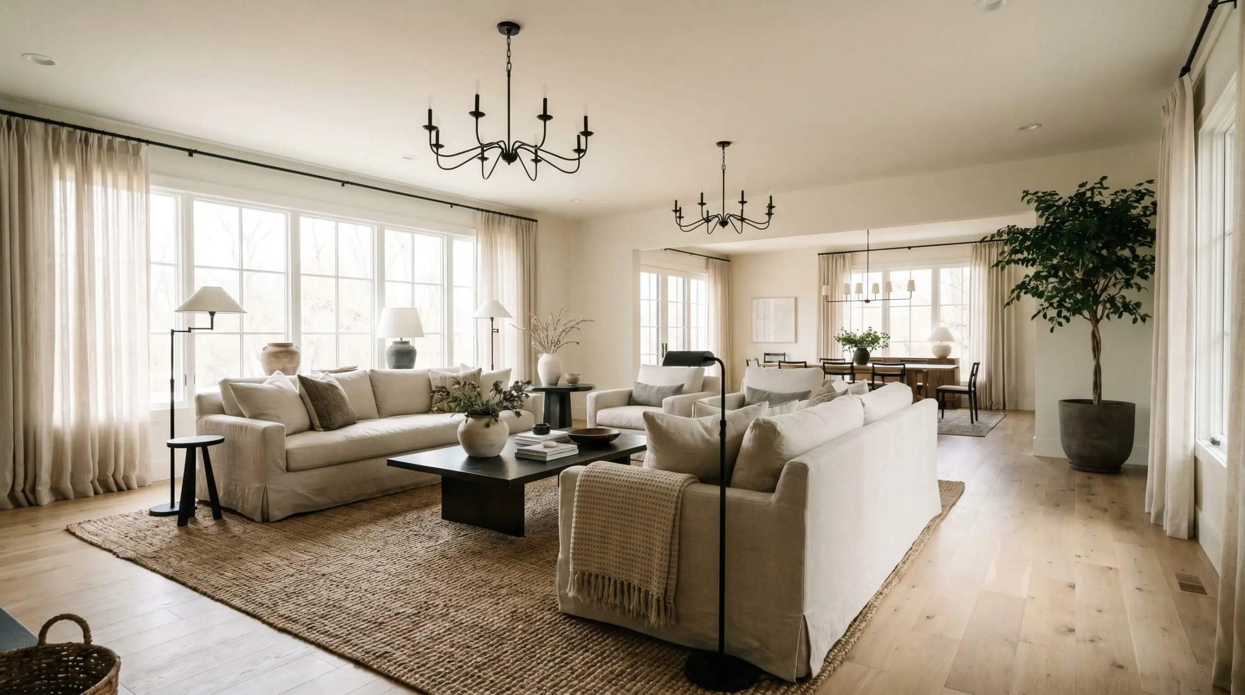
When applied across expansive living spaces, Westhighland White provides a brilliant alternative to stark gallery whites. It establishes a soft, Organic Modern foundation that feels instantly lived-in and comfortable for a busy household.
Pair this paint with wide-plank white oak flooring and oversized, washed linen slipcovered sofas to highlight its tactile warmth. To prevent the room from feeling too soft or undefined, introduce matte black steel lighting fixtures or a blackened bronze coffee table. These darker elements provide necessary visual weight and structure against the highly reflective walls.
In large, open-concept spaces, carry this exact color up onto the ceiling. Because the LRV is 86, it will not lower the visual height of the room, but it will erase the harsh boundary line between the wall and ceiling, making the architecture feel infinite and cohesive.
Hackrea Pro-Tip (The Seamless Flow Strategy)
Kitchen Cabinetry and Millwork
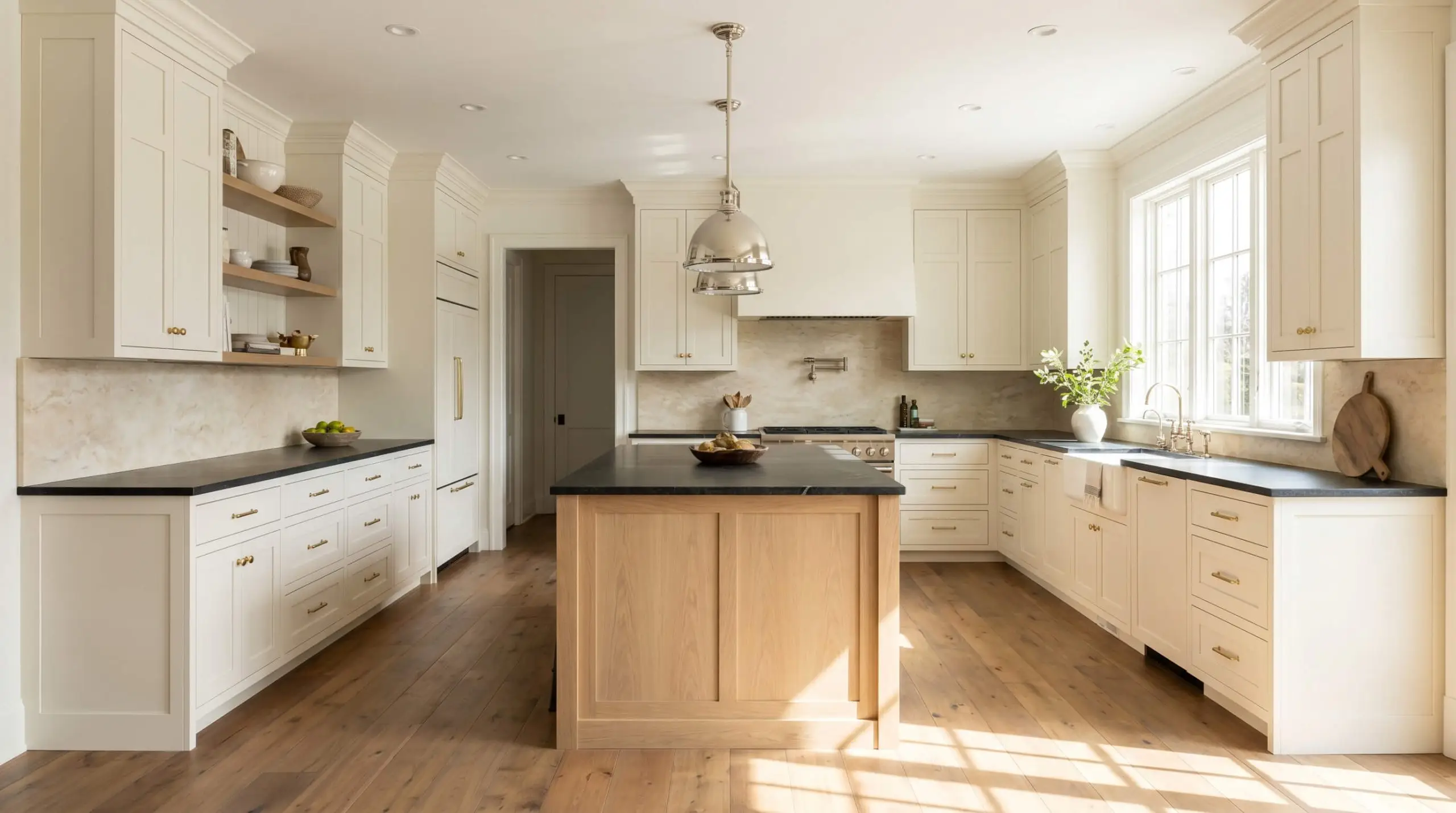
Using this shade as a cabinetry finish instantly shifts a kitchen away from the clinical, builder-basic look toward a highly tailored, Transitional aesthetic. The muted yellow undertone pairs exceptionally well with rich, natural stone surfaces like honed soapstone or dark travertine countertops.
Dress the cabinetry with unlacquered brass or polished nickel hardware to complement the creamy base.
If you paint your cabinets with Sherwin-Williams Westhighland White, you must carefully evaluate your backsplash tile. Pairing these creamy cabinets with a stark, cool-toned white subway tile will instantly make the paint look dingy and aged. Always match your tile’s undertone to the warmth of the cabinetry.
Clash Warning (The Backsplash Trap)
Primary Bedrooms
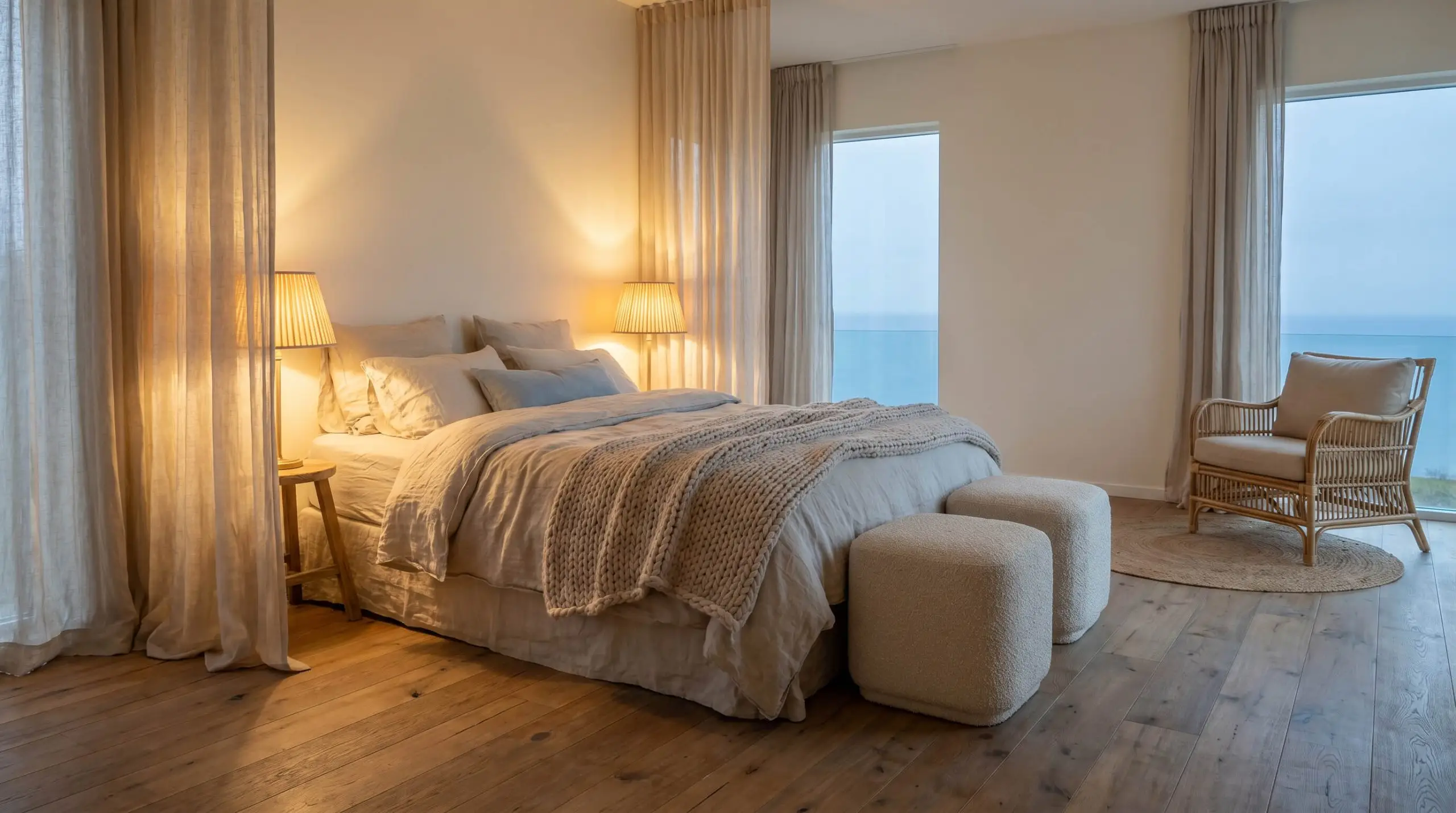
In a bedroom meant for rest and retreat, this color acts as a sensory palette cleanser. It works beautifully within a Coastal or Scandinavian-inspired space where the goal is serene simplicity.
Layer the room with textural contrast rather than loud colors. Think bouclé ottomans, woven rattan accent chairs, and sheer cotton drapery pooling effortlessly on the floor. The ambient lighting shift in the evening will turn the walls into a cozy, enveloping backdrop as your bedside lamps cast a warm glow.
Exterior Siding and Trim
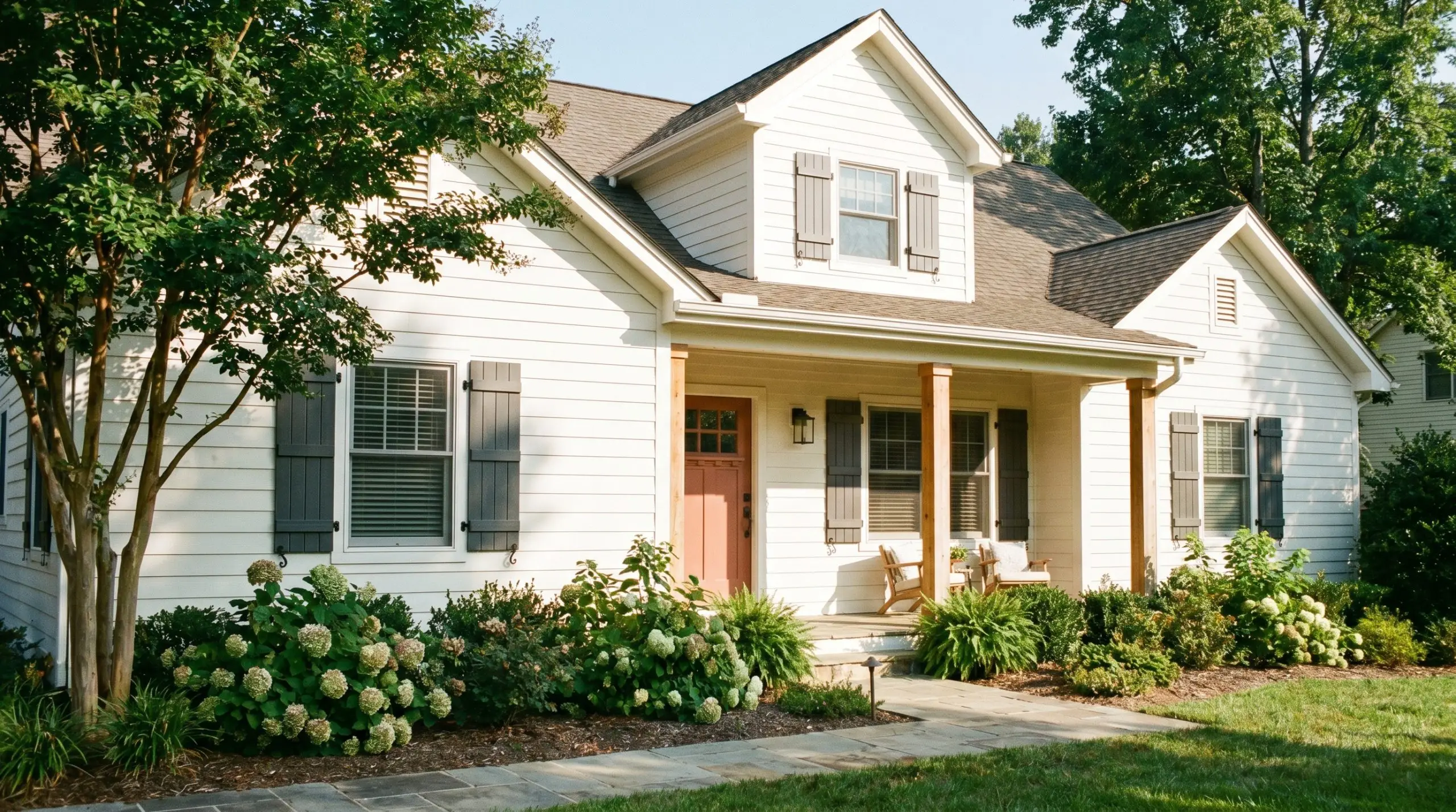
When used as a stucco exterior application or on traditional lap siding, this color transforms a home’s curb appeal. However, you must account for how the sun alters the pigment.
Direct exterior sunlight washes out paint colors significantly. Because this shade already has an LRV of 86, it will read as a brilliant, classic white outdoors while retaining just enough warmth to avoid looking icy.
Pair it with charcoal gray shutters, natural cedar architectural columns, or a muted terracotta front door to create a striking, welcoming facade.
Building a Palette Around Sherwin-Williams Westhighland White
This sunlit hue thrives when given deliberate, crisp boundaries to contain its creamy pigment, preventing it from bleeding into surrounding elements. It pairs best with materials that either sharply contrast its brightness or softly pull out its organic warmth.
Flawless Trim and Ceiling Matches
Selecting the correct trim color dictates whether your walls will feel like a soft, continuous wrap or a sharply defined architectural feature.
Tactile Finishes and Hardware Selections
Pairing this warm off-white with specific tactile materials physically alters its perceived temperature and dictates the room’s overall level of formality.
Secondary Accent Colors
Surrounding this creamy base with deliberate secondary tones will actively manipulate its undertones, pulling out either its golden warmth or its crisp brightness.
Curated Aesthetic Concepts
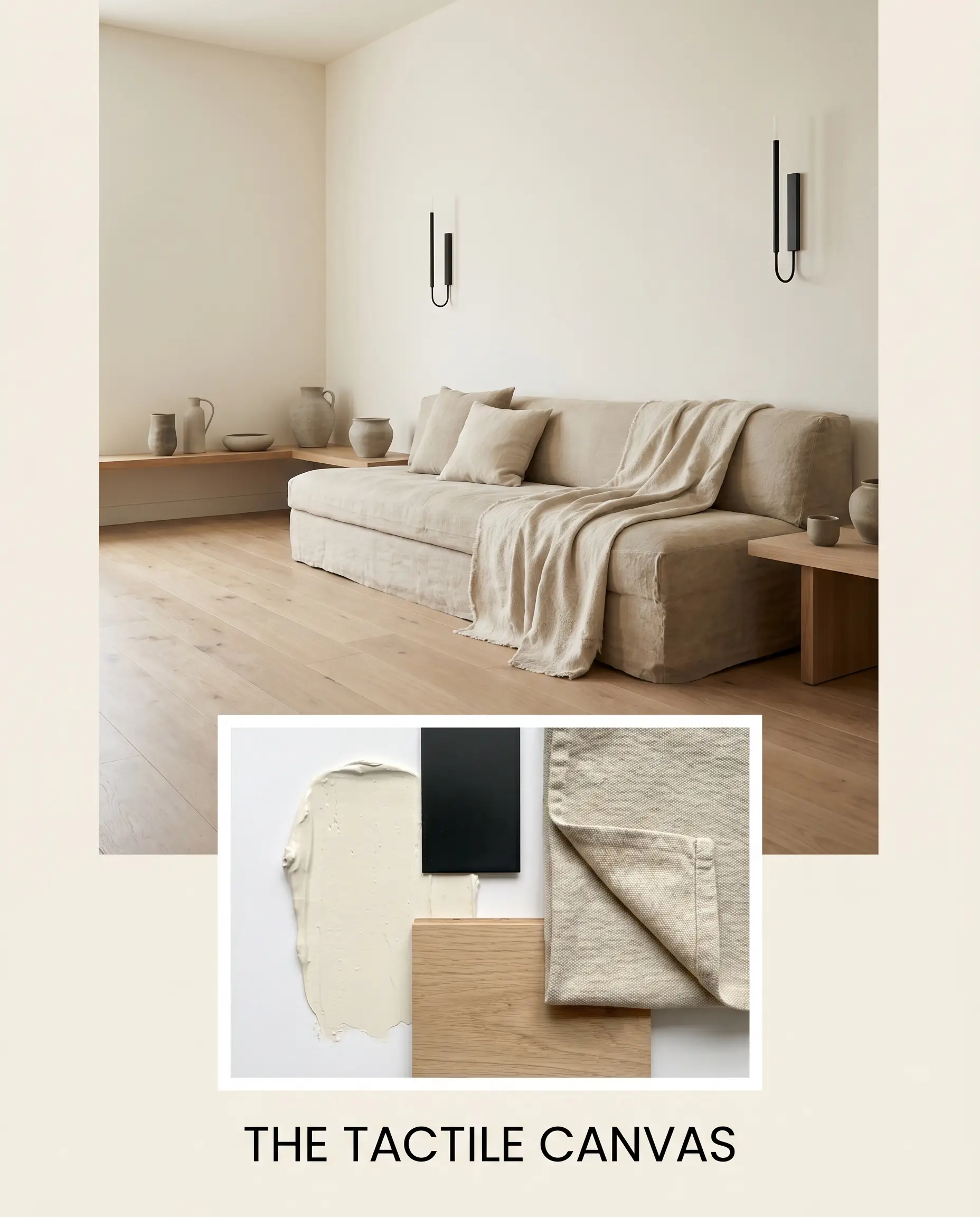
The Tactile Canvas This palette channels a raw, minimalist energy by pairing the creamy walls with matte black steel fixtures and expansive, natural white oak flooring. Layering in rough stonewashed canvas textiles and minimalist, unglazed pottery creates an atmosphere that feels distinctly modern yet deeply comfortable. The sharp black accents keep the soft white walls from feeling overly sweet, forging a sophisticated visual tension.
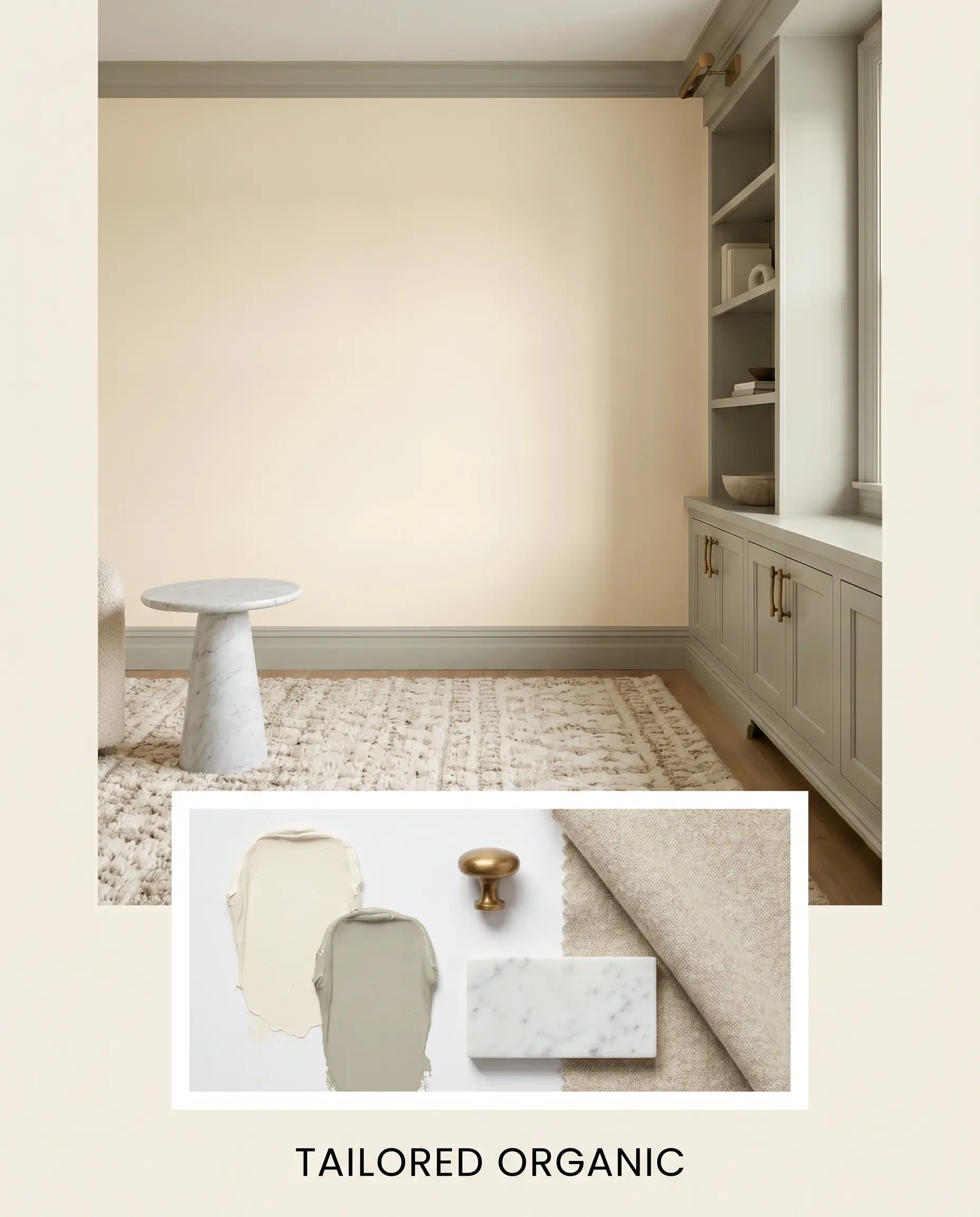
Tailored Organic A deeply calming aesthetic that uses Benjamin Moore October Mist 1495 on custom millwork to frame the glowing off-white walls. Unlacquered brass hardware acts as the premium jewelry of the palette, catching the light and echoing the wall’s inherent warmth. Bringing in honed Carrara marble surfaces and plush, worsted wool rugs completes a vibe that is simultaneously refined and effortlessly relaxed.
Sherwin-Williams Westhighland White vs. Industry Rivals
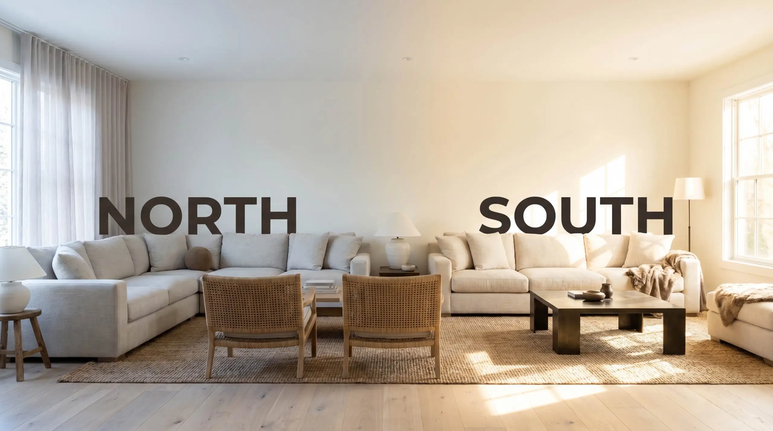
When evaluating warm whites, the final decision often hinges on your home’s specific natural light exposure and how much pigment you actually want on the walls. A south-facing room might demand a slightly cooler alternative to prevent the space from feeling overheated, while a shaded, north-facing layout often requires a more saturated base to combat the gloom.
Sherwin-Williams Westhighland White vs. Sherwin-Williams Alabaster SW 7008
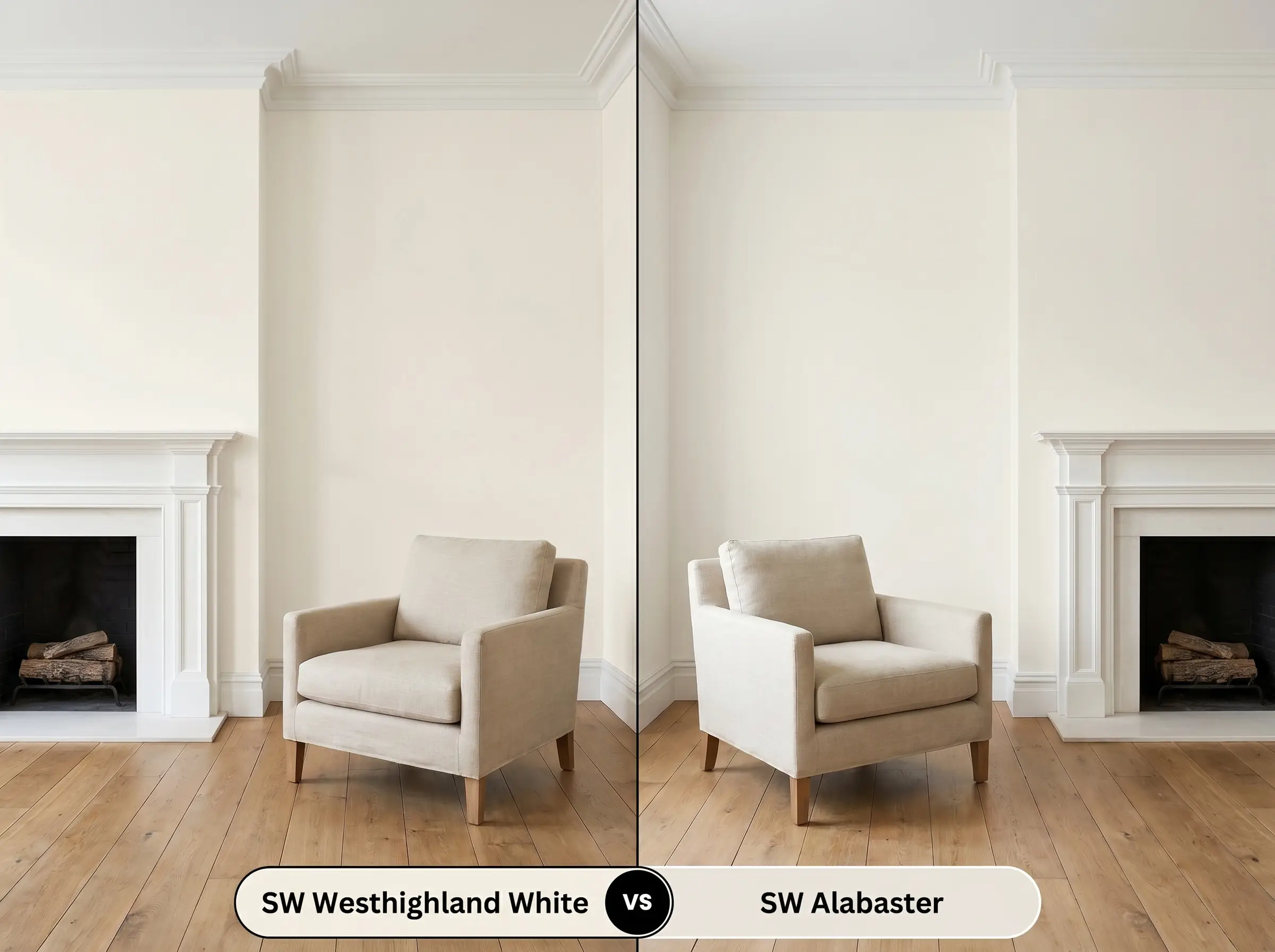
If your room lacks abundant natural light and you fear the walls turning yellow, Alabaster is the safer choice. Alabaster features a slightly lower LRV and a more muted, beige-leaning base that feels remarkably neutral in varied lighting. Choose the Westhighland alternative only if you specifically want that distinct, sunny glow to radiate throughout the room.
Sherwin-Williams Westhighland White vs. Sherwin-Williams Greek Villa SW 7551
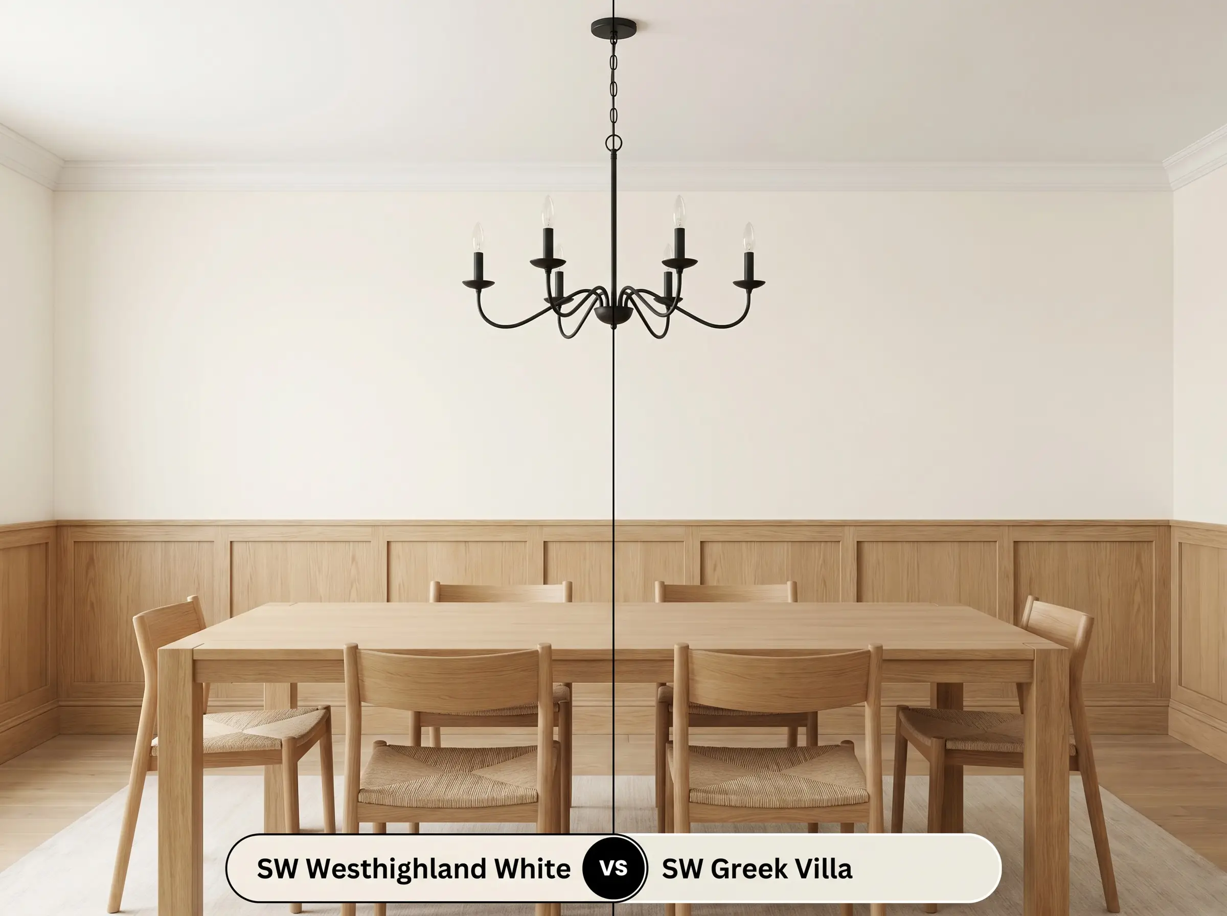
Greek Villa shares a very similar brightness level but carries a slightly more complex, almost imperceptible green-yellow undertone. If you are pairing your walls with cool-toned stones or crisp white trim, Greek Villa often reads as a touch more modern and subdued. The Westhighland option remains the better choice for homeowners seeking a traditional, unapologetically warm cream.
Sherwin-Williams Westhighland White vs. Benjamin Moore White Dove OC-17
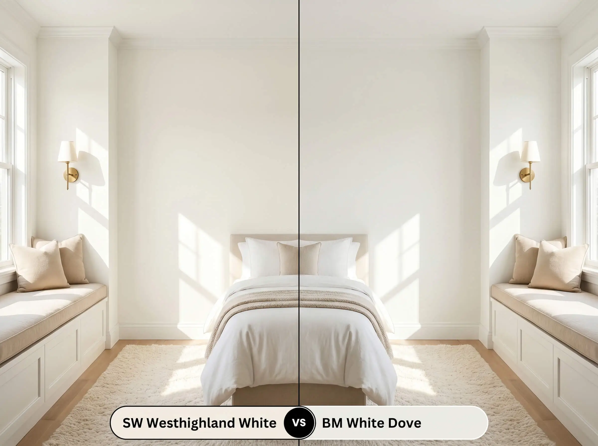
White Dove is legendary for its shaded, gray-yellow composition that rarely reads as a true yellow on the wall. If you are dealing with intense, direct afternoon sunlight that amplifies warm pigments, White Dove will hold its shape beautifully without glaring. Rely on the Sherwin-Williams paint when you actively need to inject warmth into a flat, shadow-filled space.
Navigating Alternative Shades and Matches
If the foundational warmth of this shade is slightly off for your lighting, or if you need to switch manufacturers, there are highly comparable alternatives that adjust the saturation and tone.
Exploring Same-Brand Variations
If you want to stay within the Sherwin-Williams ecosystem, these options dial the warmth up or down based on your architectural needs.
Competitor Color Matches
For homeowners who need to color-match across different manufacturers, these rival shades offer highly comparable behaviors with only minor tonal shifts.
Execution Strategy for a Flawless Finish
Moving from curating a beautiful palette to actually rolling the paint onto your walls requires a strict understanding of sheens and coverage.
Selecting the Right Sheen
Your chosen finish will physically alter how light bounces off the pigment, shifting both its durability and its visual depth.
Primer and Coat Requirements
Because this shade is highly reflective and lacks dark pigments, it requires a high-quality, bright white bonding primer to ensure the underlying drywall or previous paint color does not alter its final tone. Plan for two full, generous coats to achieve complete opacity and a professional-grade finish. To avoid flashing, you must maintain a wet edge while rolling and resist the urge to touch up semi-dry patches, as this will leave visible, uneven streaks.
Expert Answers to Common Color Queries
Because textured stucco casts tiny shadows across the facade, it naturally deepens the perceived color, which can indeed amplify the yellow undertones. If your home receives intense south-facing sunlight, you may want to test a slightly crisper white to prevent the exterior from looking overly warm.
The crisp, cool output of a 4000K bulb acts as a neutralizing agent, effectively stripping away much of the paint’s creamy warmth. In this specific lighting environment, the shade will read as a bright, clean off-white rather than a golden cream.
Pairing this distinctly warm paint with a cool, icy quartz creates a jarring visual temperature clash that often makes the cabinetry look aged or dingy. You will achieve a much more cohesive aesthetic by matching these cabinets with a warmer stone, such as soapstone or a beige-veined marble.
The expansive surface area of red oak flooring will physically reflect its reddish-orange tones onto the bright walls, aggressively pulling out the paint’s yellow base. To counteract this effect, you will need to introduce cooler, grounding elements like slate accents or blue-gray textiles.
The Final Verdict on Sherwin-Williams Westhighland White
This sunlit, highly optimistic shade is the ultimate architectural tool for homeowners who crave a bright, expansive space but refuse to live in a sterile, stark environment. It performs at its absolute peak in north-facing rooms that desperately need an injection of warmth, or in Transitional spaces layered with natural oak, raw brass, and honed stone. Sherwin-Williams Westhighland White is perfect for the design enthusiast who understands that true luxury often lies in soft, tactile, and deeply inviting atmospheres.
While this color is incredibly versatile, you will run into immediate visual friction if you attempt to force this creamy shade into spaces dominated by cool, blue-toned grays or icy architectural features. When placed directly against cool-toned materials like crisp white subway tile, the paint’s subtle yellow base is harshly exposed, causing the walls to look stained rather than intentionally warm. If your home’s fixed elements lean into the cool spectrum, bypass this shade entirely and opt for a crisper, more neutral off-white to maintain a cohesive aesthetic.
Hackrea Design Secret (The Temperature Clash)