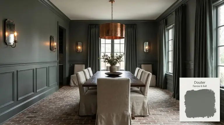
Farrow & Ball's Douter No. 318 is a deeply atmospheric, smoky grey-green inspired by the tarnished brass of traditional candle snuffers. Sitting elegantly between Inchyra Blue and Green Smoke, this moody hue shifts from slate grey in low light to a rich, muted green in brighter spaces.
Farrow & Ball Douter: Mastering This Smoky Grey-Green Architectural Finish
Farrow & Ball named this shade after a historic candle snuffer, and that exact concept translates beautifully to how it behaves on a wall. Douter instantly extinguishes the harshness of a room, replacing it with a nuanced, enveloping quiet. This smoky grey-green operates as a true moody architectural finish, shifting away from predictable charcoals to offer something with far more organic depth.
Farrow & Ball Douter: Temperature, Undertones & LRV
Is it warm or cool? Douter is a decisively cool shade that relies on its complex chromatic profile to prevent a room from feeling icy.
At an LRV of 15, this shade absorbs a massive amount of the ambient light in a space. Its low-reflectance color structure creates profound, enveloping shadows that redefine the boundaries of your walls rather than illuminating them.
You can apply wallpapers, paints, etc. on walls and see how they look in various interiors.
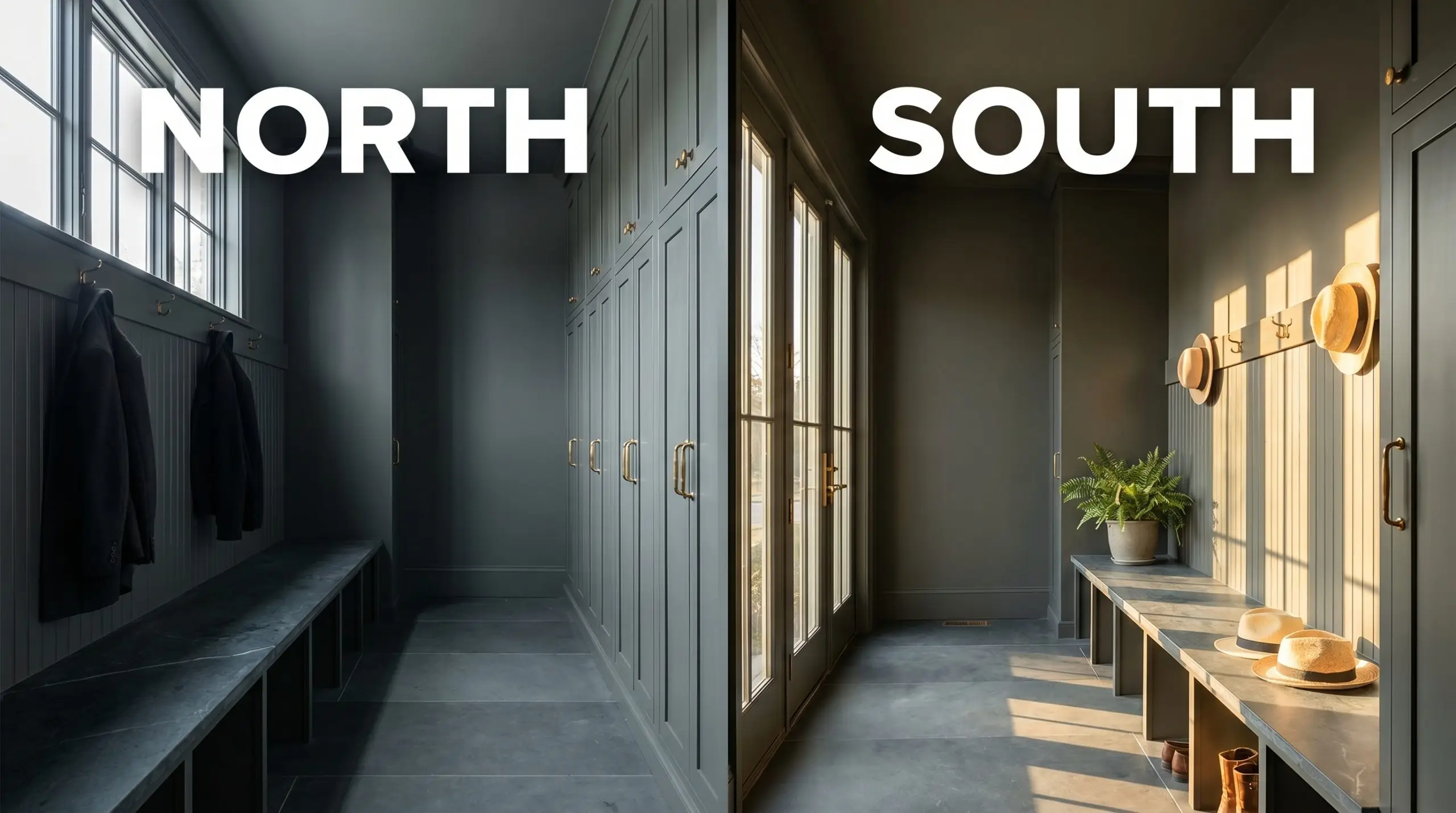
Lighting Effects: The Low Light Chameleon
This shade completely alters its visual identity based on the sun’s trajectory and your specific fixture choices.
Popular Architectural Applications
Because this shade absorbs light so effectively, it excels in spaces where you want to create deliberate architectural focus or an immersive, structured mood.
Boot Rooms & Mudrooms
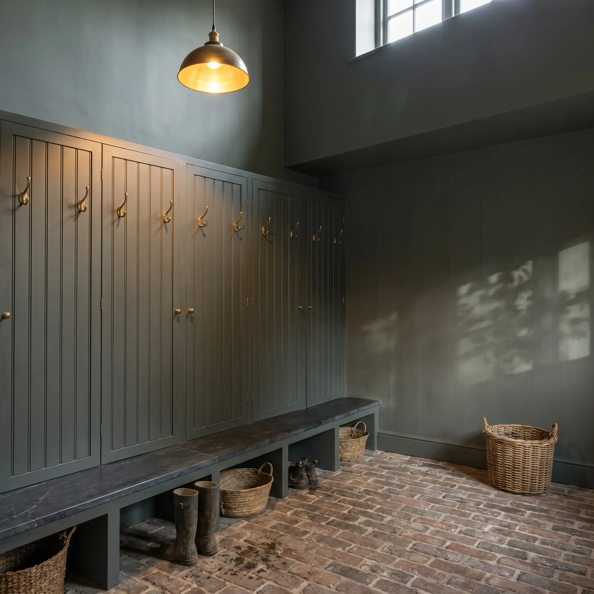
Shift away from predictable utility and treat this drop zone as a soft industrial gallery for an active family. Apply Douter across beadboard lockers and pair it with honed soapstone bench tops to absorb daily wear. Contrast the dark walls with tumbled brick floors and unlacquered brass hooks to introduce a rugged, tactile warmth.
Kitchen Cabinetry & Islands
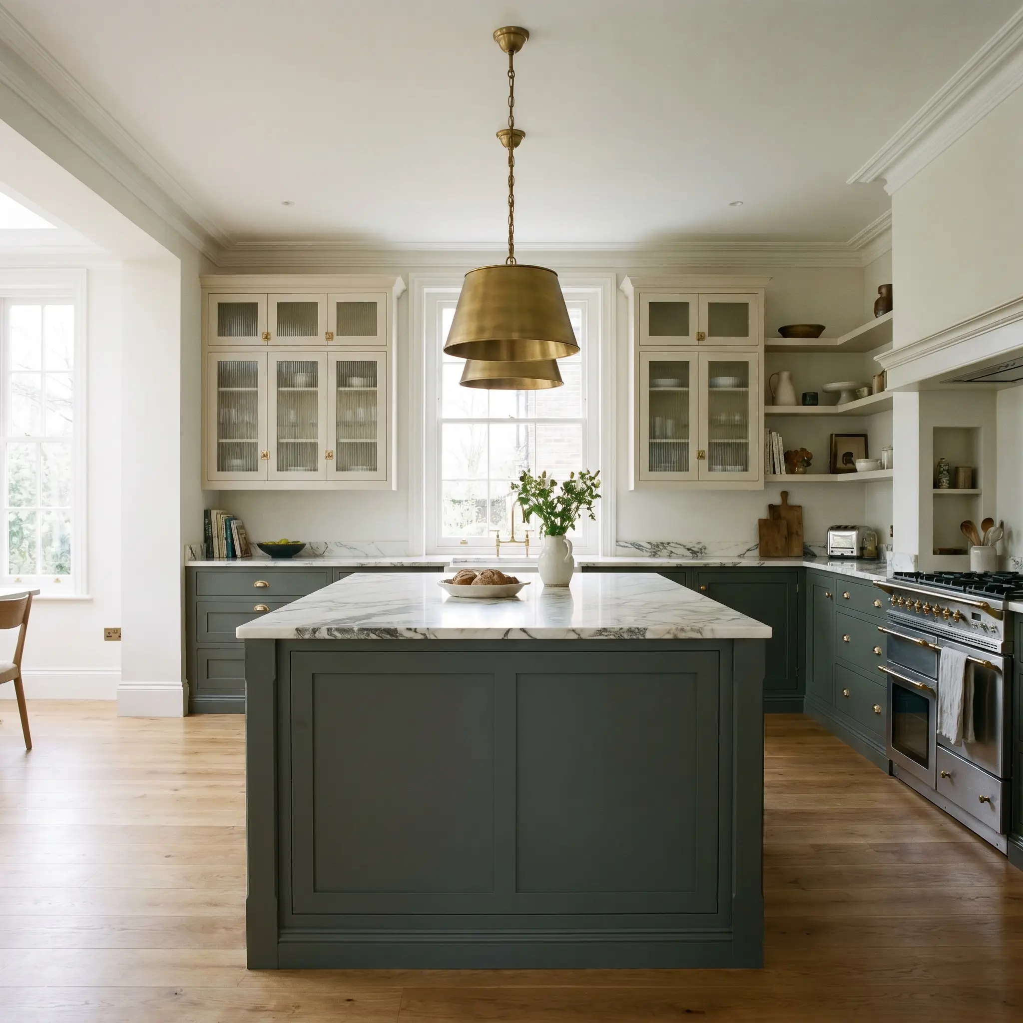
This shade transforms standard flat-panel or shaker cabinetry into a sophisticated focal point for the avid home cook. Use a Dead Flat finish on the lower cabinets, pairing the murky green notes with heavily veined Calacatta marble countertops and reeded glass upper cabinet doors.
If you are running this dark shade on your island, keep your perimeter cabinets in an unbleached parchment tone to prevent the kitchen from feeling enclosed.
Hackrea Design Secret (The Two-Tone Balance)
Libraries & Studies
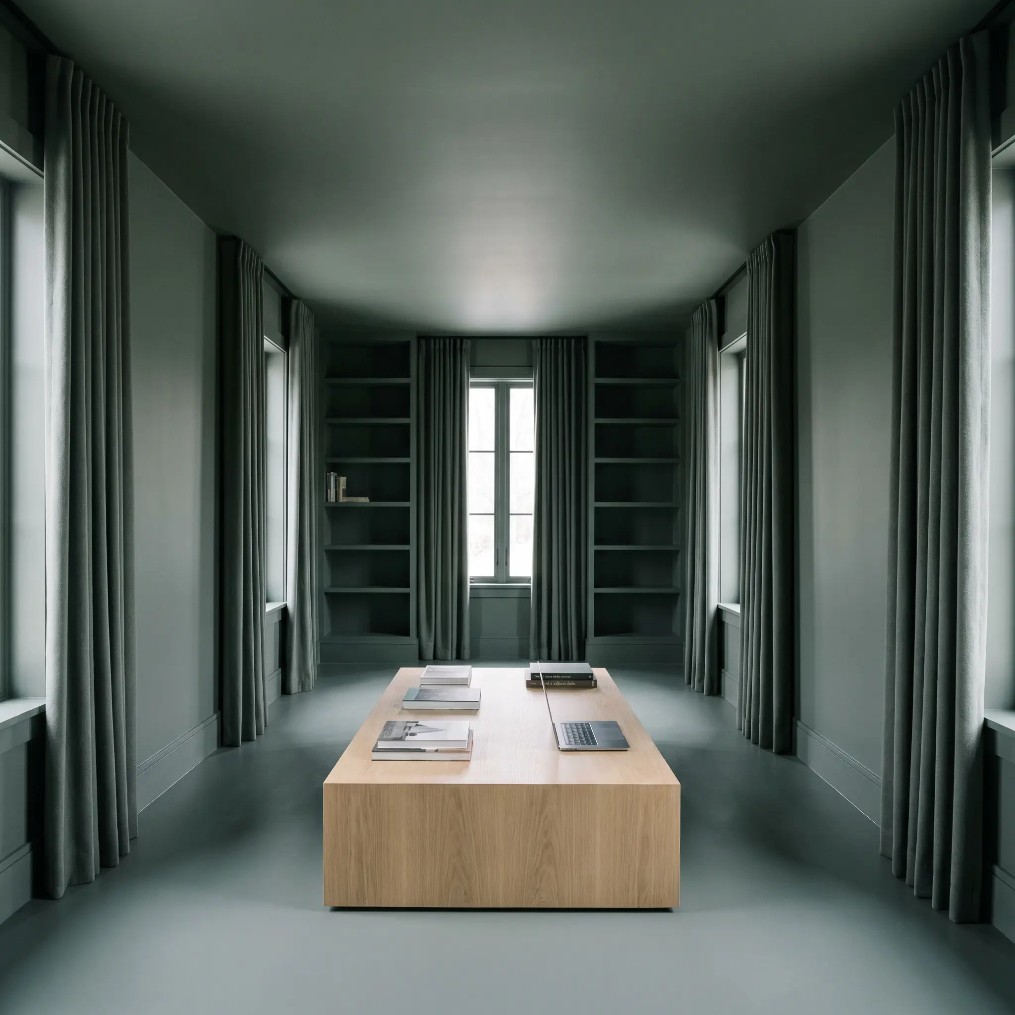
Avoid the traditional mahogany-and-leather cliches by pushing this room toward tonal modernism for the ultimate remote-work sanctuary. Color-drench the entire space—baseboards, built-in bookcases, and ceiling—to blur the harsh corners of the room. Introduce worsted wool drapery and a modern plinth coffee table in white oak to break up the saturated walls with organic texture.
Exterior Doors & Trim
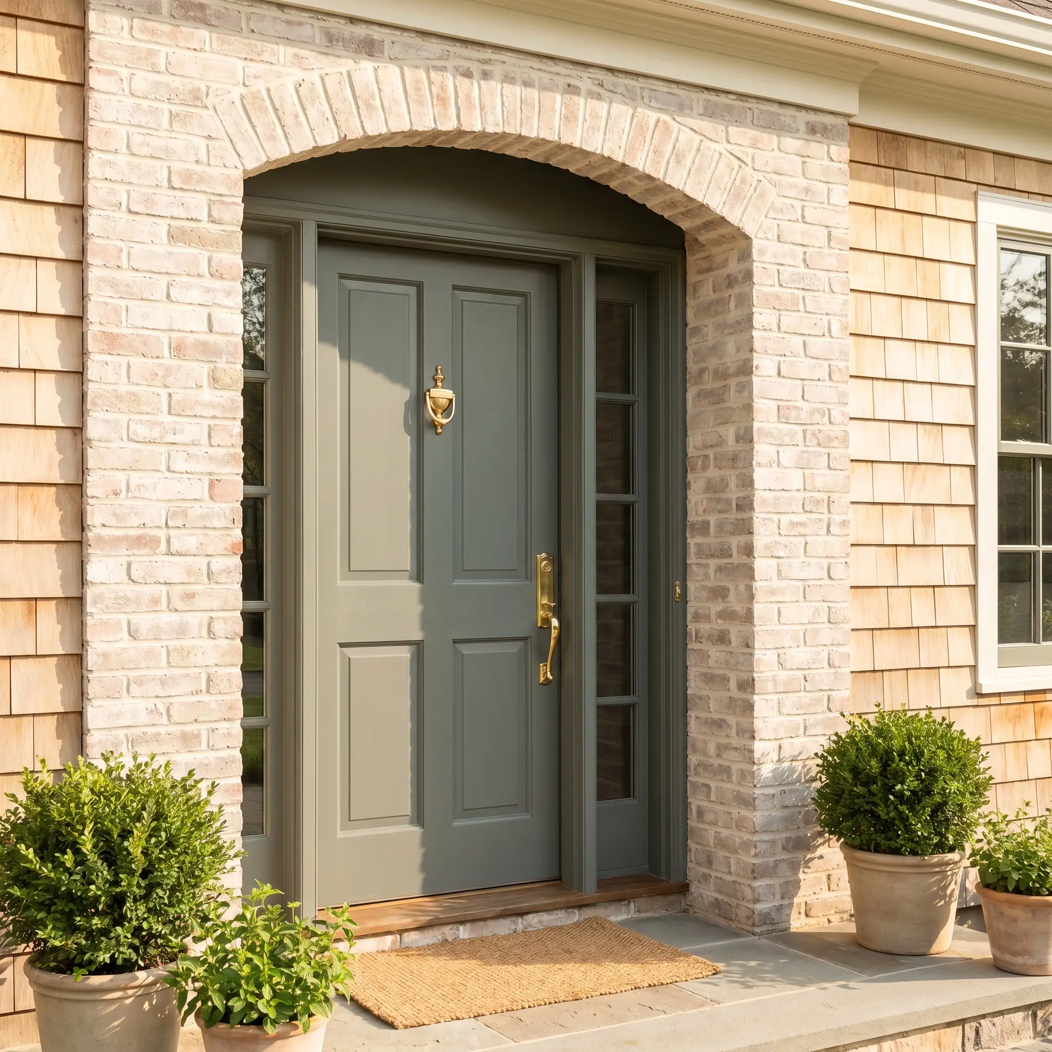
On a facade, intense direct sunlight strips away the moodiness, revealing a much softer, historic exterior profile. Paint your front door and window mullions in this shade to contrast beautifully against limewashed brick or natural cedar siding.
Avoid pairing this specific grey-green with bright, cherry-red brick facades; the high-contrast clash will make the subtle brass undertones look muddy and unintentional.
Clash Warning (Exterior Masonry)
Dramatic Dining Rooms
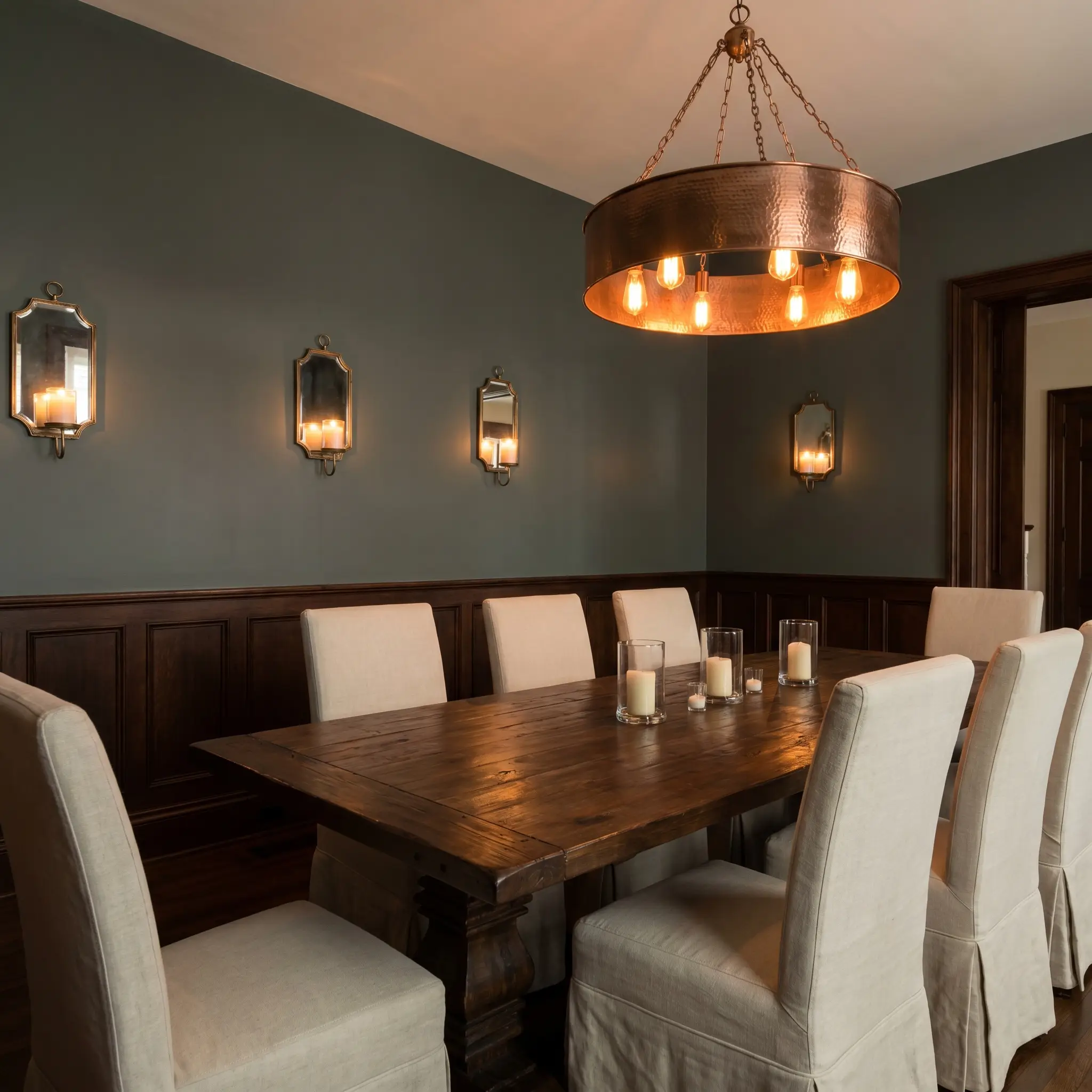
Lean into the shade’s light-absorbing qualities to craft an intimate, late-night dining experience. Wrap the walls in a matte application above classic wainscoting, then bounce ambient light around the room using a hammered copper chandelier and mirrored antique sconces. Style the space with slipcovered linen dining chairs and a dark walnut table to maintain a relaxed, premium elegance.
Expanding the Palette: Coordinating Colors for Farrow & Ball Douter
Douter’s dense, light-absorbing pigment demands intentional companions to either soften its rigid edges or amplify its moody depth. It thrives when placed next to muted, tonal shades that encourage a seamless visual bleed rather than stark, jarring transitions.
Millwork and Architectural Boundaries
Farrow & Ball Shaded White 201 provides a shaded, nuanced boundary that prevents high-contrast visual shock against the dark walls. Benjamin Moore White Dove OC-17 offers a cleaner, softly luminous frame that gently lifts the room’s energy without turning sterile. For a slightly warmer, creamier transition, Sherwin-Williams Alabaster SW 7008 actively pulls forward the hidden brass notes in the primary wall color.
Tactile Elements and Finishes
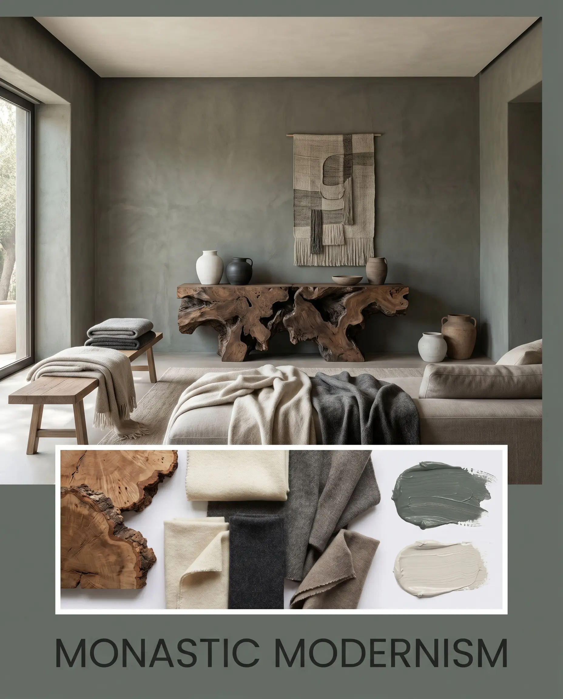
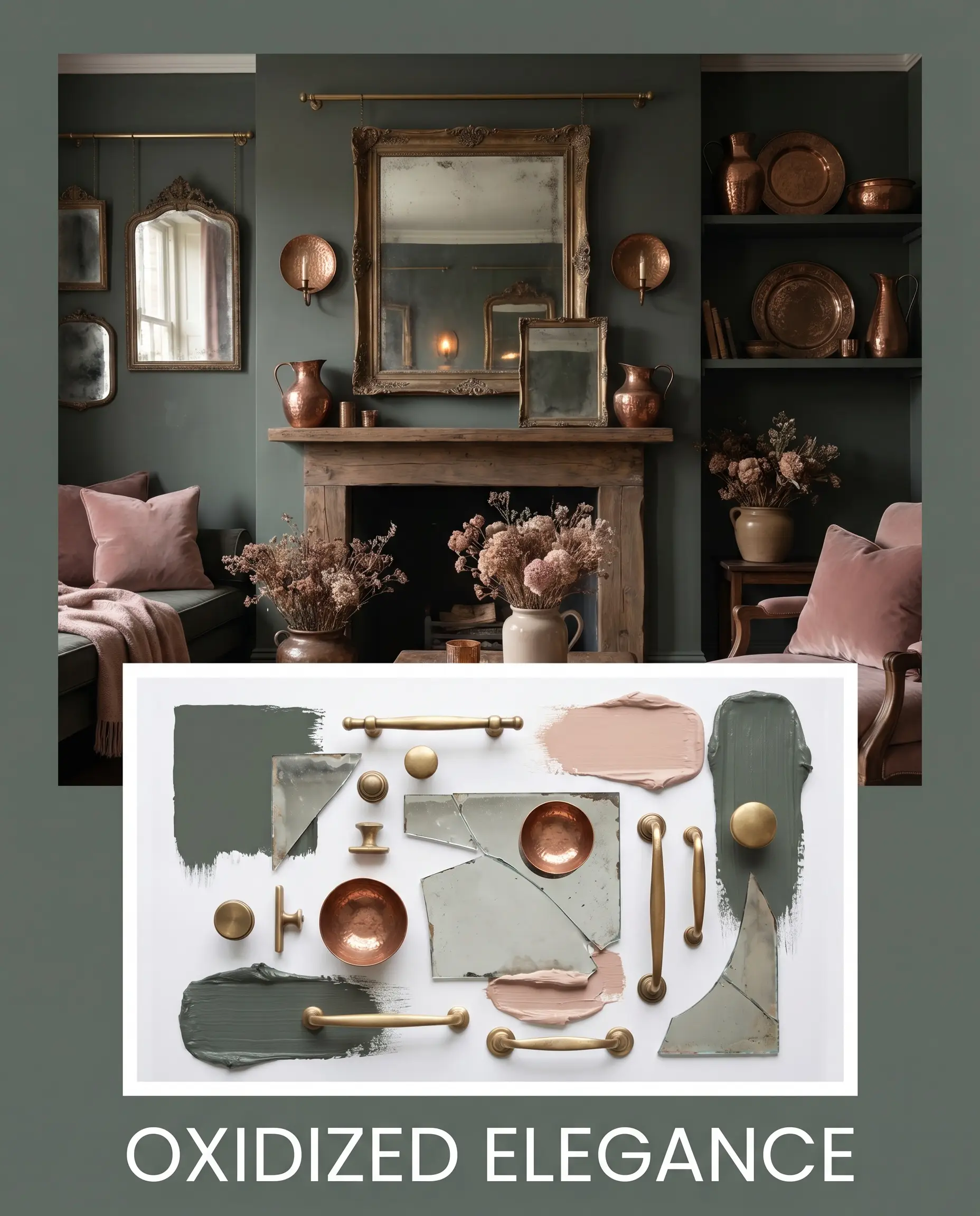
Unlacquered brass hardware fundamentally changes how this paint is perceived by actively reflecting warm, golden light back onto the slate-grey surface. Incorporating a brutalist console in rich burl wood breaks up the enveloping dark walls with an aggressive, organic woodgrain. Hand-glazed terracotta zellige tiles introduce a highly reflective, irregular surface that shatters the uniform density of the matte paint. Layering worsted wool textiles softens the rigid architectural feel of the room, adding crucial tactile warmth.
Curated Accent Shades
Curated Visual Aesthetics
Monastic Modernism This aesthetic strips away excess decor to let the dense, enveloping walls dictate the atmosphere. By pairing the dark walls with a brutalist burl wood console and unstyled worsted wool throws, the room achieves a quiet, meditative energy. The addition of Pale Oak on the ceiling and minimalist ceramic vessels ensures the space feels intentional and grounded rather than cold.
Oxidized Elegance This palette leans entirely into the hidden warmth of the paint by surrounding it with rich, reflective metals and earthy tones. Unlacquered brass gallery rails and hammered copper accents actively bounce golden light against the matte walls, illuminating the subtle historic green cast. Layering in Setting Plaster accents and antique mirrors creates a deeply romantic, lived-in mood that feels both historic and highly curated.
Farrow & Ball Douter vs. Industry Rivals
Choosing the correct dark, moody tone often comes down to how much natural light your space receives and whether you want the walls to read as definitively green or mysteriously ambiguous. In rooms with overwhelming southern exposure, certain shades will lose their depth entirely, making a head-to-head evaluation crucial.
Farrow & Ball Douter vs. Farrow & Ball Green Smoke 47
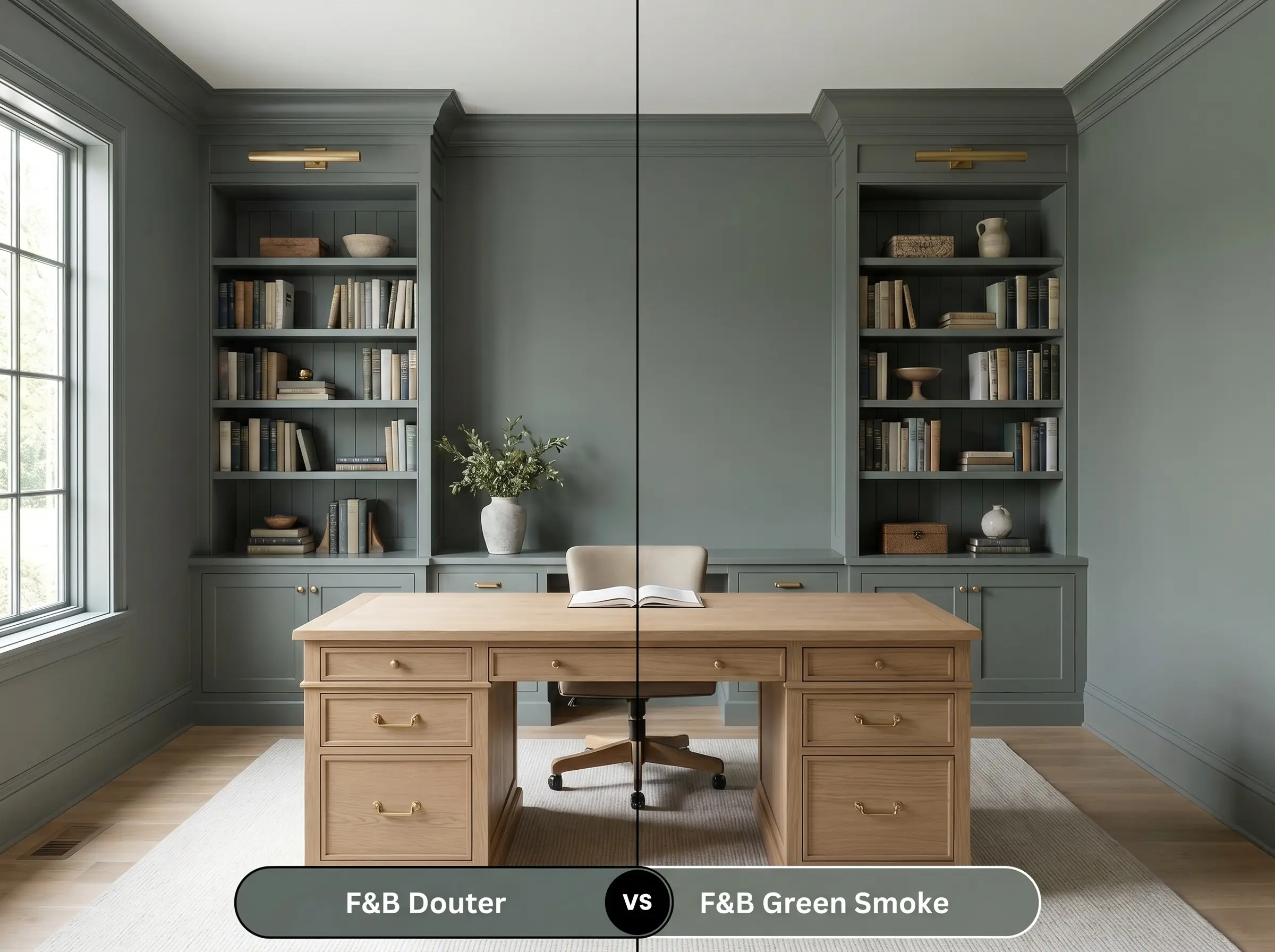
If you want a definitive, recognizable green that feels distinctly historic, then Green Smoke is the better candidate. Douter is significantly more muted and leans entirely into its slate-grey base, making it the superior choice if you want a color that constantly shape-shifts throughout the day.
Farrow & Ball Douter vs. Farrow & Ball Inchyra Blue 289
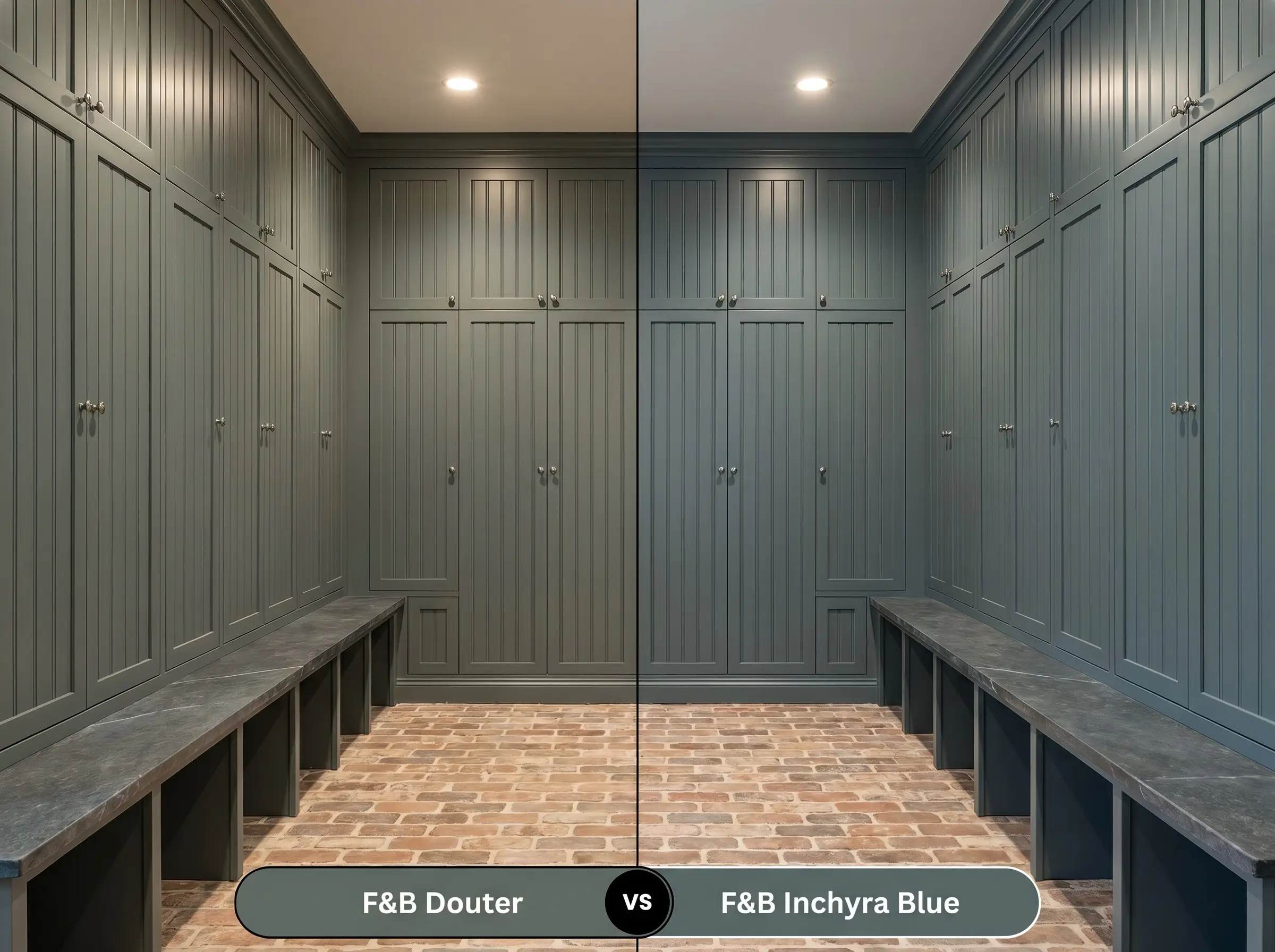
Inchyra Blue carries a much stronger dose of cyan, pulling the room toward a stormy, oceanic teal under artificial lighting. If your room features warm wood tones and you want to avoid blue undertones entirely, then Douter provides a much safer, grounded grey-green foundation.
Farrow & Ball Douter vs. Benjamin Moore Vintage Vogue 462
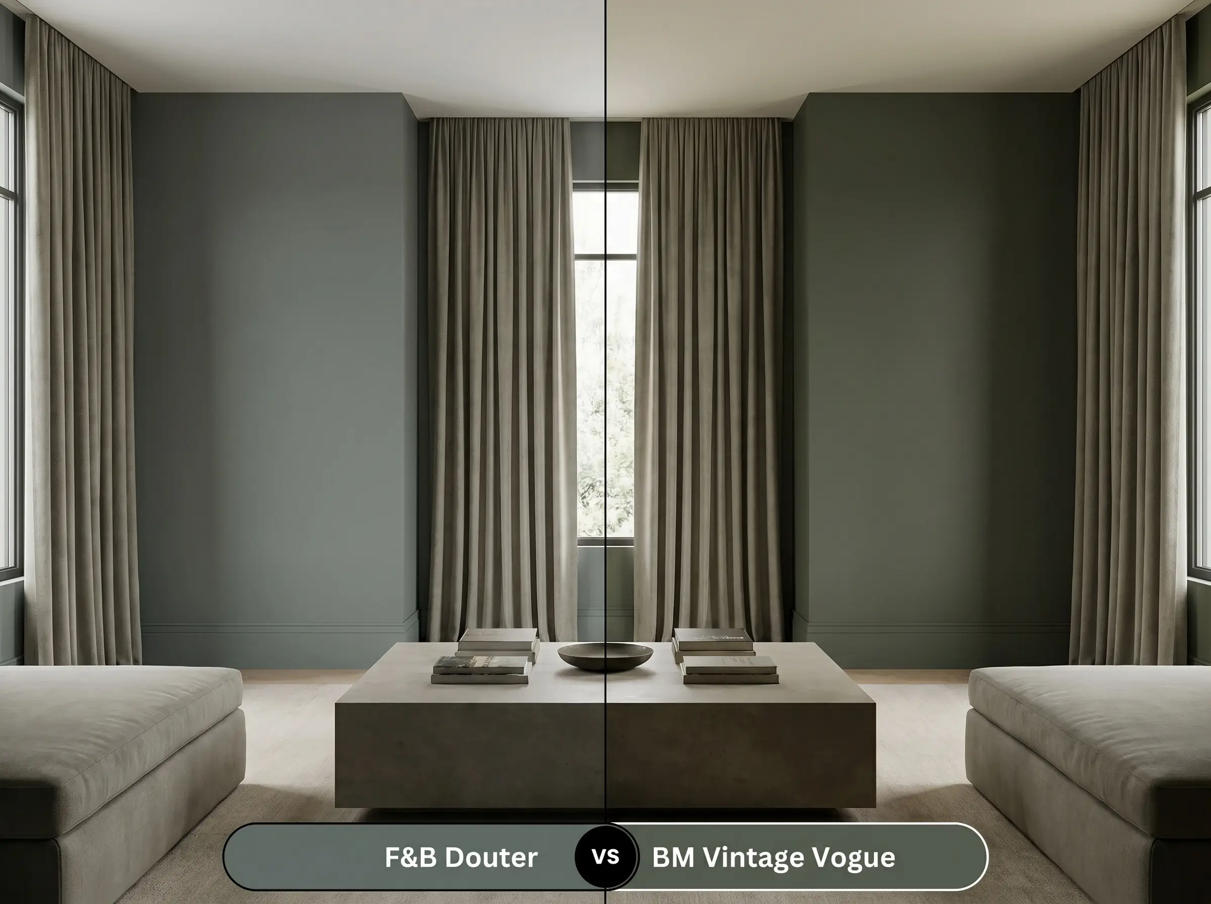
Vintage Vogue is a richer, more saturated olive tone that instantly warms up a room. If your space lacks natural light and you fear Douter will read too much like cold concrete, then Vintage Vogue will inject that necessary botanical warmth.
Alternative Selections and Color Matches
When a specific hue captures the right mood but the LRV is slightly too low for your lighting conditions, exploring adjacent tonal steps is the best path forward.
Tonal Variations
Manufacturer Equivalents
Execution Strategy: Painting with Douter
Transitioning this complex hue from a digital rendering to a flawless physical finish requires strict attention to sheen selection and surface preparation.
Optimal Surface Finishes
Base Preparation
Because of its low LRV and dense pigmentation, you must use a dark tones primer to establish a solid foundation. Skipping this step will force you to apply three or more topcoats to achieve true opacity.
Professional Application Tactics
This depth of color requires two generous coats applied with a high-quality microfiber roller to avoid flashing. Keep a wet edge at all times when rolling, as dark matte finishes will explicitly highlight uneven roller marks and overlapping dry lines. Touch-ups on this specific sheen are notoriously difficult, so paint wall-to-wall continuously rather than stopping midway.
Essential Inquiries for This Smoky Grey-Green
Because Douter lacks the strong cyan undertones of Inchyra Blue, it reads as a much more traditional, grounded slate-green on exterior woodwork. It excels on front doors where you want a moody, historic feel without the color pulling unexpectedly bright blue in direct sunlight.
Without natural light to illuminate its green and brass nuances, the slate base will absolutely dominate the space. To prevent it from feeling like a dark cave, you must layer in warm artificial lighting (2700K) and highly reflective metallic accents.
The Dead Flat finish is the ultimate choice for enhancing its complex undertones. By completely eliminating surface glare, the matte finish allows the subtle, warm brass notes to emerge organically as ambient light shifts across the room.
Placing this muted grey-green directly against vibrant, cherry-red brick creates a jarring, high-contrast visual clash. The intensity of the red masonry will strip away Douter’s subtle nuances, making the paint look muddy and unintentional.
The Architectural Verdict
Farrow & Ball Douter is a brilliant exercise in atmospheric restraint, perfect for homeowners who want to introduce profound depth without resorting to basic blacks or predictable navies. Its absolute best application is in immersive, color-drenched spaces—like moody libraries, tailored mudrooms, or intimate dining rooms—where its light-absorbing qualities can dictate a quiet, sophisticated energy. It elevates Transitional and Soft Industrial interiors beautifully, providing a grounded, organic backdrop for raw woods, unlacquered metals, and textural textiles.
However, this shade is fiercely incompatible with bright, airy coastal aesthetics or rooms outfitted entirely in stark, cool-toned whites. Pairing this murky, complex color with crisp white slipcovers, polished chrome hardware, and beach-washed woods creates a severe visual disconnect. The dense slate base will instantly make those breezy elements feel flimsy and out of place, while the bright whites will force the paint to look like a harsh, uninviting shadow rather than a curated architectural feature.