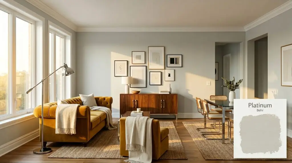
Platinum PPU26-11
BehrBehr Platinum (PPU26-11) is a soft, light dove gray with distinct silvery-green undertones. With an LRV of 65, it reflects a moderate amount of light, making it a versatile neutral that shifts between a cool, shaded gray and a subtle green depending on your room's lighting.
Paint Technical Profile
| Color ID / SKU | PPU26-11 |
| HEX Code | #d1d4d1 |
| Light Reflectance (LRV) | 65 |
| Use | Interior, Exterior |
| Best Exposures | South-Facing, West-Facing |
| Best For | Living Rooms, Bedrooms, Kitchen Cabinetry |
Behr Platinum: The Silver-Tinged Gray Redefining Everyday Architecture
Finding a gray paint that feels genuinely alive on the walls is one of the most common challenges in residential design. Too often, standard grays flatline into a sterile, concrete-like chill the moment the sun dips behind a cloud.
You need a color that actively participates in the room’s atmosphere, capturing shifting shadows and responding beautifully to the textures around it. This is exactly where Behr Platinum steps in as a highly intentional design tool.
Far from a flat neutral, this shade carries a quiet, botanical complexity that breathes life into everyday living spaces. By understanding how its hidden pigments interact with your natural light and foundational materials, you can turn a standard room into a beautifully curated retreat.
Behr Platinum: Undertones & LRV
If you are trying to determine whether this paint leans warm or cool, Platinum is decisively a cool neutral. However, its underlying color structure prevents it from feeling harsh or icy on your walls. Let’s break down the specific DNA that dictates how this color will actually behave in your home.
With a light reflectance value (LRV) of 65, this shade sits beautifully in the light-to-medium range. This means it absorbs just enough light to provide a crisp, elegant contrast against pure white crown molding or baseboards. At the same time, it bounces enough illumination around the room to keep the overall visual weight feeling incredibly open and airy.
To keep the silvery-green notes looking fresh and intentional, pair this cool neutral with a bright, untinted white trim. Creamy or yellow-based whites will clash with the cool base, making the trim look dingy and the walls appear unexpectedly murky.
Hackrea Pro-Tip (The Trim Pairing Rule)
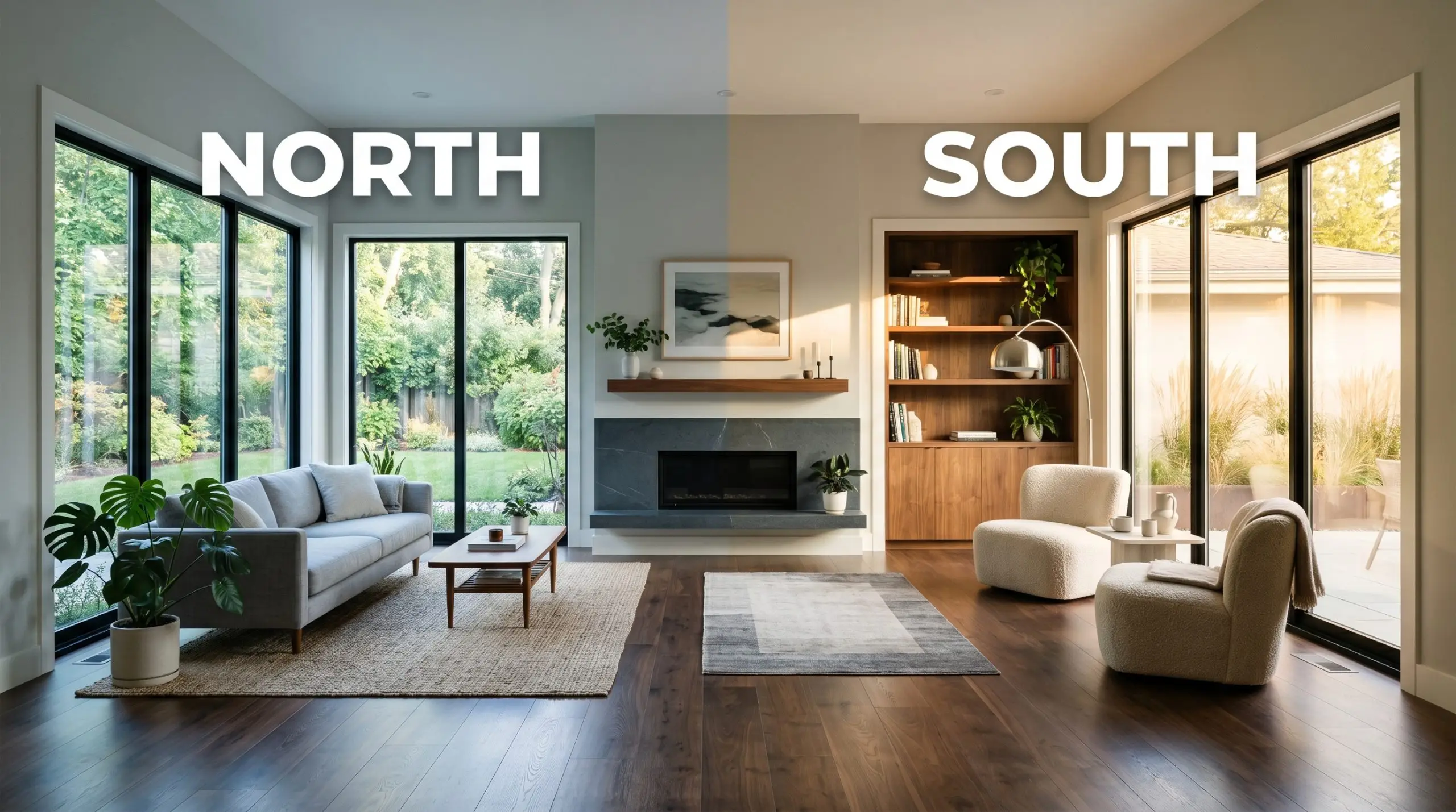
Mastering the Light: The Chameleon Factor
A paint’s true personality is entirely dependent on the sun. Because of its complex chromatic profile, this gray shifts its mood as the light moves around your house.
Where to Use This Cool Neutral: Popular Applications
The true magic of this silver-tinged gray lies in its remarkable adaptability across entirely different architectural zones. By strategically pairing it with the right textures and lighting, you can completely redefine the mood of a space.
Modern Transitional Kitchen Cabinetry
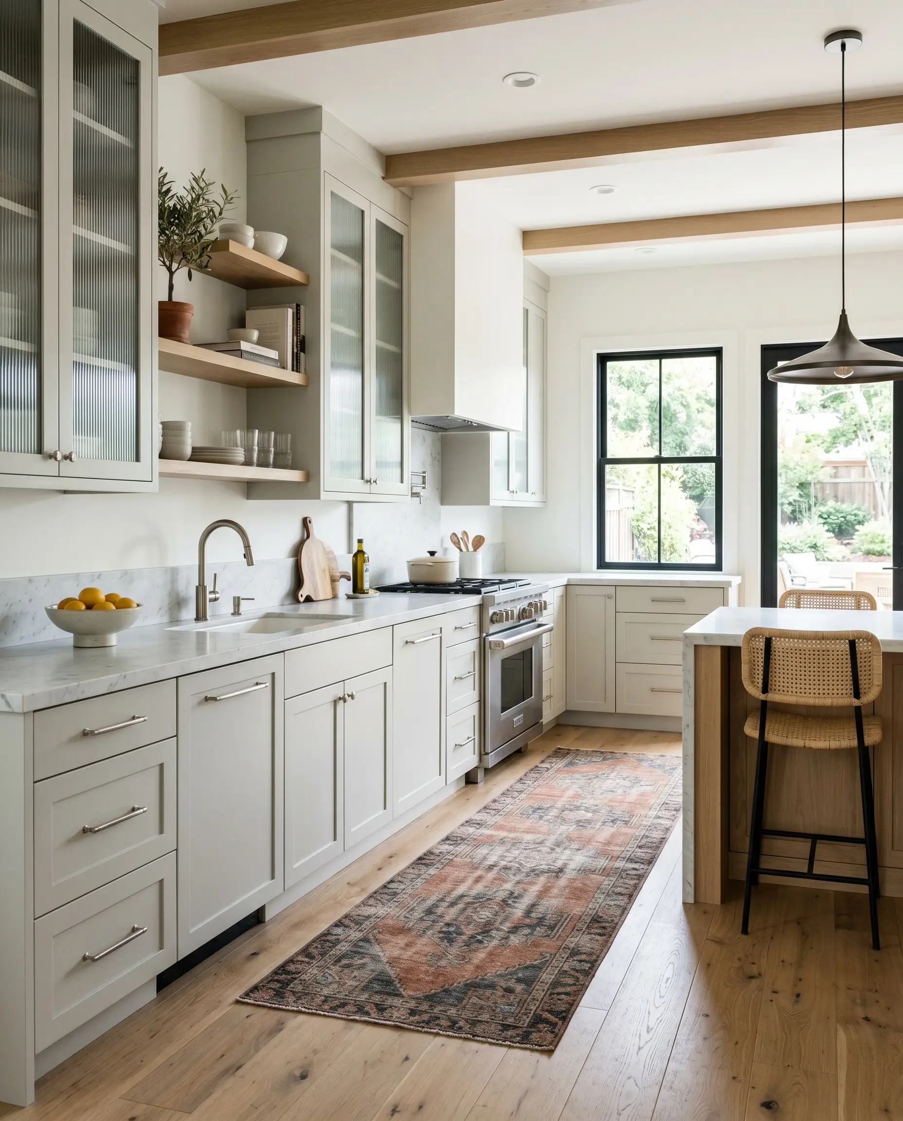
Applying this shade to kitchen cabinetry instantly modernizes a dated layout without requiring a full demolition. It serves as an incredibly sophisticated alternative to stark white or predictable navy cabinets. For an amateur chef who wants a workspace that feels both sleek and inviting, this gray establishes a beautiful, calming center to the room.
To lean into a soft-industrial aesthetic, pair the painted cabinets with fluted glass upper doors and sleek brushed nickel hardware. Using an eggshell enamel finish on the doors provides a durable, wipeable surface while reflecting just enough light to highlight the cabinet’s profile. Warm up the cool base by introducing natural white oak floating shelves or a vintage runner rug in faded rust and charcoal tones.
Organic Mediterranean Spa Bathrooms
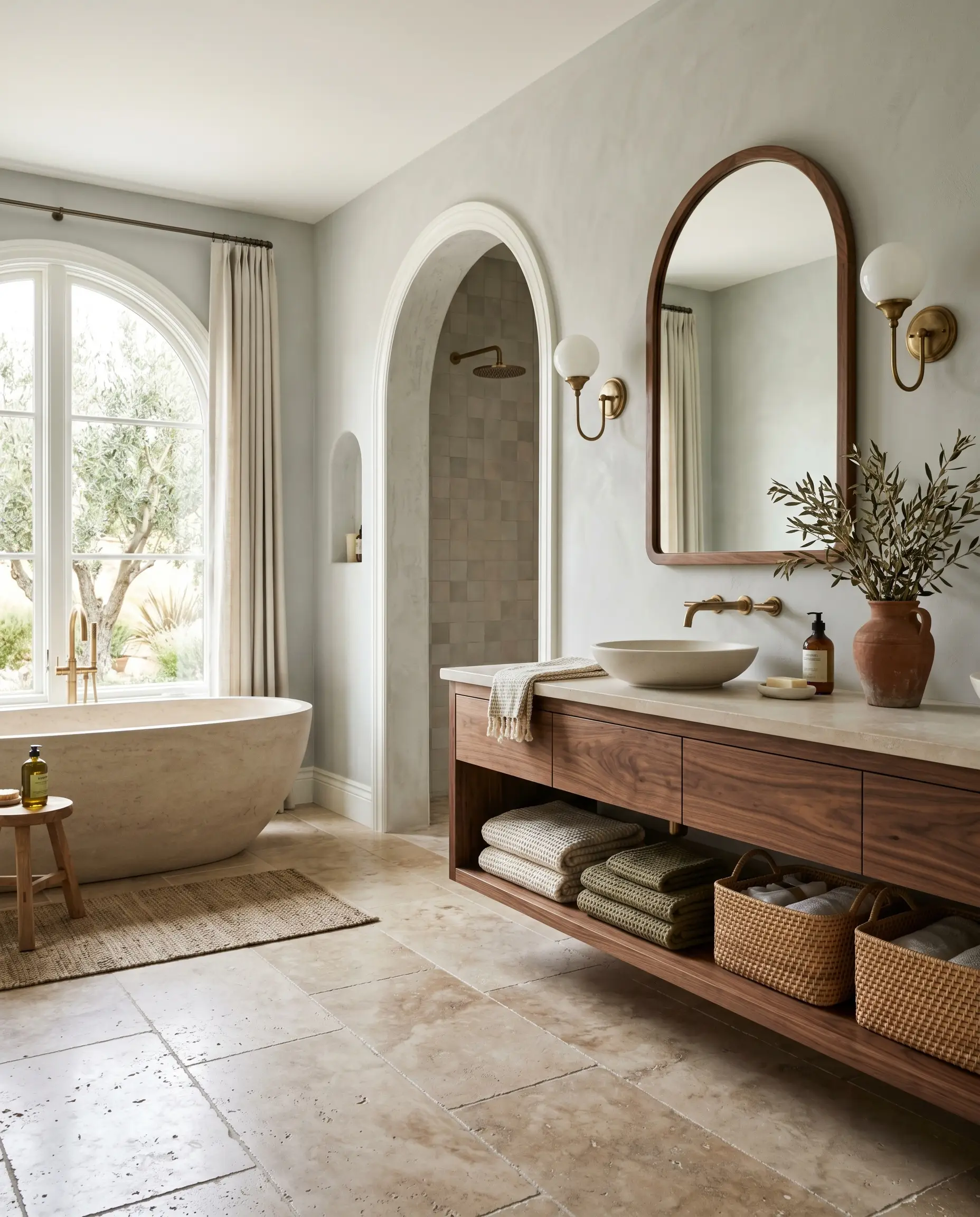
While a “spa bathroom” often defaults to predictable seafoam greens or stark whites, using this specific gray introduces a much more curated, earthy sophistication. The subtle green notes evoke the feeling of crushed sage, especially when paired with the right tactile materials. You can create a stunning daily retreat by contrasting the cool walls with intensely warm, organic textures.
To achieve this, pair a soft matte sheen on the walls with honed travertine floor tiles and a floating walnut vanity. Introduce unlacquered brass sconces; the living finish of the raw metal warms up the silver undertones beautifully. For a final layer of texture, style the space with woven rattan baskets, stacked Turkish cotton towels, and a terracotta vase holding dried olive branches.
Be incredibly careful when pairing this gray with existing bathroom tiles. If your shower surround features warm, beige-heavy Tuscan tiles from the early 2000s, the cool silver-green base of the paint will fight the yellow-orange tones in the tile, making both surfaces look entirely out of place.
Clash Warning (The Tile Trap)
Curated South-Facing Living Rooms
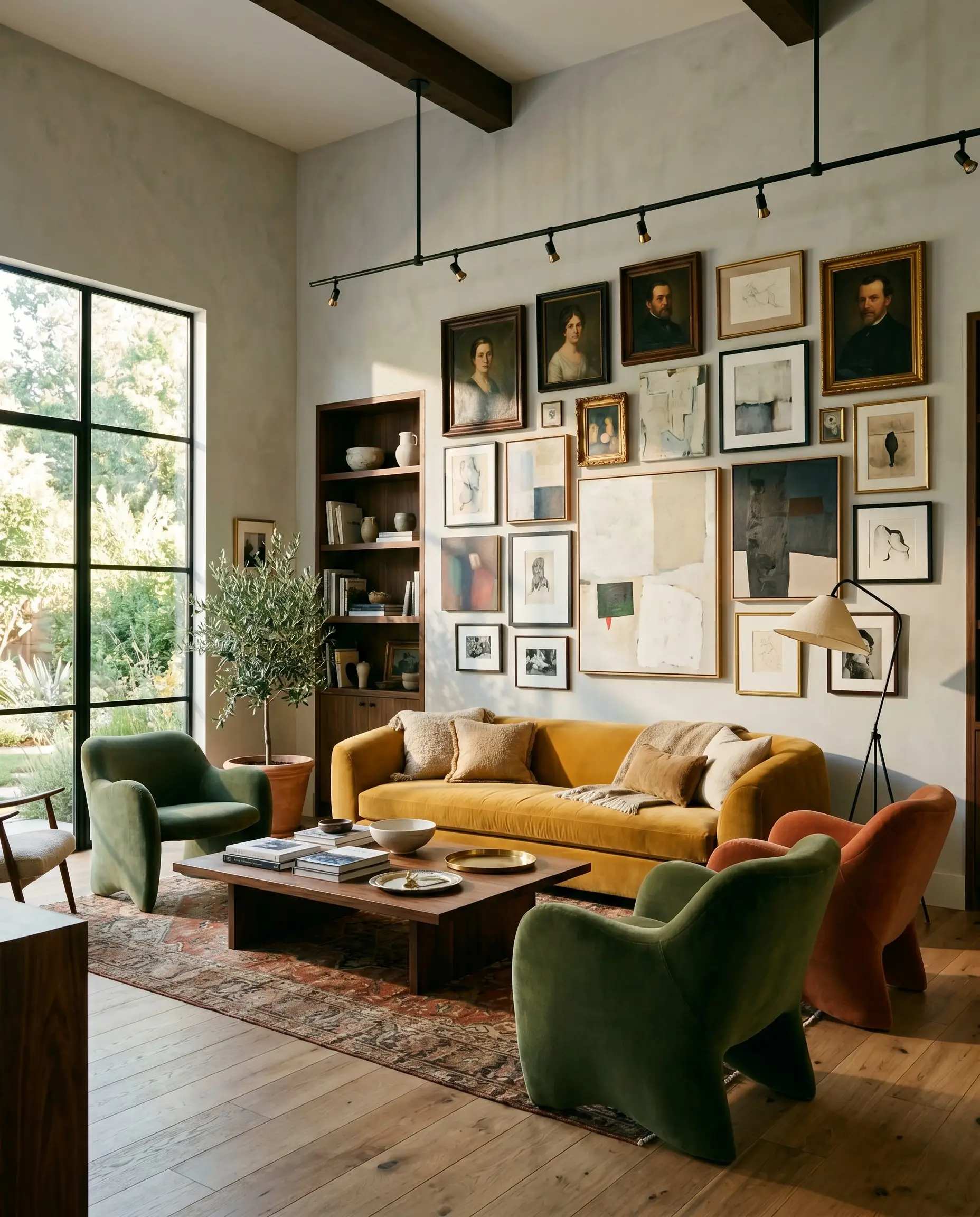
In a living room that receives abundant southern light, this paint truly shines as an aesthetic chameleon. The warm afternoon sun actively softens the gray, pulling forward that muted botanical quality. This creates a phenomenal backdrop for an eclectic, art-collector vibe, allowing vibrant furnishings to take center stage without overwhelming the eye.
Use this color to wrap the entire room, creating a cohesive backdrop that balances out bolder design choices. Root the space with a plush, mustard-yellow velvet sofa or a pair of sculptural mohair accent chairs. The softened sage-gray walls provide the perfect, quiet canvas for an asymmetrical gallery wall featuring vintage portraits, abstract canvases, and structural blackened steel lighting fixtures.
High-Traffic Open-Concept Hallways
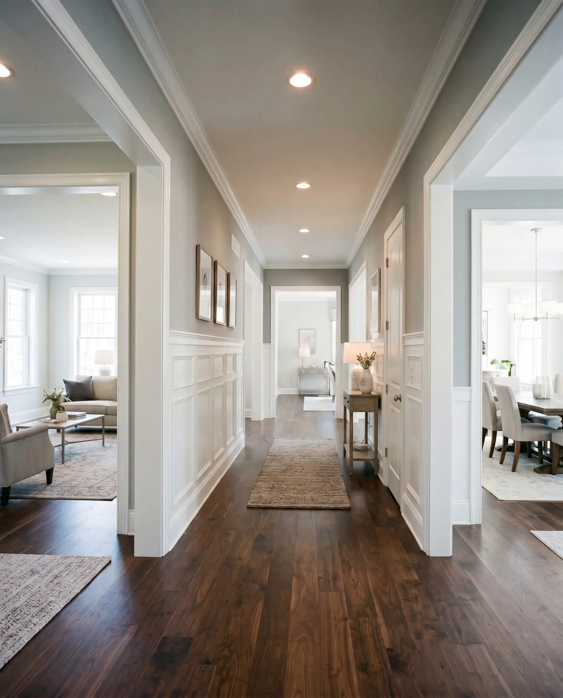
Hallways are notoriously tricky because they often lack natural light and can easily feel like endless, uninspired tunnels. This shade has just the right amount of light reflectance to keep narrow corridors feeling expansive while hiding everyday scuffs far better than a pure white. For a bustling young family, it offers a highly practical yet elevated transition between primary living spaces.
Instead of painting the entire hallway from floor to ceiling, consider breaking up the color mass with architectural molding. Install crisp white board-and-batten or traditional wainscoting on the lower third of the wall, and apply the gray to the upper portion. This classic technique adds immediate structural interest, secures a durable lower boundary for kids and pets, and establishes a beautiful visual flow that connects your open-concept rooms.
Styling Behr Platinum: Coordinating Colors & Material Pairings
This cool neutral thrives on deliberate contrast, requiring crisp architectural boundaries to hold its elegant shape rather than relying on soft tonal bleeds. When placed next to rich textures or sharp whites, its underlying green pigment steps forward to establish a beautifully balanced, grounded atmosphere.
Framing the Room: Trim and Baseboards
Because this gray carries that distinct silvery-green flash, your trim color must be chosen with absolute precision. You need an untinted, highly reflective white to create a sharp boundary that prevents the wall color from reading as murky or washed out.
Benjamin Moore Chantilly Lace OC-65 is an exceptional choice here, offering a clean, brilliant contrast that makes the gray look incredibly tailored. Sherwin-Williams High Reflective White SW 7757 performs similarly, bouncing maximum light around the room to keep the overall visual weight feeling airy and intentional. If you prefer a slightly softer transition that still lacks yellow undertones, Farrow & Ball All White No. 2005 provides a pure, pigment-free boundary that flatters the cool walls beautifully.
Hardware, Wood & Tactile Pairings
To make this accessible paint feel entirely custom and high-end, you must surround it with materials that actively interact with its cool chromatic profile.
The Coordinating Color Palette
Designer Mood Boards
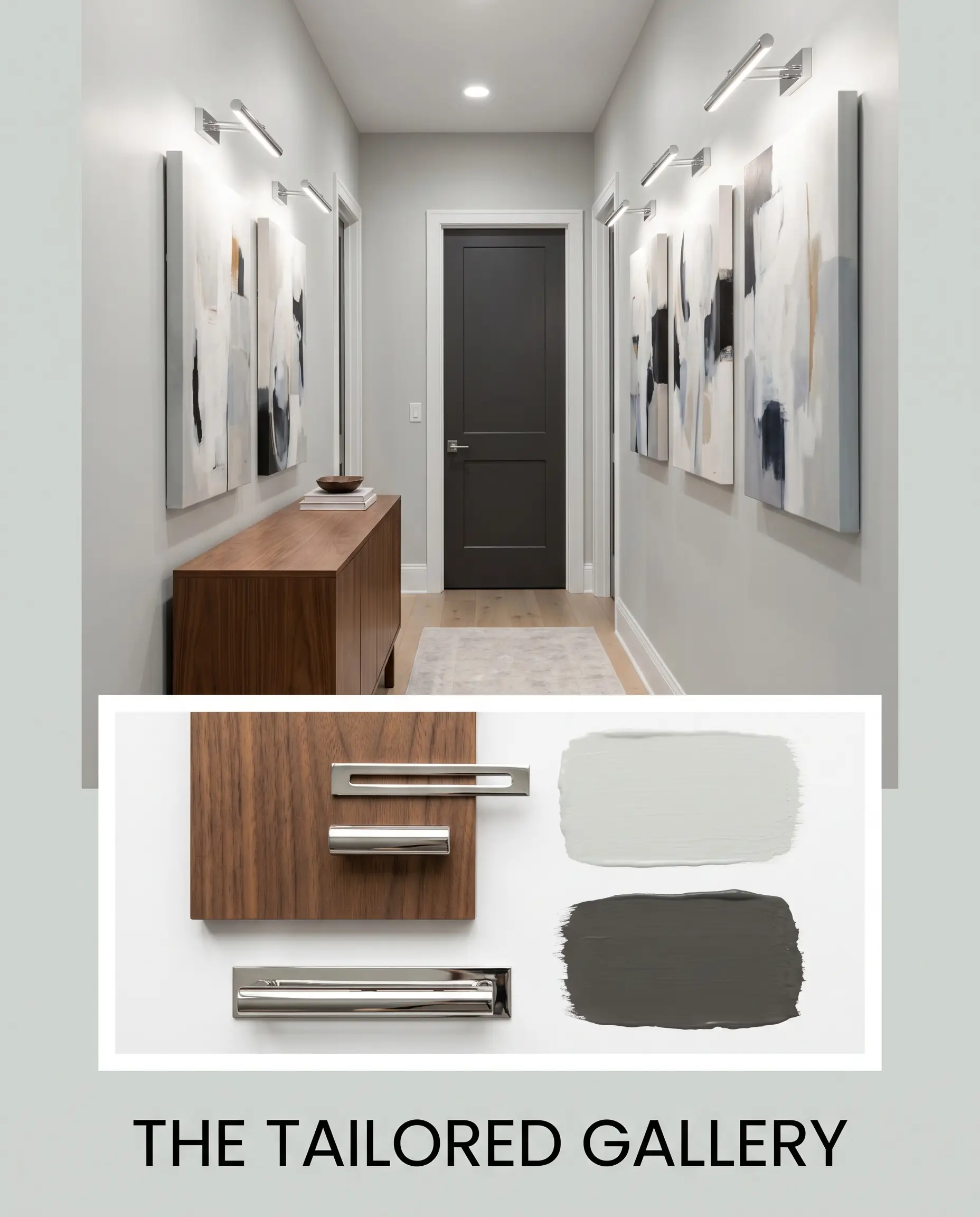
The Tailored Gallery This aesthetic relies on sharp, high-contrast boundaries to create a space that feels curated and deeply intentional. Imagine the walls wrapped in our silver-tinged gray, framed by interior doors painted in the striking depth of Behr Private Black N530-7. Bring in a sleek walnut credenza to add essential warmth, and finish the styling with polished chrome picture lights illuminating oversized, abstract canvases.
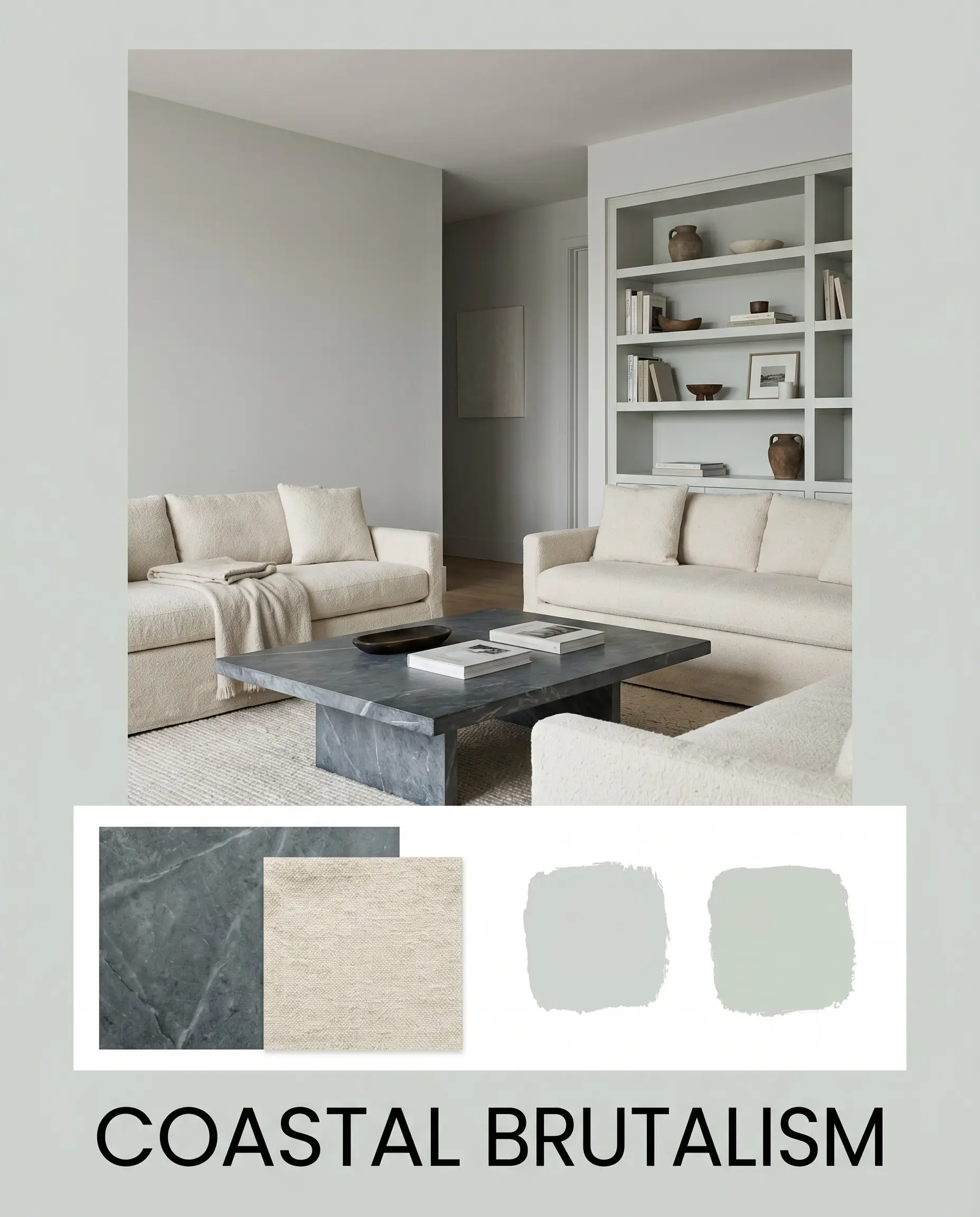
Coastal Brutalism By stripping away traditional nautical cliches, you can achieve a mood that feels raw, organic, and incredibly serene. The walls set a crisp foundation, while a secondary accent wall or built-in painted in Sherwin-Williams Sea Salt SW 6204 enhances the subtle green undertones. Anchor the energy with a heavy, honed soapstone coffee table, and soften the hard architectural lines with expansive, slipcovered seating in nubby, unbleached wool.
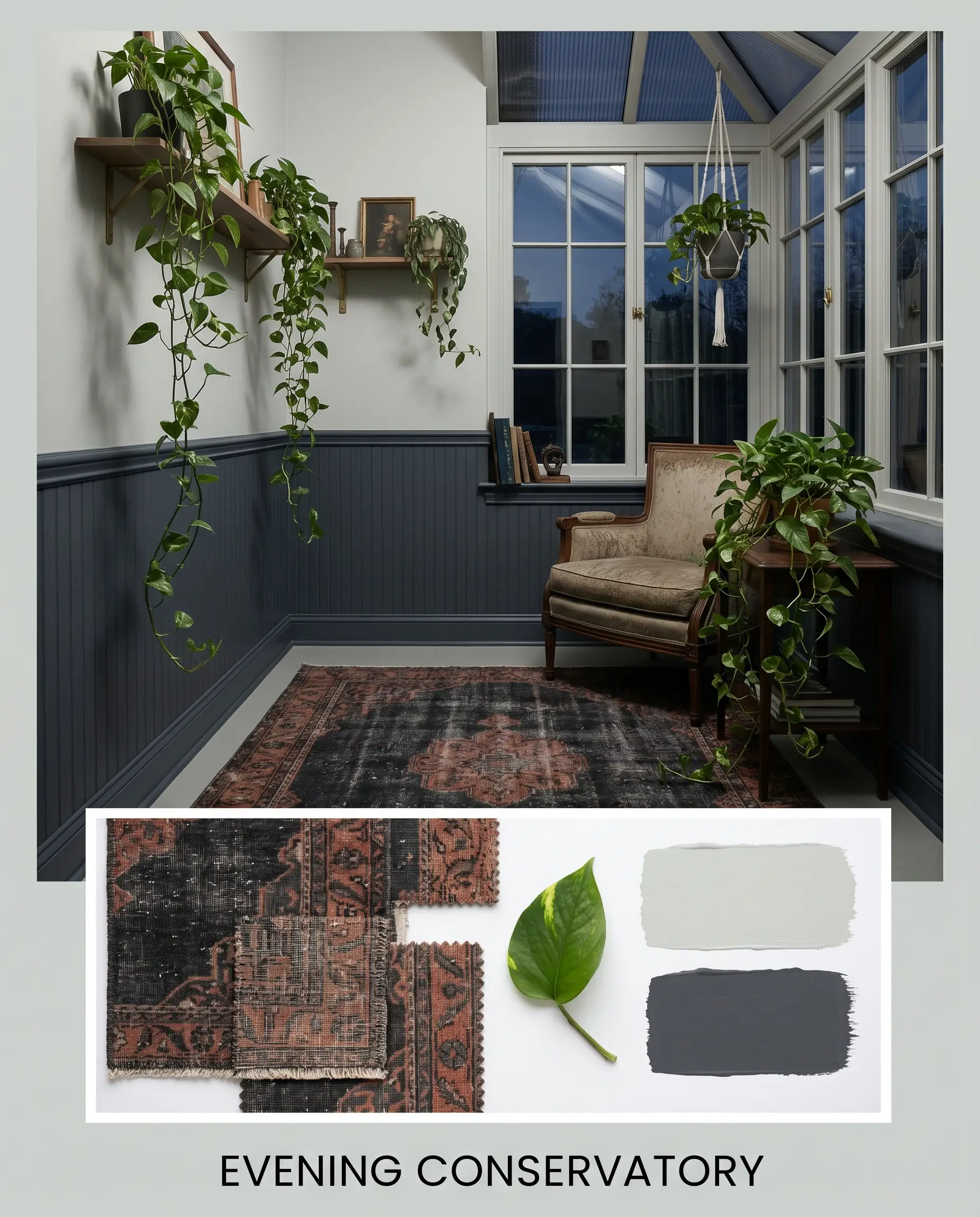
Evening Conservatory This palette leans into a moody, sophisticated energy that feels perfect for winding down at the end of the day. Use Benjamin Moore Hale Navy HC-154 on your wainscoting or lower cabinetry, allowing the lighter gray to carry the upper half of the walls and keep the room from feeling cave-like. Layer in vintage Persian rugs featuring deep charcoal and faded rust, and introduce trailing pothos plants to naturally draw out the paint’s hidden botanical pigments.
Head-to-Head: How Platinum Compares to Rival Grays
Sometimes a home’s specific exterior exposure or existing hard finishes will demand a slight shift in a paint’s underlying color structure. If you are struggling to commit, understanding how this shade behaves next to its closest rivals will give you the confidence to make a final decision.
Behr Platinum vs. Sherwin-Williams Repose Gray SW 7015
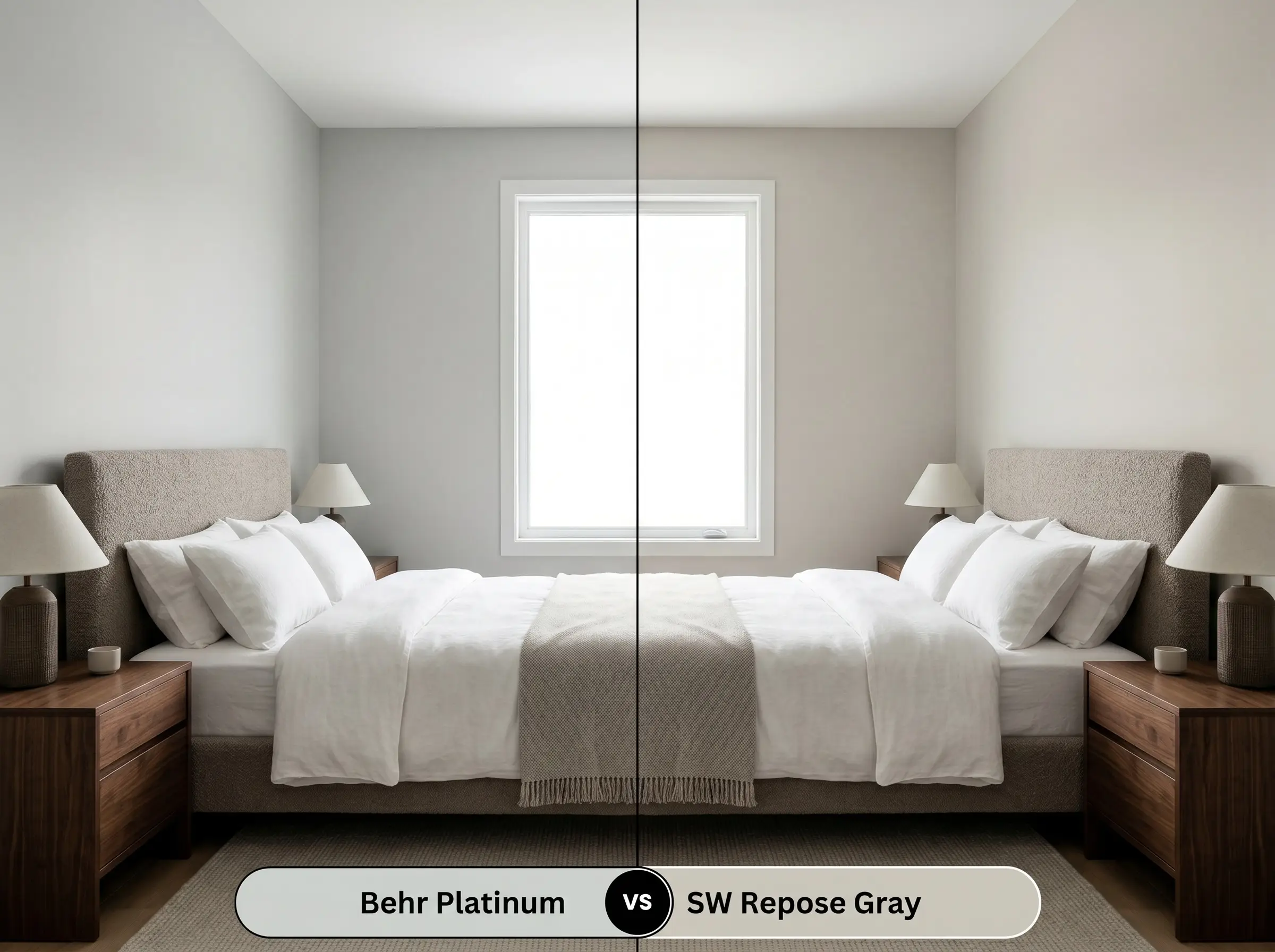
While both are incredibly popular light grays, their hidden pigments pull them in entirely different directions. Repose Gray carries a noticeable dose of warm taupe and brown, making it a true greige. If your room faces north and feels inherently chilly, then Repose Gray is the better choice to inject necessary warmth. However, if you want a crisper, more modern architectural finish, stick with the Behr option.
Behr Platinum vs. Benjamin Moore Stonington Gray HC-170
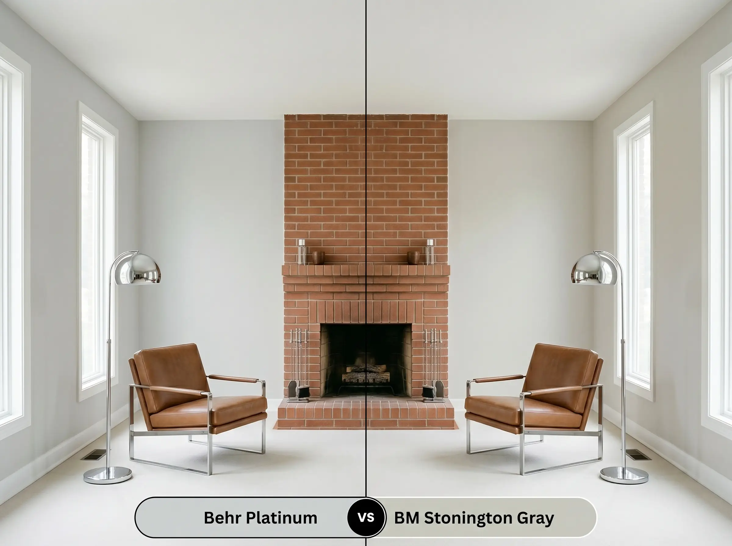
This is a battle of the cool neutrals, but the distinction lies in the undertone flash. Stonington Gray is built on a blue base, which gives it a classic, occasionally icy appearance in cool lighting. If you are pairing the paint with warm terracotta or red brick and want to avoid any green clashing, then Stonington Gray is your safest bet.
Behr Platinum vs. Behr Sterling 780E-3
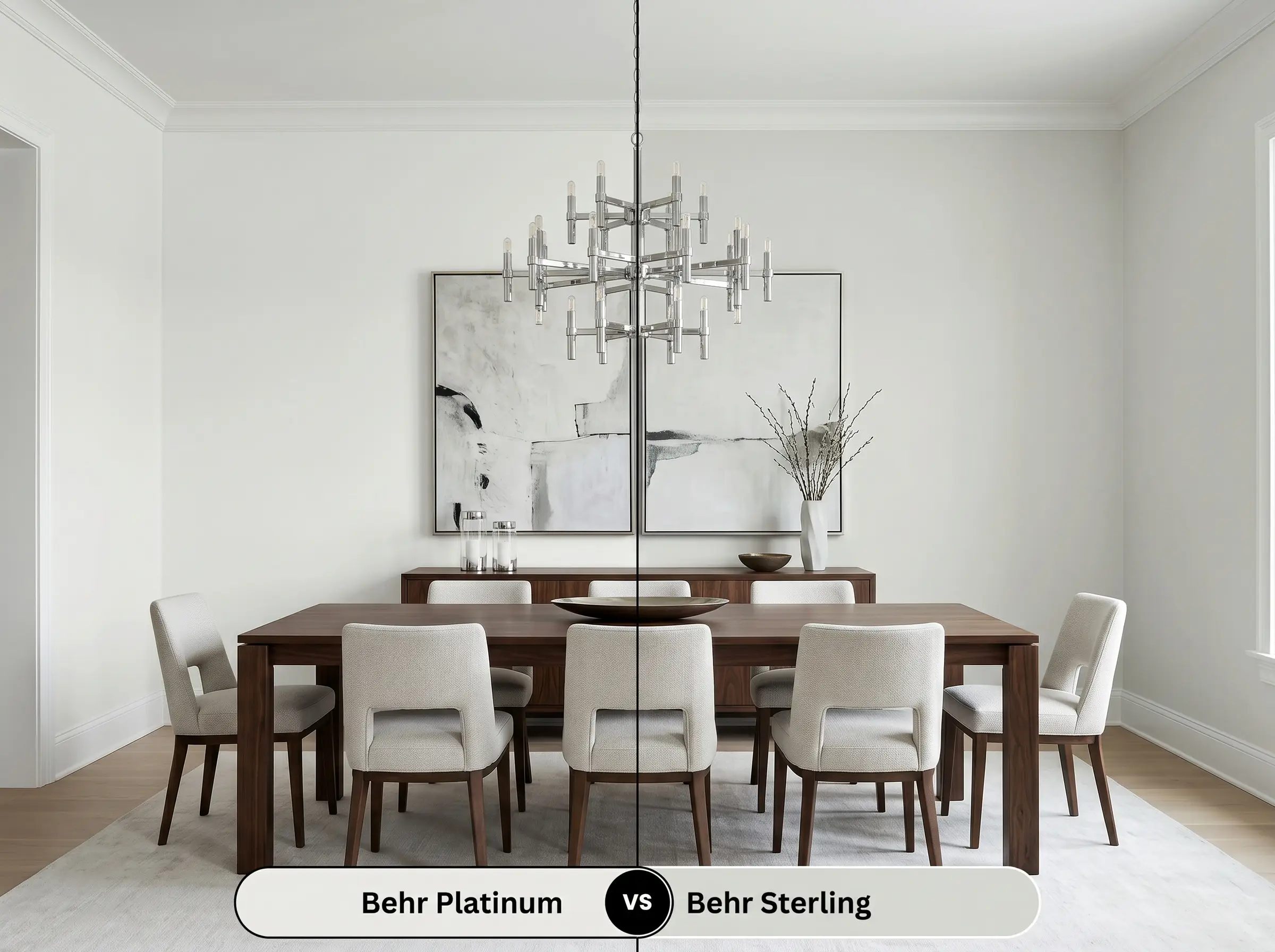
These two shades sit right next to each other on the color spectrum, but Sterling is noticeably lighter and leans heavily into a silver-blue profile. If your room is starved for natural light and you need a shade with a higher light reflectance value to brighten the space, then Sterling will perform beautifully. However, it lacks the earthy, muted sage quality that makes our primary gray feel so complex.
Exploring Paint Alternatives and Brand Matches
You may find yourself needing a shade that is just a fraction deeper for a dining space, or perhaps you need to color-match across brands due to local availability. Here is how to pivot successfully while maintaining a similar aesthetic.
Similar Shades Within the Behr Collection
Cross-Brand Color Matches
Practical Application: Painting with This Cool Neutral
Moving from color theory to physical execution requires a clear understanding of how this specific pigment behaves on a roller. Because it is a light-to-medium gray, achieving a flawless, professional-looking finish comes down to your prep work and your choice of sheen.
When applying this color over a previously dark wall or fresh drywall, a high-quality, untinted white primer is non-negotiable. Skipping the primer will allow the old wall color to alter the gray’s delicate green undertones, leading to a muddy final result.
With an LRV of 65, this paint is highly susceptible to “flashing”—visible, uneven streaks caused by inconsistent roller pressure or touching up spots after the paint has dried. To ensure a flawless finish, always maintain a wet edge while rolling, apply two full coats, and never attempt a spot touch-up in the middle of a highly lit wall.
Hackrea Design Secret (The Flashing Warning)
Frequently Asked Questions
Because it already relies on a subtle green base, abundant foliage outside your windows or large indoor plants will actively pull those botanical notes forward. If you want to tone down that effect and keep the gray looking crisp, balance the room with warm walnut woods and soft, neutral textiles.
The cool silver-green provides a beautiful, natural contrast to the fiery orange notes of red oak, actually helping to modernize the dated flooring. It cools down the overall visual temperature of the room, creating a balanced aesthetic without feeling stark or disjointed.
With an LRV of 65, this shade will significantly lighten under intense, direct sun, often reading as an off-white rather than a true gray. If you want a definitive, grounded gray for your home’s exterior, you should step down to a deeper shade on the same color card to maintain the visual weight.
Without natural sunlight to draw out its softer green side, this paint will lean heavily into its crisp, dove gray profile. You can easily manipulate this by choosing warmer 3000K LED bulbs for your sconces, which will instantly introduce a slightly softer, cozier glow to the space.
The Final Verdict on This Silver-Tinged Gray
Behr Platinum is a highly intentional, sophisticated tool for homeowners who want a neutral backdrop that actively responds to their environment. Its absolute best application is in south-facing living rooms or open-concept spaces where shifting natural light can play up its beautiful, muted sage qualities. It is perfect for those who love the idea of a modern, airy gray but want to avoid the sterile, concrete-like chill that plagues so many standard builder-grade colors.
This paint is incredibly versatile, but it will aggressively fight against warm, yellow-based finishes. If your home features heavy Tuscan-style beige tiles, creamy yellow trims, or honey-oak cabinetry, the cool silver-green base of this gray will immediately clash, making the warm finishes look dingy and the walls appear unpleasantly murky. To succeed with this color, you must commit to crisp whites and intentional, contrasting textures.
Hackrea Pro-Tip (The Undertone Clash)
Closest Cross-Brand Equivalents
The absolute closest scientific color matches for Platinum across top paint brands.