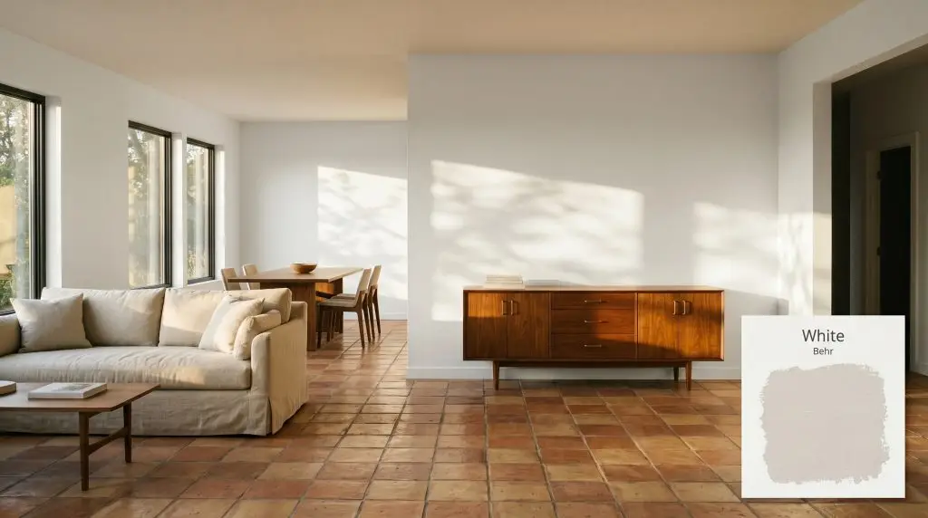
White 52
BehrBehr White (52) is a soft, warm off-white with an LRV of 83. Mathematically rooted in a yellow hue, it provides a creamy, inviting finish that avoids the stark sterility of pure whites, making it highly versatile for both walls and trim.
Paint Technical Profile
| Color ID / SKU | 52 |
| HEX Code | #ebebe6 |
| Light Reflectance (LRV) | 83 |
| Use | Interior, Exterior |
| Best Exposures | North, East |
| Best For | Kitchens, Bedrooms, Living Rooms |
The Luminous Foundation: Crafting a Sunlit, Tactile Aesthetic with Behr White 52
Choosing the right neutral is rarely about finding a complete absence of color. It is about selecting a foundational layer that actively shapes the energy, warmth, and visual scale of your room. Behr White 52 is a brilliant example of this delicate balance, offering a soft, radiant glow that instantly makes standard spaces feel incredibly intentional.
Instead of sitting flat and sterile against your drywall, this off-white architectural finish interacts beautifully with the natural elements in your home. It provides just enough creamy pigmentation to soften harsh angles while maintaining a crisp, clean aesthetic.
Whether you are updating a 90s suburban living room or layering a modern Scandinavian bedroom, White 52 acts as a highly adaptable canvas. We love how effortlessly it transitions between different lighting environments and material pairings. Let us walk through exactly how this paint behaves, where it thrives, and how to style it for maximum impact.
The DNA of Behr White 52: Undertones & LRV
If you are wondering whether this paint leans warm or cool, the answer is definitively warm. Behr 52 is a gentle, inviting hue that completely avoids the icy, blue-tinged starkness of a pure gallery white.
To understand exactly how this color will behave on your walls, we have to look at its core structural components.
Sitting at a light reflectance value 83, this paint bounces a substantial amount of natural light around your space. It absorbs just enough shadow to avoid a blinding glare, making it an incredibly forgiving choice for large, expansive walls. This specific LRV is the sweet spot for maintaining high visibility while keeping the atmosphere relaxed and approachable.
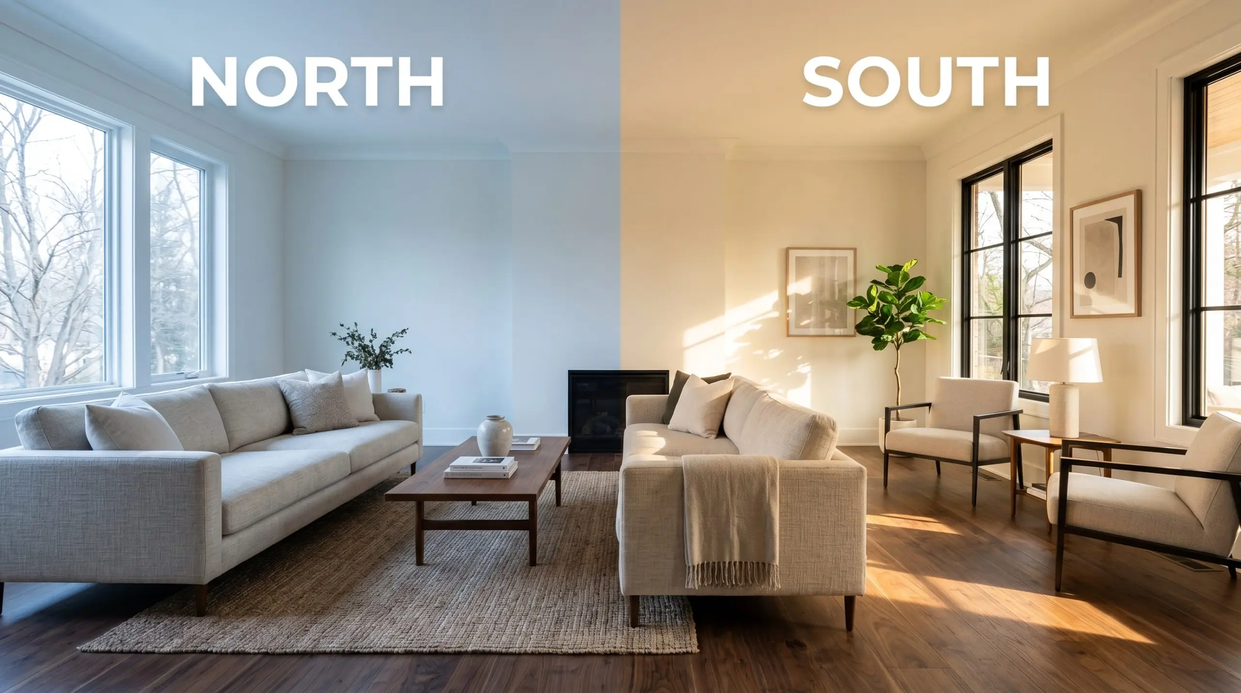
Lighting Effects & The Chameleon Factor
Because of its specific creamy yellow base, Behr White 52 is highly responsive to the shifting temperature of the light hitting it. You must anticipate how your room’s natural exposure will manipulate the final aesthetic.
If your room lacks natural sunlight, you must tightly control your artificial lighting. Never mix bulb temperatures in a room painted with this off-white. Stick strictly to warm 2700K-3000K bulbs to maintain the paint’s intended creamy glow; otherwise, the walls will look disjointed and muddy.
Hackrea Pro-Tip (The Bulb Rule)
Real-World Applications for This Warm Neutral Color Structure
The true strength of this paint lies in its ability to adapt to almost any room while quietly elevating the materials around it. Because it strikes such a careful balance between brightness and warmth, it serves as a highly reliable foundation for a variety of high-impact updates.
Here is how we recommend utilizing this soft off-white across different spaces in your home.
Elevating Kitchen Cabinetry and Walls
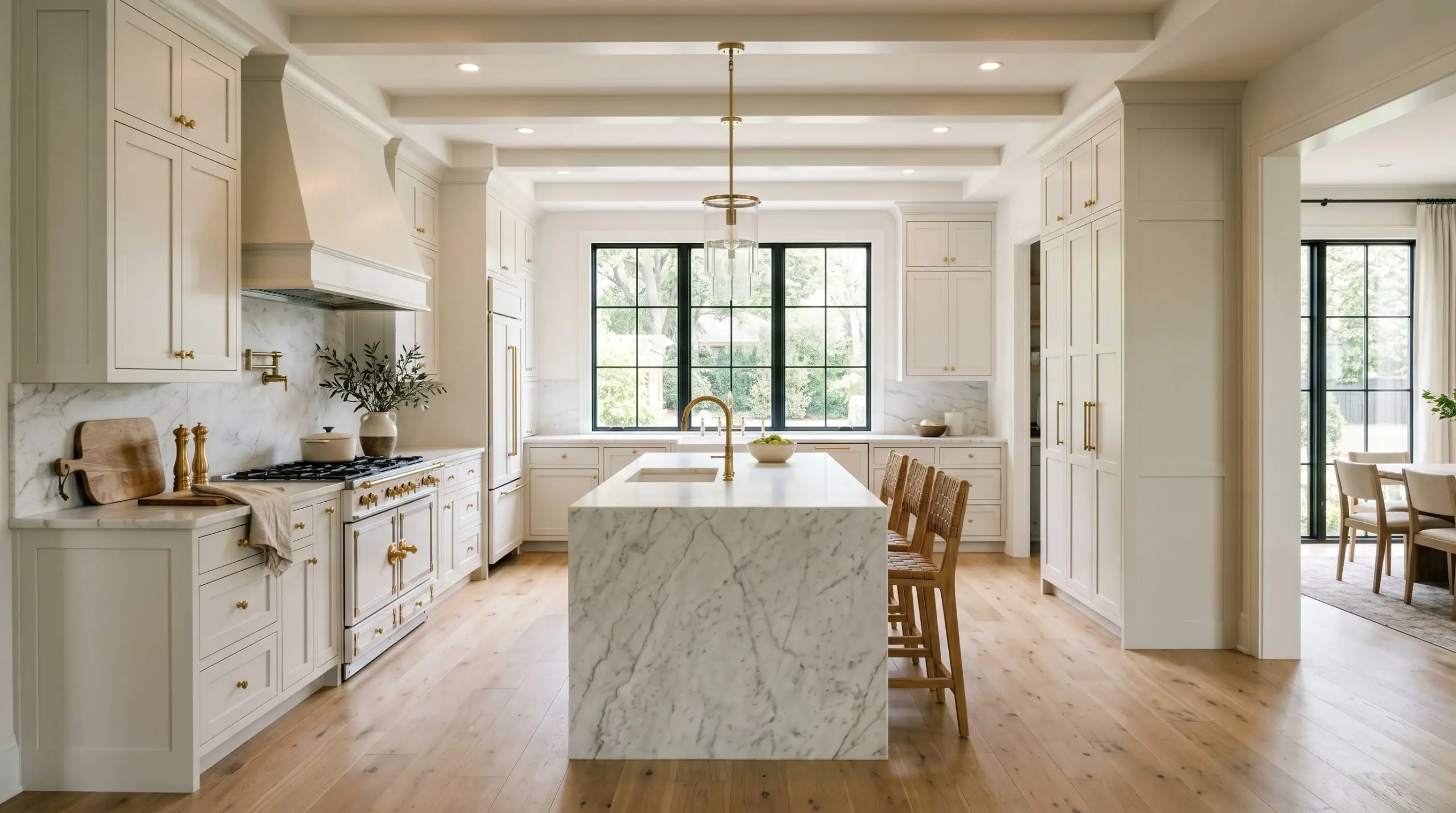
Kitchens naturally demand a sense of cleanliness, but stark white cabinets can quickly make the space feel like a commercial prep zone. Using this creamy off-white on your cabinetry introduces a beautiful, tactile warmth that softens the hard edges of appliances and countertops.
For a refined Transitional aesthetic, pair these luminous cabinets with honed marble counters and unlacquered brass hardware. The warm metallic tones will speak directly to the paint’s yellow base, creating a cohesive, custom-built look. If you are painting the kitchen walls instead, consider establishing the room with rich terracotta floor tiles or warm walnut floating shelves to balance the brightness.
When applying this color to heavily used kitchen cabinets, always opt for a satin or semi-gloss finish. The slight sheen not only makes the surface highly wipeable for a busy household, but it also helps the paint bounce even more ambient light around the room.
Hackrea Design Secret (The Finish Strategy)
Designing Restorative, Cozy Bedrooms
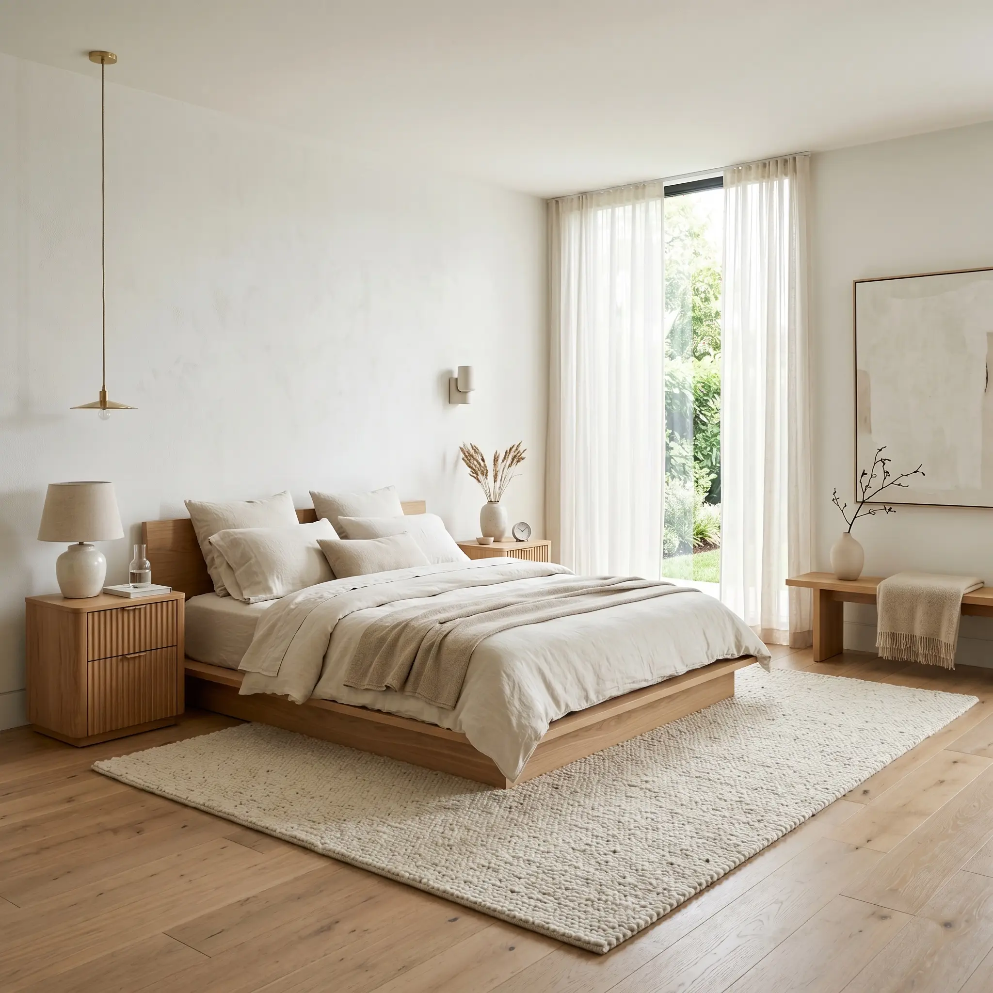
In a bedroom, the goal is almost always to create a serene, restorative retreat. This paint excels here because it provides a bright morning energy without feeling aggressive or cold when you wake up.
To execute a beautiful Warm Minimalist or soft Scandinavian vibe, pair the luminous walls with a low-profile platform bed and layers of washed linen. Introduce tactile materials like a nubby wool rug, fluted oak nightstands, and sheer cotton window treatments to build a sensory, layered environment. The creamy undertone of the paint will seamlessly tie these organic textures together.
Sunlit Living Rooms and Open Layouts
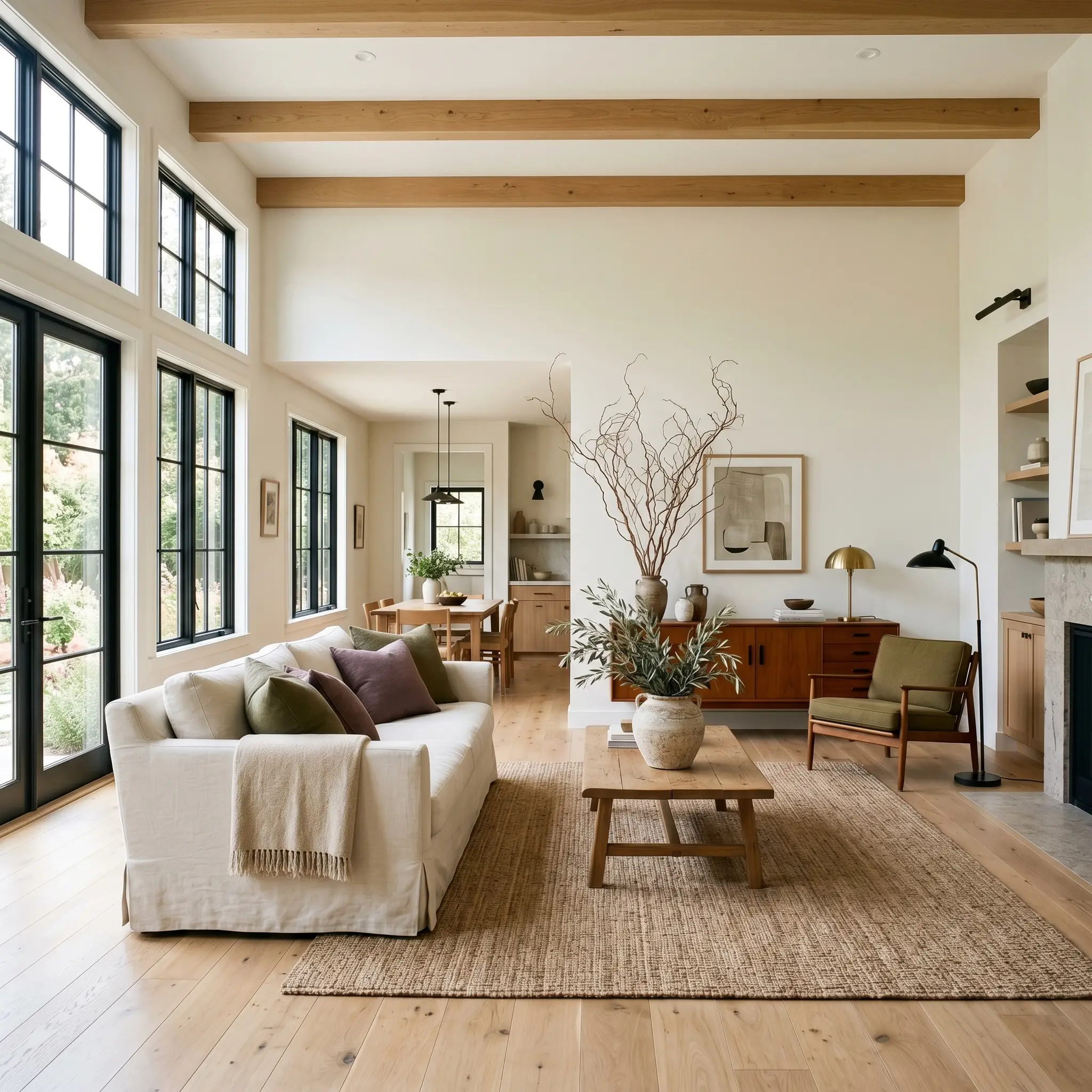
If you have a living room with abundant natural light, this off-white will capture and amplify that sunshine brilliantly. It is an exceptional choice for open-concept layouts where you need one continuous color to unite the living, dining, and entryway zones.
For a Modern Cottage approach, center the room with a slipcovered sofa and style the space with oversized branches in handmade pottery. To prevent the expansive walls from feeling too floaty, introduce contrasting elements like a mid-century teak sideboard or matte black hardware. You can also weave in textiles in muted olive or dusty plum to give the bright room a subtle, sophisticated visual weight.
Architectural Trim and Custom Millwork
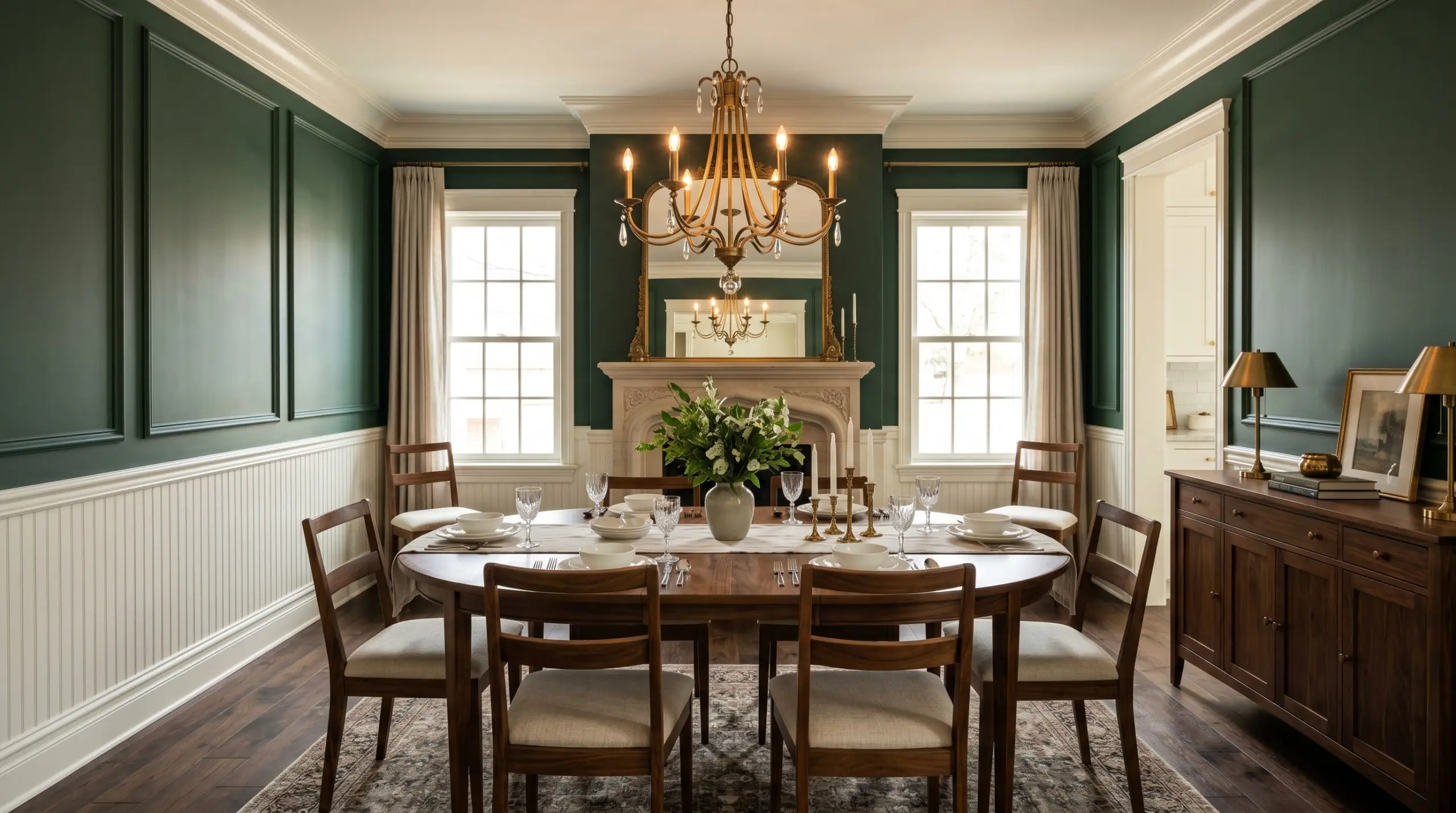
You do not have to limit this color to broad wall applications; it is a phenomenal choice for architectural detailing. When used on picture molding, beadboard, or traditional crown molding, it highlights the woodwork with a soft, inviting clarity.
If you have a dining room or study painted in a rich, saturated hue—like a moody forest green or a dark charcoal gray—using White 52 on the trim creates a stunning, classic frame. Alternatively, for a more contemporary, tonal look, you can paint your walls in a slightly darker beige and use this off-white on the trim to create a subtle, sophisticated layered effect.
Relational Dynamics & Best Pairings for Behr White 52
This soft off-white thrives on gentle, intentional contrast. Rather than requiring stark, rigid boundaries, its creamy base prefers to be layered with warm, tactile companions that gently coax out its inherent luminosity.
Framing with Trim & Baseboards
When framing this radiant hue, you want a crisp boundary that honors its warmth without looking dingy or yellowed. Benjamin Moore Chantilly Lace OC-65 provides a brilliant, sharp edge that makes the primary wall color feel intentionally soft and beautifully curated.
If you prefer a slightly softer transition, Sherwin-Williams High Reflective White SW 7757 offers a beautifully stark contrast. This pairing highlights the gentle yellow undertones of the main wall, creating a clean, tailored boundary that feels incredibly fresh.
Hardware, Wood & Tactile Material Pairings
To ground the buoyant energy of this paint, you must introduce materials that carry a tangible visual weight.
Coordinating Color Palette
Designer Mood Boards
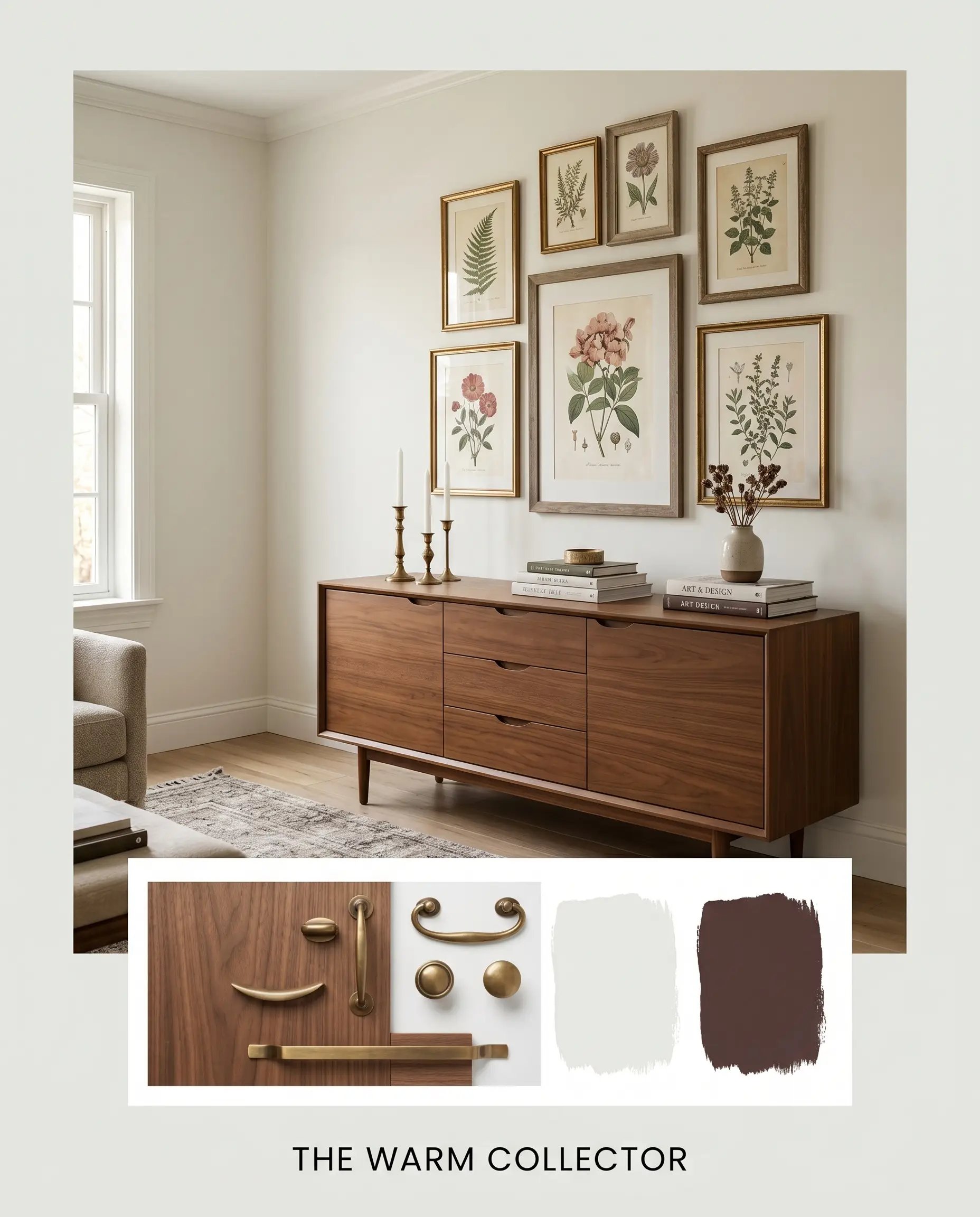
The Warm Collector This palette leans into a beautifully curated Transitional aesthetic, utilizing the deep plum tones of Sherwin-Williams Carnelian to create moments of rich visual tension. Imagine the creamy walls acting as a quiet backdrop for a mid-century warm walnut sideboard and a gallery wall of vintage botanical prints. By introducing aged brass candlesticks and stacked art books, the room feels layered, historic, and deeply personal without ever feeling cluttered.
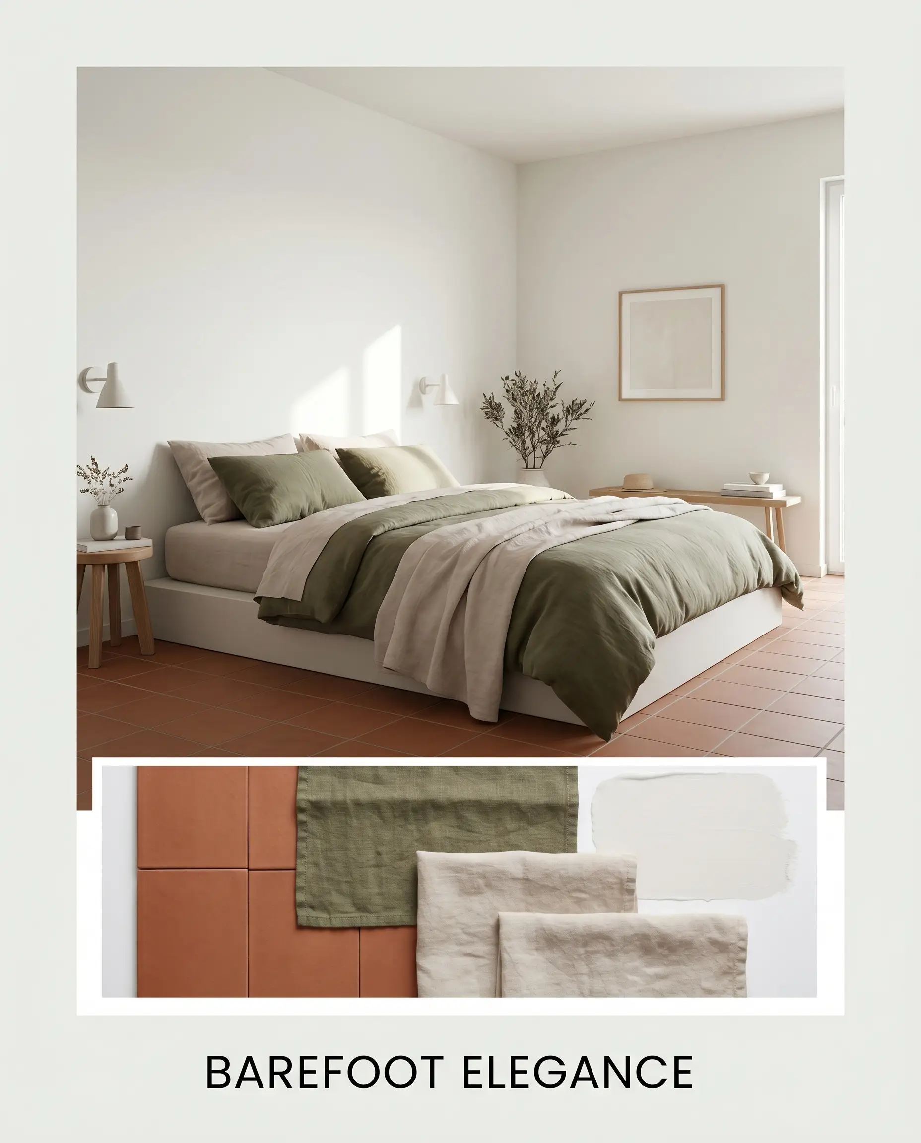
Barefoot Elegance Focusing entirely on a soft, Warm Minimalist energy, this styling approach highlights the paint’s luminous, morning-light quality. We ground the bright space with matte terracotta floor tiles and layer the room heavily with washed linen textiles in muted olive and soft beige. A low-profile platform bed or a slipcovered sofa sits gracefully in the center, allowing the architectural simplicity of the off-white walls to breathe and expand the space.
Head-to-Head Color Comparisons
When evaluating neutrals, understanding how a paint behaves under specific lighting conditions is the key to a successful application. If your room lacks natural sunlight or features challenging architectural elements, you may need to pivot to a hue with a slightly different structural makeup.
Behr White 52 vs. Behr Swiss Coffee 12
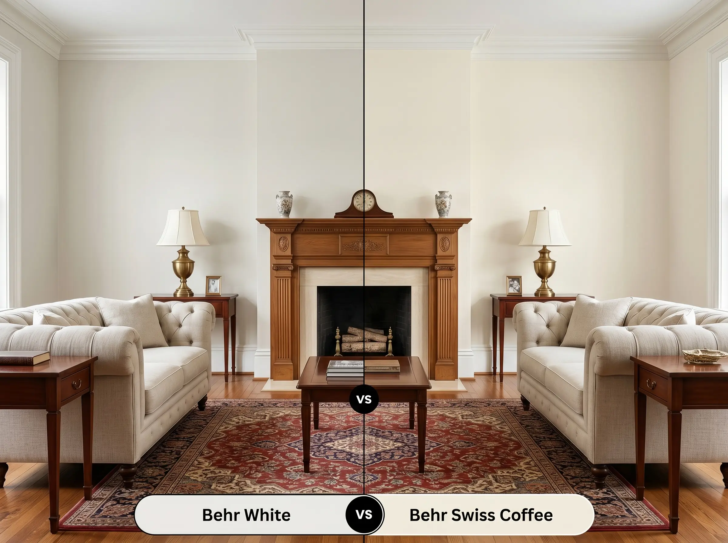
If you are deciding between these two popular Behr neutrals, the choice comes down to how much earthiness you want in the room. Swiss Coffee carries a slightly heavier beige influence, making it feel a touch more muted and traditional. White 52 is noticeably cleaner and leans closer to a true, sunny cream, making it the better option if you want a highly luminous, buoyant space.
Behr White 52 vs. Sherwin-Williams Alabaster SW 7008
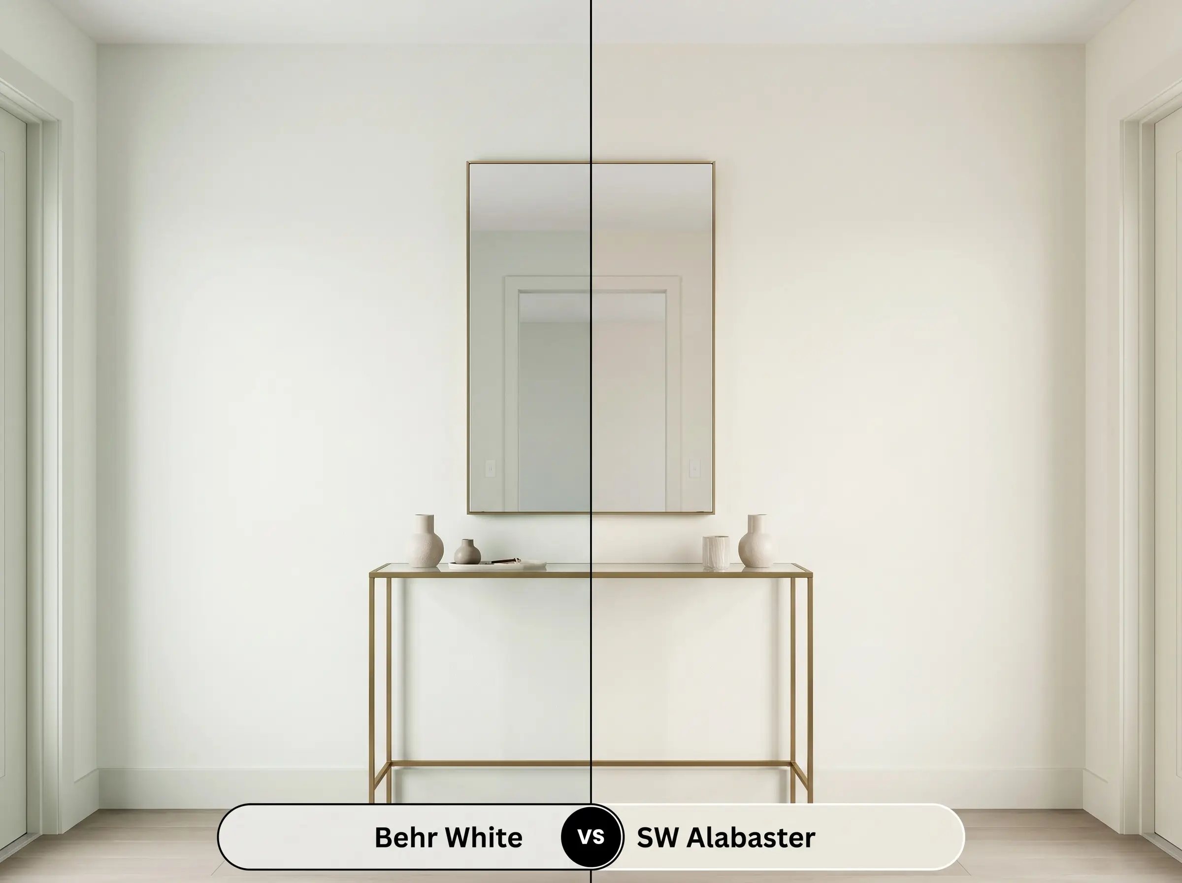
When lighting conditions are unpredictable, this is a crucial comparison to consider. Alabaster features a subtle greige undertone that helps it stay relatively neutral and balanced in shifting light. In contrast, the Behr iteration relies heavily on its yellow base, meaning it will glow much warmer in south-facing rooms but might lose its depth in chilly, north-facing light.
Exploring Similar Hues and Brand Equivalents
Sometimes a room demands just a fraction more brightness or a slightly more muted profile to feel perfectly balanced. If this specific off-white is not quite hitting the mark, here are the closest alternatives to consider.
Same-Brand Alternatives
Cross-Brand Matches
Practical Execution & DIY Strategies for Behr 52
Moving from color theory to the physical reality of painting requires an understanding of how sheens and primers interact with a warm base.
The Dynamic Sheen Guide
Primer Strategy & Coverage Tips
Because this off-white relies on a delicate, luminous base, a high-quality white bonding primer is absolutely non-negotiable. If you are painting over a dark or highly saturated color, skipping primer will cause the old color to pull through and muddy the fresh creaminess.
Expect to apply two full coats for a truly professional, opaque finish. You must maintain a wet edge while rolling to prevent flashing. This specific depth of color is highly unforgiving of dry roller marks, which will show up as dull, uneven streaks when the afternoon sun hits the wall.
Never attempt to touch up a small scuff mark in the middle of a highly lit wall with a brush. Because of how this paint bounces light, the brush texture will catch the sun and look like a permanent smudge; always reroll the entire wall section from corner to corner.
Hackrea Pro-Tip (The Touch-Up Rule)
Frequently Asked Questions
Because of its high light reflectance, intense, direct sunlight will wash out the subtle creamy undertones entirely. On a high-UV exterior, this paint will read as a very stark, glaring white rather than a soft neutral, so you may want to drop down to a slightly darker, more beige-heavy option for stucco.
Its built-in yellow base is fantastic for injecting faux warmth into light-starved spaces. To make it work beautifully in a basement, you must pair it strictly with warm 2700K-3000K LED lighting to activate that creamy glow and keep the room feeling cozy.
Carrara marble features distinct cool, icy gray veining that fights against yellow undertones. Pairing them directly can make the paint look slightly dingy or aged, so it is best to bridge the two with a warmer foundational material, like a warm wood island, or choose a crisper white paint.
Red oak floors naturally project a significant amount of orange and pink warmth into a room. When that light bounces onto this specific off-white, it will amplify the paint’s yellow base, making the walls feel considerably warmer and more golden than they would on a swatch.
Final Verdict & Expert Warnings
Behr White 52 is the ultimate foundational layer for homeowners who want a sunlit, inviting atmosphere without committing to a heavy, traditional beige. It thrives brilliantly in living rooms, bedrooms, and open-concept spaces where its gentle warmth can be layered with organic textures, washed linens, and natural woods. This paint is a powerhouse for Transitional, Modern Cottage, and Warm Minimalist styles, effortlessly bridging the gap between crisp modernism and cozy, lived-in tradition.
However, this beautiful warmth requires strategic styling to succeed. You must be highly cautious if your home features predominantly cool, blue-gray finishes, icy glass tiles, or expansive cool-toned concrete floors. When placed directly next to these chilly elements, the creamy yellow base of this off-white will instantly sour, making the walls look aged rather than intentionally warm. If your fixed architectural elements lean heavily cool, you will achieve a much more harmonious design by selecting a crisper, more neutral white.
Closest Cross-Brand Equivalents
The absolute closest scientific color matches for White across top paint brands.