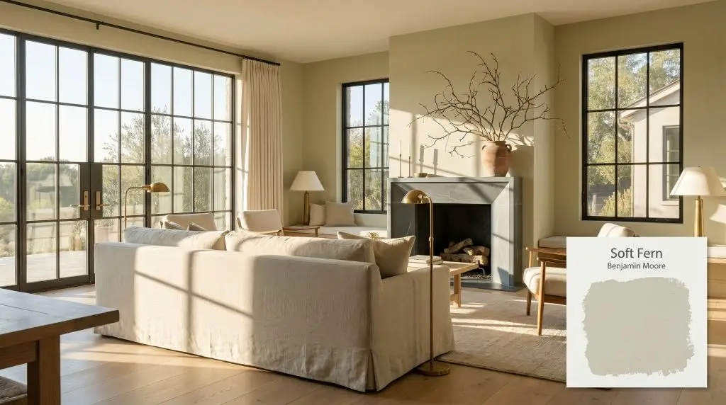
Soft Fern 2144-40
Benjamin MooreBenjamin Moore Soft Fern (2144-40) is a warm, mid-tone botanical green heavily misted with gray. With an LRV of 57.57, it acts as a highly versatile, earthy neutral that brings a calming, organic presence to interiors without overwhelming the space.
Paint Technical Profile
| Color ID / SKU | 2144-40 |
| HEX Code | #C8CAB2 |
| Light Reflectance (LRV) | 57.57 |
| Use | Interior, Exterior |
| Best Exposures | South, East, West |
| Best For | Cabinetry, Bedrooms, Restful Living Spaces |
Benjamin Moore Soft Fern: A Tactile, Earth-Toned Sage That Redefines the Modern Retreat
Finding a green wall color that feels genuinely organic rather than artificial is a common hurdle when curating a home. Benjamin Moore’s Soft Fern (2144-40) solves this dilemma by acting less like a standard coat of paint and more like a textured, botanical cast. It wraps a room in a quiet, lived-in warmth that immediately softens the hard edges of modern architecture.
This specific shade excels because it refuses to compete with your furnishings. Instead, it acts as a highly supportive earthy neutral, setting a serene stage for natural materials like unlacquered brass, white oak, and nubby textiles. It brings the outdoors inside, but it does so with immense curatorial restraint.
If you want a space that feels intentional, relaxed, and effortlessly connected to nature, this muted green offers a brilliant foundation.
Benjamin Moore Soft Fern: Undertones & LRV
Is this paint warm or cool? Soft Fern is fundamentally a warm-leaning green. It is stabilized by a subtle, earthy foundation that prevents the color from feeling icy or sterile on the wall.
Understanding the literal color structure of this paint is the secret to pairing it successfully with your decor. Here is exactly what is happening beneath the surface:
With an official Light Reflectance Value (LRV) of 57.57, this architectural finish sits right in the sweet spot of the mid-light range.
What does this LRV mean for your walls? It absorbs just enough light to maintain a distinct, saturated presence, ensuring the green never washes out into a vague pastel. Simultaneously, it reflects enough ambient energy to keep your spatial perception feeling open, breathable, and comfortably expansive.
Ambient Lighting Shifts: The Chameleon Factor
Because of its complex gray and khaki modifiers, this warm sage tone is highly reactive to the shifting temperature of the sun. You must anticipate how your room’s specific exposure will physically alter the color throughout the day.
Here is how the chromatic profile adapts to different lighting scenarios:
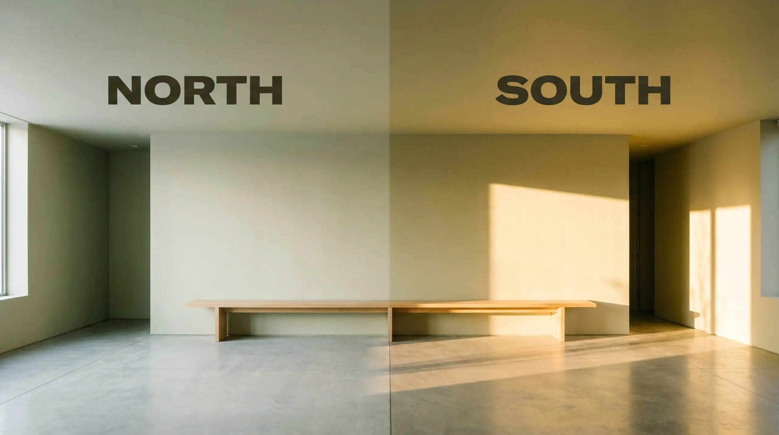
If you are pairing this paint with crisp white trim, strictly avoid bulbs cooler than 3500K. Cool lighting will clash with the paint’s earthy warmth, making the walls look muddy rather than intentional.
Hackrea Pro-Tip (The Bulb Rule)
Curating the Home: Popular Room Applications
Because of its balanced LRV, you can deploy this shade in a variety of ways without overwhelming your floor plan. Here is how to maximize its potential across different architectural spaces.
Primary Bedrooms
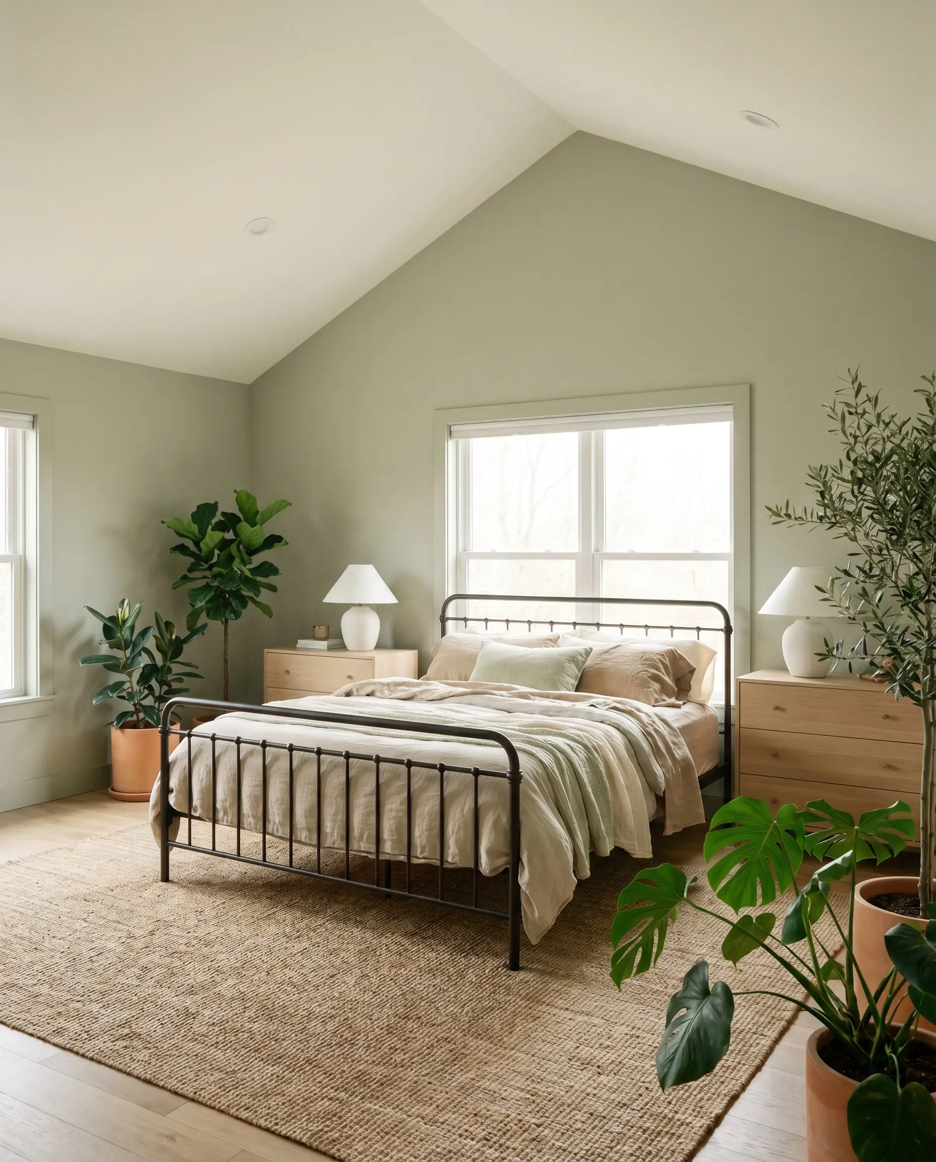
For a serene, Scandi-botanical retreat, apply this soft green to all four walls and pair it with abundant natural textures. It provides a beautiful, muted backdrop for a wrought iron bed frame dressed in layers of washed linen and sheer cotton.
To keep the room feeling contemporary, introduce crisp, contrasting elements. A clean white oak dresser and minimalist ceramic table lamps will beautifully offset the earthy warmth of the walls.
If your bedroom features vaulted ceilings, paint the walls and the baseboards in the green, but leave the ceiling a crisp, warm white. This draws the eye upward and maximizes the ambient light.
Hackrea Design Secret (The Ceiling Strategy)
Kitchen Cabinetry
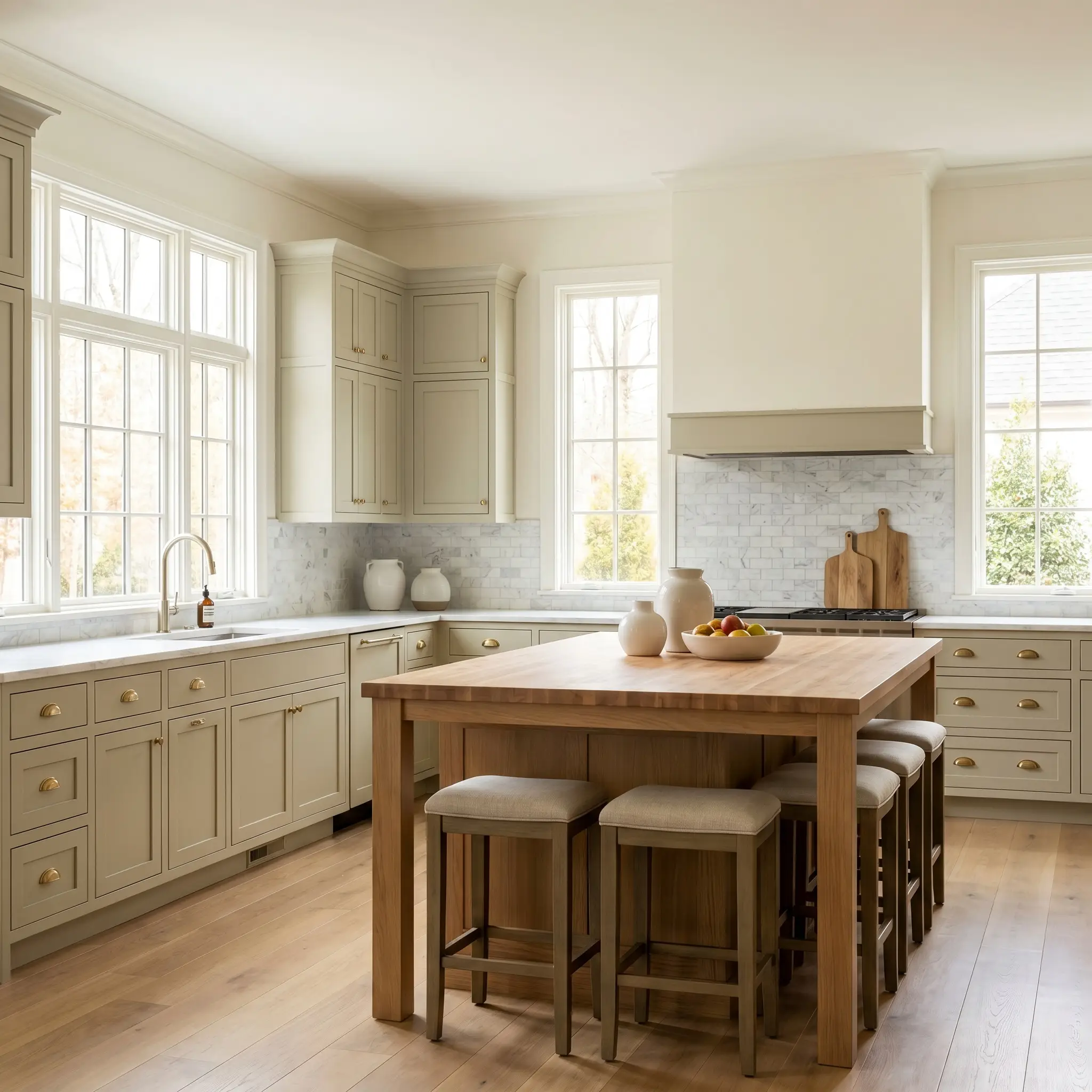
Applying this shade to standard shaker cabinetry is a brilliant way to achieve a custom, high-end look without a massive renovation budget. The muted green instantly warms up a kitchen, making it feel like a welcoming, lived-in culinary space rather than a sterile laboratory.
For a flawless High/Low mix, pair these earthy cabinets with one premium, aspirational material. A honed marble backsplash or a set of solid, unlacquered brass cup pulls will instantly elevate the entire design.
If you are worried about the room feeling too dark, keep your upper walls and ceiling a soft, creamy white to reflect the light downward.
Sunrooms and Conservatories
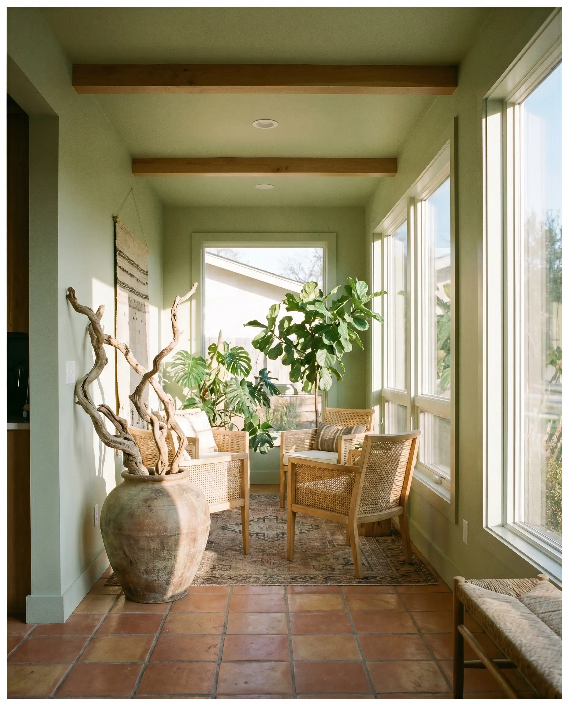
In rooms flooded with direct, south-facing sunlight, the yellow core of this paint truly comes alive. It establishes a seamless biophilic design flow, visually connecting your interior seating area to the exterior landscape.
Lean into a slightly unexpected, globally-inspired aesthetic by pairing the green walls with raw terracotta floor tiles and woven cane furniture. The warmth of the terracotta beautifully complements the subtle khaki undertones of the paint.
Add a few oversized, sculptural branches in a vintage pot to complete the organic, indoor-outdoor aesthetic.
Guest Bathrooms
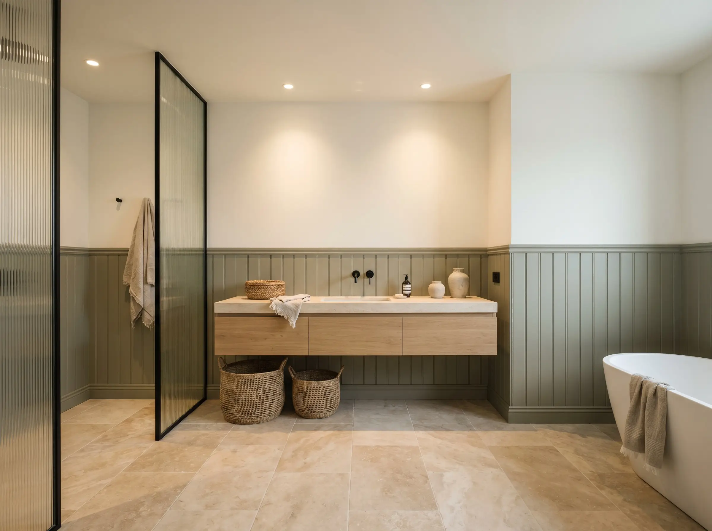
Windowless guest bathrooms often struggle to feel inviting, but applying this warm sage to a classic beadboard wainscoting instantly solves the problem. The color adds necessary character while the crisp white upper walls keep the small room feeling sanitary and bright.
To push the design toward an Organic Modern vibe, incorporate tactile, sensory materials. A floating white oak vanity, matte black fixtures, and a reeded glass shower partition will modernize the traditional beadboard.
Be highly cautious when pairing this green with cool-toned, stark gray tiles. The warm yellow-green base will actively fight against cool grays, making the tile look inexpensive and the paint look tired. Opt for warm whites, creams, or earthy stones like travertine instead.
Clash Warning (The Tile Conflict)
Home Offices
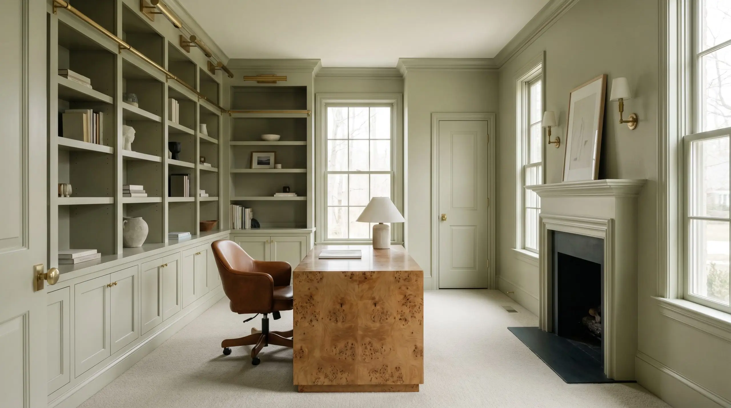
For a modern take on the classic study, consider a full color-drenching application. Painting the walls, the trim, the doors, and even the built-in bookshelves in this single green shade creates a deeply focused, enveloping environment perfect for deep work.
Break up the monochromatic walls with rich, contrasting furniture. A vintage burl wood desk or a saddle leather office chair will pop beautifully against the muted green backdrop.
Finish the space with a brass gallery rail on your shelving to display art books, adding a final layer of curated sophistication.
Curating Benjamin Moore Soft Fern: Coordinating Colors & Pairings
The secret to bringing this muted green to life lies in how it physically interacts with its surrounding textures. Rather than demanding sharp, high-contrast color blocking, this earthy shade prefers soft tonal bleeds and tactile companions to maintain its relaxed, organic spirit.
Selecting the Perfect Trim
The white you choose for your baseboards and crown molding will fundamentally alter how this green reads in the room.
Tactile Finishes and Hardware
To execute a flawless, high-end look without overspending, pair this versatile paint with materials that engage the senses.
If you are updating a builder-grade vanity painted in this shade, swap the standard brushed nickel for unlacquered brass or aged bronze. Cool silver metals will actively fight the warm green, while warm metals instantly elevate the entire fixture.
Hackrea Pro-Tip (The Hardware Rule)
Complementary Paint Palettes
Curated Styling Concepts
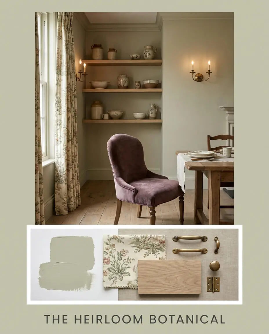
The Heirloom Botanical This palette leans into a deeply traditional, collected aesthetic by pairing the muted green with the rich, dusty plum of Farrow & Ball Brinjal. Imagine vintage pottery displayed on matte white oak shelving, illuminated by the soft glow of unlacquered brass sconces. The energy here is quiet, nostalgic, and intentionally layered, utilizing floral toile textiles to bridge the bold plum and the gentle sage.
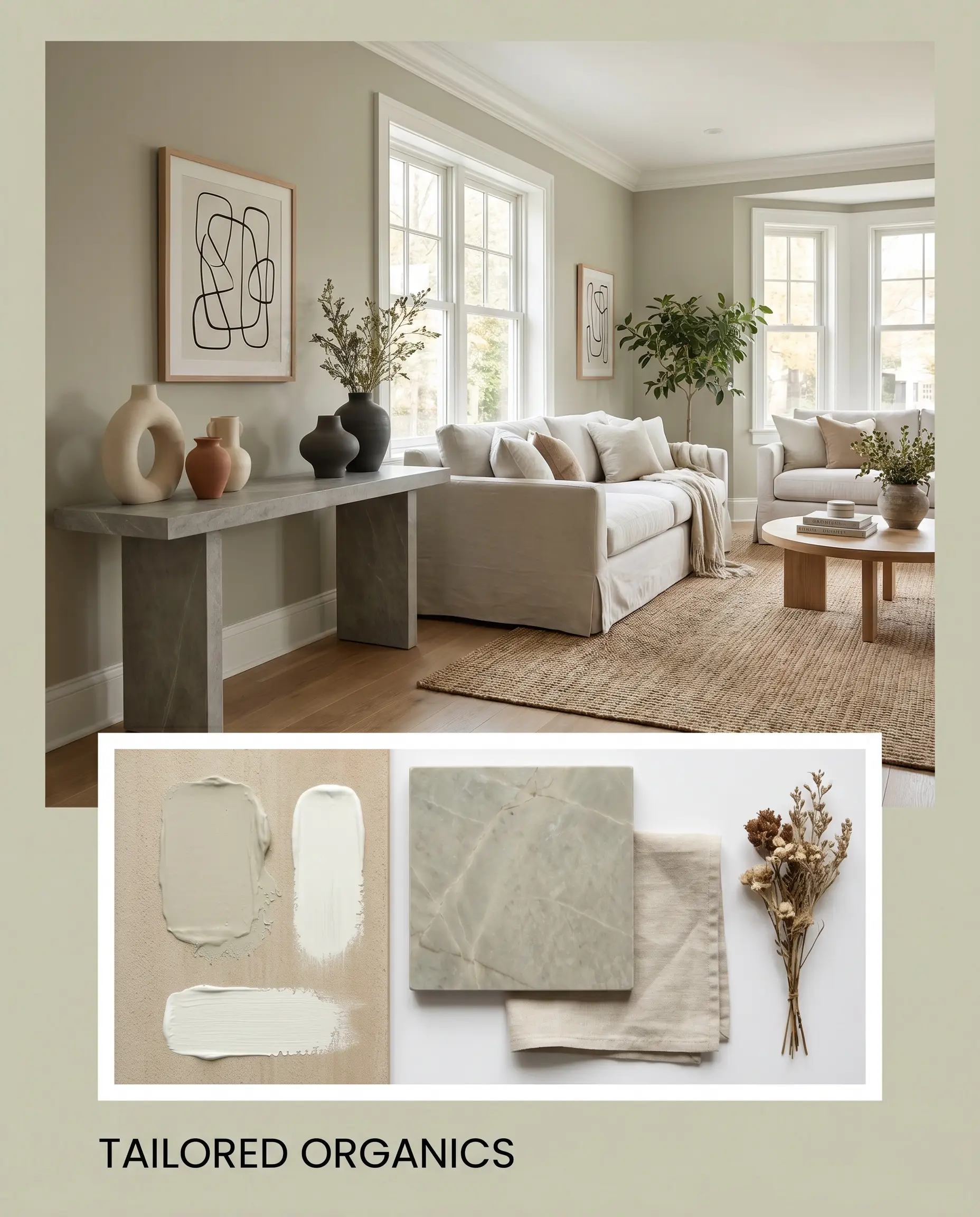
Tailored Organics For a cleaner, more transitional approach, frame the green walls with the crisp boundary of Chantilly Lace trim. Anchor the room with a honed soapstone console table and a slipcovered sofa in a pale, washed linen. By introducing abstract line art and sculptural ceramic vases, the earthy paint is instantly modernized, resulting in a breathable, uncluttered environment.
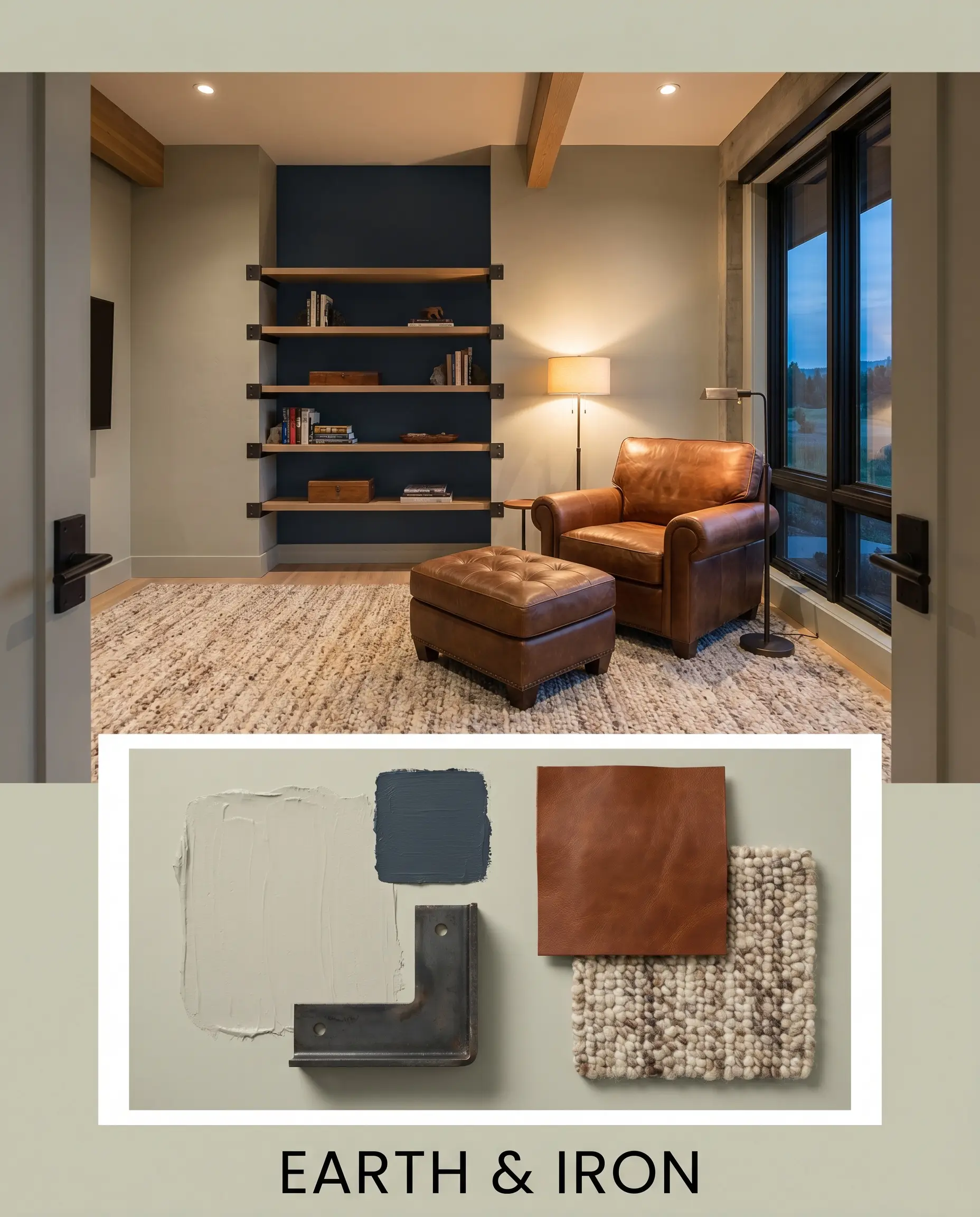
Earth & Iron This styling concept embraces a slightly more masculine, structured vibe by introducing Sherwin-Williams Naval as a secondary accent. The soft green walls provide a welcoming backdrop for blackened steel architectural hardware and rich saddle leather seating. A textured, nubby wool rug softens the sharp metallic lines, creating a space that feels both highly tailored and comfortably worn-in.
Comparing Benjamin Moore Soft Fern Against Rival Greens
While this muted botanical shade is incredibly versatile, certain lighting conditions or specific architectural styles might demand a slight pivot. If your room receives very little natural light, or if you need a crisper finish to match modern fixtures, you must evaluate how the underlying pigments perform against similar contenders.
Benjamin Moore Soft Fern vs. Benjamin Moore Saybrook Sage HC-114
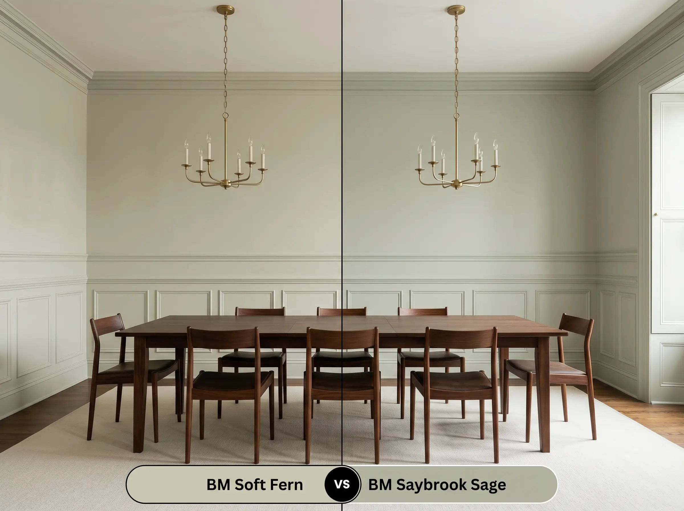
If you are styling a historic home and need a color with a bit more traditional gravity, Saybrook Sage is the stronger candidate. While both share a warm base, Saybrook Sage has a slightly lower LRV (45.46) and carries more distinct gray-blue undertones, giving it a slightly more formal, heritage feel. Soft Fern remains the better choice if you want a brighter, more relaxed energy that leans slightly more yellow-green.
Benjamin Moore Soft Fern vs. Sherwin-Williams Sea Salt SW 6204
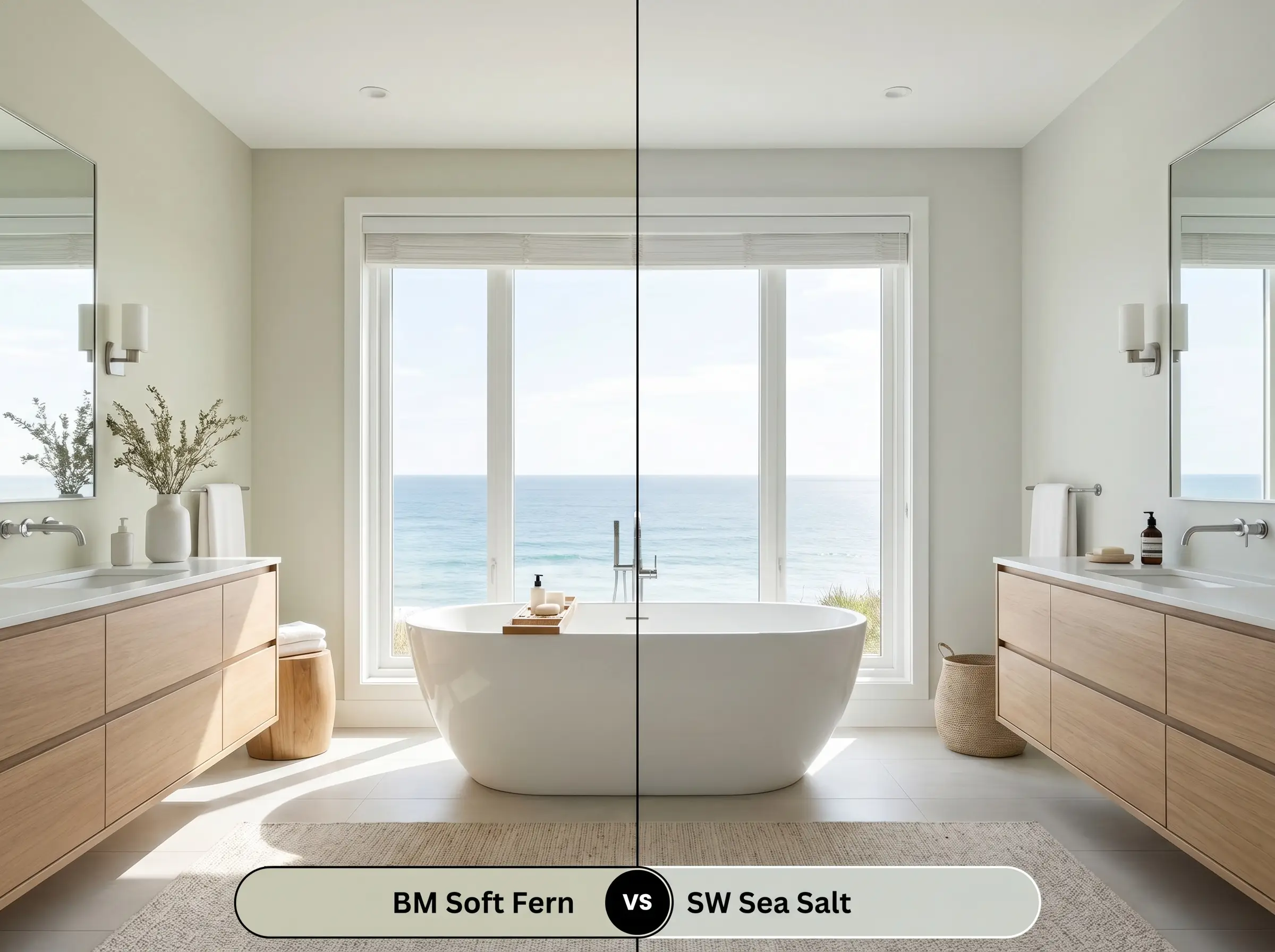
This comparison comes down to the temperature of your room. Sea Salt is a highly popular chameleon, but it is fundamentally a cool-toned green-gray with a flash of blue. If your room is flooded with warm southern light, Sea Salt will balance that intensity beautifully. However, if your room faces north, Sea Salt can easily turn chilly, making the inherently warm, khaki-infused Soft Fern the much safer bet to maintain a cozy atmosphere.
Benjamin Moore Soft Fern vs. Benjamin Moore October Mist 1495
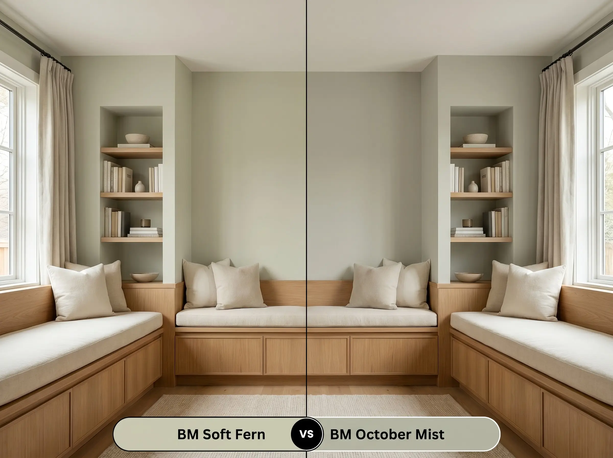
These two shades are incredibly close siblings, but October Mist acts as a slightly more muted, silvery alternative. If you are worried about the yellow core of Soft Fern pulling too vibrant on your walls, October Mist dials back the saturation and leans harder into a dusty, neutral gray. Choose Soft Fern when you want the botanical green to be the undeniable star of the room.
Alternative Shades and Brand Matches
Sometimes a color is nearly perfect, but you realize you need just a fraction more depth for a cozy den, or a slightly higher reflectance value to brighten a dim hallway.
Benjamin Moore Alternatives
Color Matches from Rival Brands
Painting with Soft Fern: Application and Finish Guide
Transitioning this beautiful color from a digital concept to a physical wall requires a strategic approach to your materials. The sheen you choose will dictate how the light interacts with the pigment, ultimately altering your perception of the color.
Selecting the Right Sheen
Primer and Coverage Expectations
Because this shade sits comfortably in the middle of the light reflectance spectrum, a standard white, high-quality interior primer is generally sufficient. If you are painting over a very dark or highly saturated wall (like a deep navy or crimson), ask your paint counter to tint your primer slightly gray to ensure a neutral starting point.
Expect to apply two full coats for a professional, opaque finish.
When working with mid-tone greens, inconsistent roller pressure can lead to “flashing”—visible, uneven streaks where the paint dried at different thicknesses. Always maintain a wet edge as you roll, and resist the urge to touch up small spots once the wall has begun to dry.
Hackrea Design Secret (The Roller Warning)
Frequently Asked Questions
Because 4000K bulbs emit a cool, slightly blue-tinted light, they will actively suppress the warm yellow core of this paint. The resulting color will read as a much cooler, flatter gray-green, losing some of its cozy, botanical charm.
The earthy, muted nature of this green makes it an exceptional companion for classic red brick. The subtle khaki undertones harmonize beautifully with the warm, baked clay colors of the brick, creating a heritage-inspired, welcoming exterior.
By balancing a lively green hue with a calming gray modifier, this shade reduces visual fatigue and promotes sustained focus. It brings the soothing energy of nature indoors, establishing a serene workspace that feels productive rather than stressful.
These rich, reddish-brown woods actually create a stunning, complementary pairing with the paint. The warm undertones in the green converse perfectly with the natural warmth of the wood, resulting in a deeply layered, sophisticated design.
The Final Verdict on Benjamin Moore Soft Fern 2144-40
Benjamin Moore Soft Fern is a masterclass in curatorial restraint, offering the perfect solution for homeowners who crave color but fear overwhelming their spaces. Its absolute best application is in rooms designed for relaxation and gathering—think sunlit breakfast nooks, cozy reading rooms, or welcoming guest bedrooms. It is the ultimate chameleon for those executing a High/Low design strategy, effortlessly elevating standard architectural elements when paired with thoughtful, tactile materials like unlacquered brass and white oak.
While this earthy green is incredibly versatile, you must protect it from stark, blue-based grays. If your home is currently outfitted with cool gray luxury vinyl plank flooring or icy gray quartz countertops, this paint is not for you. The warm, yellow-green base will actively fight those cool surfaces, making the floors look inexpensive and leaving the paint looking muddy and exhausted. To succeed with this shade, you must commit to a palette of warm whites, creams, and natural, earthy tones.
Clash Warning (The Cool Gray Conflict)